
Introduction: Visualizing the ROI of Vitality
The corporate wellness sector has evolved from a "nice-to-have" perk into a strategic operational imperative. As organizations fight to retain top talent in a hybrid world, the global market for corporate wellness solutions has surged, projected to reach USD 129.44 billion by 2034. Yet, for HR Directors and Benefits Administrators, the challenge is no longer procurement—it is activation.
We are witnessing a "Physical/Digital Divide." Sophisticated SaaS platforms are purchased but often sit unused because employees struggle to connect a digital dashboard with their physical reality. This "Engagement Gap" is the primary enemy of ROI.
To bridge this gap, video strategy must move beyond generic imagery. It must articulate the seamless integration of technology, psychology, and productivity. The stakes are high: recent studies show that 95% of companies measuring the return on their wellness programs see positive financial results.
The following guide dissects 10 specific visualization styles for the top of the funnel (Introduction) and middle of the funnel (Education). These styles are not just aesthetic choices; they are strategic levers designed to reduce cognitive load, build data trust, and visualize the invisible benefits of a healthy workforce.
1. Aspirational Stock Montage
TOFU | Brand Awareness
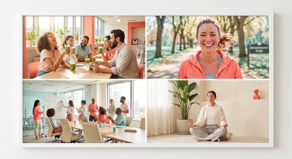
The Visual & Narrative Approach
Scenario: The video opens with a rhythmic, high-energy 4-panel grid. We see a synchronized display of wellness: a "Soft Teal" filtered shot of a morning jog, cutting instantly to a collaborative team meeting in a sunlit office. The narrative voiceover focuses on "community" and "shared energy," moving away from the isolated user journey. The "Vivid Coral" accents in the styling create a subconscious link between vitality and the software brand.
Tone: Inclusive, Energetic, Optimistic, Community-Focused.
Psychological Impact & KPI Focus
Niche Psychology: One of the biggest barriers to adoption is the "Athlete Myth"—the belief that wellness programs are only for the fitness elite. This grid layout democratizes health by giving equal visual weight to meditation (mental health) and nutrition (social health), proving inclusivity.
Operational Impact: This style directly impacts Program Registration Rates. It signals to the employee that the platform supports their specific version of health, reducing the psychological friction of "not fitting in."
Strategic Implementation & Trade-offs
Use Case: Ideal for Meta (Facebook/Instagram) Ads where capturing attention in a sound-off environment is critical.
Duration: 15-30 Seconds.
Trade-off: While cost-effective, this style lacks specific product UI visibility. It sells the feeling of the culture, not the function of the software.
Companies using similar video content -
Wellable – Wellable Wellness Platform – Holistic employee wellbeing programs.
Virgin Pulse – Virgin Pulse – Comprehensive employee health and wellbeing.
Health Fitness – Employee Wellbeing Solutions – Promotes employee health and performance.
2. Bold Kinetic Typography (Visual)
TOFU | Market Education
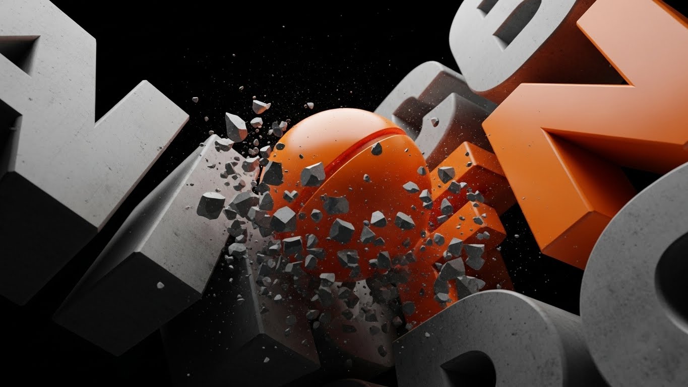
The Visual & Narrative Approach
Scenario: The screen is dominated by the word "BURNOUT" rendered as a heavy, grey concrete monolith. A vibrant "Safety Orange" sphere (representing your software's intervention) slams into the text, shattering the concrete block into dust. The sound design features a heavy, bass-rich impact followed by a digital "refresh" sound. The low camera angle makes the intervention feel powerful and heroic.
Tone: Urgent, Disruptive, Authoritative, Bold.
Psychological Impact & KPI Focus
Niche Psychology: Corporate burnout is a heavy, tangible weight on employees and HR teams. Visualizing this negative state as brittle concrete validates their struggle. The shattering effect provides a "cathartic visual"—a visceral promise that the software can break the cycle of stress.
Operational Impact: This style addresses Market Education. It frames the problem (stress/admin load) as something that can be destroyed, creating a sense of urgency and solution-readiness.
Strategic Implementation & Trade-offs
Use Case: YouTube Shorts or high-impact intro sequences for webinars.
Duration: 10-15 Seconds (Loopable).
Trade-off: This is a high-concept abstract style. It engages the viewer but explains nothing about features. It requires strong, punchy copy to anchor the metaphor.
Companies using similar video content -
Headversity – Headversity – Workforce mental health and skill building.
Kona – Kona – Prevents burnout with real-time emotional data.
Spring Health – Spring Health – Personalized mental health care plans.
3. Abstract 2D Motion Graphics
TOFU | Shaping Brand Perception

The Visual & Narrative Approach
Scenario: We view a top-down abstract representation of an employee's mental state. Initially, "chaotic, jagged shapes in deep ocean blue" move erratically. As the software's logo pulses in the center, these shapes smooth out into "harmonious, flowing waves of bioluminescent cyan." The motion is liquid and easing, utilizing gradients to imply depth without 3D heaviness.
Tone: Calming, Sophisticated, Fluid, Modern.
Psychological Impact & KPI Focus
Niche Psychology: This appeals to the "Cognitive Load" anxiety. Employees are bombarded with notifications. This style visualizes the "Flow State." It promises that the software will not add to their burden but will organize and harmonize their existing chaos.
Operational Impact: Highly effective for Shaping Brand Perception on LinkedIn. It positions the platform as an "elegant solution" rather than a "clunky tool," implying seamless interoperability.
Strategic Implementation & Trade-offs
Use Case: LinkedIn Feed posts and waiting room loops for virtual sales demos.
Duration: 15-45 Seconds.
Trade-off: The abstraction can be too vague for pragmatic buyers who want to see the dashboard. It relies heavily on accompanying text to explain the specific benefit.
Companies using similar video content -
Wellics – Wellics Wellbeing Operating System – Transforms workplace health into measurable performance.
Microsoft Viva Insights – Microsoft Viva Insights – Enhances employee experience and wellbeing.
4. Abstract 3D AI Visualization
TOFU | Category Creation

The Visual & Narrative Approach
Scenario: The camera flies through an infinite digital horizon of metallic silver and electric purple nodes. Each node represents an employee, connected by pulsing white lines that visualize real-time health data synchronization. As the camera pulls back, the nodes form a cohesive network structure. Volumetric lighting adds a layer of "premium tech" atmosphere.
Tone: Futuristic, Enterprise-Grade, Secure, Expansive.
Psychological Impact & KPI Focus
Niche Psychology: For the Enterprise Buyer (CIO/CTO), the concern is scale and security. This visualization proves "Enterprise Readiness." It shows that the platform can handle thousands of concurrent data streams (nodes) without breaking.
Operational Impact: Supports Category Creation. It elevates the conversation from "wellness app" to "Population Health Infrastructure," helping justify higher contract values.
Strategic Implementation & Trade-offs
Use Case: Website Headers (Hero Backgrounds) and Event Keynote Openers.
Duration: 10-20 Seconds (Looping).
Trade-off: It can feel "cold" or "impersonal" if not balanced with human-centric content. It speaks to the buyer's logic, not their empathy.
Companies using similar video content -
TELUS Health – TELUS Health – Data-driven workplace wellness platform.
Personify Health – Personify Health – AI-powered personalized health and wellbeing.
5. AI generated mixed media video
TOFU | Demand Gen

The Visual & Narrative Approach
Scenario: A stop-motion paper cutout character (representing a fragile human) sits at a kraft-paper desk. As they complete a wellness check-in, a glossy, 3D animated bar chart (Pastel Yellow and Sky Blue) sprouts organically from the desk, supporting them. The contrast between the tactile paper texture and the smooth 3D glass renders creates a dynamic visual hook.
Tone: Playful, Innovative, Approachable, Data-Driven.
Psychological Impact & KPI Focus
Niche Psychology: Data can be boring; people are interesting. This style bridges the gap. It visually argues that "soft" human actions (paper) lead to "hard" business results (3D glass). It disarms the skepticism that data collection is invasive.
Operational Impact: Excellent for Demand Gen on platforms like TikTok or Reels. It signals that your brand is creative and modern, distinguishing you from legacy enterprise software.
Strategic Implementation & Trade-offs
Use Case: TikTok/Instagram Reels ads targeting younger HR decision-makers.
Duration: 15-30 Seconds.
Trade-off: The "artsy" aesthetic might not resonate with highly conservative industries (e.g., Banking) that prefer a traditional corporate look.
Companies using similar video content -
YuLife – YuLife – Gamified insurance and wellbeing app.
BetterMe Business – BetterMe Business – Integrates mental and physical wellness.
6. 2D Character-Driven Story
TOFU | Vertical Social Organic
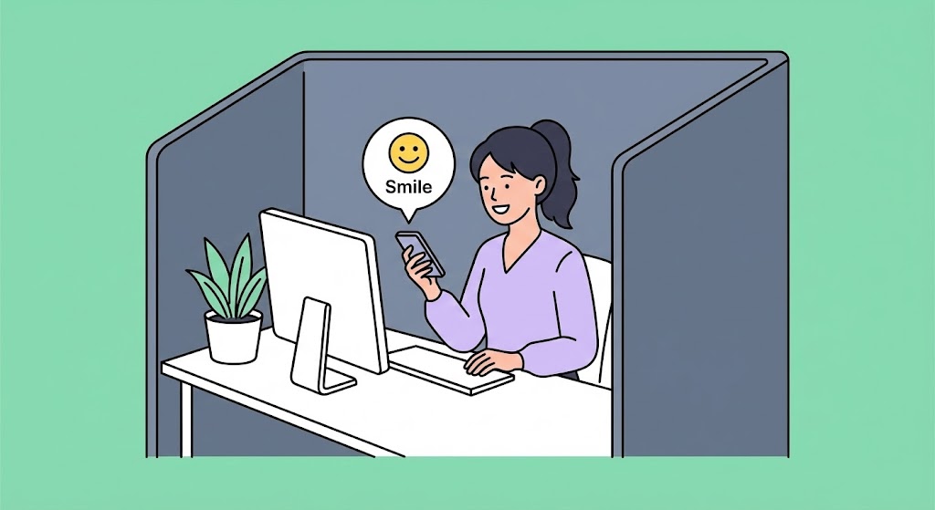
The Visual & Narrative Approach
Scenario: A flat vector animation focuses on "Sarah," a professional in a slate grey cubicle. She looks stressed. Her phone lights up with a soft, floating bubble notification—a "Smile" emoji from your wellness app. Her expression shifts to relief, and the background subtly shifts to Mint Green. The animation is simple, focusing entirely on the emotional shift triggered by the app.
Tone: Empathetic, Clear, Minimalist, User-Centric.
Psychological Impact & KPI Focus
Niche Psychology: This taps into the "Micro-Moment." Wellness isn't always about a marathon; sometimes it's just a reminder to breathe. This style validates the small, invisible struggles of desk workers and presents the software as a supportive "pocket companion."
Operational Impact: Drives Vertical Social Organic engagement. It builds community trust by showing that the brand understands the daily grind.
Strategic Implementation & Trade-offs
Use Case: Instagram Stories (Polls/Q&A context).
Duration: 15 Seconds.
Trade-off: Flat vector art is common. To stand out, the character acting must be genuine and the script must address a specific, relatable pain point.
Companies using similar video content -
Limeade – Limeade Well-Being – Culture-centric employee experience and wellbeing.
Headspace For Work – Headspace For Work – Mindfulness and mental health for employees.
7. Generative AI cinematic video
TOFU | Skippable Pre-Roll Ad

The Visual & Narrative Approach
Scenario: A wide, cinematic tracking shot follows a determined employee jogging past a massive office window at sunrise. The "golden hour" light creates lens flares. The camera focuses sharply on the smart wearable on her wrist, while the city skyline remains in a dreamy blur. The movement is smooth and stabilized, mimicking a high-budget athletic commercial.
Tone: Premium, Aspirational, Cinematic, Motivating.
Psychological Impact & KPI Focus
Niche Psychology: This appeals to the "Best Self" aspiration. HR buyers want to believe their company creates this kind of lifestyle for employees. It visualizes the ideal state of "Work-Life Integration" rather than just balance.
Operational Impact: Perfect for YouTube Pre-roll Ads. The high visual quality in the first 5 seconds prevents the "Skip" click and elevates the brand's perceived value.
Strategic Implementation & Trade-offs
Use Case: YouTube TrueView and Digital Out-of-Home (DOOH) screens.
Duration: 30-60 Seconds.
Trade-off: Consistency is key. If the AI generation flickers or warps, it destroys credibility. It requires rigorous quality control.
Companies using similar video content -
ClassPass – ClassPass – Fitness membership platform for employees.
Future – Future – One-on-one digital training platform.
8. Isometric 2D Motion Design
MOFU | Product Differentiation
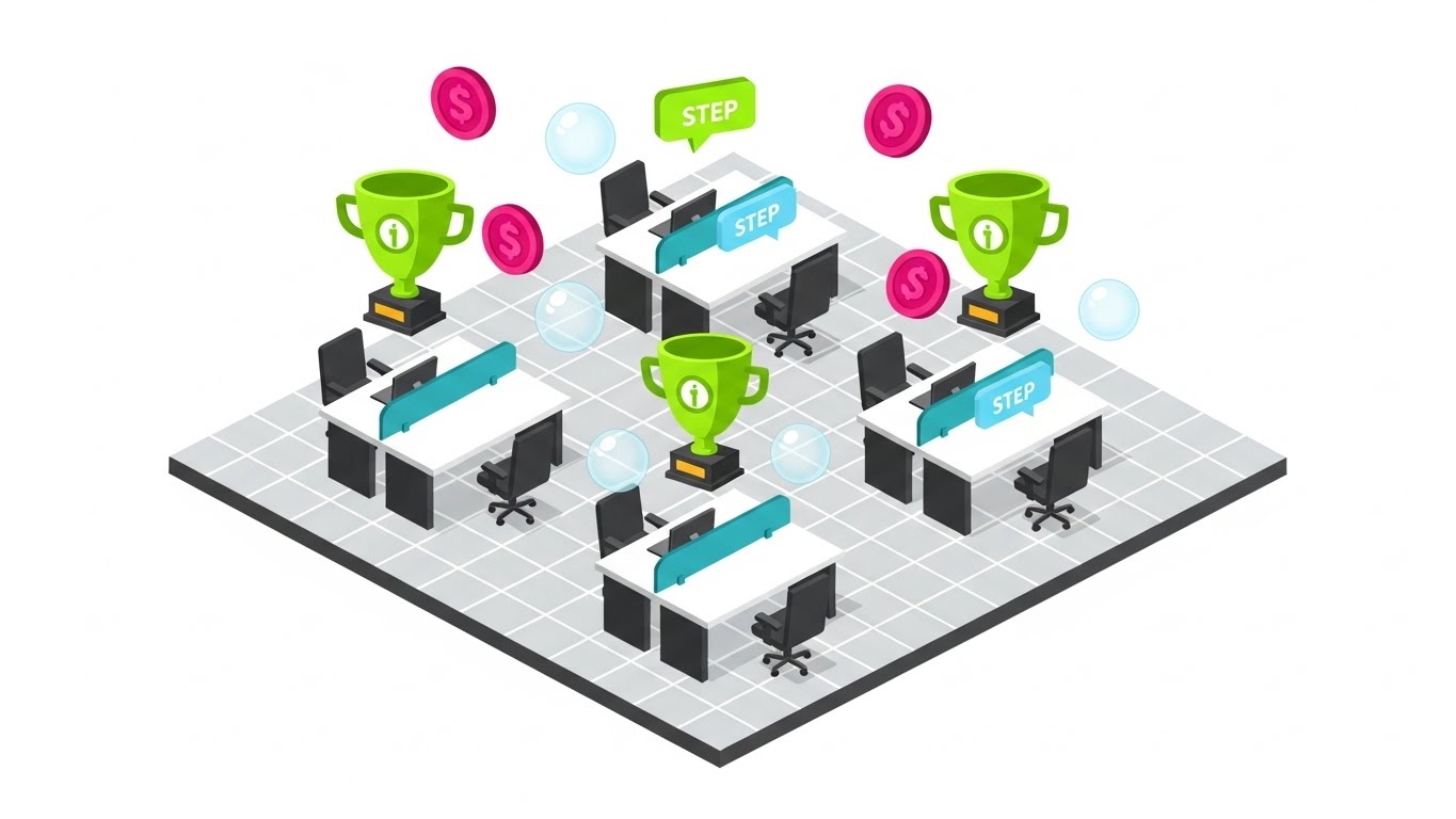
The Visual & Narrative Approach
Scenario: An isometric camera view looks down on a bustling office floor. As employees move, small "Magenta Coins" and "Lime Green Trophies" pop up above their desks. A path lights up on the floor connecting the water cooler to the stairs. The motion is snappy and mechanical, emphasizing the structured nature of the gamification system.
Tone: Structural, Gamified, Clear, Logical.
Psychological Impact & KPI Focus
Niche Psychology: This visualizes "Behavioral Economics." It shows the HR buyer exactly how the gamification works spatially. It takes the abstract concept of "points" and places them into the physical context of the office.
Operational Impact: Deeply effective for Product Differentiation on Landing Pages. It explains the "mechanism of action"—how the software turns steps into rewards.
Strategic Implementation & Trade-offs
Use Case: Feature Landing Pages ("How it Works" section).
Duration: 45-60 Seconds.
Trade-off: Can feel impersonal. It focuses on the system, not the individual. It should be paired with human stories to avoid feeling robotic.
Companies using similar video content -
CoreHealth – CoreHealth – Customizable gamified wellness platform.
YuMuuv – YuMuuv – Engaging wellness challenge app.
9. Wireframe to Reality Transition
MOFU | Feature Education
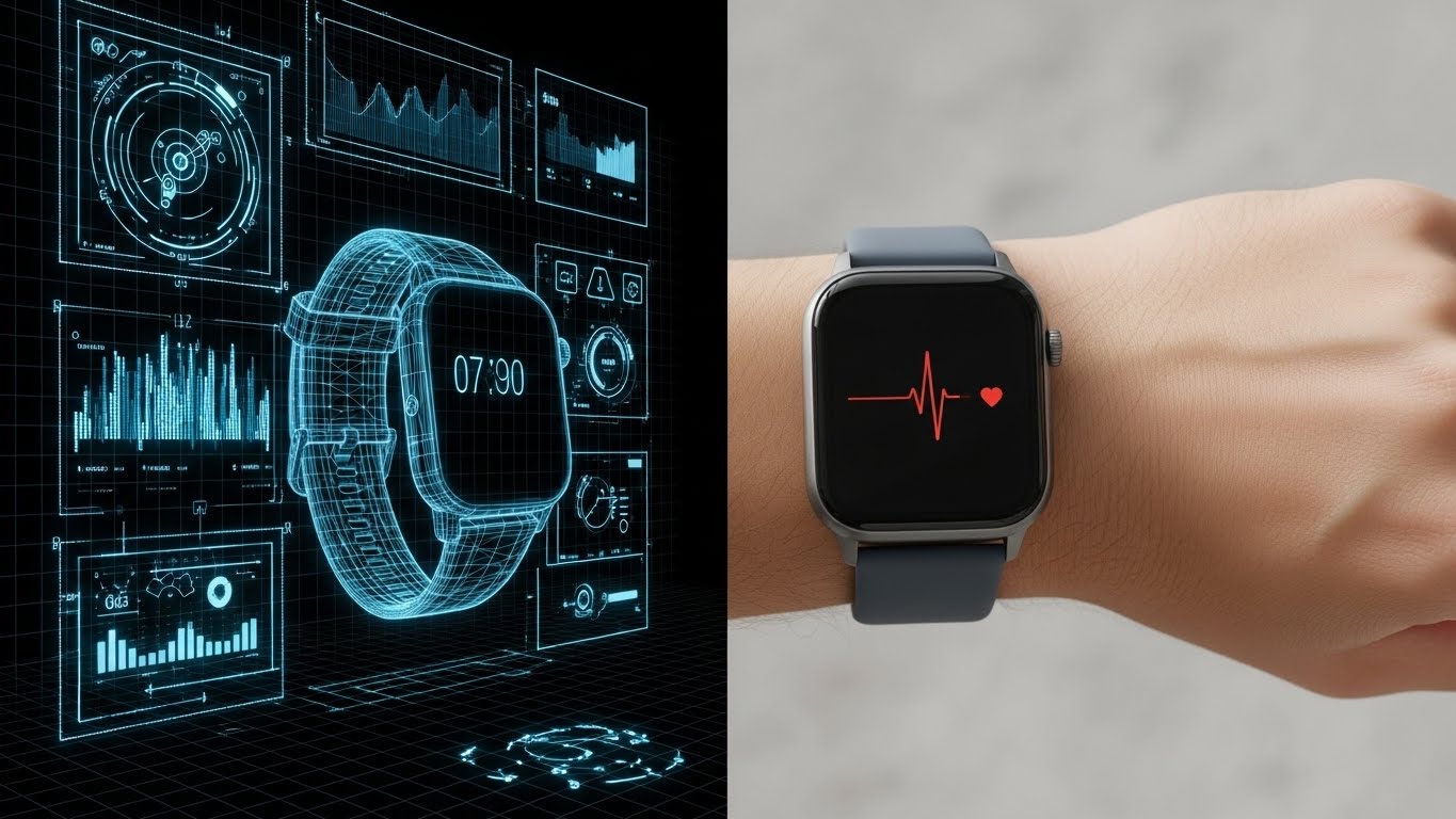
The Visual & Narrative Approach
Scenario: A vertical split-screen line sweeps back and forth. On the left, we see the "Blueprint Blue" wireframe code of the interface. As the line passes to the right, the wireframe instantly renders into a photorealistic arm wearing the device. The heart rate line on the screen matches perfectly across both dimensions.
Tone: Technical, Precise, Transparent, Trustworthy.
Psychological Impact & KPI Focus
Niche Psychology: This targets "Accuracy Anxiety." HR and medical directors worry about data validity. This style says: "We aren't just a toy; we are engineered technology." The wireframe implies rigorous development and medical-grade precision.
Operational Impact: Critical for Feature Education. It bridges the gap between the "black box" of the algorithm and the "real world" application, building technical trust.
Strategic Implementation & Trade-offs
Use Case: Product Feature Deep-Dives and Technical Documentation.
Duration: 30-45 Seconds.
Trade-off: It is less emotional. It appeals almost exclusively to the logical/analytical brain.
Companies using similar video content -
Wellsource – Wellsource – Data-driven health content and assessments.
MediKeeper – MediKeeper – Population health management tools.
10. Split Screen: Optimized Reality and UI
MOFU | Competitive Displacement
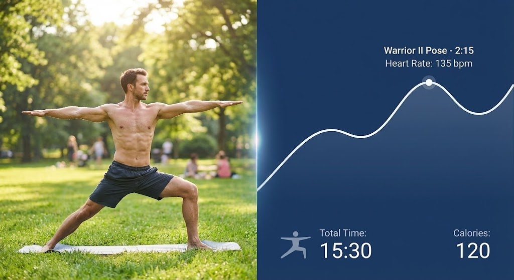
The Visual & Narrative Approach
Scenario: The screen is split 50/50. Left side: A man holds a Warrior II yoga pose in a park (Natural Green). Right side: A mobile app UI (UI Blue) shows the heart rate graph climbing and steadying, mirroring his exertion. A "Calorie Burn" counter ticks up in real-time synchronization with his breathing.
Tone: Synchronized, Responsive, Verified, User-Friendly.
Psychological Impact & KPI Focus
Niche Psychology: Users crave "Instant Gratification." They want to know that their effort is being counted now. This style provides visual proof of the feedback loop. It validates the user's effort by showing the digital mirror of their physical hard work.
Operational Impact: Powerful for Competitive Displacement. It answers the question, "What does the user actually see while they are working out?" eliminating ambiguity and proving latency-free performance.
Strategic Implementation & Trade-offs
Use Case: Retargeting Ads and App Store Preview videos.
Duration: 15-30 Seconds.
Trade-off: Requires precise editing. If the video and the UI animation are even slightly out of sync, the illusion of accuracy is broken.
Companies using similar video content -
VantageFit – Vantage Fit – Employee wellness with real-time tracking.
Pacer for Teams – Pacer for Teams – Fitness tracking and challenges.
GoVida – GoVida – Employee wellbeing and fitness challenges.
11. Clean UI Workflow (Light Mode)
MOFU | Driving Demo Requests
The Visual & Narrative Approach
Scenario: We enter a pristine, "High-Key White" studio space where the platform’s interface floats as a series of translucent, glass-like cards (Glassmorphism). The camera glides smoothly past a "Royal Blue" card displaying chaotic raw data, which instantly resolves into a clean, simplified trend line on the foreground card. The focus is sharp, highlighting the effortless translation of complex health metrics into actionable insights.
Tone: Professional, Transparent, Organized, Airy.
Psychological Impact & KPI Focus
Niche Psychology: HR administrators are often overwhelmed by "Dashboard Fatigue." They fear buying a tool that requires a PhD to interpret. This style utilizes "Visual Salience"—stripping away noise to highlight ease of use. It promises that the platform serves as a clarity filter, not an additional layer of complexity.
Operational Impact: Directly drives Demo Requests. By showcasing the specific "Aha!" moment of understanding a health trend, it proves the platform’s usability before the user even logs in.
Strategic Implementation & Trade-offs
Use Case: Website Hero Sections or the opening of a Product Tour.
Duration: 15-20 Seconds (Looping).
Trade-off: The minimalist aesthetic can feel sterile if devoid of all human elements. It sells the tool, not the result, so it functions best when sandwiched between human-centric content.
Companies using similar video content -
Wellness 360 – Wellness 360 – Comprehensive employee wellness programs.
Workday Peakon Employee Voice – Workday Peakon Employee Voice – Measures and improves employee engagement.
12. Rapid UI Feature Montage
MOFU | The Functional Buyer
The Visual & Narrative Approach
Scenario: A high-energy sequence set against a deep void. Multiple dark-mode interface widgets—calendar invites, biometric check-ins, and peer recognition badges—fly into the frame, layering over each other with a satisfying "snap." The color palette creates a vibrant contrast with "Sunset Orange" and "Deep Purple" gradients acting as visual accelerators. Speed lines blur the edges, emphasizing the swiftness of task completion.
Tone: Fast, Robust, Feature-Rich, Dynamic.
Psychological Impact & KPI Focus
Niche Psychology: The Functional Buyer (e.g., Benefits Manager) cares about "Time-to-Value." They want to know: "Does this do everything I need, and does it do it fast?" This montage creates a "Cognitive Surplus" effect, suggesting the software handles the heavy lifting so the human doesn't have to.
Operational Impact: Highly effective for Email Marketing campaigns announcing new feature rollouts. It visually catalogues the breadth of the suite (scheduling, tracking, rewarding) in seconds, increasing click-through rates.
Strategic Implementation & Trade-offs
Use Case: Feature Announcement Emails or fast-paced social retargeting.
Duration: 10-15 Seconds.
Trade-off: The pace is too fast for education. It generates excitement about capability but fails to explain functionality. It assumes the viewer already knows what the widgets do.
Companies using similar video content -
Woliba – Woliba – All-in-one wellness and employee experience.
Reward Gateway Employee Experience Platform – Reward Gateway – Employee benefits, recognition, and wellbeing.
Nectar – Nectar – Employee recognition and rewards platform.
13. 3D X-Ray Visualization
MOFU | Building Trust

The Visual & Narrative Approach
Scenario: A translucent, "Bone White" 3D render of a human figure stands in a dark, clinical environment. As we see the nervous system glowing in vulnerable "Neon Red," a digital shield composed of "X-Ray Blue" grid lines materializes over the chest. The shield pulsates, locking in the data. Text overlays like "SOC2 Verified" and "HIPAA Compliant" appear as holographic projections, anchored to the shield.
Tone: Clinical, Secure, High-Tech, Protective.
Psychological Impact & KPI Focus
Niche Psychology: Data privacy is the single largest objection for Legal and IT stakeholders. This style addresses "Vulnerability Paradox"—the fear that sharing health data exposes employees to risk. By visually armor-plating the human, the video metaphorically guarantees the safety of the biological data.
Operational Impact: Critical for Trust Building in Whitepapers or Security Documentation. It transforms the abstract legal concept of "Compliance" into a tangible, defensive asset.
Strategic Implementation & Trade-offs
Use Case: Security Pages, Compliance PDFs, and mid-sales cycle collateral for IT vetting.
Duration: 20-30 Seconds.
Trade-off: It is somewhat clinical and cold. It speaks purely to risk mitigation, not wellness promotion. It should be used surgically to answer security questionnaires.
Companies using similar video content -
WebMD Health Services – WebMD Health Services – Enterprise-level security for health data.
Oracle Fusion Cloud HCM – Oracle Fusion Cloud HCM – Secure HR, payroll, and talent management.
14. Dynamic Data Visualization
MOFU | ROI Justification

The Visual & Narrative Approach
Scenario: We adopt a dramatic "worm's eye" camera angle looking up at a bar chart rising from a matte black floor. The bars are not flat graphics; they are constructed from solid, heavy "Metallic Gold" blocks, reflecting "Emerald Green" operational lights. As the chart climbs, the sound design adds a heavy, metallic thud for each increment, emphasizing the solidity and weight of the financial returns.
Tone: Premium, Solid, Undeniable, Wealth-Focused.
Psychological Impact & KPI Focus
Niche Psychology: The CFO views wellness as a "soft cost." This visualization transmutes soft wellness metrics into "Hard Currency." The choice of gold and heavy physics triggers the "Authority Bias," making the data feel substantial, verified, and irrefutable rather than speculative.
Operational Impact: A powerful tool for Sales Decks presented to Finance Committees. It visually anchors the ROI argument, helping to justify budget allocation by framing wellness as an asset class.
Strategic Implementation & Trade-offs
Use Case: ROI Calculators and Executive Summary slides.
Duration: 10-15 Seconds (Loopable).
Trade-off: It is abstract. Without specific labels (e.g., "$ saved per employee"), it is just a pretty chart. It relies entirely on the presenter's narrative to give the gold bars meaning.
Companies using similar video content -
Abenity – Abenity – Employee perks and discount programs.
Fringe – Fringe – Flexible lifestyle benefits and rewards.
15. Minimalist Flat 2D Vector
MOFU | Overcoming Objections

The Visual & Narrative Approach
Scenario: A clean, monochromatic animation plays out on a "Pure White" canvas. A "Square Peg" (representing legacy systems) floats towards a "Circular Hole." Instead of jamming, the square fluidly morphs into a circle mid-air and slides perfectly into the slot with a satisfying click. The animation is silent, smooth, and perfectly symmetrical, using shades of "Tech Blue."
Tone: Simple, Clever, Frictionless, Smart.
Psychological Impact & KPI Focus
Niche Psychology: IT Directors fear "Integration Hell"—clunky APIs that break existing stacks. This visual metaphor alleviates that anxiety by showing "Adaptive Compatibility." It promises that the software will change to fit the company, not force the company to change for the software.
Operational Impact: Ideal for Overcoming Objections in technical blog posts or integration guides. It visually summarizes "Seamless API Connectivity" without using a single line of code.
Strategic Implementation & Trade-offs
Use Case: Blog Headers (e.g., "Integrating Wellness with your HRIS") and FAQ sections.
Duration: 5-10 Seconds (GIF format).
Trade-off: It is highly stylized and metaphorical. It doesn't show the actual dashboard, so it proves concept but not fidelity.
Companies using similar video content -
Odoo – Odoo – Open source ERP with seamless app integration.
HashiCorp – Terraform – Infrastructure as Code for cloud automation.
16. Photorealistic 3D Renders
BOFU | The Economic Buyer
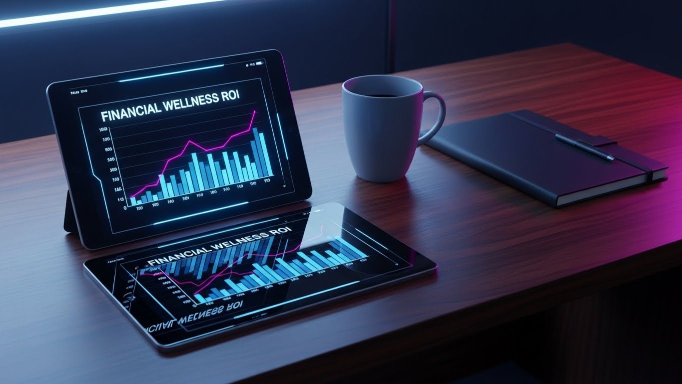
The Visual & Narrative Approach
Scenario: A hyper-realistic render of a mahogany executive desk. The lighting is warm and expensive. On the desk, a high-end tablet displays a crisp "Financial Wellness ROI" dashboard. The reflection of a leather notebook and a ceramic coffee cup on the tablet's glass screen adds extreme realism. The camera slowly pans over the device, treating the software as a luxury object.
Tone: Executive, Serious, Tangible, High-Value.
Psychological Impact & KPI Focus
Niche Psychology: C-Suite executives live in a physical world of boardrooms and bottom lines. This style places the digital product into their physical context. It uses "Contextual Framing" to elevate the software from a "tool for employees" to a "command center for executives."
Operational Impact: Best used for Direct Mail (via AR triggers) or high-end Print collateral. It targets the Economic Buyer by associating the software with the trappings of leadership and decision-making power.
Strategic Implementation & Trade-offs
Use Case: Account-Based Marketing (ABM) assets targeting CFOs.
Duration: Static Image or Slow Pan (10s).
Trade-off: High production cost. It requires photorealistic textures to work; anything less looks like a bad video game and damages brand prestige.
Companies using similar video content -
UKG Pro – UKG Pro – Unified HR, payroll, and talent management.
Workday – Workday – Enterprise cloud applications for finance and HR.
17. Isometric 3D Workflow
BOFU | Sales Cycle Acceleration
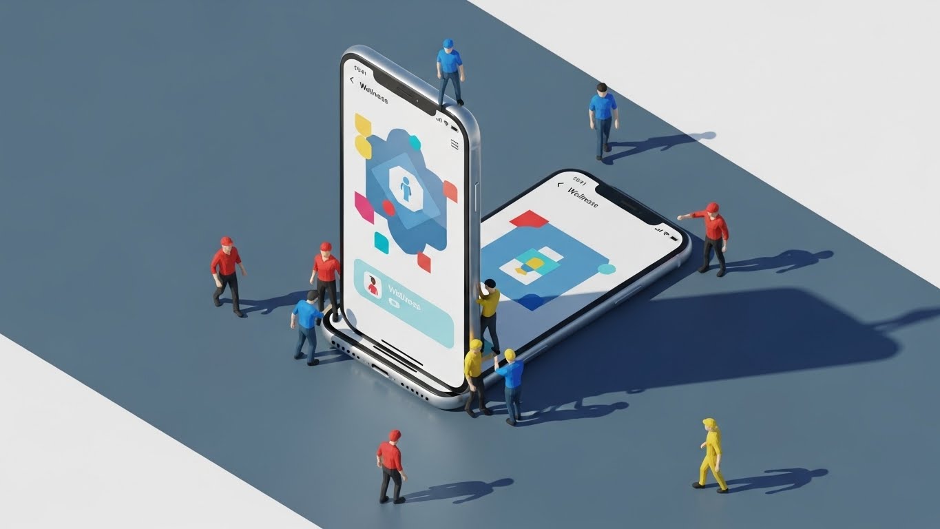
The Visual & Narrative Approach
Scenario: A playful, "tilt-shift" miniature world. A giant, realistic smartphone stands vertically in the center. Tiny, 3D animated figures (representing a diverse workforce in primary colors) bustle around the phone. Some climb ladders to "high-five" the screen; others slide down data charts like slides. The lighting simulates bright, outdoor sunlight, casting long, sharp shadows that ground the figures in reality.
Tone: Collaborative, Busy, Scale-Focused, Playful.
Psychological Impact & KPI Focus
Niche Psychology: The buyer needs to visualize "Adoption at Scale." They worry that only a few people will use the program. This "Gulliver’s Travels" perspective visualizes the entire workforce engaging with the platform simultaneously. It leverages "Social Proof" by showing a crowd mentality.
Operational Impact: Accelerates the Sales Cycle in Case Studies. It visually proves that the platform fosters community and mass participation, answering the question: "Will my team actually use this?"
Strategic Implementation & Trade-offs
Use Case: Case Study Videos and "How it Works" ecosystem overviews.
Duration: 30-45 Seconds.
Trade-off: The "toy-like" aesthetic must be balanced. If it’s too cute, it trivializes the health aspect. It works best for explaining engagement, not medical features.
Companies using similar video content -
Sprout – Sprout – Gamified workplace wellness platform.
Motivosity – Motivosity – Employee recognition and culture building.
Grokker – Grokker – Gamified wellbeing and fitness videos.
18. 3D Parallax UI Presentation
BOFU | Objection Handling

The Visual & Narrative Approach
Scenario: Three distinct UI layers float in a sterile "Cyber White" void. The camera uses a shallow depth of field. Focus shifts from the front card (an "Electric Cyan" Security Shield) to the middle card (a "Compliance Lock") and finally to the back card (User Data). The parallax movement reveals that each layer protects the one behind it.
Tone: Sophisticated, Deep, Multi-layered, Verified.
Psychological Impact & KPI Focus
Niche Psychology: This addresses the "Depth of Defense" objection. Security isn't just a password; it's layers of protocol. This visualizes "Defense in Depth." By using parallax to show physical space between the layers, it visually separates the threat from the asset (the data), creating a sense of impenetrable distance.
Operational Impact: A surgical tool for Objection Handling in retargeting ads. When a prospect visits the security page but doesn't convert, this ad follows them, reinforcing the "Bank-Grade Security" message.
Strategic Implementation & Trade-offs
Use Case: Retargeting Ads specifically for visitors to pricing/security pages.
Duration: 10-15 Seconds (Looping).
Trade-off: It is very niche. It’s boring to the average employee but fascinating (and reassuring) to the IT Vetting team.
Companies using similar video content -
Wellics – Wellics Wellbeing Operating System – Layered security for health data.
TELUS Health – TELUS Health – Advanced data security for wellness programs.
19. 2D Line Art Animation
BOFU | Competitive Comparison
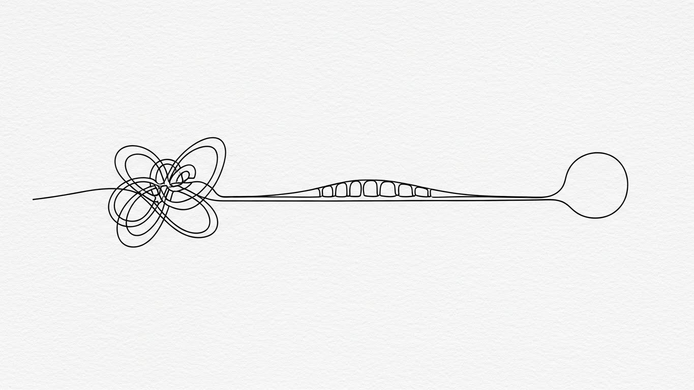
The Visual & Narrative Approach
Scenario: A single, continuous black ink line rests on a textured white paper background. On the left, the line is a frantic, tangled, anxious knot (representing the competitor or current state). As the line flows to the right, it untangles itself, smoothing out into a straight, elegant bridge that connects to a perfect, calm circle. The motion is fluid, easing slowly into the final shape.
Tone: Minimalist, Sophisticated, Transformative, Zen.
Psychological Impact & KPI Focus
Niche Psychology: Buyers are afraid that switching providers will be messy and chaotic. This animation utilizes the "Cognitive Ease" bias. It visualizes the transition not as a disruption, but as a release of tension. It promises that the new state is natural, simple, and inevitable.
Operational Impact: Excellent for Competitive Comparison emails. It creates a stark "Before vs. After" contrast without being aggressive or naming competitors directly. It sells the feeling of the solution.
Strategic Implementation & Trade-offs
Use Case: Nurture Emails for "Stalled Deals" or "Switching Campaigns."
Duration: 10-15 Seconds (GIF).
Trade-off: It is highly abstract. It sells the philosophy of the partnership, not the features.
Companies using similar video content -
LifeDojo – LifeDojo – Employee health habit-building.
WellSteps – WellSteps – Behavior-change approach to employee health.
20. 2D Animation & UI Composition
Onboarding | Self-Serve Onboarding

The Visual & Narrative Approach
Scenario: A bright, energetic composition blending a 2D cel-shaded character in "Turquoise" with floating 3D UI elements. The character isn't just looking at the screen; they are interacting with it—high-fiving a large, floating yellow "Play" button. A loading bar fills up rapidly in the background, signaling progress. The scene is exploding with positivity and momentum.
Tone: Enthusiastic, Welcoming, Simple, Fun.
Psychological Impact & KPI Focus
Niche Psychology: The "First Run Experience" (FRE) is where most churn happens. Users feel stupid or lost. This style leverages "Affective Design"—using joy and character interaction to lower the anxiety of learning a new tool. It says: "You can't mess this up; we are in this together."
Operational Impact: Critical for Self-Serve Onboarding. It increases the "Activation Rate" by making the first interaction feel like a game rather than a form-filling exercise.
Strategic Implementation & Trade-offs
Use Case: App Welcome Screens and "Day 1" User Guides.
Duration: 5-10 Seconds (Looping).
Trade-off: It sets a casual tone. Ensure the actual product experience matches this energy, or the user will feel a "Tone Mismatch" disconnect.
Companies using similar video content -
YuLife – YuLife – Gamified insurance and wellbeing app.
MoveSpring – MoveSpring – Fun and user-friendly wellness challenges.
21. Macro UI Micro-Interactions
Onboarding | Accelerating TTV

The Visual & Narrative Approach
Scenario: An extreme macro close-up of a digital UI screen fills the frame. We focus on a specific interaction: a progress bar filling with "Electric Green" light. As it hits 100%, a checkmark animates with a crisp, satisfying "pop." The background is a textured dark grey, making the green glow intensely. The shallow depth of field blurs the surrounding buttons, forcing the eye to the moment of completion.
Tone: Satisfying, Precise, Instant, Rewarding.
Psychological Impact & KPI Focus
Niche Psychology: Onboarding friction often stems from "Status Ambiguity"—the user doesn't know if their action worked. This style leverages "Kinetic Feedback." By magnifying the success moment, it triggers a small dopamine release, reinforcing the behavior and making the software feel responsive and alive.
Operational Impact: Directly improves Time-to-Value (TTV). By clearly signaling task completion, it reduces user hesitation and support queries related to "Did I do this right?"
Strategic Implementation & Trade-offs
Use Case: In-App Tooltips and "First Action" celebration screens.
Duration: 3-5 Seconds (Looping).
Trade-off: It is hyper-specific. It works for micro-moments but cannot explain complex workflows or multi-step processes.
Companies using similar video content -
VantageFit – Vantage Fit – Instant confirmation of user success.
Glint – Glint – Real-time employee engagement feedback.
22. Low-Poly 3D Modeling
Onboarding | Reducing Implementation Friction

The Visual & Narrative Approach
Scenario: A playful, aerial view of a digital city being assembled. Simple, faceted blocks in "Pastel Green," "Soft Clay," and "Sky Blue" click together to form buildings. A "Soft Purple" tower rises in the center, representing the main platform. The motion is stop-motion-like and tactile. Soft ambient lighting gives the scene a welcoming, toy-like atmosphere.
Tone: Constructive, Simple, Non-Intimidating, Modular.
Psychological Impact & KPI Focus
Niche Psychology: Implementation is often feared as a complex, messy construction project. This style utilizes "Visual Simplification." By rendering complex IT infrastructure as simple, colorful blocks, it reduces the "Perceived Complexity" for the administrator. It frames the setup as a creative, building-block process rather than a technical chore.
Operational Impact: Reduces Implementation Friction. It helps HR teams visualize the "stack" of services they are building without getting bogged down in server diagrams or code snippets.
Strategic Implementation & Trade-offs
Use Case: Setup Guide Videos and Integration Overviews.
Duration: 30-60 Seconds.
Trade-off: The aesthetic is stylized and "cute." It may not be appropriate for discussing serious security protocols or legal compliance.
Companies using similar video content -
Odoo – Odoo – Modular open source ERP setup.
CoreHealth – CoreHealth – Building customizable wellness programs.
23. 2D Graphics Over Live Action
Retention | Trial/Freemium Activation

The Visual & Narrative Approach
Scenario: A hand-held, candid shot of a real employee smiling at her laptop in a casual office. As she types, hand-drawn "Neon Yellow" sketches appear in the air around her—sparkles, upward-trending arrows, and a glowing outline of the laptop. The sketches jitter slightly, adding a human, organic feel to the tech interaction.
Tone: Human, Spirited, Creative, Augmented.
Psychological Impact & KPI Focus
Niche Psychology: Users in a trial phase need to feel the "Magic." Standard UI screens can feel flat. This style injects "Emotional Overlay" onto the physical world. It visually suggests that the software isn't just a tool on a screen; it’s an energy source that brightens the real-world working environment.
Operational Impact: Drives Freemium Activation. It creates a "Fear Of Missing Out" (FOMO) on the energy and positivity that the paid/full version brings to the daily grind.
Strategic Implementation & Trade-offs
Use Case: In-App Modals encouraging feature unlock or subscription upgrades.
Duration: 10-15 Seconds.
Trade-off: Requires high-quality custom footage. Stock footage can look cheesy if the lighting doesn't match the overlay graphics.
Companies using similar video content -
BurnAlong – BurnAlong – Engaging wellness courses with high interaction.
Hoppier – Hoppier – Mobile engagement and employee recognition.
24. Abstract Organic Modern
Retention | Reducing Churn

The Visual & Narrative Approach
Scenario: A mesmerizing, slow-motion close-up of viscous, organic liquid blobs merging. The colors are calming "Sage Green," "Sand Beige," and "Glossy White." The textures are hyper-realistic, looking like liquid ceramic or polished stone. They flow into each other without resistance, creating a perfect, unified sphere. The lighting is high-key, highlighting the smooth curves.
Tone: Serene, Harmonious, Premium, Stress-Free.
Psychological Impact & KPI Focus
Niche Psychology: Churn often happens when a product feels "clunky" or abrasive. This style sells "Seamlessness." It appeals to the desire for "Digital Wellbeing"—the idea that technology should be fluid and calming, not jagged and stressful. It visually reinforces the brand promise of holistic health.
Operational Impact: Supports Churn Reduction strategies. Used in newsletters or milestone emails, it subconsciously associates the brand with peace and ease, countering the stress of the corporate environment.
Strategic Implementation & Trade-offs
Use Case: Customer Newsletters (e.g., "Monthly Mindfulness" digest) or screensavers.
Duration: 15-20 Seconds (Looping).
Trade-off: Totally abstract. It conveys mood effectively but communicates zero information about the product itself.
Companies using similar video content -
Headspace For Work – Headspace For Work – Serene mindfulness and mental health.
Meditopia for Work – Meditopia for Work – Calming mental wellbeing solutions.
25. Holographic UI over 3D Render
Retention | Reducing Support Overhead

The Visual & Narrative Approach
Scenario: A highly detailed metallic robot hand extends its palm upward. Floating just above the metal fingers is a translucent, holographic orb in "Electric Blue." Inside the orb, a glowing question mark icon rotates. The background is a blurred, high-tech laboratory. The light from the hologram reflects realistically off the robot's chrome plating.
Tone: Futuristic, Helpful, Automated, Intelligent.
Psychological Impact & KPI Focus
Niche Psychology: Users hesitate to use "Help Bots" because they expect bad service. This visualization reframes the support bot as a "High-End AI Assistant." The precision of the robot hand and the clarity of the hologram signal that the automated support is sophisticated, capable, and precise.
Operational Impact: Critical for Reducing Support Overhead. By making the AI support tools look advanced and inviting, it encourages users to self-serve rather than opening a human ticket.
Strategic Implementation & Trade-offs
Use Case: Help Center headers or the "Loading" state of a chatbot.
Duration: 5-10 Seconds (Looping).
Trade-off: Can feel "cold." It emphasizes the absence of a human, which might alienate users seeking empathy for sensitive health issues.
Companies using similar video content -
Wysa – Wysa – AI-powered mental health chatbot.
AdvantageClub.ai – AdvantageClub.ai – AI-powered engagement and rewards.
26. Lifestyle Stock with UI Overlay
Expansion | Driving Deep Feature Adoption

The Visual & Narrative Approach
Scenario: A sunlit, natural shot of a woman in a casual breakroom drinking from a clear water bottle. As she tilts the bottle, a crisp, white vector circle appears in the air next to it. Inside the circle, a "Water Drop" icon fills up, and a counter ticks from "0.8L" to "1.2L." The graphic is tracked perfectly to the bottle’s movement, integrating the data into the physical act.
Tone: Refreshing, Integrated, Smart, Encouraging.
Psychological Impact & KPI Focus
Niche Psychology: Existing users often stick to basic features (e.g., step counting) and ignore others (e.g., hydration/nutrition). This style visualizes the "Quantified Self" in a new context. It shows that the app can track more than just movement, prompting users to explore underutilized features.
Operational Impact: Drives Deep Feature Adoption. It serves as a visual prompt: "Did you know you can track this too?" increasing the daily active usage of the app.
Strategic Implementation & Trade-offs
Use Case: Instagram/Social Ads targeting existing users to re-engage them.
Duration: 10-15 Seconds.
Trade-off: The tracking must be perfect. "Floating" graphics that slip off the object look amateurish and break the immersion.
Companies using similar video content -
Wellable – Wellable Wellness Platform – Tracks wellness in real-time.
Fitbit – Fitbit Wellness – Integrates activity tracking with lifestyle.
27. Futuristic Neon/Dark Mode
Expansion | Proactive Support

The Visual & Narrative Approach
Scenario: A document or contract icon sits on a dark, digital grid floor. A vertical "Neon Green" laser beam sweeps across the object. As the laser passes, code lines and binary data scroll rapidly on the document, symbolizing a deep scan or update. The environment is "Dark Mode" aesthetic—sleek blacks and greys with high-contrast neon accents.
Tone: High-Tech, Thorough, Proactive, Secure.
Psychological Impact & KPI Focus
Niche Psychology: When expanding to new features (especially medical or legal ones), trust is paramount. This style visualizes "Rigorous Analysis." The laser scan metaphor implies that the system is actively checking, verifying, and optimizing the data, offering peace of mind.
Operational Impact: Good for Proactive Support or Security Updates. It tells the user: "We are working in the background to keep you safe/compliant," justifying renewal costs.
Strategic Implementation & Trade-offs
Use Case: Feature Update Emails or "System Maintenance" notifications.
Duration: 5-10 Seconds (Looping).
Trade-off: Very aggressive aesthetic. It appeals to the IT/Ops mindset but may feel too "Cyberpunk" for a general wellness audience.
Companies using similar video content -
WebMD Health Services – WebMD Health Services – Proactive security and data analysis.
TELUS Health – TELUS Health – Advanced tech for wellness program security.
28. Dark Mode UI Showcase
Expansion | Driving Upsell
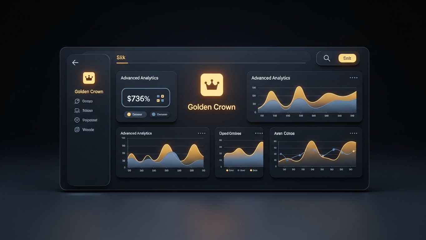
The Visual & Narrative Approach
Scenario: A perfectly symmetrical, straight-on view of a dashboard in "Dark Mode." The background is a deep, rich charcoal. The charts and graphs aren't standard colors; they are gradients of "Metallic Gold" and "Slate Blue." A central icon—a "Golden Crown"—glows softly. The entire composition feels like a luxury car dashboard or a high-end financial terminal.
Tone: Exclusive, Premium, Executive, Powerful.
Psychological Impact & KPI Focus
Niche Psychology: Upselling to an "Enterprise" or "Premium" tier requires a shift in perceived value. Standard bright colors look like "utilities." Dark mode with gold accents looks like "luxury." This style triggers the "Veblen Good" effect—making the software feel more valuable simply because of its aesthetic presentation.
Operational Impact: Drives Upsell Conversions. It visualizes the "Premium Tier" as a distinct, desirable upgrade, appealing to the administrator’s desire for status and advanced power.
Strategic Implementation & Trade-offs
Use Case: Admin Dashboard Modals promoting "Pro" features.
Duration: Static or subtle shimmer (5 Seconds).
Trade-off: It can look elitist. Ensure the features behind the "Gold" design actually offer substantial executive value.
Companies using similar video content -
UKG Pro – UKG Pro – Premium executive HR and analytics dashboard.
Workday – Workday – Sophisticated enterprise finance and HR UI.
29. Hyper-lapse Stock Footage with Data
Expansion | Driving Referrals
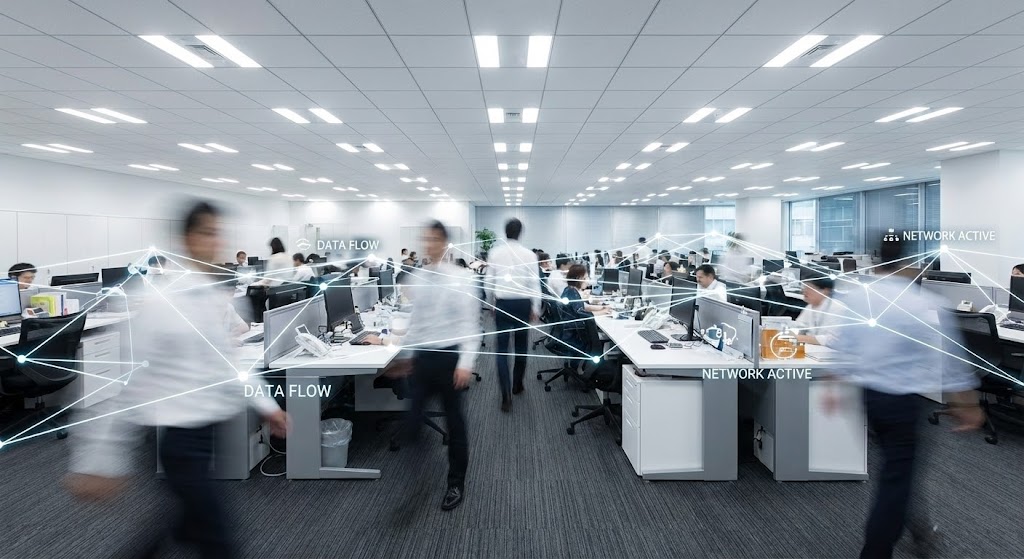
The Visual & Narrative Approach
Scenario: A wide-angle shot of a busy open-plan office. The footage is a hyper-lapse; employees blur as they zip around. Overlaying this chaos is a static, sharp white network of lines and nodes connecting the desks. "Data Flow" and "Network Active" labels pop up. The contrast between the frantic human motion and the steady digital network illustrates stability amidst chaos.
Tone: Dynamic, Connected, Widespread, Stable.
Psychological Impact & KPI Focus
Niche Psychology: Referrals and expansion depend on "Social Proof." This visual demonstrates "Critical Mass." It shows that the wellness program isn't an isolated event for one person; it's a connective tissue linking the entire office. It visualizes the "Culture of Health."
Operational Impact: Drives Referrals and internal expansion. It gives the Champion (HR Director) a visual asset to show Department Heads: "Look how connected our teams are becoming."
Strategic Implementation & Trade-offs
Use Case: LinkedIn Videos celebrating company milestones (e.g., "1,000 Employees Active").
Duration: 10-15 Seconds.
Trade-off: Privacy. Ensure the stock footage is generic enough that it doesn't look like you are filming a specific client's office without permission.
Companies using similar video content -
Limeade – Limeade Well-Being – Visualizes widespread employee adoption.
Staffbase – Staffbase – Connects and communicates with a busy workforce.
30. Generative AI Realistic Character video
Expansion | Website Visitor Re-engagement
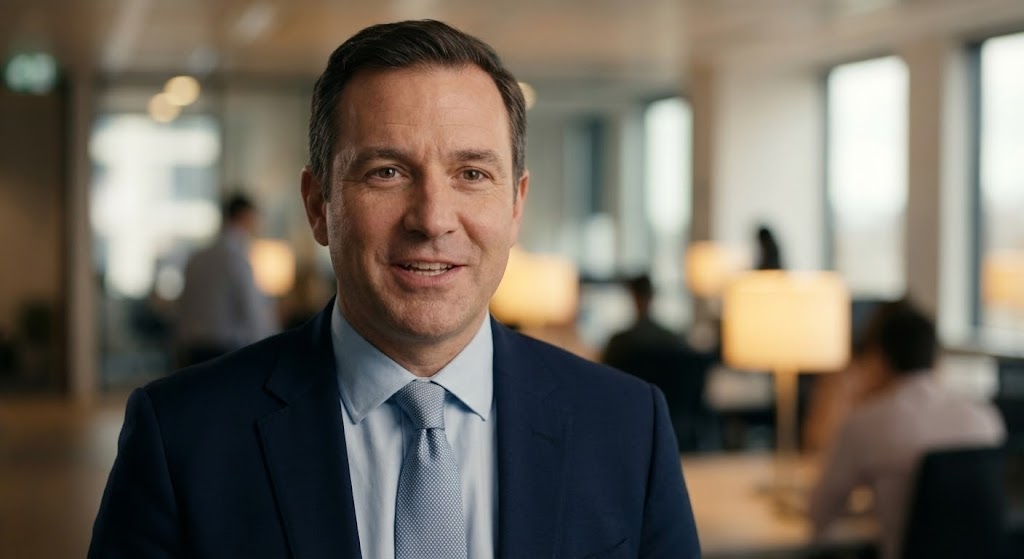
The Visual & Narrative Approach
Scenario: A medium close-up of a confident, professional man in a navy suit. He looks directly into the lens, speaking with a friendly but authoritative expression. The background is a high-end office with soft bokeh blur. The lighting is cinematic portrait lighting. The realism is uncanny—every pore and hair strand is visible—yet it is generated to allow for infinite script variations.
Tone: Personal, Trustworthy, Scalable, Direct.
Psychological Impact & KPI Focus
Niche Psychology: People buy from people. However, filming the CEO for every single client update is impossible. This style solves the "Scale vs. Intimacy" paradox. It provides the feeling of a one-on-one executive check-in, building trust and authority, while allowing the message to be customized for thousands of different accounts.
Operational Impact: Powerful for Re-engagement. A "personal" video message from a "Director" is far more likely to get a click than a text email. It re-establishes the human connection with dormant leads.
Strategic Implementation & Trade-offs
Use Case: YouTube Pre-roll or personalized email video inserts for account management.
Duration: 30-60 Seconds.
Trade-off: The "Uncanny Valley." If the lip-sync or eye movement is even slightly off, it creates revulsion. Use only top-tier Gen AI models (e.g., HeyGen, Synthesia) and disclose AI usage if required by ethics policies.
Strategic Knowledge Base: The Visual Operations Doctrine
To transform these 30 visual styles from "marketing assets" into a cohesive business driver, we must implement a strategic framework. This section outlines the Visual Operations Doctrine—a three-part guide to aligning, deploying, and measuring visual strategy in the Corporate Wellness sector.
Strategic Alignment & Visual Architecture (Pre-Production)
The "Visual Operating System" for Wellness
Before a single pixel is rendered, the visual strategy must be aligned with the organizational health goals. This is not about making things "pretty"; it is about reducing the Cognitive Load of health information. Wellness programs often fail because they are communicated through dense PDFs and complex intranets. A defined "Visual Architecture" acts as a translation layer, converting complex benefit logic into intuitive visual cues.
- The Cognitive Load Audit: Conduct an audit of current training materials. If a concept (e.g., "How to earn points") takes more than 3 paragraphs to explain, it requires a Style 8 (Isometric Motion) or Style 11 (Clean UI) visualization.
- Role-Based Visual Mapping: Differentiate your visual strategy. Desk-based employees (Engineers/Sales) respond to Style 11 (Clean UI) and Style 10 (Split Screen) on desktop monitors. Non-desk employees (Retail/Manufacturing) need Style 6 (2D Character) and Style 5 (Mixed Media) delivered via mobile for high-contrast, quick consumption.
- The "Glanceability" Standard: In a busy work environment, health nudges must be understood in under 3 seconds. Apply the "Glanceability" rule to all notification visuals (Style 21 and 26). If the user cannot identify the "Ask" and the "Reward" instantly, the visual has failed.
- Brand Voice Consistency: Ensure that the "Vivid Coral" of your marketing (Style 1) matches the "UI Blue" of your product tutorials (Style 11). Visual dissonance between the "Promise" (Ad) and the "Product" (App) erodes trust instantly.
- The Advids Strategic Audit: Partnering with a specialized agency like Advids allows for a comprehensive audit of your visual touchpoints. We help define this "Visual Operating System" before production begins, ensuring every asset builds equity in the master brand.
- Standardization vs. Customization: Use high-quality stock/template styles (like Style 22) for generic setup concepts to save budget. Reserve bespoke, high-fidelity styles (like Style 2) for your core value proposition and "Wow" moments.
- The Cross-Departmental Bridge: Use visuals to unify terminology. If Sales calls it "Total Health" and Ops calls it "Biometrics," use a Style 9 (Wireframe) video to visually link the two terms, creating a shared internal language.
- Legacy System Integration: Visualizing the connection between old on-premise HRIS and your new SaaS is crucial. Use Style 15 (Plug & Play) to visually reassure IT stakeholders that the integration is a seamless "snap," not a messy rewire.
- Accessibility in Visuals: Corporate wellness must be inclusive. Ensure that all motion graphics (especially Style 2) utilize color-blind friendly palettes and include subtitles for sound-off consumption, which is critical for office environments.
- The Mobile-First Mandate: 80% of wellness interaction happens on mobile. All 30 styles must be legible on a 5-inch screen. Avoid tiny text or complex wide shots (like Style 29) unless they are optimized for vertical viewing.
Operational Adoption & Implementation (Deployment)
Embedding Visuals into the Flow of Work
The best visual content is useless if it sits in a repository no one visits. The "Deployment" phase focuses on embedding these assets directly into the employee's existing workflow (Slack, MS Teams, LMS). This shifts the dynamic from "Pull" (expecting employees to find content) to "Push" (delivering content where they are).
- Overcoming "Big Brother" Anxiety: Employees fear surveillance. Use empathy-driven visuals (Style 6 or Style 5) to explain why data is collected (for their benefit), shifting the narrative from "Monitoring" to "Support."
- The Micro-Learning Shift: Replace 50-page PDF handbooks with a library of 30-second clips (referencing Styles 11 & 12). Embed these directly into the onboarding email sequence to boost information retention.
- Just-in-Time Support: Embed specific visual styles (like Style 25) directly into the Helpdesk or Chatbot. A user struggling with a setting should see a looping GIF of the solution instantly, preventing a support ticket.
- Gamification of Training: Don't just gamify the wellness; gamify the learning of the platform. Use Style 8 (Isometric Gamified) to show users how filling out their profile leads to rewards, increasing activation rates.
- Reducing Support Ticket Volume: There is a direct correlation between the quality of your proactive visual guides and reduced call center load. Deploy Style 21 (Micro-Interactions) in tooltips to answer "Did this work?" questions before they are asked.
- Remote Onboarding: For distributed teams, you cannot rely on in-person seminars. Leverage Style 4 (Abstract 3D) and Style 30 (Gen AI Persona) to create a "Virtual Town Hall" experience that feels premium and connected, regardless of location.
- Visualizing SOPs: Transform text-based Standard Operating Procedures (SOPs) for health checks into visual process flows (Style 17). This is critical for HR Admins who need to learn the dashboard quickly without reading a manual.
- Feedback Loops: Use interactive video elements (end cards) on Style 23 videos to gather user feedback. A simple "Thumbs Up/Down" on a tutorial provides data on which features are confusing.
- Scalable Localization: Global companies need global assets. Styles that rely on visual metaphor (Style 19) rather than heavy on-screen text are cheaper to localize for different regions.
- Leadership Communication: Use high-end styles (Style 7 or Style 30) when communicating results to the C-Suite. Executives respond to "Executive Polish." A low-quality screen recording will devalue your data; a cinematic presentation elevates it.
Measuring Impact & Future-Proofing (ROI)
Quantifying the Invisible
To justify the budget for high-quality wellness software, you must measure more than just "Video Views." You must measure behavioral change. The ROI of visual strategy is found in the speed of adoption and the depth of engagement.
- Beyond "Views": Vanity metrics (views) are useless. Define actionable KPIs: measure "Time-to-Competency" (how fast a user masters a feature after watching Style 11) or "Feature Adoption Rate" (did usage of the hydration tracker spike after the Style 26 ad?).
- The "Idle Time" Metric: Correlate better visualization with reduced software navigation time. If Style 12 works, users should spend less time figuring out the UI and more time engaging with wellness activities.
- Compliance Velocity: Measure how fast new regulations (e.g., a policy update) are acknowledged. A Style 27 (Laser Scan) video notification typically yields faster acknowledgement rates than a text email.
- Retention and Churn: High-quality UX visualization directly impacts Customer Lifetime Value (LTV). Users who "understand" the product instantly (thanks to Style 20) are less likely to churn in the first 90 days.
- The AI Visual Frontier: Prepare for the next generation. We are moving toward real-time, personalized video where Style 30 avatars address users by name. Start building the data infrastructure for this now.
- Scalability of Assets: Build a library, not a landfill. Organize your source files so that when the UI changes, you can update Style 11 without re-shooting the entire video.
- The Advids Partnership: This is where a long-term partner like Advids becomes an asset. We manage the lifecycle of your visual library, ensuring that as your software evolves, your visual documentation keeps pace without exponentially increasing costs.
- Benchmarking Success: Don't just compare against yourself; compare against consumer apps. Your wellness platform isn't competing with Excel; it's competing with Instagram for attention. Your visuals must meet that bar (Style 5).
- The ROI of Safety: For platforms with safety components, quantify the cost reduction. If Style 13 (X-Ray) explains a safety protocol better, resulting in 10% fewer incidents, that is a direct financial return.
- Final Call to Innovation: Treat video not as "Marketing Content" but as "Visual Infrastructure." Just as you wouldn't build a house without a blueprint, do not build a wellness platform without a Video Style Guide. It is the interface through which your value is understood, adopted, and retained.
[END OF PART 3]
Companies using similar video content -
Personify Health – Personify Health – Scalable personalized health communication.
Ulliance – Ulliance – AI-driven flexible EAP and mental health support.
Author & Editor Bio


