
Introduction: The Visual Bridge to Profitability
In the high-stakes world of pre-construction, the margin for error has effectively vanished. We operate in an industry where precision is the only currency that matters, yet the data tells a starkly different story. Recent industry analysis reveals that 98% of construction projects incur cost overruns. This statistic isn't just a number; it represents the "Variance Gap"—the terrifying space between a submitted bid and the final build cost where profit fades away.
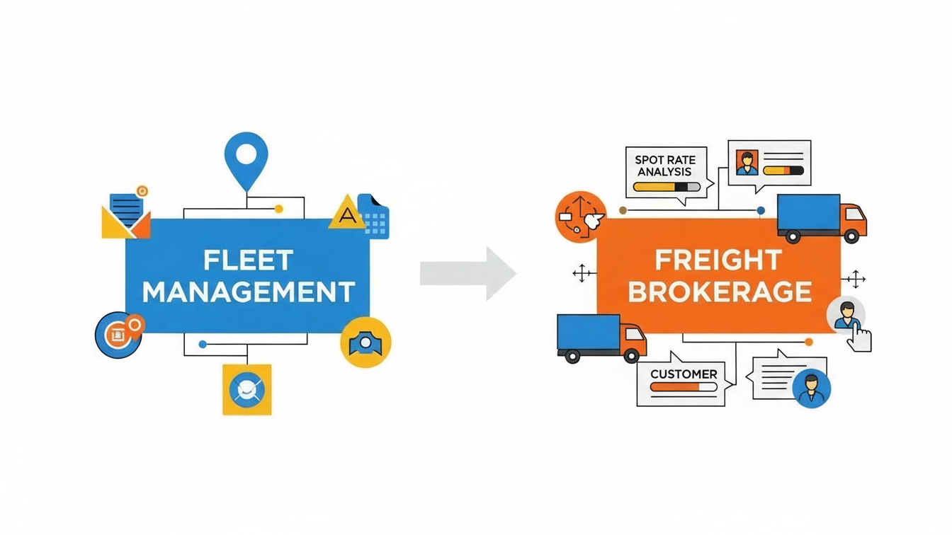
For SaaS platforms in the cost estimation space, the challenge is no longer about proving you have a calculator—it is about proving you have a strategy. Your software doesn't just crunch numbers; it bridges the cognitive divide between a chaotic set of blueprints and a winning, profitable bid.
The most successful platforms are realizing that "seeing is believing." They are moving beyond static spreadsheets and embracing dynamic visualization to reduce cognitive load and build trust. In fact, companies that successfully embrace this digital transformation see a 15% average increase in productivity.
This guide curates 30 expert-driven visual examples designed to help you articulate that value. We analyze these styles not just as "marketing assets," but as strategic tools that dismantle skepticism, build authority, and help your users bid with absolute confidence.
1. Generative AI cinematic video
TOFU | Brand Awareness

The Visual & Narrative Approach
This style leverages the "Hero Shot" technique to create an immediate emotional connection with the scale of construction. By using a low-angle perspective of a steel skyscraper against a dramatic teal and orange sky, the video positions the viewer (the estimator) as the architect of this grandeur. The subtle integration of "digital projection lines" in soft gold tracing the unfinished beams is the critical visual hook—it subtly implies that the software is ahead of the build, planning the future in real-time.
Psychological Impact & KPI Focus
Niche Psychology: Pre-construction professionals often feel disconnected from the physical result of their work. This style reconnects the "spreadsheet" to the "skyline," validating their role as key stakeholders.
Operational Impact: By visually overlaying digital planning onto physical steel, this style addresses the Physical/Digital Bridge, demonstrating that your software is deeply integrated with the onsite reality.
Strategic Implementation & Trade-offs
- Best Use Case: High-impact YouTube Brand Awareness campaigns where you need to stop the scroll with visual spectacle.
- Duration: 15-30 Seconds.
- Trade-off: High Production Value vs. Specificity. While emotionally resonant, this style is broad. It builds brand prestige but explains zero features. Use it to open the door, not to close the deal.
Companies using similar video content -
Procore – Construction Management Platform – Visionary platform for managing construction projects.
Autodesk Construction Cloud – Unified Platform – Integrated solutions for design and construction.
InEight – Project Cost Management – Enterprise-grade project intelligence and control.
2. Bold Kinetic Typography
TOFU | Category Creation

The Visual & Narrative Approach
Here, the medium is the message. By constructing the words "BID" and "WIN" out of massive, gritty steel I-beams, the video physically manifests the weight and solidity of the industry. The hard, directional lighting mimics a job site at high noon, creating deep shadows that add depth and realism. This isn't just text; it's structural engineering. The faint chalk grid lines on the asphalt background ground the abstract typography in the familiar visual language of site plans.
Psychological Impact & KPI Focus
Niche Psychology: This style addresses the "Commoditization Anxiety" estimators feel. It transforms the abstract concept of "bidding" into something tangible and heavy. The industrial texture signals, "We understand dirt, steel, and concrete," building immediate credibility with a pragmatic demographic.
Operational Impact: It is designed to maximize Recall and Click-Through Rate (CTR) by using simple, punchy directives that resonate with the primal desire to win the contract.
Strategic Implementation & Trade-offs
- Best Use Case: Aggressive Social Ads (Instagram/Facebook) aimed at disrupting the viewer's feed with a bold, simple message.
- Duration: 6-10 Seconds.
- Trade-off: Impact vs. Nuance. This style is a hammer, not a scalpel. It is excellent for driving a singular message (e.g., "Win More Bids") but poor for explaining complex workflows.
Companies using similar video content -
STACK Construction Technologies – Takeoff & Estimating – Accelerate takeoff and win more bids.
ProEst – Estimating Software – Build accurate estimates, secure profitable contracts.
3. Minimalist Flat 2D Vector
TOFU | Market Education
The Visual & Narrative Approach
This style serves as a visual metaphor for the "Chaos to Order" value proposition. The view is a direct top-down perspective of a pastel mint green desk surface. On the left, a chaotic pile of raw lumber shapes represents the "Before" state—disorganized data and risk. On the right, these same elements are snapped into a perfect, neat grid, representing the "After" state of organized estimation. The aesthetic is clean and flat, using vibrant blocks to suggest clarity.
Psychological Impact & KPI Focus
Niche Psychology: The greatest enemy of the estimator is chaos—unorganized piles of PDFs and loose change orders. This visual offers immediate "cognitive relief," promising a world where data is tamed.
Operational Impact: It directly addresses Market Education by simplifying the value proposition into a single visual metaphor: We turn chaos into order. This lowers the barrier to entry for tech-averse buyers.
Strategic Implementation & Trade-offs
- Best Use Case: Blog headers or educational content where the goal is to explain the concept of automated estimation without overwhelming the viewer with UI details.
- Duration: Static or 5-10 Second Loop.
- Trade-off: Clarity vs. Realism. The abstract nature means it doesn't show the actual software interface. It sells the benefit, not the feature.
Companies using similar video content -
Planswift – Takeoff & Estimating – Simplify complex estimation, bring order to chaos.
Countfire – Automated Takeoff – Transform disorganized plans into structured data.
4. Rapid UI Feature Montage
TOFU | Skippable Pre-Roll Ad
The Visual & Narrative Approach
Speed is the primary value proposition here. The electric cyan and matte black high-contrast palette creates a "Dark Mode" aesthetic that is increasingly popular in productivity software. The "rapid zoom-in" sequence mimics the focus of an expert user diving into data. By abstracting the UI into flashing widgets and scrolling numbers, the video simulates the feeling of high-velocity data processing without forcing the viewer to read specific text.
Psychological Impact & KPI Focus
Niche Psychology: Speed is currency in pre-construction. Estimators are often racing against a bid clock. This visual style validates their need for velocity and responsiveness.
Operational Impact: By highlighting "real-time updates," this style attacks the pain point of stale data. It demonstrates that the software is a dynamic engine, not a static repository.
Strategic Implementation & Trade-offs
- Best Use Case: YouTube Pre-Roll ads where you have 5 seconds to hook the viewer before they skip. The motion keeps the eye engaged.
- Duration: 15-30 Seconds.
- Trade-off: Excitement vs. Comprehension. The rapid cutting creates a feeling of power, but the viewer won't learn how to use the tool. It generates interest, not mastery.
Companies using similar video content -
Bluebeam Revu – PDF Markup & Takeoff – Speed up document review and quantity takeoff.
eTakeoff – Takeoff Software – Process data rapidly for accurate quantity takeoff.
5. AI generated mixed media video
TOFU | Vertical Social Organic

The Visual & Narrative Approach
This visually arresting style bridges the gap between the old world and the new. The lower half of the frame features a traditional, hand-drawn architectural pencil sketch on textured sepia paper. As the building rises to the top, the lines lift off the paper and transform into glowing 3D wireframes in electric blue. The lighting transitions from warm desk lamp illumination to cool digital glow.
Psychological Impact & KPI Focus
Niche Psychology: Many senior estimators have a deep appreciation for the craft of drafting. This style honors that heritage while gently introducing the necessity of digital evolution. It says, "We don't replace your craft; we elevate it."
Operational Impact: This effectively targets Vertical Social Organic channels like TikTok, where visual transformation trends perform well. It symbolizes the operational shift from manual takeoff to digital modeling.
Strategic Implementation & Trade-offs
- Best Use Case: Organic social content aimed at younger estimators or those looking for "tech-forward" inspiration.
- Duration: 15-20 Seconds.
- Trade-off: Engagement vs. Accuracy. This is an artistic representation. It captures the feeling of innovation but may abstract the actual technical process of BIM integration.
Companies using similar video content -
Togal.AI – AI Takeoff – Bridge traditional plans with intelligent AI takeoff.
Glodon – BIM Cost Management – Transform architectural sketches into digital models.
6. Abstract 2D Motion Graphics
TOFU | Shaping Brand Perception

The Visual & Narrative Approach
This style uses abstract symbolism to represent the financial core of construction. A symmetrical kaleidoscope effect morphs gold and silver coin shapes into solid brick textures and back again. Set against a deep grey void, the motion represents the alchemy of converting financial investment into physical infrastructure.
Psychological Impact & KPI Focus
Niche Psychology: At the executive level, construction is an investment game. This style speaks the language of the CFO and the owner—ROI, liquidity, and asset creation.
Operational Impact: It shapes Brand Perception by positioning the software as a financial tool, not just a construction tool. It elevates the conversation from "counting bricks" to "managing capital."
Strategic Implementation & Trade-offs
- Best Use Case: Display Ads on financial news sites or industry portals where you want to stand out from generic "construction site" stock photos.
- Duration: Loop.
- Trade-off: Sophistication vs. Relevance. It is highly stylized and may be too abstract for a tactical estimator looking for a specific feature set. It works best for brand lift.
Companies using similar video content -
InEight – Project Cost Management – Visualize investment return and financial alchemy.
RIB Software – iTWO – Abstract representation of comprehensive cost management.
7. Isometric 2D Motion Design
MOFU | Demand Gen
The Visual & Narrative Approach
The isometric view is the standard language of digital planning. This style uses a clean "SimCity" aesthetic with a palette of Sky Blue, White, and Terracotta to make the data feel approachable. The "popping up" animation of buildings from the grid map visualizes the speed of model generation. The floating "price tag" bubbles attached to each structure serve as immediate visual cues for "Cost-Loaded Models," a key industry deliverable.
Psychological Impact & KPI Focus
Niche Psychology: Estimators think in terms of "assemblies" and "areas." The isometric grid mirrors how they mentally deconstruct a project site. It feels orderly, manageable, and data-rich.
Operational Impact: This style drives Demand Gen by illustrating the software's ability to handle multi-structure complexity. It visually answers the question: "Can this handle a multi-phase campus project?"
Strategic Implementation & Trade-offs
- Best Use Case: LinkedIn feeds where professional, clean, and informative visuals stop the scroll. It communicates "System" and "Scale."
- Duration: 15-30 Seconds.
- Trade-off: Information Density vs. Emotion. It is very clinical and informative but lacks the emotional "wow" factor of the cinematic style. It appeals to the logical brain.
Companies using similar video content -
Sigma Estimates – BIM Estimating – Map cost context across complex city grids.
Vico Office – 5D BIM – Visualize cost-loaded models for project planning.
8. Wireframe to Reality Transition
MOFU | Differentiation

The Visual & Narrative Approach
The "Split-Screen" is the ultimate proof point. The sharp vertical light dividing the glowing blue wireframe crane from the photorealistic yellow steel crane acts as a "Truth Line." It visually demonstrates the software's ability to simulate reality before a single beam is lifted. The digital grid on the left provides the technical context, while the bright blue sky on the right promises a successful field execution.
Psychological Impact & KPI Focus
Niche Psychology: The "accuracy gap" is a major anxiety—does the model match the build? This visual proves that the digital plan is a perfect mirror of the physical reality, alleviating fears of discrepancy.
Operational Impact: This serves as a key Differentiation asset on a website. It visually claims, "What you plan is exactly what you build," reinforcing the software's precision and reliability.
Strategic Implementation & Trade-offs
- Best Use Case: Website "Features" page or a Hero section background. It instantly communicates the core value of BIM-based estimation.
- Duration: Loop or Scroll-Triggered.
- Trade-off: Concept vs. Interface. It sells the result of using the software (accuracy) but doesn't show the user interface itself.
Companies using similar video content -
Assemble Systems – BIM Data Management – Verify digital accuracy before physical construction.
Tekla Structures – BIM Software – Transition from wireframe models to constructible reality.
9. Clean UI Workflow (Light Mode)
MOFU | Feature Education
The Visual & Narrative Approach
Sometimes, the most radical visual is clarity. This style strips away all cinematic excess to focus on a "Pixel-Perfect" render of the interface. The "Light Mode" aesthetic with pure white and light gray suggests an airy, stress-free modern office environment. The specific focus on a "Green Status Row" directs the eye immediately to the "success state"—a balanced budget or an approved bid.
Psychological Impact & KPI Focus
Niche Psychology: Estimators stare at screens for 10 hours a day; they crave a UI that doesn't cause eye strain. This visual promises a "clean slate" and organizes complex data into a digestible format, directly addressing the pain point of "Spreadsheet Fatigue."
Operational Impact: Ideal for Feature Education in email campaigns. It respects the user's intelligence by showing the actual utility of the product without unnecessary flash.
Strategic Implementation & Trade-offs
- Best Use Case: Nurture emails to leads who have already expressed interest. It says, "Here is what your workday could look like."
- Duration: 45-90 Seconds.
- Trade-off: Reality vs. Excitement. It is functionally accurate but risks being "boring" if not paired with strong copy. It appeals to the user, perhaps less to the visionary buyer.
Companies using similar video content -
Sage Estimating – Estimating Software – Pristine grid for illuminating data precision.
Knowify – Contractor Management – Clean workflow for managing projects efficiently.
10. Split Screen: Reality/UI
MOFU | Competitive Displacement
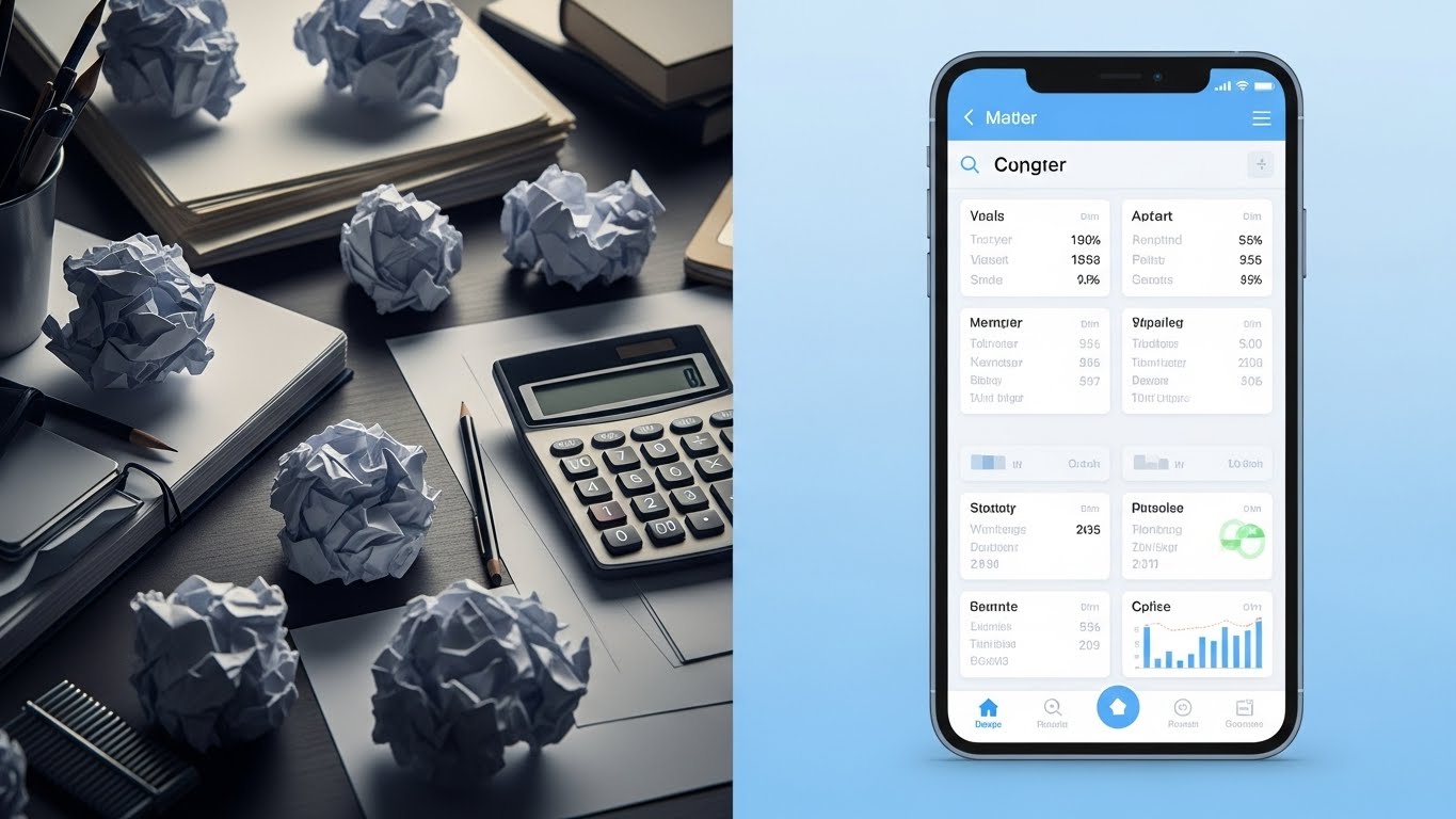
The Visual & Narrative Approach
This is a direct "Pain vs. Gain" comparison. The left side (Reality) is gritty, grey, and cluttered with crumpled papers and a calculator—symbols of frustration and waste. The right side (UI) is a pristine, Sky Blue mobile interface. The contrast in lighting—dim vs. bright—subconsciously cues the viewer to prefer the right side. It frames the mobile app not just as a tool, but as a portal to a better work life.
Psychological Impact & KPI Focus
Niche Psychology: This taps into the "Grass is Greener" psychology. Every estimator working late nights amidst paper piles dreams of the clean, organized reality on the right. It validates their desire for a better quality of life.
Operational Impact: A classic Competitive Displacement tactic. It doesn't just sell the software; it sells the absence of their current pain. It visualizes the operational shift from manual chaos to digital serenity.
Strategic Implementation & Trade-offs
- Best Use Case: Retargeting Display Ads. Remind the user of the pain they are currently feeling (the mess) and the solution you offer (the UI).
- Duration: 10-15 Seconds.
- Trade-off: Negative priming vs. Solution selling. While effective, it relies on reminding the user of a negative state. Ensure the "solution" side is dominant and appealing.
Companies using similar video content -
Fieldwire – Field Management – Visualize efficiency shift from chaos to order.
Autodesk Build – Field Management – Bridge site reality with digital plans.
11. Lifestyle Stock with UI Overlay
MOFU | The Functional Buyer

The Visual & Narrative Approach
This style creates a harmonious "Physical/Digital Bridge" by overlaying a sleek, holographic interface onto a relatable human scene. The visual anchors the viewer in a realistic office setting—natural daylight, blurred background activity—while the sharp, glowing Cyan UI in the foreground represents the software's "superpowers." By focusing on the estimator from an over-the-shoulder perspective, the video invites the viewer to step into their shoes, seeing the "Approved" status not as a system output, but as a personal achievement.
Psychological Impact & KPI Focus
Niche Psychology: Estimators often fear that AI and automation will replace them. This visual counteracts that anxiety by positioning the software as an exoskeleton for their expertise, not a replacement. It validates their role as the final decision-maker.
Operational Impact: It targets the Functional Buyer by visualizing the "Flow State." It demonstrates how the software integrates seamlessly into their daily environment, reducing friction and accelerating the approval process.
Strategic Implementation & Trade-offs
- Best Use Case: LinkedIn Sponsored Content targeting Senior Estimators. It builds immediate empathy and relatability.
- Duration: 15-20 Seconds.
- Trade-off: Relatability vs. Feature Density. It sells the experience of using the software rather than the detailed specs. It creates desire but requires a follow-up for technical validation.
Companies using similar video content -
Procore – Project Management – Augment estimator focus with digital precision.
Buildertrend – Construction Management – Seamlessly integrate software into daily workflow.
12. 3D X-Ray Visualization
MOFU | ABM Awareness
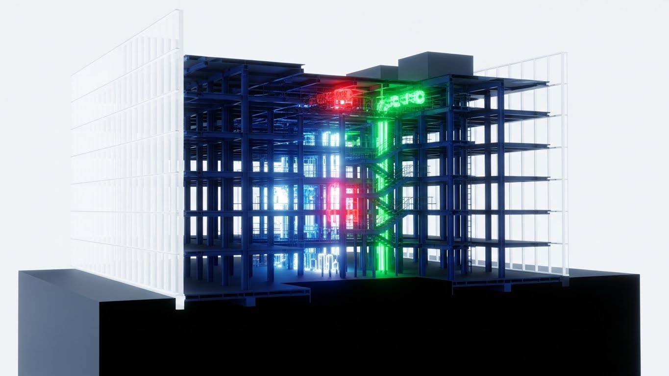
The Visual & Narrative Approach
This style utilizes the "X-Ray" effect to peel back the layers of a building, revealing the complex, often hidden systems that drive cost variance. By rendering the outer walls as translucent glass, the visual exposes the critical internal skeleton—the steel (Blue) and mechanical systems (Red)—isolating them against a clinical white background. The narrative visualizes the software’s ability to "see through" a generic bid and identify specific MEP (Mechanical, Electrical, Plumbing) clashes or material requirements before they become expensive change orders.
Psychological Impact & KPI Focus
Niche Psychology: The greatest fear in estimation is the "missed item"—the expensive ductwork or structural load that wasn't in the initial takeoff. This visual creates a sense of omniscience, reassuring the user that the software provides total transparency.
Operational Impact: It drives Account-Based Marketing (ABM) awareness by signaling deep technical competence. It visually proves that your platform handles the complexity of multi-layered projects, directly addressing risk mitigation.
Strategic Implementation & Trade-offs
- Best Use Case: Direct Mail video brochures or high-value landing pages targeting Commercial General Contractors (GCs).
- Duration: Loop or 10-15 Seconds.
- Trade-off: Technical Awe vs. Human Connection. It is a cold, analytical style. It builds authority on accuracy but lacks emotional warmth. Use it to prove capability.
Companies using similar video content -
Cubicost – BIM Quantity Takeoff – See unseen costs within translucent structures.
Vectorworks Architect – BIM Design – Reveal hidden building systems and components.
13. Generative AI Realistic Character video
BOFU | Building Trust

The Visual & Narrative Approach
Trust is the ultimate currency at the Bottom-of-Funnel (BOFU). This style uses high-fidelity AI video to personify the outcome of good software: confidence. The visual centers on a composed CEO in a high-rise office, the city skyline representing the market he commands. The lighting is premium and cinematic, moving away from the "grind" of the job site to the "strategy" of the boardroom. It doesn't show the software; it shows the feeling of having the numbers right.
Psychological Impact & KPI Focus
Niche Psychology: For the C-Suite, the software choice is a reputation risk. This style acts as "Implicit Social Proof," suggesting that successful, forward-thinking leaders rely on this platform. It mirrors the self-image the buyer aspires to.
Operational Impact: It focuses on Building Trust with the Economic Buyer. It elevates the conversation from "features and functions" to "leadership and control," reducing the perceived risk of the investment.
Strategic Implementation & Trade-offs
- Best Use Case: Website "About Us" sections or Investor Relations materials. It sets a premium tone for the brand.
- Duration: 10-20 Seconds.
- Trade-off: Brand Trust vs. Product Verification. It effectively sells the brand's prestige but offers no evidence of product performance. It must be supported by case studies.
Companies using similar video content -
CMiC – ERP for Construction – Embody financial leadership and executive presence.
Penta Technologies – ERP for Construction – Project confidence in financial outcomes.
14. Dynamic Data Visualization
BOFU | ROI Justification

The Visual & Narrative Approach
This style bridges the gap between architectural space and financial data. By extruding 3D bar charts directly from the rooms of a floor plan, it creates a literal connection between "Square Footage" and "Cost." The worm's-eye camera movement adds dynamism to what could be a static chart, making the financial data feel towering and substantial. The Green and Gold palette reinforces the themes of profitability and value engineering.
Psychological Impact & KPI Focus
Niche Psychology: Estimators and CFOs often struggle to communicate the "why" behind a cost to non-technical owners. This visual provides a shared language, turning a spreadsheet row into a spatial object that is instantly understood.
Operational Impact: It is a powerful tool for ROI Justification. It demonstrates the software's ability to perform granular analysis (e.g., cost-per-room), helping users justify their bids and identify value engineering opportunities.
Strategic Implementation & Trade-offs
- Best Use Case: Sales Decks and final presentation slides. It helps the sales team visualize the "depth of reporting" capabilities.
- Duration: Loop or Scroll-Triggered.
- Trade-off: Analytical Depth vs. Operational Context. It abstracts the building into data. While great for finance discussions, it disconnects from the construction reality of materials and labor.
Companies using similar video content -
CostX – BIM Quantity Takeoff – Extrude charts to map money meters spatially.
Gordian – Construction Cost Data – Visualize cost data in a spatial context.
15. 2D Line Art Animation
BOFU | Risk Mitigation

The Visual & Narrative Approach
Simplicity is the antidote to anxiety. This continuous line art style uses a single, unbroken stroke to draw a shield around a stack of coins, visualizing the concept of "Margin Protection." The minimalist Ink Black on Paper White aesthetic evokes the feeling of a signed contract or a finalized blueprint. It conveys that the software is a seamless, unbroken barrier against risk, requiring no complex effort to maintain security.
Psychological Impact & KPI Focus
Niche Psychology: Profit margins in construction are razor-thin. This visual speaks directly to the primal need for safety. It reassures the buyer that the primary function of the software is to protect their bottom line from erosion.
Operational Impact: It targets Risk Mitigation in whitepapers or legal/compliance sections. It simplifies the complex algorithms of risk assessment into a binary state: You are protected.
Strategic Implementation & Trade-offs
- Best Use Case: Whitepaper illustrations or "Security" pages on the website. It communicates sophistication and elegance.
- Duration: 5-10 Second Loop.
- Trade-off: Concept vs. Capability. It is purely metaphorical. It communicates "Safety" effectively but does not explain how the software detects errors or protects the margin.
Companies using similar video content -
RSMeans – Construction Cost Data – Elegant risk mitigation with continuous shield.
Causeway – Estimating & Project Control – Protect margins with clear visual security.
16. Photorealistic 3D Renders
BOFU | The Economic Buyer

The Visual & Narrative Approach
This style focuses entirely on the "After" state—the successfully completed project. The photorealistic drone shot of a gleaming glass tower under a bright sun represents the ultimate promise of the software: a project finished on time and on budget. The reflection of the sky in the facade symbolizes transparency and clarity. It is the visual equivalent of a handshake on a job well done.
Psychological Impact & KPI Focus
Niche Psychology: The Economic Buyer (Owner/Developer) is buying a result, not a tool. They want certainty. This visual aligns the software with the image of a prestigious, problem-free asset, subliminally linking your platform to their success.
Operational Impact: It anchors the website's visual hierarchy, serving as a reminder of the industry's tangible output. It reinforces the scale of projects the software can handle, validating enterprise readiness.
Strategic Implementation & Trade-offs
- Best Use Case: Website Hero Backgrounds or Case Study covers. It establishes industry relevance immediately.
- Duration: Static or Slow Pan Video.
- Trade-off: Inspiration vs. Differentiation. High-quality renders are common. While necessary for credibility, this style alone does not differentiate your specific software solution from a competitor's.
Companies using similar video content -
Beck Technology – DProfiler – Sell certainty and success with glazed skyscrapers.
Archicad – BIM Software – High-fidelity renders of successfully completed projects.
17. 2D Animation & UI Composition
BOFU | Overcoming Objections

The Visual & Narrative Approach
Construction is adversarial by nature; this style visualizes the opposite. Using the "Corporate Memphis" aesthetic with exaggerated, fluid limbs and vibrant Coral/Teal colors, it depicts a seamless interaction between stakeholders (e.g., GC and Subcontractor). The central "Thumbs Up" UI element acts as the bridge, signifying instant approval and alignment. The animation is bouncy and frictionless, suggesting that the software removes the "grind" of negotiation.
Psychological Impact & KPI Focus
Niche Psychology: One of the biggest objections to new software is "adoption resistance" from partners. This visual counters that by depicting collaboration as easy, joyful, and human-centric. It promises a culture shift from conflict to cooperation.
Operational Impact: It is designed for Overcoming Objections regarding team onboarding. It visually argues that the software is intuitive and fosters positive relationships, speeding up the "Bid leveling" process.
Strategic Implementation & Trade-offs
- Best Use Case: Website "Team" or "Collaboration" feature pages. It adds a human, friendly touch to technical software.
- Duration: 10-15 Seconds.
- Trade-off: Approachability vs. Seriousness. This style is playful. It works well for "Ease of Use" messaging but may feel too casual for "Enterprise Security" or "Financial Audit" topics.
Companies using similar video content -
BuildingConnected – Bid Management – Foster frictionless collaboration and team joy.
SmartBid – Bid Management – Streamline subcontractor communication for approvals.
18. Futuristic Neon/Dark Mode
BOFU | The Technical Buyer
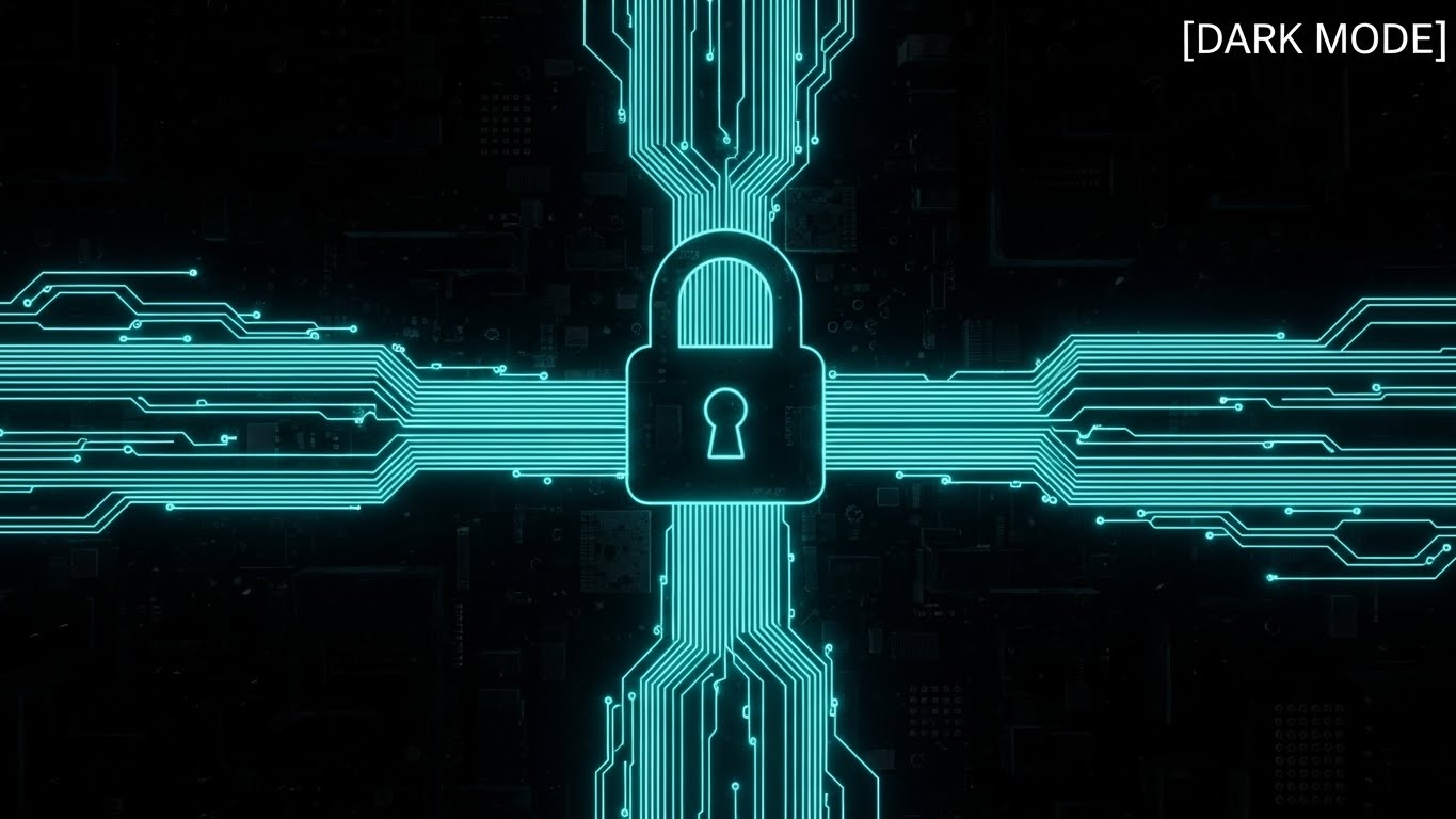
The Visual & Narrative Approach
For the IT Director, "Dark Mode" signifies power and control. This style uses a Cyberpunk aesthetic—Neon Cyan lines on Jet Black—to visualize data encryption. The circuit lines converging into a glowing padlock create a strong metaphor for a secure, closed-loop system. The high contrast implies precision and the "active" monitoring of data. It transforms the abstract concept of "SOC2 Compliance" into a tangible, impregnable fortress.
Psychological Impact & KPI Focus
Niche Psychology: The Technical Buyer (CTO/IT) is risk-averse regarding data breaches. This visual speaks their language—encryption, structure, and monitoring. It reassures them that the platform is robust, modern, and enterprise-ready.
Operational Impact: It effectively targets the technical review phase of the sales cycle. It visually answers the "Security Questionnaire" by projecting an image of sophisticated, impenetrable data architecture.
Strategic Implementation & Trade-offs
- Best Use Case: Technical Documentation (Tech Docs), Security Compliance pages, or IT-focused nurture emails.
- Duration: 10-15 Seconds.
- Trade-off: Security Focus vs. User Friendliness. The dark, complex aesthetic signals "secure," but can also signal "complicated." Use it strictly for security-focused messaging.
Companies using similar video content -
Viewpoint Spectrum – ERP for Construction – Enterprise security architecture with circuit padlock.
Foundation Software – Construction Accounting – Secure and modern data management.
19. 2D Character-Driven Story
BOFU | Demo Requests

The Visual & Narrative Approach
This style creates a direct empathetic link with the user's internal struggle. The visual metaphor of a "messy mental knot" untangling into a straight, clear line perfectly encapsulates the value of the software: Clarity. The storybook aesthetic with warm Beige and Forest Green tones feels therapeutic and safe. It validates the user's stress ("We know it's hard") and immediately offers the solution ("We make it simple").
Psychological Impact & KPI Focus
Niche Psychology: Estimators carry a high "Cognitive Load"—keeping track of thousands of line items creates mental fatigue. This visual promises relief. It frames the demo request not as a sales meeting, but as a therapy session for their workflow.
Operational Impact: It drives Demo Requests by selling the emotional benefit of the tool. It suggests that clicking "Book Demo" is the first step toward a less stressful work life.
Strategic Implementation & Trade-offs
- Best Use Case: Retargeting Social Ads (Facebook/Instagram) for users who visited the pricing page but didn't convert.
- Duration: 15-30 Seconds.
- Trade-off: Empathy vs. Authority. It positions the brand as a helpful friend rather than a dominant industry leader. It is excellent for conversion, less so for category creation.
Companies using similar video content -
UDA Technologies – ConstructionSuite – Untangle mental knots for cognitive relief.
CoConstruct – Project Management – Simplify complex project workflows, reduce stress.
20. Abstract 2D flat vector organic
BOFU | Competitive Comparison

The Visual & Narrative Approach
This style is a metaphor for the "Standardization" of data. In the chaotic bid phase, information is fluid and unpredictable (Liquid Metal). The software acts as the "mold," forcing this chaos into a perfect, standardized Cube. The glossy gradients and clean grey background suggest a premium, refined process. It visually demonstrates the transformation of raw input into a solid, reliable output—the "Golden Record" of the project.
Psychological Impact & KPI Focus
Niche Psychology: Consistency is the hallmark of a mature construction firm. This visual appeals to the desire for repeatable success. It argues that the software doesn't just manage one project; it creates a standard for all projects.
Operational Impact: It is used for Competitive Comparison to show that while others might manage the chaos (liquid), your platform resolves it (solid). It creates a visual distinction between "flexible tools" (spreadsheets) and "structured platforms" (your SaaS).
Strategic Implementation & Trade-offs
- Best Use Case: Display Ads and "Why Us" comparison pages. It creates a memorable visual hook for the concept of data integrity.
- Duration: Loop.
- Trade-off: Metaphor vs. Literal Capability. It is highly abstract. It effectively communicates the concept of standardization but requires accompanying copy to explain the specific features (e.g., Assemblies, Templates) that achieve it.
Companies using similar video content -
Alice Technologies – AI Construction Planning – Standardization engine from liquid to solid.
Touchplan – Lean Construction Planning – Transform fluid plans into structured processes.
21. Hyper-lapse Stock Footage with Data
BOFU | Sales Cycle Acceleration

The Visual & Narrative Approach
This style juxtaposes the chaotic energy of a construction site with the absolute control of software. By using a hyper-lapse technique, we blur the movement of traffic and cranes into streams of light, representing the relentless pace of the industry. Overlaid on this is a crisp, static white HUD (Heads Up Display) that calmly tracks progress percentages and active resources. The contrast is the story: The world moves fast, but your data remains stable, accurate, and in control.
Psychological Impact & KPI Focus
Niche Psychology: General Contractors (GCs) operate in a high-pressure environment where delays cost millions. This visual alleviates the anxiety of "losing control" by showing that the software can keep pace with—and measure—the chaos of the real world.
Operational Impact: It drives Sales Cycle Acceleration by proving enterprise readiness. It signals to the buyer that this system is robust enough to handle high-velocity, multi-site tracking without lagging.
Strategic Implementation & Trade-offs
- Best Use Case: YouTube Pre-roll ads or "Why Us" landing page headers. It creates an immediate feeling of momentum.
- Duration: 10-15 Seconds.
- Trade-off: Mood vs. Detail. It captures the feeling of management but does not show the granular data entry process. It is a mood-setter, not a tutorial.
Companies using similar video content -
DroneDeploy – Drone Mapping – Accelerate project velocity with construction HUD.
OpenSpace – 360° Photo Documentation – Track site progress with overlaid data.
22. Macro UI Micro-Interactions
Onboarding | Time-to-Value

The Visual & Narrative Approach
Success in software is often a series of small, satisfying clicks. This style uses an extreme macro perspective to elevate a mundane action—clicking "Submit Bid"—into a cinematic event. The texture of the pixels, the soft shadow of the cursor, and the vibrant Lime Green "Success" state create a tactile connection. The visual isolates the user's primary goal: the completion of a task. It is free of clutter, focusing entirely on the point of interaction.
Psychological Impact & KPI Focus
Niche Psychology: New users are often intimidated by complex dashboards. This visual focuses on the "micro-win," releasing a small dopamine hit associated with finishing a task. It promises that the software is responsive and decisive.
Operational Impact: This style supports Time-to-Value by visually guiding the user to the most important actions. It reduces the "Analysis Paralysis" new users feel when facing a blank screen.
Strategic Implementation & Trade-offs
- Best Use Case: In-App Tooltips or Welcome Emails. It directs attention to the "First Value Moment."
- Duration: 3-5 Second Loop.
- Trade-off: Focus vs. Context. By zooming in so close, you lose the context of the workflow. Use it to highlight specific actions, not entire processes.
Companies using similar video content -
Autodesk Takeoff – Quantity Takeoff – Design commitment moments with cursor focus.
STACK Construction Technologies – Takeoff & Estimating – Highlight key actions for time-to-value.
23. Aspirational Stock Montage
Onboarding | Self-Serve Onboarding

The Visual & Narrative Approach
While the software is technical, the outcome is human. This style utilizes high-key, sun-drenched photography to depict the emotional result of a successful bid. The composition focuses on a diverse team gathered around a single screen, capturing the moment of "Bid Awarded." The bright, shadowless lighting conveys transparency and optimism, a stark contrast to the often gritty imagery of construction sites.
Psychological Impact & KPI Focus
Niche Psychology: Estimation is often a lonely, high-stress job. This visual reframes it as a team victory. It appeals to the desire for validation and shared success, suggesting that this software brings teams together rather than isolating them in silos.
Operational Impact: Ideal for Self-Serve Onboarding welcome sequences. It sets a positive emotional tone before the user dives into the technical training, reducing abandonment rates by reminding them of the "happy ending."
Strategic Implementation & Trade-offs
- Best Use Case: Welcome Email headers or "Success Stories" pages.
- Duration: Static or Slow Zoom.
- Trade-off: Emotion vs. Specificity. It is generic. It builds morale but doesn't teach the user anything about the product. It must be paired with technical content.
Companies using similar video content -
Buildertrend – Construction Management – Celebrate team success and collaboration.
CoConstruct – Project Management – Aspirational scenes of project completion.
24. Isometric 3D Workflow
Onboarding | Reducing Friction
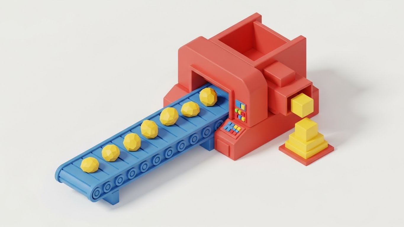
The Visual & Narrative Approach
This style translates the abstract concept of "Automated Takeoff" into a physical metaphor. Using a matte-finish clay render style, it depicts data as raw shapes moving along a conveyor belt, being processed by a machine, and emerging as perfectly stacked blocks. The primary color palette (Red/Blue/Yellow) makes the process look simple, almost toy-like, which drastically reduces the intimidation factor of complex algorithms.
Psychological Impact & KPI Focus
Niche Psychology: Users fear that automation is a "Black Box" they can't trust. This visual opens the box, showing a logical, linear process. It reassures the user that the software is a predictable engine, not a magic trick.
Operational Impact: It targets Reducing Friction by providing a mental map of how the system works. When a user understands the "input-process-output" flow, they are less likely to make errors during data entry.
Strategic Implementation & Trade-offs
- Best Use Case: In-App "Empty State" screens (e.g., before a user uploads their first plan). It encourages the first action.
- Duration: Loop.
- Trade-off: Simplicity vs. Accuracy. It is a gross simplification of the actual algorithm. It explains the concept of automation, not the mechanics.
Companies using similar video content -
Planswift – Takeoff & Estimating – Visualize automation flow with data conveyor.
Countfire – Automated Takeoff – Simplify complex takeoff processes.
25. 2D Graphics Over Live Action
Onboarding | Trial Activation

The Visual & Narrative Approach
The construction industry is still transitioning from paper to digital. This style acknowledges that reality by overlaying bright, vector-based digital graphics (arrows, widgets, measurements) onto live-action footage of physical blueprints. The "Red Overlay" visually represents the software's intelligence augmenting the estimator's manual expertise. It doesn't replace the paper; it makes the paper smart.
Psychological Impact & KPI Focus
Niche Psychology: Many estimators still trust their paper plans more than a screen. This visual validates their traditional workflow while gently introducing digital tools. It says, "Keep working how you work; we just add speed."
Operational Impact: This is powerful for Trial Activation. It lowers the barrier to entry by showing that the user doesn't have to abandon their physical habits immediately to get value from the digital tool.
Strategic Implementation & Trade-offs
- Best Use Case: "How It Works" videos on YouTube or within the trial onboarding checklist.
- Duration: 15-30 Seconds.
- Trade-off: Hybrid vs. Pure Digital. It validates hybrid workflows, which is good for adoption but might delay the transition to a fully digital, paperless environment.
Companies using similar video content -
Bluebeam Revu – PDF Markup & Takeoff – Bridge paper and pixel with red overlay.
SmartUse – Digital Plan Room – Augment live plans with digital graphics.
26. Abstract 3D AI Visualization
Retention | Reducing Churn

The Visual & Narrative Approach
As users mature, they need to see the depth of the system. This style uses a pristine, laboratory-white aesthetic with polished silver nodes connected by beams of light. It represents the "hidden intelligence" of the platform—the database of costs, the historical trends, and the AI predictions. The structure suggests stability, complexity, and interconnectivity, framing the software as a living organism rather than a static tool.
Psychological Impact & KPI Focus
Niche Psychology: Long-term users stay when they feel the platform is "learning" and growing with them. This visual represents the cumulative value of their data. It implies that leaving the platform means losing this valuable, interconnected intelligence.
Operational Impact: It targets Reducing Churn by visualizing the "Network Effect." It reminds the user that the value of the software increases the more they use it and the more data they feed into it.
Strategic Implementation & Trade-offs
- Best Use Case: Login Screens or "New Feature" announcements regarding AI or Database updates.
- Duration: Loop.
- Trade-off: Abstraction vs. Utility. It is purely conceptual. It builds confidence in the backend technology but offers no functional instruction.
Companies using similar video content -
Buildots – AI Construction Monitoring – Connect intelligent networks with silver nodes.
SiteAware – AI Site Monitoring – Visualize AI-driven insights and intelligence.
27. 3D Parallax UI Presentation
Retention | Feature Adoption

The Visual & Narrative Approach
Advanced users need to manage complex data without losing context. This style explodes the UI into floating, translucent glass layers in a 3D space. The camera drifts through these layers, revealing that behind the simple summary dashboard lies deep, granular data. The "Glass" texture implies transparency, while the parallax movement creates a sense of immersion and endless capability.
Psychological Impact & KPI Focus
Niche Psychology: Power users often get bored or frustrated if they feel "walled in" by a simple interface. This visual promises depth. It tells the expert user, "There is more here for you to discover," encouraging them to dig deeper.
Operational Impact: It drives Feature Adoption for advanced reporting modules. It visually demonstrates that the software can handle "drill-down" analysis, moving users from basic takeoff to complex variance reporting.
Strategic Implementation & Trade-offs
- Best Use Case: Newsletters announcing "Pro" features or Deep Dive webinar intros.
- Duration: 10-20 Seconds.
- Trade-off: Complexity vs. Simplicity. It makes the software look complex. While attractive to power users, it might overwhelm a novice user who just wants a simple answer.
Companies using similar video content -
InEight – Project Cost Management – Visualize data depth with floating glass.
e-Builder – Construction Program Management – Advanced reporting and drill-down capabilities.
28. Holographic UI over 3D Render
Retention | Knowledge Base

The Visual & Narrative Approach
Support is a key retention driver. This style visualizes the "Help" function not as a static document, but as a dynamic, holographic projection emerging from a tablet. Set in a bright, sunlit office, the blue hologram represents immediate, futuristic assistance. It creates the impression that help is not a phone call away, but literally projected into the user's workspace whenever needed.
Psychological Impact & KPI Focus
Niche Psychology: The fear of getting stuck causes users to abandon software. This visual provides a "safety net." It reassures the user that they are never alone; the system provides proactive guidance.
Operational Impact: It promotes the Knowledge Base and self-service support. By visualizing help as a futuristic feature, it encourages users to use in-app guides rather than opening support tickets, reducing support costs.
Strategic Implementation & Trade-offs
- Best Use Case: The "Help Center" landing page or in-app support widget icon.
- Duration: Loop.
- Trade-off: Promise vs. Reality. If your actual support is slow or your documentation is poor, this high-tech visual will create a gap between expectation and reality.
Companies using similar video content -
Newforma – Project Information Management – On-demand expertise with tablet help.
Aconex – Project Collaboration – Futuristic support for project information.
29. Dark Mode UI Showcase
Expansion | Upsell/Cross-sell
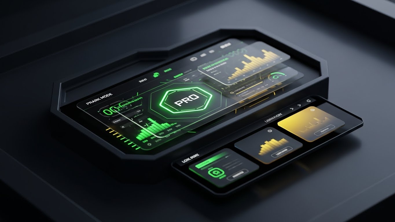
The Visual & Narrative Approach
"Dark Mode" is often associated with "Pro" or "Enterprise" tiers. This style uses a sleek, charcoal and gold palette to present the software as a high-performance instrument. The glowing "PRO" badge and the intricate data visualizations suggest exclusivity and power. It appeals to the user's ego—this is the interface for the elite estimator who manages the biggest projects.
Psychological Impact & KPI Focus
Niche Psychology: Professional identity is strong in construction. Estimators want to feel like masters of their trade. This aesthetic aligns with the "Gaming/Pro" hardware they often admire, positioning the upgrade not as a cost, but as a status symbol.
Operational Impact: It effectively drives Upsell/Cross-sell to premium tiers. It visually differentiates the "Basic" experience from the "Executive" experience, creating desire for the higher-level toolset.
Strategic Implementation & Trade-offs
- Best Use Case: In-App Modals prompting an upgrade or "Enterprise" pricing pages.
- Duration: Static or Slow Pan.
- Trade-off: Exclusivity vs. Accessibility. It creates a divide. Ensure the "Basic" version doesn't look broken or cheap by comparison, just less "specialized."
Companies using similar video content -
Destini Estimator – Enterprise Estimating – Premium dashboard for high performance.
HCSS HeavyBid – Heavy Civil Estimating – Showcase advanced features for power users.
30. Low-Poly 3D Modeling
Expansion | Referrals

The Visual & Narrative Approach
Referrals and network expansion should feel easy, even playful. This style uses "Low-Poly" art—geometric, pastel-colored blocks snapping together to form a house—to visualize the ease of building a network. It strips away the grit and the data to leave a pure, satisfying animation of growth. It suggests that adding a new user or referring a partner is as simple as snapping a Lego block into place.
Psychological Impact & KPI Focus
Niche Psychology: Users won't refer a product if they think it's a burden to explain. This visual communicates "Simplicity." It subliminally tells the user, "This is easy to share, and your peers will thank you for it."
Operational Impact: It drives Referrals and viral loops. It creates a friendly, approachable brand image that users are happy to associate their own reputation with.
Strategic Implementation & Trade-offs
- Best Use Case: Referral program emails or "Invite a Colleague" screens.
- Duration: Loop.
- Trade-off: Playfulness vs. Seriousness. It is very casual. Use it only for peer-to-peer communications, not for top-down executive presentations where it might look childish.
Strategic Knowledge Base: The Visual Operations Doctrine
Having analyzed 30 distinct visual styles across the customer lifecycle, we must now synthesize these into a cohesive operational framework. A style guide is not just a menu of assets; it is a Strategic Operating System for your business. The following three segments outline how to transition from "making videos" to "deploying visual strategy" specifically for the Cost Estimation SaaS industry.
Strategic Alignment & Visual Architecture
The "Pre-Production" Strategy. Defining the "Why" and "Who."
- The Cognitive Load Audit: Before commissioning a single pixel, audit your current training materials. If a PDF manual takes 20 minutes to read, the goal of the visual is not just to "explain" it, but to compress that time-to-competency by 80%.
- Role-Based Visual Mapping: Do not use the same visual style for everyone. The Field Estimator (Mobile/Field User) requires high-contrast, large-text visuals (Style 2, 10) for sunlight legibility on the job site. The Chief Estimator (Desktop/Office) requires dense, data-rich visuals (Style 14, 27) to convey control and depth.
- The "Glanceability" Standard: In high-stakes environments like pre-construction, visuals must pass the "Glance Test." Information must be comprehended in under 1.5 seconds. Use styles like Hyper-lapse HUD (Style 21) to train users on scanning project status quickly.
- Brand Voice Consistency: Your marketing videos (Cinematic - Style 1) and your support videos (Holographic - Style 28) must share a "Visual DNA." Use consistent accent colors (e.g., Safety Orange or Cyan) across all 30 styles to maintain brand authority.
- The Advids Strategic Audit: Partner with Advids to define this "Visual Operating System" before production begins. A fragmented visual library confuses users; a cohesive one builds trust.
- Standardization vs. Customization: For generic workflows (e.g., "Reset Password"), use cost-effective Stock Montage (Style 23). For core IP (e.g., "Proprietary Algorithm"), invest in 3D X-Ray (Style 12). Allocate budget based on strategic value.
- The Cross-Departmental Bridge: Use visuals to unify terminology. If Sales calls it a "Bid," but Support calls it a "Quote," confusion reigns. Create a Kinetic Typography (Style 2) video that defines the company lexicon.
- Legacy System Integration: Visualizing the invisible connection between old on-prem servers and new SaaS interfaces is critical. Use Wireframe to Reality (Style 8) to show users that their legacy data is safe in the new system.
- Accessibility in Construction: Construction is a global industry. Ensure motion graphics (Style 6, 25) rely on icons and visual metaphors rather than heavy text, reducing localization costs for multi-lingual crews.
- The Mobile-First Mandate: 70% of construction software usage happens on a tablet or phone. Ensure all 30 styles are legible on a 6-inch screen. If Style 27 (Parallax UI) is too complex for mobile, adapt it to Style 10 (Split Screen).
Operational Adoption & Implementation
The "Deployment" Phase. Embedding visuals into the workflow.
- Overcoming "Big Brother" Anxiety: When introducing activity tracking features, use empathy-driven visuals (Style 11) to show the estimator that the software protects them (e.g., proving they submitted the bid on time), rather than just monitoring them.
- The Micro-Learning Shift: Replace the "University" concept with "TikTok-style" learning. Break complex workflows into 30-second Macro UI clips (Style 22) and embed them directly into the software interface.
- Just-in-Time Support: Don't hide videos in a library. Trigger a Holographic Help (Style 28) video automatically when a user hovers over a complex feature for more than 5 seconds.
- Gamification of Training: Use Low-Poly (Style 30) visuals to create "Completion Badges" for training modules. Visualizing progress motivates users to complete onboarding.
- Reducing Support Ticket Volume: There is a direct correlation between proactive visual guides and reduced call center load. If "Export to PDF" is a top ticket, place a Rapid UI Montage (Style 4) on that page showing exactly how to do it.
- Remote Onboarding: Use Screencasts with Live Action (Style 25) to simulate a "human looking over your shoulder," allowing you to train distributed estimating teams without expensive travel.
- Visual SOPs: Transform text-based Standard Operating Procedures into Isometric Process Flows (Style 24). Users follow visual maps 323% better than written instructions.
- Feedback Loops: Use interactive video elements. After a Feature Education video (Style 9), ask the user to click "Helpful" or "Not Helpful" to continuously refine your visual assets.
- Scalable Localization: When generating Generative AI videos (Style 13), use avatars that can be lip-synced to multiple languages, ensuring your global users receive the same high-quality training.
- Leadership Communication: Use premium Cinematic styles (Style 1) for quarterly updates from the CEO. High production value signals company health and stability to the workforce and investors.
Measuring Impact & Future-Proofing
The "ROI" Phase. Measuring success and looking ahead.
- Beyond "Views": Do not measure video success by views. Measure Time-to-Competency. Did the group that watched the Isometric Workflow (Style 7) master the tool faster than the group that read the manual?
- The "Idle Time" Metric: In software, "idle time" often means confusion. Correlate the deployment of Macro UI videos (Style 22) with a reduction in idle time on complex forms.
- Compliance Velocity: How fast can you get the entire team to adopt a new regulation (e.g., BIM standards)? Use Bold Kinetic Typography (Style 2) to blast critical updates and measure the "Acknowledged" rate.
- Retention and Churn: High-quality UX visualization (Style 27, 29) reduces churn. Measure Net Promoter Score (NPS) specifically for the "Ease of Use" category after deploying these assets.
- The AI Visual Frontier: Prepare for Generative UI. Tag every video component (Style 26) so that future AI tools can auto-generate personalized training videos for specific user behaviors.
- Scalability of Assets: Build a library, not a landfill. Organize assets by Funnel Stage and Style Code (as done in this guide) so your sales team can find the right asset for the right prospect instantly.
- The Advids Partnership: Scale is the enemy of quality unless managed. Lean on Advids as your long-term production partner to ensure that as your feature set grows, your visual library evolves without losing stylistic consistency.
- Benchmarking Success: "Good enough" is a competitive risk. Regularly audit your competitor's visual strategy. If they are moving to 3D X-Ray (Style 12) and you are still using static screenshots, you are losing the perception war.
- The ROI of Safety/Accuracy: In construction, one error costs millions. Quantify the reduction in "Bid Variance" or "Change Orders" attributed to better visual training. This is your ultimate ROI metric.
- Final Call to Innovation: Treat video as infrastructure. It is not content to be consumed and forgotten; it is the graphical user interface (GUI) of your business strategy. Invest in it with the same rigor you invest in your code.
Generated by Advids Expert Team
The concepts and strategies outlined in this guide reflect the cutting-edge intersection of visual communication and B2B SaaS growth. For implementation support and high-fidelity production of these styles, contact Advids.
Companies using similar video content -
Bridgit Bench – Resource Management – Gamify referral growth with snapping blocks.
Knowify – Contractor Management – Playful visualization of network building.
Author & Editor Bio


