
Introduction: Bridging the Physical-Digital Divide
The courier and logistics industry is currently navigating a pivotal transition. We are moving from the era of manual dispatch and opaque supply chains to a future of "Invisible Logistics"—where operations are so seamless, automated, and predictive that the complexity is invisible to the end customer. However, for the SaaS platforms driving this change, the challenge is not just technological; it is communicational. How do you visualize an algorithm that saves milliseconds? How do you depict the reliability of a dispatch API?
The stakes are incredibly high. The global logistics landscape is defined by tight margins and high expectations. Recent data indicates that last-mile delivery costs now account for 53% of the total cost of shipping, making it the most expensive and operationally complex part of the fulfillment chain. In this high-pressure environment, clarity is currency. Operational leaders need to see solutions that don't just promise efficiency but visibly demonstrate control.
Strategic visualization is the bridge. It transforms abstract datasets—latency, fuel burn, zone logic—into intuitive narratives that drive faster decision-making and deeper stakeholder trust. Industry projections suggest that adopting advanced courier software can drive a reduction in logistics costs by up to 20%, but only if the technology is adopted and understood. This guide explores 30 distinct visualization styles (Styles 1-10 in this section) tailored to bridge the physical reality of fleets with the digital precision of SaaS, lowering cognitive load and proving ROI in a market that refuses to slow down.
1. Minimalist Flat 2D Vector
TOFU | Brand Awareness

The Visual & Narrative Approach
This style utilizes a "Vivid Coral" and "Soft Cream" palette to create immediate visual arrest. The scenario depicts an abstract package icon that doesn't just move; it transforms into a swift motion line, cutting across a centered, symmetrical composition. There are no distracting gradients or textures—only clean, hard edges that convey the concept of "velocity" without clutter. The narrative tone is punchy and direct, focusing on speed as the primary value proposition.
Psychological Impact & KPI Focus
- Niche Psychology: For a social ad, cognitive load must be near zero. This style leverages Processing Fluency; the brain instantly recognizes the shapes as "package" and "speed," allowing the viewer to absorb the message in milliseconds.
- Operational Impact: It anchors the brand to the concept of "immediacy," directly addressing the anxiety of slow, clunky legacy systems.
Strategic Implementation & Trade-offs
- Best Use Case: 15-second Instagram/LinkedIn ads launching a new "Rapid Delivery" feature.
- Trade-off: It lacks technical depth. It cannot explain how the routing works, only that it is fast.
Companies using similar video content -
Shipday – Local Delivery Software – Automates local deliveries with AI-powered speed.
Metrobi – Last-Mile Delivery – Streamlines local business deliveries efficiently.
2. Abstract 2D flat vector organic modern motion graphics
TOFU | Category Creation

The Visual & Narrative Approach
This style reimagines the logistics network as a living organism. Mint Green fluid shapes (representing delivery zones) flow effortlessly around Deep Charcoal obstacles (traffic or delays). The top-down view allows the viewer to see the "logistics network" adapting in real-time. It visualizes "Zone Skipping" not as a calculation, but as a natural flow of water around a rock.
Psychological Impact & KPI Focus
- Niche Psychology: Logistics managers fear rigidity. This style visually reassures them that the system is adaptive and resilient.
- Operational Impact: The visual concordance of the fluid green shapes bypassing the jagged charcoal rocks perfectly illustrates the "agile vs. legacy" conflict. It validates the viewer's need for a system that evolves with the environment.
Strategic Implementation & Trade-offs
- Best Use Case: Blog headers or explainer videos for complex methodologies like "Dynamic Zone Skipping."
- Trade-off: It is highly abstract. It requires a supporting caption or voiceover to connect the "blob" to a "truck."
Companies using similar video content -
Bringg – Delivery Management Platform – Orchestrates flexible, adaptive delivery networks.
AnyLogic Company – anyLogistix – Simulates complex supply chain scenarios.
3. Isometric 2D Motion Design
TOFU | Market Education

The Visual & Narrative Approach
Set on a rigid Sky Blue and Paper White grid, this style brings order to the chaos of urban delivery. The isometric perspective provides a "God's eye view" of a stylized city block. Uniform dots, representing fleet vehicles, move along the grid lines in perfect synchronization. There is no weather, no traffic jams—only the idealized precision of your software's Dynamic Routing engine.
Psychological Impact & KPI Focus
- Niche Psychology: The isometric grid is the universal symbol of Control and Omniscience. It gives the viewer a sense of total visibility, satisfying the Fleet Manager's desire to bring order to chaos.
- Operational Impact: It builds trust in the platform's ability to handle scale. The uniformity suggests that the software treats 10,000 deliveries with the same precision as ten.
Strategic Implementation & Trade-offs
- Best Use Case: The "How It Works" section of a landing page explaining fleet tracking.
- Trade-off: It can feel clinical. It removes the "human element" (the driver), so it is less effective for driver recruitment content.
Companies using similar video content -
Routific – Route Planning Software – Optimizes delivery routes for efficiency.
Circuit for Teams – Delivery Software – Synchronizes dispatch and driver operations.
5. Wireframe to Reality Transition
TOFU | Product Differentiation
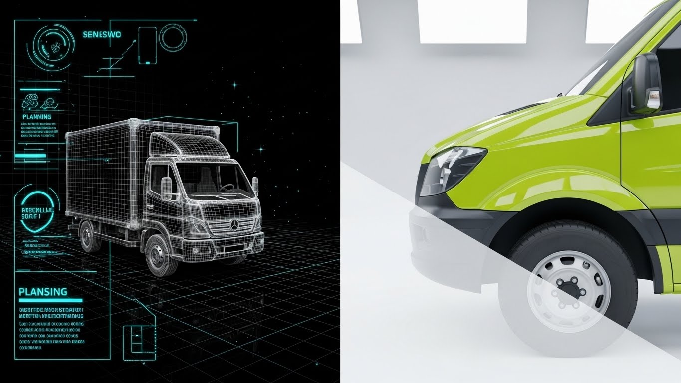
The Visual & Narrative Approach
This split-screen technique is a powerful metaphor for "Planning vs. Execution." The left side presents a technical Metallic Silver wireframe of a delivery truck on a grid. This seamlessly morphs across the screen into a photorealistic Neon Lime render of the truck's fender on the right. It visually proves that your digital planning (wireframe) directly translates to tangible, high-quality physical assets (render).
Psychological Impact & KPI Focus
- Niche Psychology: This addresses the "Physical/Digital Divide." It proves to the skeptic that the software (wireframe) effectively manages the hardware (reality).
- Operational Impact: The high contrast between the skeletal data structure and the glossy fender emphasizes the "Digital Twin" technology. It visualizes the ROI of maintenance software: seeing the invisible data behind the physical asset.
Strategic Implementation & Trade-offs
- Best Use Case: Hero background video on a "Fleet Management" product page.
- Trade-off: High production cost. Requires perfect alignment between the 3D model and the wireframe to ensure the transition looks seamless.
Companies using similar video content -
Motive – Fleet Management Platform – Connects physical fleet data to digital insights.
Powerfleet – Telematics Solutions – Links vehicle telematics to operational visibility.
6. 2D Character-Driven Story
TOFU | YouTube SEO

The Visual & Narrative Approach
We zoom in on the human element: the Courier. The character is illustrated in a friendly style, wearing a Teal uniform. The key visual element is the Sunshine Yellow glow from the handheld device, which illuminates the driver's smiling face. The city skyline is a mere silhouette; the hero is the driver's ease of interaction with the "Driver App," symbolizing ease of use and reduced frustration.
Psychological Impact & KPI Focus
- Niche Psychology: Driver retention is a massive pain point. This visual signals that your software is driver-friendly and won't cause frustration or burnout.
- Operational Impact: By highlighting the "glow" of the interface on the driver's face, we visually cue "enlightenment" or ease of use. It solves the anxiety of "will my team actually use this?"
Strategic Implementation & Trade-offs
- Best Use Case: Driver onboarding videos and recruitment ads.
- Trade-off: It can feel "childish" if not executed with professional polish. It must strike a balance between friendly and authoritative.
Companies using similar video content -
Track-POD – Delivery Driver App – Empowers drivers with intuitive mobile tools.
Onfleet – Driver App – Simplifies driver tasks and communication.
7. Bold Kinetic Typography (Visual)
TOFU | Skippable Pre-Roll Ad

The Visual & Narrative Approach
Abstract geometric blocks, resembling heavy typography, rush toward the viewer with strong motion blur. The Hot Pink and Electric Blue palette screams "Urgency." The composition is diagonal and aggressive, replicating the feeling of a "Rush Delivery" or an SLA deadline being met. There is no readable text—just the raw energy of shape and color moving through space, visualizing "Urgent Delivery" and the high-speed nature of on-demand logistics.
Psychological Impact & KPI Focus
- Niche Psychology: It taps into the adrenaline of the logistics industry. It mimics the high-stakes, time-sensitive nature of on-demand delivery.
- Operational Impact: The "aggressive" diagonal movement visually disrupts the viewer's scroll pattern. It is designed purely to arrest attention in the first 3 seconds of a pre-roll ad.
Strategic Implementation & Trade-offs
- Best Use Case: Brand awareness campaigns targeting high-growth e-commerce brands needing speed.
- Trade-off: Zero educational value. It gets attention but explains nothing about the product features.
Companies using similar video content -
GoFor – On-Demand Delivery – Visualizes rapid, urgent delivery services.
RoadWarrior – Route Planner – Emphasizes quick, efficient route planning.
8. Rapid UI Feature Montage
TOFU | Instant Gratification Hook
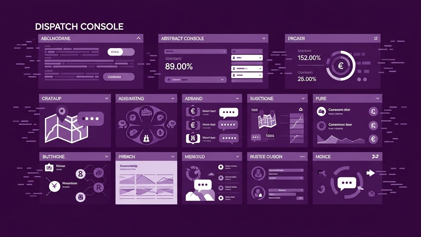
The Visual & Narrative Approach
A high-tempo visual assault of utility. The grid layout flashes abstract UI elements—maps, chat bubbles, and currency symbols—in a Deep Violet and Pure White scheme. It represents a "Dispatch Console" that handles high information density without clutter. The lack of shadows (flat design) keeps it crisp, suggesting that the software is lightweight and fast.
Psychological Impact & KPI Focus
- Niche Psychology: Operations managers crave "Omniscience"—seeing everything at once. This dense grid satisfies that desire for total control.
- Operational Impact: The visual represents a "Dispatch Console" with high information density. It visualizes "Efficiency" by showing how much data can be organized cleanly in a single view.
Strategic Implementation & Trade-offs
- Best Use Case: TikTok or Instagram Reels targeting tech-savvy dispatchers.
- Trade-off: The speed makes it impossible to read actual data. It sells the breadth of features, not the depth of functionality.
Companies using similar video content -
Descartes Systems Group – Route Planner On-demand – Displays comprehensive dispatch and routing features.
Alvys – TMS Platform – Showcases integrated dispatch, billing, and reporting.
9. Photorealistic 3D Renders
MOFU | Thought Leadership
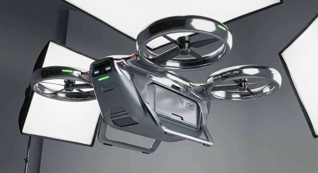
The Visual & Narrative Approach
The camera pans low, looking up at a futuristic autonomous delivery drone. The Chrome and Aerospace Grey finish reflects the softbox studio lighting, creating high-contrast highlights. The background is a dark, infinite void. The slow, cinematic camera movement conveys weight, quality, and serious engineering. This is the "Concept Car" of logistics.
Psychological Impact & KPI Focus
- Niche Psychology: Leaders want to partner with innovators. This "hero shot" aesthetic signals premium quality and cutting-edge technology.
- Operational Impact: While not a current operational reality for many, it validates the platform's roadmap. It builds trust that the vendor is preparing for the next decade of logistics.
Strategic Implementation & Trade-offs
- Best Use Case: LinkedIn Thought Leadership posts or Investor Decks.
- Trade-off: It creates high expectations. The actual service must be modern enough to not feel like a letdown after this futuristic imagery.
Companies using similar video content -
Locus Robotics – Autonomous Mobile Robots – Highlights advanced warehouse automation hardware.
10. Clean UI Workflow (Light Mode)
MOFU | Feature Education
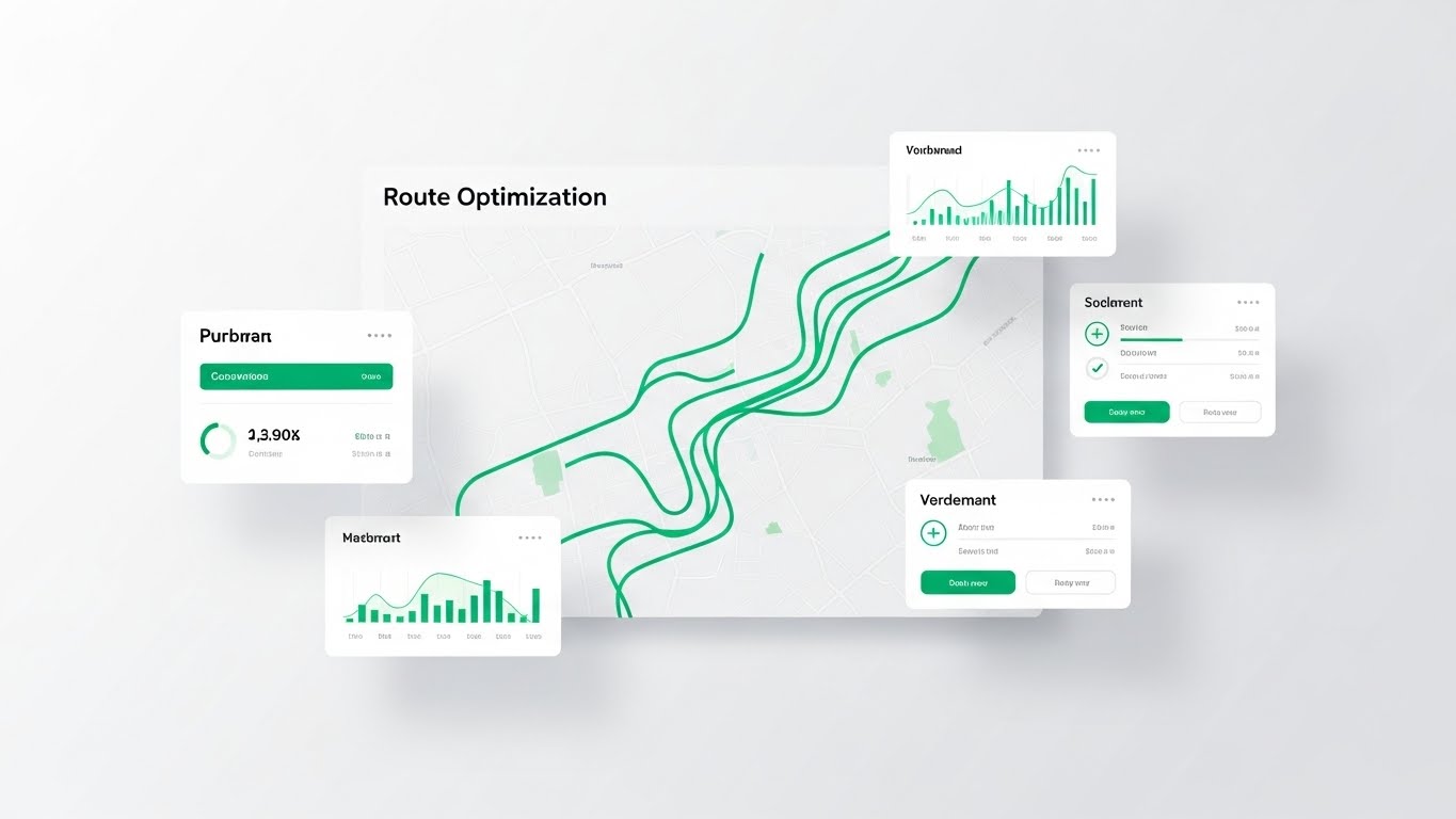
The Visual & Narrative Approach
We see a high-fidelity, straight-on view of the software interface in Light Mode. The background is Pure White. An "Optimization Route" is drawn in a crisp Emerald Green line, cutting through the map. Floating data widgets with soft shadows hover slightly above the map, showing "ETA" and "Cost." The aesthetic is pristine and breathable.
Psychological Impact & KPI Focus
- Niche Psychology: This style is the antidote to "Spreadsheet Fatigue." It promises a workspace that is organized and manageable.
- Operational Impact: The "Light Mode" aesthetic implies transparency. It is crucial for MOFU where the user needs to understand exactly what they will be looking at all day.
Strategic Implementation & Trade-offs
- Best Use Case: Website Product Pages and detailed Demo Videos.
- Trade-off: It works best when the viewer is already interested and wants to see "what it looks like." It can be perceived as "generic" if not branded well.
Companies using similar video content -
OptimoRoute – Route Optimization Software – Presents clear, intuitive route planning interface.
Kosmo – Delivery Optimization Platform – Offers streamlined, easy-to-use delivery management UI.
11. Split Screen: Optimized Reality and UI**
MOFU | Overcoming Objections
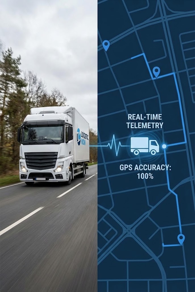
The Visual & Narrative Approach
This style directly confronts the skepticism regarding data latency. The composition utilizes a vertical split-screen to create a "truth test." On the left, high-resolution footage captures a white delivery truck navigating a physical route. On the right, a UI Blue digital map mirrors this movement in perfect synchronization. The visual narrative locks the physical asset to the digital node; when the truck turns, the node turns instantly. It creates an irrefutable visual link between the road and the screen.
Psychological Impact & KPI Focus
- Niche Psychology: Fleet Managers are often burned by "ghosting"—where the software shows a driver in one location, but they are actually miles away. This visual utilizes Visual Concordance to bridge that trust gap, proving that the digital twin is an exact reflection of reality.
- Operational Impact: It targets the Data Integrity KPI. By visually demonstrating zero latency, it reassures operations leaders that they can rely on the platform for critical, real-time dispatch decisions.
Strategic Implementation & Trade-offs
- Best Use Case: "Features" landing pages specifically for GPS Tracking, Telemetry, or ELD Compliance.
- Trade-off: It requires precise post-production. The footage and the UI animation must be perfectly timed; even a second of lag breaks the illusion of accuracy and damages credibility.
Companies using similar video content -
Samsara – Connected Operations Platform – Synchronizes real-world fleet activity with digital dashboard.
Tive – Real-Time Visibility Solution – Links physical shipment conditions to digital tracking.
12. 2D Animation & UI Composition
MOFU | Competitive Displacement
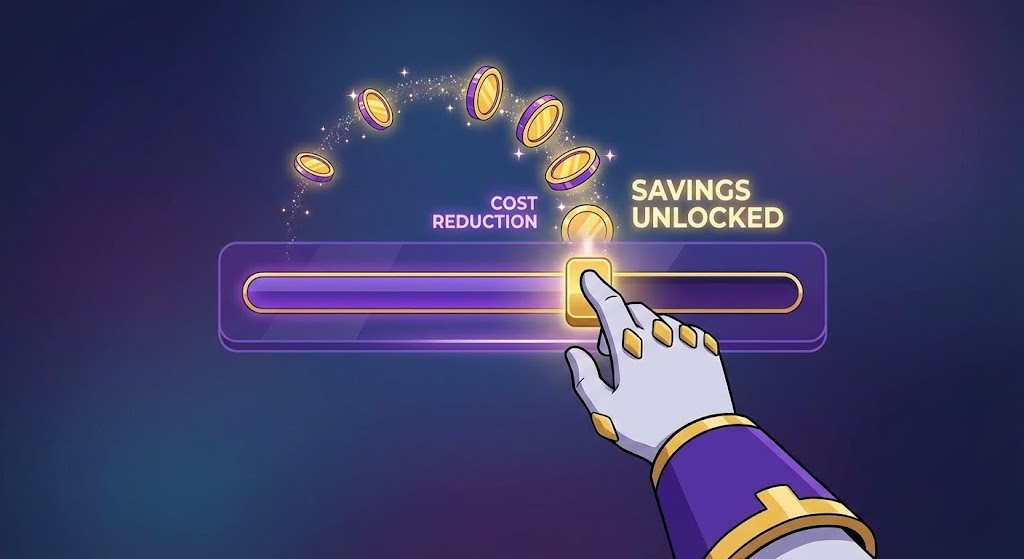
The Visual & Narrative Approach
Here, we gamify the abstract concept of "ROI." The visual features a stylized hand interacting with a semi-transparent UI slider bar, rendered in a premium Royal Purple and Gold palette. As the user slides the toggle to the right, abstract gold coin icons physically pop and float upwards, visualizing the immediate release of value. The animation is smooth and satisfying, transforming a dry spreadsheet metric ("cost reduction") into a rewarding, tactile interaction.
Psychological Impact & KPI Focus
- Niche Psychology: Cost-cutting is often viewed as a restrictive or negative process. This style leverages Idiosyncratic Fit, making the act of saving money feel like "winning" a game. It triggers a positive dopamine response associated with the platform's usage.
- Operational Impact: It focuses on Unit Economics. It simplifies complex savings triggers (like fuel optimization or route density) into a simple cause-and-effect visualization: Use Tool = Generate Wealth.
Strategic Implementation & Trade-offs
- Best Use Case: Retargeting Display Ads or interactive ROI calculators on the pricing page.
- Trade-off: It is highly stylized. It works best for communicating the feeling of value rather than the specific technical method of achieving it, so it should be supported by data-heavy content.
Companies using similar video content -
FreightPOP – Transportation Management System – Gamifies cost savings through optimized shipping.
Log-hub – Supply Chain Apps – Visualizes efficiency gains and cost reductions.
13. Isometric 3D Workflow
MOFU | ABM Awareness

The Visual & Narrative Approach
This style brings order to the chaos of a logistics hub. We see a highly detailed isometric 3D miniature of a warehouse. The palette utilizes Safety Orange for machinery and Steel Blue for the flooring, creating a clear industrial aesthetic. Tiny elements—forklifts, packages, conveyor belts—move in a perfect, mesmerizing loop. It visualizes the facility as a synchronized, automated symphony, implying that the software is the invisible conductor orchestrating every movement.
Psychological Impact & KPI Focus
- Niche Psychology: For the Operations Director, a messy floor is a liability. This clean, isometric view offers Cognitive Relief. It presents the ideal state of operations: ordered, visible, and predictable.
- Operational Impact: It visualizes Throughput Efficiency and Automated Sorting. It demonstrates how the software optimizes the flow of goods within the four walls, reducing bottlenecks and manual handling errors.
Strategic Implementation & Trade-offs
- Best Use Case: Account-Based Marketing (ABM) campaigns targeting large enterprise logistics firms with complex hub-and-spoke networks.
- Trade-off: Creating detailed 3D assets is resource-intensive. The "loop" must be seamless to effectively convey the message of continuous, uninterrupted operations.
Companies using similar video content -
Manhattan Associates – Active Warehouse Management – Depicts organized, automated warehouse operations.
14. Macro UI Micro-Interactions
MOFU | Driving Freemium

The Visual & Narrative Approach
Sometimes, the power of a platform is in the details. This style uses an extreme macro close-up of a single UI element: a toggle switch. Set against a Stark White background, the switch transitions from inactive gray to a vibrant, glowing Magenta. The shallow depth of field blurs the edges, forcing focus on the action. It visualizes the concept of "One-Click Dispatch" or "Instant Activation," suggesting that complex tasks are handled with a simple flick of a switch.
Psychological Impact & KPI Focus
- Niche Psychology: Dispatchers suffer from "Click Fatigue" and complex interfaces. This visual promises Frictionless Interaction. It signals that the software is modern, responsive, and designed to save them effort.
- Operational Impact: It highlights Usability and Speed of Execution. It suggests that the learning curve is low and the software is intuitive enough for immediate adoption by the entire fleet.
Strategic Implementation & Trade-offs
- Best Use Case: Email marketing sequences aimed at driving Freemium sign-ups or trial activations.
- Trade-off: It is hyper-focused. It tells you nothing about the breadth of the platform, only the quality of the interface design. It serves as a hook, not a full explanation.
Companies using similar video content -
Dista Deliver – Location Intelligence Platform – Highlights frictionless UI for field operations.
CargoApps – Transport Logistics Software – Emphasizes quick, automated task execution.
15. 3D Parallax UI Presentation
MOFU | The Functional Buyer
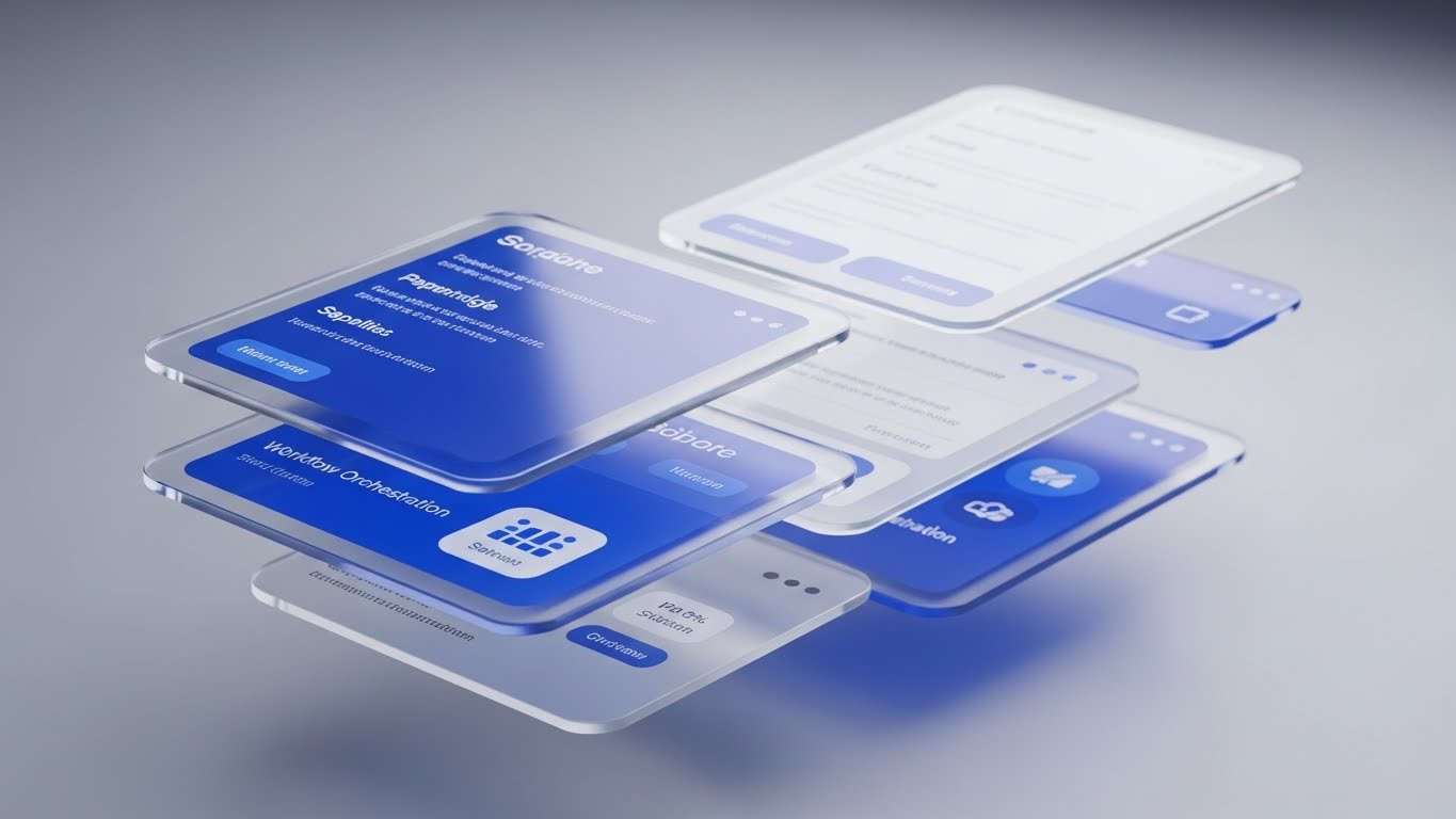
The Visual & Narrative Approach
To visualize the full scope of an enterprise platform, flat screens are not enough. This style floats multiple UI screens in a 3D void, utilizing "glassmorphism" with Sapphire Blue accents to create transparency and depth. The camera moves dynamically through the layers, revealing how different modules (Dispatch, Billing, Driver App) are stacked and integrated. It visualizes the "Ecosystem" of the software, showing that it isn't just a tool, but a multi-layered infrastructure.
Psychological Impact & KPI Focus
- Niche Psychology: The Functional Buyer (e.g., IT Manager) worries about data silos. This visual demonstrates Architectural Cohesion. It reassures them that the modules are not isolated but are part of a unified, communicating stack.
- Operational Impact: It visualizes Data Integration and Workflow Orchestration. It implies that data flows seamlessly from the bottom layer (driver input) to the top layer (management reporting) without manual entry.
Strategic Implementation & Trade-offs
- Best Use Case: The "Platform" or "Features" page of the website, specifically for explaining all-in-one solutions.
- Trade-off: Legibility can be sacrificed for style. The text on the floating screens is often secondary to the visual effect of depth, so use it to sell the concept of integration.
Companies using similar video content -
Blue Yonder – Luminate Platform – Showcases integrated supply chain planning and execution modules.
Magaya – Digital Freight Platform – Presents a multi-layered logistics and supply chain ecosystem.
16. 3D X-Ray Visualization
MOFU | The Technical Buyer

The Visual & Narrative Approach
This style is designed for the technical skeptic who wants to see under the hood. We see a high-tech server unit or computing core rendered with a transparent outer shell. Inside, glowing nodes, gears, and circuitry are visible in X-Ray Blue and Neon Green. This "X-Ray" view visualizes the massive, invisible data processing happening behind the fleet operations. It represents the "Backend Logic" and predictive algorithms that power the physical movement of goods.
Psychological Impact & KPI Focus
- Niche Psychology: Technical buyers want to know how it works. This style offers Epistemic Satisfaction—the joy of seeing the inner workings. It moves beyond the "shiny exterior" to prove there is sophisticated engineering and infrastructure underneath.
- Operational Impact: It visualizes System Resilience and Data Processing Power. It demonstrates that the platform is supported by robust hardware logic capable of handling complex computations without failure.
Strategic Implementation & Trade-offs
- Best Use Case: Technical whitepapers, datasheets, or product pages dedicated to API architecture and System Reliability.
- Trade-off: It can look "medical" or overly cold. It appeals strongly to engineers and CTOs but less so to sales-focused personas who care about the interface.
Transition: From Validation to Strategic Dominance
As we move to the Bottom of the Funnel (BOFU), the conversation shifts from "How does it work?" to "What is the strategic value?" The visuals must now convey authority, trust, and undeniable financial impact to close the deal.
Companies using similar video content -
FICO Xpress Optimization – Optimization Software – Reveals complex algorithms and data processing.
C3 AI – AI Supply Chain Management – Visualizes the intricate AI backend logic.
17. Generative AI Cinematic Video
BOFU | Demand Gen & Lead Capture
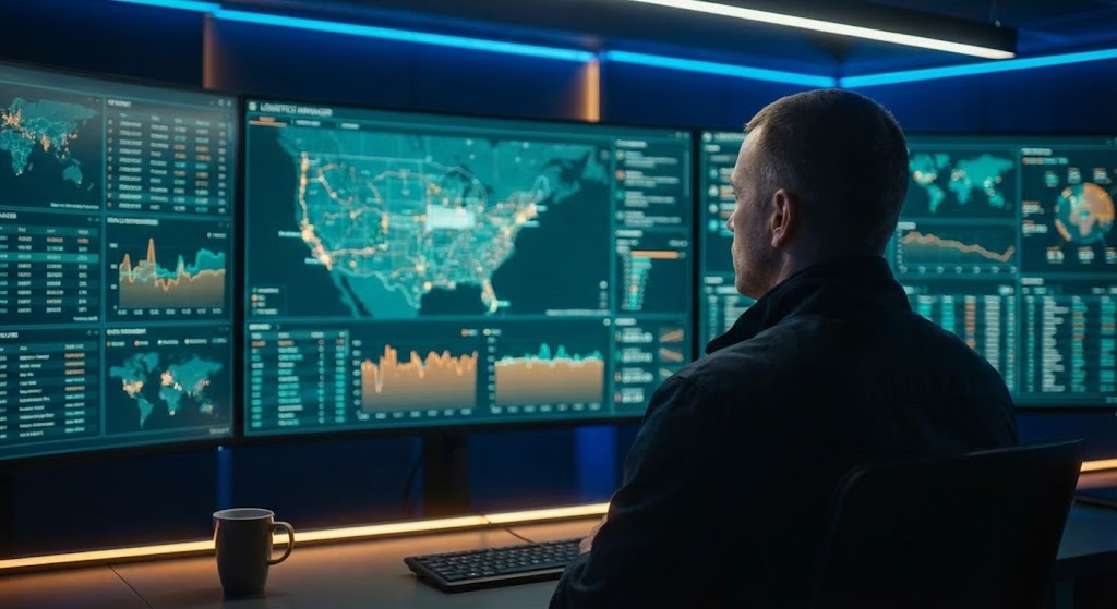
The Visual & Narrative Approach
This style sells the ultimate fantasy of the Logistics Director: total control. Using generative AI for cinematic quality, we see an over-the-shoulder shot of a manager in a dim, high-tech control room. A wall of monitors glows with Cinematic Teal and Orange data visualizations. The bokeh effect adds depth and drama. It doesn't show the specific software UI, but rather the feeling of being in a "Command Center," orchestrating a global fleet with calm authority.
Psychological Impact & KPI Focus
- Niche Psychology: It appeals to the desire for Status and Mastery. It positions the user not just as a manager, but as a Commander. It visualizes the state of being "on top of everything," which is the emotional opposite of their daily chaotic reality.
- Operational Impact: It visualizes Centralization. It represents the transition from scattered, reactive operations to a centralized, proactive command hub.
Strategic Implementation & Trade-offs
- Best Use Case: High-impact Meta (Facebook/Instagram) ads aimed at retargeting senior decision-makers.
- Trade-off: It sets a very high aesthetic bar. The actual product experience must feel empowering, or this marketing will feel deceptive.
Companies using similar video content -
project44 – Supply Chain Visibility Platform – Creates a sense of total control over global shipments.
18. Aspirational Stock Montage
BOFU | Building Trust & Credibility

The Visual & Narrative Approach
Technology is bought by humans. This style strips away the 3D renders and neon lights to focus on people. We see a high-key, bright photograph of a diverse team in a modern glass-walled office, shaking hands and smiling. The lighting is Warm Sunlight mixed with professional Office Grey. It conveys stability, partnership, and the "human support" behind the SaaS platform. It reassures the buyer that they are not just buying code, but a relationship with a reliable team.
Psychological Impact & KPI Focus
- Niche Psychology: B2B buyers fear being left alone with broken software. This visual leverages Social Proof and Trust signals. It says, "We are real people, and we are here to help you succeed."
- Operational Impact: It validates Customer Success and Support. It visualizes the onboarding and long-term partnership phase, which is often a key differentiator in enterprise SaaS deals.
Strategic Implementation & Trade-offs
- Best Use Case: The "About Us" page, the "Contact Sales" section, or the final slide of a sales deck.
- Trade-off: It can easily feel generic. The image must look authentic and not like a standard "stock photo cliché."
Companies using similar video content -
E2open – Multi-Enterprise Network – Focuses on collaborative human partnerships in supply chain.
19. Dynamic Data Visualization
BOFU | ROI Justification

The Visual & Narrative Approach
When the CFO enters the room, only one thing matters: the numbers. This style visualizes financial success with aggression and clarity. A 3D bar chart rises rapidly upwards, the bars rendered in glossy Forest Green with Gold Leaf accents. Abstract coins or data points ascend with the graph. The perspective is low, looking up, making the growth feel monumental. It is a pure, unadulterated visualization of "ROI Acceleration."
Psychological Impact & KPI Focus
- Niche Psychology: The CFO is risk-averse. This visual uses Upward Motion to signal positive momentum and financial safety. The use of Gold and Green triggers semiotic associations with wealth and profit.
- Operational Impact: It directly visualizes Revenue Growth and Margin Expansion. It takes the abstract promise of "efficiency" and translates it into the universal language of business: profit.
Strategic Implementation & Trade-offs
- Best Use Case: The "Business Case" section of a pitch deck or a case study highlighting a client's success.
- Trade-off: It is purely symbolic. It requires hard data (actual numbers) alongside it to be credible.
Companies using similar video content -
Logility – Decision Intelligence Platform – Displays rapid financial growth and optimization.
20. Futuristic Neon/Dark Mode
BOFU | Risk Mitigation
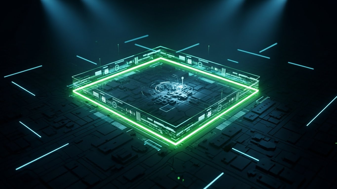
The Visual & Narrative Approach
Security and compliance are often the final hurdles. This style adopts a "Cyberpunk" or "Dark Mode" aesthetic to visualize protection. Set against a Deep Void Black, a glowing Neon Green perimeter line encircles a central processing chip or data core. It visualizes "Geo-fencing" or "Data Firewalling" not just as a setting, but as an impenetrable fortress. It implies high-tech surveillance and robust boundary control protecting the client's assets.
Psychological Impact & KPI Focus
- Niche Psychology: Fear of data breaches and asset theft is a powerful motivator. This style leverages the Aesthetic of Security (high contrast, neon, dark backgrounds) to make the viewer feel the system is robust and vigilant.
- Operational Impact: It visualizes Asset Protection and Compliance Monitoring. It shows that the system is actively guarding the core logic and data from external threats 24/7.
Strategic Implementation & Trade-offs
- Best Use Case: LinkedIn posts targeting Security Officers or Risk Managers, highlighting compliance and anti-theft features.
- Trade-off: The "Dark Mode" look is popular but can feel "gamer-like" if not executed with professional restraint. It works best for security-focused features.
Companies using similar video content -
Fleetx – Fleet and Transportation Management – Highlights security and predictive alerts in dark UI.
DRIP (by D3EIF) – Real-Time Vehicle Data – Visualizes asset protection and risk mitigation with data.
21. Lifestyle Stock with UI Overlay
BOFU | Sales Cycle Acceleration

The Visual & Narrative Approach
This style bridges the gap between the "boots on the ground" reality and digital intelligence. We see a high-quality photograph of a warehouse supervisor in a busy industrial setting, holding a ruggedized tablet. Overlaid on the screen—and floating slightly above it in 3D space—are holographic UI elements in Hologram Blue. These graphics track inventory movement in real-time. The visual narrative suggests that the software augments the human worker, giving them "superpowers" of visibility without replacing them.
Psychological Impact & KPI Focus
- Niche Psychology: Warehouse staff often fear that new software will be complicated or restrictive. This visual utilizes Cognitive Ease, showing the data as an intuitive, helpful layer that assists rather than monitors.
- Operational Impact: It visualizes Mobile Accessibility and Real-Time Inventory Management. It demonstrates that the platform’s power isn't confined to a desktop; it moves with the workforce.
Strategic Implementation & Trade-offs
- Best Use Case: Retargeting ads for Operations Managers who have visited the pricing page but haven't converted.
- Trade-off: It relies on high-quality stock photography. If the base image feels staged or inauthentic, the holographic overlay will look like a gimmick rather than a tool.
Companies using similar video content -
Z2Data – Supply Chain Mapping Software – Overlays digital insights onto real-world supply chain operations.
22. Generative AI Realistic Character Video
BOFU | Driving Demo Requests

The Visual & Narrative Approach
Trust is the currency of the enterprise buyer. This style features a hyper-realistic, AI-generated character representing a confident female CEO or VP of Logistics. She wears a professional navy blazer, standing in a blurry, high-end executive office. The lighting is premium studio quality. She speaks directly to the camera (the viewer), conveying authority and "thought leadership." The visual suggests that this platform is backed by serious, capable leadership who understand the industry's strategic needs.
Psychological Impact & KPI Focus
- Niche Psychology: In high-ticket SaaS sales, buyers buy the company as much as the product. This persona leverages Authority Bias, using a polished, executive figure to instill confidence in the vendor's stability and vision.
- Operational Impact: It targets the Strategic Partnership KPI. It shifts the conversation from "features" to "vision," positioning the vendor as a peer to the client's executive team.
Strategic Implementation & Trade-offs
- Best Use Case: The primary video on a "Request a Demo" landing page or a welcome video in an email nurture sequence.
- Trade-off: Authenticity is key. While AI allows for perfect delivery, it must be indistinguishable from reality. Poor lip-syncing or "uncanny valley" effects will destroy trust instantly.
Companies using similar video content -
SAP Business AI – Supply Chain Solutions – Features executive-level communication on strategic AI impact.
IBM Sterling Supply Chain Solutions – AI-powered Solutions – Presents confident leadership discussing AI vision.
23. 2D Line Art Animation
Onboarding | Self-Serve Onboarding

The Visual & Narrative Approach
Complexity is the enemy of adoption. This style uses a continuous, elegant line drawing to map out the customer journey. A single graphite-colored line winds across a Paper Cream background, connecting simple milestones (e.g., "Upload Drivers," "Define Zones," "Go Live"). The animation is fluid and unbroken, visually promising a seamless, uninterrupted path to success. It strips away all interface noise to focus purely on progress.
Psychological Impact & KPI Focus
- Niche Psychology: New users often feel overwhelmed by "Setup Anxiety." This minimalist style utilizes Processing Fluency to make the onboarding process appear simple, linear, and achievable.
- Operational Impact: It directly targets Time-to-Value. By making the setup process look like a simple roadmap, it encourages users to complete the configuration steps without needing human support.
Strategic Implementation & Trade-offs
- Best Use Case: Welcome screens inside the SaaS application or "Getting Started" email sequences.
- Trade-off: It is not detailed. It sets the expectation of simplicity but cannot be used to teach complex, multi-step technical configurations.
Companies using similar video content -
OpenLMIS – Logistics Management System – Simplifies onboarding for health supply chains.
Budibase – Low-Code Platform – Illustrates straightforward path to building custom logistics apps.
24. Hyper-lapse Stock Footage with Data
Onboarding | Accelerating Time-to-Value

The Visual & Narrative Approach
This style captures the energy of the logistics network at night. We use hyper-lapse footage of a city street, where long-exposure photography turns car lights into streaks of red and white. Overlaying this organic chaos are crisp digital data lines in Data Red, tracking the flow and velocity. The contrast between the dark, blurry city and the sharp, bright data trails visualizes the concept of "Traffic Analysis" and the platform’s ability to extract clear insights from a chaotic environment.
Psychological Impact & KPI Focus
- Niche Psychology: Speed is the defining characteristic of modern logistics. This visual leverages the Aesthetic of Velocity to reassure the user that the system works at the speed of the real world.
- Operational Impact: It visualizes Predictive Logistics. It shows that the software is constantly analyzing the pulse of the city to optimize routes, reducing "Time-to-Value" by proactively managing delays.
Strategic Implementation & Trade-offs
- Best Use Case: Onboarding emails explaining "Dynamic Routing" features or waiting screens while the system calculates routes.
- Trade-off: It is atmospheric rather than instructional. It builds excitement about the feature's power but doesn't teach the user how to use it.
Companies using similar video content -
Route4Me – Last Mile Transportation Platform – Overlays data on dynamic city traffic for optimization.
DeliverLogic – Delivery Management Software – Visualizes real-time traffic analysis for food delivery.
25. Low-Poly 3D Modeling
Onboarding | Reducing Implementation Friction

The Visual & Narrative Approach
Integration is often the scariest part of software adoption. This style uses a playful, low-poly 3D aesthetic to render trucks as simplified blocks. Set against a Pastel Blue background, these trucks fit perfectly into matching geometric slots on a platform, exactly like puzzle pieces. The soft, global lighting makes the scene feel approachable and safe. It visualizes "API Integration" not as complex coding, but as a simple, snap-in-place process.
Psychological Impact & KPI Focus
- Niche Psychology: This style addresses Complexity Bias by deliberately simplifying the visual representation. It makes the intimidating task of system integration feel like a child's game—easy, logical, and satisfying.
- Operational Impact: It targets Implementation Friction. By visualizing compatibility as a "perfect fit," it reduces the fear of technical debt or system mismatch.
Strategic Implementation & Trade-offs
- Best Use Case: API documentation headers, integration guides, or the "Integrations" section of the dashboard.
- Trade-off: It can feel too "cute" for very serious, enterprise-level technical documentation. It works best for high-level concepts rather than detailed architectural diagrams.
Companies using similar video content -
Open Door Logistic Studio – Logistic Management Software – Simplifies territory design and route planning.
EasyPost – Shipping API – Visualizes seamless integration of shipping services.
26. Abstract 3D AI Visualization
Retention | Driving Deep Feature Adoption

The Visual & Narrative Approach
To explain the "magic" of AI, we move to the abstract. This style features a macro zoom of a digital network node. Swirling particles in Quantum Purple and Laser Red connect to a central glowing sphere, pulsing with energy. It looks high-tech and ethereal. This imagery represents the invisible work of "AI Algorithms"—processing millions of data points to optimize a single route. It gives a physical form to the software's brain.
Psychological Impact & KPI Focus
- Niche Psychology: Users can't trust what they can't see. This visual gives Tangibility to the AI, making the "black box" of machine learning feel powerful and active.
- Operational Impact: It visualizes Algorithmic Efficiency. It reinforces the value of the subscription by showing that the software is constantly "thinking" and evolving to save the client money.
Strategic Implementation & Trade-offs
- Best Use Case: Product update emails announcing new AI features or predictive capabilities.
- Trade-off: It is purely metaphorical. It requires clear copy to explain what the AI is actually doing (e.g., "predicting weather delays").
Companies using similar video content -
Locus – AI-First Logistics Platform – Represents complex, invisible work of AI algorithms.
Shipsy – AI Native Platform – Visualizes deep learning behind autonomous supply chains.
27. 2D Graphics Over Live Action
Retention | Reducing Support Overhead

The Visual & Narrative Approach
This style mixes reality with digital assistance. We see a first-person POV photograph of a hand holding a smartphone. Floating out of the screen are pop-up 2D vector icons—specifically question marks transforming into checkmarks. The vectors use bright Pop-Art Colors that contrast sharply with the realistic photo background. It visualizes the concept of "Instant Answers" or "Support Ticket Deflection," suggesting that help is immediate and problems are solved right on the device.
Psychological Impact & KPI Focus
- Niche Psychology: Nothing frustrates a driver more than being stuck on the road waiting for support. This visual promises Autonomy and Resolution. It tells the user, "You have the tools to fix this yourself."
- Operational Impact: It targets Support Ticket Volume. By promoting self-service tools visually, it encourages users to use the app's help features rather than calling dispatch.
Strategic Implementation & Trade-offs
- Best Use Case: "Help" sections within the app or tutorial videos for drivers.
- Trade-off: The "Pop-Art" style must be consistent with the brand. If the brand is very serious, these bright colors might clash, so the palette can be adjusted to brand colors.
Companies using similar video content -
Delivety – Restaurant Delivery Software – Shows instant in-app support for delivery issues.
CXT Software – Courier Software – Overlays quick help solutions for drivers/dispatchers.
28. Abstract 2D Motion Graphics
Retention | Reducing Churn

The Visual & Narrative Approach
When a user is frustrated, you need to calm them down. This style uses abstract, fluid shapes in a Calming Lavender and Soft White palette. Jagged, rough shapes (representing problems or errors) slowly morph into smooth, circular forms. The motion is therapeutic and slow. This visual is designed to appear during loading screens, error states, or "success" confirmations, subconsciously inducing a state of calm and reducing the perceived friction of the experience.
Psychological Impact & KPI Focus
- Niche Psychology: Frustration leads to churn. This visual utilizes Color Psychology (Lavender) and fluid motion to lower the user's heart rate and reduce Negative Affect.
- Operational Impact: It targets User Satisfaction (CSAT). It transforms a potential pain point (waiting for data to load) into a moment of visual zen, subtly improving the user's emotional relationship with the app.
Strategic Implementation & Trade-offs
- Best Use Case: In-app loading animations, success states after a complex task, or "system maintenance" screens.
- Trade-off: It is passive. It doesn't convey information, only mood. It should not be used where the user needs critical data immediately.
Companies using similar video content -
CourierManager – Courier Management Software – Creates a calming visual for smooth operations.
OnTime 360 – Courier Management Software – Aims to reduce user friction with fluid animations.
29. Dark Mode UI Showcase
Expansion | Driving Upsell/Cross-sell
The Visual & Narrative Approach
To sell a premium tier, you must look expensive. This style showcases a sleek "Dark Mode" version of the interface. The background is Deep Charcoal, and the data pops in glowing Neon Purple notification badges. Gold accents highlight "Premium Features" like advanced analytics. The screen is angled dynamically with glass-like reflections. It implies that this view is reserved for the "Power User" or the Executive.
Psychological Impact & KPI Focus
- Niche Psychology: "Dark Mode" is often associated with "Pro" tools and developer environments. This style appeals to the user's desire for Status and Exclusivity. It signals that the "Premium Tier" is for serious power users.
- Operational Impact: It targets Average Revenue Per User (ARPU). By visually differentiating the "Pro" features with a distinct, desirable aesthetic, it drives upsells.
Strategic Implementation & Trade-offs
- Best Use Case: In-app paywalls, "Upgrade to Pro" modals, or feature release videos for enterprise tiers.
- Trade-off: Readability. Dark Mode marketing assets must ensure that the neon text is high-contrast enough to be readable on all screens.
Companies using similar video content -
Microsoft Dynamics 365 Supply Chain Management – SCM Platform – Showcases premium features in sleek dark mode.
AWS Supply Chain – AI Solutions – Presents enterprise-grade AI features with dark UI.
30. Holographic UI over 3D Render
Expansion | Driving Referrals & Advocacy

The Visual & Narrative Approach
The final stage is advocacy—empowering your clients to brag about their scale. This visual features a realistic 3D render of a wooden executive desk. Projected upwards from a smartphone is a rotating wireframe hologram of the Earth in Cyan. Nodes on the globe light up, connecting continents. It visualizes "Global Scalability." It tells the story that the user's business has no borders because of this software.
Psychological Impact & KPI Focus
- Niche Psychology: Logistics leaders want to be seen as empire builders. This style validates their Ambition. It visualizes their fleet not as trucks on a road, but as a global dominion connected by your technology.
- Operational Impact: It drives Referrals and Advocacy. It provides a "Shareable Moment" that validates the user's decision to choose this platform, making them more likely to recommend it to peers.
Strategic Implementation & Trade-offs
- Best Use Case: "Milestone Reached" emails (e.g., "You just shipped your 10,000th package!") or social media posts celebrating client expansion.
- Trade-off: It implies global reach. It should only be used for clients or features that actually support international operations.
Strategic Knowledge Base: The Visual Operations Doctrine
Having explored 30 distinct visualization styles across the courier and SaaS lifecycle, we must now synthesize these tactical examples into a cohesive strategic framework. This is not just about making "pretty videos"; it is about establishing a Visual Operating System that drives adoption, efficiency, and ROI.
The following three segments outline the Advids Visual Operations Doctrine—a 30-point framework for Logistics SaaS leaders to operationalize visual communication.
STRATEGIC ALIGNMENT & VISUAL ARCHITECTURE
The "Pre-Production" Strategy – Defining the Visual OS.
Before a single pixel is rendered, the visual strategy must be aligned with business logic. This phase defines who sees what and why.
- The Cognitive Load Audit: Before creating content, audit your current training manuals. If a PDF takes 20 minutes to read, the goal is not just to "make a video," but to use styles like Minimalist Flat (Style 1) to reduce that consumption time to 2 minutes.
- Role-Based Visual Mapping: Differentiate your visual language. Drivers on mobile need high-contrast, simple Line Art (Style 23) for readability in sunlight. HQ Dispatchers need dense Rapid UI Montages (Style 8) to feel in control of data.
- The "Glanceability" Standard: In logistics, seconds matter. Design every operational visual asset to be understood in under 3 seconds. If the viewer has to pause to understand the graph, the visual has failed.
- Brand Voice Consistency: Your marketing (TOFU) visuals cannot look like a different company than your support (Retention) visuals. Use a consistent palette (e.g., "Data Red" for alerts) across all 30 styles to build semiotic familiarity.
- The Advids Strategic Audit: Partner with visual strategists (like Advids) early to define this "Visual Operating System." We help map your software's complex features to the correct visual metaphors before production begins, preventing "asset fragmentation."
- Standardization vs. Customization: Use Stock Montages (Style 18) for generic emotional beats (trust, partnership), but strictly reserve Bespoke 3D (Style 9) for your unique IP (proprietary algorithms/hardware) to save budget.
- The Cross-Departmental Bridge: Use visuals to unify terminology. If Sales calls it "Smart Routing" but Support calls it "Zone Skipping," use a Kinetic Typography (Style 7) video to standardize the term across the org.
- Legacy System Integration: Visualizing the invisible link between old on-prem hardware and new SaaS is critical. Use Wireframe Transitions (Style 5) to show how your modern software wraps around and upgrades their legacy assets.
- Accessibility in Trucking: The logistics workforce is diverse. Prioritize visuals that rely on Motion Semantics (Style 2) rather than text overlays, allowing non-native speakers to understand training instantly.
- The Mobile-First Mandate: Every style from 1-30 must be legible on a 5-inch screen. If your Dark Mode UI (Style 29) isn't readable on a driver's cheap Android tablet, it is operationally useless.
OPERATIONAL ADOPTION & IMPLEMENTATION
The "Deployment" Phase – Embedding Visuals into Workflow.
The best video is useless if it sits in a folder. This phase focuses on embedding these visual styles directly into the operational workflow to drive behavior change.
- Overcoming "Big Brother" Anxiety: When introducing driver monitoring, avoid cold data visuals. Use Character-Driven Stories (Style 6) to frame the technology as a "Digital Co-Pilot" for safety, not a surveillance tool.
- The Micro-Learning Shift: Replace the hour-long "onboarding webinar" with a library of 30-second clips using Macro UI Interactions (Style 14). Deliver answers exactly when the user is stuck.
- Just-in-Time Support: Embed 2D Overlay (Style 27) videos directly into the app's "Help" widgets. Trigger them based on user behavior (e.g., if a user hovers over a setting for 10 seconds, pop up the explainer).
- Gamification of Training: Use Gamified Animation (Style 12) to visualize driver scorecards. Turning "Safety Scores" into a visual game increases engagement and compliance.
- Reducing Support Ticket Volume: There is a direct correlation between proactive visual guides and low support volume. If "Password Reset" is your top ticket, a Clean UI Workflow (Style 10) video on the login page will cut those costs immediately.
- Remote Onboarding: For distributed fleets, you cannot fly trainers to every hub. Use Isometric 3D (Style 13) to simulate the warehouse environment, allowing remote staff to "tour" the process virtually.
- Visual SOPs: Transform text-based Standard Operating Procedures into Low-Poly (Style 25) visual flows. Visuals are recalled 60,000x faster than text, crucial for safety protocols.
- Feedback Loops: Don't just broadcast; listen. Use interactive video elements to ask "Was this helpful?" This data helps refine which visual styles resonate best with your specific user base.
- Scalable Localization: When expanding globally, separate the text layers from the animation layers in your source files. This allows you to swap languages in Kinetic Typography (Style 7) assets without re-animating the whole scene.
- Leadership Communication: When pitching a new fleet strategy to the Board, do not use spreadsheets. Use Generative AI Cinematic (Style 17) to visualize the "Future State" of the company, securing buy-in through emotional impact.
MEASURING IMPACT & FUTURE-PROOFING
The "ROI" Phase – Metrics and Evolution.
Finally, we must treat visual content as an asset class that requires measurement, maintenance, and evolution.
- Beyond "Views": Stop counting views. Measure Time-to-Competency. If a new dispatcher learns the board in 3 days instead of 3 weeks because of your video library, that is a calculable ROI.
- The "Idle Time" Metric: Correlate better visualization with reduced software navigation time. If Clean UI (Style 10) reduces the time to dispatch a truck by 15 seconds, multiply that by 10,000 trips to find your savings.
- Compliance Velocity: How fast does the fleet adapt to a new regulation (like ELD mandates)? Measure the speed of adoption pre- and post-video campaign.
- Retention and LTV: High-quality retention visuals (Style 26) reduce churn. Calculate the Lifetime Value (LTV) increase of cohorts exposed to the "Pro Feature" educational series.
- The AI Visual Frontier: Prepare for real-time generative video. Soon, the Holographic UI (Style 21) won't be a pre-rendered video; it will be an AR overlay generated in real-time on the driver's windshield.
- Scalability of Assets: Build a "Visual Component Library." If you change your brand color, you should be able to ripple that change through all 30 styles efficiently.
- The Advids Partnership: Scale is difficult alone. Advids acts as your long-term production partner, maintaining the integrity of this library and ensuring that as your product evolves, your visuals evolve in lockstep.
- Benchmarking Success: Compare your visual suite against competitors. If they are using 3D X-Ray (Style 16) to explain their tech and you are using text, you are losing the "Perception of Innovation" battle.
- The ROI of Safety: Quantify insurance cost reductions. Better visual safety training leads to fewer accidents. This is often the single largest financial justification for a high-end video budget.
- Final Call to Innovation: Treat video as infrastructure, not content. In the era of "Invisible Logistics," visualization is the only way your customers can see the value you provide. Invest in it with the same rigor you apply to your code.
Companies using similar video content -
Google Cloud Supply Chain Solutions – SCM Solutions – Projects global network scale and AI capabilities.
Coupa – Supply Chain Design Software – Visualizes global supply chain optimization and digital twin.
Author & Editor Bio


