
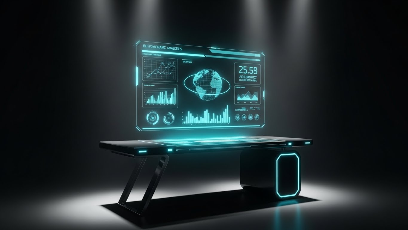
Introduction: Visualizing the Infrastructure of Trust
The global credit reporting landscape is undergoing a tectonic shift. As the credit risk rating software market is projected to reach USD 6.16 billion by 2032, the pressure on furnishers to provide accurate, real-time data is at an all-time high. We are moving from an era of static, monthly batch files to a dynamic landscape of API-driven disputes and instant validation.
However, for many institutional lenders and fintechs, a "Physical/Digital Divide" remains. Legacy mainframes, opaque algorithms, and dense regulations create an operational bottleneck. The cost of this friction is measurable: operational data indicates that employee hours spent on compliance rose 61% between 2016 and 2023. This statistic underscores a critical narrative: legacy processes are not just slow; they are becoming sustainably expensive.
For SaaS platforms in this space, the challenge is articulation. How do you visualize the accuracy of a tradeline? How do you demonstrate the logic of a Metro 2® validation engine without showing boring code? This guide presents a strategic visual framework to solve these challenges. By utilizing 30 expert-curated video styles, you can bridge the gap between complex backend compliance and the intuitive clarity your buyers demand.
1. Abstract 2D flat vector organic
TOFU | Brand Awareness

The Visual & Narrative Approach
This style utilizes a "Clean Modern" aesthetic to simplify the concept of data aggregation. The central "Data Orb," composed of interlocking Vivid Cyan and Pure White geometries, serves as a metaphor for the "Single Source of Truth." By showing organic lines (data streams from LOS, CRM, and Servicing) flowing seamlessly into this organized sphere against a Slate Grey background, we visually resolve the chaos of fragmented data into a unified, coherent whole. The soft, ambient lighting suggests a frictionless process.
Psychological Impact & KPI Focus
- Niche Psychology: Furnishers often feel overwhelmed by "Data Sprawl"—the anxiety of having consumer data scattered across siloed systems. This visual triggers a sense of relief by demonstrating order and containment.
- Operational Impact: It visually answers the question, "Where is my data?" by showing it all converging into one secure, accessible location.
Strategic Implementation & Trade-offs
- Best Use Case: 15-second Social Ads (LinkedIn) targeting C-level executives.
- Trade-off: This style is excellent for concepts but poor for showing features. Use it to sell the "Why," not the "How."
Companies using similar video content -
Plaid – Data Connectivity – Aggregates financial data from disparate sources.
MX – Data Aggregation Platform – Connects and cleanses financial data streams.
Finicity – Data Access & Insights – Provides unified financial data for insights.
2. Isometric 2D Motion Design
TOFU | Market Education
The Visual & Narrative Approach
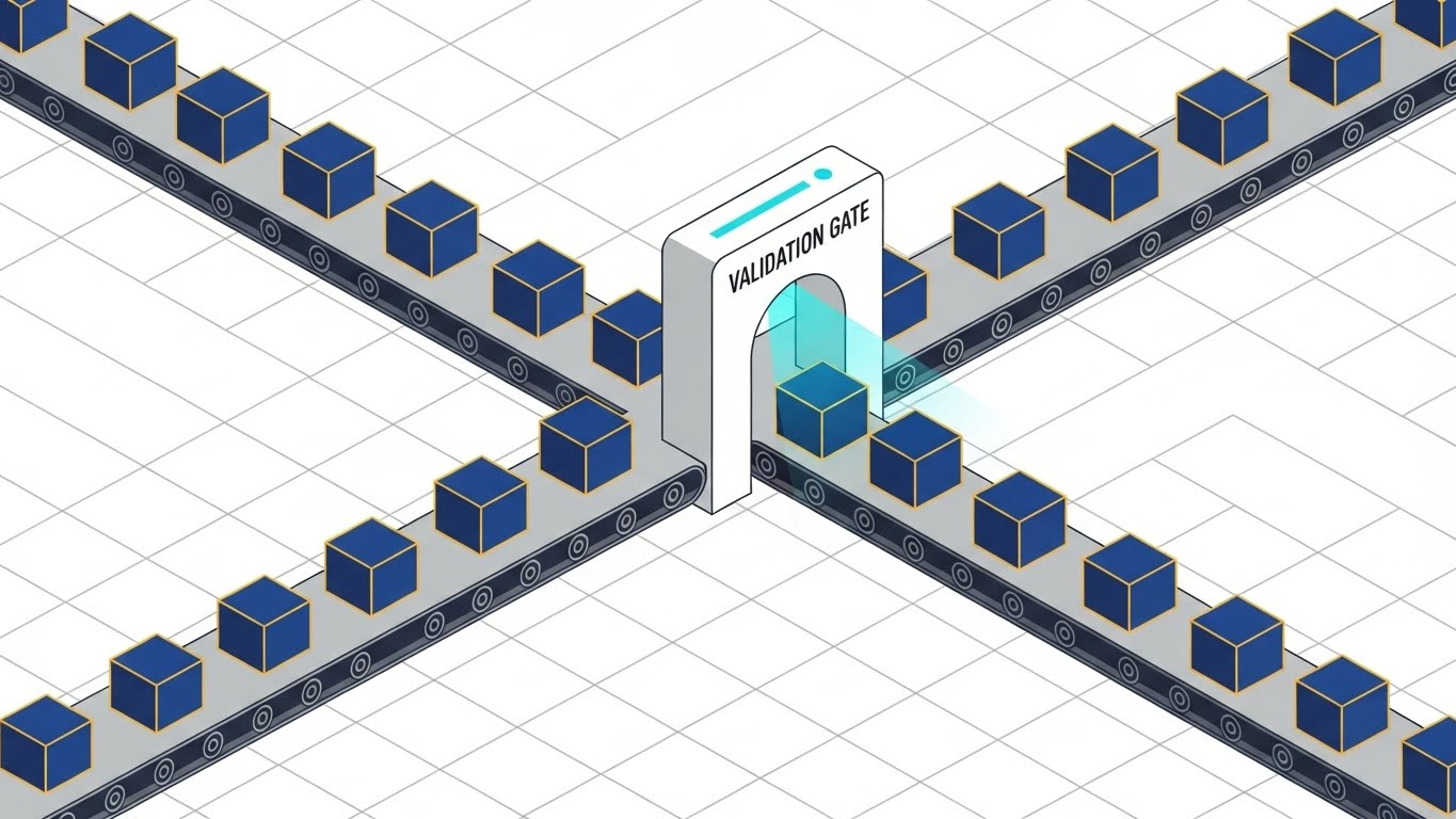
We employ a "Factory Metaphor" to visualize the invisible process of data validation. The isometric grid provides a sense of engineering precision. As Navy Blue cubes (data packets) with Gold outlines travel along conveyor belts, they pass through a "Validation Gate" that scans them with a beam of light. This visually demonstrates the "filtering" of Metro 2® errors before they reach the bureau. The aesthetic is technical but simplified, stripping away noise to focus on the workflow.
Psychological Impact & KPI Focus
- Niche Psychology: The fear of "bureau rejection" (e-OSCAR errors) is high. This visual reassures the viewer that a mechanism is in place to catch errors automatically.
- Operational Impact: It directly illustrates the "Sanitization" process, bridging the gap between raw input and compliant output.
Strategic Implementation & Trade-offs
- Best Use Case: 30-second YouTube Pre-roll ads explaining the "Quality Control" aspect of the software.
- Trade-off: Isometric art can feel "cartoony" if not executed with sharp lines. Ensure the color palette remains professional to avoid looking like a mobile game.
Companies using similar video content -
Aklero – Metro 2 Compliance Software – Automates data validation for credit reporting.
Credit Bureau Connection (CBC) – Credit Reporting Solutions – Validates and formats data for bureaus.
MeridianLink – LoansPQ – Streamlines loan origination with data validation.
3. Generative AI cinematic video
TOFU | Shaping Brand Perception

The Visual & Narrative Approach
This high-budget cinematic style dramatizes the value of data refinement. We see a chaotic field of jagged "Data Asteroids" in Deep Sapphire being pulled into a glowing tunnel. Inside, the friction of the process smooths them into perfect, luminescent spheres. The camera’s slow, heroic push-in towards the monolithic "Bureau Towers" frames your software as the essential gateway to the industry. The visual metaphor creates a sense of awe and destiny.
Psychological Impact & KPI Focus
- Niche Psychology: It elevates the mundane task of "reporting" into a heroic act of "asset protection." It appeals to the aspiration of the decision-maker to be a modernizer.
- Operational Impact: Metaphorically represents the transition from "Unstructured Legacy Data" to "Standardized Tradelines."
Strategic Implementation & Trade-offs
- Best Use Case: CTV/OTT ads or Event Openers where emotional impact takes precedence over technical detail.
- Trade-off: High production value sets high expectations. The software UI must live up to this "futuristic" promise.
Companies using similar video content -
Zest AI – AI-Powered Credit Underwriting – Transforms raw data into refined credit decisions.
Scienaptic AI – AI Credit Decisioning Platform – Elevates lending with advanced data processing.
Upstart – AI Lending Platform – Drives cinematic transformation in personal lending.
4. Abstract 3D AI Visualization
TOFU | Category Creation

The Visual & Narrative Approach
Set in a pristine Mint Green and Charcoal void, this style uses "Glassmorphism" to depict intelligence. The central "Neural Node" acts as the brain, sending fiber-optic pulses to floating "Document Icons." Upon contact, these documents instantly transmute into glowing "Check-Shapes." This visualizes the speed of AI-driven compliance checks and the seamless connectivity of the API.
Psychological Impact & KPI Focus
- Niche Psychology: Compliance officers fear "manual review bottlenecks." This implies that the review process is instantaneous and automated.
- Operational Impact: Visualizes the "Physical/Digital Bridge" by showing the literal transformation of a document icon (paper) into a digital verification (check).
Strategic Implementation & Trade-offs
- Best Use Case: Website Hero Backgrounds or "Why Us" section headers.
- Trade-off: Abstract 3D can be vague. Captions are critical to explain that the "node" represents the software's AI engine.
Companies using similar video content -
Socure – Identity Verification Platform – AI-driven instant identity and fraud checks.
Alloy – Identity Decisioning Platform – Uses AI to verify identities and prevent fraud.
5. AI generated mixed media video
TOFU | Vertical Social Organic

The Visual & Narrative Approach
This style embraces the chaotic energy of social feeds by blending textures. We start with a tactile, paper "Credit Report" cutout in Amber tones—representing the "Old Way." As it flies through the air, it explodes into a cloud of Teal polygons that reassemble into a sleek, Matte Black 3D shield. This dynamic "Explosion/Reassembly" technique visually narrates the disruption of legacy processes.
Psychological Impact & KPI Focus
- Niche Psychology: Targets the younger generation of fintech founders who view legacy bureaus as "dinosaurs." It positions your tool as the "disruptor."
- Operational Impact: The "Shield" metaphor reinforces data security and FCRA compliance without using generic padlock icons.
Strategic Implementation & Trade-offs
- Best Use Case: 15-second Vertical Video (9:16) for organic social reach.
- Trade-off: The "grunge" aesthetic must be carefully balanced so it doesn't look "unprofessional" to conservative banking clients.
Companies using similar video content -
DataVerify – Fraud & Risk Mitigation – Disrupts traditional fraud detection with modern tools.
LexisNexis Risk Solutions – Risk Management Solutions – Transforms legacy risk assessment processes.
6. Bold Kinetic Typography (Visual)
TOFU | Skippable Pre-Roll Ad

The Visual & Narrative Approach
This is a high-energy visual assault on "Compliance Fatigue." We don't read the text; we feel it. Massive Hot Pink blocks (representing burdens/regulations) slam into the frame, creating a sense of heaviness. Suddenly, a sleek Kinetic White arrow (your software) pierces through, shattering the blocks into dust. The Vibrant Purple background keeps the energy electric.
Psychological Impact & KPI Focus
- Niche Psychology: Taps into the frustration of "red tape." The shattering effect provides a visceral dopamine hit of "problem solved."
- Operational Impact: Represents the "Speed to Market." While others are blocked by regulations, your users smash through them.
Strategic Implementation & Trade-offs
- Best Use Case: 6-second YouTube Bumper Ads.
- Trade-off: Extremely fast-paced. Not suitable for conveying complex value propositions; purely for capturing attention.
Companies using similar video content -
ComplyAdvantage – AI-driven AML Compliance – Breaks down complex regulatory hurdles efficiently.
Verafin – Financial Crime Management – Accelerates detection, shatters financial crime.
7. Isometric 3D Workflow
MOFU | Demand Gen

The Visual & Narrative Approach
Moving into the middle of the funnel, we need to show how it works. This clay-render style shows a "Data Factory Floor." Small, precise robotic arms pick up Emerald Green (valid) and Stark White (dispute) cubes, placing them into designated slots on a grid floor. The lighting is soft and shadowless. It transforms the abstract concept of "Dispute Resolution Codes" into a tangible, mechanical sorting process.
Psychological Impact & KPI Focus
- Niche Psychology: Operational managers love "Order." This visual promises that your software brings order to the chaos of consumer disputes.
- Operational Impact: Visualizes "Automated Decisioning." It shows that human intervention is only needed for exceptions, reducing cognitive load.
Strategic Implementation & Trade-offs
- Best Use Case: Display Ads (1:1) or Email headers for "Product Feature" newsletters.
- Trade-off: Can look generic if not branded. Ensure the "Green" matches your brand's "Success/Valid" color exactly.
Companies using similar video content -
e-OSCAR – Credit Dispute Resolution – Manages and sorts consumer credit disputes precisely.
Credit Technologies – Credit Reporting Software – Automates dispute processing workflows efficiently.
8. Split Screen: Reality and UI
MOFU | Product Differentiation

The Visual & Narrative Approach
This style uses a sharp contrast to sell the "Before and After." The Left side is "The Nightmare": a desaturated, sepia-toned photo of a desk cluttered with paper files (The Old Way). The Right side is "The Dream": a pristine, high-tech workspace with a monitor displaying a clean, Vivid Cyan and Charcoal UI dashboard (The New Way). The dividing line is a sharp diagonal slash.
Psychological Impact & KPI Focus
- Niche Psychology: FOMO (Fear Of Missing Out). It forces the viewer to identify with the "Old Way" and yearn for the "New Way."
- Operational Impact: Directly compares "Manual Entry" (Left) with "Real-Time Dashboarding" (Right), highlighting the efficiency gap.
Strategic Implementation & Trade-offs
- Best Use Case: Landing Page Hero Sections or "Comparison" case studies.
- Trade-off: Avoid making the "Old Way" look too exaggerated/fake. It needs to look like a realistic pain point.
Companies using similar video content -
nCino – Bank Operating System – Contrasts legacy banking with modern digital platform.
Blend – Digital Lending Platform – Shows transformation from manual to digital lending.
9. Clean UI Workflow (Light Mode)
MOFU | Feature Education
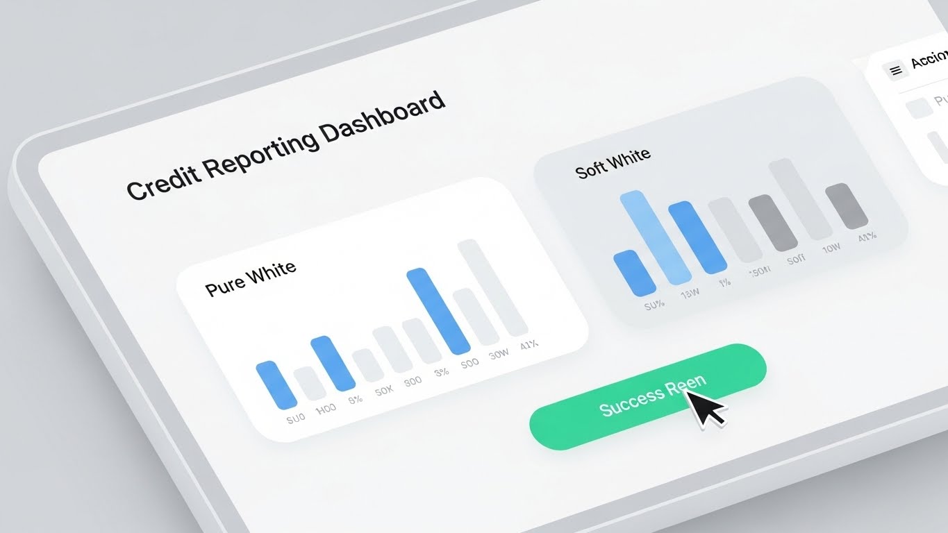
The Visual & Narrative Approach
Here, we strip away the metaphors and show the product. The focus is on "White Space" and "Readability." We see a close-up of a dashboard with Pure White cards, Light Blue data bars, and Soft Grey text. A cursor hovers and clicks a Success Green button ("Submit Report"). The lack of clutter suggests that the software handles the complexity in the background.
Psychological Impact & KPI Focus
- Niche Psychology: Compliance tools are notoriously ugly and complex. This "Consumer-Grade UI" signals that the tool is easy to learn (Low Training Overhead).
- Operational Impact: Visualizes "User Experience." It promises that a junior analyst can operate the system without extensive training.
Strategic Implementation & Trade-offs
- Best Use Case: Website "Features" page or Product Demo Videos.
- Trade-off: Must be an accurate representation of the actual UI. If your real UI is dark/cluttered, this will create a "False Promise."
Companies using similar video content -
Provenir – AI-Powered Risk Decisioning – Features a clean, intuitive decisioning interface.
Amount – Digital Lending Platform – Showcases user-friendly digital loan origination experience.
10. Wireframe to Reality Transition
MOFU | Competitive Displacement

The Visual & Narrative Approach
This transition style is perfect for "Migration" stories. We see a diagonal wipe. Top-Left is a technical Blueprint Blue wireframe grid of a bridge structure. Bottom-Right is the final, photorealistic 3D render of the same structure in sleek Chrome and Glass materials. This visualizes the "Build vs. Buy" or "Legacy vs. Modern" decision.
Psychological Impact & KPI Focus
- Niche Psychology: CTOs worry that new software is "vaporware." This visual anchors the concept in "structural engineering," implying stability and robustness.
- Operational Impact: Represents "System Architecture." It shows that the foundation (wireframe) is sound, and the execution (render) is polished.
Strategic Implementation & Trade-offs
- Best Use Case: LinkedIn carousel posts targeting CTOs/Engineers.
- Trade-off: Requires high-quality 3D assets. A poor render will make the "Reality" look cheap.
Companies using similar video content -
Temenos – Core Banking Platform – Visualizes modernizing core banking infrastructure seamlessly.
Finastra – FusionFabric.cloud – Shows building financial services on a robust platform.
11. Dynamic Data Visualization
MOFU | LinkedIn Organic

The Visual & Narrative Approach
This style abandons the static nature of spreadsheets for a kinetic display of value. Set in a pristine White abstract space, we see a "Heads Up Display" interface made of glass and light. Emerald Green and Gold 3D cylindrical bars don't just exist; they grow rapidly upwards, driven by the underlying software engine. This dynamic animation transforms the concept of "Data Monetization" and "Correction Efficiency" into a visceral, upward trajectory.
Psychological Impact & KPI Focus
- Niche Psychology: CFOs and Revenue Officers often view compliance as a "Cost Center." This visual reframes the software as a "Profit Protector" by visualizing the recovery of lost revenue through better dispute management.
- Operational Impact: Directly links "Data Quality" to "Revenue Growth," showing that cleaner data leads to higher approval rates and fewer operational penalties.
Strategic Implementation & Trade-offs
- Best Use Case: LinkedIn organic posts with captions focusing on "The ROI of Clean Data."
- Trade-off: Focuses heavily on the result (money/growth), not the process. It needs accompanying text to explain how the software achieves this growth.
Companies using similar video content -
FICO – Enterprise Security Suite – Visualizes fraud detection and risk reduction dynamically.
SAS – Risk Management for Banking – Displays dynamic analytics for portfolio growth.
12. 2D Character-Driven Story
MOFU | Overcoming Objections

The Visual & Narrative Approach
To address the anxiety of the everyday user, we use a friendly, flat 2D vector style. A professional analyst wearing a Soft Blue blouse sits at a clean, organized desk, smiling comfortably. A thought bubble above her reveals a geometric "Shield" icon, representing the psychological safety net the software provides. The Pale Blue and Soft Grey palette creates a calming atmosphere, contrasting sharply with the high-stress reality of manual reporting.
Psychological Impact & KPI Focus
- Niche Psychology: Data analysts live in fear of making a "Metro 2® formatting error" that triggers a regulatory audit. This visual validates their desire for a safety net that catches mistakes before they leave the desktop.
- Operational Impact: Humanizes the "Validation" feature. It’s not just code; it’s a guardian that allows the user to work with confidence and reduced stress.
Strategic Implementation & Trade-offs
- Best Use Case: "About Us" section on the website or introductory training videos.
- Trade-off: This style can appear "lightweight" to technical buyers. It is best used to influence the end-user (Influencer Persona) rather than the final decision-maker (Economic Buyer).
Companies using similar video content -
Wolters Kluwer – Compliance Solutions – Empowers users with regulatory confidence and safety.
Compliance Systems – Compliance Management – Provides peace of mind for regulatory adherence.
13. Futuristic Neon/Dark Mode
MOFU | Building Trust

The Visual & Narrative Approach
Security in credit reporting is non-negotiable. This style utilizes a "Dark Mode" aesthetic associated with cybersecurity and OPS-centers. A central padlock, constructed from glowing Neon Green and Midnight Blue laser lines, dominates the frame against a circuit-board void. It visually communicates "Military-Grade Encryption" and "SOC 2 Compliance" without needing a single word of text. The bloom effects suggest power and active monitoring.
Psychological Impact & KPI Focus
- Niche Psychology: Taps into the deep-seated fear of data breaches and PII leaks. The "Cyberpunk" aesthetic signals that the platform is ahead of the threat curve.
- Operational Impact: Visualizes "Data Sovereignty" and security protocols. It reassures the viewer that the infrastructure is robust enough to handle millions of sensitive consumer records.
Strategic Implementation & Trade-offs
- Best Use Case: The "Security" or "Trust Center" page of your website.
- Trade-off: The dark aesthetic can feel "ominous" if not balanced with clear, reassuring messaging. Avoid making it look too much like a hacker's terminal.
Companies using similar video content -
NICE Actimize – Financial Crime & Compliance – Showcases advanced security and monitoring capabilities.
Refinitiv – Risk & Compliance Solutions – Highlights secure data and financial crime prevention.
14. 3D X-Ray Visualization
MOFU | Risk Mitigation
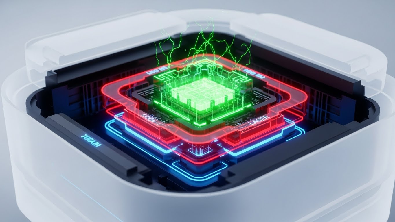
The Visual & Narrative Approach
For the technical due diligence team, surface-level visuals aren't enough. This style uses an "X-Ray" cutaway to reveal the internal sophistication of the platform. Through a Translucent White casing, we see the glowing "Data Core"—the engine processing disputes and updates. Surrounded by protective layers of Laser Red (firewall) and Cool Blue (validation), it visualizes the depth of the architecture.
Psychological Impact & KPI Focus
- Niche Psychology: CTOs and IT Directors are skeptical of "black box" solutions. This visual metaphor implies transparency and architectural soundness.
- Operational Impact: Demonstrates "System Integrity" and the multi-layered approach to data processing, differentiating your solution from superficial "wrapper" applications.
Strategic Implementation & Trade-offs
- Best Use Case: Whitepapers or Technical Specification sheets.
- Trade-off: High production cost. Requires a clear understanding of what the "internal components" represent metaphorically (e.g., API layer, Storage layer).
Companies using similar video content -
S&P Global Market Intelligence – Credit Risk Solutions – Reveals deep insights into credit architecture.
Moody's Analytics – Risk & Finance Solutions – Explores the core of financial risk models.
15. Generative AI Realistic Character
MOFU | Functional Buyer

The Visual & Narrative Approach
This style targets the emotional state of the decision-maker. We see a photorealistic cinematic shot of a male Chief Risk Officer (CRO) in a high-end office. He isn't stressed; he is smiling with genuine relief as he views a floating holographic tablet. The lighting is Warm Beige and Navy, contrasting with the cold corporate norm. This sells the feeling of having the problem solved—the "Peace of Mind" that comes with compliance.
Psychological Impact & KPI Focus
- Niche Psychology: Senior executives carry the weight of regulatory liability. This visual reflects their desired state: control, visibility, and the absence of surprises.
- Operational Impact: Represents "Executive Oversight." It shows that the data is accessible, digestible, and ready for board-level presentation at a moment's notice.
Strategic Implementation & Trade-offs
- Best Use Case: Customer Testimonial videos or "Our Vision" YouTube content.
- Trade-off: Navigating the "Uncanny Valley." The AI generation must be flawless; otherwise, the facial expressions will look unnatural and erode trust.
Companies using similar video content -
Experian – Ascend Analytical Platform – Empowers executives with strategic data insights.
TransUnion – CreditVision Link – Provides comprehensive view for executive decision-making.
16. Minimalist Flat 2D Vector
BOFU | ROI Justification

The Visual & Narrative Approach
Sometimes, the strongest message is the simplest. Using Electric Blue and White, this style depicts a complex, tangled knot (Legacy Processes/Spaghetti Code) effortlessly untying itself to form a straight, upward-trending line. It is a visual haiku: Chaos Order. The lack of gradients or noise focuses the eye entirely on the transformation.
Psychological Impact & KPI Focus
- Niche Psychology: Buyers are exhausted by complexity. They don't want more features; they want less friction. This visual promises an "Easy Button."
- Operational Impact: Visualizes "Workflow Optimization." It asserts that the software doesn't just manage the mess; it eliminates it, streamlining the path from data entry to bureau acceptance.
Strategic Implementation & Trade-offs
- Best Use Case: Email signatures or "Quick Win" slide decks.
- Trade-off: It is abstract. It works best when paired with a hard stat, e.g., "Reduce dispute processing time by 40%."
Companies using similar video content -
Creditinfo – Credit Bureau Solutions – Simplifies complex credit reporting processes radically.
CRIF – Credit Management Solutions – Streamlines credit decisions and operations effortlessly.
17. Hyper-lapse Stock Footage + Data
BOFU | Sales Cycle Acceleration

The Visual & Narrative Approach
To sell "Speed," we anchor the software in the real world. A hyper-lapse of a city at night captures the kinetic energy of commerce. Overlaid on this organic blur are sharp, Bright Green digital data streams and City Light Gold binary rain. This connects the abstract concept of "Credit Reporting" to the pulse of the real economy—loans being approved, cars being bought, lives moving forward.
Psychological Impact & KPI Focus
- Niche Psychology: Lenders are in a race. Slow data means lost loans. This visual triggers FOMO (Fear Of Missing Out) on the speed of the market.
- Operational Impact: Visualizes "Real-Time Processing." It positions the software as the high-speed rail of data, compared to the horse-and-buggy of monthly batch files.
Strategic Implementation & Trade-offs
- Best Use Case: Social Media Ads (Instagram/LinkedIn) targeting Fintech founders.
- Trade-off: Can look generic if the "Data Overlay" isn't specific enough. Ensure the code/data looks relevant to finance (e.g., FICO scores, dollar signs).
Companies using similar video content -
Truework – Income & Employment Verification – Provides high-speed, real-time data verification.
Argyle – Payroll Data API – Delivers real-time income and employment data rapidly.
18. Lifestyle Stock with UI Overlay
BOFU | Objection Handling

The Visual & Narrative Approach
"How long will it take to implement?" is a common objection. This style answers it. We see a high-quality stock photo of colleagues collaborating under Natural Sunlight. Superimposed is a crisp, vector Vibrant Teal "Progress Bar" hitting 100%. This blends social proof (people working happily) with a specific interface element that signals completion and success.
Psychological Impact & KPI Focus
- Niche Psychology: Fear of "Implementation Hell." Buyers worry about 12-month integration cycles. This visual subliminally suggests a swift, painless setup.
- Operational Impact: Visualizes "Time-to-Value." It suggests that the software is ready to deploy and that teams will be up and running (the 100% bar) quickly.
Strategic Implementation & Trade-offs
- Best Use Case: Retargeting ads for users who visited the pricing page but didn't convert.
- Trade-off: The stock photo must look authentic, not "cheesy corporate." The lighting should be natural to contrast with the digital overlay.
Companies using similar video content -
Fiserv – DNA Core Banking – Depicts seamless implementation for banking teams.
Oracle – Financial Services Applications – Shows teams achieving rapid project completion.
19. 3D Parallax UI Presentation
BOFU | Driving Demo Requests

The Visual & Narrative Approach
When driving the final demo request, we need to show the "Full Suite." This style uses 3D space to float multiple translucent glass UI screens in a Gradient Blue and Purple palette. The camera tilts, creating a parallax effect that reveals the depth of the platform—showing that behind the simple dashboard lies a robust reporting engine. The focus pulls to a "Play" button widget, subtly guiding the user to action.
Psychological Impact & KPI Focus
- Niche Psychology: Validates the "Premium" price point. The sophisticated presentation signals that this is an enterprise-grade solution, not a cheap plugin.
- Operational Impact: Visualizes "Modularity." It implies that the system is composed of multiple, integrated modules (Disputes, Validation, Furnishing) working in harmony.
Strategic Implementation & Trade-offs
- Best Use Case: The primary "Book a Demo" landing page or the final seconds of a product video.
- Trade-off: Text on the rear screens will be blurry (bokeh). Put the most critical call-to-action or data point on the front-most screen.
Companies using similar video content -
SAP – Financial Services Solutions – Presents a multi-layered view of financial operations.
IBM – Financial Crimes Insight – Showcases comprehensive analytics and control dashboards.
20. Low-Poly 3D Modeling
BOFU | Competitive Comparison

The Visual & Narrative Approach
In the final competitive push, we use a stark, playful comparison. A sleek, Matte Black race car (Your Software) zooms effortlessly past a clunky, blocky Grey vehicle (Legacy Competitors/Internal Spreadsheets) on a neon digital highway. The Primary Blue, Red, and Yellow accents emphasize the competitive dynamic. This simple, gamified visual communicates "Speed" and "Modernity" instantly.
Psychological Impact & KPI Focus
- Niche Psychology: Competitiveness. No lender wants to be left behind. This visual frames the choice not as "Option A vs. Option B," but as "Fast vs. Slow."
- Operational Impact: Visualizes "Processing Speed" and "Market Agility." It shows that while the competition is clunking along with manual updates, your client is accelerating.
Strategic Implementation & Trade-offs
- Best Use Case: Display Ads (Google Display Network) where quick visual comprehension is necessary.
- Trade-off: It is aggressive. Ensure your software actually is faster, or this visual will backfire during the demo phase.
Companies using similar video content -
Zest AI – Credit Underwriting Platform – Outperforms traditional credit scoring models rapidly.
Scienaptic AI – AI Credit Decisioning – Accelerates past legacy decisioning systems effectively.
21. 2D Animation & UI Composition
Onboard | Self-Serve Onboarding

The Visual & Narrative Approach
Onboarding is where the promise of the sales cycle meets reality. To bridge the gap between user and interface, this style blends a flat, illustrative character element—a hand with a Royal Purple sleeve—interacting directly with a semi-3D UI element. The background is a soothing Pastel Coral and Soft Blue abstract desk surface. The hand physically points to a glowing "tooltip" bubble featuring an information icon. This "Fourth Wall" break—where a character interacts with the UI—creates a friendly, guided experience that feels like a personal walkthrough rather than a dry tutorial.
Psychological Impact & KPI Focus
- Niche Psychology: New users often feel "Dashboard Paralysis" when facing a complex compliance suite. This visual style acts as a digital shepherd, reducing anxiety by directing attention precisely where it’s needed.
- Operational Impact: Visualizes "Self-Serve Capability." It reinforces the idea that the platform is intuitive enough to be mastered without calling a support technician, directly impacting "Time-to-Competency."
Strategic Implementation & Trade-offs
- Best Use Case: In-app "Welcome" modals or "New Feature" walkthroughs.
- Trade-off: The hand/character style must match your brand guidelines. If your brand is strictly corporate, use a realistic hand or a cursor instead.
Companies using similar video content -
Credit Repair Cloud – Credit Repair Software – Guides users through credit repair processes.
DisputeSuite – Dispute Management Software – Provides interactive onboarding for dispute resolution.
22. Rapid UI Feature Montage
Onboard | Time-to-Value
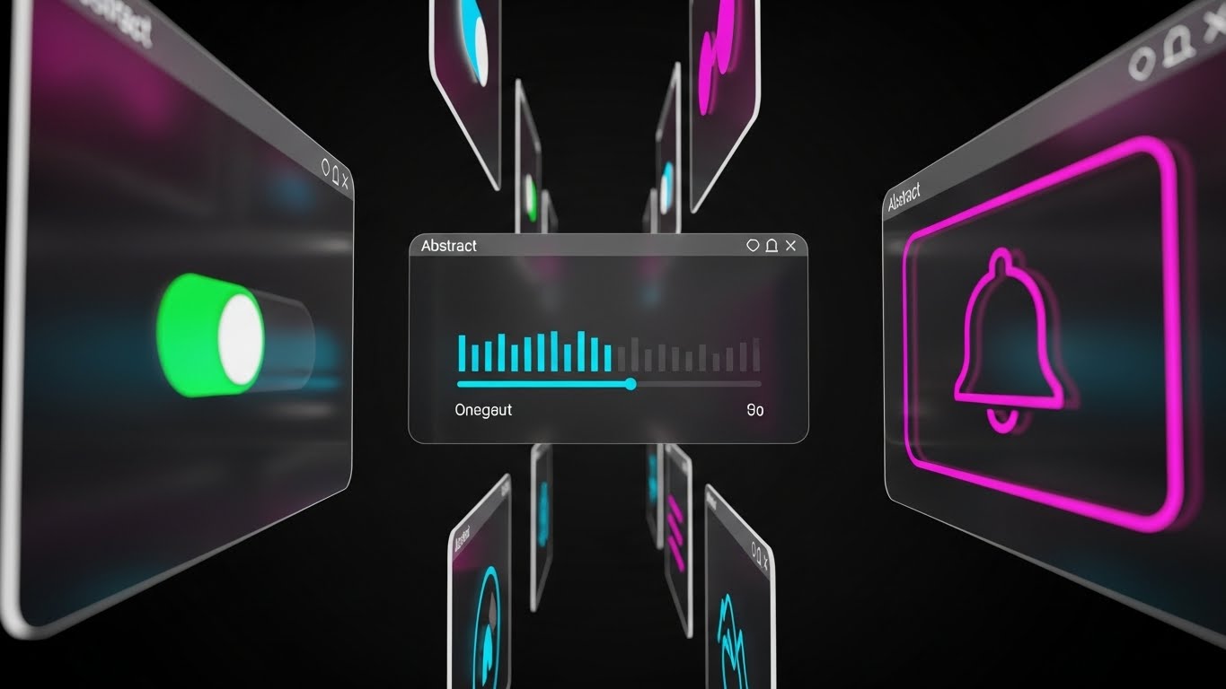
The Visual & Narrative Approach
To combat buyer's remorse, we need to show speed and breadth. This style features a high-energy montage of abstract UI screens floating in Z-space, utilizing a Vibrant Violet, Cyan, and White palette. The camera zooms through "portals" in the screens, each revealing a different micro-interaction: a toggle turning green (Activation), a progress bar filling (Completion), and a notification bell ringing (Alert). The motion blur and depth of field create a sense of forward momentum and comprehensive utility.
Psychological Impact & KPI Focus
- Niche Psychology: Operations Managers fear that new software will slow their teams down. This "Feature Blitz" overwhelms the skepticism center by showing the sheer volume of tools available at their fingertips.
- Operational Impact: Visualizes "System Throughput." It argues that this is not a point solution, but a complete ecosystem for credit reporting management capable of high-volume processing.
Strategic Implementation & Trade-offs
- Best Use Case: Post-purchase "Getting Started" emails or hype reels for user conferences.
- Trade-off: The pace is too fast for education. Use it to build excitement, not to teach specific mechanics.
Companies using similar video content -
Calyx Software – PointCentral – Showcases rapid UI features for loan origination.
Byte Software – BytePro – Provides quick feature overview for mortgage professionals.
23. Dark Mode UI Showcase
Onboard | Implementation Friction

The Visual & Narrative Approach
Targeting the technical implementers, this style speaks the language of code. We see a sleek Dark Grey code editor environment. Syntax highlighting in Vibrant Neon Pink, Electric Blue, and Yellow makes the API calls pop. A central "Success" modal glows in Neon Green, confirming a secure handshake. This is not about the front-end dashboard; it is about the backend elegance. It validates the developer's preference for clean, documented, and modern code structures.
Psychological Impact & KPI Focus
- Niche Psychology: Developers are the gatekeepers of implementation. If they think the API is messy, the project stalls. This visual signals a "Developer-First" architecture.
- Operational Impact: Visualizes "Interoperability." It shows that your system plays nicely with their existing stack (LOS, Core Banking Systems), reducing the perceived technical debt of adoption.
Strategic Implementation & Trade-offs
- Best Use Case: API Documentation headers, Developer Portal intros, or technical onboarding PDFs.
- Trade-off: It is alienating to non-technical buyers. Use strictly for the technical audience segment (CTO/Engineering Leads).
Companies using similar video content -
Experian Developer Portal – API Documentation – Showcases API integration for developers.
TransUnion Developer Portal – API Services – Highlights clean code for seamless data access.
24. Macro UI Micro-Interactions
Retain | Reducing Support Overhead

The Visual & Narrative Approach
Retention is built on the small moments of delight. This style uses a macro lens (100mm equivalent) to focus intensely on a single UI element: a toggle switch sliding from grey to a vivid, glowing Neon Teal. The extreme close-up reveals the texture of the pixels, grounding the digital tool in reality. It elevates a mundane action—like turning on "Auto-Dispute"—into a significant, tactile event.
Psychological Impact & KPI Focus
- Niche Psychology: Ambiguity breeds errors. This visual style eliminates ambiguity, giving the user absolute certainty about the state of their system (e.g., "Is the batch submission live?").
- Operational Impact: Visualizes "Automation Ease." It shows that complex background processes (like Metro 2® validation) can be engaged with a simple, decisive flick of a switch.
Strategic Implementation & Trade-offs
- Best Use Case: "Feature Spotlight" social posts or in-app tooltips explaining new settings.
- Trade-off: Lacks context. It must be paired with text explaining what the switch does.
Companies using similar video content -
Alteryx – Analytic Process Automation – Focuses on precise control over data workflows.
Informatica – Data Management Cloud – Emphasizes granular control in data governance.
25. Holographic UI over 3D Render
Retain | Reducing Churn
The Visual & Narrative Approach
To retain premium clients, you must demonstrate ongoing value. This style places a Holographic Cyan dashboard hovering above a high-end, futuristic desk in a sterile, white-tiled laboratory setting. The hologram projects rotating globes and complex charts upwards. It suggests that the software isn't just a reporting tool; it's a "Command Center" for global credit risk analysis. The physical desk anchors the hologram, making the advanced analytics feel grounded and attainable.
Psychological Impact & KPI Focus
- Niche Psychology: Executives want to feel they are at the cutting edge. This visual appeals to the "Visionary" self-image, positioning them as the commander of their data universe.
- Operational Impact: Visualizes "Data Visibility." It shifts the perception of the software from "Utility" (reporting data) to "Strategic Asset" (analyzing trends).
Strategic Implementation & Trade-offs
- Best Use Case: "Quarterly Business Review" presentations or "New Feature" announcements for existing customers.
- Trade-off: The holographic effect must be readable. Avoid too much transparency, or the data becomes illegible against the background.
Companies using similar video content -
IBM – Watson Financial Services – Projects advanced analytics for strategic oversight.
Oracle – Fusion Cloud ERP – Displays holographic insights for enterprise command.
26. Abstract 2D Motion Graphics
Retain | Visitor Re-engagement

The Visual & Narrative Approach
Re-engagement requires visual disruption. This style uses Organic Green and Liquid Gold shapes that merge and separate like a digital lava lamp on a white void. The movement is hypnotic and fluid, eventually morphing into a solid sphere. This metaphor speaks to the software's ability to adapt to changing regulations and "absorb" new data requirements without breaking the system.
Psychological Impact & KPI Focus
- Niche Psychology: Compliance is often seen as rigid and brittle. This visual suggests "Resilience" and "Flexibility," reassuring clients that regulatory changes won't break their workflow.
- Operational Impact: Visualizes "Agile Compliance." It represents the software's capability to fluidly handle updates (like new FCRA rules) without requiring a hard reset.
Strategic Implementation & Trade-offs
- Best Use Case: Display Retargeting Ads for users who haven't logged in for 30 days.
- Trade-off: Purely conceptual. It works best as a "Brand Reminder" rather than a conveyance of specific information.
Companies using similar video content -
Collibra – Data Governance Platform – Visualizes fluid data flow and governance.
Talend – Data Integration & Quality – Shows seamless data movement and transformation.
27. Aspirational Stock Montage
Expan | Deep Feature Adoption

The Visual & Narrative Approach
Expansion comes from selling the result of the software to the leadership. We use high-end stock footage of a female executive in a sun-drenched, glass-walled office (Sunlight Yellow and Sky Blue). She holds a tablet showing a simplified "Growth Graph" facing the camera. She looks out the window, confident. This is not about data entry; it's about the career success and business growth that accurate data enablement provides.
Psychological Impact & KPI Focus
- Niche Psychology: Aspiring C-suite leaders want to be seen as visionaries, not administrators. This visual aligns your software with their personal career trajectory and success.
- Operational Impact: Visualizes "Scalability." It implies that the software handles the details so the executive can focus on the horizon (strategy).
Strategic Implementation & Trade-offs
- Best Use Case: Email campaigns for "Pro Tier" upgrades or Case Study headers.
- Trade-off: Generic stock footage is a risk. Select images with "Tech-forward" styling (modern architecture, tablets) to avoid the "1990s corporate" look.
Companies using similar video content -
FICO – Decision Management Suite – Inspires executives with growth and strategic outcomes.
SAS – Customer Intelligence 360 – Connects data insights to business growth.
28. Photorealistic 3D Renders
Expan | Upsell/Cross-sell

The Visual & Narrative Approach
When upselling a "Pro" or "Enterprise" tier, the visual must scream luxury and value. We use a photorealistic render of a Gold and Brushed Steel credit card/access pass floating in a Marble White zero-gravity studio. Glowing Neon Pink and Blue data nodes orbit it like satellites. The lighting highlights the texture of the metal. This makes the intangible software service feel like a tangible, premium asset that the user wants to possess.
Psychological Impact & KPI Focus
- Niche Psychology: Exclusivity. The "Gold Card" is a universal symbol of status and access. It triggers the desire to upgrade to the "Best" version.
- Operational Impact: Visualizes "Tiered Access." The orbiting nodes represent the additional features (API calls, dedicated support) unlocked at this level.
Strategic Implementation & Trade-offs
- Best Use Case: Pricing Page "Enterprise" column or specific "Upgrade Now" landing pages.
- Trade-off: Must be rendered at extremely high resolution. Any pixelation ruins the "Premium" illusion.
Companies using similar video content -
CRIF – Digital Onboarding Solutions – Presents premium, seamless customer experiences.
Creditinfo – Decision Analytics – Showcases high-value, exclusive data insights.
29. 2D Graphics Over Live Action
Expan | Referrals & Advocacy

The Visual & Narrative Approach
Referrals are built on trust. We see a professional handshake in a live-action office setting. Superimposed is a glowing Teal vector lock that snaps shut over the hands, accompanied by floating White network nodes. This visual combination of human agreement and digital security perfectly encapsulates the B2B referral dynamic: "I trust this platform enough to recommend it to my network."
Psychological Impact & KPI Focus
- Niche Psychology: Reputation risk. People only refer products that won't embarrass them. The "Lock" symbol reinforces that this recommendation is safe and secure.
- Operational Impact: Visualizes "Network Effects." It suggests that joining the platform connects you to a broader ecosystem of secure, compliant lenders.
Strategic Implementation & Trade-offs
- Best Use Case: Referral Program landing pages or "Thank You" emails after a high NPS score.
- Trade-off: Ensure the motion tracking is perfect. If the lock "slips" off the handshake, it looks amateurish.
Companies using similar video content -
Fenergo – Client Lifecycle Management – Visualizes trusted partnerships and secure onboarding.
Regnology – Regulatory Reporting – Emphasizes secure, compliant collaborations.
30. 2D Line Art Animation
Expan | Proactive Support

The Visual & Narrative Approach
For the final stage of long-term loyalty, we strip everything back to elegance. A continuous Monoline Black line draws a complex suspension bridge on a Safety Orange background. The line never breaks; it flows from one side to the other. This minimalist metaphor represents the ongoing, unbroken support and connectivity your platform provides. It is sophisticated, calm, and reliable.
Psychological Impact & KPI Focus
- Niche Psychology: Long-term customers fear "vendor drop-off"—being ignored after the sale. This visual promises continuity and a permanent infrastructure of support.
- Operational Impact: Visualizes "Uptime" and "Reliability." The bridge is a classic symbol of infrastructure; it says, "We are the road you run on."
Strategic Implementation & Trade-offs
- Best Use Case: Blog headers for "Product Updates" or annual "Year in Review" customer emails.
- Trade-off: Minimalism can be boring. The animation must be fluid and graceful to hold attention.
Strategic Knowledge Base: The Visual Operations Doctrine
To transition from a collection of "video styles" to a cohesive business strategy, we must apply a Visual Operations Doctrine. This framework synthesizes the 30 visual examples into three actionable segments, designed to align your visual content with operational goals, adoption velocity, and ROI measurement.
Strategic Alignment & Visual Architecture
The "Pre-Production" Strategy – Why visual consistency matters in Credit Reporting SaaS.
The "Physical/Digital Divide" in credit reporting is not just a technology problem; it is a communication problem. Bridging this gap requires a "Visual Operating System" that aligns every stakeholder, from the CTO to the junior dispute analyst.
- The Cognitive Load Audit: Before commissioning a single video, audit the complexity of your current text manuals. If a Metro 2® validation rule takes 3 paragraphs to explain, it is a candidate for a Style 7 (Isometric 3D Workflow) video to reduce cognitive friction.
- Role-Based Visual Mapping: Differentiate your visual language. Use Style 23 (Dark Mode UI) strictly for Developers/IT Ops to signal technical competence, while using Style 9 (Clean UI) for Operational Analysts to signal ease of use.
- The "Glanceability" Standard: In high-volume dispute centers, analysts don't have time to watch 2-minute videos. Design "Micro-Interaction" loops (Style 24) that convey a single function in 5 seconds—designed for second-monitor viewing.
- Brand Voice Consistency: Your "Compliance Voice" (authoritative, rigid) must visually harmonize with your "Sales Voice" (dynamic, modern). Use a consistent color palette (e.g., Vivid Cyan/Deep Charcoal) across all 30 styles to unify these disparate modules.
- The Advids Strategic Audit: Partner with Advids to define this visual language before production. A mismatch between a "Playful" visual style and a "Serious" regulatory topic can erode trust instantly.
- Standardization vs. Customization: For core regulatory features (e.g., FCRA adherence), use standardized, polished styles (Style 2). For specific custom API integrations, use lower-fidelity, rapid screencasts to save budget without sacrificing clarity.
- The Cross-Departmental Bridge: Use visuals to unify terminology. A "Data Node" (Style 4) should look the same in a Sales deck as it does in a Support ticket, creating a shared visual lexicon between Sales and Ops.
- Legacy Mainframe Integration: Don't hide the legacy reality. Use "Wireframe to Reality" transitions (Style 10) to explicitly visualize how your modern SaaS interface "wraps" and protects their aging mainframe data.
- Accessibility in Compliance: Your users range in age and ability. Ensure all motion graphics (Style 22) adhere to WCAG contrast standards. Motion should clarify, not distract, especially for global teams.
- The Mobile-First Mandate: While heavy work happens on desktops, executive decision-making happens on mobile. Ensure "Abstract" and "Cinematic" styles (Styles 1, 3, 5) are optimized for vertical or square viewing on LinkedIn.
Operational Adoption & Implementation
The "Deployment" Phase – How to embed visuals into the workflow.
Buying software is easy; getting a 50-person compliance team to use it is hard. This segment focuses on using video as a change management tool to accelerate adoption and reduce friction.
- Overcoming "Audit Anxiety": Analysts often fear that new software is a "surveillance tool." Use empathy-driven Character styles (Style 12) to frame the software as a "Shield" that protects them from errors, rather than a tool for management to spy on them.
- The Micro-Learning Shift: Replace the 50-page PDF "Implementation Guide" with a library of 30-second "Feature Montage" clips (Style 22). This allows users to learn exactly what they need, exactly when they need it.
- Just-in-Time Support: Embed specific visual styles directly into the dashboard. A "Validation Gate" animation (Style 2) should appear right next to the "Submit" button, reinforcing the quality check process in real-time.
- Gamification of Training: Use "Level Up" visuals (Style 11) to track training progress. Show users a visual "Progress Bar" (Style 18) filling up as they master different dispute resolution codes.
- Reducing Support Ticket Volume: There is a direct correlation between proactive visual guides and reduced helpdesk load. A "Micro-Interaction" video (Style 24) explaining a complex toggle can eliminate hundreds of "How do I...?" tickets.
- Remote Onboarding: Use "UI Composition" styles (Style 21) to simulate an over-the-shoulder training session. This is critical for scaling onboarding to distributed teams without flying trainers to physical locations.
- Visualizing SOPs: Transform text-based Standard Operating Procedures into "Workflow" animations (Style 7). "If X happens, do Y" is much clearer when visualized as a robotic sorting process than as a bulleted list.
- Feedback Loops: Use interactive video elements. After a "New Feature" video (Style 25), include a simple "Thumps Up/Down" interaction to gather immediate feedback on the feature's clarity.
- Scalable Localization: Credit reporting is becoming global. Use text-free or icon-heavy styles (Style 16) for core concepts, allowing you to easily swap voiceovers or captions for different regions without re-animating.
- Leadership Communication: Use high-end "Cinematic" styles (Style 3) for internal town halls. When the CTO explains the new data strategy, back them up with visuals that match the magnitude of the investment.
Measuring Impact & Future-Proofing
The "ROI" Phase – Measuring success and looking ahead.
Visual communication is an investment that must yield a return. This segment defines how to measure that return and prepare for the next generation of data visualization.
- Beyond "Views": Don't measure video success by "views." Measure it by "Time-to-Competency" (how fast a new hire handles their first dispute) and "Feature Adoption Rate" (how many users try a new tool after watching the video).
- The "Idle Time" Metric: Correlate better visualization with reduced software navigation time. If users spend less time staring at the screen figuring out what to do, your "User Efficiency" scores go up.
- Compliance Velocity: Measure how fast new regulations are understood. When a new FCRA rule drops, track how quickly the team adapts after watching the "Update Explainer" video (Style 6) versus the old text memo method.
- Retention and Churn: High-quality UX visualization (Style 25) increases perceived value. Track customer retention rates among cohorts who engage with your "Pro Tier" visual content versus those who don't.
- The AI Visual Frontier: Prepare for Generative AI. The data structures you build today will feed the AI video generators of tomorrow. Standardizing your visual metaphors now (e.g., "Data = Cyan Orbs") prepares you for real-time AI visualization.
- Scalability of Assets: Build a library, not just one-offs. A "Green Checkmark" asset created for Style 9 should be reusable in Style 23 and Style 29. This component-based approach reduces long-term production costs.
- The Advids Partnership: As your feature set grows, your visual library must grow with it. Treat Advids not just as a creator, but as the librarian of your visual assets, ensuring consistency as you scale from 10 to 100 features.
- Benchmarking Success: "Good enough" visuals are a competitive risk. If your competitor uses "Holographic 3D" (Style 25) and you use "Static Screenshots," you lose the perception battle before the demo even starts.
- The ROI of Litigation Avoidance: Quantify the cost of prevented errors. If a "Validation Gate" video (Style 2) stops an analyst from uploading bad data, it potentially saves thousands in regulatory fines.
- Final Call to Innovation: Treat video as infrastructure. In the API economy, the company that explains its complexity the fastest wins. Your visual strategy is not just marketing; it is the interface through which the market understands your value.
Companies using similar video content -
BlackLine – Financial Close Management – Represents continuous accounting and support.
Workiva – Connected Reporting – Illustrates unbroken data flow and collaboration.
Author & Editor Bio


