
Introduction: Visualizing the $56 Trillion Opportunity
The global financial landscape is undergoing a tectonic shift. As B2B trade becomes increasingly digitized, the demand for frictionless, borderless capital movement is exploding. Recent market intelligence indicates that global B2B cross-border payments will grow to reach $56tn by 2030. For Fintech leaders and CFOs, this represents a massive opportunity to capture market share by demonstrating speed, reliability, and intelligence.
However, scaling to meet this demand requires overcoming significant friction. The "physical/digital divide"—the gap between legacy banking infrastructure and modern API expectations—remains a costly barrier. Inefficiencies are not just operational nuisances; they are financial drains. It is estimated that failed payments cost the global economy $118.5 billion annually. This statistic underscores the urgent need for platforms that can bridge the gap between complex compliance requirements and the user's need for simplicity.
For software vendors, the challenge is communication. How do you visualize "Settlement Finality" or "Liquidity Optimization"? How do you make an invisible, purely digital transaction feel secure and tangible? The answer lies in strategic video marketing. By moving beyond generic stock footage and embracing specialized visualization styles—from Isometric Motion to 3D X-Ray perspectives—brands can reduce the cognitive load for their buyers. This guide explores 30 specific visual strategies designed to translate complex financial data into a coherent, persuasive narrative of trust and efficiency.
1. Isometric 2D Motion Design
TOFU | Brand Awareness

The Visual & Narrative Approach
This style utilizes a "God’s Eye View" to simplify the complexity of global finance. The composition centers on a stylized, geometric globe constructed from interlocking white and teal facets, set against a clean "Azure Blue" background. It avoids realistic geography in favor of a "network node" aesthetic. Glowing arcs of light in "Electric Cobalt" travel between continents, representing the seamless flow of cross-border payments. The shadowless, flat lighting creates a modern, frictionless atmosphere, signaling a platform that removes barriers.
Psychological Impact & KPI Focus
Psychologically, the isometric perspective implies control and order. It reduces the chaos of a fragmented global banking system into a manageable, organized architecture. This directly addresses the "Strategic Liquidity Architect" persona’s desire for oversight. It reinforces the concept of Interoperability—visually proving that your platform connects disparate payment rails into a single, cohesive ecosystem.
Strategic Implementation & Trade-offs
- Duration: 15–30 Seconds.
- Trade-off: This style is excellent for high-level concepts like "Global Reach" but suboptimal for showing specific UI features or granular data. Use it as a hero element on your homepage to establish a modern, corporate identity immediately.
Strategic Transition: Once you have established global reach, the next challenge is to address the specific friction points that plague that reach—specifically, hidden costs.
Companies using similar video content -
Airwallex – Global Account – Seamless global financial infrastructure.
Nium – Global Payments Infrastructure – Connecting global payment rails.
2. Minimalist Flat 2D Vector
TOFU | Market Education

The Visual & Narrative Approach
This style uses a "reductive" aesthetic to simplify complex pain points into a single visual metaphor. The image depicts a stack of "Mint Green" geometric coins against a pale background. A stylized magnifying glass with a thick "Slate Grey" rim hovers over the stack, acting as a truth-teller. Through the lens, hidden red square blocks are revealed inside the coin stack—a powerful visualization of "hidden fees" or FX markups. The hard edges and lack of gradients create a clinical, honest feel.
Psychological Impact & KPI Focus
The visual metaphor triggers the "Ah-ha!" moment in cognitive processing. By making the abstract concept of "FX spreads" physically visible as "red blocks," you validate the CFO's suspicion that they are overpaying. This style builds Trust by demonstrating transparency. It signals that your platform solves the problem of "Fee Erosion," a critical KPI for financial decision-makers.
Strategic Implementation & Trade-offs
- Duration: 10–15 Seconds (Looping).
- Trade-off: The flat style lacks "premium" depth and may feel too playful for very conservative banking clients. It is best used for educational content on social feeds where quick comprehension is prioritized over cinematic grandeur.
Strategic Transition: Having built trust through transparency, you must now elevate the brand perception to show that you are not just honest, but highly advanced.
Companies using similar video content -
Wise Business – Business Account – Transparent international money transfers.
OFX – Business Transfers – Exposing hidden FX markups.
3. Abstract 3D AI Visualization
TOFU | Shaping Brand Perception

The Visual & Narrative Approach
This visualization elevates the brand to the "Future of Finance." It features a neural network of translucent, glass-like nodes connected by flowing beams of "Violet" and "Cyan" light, suspended in a premium silver mist. The camera floats through this depth-of-field-rich environment, suggesting a vast, intelligent data architecture. The aesthetic is not about "money" but about "intelligence." The narration should be aspirational, using terms like "AI-driven," "Predictive," and "Next-Gen."
Psychological Impact & KPI Focus
This style leverages the "Halo Effect," associating your software with high-end, futuristic technology. It appeals to the "Early Adopter" persona within the bank who wants to champion innovation. By visualizing data as light and glass, you imply Transparency and Speed without needing to show a spreadsheet. It frames the platform as an "Intelligent Layer" rather than just a utility.
Strategic Implementation & Trade-offs
- Duration: 30 Seconds.
- Trade-off: This is a high-budget, high-render-time style. It conveys "Premium Status" but explains very little about how the product actually works. Use it for brand anthems, not tutorials.
Strategic Transition: High-level intelligence is compelling, but the market also demands raw speed. We need to visualize velocity.
Companies using similar video content -
Feedzai – RiskOps Platform – AI-powered financial crime prevention.
ComplyAdvantage – AI-driven Risk Detection – Visualizing intelligent compliance.
4. Bold Kinetic Typography (Visual)
TOFU | YouTube

The Visual & Narrative Approach
This style mimics the velocity of high-frequency trading. Instead of traditional letters, it uses large, heavy geometric blocks in "International Orange" and "Deep Navy" that slide, lock, and collide on a clean white background. A streak of motion blur cuts diagonally across the frame, representing a high-speed transaction. The composition is dynamic and aggressive, utilizing sharp angles and high contrast to convey energy and "Payment Rails."
Psychological Impact & KPI Focus
The aggression and speed of the animation trigger a physiological response related to Urgency and Power. It visualizes the KPI of "Settlement Speed" (e.g., T+0). For a Payment Operations Manager, this visual language says, "We move money faster than the competition." It replaces the boring concept of "wire transfers" with the exciting concept of "High-Speed Rails."
Strategic Implementation & Trade-offs
- Duration: 6–10 Seconds (Bumper Ad).
- Trade-off: It is purely visceral. It grabs attention effectively on YouTube but lacks the nuance to explain complex compliance features. Use it to disrupt the viewer's scroll and lead them to longer content.
Strategic Transition: Speed on the backend is crucial, but the user needs to feel that speed in their hand. We shift from the rails to the device.
Companies using similar video content -
Ripple – RippleNet – Accelerating cross-border payments.
Thunes – Global Payments Network – High-speed payment rail connections.
5. Rapid UI Feature Montage
TOFU | Vertical Social Organic
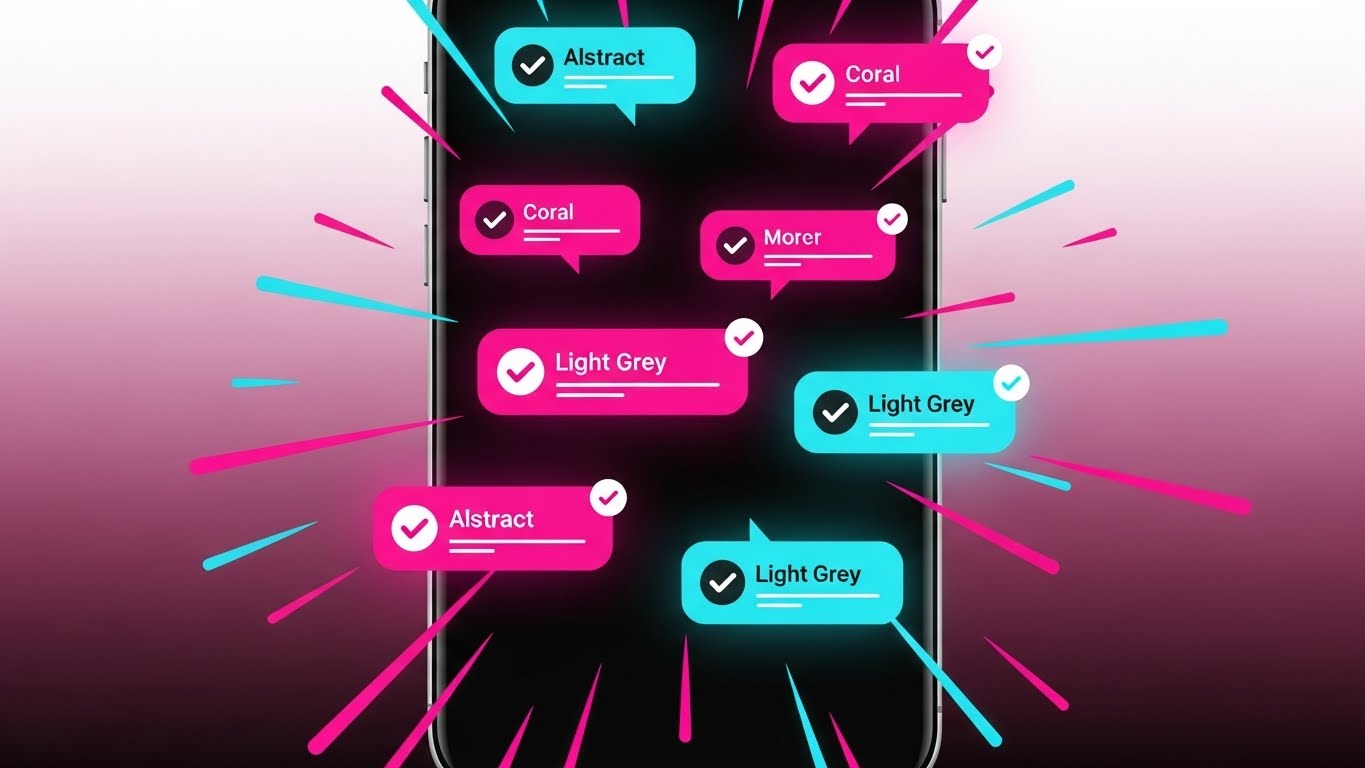
The Visual & Narrative Approach
Designed for the mobile-first generation of fintech users, this vertical composition focuses on speed. A stylized, abstract mobile phone frame sits in the center. The screen displays a rapid succession of abstract UI notifications—rounded rectangles in "Coral" and "Light Grey" with bright "White" checkmarks popping up. The background is a soft, blurred gradient of coral and white. Speed lines radiate from the phone to emphasize the speed of the notifications. The style is flat, vector-based, and fast-paced.
Psychological Impact & KPI Focus
This style addresses the "Anxiety of Waiting." In legacy banking, a notification might take days; here, it is instantaneous. It visualizes Real-Time Visibility, a massive pain point for Treasurers. The dopamine hit of the "Green Checkmark" reinforces the feeling of success and completion, associating the app with "Zero Friction."
Strategic Implementation & Trade-offs
- Duration: 15 Seconds.
- Trade-off: The vertical format is platform-specific. It excels on mobile social media but looks awkward on a desktop landing page. It is strictly for generating "hype" and demonstrating UI responsiveness.
Strategic Transition: We've shown the technology; now we must mirror the aspiration of the person controlling it.
Companies using similar video content -
Revolut Business – Business App – Instant payment notifications and control.
Mercury – Banking for Startups – Fast mobile banking alerts.
6. Aspirational Stock Montage
TOFU | Aspiration & Identity Hook

The Visual & Narrative Approach
This style humanizes the B2B sale. It features a high-quality photorealistic image of a professional CFO, a woman with diverse features, standing in a modern glass-walled office. She is looking out at a golden-hour city skyline with a confident, calm expression. She wears a tailored Navy Blue blazer. The lighting is warm and natural, highlighting her silhouette. The background features blurred skyscrapers. The image conveys control, success, and the "Global Financial Leader" lifestyle.
Psychological Impact & KPI Focus
This appeals to the buyer's Ego and Identity. It positions the software as the tool that empowers them to become this "Visionary Leader." It moves the conversation from "operational cost" to "strategic value." The blurred skyscrapers in the background subtly reinforce the "Global" context without needing a map.
Strategic Implementation & Trade-offs
- Duration: Static Image or 5-Second Cinemagraph.
- Trade-off: It can feel generic if not paired with strong, specific copy. It must be used to "Stop the Scroll" on LinkedIn by mirroring the viewer's self-image, but it cannot stand alone as a product explanation.
Strategic Transition: To make the value of this lifestyle clear, we need to contrast it sharply with the current reality of manual operations.
Companies using similar video content -
Kyriba – Treasury Management – Empowering strategic CFOs.
GTreasury – Treasury & Risk Management – Reflecting financial leadership.
7. Split Screen: Optimized Reality and UI
MOFU | Product/Solution Differentiation
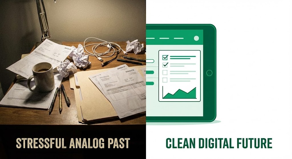
The Visual & Narrative Approach
A split-screen composition. The left half shows a chaotic, desaturated photo of a messy wooden desk piled with paper invoices and tangled wires. The right half shows a pristine, high-contrast vector illustration in "Emerald Green" and "White," depicting a sleek tablet device displaying an organized, check-marked list. The dividing line is sharp. The contrast between the "stressful analog past" and the "clean digital future" is the visual hook.
Psychological Impact & KPI Focus
This triggers the brain's desire for Order and Resolution. It visually quantifies the "Operational Efficiency" gain. For a team drowning in manual reconciliation, the right side represents "Salvation." It effectively visualizes the Physical/Digital Bridge, showing exactly how the software replaces manual labor.
Strategic Implementation & Trade-offs
- Duration: Static or 10-Second Transition.
- Trade-off: It is a direct sales tactic. It works well for retargeting (MOFU) where the user already knows the problem, but might seem too "salesy" for an initial brand introduction.
Strategic Transition: Once the user chooses the 'Digital Future,' we must explain the mechanics of how that future handles their most precious asset: liquidity.
Companies using similar video content -
BlackLine – Account Reconciliation – Transforming manual close processes.
Trintech – Financial Close Solutions – Bridging legacy to digital reconciliation.
8. Dynamic Data Visualization
MOFU | Demand Gen & Lead Capture

The Visual & Narrative Approach
A 3D dynamic data visualization of "Liquidity." Glowing "Aqua Blue" fluid flows smoothly through clear, laboratory-grade glass pipes arranged in a complex but organized grid. The pipes connect to translucent spherical reservoirs. The background is a clean, sterile white laboratory environment. Tiny white data particles flow within the liquid. The aesthetic is scientific, precise, and fluid.
Psychological Impact & KPI Focus
Liquidity is abstract; this makes it physical. The "Scientific" aesthetic implies precision and accuracy—crucial for Treasury Management. It alleviates the fear of "Trapped Cash" by showing constant movement. It visually answers the question: "Where is my money?" with a clear, flowing answer.
Strategic Implementation & Trade-offs
- Duration: 15–30 Seconds.
- Trade-off: It is metaphorical. While beautiful, it doesn't show the actual dashboard. It is best used to explain the concept of an automated liquidity engine before showing the actual UI.
Strategic Transition: Liquidity flow is vital, but security is non-negotiable. We need to look inside the engine to prove it's safe.
Companies using similar video content -
Cashforce – Cash Flow Forecasting – Mapping real-time liquidity movement.
Treasury Intelligence Solutions (TIS) – Payments Platform – Visualizing enterprise payment flows.
9. 3D X-Ray Visualization
MOFU | Risk Mitigation

The Visual & Narrative Approach
A 3D X-ray visualization of a metallic coin. The outer shell of the coin is semi-transparent "Silver," revealing a complex, glowing "Electric Blue" internal locking mechanism and gears made of "Gold." The background is a technical blueprint grid in faint white on a bright blue surface. The image focuses on the internal security architecture, symbolizing robust compliance.
Psychological Impact & KPI Focus
This appeals to the "Risk-Averse" side of the persona. It visualizes Compliance (AML/KYC) and Security not as a checklist, but as robust engineering. It suggests that the security is "baked in" to the core of the transaction, not bolted on. It builds confidence in the platform's ability to handle high-value payments.
Strategic Implementation & Trade-offs
- Duration: 15 Seconds.
- Trade-off: It is highly technical. It appeals deeply to the CTO or Compliance Officer but might bore a Marketing Manager. Use it specifically for content addressing risk and regulation.
Strategic Transition: After validating the complex security architecture, we return to the daily user experience—simple, clean, and efficient.
Companies using similar video content -
LexisNexis Risk Solutions – Financial Crime Compliance – Revealing robust security protocols.
Fenergo – Client Lifecycle Management – X-raying regulatory compliance.
10. Clean UI Workflow (Light Mode)
MOFU | Feature Education & Demonstration
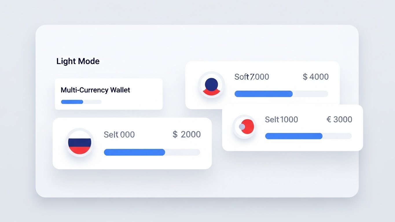
The Visual & Narrative Approach
A Clean UI Workflow illustration in Light Mode. The composition shows a flat-lay view of an abstract dashboard interface. The palette is "Pure White," "Soft Light Grey," and accents of "Primary Blue." The screen displays a "Multi-Currency Wallet" concept using circular icons representing flags (abstracted colors only) and horizontal bars representing balances. Soft drop shadows give depth to the floating UI cards. The look is airy and organized.
Psychological Impact & KPI Focus
The primary psychological trigger here is the reduction of Cognitive Load. Financial software is notoriously complex and cluttered. By showing a "Clean" interface, you promise Ease of Use. It visualizes the KPI of "Time-to-Value"—implying that a user can log in and start working immediately without a steep learning curve.
Strategic Implementation & Trade-offs
- Duration: 30–60 Seconds.
- Trade-off: It abstracts the real UI slightly for clarity. You must ensure the actual product is not disappointingly different, but this idealized version is perfect for email onboarding sequences where clarity is key.
Companies using similar video content -
Modern Treasury – Payment Operations – Simplifying payment workflows.
Dwolla – Account-to-Account Payments API – Clean interface for payment management.
11. Isometric 3D Workflow
MOFU | The Functional Buyer

The Visual & Narrative Approach
This style creates a tangible "Digital Twin" of the payment operations floor. Rendered in a soft "Claymorphism" aesthetic with matte textures, the scene depicts a miniature, stylized factory. "Industrial Grey" cubes (representing payment batches) travel smoothly along "Yellow" conveyor belts. They pass through "Blue" scanning gates and are automatically sorted into different chutes. The global lighting is soft and shadow-free, making the complex backend process look approachable, organized, and rhythmic.
Psychological Impact & KPI Focus
For the VP of Operations, "Batch Processing" is often synonymous with "Error Management." This visualization reframes the narrative to Systematization. By depicting the workflow as a physical, automated conveyor, you reduce the anxiety of manual intervention. It visually proves Straight-Through Processing (STP), demonstrating that your platform can handle high-volume mass payouts without bottlenecks. It validates the KPI of "Operational Efficiency."
Strategic Implementation & Trade-offs
- Duration: 45–60 Seconds.
- Trade-off: The "toy-like" aesthetic creates high clarity but can lower the "seriousness" of the brand if used exclusively. It is best used for explaining backend logic or API routing, where realism would simply be a boring picture of a server rack.
Strategic Transition: We have visualized the macro workflow; now we must zoom in to the micro-moment of user interaction that triggers it.
Companies using similar video content -
Tipalti – Mass Payments Automation – Streamlining global supplier payouts.
Coupa Pay – B2B Payments – Automating invoice-to-pay processes.
12. Macro UI Micro-Interactions
MOFU | Overcoming Objections

The Visual & Narrative Approach
A hyper-focused macro close-up of a single UI element: a toggle switch. The background is a shallow depth-of-field blur, keeping the razor-sharp focus on the interaction itself. The animation shows the switch sliding from "Grey" to a vibrant "Vivid Green" with a satisfying "ACTIVATE" label. The motion is snappy and responsive. This visualizes the concept of "turning on" a benefit—like "Zero Fees" or "Auto-Hedging"—with zero friction.
Psychological Impact & KPI Focus
This style leverages Haptic Visuals—the viewer can almost "feel" the click. It builds confidence in the Ease of Implementation. It counters the objection that switching providers is difficult by visually metaphorizing it as a simple "on/off" switch. It reinforces the KPI of User Control, showing the user they have immediate, tactile power over the system's capabilities.
Strategic Implementation & Trade-offs
- Duration: 3–6 Seconds (Looping GIF).
- Trade-off: It lacks context. A button click means nothing without surrounding information. Use this as a supporting visual in a feature block or pricing page to emphasize simplicity alongside technical copy.
Strategic Transition: The user has activated the system. Now we need to show the scale of the network they have just unleashed.
Companies using similar video content -
Plaid – Data Network – Activating secure bank connections.
Spreedly – Payment Orchestration – Toggling payment gateway routing.
13. Futuristic Neon/Dark Mode
MOFU | ABM Awareness

The Visual & Narrative Approach
This aesthetic adopts a "Cyberpunk Fintech" look, utilizing a high-contrast dark mode palette. A top-down view of a stylized world map features major financial capitals as glowing nodes. Vibrant "Neon Blue" and "Magenta" lines arc high above the map, connecting these nodes in a complex, pulsing network. A holographic grid floor sits beneath the map. The visual language conveys high-frequency, encrypted, and futuristic data transfer.
Psychological Impact & KPI Focus
This style appeals to the IT and Tech stakeholders within the buying committee. It signals Modernity and Speed. The dark mode aesthetic is often associated with "Pro" or "Developer" tools, suggesting a robust, high-performance infrastructure. It visualizes Global Reach and 24/7 Availability, reinforcing that money never sleeps on your platform.
Strategic Implementation & Trade-offs
- Duration: 15–30 Seconds.
- Trade-off: It can feel cold or overly abstract. If your brand positioning is "Human-Centric," this style might feel too aggressive. It is best used for "Power Users" or technical audiences who value raw performance and speed.
Strategic Transition: We've shown the global network, but prospects are often stuck with legacy local systems. We must visualize their evolution.
Companies using similar video content -
Adyen – Unified Commerce Platform – Illuminating global payment networks.
Stripe – Payments Infrastructure – Visualizing high-frequency data transfer.
14. Wireframe to Reality Transition
MOFU | Competitive Displacement

The Visual & Narrative Approach
A diagonal split-screen composition that tells a story of transformation. The bottom-left displays a technical, white-on-blue architectural wireframe blueprint sketch of a structure. As the eye travels across the diagonal transition line, the wireframe morphs seamlessly into a photorealistic, modern glass-and-concrete fintech headquarters against a clear sky. This visualizes the upgrade from "Legacy Planning" (the blueprint) to "Modern Reality" (the building).
Psychological Impact & KPI Focus
This visualizes Digital Transformation. It validates the persona’s desire to evolve from clunky, manual processes (the blueprint) to a solid, operationalized reality. It addresses the Legacy Migration pain point, showing that the transition is a natural evolution, not a destructive tear-down. It promises structure, stability, and a future-proof foundation.
Strategic Implementation & Trade-offs
- Duration: 10–15 Seconds.
- Trade-off: It is metaphorical. It doesn't show the software interface. It is a strategic narrative tool to sell the concept of modernization before selling the specific features of the software.
Strategic Transition: Once the modern infrastructure is built, the primary concern shifts to the safety of the assets housed within it.
Companies using similar video content -
SAP S/4HANA Finance – ERP for Finance – Modernizing enterprise financial systems.
Oracle Fusion Cloud ERP – Cloud ERP – Evolving legacy finance to cloud.
15. Photorealistic 3D Renders
BOFU | Building Trust & Credibility

The Visual & Narrative Approach
A hyper-realistic 3D render focusing on material quality and weight. The subject is a heavy, circular bank vault door composed of "Platinum" and "Gold" metals. The door is slightly ajar, allowing a brilliant, pure white light to escape from within. The textures include brushed metal scratches and realistic studio reflections. The image is static or moves very slowly, conveying weight, permanence, and impenetrability.
Psychological Impact & KPI Focus
This is the ultimate Trust Signal. In the BOFU stage, the CFO needs reassurance that their funds are safe. This visual activates the "Safety" bias. It moves the brand perception from "Startup Risky" to "Institutional Grade." It visualizes Security Compliance and Asset Protection without needing to list ISO certifications.
Strategic Implementation & Trade-offs
- Duration: Static Image or 10-Second Loop.
- Trade-off: It is a cliché if executed poorly. To work, the render quality must be cinema-grade. If it looks like a cheap clip-art vault, it has the opposite effect. Use it to anchor sections about security and compliance.
Strategic Transition: Security is the baseline. The differentiator is what happens to the money once it is safe. We shift from protection to growth.
Companies using similar video content -
J.P. Morgan Payments – Treasury Services – Solidifying institutional asset protection.
Citi Treasury and Trade Solutions – Global Payments – Conveying robust financial security.
16. Low-Poly 3D Modeling
BOFU | ROI Justification

The Visual & Narrative Approach
A playful yet professional metaphor for ROI. The scene features a low-poly landscape with geometric trees. Instead of fruit, large "Gold" polygonal coins hang from the branches. The terrain is a soft "Pastel Green," and the sky is "Sky Blue." The lighting is clean and sunny. The aesthetic is simplified, stripping away the noise of complex finance to show a simple truth: growth.
Psychological Impact & KPI Focus
This style reduces the anxiety of complex financial modeling. It visualizes Yield Generation and Working Capital Optimization in a way that feels effortless (passive growth). The low-poly style suggests that the platform simplifies the data, making "Growth" a natural byproduct of using the software. It triggers the Optimism bias, focusing entirely on the positive outcome (ROI).
Strategic Implementation & Trade-offs
- Duration: 15 Seconds (Looping).
- Trade-off: The "cartoonish" look must be balanced with serious copy. It works best on social media (LinkedIn) to break the pattern of boring corporate stock photos, but might be too informal for a final contract proposal.
Strategic Transition: We've shown the ROI. Now we need to mirror the person who gets the credit for that ROI.
Companies using similar video content -
Ebury – International Payments & FX – Visualizing currency growth.
Kantox – FX Management Automation – Showing passive FX savings.
17. Generative AI Realistic Character video
BOFU | The Economic Buyer

The Visual & Narrative Approach
A realistic character video generated to mirror the target buyer. The medium shot features a distinguished CFO in a grey suit, standing in a busy, blurred modern office. He holds a transparent "Glass Tablet" displaying holographic charts. He looks at the data with a satisfied, confident smile. The lighting is cinematic office lighting with cool blue tones. The focus is not on the tech, but on the emotion of the user.
Psychological Impact & KPI Focus
This leverages Social Proof and Identity Mirroring. The CFO sees themselves in this image—not stressed and overworked, but in control and satisfied. It validates their decision to buy. The transparent tablet represents Total Visibility, a key desire for the "Strategic Liquidity Architect." It creates an emotional connection: "This could be me."
Strategic Implementation & Trade-offs
- Duration: 15–30 Seconds.
- Trade-off: Generic stock footage often lacks soul. Using high-quality Generative AI allows for perfect tailoring of the "Glass Tablet" interface to match your brand colors, making it feel bespoke rather than bought off the shelf.
Strategic Transition: The executive is happy because the data is accurate. The data is accurate because the systems are connected.
Companies using similar video content -
Workday Global Payroll – Cloud Payroll – Executive oversight of global workforce finance.
ADP Global Payroll – Global Payroll Services – Monitoring real-time payroll insights.
18. 2D Line Art Animation
BOFU | The Technical Buyer
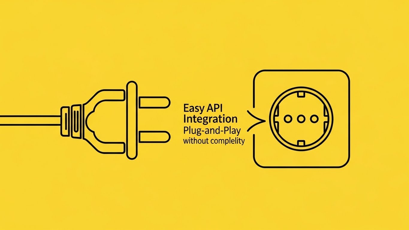
The Visual & Narrative Approach
A sophisticated, minimalist 2D animation using continuous, elegant lines in "Black" on a vibrant "Electric Yellow" background. The line draws a stylized electrical plug on the left and a matching socket on the right. They merge seamlessly with a satisfying "snap" animation. Text appears: "Easy API Integration." The style is minimal, precise, and technical, stripped of all unnecessary decoration.
Psychological Impact & KPI Focus
This appeals to the Technical Buyer (CIO) who values Simplicity and Interoperability. It visualizes the "Plug-and-Play" nature of the software. The continuous line implies an unbroken flow of data. It addresses the fear of "Integration Hell" by visually promising a smooth, effortless connection. It reinforces the KPI of Time-to-Implementation.
Strategic Implementation & Trade-offs
- Duration: 6–10 Seconds.
- Trade-off: It is very abstract. It explains that it connects, not how. It is best used as a section header for the "Developers" or "Integration" page of your website to set a tone of simplicity.
Strategic Transition: Connection creates data flow. But raw data is messy. We need to show how the system organizes it.
Companies using similar video content -
Currencycloud – Embedded Finance Platform – Simplifying API integration for payments.
Volante Technologies – Cloud Payments – Connecting diverse financial messaging.
19. Abstract 2D flat vector organic modern motion graphics with glossy textures
BOFU | Objection Handling & Friction Reduction

The Visual & Narrative Approach
An abstract motion graphic using glossy, flat vector shapes. On the left, a chaotic, tangled knot of "Chaos Red" tubes represents messy, unreconciled data. As the eye moves to the right, the knot unravels and straightens into smooth, straight, parallel lines in "Order Blue." The background is clean white. The animation is smooth and therapeutic.
Psychological Impact & KPI Focus
This visualizes Reconciliation Automation. It triggers the psychological relief of Order from Chaos. "Reconciliation" is often the biggest headache for back-office teams. This visual promises a solution to that pain. It validates the software's ability to handle Exception Management and turn a mess into a streamlined workflow.
Strategic Implementation & Trade-offs
- Duration: 10–15 Seconds.
- Trade-off: Highly metaphorical. If the audience is very literal, they might not immediately connect "Red Knot" to "Bad Data." It requires accompanying copy like "Untangle your reconciliation process" to anchor the meaning.
Strategic Transition: With the process streamlined and the knot untangled, the final result is a successful, secure business relationship.
Companies using similar video content -
FloQast – Close Management Software – Untangling financial close processes.
Adra by Trintech – Financial Close Management – Streamlining reconciliation workflows.
20. Lifestyle Stock with UI Overlay
BOFU | Driving Demo Requests

The Visual & Narrative Approach
A high-quality photographic composition showing a "Deal Closing" moment. Two hands in business suits are shaking hands in a modern, warm-toned conference room. Floating in the air above the handshake is a sleek, 3D floating UI element: a large, glowing "Navy Blue" shield with a checkmark. The UI element casts a subtle light onto the hands, visually protecting the agreement.
Psychological Impact & KPI Focus
This combines the human element of business with the digital element of trust. It visualizes Settlement Finality and Transactional Security. For the sales team, this image represents the "Closed Won" moment. It reassures the buyer that technology does not replace the relationship; it protects it. It anchors the feeling of Partnership.
Strategic Implementation & Trade-offs
- Duration: Static Image.
- Trade-off: It can feel like a generic stock photo. The addition of the high-quality 3D UI element (the shield) is critical—it brands the generic moment and makes it specific to your software's protection.
Companies using similar video content -
Checkout.com – Global Payment Solutions – Validating secure transaction completion.
Flywire – International Payments – Protecting high-value international payments.
21. 2D Character-Driven Story
BOFU | Driving Freemium/Trials

The Visual & Narrative Approach
This style embraces a "Product-Led Growth" (PLG) aesthetic. A stylized female character with "Purple" hair, dressed in modern tech-casual attire, leans forward to press an oversized, tactile "Orange" button labeled "Play." Behind her, a simple geometric rocket lifts off into a clean sky of abstract white clouds. The illustration is flat, vector-based, and energetic, using vibrant colors to signify action and excitement.
Psychological Impact & KPI Focus
This appeals to the End User (Treasury Analyst or Developer) rather than the C-Suite. It lowers the barrier to entry by framing the software as "Fun" and "Accessible." The rocket metaphor triggers the Achievement bias—starting this trial isn't work; it's a launch. It directly attacks the fear of "Complex Setup" by suggesting that getting started is as easy as pushing a single button.
Strategic Implementation & Trade-offs
- Duration: 15–30 Seconds.
- Trade-off: It is distinctly "Tech Startup" in tone. While excellent for driving free trials or developer sandbox sign-ups, it may lack the gravitas required for a $500k Enterprise license negotiation.
Strategic Transition: Once the user clicks 'Start,' they enter the onboarding phase. We must prove that integration is not a nightmare.
Companies using similar video content -
Deel – Global Payroll & Compliance – Triggering easy global hiring and payments.
Remote – Global HR & Payroll – Launching international employment.
22. 2D Graphics Over Live Action
Onboarding | Reducing Implementation Friction

The Visual & Narrative Approach
A mixed-media style that blends reality with digital magic. A top-down photo shows a pristine silver laptop on a white desk—representing the user's physical reality. Emanating from the screen are animated 2D "Sparkles," "Stars," and "Magic Dust" in "Silver" and "Blue." These flat, cartoon-like elements swirl upwards, contrasting sharply with the photorealistic laptop. This visualizes the software "coming alive" instantly.
Psychological Impact & KPI Focus
This visualizes the "It Just Works" promise. Implementation is often the highest friction point in Fintech (the "Integration Gap"). By overlaying whimsical, magical elements on a real laptop, you suggest that the software installs effortlessly—like magic. It reinforces the KPI of Time-to-Implementation, reducing the anxiety of long, painful IT setups.
Strategic Implementation & Trade-offs
- Duration: 10–15 Seconds.
- Trade-off: The "Magic" metaphor is abstract. It doesn't explain how the API connects. It is an emotional reassurance tool, best used in "Welcome" emails to keep momentum high before the technical work begins.
Strategic Transition: The software is installed. Now, the user needs to learn how to navigate it without reading a manual.
Companies using similar video content -
Veem – Global Payments Network – Visualizing effortless payment setup.
TransferMate – International B2B Payments – Making integration feel magical.
23. 2D Animation & UI Composition
Onboarding | Self-Serve Onboarding

The Visual & Narrative Approach
A "Gamified Education" style. A small, isometric 3D character (a helpful "Bot" or "Guide" in Teal) walks confidently across a purple bridge connecting two floating UI screens. The screens display simplified onboarding steps ("Profile," "Link Bank"). The background is a warm, inviting "Yellow" gradient. The character points forward, directing the user's journey.
Psychological Impact & KPI Focus
This leverages Cognitive Guidance. It breaks complex treasury setups into a linear, game-like journey. The bridge metaphor visually connects "Where you are" to "Where you need to be." It reduces Support Ticket Volume by encouraging self-serve configuration. The friendly character makes the intimidating process of linking bank accounts feel safe and guided.
Strategic Implementation & Trade-offs
- Duration: 30–60 Seconds.
- Trade-off: It can feel patronizing if the character is too childish. The UI elements on the screens must be accurate enough to be helpful, even if stylized.
Strategic Transition: The user is set up. Now they expect results. We need to show them the speed of the data they are now commanding.
Companies using similar video content -
Bellin – Treasury Management System – Guiding users through treasury setup.
TreasuryXpress – Cloud TMS – Automating onboarding for cash management.
24. Hyper-lapse Stock Footage with Data
Onboarding | Accelerating Time-to-Value

The Visual & Narrative Approach
A vertical hyper-lapse video designed for mobile consumption. The camera looks down on a busy city street canyon, with sunlight reflecting off glass skyscrapers. Cars blur into streaks of light below. Overlaid on this physical traffic are brighter, faster, pure "White" data streams and binary codes zipping through the air, outpacing the physical cars. This contrasts the "slow" physical world with the "instant" digital payment layer.
Psychological Impact & KPI Focus
This reinforces Velocity. It validates the user's purchase by showing them that they have moved from the "Slow Lane" (traditional banking) to the "Fast Lane" (your software). It creates a dopamine hit associated with Speed and Efficiency, confirming the "Time-to-Value" KPI.
Strategic Implementation & Trade-offs
- Duration: 10–15 Seconds.
- Trade-off: It is atmospheric, not functional. It creates a "vibe" of speed but doesn't teach features. Use it to maintain excitement during the first week of user adoption.
Strategic Transition: Speed is great, but the user needs a concrete "First Win." We must visualize the moment of value realization.
Companies using similar video content -
Visa B2B Connect – Cross-Border Network – Outpacing traditional payment speeds.
Mastercard Track Business Payment Service – B2B Payment Network – Visualizing rapid transaction flow.
25. Holographic UI over 3D Render
Onboarding | Trial/Freemium User Activation

The Visual & Narrative Approach
A futuristic celebration of the "First Transaction." A sleek smartphone lies on a technical surface. Projecting upwards from the screen is a high-fidelity "Holographic Blue" and "Silver" coin, spinning in mid-air. The hologram creates a tech-noir glow. Surrounding the coin are floating data brackets reading "FIRST VALUE" and "SOLVER." It treats a simple payment confirmation like a sci-fi event.
Psychological Impact & KPI Focus
This gamifies the "Aha! Moment." In B2B SaaS, the first successful transaction is the critical hook. By visualizing it as a holographic reward, you elevate the mundane task of "Funding a Wallet" into a significant achievement. It creates a Positive Reinforcement Loop that encourages the user to repeat the action.
Strategic Implementation & Trade-offs
- Duration: 5–8 Seconds (Looping).
- Trade-off: High production value required. A cheap hologram looks cheesy. This is best used as a celebratory "Success State" screen inside the actual app.
Strategic Transition: Problems will inevitably arise. We must show that when they do, help is human, accessible, and friendly.
Companies using similar video content -
Rapyd – Fintech-as-a-Service – Confirming first successful embedded payment.
DLocal – Cross-Border Payments – Celebrating first local payment success.
26. AI Generated Mixed Media Video
Retention | Reducing Support Overhead

The Visual & Narrative Approach
A dynamic, mixed-media collage that radiates warmth. Centered on a "Friendly Yellow" circle, the composition features cut-out photos of diverse, smiling support agents. These real faces are surrounded by playful, hand-drawn doodles: chat bubbles, headsets, and question marks in "Cyan." The animation is jerky and stop-motion-like, giving it a handcrafted, authentic feel.
Psychological Impact & KPI Focus
This addresses Support Anxiety. Users often fear that Fintech support will be a faceless bot. This visual promises Human Connection. It reframes the "Help Desk" from a place of frustration to a place of community. It aids Retention by reassuring the client that they are not alone.
Strategic Implementation & Trade-offs
- Duration: 30 Seconds.
- Trade-off: It contrasts sharply with the "Sleek/Futuristic" styles (like Style 25). This is intentional—support should feel human, not robotic—but ensure the brand colors remain consistent so it doesn't feel like a different company.
Strategic Transition: Human support is good, but system reliability is better. We need to show that the engine never stops running.
Companies using similar video content -
Convera – Global Payments – Humanizing international payment support.
WorldFirst – International Payments – Personalizing business payment assistance.
27. Abstract 2D Motion Graphics
Retention | Reducing Churn

The Visual & Narrative Approach
A hypnotic, abstract motion graphic. A Mobius strip (infinity loop) made of smooth, flowing strands in "Bright Cyan," "Pink," and "White" twists seamlessly against a radiant white background. The strands never break; they flow continuously into one another. The lighting is soft and ethereal.
Psychological Impact & KPI Focus
This visualizes Uptime and Continuity. For a Treasurer, the fear is a system outage or a break in the data chain. The infinity loop subliminally communicates "Always On" and "Endless Reliability." It is a calming visual to use in "Service Update" emails or renewal reminders, reinforcing the stability of the platform.
Strategic Implementation & Trade-offs
- Duration: 10–15 Seconds (Looping).
- Trade-off: It is purely abstract. It conveys a feeling of stability but no information. It is a "Background Mood Setter" rather than a "Feature explainer."
Strategic Transition: The user is retained. Now we must prove the value delivered over the last quarter to justify the next contract.
Companies using similar video content -
ION Treasury – Treasury & Risk Management – Ensuring continuous financial operations.
CGI Trade360 – Trade Finance – Visualizing uninterrupted trade flows.
29. 3D Parallax UI Presentation
Expansion | Driving Upsell/Cross-sell
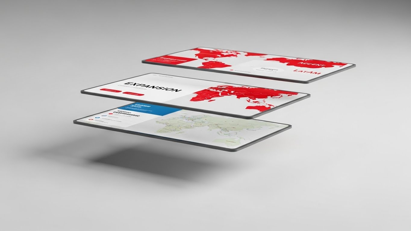
The Visual & Narrative Approach
A sophisticated 3D parallax composition. Three layers of UI screens float in a clean white studio space, stacked in depth. The front screen is sharp, showing a map of the current region (e.g., "Europe"). The screens behind it are slightly out of focus but visible, displaying maps of new potential markets ("Asia," "LatAm") highlighted in "Accent Red." The camera drifts slowly, shifting the perspective to reveal the depth of the "Expansion Pack."
Psychological Impact & KPI Focus
This visualizes Scalability. It suggests that the new markets are already there, just waiting to be "brought into focus." It appeals to the Growth Mindset of the CFO. It makes the upsell feel like a natural layer of the existing product, not a risky new purchase.
Strategic Implementation & Trade-offs
- Duration: 10–15 Seconds.
- Trade-off: It is subtle. It works best on a "Solutions" page where the user can scroll to control the parallax effect, giving them a sense of exploring new territories.
Strategic Transition: Expansion relies on the network. The final step is to show that the more they use the system, the stronger it gets.
Companies using similar video content -
Global Payments Inc. – Global Solutions – Unlocking new market opportunities.
PayU – Payment Solutions – Expanding into emerging markets.
30. Dark Mode UI Showcase
Expansion | Driving Referrals & Advocacy
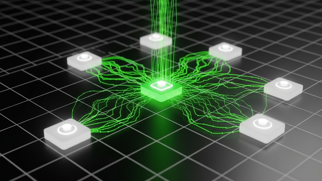
The Visual & Narrative Approach
A "Dark Mode" aesthetic that screams "Power User." On a black grid background, a central "Neon Green" node (the user) pulses. It shoots out connection lines to activate surrounding white nodes (partners/vendors), turning them green. As more nodes connect, the entire grid lights up. This is the visual of a Network Effect.
Psychological Impact & KPI Focus
This visualizes Ecosystem Connectivity. It frames the user as the "Hub" of a powerful financial network. It encourages referrals by showing that the network becomes more valuable as more partners join. It appeals to the desire for dominance and influence in the market.
Strategic Implementation & Trade-offs
- Duration: 15 Seconds.
- Trade-off: Dark mode can feel aggressive. Ensure the green is "Growth Green," not "Hacker Green," to maintain a corporate finance feel.
STRATEGIC KNOWLEDGE BASE: THE VISUAL OPERATIONS DOCTRINE
To transform these 30 visual styles from "Marketing Assets" into a "Strategic Operating System," we must apply a cohesive framework. This section synthesizes the visual guide into three actionable knowledge segments for the "Strategic Liquidity Architect."
STRATEGIC ALIGNMENT & VISUAL ARCHITECTURE
The "Pre-Production" Strategy. Defining the Why and Who.
- The Cognitive Load Audit: Before commissioning a video, audit your current training materials. If a concept takes 3 paragraphs to explain (e.g., "Settlement Finality"), it requires a Style 8 (Dynamic Data) or Style 2 (Minimalist Vector) visualization.
- Role-Based Visual Mapping: Differentiate your visual language. "Approvers" (CFOs) need Style 28 (High-Level Dashboards) on mobile devices for quick sign-offs. "Controllers" (Treasurers) need Style 11 (Detailed Workflow) on desktop for granular reconciliation.
- The "Glanceability" Standard: In high-stress Treasury environments, information must be consumed in milliseconds. Adopt the "Glanceability" standard for all UI montages—if the KPI isn't visible in 1.5 seconds, the visual has failed.
- Brand Voice Consistency: Cross-border payments involve disparate modules (FX, Hedging, Payouts). Use a unified "Visual Concordance" (e.g., always using "Electric Cobalt" for Liquidity Flow) to tie these modules together subconsciously.
- The Advids Strategic Audit: Leveraging an external partner like Advids at this stage allows for an unbiased audit of your visual assets, identifying gaps where "Invisible" backend processes need "Visible" frontend representation.
- Standardization vs. Customization: Use standardized "Stock" bases for generic concepts (Global Maps - Style 1), but invest in bespoke "3D Renders" (Style 15) for your core security features.
- The Cross-Departmental Bridge: Use the same visual metaphors (e.g., "The Pipeline" in Style 8) across Sales, Ops, and Support to create a unified internal language.
- Legacy System Integration: Visually acknowledge the "Old World." Use styles like "Wireframe to Reality" (Style 14) to validate the customer's current legacy infrastructure before showing them the new API future.
- Accessibility in Finance: Ensure all motion graphics (especially Kinetic Type, Style 4) meet WCAG accessibility standards. Motion should be smooth, not flashing, to accommodate neurodiverse users in the operations center.
- The Mobile-First Mandate: Even for desktop-heavy software, your marketing visuals will be consumed on mobile (LinkedIn). All 30 styles must be legible on a 9:16 vertical screen.
OPERATIONAL ADOPTION & IMPLEMENTATION
The "Deployment" Phase. Embedding visuals into the daily financial workflow.
- Overcoming "Black Box" Anxiety: Use "Glass Box" visuals (Style 3, 9) to demystify AI decision-making. If your software routes payments automatically, show the "Routing Logic" visually to reassure the risk officer.
- The Micro-Learning Shift: Replace the 50-page "Integration Manual" with a library of 30-second clips using Style 10 (Clean UI Workflow). Users will watch a clip; they will not read a manual.
- Just-in-Time Support: Embed specific visual styles directly into the Treasury Management System (TMS). If a user hovers over "SWIFT gpi," a small tooltip GIF (Style 12) should play immediately to explain the function.
- Gamification of Training: Use Style 23 (Guided Bridge) to visualize onboarding progress. Show a progress bar filling up or a character moving forward. Financial users are goal-oriented; give them a visual score.
- Reducing Support Ticket Volume: There is a direct correlation between the quality of your "Error State" visuals and support volume. If an error occurs, show a video of how to fix it (Style 19), not just an error code.
- Remote Onboarding: You cannot fly trainers to every regional office. Use Style 11 (Isometric Workflow) to visually demonstrate "Batch Processing" concepts to remote teams in Singapore or London, ensuring global consistency.
- Visual SOPs: Transform text-based Standard Operating Procedures into Style 10 (Clean UI) video flows. This ensures that the Shanghai office and the New York office follow the exact same compliance steps.
- Feedback Loops: Use interactive video elements (Style 25) to gather feedback. After a user watches a "New Feature" video, ask "Did this help?" directly in the player.
- Scalable Localization: When expanding to new regions (Style 29), use Advids to clone your visual assets and swap text layers for local languages (e.g., Spanish, Japanese) while keeping the visual "Source of Truth" identical.
- Leadership Communication: When the VP of Treasury needs to present to the Board, give them the high-end assets (Style 6 & 15). Empower your champions to look good, and they will fight for your renewal.
MEASURING IMPACT & FUTURE-PROOFING
The "ROI" Phase. Measuring success and looking ahead.
- Beyond "Views": Vanity metrics (views) are useless in B2B. Measure "Feature Adoption Rate" post-video. Did the use of the "FX Hedging Tool" increase after we released the Style 8 explainer?
- The "Idle Time" Metric: Measure how long users spend "stuck" on a screen. Better visualization (Style 12) should reduce idle time and increase "Transaction Velocity."
- Compliance Velocity: How fast can your client base adapt to new regulations like ISO 20022? A well-executed explainer campaign (Style 1) can cut compliance migration time by weeks.
- Retention and Churn: High-quality UX visualization (Style 27) acts as a subliminal barrier to churn. Users leave "clunky" software; they stay with "smooth" software. Visuals define "smoothness."
- The AI Visual Frontier: Prepare for Generative UI. Soon, the interface itself might adapt to the user. Your video content must prepare users for this dynamic future (Style 30).
- Scalability of Assets: Build a "Visual Component Library." If you update your UI color from Blue to Purple, you shouldn't have to re-shoot 50 videos. Vector-based styles (Style 2) allow for global color updates in minutes.
- The Advids Partnership: You are building a financial infrastructure, not just making ads. Advids serves as your long-term "Visual Infrastructure Partner," ensuring that as your software evolves from V1 to V5, your visual assets evolve in lockstep, without needing a total rebuild.
- Benchmarking Success: Compare your visual "Help Center" against competitors. If they use text and you use video (Style 26), you have a defensible competitive advantage in "Ease of Doing Business."
- The ROI of Safety: Quantify the cost of a "Failed Payment" ($50+ per error). If a "Validation Video" (Style 19) prevents 1,000 failed payments, the ROI of that video is $50,000.
- Final Call to Innovation: Stop treating video as "Marketing Content." In the world of invisible, digital finance, video is your Product Interface. It is the only tangible evidence of the $56 Trillion flowing through your pipes. Invest in it like infrastructure.
Companies using similar video content -
Forter – Fraud Prevention Platform – Visualizing network intelligence for fraud.
Signifyd – Fraud Protection – Showcasing network effect in fraud prevention.
Author & Editor Bio


