
Introduction: Visualizing the Algorithmic Future
The digital advertising landscape is shifting from manual negotiation to algorithmic precision at an unprecedented pace. As we approach a new era of efficiency, more than 70% of digital ad spend is projected to be transacted programmatically by 2025, solidifying its role as the dominant infrastructure for global media buying. For B2B SaaS leaders and AdTech innovators, this growth represents a massive opportunity to scale, but it brings a shadow of complexity.
The challenge is no longer just about access to inventory; it is about orchestration. Recent industry data reveals that 66% of advertisers cite managing multiple channels as their primary operational pain point. The "physical" reality of fragmented data silos—separating CTV, mobile, and display—often clashes with the "digital" aspiration of a unified, omnichannel workflow.
This guide serves as a strategic bridge. By translating abstract DSP (Demand Side Platform) mechanics—like real-time bidding latency, supply path optimization, and identity resolution—into clear, compelling visual languages, we empower you to communicate value instantly. A well-executed video strategy does more than explain your platform; it reduces cognitive load, accelerates adoption, and turns complex technical workflows into a competitive advantage.
Below, we analyze ten distinct visual styles designed to demystify the ad-tech ecosystem, turning data density into clarity and hesitation into user confidence.
1. Minimalist Flat 2D Vector
TOFU | Brand Awareness
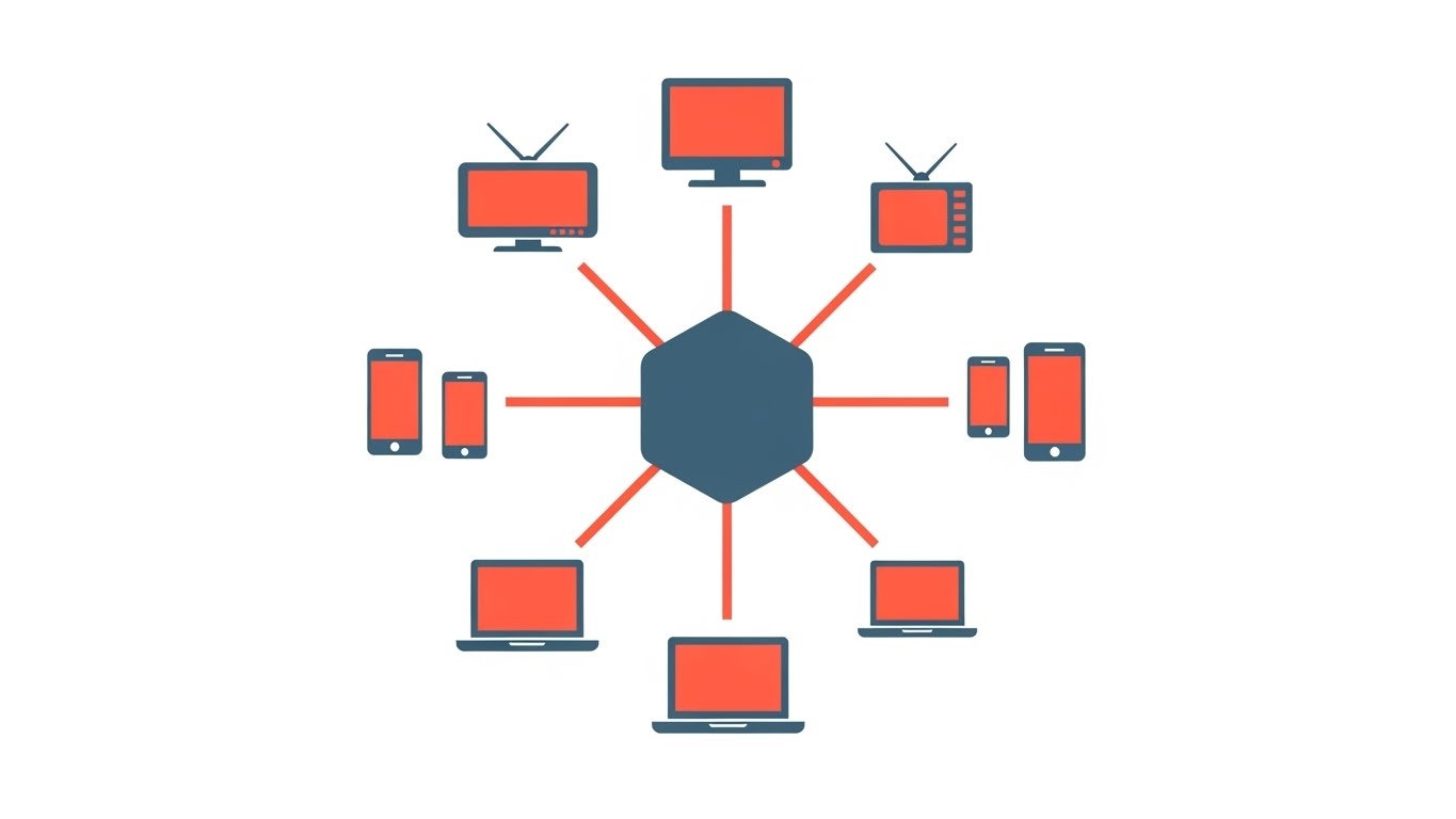
The Visual & Narrative Approach
Visualization Scenario: This style utilizes a strict "clean room" aesthetic. The visual centers on a perfectly symmetrical hub-and-spoke model where a central hexagon (representing the DSP core) anchors a constellation of devices—TVs, mobiles, and laptops. The lines connecting them are razor-thin and unbending, suggesting a direct, latency-free connection. The vivid coral and slate blue palette on a stark white background eliminates visual noise, forcing the viewer to focus solely on the relationship between the platform and the endpoints.
Narration Tone: Precise, authoritative, and uncluttered. It speaks to the "purity" of the connection.
Psychological Impact & KPI Focus
- Niche Psychology: AdOps professionals fear fragmentation. This symmetry reassures them that your platform brings order to chaos.
- Operational Impact: Directly visualizes the promise of Unified Campaign Management, a key KPI for reducing setup time.
Strategic Implementation & Trade-offs
- Best Use Case: 15-second social media teasers (Meta/LinkedIn) where attention spans are short. Perfect for announcing new channel integrations.
- Trade-off: The lack of depth makes it less suitable for explaining complex features like "bid shading," which require more nuance.
Companies using similar video content -
The Trade Desk – Unified ID 2.0 – Centralizing identity for programmatic advertising.
Adform – Flow – Connecting fragmented ad channels into a single platform.
2. 2D Line Art Animation
TOFU | Market Education

The Visual & Narrative Approach
Visualization Scenario: Imagine a digital "subway map" drawn in precise white architectural lines against a deep emerald background. This style eschews fill colors entirely, relying on the flow of the line to tell the story. It visualizes the invisible journey of a bid request—from the user’s device through the SSP, into the Ad Exchange, and finally to your DSP. The animation shows a pulse of light traveling along these paths, highlighting the "stations" without cluttering the screen.
Narration Tone: Sophisticated and intellectual. It adopts the tone of an engineer explaining a well-oiled machine.
Psychological Impact & KPI Focus
- Intellectual Authority: The blueprint aesthetic signals deep technical competence. It says, "We built the infrastructure, so we understand it better than anyone."
- Operational Impact: Supports Supply Path Optimization (SPO) narratives by visually simplifying the route to inventory.
Strategic Implementation & Trade-offs
- Best Use Case: 60-second "How It Works" explainer videos on YouTube or landing pages. It allows for a dense information hierarchy without overwhelming the viewer.
- Trade-off: Can feel cold or academic. It lacks emotional resonance, making it poor for testimonials or culture-focused content.
Companies using similar video content -
Xandr – Invest DSP – Visualizing the complex ad ecosystem and bid request flow.
Magnite – ClearLine – Illustrating the supply path infrastructure for publishers.
3. Isometric 2D Motion Design
TOFU | Shaping Brand Perception
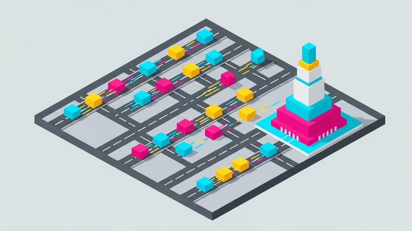
The Visual & Narrative Approach
Visualization Scenario: This style adopts a "God-view" perspective, looking down at a 45-degree angle onto a bustling digital city. Cyan, magenta, and yellow data packets (representing audience segments) zip along grey grid lines toward a central processing tower. The motion is constant and rhythmic, mimicking the heartbeat of the internet. There are no textures, only flat planes of color, which allows the viewer to track multiple moving elements simultaneously.
Narration Tone: Dynamic and rhythmic. It emphasizes scale, speed, and capacity.
Psychological Impact & KPI Focus
- Scale: It visually validates the claim of handling "millions of QPS" (Queries Per Second) by showing volume in a contained space.
- Operational Impact: Ideal for visualizing Traffic Shaping or Load Balancing capabilities.
Strategic Implementation & Trade-offs
- Best Use Case: LinkedIn feed ads. The colorful, complex motion stops the scroll, while the isometric structure keeps the content professional.
- Trade-off: The abstraction can detach the viewer from the end-user outcome. It visualizes data, not people.
Companies using similar video content -
Basis Technologies – Basis Platform – Showing high-volume data packets moving through a campaign grid.
StackAdapt – Programmatic Advertising Platform – Visualizing data segments flowing to target audiences.
4. Bold Kinetic Typography (Visual)
TOFU | Product Differentiation

The Visual & Narrative Approach
Visualization Scenario: This style is pure energy. It abandons representational imagery for abstract geometric shapes that act as stand-ins for heavy text blocks. Colored in electric purple and vivid lime green, these shapes crash, slide, and stack on a dynamic diagonal tilt. Motion blur and "speed lines" are applied generously. The visual metaphor is the "Bid" itself—fast, impactful, and competitive. It conveys the adrenaline of the real-time auction environment.
Narration Tone: Urgent, punchy, and sound-design driven. It emphasizes "Winning" and "Speed."
Psychological Impact & KPI Focus
- Urgency: The high contrast and rapid motion trigger an immediate alertness. It mimics the sub-millisecond nature of RTB.
- Operational Impact: Aligned with Win Rate and Bid Density. It feels like winning.
Strategic Implementation & Trade-offs
- Best Use Case: Instagram Stories or TikTok ads. It’s designed for sound-off environments where visual rhythm must carry the message.
- Trade-off: Zero explanatory power. It cannot explain how the platform works, only that it is fast.
Companies using similar video content -
MediaMath – Brain – Emphasizing speed and impact in real-time bidding.
Viant – Adelphic DSP – Conveying urgency and competitive advantage in ad auctions.
5. 2D Character-Driven Story
TOFU | Competitive Displacement

The Visual & Narrative Approach
Visualization Scenario: Here we humanize the software. We see a confident AdOps professional—stylized with grain texture and flat colors—orchestrating a global campaign via a floating hologram. The environment is a warm, idealized office. The focus is not on the server, but on the user's command over the server. The gold and muted blue tones create a sense of premium stability. It moves the narrative from "what the machine does" to "what you can do with the machine."
Narration Tone: Empathetic and empowering. It places the viewer in the shoes of the successful protagonist.
Psychological Impact & KPI Focus
- Aspiration: The persona sees themselves in the character—competent, in control, and relaxed. It counters the anxiety of burnout common in ad operations.
- Operational Impact: Visualizes User Experience (UX) and Ease of Use, critical factors for SaaS churn reduction.
Strategic Implementation & Trade-offs
- Best Use Case: Blog headers and Case Study videos. It anchors abstract success metrics to a relatable human story.
- Trade-off: Can feel "generic SaaS" if the art style isn't distinctive. Requires careful character design.
Companies using similar video content -
Choozle – Digital Advertising Platform – Showing an AdOps professional easily managing campaigns.
Simpli.fi – Local Programmatic – Humanizing local campaign management for small businesses.
6. Dynamic Data Visualization
TOFU | YouTube

The Visual & Narrative Approach
Visualization Scenario: Data becomes a landscape. Bar charts rise like glossy, glass skyscrapers from a pristine white fog. The camera glides through this "city," using shallow depth of field (blurring the background) to force focus on specific insights (the glowing orange peaks). The deep teal contrasts sharply with the orange, guiding the eye to outliers and trends. It turns a spreadsheet into a cinematic environment.
Narration Tone: Insightful and visionary. It emphasizes clarity, transparency, and "seeing the signal."
Psychological Impact & KPI Focus
- Value: Elevates raw data into "Business Intelligence." The glossy texture implies high value and polish.
- Operational Impact: Perfect for showcasing Reporting Granularity and Attribution Modeling.
Strategic Implementation & Trade-offs
- Best Use Case: YouTube search ads (e.g., targeting keywords like "marketing analytics dashboard"). The high production value builds immediate trust.
- Trade-off: High rendering cost. Making changes to a 3D scene is slower than 2D.
Companies using similar video content -
Adobe Advertising Cloud – Analytics & Reporting – Presenting campaign performance data as a cinematic landscape.
Google Analytics 360 – Data Studio – Elevating raw web data into clear business intelligence.
7. Abstract 2D flat vector organic
TOFU | CTV / OTT

The Visual & Narrative Approach
Visualization Scenario: To visualize the intangible concept of "audience overlapping," this style uses liquid, organic blobs in soft pastels (pink, mint, lilac). These shapes morph, merge, and separate effortlessly, mimicking how a user moves from mobile to CTV to desktop. The "wet" glossy look adds a modern, tactile feel, distinguishing it from the rigid geometric styles of typical B2B tech.
Narration Tone: Fluid, soft, and adaptive. It speaks to "seamlessness" and "evolution."
Psychological Impact & KPI Focus
- Adaptability: The fluid motion suggests a platform that adapts to the user, rather than forcing the user to adapt to rigid rules.
- Operational Impact: Visualizes Cross-Device Identity Graphs and Fuzzy Matching logic without getting technical.
Strategic Implementation & Trade-offs
- Best Use Case: CTV (Connected TV) Ad Backgrounds. The gentle motion is non-intrusive on a large screen but keeps the brand top-of-mind.
- Trade-off: Can appear "too soft" for hardcore performance marketers who prefer hard data visuals.
Companies using similar video content -
LiveRamp – IdentityLink – Visualizing the seamless merging of cross-device audience identities.
Tealium – AudienceStream CDP – Showing fluid data segments adapting across customer journeys.
8. Abstract 2D Motion Graphics
TOFU | Demand Gen

The Visual & Narrative Approach
Visualization Scenario: This style is mathematical and precise. A spiral of metallic silver and neon blue particles flows like a fiber-optic river into a central, infinite point. It visualizes the marketing funnel in its purest abstract form: chaotic traffic becoming ordered leads. The bright white background ensures high contrast and readability of any overlay text. The motion is an infinite loop, hypnotic and satisfying.
Narration Tone: Technical, precise, and efficient. It focuses on "capture," "funnel," and "optimization."
Psychological Impact & KPI Focus
- Inevitability: The inward spiral suggests that capturing the lead is the inevitable result of using the platform.
- Operational Impact: Strong visual metaphor for Conversion Rate Optimization (CRO) and Retargeting Pools.
Strategic Implementation & Trade-offs
- Best Use Case: Display Ads (HTML5/GIF). The looping nature works perfectly for banner placements where the animation must repeat seamlessly.
- Trade-off: Highly abstract. If the viewer doesn't understand the "funnel" metaphor, it just looks like pretty digital art.
Companies using similar video content -
Criteo – Commerce Media Platform – Visualizing the capture of infinite demand through retargeting.
InMobi – Programmatic Platform – Showing the funneling of mobile ad impressions into conversions.
9. Low-Poly 3D Modeling
MOFU | Feature Education

The Visual & Narrative Approach
Visualization Scenario: We render the digital marketplace as a literal terrain map using low-poly 3D geometry. Faceted triangles in primary colors (Red, Blue, Yellow) form hills (high traffic) and valleys (low cost). Small pawn figures (users) navigate this landscape. The hard, midday lighting casts sharp shadows, emphasizing the topology. This style turns "market share" into physical territory that can be conquered.
Narration Tone: Strategic, explorative, and confident. It speaks to "navigating," "mapping," and "conquering."
Psychological Impact & KPI Focus
- Strategy: Gamifies the ad-buying process. It appeals to the strategist in the CMO who views the market as a battlefield.
- Operational Impact: Visualizes Geotargeting and Inventory Availability by region.
Strategic Implementation & Trade-offs
- Best Use Case: Website feature pages (e.g., "Global Inventory Map"). It invites the user to explore the landscape.
- Trade-off: Can look like a mobile game. Must be rendered with high-quality lighting to ensure it looks "professional tech."
Companies using similar video content -
Quantcast – Audience Intelligence Platform – Mapping audience segments as geographical terrain.
DeepIntent – Healthcare Marketing Platform – Visualizing patient journeys and targeting in a low-poly map.
10. Isometric 3D Workflow
MOFU | Feature Education

The Visual & Narrative Approach
Visualization Scenario: A clean, soft "claymorphism" style depicts a miniature factory. Robotic arms (the algorithms) pick up orange cubes (bids) and sort them into chutes (exchanges) with perfect rhythm. The matte textures and soft global lighting create a friendly, approachable vibe. It demystifies the "black box" of programmatic bidding by showing it as a logical, mechanical sorting process.
Narration Tone: Helpful, process-oriented, and reassuring. It emphasizes "automation," "filtering," and "safety."
Psychological Impact & KPI Focus
- Reliability: The mechanical repetition assures the viewer that the process is consistent and error-free.
- Operational Impact: Visualizes Automated Rules, Bid Factoring, and Creative Optimization.
Strategic Implementation & Trade-offs
- Best Use Case: Product Pages (e.g., "Automation Features"). It breaks down the step-by-step logic of a specific feature.
- Trade-off: Static pacing. It is a "learning" style, not a "hype" style.
[END OF PART 1]
Companies using similar video content -
FreeWheel – Ad Management Platform – Demystifying automated ad decisioning and sorting.
Amobee – Platform – Showing the mechanical sorting of bids and creatives for efficiency.
11. Abstract 3D AI Visualization
MOFU | ABM Awareness

The Visual & Narrative Approach
Visualization Scenario: This style utilizes a high-tech, macro aesthetic to represent the DSP’s optimization engine. We see a neural network of glowing nodes—rendered in iridescent pearl and metallic silver—connected by razor-thin filaments of light. The camera uses a shallow depth of field, blurring the background into a soft, clinical white bokeh. As data pulses through the connections, the nodes brighten, symbolizing the real-time "learning" process of the algorithm as it adjusts bids based on performance data.
Narration Tone: Clinical, futuristic, and intelligent. It emphasizes "machine learning," "adaptive intelligence," and "optimization."
Psychological Impact & KPI Focus
- Demystification: It provides a visual metaphor for the "Black Box" of AI. It reassures the viewer that there is a sophisticated, ordered logic behind the automated bidding.
- Operational Impact: Visualizes Algorithmic Learning Models and Predictive Performance, critical for clients relying on automated CPA goals.
Strategic Implementation & Trade-offs
- Best Use Case: LinkedIn Video Ads targeting technical decision-makers. The premium, scientific look aligns well with Account-Based Marketing (ABM) campaigns.
- Trade-off: Highly abstract. It sells the intelligence of the system but does not show the interface, so it shouldn't be used for user training.
Companies using similar video content -
Google DV360 – Optimized Targeting – Representing AI-driven bidding and optimization with neural networks.
Adthena – Competitive Intelligence – Visualizing AI-driven insights for search marketing.
12. Photorealistic 3D Renders
MOFU | Programmatic Display

The Visual & Narrative Approach
Visualization Scenario: To communicate low latency and high availability, we ground the digital platform in physical reality. This style features a photorealistic close-up of a sleek, brushed copper and steel server rack. Through a tinted glass panel, we see internal blue LED lights pulsing rhythmically, mimicking the heartbeat of a massive data center. Dramatic studio lighting highlights the metallic textures, conveying a sense of expensive, industrial-grade hardware.
Narration Tone: Robust, solid, and dependable. It speaks to "uptime," "infrastructure," and "scale."
Psychological Impact & KPI Focus
- Tangibility: AdTech is often intangible. Showing "heavy iron" hardware creates a psychological anchor of stability and reliability.
- Operational Impact: Directly supports narratives around Low Latency (ms) and High QPS (Queries Per Second) capacity.
Strategic Implementation & Trade-offs
- Best Use Case: Retargeting Ads. When a user has already visited your site, this image reinforces that you are a serious, enterprise-grade partner.
- Trade-off: Can look like a hardware ad if not contextually branded. Must be paired with copy about software performance.
Companies using similar video content -
Equinix – Data Centers – Highlighting the physical infrastructure supporting AdTech operations.
AWS – Cloud for AdTech – Showcasing robust cloud infrastructure for high QPS.
13. Futuristic Neon/Dark Mode
MOFU | Building Trust
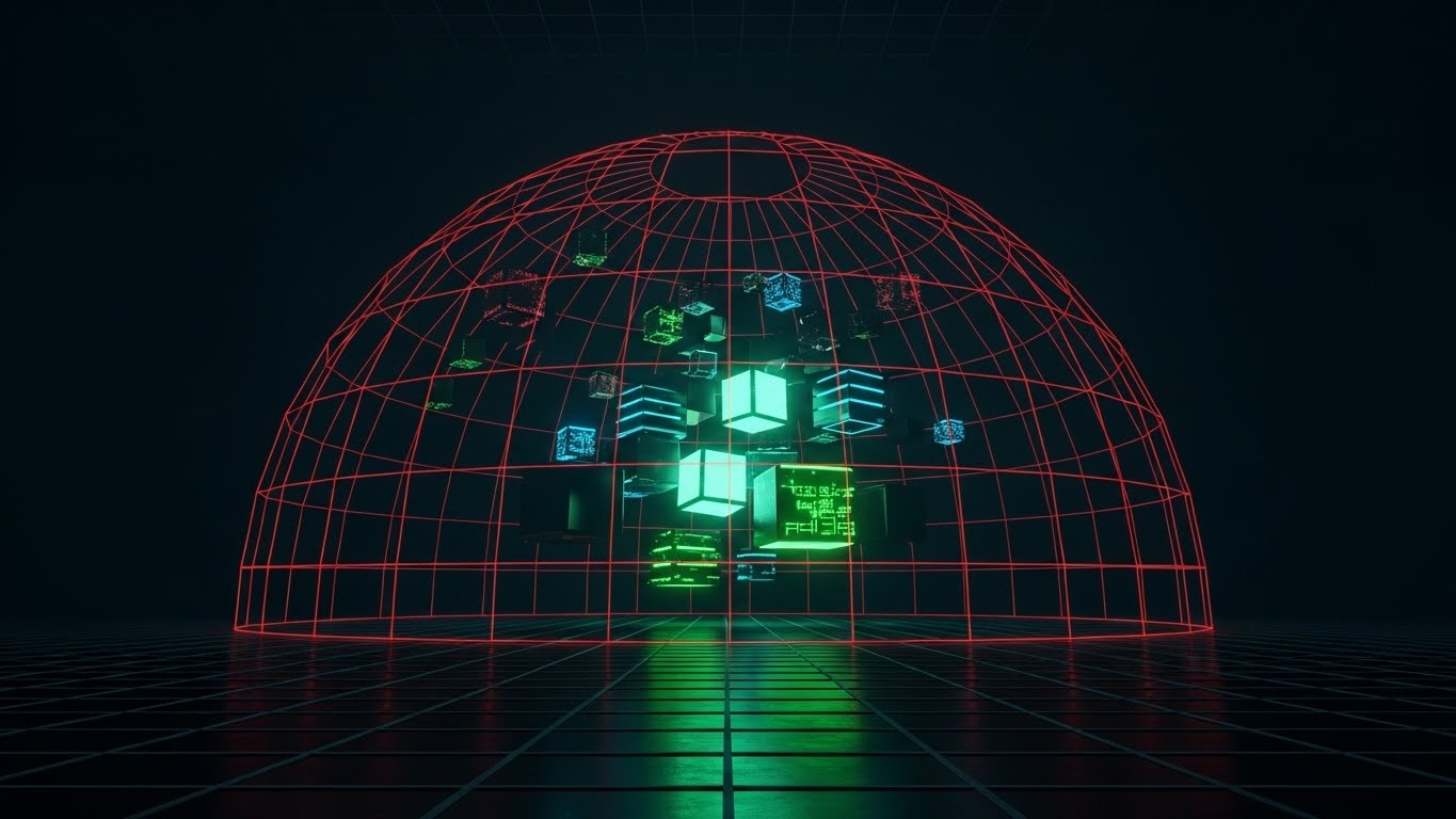
The Visual & Narrative Approach
Visualization Scenario: In an era of privacy sandboxes and GDPR compliance, this style visualizes security. A dark, grid-lined environment is illuminated by a glowing neon red protective dome. Inside this shield, abstract data cubes (representing user identities or first-party data) float securely, untouched by the external environment. The low-angle perspective makes the shield appear imposing and impenetrable. The aesthetic borrows from cybersecurity visual language—clean, dark, and vigilant.
Narration Tone: Serious, protective, and vigilant. It emphasizes "sovereignty," "compliance," and "protection."
Psychological Impact & KPI Focus
- Safety: Alleviates the fear of data leakage. It visually confirms that the platform is a fortress for the client's most valuable asset: their audience data.
- Operational Impact: Visualizes Data Privacy Compliance, Clean Rooms, and First-Party Data Onboarding.
Strategic Implementation & Trade-offs
- Best Use Case: Security/Privacy Policy pages or "Trust Center" sections of the website.
- Trade-off: Can feel "dystopian" if too dark. The neon accents must remain clean, not menacing.
Companies using similar video content -
InfoSum – Data Clean Room – Visualizing secure, privacy-preserving data collaboration.
DoubleVerify – Authentic Brand Safety – Emphasizing protection and compliance in a dark, neon aesthetic.
14. 3D X-Ray Visualization
MOFU | Overcoming Objections

The Visual & Narrative Approach
Visualization Scenario: This style addresses the demand for supply chain transparency. We see a complex machine rendered in translucent white and blue materials. The outer shell is semi-transparent, acting as an X-ray view that reveals an internal mechanism of clockwork gears and floating data streams (green). This visual metaphor shows "what's under the hood" of the auction, stripping away the mystery of fees and supply paths.
Narration Tone: Honest, transparent, and intricate. It focuses on "clarity," "insight," and "disclosure."
Psychological Impact & KPI Focus
- Trust: Transparency is the antidote to skepticism. By "showing the gears," you signal that you have nothing to hide regarding take rates or inventory sources.
- Operational Impact: Supports Supply Path Optimization (SPO) and Fee Transparency narratives.
Strategic Implementation & Trade-offs
- Best Use Case: "Deep Dive" Explainer Videos or Technical Webinars. It keeps viewers engaged while complex topics are discussed.
- Trade-off: Visual complexity. Requires high-resolution viewing to appreciate the details; not suitable for mobile banners.
Companies using similar video content -
PubMatic – OpenWrap – Revealing the internal mechanics of header bidding and supply paths.
Index Exchange – Exchange – Showing transparency in the ad exchange's internal processes.
15. Clean UI Workflow (Light Mode)
BOFU | Risk Mitigation

The Visual & Narrative Approach
Visualization Scenario: As we move to the bottom of the funnel, the focus shifts to usability. This style presents a high-fidelity, abstracted representation of the SaaS dashboard in "Light Mode." Sky blue and paper-white widgets—pie charts, line graphs, and data tables—float slightly off the screen surface, casting soft shadows. There is no legible text to distract the eye, only horizontal lines representing data fields. The lighting is diffuse and airy, promising a friction-free experience.
Narration Tone: Fresh, simple, and efficient. It emphasizes "ease," "clarity," and "workflow."
Psychological Impact & KPI Focus
- Ease of Adoption: The clean aesthetic counters the fear that the platform will be clunky or difficult to learn. It promises a "clean slate" for the AdOps team.
- Operational Impact: Visualizes Dashboard Customization and Reporting Usability.
Strategic Implementation & Trade-offs
- Best Use Case: Whitepaper Covers and Case Study PDFs. It projects a professional, organized image that looks great in print or digital documents.
- Trade-off: Lacks grit. It doesn't show the "power" features, just the "pretty" reporting.
Companies using similar video content -
HubSpot – Marketing Hub – Presenting a clean, user-friendly dashboard for campaign management.
Sprinklr – Unified-CXM Platform – Simplifying complex social and ad analytics in a light UI.
16. Dark Mode UI Showcase
BOFU | Driving Demo Requests

The Visual & Narrative Approach
Visualization Scenario: While managers love Light Mode, power users live in Dark Mode. This style showcases the interface in charcoal greys with vibrant "Cyber Yellow" accents, viewed from a dynamic tilted perspective. Background panels subtly reveal code syntax or API logs. This signals that the platform isn't just a simple dashboard—it's a developer-friendly environment capable of custom integrations. The monitor glow suggests late-night productivity.
Narration Tone: Professional, technical, and sophisticated. It speaks to "power users," "APIs," and "customization."
Psychological Impact & KPI Focus
- Expertise: Dark mode is the uniform of the expert. It signals that this tool is built for serious, high-volume traders and developers.
- Operational Impact: Visualizes API Integration, Log Level Data Access, and Advanced Scripting.
Strategic Implementation & Trade-offs
- Best Use Case: Developer Documentation pages or Technical Landing Pages.
- Trade-off: Can alienate non-technical buyers who might find the "code" aesthetic intimidating.
Companies using similar video content -
Segment – Customer Data Platform – Showcasing a developer-friendly interface for data integration.
Braze – Customer Engagement Platform – Highlighting API access and customization for power users.
17. Macro UI Micro-Interactions
BOFU | The Economic Buyer

The Visual & Narrative Approach
Visualization Scenario: Sometimes, the most powerful message is simplicity. This style uses an extreme macro close-up of a single UI element: a toggle switch flipping from grey to vibrant gold (or brand color). The background is a heavy bokeh blur. The lighting highlights the tactile texture of the button. This single action symbolizes "Activation"—the moment a campaign goes live or a powerful feature (like "Auto-Optimize") is engaged.
Narration Tone: Decisive, satisfying, and impactful. It focuses on "control," "activation," and "results."
Psychological Impact & KPI Focus
- Control: The tactile nature of the switch triggers a sense of immediate power. It implies that complex results are just one click away.
- Operational Impact: Visualizes Automation Triggers and Ease of Setup.
Strategic Implementation & Trade-offs
- Best Use Case: Email Headers. The simple, bold visual works perfectly in the small viewing window of an email client.
- Trade-off: Zero context. It relies entirely on the accompanying text to explain what is being toggled.
Companies using similar video content -
AdRoll – Growth Platform – Focusing on a single, impactful toggle for campaign activation.
Marin Software – MarinOne – Emphasizing ease of control with a tactile UI element.
18. 3D Parallax UI Presentation
BOFU | The Functional Buyer

The Visual & Narrative Approach
Visualization Scenario: To visualize the multi-dimensional nature of ad targeting (Audience, Inventory, Creative, Time), we use a 3D parallax composition. Multiple UI "glass sheets" float in deep space, layered one behind the other. The camera looks through the violet-tinted layers, seeing data visualizations on each sheet. This implies depth and richness without clutter. It suggests that the platform allows you to drill down through layers of data.
Narration Tone: Deep, analytical, and comprehensive. It emphasizes "depth," "layers," and "dimensionality."
Psychological Impact & KPI Focus
- Sophistication: The layered effect suggests a tool that can handle complex, multi-variate problems. It appeals to the functional buyer who needs to dig into the details.
- Operational Impact: Visualizes Multi-Touch Attribution and Granular Targeting Layers.
Strategic Implementation & Trade-offs
- Best Use Case: Product Demo Videos. It serves as a sophisticated intro bumper before diving into the actual screen recording.
- Trade-off: Abstract representation. It beautifies the UI, so it must be followed by actual screenshots to manage expectations.
Companies using similar video content -
Oracle Marketing Cloud – Responsys – Visualizing multi-dimensional targeting and data layers.
Salesforce Marketing Cloud – Datorama – Presenting layered data visualizations for deep insights.
19. Rapid UI Feature Montage
BOFU | The Technical Buyer
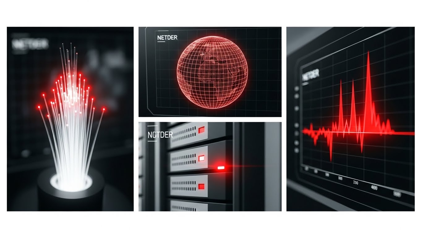
The Visual & Narrative Approach
Visualization Scenario: This style communicates speed and breadth. A 3x3 grid composition features rapid vignettes of different tech elements: a close-up of a fiber cable, a wireframe global map, a blinking server light, and an abstract graph spiking. The aesthetic uses high-contrast black and white with red accents. The imagery simulates motion blur and high energy, conveying the sheer processing power and global reach of the DSP.
Narration Tone: Fast-paced, global, and energetic. It focuses on "speed," "reach," and "scale."
Psychological Impact & KPI Focus
- Momentum: The rapid cuts create a feeling of momentum and inevitability. It suggests a platform that is moving fast and taking the market with it.
- Operational Impact: Visualizes Global Reach, Real-Time Bidding Speed, and Ecosystem Connectivity.
Strategic Implementation & Trade-offs
- Best Use Case: Social Media Shorts (YouTube Shorts/TikTok) or event loop videos. The high energy captures attention in distracting environments.
- Trade-off: Can be overwhelming. It’s a mood piece, not an educational one.
Companies using similar video content -
Digital Turbine – Ignite – Conveying speed and global reach for mobile app advertising.
AppLovin – AppDiscovery – Showcasing rapid processing power and global ecosystem connectivity.
20. Lifestyle Stock with UI Overlay
BOFU | Sales Cycle Acceleration

The Visual & Narrative Approach
Visualization Scenario: Finally, we return to the human element. A high-quality over-the-shoulder shot shows a media buyer in a sunlit, modern creative agency. They are looking at a sleek monitor displaying a glowing, semi-transparent UI overlay of analytics curves. The lighting is natural and warm. This style grounds the software in the daily life of the user, showing it not as a burden, but as an empowering tool that fits into a pleasant work environment.
Narration Tone: Relatable, human, and successful. It emphasizes "partnership," "empowerment," and "success."
Psychological Impact & KPI Focus
- Relatability: It helps the prospect visualize themselves using the tool. It counters the sterile, cold nature of pure tech visuals by adding a human face.
- Operational Impact: Visualizes User Experience (UX) and Workflow Integration.
Strategic Implementation & Trade-offs
- Best Use Case: Sales Decks and Closing Presentations. It reminds the buyer that this purchase is for people—their team.
- Trade-off: Can look like generic stock photography if the UI overlay isn't custom and specific to the brand.
Companies using similar video content -
Skai – Intelligent Marketing Platform – Grounding software in the daily life of a media buyer.
Adverity – Marketing Intelligence Platform – Showing users interacting with data dashboards in a modern setting.
21. Aspirational Stock Montage
Onboarding | Self-Serve Onboarding

The Visual & Narrative Approach
Visualization Scenario: The journey begins with a vision of the destination. We utilize a cinematic low-angle hero shot of a diverse corporate executive standing confidently against a bright, golden-hour city skyline. The lens flare adds a touch of optimism and premium quality. They are holding a tablet, not frantically tapping it, but reviewing it with satisfaction. The palette is rich with warm golds and stabilizing deep greens. This isn't about the software's buttons; it's about the result of using the software: professional ascendancy.
Narration Tone: Inspiring, welcoming, and visionary. It speaks to "arrival," "potential," and "new beginnings."
Psychological Impact & KPI Focus
- Validation: Onboarding is often stressful. This visual validates the buyer's decision, reassuring them that they have joined the ranks of successful, forward-thinking leaders.
- Operational Impact: Sets the emotional stage for Platform Adoption, reducing initial resistance to change.
Strategic Implementation & Trade-offs
- Best Use Case: The "Welcome" Email or the very first frame of the Onboarding Video Series.
- Trade-off: It is purely emotional. It must be immediately followed by practical, tactical content (like Style 22) to maintain momentum.
Companies using similar video content -
Adobe Experience Cloud – Marketing Cloud – Inspiring vision of executive success with integrated marketing.
22. Hyper-lapse Stock Footage with Data
Onboarding | Accelerating TTV

The Visual & Narrative Approach
Visualization Scenario: To bridge the gap between the physical world and the digital dashboard, we use a high-energy hyper-lapse of a busy city intersection. Cars streak by in blurs of motion. Overlaying this physical chaos are glowing, orderly digital data streams in "Tech Blue," moving in perfect sync with the traffic. Text tags float above clusters of cars, reading "Audience Segment: Commuters" or "Geo-fence Active." It visually demonstrates that your platform translates real-world chaos into structured, actionable data.
Narration Tone: Energetic, pacing, and transformative. It emphasizes "speed," "translation," and "insight."
Psychological Impact & KPI Focus
- Competence: It reinforces the idea that the platform is "always on" and processing the world faster than a human could.
- Operational Impact: Directly addresses Time-to-Value (TTV) by showing how quickly raw activity is converted into campaign data.
Strategic Implementation & Trade-offs
- Best Use Case: The Login Screen background or the "Data Sources" training module.
- Trade-off: If the data graphics are too dense, it can look messy. The tracking must be rock-solid (motion-tracked) to look professional.
Companies using similar video content -
Tapad – Graph – Visualizing real-time cross-device data from city traffic.
Neustar – Identity Resolution – Showing real-time data translation from physical world to digital.
23. 2D Graphics Over Live Action
Onboarding | Reducing Friction

The Visual & Narrative Approach
Visualization Scenario: Training videos often suffer from being dry. This style solves that by placing a friendly, professional presenter in a clean, white tech environment. As they explain complex concepts (like "Waterfall vs. Header Bidding"), bright lime green 2D vector icons (checks, arrows, play buttons) pop up in the air around them. The graphics interact with the presenter—they might "catch" an icon or point to a floating chart. It blends the human connection of a teacher with the clarity of a diagram.
Narration Tone: Friendly, instructional, and clear. It creates a "peer-to-peer" learning vibe.
Psychological Impact & KPI Focus
- Approachability: The human face reduces the intimidation factor of complex SaaS tools. It feels like a conversation, not a lecture.
- Operational Impact: Critical for Completion Rates of training modules and reducing Support Ticket Volume.
Strategic Implementation & Trade-offs
- Best Use Case: Core Training Library and "How-To" video series.
- Trade-off: Requires a charismatic presenter. A stiff actor can ruin the effect.
Companies using similar video content -
Google Ads – Training Resources – Simplifying complex ad concepts with a friendly presenter.
Meta Business Suite – Learning Center – Using live presenters with graphics for training.
24. Holographic UI over 3D Render
Retention | Trial User Activation
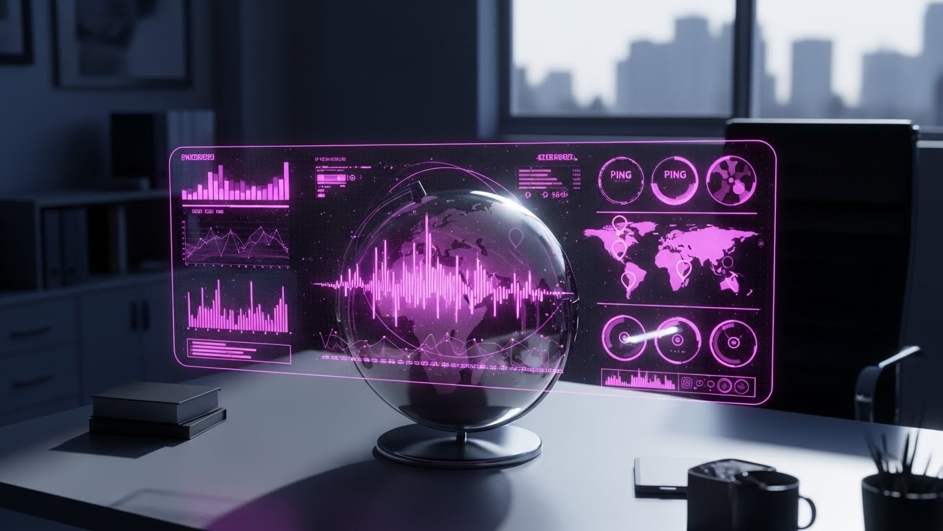
The Visual & Narrative Approach
Visualization Scenario: To encourage users to launch their first global campaign, we use a cinematic "Command Center" aesthetic. A realistic 3D globe sits on a desk in a darkened, futuristic office. A transparent, neon-pink holographic UI projects outward from the globe, showing "Ping" locations of active bids and equalizer bars representing spend velocity. It elevates the mundane task of "setting geo-targeting" into the feeling of running a mission control center.
Narration Tone: Epic, empowering, and grand. It emphasizes "command," "reach," and "activation."
Psychological Impact & KPI Focus
- Empowerment: It gamifies the user experience. The user feels powerful, like a director of global operations, which encourages feature usage.
- Operational Impact: Drives Feature Activation and Campaign Launch Rates during the trial period.
Strategic Implementation & Trade-offs
- Best Use Case: In-App Modals (e.g., "Ready to Launch?") or Feature Highlight emails.
- Trade-off: It sets a high visual bar. The actual product UI might look flat by comparison, so manage expectations.
Companies using similar video content -
Roku – Advertising Platform – Gamifying CTV campaign control with a global command center.
Samsung Ads – DSP – Elevating ad targeting to a mission control experience.
25. 2D Animation & UI Composition
Retention | Reducing Churn
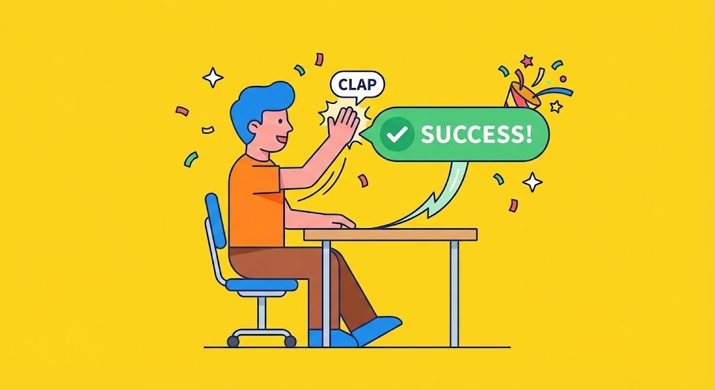
The Visual & Narrative Approach
Visualization Scenario: Positive reinforcement is key to retention. This style uses vibrant, flat 2D vector animation. A stylized user character sits at a desk and physically high-fives a floating UI element that displays a green checkmark and "Success!" text. Confetti bursts in the background (yellow and orange). It creates a dopamine loop, visually rewarding the user for completing a task or hitting a KPI. The mood is light, fun, and celebratory.
Narration Tone: Cheerful, supportive, and enthusiastic. It emphasizes "wins," "progress," and "partnership."
Psychological Impact & KPI Focus
- Habit Formation: By associating platform usage with visual rewards (celebration), you build a positive emotional habit loop.
- Operational Impact: Directly targets Daily Active Users (DAU) and Churn Reduction by making the platform feel rewarding.
Strategic Implementation & Trade-offs
- Best Use Case: "Milestone Reached" emails (e.g., "You delivered your 1st Million Impressions") or in-app success states.
- Trade-off: Can feel childish if overused. Save it for genuine wins.
Companies using similar video content -
Mailchimp – Marketing Platform – Using cheerful animation for campaign success and positive feedback.
ActiveCampaign – Marketing Automation – Reinforcing positive user actions with celebratory animations.
26. Wireframe to Reality Transition
Retention | Driving Deep Feature Adoption
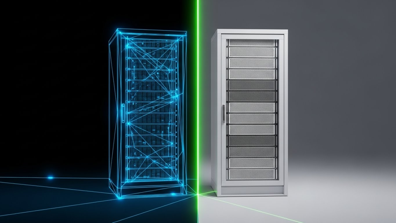
The Visual & Narrative Approach
Visualization Scenario: To convince users to upgrade to premium infrastructure features, we visualize the "build quality." The screen is split vertically. The left side shows a complex blue wireframe blueprint of a server rack or data structure. A glowing laser line scans across to the right, revealing the final, photorealistic render in pristine white and silver. It visualizes the transition from "Plan" to "Execution," or "Basic" to "Premium." It says: "This isn't just code; it's engineered infrastructure."
Narration Tone: Sophisticated, transformative, and premium. It emphasizes "engineering," "quality," and "upgrade."
Psychological Impact & KPI Focus
- Perceived Value: It highlights the depth of engineering behind the scenes, justifying a higher price point for premium tiers.
- Operational Impact: Supports Upsell/Cross-sell narratives by visually simplifying the robustness of the Enterprise tier.
Strategic Implementation & Trade-offs
- Best Use Case: Upgrade Pages or "Enterprise Feature" spotlights.
- Trade-off: Abstract. Best suited for technical audiences who appreciate "architecture."
Companies using similar video content -
Snowflake – Data Cloud – Visualizing the transition from data architecture blueprint to robust platform.
Databricks – Lakehouse Platform – Showing the engineering behind data infrastructure.
27. Split Screen: Optimized Reality and UI
Expansion | Driving Upsell
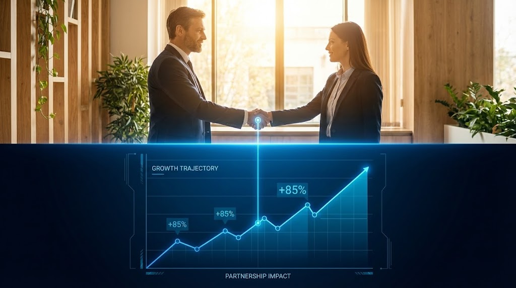
The Visual & Narrative Approach
Visualization Scenario: Business growth is about both relationships and results. This style uses a horizontal split screen. The top half shows a warm, cinematic photograph of a handshake between two business professionals in a sunlit office. The bottom half displays a clean, high-tech UI graph trending sharply upwards in "Tech Blue." A connecting line draws a direct visual link between the handshake (the partnership) and the graph (the revenue). It creates a cause-and-effect relationship between the service and the growth.
Narration Tone: Professional, correlative, and proven. It emphasizes "growth," "collaboration," and "results."
Psychological Impact & KPI Focus
- Correlation: It visually proves the ROI of the partnership. It answers the CFO's question: "What are we getting for this contract?"
- Operational Impact: Critical for Account Expansion and Contract Renewal discussions.
Strategic Implementation & Trade-offs
- Best Use Case: Case Study videos and Quarterly Business Review (QBR) decks.
- Trade-off: Relies on high-quality stock. Bad stock photos will make it look like a generic bank ad.
Companies using similar video content -
Impact.com – Partnership Automation – Connecting human partnerships with quantifiable growth metrics.
Partnerize – Partner Management Platform – Quantifying partnership value with split-screen visuals.
28. Mixed Media Testimonial Montage
Expansion | Knowledge Base

The Visual & Narrative Approach
Visualization Scenario: Authentic user-generated content meets high-end branding. We frame vertical smartphone footage of real clients (AdOps Directors, CMOs) within a polished, branded frame. As they speak about their wins, key phrases ("30% ROI lift," "saved 10 hours") animate on-screen in bold, kinetic typography. This blends the raw authenticity of a peer review with the authority of the platform's brand identity.
Narration Tone: Authentic, trusted, and peer-to-peer. It emphasizes "community," "results," and "truth."
Psychological Impact & KPI Focus
- Trust: In B2B, peers are the ultimate influencers. Seeing a real person in a casual setting validates the polished marketing claims.
- Operational Impact: Supports Net Promoter Score (NPS) and Referral Program narratives.
Strategic Implementation & Trade-offs
- Best Use Case: Social Media Retargeting (LinkedIn/Instagram) and "Customer Stories" website sections.
- Trade-off: Audio quality of UGC can be poor; requires good subtitles and sound mixing to remain professional.
Companies using similar video content -
Terminus – ABM Platform – Using mixed media testimonials for peer validation in ABM.
RollWorks – ABM Platform – Amplifying client success stories with authentic voices.
29. 3D Event & Ecosystem Montage
Expansion | Driving Advocacy

The Visual & Narrative Approach
Visualization Scenario: To position the platform as an industry leader, not just a tool, we use a 3D montage of "connection." Gold and silver nodes (representing partners, events, and integrations) orbit a central brand monolith. Interspersed are clips of the brand’s presence at major industry events (Cannes, dmexco), filtered with a premium color grade. It visualizes the platform as the gravitational center of the AdTech ecosystem.
Narration Tone: Leading, expansive, and authoritative. It speaks to "movement," "future," and "center of gravity."
Psychological Impact & KPI Focus
- FOMO (Fear Of Missing Out): Suggests that this platform is where the industry is heading. Being outside of it means being left behind.
- Operational Impact: Visualizes Partner Integrations and API Ecosystem Strength.
Strategic Implementation & Trade-offs
- Best Use Case: Annual Wrap-Up Videos or Event Invitation Backgrounds.
- Trade-off: High level effort. Requires footage from actual events or high-end 3D assets to represent the "ecosystem."
Companies using similar video content -
OpenX – Ad Exchange – Visualizing its role as a central node in the ad ecosystem.
Yahoo Ad Tech – DSP – Visualizing its broad ecosystem and partnerships.
30. Generative AI Realistic Character
Expansion | ROI Justification

The Visual & Narrative Approach
Visualization Scenario: We conclude with the ultimate decision-maker. A hyper-realistic, AI-generated video portrait of a CEO standing in a high-end glass-walled boardroom. The lighting is soft, cinematic studio quality. The background is a soft bokeh of a metropolis. The character speaks (lip-synced) with passion and a slight, confident smile. They hold a tablet but look at the camera. This isn't a "user"; this is a "leader" who is satisfied with the financial results the platform delivered.
Narration Tone: Authoritative, satisfied, and credible. It emphasizes "value," "strategy," and "bottom line."
Psychological Impact & KPI Focus
- Authority: This speaks the language of the C-Suite. It mirrors the persona of the Economic Buyer, validating the purchase at the highest level.
- Operational Impact: The ultimate tool for QBRs (Quarterly Business Reviews) and ROI Justification.
Strategic Implementation & Trade-offs
- Best Use Case: Testimonial compilations (where privacy prevents real client footage) or high-level brand manifestos.
- Trade-off: AI characters must be flawless. Any "uncanny valley" effect will destroy trust.
Strategic Knowledge Base: The Visual Operations Doctrine
To transform these 30 visual styles from "marketing assets" into a "competitive business advantage," we must apply a strategic framework. Below is the Visual Operations Doctrine, divided into three core segments. This doctrine bridges the gap between AdTech complexity and operational clarity.
Strategic Alignment & Visual Architecture (Pre-Production)
The "Why" and "Who" of Visual Strategy.
Before a single pixel is rendered, the visual architecture must be defined to align with business goals. This is not about "making it pretty"; it is about Cognitive Ergonomics.
- The Cognitive Load Audit: AdTech platforms are dense. Before creating a video, conduct an audit of your current training materials. If a concept takes 3 paragraphs to explain, it qualifies for a Visual Translation (e.g., Style 2 or 10). The goal is to reduce the "Time-to-Comprehension" for a junior AdOps trader.
- Role-Based Visual Mapping: Different users need different visual languages.
- The Trader (User): Needs Dark Mode UI (Style 16) and Kinetic Typography (Style 4). They care about speed, shortcuts, and dark-mode compatibility.
- The CMO (Buyer): Needs Aspirational Stock (Style 21) and Dynamic Data Viz (Style 6). They care about scale, reporting, and "boardroom-ready" aesthetics.
- The "Glanceability" Standard: In a real-time bidding environment, users don't have time to study a video. Visuals must be "glanceable"—understood in under 2 seconds. This is where Minimalist Flat 2D (Style 1) excels.
- Brand Voice Consistency: Your DSP likely consists of multiple modules (DMP, DSP, Analytics). Use a unified visual thread—like the "Neon" accent in Style 13—across all videos to create a cohesive product identity that stitches these modules together.
- The Advids Strategic Audit: Defining this visual language requires an external eye. Partnering with a specialized agency like Advids allows for a comprehensive audit of your existing assets, ensuring that your new visual "operating system" is consistent across Sales, Support, and Product.
- Standardization vs. Customization: Establish a "Visual Style Guide" for your video content just as you have for your brand logo. Decide early: Do we use Isometric 3D (Style 10) for all automation features? Consistency breeds familiarity, which speeds up learning.
- The Cross-Departmental Bridge: Use visuals to unify terminology. If Product calls it "Optimization" and Sales calls it "AI," use Abstract 3D AI (Style 11) to visually define the term for both teams, acting as the single source of truth.
- Legacy System Integration: Many clients are migrating from manual insertion orders (IOs) to programmatic. Use Wireframe to Reality (Style 26) to visually demonstrate the transition from "Old Way" to "New Way" without disrespecting the user's past methods.
- Accessibility in Global AdTech: Programmatic is global. Ensure text-heavy styles like Kinetic Typography (Style 4) are designed with separate text layers to allow for rapid translation into Japanese, German, or Spanish without re-rendering the complex 3D elements.
- The Mobile-First Mandate: Even desktop-heavy DSPs are researched on mobile. Ensure all 30 styles—especially Macro UI (Style 17)—are optimized for vertical viewing on LinkedIn to capture the attention of commuting executives.
Operational Adoption & Implementation (Deployment)
The "How" of embedding visuals into the workflow.
The best video in the world is useless if it sits unseen on a YouTube channel. This segment focuses on embedding these styles directly into the user's operational reality.
- The Micro-Learning Shift: Kill the PDF manual. Replace 50-page docs with a library of 30-second clips using Clean UI Workflow (Style 15). Embed these videos directly into the SaaS dashboard (e.g., a tooltip on the "Bid Factor" button opens a Style 15 video).
- Overcoming "Black Box" Anxiety: Clients fear what they can't see. Use 3D X-Ray Visualization (Style 14) and Abstract 3D AI (Style 11) proactively during onboarding to visually "open the box." This builds trust faster than any whitepaper.
- Just-in-Time Support: Support tickets are a major cost center. Deploy 2D Graphics Over Live Action (Style 23) videos in your Help Center. When a user searches "How to integrate API," they should see a Dark Mode UI (Style 16) video, not a text wall.
- Gamification of Training: Use 2D Character Story (Style 5) and Celebration Styles (Style 25) to gamify the learning process. Award "Visual Badges" for completing video modules. This increases training completion rates, a leading indicator of retention.
- Reducing Support Ticket Volume: There is a direct correlation between proactive visual guides and reduced support load. Deploying Line Art Blueprint (Style 2) videos for the top 5 most common support queries can deflect up to 40% of L1 tickets.
- Remote Onboarding: With distributed AdOps teams, you cannot rely on in-person seminars. Use Character Story (Style 5) to create an emotional connection during remote onboarding sessions, reducing the sense of isolation.
- Standard Operating Procedures (SOPs): Transform text-based campaign setup SOPs into linear video flows using Minimalist Flat (Style 1) to ensure consistent campaign execution across teams and reduce human error.
- Feedback Loops: Use interactive video elements (end cards) on Testimonials (Style 28) to gather immediate viewer feedback. If a user pauses a "How-To" video frequently, it signals a friction point in the UI that needs product attention.
- Scalable Localization: For global DSPs, separate voiceover tracks from the visual assets in Low Poly Map (Style 9) to allow for rapid, low-cost translation of market-specific content (e.g., swapping "GDPR" for "CCPA" references).
- Leadership Communication: Empower your internal champions. Give them Gen AI Executive (Style 30) and Data Viz (Style 6) assets to present to their boards, making them look good for choosing your platform.
Measuring Impact & Future-Proofing (ROI)
The "Value" and "Evolution" of the visual strategy.
Finally, we must measure the impact of this visual overhaul and prepare for the future. Video is not a sunk cost; it is an asset class.
- Beyond "Views" - Actionable KPIs: Stop measuring video "views." Start measuring Time-to-Competency. Did the Isometric 3D Workflow (Style 10) video reduce the average time it takes a new user to set up their first campaign?
- The "Idle Time" Metric: Analyze platform logs. High "idle time" on a specific page usually means confusion. Target these pages for a Macro UI Interaction (Style 17) video intervention to smooth the workflow.
- Compliance Velocity: In an era of privacy regulation (GDPR/CCPA), use Futuristic Security (Style 13) to rapidly educate users on new rules. Measure how fast compliance is achieved post-viewing compared to text-only updates.
- Retention and Churn Correlation: Track the "Health Score" of clients who engage with your Feature Adoption videos (Style 26) versus those who don't. High-quality visual education creates "Sticky" users who utilize more features and churn less.
- The AI Visual Frontier: Prepare for the next wave. Generative AI (Style 30) is just the beginning. The future is real-time, personalized video generation where the dashboard creates a custom Data Viz video (Style 6) for the client on the fly for their QBR.
- Scalability of Assets: Build a library that grows with the feature set. The 3D assets from Server Rack (Style 12) should be reusable for future videos about capacity or security, reducing the marginal cost of new content.
- The Advids Partnership for Scale: As your platform evolves, your library must keep pace. A quarterly review with Advids ensures that your visual assets evolve with your roadmap. When you launch a CTV module, your visual language should seamlessly expand to include Abstract 2D Organic (Style 7) without breaking brand consistency.
- Benchmarking Success: Why "good enough" visuals are a competitive risk. If your competitor uses Photorealistic 3D (Style 12) and you use generic screenshots, you lose the perception of "Enterprise Readiness."
- The ROI of Safety: Quantify the value of error reduction. Visualizing "Brand Safety" controls (Style 13) effectively can save clients millions in wasted ad spend on bad inventory, a powerful ROI story for your sales team.
- Final Call to Innovation: Treat video not as "content," but as infrastructure. A well-visualized platform is easier to sell, easier to use, and harder to leave. Invest in your visual language as you invest in your code.
[END OF GUIDE]
Companies using similar video content -
Veeva Systems – Commercial Cloud – Personifying executive satisfaction with ROI in life sciences.
Medallia – Experience Cloud – Using AI-generated personas to convey executive satisfaction with customer experience.
Author & Editor Bio


