
Introduction: Charting the Course for Visual Clarity
The cruise industry is currently navigating a period of unprecedented technological evolution. With the maritime artificial intelligence sector now valued at $4.13 billion, the race to modernize the "floating city" is no longer just about hardware—it is about the software ecosystems that control everything from engine performance to guest satisfaction. For industry leaders, the challenge has shifted from simply acquiring data to visualizing it effectively across a global fleet.
The Physical-Digital Divide
The core operational anxiety for many executives lies in the "Physical-Digital Divide"—the gap between the rugged, steel reality of maritime operations and the fluid, cloud-based capabilities of modern SaaS platforms. How do you demonstrate a seamless "Smart Ship" ecosystem when your assets are moving targets in the middle of the Atlantic? The answer lies in strategic visualization. By using the right video styles, software providers can bridge this gap, translating complex backend logic into tangible operational benefits.
The Visual ROI of Efficiency
Visual clarity equates to operational speed. In an industry where efficiency is paramount, the impact of intuitive design is measurable; for instance, digital check-in processes have reduced boarding time by 30%. Your video content must mirror this efficiency. It should not just show features; it must demonstrate how your platform alleviates cognitive load for the crew and removes friction for the guest.
This guide outlines 30 high-impact video visualization styles tailored for Cruise Line Management Software. Each style is selected to address specific touchpoints in the buyer’s journey, from the high-level brand awareness of a photorealistic hull to the granular precision of an optimized UI. By adopting these visual standards, you position your platform not just as a tool, but as the essential navigational system for the future of cruising.
1. Photorealistic 3D Renders
TOFU | Brand Awareness
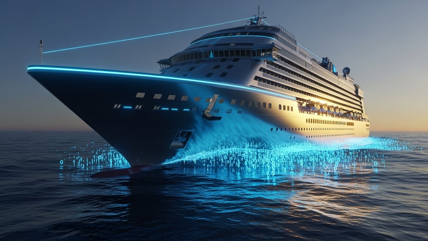
The Visual & Narrative Approach
This style leverages high-fidelity photorealism to create a "Digital Twin" of the physical asset. The scenario depicts a majestic cruise ship hull cutting through the ocean at golden hour. However, the water interacting with the hull is not just foam, but stylized streams of glowing binary code and data particles in deep sapphire and bioluminescent blue. The lighting is dramatic, highlighting the sleek chrome silver details of the vessel against a vast horizon.
Psychological Impact & KPI Focus
Niche Psychology: For C-Suite executives, this visual triggers a sense of Prestige and Mastery. It elevates the software from a utility to a core strategic asset. By replacing the chaotic randomness of the ocean with structured data streams, the visual psychologically reinforces the concept of predictability—a primary KPI for maritime operations. It signals that the platform brings order to the unpredictable nature of the sea.
Strategic Implementation & Trade-offs
- Best Use Case: High-impact Website Hero backgrounds or opening shots of a Brand Manifesto video (Duration: 10-15 seconds).
- Trade-off: High production value requires significant rendering time and budget. It is optimal for the "Wow Factor" but less effective for explaining detailed workflows.
Companies using similar video content -
Veridian – AMOS™ – Manages cruise technical assets, global fleet visibility.
KONGSBERG Gruppen ASA – K-Bridge – Integrated bridge systems, digital twin solutions.
MariApps – smartPAL – Comprehensive marine ERP, automates ship management.
2. Abstract 2D Flat Vector Organic
TOFU | Category Creation
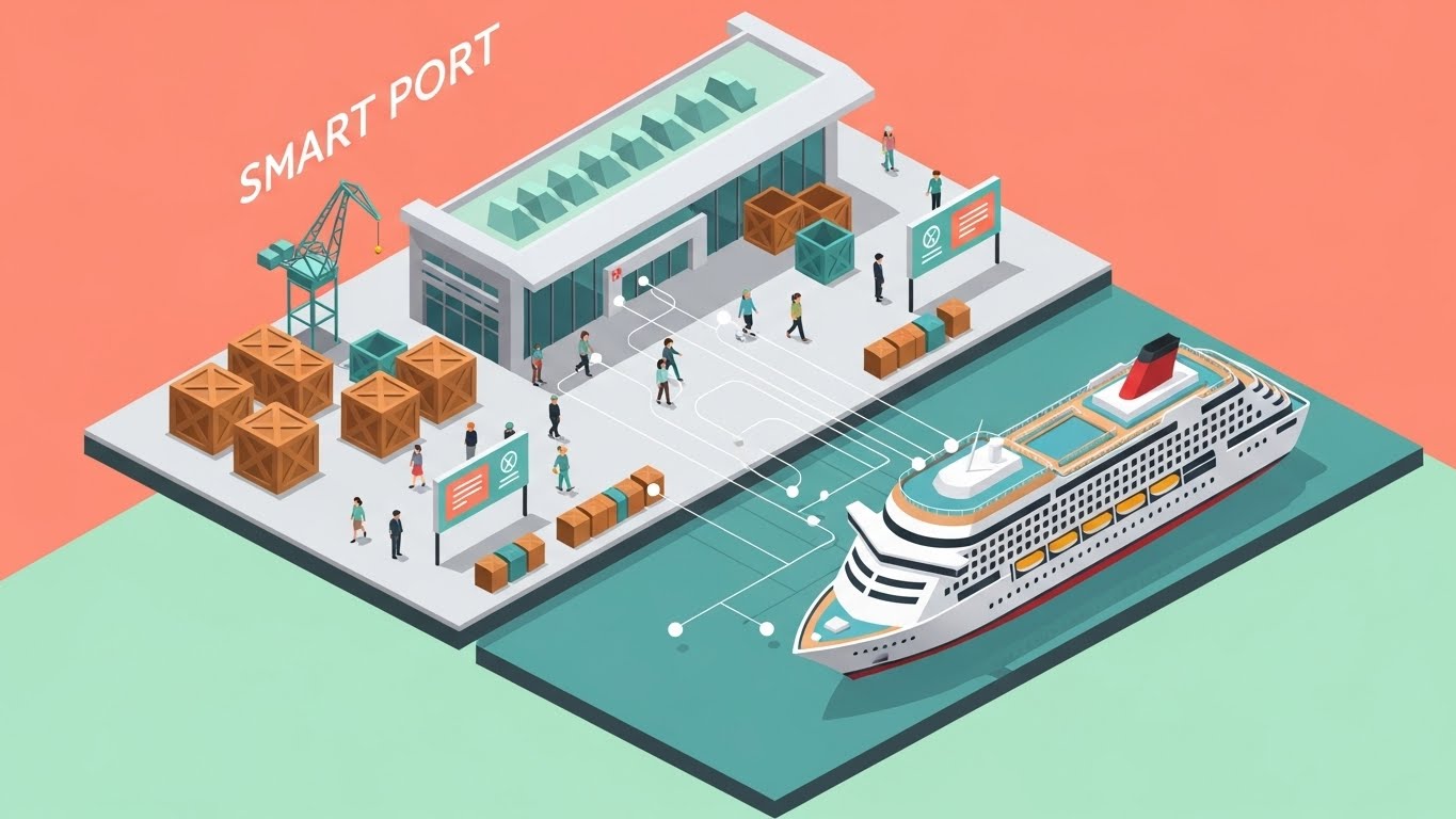
The Visual & Narrative Approach
To illustrate the complexity of port operations without overwhelming the viewer, this style uses a clean, isometric 2D vector aesthetic. The scene depicts a bustling cruise port terminal set against a pastel coral and soft mint green background. It shows a "Smart Port" ecosystem with stylized geometric cargo crates, passengers, and a cruise ship docked at a 45-degree angle. White data lines connect the ship to the shore infrastructure, symbolizing seamless integration.
Psychological Impact & KPI Focus
Niche Psychology: This style addresses Cognitive Load Reduction. Port turnaround days are inherently chaotic; this visual organizes that chaos into a manageable, logical system. For Operations Managers, it visually validates the promise of interoperability—showing that the software connects the ship to the shore infrastructure effortlessly.
Strategic Implementation & Trade-offs
- Best Use Case: LinkedIn carousel slides or explainer snippets focusing on API integrations and logistics flow (Duration: 30-45 seconds).
- Trade-off: The abstract nature can feel less "tangible" than 3D. It excels at explaining concepts but may lack the emotional weight of photorealism.
Companies using similar video content -
Cisco – Smart Port Solutions – IoT infrastructure for port connectivity.
AST Networks – Smart Port Ecosystems – Seamless ship-to-shore connectivity, optimize operations.
Accenture – Smart Port Consulting – Digital transformation for port efficiency.
3. Isometric 2D Motion Design
TOFU | Market Education
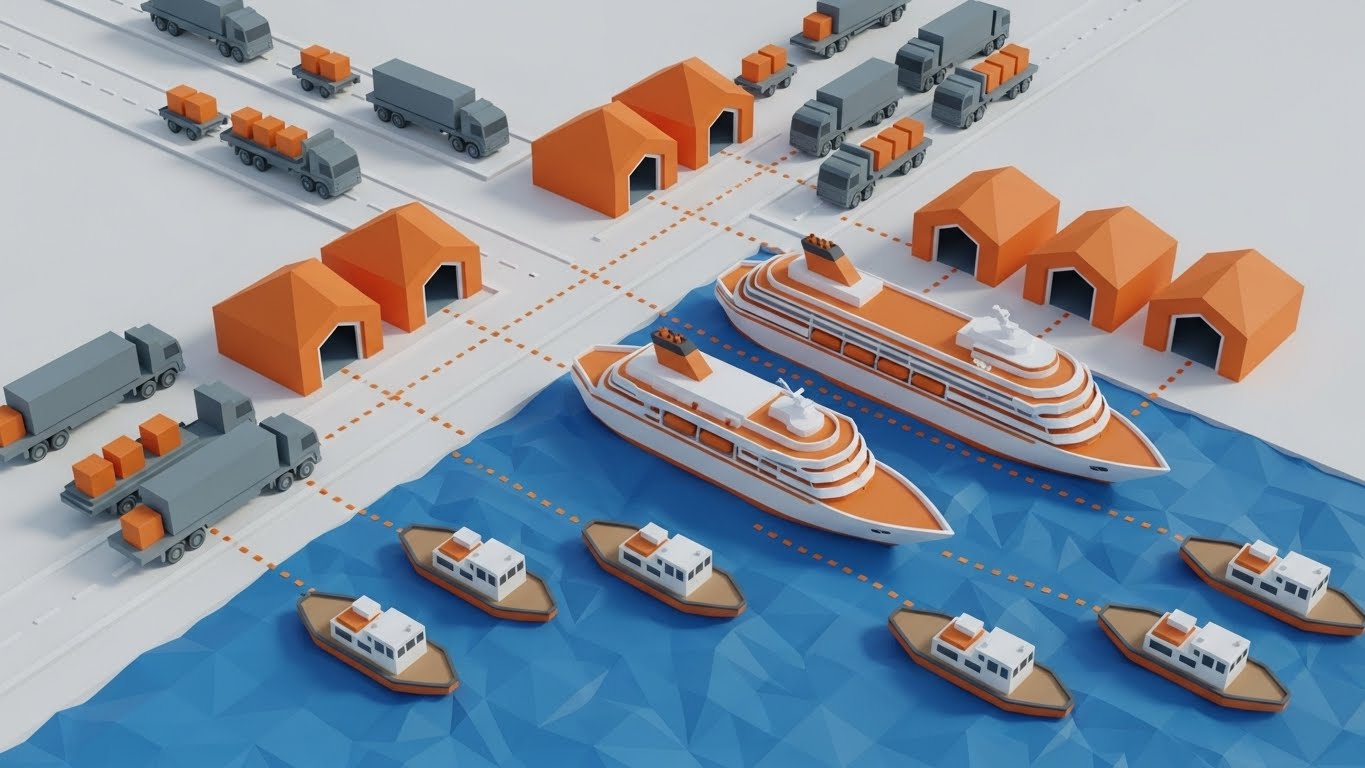
The Visual & Narrative Approach
This style uses a low-poly 3D environment to map the global cruise supply chain. Matte orange, slate gray, and pure white geometric shapes represent trucks, tender boats, and provision warehouses. The camera angle is a top-down "God View," showing the logistical flow moving toward a central low-poly ship. The lighting is soft and ambient, focusing entirely on the movement of goods.
Psychological Impact & KPI Focus
Niche Psychology: The primary trigger here is Pattern Recognition. The stylized geometry strips away the "noise" of real-world logistics (weather, traffic, paperwork) to show the pure, efficient logic of the software's algorithm. It appeals to Procurement Directors by visualizing efficiency and waste reduction—key metrics in the low-margin maritime supply sector.
Strategic Implementation & Trade-offs
- Best Use Case: Educational videos explaining inventory management or provisioning algorithms (Duration: 60-90 seconds).
- Trade-off: The simplified aesthetic may seem "playful" to some conservative stakeholders. It requires a professional voiceover to ground the visual in serious business value.
Companies using similar video content -
WHIZTEC – WHIZMarine – ERP for maritime supply chain, stores control.
Marine ERP – Planned Maintenance System – Streamlines maintenance, optimizes vessel performance.
Centerpoint ERP – Supply Chain Management – Streamlines complex supply chains, ensures compliance.
5. AI Generated Mixed Media Video
TOFU | Vertical Social Organic
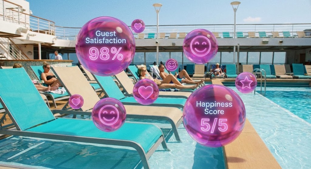
The Visual & Narrative Approach
Targeting the mobile-first executive, this mixed media style blends real footage with dynamic 3D motion graphics. As the camera moves past lounge chairs on a sunny pool deck in tropical turquoise tones, 3D pop-up bubbles in magenta appear over guests, displaying "Guest Satisfaction" scores and positive sentiment icons.
Psychological Impact & KPI Focus
Niche Psychology: This visual leverages Social Proof and Quantification. It validates the software's impact on Net Promoter Score (NPS). By visually attaching data points to happy guests, it bridges the gap between the IT department (who buys the software) and the Guest Experience team (who benefits from it). It makes the intangible "happiness" metric tangible and trackable.
Strategic Implementation & Trade-offs
- Best Use Case: Short, punchy vertical videos for social media recruitment or brand awareness (Duration: 15-30 seconds).
- Trade-off: Requires high-quality stock or original footage. The pacing must be fast to retain attention on social platforms, limiting the depth of technical information.
6. Generative AI Realistic Character Video
TOFU | Skippable Pre-Roll Ad
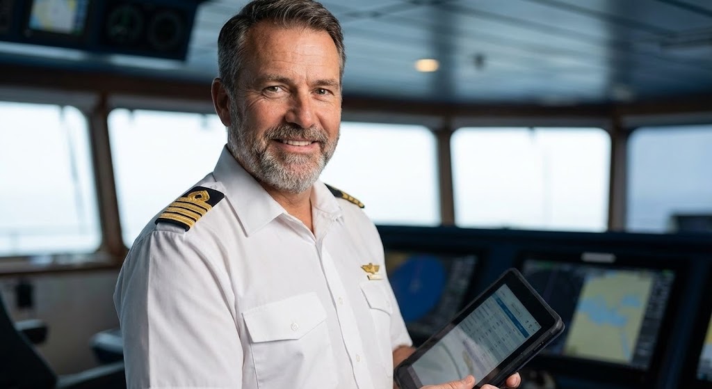
The Visual & Narrative Approach
Trust is the currency of the maritime industry. This style utilizes a high-fidelity Generative AI character—a professional cruise ship captain with a warm, confident smile and a pristine white uniform. Set against a soft-focus, high-end bridge background, he holds a digital tablet. The lighting is studio-quality, highlighting his trustworthy expression.
Psychological Impact & KPI Focus
Niche Psychology: The driver here is Authority Bias. Software decisions in maritime are high-risk; seeing a "Captain" endorse or utilize the tool reduces perceived risk. It appeals to the conservative nature of the industry by presenting innovation through a familiar, respected figure. The tablet acts as a subtle anchor, suggesting that the technology is now a standard part of the command hierarchy.
Strategic Implementation & Trade-offs
- Best Use Case: "Hook" segments of pre-roll ads to stop the scroll, or customer testimonial simulations (Duration: 6-10 seconds).
- Trade-off: AI characters must be generated with extreme precision to avoid the "Uncanny Valley," which would immediately destroy credibility.
Companies using similar video content -
Agilysys – Cruise Line Solutions – AI-driven operations for guest satisfaction.
IBS Software – iTravel Cruise SaaS – Customer-centric platform for guest experience.
Trawex Technologies – Cruise Management Software – AI-powered customization for client journeys.
7. Futuristic Neon/Dark Mode
TOFU | ABM Awareness
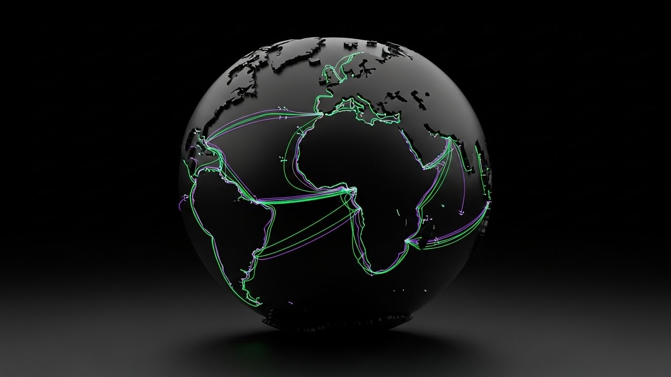
The Visual & Narrative Approach
A dark mode visualization featuring a stylized 3D globe in matte black. Glowing neon purple and cyber green lines trace cruise ship itineraries across the oceans. The aesthetic is sleek, high-tech, and data-driven, with glowing shipping lanes illuminating the dark environment.
Psychological Impact & KPI Focus
Niche Psychology: This style appeals to the desire for Omniscience and Oversight. It targets Fleet Operations Directors who need to feel they have a pulse on every vessel, everywhere. The contrast of neon on black reduces eye strain and mimics the actual UI of high-end monitoring systems (ECDIS), creating a sense of familiarity and sophistication.
Strategic Implementation & Trade-offs
- Best Use Case: Background visuals for webinars, whitepaper landing pages, or ABM ads targeting enterprise fleet owners (Duration: Looping backgrounds).
- Trade-off: Can feel "cold" or overly technical. It is excellent for selling power and capability but lacks the human element of guest experience.
Companies using similar video content -
Oracle Hospitality Cruise – Fleet Management – Provides comprehensive fleet performance information.
Veridian – AMOS™-X – Flagship cruise asset management.
MariApps – smartPAL – Delivering leading-edge maritime applications.
8. Wireframe to Reality Transition
TOFU | YouTube
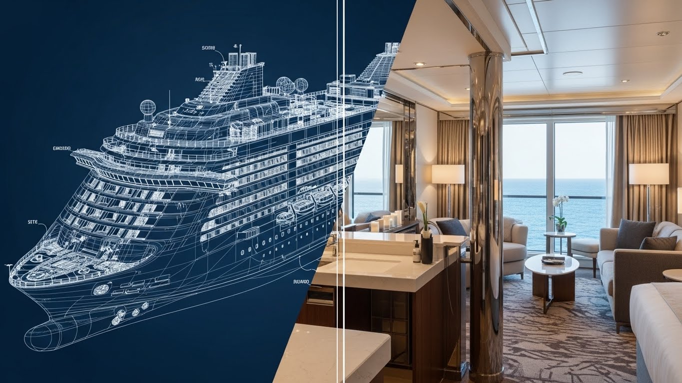
The Visual & Narrative Approach
To demonstrate the software's role in the design-to-operation lifecycle, this style uses a seamless split-screen transition. The left side shows a technical wireframe blueprint of a cruise ship in blueprint blue and chalk white lines. The right side seamlessly transitions into a photorealistic render of the same ship's luxury suite in realistic steel and glass textures.
Psychological Impact & KPI Focus
Niche Psychology: This appeals to Competence and Accuracy. It is particularly effective for Refit Managers and Newbuild Supervisors. The visual proves that the software honors the engineering specifications (wireframe) while delivering the promised commercial outcome (reality). It validates fidelity and compliance.
Strategic Implementation & Trade-offs
- Best Use Case: Feature highlight videos focusing on space management, refit planning, or asset maintenance modules (Duration: 45-60 seconds).
- Trade-off: Requires perfectly matched assets (wireframe and render) to work effectively. Misalignment breaks the illusion of precision.
Companies using similar video content -
MarineTraffic – Vessel Tracking – Global ship movements and real-time data.
BigOceanData – Vessel Monitoring – Real-time vessel tracking and intelligence.
Nautilus Labs – Voyage Optimization – AI-driven optimization, decarbonization solutions.
9. Aspirational Stock Montage
TOFU | Connected TV / OTT
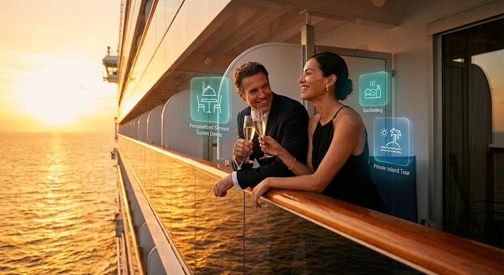
The Visual & Narrative Approach
This style focuses on the end-result of effective management software: increased onboard revenue. A cinematic shot shows a happy couple leaning on a balcony railing at sunset, clinking champagne glasses. Subtle, high-end augmented reality graphical overlays in ocean teal float near them, suggesting personalized service options.
Psychological Impact & KPI Focus
Niche Psychology: The focus here is Desire and Revenue Generation. For Chief Commercial Officers (CCOs), the software is a tool to unlock wallet share. The AR overlays visually represent the upsell opportunities that the software facilitates. It connects the emotional high of the guest directly to the financial goal of the cruise line.
Strategic Implementation & Trade-offs
- Best Use Case: Brand-level commercials on Connected TV platforms targeting travel industry investors or executives (Duration: 15-30 seconds).
- Trade-off: Reliance on stock footage can feel generic if the AR graphics aren't integrated with high-quality motion tracking.
Companies using similar video content -
ITsynch – Ship Management Software – Optimizes technical and hotel operations.
Veridian – AMOS™ – Asset management for newbuilds and refits.
KONGSBERG Gruppen ASA – Maritime Digital Solutions – Autonomous shipping systems, digital twin.
10. Split Screen: Optimized Reality and UI
MOFU | Product Differentiation
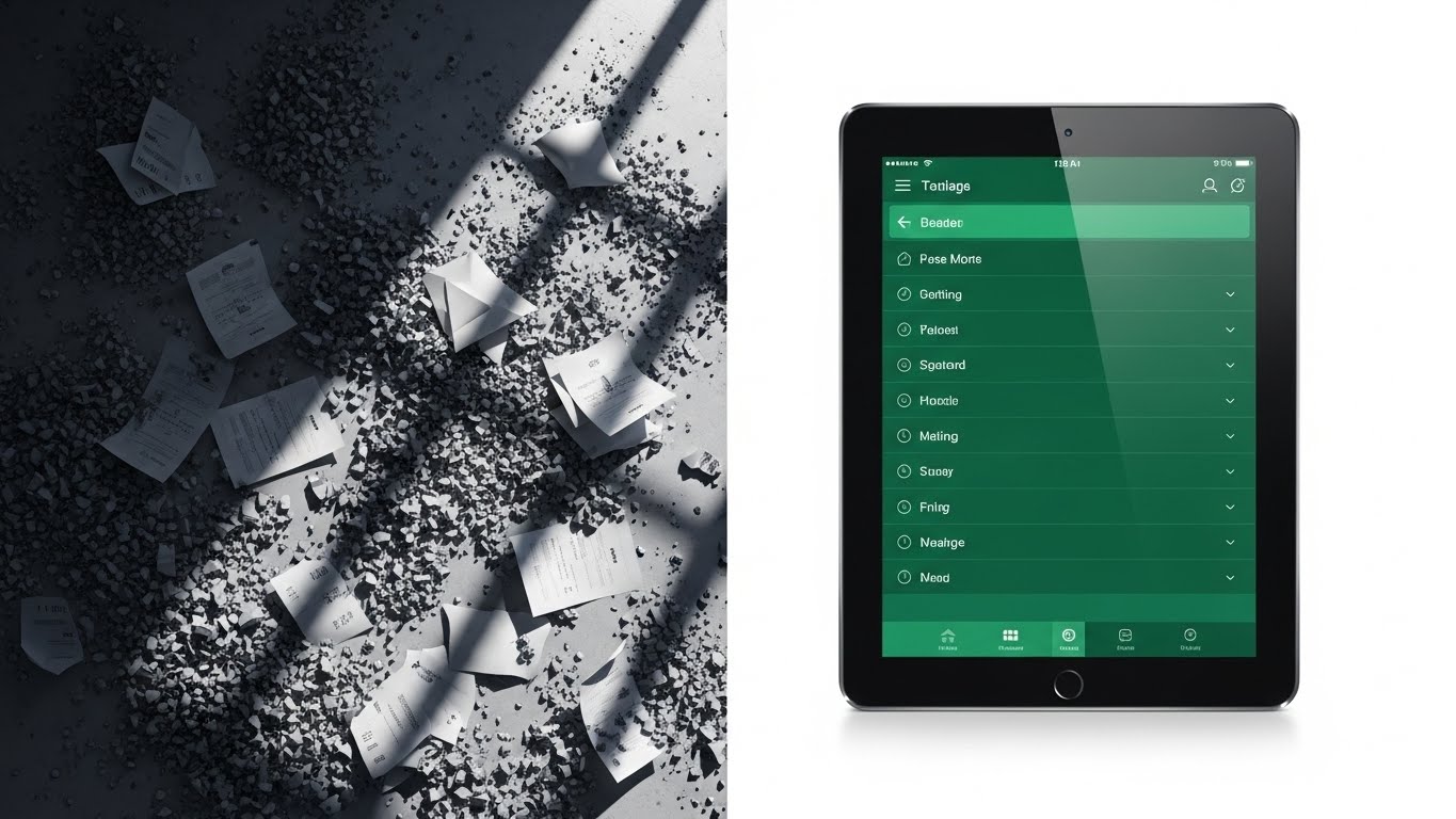
The Visual & Narrative Approach
A split-screen image designed to create immediate contrast. The left side depicts a chaotic, gritty grey texture with scattered paper manifests—representing the "Old Way." The right side contrasts sharply with a pristine, organized emerald green and glassmorphism aesthetic, showing a sleek digital tablet with a perfectly ordered list.
Psychological Impact & KPI Focus
Niche Psychology: This leverages the Pain/Gain Principle. It visually agitates the viewer's frustration with paperwork and manual errors (the grey side) and offers immediate relief (the green side). It directly addresses Operational Efficiency and Compliance, showing the software as the tool that cleans up the mess.
Strategic Implementation & Trade-offs
- Best Use Case: Landing page headers or "Problem/Solution" sections of a demo video (Duration: Static or subtle motion).
- Trade-off: Must be careful not to make the "Before" state look too exaggerated, or it risks feeling like an infomercial. The contrast must feel grounded in reality.
Companies using similar video content -
IBS Software – iTravel Cruise SaaS – Optimizes revenues and guest experience.
Agilysys – Cruise Line Solutions – Maximizes onboard revenue.
Travoxis – Cruise Management Software – Empowers crew to deliver exceptional service.
11. Clean UI Workflow (Light Mode)**
MOFU | Feature Education
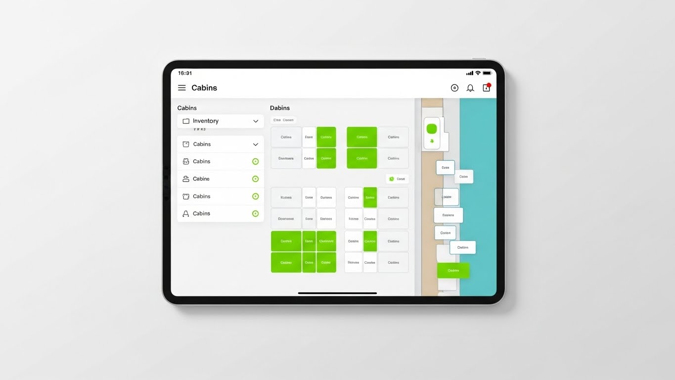
The Visual & Narrative Approach
Transitioning from conceptual comparisons to direct functional demonstration, this style embraces a minimalist "Light Mode" aesthetic. The visual focuses on a straight-on view of a digital tablet frame against an arctic white background, simulating the actual user experience of a Hotel Director. The screen displays a "Deck Map" inventory interface, where cabins are arranged in a clean, intuitive grid. Vibrant lime green highlights clearly distinguish available inventory from the white occupied units, using soft drop shadows to create a subtle sense of depth and hierarchy.
Psychological Impact & KPI Focus
Niche Psychology: This style addresses the anxiety of Interface Fatigue. Shipboard crews often rely on legacy systems with clunky, DOS-like interfaces. By presenting a clean, whitespace-rich UI, you visually promise Ease of Use and Reduced Training Time. It signals to the buyer that the learning curve for their crew will be minimal, directly impacting the KPI of User Adoption Rates.
Strategic Implementation & Trade-offs
- Best Use Case: "How-To" video sections on product pages or detailed feature walkthroughs for Hotel Operations modules (Duration: 90-120 seconds).
- Trade-off: While excellent for clarity, it lacks emotional "hook." It assumes the viewer is already interested in the solution and seeking validation of usability.
Companies using similar video content -
smartOps – Analytics Platform – Optimizes vessel operations with advanced analytics.
ClearVoyage – Voyage Management System – Streamlines workflows, reduces operational costs.
MariApps – smartPAL – Automates all shipping processes end-to-end.
12. Lifestyle Stock with UI Overlay
MOFU | Building Trust & Credibility
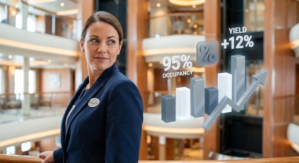
The Visual & Narrative Approach
To humanize the data, this style integrates professional lifestyle imagery with 3D data visualizations. The scene features a female hotel director in a crisp navy uniform, standing confidently in a blurred ship atrium. As she looks back, crisp, steel-grey and white 3D abstract icons—representing percentages and growth charts—float in the air beside her. The text "Yield +12%" and "95% Occupancy" anchors the human element to hard financial metrics.
Psychological Impact & KPI Focus
Niche Psychology: This appeals to Identity Reinforcement. It mirrors how the target audience (Officers and Directors) sees themselves: as competent leaders supported by data. By placing the data in the environment with the officer, it reinforces the concept of Augmented Intelligence—the software doesn't replace the crew; it empowers them to achieve higher Yield Management targets.
Strategic Implementation & Trade-offs
- Best Use Case: Email nurture campaigns targeting middle management, where building a connection between the user and the outcome is critical (Duration: 15-30 seconds).
- Trade-off: The effectiveness relies heavily on the authenticity of the "stock" model. If the uniform or setting looks inaccurate to a maritime professional, credibility is lost.
Companies using similar video content -
cruisePAL – Hotel Management Tools – Streamlines guest relationships, optimizes revenue.
Agilysys – InfoGenesis POS – Mobile POS for F&B operations.
Travoxis – Cruise Management Software – User-friendly interface for crew, guest operations.
13. Rapid UI Feature Montage
MOFU | Driving Demo Requests
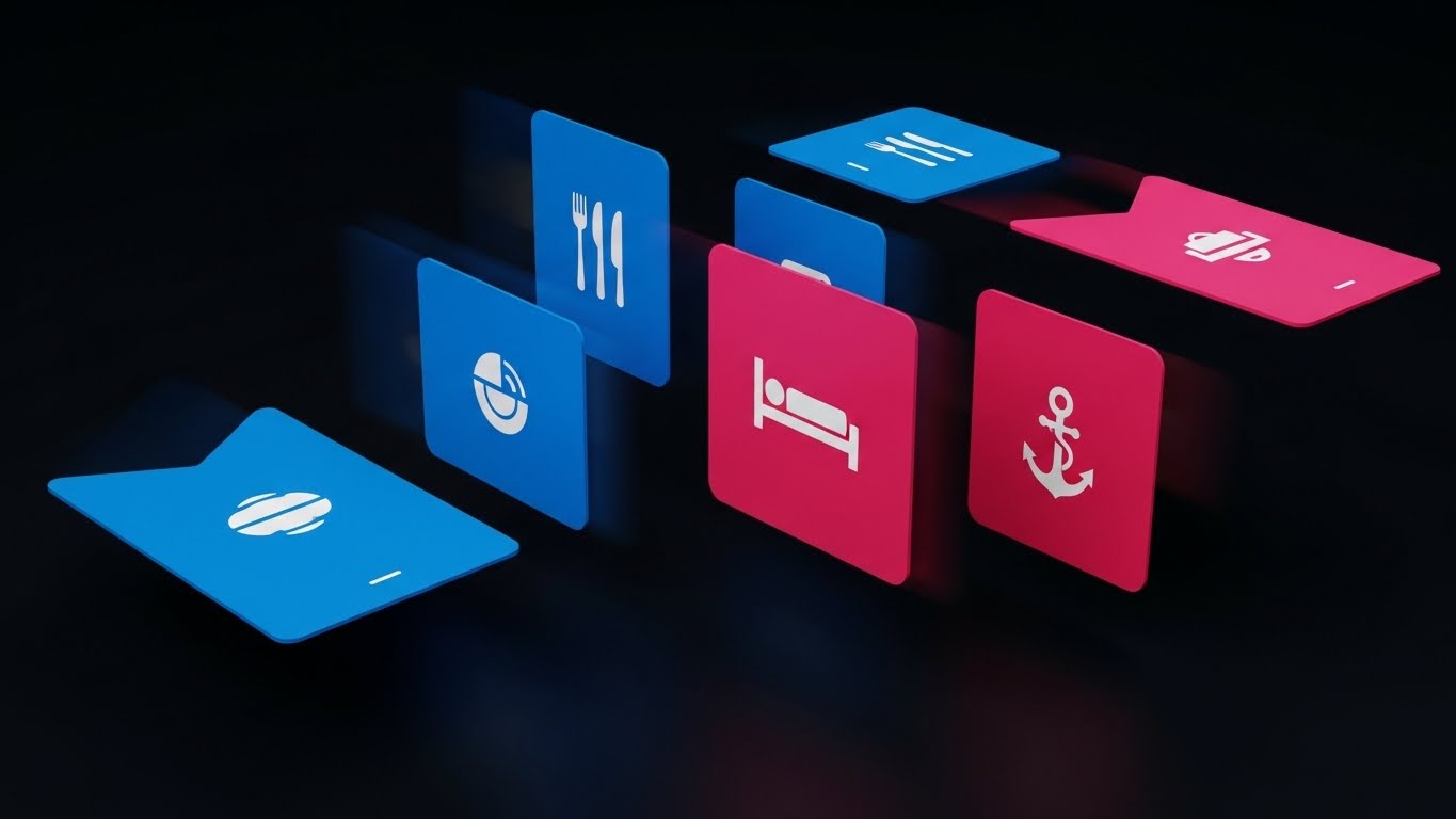
The Visual & Narrative Approach
Demonstrating the platform's modularity, this style uses a dynamic, high-energy composition. Abstract UI cards in electric blue and hot pink—featuring icons of cutlery (F&B), beds (Housekeeping), and anchors (Marine Ops)—cascade across a dark background. The motion blur suggests speed and fluidity, visually arguing that the software allows for rapid switching between different operational modules without lag or friction.
Psychological Impact & KPI Focus
Niche Psychology: The trigger here is Agility. In an industry often bogged down by siloed systems that don't talk to each other, this visual metaphor of flowing, interconnected cards represents Seamless Integration. It appeals to IT Directors looking for a unified ecosystem rather than disjointed point solutions.
Strategic Implementation & Trade-offs
- Best Use Case: High-energy hype reels at the beginning of a demo video or as a YouTube retargeting ad (Duration: 15-20 seconds).
- Trade-off: The speed can obscure specific details. It creates an impression of capability rather than explaining how it works.
Companies using similar video content -
Agilysys – AI-Driven Operations – Predictive analytics optimizes staffing, inventory, revenue.
IBS Software – iTravel Cruise SaaS – Enhances decision-making through increased collaboration.
VoyageX AI – Ship Crew Management Software – Real-time analytics and reporting for crew.
14. 2D Character-Driven Story
MOFU | Visitor Re-engagement

The Visual & Narrative Approach
Shifting focus to the guest experience (GX), this style employs a friendly, textured 2D vector illustration. A crew member in soft pastel mint and charcoal uniforms is shown engaging with a guest, holding a tablet. A large, soft peach checkmark floats above the device, symbolizing immediate success. The aesthetic is warm, approachable, and devoid of technical intimidation, focusing purely on the human interaction facilitated by the tech.
Psychological Impact & KPI Focus
Niche Psychology: This leverages Empathy and Simplicity. For Guest Experience Managers, the nightmare is a long queue at the gangway. This visual alleviates that anxiety by depicting the ideal state: a calm, smiling interaction. It validates the KPI of Guest Satisfaction (CSAT) by showing technology as an enabler of hospitality, not a barrier.
Strategic Implementation & Trade-offs
- Best Use Case: Retargeting display ads or social snippets aimed at professionals focused on passenger flow and terminal operations (Duration: 10-15 seconds).
- Trade-off: The "cartoonish" style might be perceived as too casual for strict enterprise operational software unless balanced with serious copy.
Companies using similar video content -
MariApps – smartPAL – Comprehensive marine ERP plug-and-play suite.
cruisePAL – Unified Operational Platform – Technology-driven efficiency for multiple modules.
Trawex Technologies – Cruise Management Software – Seamlessly integrates with numerous supplier APIs.
15. Isometric 3D Workflow
MOFU | The Functional Buyer
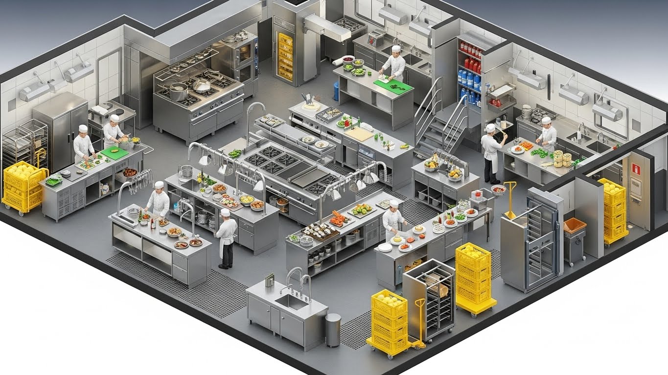
The Visual & Narrative Approach
To visualize the complexity of back-of-house operations, this style utilizes a detailed isometric 3D cutaway. The scene depicts a stainless-steel cruise ship galley with industrial grey floors. Chefs are positioned at stations, and supply crates highlighted in safety yellow are stacked neatly, visualizing the flow of provisioning. The "God View" allows the viewer to see the entire logistical chain of food preparation in one glance.
Psychological Impact & KPI Focus
Niche Psychology: This appeals to the Systemizer mindset of F&B Directors and Provision Masters. It brings order to the chaotic reality of a high-volume kitchen. By highlighting the crates in yellow, the visual emphasizes Inventory Control and Waste Reduction, proving the software understands the granular details of consumption logic and supply chain management.
Strategic Implementation & Trade-offs
- Best Use Case: Deep-dive whitepapers or case study videos explaining inventory algorithms or galley management modules (Duration: 45-60 seconds).
- Trade-off: The high level of detail requires viewing on a larger screen (desktop/tablet) to be fully appreciated; less effective on mobile.
Companies using similar video content -
cruisePAL – Guest Operations – Enhances guest experience, digital check-in.
IBS Software – iTravel Cruise SaaS – Simplifies and speeds up fast-track embarkment.
Travelopro – Cruise Management Software – Improves passenger experience, simplifies processes.
16. 2D Line Art Animation
MOFU | Competitive Displacement

The Visual & Narrative Approach
This elegant, minimalist style uses continuous line art to create a powerful visual metaphor for problem-solving. On the left, a complex, tangled knot of red rope represents the "Competitor's Solution" or the "Current State." As the animation progresses to the right, the rope smoothly unravels into a perfectly straight, taut line. The stark contrast of red ink on paper white focuses the viewer entirely on the concept of Simplification.
Psychological Impact & KPI Focus
Niche Psychology: This triggers Cognitive Ease. It visually validates the feeling that current legacy systems are "tangled" and messy. It positions your software as the straight line—the most direct path to the solution. It is highly effective for Competitive Displacement, subtly suggesting that the alternative is complicated and stressful.
Strategic Implementation & Trade-offs
- Best Use Case: LinkedIn feed posts accompanying case studies about migration or system replacement (Duration: 10-15 seconds loop).
- Trade-off: Highly conceptual. It requires strong accompanying text to define exactly what complexity is being unraveled (e.g., "Untangle your billing").
Companies using similar video content -
WHIZTEC – WHIZMarine – Stores and spare parts control, procurement management.
Marine ERP – Stock Control – Efficiently manages and tracks inventory levels.
MariApps – smartPAL – Catering and procurement modules for back-of-house.
17. Bold Kinetic Typography (Visual)
MOFU | LinkedIn Organic
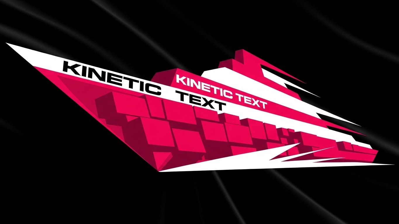
The Visual & Narrative Approach
To convey aggressive growth and momentum, this style abandons traditional imagery for pure motion typography. Heavy, blocky geometric shapes in bold magenta and stark white are arranged to form the silhouette of a ship's prow cutting through deep black space. The text itself forms the vessel, suggesting that the "message" and the "movement" are one. The sharp angles convey speed, precision, and a forward-leaning posture.
Psychological Impact & KPI Focus
Niche Psychology: The driver here is Innovation and Velocity. It appeals to stakeholders who view themselves as disruptors. The visual suggests that the software is a vehicle for Business Acceleration. It is particularly effective for announcing new version launches or major market expansions, associating the brand with Momentum.
Strategic Implementation & Trade-offs
- Best Use Case: LinkedIn Organic posts or event teaser videos where stopping the scroll is the only objective (Duration: 6-12 seconds).
- Trade-off: It conveys "energy" but not "utility." It must be followed immediately by substantive content to retain the interest it generates.
Companies using similar video content -
ClearVoyage – Maritime ERP – Streamlines operations, enhances decision-making.
MariApps – smartPAL – Automates all shipping processes, end to end.
Signal Group – Maritime Management – Integrates traditional practices with data analytics.
18. Hyper-lapse Stock Footage with Data
MOFU | LinkedIn Video Ads
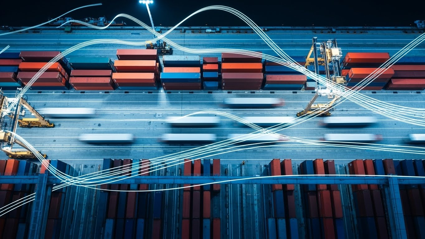
The Visual & Narrative Approach
This style grounds the software in the high-stakes reality of turnaround day. It features a bird's-eye view of a port terminal, utilizing hyper-lapse photography to speed up time. The shipping containers and trucks are blurred into streaks of vibrant port orange and concrete grey motion. Overlaid on this frenetic activity would be steady, calm data lines (implied), representing the software's ability to track and manage high-speed logistics.
Psychological Impact & KPI Focus
Niche Psychology: This addresses the Fear of Bottlenecks. Turnaround day is the most critical operational window for a cruise line. By showing the port moving at high speed, the visual implies that the software can keep up. It validates Operational Continuity and Turnaround Efficiency, reassuring logistics managers that the system won't crash under pressure.
Strategic Implementation & Trade-offs
- Best Use Case: LinkedIn Video Ads targeting Logistics and Supply Chain Directors (Duration: 20-30 seconds).
- Trade-off: Requires distinct separation between the background motion and the foreground data to ensure legibility.
Companies using similar video content -
Nautilus Labs – Voyage Optimization – AI-driven voyage optimization.
smartOps – Analytics Platform – Cutting-edge analytics for cruise industry.
AST Networks – Smart Port Ecosystems – Transforms global maritime industry.
19. Minimalist Flat 2D Vector
MOFU | Establishing Thought Leadership

The Visual & Narrative Approach
For high-level strategic presentations, simplicity is power. This style uses a minimalist flat vector graphic: a simple icon of a captain's hat in slate blue, formed creatively from the negative space within a pure white cloud shape, all set against a premium gold background. It acts as a visual shorthand for "Cloud Command"—the centralization of authority and control via cloud infrastructure.
Psychological Impact & KPI Focus
Niche Psychology: This leverages Symbolism and Authority. It connects the traditional authority of the Captain (the hat) with the modern authority of the Cloud. For CIOs and investors, this visualizes the Digital Transformation strategy without getting bogged down in technical diagrams. It represents the modernization of command.
Strategic Implementation & Trade-offs
- Best Use Case: Keynote slides, pitch decks, or thumbnail images for thought leadership articles (Duration: Static or subtle pulse).
- Trade-off: Too abstract for operational staff who need to see features. It is strictly a strategic, executive-level visual.
Companies using similar video content -
KONGSBERG Gruppen ASA – Vessel Traffic Management – Solutions for ports.
Huawei Technologies Co., Ltd. – Intelligent Port Solution – Automates container handling, tracks cargo.
Envision Enterprise Solutions – Smart Port Solutions – Improves marine operations planning and turnaround.
20. Dynamic Data Visualization
BOFU | ROI Justification

The Visual & Narrative Approach
As the buyer moves to the Bottom-of-Funnel (BOFU), the conversation turns to financial justification. This style uses abstract 3D glass bars rising from a reflective surface. The bars are rendered in "rising green" and "wealth gold," and are subtly shaped like the smokestacks of a cruise ship. The upward trajectory creates a clear visual association between the software and revenue growth/ROI.
Psychological Impact & KPI Focus
Niche Psychology: The focus is purely Financial Assurance. CFOs and Commercial Directors need to see that the investment will yield returns. The sturdy, glass-like texture of the bars implies transparency and solidity in the data. It validates the ultimate KPI: Profitability and Revenue per Available Lower Berth (RevPALB).
Strategic Implementation & Trade-offs
- Best Use Case: Embeds in digital proposals, pricing pages, or the closing slide of a sales presentation (Duration: 10-15 seconds build-up).
- Trade-off: It is a cold, hard financial visual. It lacks the romance of travel, but effectively speaks the language of the person signing the check.
Companies using similar video content -
IBM – Smart Port Solutions – Delivers robust digital transformation services.
Accenture – Smart Port Consulting – Digital transformation consulting for ports.
Signal Group – Maritime Management – Provides shipping intelligence, venture investment.
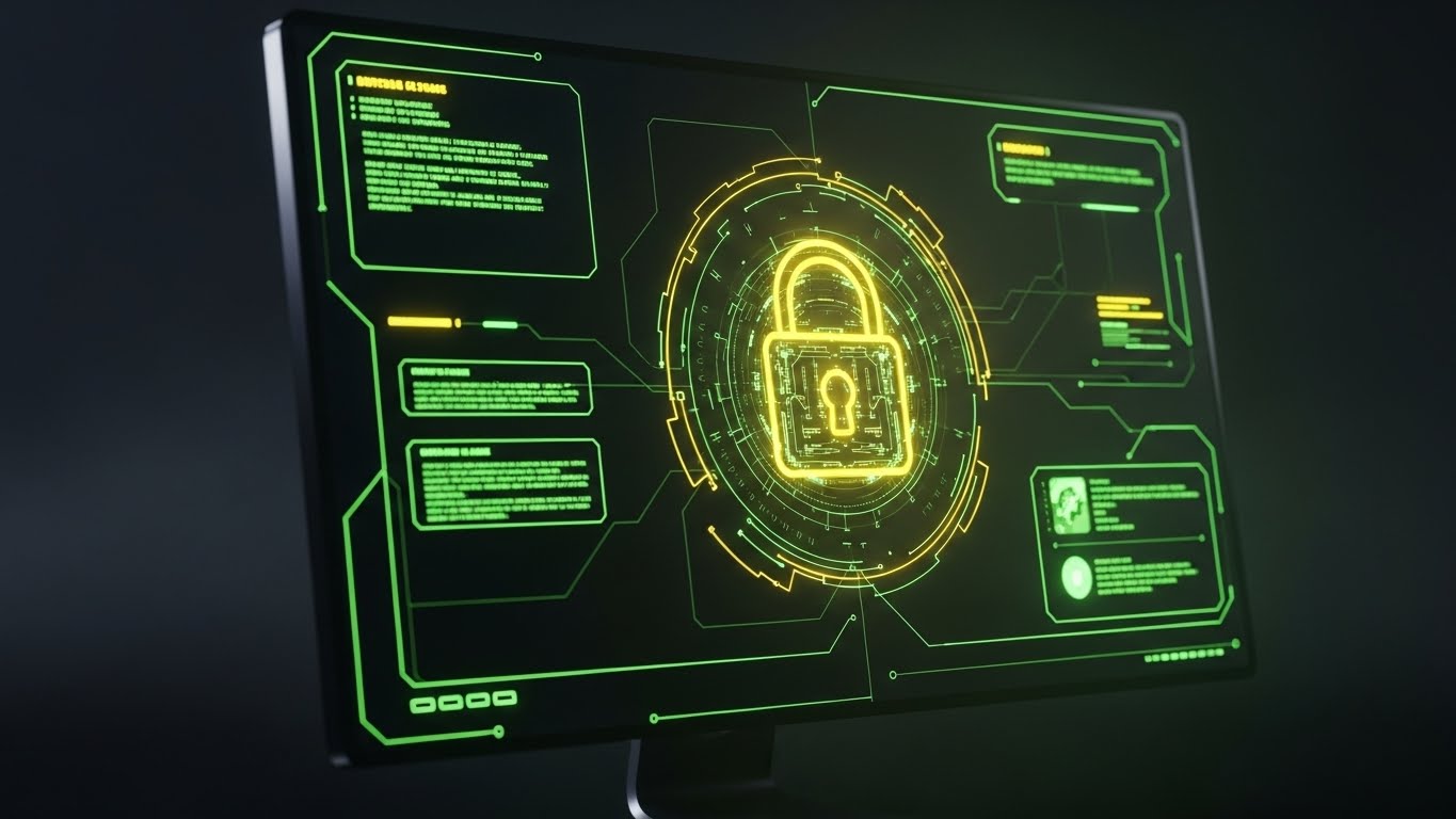
21. 2D Animation & UI Composition**
BOFU | Overcoming Objections

The Visual & Narrative Approach
Addressing the critical concern of data security in international waters, this style uses a reassuring, "cel-shaded" 2D aesthetic. A stylized IT crew member, rendered in friendly purple and soft yellow tones, stands confidently behind a large, materialized "Digital Shield." A prominent cyan padlock icon centers the shield, physically deflecting abstract "data packets" and red threat shapes. The animation is smooth and resilient, visually metabolizing the concept of a firewall into a tangible protective barrier.
Psychological Impact & KPI Focus
Niche Psychology: This triggers Safety and Reassurance. For CIOs and Data Protection Officers, the fear of a breach at sea is paralyzing. This visual simplifies the complex, invisible concept of Encryption into a clear, defensive metaphor. It validates the KPI of Data Integrity and GDPR/Maritime Compliance, visually confirming that the software is a fortress for passenger and crew data.
Strategic Implementation & Trade-offs
- Best Use Case: FAQ videos addressing "Is my data safe?" or embedded in the "Security" section of a digital proposal (Duration: 30-45 seconds).
- Trade-off: The cartoon-like aesthetic must be balanced with serious, technical voiceover content to ensure it doesn't trivialize the gravity of cybersecurity.
Companies using similar video content -
Agilysys – AI-Powered Revenue Optimization – Real-time dashboards and enterprise analytics.
IBS Software – iTravel Cruise SaaS – Optimizes revenues by responding to consumer behavior.
Travoxis – Finance Management Module – Provides in-depth financial reporting.
22. 3D X-Ray Visualization
BOFU | Risk Mitigation
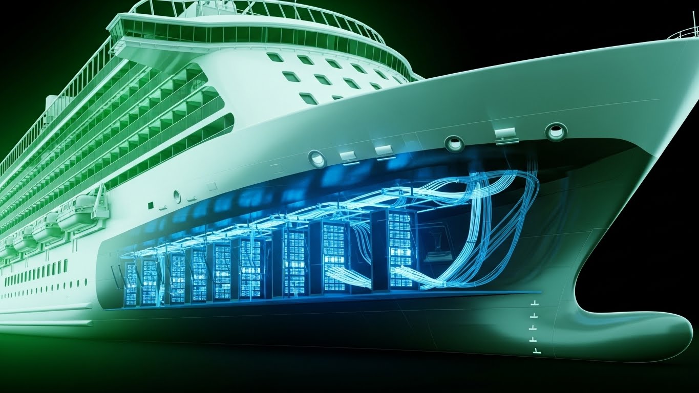
The Visual & Narrative Approach
To prove the depth of the system's integration, this style utilizes a "Superman Vision" effect. A 3D X-ray visualization reveals the inner workings of a cruise ship section. The hull is rendered in translucent skeleton white, allowing the viewer to see through the steel. Inside, glowing x-ray blue server racks, data cabling, and redundant power systems are clearly visible and protected. This visualizes the "nervous system" of the ship, showing how the software is physically embedded in the vessel's infrastructure.
Psychological Impact & KPI Focus
Niche Psychology: The driver here is Structural Integrity and Depth. It appeals to Technical Buyers and Marine Engineers who need to know the solution isn't just a superficial interface. It validates Infrastructure Visibility, assuring the buyer that the software has deep roots in the ship's hardware ecosystem, minimizing the risk of superficial failure.
Strategic Implementation & Trade-offs
- Best Use Case: Technical whitepapers or "Under the Hood" deep-dive videos for engineering teams (Duration: 45-60 seconds).
- Trade-off: Highly technical. It may alienate non-technical stakeholders (like Marketing VPs) if not paired with a clear explanation of business benefits.
Companies using similar video content -
MariApps – MaxV – Cyber security application protecting vessel systems.
mHSEQ – Electronic Reporting Solution – Ensures HSEQ compliance for marine companies.
Centerpoint ERP – Compliance and Regulations – Adheres to industry regulations.
23. Abstract 3D AI Visualization
BOFU | Reducing Friction

The Visual & Narrative Approach
Visualizing the invisible flow of data between diverse systems (POS, PMS, Navigation), this style employs an abstract 3D network aesthetic. Glowing fiber optic nodes in deep space blue are connected by bright, pulsing lines. The nodes are arranged to resemble a constellation or a map of ports, symbolizing the seamless API integration between the ship and shore. The motion is fluid and rhythmic, suggesting a pulse.
Psychological Impact & KPI Focus
Niche Psychology: This addresses the Fear of Disconnection. In a maritime environment, systems often fail to "talk" to each other. This visual creates a sense of Universal Connectivity. It appeals to the Chief Information Officer (CIO) by visualizing Interoperability—showing a unified data ecosystem where friction is eliminated.
Strategic Implementation & Trade-offs
- Best Use Case: API documentation headers or background visuals for technical implementation guides (Duration: Looping animation).
- Trade-off: It is purely conceptual. It requires specific text overlays to define what systems are actually connecting (e.g., "Booking Engine <-> Gangway Security").
Companies using similar video content -
Intangles – Predictive Maintenance – Digital Twin Technology for marine engines.
PerfoMax – Predictive Maintenance – Proactive maintenance for 2-stroke marine engines.
Info-marine – Condition Monitoring – Online solutions for critical rotating machinery.
24. Abstract 2D Motion Graphics
BOFU | The Economic Buyer

The Visual & Narrative Approach
For the Economic Buyer focused on the "Big Picture," this style uses abstract, smooth motion graphics to depict operational synchronization. Corporate blue and silver shapes—resembling stylized gears and ocean waves—move in a rhythmic, synchronized flow on a translucent white background. The visual metaphor is clear: the software is the lubricant that keeps the complex machine of a cruise line running smoothly.
Psychological Impact & KPI Focus
Niche Psychology: This leverages the concept of Gestalt Harmony. It reassures the CFO or Board Members that the investment will lead to a holistic improvement in operations, rather than isolated fixes. It validates Operational Efficiency at a macro level, suggesting that the software brings rhythm and predictability to the balance sheet.
Strategic Implementation & Trade-offs
- Best Use Case: Annual reports, investor presentations, or high-level executive summaries (Duration: 15-20 seconds).
- Trade-off: It is generic by design. It works best as a mood-setter or transition element rather than a vehicle for specific feature information.
Companies using similar video content -
Huawei Technologies Co., Ltd. – Intelligent Port Solution – 5G connectivity, IoT integration, AI.
Wipro – Smart Port Solutions – AI, blockchain, IoT to improve logistics.
AST Networks – Smart Port Ecosystems – IoT, AI, 5G, blockchain, digital twins.
25. Dark Mode UI Showcase
BOFU | The Technical Buyer
The Visual & Narrative Approach
Targeting the developer or security architect, this style strips away the marketing fluff to show raw capability. An angled view of a monitor screen is presented in "Code Green" and "Terminal Black"—the native colors of backend development. Lines of clean, scrolling code are visible, with a prominent, glowing yellow lock icon in the center. This visualizes the secure encryption layer that wraps around the passenger data.
Psychological Impact & KPI Focus
Niche Psychology: This appeals to Technical Rigor. Developers trust code, not stock photos. By showing the terminal interface, you signal that you speak their language. It validates Compliance (GDPR, CCPA) and Data Integrity, proving that security is baked into the code, not bolted on as an afterthought.
Strategic Implementation & Trade-offs
- Best Use Case: Technical specification sheets, security compliance pages, or IT implementation webinars (Duration: Static or slow scroll).
- Trade-off: Completely unappealing to the creative or guest experience teams. It is a niche visual for a gatekeeper audience.
Companies using similar video content -
ABB – Automation Solutions – Electrification and automation for smart ports.
Siemens – Smart Port Solutions – Integrated solutions for port operations.
Dataloy Systems – Vessel Operations Software – Fleet allocation, business intelligence.
26. 2D Graphics Over Live Action
Onboarding | Time-to-Value
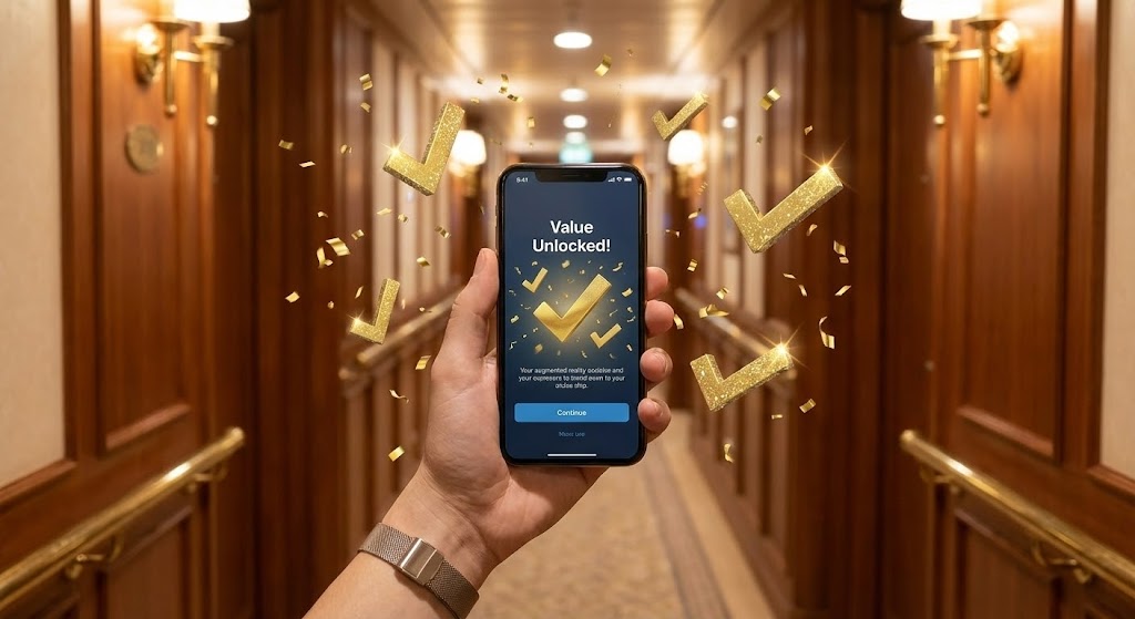
The Visual & Narrative Approach
To build excitement during the onboarding phase, this mixed-media style combines a first-person perspective (POV) with celebratory graphics. The shot features a hand holding a smartphone against the blurred background of a luxury ship hallway. On the screen—and popping out into the real world—are sparkle gold checkmarks and augmented reality confetti. The text "Value Unlocked!" anchors the moment of activation.
Psychological Impact & KPI Focus
Niche Psychology: This triggers Dopamine and Achievement. Implementing new software is stressful; this visual validates the success of that effort. It reinforces the KPI of Time-to-Value, visually confirming that the user has successfully deployed the tool and is already reaping the rewards (the "Value Unlocked" state).
Strategic Implementation & Trade-offs
- Best Use Case: "Welcome Aboard" emails, first-login success screens, or milestone celebration messages (Duration: 5-8 seconds).
- Trade-off: Can feel gimmicky if overused. It should be reserved for genuine milestones (e.g., first completed voyage, system launch).
Companies using similar video content -
MariApps – MaxV – Cyber security application protecting vessel systems.
OpenAIS – Vessel Tracking Tools – Open source, analyzes raw vessel data.
AISViz – Open-Source Toolbox – Processes, visualizes AIS data for marine traffic.
27. Low-Poly 3D Modeling
Onboarding | Self-Serve Onboarding
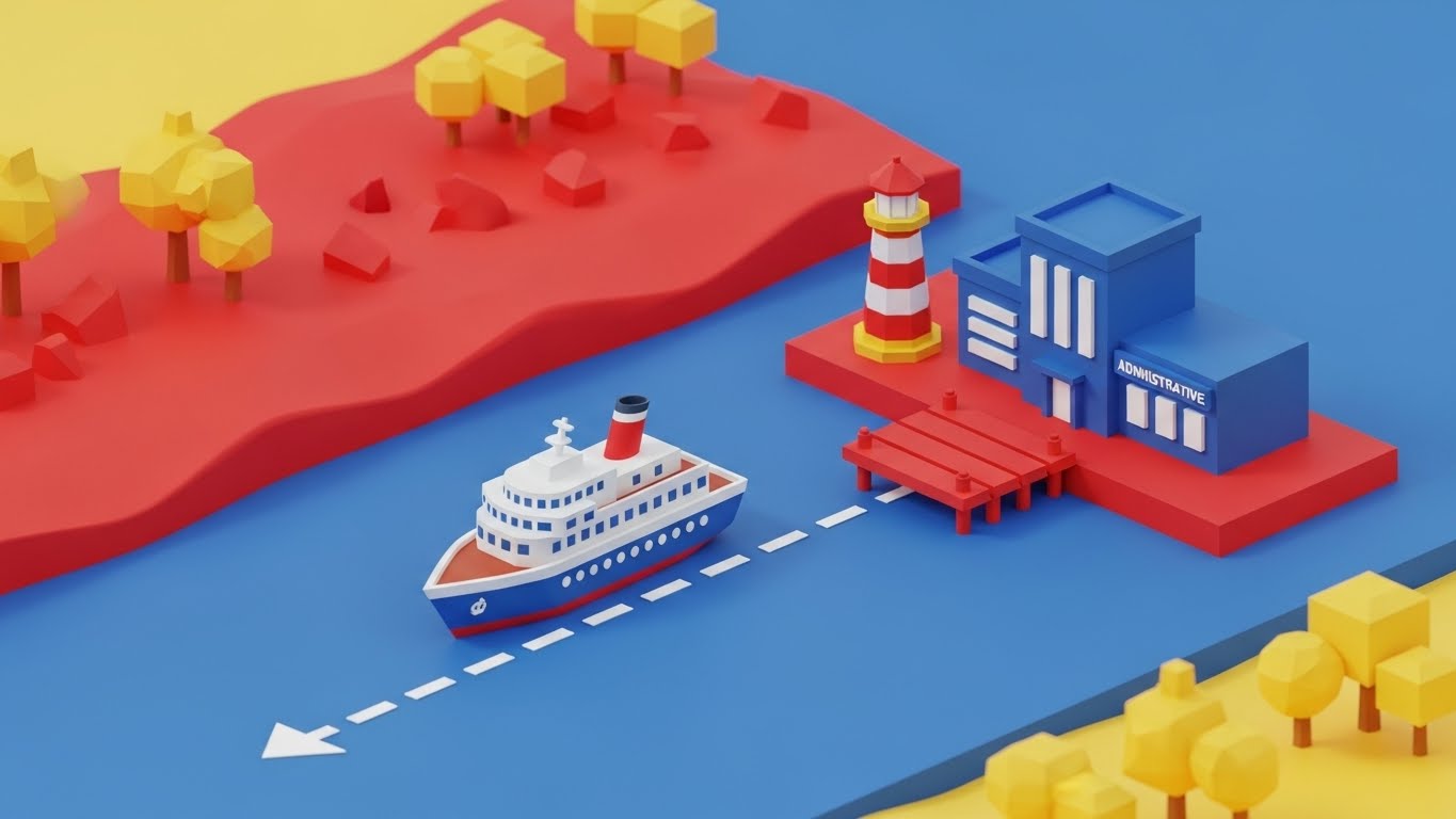
The Visual & Narrative Approach
To make learning complex software feel less like homework, this style adopts a gamified, low-poly 3D aesthetic. A miniature isometric cruise ship moves along a dotted white path through a vibrant world of red, blue, and yellow islands. The ship approaches a tiny port labeled "Administrative," visualizing the user's progress through the onboarding modules.
Psychological Impact & KPI Focus
Niche Psychology: This leverages Gamification and Progress Tracking. It transforms the drudgery of training manuals into a "journey." By making the process look like a game, it reduces Resistance to Training and boosts User Adoption Rates. It visually promises that learning the system will be a structured, manageable, and even enjoyable process.
Strategic Implementation & Trade-offs
- Best Use Case: Interactive onboarding maps, progress trackers within the LMS (Learning Management System), or training app interfaces (Duration: Interactive or looping).
- Trade-off: The "toy-like" aesthetic might seem childish to senior captains. It is best used for general crew training rather than executive briefings.
Companies using similar video content -
cruisePAL – Guest Operations – Digital check-in and express boarding.
Agilysys – Cruise Line Solutions – Delivers unforgettable guest journeys.
Travoxis – Cruise Management Software – Empowers crew with mobile, intuitive tools.
28. Macro UI Micro-Interactions
Retention | Reducing Support Overhead

The Visual & Narrative Approach
This style focuses on the tactile feel of the software. A photorealistic macro close-up shows a finger hovering just above a glass UI button on a white touchscreen. The button glows with a soft, responsive blue light, suggesting a "hover state." The background is a premium shadow grey. The extreme focus highlights the texture of the screen and the responsiveness of the interface.
Psychological Impact & KPI Focus
Niche Psychology: This appeals to the desire for Control and Responsiveness. It counters the frustration of laggy, unresponsive legacy systems. By highlighting the Micro-Interaction, it visually validates Ease of Use and System Responsiveness. It assures the user that the system is listening and ready to react instantly to their command.
Strategic Implementation & Trade-offs
- Best Use Case: Feature update announcements, "Pro-Tip" snippets in the help center, or changelog videos (Duration: 3-5 seconds).
- Trade-off: It is hyper-specific. It sells the "feel" of the product but tells you nothing about the broader "function."
Companies using similar video content -
VoyageX AI – Crew Management Software – Automates crew management, roster planning.
MariApps – smartPAL Crewing – Centralized crew management system.
FloatHub – Boat Monitoring System – Open source, Raspberry Pi based monitoring.
29. Holographic UI over 3D Render
Retention | Reducing Churn
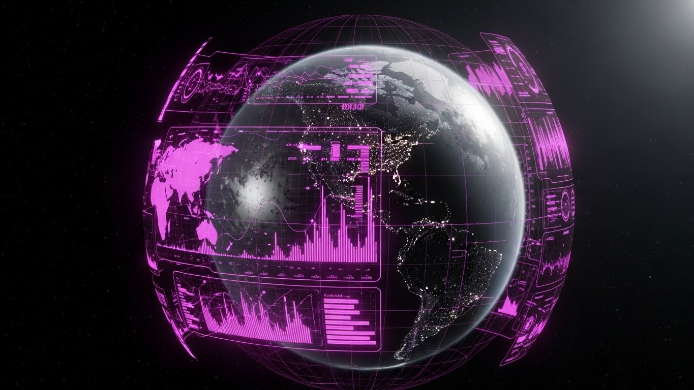
The Visual & Narrative Approach
To remind existing clients of the global scale of their partnership, this style uses a cinematic sci-fi aesthetic. A realistic 3D render of a spinning Earth in space black is wrapped in a holographic digital overlay. Glowing dots in "Hologram Blue" and "Earth Green" pinpoint ship locations in real-time. Floating data panels rotate with the globe, offering a "Command Center" perspective.
Psychological Impact & KPI Focus
Niche Psychology: This reinforces Strategic Partnership and Scale. It reminds the client that they are not just using a tool; they are commanding a global fleet. It validates Fleet Optimization and Global Visibility, making it psychologically difficult for them to switch to a lesser, non-global competitor (increasing Switching Costs).
Strategic Implementation & Trade-offs
- Best Use Case: Quarterly business review (QBR) presentations, client newsletters, or idle screens on command center monitors (Duration: Looping background).
- Trade-off: High production complexity. It requires high-quality assets to look "premium" rather than like a cheap sci-fi movie.
Companies using similar video content -
Agilysys – InfoGenesis POS – Fast, secure, and mobile-enabled ordering.
cruisePAL – ePOS Module – Adds innovation and flexibility to sales operations.
Travoxis – User-Friendly Interface – Easy for short-term management.
30. 3D Parallax UI Presentation
Expansion | Driving Upsell
The Visual & Narrative Approach
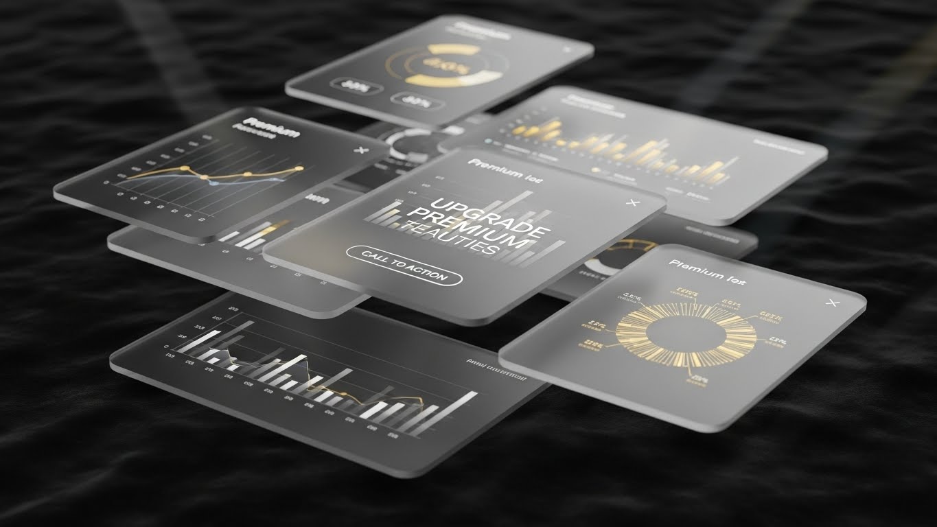
Designed to sell premium features to existing users, this style uses depth and luxury cues. Layers of semi-transparent glass UI panels float in a deep velvet space. The camera moves through them in a parallax motion, creating a sense of immersion. The data displayed on the panels uses "Premium Gold" and "Platinum" color palettes, showcasing advanced charts and predictive analytics available only in the top tier.
Psychological Impact & KPI Focus
Niche Psychology: This leverages Exclusivity and Aspiration. The visual language mimics high-end credit card marketing. It signals that the "Gold" data is valuable, desirable, and exclusive. It directly targets the KPI of Upsell Revenue and Average Revenue Per Account (ARPA), tempting users to unlock the "hidden" value behind the paywall.
Strategic Implementation & Trade-offs
- Best Use Case: In-app paywalls, upgrade promotion videos, or "Unlock Potential" marketing emails (Duration: 10-15 seconds).
- Trade-off: If the data shown isn't actually valuable, the visual gloss will be seen as deceptive. The "Platinum" look must match "Platinum" utility.
Strategic Knowledge Base: The Visual Operations Doctrine
To transform these 30 visual styles from mere "content" into a competitive business asset, cruise line executives must adopt a strategic implementation framework. This "Visual Operations Doctrine" bridges the gap between the creative output and the operational reality of the maritime industry.
Strategic Alignment & Visual Architecture
"The Pre-Production Strategy: Defining the Visual Operating System"
Before a single pixel is rendered, the visual strategy must be aligned with the complex hierarchy of a cruise line. The goal is to reduce the cognitive load for a diverse, multinational crew while creating a unified brand experience for the executive fleet.
- The Cognitive Load Audit: Before requesting a video, audit the current training complexity. If a manual is 50 pages, the video (Style 11 or 15) must condense that logic, not just decorate it. Visuals should be measured by how much they remove from the learner's plate.
- Role-Based Visual Mapping: Differentiate your visual language. Use "Mobile-First/Simple" styles (Style 14, 26) for deckhands and guest-facing crew who consume content on personal devices. Use "Desktop/Data-Rich" styles (Style 7, 25) for Bridge Officers and Fleet Managers who operate in multi-monitor environments.
- The "Glanceability" Standard: In high-stress maritime environments (e.g., Turnaround Day), visuals must be understood in under 3 seconds. Apply the "Glanceability Standard" to all operational videos—if the crew member has to rewind to understand the safety protocol, the visual has failed.
- Brand Voice Consistency: Your software likely consists of disparate modules (POS, PMS, Marine Ops). Use a unified visual language (e.g., the "Glassmorphism" of Style 30 or the "Line Art" of Style 16) to visually tie these modules together, creating the perception of a seamless, single-platform ecosystem.
- The Advids Strategic Audit: Partnering with specialized agencies like Advids allows for a "Visual Audit" of your entire content library. We help define a cohesive "Visual Operating System" that ensures every asset—from a 6-second ad to a 60-minute training module—adheres to a strategic visual standard.
- Standardization vs. Customization: For fleet-wide protocols (Safety), use standardized, high-fidelity 3D (Style 1). For ship-specific nuances (e.g., a specific galley layout), use adaptable templates (Style 15) that can be quickly modified without a full re-render.
- The Cross-Departmental Bridge: Use visuals to unify terminology. A "Booking" to Sales might be a "Manifest Entry" to Ops. Visuals (Style 23) that show the data flowing from one to the other help align these departments on a shared truth.
- Legacy System Integration: Many ships still run on older hardware. Use "Wireframe to Reality" transitions (Style 8) to visually demonstrate how your modern cloud interface connects with and modernizes their existing legacy infrastructure.
- Accessibility in Maritime: Your crew speaks 50+ languages. Motion graphics (Style 21, 24) must rely on visual storytelling, not voiceover or heavy text. Icons and animations must be universally understood cultural symbols.
- The Mobile-First Mandate: Even if your software is desktop-based, your buyer is mobile. Ensure all 30 styles are optimized for vertical consumption (Style 5) to reach executives traveling between ports and HQs.
Operational Adoption & Implementation
"The Deployment Phase: Embedding Visuals into the Workflow"
The best software fails if the crew doesn't use it. This segment focuses on using video not just for marketing, but as a tool for change management and operational embedding onboard the vessel.
- Overcoming "Big Brother" Anxiety: Crew members are often wary of monitoring software. Use empathy-driven visuals (Style 12, 14) that focus on support and safety rather than surveillance, framing the AI as a "Digital Co-Pilot" rather than an overseer.
- The Micro-Learning Shift: Abandon the hour-long training video. Break down complex manuals into a library of 30-second "Micro-Visuals" (Style 11, 28) that address single tasks (e.g., "How to Check-In," "How to Log Inventory").
- Just-in-Time Support: Embed specific visual styles directly into the software's "Help" section. When a user hovers over a complex feature, a "Macro UI" video (Style 28) should trigger, offering instant context without leaving the workflow.
- Gamification of Training: Use Low-Poly styles (Style 27) to visualize training progress. Create leaderboards and visual scorecards that reward crew for completing modules, turning compliance into a competitive and engaging activity.
- Reducing Support Ticket Volume: There is a direct correlation between the clarity of your visual guides and the volume of support tickets. Investing in high-fidelity "How-To" videos (Style 15) is a defensive strategy to protect your support team from repetitive queries.
- Remote Onboarding: With crews constantly rotating, physical seminars are impossible. Leverage 3D simulations (Style 1) and Screencasts to train distributed fleets remotely, ensuring new hires are "bridge-ready" before they even board.
- Visual SOPs: Transform text-heavy Standard Operating Procedures (SOPs) for SOLAS (Safety of Life at Sea) into visual process flows (Style 13). A visual animation of a luggage handling protocol is retained 60% better than a written checklist.
- Feedback Loops: Use interactive video elements to gather crew feedback. A simple "Thumbs Up/Down" overlay on a training video provides real-time data on which features are confusing the crew.
- Scalable Localization: When designing assets, separate the text layers from the animation layers. This allows for rapid, low-cost localization of the same visual asset into 20+ languages for a global fleet deployment.
- Leadership Communication: Use high-end, cinematic styles (Style 9, 19) for messages from the Captain or HQ. These visuals signal importance and authority, ensuring fleet-wide strategic pivots are taken seriously.
Measuring Impact & Future-Proofing
"The ROI Phase: Metrics, Scaling, and Evolution"
Visual communication is an investment that must yield a return. This final segment defines how to measure the success of your visual strategy and prepare for the future of maritime technology.
- Beyond "Views": Move beyond vanity metrics. Measure "Time-to-Competency" (how fast a new hire learns the system) and "Feature Adoption Rate" (how many users engage with a new tool after watching the video).
- The "Idle Time" Metric: Correlate better visualization with reduced software navigation time. If a clear UI video (Style 11) saves a Hotel Director 10 minutes a day, that is thousands of hours saved across the fleet annually.
- Compliance Velocity: Measure how quickly new maritime regulations (e.g., SOLAS updates, MARPOL reporting) are understood and acknowledged by the crew when delivered via video versus text. Speed of compliance is a major insurance advantage.
- Retention and Churn: High-quality UX visualization (Style 26, 29) reduces customer churn. When users feel "successful" and "supported" by the visuals, they are less likely to rip and replace the platform.
- The AI Visual Frontier: Prepare for the next wave of Generative AI. Future visuals will allow for real-time data overlays on live video feeds from the ship's CCTV, creating dynamic training scenarios based on actual events.
- Scalability of Assets: Build a visual library, not just one-off videos. Create a "Kit of Parts" (icons, 3D models, characters) that can be reassembled into new videos as your software evolves.
- The Advids Partnership: Scalability requires a long-term partner. Advids acts as the custodian of your visual assets, ensuring that as your software expands from "Ship Management" to "Guest Experience," your visual language evolves without fracturing.
- Benchmarking Success: Do not just compare your visuals to other software; compare them to consumer apps (Netflix, Uber). Your crew expects consumer-grade UX. "Good enough for B2B" is a competitive risk.
- The ROI of Safety: Quantify the reduction in onboard incidents. Better visual safety training (Style 22) leads to fewer accidents, directly lowering insurance premiums and liability costs.
- Final Call to Innovation: Treat video as infrastructure, not marketing content. In the cognitive age of shipping, the ability to visualize complex data is the ultimate competitive advantage. By adopting these 30 styles, you are not just showing software; you are charting the course for the future of intelligent cruising.
Companies using similar video content -
Veridian – AMOS™ – Aligns fleet onto a single, global environment.
Oracle Hospitality Cruise – Fleet Management – Provides comprehensive fleet performance information.
MariApps – smartPAL – Cloud-based, mobile-compliant marine ERP.
Author & Editor Bio


