
Introduction: The Architecture of Connection
The era of "silent" software is over. In today's hyper-connected ecosystem, the platform is the communication. For Customer Communication Management (CCM) leaders, the mandate has shifted from simply delivering documents to orchestrating dynamic, bi-directional conversations that span the entire customer lifecycle. We are witnessing a fundamental transformation where static touchpoints are being replaced by living, breathing digital ecosystems.
The core challenge—and the immense opportunity—lies in bridging the "Physical/Digital Divide." Enterprises are often burdened by legacy infrastructure that treats print and digital as separate worlds. However, the future belongs to those who visualize this complexity as a unified, seamless flow. When communication architecture is visualized effectively, it ceases to be a cost center and becomes a primary driver of trust and efficiency.
The data supports this strategic pivot. The global customer communication management software market is projected to reach USD 4.80 billion by 2030, driven by the demand for seamless omni-channel integration. This growth signals a clear mandate: modernization is no longer optional. Furthermore, the ROI of this evolution is tangible. Research indicates that businesses that adopt robust omnichannel strategies achieve 91% greater retention rates compared to their peers.
This guide serves as your strategic blueprint. We have curated a "Gold Standard" collection of visualization styles designed to articulate the sophistication of modern CCM platforms. From the topology of network nodes to the fluidity of data streams, these examples are crafted to resonate with the specific aspirations of C-level decision-makers who demand clarity, compliance, and connection.
1. Minimalist Flat 2D Vector
TOFU | Brand Awareness

The Visual & Narrative Approach
Visualization Scenario: This style utilizes a "Bauhaus-inspired" aesthetic to distill complex network topologies into elegant simplicity. The composition features simple geometric shapes—circles, squares, and triangles—connected by thin, elegant lines forming a network topology. The color palette is restricted to Electric Blue and Crisp White against a solid White background. The shapes abstractly represent different communication nodes (email, mobile, web) merging into a central harmonic structure.
Narration Style: The tone is sophisticated and architectural, positioning the platform not as a tool, but as the central nervous system of enterprise communication.
Psychological Impact & KPI Focus
- Niche Psychology: Decision-makers in the CCM space often fear fragmentation and "spaghetti code." This style addresses that anxiety by visually enforcing symmetry and order, signaling that the platform brings clarity to chaos.
- Operational Impact: The interconnected nodes visually prove the elimination of silos, directly supporting KPIs related to "channel consistency" and "integration efficiency."
Strategic Implementation & Trade-offs
- Best Use Case: 15-second LinkedIn Organic videos to establish high-level brand authority.
- Trade-off: This high-abstraction approach is excellent for concepts but suboptimal for showing features. It sells the "vision" of connectivity, not the "how-to" of the dashboard.
Companies using similar video content -
OpenText Communications – Exstream – Enterprise CCM for personalized omnichannel delivery.
Smart Communications – Cloud CCM for interactive customer conversations.
Precisely – EngageOne RapidCX – Automated CCM for faster approvals and compliance.
7. Abstract 2D flat vector organic
MOFU | Product Differentiation

The Visual & Narrative Approach
Visualization Scenario: Moving away from rigid structures, this style embraces fluidity. While often defined by pastel fluid shapes, this specific execution utilizes high-gloss tubular forms in Red, Silver, and White to mimic the movement of liquid through a sophisticated pipeline. These organic forms represent data ingestion streams merging seamlessly. The rendering includes subtle glossy highlights on the curves to suggest viscosity and smooth motion, guiding floating icons (like checkmarks and lifebuoys) through the system.
Narration Style: The narration should be rhythmic and assuring, emphasizing "seamless ingestion" and "frictionless delivery."
Psychological Impact & KPI Focus
- Niche Psychology: It subtly addresses the fear of data bottlenecks or "stuck" processes. The organic movement triggers a sense of ease and adaptability, reassuring stakeholders that the system can handle variable data loads without breaking.
- Operational Impact: By visualizing data as a unified stream rather than disparate packets, this style highlights throughput and agility, key metrics for technical buyers concerned with latency and scale.
Strategic Implementation & Trade-offs
- Best Use Case: Website background loops or hero sections where the goal is to keep the visitor engaged without demanding intense focus.
- Trade-off: The abstract nature can be ambiguous. It requires strong accompanying copy to clarify that these "fluids" represent specific data streams like XML or JSON.
Companies using similar video content -
Braze – Customer engagement platform for cross-channel campaigns.
Infobip – Omnichannel communication platform for seamless customer journeys.
GetVero – Customer engagement platform for personalized marketing messages.
4. Bold Kinetic Typography (Visual)
TOFU | Category Creation

The Visual & Narrative Approach
Visualization Scenario: This style visualizes the velocity of modern communication. Large, blocky geometric forms—abstractions of text bubbles and messages—careen through the frame on dynamic diagonals. The high-contrast palette of Vibrant Orange and Royal Purple on a Stark White background creates immediate visual urgency. The forms appear to be colliding and reforming, symbolizing the dynamic impact of instant messaging. Motion blur is applied to the edges to convey high velocity.
Narration Style: The narrative is punchy and staccato, matching the high speed of the visuals.
Psychological Impact & KPI Focus
- Niche Psychology: It appeals to the desire for speed and impact. In a world of instant gratification, this style assures the viewer that the platform is built for real-time performance.
- Operational Impact: The motion blur and diagonal trajectories emphasize delivery speed and latency reduction, critical for transactional communication use cases (e.g., OTPs, fraud alerts).
Strategic Implementation & Trade-offs
- Best Use Case: Instagram Stories or high-energy event openers (9:16 vertical format) to disrupt scrolling patterns.
- Trade-off: The intensity can be overwhelming for detailed information. It is a "shout," not a "conversation," making it unsuitable for explaining complex compliance features.
Companies using similar video content -
DocuWare – Document management and workflow automation solutions.
ServiceNow – Customer Service Management – Unifying customer service workflows across channels.
Granicus – govDelivery – Digital communication and engagement for government.
3. Isometric 2D Motion Design
TOFU | Shaping Brand Perception
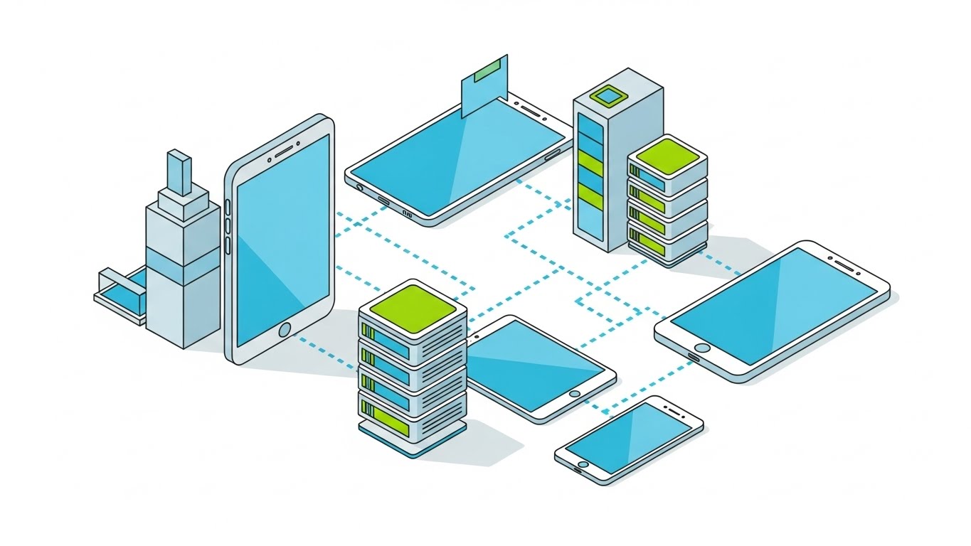
The Visual & Narrative Approach
Visualization Scenario: This style creates a "God's eye view" of the entire communication ecosystem. Placed on an isometric grid, the visual replaces traditional buildings with stylized devices—servers, smartphones, and tablets—connected by precise dotted lines representing an omni-channel ecosystem. The colors are Cyan, Lime Green, and Light Grey on a clean White background. The rendering is precise, with hard outlines and no gradients.
Narration Style: The narrative is explanatory and holistic, walking the viewer through the journey of a message from the server "tower" to the customer's handheld "home."
Psychological Impact & KPI Focus
- Niche Psychology: It satisfies the "Architect" persona who needs to see the Big Picture. The isometric perspective implies control and comprehensive oversight, mitigating the fear of losing track of assets in a complex network.
- Operational Impact: The dotted connection lines clearly visualize end-to-end traceability and audit trails, reinforcing the value of a unified platform over point solutions.
Strategic Implementation & Trade-offs
- Best Use Case: Blog headers or "How It Works" overview pages where understanding the system topology is a prerequisite for purchase.
- Trade-off: While great for structure, it lacks human emotion. It explains the "machine" perfectly but misses the "customer feeling."
Companies using similar video content -
Aircall – AI-powered voice communication and intelligence.
Twilio – Flex – Programmable contact center for rapid communication.
Podium – SMS-first platform for local business engagement.
9. Rapid UI Feature Montage
MOFU | Competitive Displacement

The Visual & Narrative Approach
Visualization Scenario: A composition designed for a rapid montage, implying speed. Abstracted UI panels in Bright Magenta and Navy Blue slide into the frame from multiple angles with motion blur. The panels feature simplified data visualizations—bar charts and toggle switches—without legible text. The lighting is high-key and studio-bright, creating sharp reflections on the "glass" surfaces of the UI elements against a White background.
Narration Style: The narrative is fast-paced and feature-centric, listing capabilities in rapid succession: "Analyze. Optimize. Deploy."
Psychological Impact & KPI Focus
- Niche Psychology: It appeals to the buyer's desire for modernity and innovation. The sleek, "glassy" look suggests a cutting-edge, premium tool that will future-proof their stack.
- Operational Impact: The visual density implies robust functionality without getting bogged down in details. It suggests that the platform is feature-rich and powerful enough to handle complex enterprise needs.
Strategic Implementation & Trade-offs
- Best Use Case: Paid Social ads (1:1 square) aimed at retargeting users who have already visited the site.
- Trade-off: It is impressionistic, not instructional. Users will remember that the UI looks good, but they won't learn how to use it.
Companies using similar video content -
Phocas – Financial data visualization for business insights.
Workiva – Financial automation for reporting and compliance.
Cube Software – AI-powered financial intelligence for FP&A.
5. Clean UI Workflow (Light Mode)
TOFU | Vertical Social Organic

The Visual & Narrative Approach
Visualization Scenario: A pristine, high-fidelity UI representation in a Light Mode aesthetic. The background is Pure White. The interface elements are rendered in soft Light Grey and Sky Blue. A stylized mouse cursor is depicted dragging a modular content block from a sidebar to a central canvas, visualizing a "drag-and-drop" workflow. Soft drop shadows give the elements a subtle lift, creating depth.
Narration Style: The narrative is educational and paced, walking the viewer through the logic of the workflow step-by-step.
Psychological Impact & KPI Focus
- Niche Psychology: It targets the anxiety of complexity. By showing a clean, uncluttered interface with ample whitespace, it proves the system is "easy to learn," directly addressing concerns about long training times.
- Operational Impact: This style explicitly demonstrates Operational Efficiency and Time-to-Market. Showing how quickly a template can be built proves the ROI of agility.
Strategic Implementation & Trade-offs
- Best Use Case: Knowledge Base articles, Help Center videos, and deep-dive webinars.
- Trade-off: It can feel "dry" or "academic." It lacks the emotional hook of the character style or the excitement of the kinetic style.
Style 26: Wireframe to Reality Transition
Funnel Stage: MOFU | Goal: Competitive Displacement (1.13)
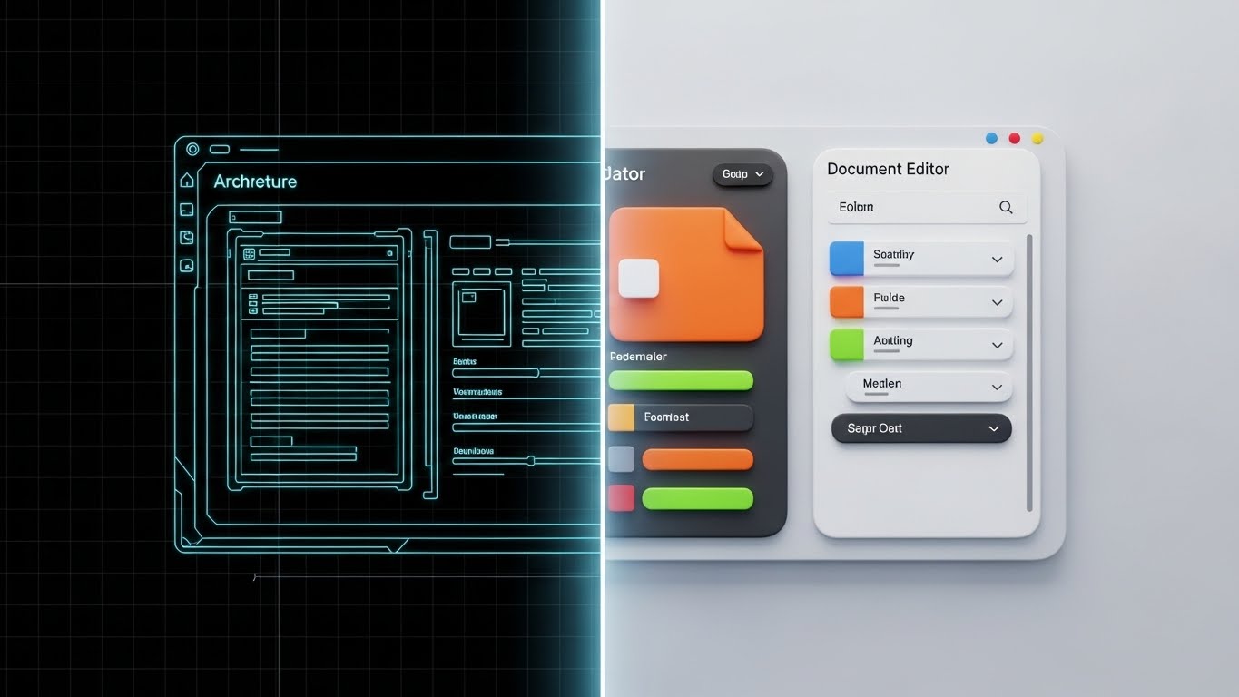
The Visual & Narrative Approach
Visualization Scenario: A split-screen composition vertically dividing the image. The left side shows a technical wireframe blueprint of a document editor in Blueprint Blue and White lines. The right side shows the final, fully rendered colorful interface in 3D with realistic lighting. The transition line in the center is glowing. This visualizes the shift from "Architecture" to "Reality."
Narration Style: The narrative focuses on the precision of the build and the fidelity of the final output, emphasizing the "Architecture to Reality" journey.
Psychological Impact & KPI Focus
- Niche Psychology: It appeals to both the Developer (who respects the wireframe) and the Marketer (who loves the final render). It bridges the gap between IT and Business, showing that the platform serves both masters.
- Operational Impact: It visually proves Alignment. It reinforces that what was planned (compliance/structure) is exactly what is delivered (experience/brand), supporting KPIs related to Brand Consistency.
Strategic Implementation & Trade-offs
- Best Use Case: LinkedIn Ads targeting technical decision-makers who need to see under the hood before they buy.
- Trade-off: It requires precise synchronization to look effective; if the transition is clunky, the metaphor fails.
Companies using similar video content -
MoEngage – AI-powered customer engagement for personalized campaigns.
Cognizant – UtilityOne Engage – Utility customer engagement via web, mobile, voice.
Elixir CCM – End-to2end CCM for personalized, secure communications.
10. Lifestyle Stock with UI Overlay
MOFU | The Functional Buyer

The Visual & Narrative Approach
Visualization Scenario: High-quality lifestyle photography overlaid with abstract graphics. An over-the-shoulder shot of a professional woman in a blazer looking at a laptop screen. The screen emits a Warm Amber glow. Overlaying the screen are semi-transparent, floating UI widgets in Slate Grey and White, representing workflow approval buttons. The background is a blurred, modern open-plan office.
Narration Style: The narrative connects the digital tool to real-world outcomes: "Approvals made simple. Workflows made human."
Psychological Impact & KPI Focus
- Niche Psychology: It validates the User's Identity. It shows the target audience (the professional) being productive and empowered by the tool, reinforcing their self-image as an efficient leader.
- Operational Impact: The floating widgets visualize Augmented Intelligence. It suggests that the software acts as a layer of intelligence that enhances the human's natural capabilities, rather than replacing them.
Strategic Implementation & Trade-offs
- Best Use Case: Landing Pages and Case Studies where social proof and human context are essential for conversion.
- Trade-off: Stock footage can feel generic if not carefully selected. The UI overlay must look "native" to the scene, not pasted on.
Companies using similar video content -
Crisp – Unified messaging platform for customer conversations.
Hiver – Gmail-native shared inbox for collaborative support.
11. 2D Line Art Animation
MOFU | Establishing Thought Leadership
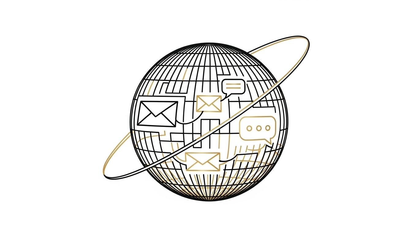
The Visual & Narrative Approach
Visualization Scenario: This style utilizes a sophisticated "Architectural Wireframe" aesthetic to represent the global reach of the platform. A continuous, elegant line in Gold and Black weaves to form a rotating wireframe sphere against a pristine White background. Inside the sphere, the lines fluidly connect to form abstract icons of envelopes and speech bubbles, symbolizing the containment and delivery of messages. The variable width of the lines creates a sense of depth and curvature without heavy rendering.
Narration Style: The tone is visionary and C-Suite focused: "Beyond boundaries. Beyond time zones. One platform, infinite connections."
Psychological Impact & KPI Focus
- Niche Psychology: This appeals to the Chief Information Officer (CIO) who views the organization as a global entity. It alleviates the fear of fragmented, region-specific solutions by presenting a unified, holistic globe.
- Operational Impact: The continuous line visually reinforces Seamless Integration and Global Scalability. It suggests that the platform maintains integrity across borders, supporting KPIs related to "channel consistency" in multi-region deployments.
Strategic Implementation & Trade-offs
- Best Use Case: Whitepaper covers and Executive Summary videos where the goal is to establish the vendor as a mature, global partner.
- Trade-off: It is highly stylized and lacks technical detail. It establishes authority but does not explain how the global delivery is technically achieved.
Companies using similar video content -
Intercom – AI-first customer service with in-app messaging.
LiveAgent – Comprehensive help desk with live chat and call center.
Freshchat – Customer engagement tool for multi-channel interactions.
12. Photorealistic 3D Renders
MOFU | ABM Awareness

The Visual & Narrative Approach
Visualization Scenario: To communicate unwavering reliability, this style uses hyper-realistic 3D rendering. The camera is positioned at a low angle, looking up at a towering server rack rendered in brushed Steel and Silver. Cool Blue LED status lights pulse rhythmically, indicating active data processing. The shallow depth of field focuses on the nearest unit while blurring the background, emphasizing the scale of the infrastructure. The setting is a clean, bright white studio, stripping away distractions to focus on the hardware's solidity.
Narration Style: The narrative is weighty and secure, emphasizing "infrastructure," "uptime," and "redundancy."
Psychological Impact & KPI Focus
- Niche Psychology: It targets the Risk Averse buyer (IT Security Directors). The physical weight and metallic textures of the servers subconsciously signal stability and permanence, countering fears of cloud downtime or data loss.
- Operational Impact: This visualizes High Availability and Tier 1 Infrastructure. It grounds the cloud software in physical reality, reassuring buyers about the platform's capacity to handle massive batch processing loads.
Strategic Implementation & Trade-offs
- Best Use Case: Display Ads targeting IT decision-makers and "Security & Compliance" pages on the website.
- Trade-off: It risks looking like a hardware company advertisement. The copy must explicitly connect the "iron" to the "software reliability."
Companies using similar video content -
TigerConnect – Healthcare communication and collaboration platform.
OhMD – HIPAA-compliant patient communication via SMS.
Local Measure – Engage – Customer engagement for social media interactions.
13. Dynamic Data Visualization
BOFU | ROI Justification
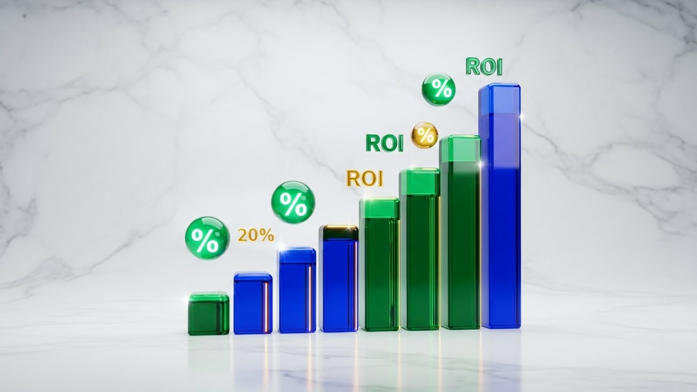
The Visual & Narrative Approach
Visualization Scenario: A premium 3D visualization designed to sell value. Translucent, glass-like bars in Emerald Green and Gold rise upwards in a 3D space, symbolizing cost savings and engagement growth. Floating percentage symbols and data points (represented as glowing orbs) drift dynamically around the bars. The background is a clean White marble texture. The lighting passes through the glass bars, creating caustics and refractions that subtly suggest "wealth" and "transparency."
Narration Style: The narrative is financial and results-oriented: "Convert communication into capital. See the returns in real-time."
Psychological Impact & KPI Focus
- Niche Psychology: It appeals to the CFO and financial stakeholders. The use of gold and crystal textures subliminally associates the software with premium value and profitability, shifting the conversation from "cost" to "investment."
- Operational Impact: The upward trajectory directly visualizes ROI and Cost Reduction (e.g., shifting from print to digital). It focuses entirely on the output metrics of the system rather than the input efforts.
Strategic Implementation & Trade-offs
- Best Use Case: Pitch Decks and "Why Us" presentation slides used during the closing stages of a deal.
- Trade-off: It is abstract financial data. If the actual numbers in the case study don't match the visual optimism, it can create a disconnect.
Companies using similar video content -
Infobip – Global omnichannel communication platform.
Messagepoint – Content management for global CCM.
14. 3D X-Ray Visualization
BOFU | Risk Mitigation

The Visual & Narrative Approach
Visualization Scenario: This style visually deconstructs the platform's security. A digital padlock is rendered with a semi-transparent Translucent White glass shell. Inside, complex internal gears and tumblers, rendered in Cyan and Silver, are visible and interlocked perfectly. The background is a sterile, clean White laboratory setting. This X-Ray view allows the viewer to "see inside" the security mechanism, symbolizing transparency in compliance.
Narration Style: The narrative is analytical and precise: "Security isn't a wrapper; it's engineered at the core."
Psychological Impact & KPI Focus
- Niche Psychology: It addresses the deep anxiety regarding Data Breaches and Compliance (GDPR/HIPAA). By showing the internal mechanics, it proves there are no "hidden vulnerabilities." It satisfies the engineer's need to understand how it works.
- Operational Impact: The interlocking gears visualize Governance and Auditability. It demonstrates that security is an integral, mechanical part of the workflow, not an afterthought.
Strategic Implementation & Trade-offs
- Best Use Case: Security Trust Center pages and Compliance documentation videos.
- Trade-off: It is highly technical. It may bore a marketing buyer who is more interested in design flexibility than encryption keys.
Companies using similar video content -
OpenText – Content Suite – Enterprise Content Management for secure data.
Hyland – OnBase – Enterprise Content Management for critical documents.
15. Abstract 3D AI Visualization
BOFU | The Technical Buyer

The Visual & Narrative Approach
Visualization Scenario: Visualizing the invisible "brain" of the platform. An abstract 3D representation of a neural network where glowing nodes in Deep Purple and Neon Blue are connected by intricate webs of silver filaments. The camera focuses on a central cluster where the connections are densest, representing the AI's processing core. The aesthetic is high-tech, floating in a clean, high-key White Void.
Narration Style: The narrative is futuristic and intelligent, focusing on "predictive capabilities" and "smart orchestration."
Psychological Impact & KPI Focus
- Niche Psychology: It appeals to the Innovator within the technical team. It validates that the platform uses Next-Gen Tech, distinguishing it from legacy "mail merge" tools.
- Operational Impact: The density of connections visualizes Personalization at Scale. It shows how the system connects disparate data points (customer history, behavior) to generate unique, relevant communications.
Strategic Implementation & Trade-offs
- Best Use Case: Technical documentation headers and sections explaining "Next Best Action" capabilities.
- Trade-off: It is conceptual. It relies on the viewer understanding that "nodes and lines" equal "artificial intelligence."
Companies using similar video content -
Qualtrics – Customer journey analytics and experience management.
Medallia – Experience management software with AI insights.
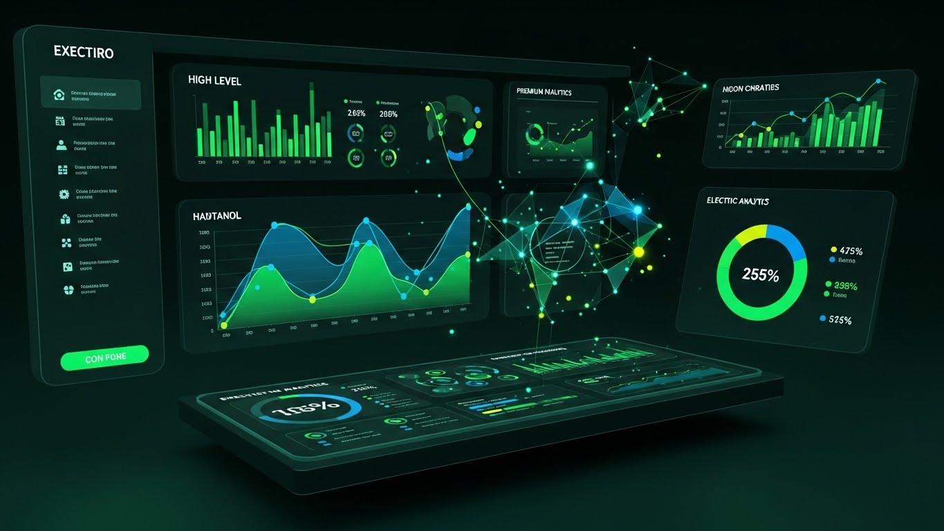
16. Dark Mode UI Showcase
BOFU | The Economic Buyer
The Visual & Narrative Approach
Visualization Scenario: A dramatic departure from the white backgrounds, this style utilizes a high-contrast Dark Mode UI design. The background is Deep Charcoal. Data visualization elements—line graphs and pie charts—pop in vibrant Neon Green and Electric Blue. The layout resembles a pilot's cockpit or an executive control center. The design uses gradients and inner glows to make the data appear to emit light, suggesting live, real-time activity.
Narration Style: The narrative is authoritative and commanding: "Total visibility. Total control. Your command center for customer communication."
Psychological Impact & KPI Focus
- Niche Psychology: It targets the Executive's need for Oversight. The "Dark Mode" aesthetic is often associated with pro-level tools and developer environments, signaling power and sophistication.
- Operational Impact: The vibrant data points emphasize Real-Time Analytics and Dashboard Reporting. It shows that the platform turns raw data into immediate, actionable insights.
Strategic Implementation & Trade-offs
- Best Use Case: Executive Summary decks and "Analytics" feature pages where the goal is to impress with data visualization capabilities.
- Trade-off: Dark mode can feel "heavy" if overused. It should be reserved for analytics and admin views, not general document editing workflows.
Companies using similar video content -
Adlib – Document process automation for financial compliance.
Docsumo – Document AI platform for data extraction and validation.
17. Generative AI Cinematic Video
BOFU | Building Trust

The Visual & Narrative Approach
Visualization Scenario: Moving away from software entirely to focus on the result of good software. A wide, cinematic shot inside a glass-walled boardroom. A diverse group of professionals is seated around a table, engaged in a collaborative discussion, looking at a screen (off-camera) with approval. The lighting is warm and cinematic, with a shallow depth of field (bokeh) blurring the city skyline. The color grading is rich, utilizing natural skin tones and office neutrals.
Narration Style: The narrative is human-centric and emotive: "Behind every great customer experience is a team aligned by great technology."
Psychological Impact & KPI Focus
- Niche Psychology: It addresses the Human Element of B2B sales. Ultimately, people buy from people. This style validates that the software fosters Collaboration and Alignment between IT and Marketing teams.
- Operational Impact: The focus is on Workflow Efficiency and Team Satisfaction. It implies that the software removes friction, allowing teams to focus on strategy rather than troubleshooting.
Strategic Implementation & Trade-offs
- Best Use Case: Homepage Hero videos and "About Us" pages to humanize the brand.
- Trade-off: It is generic "corporate stock" style. To be effective, it must be high quality; otherwise, it risks looking like a cheesy stock photo.
Companies using similar video content -
IBM – Watson Customer Engagement – AI-powered customer engagement solutions.
Nanonets – AI-powered document automation for data extraction.
Rossum – AI-driven document processing for transactional documents.
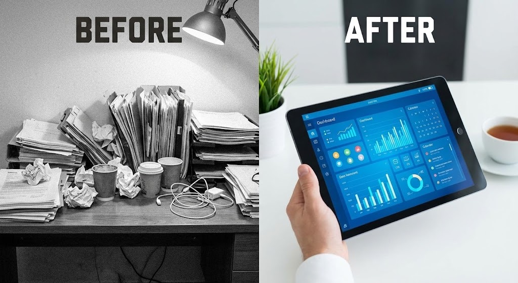
18. Split Screen: Optimized Reality and UI
BOFU | Objection Handling
The Visual & Narrative Approach
Visualization Scenario: A split-screen composition vertically dividing the image. The left half shows a chaotic, black-and-white photo of a messy desk piled high with physical papers and red stamps (representing the "Old Way"). The right half shows a serene, full-color image of a hand holding a tablet displaying a clean, organized Blue dashboard (representing the "New Way"). The contrast emphasizes the shift from analog chaos to digital clarity.
Narration Style: The narrative is comparative and problem-solution oriented: "Stop drowning in paper. Start swimming in data."
Psychological Impact & KPI Focus
- Niche Psychology: It leverages the Contrast Principle. By juxtaposing the pain (chaos) directly with the cure (order), it makes the value proposition undeniable. It targets the frustration with Legacy Systems.
- Operational Impact: It clearly visualizes Digital Transformation and Paperless Adoption. It is a direct representation of the efficiency gains and space savings achieved by the platform.
Strategic Implementation & Trade-offs
- Best Use Case: "Comparison" pages and competitive displacement campaigns.
- Trade-off: It is a blunt instrument. It works well for convincing late adopters but may seem too simplistic for mature organizations already using digital tools.
Companies using similar video content -
Salesforce – Service Cloud – Enterprise CRM with AI-powered insights.
Kapture CX – Customer experience software for utilities.
Oracle – Utilities Customer Experience – Utility CX management and analytics.
19. Hyper-lapse Stock Footage with Data
BOFU | Sales Cycle Acceleration

The Visual & Narrative Approach
Visualization Scenario: Integrating real-world energy with digital metrics. A high-angle hyper-lapse view of a busy city street in bright daylight. The car traffic creates a sense of rapid flow. Overlaid on the traffic are glowing digital data packets (White and Red) moving in sync with the cars, flowing rapidly toward a central hub. The lighting is sunny and optimistic.
Narration Style: The narrative is paced and rhythmic: "Millions of messages. One synchronized flow. Delivered instantly."
Psychological Impact & KPI Focus
- Niche Psychology: It appeals to the need for Scale and Speed. For enterprises sending millions of statements, this visualization assures them that the platform has the Throughput to handle the load without latency.
- Operational Impact: The fast-moving traffic metaphorically represents Transaction Speed and Delivery Rates. It visualizes the system's ability to manage peak loads (e.g., end-of-month billing) effortlessly.
Strategic Implementation & Trade-offs
- Best Use Case: LinkedIn Video Ads and Event booth backgrounds where movement grabs attention.
- Trade-off: The connection between "cars" and "emails" is metaphorical. It requires copy to clarify that this represents communication traffic, not logistics.
Companies using similar video content -
Front – Collaborative inbox for team communication.
RingCentral – MVP – Communication and collaboration platform.
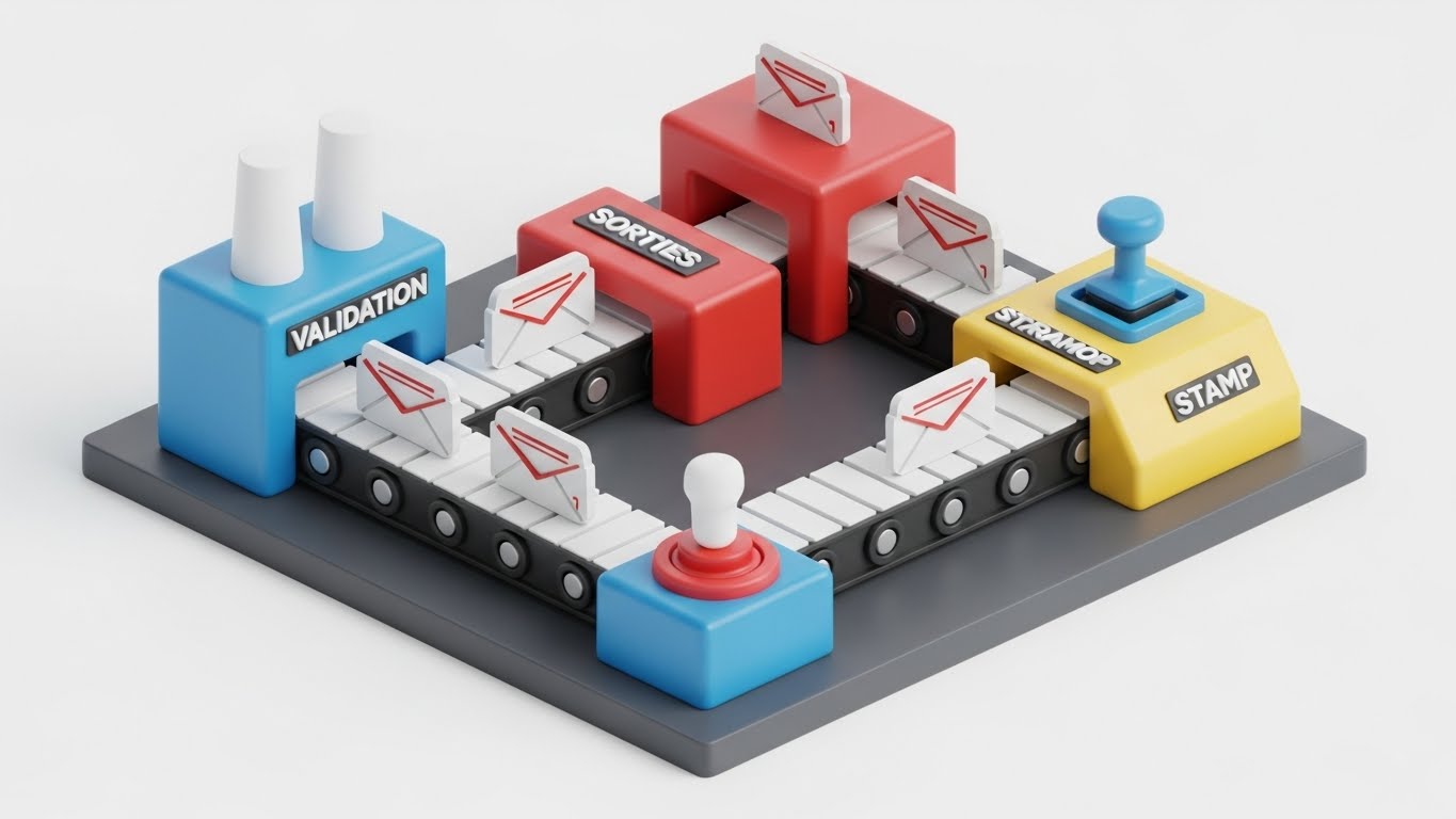
20. Isometric 3D Workflow
Onboarding | Reducing Implementation Friction
The Visual & Narrative Approach
Visualization Scenario: An isometric 3D render of a stylized miniature factory. The "factory" is clean and toy-like, colored in Primary Blue, Red, and Yellow. Little conveyor belts carry abstract "envelope" icons through various stations labeled "Validation," "Sorting," and "Stamping." The lighting is bright and soft, like a studio product shot. The aesthetic makes the complex process of document generation look like a playful, manageable assembly line.
Narration Style: The narrative is educational and step-by-step: "From template to inbox, every step is automated, validated, and tracked."
Psychological Impact & KPI Focus
- Niche Psychology: It reduces Implementation Anxiety. By gamifying the workflow into a toy-like factory, it makes the complex logic of CCM governance feel Approachable and Manageable for non-technical users.
- Operational Impact: It visualizes the Content Supply Chain. It explicitly shows the stages of Approval Workflows and Quality Assurance, reinforcing the platform's role in error reduction.
Strategic Implementation & Trade-offs
- Best Use Case: Onboarding emails, training modules, and "How it Works" sub-pages.
- Trade-off: The "toy" aesthetic might feel too juvenile for very serious, high-compliance banking clients. It works best for internal user training rather than executive pitches.
The Strategic Imperative: Visualizing the Invisible
In the Customer Communication Management sector, the product is often invisible—it is code, logic, and delivery. The challenge for leadership is to make these invisible processes tangible, valuable, and urgent. By deploying this diverse range of visualization styles—from the architectural authority of the wireframe to the approachable clarity of the isometric factory—you transform abstract technical capabilities into concrete business advantages. This visual strategy is not merely about aesthetics; it is a mechanism for reducing cognitive load, accelerating trust, and ultimately, closing the distance between the legacy present and the digital future.
Companies using similar video content -
DocuWare – Document management transforming paper processes.
Compart – DocBridge Communication Suite – Cloud-native CCM for modernization.
21. Macro UI Micro-Interactions
Onboarding | Self-Serve Onboarding

The Visual & Narrative Approach
Visualization Scenario: This style zooms in to the microscopic level of user interaction. The frame is filled entirely by a single, pill-shaped UI button colored in Vivid Red on a Crisp White background. A realistic human finger is captured in the split-second of contact, causing a subtle, satisfying ripple effect on the digital surface. The focus is razor-sharp on the texture of the skin and the button's surface, blurring the surrounding interface to emphasize the singular, decisive action.
Narration Style: The narrative is intimate and assuring: "One touch. Zero friction. Consider it done."
Psychological Impact & KPI Focus
- Niche Psychology: It addresses the Fear of Complexity. New users often hesitate, fearing that enterprise software requires endless clicks to perform a simple task. This visual proves the "One-Click" promise is real.
- Operational Impact: This style directly drives Time-to-Value (TTV). By highlighting the simplicity of critical "Power Actions" (like "Publish" or "Send"), it encourages users to complete setup wizards faster.
Strategic Implementation & Trade-offs
- Best Use Case: Tooltip videos embedded directly in the software (e.g., hovering over a "Deploy" button) or "Tip of the Day" emails.
- Trade-off: It is hyper-specific. It shows the feeling of the tool but conveys zero information about the breadth of the platform's capabilities.
Companies using similar video content -
JustCall – Call and SMS engagement for high-volume interactions.
respond.io – Messaging platform for high-volume channels.
22. 2D Animation & UI Composition
Onboarding | Trial/Freemium User Activation

The Visual & Narrative Approach
Visualization Scenario: A composition blending flat 2D animation with UI elements to create a sense of reward. A stylized 2D character in Turquoise and Yellow is shown "high-fiving" a floating UI checkmark icon. The background is a solid, vibrant Orange. The style is cel-shaded with bold outlines, mimicking high-quality mobile game aesthetics. Confetti particles burst around the checkmark, capturing a moment of genuine celebration.
Narration Style: The tone is enthusiastic and rewarding: "Setup complete. You are now ready to communicate at scale."
Psychological Impact & KPI Focus
- Niche Psychology: It leverages Gamification Psychology. The "dopamine hit" of the visual celebration validates the user's effort, reinforcing the behavior of completing tasks.
- Operational Impact: The focus is on Stickiness and Habit Formation. Positive reinforcement during the first session significantly reduces Day 1 drop-off rates, driving higher Activation.
Strategic Implementation & Trade-offs
- Best Use Case: In-App Modals that pop up after a user completes a key milestone (e.g., sending their first campaign).
- Trade-off: It is playful. It may not align with the tone of ultra-conservative enterprise environments (e.g., defense or legal sectors).
Companies using similar video content -
Docupilot – Document automation and generation platform.
Upland Objectif Lune – OL Connect – Document composition and workflow automation.
InterActive Legal – Software for generating planning documents.
23. 2D Graphics Over Live Action
Onboarding | Accelerating Time-to-Value

The Visual & Narrative Approach
Visualization Scenario: A "Mixed Reality" style that bridges the human and the software. A frontal portrait of a young professional smiling and tapping their temple. Surrounding their head are hand-drawn, neon-colored "doodles"—lightbulbs, gears, and lightning bolts—that appear to be drawn in 3D space around them. The photo is realistic, while the doodles are sketchy and vibrant. This visualizes the spark of creativity that the software enables.
Narration Style: The narrative is empowering and energetic: "Your ideas, instantly operationalized. From thought to template in seconds."
Psychological Impact & KPI Focus
- Niche Psychology: It appeals to the Creative Marketer who feels bogged down by technical limitations. It promises that the software acts as a direct extension of their imagination.
- Operational Impact: It visualizes User Empowerment. It suggests that the tool reduces the "translation gap" between a creative idea and a live communication, supporting Campaign Velocity.
Strategic Implementation & Trade-offs
- Best Use Case: Welcome emails and "Getting Started" guides where the goal is to inspire usage rather than teach mechanics.
- Trade-off: It is metaphorical. It inspires feeling but doesn't show function. It needs to be paired with a practical tutorial.
Companies using similar video content -
Tidio – Live chat software with chatbot automation.
Gorgias – Shopify chat widget for e-commerce support.
24. Holographic UI over 3D Render
Retention | Proactive Support

The Visual & Narrative Approach
Visualization Scenario: A realistic 3D render of a smartphone lying on a pristine white desk. Projecting upwards from the screen is a semi-transparent, Holographic Blue shield icon. The shield rotates slightly, glowing with a soft internal light. The background is a bright, blurred office environment. The visual metaphor represents the "invisible" layer of proactive protection and compliance security available on mobile devices.
Narration Style: The tone is protective and high-tech: "Protection that travels with you. Enterprise-grade security, right in your pocket."
Psychological Impact & KPI Focus
- Niche Psychology: It addresses the Security Persona's fear of mobile vulnerabilities. The "force field" visual implies an impenetrable barrier, fostering Peace of Mind.
- Operational Impact: It promotes Mobile Adoption while mitigating security concerns. It supports KPIs related to Compliance Adherence across distributed teams.
Strategic Implementation & Trade-offs
- Best Use Case: Mobile App feature updates and Security Compliance newsletters.
- Trade-off: The holographic effect is "sci-fi." It creates a high-tech perception but shouldn't promise features (like literal holograms) that don't exist.
Companies using similar video content -
HubSpot – Marketing Hub – Marketing automation and customer service.
Zoho Desk – Multichannel support with gamified onboarding.
25. Aspirational Stock Montage
Retention | Reducing Churn

The Visual & Narrative Approach
Visualization Scenario: An aspirational stock photography style designed to evoke emotion. A low-angle shot of a diverse team standing outdoors on a sunny day, looking towards the horizon. The sun creates a cinematic lens flare. They are holding tablets and smiling naturally. The colors are warm, dominated by Sunny Yellow and Sky Blue. The image evokes feelings of freedom, shared success, and a bright future.
Narration Style: The narrative is relational and visionary: "Together, we don't just send messages. We build relationships."
Psychological Impact & KPI Focus
- Niche Psychology: It targets the Emotional Connection to the brand. In B2B, retention is often about the relationship. This style reinforces the feeling of being part of a winning team.
- Operational Impact: The focus is on Lifetime Value (LTV). By associating the software with team happiness and success, it subtly increases the psychological switching costs, reducing Churn.
Strategic Implementation & Trade-offs
- Best Use Case: Quarterly Business Reviews (QBRs) and "Year in Review" videos sent to existing clients.
- Trade-off: It is generic. Without specific brand overlays or UI shots, it could apply to any successful company. It must be anchored by the brand voice.
Companies using similar video content -
Piktochart – AI Document Creator – AI-powered document creation from text prompts.
Type.ai – AI book writer and intelligent editor.
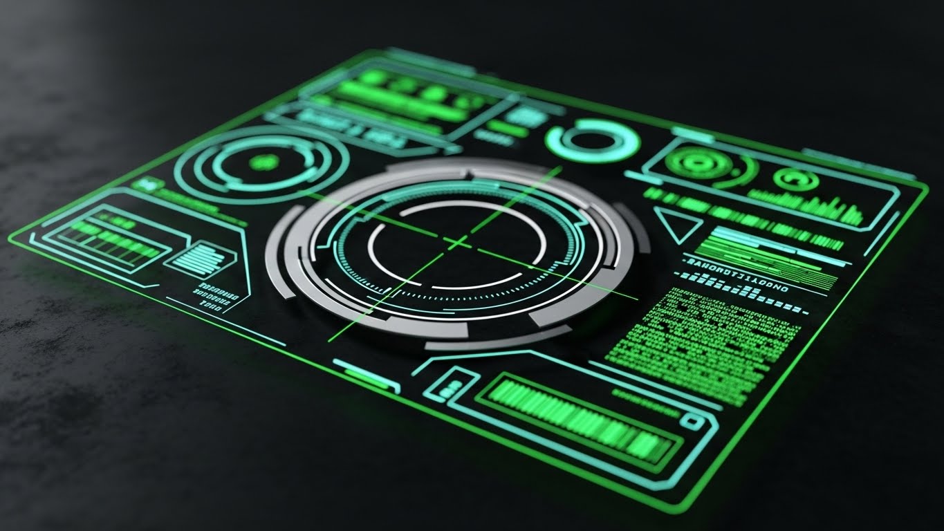
26. Futuristic Neon/Dark Mode
Retention | Reducing Support Overhead
The Visual & Narrative Approach
Visualization Scenario: A sci-fi inspired interface design representing advanced automation. A Heads-Up Display (HUD) overlay in Silver and Laser Green is superimposed over a blurred technical background (Dark Mode). The HUD features circles, crosshairs, and scrolling data streams. The aesthetic is similar to a superhero's tactical interface—highly advanced, automated, and intelligent. It visually represents the platform's self-healing and proactive support capabilities.
Narration Style: The tone is robotic but helpful: "Analyzing. Detecting. Resolving. Issues fixed before you even notice them."
Psychological Impact & KPI Focus
- Niche Psychology: It appeals to the IT Director who wants a "set it and forget it" system. The advanced HUD implies that the system is smarter than a human, capable of autonomous maintenance.
- Operational Impact: This style directly targets Support Ticket Deflection. By visualizing the AI handling issues, it encourages users to trust the automated help center rather than calling support.
Strategic Implementation & Trade-offs
- Best Use Case: Chatbot Avatar animations and "System Health" status pages.
- Trade-off: It can feel cold/impersonal. It is excellent for "system status" but poor for "customer empathy."
Companies using similar video content -
OhMD – HIPAA-compliant patient communication for mobile.
TigerConnect – Secure healthcare communication on mobile.
27. 3D Parallax UI Presentation
Expansion | Driving Upsell/Cross-sell
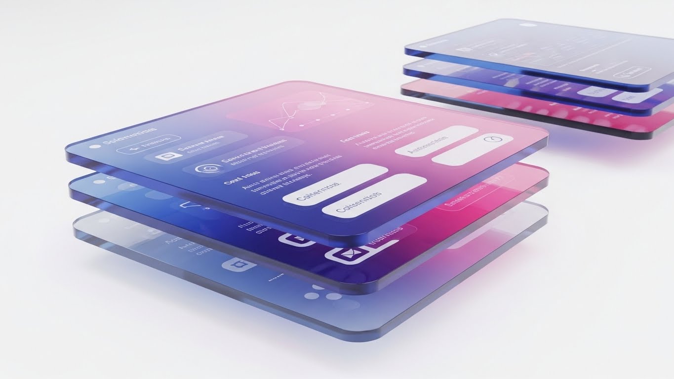
The Visual & Narrative Approach
Visualization Scenario: A 3D composition showing multiple layers of UI screens floating in depth (parallax). The screens are rendered as thick, refractive acrylic glass plates. The color palette uses Cyberpunk Pink and Blue gradients. The camera angle is from the side, revealing the physical depth and layering of the interface. This visualizes the "depth" of features and the richness of the premium tier offering against a clean White background.
Narration Style: The narrative is premium and expansive: "Go deeper. Unlock the layers of intelligence hidden within your data."
Psychological Impact & KPI Focus
- Niche Psychology: It appeals to the Power User's desire for more. The visual depth subconsciously equates to "value depth." It makes the Premium Tier look "thicker" and more substantial than the Basic Tier.
- Operational Impact: This style drives Average Revenue Per User (ARPU). It visually justifies the cost of upgrading by making the additional features look tangible and weighty.
Strategic Implementation & Trade-offs
- Best Use Case: Webinar backgrounds and "Upgrade to Pro" landing pages.
- Trade-off: It is abstract. It sells the concept of more features, but doesn't necessarily show what those features are.
Companies using similar video content -
Wipro – Digital Customer Engagement Platform – Insurance customer engagement for self-service.
Bolttech – Customer engagement platform for insurance.
28. Generative AI Realistic Character Video
Expansion | Driving Referrals & Advocacy
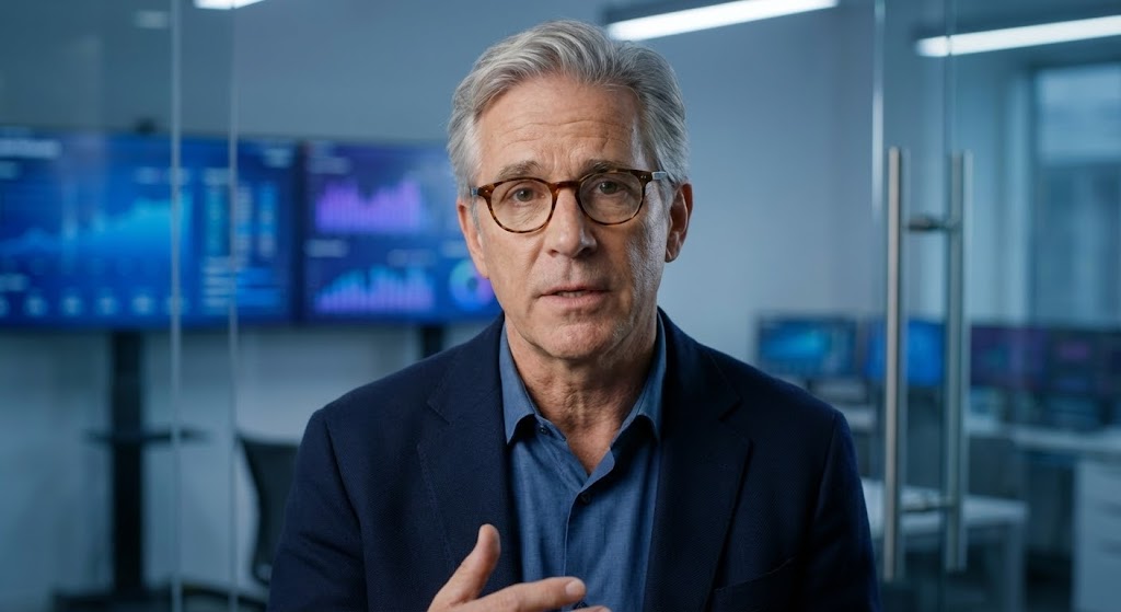
The Visual & Narrative Approach
Visualization Scenario: A highly realistic AI-generated video character. A medium close-up of a distinguished professional (50s, glasses) speaking directly to the camera. The lighting is professional 3-point studio lighting. The background is a soft-focus, high-tech office environment with cool tones. The subject's expression is earnest and recommending. The texture of the skin and fabric is 8k resolution, indistinguishable from reality, fostering immediate trust.
Narration Style: The narrative is testimonial and direct: "We didn't just upgrade our software; we upgraded our entire customer strategy."
Psychological Impact & KPI Focus
- Niche Psychology: It leverages Social Proof. In the expansion phase, buyers trust their peers more than the vendor. This style mimics a high-end case study interview without the logistical cost of filming one.
- Operational Impact: The focus is on Referrals and NPS. A relatable face delivering a strong endorsement can be the tipping point for an existing client to recommend the platform to a peer.
Strategic Implementation & Trade-offs
- Best Use Case: Case Study summaries and "Partner Program" invitations.
- Trade-off: The "Uncanny Valley." If the lip-sync or eye movement is slightly off, trust is instantly broken. Quality control is paramount.
Companies using similar video content -
Zendesk – AI-driven customer service with advanced ticketing.
Sprout Social – Social media CX with AI assistant.
29. Abstract 2D Motion Graphics
Expansion | Driving Deep Feature Adoption

The Visual & Narrative Approach
Visualization Scenario: Abstract 2D motion graphics designed to soothe and explain. Gentle, wave-like patterns in Lavender and Mint Green flow across the screen. Within the waves, small geometric icons (gears, documents, users) float and bob rhythmically. The style is flat, vector-based, and smooth. It conveys a sense of "flow" and "ease" associated with adopting deep, automated features, removing the friction from complex tasks.
Narration Style: The narrative is hypnotic and educational: "Let the workflow carry the load. Automate the complex, effortlessly."
Psychological Impact & KPI Focus
- Niche Psychology: It addresses Change Fatigue. Existing users often resist learning new features because they are tired. This soothing visual style lowers their defense mechanisms and invites them to try something new.
- Operational Impact: It targets Feature Adoption Rates. By making the new feature look "easy" and "light," it encourages users to explore deeper functionality without fear of breaking anything.
Strategic Implementation & Trade-offs
- Best Use Case: Feature Announcement emails and "What's New" sidebar widgets.
- Trade-off: It is low-information. It creates a vibe of ease but doesn't teach the user how to use the feature. It works best as a teaser.
Companies using similar video content -
Adobe – Experience Manager – Personalized customer experiences at scale.
Dynamic Yield – AI-powered personalization platform.
30. Low-Poly 3D Modeling
Expansion | In-App Upsell

The Visual & Narrative Approach
Visualization Scenario: A playful, low-poly 3D model of a tower constructing itself. The shapes have sharp, faceted edges and are colored in soft Pastels (Lilac, Peach, Mint). The tower blocks are flying into place to build a higher structure. The background is a clean, solid White. The aesthetic is playful and game-like, encouraging the user to "build" their plan to the next level (Upsell).
Narration Style: The narrative is aspirational and growth-focused: "Your business is growing. Your platform should too. Add the next block."
Psychological Impact & KPI Focus
- Niche Psychology: It appeals to the Builder Persona. It visualizes the company as a structure that is constantly growing. The "gamified" building process makes the act of purchasing an add-on feel like leveling up.
- Operational Impact: It drives Expansion Revenue. The visual metaphor of "completing the tower" creates a psychological need to fill the gap, prompting the purchase of additional modules.
Strategic Implementation & Trade-offs
- Best Use Case: Gamification Badges and "Plan Limit Reached" screens where an upsell is presented.
- Trade-off: It is stylized. It may feel too "cartoonish" for C-level financial discussions, but it is perfect for the end-user who advocates for the upgrade.
The Advids Visual Operations Doctrine: A Strategic Framework
The 30 styles outlined above are not merely artistic choices; they are strategic assets. To extract maximum value from this visual catalog, CCM leaders must transition from treating video as "content" to treating it as "infrastructure." This Knowledge Base synthesizes the visual strategies into a cohesive doctrine for driving adoption, efficiency, and ROI.
Strategic Alignment & Visual Architecture
The "Visual Operating System" – Why consistency matters before a single pixel is rendered.
- The Cognitive Load Audit: Before production, audit your current training materials. If a PDF takes 10 minutes to read, replace it with a 30-second Minimalist Flat (Style 1) video. Measure the reduction in "time-to-comprehension" as a primary KPI.
- Role-Based Visual Mapping: Do not use one style for all users. Deploy High-Contrast Dark Mode (Style 16) for Executive Dashboards to signal power, but use Clean UI Workflow (Style 5) for Operations teams to signal clarity and ease.
- The "Glanceability" Standard: In high-stress CCM environments, users don't have time to study. Visuals must be "glanceable." Use Bold Kinetic Typography (Style 4) for alerts and Abstract Organic (Style 7) for status loops.
- Brand Voice Consistency: Your software is a collection of disparate modules. Use a unified visual language (e.g., specific 3D Renders (Style 12)) to visually stitch these modules together, creating a perception of a seamless, single platform.
- The Advids Strategic Audit: Partner with Advids to define this "Visual Operating System" early. A fragmented visual strategy (mixing cartoons with photorealism randomly) erodes trust. Consistency builds authority.
- Standardization vs. Customization: For core features, use standardized Clean UI (Style 5) to ensure clarity. For bespoke, high-value pitches, use Cinematic Video (Style 17) to create emotional resonance.
- The Cross-Departmental Bridge: Sales talks "ROI," Ops talks "Efficiency." Use Split Screen (Style 18) visuals to literally show both sides of the coin, unifying the terminology between departments.
- Legacy System Integration: The biggest competitor is often "the old way." Use Wireframe to Reality (Style 26) to respect the legacy architecture while visualizing the modern transformation, validating the IT team's past work while selling the future.
- Accessibility by Design: Visuals are the universal language. Use Line Art Animation (Style 11) which relies on shape rather than text, ensuring your training materials are accessible to global, multi-lingual teams without heavy localization costs.
- The Mobile-First Mandate: C-Level execs approve deals on their phones. Ensure all "Executive" styles (like Style 13: Dynamic Data) are legible on a vertical 9:16 screen.
Operational Adoption & Implementation
The "Deployment" Phase – Integrating visuals into the daily workflow.
- Overcoming "Big Brother" Anxiety: When introducing compliance monitoring, use 2D Character Stories (Style 5) to show the benefit to the employee (safety/protection) rather than the surveillance, fostering empathy and acceptance.
- The Micro-Learning Shift: Kill the hour-long webinar. Break training into 60-second Macro UI (Style 21) clips. Embed these directly into the software tooltips for "Just-in-Time" learning.
- Just-in-Time Support: Embed Futuristic HUD (Style 26) animations in the Help Center to visualize "system health." If a user sees the system fixing itself, they are less likely to file a ticket.
- Gamification of Training: Use Low-Poly 3D (Style 30) visuals in your Learning Management System (LMS). Visualizing progress as "building a tower" increases course completion rates significantly.
- Reducing Support Ticket Volume: There is a direct correlation between proactive visual guides and reduced call center load. Deploy Clean UI Workflow (Style 5) videos for the Top 10 most common support tickets.
- Remote Onboarding: For distributed teams, use Isometric 3D (Style 20) to show the "factory floor" of the software. It gives remote workers a mental map of the system they can't physically see.
- Visual SOPs: Transform text-based Standard Operating Procedures into Abstract Motion (Style 29) flows. Visual processes are retained 60,000x faster than text, reducing error rates in compliance-heavy industries.
- Feedback Loops: Use 2D/UI Composition (Style 22) to celebrate user milestones (e.g., "1000th document sent"). This positive reinforcement builds habit loops and increases Daily Active Users (DAU).
- Scalable Localization: When expanding globally, use Abstract 3D AI (Style 15) or Line Art (Style 11). These styles rely on symbology, not text, reducing the cost and complexity of translating assets for different regions.
- Leadership Communication: When the CTO presents the roadmap, replace bullet points with Photorealistic 3D (Style 12) server renders. It communicates "robust infrastructure" and "investment security" instantly.
Measuring Impact & Future-Proofing
The "ROI" Phase – Proving value and preparing for the next wave.
- Beyond "Views": Stop counting video views. Start measuring Time-to-Competency. If a video reduces the time it takes a user to send their first invoice by 20%, that is a hard ROI metric.
- The "Idle Time" Metric: Correlate better visualization with reduced "software idle time" (users staring at the screen confused). Macro UI (Style 21) videos directly attack this inefficiency.
- Compliance Velocity: Measure how fast a new regulation (e.g., GDPR update) is understood by the team. Use 3D X-Ray (Style 14) to visually deconstruct the new rule, accelerating compliance adoption.
- Retention and Churn: High-quality UX visualization acts as an emotional anchor. Use Aspirational Stock (Style 25) in QBRs to remind clients of the human success the partnership enables, directly impacting LTV.
- The AI Visual Frontier: Prepare for Generative UI. Use Abstract Neural Net (Style 15) visuals now to condition your users to expect AI-driven features, reducing the "shock" of future automation updates.
- Scalability of Assets: Build a "Visual Library," not just one-off videos. A library of Isometric (Style 3) assets can be reused across Sales, Marketing, and Product, amortizing the cost of production.
- The Advids Partnership: Scale requires a partner. Advids acts as the custodian of your Visual Library, ensuring that as your feature set grows, your visual assets evolve without losing brand coherence.
- Benchmarking Success: "Good enough" visuals are a competitive risk. If your competitor uses 3D Glass (Style 13) and you use flat screenshots, you lose the "perceived value" battle before the demo starts.
- The ROI of Safety: In regulated industries, error reduction is a financial metric. Quantify the insurance or penalty cost reduction achieved by better Wireframe (Style 26) training modules.
- Final Call to Innovation: Treat video as infrastructure. The companies that win the next decade of CCM will be those that visualize complexity with the most clarity. This is not just about looking good; it is about operating faster, smarter, and with greater connection.
Companies using similar video content -
Insider One – Customer journey orchestration and personalization.
Netcore Cloud – Customer Journey Orchestration – Real-time personalized experiences.
Author & Editor Bio


