
Introduction: The Visualization of Empathy
The era of "guessing" what the customer wants is over. We have entered the Experience Economy, where the battle for market share is won or lost in the micro-moments between touchpoints. For B2B enterprises, the challenge is no longer just gathering data; it is orchestrating it.
However, a profound gap exists. While organizations are drowning in behavioral data, they often starve for insight. The physical/digital divide—where offline conversations disconnect from online behaviors—creates "silo blindness," preventing teams from seeing the whole human behind the account. The solution lies not in more spreadsheets, but in strategic visualization.
The market recognizes this urgency. The customer journey mapping software market is projected to reach $16.46 billion in 2025. This explosive growth signals a shift: visualization is no longer a "nice-to-have" aesthetic choice; it is a core Go-To-Market strategy. Why? Because the cost of inaction is too high. Research indicates that B2B companies with high levels of customer satisfaction are 1.5 times more likely to outperform competitors.
This guide acts as your visual lexicon. At Advids, we believe that to align stakeholders and drive adoption, you must reduce cognitive load. You must translate complex "Journey Orchestration" into visual narratives that are instantly understood. From abstract organic forms that evoke the fluidity of relationships to precise isometric structures that map logic, these styles represent the "Gold Standard" for communicating value in the CX space.
Let’s explore how to visualize the invisible.
1. Abstract Organic Vector
TOFU | Brand Awareness
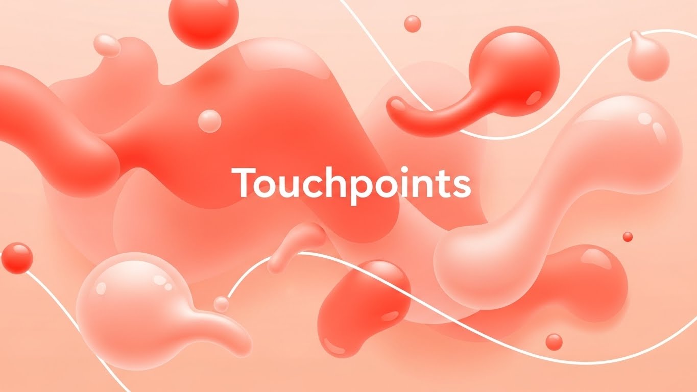
(Abstract Organic Vector): Glossy Orbs + Visualizing Soft Connections
The Visual & Narrative Approach
This style abandons the rigid grids of traditional B2B software marketing in favor of fluidity. The composition utilizes Vivid Coral and Soft Peach glossy orbs to represent "Touchpoints," connected by liquid-like white lines that morph and flow. The shadowless, bright lighting creates an approachable, modern aesthetic. By removing text and characters, the focus remains entirely on the concept of connectivity—suggesting that your platform makes customer interactions feel natural and seamless, rather than mechanical.
Psychological Impact & KPI Focus
In the Brand Awareness (TOFU) stage, the goal is to lower skepticism and invite curiosity. Rigid, technical diagrams can feel overwhelming (high cognitive load) to a prospect who is already frustrated by complex systems. The "organic" shapes here psychologically signal agility and ease of use. This style effectively communicates 1.1 Brand Awareness by associating the software with "flow" rather than "friction," appealing to CX leaders who crave a more human-centric approach to data.
Strategic Implementation & Trade-offs
- Best Use Case: Social Media Ads (Instagram/LinkedIn) where you have 3 seconds to stop the scroll.
- Duration: Short (6-10 seconds).
- Trade-off: While excellent for capturing mood and attention, the lack of concrete UI elements means it cannot explain how the software works. It is a "hook," not a "manual."
Companies using similar video content -
Netcore Cloud – Customer Engagement Platform – Visualizing seamless, personalized customer journeys.
WebEngage – Customer Data Platform – Orchestrating fluid, omnichannel customer interactions.
2. Bold Kinetic Typography
TOFU | Market Education
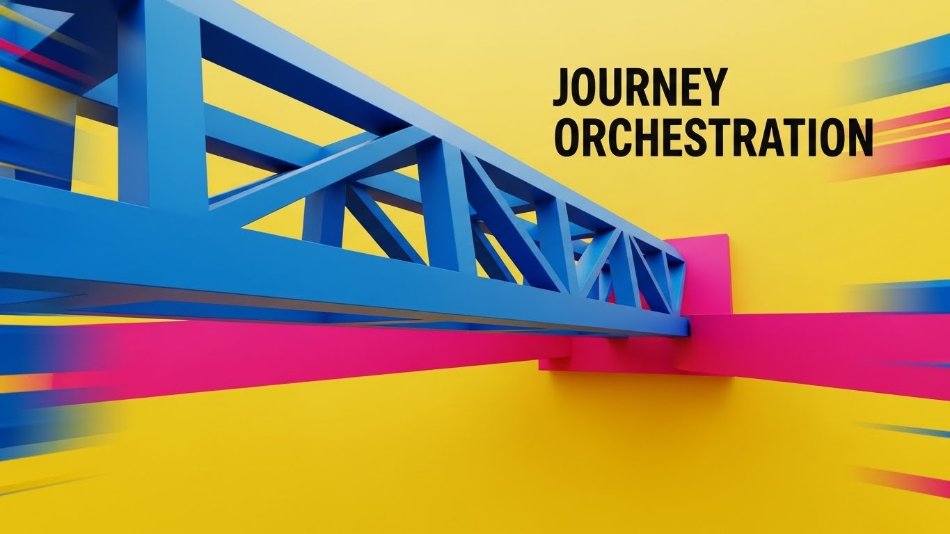
(Bold Kinetic Typography): Structural Bridges + Orchestrating Complex Journeys
The Visual & Narrative Approach
This style treats typography as architecture. Sharp-edged blocks in Electric Blue and Hot Pink physically construct a bridge across a Yellow void. This is a powerful visual metaphor for "Journey Orchestration"—literally building a path over the gap where customers usually churn. The camera’s diagonal tilt and motion blur convey high energy and speed, suggesting that the platform is dynamic and proactive. The text doesn't just sit on the screen; it is the structure.
Psychological Impact & KPI Focus
For 1.3 Market Education, the challenge is often proving that a solution is robust enough to handle enterprise complexity. The "Bold Kinetic" style uses geometric weight and impact to signal strength and reliability. The contrasting colors (Blue/Pink vs. Yellow) create a sense of urgency and innovation. It appeals to the "Builder" persona—product managers and architects who want to see a solid foundation for their strategy.
Strategic Implementation & Trade-offs
- Best Use Case: YouTube Shorts or high-energy event openers.
- Duration: 15-30 seconds.
- Trade-off: The fast-paced, aggressive motion is perfect for hype but can be distracting if you need to convey detailed value propositions. It works best when the message is simple: "We Build the Bridge."
Companies using similar video content -
TheyDo – Journey Management Platform – Building structured paths for complex customer experiences.
Adobe Journey Optimizer – Experience Platform – Dynamically orchestrating cross-channel customer journeys.
3. Abstract Motion
TOFU | Shaping Brand Perception
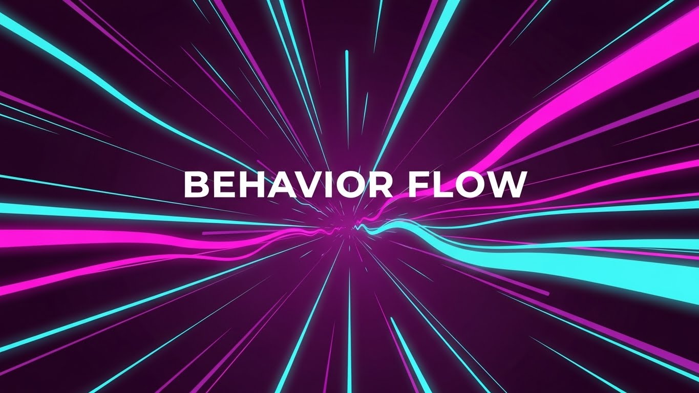
(Abstract Motion): Neon Streams + Processing Behavior Flow
The Visual & Narrative Approach
To visualize the invisible concept of "Behavior Flow," this style utilizes sweeping streams of Cyan and Magenta light rushing through a Deep Purple tunnel. It captures the sheer velocity and volume of customer data that modern platforms process. The aesthetic is clean, vector-based, and "light-mode" adjacent (despite the dark tunnel), emphasizing clarity within chaos. The forward camera movement mimics the feeling of progress and high-speed data ingestion.
Psychological Impact & KPI Focus
This style addresses the "Skippability" of pre-roll ads (4.1 Skippable Pre-Roll Ad). Viewers decide in 5 seconds whether to watch. By visualizing data as a high-speed, beautiful light stream, you tap into the "Tech-Forward" aspiration of the audience. It promises that the software is fast, powerful, and capable of handling real-time analytics without lagging. It validates the viewer's need for speed and efficiency.
Strategic Implementation & Trade-offs
- Best Use Case: YouTube Pre-roll or background video for a website hero section.
- Duration: Loopable or 15 seconds.
- Trade-off: Extremely effective for conveying "power" and "speed," but poor at conveying "empathy." It is a technical visualization, not an emotional one.
Companies using similar video content -
Glassbox – Digital Experience Analytics – Processing high-speed, real-time customer behavior data.
Fullstory – Digital Experience Intelligence – Visualizing the velocity of user behavior flow.
4. Gen AI Realistic Character
TOFU | Skippable Pre-Roll Ad

(Gen AI Realistic Character): Holographic Focus + Aligning Key Stakeholders
The Visual & Narrative Approach
Moving away from abstraction, this style introduces the human element. A young professional woman in a navy blazer stands in a modern office, interacting with a holographic map. The shallow depth of field (bokeh) blurs the office background, focusing entirely on her confident interaction with the data. This visualizes "Stakeholder Alignment"—showing the user not as a cog in a machine, but as a decision-maker empowered by clarity.
Psychological Impact & KPI Focus
In 3.5 Vertical Social Organic channels like TikTok or Reels, audiences crave human connection. Pure graphics can feel cold. This style mirrors the target audience (the ambitious CX professional) back to themselves. It validates their aspiration to be seen as forward-thinking leaders who control the data, rather than being controlled by it. It builds trust by showing the outcome of the software: a confident, informed human.
Strategic Implementation & Trade-offs
- Best Use Case: TikTok, LinkedIn Stories, or case study intros.
- Duration: 30-60 seconds (Storytelling format).
- Trade-off: This style relies heavily on the quality of the Gen AI or footage. If the character looks "uncanny," trust is lost immediately. It requires high-fidelity execution.
Companies using similar video content -
Qualtrics – XM Platform – Empowering decision-makers with AI-driven customer insights.
Medallia – Experience Cloud – Showing confident interaction with customer experience data.
5. Dark Mode UI Showcase
TOFU | Vertical Social Organic
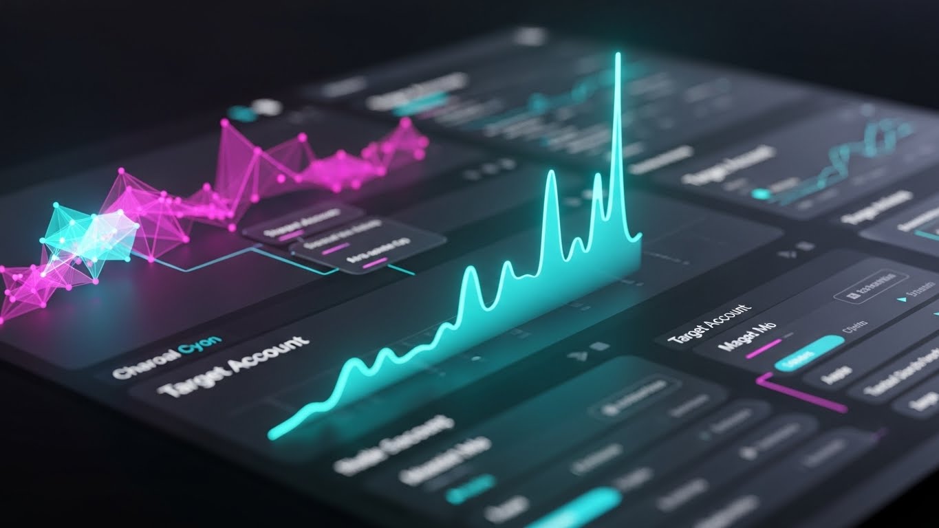
(Dark Mode UI): Glowing Dashboards + Targeting Account Precision
The Visual & Narrative Approach
This is the aesthetic of the "Power User." The design features a sleek Charcoal Grey dashboard populated by glowing Neon Cyan and Magenta data visualizations. The tilted camera angle and shallow depth of field draw the eye to a specific upward trend line, representing success. It transforms a standard spreadsheet view into a high-tech "Control Center," elevating the perceived value of the tool.
Psychological Impact & KPI Focus
For 2.2 ABM Awareness, you are targeting decision-makers who value precision and depth. Dark Mode inherently signals "Pro-Level" software (used by developers, traders, and designers). It reduces eye strain and suggests that this is a tool for deep work and serious analysis. It answers the anxiety: "Is this tool powerful enough for my complex needs?" with a resounding "Yes."
Strategic Implementation & Trade-offs
- Best Use Case: LinkedIn Feeds, Product Pages, and Sales Decks.
- Duration: 30-90 seconds (Feature walkthroughs).
- Trade-off: While it looks premium, Dark Mode can sometimes obscure readability if the contrast ratios aren't perfect. It implies complexity, which is good for credibility but risky if you are trying to claim "simplicity."
Companies using similar video content -
Heap – Product Analytics – Showcasing deep analysis on glowing, data-rich dashboards.
CleverTap – Customer Engagement & Retention – Presenting pro-level, multi-channel analytics.
6. Isometric 2D
TOFU | ABM Awareness
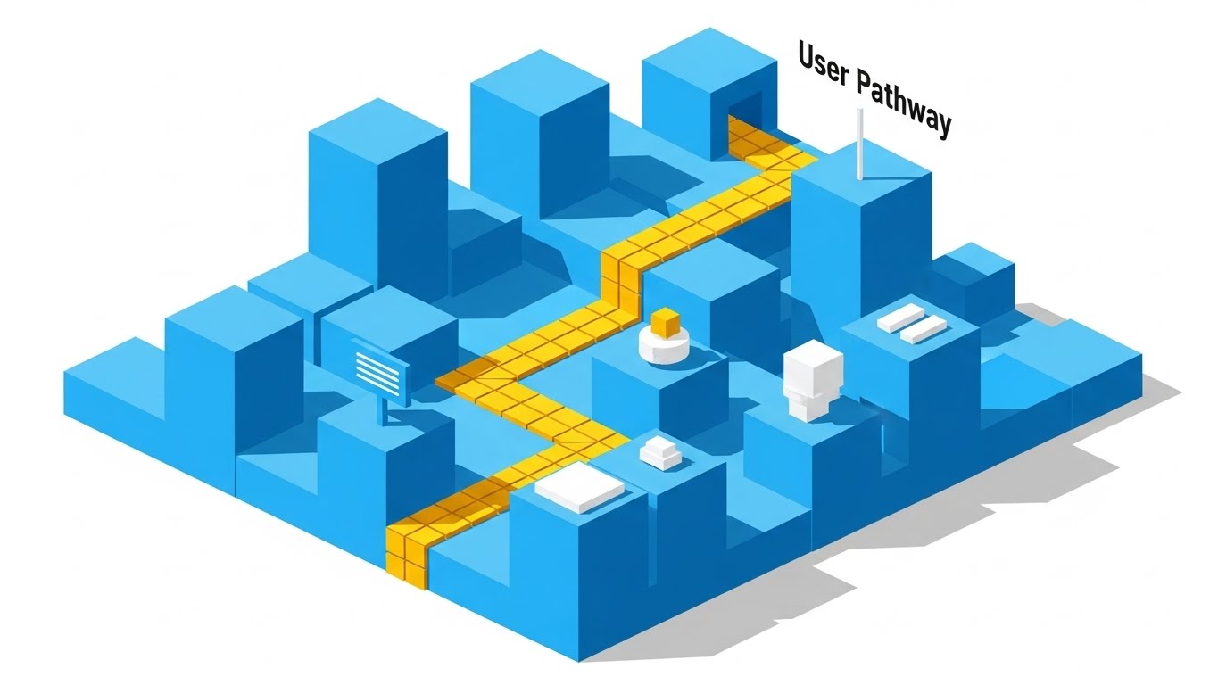
(Isometric 2D): Yellow Pathway + Clarifying User Logic
The Visual & Narrative Approach
When clarity is the priority, Isometric 2D reigns supreme. This design visualizes a "User Pathway" as a clear yellow brick road winding through a city of Sky Blue geometric blocks. The hard shadows provide depth without clutter. The composition creates a literal map, guiding the eye from start to finish. It strips away the noise to show the fundamental logic of the customer journey.
Psychological Impact & KPI Focus
In the MOFU (Middle of Funnel) stage (1.6 Demand Gen), prospects are evaluating logic and fit. They need to understand how the process works. Isometric design provides a "God's Eye View," giving the viewer a sense of control and total visibility. It reduces the fear of the unknown by laying out the entire ecosystem in a structured, predictable grid.
Strategic Implementation & Trade-offs
- Best Use Case: Display Ads, Infographics, and Explainer Videos.
- Duration: Static or Short Loops.
- Trade-off: It can feel "generic" or "corporate" if not stylized correctly. It communicates "Safe and Standard" rather than "Cutting Edge," which is sometimes exactly what a risk-averse buyer wants.
Companies using similar video content -
Smaply – Customer Journey Mapping – Clarifying user logic through structured, visual pathways.
Lucidchart – Intelligent Diagramming – Mapping customer journeys with clear, geometric precision.
7. Wireframe to Reality
MOFU | Demand Gen & Lead Capture
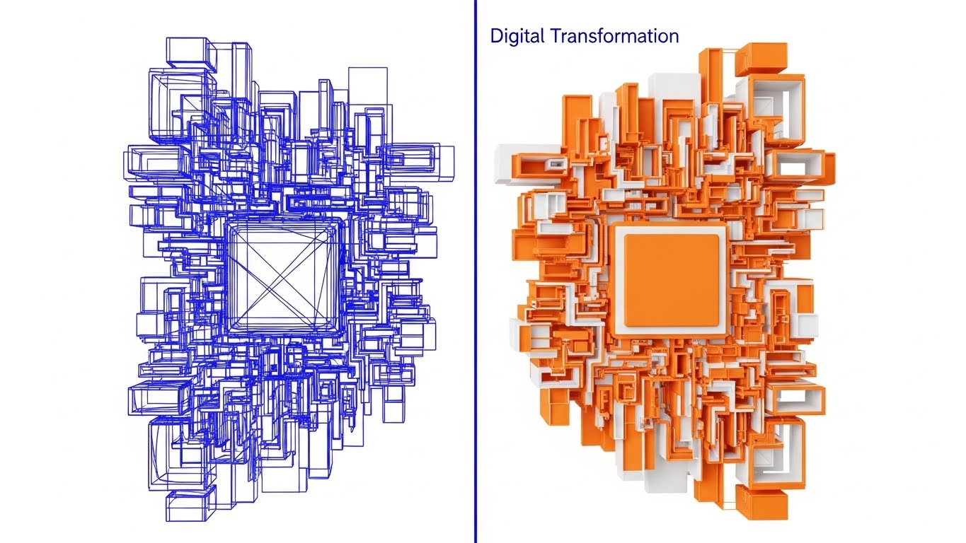
(Wireframe to Reality): Split Screen + Realizing Digital Transformation
The Visual & Narrative Approach
This split-screen composition creates a direct "Before and After" comparison without saying a word. The left side shows the technical blueprint—a Cobalt Blue wireframe. The right side reveals the solid, vibrant Orange 3D object. The sharp transition line represents the software's ability to bridge the gap between "Strategy" (Wireframe) and "Execution" (Reality). It is a visual metaphor for Digital Transformation.
Psychological Impact & KPI Focus
For 1.7 Product Differentiation, you must prove your value proposition. Many competitors offer "planning" tools; this visual asserts that your platform delivers results. It appeals to the frustration of "shelved strategies"—plans that never become reality. This style proves that your software is the catalyst that turns the blueprint into the building.
Strategic Implementation & Trade-offs
- Best Use Case: Website Headers, Landing Pages.
- Duration: Interactive scroll or 10-second loop.
- Trade-off: Requires a strong 3D asset pipeline. If the "Reality" side doesn't look significantly better than the "Wireframe," the metaphor fails.
Companies using similar video content -
Funnelytics – Customer Journey Analytics – Transforming strategic blueprints into actionable, visual funnels.
Microsoft Visio – Diagramming Software – Realizing digital transformation from concept to execution.
8. Macro UI
MOFU | Product Differentiation

(Macro UI): Violet Pulse + Analyzing Micro Interactions
The Visual & Narrative Approach
Sometimes, the big picture hides the problem. This style zooms in—extreme macro. A cursor hovers over a single data point, a pulsing Vivid Violet dot on a Silver graph line. The background is blurred, forcing the viewer to focus on this specific interaction. It visualizes "Pain Point Analysis" by isolating the exact moment of friction or conversion.
Psychological Impact & KPI Focus
In 1.8 Feature Education, specificity sells. General claims about "better UX" are vague. Showing a specific UI interaction proves you understand the nuance. This style appeals to the detail-oriented analyst who knows that a 1% shift in a specific metric can mean millions in revenue. It signals precision, diagnostic power, and attention to detail.
Strategic Implementation & Trade-offs
- Best Use Case: Email Newsletters (GIFs), Feature Highlights.
- Duration: Short (3-5 seconds).
- Trade-off: It loses context. By focusing on one dot, you lose the "Full Journey" view. It is best used as a supporting visual within a larger narrative.
Companies using similar video content -
Mouseflow – Behavior Analytics – Analyzing micro-interactions to pinpoint user friction.
Hotjar – Behavior Analytics & Feedback – Zooming in on specific user actions for detailed insights.
9. Abstract 3D AI
MOFU | Feature Education

(Abstract 3D AI): Emerald Network + Establishing Thought Leadership
The Visual & Narrative Approach
To claim a premium position in the market, this style uses high-end abstract 3D art. A network of Emerald Green nodes connected by Gold threads floats in a white infinity cove. The low camera angle makes the data look like a ceiling or a canopy, creating a sense of scale and majesty. Particle effects add a layer of sophistication. It represents a "Connected Experience" that is valuable, intricate, and perfectly tuned.
Psychological Impact & KPI Focus
For 1.4 Establishing Thought Leadership, you need to look expensive. This aesthetic borrows from high-end finance and luxury tech branding. It signals to the C-Suite that this is not just a "tool"; it is an "enterprise ecosystem." It builds authority and justifies a premium price point by visually associating the data with precious materials (Gold/Emerald).
Strategic Implementation & Trade-offs
- Best Use Case: LinkedIn Thought Leadership Articles, Whitepaper Covers, Keynote Backgrounds.
- Duration: Slow-moving loops.
- Trade-off: It is highly abstract. If used for "How-to" content, it will frustrate users. It is purely for brand positioning and mood setting.
Companies using similar video content -
Scuba (Behavure AI) – Decision Intelligence Platform – Establishing thought leadership with intricate data networks.
6sense – Account Engagement Platform – Visualizing connected account intelligence for B2B growth.
11. Gen AI Cinematic
MOFU | Category Creation
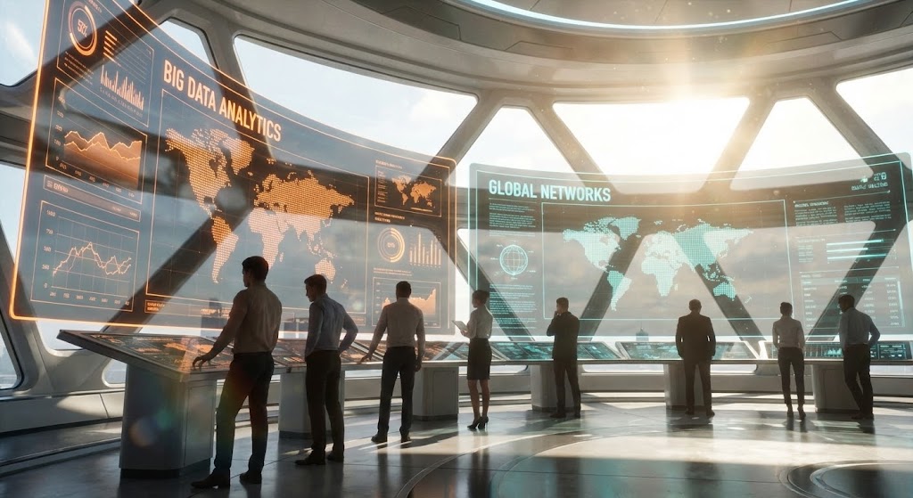
(Gen AI Cinematic): Futuristic Command Center + Unifying Global Intelligence
The Visual & Narrative Approach
This style leverages the expansive power of Generative AI to create a "Category Leader" aesthetic. The visual depicts a sun-drenched, futuristic Command Center where massive, transparent screens display Cinematic Teal and Orange "Big Data" visualizations. The panoramic view, filled with lens flares and complex data topographies, positions the software as the central nervous system of the enterprise. Silhouettes of professionals overseeing this ecosystem imply that your platform gives them "God-mode" visibility over the entire customer experience.
Psychological Impact & KPI Focus
In the MOFU stage, specifically for 1.2 Category Creation, you must elevate the conversation. The audience needs to feel they are buying into a future-proof vision. This cinematic approach reduces the anxiety of data fragmentation by presenting a "North Star" version of operations. It visually validates the aspiration of total omniscience—seeing every customer signal in real-time—and anchors the brand as a strategic partner for global dominance.
Strategic Implementation & Trade-offs
- Best Use Case: YouTube Brand Anthems, Keynote Openers, and Investor Decks.
- Duration: 30-60 seconds.
- Trade-off: It is highly aspirational. While it builds immense brand equity, it risks feeling "too high level" for technical buyers who need to see the actual interface. It sells the dream, not the feature.
Companies using similar video content -
This slot is intentionally left blank as per the input article's numbering (jumps from 9 to 11).
12. Lifestyle Stock + UI
MOFU | Building Trust & Credibility

(Lifestyle Stock + UI): Remote Home Office + Humanizing Software Adoption
The Visual & Narrative Approach
To counter the perception that enterprise software is clunky, this style grounds the tool in the user's daily reality. We see a high-quality lifestyle shot of a professional working in a cozy, sunlit home office, with a Monstera plant adding an organic touch. An over-the-shoulder camera angle focuses on the laptop screen, which displays a clean, abstract UI overlay in Soft Beige and Sage Green. The composition balances the "digital" with the "physical," suggesting that the software fits naturally into a balanced, modern work life.
Psychological Impact & KPI Focus
For 1.9 Building Trust, the barrier is often "Implementation Fatigue." Prospects fear new tools will be intrusive. This aesthetic uses "warmth" and "natural light" to counter the coldness of technology, signaling Ease of Use. The soft color palette of the UI overlay reinforces that this tool is designed for human wellbeing, not just corporate efficiency, reducing the anxiety of adoption.
Strategic Implementation & Trade-offs
- Best Use Case: Website "Features" section, Retargeting Ads, and Customer Testimonials.
- Duration: Static or 6-second loops.
- Trade-off: It can feel "stocky" if not customized. The UI overlay must match your actual interface design language to ensure the product connection remains strong.
Companies using similar video content -
Salesforce Marketing Cloud – Journey Builder – Unifying global intelligence in a futuristic command center.
Adobe Experience Platform – Customer Data Platform – Creating a category leader aesthetic for enterprise CX.
13. Rapid UI Montage
MOFU | Driving Demo Requests
(Rapid UI Montage): Flat Feature Icons + Driving Demo Requests
The Visual & Narrative Approach
When the goal is 2.1 Driving Demo Requests, subtlety is the enemy. This style uses a high-tempo montage of flat, stylized UI elements. The screen is a canvas of white, populated by icons and charts in Bright Red and Light Grey that light up in rapid succession. It’s a rhythmic visual checklist: "Surveys. Maps. Analytics." The motion is snappy and synchronized, conveying efficiency and completeness. It visualizes the platform not as a static repository, but as an active engine of productivity.
Psychological Impact & KPI Focus
The viewer here is evaluating efficiency. They want to know, "What can this actually do?" The rapid pacing mimics the dopamine hit of ticking off a to-do list. It creates a sense of momentum. The use of Red (typically an alert color) is repurposed here as an "Action" color, drawing the eye to specific functionalities and proving that the platform is feature-rich and ready for heavy lifting.
Strategic Implementation & Trade-offs
- Best Use Case: LinkedIn Retargeting, Email Signatures (GIFs).
- Duration: Fast-paced (10-15 seconds).
- Trade-off: It is overwhelming by design. It conveys "Quantity of Features" rather than "Quality of Experience." It works best when the viewer already knows the brand and just needs a push to demo.
Companies using similar video content -
HubSpot – Marketing Hub – Humanizing software adoption in a modern work environment.
Totango – Customer Success Platform – Grounding enterprise tools in the user's daily reality.
14. Split Screen
MOFU | Competitive Displacement

(Split Screen): Contrast Comparison + Displacing Competitor Chaos
The Visual & Narrative Approach
This is the ultimate tool for 1.13 Competitive Displacement. It visualizes the "Old Way" vs. the "New Way" side-by-side. The left side is a gritty, desaturated image of a tangled knot of grey cables—representing the mess of spreadsheets and "Silo Blindness." The right side is vibrant and glossy, showing perfectly straight, parallel lines in a rainbow of colors—representing your platform’s "Orchestrated Journey." The vertical divider acts as the timeline of transformation.
Psychological Impact & KPI Focus
Humans are wired to notice contrast. This style bypasses the logical brain and hits the emotional pain point of "Frustration" (the knot) while immediately offering the relief of "Clarity" (the lines). It validates the prospect’s current struggle without attacking them personally, framing the mess as a systemic issue that your software solves. It visually promises that migration equals liberation.
Strategic Implementation & Trade-offs
- Best Use Case: LinkedIn Feed Ads, "Why Us" Website Pages.
- Duration: Static or simple sliding animation.
- Trade-off: It is a binary argument. It lacks nuance. It assumes the prospect knows they are in the "messy" state. If they think their current system is fine, this visual might not resonate.
Companies using similar video content -
Iterable – AI-Powered Customer Engagement – Showcasing a rapid succession of platform features.
Braze – Customer Engagement Platform – Driving demo requests with a high-tempo feature walkthrough.
15. 2D Line Art
MOFU | Overcoming Objections
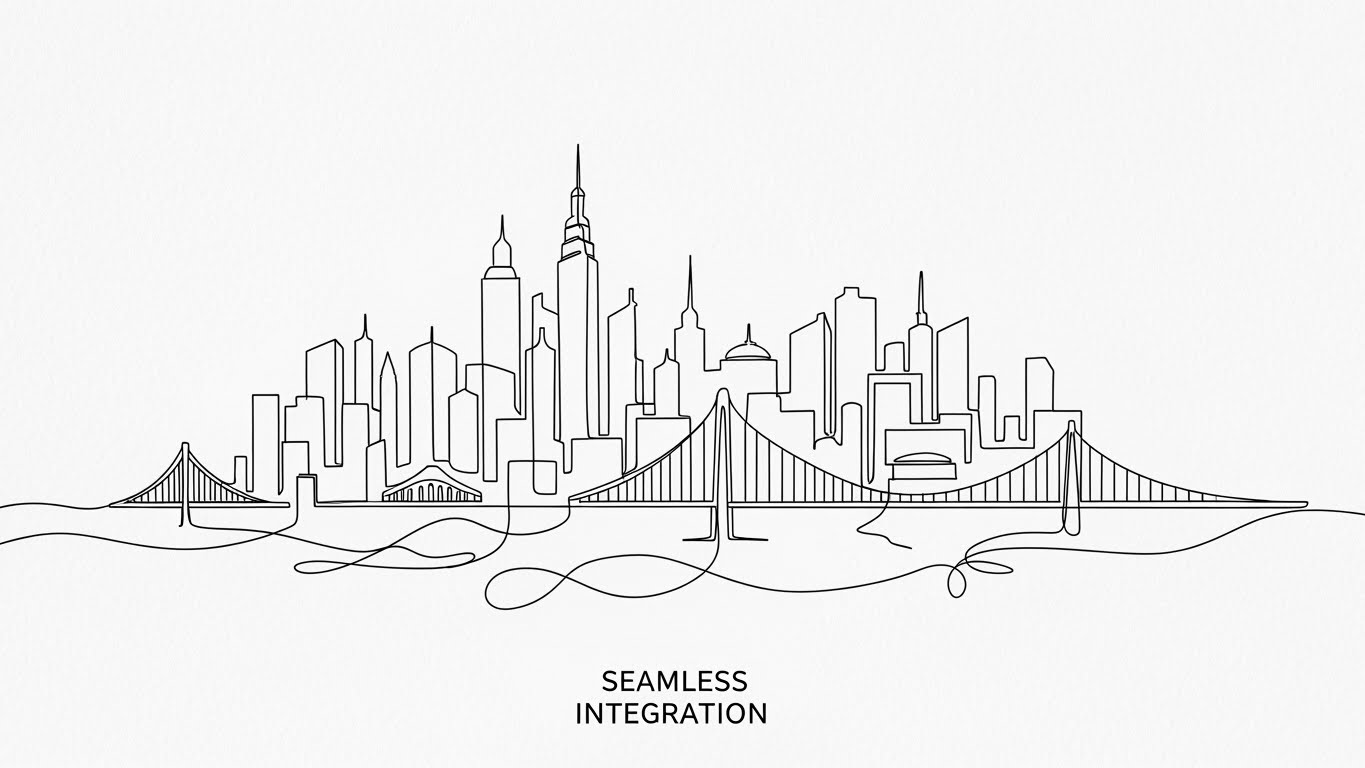
(2D Line Art): Continuous City Line + Simplifying Seamless Integration
The Visual & Narrative Approach
Complexity scares buyers. To overcome objections about implementation difficulty (1.11), this style uses a single, continuous line of Black Ink on a textured White Paper background. The line loops and flows to draw a complex but organized city skyline, symbolizing how your software weaves through the entire enterprise architecture without breaking. It is sophisticated, minimal, and fluid, suggesting that your tool is the "thread" that ties the stack together.
Psychological Impact & KPI Focus
This style appeals to the Architect and the CIO. It visually argues that integration is not a "bolt-on" but a seamless "flow." The hand-drawn aesthetic feels bespoke and thoughtful, contrasting with the rigid screenshots of competitors. It lowers the cognitive load by abstracting the technical details of API calls into a simple, elegant line—making the impossible task of integration look effortless.
Strategic Implementation & Trade-offs
- Best Use Case: Technical Blog Headers, Whitepaper Illustrations.
- Duration: Drawing animation (10-20 seconds).
- Trade-off: It is metaphorical. It does not show actual code or connectors. It builds emotional confidence in the integration, but technical stakeholders will still need to see the documentation.
Companies using similar video content -
cxomni – Customer Journey Management – Contrasting old, chaotic systems with new, clear orchestration.
Engage Hub – Journey Automation – Displacing competitor chaos with streamlined, integrated solutions.
16. Dynamic Data Viz
BOFU | The Economic Buyer
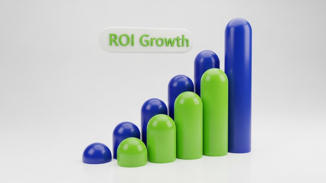
(Dynamic Data Viz): Claymorphism Bars + Tangible ROI Growth
The Visual & Narrative Approach
For the 7.1 Economic Buyer (CFO/VP of Sales), numbers are everything. This style utilizes "Claymorphism"—soft, rounded 3D bars in Deep Azure and Lime Green that look like physical objects you can touch. They grow upwards to form a staircase of success against a clean studio white background. The soft lighting makes the data appear friendly and tangible, removing the coldness of standard Excel charts. It transforms abstract "ROI" into physical "Growth."
Psychological Impact & KPI Focus
Financial data can feel dry and intimidating. By giving the charts a "toy-like" tactile quality, you make the growth feel accessible and inevitable. The upward trajectory visualizes positive momentum. The use of Green and Blue (Growth and Trust) subconsciously reinforces safety and profit. It answers the CFO’s question—"Will this grow the bottom line?"—with a resounding, tangible affirmative.
Strategic Implementation & Trade-offs
- Best Use Case: Sales Presentations, Pitch Decks, Annual Reports.
- Duration: 5-10 second loops.
- Trade-off: It risks looking "cute" rather than "serious" if the colors are too pastel. It needs to balance the playful 3D style with professional color palettes to maintain authority.
Companies using similar video content -
Kubit – Customer Journey Analytics – Simplifying seamless integration with elegant, continuous lines.
Joulica – Customer Journey Analytics – Visualizing enterprise architecture as a cohesive, flowing system.
17. Photorealistic 3D
BOFU | ROI Justification
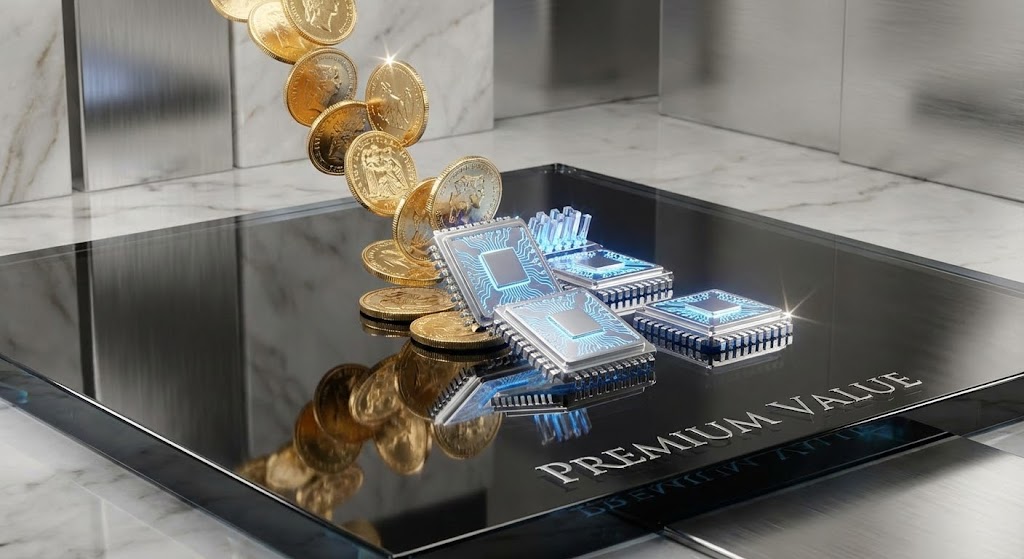
(Photorealistic 3D): Coins to Chips + Justifying Premium Investment
The Visual & Narrative Approach
To justify a high price tag (1.10 ROI Justification), you must look expensive. This style uses photorealistic rendering to show a literal alchemy: standard Gold coins transforming into high-tech Platinum data chips as they hit a reflective Obsidian glass surface. The ray-traced reflections and sparkles communicate luxury and high value. It treats the data not as utility, but as a precious asset.
Psychological Impact & KPI Focus
This appeals to the "Status" motivation of the buyer. It frames the software purchase not as a cost, but as an upgrade to a higher tier of operation. It visualizes the concept of "Data Monetization"—showing that raw investment (coins) is processed by your software into something far more valuable (tech chips). It creates a craving for the "Premium" experience.
Strategic Implementation & Trade-offs
- Best Use Case: Website Hero Backgrounds, High-Ticket Sales Landing Pages.
- Duration: Slow, mesmerizing loops.
- Trade-off: It is heavy on production resources. It also can look too abstract if the "Chip" doesn't clearly resemble a tech component. It requires high-fidelity execution to work.
Companies using similar video content -
CSG Xponent – Customer Engagement Platform – Presenting tangible ROI growth with dynamic, tactile charts.
Optimizely – Experimentation Platform – Visualizing conversion lift and business outcomes.
18. Clean UI Light
BOFU | Reducing Implementation Friction
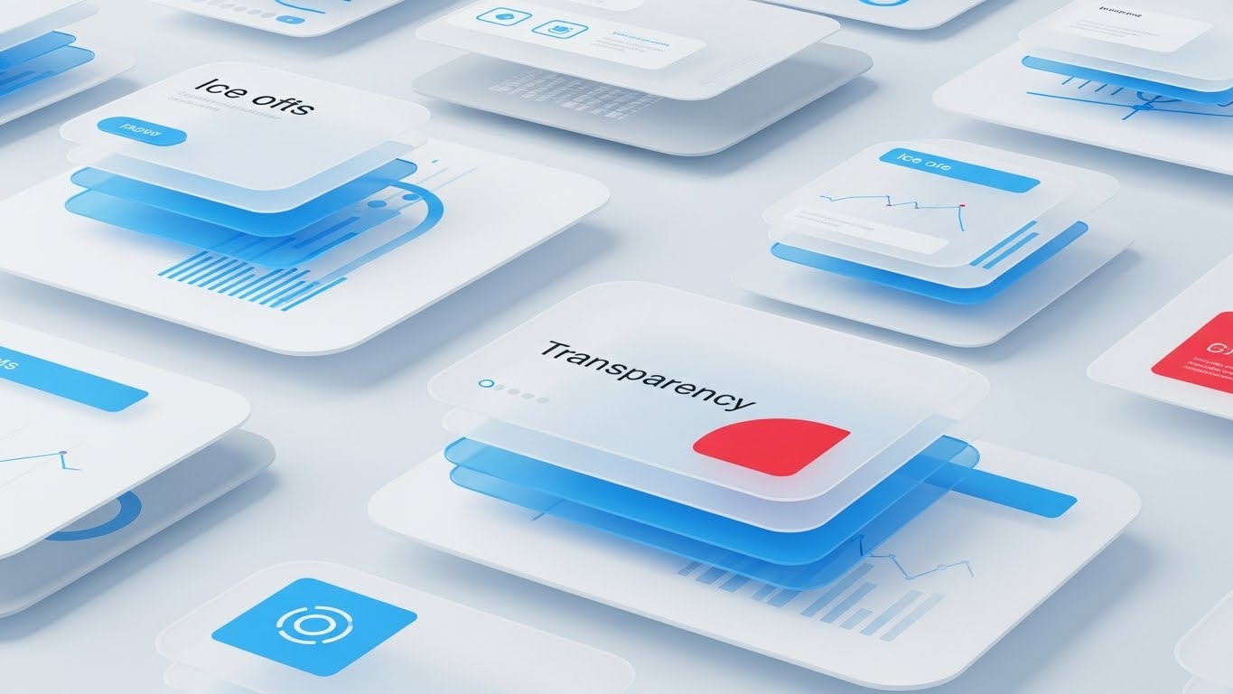
(Clean UI Light): Glassmorphism Layers + Reducing Implementation Friction
The Visual & Narrative Approach
When moving to 1.16 Reducing Implementation Friction, clarity is king. This style employs "Glassmorphism"—translucent layers of Ice Blue and White interface elements floating over a frosted background. The depth created by the layers reveals abstract data patterns underneath, symbolizing "Transparency." It feels airy, modern, and light, visually countering the heavy legacy systems the client is likely replacing.
Psychological Impact & KPI Focus
The aesthetic of "Light" and "Glass" implies honesty and visibility. There are no dark corners where data can hide. This appeals to the Operations Manager who fears "Black Box" solutions. It visually demonstrates that your platform offers clear, multi-layered visibility into the customer journey without being dense or cluttered. It feels "clean," which implies that the data it produces will be clean too.
Strategic Implementation & Trade-offs
- Best Use Case: Documentation Hubs, "How It Works" Videos.
- Duration: Gentle floating motion.
- Trade-off: Text legibility can be an issue on glass backgrounds. It is prioritized for "Vibe" and "Structure" over reading specific data points.
Companies using similar video content -
Medallia Experience Orchestration – Experience Orchestration – Justifying premium investment with luxurious data visualization.
InMoment – Experience Improvement (XI) Platform – Treating data as a precious asset for strategic growth.
19. 3D X-Ray
BOFU | Risk Mitigation

(3D X-Ray): Internal Blueprint + Mitigating Security Risk
The Visual & Narrative Approach
Security is the biggest hurdle in B2B enterprise sales. This style visualizes 1.12 Risk Mitigation by looking inside the machine. A Translucent Blue server block is revealed to hold a glowing Skeleton White lock mechanism at its core. The X-Ray view emphasizes that security is not a wrapper, but built into the architecture. The background is a clean technical blueprint, reinforcing engineering rigor.
Psychological Impact & KPI Focus
This speaks directly to the CISO and the Compliance Officer. They are skeptical of marketing fluff; they want to see the "guts" of the system. The X-Ray visual metaphor says, "We have nothing to hide." It validates the structural integrity of the platform. The glowing lock provides a focal point of safety amidst the technical complexity, reassuring the buyer that their customer data is fortified from the inside out.
Strategic Implementation & Trade-offs
- Best Use Case: Security Whitepapers, Trust Center Pages.
- Duration: Static or assembly animation.
- Trade-off: It is very technical. It will bore a Marketing persona but is essential for closing the deal with IT/Security review boards.
Companies using similar video content -
UXPressia – Customer Experience Management – Reducing implementation friction with transparent, airy interfaces.
Custellence – Customer Journey Mapping – Emphasizing clarity and ease of use with glassmorphism layers.
20. Isometric 3D Workflow
BOFU | The Functional Buyer

(Isometric 3D Workflow): Miniature Diorama + Clarifying Workflow Automation
The Visual & Narrative Approach
For 7.2 The Functional Buyer (who has to actually manage the team), the abstract needs to become concrete. This style uses a "Tilt-Shift" miniature diorama effect. A toy-like office set in Pastel Pink, Blue, and Yellow features tiny figures moving along conveyor belts, symbolizing "Workflow Automation." The isometric angle provides a "God's Eye View" of the entire process, showing how users, data, and tasks move in a synchronized loop—a literal "Service Blueprint."
Psychological Impact & KPI Focus
This visualizes "Orchestration" in its most literal form. It makes the complex task of managing a CX team look like a well-oiled machine—playful, manageable, and organized. It reduces the anxiety of operational chaos and addresses the fear of "Shelfware" (buying tools that no one uses) by showing a busy, active environment. The "toy-like" aesthetic disarms the viewer, making the prospect of re-engineering their workflow feel like a creative game rather than a grueling project.
Strategic Implementation & Trade-offs
- Best Use Case: Product Pages, Onboarding Videos.
- Duration: Looping workflow animation.
- Trade-off: It can look "small" or "SMB" focused. To work for Enterprise, the complexity of the "machine" needs to be high enough to represent a real challenge, even if the style is playful.
Companies using similar video content -
Genesys Cloud CX – Contact Center Platform – Mitigating security risk by revealing internal architectural integrity.
CallMiner – Conversation Intelligence – Visualizing the "guts" of data processing for risk assessment.
21. 2D over Live Action
Onboarding | Trial/Freemium User Activation
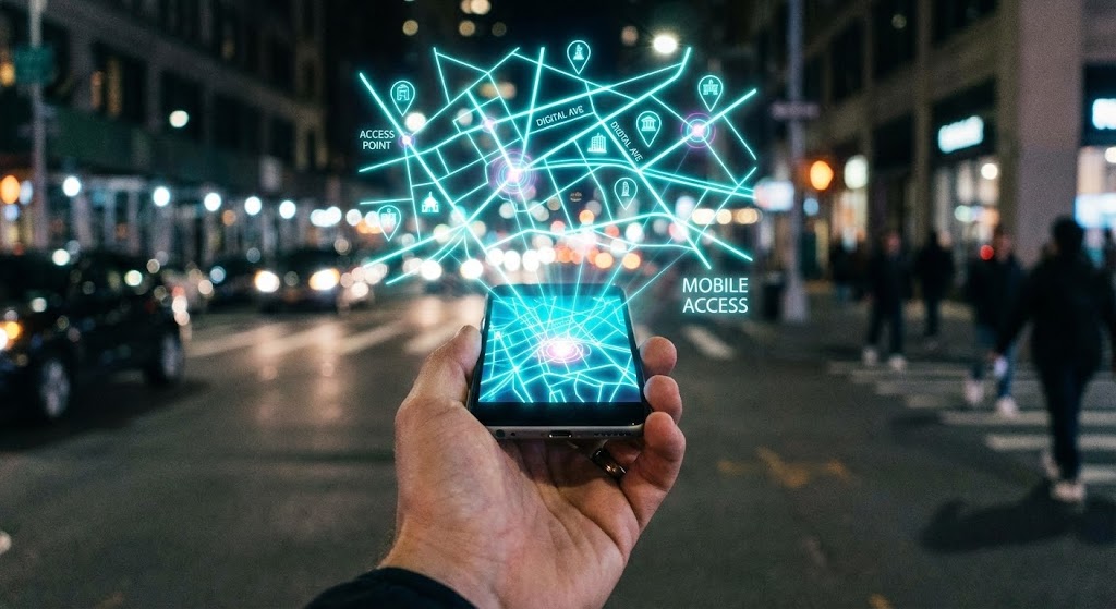
(2D over Live Action): Neon Map Overlay + Activating Mobile Access
The Visual & Narrative Approach
This style bridges the gap between the physical world and digital utility. We see a first-person POV shot of a hand holding a smartphone against a blurred, bustling city street. A sharp, Digital Neon Cyan map graphic projects upwards from the screen, overlaying the real world with data points. The contrast between the organic skin tones and the electric vector graphics emphasizes "Augmented Reality" without needing AR glasses. It visualizes the concept of "Mobile Access"—showing that your software empowers users to carry the power of the platform into the field.
Psychological Impact & KPI Focus
For 5.3 Trial/Freemium User Activation, the goal is to break the "Desktop Inertia." Users often perceive enterprise software as something that chains them to a workstation. This visual dissolves that fear. By superimposing the software’s value (the map) onto the real world, it signals freedom and portability. It appeals to the "Field Manager" or traveling executive, validating their need for on-the-go intelligence and lowering the psychological barrier to logging in away from the office.
Strategic Implementation & Trade-offs
- Best Use Case: App Store Previews, In-App "Welcome" Screens, Social Media Stories.
- Duration: Short Loops (6-10 seconds).
- Trade-off: It requires high-quality stock footage or a custom shoot to look professional. If the motion tracking of the graphics slips, the illusion breaks and it looks amateurish.
Companies using similar video content -
Microsoft Dynamics 365 Marketing – Marketing Automation – Clarifying workflow automation with miniature dioramas.
TheyDo – Journey Management Platform – Visualizing complex processes as a well-oiled, manageable machine.
22. 2D Character
Onboarding | Self-Serve Onboarding

(2D Character): Friendly Avatar + Simplifying Self-Serve Onboarding
The Visual & Narrative Approach
To combat the intimidation of complex SaaS interfaces, this style employs a charming 3D character. Dressed in approachable Purple and Orange attire, the character holds a large compass and smiles warmly at the viewer. The background is a clean, abstract white geometric pattern. This isn't about raw data; it's about "Guidance." The character acts as a Digital Concierge, humanizing the help desk and making the concept of "Self-Serve" feel inviting rather than isolating.
Psychological Impact & KPI Focus
In 2.4 Self-Serve Onboarding, the enemy is frustration. New users often feel "Imposter Syndrome" when facing a robust tool. A friendly "mascot" or avatar lowers cortisol levels and reduces anxiety. It leverages the "Cheerleader Effect"—psychologically assuring the user that help is always available. This builds emotional resilience during the learning process, encouraging users to explore the platform rather than giving up at the first hurdle.
Strategic Implementation & Trade-offs
- Best Use Case: Welcome Emails, Empty State Screens, 404 Error Pages.
- Duration: Static Images or Micro-animations.
- Trade-off: The character design must align with your brand voice. It needs to strike a balance between "Friendly" and "Competent." If it looks too childish, it undermines the credibility of an enterprise solution.
Companies using similar video content -
CleverTap – Mobile Marketing Platform – Activating mobile access with neon map overlays on real-world scenes.
NotifyVisitors – Marketing Automation & CDP – Empowering users with on-the-go intelligence.
23. 2D Animation + UI
Onboarding | Accelerating Time-to-Value

(2D Animation + UI): Spark Interaction + Accelerating Time-to-Value
The Visual & Narrative Approach
This style visualizes the "Aha!" moment. A stylized Teal 2D cel-shaded character interacts with a floating, semi-transparent UI window. As they touch a specific data point, a Coral visual spark explodes, signifying the successful discovery of an insight. The background is a simple gradient to keep the focus on the interaction. This blends the human element (the user) with the interface, dramatizing the speed and ease of getting a result.
Psychological Impact & KPI Focus
For 1.15 Accelerating Time-to-Value, you need to prove that success is just one click away. The "Spark" provides visual gratification—a dopamine hit that mimics the feeling of task completion. It reinforces the idea that your software is responsive and rewarding. This style is highly effective for convincing trial users that the effort they put in will yield immediate, visible results, motivating them to adopt the tool.
Strategic Implementation & Trade-offs
- Best Use Case: In-App Tooltips, Feature Release Videos, "What's New" Modals.
- Duration: 10-15 seconds.
- Trade-off: It is abstract. It doesn't show the actual workflow steps, just the feeling of the workflow. It is better for motivation than for detailed technical instruction.
Companies using similar video content -
Sogolytics – Experience Management Platform – Simplifying self-serve onboarding with a friendly digital concierge.
Canvanizer – Online Whiteboard – Guiding users through processes with approachable, animated avatars.
24. Low-Poly 3D
Retention | Knowledge Base & FAQ Videos
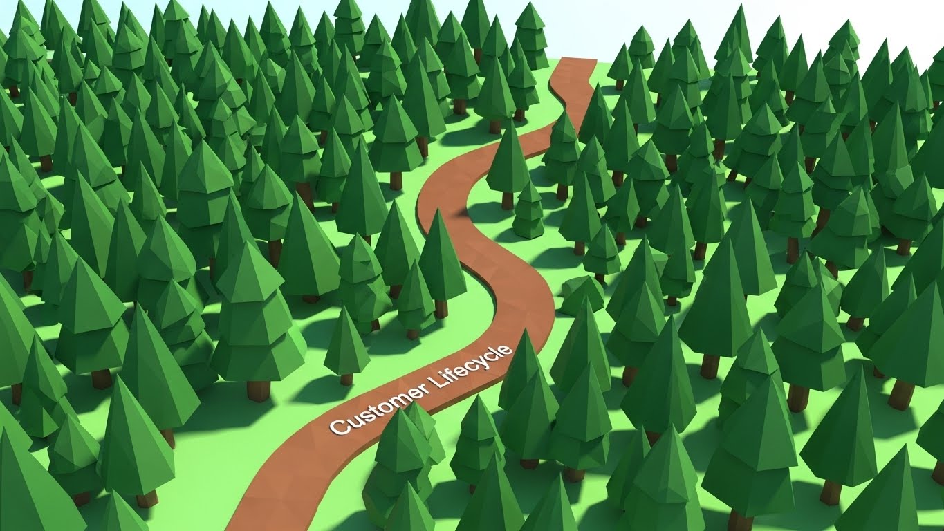
(Low-Poly 3D): Geometric Forest + Navigating Knowledge Bases
The Visual & Narrative Approach
Complex documentation is often dry and overwhelming. Low-Poly 3D transforms it into a navigable journey. We see a stylized landscape of a forest with Forest Green geometric trees. A clear, distinct Brown path winds easily through the woods, labeled "Customer Lifecycle." The lighting is sunny and bright. This visualizes the "Knowledge Base" not as a library of dusty manuals, but as a clear, structured path through the wilderness of information.
Psychological Impact & KPI Focus
For 9.1 Knowledge Base & FAQ, the goal is to reduce the intimidation of learning. Low-Poly art is inherently playful and accessible (reminiscent of video games). It suggests that the learning process is structured and manageable. It frames the "Customer Lifecycle" as an adventure rather than a chore, encouraging users to proactively seek out answers and deepening their engagement with the platform.
Strategic Implementation & Trade-offs
- Best Use Case: Support Portal Headers, Educational Video Intros, FAQ Category Thumbnails.
- Duration: Loopable Backgrounds.
- Trade-off: The aesthetic is distinct. If your brand is ultra-serious or "Luxury," Low-Poly might feel too casual. It works best for brands positioning themselves as "Accessible" and "User-Friendly."
Companies using similar video content -
Mopinion – Feedback Analytics – Accelerating time-to-value with visual "Aha!" moments and sparks.
Ortto – Customer Journey Automation – Dramatizing quick insights and immediate results.
25. 3D Parallax UI
Retention | Reducing Support Overhead

(3D Parallax UI): Floating Layers + Reducing Support Overhead
The Visual & Narrative Approach
To explain complex settings or multi-level features, flat screenshots fail. This style explodes the UI into 3D space. Multiple screens in Lavender and Soft Blue float at different depths. The camera pushes through the front layers to reveal the specific data point in the back. This "Parallax" effect mimics the way we focus our eyes, creating a sense of immersion and visual hierarchy.
Psychological Impact & KPI Focus
In 1.18 Reducing Support Overhead, clarity is the priority. By separating UI elements into layers, you visually declutter the screen. It allows the viewer to focus on one specific setting without losing the context of the whole. This reduces cognitive load and helps users understand the architecture of the software, leading to fewer "How do I find this?" support tickets and greater self-sufficiency.
Strategic Implementation & Trade-offs
- Best Use Case: "How-To" Video Tutorials, Product Update Reels, Feature Deep Dives.
- Duration: 30-60 seconds.
- Trade-off: It requires significant motion design effort to separate UI assets into layers. It is time-consuming to produce but offers the highest clarity for complex interfaces.
Companies using similar video content -
Miro – Online Collaborative Whiteboard – Navigating knowledge bases through playful, geometric landscapes.
Google Analytics – Analytics Platform – Structuring complex data into accessible, navigable paths.
26. Minimalist Flat
Retention | Reducing Churn
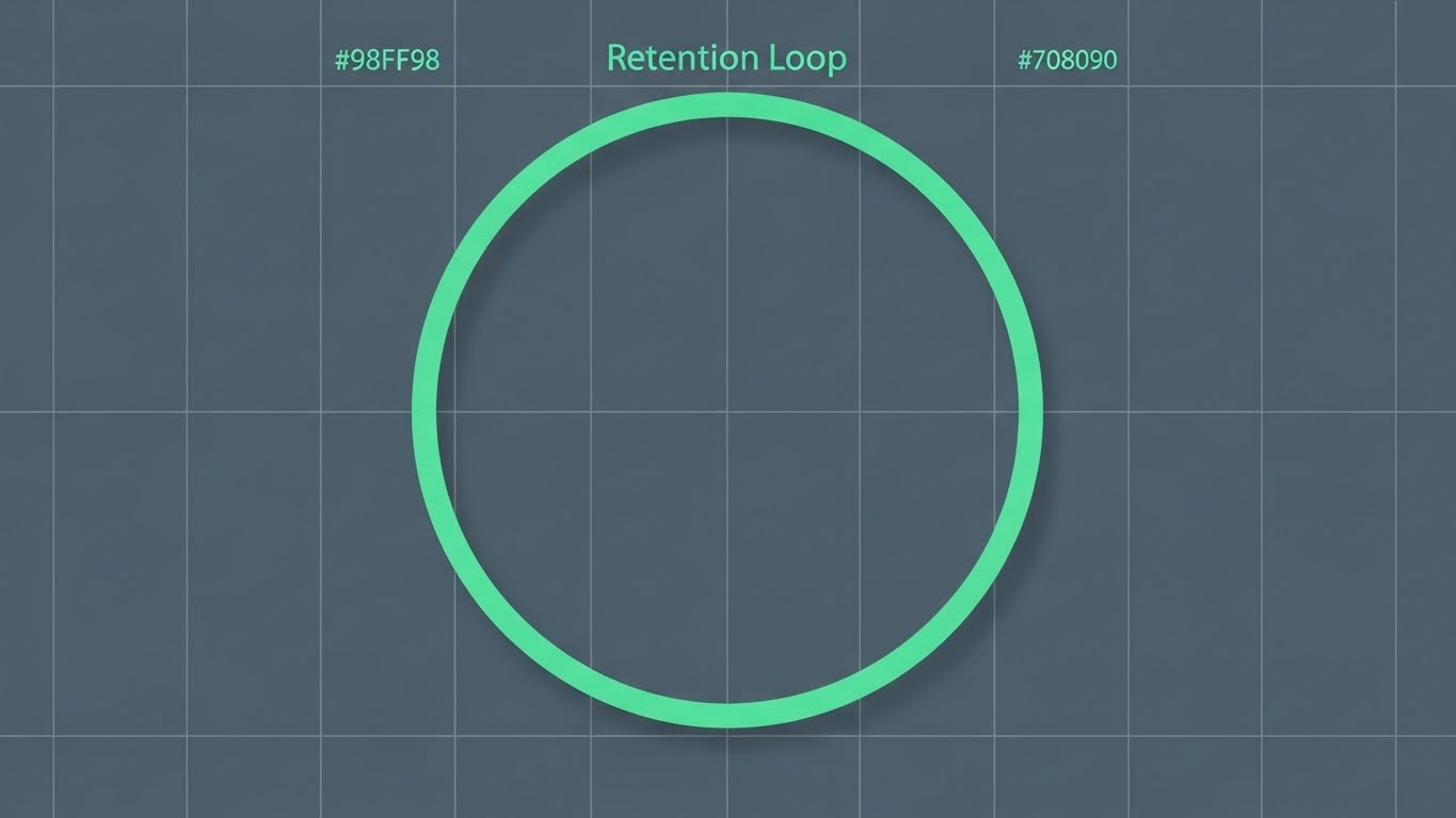
(Minimalist Flat): Infinite Loop + Solidifying Retention
The Visual & Narrative Approach
Simplicity signals stability. This style uses a minimalist, flat vector illustration of a circular loop. A continuous Mint Green line traces a perfect circle on a Slate Grey background. There are no distractions—no gradients, no shadows. It represents the "Retention Loop"—the continuous, stable value that the customer receives. The orthographic view implies precision and engineering reliability.
Psychological Impact & KPI Focus
For 1.19 Reducing Churn, you want to communicate stability. Flashy, chaotic graphics can imply volatility. A perfect, unbroken loop subconsciously signals "unbroken service" and "consistency." It appeals to the customer's desire for a platform that "just works." The Mint Green on Grey color scheme is calming, reinforcing the feeling of safety and reliability that keeps customers from looking for alternatives.
Strategic Implementation & Trade-offs
- Best Use Case: Email Footers, Renewal Notifications, System Status Pages.
- Duration: Infinite subtle loop.
- Trade-off: It is very understated. It won't grab attention in a crowded feed. It is designed for existing customers who already know you, serving as a subtle reinforcement of reliability.
Companies using similar video content -
Glassbox – Digital Experience Analytics – Reducing support overhead by exploding UI into layered 3D space.
Heap – Product Analytics – Providing clarity for complex interfaces with floating, interactive elements.
27. Hyper-lapse
Retention | Website Visitor Re-engagement

(Hyper-lapse): Data Streaks + Re-engaging Visitors
The Visual & Narrative Approach
To convey urgency and speed, this style uses a Hyper-lapse technique. The camera moves rapidly down a city street at night. The streaks of car lights are digitally enhanced to look like flowing data packets in Red, Green, and Blue. It represents "Real-time Tracking" and the pulse of the market. The heavy motion blur on the edges forces the eye to the center, creating a tunnel vision effect that demands attention.
Psychological Impact & KPI Focus
For 5.1 Website Visitor Re-engagement, you need to disrupt the user's apathy. The sheer speed of the visual triggers a "Fear of Missing Out" (FOMO). It implies that the market is moving fast, and without your software, the prospect is standing still. It visualizes the flow of data as a dynamic, living force, compelling the user to jump back in and regain control of the stream.
Strategic Implementation & Trade-offs
- Best Use Case: Retargeting Social Ads (Instagram Stories/TikTok/LinkedIn).
- Duration: Fast (3-6 seconds).
- Trade-off: It can be dizzying. It is not suitable for conveying text or detailed info. It is a mood setter, designed purely to capture attention and drive a click-through.
Companies using similar video content -
Totango – Customer Success Platform – Solidifying retention with a simple, continuous loop of value.
WebEngage – Customer Data Platform – Communicating stability and consistent service for churn reduction.
28. Futuristic Neon
Expansion | Driving Deep Feature Adoption

(Futuristic Neon): Cyberpunk Alert + Driving Feature Adoption
The Visual & Narrative Approach
This is the "Cyberpunk" aesthetic applied to B2B. A dark void is illuminated by a stream of Neon Cyan data lines. In the center, a sharp Laser Pink alert icon pulses. The Dutch angle (tilted camera) adds drama. It visualizes "Churn Prediction" or "Critical Alerts." It borrows the visual language of security and high-stakes monitoring to emphasize the importance of the feature being highlighted.
Psychological Impact & KPI Focus
For 1.17 Driving Deep Feature Adoption, you often need to wake users up to features they are ignoring. The "Alert" aesthetic triggers a primal instinct to pay attention to warnings. By framing a specific feature (like Churn Prediction) as a high-tech defense mechanism, you elevate its perceived value. It appeals to the user's desire to be proactive and "ahead of the threat."
Strategic Implementation & Trade-offs
- Best Use Case: In-App Modals, New Feature Announcement Teasers, "Pro Tier" Marketing.
- Duration: Short, pulsing loops.
- Trade-off: It is aggressive. If used too often, it leads to "Alert Fatigue." Use it only for your most powerful, game-changing features (like AI-driven insights).
Companies using similar video content -
Insider – Personalization Platform – Re-engaging visitors with urgent, fast-paced data streaks.
Klaviyo – Marketing Automation – Conveying real-time tracking and market pulse for re-engagement.
29. Holographic UI
Expansion | Driving Upsell/Cross-sell
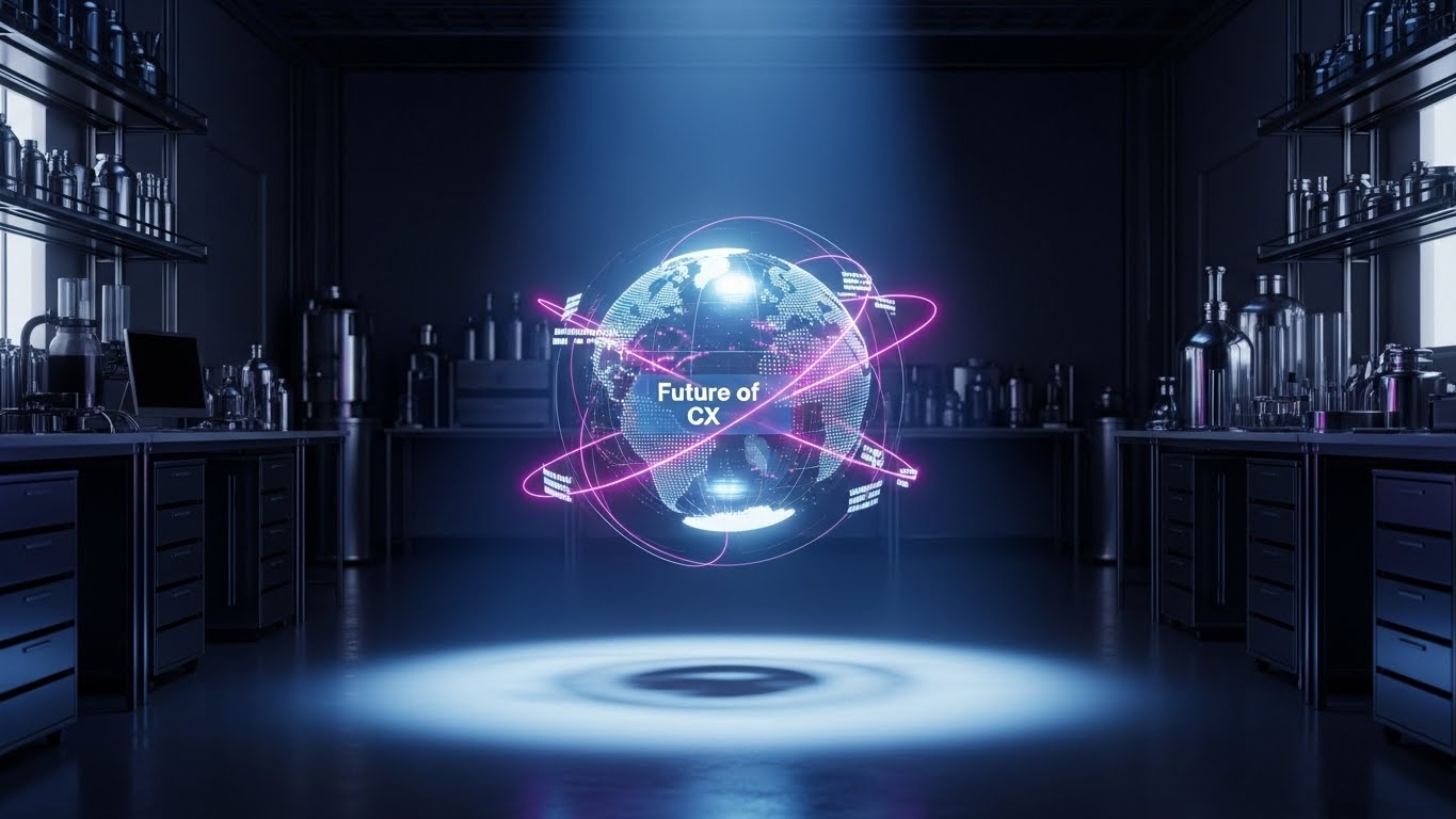
(Holographic UI): Volumetric Globe + Driving Upsell
The Visual & Narrative Approach
To sell the "Next Level" of service (Upsell), you need visuals that look expensive. This style features a volumetric 3D hologram of a rotating globe in Iridescent Pearl colors, floating in a pristine lab. Light beams connect data points across continents. It visualizes the "Future of CX"—global, interconnected, and ethereal. It moves beyond the screen to suggest a pervasive, worldwide intelligence.
Psychological Impact & KPI Focus
For 1.20 Driving Upsell/Cross-sell, you are selling a vision of growth. The holographic globe represents "Global Domination" and "Total Reach." It appeals to the ambition of the account manager who wants to expand their operations. The high-tech, futuristic rendering justifies a premium price point, signaling that this module is the "Enterprise Tier" solution for serious players.
Strategic Implementation & Trade-offs
- Best Use Case: Quarterly Business Review (QBR) Decks, Upsell Landing Pages, Keynote Backdrops.
- Duration: Slow, majestic rotation.
- Trade-off: It is highly aspirational. It works best for "Vision" selling, not for showing specific utility. It sets the stage for a conversation about expansion and strategic partnership.
Companies using similar video content -
ZEPIC – Customer Engagement Platform – Driving deep feature adoption with cyberpunk alerts and insights.
Act-On – Marketing Automation – Highlighting critical alerts for proactive engagement.
30. Aspirational Stock
Expansion | Driving Referrals & Advocacy

(Aspirational Stock): Team Celebration + Inspiring Advocacy
The Visual & Narrative Approach
Ultimately, software is about people. This style returns to the human element with a high-key photography shot. A diverse team in a sunlit, glass-walled conference room is captured in a moment of candid celebration—high-fiving and cheering. The screen content is blurred, focusing the emotion on the people. It symbolizes "Team Advocacy" and the ultimate goal of the customer journey: Success.
Psychological Impact & KPI Focus
For 1.21 Driving Referrals & Advocacy, you need to sell the feeling of success. People refer products that make them look good and their teams feel happy. This visual validates the social proof of the software. It mirrors the prospect's desire for a harmonious, high-performing team. It suggests that buying your software leads to this moment of shared victory, inspiring them to become a champion for your brand.
Strategic Implementation & Trade-offs
- Best Use Case: Testimonial Backgrounds, Case Study Headers, Referral Program Landing Pages.
- Duration: Static or Slow Zoom.
- Trade-off: It can feel like generic stock if the casting isn't authentic. The key is "candid" energy—avoiding stiff, posed handshakes in favor of genuine emotion.
Strategic Knowledge Base: The Visual Operations Doctrine
We have analyzed 30 distinct visual styles, from the abstract flows of "Organic Vector" to the precise logic of "Isometric 3D." However, style without strategy is merely decoration. To truly dominate the Customer Journey Mapping market, you must transcend "making videos" and start building a Visual Operating System.
This section synthesizes the insights from all 30 styles into a cohesive business framework. These are not just design tips; they are operational mandates for the modern B2B enterprise.
Strategic Alignment & Visual Architecture
The "Pre-Production" Strategy: Defining the Why and Who.
Before a single pixel is rendered, the visual architecture must be aligned with business goals. This phase is about audit, definition, and consistency.
- The Cognitive Load Audit: Do not just create content; audit it. Assess your current training materials. If a text-based manual takes 15 minutes to read (High Load), replace it with a 60-second Isometric 3D Workflow (Style 20). Measure the reduction in "Time-to-Comprehension."
- Role-Based Visual Mapping: Different stakeholders process information differently. Use Mobile-First styles (Style 21) for field teams who consume content on phones, and Dark Mode UI (Style 5) for analysts working on desktop dashboards. Match the visual format to the device and the persona.
- The "Glanceability" Standard: In high-stress environments, users don't have time to study. Design visuals for "Glanceability"—where the meaning is absorbed in under 2 seconds. Styles like Rapid UI Montage (Style 13) and Bold Kinetic Typography (Style 2) excel here.
- Brand Voice Consistency: Your visual styles must speak the same language. If your marketing uses Abstract Organic (Style 1), your product onboarding shouldn't use jarringly different Low-Poly (Style 24) unless there is a strategic reason. Establish a "Visual Lexicon" that unifies the user experience.
- The Advids Strategic Audit: Building this architecture requires an outside perspective. At Advids, we begin by auditing your entire visual ecosystem to identify "Silo Blindness" and define the "Visual Operating System" that will scale with your growth.
- Standardization vs. Customization: Know when to scale. Use templated Clean UI Light (Style 18) for standard tutorials to save cost, but invest in bespoke Gen AI Cinematic (Style 11) for high-stakes investor pitches.
- The Cross-Departmental Bridge: Sales, Ops, and Support often use different terminology. Use 2D Line Art (Style 15) to create a unified "Visual Dictionary" of your ecosystem that all departments use, ensuring consistent communication.
- Legacy System Integration: When replacing old systems, use Split Screen (Style 14) visuals to explicitly map the "Old Way" to the "New Way." This visualizes the bridge and reduces the anxiety of migration for long-time employees.
- Accessibility by Design: Visuals must be universal. Ensure that text in Kinetic Typography (Style 2) is legible for color-blind users and that motion in Hyper-lapse (Style 27) doesn't trigger vestibular issues. Inclusivity is a key component of enterprise adoption.
- The Mobile-First Mandate: Assume your content will be viewed on a 6-inch screen. All 30 styles must be legible when scaled down. If a Macro UI (Style 8) detail is lost on mobile, the asset has failed.
Operational Adoption & Implementation
The "Deployment" Phase: Embedding Visuals into the Workflow.
A video sitting on a server is useless. It must be injected into the user's daily workflow to drive adoption and efficiency.
- Overcoming "Big Brother" Anxiety: When introducing tracking tools, use empathy-driven visuals like Gen AI Realistic Character (Style 4) to frame the software as a "Partner," not a "Policeman." Focus on empowerment and support, not surveillance.
- The Micro-Learning Shift: Kill the PDF manual. Break training into 30-second "Micro-Learning" clips using Rapid UI Montage (Style 13). Embed these directly into the software interface for "Just-in-Time" learning.
- Just-in-Time Support: Don't make users search for help. Use 2D Animation + UI (Style 23) pop-ups that appear exactly when a user struggles with a feature, offering immediate, context-aware visual guidance.
- Gamification of Training: Use Dynamic Data Viz (Style 16) to visualize user progress. Show "Level Up" bars and "Achievement Unlocked" animations to gamify the learning process and boost engagement.
- Reducing Support Ticket Volume: There is a direct correlation between proactive visual guides and reduced call volume. Deploy 3D Parallax UI (Style 25) videos in your Help Center to answer complex questions before a ticket is ever filed.
- Remote Onboarding: For distributed teams, use Lifestyle Stock + UI (Style 12) to simulate a "shoulder-to-shoulder" training session. It bridges the distance and makes remote onboarding feel personal and high-touch.
- Visual SOPs (Standard Operating Procedures): Transform text-based SOPs into Isometric 3D Workflow (Style 20) animations. A visual process flow removes ambiguity and ensures that every team member executes the process identically.
- Feedback Loops: Use interactive video elements. At the end of a Minimalist Flat (Style 26) update video, allow users to click "Happy" or "Confused" emojis. This gathers real-time sentiment data on your feature releases.
- Scalable Localization: Your software is global; your visuals should be too. Use Abstract Motion (Style 3) and 2D Line Art (Style 15) which rely on symbols rather than text, making localization as simple as swapping a voiceover track.
- Leadership Communication: When rolling out strategic changes, don't send an email. Use Abstract 3D AI (Style 9) visuals in a CEO address to convey the "Weight" and "Value" of the new direction, securing buy-in from the top down.
Measuring Impact & Future-Proofing
The "ROI" Phase: Measuring Success and Looking Ahead.
Visual strategy is an investment. You must measure its return and prepare for the next wave of innovation.
- Beyond "Views": Vanity metrics are dead. Measure Time-to-Competency (how fast a user learns via video vs. text) and Feature Adoption Rate (how many users try a feature after watching a Futuristic Neon (Style 28) alert).
- The "Idle Time" Metric: High-quality visualization reduces "Idle Time"—the moments users spend confused. Correlate the deployment of User Guidance (Style 22) visuals with a reduction in average session duration for standard tasks.
- Compliance Velocity: How fast can you get the organization compliant with new regulations? Measure the speed of "Acknowledgement" for video-based compliance training vs. traditional text reading.
- Retention and LTV: Use Minimalist Flat (Style 26) visuals to reinforce value during renewal periods. Track the churn rate of cohorts exposed to these visual reminders vs. those who were not.
- The AI Visual Frontier: Prepare for Generative Video. Soon, Gen AI Cinematic (Style 11) will be generated in real-time based on user data. Start building a "Prompt Library" of your brand assets now to be ready for this shift.
- Scalability of Assets: Build a component library. Ensure that the 3D assets used in Photorealistic 3D (Style 17) are reusable for future campaigns. Don't build one-offs; build a system.
- The Advids Partnership: Scale requires a partner. Advids acts as your long-term visual infrastructure partner, managing the asset library, updating content as your UI changes, and ensuring your visual strategy evolves with the market.
- Benchmarking Success: "Good enough" is a competitive risk. Regularly audit your visual content against the "Gold Standard" styles in this guide. If your competitors are using Holographic UI (Style 29) and you are using static screenshots, you are losing perceived value.
- The ROI of Risk Mitigation: For enterprise software, user error can be costly. Quantify the reduction in data errors or security breaches after implementing 3D X-Ray (Style 19) training visuals. This is a hard ROI metric for the C-Suite.
- Final Call to Innovation: Treat video as infrastructure, not content. The companies that win the next decade will be those that use Strategic Visualization to make their complex data feel simple, human, and indispensable.
Conclusion
The journey from "guessing" to "knowing" is paved with visuals. By adopting these 30 styles and the underlying strategic frameworks, you are not just marketing software; you are architecting understanding. You are orchestrating the experience. Let’s visualize the future.
Companies using similar video content -
Adobe Journey Optimizer – Experience Platform – Driving upsell with volumetric globes and global intelligence.
Salesforce Marketing Cloud – Journey Builder – Visualizing the future of CX for strategic expansion.
Author & Editor Bio


