
Introduction: Bridging the Gap Between Data and Decision
For modern B2B SaaS leaders, the challenge is rarely a lack of data; it is the inability to translate that data into a shared, actionable reality for stakeholders. We possess sophisticated Customer Data Platforms (CDPs) and predictive engines, yet we often struggle to communicate the vibrant, distinct human behaviors hidden within the rows of a CSV file. The abstraction of "segmentation" creates a disconnect: Product teams build for users they can't visualize, and Sales teams pitch to personas they don't truly understand.
The opportunity lies in transforming this abstraction into tangible visual assets. When we move beyond static dashboards and leverage dynamic visual storytelling, we bridge the "Physical/Digital Divide," turning cold "cohorts" into relatable human narratives. The strategic impact of this shift is measurable. Research indicates that increasing retention by just 5% can increase profit 25–95%, yet this growth is impossible if your teams cannot visualize the segments that drive it. Furthermore, when precise segmentation is effectively communicated and deployed, it drives up to 3x higher engagement in email nurture sequences, validating the need for clear, compelling communication of these capabilities.
However, the "Black Box" nature of AI-driven segmentation often breeds skepticism. Stakeholders ask, "How do we know this works?" or "Is this just more noise?" Visualization is the antidote to this skepticism. By deploying specific video styles—from X-ray views of your predictive engine to kinetic typography that breaks through the noise—we accelerate comprehension and trust.
This guide provides a curated architectural framework of 30 visual styles, specifically designed for the Customer Segmentation domain. It moves beyond generic "explainer" concepts to offer rigorous, expert-grade visual strategies. Each style is analyzed for its psychological impact, operational utility, and strategic trade-offs, empowering you to choose the exact visual language that will turn your data into a competitive advantage.
1. Abstract 2D Flat Vector Organic
TOFU | Brand Awareness
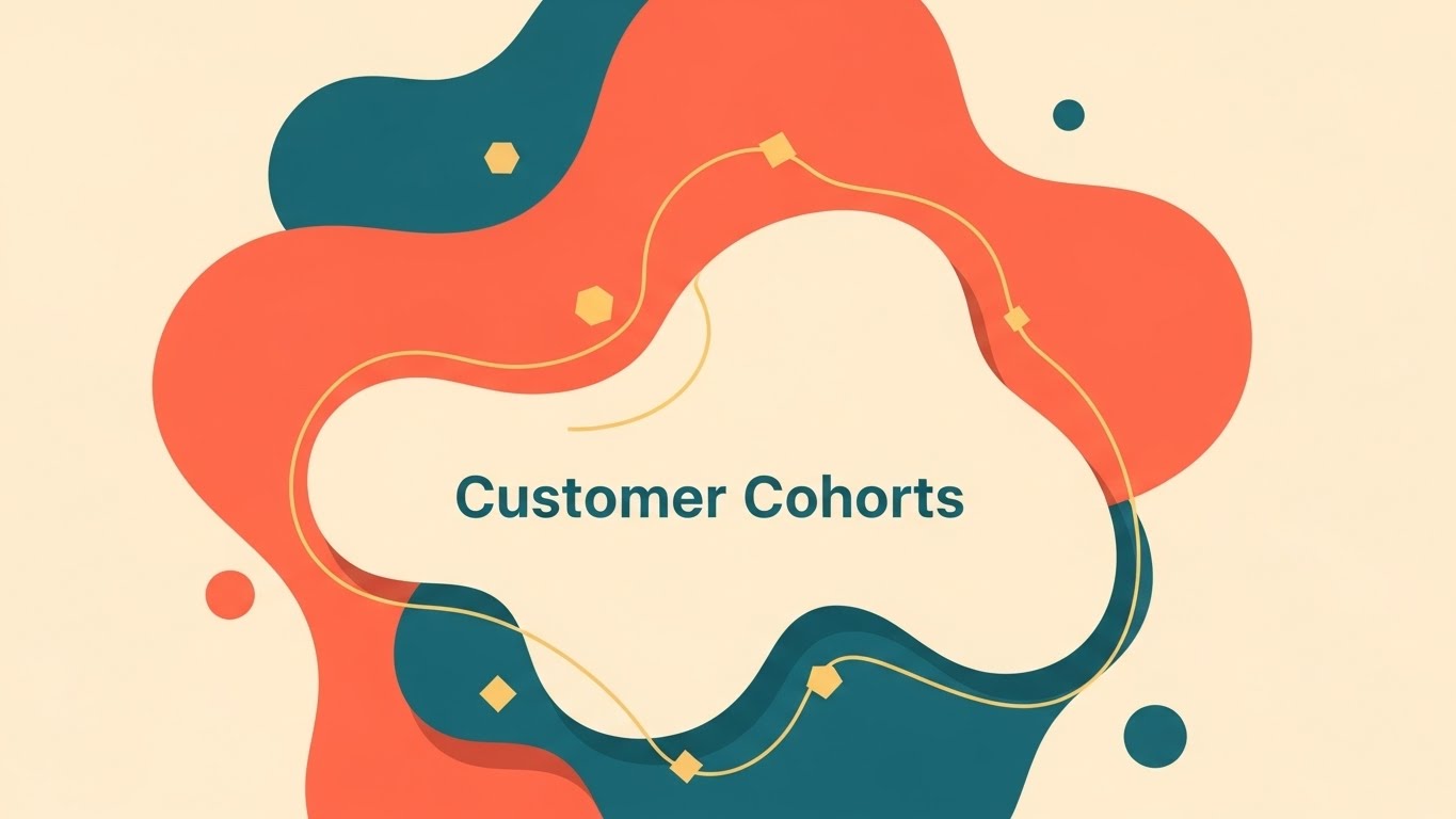
The Visual & Narrative Approach
This style abandons rigid grids for fluid, organic geometry. The visualization depicts Customer Cohorts not as static bars on a chart, but as living, breathing entities represented by merging blobs in Vivid Coral, Soft Cream, and Deep Teal. The composition is top-down and shadowless. Visualizing "Customer Cohorts" as fluid, merging organic blobs naturally groups them together, symbolizing segmentation. Floating geometric particles in Gold add detail without clutter. The aesthetic is clean, modern, and highly professional.
Psychological Impact & KPI Focus
- Niche Psychology: Stakeholders often view segmentation as "boxing people in." This organic aesthetic counters that anxiety by suggesting flexibility and adaptation (Rule 36). It reduces the cognitive load of complex clustering algorithms, making the concept of "behavioral grouping" feel intuitive rather than mechanical.
- Operational Impact: By visualizing segments as fluid, merging shapes, you subtly communicate the concept of Real-time Personalization and dynamic profile updating—key differentiators in a static market.
Strategic Implementation & Trade-offs
- Best For: Top of Funnel (TOFU) Social Ads (1:1 aspect ratio) where the goal is Brand Awareness. It works best for high-level concepts like "We understand your audience naturally."
- Duration: 15-30 Seconds.
- Trade-off: While excellent for emotional connection and high-level concepts, this style lacks the technical precision needed to explain how the segmentation engine actually works. It is a mood setter, not a technical manual.
Companies using similar video content -
Twilio Segment – Customer Data Platform – Unifies customer data for flexible segmentation.
mParticle – Customer Data Platform – Connects customer data across systems.
ActionIQ – Customer Data Platform – Orchestrates personalized customer experiences fluidly.
2. Bold Kinetic Typography (Visual)
TOFU | Market Education

The Visual & Narrative Approach
This style utilizes massive, blocky geometric shapes in high-contrast Bright Orange and Pure White to mimic the rhythm and weight of shouting text without using actual letters. The shapes explode outward from a central singularity, visually representing the "Big Bang" of data clarity. The motion is aggressive and high-velocity, utilizing motion blur to convey speed. The background remains a stark, solid color to ensure the "explosion" retains maximum visual impact. The narrative tone is one of disruption and breakthrough.
Psychological Impact & KPI Focus
- Niche Psychology: It addresses the "Data Overload" anxiety directly. The visual metaphor of explosion and subsequent order validates the user's feeling of being overwhelmed and offers an immediate, powerful release (solution).
- Operational Impact: It physically demonstrates the speed of processing. In a market where "Real-time" is a buzzword, this kinetic energy proves it visually (Rule 37), creating a sense of urgency and capability.
Strategic Implementation & Trade-offs
- Best For: TOFU Instagram Reels or TikTok (9:16 aspect ratio) for Market Education. Perfect for stopping the scroll and signaling "Disruption."
- Duration: 10-15 Seconds (Loopable).
- Trade-off: The aggression of this style captures attention but can be fatiguing. It is suboptimal for detailed feature walkthroughs or long-form content where retention requires a calmer pace.
Companies using similar video content -
Datadog – Observability Platform – High-velocity monitoring for data pipelines.
H2O.ai – AI Cloud – Accelerates AI model development and deployment.
Monte Carlo – Data Observability – Prevents data downtime with automated monitoring.
3. Abstract 3D AI Visualization
TOFU | Shaping Brand Perception

The Visual & Narrative Approach
Set in a clean White void, this visualization focuses on a high-tech neural network. Glowing nodes in Deep Purple and Neon Green represent individual data points (Identities) connected by intricate filaments of light. The camera utilizes a shallow depth of field to focus on a central cluster where data points are fusing together, representing AI-driven Identity Resolution. Sleek, crystalline textures and ethereal lighting elevate the perceived value of the technology.
Psychological Impact & KPI Focus
- Niche Psychology: It targets the "Black Box" skepticism. By visualizing the "brain" of the software, you provide a visual anchor for the invisible algorithms, building trust in the Predictive Modeling capabilities (Rule 36).
- Operational Impact: It elevates the brand perception from a "tool" to an "intelligence partner." It visually justifies premium pricing by showcasing complexity and sophistication, directly influencing Brand Authority metrics.
Strategic Implementation & Trade-offs
- Best For: Website Hero Sections (16:9 aspect ratio) to Shape Brand Perception. It signals immediately that this is an Enterprise-grade solution.
- Duration: 30-60 Seconds (Looping background).
- Trade-off: This style is abstract. If the viewer needs to know exactly "where to click" or "how to export a list," this visualization will feel too theoretical. It sells the power, not the process.
Companies using similar video content -
Google Cloud Vertex AI – Machine Learning Platform – Builds and deploys AI models.
IBM watsonx.ai – AI and Data Studio – Develops and manages AI models.
DataRobot AI Platform – Enterprise AI Platform – Automates machine learning lifecycle.
4. AI Generated Mixed Media Video
TOFU | Vertical Social Organic

The Visual & Narrative Approach
This style is a dynamic collage that blends gritty paper textures with smooth digital overlays. It visualizes the challenge of Market Education by physically piecing together fragmented "scraps" of data—charts on torn paper, handwritten notes, and digital icons—into a cohesive whole. The palette of Electric Indigo, Paper White, and Gold bridges the analog (human) and digital (SaaS) worlds. The camera zooms and pans dynamically, mimicking a detective piecing together clues.
Psychological Impact & KPI Focus
- Niche Psychology: It validates the pain point of "Fragmented Data." Most marketers feel their data is messy; this style acknowledges that messiness and shows the software creating order from chaos (Rule 37).
- Operational Impact: It visually represents Data Enrichment—taking incomplete scraps and forming a full picture. It creates a "hand-crafted" feel that suggests care and attention to detail, contrasting with cold, automated competitors.
Strategic Implementation & Trade-offs
- Best For: TOFU TikTok or Vertical Social Organic (9:16 aspect ratio). The "collage" aesthetic feels native to social trends while delivering a B2B message.
- Duration: 15-45 Seconds.
- Trade-off: The "gritty" texture might be perceived as "informal" by highly conservative enterprise buyers (e.g., Banking/FinTech) who prefer sterile, clean lines.
Companies using similar video content -
Clearbit – Data Enrichment – Unifies fragmented B2B customer profiles.
Leadspace – B2B Data Platform – Enriches leads with predictive intelligence.
FullEnrich – Waterfall Enrichment – Pieces together B2B contact data.
5. Abstract 2D Motion Graphics
TOFU | Skippable Pre-Roll Ad

The Visual & Narrative Approach
A clean, vector-based composition featuring rhythmic patterns of expanding rings and converging lines. The color palette is Royal Blue and Magenta. The central focus is a target-like concentric circle pulling in floating squares from the periphery, visualizing Account-Based Marketing (ABM) targeting mechanisms. The motion is smooth, eased, and mathematical, suggesting precision and inevitability.
Psychological Impact & KPI Focus
- Niche Psychology: It appeals to the desire for "Control" and "Efficiency." The visual metaphor of a target eliminates the fear of "Spray and Pray" marketing. It suggests that every dollar spent is guided by a precise mechanism.
- Operational Impact: It simplifies the complex concept of Lead Scoring and filtering. Instead of showing a spreadsheet with filters, it shows the result of the filter: only the right shapes entering the circle.
Strategic Implementation & Trade-offs
- Best For: TOFU YouTube Pre-Roll Ads (16:9 aspect ratio). The strong central focal point works well even on smaller mobile screens during skippable ads.
- Duration: 6 Seconds (Bumper) or 15 Seconds.
- Trade-off: It is highly stylized and lacks "human" elements. It risks feeling generic if the brand colors and specific motion language aren't distinct.
Companies using similar video content -
Demandbase One – ABM Platform – Targets high-value accounts with precision.
6sense – Predictive ABM Platform – Identifies anonymous buying intent.
Apollo.io – Sales Intelligence – Provides B2B contact data and engagement.
6. Isometric 2D Motion Design
TOFU | YouTube Organic Search
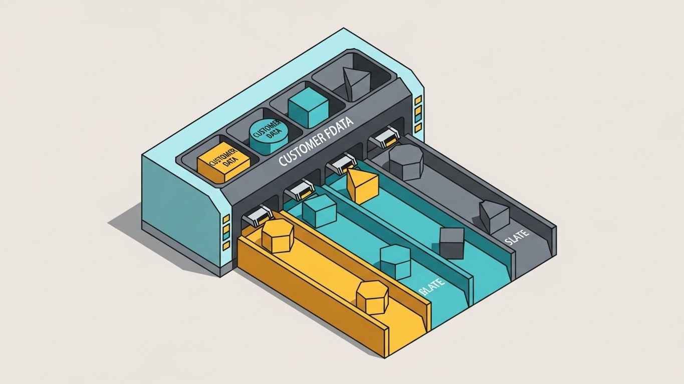
The Visual & Narrative Approach
Set against a Pale Grey background, this scene depicts a stylized digital sorting facility. Geometric shapes representing Customer Data are being categorized into clearly defined lanes colored Mustard Yellow, Teal, and Slate. The aesthetic is clean and precise with hard edges and shadowless lighting, emphasizing the concept of demographic filtering. The narrative is instructional and clear: "Input goes here, Logic happens here, Value comes out here."
Psychological Impact & KPI Focus
- Niche Psychology: This style reduces Cognitive Load. The isometric perspective allows the viewer to see the "whole system" at once, providing a "God’s eye view" that makes complex workflows feel manageable and organized.
- Operational Impact: It is the most effective way to visualize API Integrations and data flows without showing boring server diagrams. It makes infrastructure look approachable.
Strategic Implementation & Trade-offs
- Best For: TOFU YouTube Organic Search Thumbnails and Explainer Intros (16:9 aspect ratio). It promises a clear, structured explanation.
- Duration: 60-90 Seconds.
- Trade-off: It can feel "clinical." It lacks the emotional urgency of the Kinetic style or the awe of the Cinematic style. It is purely functional—which is often exactly what a mid-funnel buyer wants, but less exciting for brand awareness.
Companies using similar video content -
Airbyte – Open-Source Data Integration – Moves data between sources and destinations.
Fivetran – Automated Data Movement – Connects data from various sources.
Integrate.io – Data Integration Platform – Builds ETL/ELT pipelines with ease.
7. Generative AI Cinematic Video
TOFU | Category Creation

The Visual & Narrative Approach
A wide-angle, dramatic shot inside a futuristic, bright server cathedral. The servers are towering monoliths of White Glass and Silver. A wave of light travels through the floor, illuminating the "Transformation" of data. The lighting is moody and volumetric, with lens flares typical of high-end sci-fi production, shot with an anamorphic lens to create a sense of scale and awe. This visualizes Category Creation—positioning the platform not just as software, but as a monumental shift in the industry infrastructure.
Psychological Impact & KPI Focus
- Niche Psychology: It appeals to the "Aspiration" of the buyer. It positions the purchase not as a cost, but as an investment in the future. It triggers a sense of awe and importance (Rule 36).
- Operational Impact: It visually anchors the concept of Scalability. The endless rows of servers imply that the platform can handle infinite data, addressing fears of outgrowing the tool.
Strategic Implementation & Trade-offs
- Best For: TOFU LinkedIn Video (16:9 aspect ratio). LinkedIn audiences expect professional, high-value content. This "premium" look signals that the content is worth the time of a C-Suite executive.
- Duration: 30-45 Seconds.
- Trade-off: High production value sets high expectations. If the actual product UI is clunky or dated, this video creates a "Expectation Gap" that can lead to disappointment during the demo.
Companies using similar video content -
Databricks Machine Learning – Lakehouse Platform – Unifies data and AI workloads.
SAS Viya – AI and Analytics Platform – Enterprise-grade analytics and governance.
Informatica MDM – Master Data Management – Manages enterprise data assets.
8. 3D X-Ray Visualization
MOFU | Product Differentiation

The Visual & Narrative Approach
This visualization strips away the UI to reveal the "engine." A complex machine housing is rendered in transparent glass, revealing internal gears and mechanisms of Brushed Silver and Translucent Amber. The gears interlock perfectly to process glowing spheres, symbolizing the superior logic of the Predictive Modeling engine. The rendering is photorealistic with caustic lighting on a white background, emphasizing precision engineering.
Psychological Impact & KPI Focus
- Niche Psychology: It addresses "Skepticism of Quality." Everyone claims to have AI; this visual shows the intricate engineering behind the claim. It satisfies the analytical mind of a technical buyer or CTO.
- Operational Impact: It differentiates the product based on Performance. It implies that while others have a "black box," you have a "precision engine."
Strategic Implementation & Trade-offs
- Best For: Middle of Funnel (MOFU) Product Pages (16:9 aspect ratio). It serves as a visual anchor for "Feature Deep Dive" sections.
- Duration: 15-20 Seconds (Loop).
- Trade-off: It is a metaphor, not a tutorial. It creates confidence in the technology but doesn't teach the user how to use it. It must be paired with UI examples (like Style 9).
Companies using similar video content -
Alteryx – Analytics Automation Platform – Reveals underlying data logic.
DataRobot AI Platform – Enterprise AI Platform – Provides transparent AI model explanations.
SAS Viya – AI and Analytics Platform – Offers explainable AI and governance.
9. Clean UI Workflow (Light Mode)
MOFU | Feature Education
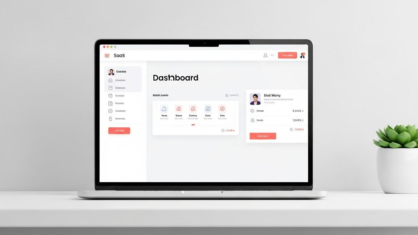
The Visual & Narrative Approach
A pristine, high-fidelity UI mockup of a customer segmentation dashboard. The interface is predominantly White and Light Grey with Royal Blue accents. A stylized cursor is dragging a user card labeled "High Value" into a drop zone. The style simulates a "Glassmorphism" effect with soft, diffused shadows and blurred backgrounds. The perspective is straight-on, emphasizing clarity and structure. The narrative is: "Look how easy this is."
Psychological Impact & KPI Focus
- Niche Psychology: It alleviates the "Usability Anxiety." Buyers fear buying complex software that their team won't use. This visual proves Ease of Adoption.
- Operational Impact: It directly showcases Workflow Efficiency. By showing a drag-and-drop action, it visually promises that segmentation is a matter of seconds, not hours of coding.
Strategic Implementation & Trade-offs
- Best For: MOFU Website Feature Sections (16:9 aspect ratio). This is the "proof" point that validates the high-level claims made in TOFU videos.
- Duration: 10-30 Seconds.
- Trade-off: It is literal. It lacks the excitement of the abstract styles. It engages the logical brain, not the emotional brain. It effectively closes the deal but rarely starts the conversation.
Companies using similar video content -
HubSpot Marketing Hub – Marketing Automation – Streamlines segmentation and campaigns.
Contentsquare – Digital Experience Platform – Visualizes customer journey and segments.
Usermaven – Product Analytics – Simplifies customer segmentation for teams.
10. Low-Poly 3D Modeling
MOFU | ABM Awareness
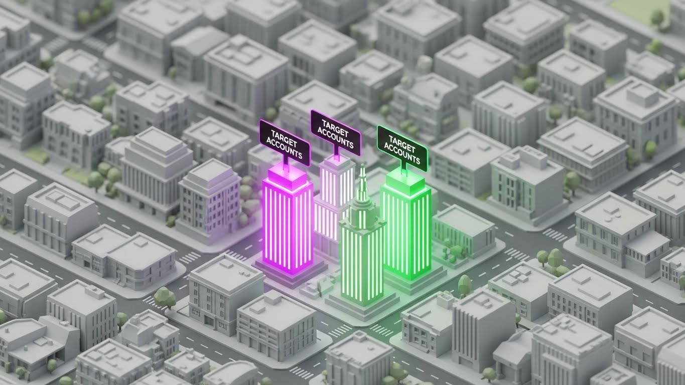
The Visual & Narrative Approach
A low-poly 3D map of a stylized digital city. Most buildings are grey and unassuming, but three specific skyscrapers are glowing in intense Neon Purple and Emerald Green. The camera angle is a bird's-eye view. The lighting mimics a bright day scene with the glowing buildings acting as beacons. The narrative focuses on "Discovery" and "Focus."
Psychological Impact & KPI Focus
- Niche Psychology: It taps into the fear of "FOMO" (Fear Of Missing Out) on key accounts. It visualizes the Total Addressable Market (TAM) and shows how the software illuminates the hidden gems (Rule 36).
- Operational Impact: It is a perfect metaphor for Lead Enrichment and prioritization. It visually communicates: "We show you exactly where to look," saving sales teams from wasting time on the "grey" buildings.
Strategic Implementation & Trade-offs
- Best For: MOFU Display Ads and Retargeting (1:1 aspect ratio). It reinforces the value proposition to users who have already visited the site.
- Duration: 10-15 Seconds.
- Trade-off: The "Low-Poly" style can sometimes be associated with mobile gaming or lower-budget indie projects. It must be rendered with high-quality lighting (Global Illumination) to ensure it feels like a professional data tool, not a mobile game.
Companies using similar video content -
ZoomInfo – Go-to-Market Intelligence – Identifies high-value accounts and contacts.
Lusha – Sales Intelligence – Provides B2B contact and company information.
Leadspace – B2B Data Platform – Prioritizes leads with predictive scoring.
11. Wireframe to Reality Transition**
MOFU | Competitive Displacement
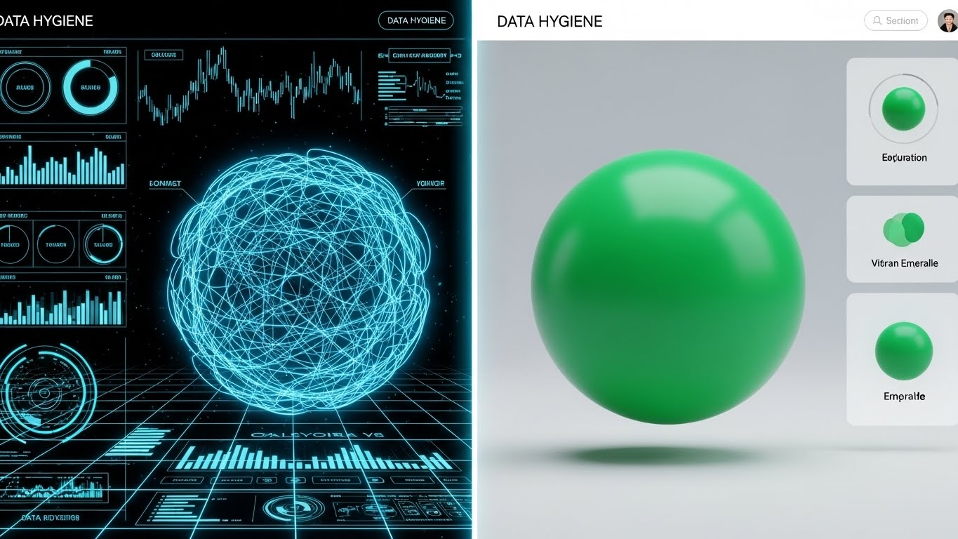
The Visual & Narrative Approach
This split-screen composition utilizes a powerful "Before and After" visual metaphor to articulate Competitive Displacement. The left half presents a chaotic, tangled wireframe mesh of a sphere in Blueprint Blue lines against a dark technical grid, representing raw, unstructured, or "dirty" data. A sharp, glowing vertical divider sweeps across the screen. As it passes, it transforms the messy wireframe into the right half: a perfectly smooth, solid sphere rendered in Vibrant Emerald Green with photorealistic lighting. The transition is seamless, visually proving the platform's ability to refine chaos into value.
Psychological Impact & KPI Focus
- Niche Psychology: It targets the anxiety of "Garbage In, Garbage Out." Data leaders often fear their insights are based on flawed inputs. This visual validates that starting point (the wireframe) and immediately resolves it (the perfect sphere), creating a sense of Cognitive Closure and trust (Rule 36).
- Operational Impact: It visualizes Data Normalization and cleansing. Instead of listing "deduplication" as a feature, it shows the result: a usable, perfect asset ready for segmentation.
Strategic Implementation & Trade-offs
- Best For: MOFU Landing Pages (16:9 aspect ratio) specifically targeting users migrating from legacy systems or spreadsheets.
- Duration: 10-15 Seconds (Looping transition).
- Trade-off: It is binary. It simplifies the nuance of data cleaning into a simple "Bad vs. Good" dichotomy, which is powerful for marketing but may require technical elaboration for data engineers.
Companies using similar video content -
Profisee – Master Data Management – Transforms messy data into clean records.
OvalEdge – Data Governance Platform – Ensures data quality and reliability.
Amperity – Customer Data Cloud – Unifies fragmented customer data profiles.
12. Split Screen: Reality/UI
MOFU | The Functional Buyer
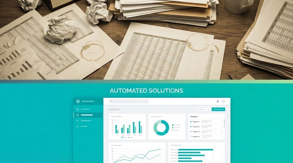
The Visual & Narrative Approach
A horizontal split-screen design that explicitly contrasts the "Analog Struggle" with the "Digital Solution." The top half utilizes stock photography in Muted Sepia tones to depict a cluttered, chaotic physical desk covered in messy spreadsheets, crumpled paper, and coffee stains. The bottom half juxtaposes this with a pristine, organized SaaS dashboard in Bright Teal and White. The UI is clean, featuring simplified graphs and clear navigation. The narrative is one of immediate relief: "Stop drowning in manual entry; start swimming in automated insights."
Psychological Impact & KPI Focus
- Niche Psychology: It appeals directly to the Functional Buyer (e.g., Marketing Operations Manager). It acknowledges the pain of their daily reality (the messy desk) and presents the software not just as a tool, but as a lifestyle improvement that reduces stress (Rule 36).
- Operational Impact: It visually quantifies Efficiency Gains. The contrast implies that the hours spent wrestling with papers (Top) are instantly converted into strategic analysis (Bottom).
Strategic Implementation & Trade-offs
- Best For: MOFU LinkedIn Ads (1:1 aspect ratio). The square format takes up maximum screen real estate on mobile feeds, and the "Top/Bottom" contrast is immediately readable without audio.
- Duration: Static Image or 6-10 Second Motion Graphic.
- Trade-off: It relies on a "Straw Man" argument (spreadsheets are bad). While effective for mid-market buyers, enterprise buyers may have already moved past paper, requiring a comparison against "Legacy Software" instead.
Companies using similar video content -
Pylon – B2B Customer Support – Automates support workflows for efficiency.
Zendesk – Customer Service Platform – Manages customer interactions and support.
Freshdesk – Multi-Channel Support – Streamlines customer service operations.
13. Minimalist Flat 2D Vector
MOFU | Demand Gen
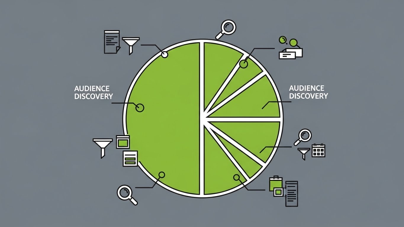
The Visual & Narrative Approach
This style embraces radical simplicity to cut through the noise of display networks. A large central circle in Lime Green represents the Total Addressable Market. It is being dissected by crisp white lines into smaller, precise pie-chart sections. Surrounding icons—magnifying glasses, filters, and data sheets—orbit the center, representing the active process of Audience Discovery. The background is a solid Slate Grey, ensuring the green pops. The lack of gradients suggests clarity and speed.
Psychological Impact & KPI Focus
- Niche Psychology: It reduces Cognitive Load. Complex customer segmentation tools can look intimidating. This style strips away the complexity, reassuring the viewer that "Discovery" is just a matter of simple geometry: Slice and Select.
- Operational Impact: It illustrates Scalability. The vector style implies that whether you have 100 or 1 million customers, the process of slicing the pie remains just as simple and clean (Rule 37).
Strategic Implementation & Trade-offs
- Best For: MOFU Display Ads and Retargeting (1:1 aspect ratio). The high contrast and lack of small text make it legible even at very small sizes on sidebar placements.
- Duration: Static or Micro-animation (3-5 seconds).
- Trade-off: It is low-fidelity. It implies functionality but lacks the "Enterprise Gravitas" of 3D styles. It works best for driving clicks, not for building premium brand perception.
Companies using similar video content -
Mixpanel – Product Analytics – Discovers audience segments and behaviors.
Heap – Digital Insights Platform – Captures user interactions for analysis.
Google Analytics – Web Analytics – Segments website visitors by behavior.
14. 2D Character-Driven Story
MOFU | LinkedIn Video Ads

The Visual & Narrative Approach
This style brings the human user back into the frame. A stylized, professional female manager—wearing a Teal blazer—stands in a bright, modern office, holding a tablet. From her device, a holographic cone of light projects outward, where miniature avatars are automatically organizing themselves into distinct groups colored Terracotta and Sand. The narrative places the user in a position of command, visualizing Micro-segmentation as a tool that extends her natural capabilities rather than replacing her.
Psychological Impact & KPI Focus
- Niche Psychology: It fosters Role Identification. The viewer sees themselves in the character. It shifts the focus from "what the software does" to "who you become when you use it" (a powerful, organized leader).
- Operational Impact: It visualizes Team Adoption. The friendly, character-driven aesthetic suggests that the software is approachable and easy for the entire marketing team to learn, reducing perceived implementation friction.
Strategic Implementation & Trade-offs
- Best For: MOFU LinkedIn Video Ads (1:1 aspect ratio). Character animation performs well socially as it builds an emotional connection that abstract data cannot.
- Duration: 15-30 Seconds.
- Trade-off: Character design is subjective. To maintain B2B credibility, the illustration must avoid being too "cartoony." It should use clean lines and professional proportions.
Companies using similar video content -
Intercom – Customer Messaging Platform – Engages users with in-app experiences.
CleverTap – Customer Engagement Platform – Personalizes mobile user journeys.
MoEngage – Customer Engagement Platform – Drives insights-led customer engagement.
15. Dynamic Data Visualization
BOFU | ROI Justification

The Visual & Narrative Approach
A focused 3D scene designed to speak the language of finance. Three pillar charts, rendered in Forest Green and Chartreuse matte plastic, are growing rapidly upwards in a diagonal composition. Floating above the peaks are gold coin-shaped geometries, explicitly linking data metrics to value extraction. The text "ROI" is integrated into the 3D structure. The background is a clean, abstract white room with soft global illumination. The narrative is singular: Growth.
Psychological Impact & KPI Focus
- Niche Psychology: It targets the Economic Buyer (CFO/VP) who cares less about features and more about outcomes. It subliminally links the software color palette with "Money" and "Success," validating the investment decision (Rule 36).
- Operational Impact: It serves as a visual proxy for Revenue Growth. It moves the conversation from "Cost Center" (buying software) to "Profit Center" (generating revenue through better segmentation).
Strategic Implementation & Trade-offs
- Best For: Bottom of Funnel (BOFU) Pitch Decks and Sales Presentations (16:9 aspect ratio). It provides a visual high-note to end a presentation on.
- Duration: 10 Seconds (Looping).
- Trade-off: It is purely symbolic. It implies results but provides no evidence. It must be accompanied by actual case study metrics (e.g., "+30% Lift") in the voiceover or accompanying text to be effective.
Companies using similar video content -
Factors.ai – Predictive Marketing Analytics – Quantifies marketing ROI and growth.
Optimove – CRM Marketing – Maximizes customer lifetime value and revenue.
Insider One – Personalization Platform – Drives revenue and retention with experiences.
16. 2D Line Art Animation
BOFU | Overcoming Objections

The Visual & Narrative Approach
An elegant, minimalist illustration designed to convey sophistication and safety. A single, continuous thin line in Metallic Gold ink forms the intricate shape of a digital lock against a textured Cream paper background. Inside the lock, the line weaves a complex labyrinth, protecting a central cluster of data points. The aesthetic is reminiscent of currency or high-end security certificates.
Psychological Impact & KPI Focus
- Niche Psychology: It addresses Privacy and Security concerns without using alarmist imagery (like hackers or red shields). The "Gold on Cream" palette signals "Bank-Grade" security and exclusivity, appealing to enterprise clients who value discretion.
- Operational Impact: It visually communicates Compliance (GDPR/SOC2) as a seamless, integrated part of the product architecture, rather than a bolt-on feature.
Strategic Implementation & Trade-offs
- Best For: BOFU One-pagers and Security Documentation (4:5 aspect ratio). It breaks the visual monotony of text-heavy security whitepapers.
- Duration: 15-20 Seconds (Drawing animation).
- Trade-off: It is subtle. It works best for audiences that appreciate nuance. It may be too understated for a high-energy social ad but is perfect for a serious sales conversation.
Companies using similar video content -
OpenMetadata – Open Source Metadata Platform – Visualizes data governance and lineage.
Apache Unomi – Open Source CDP – Manages customer data with privacy focus.
HCL CDP – Customer Data Platform – Unifies customer data for enhanced CX.
17. Photorealistic 3D Renders
BOFU | Risk Mitigation
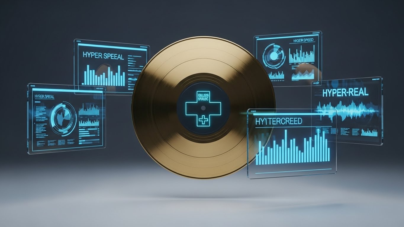
The Visual & Narrative Approach
A hyper-realistic 3D macro render focuses on a Gold Record (Disc), representing the concept of the "Golden Customer Record"—the single, validated source of truth. It is surrounded by floating, semi-transparent Blue holographic screens displaying verification metrics ("Hyper Speed", "Hyper-Real"). The lighting is studio-quality, creating sharp reflections on the gold surface against a dark, premium background. The visual establishes the data asset as something precious, protected, and verified.
Psychological Impact & KPI Focus
- Niche Psychology: It mitigates the risk of Data Fragmentation. By visualizing the "Golden Record," you assure the buyer that your platform provides the definitive, accurate version of their customer data, eliminating the chaos of duplicates (Rule 37).
- Operational Impact: It visually represents Data Integrity and validation. It elevates the concept of a database to a "Vault of Truth," justifying premium pricing for enterprise-grade reliability.
Strategic Implementation & Trade-offs
- Best For: BOFU Website "Enterprise" Sections (16:9 aspect ratio). It signals that the platform is robust enough for Fortune 500 deployment.
- Duration: 10-20 Seconds (Slow rotation/orbit).
- Trade-off: High production cost. Achieving this level of photorealism requires significant rendering time. The metaphor also requires context; without text explaining "Golden Record," it might look like a music award.
Companies using similar video content -
Treasure Data – Customer Data Platform – Creates a unified "Golden Customer Record".
Tealium – Customer Data Platform – Manages customer data for real-time experiences.
Redpoint CDP – Customer Data Platform – Delivers a single view of the customer.
18. Generative AI Realistic Character Video
BOFU | The Economic Buyer

The Visual & Narrative Approach
A high-fidelity video portrait of the target persona: a confident female CMO in her 40s. She stands in a modern corner office with glass walls, bathed in the warm light of "Golden Hour." She is looking at a tablet with a satisfied smile—not a "discovered a feature" smile, but a "strategic goal achieved" smile. The Navy Blue suit suggests authority. The visualization is not about the software, but the result of the software: Professional success and control.
Psychological Impact & KPI Focus
- Niche Psychology: It mirrors the Aspirations of the buyer. Executives want to feel in control and successful. This visual acts as a mirror, showing them the version of themselves they want to be after purchasing the solution (Rule 36).
- Operational Impact: It visualizes Strategic Oversight. It implies that the software runs smoothly enough to allow the executive to focus on the big picture (the city view) rather than the weeds of the data.
Strategic Implementation & Trade-offs
- Best For: BOFU Website Testimonials or "Why Choose Us" sections (16:9 aspect ratio). It humanizes the case studies.
- Duration: 15-30 Seconds.
- Trade-off: It is generic if not paired with a specific customer story. It needs a quote or a specific case study overlay to ground the emotion in facts.
Companies using similar video content -
Salesforce Marketing Cloud – Marketing Automation – Empowers confident marketing decisions.
Adobe Experience Platform – Customer Experience Management – Delivers personalized customer experiences.
IBM watsonx.ai – AI and Data Studio – Provides strategic AI insights for leaders.
19. Holographic UI over 3D Render
BOFU | Driving Demo Requests

The Visual & Narrative Approach
This style bridges the gap between hardware and software. A photorealistic laptop sits on a sleek desk. Rising from the keyboard is a complex, semi-transparent "city" of data, rendered as a holographic UI in Electric Purple and White. The hologram displays vertical bar charts that look like skyscrapers, visualizing the depth of Complex Data. The view is slightly low-angle, making the data look monumental and impressive.
Psychological Impact & KPI Focus
- Niche Psychology: It triggers the "Wow" factor essential for Driving Demo Requests. It promises that the demo will be an experience, not just a lecture. It appeals to the buyer's desire for a tool that feels futuristic and powerful (Rule 37).
- Operational Impact: It visualizes Deep Analytics. The "city" metaphor suggests that the data has depth, infrastructure, and is fully explorable, distinguishing it from flat, 2D competitors.
Strategic Implementation & Trade-offs
- Best For: BOFU Demo Request Landing Pages (16:9 aspect ratio). High-tech visuals increase the perceived value of the demo itself.
- Duration: 10-20 Seconds (Loop).
- Trade-off: It over-promises on the UI. The actual product likely doesn't project holograms. It is important to clarify this is a "visualization of data depth" to manage expectations.
Companies using similar video content -
Google Cloud Vertex AI – Machine Learning Platform – Visualizes deep data analytics.
Databricks Machine Learning – Lakehouse Platform – Explores complex data architectures.
Splunk Observability Cloud – Observability Platform – Provides deep insights into system data.
20. Rapid UI Feature Montage
BOFU | Objection Handling
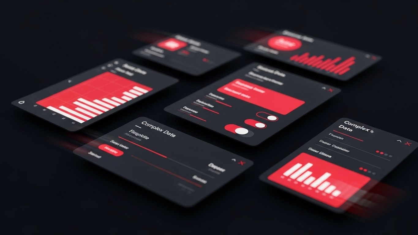
The Visual & Narrative Approach
A high-energy composition designed to visualize speed. Multiple abstract UI cards in Vivid Red and Black (Dark Mode) are layered in a dynamic perspective. Motion blur is applied to the edges, suggesting they are flying past or being processed rapidly. The cards display simplified bar charts and toggle switches. The aesthetic is aggressive and efficient, visualizing Objection Handling related to speed and volume processing.
Psychological Impact & KPI Focus
- Niche Psychology: It addresses the objection: "Is this tool fast enough for our volume?" The visual language of motion blur and high-contrast red signals raw power and Processing Speed.
- Operational Impact: It visualizes Throughput. It suggests the system can handle thousands of queries or segments per second, reassuring technical buyers of the system's performance at scale.
Strategic Implementation & Trade-offs
- Best For: BOFU Email Marketing GIFs (16:9 aspect ratio). The sense of motion grabs attention in a static inbox.
- Duration: 3-5 Seconds (Fast Loop).
- Trade-off: The "Red" color can sometimes signal "Error" in UI design. It is crucial that the red is used for emphasis and data visualization, not for alert icons, to maintain a positive association.
Companies using similar video content -
Hotjar – Product Experience Insights – Showcases rapid user behavior analysis.
Userpilot – Product Adoption Platform – Accelerates feature adoption with guidance.
Contentsquare – Digital Experience Platform – Highlights quick insights from user data.
21. Hyper-lapse Stock Footage**
BOFU | Sales Cycle Acceleration

The Visual & Narrative Approach
This style captures the essence of velocity through a juxtaposition of organic reality and digital precision. It utilizes a high-energy hyper-lapse of a busy city street at twilight, where traffic is reduced to streams of light. Overlaid on this chaotic physical movement are glowing Neon Blue vector lines that cut through the noise, moving at hyper-speed in a unified direction. These lines represent the accelerated Sales Cycle enabled by precise segmentation, contrasting sharply with the "stalled traffic" of traditional marketing methods.
Psychological Impact & KPI Focus
- Niche Psychology: It addresses the "Stagnation Anxiety" felt by Sales VPs—the fear of deals getting stuck in the pipeline. The visual momentum creates a subconscious feeling of progress and inevitability (Rule 36).
- Operational Impact: It visually quantifies Velocity. By showing data (neon lines) moving faster than reality (traffic), it implies that your software is the catalyst that speeds up revenue realization.
Strategic Implementation & Trade-offs
- Best For: BOFU Social Stories (Instagram/LinkedIn) and Remarketing (9:16 aspect ratio). It is designed for mobile consumption where vertical motion captures the eye.
- Duration: 10-15 Seconds.
- Trade-off: It is metaphorical. It does not show the UI or features. It works best as a "mood enforcer" to keep prospects excited during the final stages of negotiation.
Companies using similar video content -
ActiveCampaign – Marketing Automation – Accelerates sales cycles with targeted campaigns.
GetResponse – Email Marketing – Drives faster engagement and conversions.
SalesIntel – Sales Intelligence – Speeds up lead generation and outreach.
22. Isometric 3D Workflow
Onboarding | Implementation

The Visual & Narrative Approach
To visualize the complex process of Implementation, this style uses a charming, isometric 3D miniature aesthetic. The scene depicts a "Customer Profile Factory" where small, stylized conveyor belts in Industrial Grey are assembling Orange cubes (attributes) into complete profiles. The lighting mimics a tilt-shift photography effect with a shallow depth of field, making the entire complex infrastructure look like a manageable, organized toy set. The background is a clean Matte Grey to maintain focus.
Psychological Impact & KPI Focus
- Niche Psychology: It reduces Implementation Friction. New customers often fear the "heavy lift" of setting up new software. This "toy set" aesthetic psychologically minimizes the perceived effort, making the task feel playful and manageable (Rule 36).
- Operational Impact: It clearly visualizes Data Ingestion Logic. It shows the step-by-step flow of data without overwhelming the user with server diagrams, directly supporting faster Time-to-Value (TTV).
Strategic Implementation & Trade-offs
- Best For: Onboarding Guides and Welcome Emails (16:9 aspect ratio). It sets a positive, calm tone for the setup process.
- Duration: 30-60 Seconds.
- Trade-off: The "cute" aesthetic must be balanced. It creates approachability but should not trivialize the robustness of the enterprise security underlying the process.
Companies using similar video content -
Databand – Data Observability – Simplifies data pipeline implementation logic.
Soda Cloud – Data Quality Platform – Streamlines data quality checks and monitoring.
Apache Airflow – Workflow Orchestration – Manages complex data workflows.
23. Dark Mode UI Showcase
Onboarding | Self-Serve Onboarding
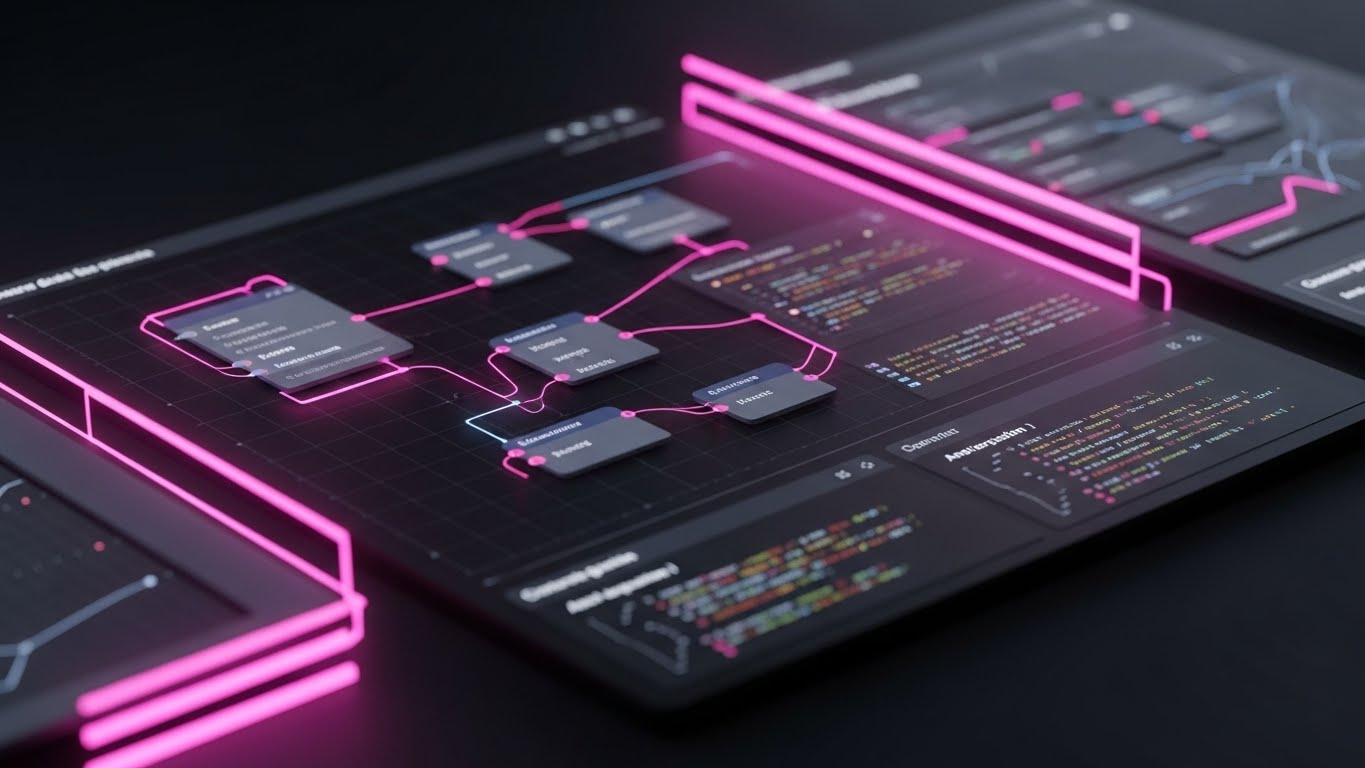
The Visual & Narrative Approach
Targeting the technical implementers, this style embraces a sophisticated "Dark Mode" aesthetic. The palette utilizes Charcoal, Slate, and Electric Pink accents. The screen displays complex nodal graphs and syntax-highlighted code snippets that glow faintly against the dark background. The camera floats slowly across the interface, focusing on the elegance of the API Integration panel. The vibe is "Hacker-Chic"—precise, powerful, and exclusive.
Psychological Impact & KPI Focus
- Niche Psychology: It signals "Developer Empathy." Developers often prefer dark mode and clean code. This visual speaks their language, building trust that the platform was built by engineers, for engineers (Rule 37).
- Operational Impact: It highlights Extensibility. It visually proves that the platform is not a closed garden but an open ecosystem ready to connect with their existing stack.
Strategic Implementation & Trade-offs
- Best For: Developer Documentation and Technical Onboarding Videos (16:9 aspect ratio).
- Duration: 45-90 Seconds.
- Trade-off: It is alienating to non-technical users. A CMO might find this intimidating or "too code-heavy." It must be strictly segmented for technical audiences.
Companies using similar video content -
Twilio Segment – Customer Data Platform – Highlights developer-first API integrations.
Datadog – Observability Platform – Presents technical monitoring and code insights.
Elastic Observability – Observability Platform – Showcases deep technical data analysis.
24. 2D Animation & UI Composition
Onboarding | Trial Activation

The Visual & Narrative Approach
A playful, high-energy composition designed to drive the "Aha!" moment. A stylized 2D character (flat design in Purple and Yellow) runs across a bridge made of floating UI elements. The bridge connects a chaotic, foggy island to a clear, sunny island. As the character steps on the UI buttons, confetti particles explode, symbolizing the successful Activation of a trial account. The motion is bouncy and encouraging.
Psychological Impact & KPI Focus
- Niche Psychology: It utilizes Gamification Principles. By rewarding the user's progress with visual celebration (confetti, bright colors), it triggers a dopamine release associated with task completion, encouraging them to continue the setup.
- Operational Impact: It drives User Activation Rate. It visualizes the transition from "Problem" (Chaos Island) to "Solution" (Clarity Island) as a simple, linear journey.
Strategic Implementation & Trade-offs
- Best For: In-App "First Run" Wizards and Trial Expiration Emails (16:9 aspect ratio).
- Duration: 15-30 Seconds.
- Trade-off: It risks feeling juvenile. To maintain B2B professionalism, the UI elements within the bridge must be accurate representations of the product, grounding the whimsy in reality.
Companies using similar video content -
Userpilot – Product Adoption Platform – Gamifies user onboarding and activation.
Intercom – Customer Messaging Platform – Guides users through trial activation.
Hotjar – Product Experience Insights – Visualizes user journey for activation.
25. 2D Graphics Over Live Action
Onboarding | Accelerating TTV

The Visual & Narrative Approach
This style bridges the gap between the user's physical reality and the software's digital utility. A vertical shot captures a real human hand holding a smartphone in a blurred modern cafe setting. Floating above the screen are crisp 2D vector graphics in Lavender and Yellow—bubbles popping with insights and checkmarks appearing in mid-air. This visualizes Mobile Responsiveness and the ability to manage segmentation alerts in real-time, anywhere.
Psychological Impact & KPI Focus
- Niche Psychology: It validates the "Anywhere Work" lifestyle. Modern marketers and execs are not always at their desks. This style assures them that they remain in control even when mobile (Rule 36).
- Operational Impact: It visually demonstrates Accessibility. It proves that critical data isn't locked on a desktop, reducing the "Time-to-Response" for urgent campaign adjustments.
Strategic Implementation & Trade-offs
- Best For: Social Video (TikTok/Reels) and Feature Announcements (9:16 aspect ratio).
- Duration: 15-20 Seconds.
- Trade-off: Live action production is less flexible than pure animation. Changing the UI on the phone screen requires precise tracking and compositing in post-production.
Companies using similar video content -
Contentsquare – Digital Experience Platform – Augments mobile user experience insights.
Pylon – B2B Customer Support – Overlays real-time alerts on mobile devices.
Insider One – Personalization Platform – Delivers mobile-first personalized experiences.
26. Futuristic Neon/Dark Mode
Retention | Reducing Churn

The Visual & Narrative Approach
Set in a sleek, futuristic Dark Mode environment, a floating OLED interface displays a calm data stream in muted silver. Suddenly, a specific section of the graph begins to pulsate with an intense Crimson Red neon glow. This serves as a visual alarm for Churn Risk. The red neon reflects onto the glossy black floor beneath the UI, creating a sense of urgency and importance. The narrative focuses on "Detection" and "Preemption."
Psychological Impact & KPI Focus
- Niche Psychology: It leverages Loss Aversion. The pulsing red creates an immediate visceral reaction—a warning that something valuable is about to be lost. It frames the software as an "Early Warning System" that protects revenue (Rule 36).
- Operational Impact: It highlights Predictive Analytics. It shows that the system identifies problems before they happen, allowing for proactive rather than reactive retention strategies.
Strategic Implementation & Trade-offs
- Best For: In-App Dashboard Tours and Retention Case Studies (16:9 aspect ratio).
- Duration: 10-15 Seconds.
- Trade-off: The use of "Red" is aggressive. It works for "Risk" visualization but should be used sparingly to avoid "Alert Fatigue."
Companies using similar video content -
Totango – Customer Success Platform – Predicts churn and mitigates risks.
Optimove – CRM Marketing – Proactively identifies churn signals.
Acceldata – Data Observability – Provides preemptive data quality alerts.
27. Macro UI Micro-Interactions
Retention | Proactive Support

The Visual & Narrative Approach
An extreme macro close-up focuses on a single, critical interaction: a digital "Toggle Switch" transitioning from gray to Vibrant Green. The texture of the screen pixels is faintly visible, grounding the digital action in a physical reality. The lighting focuses intensely on the point of activation. This style glorifies the small, tactical moments of Feature Adoption, symbolizing the ease of resolving complex issues (e.g., "Enable Auto-Sync") with a single click.
Psychological Impact & KPI Focus
- Niche Psychology: It builds Confidence in Usability. By zooming in, you remove all distraction, telling the user: "Focus on this one simple action. You can do this." It lowers the cognitive barrier to entry.
- Operational Impact: It directly reduces Support Ticket Volume. Clear, zoomed-in visuals of specific settings are far more effective than text descriptions for troubleshooting, empowering users to solve problems themselves.
Strategic Implementation & Trade-offs
- Best For: Help Center Articles and "Pro-Tip" Tooltips (16:9 aspect ratio).
- Duration: 3-5 Seconds (Loop).
- Trade-off: It lacks context. It shows "how" to click, but not "why." It must be embedded within a broader guide that explains the strategic value of the feature being toggled.
Companies using similar video content -
Heap – Digital Insights Platform – Focuses on critical user interactions.
Qualtrics XM – Experience Management – Captures granular feedback interactions.
Sleeknote – Website Visitor Segmentation – Optimizes on-site micro-conversions.
28. Lifestyle Stock with UI Overlay
Expansion | Driving Upsell

The Visual & Narrative Approach
High-quality stock photography depicts a customer support agent in a modern, sunlit office, pointing to a screen while collaborating with a colleague. Overlaid on the screen is a crisp, semi-transparent UI layer in Warm Office Tones (Orange/Gold), displaying a "Health Check" dashboard. The focus is not just on the screen, but on the interaction—the human value derived from the data. This visualizes Driving Upsell by positioning the software as a tool for strategic team collaboration.
Psychological Impact & KPI Focus
- Niche Psychology: It reinforces Social Proof and professional competency. It shows the software being used in a high-functioning, happy environment. It suggests that "teams who use this tool are successful and collaborative."
- Operational Impact: It visualizes Customer Health Monitoring. It implies that the software provides the insights necessary for Account Managers to have meaningful, data-driven conversations with clients, leading to expansion opportunities.
Strategic Implementation & Trade-offs
- Best For: Expansion Emails and Quarterly Business Review (QBR) Decks (16:9 aspect ratio).
- Duration: Static Image or Slow Zoom Video.
- Trade-off: Stock photography can look generic. The UI overlay must be high-fidelity and clearly branded to ensure it doesn't look like a generic "Business People" stock image.
Companies using similar video content -
Salesforce Service Cloud – Customer Service Platform – Enhances collaborative customer health monitoring.
HubSpot Service Hub – Customer Service Platform – Provides proactive customer health insights.
Kustomer – Conversational CRM – Drives proactive customer engagement.
29. Aspirational Stock Montage
Expansion | Deep Feature Adoption

The Visual & Narrative Approach
A wide-angle, low-angle shot captures a diverse team of professionals in a sun-drenched open-plan office. They are cheering, high-fiving, and looking up at a large monitor (implied off-camera). The lighting includes brilliant sunlight and lens flares, creating a mood of triumph. The color palette is vibrant. This style is not about the software's features, but the Team Advocacy and organizational success that results from widespread adoption.
Psychological Impact & KPI Focus
- Niche Psychology: It targets the Emotional ROI. B2B buyers ultimately want their teams to be happy and successful. This visual connects the software purchase to high morale and team victory (Rule 36).
- Operational Impact: It visualizes Cultural Impact. It suggests that the software solves problems so effectively that it becomes a source of celebration, aiding in internal buy-in and reducing resistance to change.
Strategic Implementation & Trade-offs
- Best For: LinkedIn Social Posts and "Company Culture" pages (16:9 aspect ratio).
- Duration: Static or Slow Motion Video.
- Trade-off: It is purely emotional. It provides zero information about what the software does. It is a "Brand Feel" asset, not a product asset.
Companies using similar video content -
HubSpot – All-in-One CRM Platform – Inspires organizational success and growth.
Salesforce – CRM Ecosystem – Promotes enterprise-wide advocacy and triumph.
IBM – Enterprise AI – Visualizes future-forward organizational achievements.
30. 3D Parallax UI Presentation
Expansion | Driving Referrals

The Visual & Narrative Approach
To visualize the exponential value of Network Effects and referrals, this style uses depth. Multiple semi-transparent interface layers in Deep Indigo and Lavender are stacked in Z-space (depth). The camera moves at a side angle, revealing the connections between the layers. Glowing lines traverse the gaps, showing how one dataset enriches another. The background is an abstract light field. It creates a sense of a "Platform Ecosystem" rather than a single tool.
Psychological Impact & KPI Focus
- Niche Psychology: It appeals to the System Thinker. It shows that the software is not an isolated island but a layered infrastructure that grows more valuable as more data/users are added (Rule 37).
- Operational Impact: It visualizes Scalability and Integration. It proves that the platform can handle complex, multi-layered data structures without collapsing, justifying enterprise-wide rollout.
Strategic Implementation & Trade-offs
- Best For: "Platform" Landing Pages and Partnership Decks (16:9 aspect ratio).
- Duration: 10-20 Seconds (Loop).
- Trade-off: It is complex. It requires the viewer to understand abstract spatial relationships. It is strictly for high-level strategic communication, not for training.
Strategic Knowledge Base: The Visual Operations Doctrine
The 30 styles outlined above are not merely aesthetic choices; they are functional components of a broader business strategy. To bridge the gap between "making a video" and "driving business results," this section synthesizes the visual examples into a cohesive operational framework. We call this the Visual Operations Doctrine.
This framework is designed for Leadership and Operations teams to ensure that every pixel generated serves a measurable business outcome, specifically within the Customer Segmentation and B2B SaaS domain.
Strategic Alignment & Visual Architecture
The "Pre-Production" Phase – Defining the Visual Operating System.
Before a single asset is rendered, the visual strategy must be aligned with the cognitive reality of your users—the Data Analysts, Marketing Managers, and Sales Directors who rely on your platform.
- The Cognitive Load Audit: Before selecting a style, audit the complexity of the feature being explained. High-complexity features (e.g., Predictive Modeling) require low-cognitive-load styles (Style 13: Minimalist Flat 2D) to prevent overwhelm. Conversely, simple concepts (e.g., "We have a mobile app") benefit from high-fidelity styles (Style 25) to add perceived value.
- Role-Based Visual Mapping: Differentiate your visual language by persona. The "Fleet Manager" of your software (the VP of Growth) needs "God's Eye View" visuals like Style 6 (Isometric) to feel in control. The "Driver" (the Email Marketer) needs task-specific focus like Style 9 (Clean UI) to understand daily workflows.
- The "Glanceability" Standard: In a high-velocity SaaS environment, users don't have time to decipher abstract art. Adopt a "Glanceability" standard: Can the viewer understand the core message (e.g., "Risk Detected") within 1.5 seconds? Styles like Style 26 (Futuristic Neon) are designed specifically for this instant comprehension.
- Brand Voice Consistency: Your visual assets are often the only interaction a stakeholder has with your brand outside of the login screen. Ensure that the "Visual Voice" is consistent. If your UI is clean and white, avoid using gritty, textured styles (Style 4) for product updates, as this creates a "Brand Dissonance" that erodes trust.
- The Advids Strategic Audit: This is where an external partner becomes critical. Advids specializes in conducting this pre-production audit, mapping your feature roadmap to specific visual architectures to ensure that as your product scales, your visual language evolves coherently, preventing a fragmented brand image.
- Standardization vs. Customization: For core features that rarely change (e.g., Security Architecture), invest in high-end, bespoke 3D assets (Style 16). For features that update weekly (e.g., UI Reporting widgets), utilize templated, lower-fidelity styles (Style 12) to allow for rapid, cost-effective updates.
- The Cross-Departmental Bridge: Use visuals to unify terminology. If Product calls it "Cohort Analysis" but Sales calls it "Audience Grouping," use Style 1 (Abstract Organic) to visually demonstrate that these are the same thing, creating a shared mental model across the organization.
- Legacy System Integration: Many clients are migrating from legacy on-prem databases. Use Style 11 (Wireframe to Reality) to explicitly visualize this bridge, respecting the "old" (the wireframe) while celebrating the "new" (the reality), effectively managing the emotional weight of change management.
- Accessibility in Design: Your users are diverse. Ensure that motion graphics (especially text-heavy styles like Style 2) remain accessible. Maintain high contrast ratios and avoid flashing patterns that could trigger photosensitivity. A "Cool" video that alienates 15% of your audience is a strategic failure.
- The Mobile-First Mandate: Executive decision-makers often view content on phones during transit. Ensure all 30 styles are adaptable to 9:16 or 1:1 formats (as noted in the "Channel" fields) to capture the executive's attention during their commute.
Operational Adoption & Implementation
The "Deployment" Phase – Embedding Visuals into the Workflow.
Once the assets are created, their value is determined by how effectively they are deployed to drive user behavior and adoption.
- Overcoming "Black Box" Anxiety: AI is intimidating. Use Style 8 (3D X-Ray) and Style 11 (Wireframe to Reality) to demystify the algorithm. When users can "see" the logic (gears, nodes, filters), they trust the output. Transparency is the precursor to adoption.
- The Micro-Learning Shift: Evolve beyond sending 50-page PDF manuals. Replace them with a library of 15-second "Micro-Learning" loops (using Style 9 and Style 27). Embed these directly into the UI tooltips. This "Just-in-Time" education reduces the cognitive friction of learning a new tool.
- Just-in-Time Support: Integrate Style 9 (Clean UI) videos into your chatbot or helpdesk. When a user asks "How do I export?", the bot should serve a visual demonstration, not a text link. This visual immediacy resolves frustration instantly.
- Gamification of Training: Use Style 24 (2D Animation) to celebrate onboarding milestones. When a user completes their first segmentation, a visual reward triggers a dopamine release, reinforcing the behavior and encouraging them to complete the setup process.
- Reducing Support Ticket Volume: There is a direct correlation between proactive visualization and support costs. By proactively emailing Style 20 (Feature Montage) videos when a new update ships, you answer questions before they become tickets, significantly lowering call center load.
- Remote Onboarding: For distributed teams, use Style 22 (Isometric Workflow) to visualize the entire implementation map. Since you cannot be in the room with them, your video must serve as the "virtual consultant," guiding them through complex setups with spatial clarity.
- Standard Operating Procedures (SOPs): Transform text-based SOPs into visual process flows using Style 6 (Isometric Motion). Visual processes are retained 60,000x faster than text, ensuring that complex segmentation rules are followed consistently across the client's organization.
- Feedback Loops: Use interactive video elements (Style 25 concept) to gather feedback. If a user pauses a "How-To" video repeatedly, it signals a friction point in your UI. Use this data to refine both the product and the visual assets.
- Scalable Localization: Global SaaS platforms must speak many languages. Styles that rely on visual metaphors (like Style 15's Growing Pillars) are universally understood and require zero translation, making them highly cost-effective for global deployment (Rule 39).
- Leadership Communication: Empower your internal champions (your user) to sell to their boss (the buyer). Provide them with Style 15 (ROI Visualization) assets. Give them the visual ammo they need to justify the renewal or expansion budget to their C-Suite.
Measuring Impact & Future-Proofing
The "ROI" Phase – Quantifying Value and Evolving the Strategy.
The final step is to move beyond "Vanity Metrics" (likes/views) and measure the real impact of your visual strategy on the business bottom line.
- Beyond "Views" – Actionable KPIs: Move beyond measuring video "views." Measure Time-to-Competency (how fast a user learns a feature) and Feature Adoption Rate (how many users activate a feature after watching the Style 27 clip). These are the metrics that prove ROI.
- The "Idle Time" Metric: Correlate better visualization with reduced "Idle Time" in the app. If users spend less time staring at a screen trying to figure out what to do because a Style 9 video guided them, their efficiency—and satisfaction—goes up.
- Compliance Velocity: In regulated industries (GDPR/CCPA), use Style 16 (Line Art Security) to communicate compliance updates. Measure how quickly the user base acknowledges and adopts new privacy protocols when presented visually vs. textually.
- Retention and Churn Correlation: Track the cohort of users who consume your "Health Check" videos (Style 26). You will likely find that informed users who understand the "Risk" signals are more proactive and have a higher Lifetime Value (LTV).
- The AI Visual Frontier: Prepare for the future where video is generated in real-time. Styles like Style 7 (Generative AI) are precursors to a world where your dashboard generates a custom video summary of the user's weekly data. Start building the "visual vocabulary" for this future now.
- Scalability of Assets: Build a "Visual Component Library." Don't create 30 one-off videos; create a system of reusable assets (icons, 3D models, motion presets). This allows you to scale production velocity as your software feature set grows.
- The Advids Partnership: Scalability requires a long-term partner. Advids specializes in maintaining this visual continuity. By treating your video production as an ongoing "Visual Subscription" rather than ad-hoc projects, you ensure that your visual documentation never lags behind your software updates.
- Benchmarking Success: Regularly audit your visuals against competitors. If they are using Style 19 (Holographic UI) and you are using static screenshots, you are losing the "Perception War." "Good enough" visuals are a competitive risk in a crowded SaaS market.
- The ROI of Confidence: Confidence is currency. When a user feels confident using your tool (thanks to clear Style 22 guides), they explore more features. Quantify this "Exploration Depth" as a leading indicator of upsell potential.
- Final Call to Innovation: Treat video not as "content," but as "infrastructure." Just as you wouldn't build software without a backend, don't build a user journey without a Visual Operating System. The companies that bridge the Physical/Digital divide with superior visualization will define the next era of SaaS.
Companies using similar video content -
Tealium – Customer Data Platform – Visualizes layered data ecosystems and integrations.
mParticle – Customer Data Platform – Connects diverse data sources in depth.
Adobe Experience Platform – Customer Experience Management – Presents a unified, layered view of customer data.
Author & Editor Bio


