
 /home/wwwroot/advids.co/design/index.php on line 425
Introduction: Visualizing the "Invisible" Trust Layer
In the high-stakes economy of digital trust, the most powerful security is the kind you never notice. We are witnessing a paradigm shift in the Customer Verification (SaaS) market, moving from the era of "security theater"—where friction equaled safety—to the age of "verified velocity." For CTOs, Chief Compliance Officers, and Product Leaders, the operational mandate is contradictory and unforgiving: you must impose rigorous regulatory checks (KYC/AML) without slowing down the user's journey by a single millisecond.
The cost of getting this balance wrong is quantifiable and severe. According to the TransUnion H2 2025 Global Fraud Report, businesses worldwide lost an estimated 7.7% of annual revenue to fraud in the last year alone. This figure represents not just stolen funds, but the immense opportunity cost of friction—legitimate customers turned away by opaque, anxiety-inducing processes.
However, the future belongs to platforms that can bridge this physical/digital divide. With the global identity verification market size projected to reach $15.72 billion in 2025, the opportunity for growth is massive. Capturing this market requires a shift in how we communicate value. It requires moving beyond static screenshots to visualizing the intelligence, velocity, and empathy that powers your platform.
This guide is a strategic framework for closing that communication gap. We have curated 30 distinct video visualization styles, mapped directly to the customer funnel and specific operational KPIs. From "Abstract 2D Motion" that calms user anxiety to "3D X-Ray" visualizations that prove hardware-level integrity, these examples demonstrate how to transform opaque algorithmic logic into tangible, persuasive assets.
1. The Shield of Invisible Security
TOFU | Brand Awareness

The Visual & Narrative Approach
This style redefines the traditional concept of a "security shield." Instead of a rigid, metallic barrier, the visual presents a fluid, organic form in electric blue and high-gloss white. The texture mimics liquid glass, with soft specular highlights implying a surface that is both impenetrable and self-healing. The motion is continuous and morphing, suggesting that the security layer adapts to the user's context rather than blocking them.
Psychological Impact & KPI Focus
- Niche Psychology: High-friction security often triggers user anxiety ("Is this process broken?"). The organic, rounded geometry here leverages the Aesthetic-Usability Effect, suggesting that the security protocols are smart and adaptive. It reduces the "fear of rejection" by making the barrier look soft and intelligent.
- Operational Impact: This visualization addresses Brand Sentiment. It visually promises Frictionless Onboarding, telling the viewer, "Our security flows around you," directly countering the fear of clunky, bureaucratic struggles.
Strategic Implementation & Trade-offs
- Duration: 6–10 Seconds (Looping).
- Trade-off: Excellent for setting a "premium tech" mood, but too abstract to explain specific features like OCR or liveness detection. Use it to capture attention, not to educate.
Companies using similar video content -
Socure – Sigma Identity Fraud – AI-driven, adaptive identity verification and fraud prevention.
BioCatch – Behavioral Biometrics – Invisible fraud detection through user behavior analysis.
2. The Velocity of Verification
TOFU | Market Education
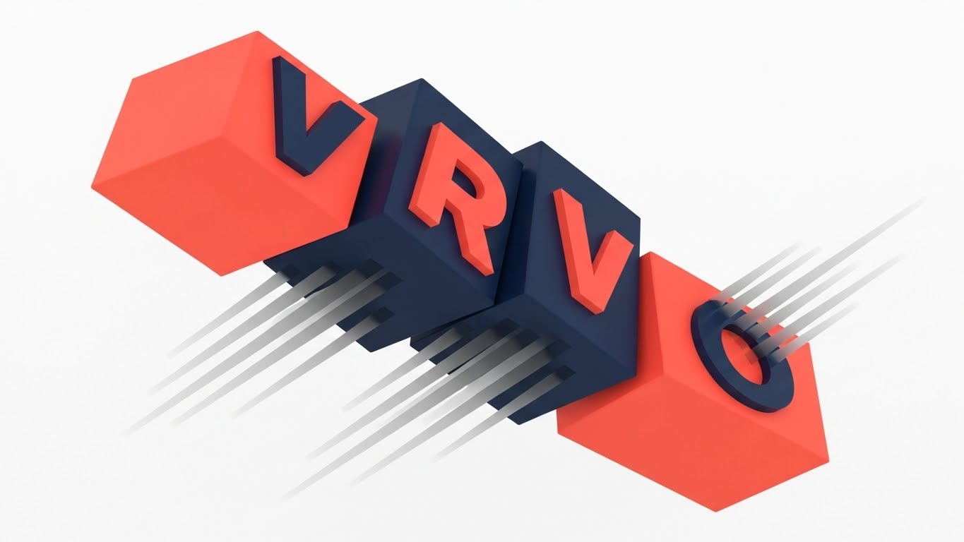
The Visual & Narrative Approach
This style abandons subtlety for raw energy, employing a "Brutalist Kinetic" aesthetic. Large, heavy rectangular blocks in vivid coral and deep navy crash into a diagonal "Dutch angle" composition. These shapes abstractly suggest letters (like "VRVO") but prioritize the feeling of momentum over legibility. Motion blur trails are applied to the blocks, visually mimicking the high velocity of automated checks. The narrative is purely about Speed and Impact.
Psychological Impact & KPI Focus
- Niche Psychology: For Fintech Product Managers, "Speed" is a proxy for "Revenue." This style visually codifies the concept of "Zero Latency," reassuring decision-makers that the platform can handle high transaction volumes (TPS) without slowing down.
- Operational Impact: Supports Market Education by differentiating the solution from manual, slow-moving competitors. It promises a reduction in Time-to-Verdict.
Strategic Implementation & Trade-offs
- Duration: 10–15 Seconds.
- Trade-off: The aggressive energy commands attention but can be overwhelming. It works best for feature announcements (e.g., "Now 2x Faster") rather than building long-term trust.
Companies using similar video content -
Veriff – Identity Verification – Fast, automated identity verification for global users.
Sumsub – KYC/AML Solution – High-speed, all-in-one verification for compliance.
3. The Remote Compliance Bridge
TOFU | LinkedIn Organic

The Visual & Narrative Approach
Precision and clarity are paramount here. The image depicts a stylized compliance officer at a desk connected via a clean, yellow data line to a field driver and their vehicle. The orthogonal composition strips away perspective to focus on the logical connection between the "Back Office" and the "Field." The strict palette of slate grey and mint green communicates professionalism and order.
Psychological Impact & KPI Focus
- Niche Psychology: Compliance officers are often overwhelmed by the chaos of manual paperwork and remote workforce management. This minimalist style offers a visual "safe harbor"—a promise of organization and clarity. It taps into the desire for a clean Audit Trail.
- Operational Impact: It effectively visualizes Remote Verification. It solves the "Physical/Digital Divide" visually, showing how field operations can be instantly verified by HQ, reducing operational overhead.
Strategic Implementation & Trade-offs
- Duration: 15–30 Seconds.
- Trade-off: Its sobriety is its strength and its weakness. While "safe," it lacks the excitement needed for viral consumer marketing. It is best used to validate reliability on LinkedIn.
Companies using similar video content -
Trulioo – GlobalGateway – Connects remote identities to global data sources for compliance.
IDnow – VideoIdent – Secure video identification for remote customer onboarding.
4. The Global Network
TOFU | Skippable Pre-Roll Ad

The Visual & Narrative Approach
This style uses "High-Fidelity Cinematography" to visualize the scale of the identity ecosystem. A low-angle tracking shot moves through a futuristic financial district at twilight, where glass skyscrapers reflect teal and amber lights. Overlaid on the busy street scene are subtle, glowing digital nodes connecting pedestrians. This transforms a standard city scene into a narrative about a "Global Identity Network."
Psychological Impact & KPI Focus
- Niche Psychology: Enterprise buyers want to partner with "visionaries." This cinematic aesthetic leverages the Halo Effect, transferring the grandeur and scale of the city to the software brand. It signals "Enterprise-Grade" capability.
- Operational Impact: A powerful tool for Brand Positioning. It addresses Scalability and Global Reach, suggesting the solution works across borders and jurisdictions.
Strategic Implementation & Trade-offs
- Duration: 15–30 Seconds.
- Trade-off: It sells the vision, not the product. It must be paired with concrete UI demonstrations later in the funnel to prove the "dream" is real.
Companies using similar video content -
LexisNexis Risk Solutions – ThreatMetrix – Global digital identity network for fraud prevention.
GBG – Identity Verification – Enterprise-scale identity intelligence for global markets.
5. The Acceleration of Data
TOFU | Meta & General Social Ads

The Visual & Narrative Approach
Using a "Flat Geometric Burst" style, this visual explodes from the center outward. Sharp geometric arrows and dashed lines in cyber yellow and charcoal grey radiate rapidly, suggesting high-speed data throughput. There are no soft curves; everything is angular, flat, and opaque. The composition creates a strobe-like effect of instant acceleration. The narrative is "Input/Output," visualizing the moment a verification request is sent and instantly processed.
Psychological Impact & KPI Focus
- Niche Psychology: In sectors like crypto or betting, Latency is the enemy. This style visually triggers the "Fast" heuristic. It convinces the technical buyer that the system is lightweight and efficient, not bloated code.
- Operational Impact: Effective for Disrupting the Feed. It reinforces the API Response Time KPI, reassuring technical buyers of the system's performance.
Strategic Implementation & Trade-offs
- Duration: 3–6 Seconds (Looping).
- Trade-off: Very aggressive and abstract. Without strong copy (e.g., "Verify in <200ms"), it might just look like "fast shapes." It requires context.
Companies using similar video content -
Ekata – Identity Engine – Instant identity verification and fraud insights API.
Telesign – Verify API – Rapid user verification and fraud prevention data.
6. The Intelligence of the Node
TOFU | Category Creation

The Visual & Narrative Approach
This "Ethereal Tech" visualization focuses on the intelligence behind the verification. It features a macro close-up of a single "hero" node within a complex network, rendered in neon cyan and deep violet. Bioluminescent filaments connect the nodes, resembling a digital neural network. A heavy depth-of-field (bokeh) effect blurs the background, forcing focus on the central node. This visualizes the "AI Brain" analyzing a specific identity attribute.
Psychological Impact & KPI Focus
- Niche Psychology: The "Black Box" nature of AI is a concern for regulators. This style makes the AI look organized and intentional ("constellations") rather than chaotic. It builds trust in the Accuracy of the fraud detection models.
- Operational Impact: Supports Category Creation by visually elevating the product from a simple checker to an "Intelligent Neural Platform."
Strategic Implementation & Trade-offs
- Duration: 10–20 Seconds (Slow Loop).
- Trade-off: It is metaphorical. It creates a feeling of "smart," but doesn't explain how the AI detects a deepfake. It needs supporting technical copy.
Companies using similar video content -
Feedzai – RiskOps Platform – AI-powered fraud detection with neural network analysis.
Featurespace – ARIC Risk Hub – Adaptive behavioral analytics for real-time fraud prevention.
7. The Logic of the Workflow
MOFU | Product/Solution Differentiation
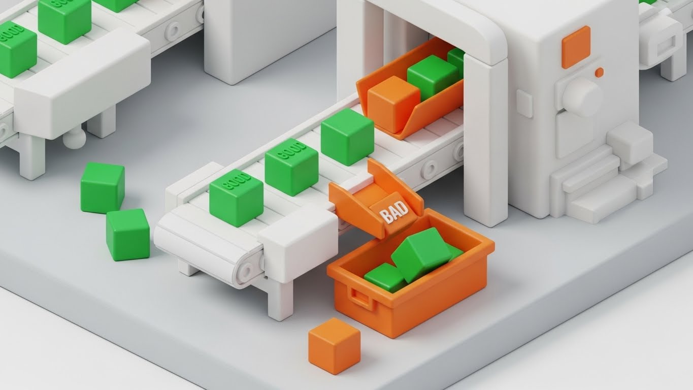
The Visual & Narrative Approach
Transitioning to a "Matte Clay Isometric" style, this visual creates a tangible, toy-like representation of a verification workflow. A miniature factory line is depicted where abstract cubes (data packets) travel on a conveyor belt. "Good" green cubes flow smoothly, while "Bad" orange cubes are mechanically diverted to a bin. The lighting is soft and shadowless, emphasizing Clean Logic and Process Transparency.
Psychological Impact & KPI Focus
- Niche Psychology: For Operations Managers, the nightmare is a messy manual review queue. This style satisfies the desire for "Process Control." It visually proves that the system handles exceptions automatically, reducing the need for human intervention.
- Operational Impact: Excellent for Product Differentiation, proving the solution handles orchestration elegantly. It visualizes Workflow Automation.
Strategic Implementation & Trade-offs
- Duration: 15–30 Seconds.
- Trade-off: The "toy-like" aesthetic simplifies complex processes effectively but must be executed with high-fidelity rendering to avoid looking childish.
Companies using similar video content -
Alloy – Identity Decisioning – Automated workflow orchestration for identity and risk decisions.
Unit21 – Detection & Investigation – Streamlined case management for fraud and AML.
8. The Hardware Beneath the Glass
MOFU | Feature Education & Demonstration
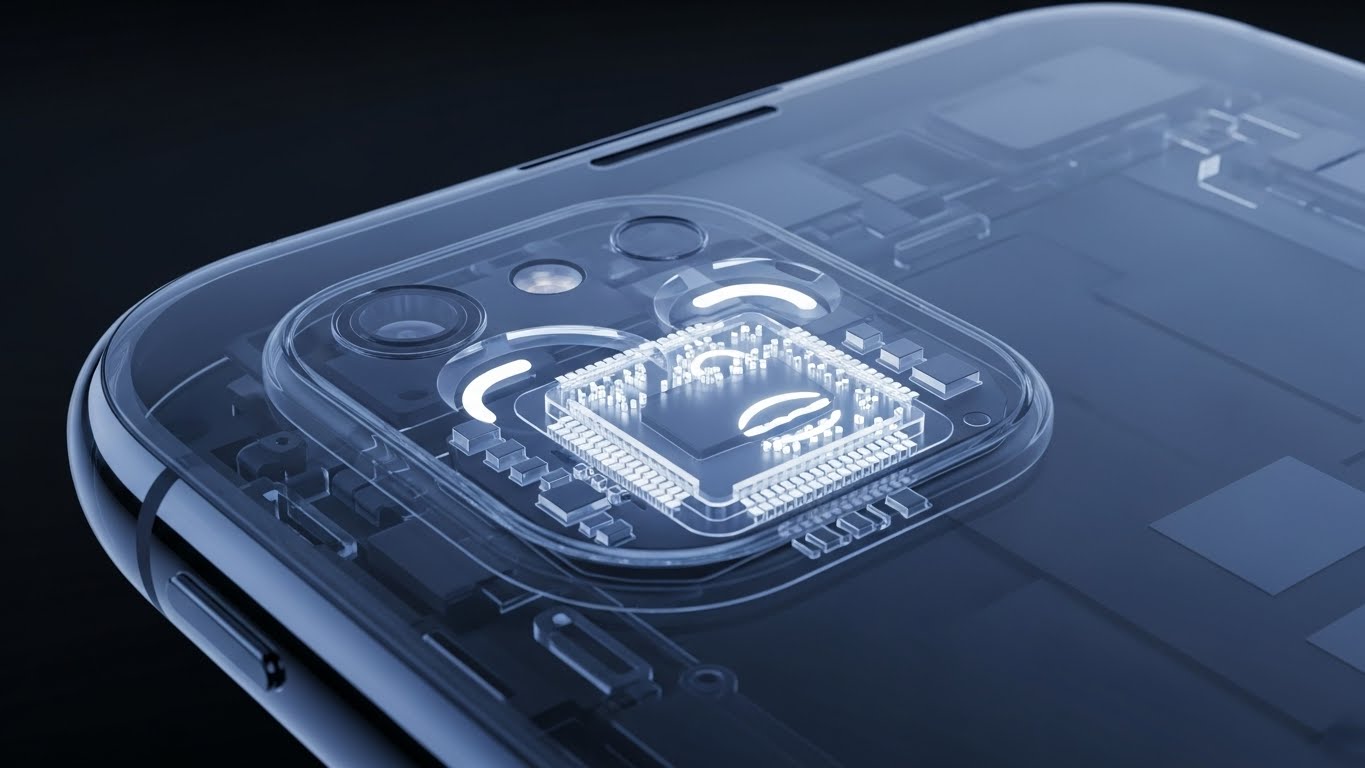
The Visual & Narrative Approach
This style employs a "High-Fidelity X-Ray" aesthetic to reveal the hidden sophistication of biometric hardware. The camera holds an extreme macro shot on the upper bezel of a smartphone. The casing is rendered as semi-transparent "X-ray blue" glass, allowing us to see the glowing internal components of a facial scanning chip. This visualizes the Hardware-Level Security (e.g., Secure Enclave) that the software accesses.
Psychological Impact & KPI Focus
- Niche Psychology: Trust often relies on physical evidence. By showing the "guts" of the technology, the visual implies a deep integration that feels more robust than a simple app overlay. It addresses the fear of Spoofing.
- Operational Impact: Drives Feature Education, specifically for liveness detection and biometric authentication features.
Strategic Implementation & Trade-offs
- Duration: 10–15 Seconds.
- Trade-off: Very specific to mobile/biometric use cases. It may alienate buyers looking for document-only verification (e.g., upload a PDF).
Companies using similar video content -
iProov – Genuine Presence Assurance – Biometric liveness detection for secure authentication.
FaceTec – 3D Face Liveness – Hardware-level biometric security against spoofing.
9. The Contrast of Reality
MOFU | Competitive Displacement

The Visual & Narrative Approach
A "Comparative Split-Screen" composition that uses high contrast to make a competitive argument. The screen is divided 50/50 vertically. The left side displays a gritty, textured photo of a disorganized pile of crumpled beige papers, symbolizing the "Manual Chaos" of traditional KYC. The right side features a pristine, smooth glass surface in bright azure blue with a single, glowing floating UI element, representing "Automated Order."
Psychological Impact & KPI Focus
- Niche Psychology: Fear of Operational Debt drives change. This visual triggers the pain of manual processing (paperwork) and immediately offers the dopamine hit of the solution (clean UI). It uses Contrast Bias to sell the upgrade.
- Operational Impact: A prime tool for Competitive Displacement, effectively arguing against legacy systems or manual in-house teams.
Strategic Implementation & Trade-offs
- Duration: Static or Slow Pan.
- Trade-off: Can be seen as aggressive. Ensure the "Paper" side represents the problem, not the client's current team, to avoid insulting the user.
Companies using similar video content -
Fenergo – CLM & KYC – Transforms manual compliance into digital efficiency.
ComplyAdvantage – AML Platform – Modernizes financial crime detection from legacy systems.
10. The Human Element
MOFU | Driving Demo Requests

The Visual & Narrative Approach
This style brings the human back into the loop using "Modern Corporate Vector" art. A young professional female character is depicted holding a smartphone. The palette is soft pastel purple and teal, with a subtle grainy texture overlay adding warmth. She is smiling at the device, which emits a soft, validating glow. The focus is entirely on her positive emotional reaction to the verification process.
Psychological Impact & KPI Focus
- Niche Psychology: Ultimately, software is bought by people who care about their customers. This style validates the End-User Experience, promising that the security measures won't annoy the user base. It humanizes the metrics.
- Operational Impact: Drives Demo Requests by proving the solution improves Net Promoter Score (NPS) and reduces drop-offs.
Strategic Implementation & Trade-offs
- Duration: 15–30 Seconds.
- Trade-off: Less "high-tech" than the 3D styles. Use this to close the deal on experience, not on security specs.
Companies using similar video content -
Persona – Identity Platform – Creates frictionless, user-friendly verification experiences.
Yoti – Digital ID App – Empowers users with simple, secure digital identity.
12. The Path of Least Resistance
MOFU | Website Visitor Re-engagement
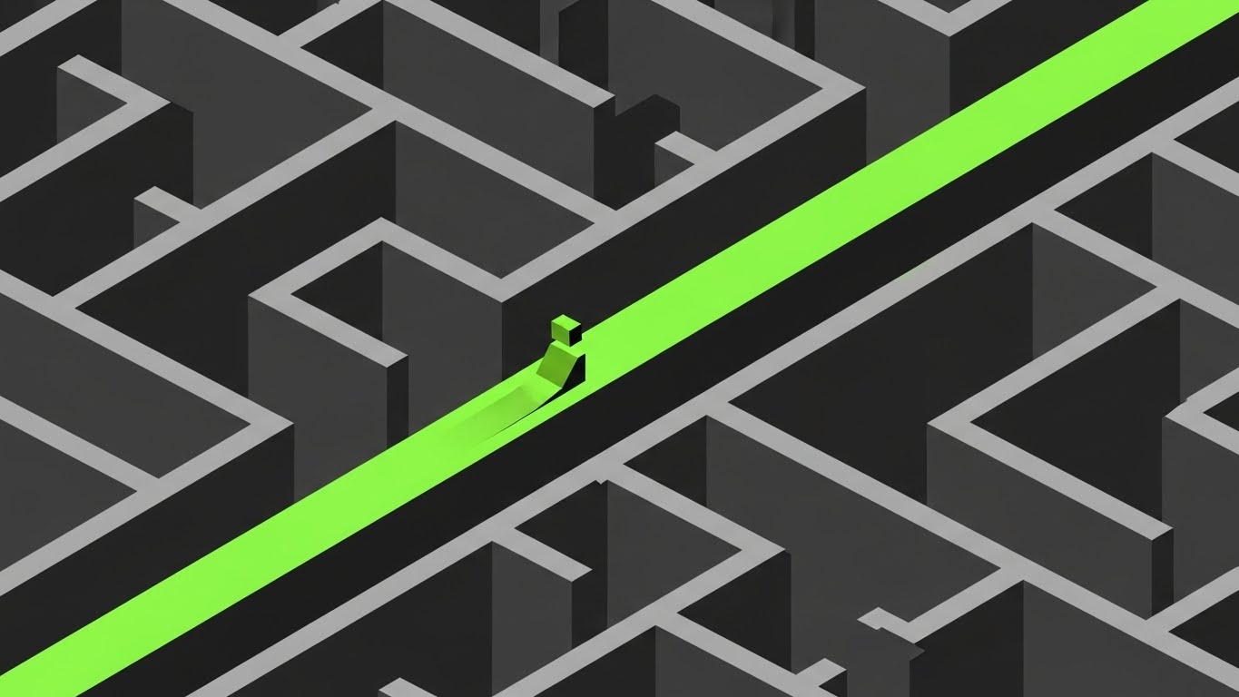
The Visual & Narrative Approach
This style employs "Isometric 2D Motion Design" to visualize the concept of efficiency. The scene depicts a complex, monochromatic grey maze representing the confusing, winding processes of competitors or legacy systems. A vibrant, electric lime green path cuts a straight, decisive line directly through the center, bypassing all dead ends and winding corridors. A simple abstract avatar glides effortlessly along this illuminated route. The narrative is one of "Bypassing Complexity."
Psychological Impact & KPI Focus
- Niche Psychology: One of the biggest barriers to adoption is the "Sunk Cost Fallacy"—the fear that switching providers will be a complex, navigational nightmare. This visual leverages the Cognitive Ease principle, signaling to the brain that the switch is not a maze, but a straight line.
- Operational Impact: This style addresses Drop-off Rates. It visually promises a reduction in user friction, directly correlating to higher conversion during the onboarding phase.
Strategic Implementation & Trade-offs
- Duration: 6–10 Seconds (Looping).
- Trade-off: This is a high-level conceptual metaphor. It is excellent for re-engaging visitors who left because they felt overwhelmed, but it does not show actual UI features.
Companies using similar video content -
Stripe Identity – Identity Verification – Simplifies user onboarding with a direct, easy path.
Passbase – Identity Verification – Streamlines identity checks, reducing user friction.
13. The Architecture of Trust
MOFU | ABM Awareness

The Visual & Narrative Approach
To appeal to the Enterprise buyer, this style utilizes a "Futuristic Neon/Dark Mode" aesthetic. Set against a deep matte black background, a glowing neon blue floor grid stretches to the horizon, establishing a sense of infinite scale. Rising from this grid are vertical columns of binary data and light, resembling a secure, skyscraper-like server architecture. The lighting is entirely self-emissive, creating high contrast that suggests robust, "Always-On" security.
Psychological Impact & KPI Focus
- Niche Psychology: Enterprise CISOs operate on paranoia; they need to see "fortifications." This visual language mimics the aesthetic of high-end cybersecurity command centers, triggering a feeling of Structural Integrity and competence.
- Operational Impact: This supports Account Based Marketing (ABM) by projecting "Enterprise-Grade" capability. It validates the Uptime and Data Sovereignty KPIs without needing a spreadsheet.
Strategic Implementation & Trade-offs
- Duration: 10–15 Seconds.
- Trade-off: The "Cyber-Grid" look is very tech-heavy. It resonates deeply with IT and Security teams but may feel too cold or abstract for a Marketing Director focused on user experience.
Companies using similar video content -
AuthID – Biometric Identity – Enterprise-grade, always-on biometric authentication infrastructure.
Thales – Digital Identity & Security – Robust, secure infrastructure for digital trust.
14. The Integration Bridge
MOFU | YouTube
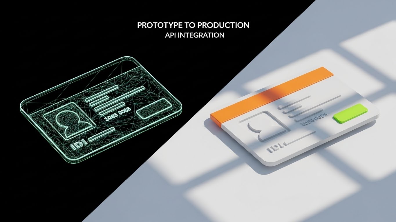
The Visual & Narrative Approach
This "Wireframe to Reality Transition" style is designed to visualize the ease of implementation. The frame is split or transitions over time: the left side shows a technical, blue-and-white wireframe blueprint of a digital ID card. As the eye moves right, this wireframe seamlessly fills in with texture and lighting to become a solid, realistic 3D render. This motion visualizes the journey from "Code" to "Customer," emphasizing how quickly a developer can turn your API documentation into a live product.
Psychological Impact & KPI Focus
- Niche Psychology: For Lead Developers and Product Owners, the anxiety is "Implementation Hell." This visual offers relief by demonstrating a seamless Prototype-to-Production pipeline. It validates the "Developer Experience" (DX).
- Operational Impact: Directly supports Organic Search for technical terms (e.g., "IDV SDK integration"). It signals a low Time-to-Live (TTL) for the integration.
Strategic Implementation & Trade-offs
- Duration: 6–12 Seconds.
- Trade-off: It is highly effective for technical audiences but may lack the emotional hook needed for C-Level brand building. Use it in documentation or technical walkthroughs.
Companies using similar video content -
Acuant – Identity Verification – Seamless API and SDK integration for developers.
Mitek – Mobile Verify – Easy integration for mobile identity verification solutions.
15. The Seal of Certainty
BOFU | Building Trust & Credibility

The Visual & Narrative Approach
Moving to the Bottom of the Funnel (BOFU), the aesthetic shifts to "Elegant 2D Line Art." A single, continuous thin line in metallic gold draws a complex, stylized rosette or seal on a premium cream background. The motion is slow and precise, mimicking the engraving of a bank note. This is not about speed; it is about Authority and Certification. It visually represents compliance standards like ISO 27001 or GDPR adherence.
Psychological Impact & KPI Focus
- Niche Psychology: At the decision stage, the buyer needs reassurance. This "Bank-Grade" aesthetic leverages Authority Bias, subconsciously linking the software to the stability of established financial institutions.
- Operational Impact: Perfect for Whitepapers and trust centers. It reinforces Regulatory Compliance capabilities, serving as a visual "stamp of approval" that reduces perceived risk.
Strategic Implementation & Trade-offs
- Duration: 5–8 Seconds (Subtle Loop).
- Trade-off: It is very static and conservative. It works best as a "visual anchor" in text-heavy documents rather than a standalone ad.
Companies using similar video content -
Onfido – Identity Verification – Provides regulatory compliance and trust through verification.
Signicat – Digital Identity – Ensures regulatory adherence with certified digital identity.
16. The Metric of Success
BOFU | ROI Justification
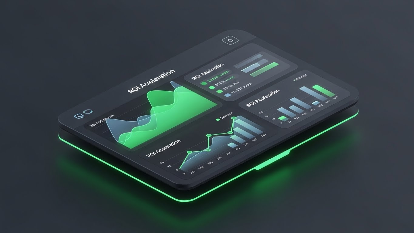
The Visual & Narrative Approach
This "Dark Mode UI Showcase" focuses purely on the numbers. The camera hovers over a high-fidelity interface floating in a charcoal void. Key data visualizations—area charts and bar graphs rendered in vibrant emerald green and slate blue—animate upwards, showing unmistakable growth. The depth is enhanced by subtle glass-like reflections on the UI panels. The narrative is "Verified Revenue," focusing on the financial outcome of stopping fraud.
Psychological Impact & KPI Focus
- Niche Psychology: The CFO doesn't care about the code; they care about the Return on Investment (ROI). This style removes the distraction of "features" to focus on "results." The upward green trends trigger the Reward System, validating the purchase.
- Operational Impact: Critical for Sales Decks. It visually substantiates claims about Fraud Prevention Savings and Revenue Recovery.
Strategic Implementation & Trade-offs
- Duration: 10–20 Seconds.
- Trade-off: It assumes the viewer understands the metrics. It requires voiceover or text overlays to contextulize exactly what is growing (e.g., "Approval Rates up 15%").
Companies using similar video content -
Sift – Digital Trust & Safety – Analytics dashboard showing fraud prevention ROI and growth.
Riskified – Fraud Prevention – Demonstrates revenue uplift through guaranteed approvals.
17. The Fortress of Compliance
BOFU | Risk Mitigation
The Visual & Narrative Approach
To visualize the abstract concept of defense, this style uses "Low-Poly 3D Modeling." The camera looks down on a stylized digital fortress with walls made of faceted, sharp blue and grey polygons. Inside, glowing cubes represent protected customer identities. The lighting is directional, casting sharp shadows that emphasize the solidity of the structure. The narrative is "Impenetrable Defense," simplifying complex cybersecurity measures into a clear architectural metaphor.
Psychological Impact & KPI Focus
- Niche Psychology: Fear of data breaches is a primary driver. This "Fortress" metaphor provides Psychological Safety, assuring stakeholders that their customer data is housed within a secure perimeter.
- Operational Impact: Supports content regarding Risk Mitigation. It effectively communicates Data Encryption and Access Control without needing to show lines of code.
Strategic Implementation & Trade-offs
- Duration: 10–15 Seconds.
- Trade-off: The "Low-Poly" look is stylized and slightly playful. Ensure the lighting remains dramatic (high contrast) to keep the tone serious enough for security software.
Companies using similar video content -
NICE Actimize – Financial Crime Platform – Digital fortress for proactive risk mitigation and compliance.
FICO – Fraud & Compliance – Secure solutions for data encryption and access control.
18. The Reality of Connection
BOFU | Reducing Implementation Friction

The Visual & Narrative Approach
This style creates a tactile sense of connection using "Photorealistic 3D Renders." The shot is a macro close-up of a silver, brushed-metal server cable connector about to plug into a pristine, backlit glass port. The shallow depth of field keeps the focus strictly on the point of connection. The "click" is implied. The narrative is "Plug-and-Play," metaphorically representing the ease of connecting your software via API or Webhook.
Psychological Impact & KPI Focus
- Niche Psychology: "Integration" is often a dirty word implying months of work. This tangible, physical metaphor leverages Tangibility Bias—making the abstract API connection feel as simple and physical as plugging in a cord.
- Operational Impact: Explicitly targets Implementation Friction. It helps convert technical buyers by promising a standardized, hassle-free onboarding process for their engineering teams.
Strategic Implementation & Trade-offs
- Duration: 5–8 Seconds.
- Trade-off: It is a metaphor for software, using hardware imagery. It must be paired with copy like "Seamless API Integration" to ensure the user doesn't think you are selling cables.
Companies using similar video content -
Ondato – KYC/AML Platform – Plug-and-play integration for hassle-free onboarding.
Incode – Omnichannel Identity – Seamless API connection for rapid implementation.
19. The Revenue Skyline
BOFU | The Economic Buyer
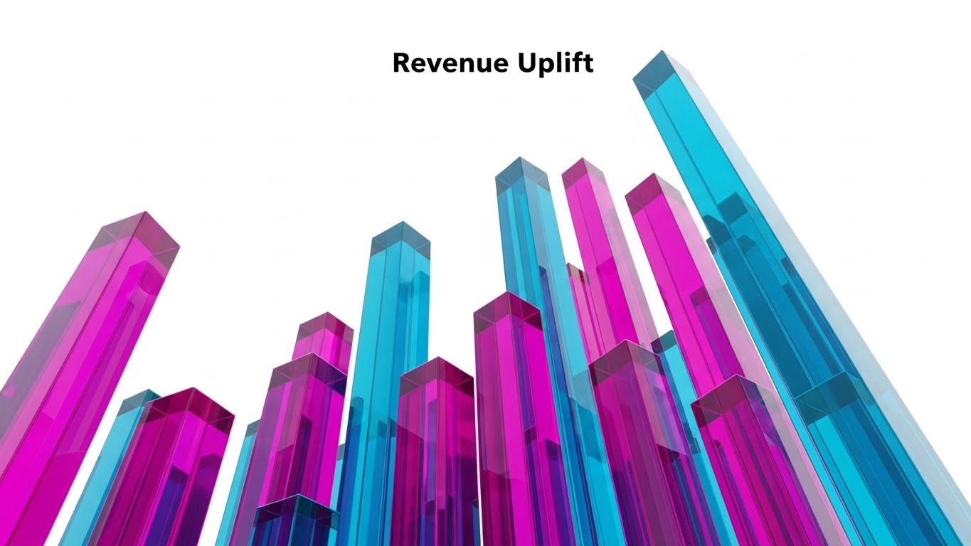
The Visual & Narrative Approach
Targeting the Economic Buyer, this "Dynamic Data Visualization" uses abstract 3D glass bars in magenta and cyan. The camera angle is an extreme "worm's-eye view," looking up at the bars as if they were skyscrapers soaring into a bright white sky. The glass texture refracts light, adding a sense of premium value. The narrative is "Unlimited Scale," suggesting that the verification platform is a foundation for massive vertical growth.
Psychological Impact & KPI Focus
- Niche Psychology: CEOs are driven by vision and scale. This grandiose perspective mimics the feeling of looking up at a city skyline, associating the software with Empire Building and success.
- Operational Impact: Visualizes Economic Uplift. It is perfect for closing arguments in annual reports or executive summaries, focusing on Customer Lifetime Value (LTV) expansion.
Strategic Implementation & Trade-offs
- Duration: 8–12 Seconds.
- Trade-off: It is purely inspirational. It provides no functional information. It serves to validate the value of the partnership, not the utility of the tool.
Companies using similar video content -
TransUnion – TruValidate – Drives executive revenue uplift through fraud prevention.
Experian – Identity & Fraud – Foundation for massive vertical growth and customer lifetime value.
20. The Face of Truth
BOFU | The Technical Buyer

The Visual & Narrative Approach
To close the technical sale, this style returns to the core technology with a "Holographic UI over 3D Render." A neutral, realistic mannequin head profile is overlaid with a complex, floating blue holographic mesh. Nodes on the mesh highlight key facial landmarks (eyes, nose bridge, jawline), visualizing the biometric mapping process. The background is a technical grey. The narrative is "Precision & Accuracy," proving the system sees what others miss.
Psychological Impact & KPI Focus
- Niche Psychology: The CIO's nightmare is a "False Positive" or a "Deepfake" spoof. This visual demonstrates the granular level of analysis, building confidence in the system's Sensitivity and Specificity.
- Operational Impact: Directly visualizes Liveness Detection. It is the ultimate proof point for Fraud Prevention Accuracy, distinguishing your solution from basic photo-matching tools.
Strategic Implementation & Trade-offs
- Duration: 10–20 Seconds.
- Trade-off: It is clinical and somewhat "Big Brother." It is excellent for proving technical competence to IT buyers but should be used carefully with consumer-facing audiences to avoid privacy concerns.
Companies using similar video content -
AU10TIX – Identity Intelligence – High-precision biometric mapping for liveness accuracy.
Regula – Document & Biometric – Advanced forensic analysis for fraud prevention accuracy.
21. The Pulse of Processing
BOFU | ROI Justification Hook
The Visual & Narrative Approach
This style utilizes a "Grid-Based Kinetic Montage" to visualize the sheer volume of successful verifications. The screen is divided into a 3x3 grid of simplified, square UI modules. Each module flashes with high-contrast red and white status icons—looping animations of "Verifying," "Scanning," and "Approved." The motion is synchronized to a fast, rhythmic beat, creating a sense of massive, simultaneous processing. The aesthetic is flat, clean, and aggressively efficient.
Psychological Impact & KPI Focus
- Niche Psychology: Late-stage buyers, particularly in gaming or crypto, worry about bottlenecks during peak events. This visual triggers the Social Proof heuristic through volume—implying that thousands of verifications are happening right now without a hitch.
- Operational Impact: Directly addresses Throughput Capacity and System Latency. It visually reassures the buyer that the platform is a high-performance engine capable of real-time scale, mitigating fears of downtime.
Strategic Implementation & Trade-offs
- Duration: 6–10 Seconds (Fast Loop).
- Trade-off: It is purely rhythmic and atmospheric. It does not allow the viewer to read specific text. Use it to create a feeling of power, not to explain detail.
Companies using similar video content -
Jumio – KYC & Identity – Rapid, high-volume processing for real-time verification.
Shufti Pro – Identity Verification – Aggressively efficient, high-throughput verification engine.
22. The Clarity of Risk
BOFU | Risk Mitigation Hook

The Visual & Narrative Approach
Transitioning to a "Glassmorphism" aesthetic, this visual focuses on clarity in chaos. A pristine, light-mode dashboard floats in a sunlit office environment. The UI layers are separated by soft depth, with a distinct, semi-transparent red "Security Alert" card hovering above the rest. The background data is blurred, forcing the eye to focus solely on the alert. The narrative is "Signal over Noise," demonstrating how the platform surfaces critical risks instantly.
Psychological Impact & KPI Focus
- Niche Psychology: Compliance teams are drowning in data. They crave Cognitive Ease. This visual promises a UI that prioritizes information for them, reducing the mental load of hunting for fraud signals.
- Operational Impact: Supports Risk Mitigation discussions. It visualizes the Mean Time to Detect (MTTD), showing how the interface helps analysts spot and resolve issues faster.
Strategic Implementation & Trade-offs
- Duration: 10–15 Seconds.
- Trade-off: The "clean" look relies on a simplified UI representation. Ensure your actual product UI isn't too cluttered, or this marketing asset will create a gap in expectation.
Companies using similar video content -
SEON – Fraud Prevention – Clean UI with clear alerts for proactive risk mitigation.
Fraugster – AI Fraud Prevention – Surfaces critical risks instantly with intuitive dashboards.
23. The Barrier Breaker
Onboard | Self-Serve Onboarding
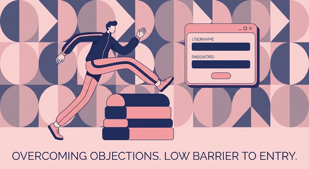
The Visual & Narrative Approach
For the onboarding phase, we shift to a "Playful Vector" style to lower user stress. A stylized character with exaggerated, fluid limbs is shown stepping effortlessly over a low, soft hurdle representing a login prompt. The palette uses calming navy and soft pink. The motion is bouncy and elastic. The narrative is "Effortless Entry," reframing the verification step not as a gate, but as a simple, small step in the user's journey.
Psychological Impact & KPI Focus
- Niche Psychology: New users often feel "Form Fatigue." This playful style leverages Affect Heuristic, using positive, bouncy motion to make the task feel smaller and easier than it actually is. It reduces intimidation.
- Operational Impact: Critical for Product-Led Growth (PLG) strategies. It aims to improve Activation Rate by visually promising that the setup process is low-friction and accessible.
Strategic Implementation & Trade-offs
- Duration: 5–8 Seconds (Looping).
- Trade-off: The abstract character style is less "corporate." It works best for end-user facing onboarding screens, but might feel too casual for a C-Level security presentation.
Companies using similar video content -
PassFort – KYC & AML – Playful, fluid onboarding to reduce user stress and form fatigue.
Credas – Digital ID & AML – Effortless entry for frictionless user onboarding.
24. The Automated Onboard
Onboard | Accelerating Time-to-Value

The Visual & Narrative Approach
This style uses "3D Parallax Depth" to visualize the onboarding workflow. Three UI cards float in a rich gradient void of orange and purple. As the camera pans, the cards separate in Z-space. The front card displays a setup checklist where items are being automatically checked off with satisfying green ticks. The lighting catches the edges of the cards, making them feel premium and tangible. The narrative is "Self-Driving Setup."
Psychological Impact & KPI Focus
- Niche Psychology: The "Day 1" fear is complexity. This visual triggers the Completion Bias—seeing the checkmarks creates a sense of progress and accomplishment before the user has even started. It promises a "Done-for-You" experience.
- Operational Impact: Targeted at Time-to-Value (TTV). It visually demonstrates that the heavy lifting is automated, encouraging users to complete the final mile of configuration.
Strategic Implementation & Trade-offs
- Duration: 10–15 Seconds.
- Trade-off: It depicts a linear, perfect process. Ensure your actual onboarding flow is this smooth, or the visual will promise a simplicity the product doesn't deliver.
Companies using similar video content -
KYC-Chain – Onboarding Platform – Automated setup velocity for quick time-to-value.
Blockpass – Digital Identity – Self-driving setup for streamlined user activation.
25. The Scale of Humanity
Onboard | Trial/Freemium User Activation
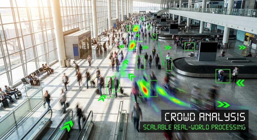
The Visual & Narrative Approach
This style combines "Hyper-lapse Footage" with "Motion Graphics Overlay." We see a high-angle, fast-motion shot of a bustling airport terminal. The crowd is a blur of motion, but sharp, static bright green bounding boxes track specific individuals, connected by data lines. The contrast between the organic, chaotic crowd and the precise, stable digital tracking visualizes "Order in Chaos."
Psychological Impact & KPI Focus
- Niche Psychology: For large enterprise clients, the fear is that the software will break under real-world load. This visual validates Scalability, proving the system works not just in a lab, but in messy, high-volume environments.
- Operational Impact: Supports Trial Activation for enterprise tiers. It visualizes Crowd Analysis capabilities and robust processing power, differentiating the tool from lightweight competitors.
Strategic Implementation & Trade-offs
- Duration: 10–20 Seconds.
- Trade-off: Use royalty-free stock carefully. Ensure the faces are blurred or unrecognizable to maintain a focus on privacy and compliance, preventing a "Big Brother" vibe.
Companies using similar video content -
Onfido – Identity Verification – Real-world scalability for high-volume environments.
IDology – ExpectID – Robust processing power for crowd analysis and verification.
26. The Hybrid Helper
Retain | Reducing Support Overhead

The Visual & Narrative Approach
To humanize the support experience, this style mixes "High-End Photography" with "Flat Vector Elements." We see an over-the-shoulder shot of a support agent (or user) looking at a screen. Popping out of the monitor are friendly, warm beige and blue speech bubbles containing simple icons like a lightbulb or a question mark. The vectors cast shadows on the "real" world, blending the two realities. The narrative is "Always-On Assistance."
Psychological Impact & KPI Focus
- Niche Psychology: When things break, users feel isolated. This visual leverages Empathy, assuring the user that there is a supportive mechanism (bot or human) ready to help. It reduces the "Tech Anxiety" of being stuck.
- Operational Impact: Directly targets Support Overhead. By visualizing the ease of finding answers (self-serve or chat), it encourages users to use the help widget rather than submitting a ticket, improving Deflection Rates.
Strategic Implementation & Trade-offs
- Duration: Static or Micro-Animation (GIF).
- Trade-off: It looks "cute" and accessible. It is perfect for Help Centers but less effective for high-stakes security pages.
Companies using similar video content -
Smile Digital Health – Identity Verification – Instant support resolution with hybrid overlay.
Data Zoo – Identity Verification – Always-on assistance for reducing support overhead.
27. The Look of Leadership
Retain | Reducing Churn

The Visual & Narrative Approach
This style utilizes "Photorealistic Gen AI Video" to create an ideal customer avatar. We see a close-up of a confident executive in a modern, glass-walled office at golden hour. He looks directly into the lens with a satisfied, calm expression. The background features subtle, out-of-focus data screens. This is not about the software; it is about the "State of Mind" of the person who bought the software.
Psychological Impact & KPI Focus
- Niche Psychology: Executives want to feel validated in their choices. This visual mirrors the Self-Image of the successful leader—calm, in control, and forward-looking. It reinforces the decision to renew the contract.
- Operational Impact: A powerful tool for Retention and Case Studies. It humanizes the success story, moving beyond cold metrics to show the feeling of operational stability.
Strategic Implementation & Trade-offs
- Duration: 5–10 Seconds (Looping Background).
- Trade-off: Gen AI can sometimes feel "uncanny." Ensure the render quality is top-tier to avoid breaking immersion.
Companies using similar video content -
AuthID – Biometric Identity – Cinematic portrait for executive decision validation and retention.
Prove – Identity Verification – Reinforces successful leadership choices with positive outcomes.
28. The Library of Logic
Retain | Knowledge Base & FAQ Videos

The Visual & Narrative Approach
This "Minimalist Isometric" style is designed for education. The visual features a structured grid of green cubes, each containing a white icon representing a knowledge topic (book, gear, magnifying glass). The cubes gently bob or rotate. The composition is orderly, clean, and encyclopedic. The narrative is "Structured Mastery," suggesting that all the answers are neatly packed and easy to find.
Psychological Impact & KPI Focus
- Niche Psychology: Users hate reading dense manuals. This visual style appeals to the desire for Order and Structure. It suggests that learning the software is a building-block process, not a chaotic deep dive.
- Operational Impact: Enhances the Knowledge Base. By making documentation look visually appealing and organized, you increase engagement with self-serve content, directly lowering Training Costs.
Strategic Implementation & Trade-offs
- Duration: 10–20 Seconds (Section Intro).
- Trade-off: It is functional and academic. It builds competence, not excitement. Use it for tutorials and FAQ headers.
Companies using similar video content -
Whitepages Pro – Identity Data – Structured intelligence for organized self-serve knowledge.
IDfy – Identity Verification – Organized knowledge base for structured mastery.
29. The Touch of Upgrade
Expand | Driving Upsell/Cross-sell
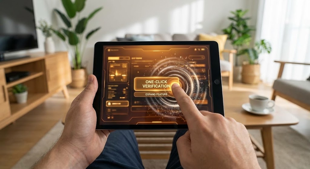
The Visual & Narrative Approach
To sell a new feature, we use a "First-Person Point of View (POV)" shot. We see a user's hands holding a tablet in a comfortable living room. A glowing, amber UI overlay (the "Upsell" feature) sits on the screen. As the user's thumb presses the "One-Click Verification" button, a digital ripple effect expands outward. The narrative is "Power at Your Fingertips," making the upgrade feel instant and tangible.
Psychological Impact & KPI Focus
- Niche Psychology: Upsells often feel like "sales pitches." This visual frames the upsell as a Utility Upgrade. By showing the feature in a "cozy" real-world context, it removes the corporate barrier and focuses on user convenience.
- Operational Impact: Drives Expansion Revenue. It is highly effective for in-app modals, visualizing the Feature Adoption moment as a simple, satisfying interaction.
Strategic Implementation & Trade-offs
- Duration: 6–10 Seconds.
- Trade-off: The "Amber" glow implies a premium or "Gold" tier. Use color psychology (Gold/Platinum) to subtly indicate that this is an upgraded capability.
Companies using similar video content -
Sardine – Fraud & Compliance – Tactile POV for seamless feature expansion and upsell.
Kount – Identity Trust Global Network – Drives upsell with intuitive, powerful feature adoption.
30. The Ecosystem of Success
Expand | Proactive Support/Announcements

The Visual & Narrative Approach
The final style is a "Mosaic Montage" of aspirational stock photography. Clean white borders separate a collection of images showing diverse teams collaborating, shaking hands, and celebrating in bright, sunlit offices. The motion is a slow, panning slide across the mosaic. The overall vibe is celebratory and human. The narrative is "Global Partnership," affirming that the customer is part of a winning community.
Psychological Impact & KPI Focus
- Niche Psychology: B2B buyers ultimately buy relationships. This style triggers Belongingness. It reaffirms that the vendor is not just a software provider, but a partner in their success. It builds emotional capital.
- Operational Impact: Supports Net Promoter Score (NPS) campaigns and newsletter announcements. It helps in Brand Advocacy, turning satisfied customers into vocal champions.
Strategic Implementation & Trade-offs
- Duration: 15–30 Seconds.
- Trade-off: It relies on stock imagery, which can feel generic. Curate the photos meticulously to ensure they look authentic and diverse, avoiding "cheesy" stock tropes.
Strategic Knowledge Base: The Visual Operations Doctrine
To transform these 30 visual styles from "marketing assets" into a "strategic operating system," we must look beyond the pixels. The following framework synthesizes the visual intelligence of this guide into three core operational segments. This is your blueprint for aligning visual strategy with business outcomes—a process where Advids acts as your architectural partner.
Strategic Alignment & Visual Architecture
The "Pre-Production" Strategy. Why we visualize and for whom.
- The Cognitive Load Audit: Before commissioning any video (Style 7 or 22), conduct an audit of the current text-based process. If a compliance manual takes 10 minutes to read, the goal of the visual is not just "engagement," but a measurable reduction in "Time-to-Comprehension."
- Role-Based Visual Mapping: Do not use the same visual language for a Developer (Style 14 - Wireframe) as you do for a CFO (Style 16 - Dark Mode UI). Map the Aesthetic Preference to the persona: Developers trust "blueprints," while Executives trust "clean dashboards."
- The "Glanceability" Standard: In operational environments (like the busy terminal in Style 25), visuals must be understood in <3 seconds. Avoid decorative elements in operational videos; prioritize high-contrast signals (Red/Green) over cinematic lighting.
- Brand Voice Consistency: Your "Abstract Motion" (Style 1) and your "Documentation Isometric" (Style 28) must share a color DNA. Inconsistent visual languages across the funnel create subconscious distrust.
- The Advids Strategic Audit: We recommend a "Visual Health Check" before production. Advids experts analyze your current asset library to identify gaps where text is failing to convert, prescribing the exact Visual Style Code needed to bridge that gap.
- Standardization vs. Customization: Use scalable, templated styles (Style 21) for recurring content like release notes. Reserve bespoke, high-end 3D (Style 6) for evergreen "Category Definition" assets that sit on your homepage for 12+ months.
- The Cross-Departmental Bridge: Use these visuals to unify terminology. If Sales sells "The Shield" (Style 1), Product must use that same "Shield" icon in the UI. Visual consistency enforces semantic consistency.
- Legacy System Integration: When replacing old systems, use "Transition Styles" (Style 9 - Split Screen) to visually acknowledge the user's past (manual chaos) and guide them to the future (digital order).
- Accessibility by Design: All motion graphics (especially Styles 2 and 5) must be tested for photosensitivity and color blindness (WCAG compliance). Trust is inclusive; your visuals must be too.
- The Mobile-First Mandate: 60% of B2B content is consumed on mobile. Styles with fine details (Style 8) must have a "Simplified View" variant for mobile screens to ensure the message isn't lost in the pixels.
Operational Adoption & Implementation
The "Deployment" Phase. How to embed visuals into the workflow.
- Overcoming "Big Brother" Anxiety: When introducing biometric monitoring, use empathy-driven visuals like "Style 10 (The Human Element)." Focus on the user's convenience (unlocking accounts fast) rather than the company's surveillance to improve end-user acceptance.
- The Micro-Learning Shift: Replace 50-page PDF manuals with a library of 30-second clips (Style 28). Embed these "Micro-Visuals" directly into the software's tooltips, delivering help exactly when the user is stuck.
- Just-in-Time Support: Integrate "Hybrid Helper" visuals (Style 26) into your 404 pages or empty states. A friendly visual intervention at a moment of error can prevent a Support Ticket from being filed.
- Gamification of Training: Use "Progress Bar" visuals (Style 24) in your learning center. Visualizing completion triggers dopamine, encouraging users to finish their certification or onboarding faster.
- Reducing Support Ticket Volume: There is a direct correlation between the quality of your "Onboarding" visuals (Style 23) and your Level 1 Support costs. Invest heavily in "Barrier Breaker" styles to deflect the most common "How-to" questions.
- Remote Onboarding: For global teams, use "Concept Metaphors" (Style 12 - The Maze) rather than text-heavy slides. Visuals transcend language barriers, ensuring a uniform understanding of compliance across all regions.
- Visual SOPs: Transform Standard Operating Procedures into "clean workflow" animations (Style 7). A 15-second loop of a process is remembered 60,000x faster than a text description of the same process.
- Feedback Loops: Use interactive video elements. After a "Style 24 (Parallax)" onboarding video, add a one-click "Was this helpful?" overlay. Use this data to refine your visual assets continuously.
- Scalable Localization: When producing global assets, avoid on-screen text in the video file. Use "Textless" master layers (Style 21) so that local teams can overlay translated copy without re-rendering the 3D assets.
- Leadership Communication: When presenting the quarterly roadmap to the Board, use "Style 19 (Revenue Skyline)." Executives respond to "Growth" visuals. Don't show them Jira tickets; show them the soaring glass towers of projected revenue.
Measuring Impact & Future-Proofing
The "ROI" Phase. Measuring success and looking ahead.
- Beyond "Views": Do not measure these videos by "Likes." Measure them by Action. Did the "Upsell POV" (Style 29) lead to a click? Did the "Support Helper" (Style 26) reduce ticket submissions?
- The "Idle Time" Metric: Monitor how long users spend "figuring out" a screen. Effective UI visualization (Style 22) should reduce this "Idle Time," a key indicator of improved User Experience (UX).
- Compliance Velocity: Track how quickly new regulatory updates are adopted. A "Kinetic Typography" announcement (Style 2) should lead to faster compliance sign-offs than a standard email update regarding new sanctions lists.
- Retention and Churn: High-quality "Success State" visuals (Style 30) reinforce the value of the partnership. Correlate engagement with these assets to your Net Dollar Retention (NDR) scores.
- The AI Visual Frontier: Prepare your asset library for Generative AI. By organizing your styles (Style 1-30), you create a dataset that can eventually train a custom AI model to generate "On-Brand" video content automatically.
- Scalability of Assets: Build a "Visual Component Library." The "Glass Shield" from Style 1 should be a reusable asset available to your Product Team, ensuring that Marketing and Product share the same 3D DNA.
- The Advids Partnership: Visual strategy is not a "one-and-done" project. As your platform evolves, your visual language must adapt. Advids serves as the long-term guardian of this "Visual Operating System," ensuring your assets scale without losing coherence.
- Benchmarking Success: Compare your "Visual Velocity" against competitors. If they are still using static screenshots (Style 9 - Left Side) and you are using "Kinetic UI" (Style 21), you possess a tangible competitive advantage in sales conversations.
- The ROI of Safety: For verification platforms, "Safety" is the product. Visualizing the "Hardware Level Trust" (Style 8) is not marketing; it is Evidence. This can significantly lower fraud losses and regulatory fines for your clients.
- Final Call to Innovation: Stop treating video as a "marketing add-on." In the age of AI and short attention spans, Video is Infrastructure. It is the primary interface through which your customers understand, trust, and value your technology. Invest in it with the same rigor you apply to your code.
Companies using similar video content -
TransUnion – TruValidate – Aspirational montage for global ecosystem success and partnership.
Equifax – Identity & Fraud – Celebratory mosaic affirming customer community and brand advocacy.
Author & Editor Bio


