
Introduction: The Architecture of Invisible Borders
In the high-stakes machinery of global logistics, the most formidable barriers are no longer physical walls or oceans; they are digital disconnects. For the modern Supply Chain Director, the difference between a seamless border crossing and a month-long port detention often lies in the invisible layer of data that accompanies every container. We are witnessing a fundamental shift where the "digital passport" of a shipment is becoming as critical as the cargo itself.
This evolution brings a unique challenge: How do you visualize the invisible? How do you demonstrate the value of a compliance algorithm, or the peace of mind provided by automated HS code classification? The answer lies in strategic visual communication. It is no longer enough to simply claim efficiency; you must show the mechanism of control.
The opportunity for software platforms in this space is immense. Recent industry analysis indicates that 20 to 40 per cent of customs delays are caused by avoidable classification or documentation errors. This statistic reveals a critical opportunity: the bottleneck is not logistical capacity, but information clarity. Conversely, the cost of clinging to legacy processes is rising exponentially. Compliance failures and associated data breaches are now estimated to cost $4.61 million on average—a staggering figure that highlights the severe opportunity cost of the status quo.
This guide serves as a strategic blueprint for visualizing that transformation. It explores distinct visual styles designed to bridge the gap between complex regulatory data and intuitive human understanding. By adopting these visual frameworks, your platform can move beyond explaining features to shaping the very perception of reliability and control in the global supply chain.
1. Isometric 2D Motion Design
TOFU | Brand Awareness
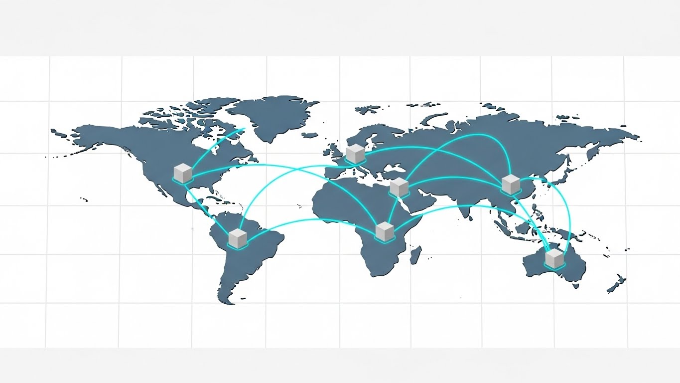
The Visual & Narrative Approach
This style utilizes a "God's-eye view" to impose order on the chaotic nature of global logistics. The slate grey continents and stark white oceans create a minimalist canvas that eliminates noise, allowing the viewer to focus entirely on the movement of value. Vivid cyan curved lines act as the "nervous system" of trade, connecting hubs with mathematical precision. The smooth gliding of geometric cubes represents packages, reinforcing the concept of frictionless trade. The narration should be crisp and rhythmic, mirroring the predictable flow of the grid.
Psychological Impact & KPI Focus
- Niche Psychology (Cognitive Load): Logistics managers often view global trade as a tangled web of risks. This orderly, grid-based aesthetic reduces cognitive load, psychologically reframing the world as a manageable, interconnected system.
- Operational Impact: It visually reinforces Network Visibility. By showing the entire globe on a single screen without realistic clutter, it subliminally promises total control over a dispersed supply chain.
Strategic Implementation & Trade-offs
- Best Use Case: Homepage hero backgrounds or "How It Works" overview videos.
- Duration: 20-30 seconds (Looping).
- Trade-off: Excellent for macro-level concepts but lacks the fidelity needed to show specific software UI details or granular document workflows.
Companies using similar video content -
Descartes Systems Group – Global Logistics Network – Visualizing global trade connectivity and order.
E2open – Global Trade Application Suite – Orchestrating multi-enterprise supply chains seamlessly.
project44 – Movement – Providing global real-time supply chain visibility.
2. Photorealistic 3D Renders
TOFU | Category Creation
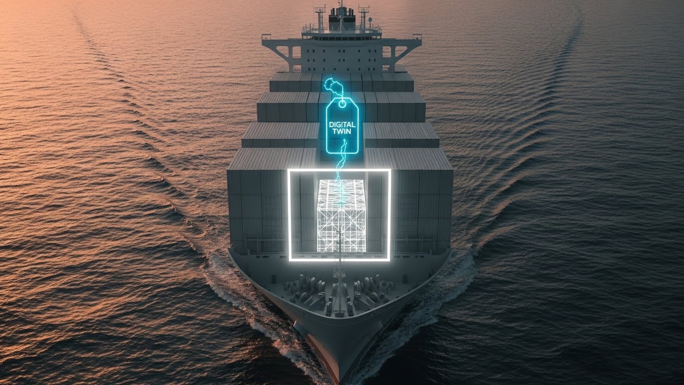
The Visual & Narrative Approach
This style bridges the gap between heavy industry and digital precision. The scene opens with a cinematic shot of a container ship bathed in warm rust orange sunlight—a nod to the physical reality of trade. The innovation appears in the digital overlay: a bright white wireframe and floating "Digital Twin" tag that locks onto a specific container. This visual contrast between the textured deep ocean blue water and the sharp, glowing data graphic perfectly articulates the concept of a "Cyber-Physical System."
Psychological Impact & KPI Focus
- Niche Psychology (Trust): The high fidelity of the water and ship signals "enterprise-grade" quality. It tells the viewer, "We understand the heavy, physical reality of your business."
- Operational Impact: It visualizes Real-Time Verification. The floating tag proves that the data travels with the cargo, addressing the fear of disconnected information.
Strategic Implementation & Trade-offs
- Best Use Case: High-budget brand anthems or product launches at trade shows.
- Duration: 45-60 seconds.
- Trade-off: High production cost and render times make it less agile for quick A/B testing or frequent updates compared to 2D styles.
Companies using similar video content -
WiseTech Global – CargoWise – Bridging physical logistics with digital precision.
FourKites – Real-Time Visibility Platform – Tracking physical assets with digital overlays.
Shippeo – Real-Time Transportation Visibility – Connecting physical shipments to live data.
3. 2D Line Art Animation
TOFU | Market Education
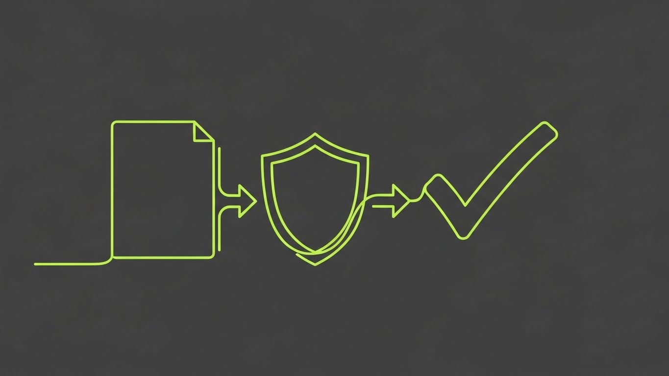
The Visual & Narrative Approach
Simplicity is the ultimate sophistication here. On a charcoal background, a single, continuous neon lime line traces the outline of a physical paper document. Without breaking the line, the shape fluidly morphs into a shield, and finally into a bold checkmark. The motion is smooth and precise, symbolizing the effortless transition from manual paperwork to automated security.
Psychological Impact & KPI Focus
- Niche Psychology (Metamorphosis): The morphing animation psychologically reinforces the ease of transformation. It suggests that moving to your platform is not a disruption, but a natural evolution.
- Operational Impact: The "Shield" to "Checkmark" transition visually defines Risk Mitigation. It promises that security and clearance are one continuous process.
Strategic Implementation & Trade-offs
- Best Use Case: LinkedIn feed ads where sound-off clarity is essential.
- Duration: 10-15 seconds.
- Trade-off: While elegant, it is abstract. It requires strong accompanying copy to ground the visual metaphor in specific business benefits.
Companies using similar video content -
Customs4trade – CAS – Automating customs declarations with seamless flow.
AEB International – Customs Management – Streamlining compliance from manual to digital.
GoCustoms – AI Customs Platform – Transforming paperwork into automated security.
4. Generative AI Cinematic Video
TOFU | Shaping Brand Perception
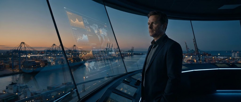
The Visual & Narrative Approach
This style sells the "Director's" dream. It features a Logistics Director in a futuristic control tower, bathed in moody midnight blue shadows. The key visual element is the reflection of amber and steel blue supply chain metrics in the glass, overlaying the physical port outside. This layering effect visually places the data between the decision-maker and the operation, symbolizing "Data-Driven Decision Making."
Psychological Impact & KPI Focus
- Niche Psychology (Aspiration): This speaks directly to the persona's ego. It validates their role not just as a manager, but as a visionary leader with Strategic Oversight.
- Operational Impact: The futuristic aesthetic signals Predictive Capability. It implies the platform solves problems before they happen.
Strategic Implementation & Trade-offs
- Best Use Case: OTT (Over-The-Top) streaming ads or keynote openers.
- Duration: 30-60 seconds.
- Trade-off: AI video generation can sometimes produce inconsistencies (artifacts). It requires careful curation to ensure the human elements appear natural.
Companies using similar video content -
Blue Yonder – Luminate Platform – Delivering AI-driven strategic supply chain insights.
Oracle – Global Trade Management – Providing executive control through predictive analytics.
SAP – Global Trade Services (GTS) – Offering enterprise-level strategic oversight.
5. Bold Kinetic Typography (Visual)
TOFU | Vertical Social Organic

The Visual & Narrative Approach
Energy is the currency of this style. Abstract, heavy geometric shapes representing text blocks—rendered in electric purple and bright yellow—scroll rapidly upwards diagonally. A pure white "stamp" graphic impacts the center of the frame with a visceral motion blur, symbolizing instant customs clearance. The background is a solid, vibrant purple that demands attention on a mobile screen.
Psychological Impact & KPI Focus
- Niche Psychology (Urgency): The fast-paced motion mimics the speed of automated processing. It triggers a dopamine response associated with "Task Completion."
- Operational Impact: It emphasizes Processing Velocity. The visual suggests the system can handle high-volume manifests without stalling.
Strategic Implementation & Trade-offs
- Best Use Case: TikTok or Instagram Reels to announce new feature updates or speed metrics.
- Duration: 6-10 seconds.
- Trade-off: It conveys zero technical detail. It is purely an attention hook to drive traffic to a more detailed asset.
Companies using similar video content -
CargoEZ – Customs Filing Software – Emphasizing rapid, hassle-free customs clearance.
NetCHB – Customs Brokerage Software – Highlighting instant processing velocity for brokers.
Track-POD – Delivery Management Software – Showcasing fast delivery and task completion.
6. 2D Character-Driven Story
TOFU | YouTube

The Visual & Narrative Approach
This style humanizes the software. It features a stylized female analyst in soft pastel blue clothing, smiling calmly at a monitor displaying a "Zero Errors" metric in coral. The texture is slightly grainy, giving it a premium editorial look rather than a cartoon feel. It creates a narrative of "Calm amidst Chaos," showing the emotional benefit of the software: a stress-free workday.
Psychological Impact & KPI Focus
- Niche Psychology (Empathy): It mirrors the user's daily reality but presents an idealized version. It addresses the anxiety of audits by highlighting the "Zero Errors" metric.
- Operational Impact: It focuses on Accuracy Rate and User Experience, promising that the software creates a better working environment.
Strategic Implementation & Trade-offs
- Best Use Case: Explainer videos detailing specific user workflows or success stories.
- Duration: 60-90 seconds.
- Trade-off: Characters must be designed professionally to avoid feeling "juvenile," which can alienate B2B buyers.
Companies using similar video content -
Magaya – Supply Chain – Humanizing workflows for stress-free logistics management.
VComply – Global Trade Compliance – Ensuring zero-error peace of mind for compliance.
SafetyCulture – iAuditor – Creating a relatable narrative for operational accuracy.
8. Lifestyle Stock with UI Overlay
MOFU | Driving Freemium/Trials

The Visual & Narrative Approach
This style grounds the software in reality. We see a high-quality photograph of a warehouse manager's hand holding a tablet. The background is a blurred, high-key warehouse in silver and white. Floating over the tablet screen is a "Glassmorphism" UI element in teal, displaying a "Duty Drawback Claimed: $4,500" notification. This connects the abstract software directly to physical operations and financial gain.
Psychological Impact & KPI Focus
- Niche Psychology (Context): It answers the question, "Where does this fit in my day?" It shows the software living in the warehouse, not just the back office.
- Operational Impact: The specific dollar amount ($4,500) visualizes Cost Recovery. It turns compliance from a cost center into a revenue generator.
Strategic Implementation & Trade-offs
- Best Use Case: Product pages or retargeting ads for mobile app features.
- Duration: 15-30 seconds.
- Trade-off: Requires high-quality stock. Poorly matched lighting between the stock photo and the UI graphic can undermine credibility.
Companies using similar video content -
Alvys – TMS – Grounding software in real-world warehouse operations.
CustomsNow – Duty Drawback Solution – Confirming tangible ROI on a mobile device.
Zebra Technologies – Savanna – Integrating data with field operations via mobile.
9. 3D X-Ray Visualization
MOFU | Product Differentiation

The Visual & Narrative Approach
A standard shipping container is rendered with translucent blue glass walls. Inside, we see glowing orange geometric blocks floating in suspension, representing unverified data. A horizontal scanning beam passes through the container, instantly turning the blocks into a secure bright white. This visualizes the concept of "Deep Tier Screening"—seeing what isn't visible on the surface.
Psychological Impact & KPI Focus
- Niche Psychology (Transparency): This style is a metaphor for "Seeing the Unseen." It reassures the viewer that the software catches errors (the orange blocks) that the human eye might miss.
- Operational Impact: It defines Automated Auditing. The scanning beam implies a systematic, machine-speed review of every line item.
Strategic Implementation & Trade-offs
- Best Use Case: Feature spotlights on compliance screening or audit features.
- Duration: 15-20 seconds (Vertical or Square).
- Trade-off: Can feel "clinical." It emphasizes technical capability over human benefit, so it is best used for technical audiences.
Companies using similar video content -
Thomson Reuters – ONESOURCE Global Trade – Revealing deep-tier compliance inspection.
MIC Customs Solutions – MIC-CUST – Visualizing automated auditing and data screening.
Traydstream – Trade Finance Platform – Inspecting complex trade documents for compliance.
10. Clean UI Workflow (Light Mode)
MOFU | Feature Education
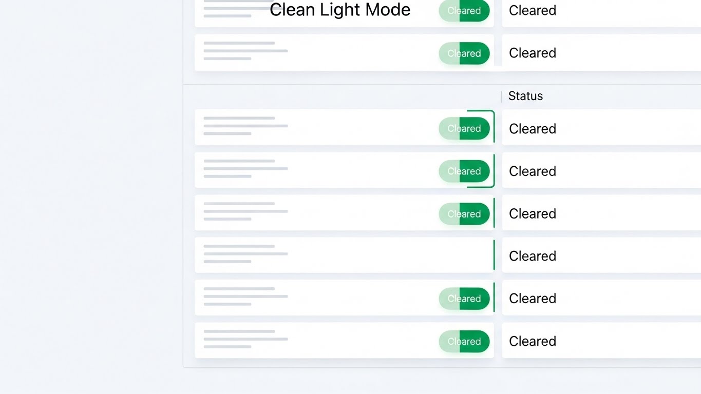
The Visual & Narrative Approach
A direct, front-facing view of the software interface in a "Clean Light Mode" aesthetic. The palette is pure white and light grey, minimizing distraction. The hero element is a column of shipment statuses, each marked with a crisp emerald green pill-shaped "Cleared" tag. Soft drop shadows create depth. The focus is purely on the repetition of the "Green" status, signaling success.
Psychological Impact & KPI Focus
- Niche Psychology (Cognitive Ease): By removing specific text and focusing on the green status pills, the visual reduces cognitive load. It communicates "Status: Good" instantly.
- Operational Impact: It showcases Exception-Based Management. By showing a list of cleared items, it implies the software has already handled the heavy lifting.
Strategic Implementation & Trade-offs
- Best Use Case: Email newsletters, onboarding walkthroughs, or feature deep-dives.
- Duration: 30-60 seconds.
- Trade-off: It is not emotive. It relies on the viewer craving order and simplicity, making it best for audiences already considering the solution.
Companies using similar video content -
E2open – Global Trade Application Suite – Presenting frictionless status verification.
PartnerLinQ – Supply Chain Connectivity – Showcasing clear, organized digital workflows.
Logi-Sys – Cloud ERP – Displaying simplified, exception-based management.
11. 2D Graphics Over Live Action
MOFU | Building Trust & Credibility

The Visual & Narrative Approach
This style anchors digital security in human interaction. We see a high-quality, close-up photographic shot of two professionals shaking hands in a boardroom, bathed in warm beige and professional navy tones. Floating above this physical connection are stylized 2D vector shield icons in metallic gold, outlined in white. These digital assets are motion-tracked to the handshake, moving naturally with the characters. The visual metaphor is clear: the technology doesn't replace the relationship; it insulates it from risk.
Psychological Impact & KPI Focus
- Niche Psychology (Assurance): In customs brokerage, trust is the currency. This style addresses the fear that automation will depersonalize critical service relationships. It reassures the viewer that the software enhances, rather than severs, the human connection.
- Operational Impact: It visualizes Vendor Reliability. The shields represent the invisible layer of compliance that protects both the importer and the broker during every transaction.
Strategic Implementation & Trade-offs
- Best Use Case: "About Us" pages or Partnership Program landing pages.
- Duration: 15-30 seconds.
- Trade-off: Reliance on stock footage can feel generic if not carefully selected. The tracking of the 2D elements must be flawless to maintain a premium feel.
Companies using similar video content -
Livingston International – Customs Brokerage – Securing partnerships with digital trust overlays.
Expeditors – Global Logistics – Enhancing human connections with digital security.
BDP International – Supply Chain Solutions – Building trust through integrated service visuals.
12. Split Screen: Optimized Reality and UI
MOFU | Competitive Displacement

The Visual & Narrative Approach
This is a classic "Before & After" structured for instant comprehension. The left half of the screen depicts the "Old Way"—a chaotic pile of physical manifests and red stamps, graded in desaturated grey to imply obsolescence. The right half displays the "New Way"—a clean, organized digital interface on a vivid green background. A wiper transition moves from left to right, physically erasing the mess and replacing it with the digital grid. The contrast is sharp, immediate, and visceral.
Psychological Impact & KPI Focus
- Niche Psychology (Cognitive Relief): It triggers a desire for organization. Logistics managers are often drowning in documentation; this visual offers an immediate psychological escape valve from that stress.
- Operational Impact: It highlights Efficiency Gains. The visual proves that digitizing the workflow doesn't just change the medium; it fundamentally organizes the chaos.
Strategic Implementation & Trade-offs
- Best Use Case: Retargeting ads on Facebook/Instagram or "Why Switch" website sections.
- Duration: 6-12 seconds.
- Trade-off: It is a binary comparison that lacks nuance. It works best for audiences still using manual processes, rather than those switching from a competitor software.
Companies using similar video content -
AEB International – Customs Management – Contrasting manual paperwork with digital efficiency.
Customs4trade – CAS – Demonstrating transformation from chaos to organized compliance.
Shipthis – Freight Forwarding Software – Erasing old methods with new digital order.
13. Wireframe to Reality Transition
MOFU | Competitive Switcher

The Visual & Narrative Approach
This style appeals to the "builders" of the supply chain. The scene begins as a 3D blueprint blue wireframe of a warehouse, representing the planning phase or a compliance framework. As the eye moves across the frame, a glowing scan line fills the wireframe in, transforming it into a solid, photorealistic concrete grey and white structure. This metamorphosis visualizes the concept of "Implementation"—turning a compliance strategy into a solid, operational reality.
Psychological Impact & KPI Focus
- Niche Psychology (Foundational Strength): It positions the software not as an add-on, but as infrastructure. It speaks to the CTO or Operations Director who views software as the structural skeleton of the business.
- Operational Impact: It visualizes Scalability. The wireframe suggests that the system is engineered and architected, capable of supporting growth without collapsing.
Strategic Implementation & Trade-offs
- Best Use Case: Implementation pages or "Onboarding" explainers.
- Duration: 15-20 seconds.
- Trade-off: It is abstract. To be effective, the narration must clearly connect the "building" metaphor to specific software setup steps (e.g., API integration).
Companies using similar video content -
SAP – Global Trade Services (GTS) – Building solid compliance infrastructure from blueprints.
3rdWave – Supply Chain Management – Visualizing implementation of robust logistics architecture.
Oracle – Global Trade Management – Transforming strategic plans into operational reality.
14. Generative AI Realistic Character Video
MOFU | Thought Leadership

The Visual & Narrative Approach
To establish authority without the logistics of a live film crew, this style utilizes a high-fidelity AI-generated persona. A confident female executive in a professional navy blazer stands against a soft-focus background of a logistics conference, accented with soft gold lighting. She speaks directly to the camera, utilizing micro-expressions that convey expertise and empathy. This "virtual expert" delivers high-level insights on regulatory trends, positioning the brand as a knowledge leader.
Psychological Impact & KPI Focus
- Niche Psychology (Peer Validation): B2B buyers buy from experts. This style simulates a peer-to-peer conversation, satisfying the need for consultative advice rather than a hard sell.
- Operational Impact: It communicates Regulatory Intelligence. The content implies that the platform is backed by deep industry knowledge, not just code.
Strategic Implementation & Trade-offs
- Best Use Case: LinkedIn thought leadership posts or newsletter introductions.
- Duration: 45-90 seconds.
- Trade-off: Authenticity is key. If the AI lip-sync or eye movement is unnatural (uncanny valley), it can damage trust. Scripts must be high-value and educational.
Companies using similar video content -
Thomson Reuters – ONESOURCE Global Trade – Delivering expert guidance on regulatory trends.
MIC Customs Solutions – Global Trade Content Service – Positioning as an authority figure in compliance.
EY – Trade Finance Compliance – Providing thought leadership through virtual experts.
15. Minimalist Flat 2D Vector
BOFU | Overcoming Objections

The Visual & Narrative Approach
When addressing security objections, clarity is paramount. This style uses clean, flat geometry on a soft mint background to simplify complex security protocols. A symmetrical dark grey padlock clicks open, morphing its shackle into a welcoming pale pink doorframe. The motion is fluid and "bouncy," suggesting that while the system is secure (the lock), it remains accessible and user-friendly for authorized personnel (the door).
Psychological Impact & KPI Focus
- Niche Psychology (Safety): It disarms the fear that "secure" means "difficult to use." The soft color palette serves to lower blood pressure and anxiety around data access control.
- Operational Impact: It visualizes User Access Control. It simplifies the concept of Single Sign-On (SSO) or multi-factor authentication into a friendly interaction.
Strategic Implementation & Trade-offs
- Best Use Case: Security compliance pages (SOC2) or FAQ sections.
- Duration: 5-10 seconds (Looping).
- Trade-off: It can feel too playful for extremely serious topics like data breaches. It is best reserved for "usability" aspects of security.
Companies using similar video content -
Zonos – Cross-Border Commerce – Simplifying accessible security for international trade.
VComply – Compliance & Risk Management – Disarming fears around data access control.
Secureframe – Compliance Automation – Representing user-friendly security protocols.
16. Dark Mode UI Showcase
BOFU | Risk Mitigation
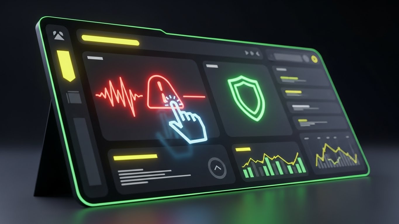
The Visual & Narrative Approach
This style dramatizes the platform's vigilance. In a sleek matte black and charcoal environment, the UI glows with neon accents. A pulsing neon red alert icon (signaling a compliance risk or denied party match) dominates the screen. A cursor interacts with it, and the alert instantly transforms into a stable neon green shield. The high contrast emphasizes the software's ability to detect signals in the noise.
Psychological Impact & KPI Focus
- Niche Psychology (Vigilance): Dark mode is often associated with "Command Centers" and elite monitoring tools. It appeals to the user's desire to be the "sentinel" of their supply chain.
- Operational Impact: It focuses on Exception Management. The visual hierarchy trains the eye to see that the software highlights problems (red) and provides solutions (green).
Strategic Implementation & Trade-offs
- Best Use Case: Feature pages for Risk Management or Denied Party Screening.
- Duration: 10-15 seconds.
- Trade-off: While striking, it may not reflect the actual default "day mode" of the software. It should be framed as a "Risk View" or specific feature set.
Companies using similar video content -
Descartes Systems Group – Denied Party Screening – Highlighting immediate threat neutralization.
Panjiva – Supply Chain Intelligence – Dramatizing vigilance in risk analysis.
E2open – Global Knowledge – Showcasing detection of compliance risks.
17. Dynamic Data Visualization
BOFU | ROI Justification

The Visual & Narrative Approach
Here, we visualize the financial argument. In a clean white studio, vertical bar charts rise from the floor. However, instead of abstract blocks, the bars are composed of stacked, gleaming gold coins and forest green cubes. The camera looks up from a low angle, making the growth feel monumental. This literalizes the concept of "Duty Drawback" or "Landed Cost Savings"—showing that the data is actually money.
Psychological Impact & KPI Focus
- Niche Psychology (Greed/Gain): For the CFO or financial buyer, abstract percentages are less compelling than the imagery of hard currency. This triggers the "Reward" center of the brain.
- Operational Impact: It visualizes Cost Savings. It moves the conversation from "compliance as a cost" to "compliance as a profit center."
Strategic Implementation & Trade-offs
- Best Use Case: Sales decks, ROI calculators, or case study videos.
- Duration: 10-20 seconds.
- Trade-off: It is overtly transactional. It must be backed by real data to avoid looking like a "get rich quick" scheme.
Companies using similar video content -
MIC-CUST – US Duty Drawback – Visualizing tangible financial growth through refunds.
CustomsNow – Duty Drawback Solution – Stacking coins to represent cost recovery.
OCR Global Trade Management – Duty Drawback Software – Demonstrating financial gains from compliance.
18. Aspirational Stock Montage
BOFU | Economic Buyer

The Visual & Narrative Approach
This style sells the result of the purchase: success. We see a low-angle hero shot of a diverse team of executives in a modern glass office, bathed in executive blue and silver light. They look up at an off-camera screen with expressions of satisfaction and confidence. Reflections of abstract world map data in the glass behind them subtly link their success to global trade mastery.
Psychological Impact & KPI Focus
- Niche Psychology (Status): It appeals to the buyer's self-image. It validates that choosing this platform places them in the league of modern, forward-thinking leadership.
- Operational Impact: It visualizes Strategic Alignment. It suggests that the software aligns with high-level corporate goals, not just tactical daily tasks.
Strategic Implementation & Trade-offs
- Best Use Case: Email signatures, proposal covers, or "Success Stories" landing pages.
- Duration: Static Image or Slow Motion Video (5-10s).
- Trade-off: It is generic "corporate" imagery. To work, it must be paired with specific, hard-hitting testimonials or metrics.
Companies using similar video content -
E2open – Global Trade Application Suite – Portraying executive vision and strategic alignment.
Oracle – Global Trade Management – Appealing to buyers' self-image of leadership.
Blue Yonder – Luminate Platform – Visualizing success and forward-thinking leadership.
19. Abstract 3D AI Visualization
BOFU | Technical Buyer

The Visual & Narrative Approach
For the IT decision-maker, beauty lies in architecture. This style features thousands of neon blue nodes connected by thin glowing lines against a deep purple void. The nodes congregate to form a solid, impenetrable sphere. The aesthetic borrows from cybersecurity and blockchain imagery, communicating "Encryption," "Redundancy," and "Network Integrity" without using a single word.
Psychological Impact & KPI Focus
- Niche Psychology (Security): The CIO's primary fear is a data breach. The "closed sphere" visual metaphorically represents a fortress, alleviating anxiety about data leakage or API vulnerability.
- Operational Impact: It visualizes Data Integrity. It confirms that while the system connects to the world (nodes), the core data remains protected and unified.
Strategic Implementation & Trade-offs
- Best Use Case: Technical documentation, API integration pages, or security whitepapers.
- Duration: 15-30 seconds (Looping background).
- Trade-off: It is highly technical and abstract. It will likely bore a non-technical user (e.g., a Compliance Manager) who cares more about workflow than encryption topology.
Companies using similar video content -
project44 – Movement – Representing data sovereignty and network integrity.
FourKites – Real-Time Visibility Platform – Communicating encrypted data flow and security.
IBM – Blockchain for Supply Chain – Visualizing secure, interconnected data nodes.
20. 3D Parallax UI Presentation
BOFU | Sales Cycle Acceleration

The Visual & Narrative Approach
This style brings the "chain reaction" of automation to life. Floating UI cards, rendered in sky blue and white with orange action buttons, are arranged in a "domino" formation in a 3D space. As the first card tips (representing an initial data entry or declaration), it triggers a rapid, satisfying cascade of the subsequent cards. This creates a powerful visual metaphor for "One Click, Multiple Actions."
Psychological Impact & KPI Focus
- Niche Psychology (Ease): It visualizes the "set it and forget it" dream. It promises that a single human action can trigger a complex sequence of automated tasks, reducing manual labor.
- Operational Impact: It visualizes Workflow Automation. It shows the cascading value of the software—how an HS code classification automatically triggers a duty calculation, which triggers a filing.
Strategic Implementation & Trade-offs
- Best Use Case: Cold email GIFs or demo follow-up emails.
- Duration: 5-8 seconds (Looping).
- Trade-off: It requires the UI design to be simplified for the 3D effect. If the actual software is text-heavy, this style might over-promise on "simplicity."
Companies using similar video content -
Alpega TMS – Transportation Management System – Showcasing automated workflow sequences.
Logi-Sys – Cloud ERP – Illustrating cascading value of integrated modules.
Shipthis – Freight Forwarding Software – Bringing automated chain reactions to life.
21. 2D Animation & UI Composition
BOFU | Demo Requests

The Visual & Narrative Approach
This style abandons subtlety for kinetic energy. Against a dynamic geometric background, a stylized, oversized 2D hand—rendered in bright yellow with bold black outlines—enters the frame to decisively press a floating 3D button. Upon contact, the button compresses and emits "sparkles" and motion lines, visualizing the "click" as a satisfying physical event. It transforms the mundane act of "booking a demo" into a rewarding, tactile interaction.
Psychological Impact & KPI Focus
- Niche Psychology (Gamification): In the final stages of the decision cycle, hesitation is the enemy. This playful, high-impact visual triggers a dopamine response, mimicking the satisfaction of a game interaction to overcome "form fatigue."
- Operational Impact: It targets Conversion Rate (CTR). The unambiguous visual directive ("Press Here") reduces cognitive friction, driving the user directly to the scheduling action.
Strategic Implementation & Trade-offs
- Best Use Case: Retargeting display ads or "Exit Intent" pop-ups on pricing pages.
- Duration: 3-5 seconds (Looping).
- Trade-off: It is purely functional and lacks "Enterprise" gravitas. It works best as a conversion hook, not a brand builder.
Companies using similar video content -
Freightify – Freight Rate Management – Driving immediate action for demo requests.
GoFreight – Freight Forwarding Software – Transforming booking into a tactile, rewarding event.
Logitude World – Freight Forwarding Software – Encouraging demo sign-ups with kinetic energy.
22. Isometric 3D Workflow
Onboarding | Implementation Friction

The Visual & Narrative Approach
Implementation anxiety is a major barrier to adoption. This style demystifies the setup process using a pristine, detailed isometric miniature. We see an industrial grey factory floor connected to a floating safety orange cloud server by a transparent glass pipe. Small, cubic "data packages" travel visibly up the pipe, flowing smoothly from the physical machinery to the digital cloud. The lighting is bright and even, making the complex process of API integration look as simple, sturdy, and reliable as plumbing.
Psychological Impact & KPI Focus
- Niche Psychology (Manageability): "Cloud Integration" often sounds abstract and risky to Operations Directors. Visualizing it as a physical pipe grounds the concept in physics, making it feel controllable and leak-proof.
- Operational Impact: It visualizes Data Ingestion. It reassures the IT team that the connection between their on-premise ERP and your SaaS platform is direct and architecturally sound.
Strategic Implementation & Trade-offs
- Best Use Case: "Getting Started" guides, Implementation documentation, or API landing pages.
- Duration: 15-20 seconds.
- Trade-off: The "toy-like" aesthetic must be paired with technical copy to ensure it doesn't trivialize the security protocols involved.
Companies using similar video content -
SAP – Global Trade Services (GTS) – Demystifying ERP integration with factory-to-cloud pipes.
Descartes Systems Group – Customs & Regulatory – Visualizing frictionless data ingestion.
One Network Enterprises – Multi-Party Network – Showing seamless integration of complex systems.
23. Rapid UI Feature Montage
Onboarding | Self-Serve Onboarding
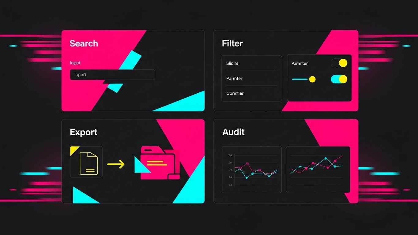
The Visual & Narrative Approach
This style communicates breadth and speed. We see a split-screen grid of four distinct UI screens (Search, Filter, Export, Audit) pulsing with vibrant magenta, cyan, and yellow accents. Speed lines and motion blur effects frame the edges, suggesting high-velocity transitioning. The narrative visualizes the platform not just as a tool, but as a complete ecosystem. It shows that for every problem (searching, auditing, filing), there is a dedicated, ready-to-use interface waiting.
Psychological Impact & KPI Focus
- Niche Psychology (Competence): New users often feel overwhelmed. This dense visual signals that the platform is robust and feature-rich, boosting confidence during the steep learning curve of onboarding.
- Operational Impact: It drives Feature Adoption. By rapidly flashing multiple modules, it raises awareness of tools the user might not have discovered yet (e.g., "Audit").
Strategic Implementation & Trade-offs
- Best Use Case: Welcome emails for new users or "What's New" platform updates.
- Duration: 10-15 seconds.
- Trade-off: It moves too fast to teach how to use the features. It is a "teaser" to encourage exploration, not a tutorial.
Companies using similar video content -
WiseTech Global – CargoWise – Communicating comprehensive toolset with vibrant grids.
Magaya – Supply Chain – Highlighting breadth of features with rapid transitions.
PartnerLinQ – Supply Chain Connectivity – Showcasing a complete ecosystem of tools.
24. Hyper-lapse Stock Footage with Data
Onboarding | Time-to-Value

The Visual & Narrative Approach
This style contrasts physical stagnation with digital speed. Using a hyper-lapse technique, the physical world (trucks, cranes) becomes a blur of red and white light streaks, while the shipping containers remain static and sharp. Overlaid on the containers are crisp, pure white data widgets ticking through "Customs Hold" to "Released" in seconds. It visually proves that while the physical logistics are slow, the data processing is instantaneous.
Psychological Impact & KPI Focus
- Niche Psychology (Pacing): It validates the logistics manager's perception that "time is money." The rapid movement of the data against the heavy machinery creates a sense of accelerated progress.
- Operational Impact: It visualizes Cycle Time Reduction. It demonstrates that the software waits for no one, ensuring the bottleneck is never digital.
Strategic Implementation & Trade-offs
- Best Use Case: Social media ads targeting "Port Congestion" keywords.
- Duration: 6-10 seconds.
- Trade-off: Requires high-quality hyper-lapse footage. If the tracking of the data widgets slips, the illusion of integration is broken.
Companies using similar video content -
project44 – Movement – Contrasting physical port stagnation with instant data clearance.
FourKites – Real-Time Visibility Platform – Proving cycle time reduction with data overlays.
Shippeo – Real-Time Transportation Visibility – Visualizing accelerated progress against physical delays.
25. Macro UI Micro-Interactions
Retention | Reducing Support Overhead

The Visual & Narrative Approach
This style zooms in—extreme close-up. We see a macro view of the pixel texture of a screen. The hero is the cursor hovering over a "Lifebuoy" support icon, rendered in soft, welcoming lavender and white. The depth of field creates a beautiful blur (bokeh) in the background, isolating the icon as a beacon of help. The click animation is soft and responsive. It reframes "Support" not as a frustrating ticket process, but as an immediate, accessible safety net.
Psychological Impact & KPI Focus
- Niche Psychology (Safety): Users hesitate to ask for help because they fear looking incompetent or waiting in queues. This gentle, soft-focus visual removes the friction and anxiety associated with seeking assistance.
- Operational Impact: It aims to reduce Support Ticket Escalation by encouraging users to use in-app help (the lifebuoy) rather than calling a rep.
Strategic Implementation & Trade-offs
- Best Use Case: "Did you know?" emails or in-app tooltips.
- Duration: 3-5 seconds (Looping).
- Trade-off: It is very specific. It only works to highlight specific UI buttons or small interaction details.
Companies using similar video content -
Track-POD – Delivery Management Software – Highlighting self-service support with a lifebuoy icon.
SafetyCulture – iAuditor – Reducing support overhead through in-app help.
Zonos – Cross-Border Commerce – Focusing on accessible, gentle support interactions.
26. Abstract 2D Motion Graphics
Retention | Reducing Churn

The Visual & Narrative Approach
To retain customers, you must remind them of the feeling of smooth operations. This style uses abstract, liquid shapes in teal and aqua that morph continuously into a perfect circle against a marine blue background. There are no hard edges, no stops, and no friction. It is a visual meditation that subconsciously reinforces the platform's reliability and "flow state."
Psychological Impact & KPI Focus
- Niche Psychology (Harmony): Supply chains are chaotic; the software should be the antidote. This soothing visual induces a state of calm, associating the platform with "Order" and "Peace."
- Operational Impact: It targets User Sentiment. By using this visual during loading screens or success states, you subtly improve the user's emotional relationship with the software.
Strategic Implementation & Trade-offs
- Best Use Case: Loading screens, success confirmations, or screensaver mode.
- Duration: Looping.
- Trade-off: It is purely decorative. It conveys no data, only mood.
Companies using similar video content -
E2open – Global Trade Application Suite – Reinforcing operational continuity with fluid loops.
Kinaxis – Supply Chain Planning – Inducing calm and harmony through continuous flow.
Blue Yonder – Luminate Platform – Associating the platform with order and peace.
27. Abstract 2D Flat Vector Organic
Retention | Website Visitor Re-engagement

The Visual & Narrative Approach
This style reminds the user they are part of a larger, valuable network. Metallic silver spheres are connected by glossy white tubes to form a complex, molecular structure that rotates slowly. The background is a professional studio blue. It visualizes the "Network Effect"—showing that the user's data is connected to customs authorities, carriers, and suppliers in a unified, living organism.
Psychological Impact & KPI Focus
- Niche Psychology (Belonging): It reinforces the idea that leaving the platform means disconnecting from a vital ecosystem. It creates a "FOMO" (Fear Of Missing Out) regarding the network intelligence.
- Operational Impact: It supports Renewal Rates. It visualizes the hidden value of the platform's connectivity, which is often invisible in daily tasks.
Strategic Implementation & Trade-offs
- Best Use Case: Account renewal emails or login pages.
- Duration: 10-15 seconds.
- Trade-off: It is abstract. It needs copy like "Stay Connected to the Global Trade Network" to land the message.
Companies using similar video content -
Descartes Systems Group – Global Logistics Network – Visualizing ecosystem value with interconnected spheres.
Infor Nexus – Supply Chain Network – Reminding users they are part of a larger network.
TradeWindow – Trade and Logistics Platform – Representing a unified, living organism of trade.
28. Holographic UI over 3D Render
Expansion | Feature Adoption

The Visual & Narrative Approach
To upsell premium features, you must sell the "future." A realistic, high-end office desk is the stage. Projecting upwards from the surface is a luminous, semi-transparent electric blue and magenta hologram of a data chart or globe. The aesthetic is "Iron Man" technology—desirable, advanced, and exclusive. It positions the new feature (e.g., Predictive Analytics) not as a tool, but as a superpower.
Psychological Impact & KPI Focus
- Niche Psychology (Status/Aspiration): It appeals to the user's desire to be on the cutting edge. It frames the upsell as an upgrade to their professional capability.
- Operational Impact: It drives Feature Adoption. The "cool factor" of the hologram draws attention to complex features that might otherwise be seen as boring or difficult.
Strategic Implementation & Trade-offs
- Best Use Case: Launch videos for new Enterprise-tier modules.
- Duration: 15-30 seconds.
- Trade-off: It sets a very high expectation. The actual software UI must be modern enough not to disappoint after this futuristic intro.
Companies using similar video content -
Blue Yonder – Luminate Platform – Upselling predictive analytics as a superpower.
Oracle – Global Trade Management – Positioning new features as desirable, advanced technology.
SAP – Global Trade Services (GTS) – Framing premium modules with futuristic appeal.
29. Futuristic Bright Mode
Expansion | Upsell/Cross-sell

The Visual & Narrative Approach
This style visualizes growth. We see a stylized digital city made of bright white and glass structures. Veins of neon pink and cyan light pulse through the streets, representing data flow. In the center, a crystalline tower rises significantly higher than the rest, symbolizing the "Premium Tier" or "Enterprise Level." The lighting is blindingly bright and clean, suggesting transparency and the "high ground" of market leadership.
Psychological Impact & KPI Focus
- Niche Psychology (Growth): It appeals to the ambitious company that sees itself outgrowing its current tools. The "Tower" represents where they want to be—above the noise.
- Operational Impact: It supports Upsell Strategy. It visualizes the difference between "Standard" (the small buildings) and "Enterprise" (the tower) without using a comparison table.
Strategic Implementation & Trade-offs
- Best Use Case: "Upgrade Your Plan" landing pages or quarterly business review presentations.
- Duration: 10-20 seconds.
- Trade-off: It is metaphorical. It works best when accompanied by hard metrics about scale and volume limits.
Companies using similar video content -
WiseTech Global – CargoWise Enterprise – Visualizing enterprise scalability as a crystal tower.
E2open – Global Trade Application Suite – Promoting growth and market leadership.
MIC Customs Solutions – Global Trade Management – Symbolizing premium tiers and high ground.
30. Low-Poly 3D Modeling
Expansion | Referrals & Advocacy

The Visual & Narrative Approach
This style is playful, disarming, and community-focused. It uses a charming "Low-Poly" aesthetic on a pastel purple background. Two faceted, abstract characters (simple geometric humanoids) in mint and peach are exchanging a glowing, floating polygon box. The lighting is soft and ambient occlusion is used to ground the characters. The image is friendly and playful, encouraging the act of sharing or referring a colleague.
Psychological Impact & KPI Focus
- Niche Psychology (Reciprocity): Referral programs can feel awkward. This cute, toy-like aesthetic removes the corporate stiffness, framing the referral as a friendly gesture of sharing value.
- Operational Impact: It drives Referral Program Sign-ups. The visual emphasizes the reward (the box/value) in a fun, non-aggressive way.
Strategic Implementation & Trade-offs
- Best Use Case: Social media posts asking for referrals or "Refer a Friend" email footers.
- Duration: 10-15 seconds.
- Trade-off: The "cute" factor must not undermine the brand's professional authority. It is strictly for "Community" communication, not "Compliance" communication.
Strategic Knowledge Base: The Visual Operations Doctrine
To truly transform your customs compliance platform, you must move beyond viewing these 30 styles as mere "marketing assets." They are, in fact, a Visual Operating System—a strategic layer of communication that dictates how your users perceive, learn, and trust your software.
The following three segments synthesize the visual strategies above into an actionable business framework for the expert team and your internal stakeholders.
Strategic Alignment & Visual Architecture
The "Pre-Production" Strategy – Defining the Why and Who.
- The Cognitive Load Audit: Before creating a "How-To" video (Style 10), conduct an audit of the current text-based manual. If a process takes 15 minutes to read, the video visual must reduce that cognitive load by 50% using "Glanceability" principles (Style 1 or 5).
- Role-Based Visual Mapping: Differentiate your visual language. "Drivers" and warehouse staff (mobile users) respond best to high-contrast, kinetic styles (Style 5, 21) that work in bright sunlight. "Fleet Managers" and "Compliance Officers" (desktop users) prefer detailed, data-rich styles (Style 2, 10, 23) that respect their need for information density.
- The "Glanceability" Standard: In logistics, speed is safety. Adopt a "Glanceability" standard for all visuals. A user should be able to understand the status of a shipment (Green Pill vs. Red Alert - Style 16) in under 1.5 seconds.
- Brand Voice Consistency: Your marketing videos (Style 4) and your in-app support GIFs (Style 25) must feel like siblings. Use a unified color palette (e.g., "Safety Orange" for action, "Teal" for verified data) across all 30 styles to create a subconscious "Visual Language" that users learn to read.
- The Advids Strategic Audit: Partnering with a specialized agency like Advids allows for a comprehensive audit of your "Visual Operating System." We define the rules of engagement—when to use 3D vs. 2D, how to represent data, and how to scale production—before a single frame is rendered.
- Standardization vs. Customization: Use "Stock-based" styles (Style 8, 11) for general industry concepts like "Partnership" or "Global Reach." Reserve expensive "Bespoke 3D" (Style 2, 22) for your unique value propositions (e.g., your proprietary algorithm).
- The Cross-Departmental Bridge: Use these visuals to unify terminology. If Sales calls it "The Shield," and Ops calls it "The Filter," confusion reigns. A single visual asset (Style 3's Morphing Shield) aligns the mental model for both teams.
- Legacy System Integration: Visualizing the invisible connection between old "Green Screen" mainframes and your new sleek SaaS is critical. Use Style 13 (Wireframe to Reality) to respect the old infrastructure while celebrating the new interface.
- Accessibility in Logistics: Your workforce is global and multilingual. Motion graphics (Style 1, 30) that rely on visual metaphors (coins, pipes, grids) transcend language barriers better than voiceover-heavy content.
- The Mobile-First Mandate: 60% of logistics interactions happen on mobile devices. Ensure every style (especially 5, 21, 25) is legible on a 5-inch screen. Text must be large, contrast high, and buttons thumb-friendly.
Operational Adoption & Implementation
The "Deployment" Phase – How to embed visuals into the workflow.
- Overcoming "Big Brother" Anxiety: When introducing AI monitoring, use empathy-driven visuals (Style 11, 25). Show the software protecting the user (shield metaphor), not just reporting to the boss. This reduces resistance to new tracking tools.
- The Micro-Learning Shift: Replace the 50-page PDF manual with a library of 30-second clips (Style 10, 25). Embed these directly into the software's "Help" tooltips. Users learn the specific task in the moment of need.
- Just-in-Time Support: Embed "Macro UI" loops (Style 25) directly into error messages. If a user gets a "Denied Party" error, show a 3-second loop of how to resolve it immediately.
- Gamification of Training: Use high-energy styles (Style 5, 23) to display driver scorecards or compliance streaks. Visualizing progress with "gold coins" or "green bars" boosts engagement with mundane tasks.
- Reducing Support Ticket Volume: There is a direct correlation between the quality of your visual onboarding and the silence of your support phones. Proactive "How-To" videos (Style 6, 10) solve problems before they become tickets.
- Remote Onboarding: For distributed global fleets, physical seminars are impossible. Use "Photorealistic 3D" (Style 2) and "Screen Recordings" (Style 10) to simulate a hands-on training session remotely.
- Visual SOPs: Transform text-based Standard Operating Procedures into visual process flows (Style 22). A pipe connecting factory to cloud is easier to remember than a bulleted list of API endpoints.
- Feedback Loops: Use interactive video elements. After a "Feature Update" video (Style 23), prompt the user with a simple "Thumbs Up/Down" visual to gather instant feedback on the new feature.
- Scalable Localization: When generating styles, keep text overlays separate from the background render. This allows Advids to rapidly swap text to Spanish, French, or Mandarin for global rollout.
- Leadership Communication: When the CTO presents the 5-year roadmap, swap the bullet points for "Cinematic Vision" (Style 4, 18). High-fidelity visuals sell the dream to stakeholders effectively.
Measuring Impact & Future-Proofing
The "ROI" Phase – Measuring success and looking ahead.
- Beyond "Views": Do not measure video success by "Views." Measure "Time-to-Competency" (how fast a new user files their first valid entry) and "Feature Adoption Rate" (how many users clicked the button after seeing the video).
- The "Idle Time" Metric: Correlate better visualization with reduced "Software Idle Time." If users are staring at the screen less and clicking more, your UI visuals (Style 10) are working.
- Compliance Velocity: Measure the speed of regulatory adoption. When a new trade law passes, release a "Line Art" explainer (Style 3). If compliance errors drop within 48 hours, the visual was effective.
- Retention and Churn: User Experience (UX) is the #1 driver of SaaS retention. High-quality, soothing visuals (Style 26) reduce "interface fatigue" and contribute to higher Lifetime Value (LTV).
- The AI Visual Frontier: Prepare for Generative AI. Soon, you will be able to generate Style 14 (AI Avatar) personalized for every single client (e.g., addressing them by name). Build your asset library now to feed these future engines.
- Scalability of Assets: Build a "Visual Lego Kit." Don't create one-off videos. Create libraries of 3D assets (containers, ships, shields) that can be remixed into new videos (Style 22, 30) efficiently.
- The Advids Partnership: Scalability requires a partner, not just a vendor. Advids acts as the custodian of your visual assets, ensuring that as your software evolves from Version 1.0 to 5.0, your visual library evolves without needing a total rebuild.
- Benchmarking Success: "Good enough" is a competitive risk. If your competitor uses "Photorealistic 3D" (Style 2) and you use "Screen Grabs," you lose the perception war before the demo starts.
- The ROI of Safety: For logistics, safety is money. Quantify the reduction in insurance premiums or accident claims achieved through better visual safety training (Style 1, 24).
- Final Call to Innovation: Treat video as infrastructure, not content. Just as you invest in your server architecture, invest in your visual architecture. It is the interface through which the world experiences your value.
Companies using similar video content -
Zonos – Cross-Border Commerce – Encouraging referrals with a playful, community-focused aesthetic.
VComply – Compliance & Risk Management – Framing advocacy as a friendly gesture of sharing.
AfterShip – Tracking Platform – Driving referral program sign-ups in a disarming way.
Author & Editor Bio


