
 /home/wwwroot/advids.co/design/index.php on line 425
Introduction: Visualizing the Invisible Frontline
In the high-stakes domain of cybersecurity, the battle is fought in code, but the war is won in the boardroom. For Threat Intelligence Platforms (TIP) and SaaS security vendors, the challenge is no longer just detecting the "unknown unknowns"—it is translating millions of complex data points into immediate, actionable insights. The gap between a raw Indicator of Compromise (IOC) and a strategic risk decision is often a gap in visualization.
The industry is pivoting from reactive defense to proactive anticipation. As organizations race to fortify their digital perimeters, the market reflects this urgency. The global threat intelligence market is projected to grow significantly, reaching nearly USD 23 billion by 2030. However, with this growth comes the challenge of cognitive overload. Security Operations Centers (SOCs) are drowning in alerts, and executives are fatigued by technical jargon.
Strategic video visualization bridges this physical-digital divide. It transforms abstract threat data into tangible business value. The impact of clarity is measurable; organizations that have deployed security AI and automation extensively saved USD 2.2 million per breach compared to those without. This efficiency isn't just about faster code—it's about faster comprehension. When a CISO can instantly visualize the "Kill Chain" or understand an AI-driven "Risk Score" through a clear motion graphic, the time-to-decision drops, and resilience rises.
This guide explores the first 8 of 30 "Gold Standard" visualization styles tailored for the cybersecurity sector. From abstract organic motion that simplifies category creation to photorealistic renders that build enterprise trust, these examples demonstrate how to articulate value without saying a word.
1. The "Biological Defense" Metaphor
TOFU | Brand Awareness

The Visual & Narrative Approach
This style abandons the rigid, militaristic imagery often associated with cybersecurity (e.g., locks, shields, walls). Instead, it utilizes Abstract 2D Flat Vector Motion Graphics with glossy, organic textures to depict the network as a living immune system. A jagged, aggressive red "threat" shape attempts to pierce a white environment, only to be fluidly intercepted by a glossy emerald green barrier. The barrier doesn't just block; it envelops and transforms the red shape into a harmless bubble. The motion is continuous and morphing, conveying adaptability.
Psychological Impact & KPI Focus
- Niche Psychology: Modern CISOs seek "Resilience" over "Perimeter Defense." This biological metaphor subconsciously reassures the viewer that the platform is intelligent and adaptive, capable of handling polymorphic malware that rigid rules would miss.
- Operational Impact: It reduces Cognitive Load. By simplifying complex remediation processes into a clear visual interaction (Absorb -> Neutralize), it allows non-technical stakeholders to grasp the concept of "Active Defense" instantly.
Strategic Implementation & Trade-offs
- Ideal Use Case: Social Media Feeds (Instagram/LinkedIn) where sound-off engagement is critical.
- Duration: 10-15 Seconds (Loopable).
- Trade-off: This style is excellent for Category Creation but suboptimal for Technical Validation. It sells the philosophy, not the feature set.
Companies using similar video content -
Darktrace – Self-Learning AI – Organic AI defense, immune system approach.
Vectra AI – AI-driven Threat Detection – Adaptive network threat detection.
2. Demystifying the Kill Chain
TOFU | Category Creation
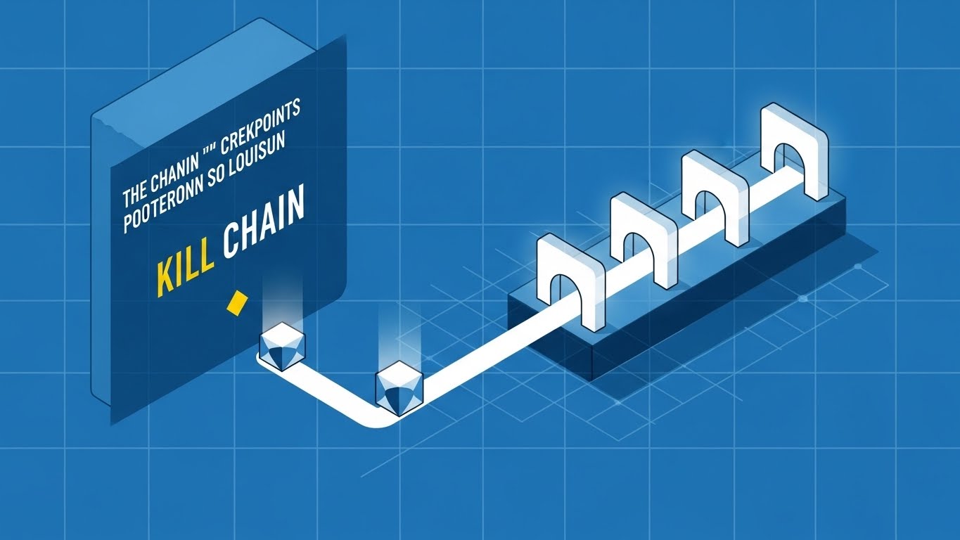
The Visual & Narrative Approach
Precision is the currency of trust in B2B security. This Isometric 2D Motion Design utilizes a "Blueprint Blue" grid background to establish an architectural tone. The visual breaks down the "Kill Chain" into stylized geometric nodes. A simplified data packet travels along a white path, encountering checkpoints represented by glowing white gates. The absence of gradients and the use of sharp vector lines convey absolute technical accuracy. It looks like a schematic, not a cartoon.
Psychological Impact & KPI Focus
- Niche Psychology: Security architects love structure. This style resonates with the "Engineer" persona who thinks in systems and diagrams. It validates the platform's ability to map, track, and control every stage of an attack.
- Operational Impact: It facilitates Market Education by linearizing complex attack vectors (like lateral movement). It gives the viewer a "God-tier" view of the network, reinforcing the promise of complete visibility.
Strategic Implementation & Trade-offs
- Ideal Use Case: Blog posts, "How it Works" website sections, or whitepaper companion videos.
- Duration: 45-60 Seconds.
- Trade-off: While highly clear, it can feel "cold" or clinical. It builds authority but may lack the emotional urgency required for high-converting top-of-funnel ads.
Companies using similar video content -
Palo Alto Networks – Cortex XSOAR – Orchestrates and visualizes incident response workflows.
Splunk – Enterprise Security – Maps and analyzes security events across the kill chain.
3. Visualizing the "Black Box" of AI
TOFU | Market Education

The Visual & Narrative Approach
To sell AI, you must make the invisible visible. This Abstract 3D AI Visualization places the viewer inside the "brain" of the platform. A complex network of floating metallic nodes is connected by pulsing filaments of neon purple light. The background is a sleek, matte silver environment. The camera floats through the network, showing the nodes pulsating rhythmically as they process information, symbolizing an AI brain analyzing millions of threat signals in real-time.
Psychological Impact & KPI Focus
- Niche Psychology: It tackles the skepticism around "AI washing." By visualizing the complexity and connectivity of the neural network, it provides visual proof of sophistication. It transforms the "Black Box" into a "Glass Box" of intelligence.
- Operational Impact: It communicates Scale and Speed. The rhythmic pulsing implies that the system is always on, always analyzing—addressing the CISO's fear of downtime or missed signals during off-hours.
Strategic Implementation & Trade-offs
- Ideal Use Case: Website Hero Background (Auto-play). It creates an immediate impression of cutting-edge technology.
- Duration: 10-20 Seconds (Loop).
- Trade-off: It is purely impressionistic. It generates "Awe" but not "Understanding." It must be paired with clear copy to define what the AI actually does.
Companies using similar video content -
SentinelOne – Singularity Platform – AI-powered endpoint protection and response.
Cybereason – Defense Platform – AI-driven extended detection and response.
4. The Kinetic "Stop" Signal
TOFU | Shaping Brand Perception
The Visual & Narrative Approach
Sometimes, subtlety is a liability. This Bold Kinetic Typography composition treats text as a physical object. Heavy, 3D geometric blocks form a solid wall in vibrant safety orange and jet black. A chaotic sphere of debris (the threat) attempts to smash through the wall but shatters upon impact, visualizing the concept of "STOP." The lighting is harsh and dynamic, casting long, dramatic shadows that emphasize the solidity of the barrier.
Psychological Impact & KPI Focus
- Niche Psychology: It appeals to the primal need for safety. In a sea of blue and white corporate tech visuals, the aggressive orange and "shattering" motion trigger an immediate attention response (The Startle Reflex).
- Operational Impact: It visualizes Prevention rather than just "Detection." For a CISO asking, "Can you actually stop ransomware?", this visual screams "Yes" without needing a spoken word.
Strategic Implementation & Trade-offs
- Ideal Use Case: YouTube Thumbnails or 6-second Bumper Ads. Designed to disrupt the viewer's pattern and drive high CTR.
- Duration: 5-6 Seconds.
- Trade-off: It is aggressive. Overusing this style can make the brand feel "alarmist" or "down-market" if not balanced with more sophisticated styles.
Companies using similar video content -
CrowdStrike – Falcon Prevent – Immediate prevention of breaches.
Sophos – Intercept X – Stops ransomware and exploits.
5. The "Zero-Latency" Dashboard
TOFU | YouTube
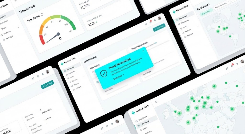
The Visual & Narrative Approach
This Rapid UI Feature Montage focuses on the user experience (UX) of the SaaS platform. It cuts rapidly between high-fidelity screens featuring a pristine "Medical-Tech" aesthetic (lots of white space, clean typography). We see specific actions: a "Risk Score" gauge needle dropping to zero, and a "Threat Neutralized" notification popping up in bright cyan. The motion is fast and rhythmic, conveying speed and efficiency.
Psychological Impact & KPI Focus
- Niche Psychology: It addresses the fear of "Clunky UI" and steep learning curves. By showing a clean, intuitive interface, it promises the buyer that their team will actually use the tool.
- Operational Impact: The visual focus on the "Risk Score" gauge dropping directly ties the software to the KPI of risk reduction. It shows the Outcome of the work, not just the work itself.
Strategic Implementation & Trade-offs
- Ideal Use Case: YouTube Pre-Roll Ads (15s). The rapid cuts keep retention high during the critical first 5 seconds.
- Duration: 15-30 Seconds.
- Trade-off: It requires the UI to be final and polished. If the product is still in beta or the UI changes frequently, this video asset will expire quickly.
Companies using similar video content -
Wiz – Cloud Security Platform – Clean UI for cloud risk visualization.
Lacework – Polygraph Data Platform – Rapid visualization of cloud security posture.
6. The Enterprise Sanctuary
TOFU | Vertical Social Organic

The Visual & Narrative Approach
To attract enterprise clients, you must look like an enterprise solution. This Photorealistic 3D Render depicts a futuristic server room with towering racks of brushed steel. The key element is the lighting: instead of standard LEDs, the racks emit a soft, pulsating azure blue glow that forms a protective dome structure near the ceiling. The floor is polished concrete, reflecting the blue light. The atmosphere is cold, clean, and silent.
Psychological Impact & KPI Focus
- Niche Psychology: It anchors the abstract concept of "Cloud Security" in physical reality. For stakeholders who still think in terms of on-premise hardware, this visual bridges the gap, suggesting that the cloud is just as tangible and secure as a physical vault.
- Operational Impact: It builds Brand Trust. The pristine, cold, and ordered environment suggests a lack of chaos—exactly what a CISO wants their infrastructure to look like.
Strategic Implementation & Trade-offs
- Ideal Use Case: Connected TV (CTV) ads or Event Booth backdrops. It establishes the brand as a major player suitable for Fortune 500 deployments.
- Duration: 30-60 Seconds.
- Trade-off: It is slow-moving and cinematic. It is not suitable for explaining how a specific feature works; it is purely for establishing gravitas.
Companies using similar video content -
Rubrik – Security Cloud – Enterprise data security and recovery.
Dell Technologies – PowerProtect Cyber Recovery – Secure data vaulting for enterprise.
7. The "Risk Reduction" Narrative
TOFU | Skippable Pre-Roll Ad
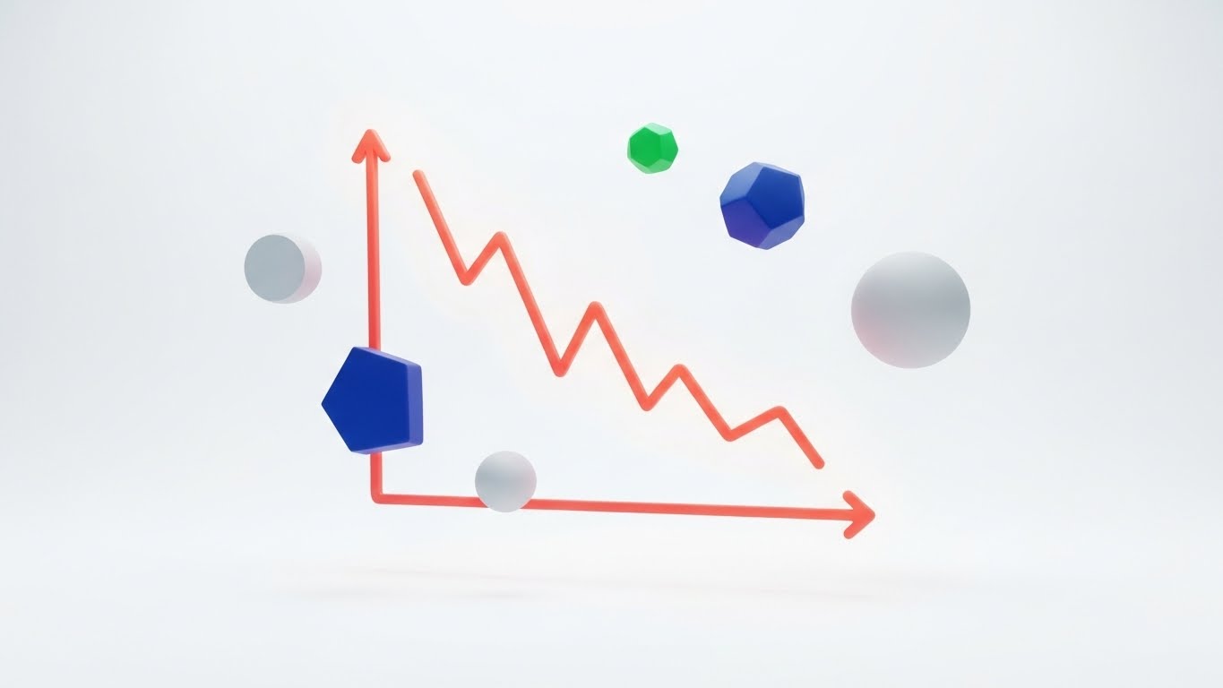
The Visual & Narrative Approach
Data is the language of the Boardroom. This Dynamic Data Visualization strips away the background noise to focus on a single metric. On a pure white background, a central line graph, rendered in a thick, vivid coral gradient, shows a sharp decline, symbolizing risk reduction. Surrounding the graph are floating abstract data points in navy blue and soft grey. The aesthetic is corporate and modern, utilizing vector-style flat rendering.
Psychological Impact & KPI Focus
- Niche Psychology: This speaks directly to the "Reporter" aspect of the CISO's job. They need materials that prove ROI. A graph going down (indicating reduced risk/incidents) is the ultimate success metric.
- Operational Impact: It visualizes the "USD 2.2 million saved" statistic. It transforms raw data into a clear narrative of improvement, making it the perfect visual anchor for a case study or whitepaper cover to drive Lead Capture.
Strategic Implementation & Trade-offs
- Ideal Use Case: Whitepaper Covers or LinkedIn Carousel Slides.
- Duration: Static or 5s Loop.
- Trade-off: It is dry. It engages the analytical brain but bores the emotional brain. It should be used after the prospect is already interested (MOFU), not to hook them initially.
Companies using similar video content -
Tenable – Tenable.io – Visualizes and reduces cyber risk exposure.
Qualys – Vulnerability Management – Tracks and reports risk reduction over time.
8. From Code to Concrete Security
TOFU | Connected TV / OTT
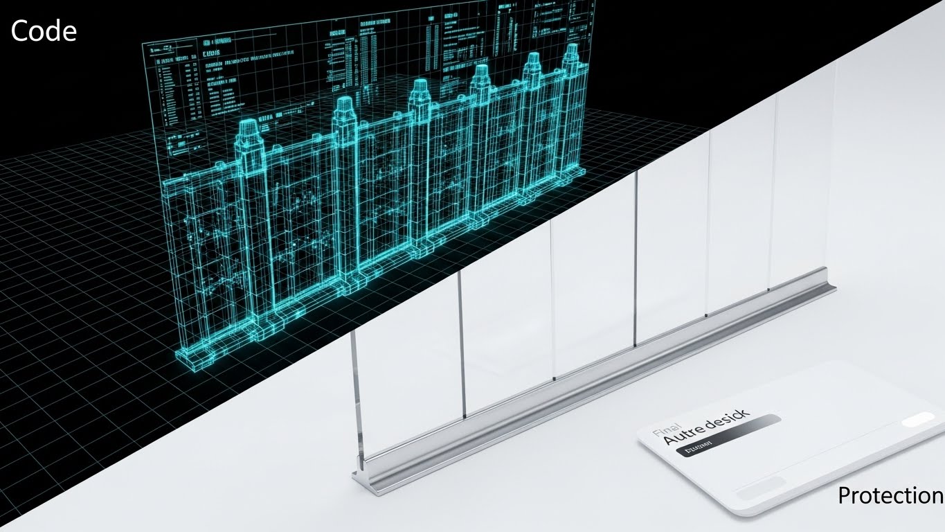
The Visual & Narrative Approach
This Wireframe to Reality Transition uses a split-screen composition to tell a "Before and After" story. The left half shows a complex 3D wireframe blueprint of a digital fortress wall in neon blue lines on a black grid. The right half shows the "final render" of the same wall, now a solid, impenetrable barrier of translucent glass and polished chrome on a white background. It captures the transition from "Code" to "Protection."
Psychological Impact & KPI Focus
- Niche Psychology: It appeals to the "Builder" mentality of developers and security architects. It validates the rigorous engineering process (the wireframe) while showcasing the polished protection (the reality) that the business side cares about.
- Operational Impact: It emphasizes Security by Design. It suggests that the security is not a bolt-on feature but is architected into the very foundation of the platform.
Strategic Implementation & Trade-offs
- Ideal Use Case: Website Product Pages or Demo Videos.
- Duration: 10-15 Seconds.
- Trade-off: It requires a clear visual match between the wireframe and the final product. If they don't align perfectly, the transition looks cheap and breaks the illusion of precision.
Companies using similar video content -
Snyk – Developer Security Platform – Securing code from development to deployment.
Aqua Security – Cloud Native Security Platform – Securing applications from build to run.
11. Visualizing "Deep Inspection"
MOFU | Feature Education & Demonstration
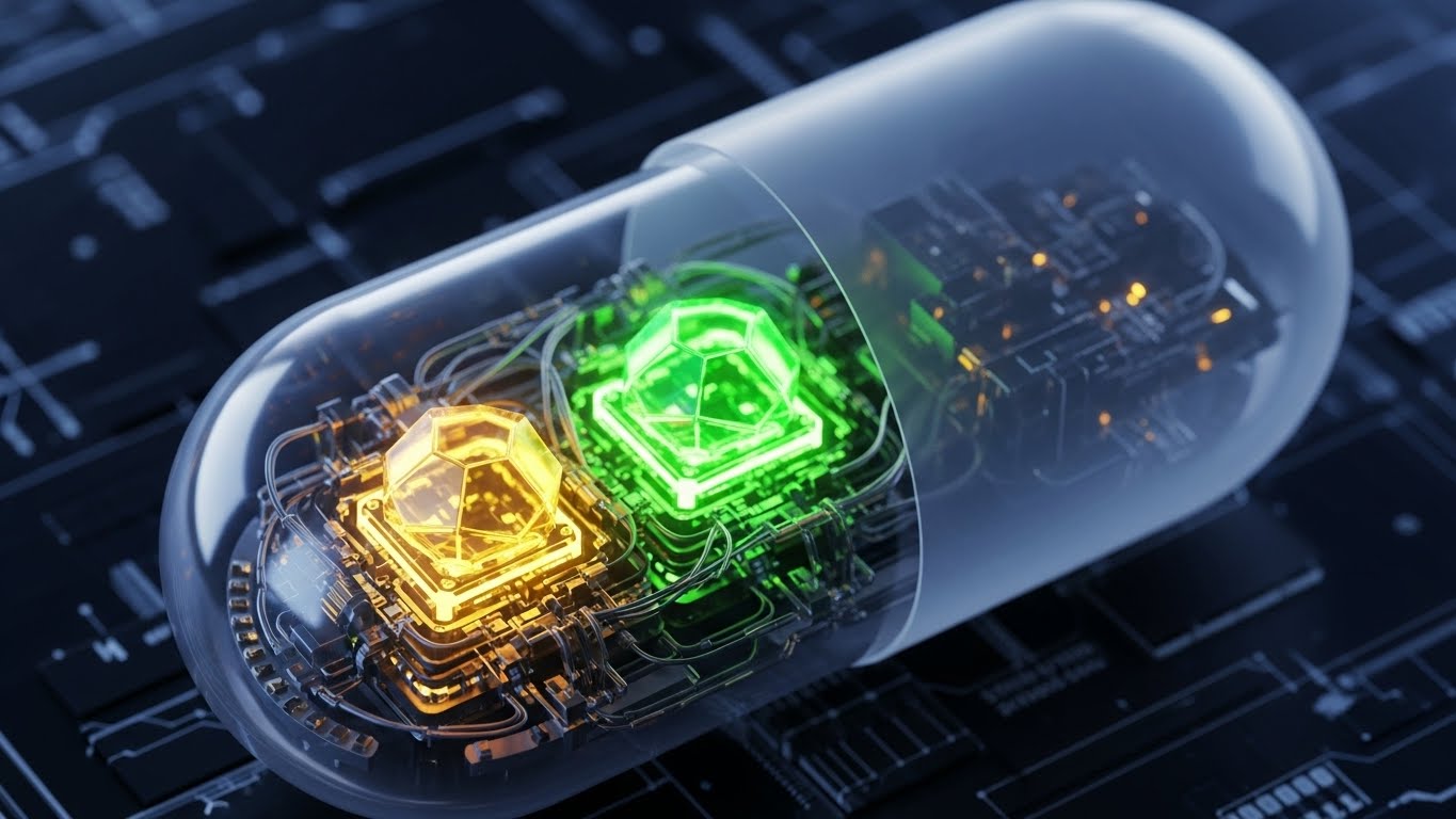
The Visual & Narrative Approach
To validate the claim of "Deep Packet Inspection" (DPI), this 3D X-Ray Visualization treats a data packet as a physical object. A translucent, matte grey capsule floats in a tech-grid environment. The camera utilizes a macro lens with a shallow depth of field to reveal the internal architecture: glowing geometric cores in emerald green and amber gold. These cores represent verified, safe payloads. The visual metaphor implies that the platform doesn't just look at the "wrapper" (headers); it scans the molecular structure of every signal.
Psychological Impact & KPI Focus
- Niche Psychology: Security architects are trained to be suspicious of surface-level appearances. This style appeals to the "Investigator" persona who values depth. It visually demonstrates thoroughness without needing a complex schematic.
- Operational Impact: It communicates Accuracy and False Positive Reduction. By showing the pristine, glowing internals of the capsule, it reinforces the platform's ability to filter out noise and deliver only high-fidelity, verified intelligence.
Strategic Implementation & Trade-offs
- Ideal Use Case: Product Pages (Feature Deep Dives) or Technical Webinar Backdrops.
- Duration: 10-15 Seconds (Loop).
- Trade-off: It is abstract. While visually striking, it requires accompanying copy to explain what specific protocol or threat is being inspected (e.g., "Malware Payload Analysis").
Companies using similar video content -
Check Point – Harmony Endpoint – Deep analysis of files and network traffic.
Forcepoint – DLP – Inspects and protects sensitive data content.
12. Order from Chaos
MOFU | Overcoming Objections

The Visual & Narrative Approach
When addressing the objection that "Implementation is too complex," clarity is the ultimate disruptor. This Minimalist Flat 2D Vector style uses a stark, side-by-side comparison. On the left, a chaotic tangle of thin grey lines represents the client's current fragmented security stack. On the right, a perfectly symmetrical, soothing pastel blue circle represents the unified platform. A simple, elegant arrow points from the chaos to the order. There are no shadows, no gradients—just pure geometric logic.
Psychological Impact & KPI Focus
- Niche Psychology: Complexity is the enemy of security. This style triggers a "Cognitive Relief" response. It promises the buyer that the platform will remove work from their plate, not add to it.
- Operational Impact: It visualizes Consolidation. For a CISO managing 40+ different security tools, this image sells the strategic benefit of a "Single Pane of Glass."
Strategic Implementation & Trade-offs
- Ideal Use Case: Sales Decks (Objection Handling Slide) or Whitepaper inserts.
- Duration: Static Image or 3-Second Animation.
- Trade-off: It is low-fidelity. It works best as a conceptual anchor in a conversation but lacks the "Tech Appeal" needed for a homepage hero section.
Companies using similar video content -
Zscaler – Zero Trust Exchange – Consolidates security services into a single platform.
Fortinet – FortiGate – Unified threat management and security fabric.
13. The "Before/After" Reality Check
MOFU | Competitive Displacement
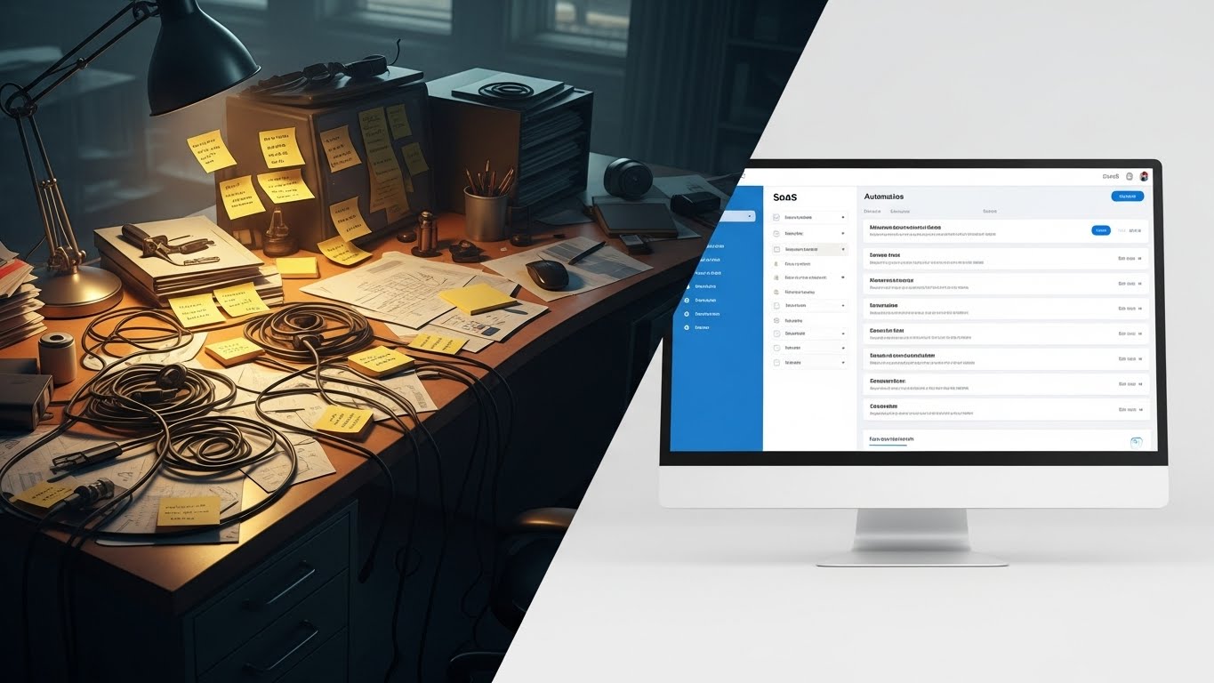
The Visual & Narrative Approach
This Split Screen Composition grounds the digital value proposition in physical reality. The left side depicts the "Old Way": a dimly lit, chaotic physical desk cluttered with sticky notes, tangled cables, and paper logs—a visual metaphor for manual incident response. The right side is a breath of fresh air: a pristine, bright SaaS interface on a monitor, listing automated tasks in a cool white and cyber-blue palette. The contrast between the warm, stressful tungsten light and the clean, cool LED light is palpable.
Psychological Impact & KPI Focus
- Niche Psychology: It validates the analyst's pain. It acknowledges the "Burnout" of manual log analysis (the messy desk) and offers a tangible escape (the clean UI).
- Operational Impact: It visualizes Efficiency Gains. It directly addresses the KPI of "Reduced Mean Time to Respond" (MTTR) by contrasting the slow, physical clutter with the instant, organized digital workflow.
Strategic Implementation & Trade-offs
- Ideal Use Case: LinkedIn Video Ads (Square 1:1) or Case Study Headers.
- Duration: Static or 6-10 Second Wipe Transition.
- Trade-off: It relies on a "straw man" argument. The "Before" state must be realistic enough to be relatable, but exaggerated enough to create contrast.
Companies using similar video content -
Swimlane – SOAR Platform – Automates manual security operations.
D3 Security – SOAR Platform – Streamlines incident response workflows.
14. The Human Face of Security
MOFU | LinkedIn Video Ads

The Visual & Narrative Approach
Technology is bought by humans. This Generative AI Realistic Video features a professional female cybersecurity analyst in a modern, glass-walled SOC environment. She engages directly with the camera, offering a confident, reassuring expression. The background is softly blurred, showing a large threat map with green "All Clear" indicators. The lighting is cinematic and flattering, moving away from the "hooded hacker" trope to present security as a professional, corporate discipline.
Psychological Impact & KPI Focus
- Niche Psychology: Trust is the ultimate currency. By showing a composed, capable human face, this style subconsciously transfers trust from the person to the platform. It suggests, "Experts use this tool."
- Operational Impact: It communicates Control. The calm demeanor of the analyst amidst a high-tech environment suggests that the platform brings order to the chaos of cyber threats.
Strategic Implementation & Trade-offs
- Ideal Use Case: LinkedIn Feed (Native Video) or Testimonial Intros.
- Duration: 15-30 Seconds.
- Trade-off: It is resource-intensive to produce. If the actor doesn't look authentic to the industry (e.g., too casual or too stiff), credibility is lost.
Companies using similar video content -
Arctic Wolf – Managed Detection and Response – Human-led security operations.
Expel – Managed Detection and Response – Experts delivering security outcomes.
15. The ROI Dashboard
BOFU | ROI Justification
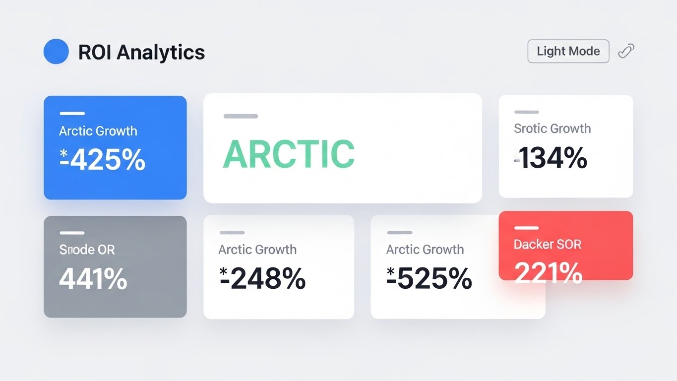
The Visual & Narrative Approach
When speaking to the CFO, data must be clean and undeniable. This Clean UI Workflow uses a high-key "Light Mode" aesthetic to present financial and operational metrics. Large, crisp typography displays growth percentages (e.g., "425% Growth") in Arctic White and Mint Green on a soft off-white background. Shadows are subtle, giving the data cards a floating, modern financial-tech feel. It strips away the dark, "hacker" aesthetic in favor of business transparency.
Psychological Impact & KPI Focus
- Niche Psychology: This appeals to the Economic Buyer. It speaks the language of "Value" and "Growth" rather than "Threats" and "Packets." It frames security as a business enabler, not a cost center.
- Operational Impact: It visualizes Value Realization. By highlighting metrics like "Risk Reduction" or "Efficiency Gains," it provides the internal champion with the visual evidence needed to get budget approval.
Strategic Implementation & Trade-offs
- Ideal Use Case: BOFU Case Studies, Pricing Pages, or Executive Summary Slides.
- Duration: Static or Slow Pan (10s).
- Trade-off: It is boring to technical users. It lacks the "cool factor" of threat maps but wins on clarity for decision-makers.
Companies using similar video content -
Vanta – Security & Compliance Automation – Automates compliance and shows ROI.
LogicManager – GRC Software – Quantifies and visualizes risk and compliance ROI.
16. The "Perimeter Assurance" Hologram
BOFU | Risk Mitigation
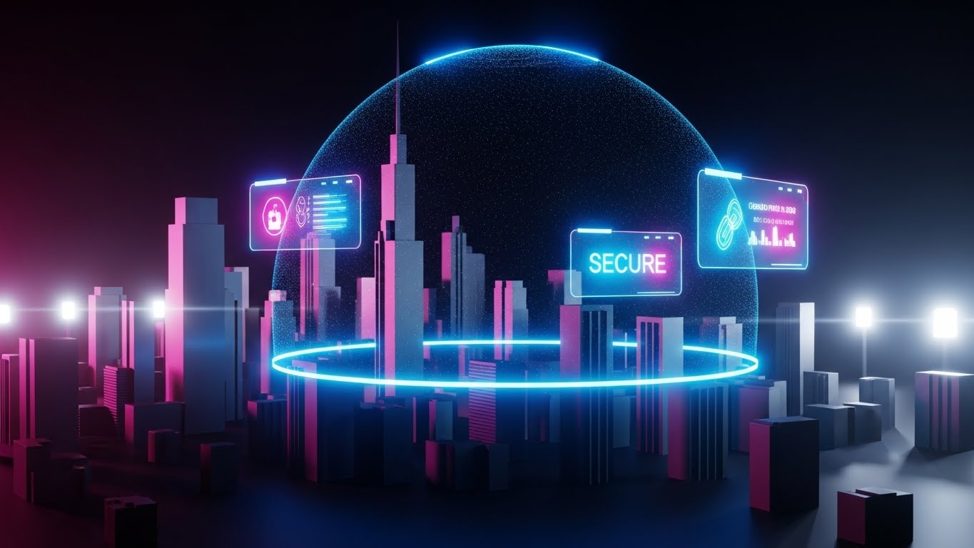
The Visual & Narrative Approach
To visualize the concept of "Total Coverage," this style overlays a Futuristic Holographic UI onto a photorealistic 3D city. A vibrant, translucent electric blue dome encapsulates a cluster of skyscrapers, representing the protected enterprise. Floating UI widgets attached to the dome display "SECURE" status and encryption icons. The contrast between the dark, tangible city buildings and the glowing, ethereal shield visualizes the invisible layer of digital protection.
Psychological Impact & KPI Focus
- Niche Psychology: It taps into the desire for Sanctuary. It visualizes the abstract promise of a firewall or endpoint protection as a literal shield, providing a strong sense of safety and containment.
- Operational Impact: It illustrates Scalability and Scope. It shows that the solution protects the entire urban infrastructure (the enterprise ecosystem), not just a single server.
Strategic Implementation & Trade-offs
- Ideal Use Case: Landing Page Hero Images or Enterprise Partnership Announcements.
- Duration: Loopable Background.
- Trade-off: It is metaphorical. It doesn't show how the protection works, only that it exists. It is a brand-building asset, not a technical explainer.
Companies using similar video content -
Cloudflare – Zero Trust Platform – Protects enterprise networks and applications globally.
Cisco – Secure Firewall – Comprehensive network security.
17. The "Compliance Verified" Moment
BOFU | Sales Cycle Acceleration

The Visual & Narrative Approach
This style merges the physical workflow of an executive with digital confirmation. A High-Quality Lifestyle Photo shows a confident male executive in a sun-drenched boardroom reviewing a tablet. Overlaying the device is a composite, glowing UI layer showing a "Compliance Checklist" with all items ticked green. The lighting is warm and natural ("Golden Hour"), suggesting a new dawn or the successful conclusion of a project.
Psychological Impact & KPI Focus
- Niche Psychology: It sells Peace of Mind. For a CISO or Compliance Officer, the ultimate goal is not just security, but the assurance of compliance (GDPR/SOC2). This image captures the feeling of a successful audit.
- Operational Impact: It visualizes the Outcome. It doesn't show the grueling work of compliance; it shows the moment of success—the "All Systems Secure" validation that allows the business to move forward.
Strategic Implementation & Trade-offs
- Ideal Use Case: Email Marketing Headers (Nurture Campaigns) or Success Story covers.
- Duration: Static.
- Trade-off: It risks looking like generic stock photography if the UI overlay isn't high-fidelity and relevant to the specific compliance pain points.
Companies using similar video content -
Drata – Compliance Automation – Automates SOC 2, ISO 27001, HIPAA compliance.
Secureframe – Compliance Automation – Streamlines security and compliance audits.
18. The "Action Impulse" Micro-Interaction
BOFU | Driving Demo Requests

The Visual & Narrative Approach
To drive conversion, focus on the point of contact. This Macro UI Micro-Interaction features an extreme close-up of a human fingertip about to tap a glowing, pill-shaped button on a glass interface. The button radiates an electric lime green pulse against a deep charcoal background. The shallow depth of field (bokeh) blurs everything except the finger and the button, creating intense visual focus on the act of "Executing" a command.
Psychological Impact & KPI Focus
- Niche Psychology: It triggers a Tactile Response. The high detail makes the interface feel physical and responsive. It suggests that the platform is ready, waiting, and easy to trigger.
- Operational Impact: It implies Ease of Remediation. It suggests that complex security actions (like "Isolate Host") are as simple as a single, decisive tap, reducing the perceived friction of the tool.
Strategic Implementation & Trade-offs
- Ideal Use Case: "Get a Demo" CTA buttons on websites or end-screens of product videos.
- Duration: 3-5 Second Loop.
- Trade-off: It is hyper-specific. It represents a single interaction and cannot explain a workflow. It is purely a conversion trigger.
Companies using similar video content -
Microsoft – Defender for Endpoint – Quick remediation actions for threats.
VMware Carbon Black – Cloud Endpoint – One-click threat containment.
19. The "Boardroom Confidence" Shot
BOFU | The Economic Buyer

The Visual & Narrative Approach
Security is a team sport. This Aspirational Stock Montage depicts a diverse group of C-level executives (CIO, CISO, CEO) standing together in a bright, modern glass corridor. They are looking at a shared screen, smiling. The high-key lighting conveys transparency and a lack of tension. There is no scary red data; only the emotional cue of a team that is aligned, secure, and confident in their strategy.
Psychological Impact & KPI Focus
- Niche Psychology: It addresses the "Us vs. Them" friction that often exists between Security and the Board. This visual creates an aspirational reality where security is a shared success, not a blocker.
- Operational Impact: It visualizes Strategic Alignment. It helps the champion sell the tool not just as a piece of software, but as a catalyst for better cross-departmental collaboration.
Strategic Implementation & Trade-offs
- Ideal Use Case: Pitch Decks (Team/Vision Slide) or Annual Reports.
- Duration: Static.
- Trade-off: It is "fluff" if used too early. It works best at the very bottom of the funnel or in high-level strategic presentations where emotional resonance outweighs technical detail.
Companies using similar video content -
IBM Security – QRadar Suite – Strategic security intelligence for executives.
RSA – Archer Suite – GRC solutions for enterprise leadership.
20. The "Data Normalization" Factory
BOFU | The Technical Buyer
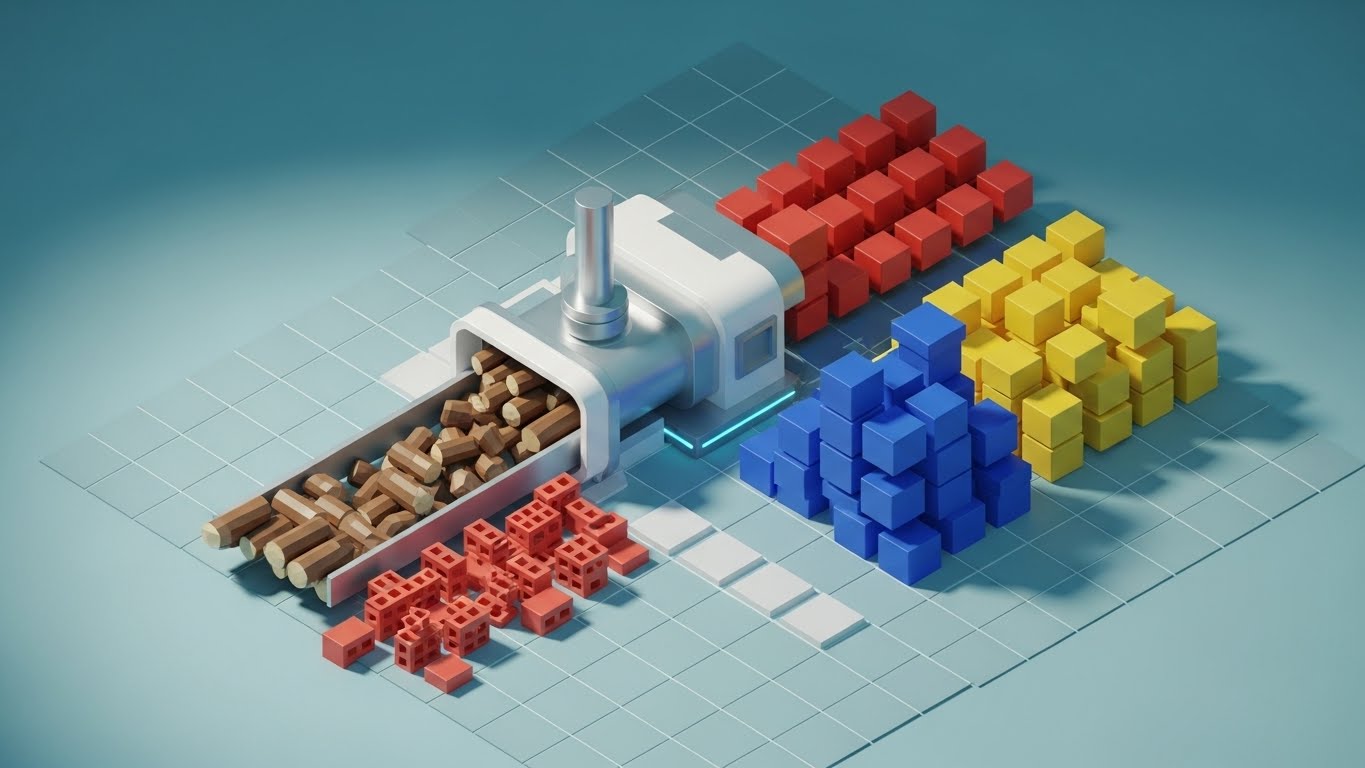
The Visual & Narrative Approach
For the technical buyer, the value lies in how the data is processed. This Isometric 3D Workflow uses a "Factory" metaphor to visualize the ingestion pipeline. On the left, a conveyor belt feeds rough, wooden logs and bricks (representing raw, unstructured data) into a sleek, white processing unit. On the right, the machine outputs perfectly organized stacks of blue, yellow, and red cubes (structured intelligence) onto a grid. The lighting is soft and studio-like, emphasizing the cleanliness and order of the process.
Psychological Impact & KPI Focus
- Niche Psychology: It appeals to the Systems Thinker. It validates the crucial (but often invisible) work of data ingestion, normalization, and enrichment. It proves the platform can handle the "messy" reality of diverse log sources.
- Operational Impact: It visualizes Interoperability and Throughput. It shows how the platform acts as a central refinery, turning the raw fuel of logs into the refined product of actionable intelligence.
Strategic Implementation & Trade-offs
- Ideal Use Case: Technical Architecture Documentation or "How it Works" web pages.
- Duration: 10-15 Second Loop.
- Trade-off: It is highly stylized. It simplifies the process to a degree that might seem "cute" if not paired with technical specs that detail the actual parsers and integrations involved.
Companies using similar video content -
Elastic – Security – Ingests, normalizes, and analyzes security data.
Exabeam – Fusion SIEM – Transforms raw logs into actionable insights.
21. The "Warm Welcome" Unboxing
Onboarding | Self-Serve Onboarding

The Visual & Narrative Approach
The "First Run" experience defines retention. This 2D Character-Driven Story utilizes a "Corporate Memphis" aesthetic—clean lines, flat colors, and friendly characters—to soften the start of the technical journey. We see a stylized female character, "The Analyst," sitting at a desk. She opens a glowing digital box labeled "UNBOXING." Instead of complex code, simple, floating icons of gears, clouds, and shields drift gently out of the box, organizing themselves into a neat stack. The palette is inviting: sunny yellows, soft blues, and mint greens.
Psychological Impact & KPI Focus
- Niche Psychology: It combats Setup Anxiety. Cybersecurity tools are notoriously complex to configure. This friendly, simplified visual assures the user that the onboarding process will be manageable, guided, and even pleasant.
- Operational Impact: It targets Time-to-Value (TTV). By visually framing the setup as a simple "unboxing" event rather than a "configuration project," it encourages the user to start immediately, reducing drop-off rates at the signup phase.
Strategic Implementation & Trade-offs
- Ideal Use Case: Welcome Emails or the first screen of the In-App Onboarding Wizard.
- Duration: 15-30 Seconds.
- Trade-off: It is playful. It works perfectly for Product-Led Growth (PLG) models targeting individual users or SMBs, but might feel too casual for a strict enterprise/government deployment.
Companies using similar video content -
Okta – Workforce Identity Cloud – User-friendly onboarding for identity management.
GitLab – DevSecOps Platform – Simplified onboarding for integrated security.
22. The Frictionless Setup
Onboarding | Accelerating Time-to-Value

The Visual & Narrative Approach
Waiting for data to ingest is inevitable; frustration is optional. This 2D Line Art Animation transforms a loading state into a brand moment. On a stark white background, a single, fluid black line draws itself into the shape of a shield. Without breaking the line, it morphs into a magnifying glass (scanning), and finally into a satisfying checkmark. The motion is smooth, hypnotic, and continuous.
Psychological Impact & KPI Focus
- Niche Psychology: It manages Perceived Latency. Known as "Benevolent Deception" in UX design, an engaging animation makes wait times feel shorter. The continuous line suggests that the system is actively connecting processes, not just hanging.
- Operational Impact: It reduces Bounce Rate during setup. By keeping the user visually engaged during the critical first data sync (which can take minutes), it prevents them from tab-switching or abandoning the session.
Strategic Implementation & Trade-offs
- Ideal Use Case: In-App Loading Screens or Data Ingestion Status bars.
- Duration: Loopable (2-5 Seconds).
- Trade-off: It is minimalist. It cannot convey complex information, only status. It serves a purely functional UX role.
Companies using similar video content -
Cloudflare – DNS/CDN Setup – Smooth, animated setup processes.
NordLayer – ZTNA Solution – Simplified network access setup.
23. Visualizing Integration
Onboarding | Reducing Implementation Friction
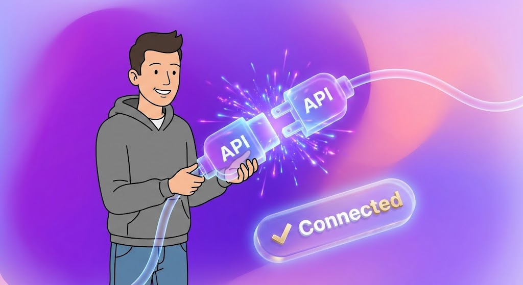
The Visual & Narrative Approach
Modern security depends on the ecosystem. This 2D Animation & UI Composition blends a stylized 2D character with glossy 3D elements to visualize "Connection." A character in a casual grey hoodie holds a glowing 3D plug labeled "API." He effortlessly connects it to a matching socket floating in the air. Upon connection, a spark of vivid purple light erupts, and a "Connected" UI badge appears. The contrast between the flat character and the dimensional plug emphasizes the "plug-and-play" nature of the technology.
Psychological Impact & KPI Focus
- Niche Psychology: It addresses the Integration Nightmare. Security engineers fear spending weeks writing custom parsers. This visual metaphor of a physical plug-in promises compatibility and ease—"It just works."
- Operational Impact: It encourages Ecosystem Adoption. By making integration look satisfying and simple, it drives users to connect more data sources, which increases the platform's stickiness and value.
Strategic Implementation & Trade-offs
- Ideal Use Case: "Integrations" Setup Page or Technical Documentation Guides.
- Duration: 10-15 Seconds.
- Trade-off: It simplifies the technical reality. If the actual API integration requires heavy coding, this visual may set false expectations of simplicity.
Companies using similar video content -
ThreatConnect – Threat Intelligence Platform – Connects diverse security tools via API.
Anomali – ThreatStream – Integrates threat intelligence feeds.
24. Deep Dive Discovery
Retention | Driving Deep Feature Adoption
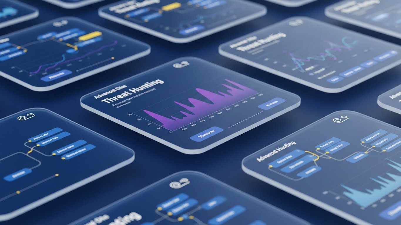
The Visual & Narrative Approach
To retain power users, you must show depth. This 3D Parallax UI Presentation breaks the interface into floating layers in 3D space. The background layer shows raw data flow; the middle layer shows the standard dashboard; the foreground layer—where the camera focuses—shows an advanced "Threat Hunting" node graph. The camera pushes through the top layers to reveal the deeper functionality, visually inviting the user to "look deeper."
Psychological Impact & KPI Focus
- Niche Psychology: It appeals to Curiosity and Mastery. It suggests that the platform has layers of capability waiting to be discovered, combating the feeling that the user has "outgrown" the tool.
- Operational Impact: It drives Feature Adoption. By highlighting advanced modules (like graph analysis) that often go unused, it increases the user's utilization of the platform, correlating directly with higher retention.
Strategic Implementation & Trade-offs
- Ideal Use Case: "What's New" Feature Update Videos or Login Screens.
- Duration: 10-20 Seconds.
- Trade-off: It is abstract. It doesn't teach the user how to use the feature, but rather advertises its existence and sophistication.
Companies using similar video content -
Mandiant – Advantage Platform – Deep threat intelligence and investigation.
Corelight – Open Network Detection and Response – Multi-layered network visibility.
25. The "Augmented" Support Agent
Retention | Reducing Support Overhead

The Visual & Narrative Approach
Support is a key retention driver. This 2D Graphics Over Live Action style features a warm, professional photo of a real support agent. Playful 2D vector animations—a wrench, a lightbulb, a shield—pop up around her in bright cyan and yellow speech bubbles. The graphics are lively and bouncy, suggesting speed and helpfulness. The human element builds connection, while the graphics signal "tech-savviness."
Psychological Impact & KPI Focus
- Niche Psychology: It combats the Isolation of troubleshooting. Security analysts often work long, lonely hours. Knowing there is a friendly, capable human (aided by smart tools) ready to help reduces frustration.
- Operational Impact: It humanizes the Help Center. It frames support not as a "ticket black hole" but as a dynamic interaction, encouraging users to seek help rather than giving up and churning.
Strategic Implementation & Trade-offs
- Ideal Use Case: "Help & Support" Portal Header or Customer Success Email Signatures.
- Duration: Static or 5s Loop.
- Trade-off: It requires brand-consistent talent. The "vibe" must match the company's actual support tone (e.g., casual vs. formal).
Companies using similar video content -
Red Canary – MDR – Human experts augmented by technology.
Sophos – Managed Threat Response – Expert-led threat hunting and response.
26. Building the Fortress
Retention | Reducing Churn

The Visual & Narrative Approach
Retention relies on reminding the client of the value built over time. This Low-Poly 3D Modeling style illustrates a digital fortress under construction. Using simple geometric facets and a palette of earth tones and digital blues, we see small cranes placing glowing blocks onto a wall. The sun is rising in the background, casting long, optimistic shadows. It represents the ongoing process of strengthening security posture.
Psychological Impact & KPI Focus
- Niche Psychology: It appeals to the Builder instinct. It reframes security expenses not as a monthly "drain" but as an investment in an asset (the fortress) that grows stronger and more valuable the longer they stay.
- Operational Impact: It visualizes Cumulative Value. Perfect for Quarterly Business Reviews (QBRs), it visually summarizes the "blocks" added (patches, rules, users) over the last period.
Strategic Implementation & Trade-offs
- Ideal Use Case: Annual Impact Reports or QBR Presentation Slides.
- Duration: Static or Slow Build Animation.
- Trade-off: It is metaphorical. It needs specific data overlays (e.g., "1,000 Threats Blocked") to ground the image in the customer's specific reality.
Companies using similar video content -
Palo Alto Networks – Prisma Cloud – Continuously builds and secures cloud environments.
Checkmarx – SAST/DAST – Builds secure code over time.
27. The Infinite Attack Surface
Expansion | Driving Upsell/Cross-sell
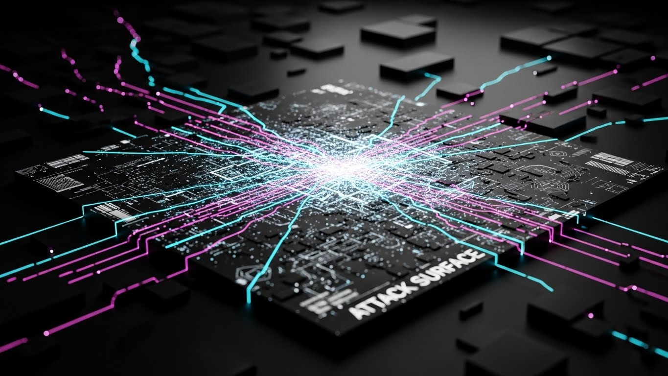
The Visual & Narrative Approach
To upsell, you must reveal the "Unseen." This Futuristic Neon/Dark Mode visualization depicts the client's network as a glowing map on a matte black surface. The center is bright and detailed (current coverage), but the edges fade into a vast, dark grid crossed by neon pink and cyan laser lines (the "Unknown" or "Shadow IT"). It visually suggests an infinite landscape of data that could be secured—if the client upgrades.
Psychological Impact & KPI Focus
- Niche Psychology: It triggers FOMO (Fear Of Missing Out) and the fear of the blind spot. The darkness at the edges implies risk. The neon lines suggest activity happening outside the current scope of visibility.
- Operational Impact: It drives Expansion Revenue. It visually justifies the need for "Add-on Modules" (like Cloud Security or IoT monitoring) by showing the gap between current visibility and total environment reality.
Strategic Implementation & Trade-offs
- Ideal Use Case: In-App "Upgrade" Modals or "Premium Feature" Teasers.
- Duration: 10-15 Seconds (Loop).
- Trade-off: It is dark. It appeals strongly to the "Cyberpunk" aesthetic loved by practitioners but might feel too "gamer-like" for conservative boards if not balanced with clean data.
Companies using similar video content -
Armis – Asset Intelligence Platform – Discovers and secures all connected devices.
Nozomi Networks – OT & IoT Security – Visualizes and protects industrial networks.
28. The Pulse of Vigilance
Expansion | Proactive Support/Announcements
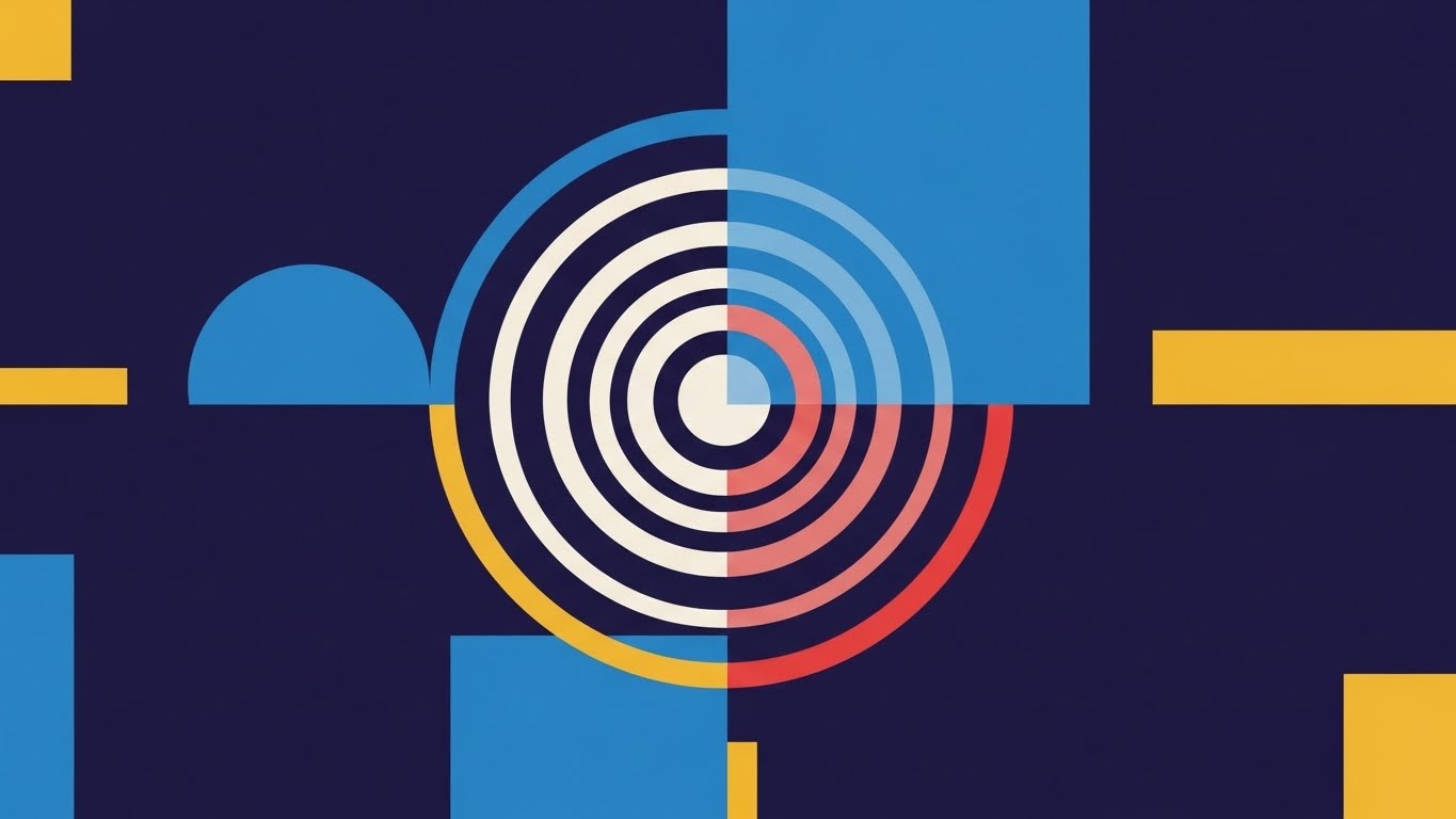
The Visual & Narrative Approach
Trust is maintained through subtle signals of activity. This Abstract 2D Motion Graphic features concentric rings of light pulsing outward on a deep violet background. The rings shift gently from white to soft red and back to white, mimicking a sonar or radar ping. It is minimal, hypnotic, and clean. It doesn't demand attention; it simply signals, "I am here, and I am watching."
Psychological Impact & KPI Focus
- Niche Psychology: It offers Subconscious Reassurance. Like the blinking LED on a smoke detector, this visual confirms system health without causing alarm. It builds the feeling of a "24/7 Guardian."
- Operational Impact: It enhances Brand Affinity. Used in notification centers or idle screens, it reinforces the value of "Always-on" monitoring without adding cognitive noise to the analyst's workflow.
Strategic Implementation & Trade-offs
- Ideal Use Case: System Status Pages, Mobile App Widgets, or Smart Watch Notifications.
- Duration: Loopable.
- Trade-off: It is purely ambient. It conveys no data, only status. It is a mood setter, not an informer.
Companies using similar video content -
Group-IB – Threat Intelligence – Constant monitoring of the cyber threat landscape.
EclecticIQ – Platform – Continuous threat intelligence updates.
29. The "Power User" Terminal
Expansion | Trial/Freemium User Activation
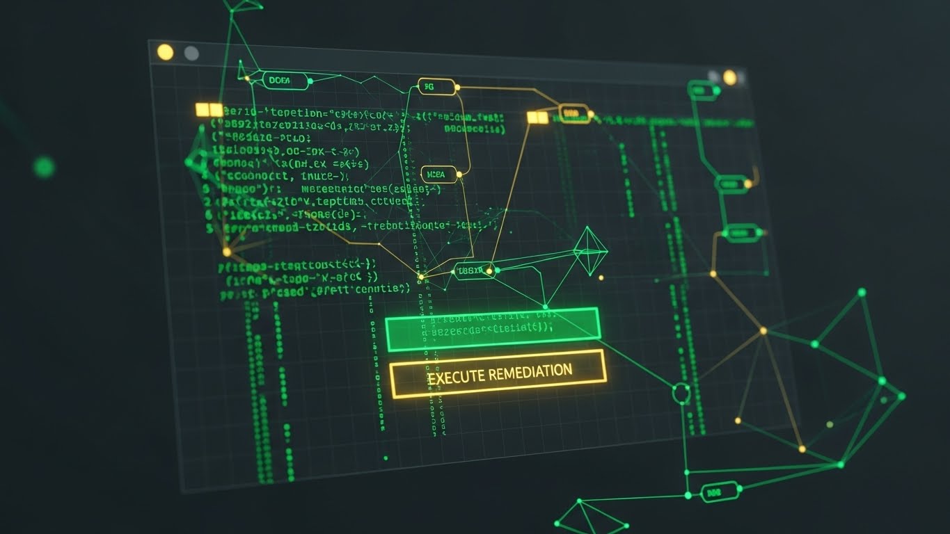
The Visual & Narrative Approach
To convert the technical champion, speak their native tongue: Code. This Dark Mode UI Showcase abandons the GUI for the CLI (Command Line Interface). On a deep charcoal background, sharp neon green code cascades down a terminal window. In the center, a bright, glowing button simply says "EXECUTE REMEDIATION." It strips away the marketing fluff to show raw power and control.
Psychological Impact & KPI Focus
- Niche Psychology: It builds Technical Credibility. Developers and DevSecOps engineers often distrust "drag-and-drop" security. This visual signals that under the hood, the platform gives them granular, code-level control.
- Operational Impact: It drives Developer Activation. By showing the API-first or CLI-first nature of the tool, it encourages the technical team to integrate the platform into their CI/CD pipelines, locking in the vendor.
Strategic Implementation & Trade-offs
- Ideal Use Case: Developer Documentation, API Portal Landing Pages, or "Trial Ended" screens targeting engineers.
- Duration: 10-20 Seconds.
- Trade-off: It alienates non-technical buyers. A CFO will not understand the value of a terminal window. It must be targeted precisely.
Companies using similar video content -
HashiCorp – Vault – CLI-driven secrets management.
GitLab – CI/CD Security – Developer-first security tools.
30. The Flow of Trust
Expansion | Driving Referrals & Advocacy

The Visual & Narrative Approach
Social proof works best when it feels massive. This Hyper-lapse Stock Footage sequence shows a busy city street at night, with car lights streaking in long exposures. Overlaid on this organic flow are glowing white data streams and packet icons, moving in perfect sync with the traffic. It metaphorically equates the city's physical infrastructure with the digital infrastructure secured by the platform—fast, flowing, and massive.
Psychological Impact & KPI Focus
- Niche Psychology: It creates a Bandwagon Effect. The scale of the city and the traffic implies that "everyone is moving this way." It positions the platform as the engine behind the modern, fast-paced digital economy.
- Operational Impact: It drives Referrals. By associating the brand with speed, scale, and modernity, it gives current customers the confidence to recommend the solution to peers ("It handles massive scale").
Strategic Implementation & Trade-offs
- Ideal Use Case: "Thank You" Pages, Case Study Intros, or Event Backdrops.
- Duration: 10-15 Seconds.
- Trade-off: It is generic. Without the data overlay, it is just stock footage. The motion graphics must be high-quality to own the visual.
Strategic Knowledge Base: The Visual Operations Doctrine
To transition from "Content Creation" to "Strategic Asset Management," Cybersecurity SaaS leaders must adopt a systematic approach to visualization. This section synthesizes the 30 styles into a cohesive doctrine designed to align teams, accelerate adoption, and measure impact.
Strategic Alignment & Visual Architecture
The "Pre-Production" Strategy – Defining the Visual Operating System (VOS).
- The Cognitive Load Audit: Before commissioning a single pixel, conduct an audit of your current platform and training materials. Identify "High Friction" zones where text density correlates with user drop-off. Map Styles 1, 2, and 12 to these friction points to radically simplify the intake of complex threat data.
- Role-Based Visual Mapping: Security is not monolithic. Deploy different visual dialects for different personas. Use Abstract/Metaphorical styles (Style 7, 26) for the C-Suite to communicate risk and value. Use High-Fidelity UI/Terminal styles (Style 19, 29) for SOC Analysts and Engineers who demand precision and proof.
- The "Glanceability" Standard: In a SOC, seconds matter. Adopt a "Glanceability" standard for all operational visuals. If a threat visualization (like Style 4) cannot be understood in under 1.5 seconds, it is a liability, not an asset. Design for the "Peripheral Vision" of the analyst.
- Brand Voice Consistency: Your visual language must be consistent across the entire "Kill Chain" of the customer journey. Ensure that the "Emerald Green" used in your marketing Biological Metaphor (Style 7) matches the "Safe Status" indicator in your Product UI (Style 15). This subconscious continuity builds trust.
- The Advids Strategic Audit: Leveraging a partner like Advids during the architectural phase prevents "Style Drift." A strategic audit defines the master visual vocabulary—palettes, motion behaviors, and metaphor hierarchies—before production begins, ensuring scalability.
- Standardization vs. Customization: For core product education, use standardized Isometric Schematics (Style 3) to ensure clarity. For high-stakes sales pitches to Fortune 500s, invest in bespoke Photorealistic Renders (Style 12) that reflect the prospect's specific industry environment.
- The Cross-Departmental Bridge: Use visuals to unify terminology. A Kinetic Typography (Style 4) video defining "Zero Trust" ensures that Sales, Marketing, and Customer Success are all selling the exact same concept, eliminating internal dissonance.
- Legacy System Integration: Many CISOs manage hybrid environments. Use Mixed Media (Style 25) or Wireframe Transitions (Style 26) to visually validate the bridge between legacy on-premise hardware and your modern cloud SaaS, respecting their past while selling the future.
- Accessibility in Cyber: Security talent is diverse. Ensure your Motion Graphics (Style 8) and color palettes are accessible (e.g., color-blind safe modes for Red/Green threat indicators). This is not just compliance; it is operational necessity for analysts staring at screens for 12 hours.
- The Mobile-First CISO: Executives consume intelligence on the go. Adapt complex dashboard visualizations into simplified Vertical Video formats (Style 17) suitable for mobile consumption, allowing the CISO to approve remediation actions from a smartphone.
Operational Adoption & Implementation
The "Deployment" Phase – Embedding Visuals into the Workflow.
- Overcoming "Black Box" Anxiety: Security teams distrust what they can't see. Use "Glass Box" visualizations (Style 11, 14) to demystify AI algorithms. Showing the logic of the decision builds trust in the outcome of the decision.
- The Micro-Learning Shift: Kill the 50-page PDF manual. Replace it with a library of 30-second Loopable GIFs (Style 17) embedded directly into the tooltips of the software. Users learn "how to isolate a host" in the exact moment they need to do it.
- Just-in-Time Support: Embed Live Action/Graphics Hybrid videos (Style 25) into the "Help" sidebar. Seeing a human face alongside the technical instruction reduces the stress of incident response and humanizes the vendor relationship.
- Gamification of Hygiene: Cyber hygiene is boring. Use Dynamic Data Visualization (Style 6) to create "Scorecards" for security teams. Visualizing "Risk Reduction" as a rising score or a completed building block motivates teams to maintain best practices.
- Reducing Support Ticket Volume: There is a direct correlation between the quality of your Onboarding Visuals (Style 22) and the volume of "Level 1" support tickets. Proactive visual explanation of common errors (like API connection failures) solves the problem before the user logs a ticket.
- Remote SOC Onboarding: With distributed security teams, physical training is impossible. Use 3D Parallax Walkthroughs (Style 24) to simulate the SOC environment and tool usage, ensuring remote analysts reach competency as fast as on-prem peers.
- Standard Operating Procedures (SOPs): Transform text-heavy Incident Response Plans into Linear Isometric Animations (Style 10). In a crisis, a stressed analyst can follow a visual flow much faster than a text document, reducing Mean Time to Respond (MTTR).
- Feedback Loops: Use Interactive Video Elements (Style 17) in beta releases to gather feedback. A "thumbs up/down" interaction on a new feature video provides instant qualitative data on user sentiment.
- Scalable Localization: Cyber threats are global. Design your Abstract Motion Graphics (Style 1) with text-free or modular text layers. This allows Advids to rapidly localize assets for different regions (EMEA, APAC) without re-animating the core visual.
- Leadership Communication: Empower your internal champion. Provide them with High-Gloss Cinematic Renders (Style 12) and ROI Dashboards (Style 15) that they can slide directly into their Board Deck. Make them look like a visionary leader for choosing your platform.
Measuring Impact & Future-Proofing
The "ROI" Phase – Quantifying Value and Evolving the Strategy.
- Beyond "Views": Vanity metrics are useless. Measure Time-to-Competency (how fast a user masters a feature after watching a video) and Feature Adoption Rate (do they use the feature highlighted in the video?). These are the true KPIs of visual strategy.
- The "Idle Time" Metric: High-quality visualization should reduce time spent in the tool for routine tasks. Correlate the deployment of clean UI visuals (Style 19) with a reduction in "navigation idle time," proving efficiency gains.
- Compliance Velocity: Measure how quickly new compliance mandates (e.g., DORA, NIS2) are understood and adopted by the organization when introduced via Visual Checklists (Style 20) versus text memos.
- Retention and LTV: Track the Churn Rate of cohorts exposed to the "Value Realization" visuals (like Style 26—The Fortress) versus those who were not. Visualizing value accumulated is a potent churn killer.
- The AI Visual Frontier: Prepare for Generative AI. The next phase of visual strategy will involve Real-Time Generative Overlays where the platform generates a unique "Threat Movie" for every incident. Establishing a strong visual language now ensures this future AI adheres to your brand standards.
- Scalability of Assets: Build a "Visual Lego Kit." Ensure that the assets created for Style 3 (Kill Chain) can be deconstructed and reused for Style 10 (Data Factory). This modularity dramatically reduces the cost per asset over time.
- The Advids Partnership: Visual strategy is not a "one-and-done" project; it is an evolving infrastructure. Partnering with Advids ensures that as your platform evolves (new features, new acquisitions), your visual library scales in lockstep, maintaining a "Single Source of Truth" for your visual brand.
- Benchmarking Success: Do not just compare against last quarter. Benchmark your visual clarity against consumer apps (like Fintech or Gaming), not just legacy security vendors. User expectations are set by their iPhone, not their firewall.
- The ROI of Safety: Work with customers to quantify the "Insurance Savings" or "Breach Avoidance" achieved. Visualize this data in Style 6 (Risk Gradient) case studies to provide undeniable financial proof of ROI for future prospects.
- Final Call to Innovation: Treat video and visualization not as "Marketing Content," but as "Product Infrastructure." In the invisible war of cybersecurity, the vendor who makes the threat—and the solution—most visible, wins. Use these 30 styles to turn the lights on.
Companies using similar video content -
Akamai – Security Solutions – Securing global digital experiences.
Cloudflare – Global Network – Powers and protects millions of internet properties.
Author & Editor Bio


