
Introduction: The Clarity Engine
The B2B SaaS landscape has shifted from a battle of features to a battle of clarity. In a market where 40-60% of people who sign up for free trials use the product once and never return, your software’s visual presentation is a survival mechanism. The challenge for today's Product-Growth Architect is not just to process petabytes of data, but to bridge the "Physical/Digital Divide"—translating complex backend logic into instant human comprehension.
Your dashboard is the face of your value proposition. If a user feels overwhelmed by data silos or confused by navigation, they churn. Conversely, visualization serves as a cognitive accelerator, reducing the load required to understand "Time-to-Value." It transforms the invisible—API connections, AI algorithms, and workflow automation—into tangible assets that drive confidence.
This guide is a strategic manual for those aiming to join the elite tier of SaaS, where top companies achieve Net Revenue Retention (NRR) of over 120%. By leveraging the following 30 visual styles, you can dismantle user skepticism, accelerate adoption, and position your platform not just as a tool, but as the intelligent operating system for your industry.
1. Abstract 3D AI Visualization
TOFU | Brand Awareness

The Visual & Narrative Approach
This style visualizes the "Black Box" of Artificial Intelligence without using lines of code. The image depicts a structured, spherical network node formed by thousands of coalescing cyan and magenta data particles against a deep midnight blue void. The aesthetic is ethereal, using bioluminescent lighting to suggest that the data is "alive" and intelligent. It represents the moment raw chaos is synthesized into a perfect, actionable insight.
Psychological Impact & KPI Focus
- Niche Psychology: B2B buyers often fear AI is complex or dangerous. This style reframes AI as "elegant" and "unifying." It appeals to the aspiration of order.
- Operational Impact: Visualizes "Centralized Intelligence." It helps the user believe that the platform can ingest messy, fragmented data and output a unified "Single Source of Truth."
- KPI: Brand Recall & Perceived Innovation.
Strategic Implementation & Trade-offs
- Use Case: 15-second social media teasers (LinkedIn/Instagram) announcing a new "AI Core" or algorithm update.
- Trade-off: High conceptual impact, but low functional clarity. It builds hype, not understanding.
Companies using similar video content -
DataRobot – AI Platform – Automates machine learning model building.
C3 AI – Enterprise AI – Develops and operates enterprise AI applications.
2. Abstract 2D Flat Vector Organic Modern
TOFU | Market Education

The Visual & Narrative Approach
This style creates a visual metaphor for "frictionless connectivity." On a surgical white background, vibrant lime green and slate blue fluids flow effortlessly between stylized mobile devices and server nodes. Unlike rigid circuit boards, the data flows organically between devices, visually demonstrating the removal of barriers. The clean, flat vector style implies simplicity and hygiene.
Psychological Impact & KPI Focus
- Niche Psychology: It soothes the "Integration Anxiety" of IT managers who fear API incompatibility. The fluid motion suggests that connecting tools is as easy as pouring water.
- Operational Impact: Visualizes "Interoperability." It promises that data is not trapped in the desktop version but flows freely to mobile endpoints.
- KPI: Comprehension Rate (Time-on-Page).
Strategic Implementation & Trade-offs
- Use Case: Blog headers explaining "API Integrations" or "Mobile Access."
- Trade-off: Can feel too "playful" for highly conservative industries (e.g., Defense). Ensure the color palette remains professional.
Companies using similar video content -
MuleSoft – Anypoint Platform – Seamless API integration and connectivity.
Workato – Automation Platform – Fluid integration for business workflows.
4. Bold Kinetic Typography (Visual)
TOFU | Skippable Pre-Roll Ad

The Visual & Narrative Approach
Aggressive, loud, and confident. Massive geometric blocks in electric orange and jet black collide with high-speed motion blur to construct a rising bar graph. The camera utilizes a dramatic Dutch tilt, adding tension and dynamism. Speed lines in the background reinforce the feeling of forward momentum. This is a visual shout designed to disrupt passive scrolling.
Psychological Impact & KPI Focus
- Niche Psychology: Targets the "Growth Hacker" persona. It taps into the visceral desire for speed and "up-and-to-the-right" metrics. It signals that the software is robust enough to handle high-velocity data without crashing.
- Operational Impact: Visualizes "Momentum." It suggests the software is robust enough to handle high-velocity data without crashing.
- KPI: Click-Through Rate (CTR) & Ad Retention.
Strategic Implementation & Trade-offs
- Use Case: YouTube Pre-Roll ads (First 5 seconds).
- Trade-off: Lacks nuance. It screams "Growth" but doesn't explain "How." It must be followed by a substantive landing page.
Companies using similar video content -
Gong.io – Revenue Intelligence – Accelerates sales team performance and growth.
Clari – Revenue Operations – Drives predictable revenue growth and forecasting.
5. 2D Line Art Animation
TOFU | YouTube
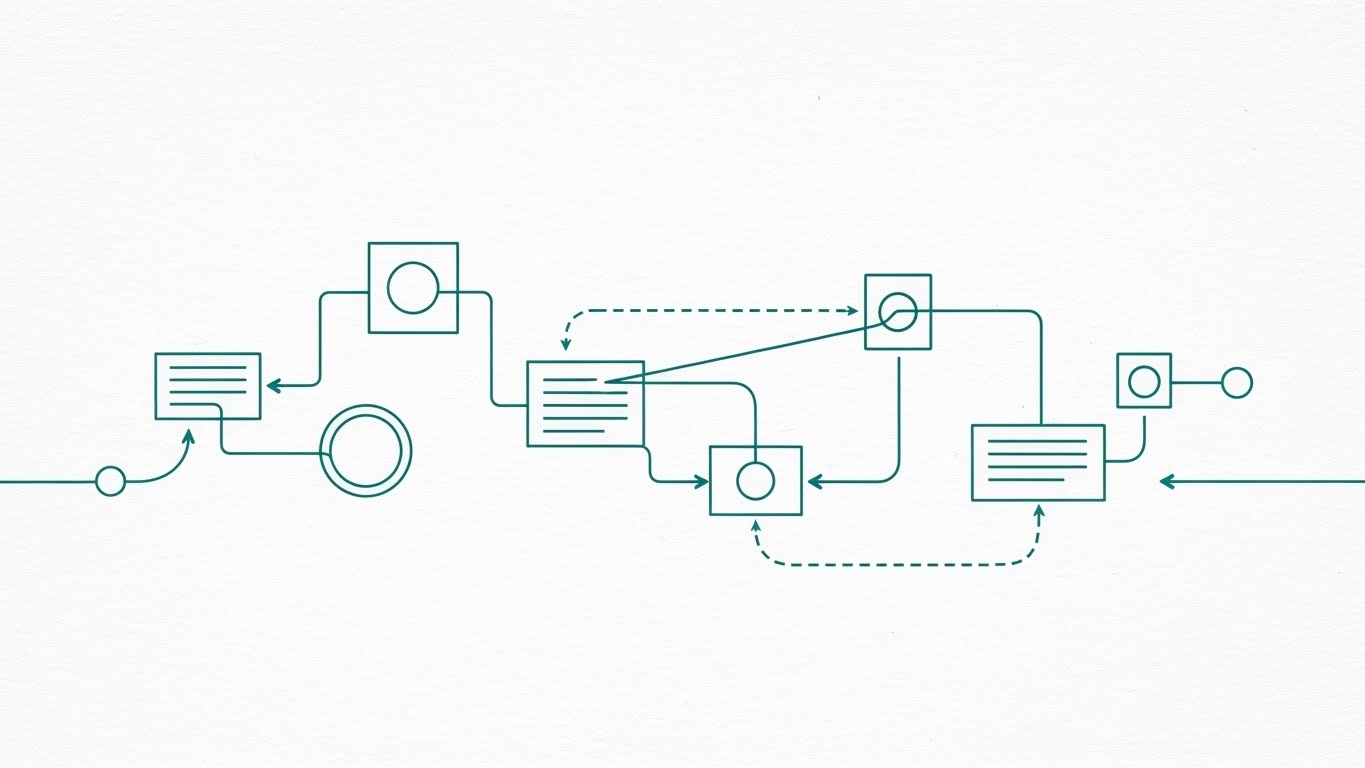
The Visual & Narrative Approach
Sophisticated minimalism. A single continuous teal ink line navigates a textured paper-white background, drawing a complex network topology map. The line connects nodes, decision points, and databases with fluid precision. The top-down view mimics a drafting table, positioning the viewer as the "Architect" of their own workflow.
Psychological Impact & KPI Focus
- Niche Psychology: Resonates with System Architects and CTOs who value "Clean Code" and logical structure over flashy graphics. It builds trust through precision.
- Operational Impact: Visualizes "Process Optimization." The unbroken line implies an uninterrupted, efficient workflow, free of bottlenecks.
- KPI: Trust Score & Information Retention.
Strategic Implementation & Trade-offs
- Use Case: "How it Works" videos or whitepaper summaries.
- Trade-off: Can feel "dry" to non-technical audiences. Requires a compelling voiceover to maintain engagement.
Companies using similar video content -
UiPath – RPA Platform – Visualizes robotic process automation workflows.
Appian – Low-Code Platform – Designs and automates complex business processes.
6. Rapid UI Feature Montage
TOFU | Vertical Social Organic
The Visual & Narrative Approach
A vertical visual cascade designed for mobile consumption. Vivid coral and white UI cards—representing notifications, toggles, and user profiles—fall in a waterfall pattern against a premium Dark Mode background. The aesthetic is crisp and ultra-modern, simulating the feeling of a "Power User" swiftly navigating a feature-rich environment.
Psychological Impact & KPI Focus
- Niche Psychology: Triggers "FOMO" (Fear Of Missing Out) on a modern tool. It signals that the software is current, fast, and designed for the "TikTok generation" of B2B workers.
- Operational Impact: Visualizes "Feature Density." It overwhelms the viewer slightly to prove the platform's robustness.
- KPI: Social Share Rate & Brand Affinity.
Strategic Implementation & Trade-offs
- Use Case: TikTok/Reels product teasers or "Year in Review" highlights.
- Trade-off: The pace is too fast for learning. It creates an impression of utility, not actual utility.
Companies using similar video content -
Monday.com – Work OS – Showcases diverse features for team collaboration.
Asana – Work Management – Highlights rapid task management and project updates.
7. Split Screen: Optimized Reality and UI
TOFU | Product Differentiation

The Visual & Narrative Approach
A stark "Before vs. After" composition. The left side depicts the user's current reality: a messy, desaturated wooden desk with paper stacks and a spilled coffee cup (chaos). The right side shows the solution: a pristine, organized digital grid in navy blue and cool grey, featuring floating abstract pie charts (order). The lighting contrasts warm/dim (stress) with cool/digital (relief).
Psychological Impact & KPI Focus
- Niche Psychology: Uses the Contrast Principle to trigger immediate desire. It validates the user's pain (the mess) and offers a visual dopamine hit of organization.
- Operational Impact: Visualizes "Digitization ROI." It explicitly shows the transition from manual, error-prone work to automated digital insight.
- KPI: Conversion Rate (CVR).
Strategic Implementation & Trade-offs
- Use Case: Homepage Hero Video. It instantly answers "Why do I need this?"
- Trade-off: Can look cliché if the stock imagery is generic. The "messy" side must look authentically stressful.
Companies using similar video content -
Smartsheet – Work Management – Transforms chaotic spreadsheets into structured work.
ServiceNow – ITSM Platform – Converts IT chaos into digital service clarity.
8. Holographic UI over 3D Render
TOFU | Category Creation

The Visual & Narrative Approach
This style anchors the software in the physical world. A photorealistic 3D render of an industrial pump sits on a white desk. Hovering above it is a translucent, laser-green holographic gauge meter (HUD). The hologram casts a realistic glow onto the object, implying a direct, real-time connection between the digital dashboard and the physical asset.
Psychological Impact & KPI Focus
- Niche Psychology: Appeals to the "Industry 4.0" mindset. It assures Operations Managers that the software is not just "cloud fluff" but is tethered to reality. It triggers a sense of "Command and Control."
- Operational Impact: Visualizes "Real-Time Telemetry." It proves the platform's ability to monitor physical assets remotely.
- KPI: Category Authority & Time-on-Site.
Strategic Implementation & Trade-offs
- Use Case: Landing pages for IoT, Manufacturing, or Logistics SaaS.
- Trade-off: High production cost. Requires custom 3D modeling to look authentic.
Companies using similar video content -
Samsara – Fleet Management – Real-time telemetry over physical fleet assets.
PTC ThingWorx – IoT Platform – Digital twin visualization for industrial control.
9. Isometric 3D Workflow
MOFU | ABM Awareness

The Visual & Narrative Approach
A playful diorama that humanizes the data. On a clean grid floor, miniature geometric figures (representing a team) work together to move massive Royal Blue and Gold Gantt chart blocks, assembling a timeline like a construction crew. The lighting is soft and studio-like. It visualizes "Project Management" as a tangible, collaborative building process.
Psychological Impact & KPI Focus
- Niche Psychology: Reduces the intimidation of complex software. It frames "Resource Allocation" as a collaborative game, fostering a sense of team spirit.
- Operational Impact: Visualizes "Dependencies." It shows how one user's action (moving a block) impacts the whole structure.
- KPI: Account Engagement (ABM).
Strategic Implementation & Trade-offs
- Use Case: Display Ads targeting Project Managers or HR leads.
- Trade-off: The "toy-like" aesthetic might be too whimsical for serious Cybersecurity or Legal Tech platforms.
Companies using similar video content -
Jira Software – Project Tracking – Collaborative construction of agile project timelines.
Wrike – Project Management – Visualizes team alignment in project execution.
10. Macro UI Micro-Interactions
MOFU | Feature Education

The Visual & Narrative Approach
This style focuses on the "Feel" of the software. An extreme macro close-up brings the viewer tight onto a "Download" icon in berry red. The sub-pixel texture of the screen is visible, making the digital interface feel physical. A subtle light sweep across the button surface emphasizes the quality of the UI design.
Psychological Impact & KPI Focus
- Niche Psychology: High fidelity signals high trust. It suggests that if the button is designed this well, the backend data handling must be equally precise. It creates a tactile desire to click.
- Operational Impact: Visualizes "Usability." It isolates a specific action to teach the user exactly what to look for.
- KPI: Feature Adoption Rate.
Strategic Implementation & Trade-offs
- Use Case: Email headers for feature releases or "Pro Tip" tooltips.
- Trade-off: Extremely narrow focus. It lacks context of the wider dashboard.
Companies using similar video content -
Figma – Design Platform – Emphasizes tactile fidelity of UI elements.
Intercom – Customer Messaging – Focuses on precise user interaction points.
11. Dynamic Data Visualization
MOFU | Demand Gen & Lead Capture

The Visual & Narrative Approach
This style abandons static charts for fluid dynamics, creating a mesmerizing metaphor for "Data Liquidity." A spiraling funnel chart, rendered as turquoise and yellow liquid glass, pours from a wide basin into a concentrated stream. The motion is smooth and continuous, visualizing the sales pipeline or freight matching process not as a stagnant list, but as a living, flowing ecosystem. The deep grey void background ensures the vibrancy of the data is the sole focus.
Psychological Impact & KPI Focus
- Niche Psychology: Logistics Brokerage leaders often view their pipeline with anxiety about "stalled" loads or "leaky" lead processes. This visual uses the metaphor of flow to suggest health, movement, and efficiency. It creates a satisfying visual resolution as the "liquid" (raw data) solidifies into a focused stream of value (booked freight).
- Operational Impact: Visualizes "Process Optimization." It demonstrates that the platform tracks the movement of data, automatically filtering noise to identify actionable opportunities.
- KPI: Lead-to-Opportunity Conversion Rate.
Strategic Implementation & Trade-offs
- Use Case: LinkedIn Feed ads targeting Sales Directors, focusing on "Unsticking your Pipeline" or "Automated Freight Matching."
- Trade-off: High production value is required for the fluid simulation. If the physics look "glitchy," it undermines the message of operational smoothness.
Companies using similar video content -
Tableau – Desktop – Fluidly transforms raw data into actionable insights.
Qlik Sense – Analytics Platform – Dynamic exploration of business data.
12. Lifestyle Stock with UI Overlay
MOFU | Driving Demo Requests

The Visual & Narrative Approach
A shift from the abstract to the aspirational. A professional woman sits in a sunlit, modern coffee shop, holding a tablet displaying a clean, abstract scatter plot. The focus is on the seamless blend of work and life; the "UI Overlay" technique places the software naturally into a real-world context without the harsh glare of a studio screen recording. The blurring of the background emphasizes focus and tranquility.
Psychological Impact & KPI Focus
- Niche Psychology: Targeted at the "Burned Out Manager." In logistics, dispatchers are often tethered to their desks. This style sells the promise of Autonomy. It suggests the software is so intuitive and cloud-accessible that high-level fleet analysis can happen anywhere, liberating the user from the command center.
- Operational Impact: Visualizes "Mobility." It proves the desktop experience translates perfectly to touch interfaces without loss of data fidelity, essential for modern, distributed teams.
- KPI: Mobile App Adoption & Session Duration.
Strategic Implementation & Trade-offs
- Use Case: Landing Page Hero sections for "Mobile Solutions" or "Remote Dispatch" features.
- Trade-off: Can feel generic if the stock footage is cliché. The UI overlay must track perfectly to the tablet's movement to maintain immersion and authenticity.
Companies using similar video content -
ZoomInfo – Go-to-Market Platform – Mobile accessibility for sales intelligence.
Salesforce – CRM – Remote autonomy for managing customer relationships.
13. Isometric 2D Motion Design
MOFU | Driving Freemium/Trials

The Visual & Narrative Approach
Welcoming and frictionless. A flat, isometric vector illustration shows a stylized heavy door swinging open to reveal a room populated by floating mint green and lavender bar charts. The aesthetic is light, airy, and inviting without being childish. It visually invites the user to "step inside" the data environment, framing the sign-up process as an opening of opportunity rather than a barrier.
Psychological Impact & KPI Focus
- Niche Psychology: Lowers the "Activation Energy" required to start a trial. Users often fear that starting a trial involves a steep learning curve or complex setup. This style frames the software as "Plug and Play."
- Operational Impact: Visualizes "Out-of-the-Box Value." It suggests that the dashboard is ready to use immediately, minimizing configuration time for SMB fleets.
- KPI: Sign-Up Rate (Visitor-to-Lead).
Strategic Implementation & Trade-offs
- Use Case: Pricing Pages or "Free Trial" modal pop-ups.
- Trade-off: Lacks technical depth. It sells the ease of the start, not the power of the engine, so it is less effective for enterprise-grade feature showcases.
Companies using similar video content -
Appcues – Product Adoption – Frictionless entry into new user experiences.
UserGuiding – User Onboarding – Instant access to product value.
14. Wireframe to Reality Transition
MOFU | Competitive Displacement

The Visual & Narrative Approach
A powerful "Before and After" transition within a single frame. A diagonal wipe separates a technical, white-on-blue wireframe blueprint of a gear icon from its fully realized, glossy, 3D rendered counterpart in rust orange and silver. This visualizes the journey from "Plan" to "Product," or from a legacy spreadsheet process to a modern digital tool.
Psychological Impact & KPI Focus
- Niche Psychology: Appeals to the "Builder" persona (Operations Director/IT) who is tired of vaporware or long implementation cycles. It validates the speed of deployment. It says, "What you design is exactly what you get, instantly."
- Operational Impact: Visualizes "Low-Code Velocity." It demonstrates how quickly a user can configure a backend process (wireframe) and see it live in the dashboard (3D render).
- KPI: Time-to-Deployment (TTD).
Strategic Implementation & Trade-offs
- Use Case: Social Ads targeting developers or implementation specialists comparing your tool to legacy systems.
- Trade-off: Requires careful syncing. The wireframe must match the final render exactly to prove fidelity and attention to detail.
Companies using similar video content -
OutSystems – Low-Code Platform – Rapid deployment from blueprint to live app.
Mendix – Low-Code Platform – Engineering precision from design to reality.
15. Clean UI Workflow (Light Mode)
MOFU | Building Trust & Credibility

The Visual & Narrative Approach
Pristine clarity. Utilizing the Glassmorphism trend, translucent, frosted-glass panels with sky blue accents hover over a soft cloud background. The central element, a glass security shield, suggests protection without opacity. The light mode aesthetic conveys hygiene, openness, and "nothing to hide."
Psychological Impact & KPI Focus
- Niche Psychology: Security is often visualized as dark, scary locks. This style reframes security as "Cleanliness." It assures the Compliance Officer (SOC2/GDPR/ELD) that the platform is secure by design, transparent, and compliant with industry regulations.
- Operational Impact: Visualizes "Data Governance." It makes the invisible layer of permissioning and security protocols feel tangible, organized, and modern.
- KPI: Trust Score & Compliance Page Dwell Time.
Strategic Implementation & Trade-offs
- Use Case: Whitepaper covers on "Data Security" or "Enterprise Compliance."
- Trade-off: Can feel "clinical." Needs subtle drop shadows and lighting effects to avoid looking flat or uninteresting.
Companies using similar video content -
Vanta – Compliance Automation – Transparent security and compliance confidence.
Drata – Compliance Automation – Clean interface for data governance.
16. 3D Parallax UI Presentation
MOFU | The Functional Buyer
The Visual & Narrative Approach
This style explodes the 2D dashboard into 3D space. Multiple dashboard screens displaying emerald green and dark grey pivot tables float in layers. A side-angle camera view reveals the depth between them, using a parallax effect to create a sense of immersion. It visually represents the ability to "drill down" through layers of data.
Psychological Impact & KPI Focus
- Niche Psychology: Resonates with the Data Analyst who needs depth. It counters the objection that the dashboard is just a "pretty surface." It shows that there is substance and granularity underneath the summary cards, capable of handling complex logistics data.
- Operational Impact: Visualizes "Multi-Tenancy" or "Drill-Down Capabilities." It shows how high-level metrics (top layer) connect to granular data rows (bottom layers), from fleet overview to individual truck telemetry.
- KPI: Product Demo Engagement.
Strategic Implementation & Trade-offs
- Use Case: Sales Presentations (Deck Slide) or Feature Walkthrough videos.
- Trade-off: Legibility can suffer at the angles. Ensure the data on the screens is large enough to be recognized as "charts" even if the text isn't fully readable.
Companies using similar video content -
Looker – BI and Analytics – Multi-layered depth for granular data exploration.
Sisense – Analytics Platform – Drill-down capabilities for complex datasets.
17. Minimalist Flat 2D Vector
MOFU | Overcoming Objections

The Visual & Narrative Approach
Bauhaus-inspired precision. Primary red, blue, and yellow geometric shapes (triangles, circles) snap together with magnetic satisfaction to form a perfect pie chart. The style is stripped of all noise—no gradients, no shadows, just pure geometry. It visualizes the concept of "Integration" as a perfect mechanical fit.
Psychological Impact & KPI Focus
- Niche Psychology: Addresses the fear of "Spaghetti Code" or messy tech stacks. This style soothes the IT Architect by visualizing modularity. It implies that your TMS software plays nicely with others (ERP, Accounting, ELD), snapping into the existing stack without friction.
- Operational Impact: Visualizes "API Interoperability." It turns the abstract concept of JSON endpoints connecting into a physical "snap," representing a unified ecosystem.
- KPI: Integration Page Traffic.
Strategic Implementation & Trade-offs
- Use Case: Blog posts about "Ecosystem" or "Partnerships."
- Trade-off: Very abstract. It works best as a conceptual illustration, not a feature demo, and requires copy to contextualize the "Integration" message.
Companies using similar video content -
Boomi – Integration Platform – Modular unity for seamless API integration.
Zapier – Workflow Automation – Connects apps with integration logic.
18. Photorealistic 3D Renders
BOFU | ROI Justification

The Visual & Narrative Approach
The crystallization of value. A solid gold upward-trending arrow rises from a platinum surface, rendered with photorealistic brushed metal textures. The low-angle "hero" shot gives the object massive weight and scale. It transforms the abstract concept of "Revenue Growth" into a tangible, heavy, precious asset.
Psychological Impact & KPI Focus
- Niche Psychology: Targeted at the CFO. It speaks the language of Capital. It moves the conversation from "Software Cost" to "Asset Value." It signals that this platform is not an operational expense, but a gold mine of efficiency and profit.
- Operational Impact: Visualizes "Net Revenue Retention." It represents the solid, enduring value generated by the platform over time through fuel savings and asset utilization.
- KPI: Average Contract Value (ACV).
Strategic Implementation & Trade-offs
- Use Case: Investor Decks or "Results" section of Case Studies.
- Trade-off: Can appear ostentatious if overused. It must be reserved for moments where financial value is the sole focus.
Companies using similar video content -
Anaplan – Connected Planning – Visualizes tangible financial growth and ROI.
Workday Adaptive Planning – Financial Planning – Represents premium value of strategic planning.
19. Realistic Character Video
BOFU | The Economic Buyer

The Visual & Narrative Approach
A cinematic portrait of leadership. A distinguished CEO with silver hair stands in a glass-walled executive office, looking at an off-screen monitor with a satisfied, confident smile. The key detail is the subtle reflection of a world map dashboard in his glasses. It visualizes the moment of insight and control that every executive craves.
Psychological Impact & KPI Focus
- Niche Psychology: Social Proof for the C-Suite. Executives buy what other successful executives use. This image mirrors their aspiration: to be the calm, informed leader overlooking a thriving global operation, powered by your data.
- Operational Impact: Visualizes "Executive Visibility." It shows the outcome of the software: peace of mind and total situational awareness over the entire supply chain.
- KPI: C-Suite Conversion Rate.
Strategic Implementation & Trade-offs
- Use Case: LinkedIn Video Ads targeting Job Titles (CEO, VP, Founder).
- Trade-off: Authenticity is critical. If the actor looks like a "stock photo model," credibility is lost. It must look cinematic and high-stakes.
Companies using similar video content -
Gainsight – Customer Success – Executive vision for customer retention.
ChurnZero – Customer Success – Global command over customer lifecycle.
20. 3D X-Ray Visualization
BOFU | The Technical Buyer

The Visual & Narrative Approach
Radical transparency for the technical gatekeeper. A 3D render of a black server rack uses an X-Ray effect to make the outer casing transparent, revealing the glowing neon green API sockets and data cables pulsing within. It is a visual promise that the "black box" is actually a well-engineered, high-performance machine.
Psychological Impact & KPI Focus
- Niche Psychology: The CTO or DevOps lead fears "Black Box" solutions that break under load. This style respects their intelligence by showing the "guts" of the system. It signals robustness, uptime, and clean architecture.
- Operational Impact: Visualizes "Backend Reliability" and "API Throughput." It reassures the buyer that the physical/digital infrastructure can handle enterprise-scale data loads and real-time telemetry.
- KPI: Technical Review Pass Rate.
Strategic Implementation & Trade-offs
- Use Case: API Documentation headers or "Architecture" pages.
- Trade-off: Potentially intimidating to non-technical users. Keep this strictly for developer-focused channels or technical validation steps.
Companies using similar video content -
Dynatrace – Observability Platform – Reveals infrastructure core and backend power.
New Relic – Observability Platform – Transparency into application performance.
21. Dark Mode UI Showcase
BOFU | Risk Mitigation

The Visual & Narrative Approach
This style visualizes the "Fortress" aspect of enterprise software. A sleek, matte charcoal interface serves as the foundation for glowing crimson red and white defense rings that pulse around a central padlock icon. The aesthetic is "Cyber Command Center"—serious, high-contrast, and vigilant. It abandons playfulness for absolute, stoic protection, utilizing the popular Dark Mode aesthetic to suggest premium, professional-grade security.
Psychological Impact & KPI Focus
- Niche Psychology: Targeted at the Chief Information Security Officer (CISO) or Compliance Lead. These buyers equate "brightness" with "exposure." Dark mode combined with red alerts triggers a sense of active monitoring. It reassures them that the platform is a sentinel, not just a tool.
- Operational Impact: Visualizes "Threat Detection." It demonstrates that the system is always awake, proactively identifying risks before they breach the perimeter.
- KPI: Security Review Pass Rate.
Strategic Implementation & Trade-offs
- Use Case: "Security & Compliance" landing pages or BOFU decks addressing data privacy (SOC2, GDPR).
- Trade-off: The color palette (Red/Black) can look "alarming" if not balanced. It creates tension, so it should be used to sell protection from tension.
Companies using similar video content -
CrowdStrike – Endpoint Security – Cyber-defense rings for risk mitigation.
Palo Alto Networks – Cybersecurity Platform – Professional-grade security monitoring.
22. 2D Character-Driven Story
Onboarding | Self-Serve Onboarding

The Visual & Narrative Approach
A celebration of user progress. A stylized 2D vector character, dressed in a professional sunflower yellow blazer, strides confidently along a lit path. As she steps, large floating checkboxes beneath her feet turn green, signifying completion. The fluid shapes and warm lighting transform the often-tedious onboarding checklist into a rewarding, gamified journey of "leveling up."
Psychological Impact & KPI Focus
- Niche Psychology: New users often feel "Setup Fatigue." This style uses Gamification Psychology to release dopamine with every step. It reframes complex configuration tasks as small, winnable achievements, encouraging the user to keep moving forward.
- Operational Impact: Visualizes "Self-Sufficiency." It subtly trains the user that they are in control of their own success, reducing reliance on support teams.
- KPI: Time-to-First-Value (TTFV).
Strategic Implementation & Trade-offs
- Use Case: In-App Welcome Screens or "Getting Started" email sequences.
- Trade-off: Can feel too casual for very severe industries. Ensure the character looks professional, not cartoonish.
Companies using similar video content -
WalkMe – Digital Adoption Platform – Gamified progress for user onboarding.
Pendo – Product Analytics – Self-serve momentum in product adoption.
23. Hyper-lapse Stock Footage
Onboarding | Accelerating TTV

The Visual & Narrative Approach
A visual metaphor for speed and focus. A wide-angle hyper-lapse shot captures a bustling, open-plan office. While the human elements blur with motion, vibrant white and electric blue data streaks zip through the air, converging instantly onto a central monitor. The image conveys that while the office is busy, the software acts as a high-speed conduit, cutting through the noise to deliver insight.
Psychological Impact & KPI Focus
- Niche Psychology: addresses the anxiety of "Workflow Bottlenecks." It visually proves that the software is faster than the chaos of the physical office. It appeals to the manager who wants to see their team moving at the speed of light.
- Operational Impact: Visualizes "Throughput." It suggests that data entry and retrieval happen instantaneously, removing latency from decision-making.
- KPI: User Activation Rate.
Strategic Implementation & Trade-offs
- Use Case: Social Media ads targeting "Efficiency" or "Productivity" keywords.
- Trade-off: Generic office footage can be forgettable. The "Data Streaks" VFX must be high-quality to brand the footage as your software story.
Companies using similar video content -
Microsoft Teams – Collaboration Platform – Accelerated workflows in a busy office.
Slack – Communication Platform – Time-to-value in team communication.
24. Abstract 2D Motion Graphics
Onboarding | Reducing Friction

The Visual & Narrative Approach
Pure, unadulterated flow. Pastel pink and blue spheres glide effortlessly through smooth, curving matte tubes against a soft, dreamlike gradient background. There are no sharp corners, no rough textures, and no obstacles. This abstract animation creates a sensory experience of "Zero Friction," visually promising that the user experience is intuitive and resistance-free.
Psychological Impact & KPI Focus
- Niche Psychology: Soothes the "Tech Stress" of non-technical users. It uses ASMR-like visual satisfaction to lower heart rates and build a subconscious association between the software and "Ease."
- Operational Impact: Visualizes "UX Intuition." It implies that data moves where it needs to go without manual intervention or "clunky" interfaces.
- KPI: Onboarding Completion Rate.
Strategic Implementation & Trade-offs
- Use Case: Background loops for "Ease of Use" sections on landing pages or email headers.
- Trade-off: Totally abstract. It conveys a feeling, not a feature. Do not use this when you need to explain how something works.
Companies using similar video content -
Mailchimp – Marketing Platform – Smooth flow for email campaign creation.
Freshworks – Customer Service Suite – Smooth flow for customer engagement.
26. Low-Poly 3D Modeling
Retention | Reducing Churn

The Visual & Narrative Approach
The visualization of continuity. A geometric, Low-Poly landscape in shades of violet and indigo features a road twisted into a Möbius strip (infinity loop). Small, faceted data packets travel this road endlessly. The style is digital and structured, representing a closed-loop system where value is constantly generated, recycled, and renewed without end.
Psychological Impact & KPI Focus
- Niche Psychology: Targets the "Subscription Mindset." It subtly reinforces the idea that the software is not a one-time purchase but a continuous journey. The infinity loop suggests that the longer you stay, the more value you extract.
- Operational Impact: Visualizes "Lifecycle Management." It shows data as a cycle (Collect -> Analyze -> Act -> Repeat), reinforcing the habit loop.
- KPI: Customer Retention Rate (CRR).
Strategic Implementation & Trade-offs
- Use Case: Re-engagement emails or "Year in Review" personalized videos.
- Trade-off: Low-poly can look "retro" or "indie game" if not rendered with high-quality lighting. Needs to look intentional, not low-budget.
Companies using similar video content -
HubSpot – CRM Platform – Infinite loops for recurring customer value.
Zendesk – Customer Service – Continuous value generation in support.
27. 2D Animation & UI Composition
Retention | Driving Deep Feature Adoption

The Visual & Narrative Approach
Empowering the power user. A blend of friendly character animation and flat UI design shows a user in an orange sweater effortlessly lifting a heavy, teal-colored "Widget" block and slotting it into a dashboard interface. It visualizes the Drag-and-Drop capability, making the customization of complex dashboards look as simple as playing with building blocks.
Psychological Impact & KPI Focus
- Niche Psychology: Addresses the "Rigidity" objection. Users hate feeling stuck with a default view. This style celebrates Agency—the ability to mold the tool to fit their specific workflow.
- Operational Impact: Visualizes "Customization." It proves the platform is flexible enough to handle unique operational requirements without custom coding.
- KPI: Feature Depth / Sticky Features Adoption.
Strategic Implementation & Trade-offs
- Use Case: Help Center articles or "Pro Tip" pop-ups within the dashboard.
- Trade-off: Must accurately reflect the UI. If the actual product isn't drag-and-drop, this visual is misleading.
Companies using similar video content -
Airtable – Database/Workflow – Modular control for custom database building.
Notion – Workspace – Feature mastery through drag-and-drop customization.
28. Futuristic Neon/Dark Mode (Bright Variant)
Expansion | Driving Upsell/Cross-sell

The Visual & Narrative Approach
The beauty of scale. Iridescent, crystalline structures grow and branch out like coral against a stark white background, refracting light in brilliant rainbows. Unlike the structured "grid" styles, this represents organic, high-value growth. It visualizes the "Premium" tier of the software—where data crystallizes into rare, valuable insights.
Psychological Impact & KPI Focus
- Niche Psychology: Appeals to the "Ambition" of the account holder. It suggests that upgrading isn't just about "more storage," but about unlocking a higher state of existence for their business—something beautiful, complex, and valuable.
- Operational Impact: Visualizes "Ecosystem Value." It shows how adding new modules (branches) creates a structure that is greater than the sum of its parts.
- KPI: Expansion Revenue (Upsell %.).
Strategic Implementation & Trade-offs
- Use Case: "Enterprise Tier" announcement emails or high-value account reviews.
- Trade-off: Very artistic. It serves as a brand piece for "Premium Status" rather than a functional explanation.
Companies using similar video content -
Snowflake – Data Cloud – Organic expansion of data ecosystem.
Databricks – Lakehouse Platform – Ecosystem growth for data and AI.
29. 2D Graphics Over Live Action
Expansion | Driving Referrals & Advocacy

The Visual & Narrative Approach
Bridging the digital and the human. A high-quality photograph captures a warm handshake between two professionals. Floating in the air between them are 2D vector icons—network nodes, "thumbs up," and share symbols—glowing in brand colors. The graphics track the motion of the handshake, visualizing the Network Effect: how the software facilitates trust and connection between partners, vendors, or clients.
Psychological Impact & KPI Focus
- Niche Psychology: B2B is ultimately H2H (Human to Human). This style reminds the user that the software builds relationships. It validates the user's decision to recommend the tool, framing it as a social currency.
- Operational Impact: Visualizes "Collaboration." It shows that the value of the platform extends beyond the screen, improving real-world business partnerships.
- KPI: Net Promoter Score (NPS) & Referral Rate.
Strategic Implementation & Trade-offs
- Use Case: Referral Program landing pages or LinkedIn "Customer Success" stories.
- Trade-off: Stock photography of handshakes is the ultimate cliché. The graphical overlay must be high-quality and animated to save it from looking like a generic corporate brochure.
Companies using similar video content -
LinkedIn Sales Navigator – Sales Intelligence – Human connection for network effects.
Zoom – Video Conferencing – Facilitates collaboration and partnerships.
30. Aspirational Stock Montage
Expansion | Proactive Support

The Visual & Narrative Approach
The "Mission Accomplished" moment. A cinematic, low-angle shot shows a diverse team of professionals standing on a rooftop terrace, looking out toward a sun-drenched, golden-hour horizon. A subtle lens flare evokes a sense of optimism and limitless potential. This is the Emotional Anchor of the guide—visualizing the ultimate outcome of using the software: a team aligned, confident, and looking toward a bright future.
Psychological Impact & KPI Focus
- Niche Psychology: Targets the "Visionary Leader." It moves beyond features, data, and workflows to sell the feeling of success. It answers the question, "What does it feel like when everything works perfectly?"
- Operational Impact: Visualizes "Organizational Alignment." It implies that the software has eliminated the chaos, allowing the team to stop fighting fires and start looking ahead.
- KPI: Customer Lifetime Value (CLTV).
Strategic Implementation & Trade-offs
- Use Case: Company Newsletters, Annual Reports, or "Thank You" videos.
- Trade-off: Zero functional information. It is purely brand building. Use it only after the value has been proven.
The Visual Operations Doctrine: A Strategic Synthesis
The 30 visual styles outlined above are not merely artistic choices; they are functional components of a "Visual Operating System" designed to bridge the gap between complex SaaS logic and human adoption. To transform these examples into a cohesive business strategy, we must move beyond creation and focus on implementation.
The following Knowledge Base synthesizes these styles into three core strategic segments, providing the framework for a high-performance visual strategy.
Strategic Alignment & Visual Architecture
The "Pre-Production" Strategy: Defining the Why and Who
Before a single pixel is rendered, the visual architecture must be aligned with the cognitive reality of your users.
- The Cognitive Load Audit: Do not choose a style based on "coolness." Audit the complexity of the task. High-complexity tasks (e.g., API Configuration, Style 17) require high-simplicity visuals (Flat Vector). Low-complexity tasks (e.g., Success Confirmation, Style 22) benefit from high-engagement visuals (Gamification).
- Role-Based Visual Mapping: Differentiate your visual language. The "Driver" persona (Mobile/Field) requires High Contrast/Large UI styles (Style 6) for readability in sunlight. The "Analyst" persona (Desktop/HQ) requires High Density/Parallax styles (Style 16) to convey depth and granularity.
- The "Glanceability" Standard: In logistics and dashboard environments, users are under pressure. Adopt a "3-Second Rule" for all visuals. If the insight (Style 1) isn't understood within 3 seconds, the visual has failed as a cognitive accelerator.
- Brand Voice Consistency: Your dashboard, marketing site, and sales deck are often treated as separate visual islands. Unified visual architecture means the "Wireframe to Reality" transition (Style 14) seen in ads must match the actual onboarding experience to prevent "Trust Churn."
- The Advids Strategic Audit: Visual strategy is often fragmented across departments. Engaging a partner like Advids early allows for a holistic audit of your "Visual Operating System," ensuring that the styles selected for the Homepage (TOFU) naturally evolve into the styles used in the Help Center (Retention).
- Standardization vs. Customization: Use standardized "Stock with Overlay" (Style 12) for universal concepts like "Remote Work." Reserve custom, high-budget 3D (Style 8) for your core differentiator—the specific feature that separates you from competitors.
- The Cross-Departmental Bridge: Sales sells "Magic" (Style 1), but Ops delivers "Logic" (Style 5). A coherent visual strategy uses hybrid styles (Style 7) to bridge this gap, ensuring the "Magic" sold is grounded in the "Logic" delivered.
- Legacy System Integration: Your software likely replaces or integrates with old hardware. Use X-Ray Visuals (Style 20) to show respect for the legacy infrastructure while highlighting the modern "Brain" you are installing within it.
- Accessibility in Motion: Motion graphics must be accessible. Avoid rapid flashing (Style 4) in product documentation. Ensure color contrast in "Dark Mode" styles (Style 21) meets WCAG standards for inclusive operational clarity.
- The Mobile-First Mandate: 60% of SaaS interaction happens on mobile devices. Ensure every wide-screen visual (Style 16) has a vertical, simplified variant (Style 6) ready for the mobile feed.
Operational Adoption & Implementation
The "Deployment" Phase: Embedding Visuals into Workflow
A visual asset sitting in a folder is a wasted asset. Strategy lies in where and when these visuals are deployed to reduce friction.
- Overcoming "Big Brother" Anxiety: In fleet tracking and employee monitoring, data can feel invasive. Use "Clean UI" styles (Style 15) and "Protection" metaphors (Style 21) to reframe monitoring as "Safety" and "Compliance," not surveillance.
- The Micro-Learning Shift: No one reads the PDF manual. Replace 50-page guides with a library of 30-second "Macro UI" loops (Style 10). Embed these directly into the dashboard tooltips for "Just-in-Time" learning.
- Just-in-Time Support: When a user encounters an error, display a "Frictionless Flow" animation (Style 24) with the solution, rather than a text error code. Visualizing the fix reduces frustration and support ticket volume.
- Gamification of Training: Drivers and operators respond to progress. Use Character-Driven Story visuals (Style 22) in your learning management system (LMS) to turn dry compliance training into a visual journey of achievement.
- Reducing Support Ticket Volume: There is a direct correlation between the quality of your "Feature Montage" (Style 6) videos and the volume of "How-to" tickets. Proactive visualization acts as a deflection shield for your support team.
- Remote Onboarding: For distributed teams, you cannot hold in-person seminars. Use Hyper-lapse (Style 23) and Screen Recording blends to simulate the energy of a live demo, creating a sense of connection without physical presence.
- Visualizing SOPs: Standard Operating Procedures are often ignored text blocks. Convert them into Isometric Workflow diagrams (Style 9). A visual map of the process is referenced 4x more often than a text list.
- Feedback Loops: Use Interactive Video elements where users can click on the "Pain Point" in a visual (Style 7) to give feedback. This turns passive viewing into active product data collection.
- Scalable Localization: If you operate globally, text is a barrier. Abstract 3D (Style 1) and Line Art (Style 5) are universal languages. Heavily leaning on non-textual visual explanation reduces localization costs.
- Leadership Communication: When presenting to the C-Suite, do not show raw data tables. Use Photorealistic 3D Renders (Style 18) to visualize the value of the data. Executives buy the "Gold Bar," not the spreadsheet.
Measuring Impact & Future-Proofing
The "ROI" Phase: Metrics and Evolution
Visual strategy must be accountable. We must measure the impact of these styles on the bottom line and prepare for the next evolution of SaaS.
- Beyond "Views": Vanity metrics are useless. Measure "Time-to-Competency." How much faster does a user master a feature after watching a "UI Composition" (Style 27) vs. reading a text guide? This is your ROI.
- The "Idle Time" Metric: In dashboard software, confusion looks like "idle time" (mouse hovering, no clicking). Correlate the deployment of "Macro UI" (Style 10) helpers with a reduction in user idle time.
- Compliance Velocity: For logistics (ELD/DOT), speed of compliance is cash. Measure how fast a fleet achieves 100% compliance after releasing a "Clean UI" (Style 15) explainer video compared to previous text memos.
- Retention and Churn: High-quality visualization builds emotional capital. Track the Net Revenue Retention (NRR) of cohorts exposed to "Visionary" content (Style 30) vs. those who are not. Visuals build the brand affinity that prevents churn.
- The AI Visual Frontier: The next phase is Generative UI. Prepare your visual language to be adaptive. Styles like "Abstract 3D AI" (Style 1) are not just marketing; they are precursors to interfaces that change shape based on user needs.
- Scalability of Assets: Don't build "One-off" videos. Build a "Visual Design System" (components, motion behaviors, assets). This allows you to scale from 10 videos to 1000 without linear cost increases.
- The Advids Partnership: Building a scalable, future-proof visual library is a massive operational lift. Partnering with Advids ensures that as your feature set grows, your visual assets evolve in lockstep, preventing your library from becoming obsolete.
- Benchmarking Success: "Good enough" is a churn risk. If your competitor's visualization helps a user understand a trend in 5 seconds (Style 11) and yours takes 15, you are losing. Constant visual benchmarking is essential.
- The ROI of Safety: In industrial SaaS, better training means fewer accidents. Quantify the reduction in insurance claims or safety incidents and attribute it to the clarity of your "Simulation" visuals (Style 8).
- Final Call to Innovation: Treat video and visualization not as "Marketing Content," but as "Infrastructure." Just as you invest in server stability, invest in visual clarity. In the Clarity Engine economy, the platform that is easiest to understand is the platform that wins.
Companies using similar video content -
SAP – ERP Software – Collective vision for operational victory.
Oracle Cloud – Enterprise Cloud – Aspirational future for business transformation.
Author & Editor Bio


