
Introduction: The Visual Bridge to Data Integrity
The modern enterprise runs on data, yet the reality for most organizations is a chaotic struggle against entropy. We often speak of "data lakes," but without rigorous preparation, these reservoirs quickly stagnate into unmanageable swamps. The operational reality is that data engineers are currently spending 80 percent of their time on the mundane labor of cleaning and organizing data, rather than extracting the insights that drive innovation.
This inefficiency is not just a technical nuisance; it is a massive financial leak. The cumulative effect of errors, duplicates, and schema drift results in poor data quality, averaging $12.9 million in annual costs for organizations. The challenge for SaaS platforms in this space is not just to solve the problem, but to articulate the solution. How do you visualize the invisible process of turning raw, unstructured chaos into pristine, actionable intelligence?
This guide acts as a strategic framework for bridging that communication gap. By leveraging specific video styles, we can transform abstract concepts like "ETL pipelines" and "schema mapping" into tangible, compelling visual narratives. From the high-energy kinetic typography that captures the speed of processing to the tactile isometric 3D models that humanize complex workflows, these examples demonstrate how to reduce cognitive load and accelerate the "Aha!" moment for your buyers.
The following visual strategies are designed to resonate with the specific anxieties and aspirations of data leaders—moving them from skepticism to trust by vividly demonstrating how your platform bridges the physical/digital divide.
1. Bold Kinetic Typography (Visual)
TOFU | Brand Awareness

(Bold Kinetic Typography): Kinetic Alignment + Visualizing Structural Order
The Visual & Narrative Approach
This style abandons traditional legibility for pure visceral impact, perfectly suited for the noisy environment of social media feeds. The visualization captures the essence of "Chaos to Order." We see a high-energy composition where bold, chunky geometric blocks—colored in Electric Blue and Hot Pink—initially fly through a digital void in a scattered, disorganized state. This represents the raw, unstructured data entering the system. Through dynamic motion blur and aggressive pacing, these shapes abruptly snap into a perfectly aligned grid structure, changing to a unified palette against a Pure White digital noise texture. There is no voiceover; the sound design does the heavy lifting with mechanical clicks and "whooshes" that synchronize with the visual alignment.
Psychological Impact & KPI Focus
For a Data Engineer or CDO, the most immediate psychological trigger is the relief of structure. They deal with entropy daily. This visual metaphor bypasses the logical brain and hits the emotional desire for control and organization. It communicates "speed" and "precision" without getting bogged down in technical details. The primary KPI here is Ad Recall and Stop-Ratio. By using high-contrast colors and rapid motion, we disrupt the scroll pattern, planting a seed of brand recognition associated with efficiency.
Strategic Implementation & Trade-offs
- Best Use Case: Instagram Reels or LinkedIn succinct video ads where audio might be off. It serves as a "hook" to drive traffic to a landing page.
- Strategic Trade-off: This style sacrifices informational depth for engagement. It cannot explain how the data is cleaned, only that it is cleaned. It must be paired with deeper content (like Style 5 or 10) further down the funnel.
Companies using similar video content -
Fivetran – Data Integration Platform – Automates data movement and ELT pipelines.
Airbyte – Open-Source ELT Platform – Connects diverse data sources for pipelines.
2. Abstract 2D Motion Graphics (Organic)
TOFU | Market Education

(Abstract 2D Motion Graphics): Fluid Filtering + Simplifying Data Refining
The Visual & Narrative Approach
This style utilizes a therapeutic, "oddly satisfying" aesthetic to counter the stress usually associated with data wrangling. We observe fluid, organic blobs in Glossy Purple and Mint Green, floating in a pristine white space. These blobs represent different data streams—distinct but amorphous. They gently drift toward a stylized, semi-transparent mesh. As they pass through, they don't just pass; they refine. They merge, separate, and emerge on the other side as polished, consistent shapes. The lighting is soft and shadowless, giving the surfaces a wet, polished look. The motion is slow, deliberate, and smooth, conveying a sense of effortless processing.
Psychological Impact & KPI Focus
The target audience often views data preparation as a gritty, jagged, and painful process. This style re-frames it as a seamless, almost biological function. It lowers Cognitive Load by abstracting complex filtering rules into a simple visual of "passing through a mesh." This builds Brand Affinity by positioning the platform not as a complex tool that requires a manual, but as an automated environment that naturally cleanses the ecosystem. It appeals to the aspiration for a "self-healing" pipeline.
Strategic Implementation & Trade-offs
- Best Use Case: Website homepages or "Platform" overview pages. It sets a premium tone immediately.
- Strategic Trade-off: The high level of abstraction means it may be too vague for technical buyers looking for specific feature validation (e.g., "Does it handle JSON flattening?"). It works best for high-level value propositioning rather than technical demos.
Companies using similar video content -
Ataccama ONE – ONE – AI-powered data management and quality.
3. Minimalist Flat 2D Vector
TOFU | Shaping Brand Perception

(Minimalist Flat 2D Vector): Geometric Funnel + Converting Raw to Value
The Visual & Narrative Approach
Drawing inspiration from Bauhaus design, this style uses strict geometry to tell a clear transformation story. We see "raw documents"—represented by rectangles with dog-ears in Mustard Yellow and Slate Grey—tumbling chaotically from the top of the frame. They fall into a large, stylized U-shaped funnel (the software). Inside the funnel, we see brief, rhythmic flashes of gears or icons, implying work. Crucially, what emerges from the bottom are not documents, but perfectly identical, aligned golden circles. The background is a textured off-white paper grain, adding a sense of tactile quality. The edges are sharp, with no gradients, emphasizing simplicity.
Psychological Impact & KPI Focus
This visual leverages the Metaphor of Alchemy: turning base material (raw data) into gold (value). For a business stakeholder, this directly connects data preparation to ROI. It removes the technical "black box" and replaces it with a clear input/output value equation. The use of flat, unpretentious vector art signals transparency and ease of use. The goal is to improve Click-Through Rates (CTR) on social platforms by offering a clear, visual promise of value generation.
Strategic Implementation & Trade-offs
- Best Use Case: LinkedIn carousel ads or sidebar ads where quick visual comprehension is necessary.
- Strategic Trade-off: The "paper" aesthetic might feel "low-tech" to some enterprise architects looking for cutting-edge AI solutions. It frames the solution as a utility rather than a futuristic innovation.
Companies using similar video content -
Astera Centerprise – Centerprise – Code-free ETL/ELT and data quality.
Hevo Data – Data Integration Platform – No-code ELT and real-time data transfer.
4. Abstract 2D Motion Graphics (Geometric)
TOFU | Category Creation

(Abstract 2D Motion Graphics): Grid Connections + Mapping Complex Schemas
The Visual & Narrative Approach
Here, we visualize the invisible architecture of data connectivity. The perspective is a dynamic Dutch-angle view of a digital grid. Fast-moving lines of Cyan and Magenta light zip across a Deep Navy background, representing data packets moving at speed. Where these lines intersect, they form glowing white nodes. The camera pans along these lines, simulating the journey of a data point finding its place in a schema. The aesthetic is clean, sharp, and precise, utilizing geometric primitives to visualize the concept of "mapping" disparate sources into a cohesive whole.
Psychological Impact & KPI Focus
This style appeals to the "Architect" persona. It visualizes the Network Effect—showing that the value of the platform increases as more connections are made. It addresses the fear of "Siloed Data" by visually demonstrating connectivity and flow. The deep navy background suggests enterprise-grade security and reliability. This style is effective for establishing Authority and positioning the brand as the "central nervous system" of the client's data operations.
Strategic Implementation & Trade-offs
- Best Use Case: Background video for a "Integrations" page or a header for a technical blog post.
- Strategic Trade-off: It is somewhat generic to the "tech" industry. Without specific UI overlays or voiceover context, it could easily be mistaken for a cybersecurity or cloud hosting ad. It needs strong copy to anchor it to Data Prep.
Companies using similar video content -
Collibra – Data Intelligence Platform – Governs, catalogs, and ensures data quality.
OpenMetadata – Open Source Metadata Platform – Manages data discovery, quality, and lineage.
5. Isometric 2D Motion Design
TOFU | Product Differentiation
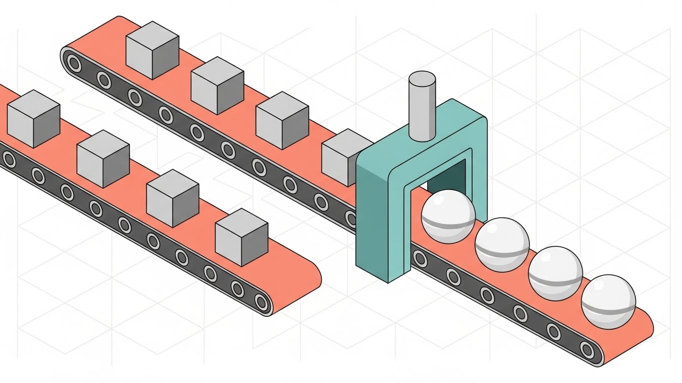
(Isometric 2D Motion Design): Factory Process + Demystifying ETL Workflows
The Visual & Narrative Approach
This style uses the friendly, approachable isometric perspective to build a "Data Factory." We see conveyor belts in Pastel Coral carrying grey, rough geometric cubes (raw data) through a teal-colored processing gate. On the other side, the cubes emerge as bright White, polished spheres, which are then neatly packed into crates. The background is a faint isometric grid pattern. The motion is rhythmic and looped, illustrating the continuous nature of the ETL (Extract, Transform, Load) process.
Psychological Impact & KPI Focus
Isometric design is excellent for Process Visualization. It allows the viewer to see the "before" and "after" simultaneously in a single frame. This reduces the Time-to-Understanding for complex ETL concepts. It makes the scary, invisible back-end process look manageable, predictable, and even cute. This style is particularly effective for Market Education, helping non-technical stakeholders understand why they need to budget for data preparation tools.
Strategic Implementation & Trade-offs
- Best Use Case: "How it Works" section on the website or a slide in a sales deck.
- Strategic Trade-off: The playful, almost "game-like" aesthetic might undercut the perceived seriousness of the tool for highly regulated industries (like Finance or Healthcare) if not balanced with serious copy.
Companies using similar video content -
Matillion – Cloud ETL Platform – Transforms data within cloud data warehouses.
6. 2D Line Art Animation
TOFU | YouTube
(2D Line Art Animation): Blueprint Trace + Tracing Data Lineage
The Visual & Narrative Approach
Sophistication through simplicity. This style features a single, continuous thin line in Navy Blue and Metallic Gold drawing itself across a clean White Blueprint Paper background. The line weaves, turns, and branches out to draw a complex map of a data network. It traces the lineage of a single data packet—starting from a source icon (e.g., a server), winding through transformation logic, and arriving at a destination (e.g., a dashboard). The aesthetic resembles a high-end architectural schematic. It is quiet, elegant, and intellectually stimulating.
Psychological Impact & KPI Focus
This style targets the Cognitive need for Clarity. Data lineage—knowing where data came from—is a huge compliance pain point (GDPR, CCPA). The "blueprint" aesthetic subconsciously signals precision, planning, and architectural integrity. It tells the viewer: "We don't just move data; we engineer its path." This is highly effective for building Trust with senior technical decision-makers who value documentation and traceability.
Strategic Implementation & Trade-offs
- Best Use Case: YouTube educational videos (e.g., "What is Data Lineage?") or whitepaper summaries.
- Strategic Trade-off: It is visually sparse. It requires a very strong script and voiceover to hold attention, as the visual stimulation is low compared to 3D or kinetic styles.
Companies using similar video content -
SAS – Data Management – Prepares, profiles, and transforms data.
7. Low-Poly 3D Modeling
MOFU | ABM Awareness

(Low-Poly 3D Modeling): City Bridges + Bridging Data Silos
The Visual & Narrative Approach
We zoom out to a bird's-eye view of a digital landscape rendered in low-poly 3D. We see isolated towers representing "data silos" (Marketing, Sales, Finance) rendered in faceted Orange and Blue shades against a clean white sky. Initially, they are disconnected islands. As the animation progresses, bridges spontaneously form between the towers, and small "traffic" (data packets) begins to flow smoothly between them. The lighting is soft (Gouraud shading), highlighting the geometric facets. The camera rotates slowly, emphasizing the scale of the integration.
Psychological Impact & KPI Focus
This metaphor addresses the "Siloed Data" pain point directly. By representing departments as buildings, it makes the problem of Organizational Fragmentation tangible. The formation of bridges visualizes the solution: Interoperability. It creates a sense of community and holistic health within the enterprise. The goal is to drive Account-Based Engagement, showing specific industry use cases (e.g., connecting a hospital's disparate systems).
Strategic Implementation & Trade-offs
- Best Use Case: Display Ads targeting specific accounts or industries (e.g., "Connect your Healthcare Ecosystem").
- Strategic Trade-off: Low-poly art can sometimes look "dated" or "video-gamey" if not rendered with high-quality lighting and materials. It needs to look like a modern architectural model, not a 90s game.
Companies using similar video content -
Dell Boomi – Integration Platform as a Service – Connects applications and data with low-code.
MuleSoft – Anypoint Platform – Integrates applications and data via APIs.
8. Abstract 3D AI Visualization
MOFU | Demand Gen

(Abstract 3D AI Visualization): Particle Vortex + AI-Driven Data Organization
The Visual & Narrative Approach
This is the "High-Tech" hero shot. We see thousands of tiny glowing particles in Deep Violet and Cyan forming a swirling, chaotic vortex. This represents the sheer volume and velocity of Big Data. In the center of the vortex, a structured, crystalline lattice in Silver begins to form. The particles are sucked into this lattice and instantly lock into place. The background is a bright, high-key white void, making the colors pop. A shallow depth of field keeps the focus on the "moment of organization" (the center), while the edges blur into bokeh.
Psychological Impact & KPI Focus
This visualizes Artificial Intelligence and Machine Learning capabilities without showing lines of code. It triggers the "Future-Ready" aspiration. It suggests that the platform handles complexity that is beyond human capacity. The "swirl to structure" motion is deeply satisfying and implies that the software is powerful enough to tame the storm. This is designed to generate Marketing Qualified Leads (MQLs) who are looking for enterprise-grade, scalable solutions.
Strategic Implementation & Trade-offs
- Best Use Case: LinkedIn video ads promoting a "State of AI in Data" report or a webinar background.
- Strategic Trade-off: It is purely metaphorical. It creates hype but doesn't explain functionality. It must be followed up with evidence of how the AI actually works to avoid skepticism.
Companies using similar video content -
Informatica – Intelligent Data Management Cloud – Governs, integrates, and ensures data quality.
Anomalo – Data Quality Monitoring – Detects data anomalies using AI.
9. Dynamic Data Visualization
MOFU | Skippable Pre-Roll Ad

(Dynamic Data Visualization): Rapid Charts + Demonstrating Real-Time Velocity
The Visual & Narrative Approach
Inspired by Swiss Design, this composition features aggressive, fast-moving bar charts and scatter plots. The palette is high-contrast Red, White, and Black. The bars don't just grow; they shift, re-sort, and leave motion trails, symbolizing Real-Time Analytics. The camera moves dynamically with the charts, creating a sense of explosive energy and statistical precision. There is no text, just the visual language of data scaling up rapidly.
Psychological Impact & KPI Focus
This appeals to the desire for Speed to Insight. Data engineers are often blamed for "slow dashboards." This visual promises the opposite: instant availability. The high-contrast palette screams urgency and importance. It creates a sense of FOMO (Fear Of Missing Out) regarding real-time capabilities. The goal is to reduce Skip Rates on YouTube by providing an immediate, visually stimulating hook that promises performance.
Strategic Implementation & Trade-offs
- Best Use Case: YouTube Pre-roll ads (first 5 seconds are crucial).
- Strategic Trade-off: It focuses on the output (analytics) rather than the process (preparation). It assumes the viewer understands that good prep leads to fast charts.
Companies using similar video content -
Qlik – Sense – Visualizes and analyzes data interactively.
ThoughtSpot – AI-Powered Analytics – Delivers search-driven insights with natural language.
10. Isometric 3D Workflow
MOFU | Feature Education
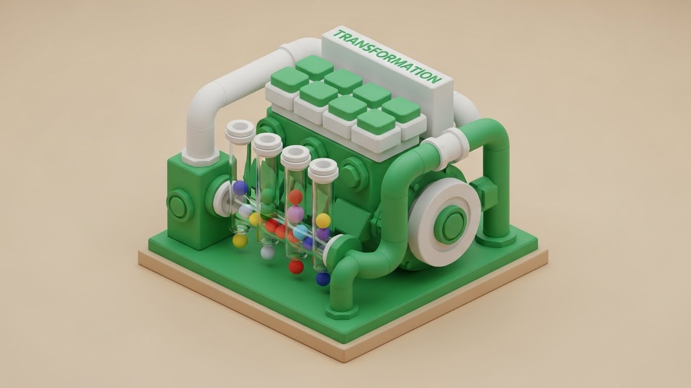
(Isometric 3D Workflow): Tactile Machine + Humanizing Automated Orchestration
The Visual & Narrative Approach
A charming, highly detailed isometric 3D miniature of a "Transformation Engine." It looks like a clean, toy-like machine in Emerald Green and White, sitting on a Beige studio floor. We see pipes connecting to it, and tiny balls roll through visible glass tubes. As they roll, we see them getting sorted by color—red balls go left, blue balls go right. The lighting creates soft shadows (Claymorphism), making the complex engineering look approachable and tactile. We might see a little "gear" spinning smoothly.
Psychological Impact & KPI Focus
This style utilizes Tactile Realism to make software feel like hardware. It grounds abstract concepts (like "conditional logic" or "routing") in physical reality. By showing the balls being sorted in glass tubes, it provides a clear mental model of how the software handles data logic. This reduces anxiety about "Black Box" algorithms. It makes the tool feel "shippable" and concrete, aiding in Feature Retention and education.
Strategic Implementation & Trade-offs
- Best Use Case: Product pages explaining specific features (e.g., "Automated Routing" or "Error Handling").
- Strategic Trade-off: High production cost. Creating detailed 3D assets takes time and budget. It is an investment for core evergreen content, not disposable social posts.
Companies using similar video content -
Alteryx – Analytics Automation Platform – Automates data preparation and advanced analytics.
11. Wireframe to Reality Transition
MOFU | Reducing Implementation Friction

(Wireframe to Reality Transition): Blueprint Alignment + Validating Implementation Plan
The Visual & Narrative Approach
This split-screen technique visually answers the question: "Can you deliver what you promise?" The left side of the frame displays a technical, schematic view of a database schema, rendered in Blueprint Blue with stark White contour lines. It represents the "plan" or the "backend logic." The right side is a perfect mirror image but rendered as a sleek, photorealistic server rack in Metallic Silver and Glass. A glowing scanning line moves horizontally across the boundary, transforming the wireframe into reality in real-time. The motion is precise and mechanical, symbolizing a flawless transition from architecture to deployment.
Psychological Impact & KPI Focus
Implementation risk is a major barrier for Data Engineers. They fear that the sales pitch (the reality) won't match the documentation (the wireframe). This visual metaphor bridges that gap, subconsciously signaling Fidelity and Reliability. It tells the technical buyer that the platform's architectural integrity is sound. The primary KPI is Conversion Rate on landing pages, as this visual serves as a "trust seal" that validates the engineering quality of the software.
Strategic Implementation & Trade-offs
- Best Use Case: Landing pages for "Enterprise Deployment" or technical documentation headers.
- Strategic Trade-off: It is highly technical. It appeals strongly to architects and engineers but may feel "cold" or overly abstract to non-technical business stakeholders who care more about dashboard outputs than server racks.
Companies using similar video content -
Snowflake – Data Cloud – Provides cloud data warehousing and management.
Denodo – Data Virtualization Platform – Accesses real-time data without movement.
12. Dark Mode UI Showcase
MOFU | Building Trust

(Dark Mode UI Showcase): Glowing Security + Visualizing Data Health
The Visual & Narrative Approach
This style speaks the native language of developers: Dark Mode. Against a Deep Charcoal background, we see a sleek, professional interface where code syntax and validation rules glow in vivid Neon Green and Soft Blue. The central focus is a 3D glass "Health Check" shield icon that pulsates softly, indicating active protection. The lighting includes a subtle bloom effect, making the data look "alive" and secure. The camera holds a steady, straight-on view, emphasizing stability and control.
Psychological Impact & KPI Focus
Dark mode is often associated with "Pro" tools and developer environments. By showcasing the UI in this aesthetic, you signal that the platform is a serious, developer-friendly tool, not just a lightweight business app. The glowing shield creates a feeling of Safety and Monitoring, addressing the anxiety of data governance and compliance. This style is effective for increasing Time on Site by inviting the viewer to study the "code" and interface details, building trust in the platform's sophistication.
Strategic Implementation & Trade-offs
- Best Use Case: "Security" or "Compliance" feature pages on the website.
- Strategic Trade-off: If your actual platform does not offer a dark mode, this visualization can be misleading. It sets an expectation of a specific UX that must be met by the product reality.
Companies using similar video content -
Microsoft – SQL Server Integration Services – Integrates and transforms data.
13. Clean UI Workflow (Light Mode)
MOFU | The Functional Buyer

(Clean UI Workflow): Intuitive Mapping + Simplifying Transformation Logic
The Visual & Narrative Approach
While the Dark Mode style targets coders, this style targets the business analyst. We see a pristine, high-fidelity UI mockup on a clean White background with crisp Royal Blue accents. The focus is on a "drag-and-drop" interaction: a stylized 3D cursor holds a "data pill" (labeled "Data Vill"), hovering over a target drop zone to trigger a transformation. Soft drop shadows give the elements depth, separating the active task from the background. The backdrop is a heavily blurred, bright office environment, subtly suggesting a professional, daylight context.
Psychological Impact & KPI Focus
This visual minimizes Perceived Effort. It demonstrates that complex SQL transformations can be handled with a simple mouse movement. It appeals to the "Functional Buyer" who needs efficiency and ease of use. By isolating the specific "drag-and-drop" action, it validates the claim of "No-Code/Low-Code" usability. The goal is to drive Demo Requests by showing how user-friendly the daily workflow is.
Strategic Implementation & Trade-offs
- Best Use Case: Email marketing campaigns targeting business analysts or "Product Tour" videos.
- Strategic Trade-off: It focuses on ease of use over power. Advanced data engineers might view this as "too simple" for their complex needs if not balanced with deep-dive technical specs.
Companies using similar video content -
Skyvia – Cloud Data Platform – Offers no-code data integration and backup.
Zoho DataPrep – Data Preparation Tool – Cleanses, transforms, and unifies raw data.
14. Photorealistic 3D Renders
MOFU | Website Visitor Re-engagement

(Photorealistic 3D Renders): Material Sorting + Metaphor for Deduplication
The Visual & Narrative Approach
This style uses a "satisfying loop" aesthetic to visualize the concept of automated sorting and deduplication. We see a macro, photorealistic 3D render where glass marbles in Gold, Silver, and Bronze roll down a pristine white track. As they approach a junction, they are automatically and flawlessly diverted into separate chutes based on their material properties. The ray-traced reflections (caustics) on the glass and metal add a layer of hyper-realism and polish.
Psychological Impact & KPI Focus
Data cleaning is often abstract; this metaphor makes it physical and satisfying. It leverages the ASMR (Autonomous Sensory Meridian Response) trend to hold attention. The precision of the sorting mechanism subconsciously reassures the viewer about the accuracy of the platform’s deduplication algorithms. It implies: "We handle your data with this level of care." This is highly effective for Retargeting Ads, where the goal is to re-engage a visitor who has already seen the technical pitch but needs a "nudge" of quality assurance.
Strategic Implementation & Trade-offs
- Best Use Case: Display Ads or Instagram/LinkedIn retargeting.
- Strategic Trade-off: It is purely metaphorical. It draws attention but explains zero functionality. It must be used to reinforce brand quality, not to teach features.
Companies using similar video content -
Melissa – Data Quality Suite – Verifies and enriches contact data globally.
Precisely – Trillium Data Integrity Suite – Ensures data quality and governance.
15. 2D Character-Driven Story
MOFU | Competitive Displacement

(2D Character-Driven Story): Relatable Success + Humanizing ROI Metrics
The Visual & Narrative Approach
Data problems are ultimately people problems. This style puts the user in the spotlight. We see a stylized 2D vector illustration with a warm, grainy texture. A professional woman with deep skin tones, wearing a Lavender blazer and a messy bun, looks at a tablet with an expression of pleasant surprise and relief. A floating holographic chart projects from the tablet, showing a "Before" and "After" growth curve. The background uses abstract geometric shapes in Peach and White to keep the mood light and optimistic.
Psychological Impact & KPI Focus
This visual triggers Empathy and Social Proof. It allows the viewer to see themselves in the success story. It shifts the narrative from "software features" to "career success." For a manager stressed about deadlines, this image promises relief and recognition. It is particularly effective for Competitive Displacement, subtly suggesting that the current solution causes stress, while this platform brings relief and growth.
Strategic Implementation & Trade-offs
- Best Use Case: Social Media Ads (Facebook/LinkedIn) featuring customer testimonials or case studies.
- Strategic Trade-off: The "cartoon" style can sometimes be perceived as less "enterprise-ready" than 3D or high-fidelity UI. It works best for human-centric storytelling rather than technical validation.
Companies using similar video content -
Redpoint Global – Customer Data Platform – Unifies customer data for engagement.
16. 3D X-Ray Visualization
BOFU | The Technical Buyer

(3D X-Ray Visualization): Transparent Architecture + Revealing Internal Power
The Visual & Narrative Approach
For the final stages of the decision process, transparency is key. This style features a high-tech server tower against a bright white studio backdrop. The outer casing is rendered in Translucent White, acting as an "X-Ray" skin that reveals the internal architecture. Inside, we see glowing "data cores" and processing units in Electric Blue, intricately detailed. The camera rotates slightly, giving a sense of three-dimensional depth and complexity.
Psychological Impact & KPI Focus
This appeals directly to the Technical Buyer (CTO/Lead Architect) who wants to know "what's under the hood." The transparency metaphor demonstrates that the vendor has nothing to hide. It visualizes Power and Robustness. Unlike the "black box" of competitors, this style suggests an open, understandable, and powerful architecture. The goal is to support Sales Enablement, giving the internal champion visual assets to convince their stakeholders of the platform's technical superiority.
Strategic Implementation & Trade-offs
- Best Use Case: Whitepapers, technical decks, or deep-dive webinar backgrounds.
- Strategic Trade-off: It creates a hardware association for a software product. The copy must ensure the viewer understands this represents software architecture (cloud/on-prem), not a physical appliance.
Companies using similar video content -
IBM – InfoSphere DataStage – Performs enterprise ETL for complex data.
Ab Initio – Enterprise Data Processing – Integrates and processes high-volume data.
17. Rapid UI Feature Montage
BOFU | Overcoming Objections
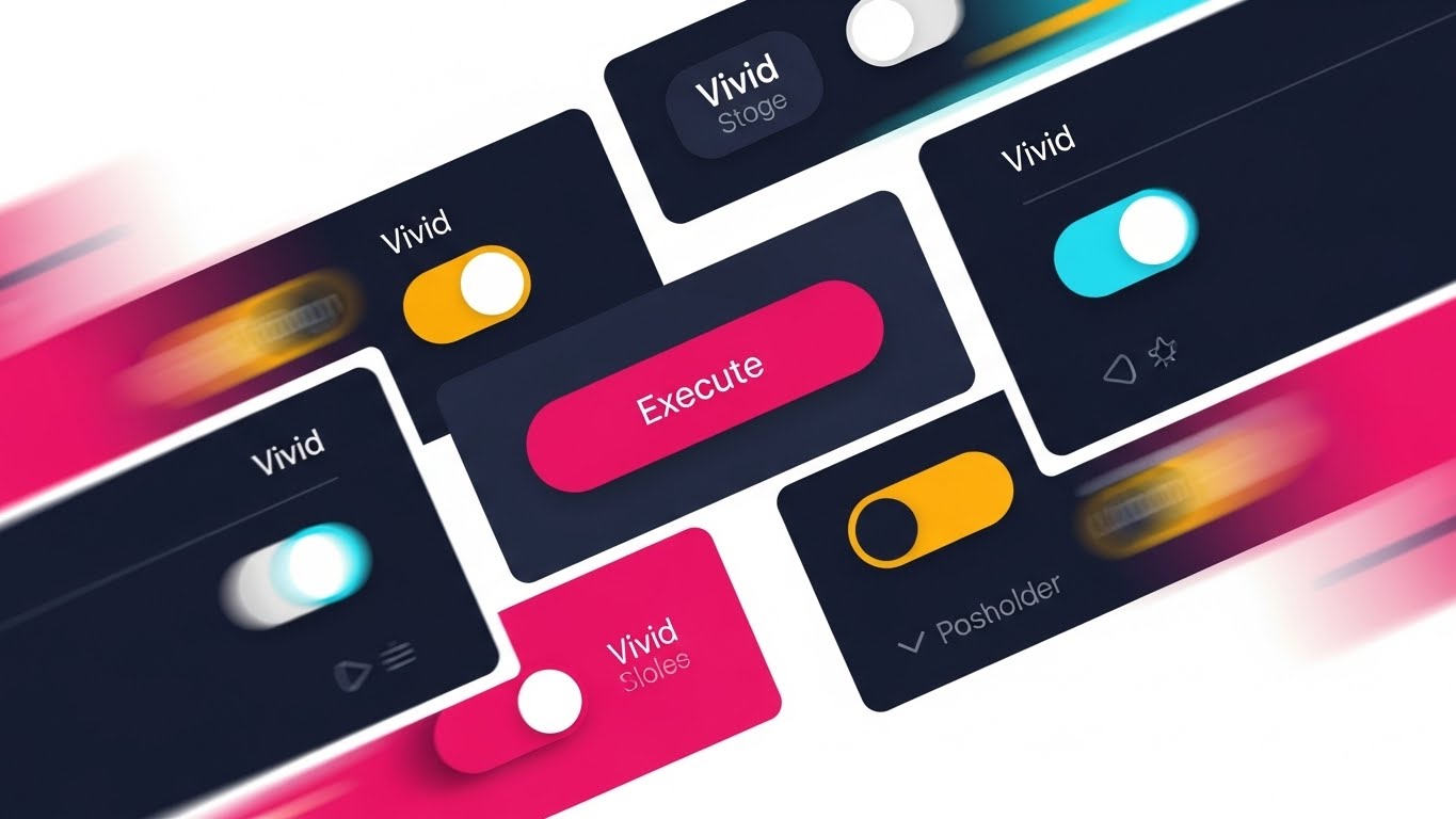
(Rapid UI Feature Montage): Kinetic Control + Accelerating Feature Adoption
The Visual & Narrative Approach
This style is designed to overwhelm the viewer with value. It uses a dynamic collage of UI elements—toggles, switches, and buttons in Vivid Orange and Navy—arranged artistically against a white background. Motion blur is applied to the edges, creating a "tunnel vision" effect that focuses the eye on a central "Execute" button. The elements fly past the camera or snap into place rapidly, conveying a sense of speed and comprehensive control.
Psychological Impact & KPI Focus
The sheer volume of UI elements displayed in rapid succession triggers the Heuristic of Quantity—"If there are this many controls, it must be powerful." It addresses the objection: "Does it have enough features?" without needing a boring list. The kinetic energy suggests that the platform is fast and responsive. This is excellent for YouTube Pre-rolls or closing slides in a video sales letter, designed to push the viewer over the edge by showcasing feature density.
Strategic Implementation & Trade-offs
- Best Use Case: Bottom-of-funnel video ads or "recap" sections in a demo video.
- Strategic Trade-off: It is chaotic by design. It creates an impression of power but teaches nothing about specific workflows. It serves as an emotional "closer" rather than an educational tool.
Companies using similar video content -
Integrate.io – Data Integration Platform – Provides cloud-based ETL for analytics.
Jitterbit – Harmony – Offers low-code integration for apps and data.
18. Aspirational Stock Montage
BOFU | ROI Justification

(Aspirational Stock Montage): Augmented Success + Visualizing Executive ROI
The Visual & Narrative Approach
Here we visualize the result of data preparation: Business Growth. We see a low-angle hero shot of a professional man in a Navy suit and crisp White shirt, standing in a modern glass-walled office. He looks upward with a confident smile, bathed in natural sunlight. Overlaid around him are subtle, high-end Augmented Reality (AR) metrics—growth arrows and percentage indicators in Teal. The aesthetic is clean, corporate, and undeniably successful.
Psychological Impact & KPI Focus
This targets the Economic Buyer (CFO/CEO). They care less about "schema mapping" and more about "market leadership." This image connects the software investment directly to the personal and professional success of the executive. It visualizes the ROI (Return on Investment) and the feeling of being "on top" of the data. It is designed to validate the purchase decision on an emotional level, reinforcing that this is a smart, career-enhancing move.
Strategic Implementation & Trade-offs
- Best Use Case: LinkedIn Slide Decks or Case Study headers tailored for C-Level executives.
- Strategic Trade-off: It relies on stock photography tropes. If the execution is too generic, it can feel like "corporate fluff." The AR overlay is critical to tie it back to data and tech; otherwise, it's just a picture of a man in a suit.
Companies using similar video content -
Microsoft – Power BI – Visualizes and analyzes business data.
Domo – Business Intelligence & Data Integration – Connects, transforms, and visualizes data.
19. 2D Graphics Over Live Action
BOFU | Driving Demo Requests

(2D Graphics Over Live Action): Mobile Agility + Breaking the Fourth Wall
The Visual & Narrative Approach
This style mixes the real world with the digital to show the flexibility of modern SaaS. We see an over-the-shoulder shot of a person in a bright, sunlit coffee shop holding a tablet. On the screen, a dashboard is visible, but the magic happens off the screen: bright 2D vector sparks, "cleaning" icons (brooms, bubbles), and sparkles in Primary Red, Blue, and Yellow pop out into the real world. This "Mixed Reality" effect emphasizes that the software's impact breaks the boundaries of the device.
Psychological Impact & KPI Focus
This visualizes Agility and Remote Management. It tells the story that data preparation doesn't require being chained to a desk in a dark server room; it can be done from anywhere. The playful "sparks" popping out break the fourth wall, creating a sense of delight and magic. It reduces the intimidation factor of complex software, making it feel app-like and accessible. This drives Demo Requests from users who want a modern, flexible tool.
Strategic Implementation & Trade-offs
- Best Use Case: Social Media Ads (Instagram Stories/Reels) targeting the "modern data worker."
- Strategic Trade-off: The casual setting (coffee shop) might seem too informal for highly regulated industries (banking/defense) where security is paramount over mobility.
Companies using similar video content -
Adverity – Marketing Data Integration – Connects marketing data for analytics.
AWS – AppSync – Provides real-time GraphQL APIs for data.
20. Split Screen: Optimized Reality and UI
BOFU | The Economic Buyer

(Split Screen: Optimized Reality and UI): Balanced Reality + Outsourcing Operational Complexity
The Visual & Narrative Approach
The final visual summarizes the ultimate value proposition: Balance. A horizontal split-screen composition divides the frame. The left side shows a serene, peaceful view of a peaceful park in Warm Sunlight, representing the user's peace of mind (or the time saved). The right side shows a complex, sophisticated data dashboard in Cool Screen Blue, perfectly organized and running efficiently. The composition implies a causal link: because the software handles the complexity (right), the human gets the clarity (left).
Psychological Impact & KPI Focus
This addresses Burnout. Data professionals are often overworked. This visual promises not just "better data," but a "better life." It visualizes the concept of Outsourcing Complexity to the machine. For the Economic Buyer, it represents efficiency—getting more done without burning out the team. It is a powerful closing argument for the software as a partner in sustainable operations.
Strategic Implementation & Trade-offs
- Best Use Case: Email closers or the final slide of a sales presentation.
- Strategic Trade-off: It is a high-level conceptual pitch. It works best as a summary emotion after the technical features have been proven (by styles 11-17). It assumes the viewer trusts the dashboard on the right is real.
Companies using similar video content -
Workato – Integration & Automation Platform – Automates business workflows and integrations.
Celigo – Integration Platform as a Service – Automates data flows between business apps.
21. Lifestyle Stock with UI Overlay
BOFU | Sales Cycle Acceleration

(Lifestyle Stock with UI Overlay): Augmented Harmony + Accelerating Sales Cycles
The Visual & Narrative Approach
This style bridges the gap between the "grind" of data work and the "freedom" of result-driven success. We see high-quality lifestyle cinematography: a professional woman working in a sunlit, plant-filled home office. The atmosphere is calm and organic, utilizing a Soft Beige and Forest Green palette. Floating in the air before her are semi-transparent, futuristic UI planes. These aren't cluttered spreadsheets but sleek "Sales Velocity" speedometers and growth charts. The focus remains sharp on her happy, determined face, while the UI layers hover slightly out of focus in the foreground, suggesting that the software is an omnipresent, frictionless enabler of her lifestyle.
Psychological Impact & KPI Focus
For the Sales Leader or CRO, data preparation is often seen as a bottleneck that slows down deals. This visual re-frames the software as an accelerator. It subliminally connects the platform with Work-Life Balance and Professional Autonomy. It suggests: "Our tool handles the heavy lifting so you can focus on closing." The primary KPI is Conversion Rate on bottom-of-funnel retargeting ads, appealing to the desire for a smoother, faster sales process.
Strategic Implementation & Trade-offs
- Best Use Case: Instagram/Facebook retargeting ads or "Life at [Company]" culture videos.
- Strategic Trade-off: It relies heavily on the quality of the stock footage and the compositing. Poorly tracked UI elements will look like a cheap sci-fi movie. The "lifestyle" angle may feel disconnected if the product is purely technical (e.g., backend SQL parser).
Companies using similar video content -
Tray.io – Integration Platform as a Service – Automates workflows and integrates data.
Zigiwave – Data Integration Platform – Integrates enterprise applications and systems.
22. Macro UI Micro-Interactions
Onboard | Self-Serve Onboarding

(Macro UI Micro-Interactions): Tactile Precision + Automating Complex Tasks
The Visual & Narrative Approach
This style celebrates the power of the "Click." We see an extreme macro close-up (simulated 100mm lens) of a finger hovering over a physical mouse button or trackpad. The texture of the skin and the device is hyper-real. Superimposed near the click point is a glowing, digital cursor hovering over a "Clean" or "Execute" button in bright Electric Blue and Red. The audio design is critical here—a rising "charge-up" sound culminates in a satisfying, resonant click that ripples out visual shockwaves, instantly clearing a digital clutter.
Psychological Impact & KPI Focus
New users often feel overwhelmed by complex interfaces. This style utilizes Sensory Satisfaction to reduce that anxiety. It isolates a single, powerful action, reinforcing the concept of Simplicity. It promises the user: "One click is all it takes." This is highly effective for User Activation, specifically designed to get a new signup to perform their first key action (the "Aha!" moment) by making the interaction look tangibly rewarding.
Strategic Implementation & Trade-offs
- Best Use Case: Welcome emails, in-app onboarding tooltips, or "Feature Highlight" shorts.
- Strategic Trade-off: It is hyper-specific. It works for single-action features (e.g., "Run Deduplication") but fails to explain multi-step workflows. It is a mood setter, not a tutorial.
Companies using similar video content -
Tableau – Prep – Prepares and cleans data visually.
Portable.io – ELT Platform – Builds custom, on-demand data connectors.
23. 3D Parallax UI Presentation
Onboard | User Activation

(3D Parallax UI Presentation): Layered Depth + Visualizing Platform Richness
The Visual & Narrative Approach
To show depth without clutter, we use a 3D parallax effect. Three distinct layers of UI screens float in a deep digital space, angled slightly to reveal their separation. The front screen is razor-sharp, displaying a "Success" notification in Sharp UI Blue. The layers behind it—showing the underlying data logic and logs—are slightly blurred (bokeh effect). The background is a sophisticated abstraction of city lights or server rack lights in Silver/White. As the "camera" pans, the layers move at different speeds, creating a rich sense of immersion and dimensionality.
Psychological Impact & KPI Focus
This visualizes Hierarchy and Architecture. It tells the user that while the interface (front layer) is simple, the engine (back layers) is deep and robust. It builds Confidence in the tool's capability without overwhelming the eye. The goal is to drive Feature Adoption by making the interface look modern, high-tech, and professionally engineered. It combats the perception of "flat" or "basic" web apps.
Strategic Implementation & Trade-offs
- Best Use Case: Website "Features" section headers or product tour intro videos.
- Strategic Trade-off: Requires high-fidelity UI assets. If the actual product UI is dated or cluttered, this style will set an expectation that the reality cannot match, leading to disappointment.
Companies using similar video content -
Datameer – Data Transformation SaaS – Engineers analytics and transforms data.
Coalesce – Data Transformation Platform – Builds data for cloud data warehouses.
24. Futuristic Neon/Dark Mode
Onboard | Accelerating TTV

(Futuristic Neon/Dark Mode): Velocity Tunnel + Accelerating Time-to-Value
The Visual & Narrative Approach
A high-octane journey through a digital tunnel. Glowing Neon Purple and Cyber Blue lines race along black circuit-board walls toward a blinding bright light at the end. The perspective is a "fly-through," moving at breakneck speed. The motion implies zero friction. We don't see data "struggling"; we see it flowing as pure light. This style borrows from the visual language of gaming and cyberpunk to symbolize low latency and high throughput.
Psychological Impact & KPI Focus
This targets the technical need for Speed. In data prep, "waiting for the query to run" is a major pain point. This visual creates a visceral feeling of Velocity. It reassures the Data Engineer that this platform is built for performance. The primary KPI is Time-to-Value (TTV) perception—convincing the user that they will get results faster with this tool than with legacy systems.
Strategic Implementation & Trade-offs
- Best Use Case: Email marketing campaigns announcing "Performance Updates" or "New Engine" releases.
- Strategic Trade-off: It is abstract and aggressive. It may alienate conservative enterprise buyers who prefer "clean and corporate" over "gamer aesthetic." It works best for developer-focused communications.
Companies using similar video content -
Estuary – Flow – Provides real-time and batch data integration.
TIBCO – Cloud Integration – Offers cloud-native integration for applications.
25. 2D Animation & UI Composition
Retention | Driving Deep Feature Adoption

(2D Animation & UI Composition): Whimsical Debugging + Humanizing Error Detection
The Visual & Narrative Approach
To make the tedious task of error detection friendly, we introduce a character. A 3D rendered monitor sits on a clean desk. Inside the screen, a flat 2D "rubber hose" style animation character (think 1930s cartoons, colored in Bright Yellow with thick Black outlines) is physically "fishing" into a data window and pulling out a jagged "bug" icon. The character wipes its brow, smiles, and tosses the bug into a trash can. It’s a fun, whimsical representation of automated error handling.
Psychological Impact & KPI Focus
This style reduces Data Anxiety. Error logs are usually stressful red text. By personifying the "debugger" as a helpful, cute character, we transform the emotion from stress to Delight. It fosters Brand Affinity and makes the platform feel like a helpful partner rather than a cold tool. The goal is Retention—creating a positive emotional bond that makes it harder for the user to switch to a competitor.
Strategic Implementation & Trade-offs
- Best Use Case: Empty states (e.g., "No Errors Found" screen), success messages, or "Did You Know?" feature tips.
- Strategic Trade-off: The "cartoon" style must be used sparingly. If used for critical system failure alerts, it will seem patronizing or unserious. It is for "delight" moments only.
Companies using similar video content -
Datafold – Data Observability Platform – Ensures data quality and pipeline testing.
26. Hyper-lapse Stock Footage with Data
Retention | Support / Knowledge Base

(Hyper-lapse Stock Footage): Organized Chaos + Streamlining Support Traffic
The Visual & Narrative Approach
This style connects the digital world to the physical concept of logistics. We see a high-angle hyper-lapse of a busy city intersection at night. Traffic streaks of Red (tail lights) and White (headlights) flow chaotically. Floating above the cars are glowing Cyan data lines and nodes that organize the chaotic flow into perfect, optimized lanes. Text overlays like "Flow Managed" and "Optimization Active" appear in 3D space, tracking with the camera movement.
Psychological Impact & KPI Focus
This visualizes Orchestration. It appeals to the Support Manager or Operations Lead who deals with the "traffic" of tickets and issues. It demonstrates that the software brings order to the chaos of real-world operations. The metaphor of "traffic control" is universally understood as a critical, high-stakes function. The goal is to drive engagement with Support Resources or Knowledge Base articles by framing them as optimization tools.
Strategic Implementation & Trade-offs
- Best Use Case: YouTube thumbnails for tutorial playlists, support portal headers, or "Status Page" backgrounds.
- Strategic Trade-off: Requires high-quality tracking and compositing. If the text floats awkwardly, it breaks the illusion of integration.
Companies using similar video content -
Nexla – Data Operations Platform – Integrates, transforms, and monitors data.
DCKAP – Integrator – Connects ERP with other business systems.
27. Holographic UI over 3D Render
Retention | Reducing Churn
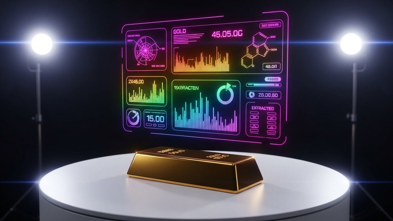
(Holographic UI over 3D Render): Value Extraction + Visualizing Data Worth
The Visual & Narrative Approach
A direct visual metaphor for value. A realistic, heavy Gold Bar rests on a pristine white turntable. Projected above it is a complex, wireframe Holographic Rainbow UI. This hologram breaks down the gold bar into its constituent chemical data points, charts, and value metrics. The lighting is dramatic, high-key studio lighting, highlighting the texture of the gold and the ethereal quality of the digital overlay.
Psychological Impact & KPI Focus
This addresses the "Value Gap." Customers churn when they forget the value the software provides. This image is a potent reminder: "Your data is gold, and we help you refine it." It reinforces the ROI argument during the renewal phase. It appeals to the Economic Buyer's desire to see tangible assets. The goal is Churn Reduction by visually anchoring the software's function to the creation of wealth/value.
Strategic Implementation & Trade-offs
- Best Use Case: Renewal notification emails, "Year in Review" personalized videos, or quarterly business review (QBR) decks.
- Strategic Trade-off: It creates a very high expectation of value. It should be paired with actual metrics (e.g., "You saved $10k this year") to avoid feeling like empty marketing.
Companies using similar video content -
Qlik – Talend Data Fabric – Provides comprehensive data integration and governance.
IRI – Voracity – Manages data, ETL, and data quality.
28. 3D Network Constellation
Expansion | Driving Upsell/Cross-sell

(3D Network Constellation): Global Connectivity + Visualizing Enterprise Scale
The Visual & Narrative Approach
To sell the "Suite" or "Ecosystem," we move beyond the single node. We see a dark void populated by hundreds of glowing Orbital Nodes in Teal, Purple, and Orange. Initially, only a small cluster is lit (the current product usage). Slowly, connections shoot out to distant nodes, illuminating them one by one until a massive, interconnected constellation is formed. The camera pulls back to reveal this network forms the shape of a globe or a brain. The aesthetic is grand, cinematic, and expansive.
Psychological Impact & KPI Focus
This targets the Expansion phase. It triggers the Network Effect bias—the idea that the system becomes more valuable the more you add to it. It visually argues for Cross-Selling: "You have the core; now connect the rest." It appeals to the CIO's vision of a "Unified Data Fabric." The goal is to drive Upsell/Cross-sell opportunities by showing the potential of a fully integrated ecosystem.
Strategic Implementation & Trade-offs
- Best Use Case: Keynote presentations at user conferences, "Platform Vision" whitepapers, or strategic account planning meetings.
- Strategic Trade-off: It is abstract. It sells a "vision," not a feature. It is less effective for tactical buyers who just want to fix a specific bug today.
Companies using similar video content -
Meltano – Open-Source ELT Platform – Orchestrates data integration pipelines.
Apache – Hop – Integrates and orchestrates data flows.
29. Mixed Media Case Study
Expansion | Driving Referrals

(Mixed Media Case Study): The Human Metric + Validating Customer Success
The Visual & Narrative Approach
A dynamic collage style that blends credibility with energy. The screen is split into a grid. One cell shows a high-quality video portrait of a real customer smiling. Another cell shows a scrolling "Code Terminal" view. A third cell shows a rapid-fire counter ticking up (e.g., "Records Processed: 1B+"). Animated Brush Strokes in brand colors circle the key metrics. The grid pulses to an upbeat rhythm. It’s a celebration of customer victory using the software.
Psychological Impact & KPI Focus
This leverages Social Proof and Tribalism. Seeing a peer (another Data Engineer) succeeding validates the user's choice and encourages them to become an advocate. The mix of code and human faces bridges the gap between the technical and the personal. The goal is to drive Advocacy—getting users to share their own success stories or participate in case studies.
Strategic Implementation & Trade-offs
- Best Use Case: LinkedIn "Customer Spotlight" posts, case study landing pages, or community newsletters.
- Strategic Trade-off: It requires real customer assets. If you don't have permission to use a client's face or data, this style cannot be executed authentically.
Companies using similar video content -
Atlas Systems – PRIME® – Manages healthcare provider data quality.
ONEiO Cloud – IT Service Integration – Integrates IT service management tools.
30. Generative AI Realistic Character
Expansion | Thought Leadership

(Generative AI Realistic Character): Visionary Stance + Establishing Market Authority
The Visual & Narrative Approach
The final style establishes authority. We see a realistic, AI-generated or filmed professional (male, 40s) standing on a conference stage, illuminated by bright Stage Lights. He exudes confidence. Next to him, a large, high-fidelity 3D hologram of a "Data Globe" spins. He gestures towards it, explaining a future trend. The background is a blurred, brightly lit audience, suggesting a TED-talk atmosphere. The video quality is cinematic, with lens flares and high contrast.
Psychological Impact & KPI Focus
This positions the brand not just as a tool provider, but as a Thought Leader. It appeals to the user's aspiration to be part of a "winning" movement. It suggests that by using this software, they are aligned with the future of the industry. The goal is Brand Equity and Market Authority, differentiating the platform from "commodity" tools. It says: "We define the category."
Strategic Implementation & Trade-offs
- Best Use Case: LinkedIn video ads promoting a "State of the Industry" report, webinar invitations, or the company's "Vision Keynote."
- Strategic Trade-off: The "fake" nature of AI characters can trigger the "Uncanny Valley" effect if not done perfectly. It requires top-tier generation tools (like Sora or Runway Gen-3) or actual live-action filming to be credible.
Strategic Knowledge Base: The Visual Operations Doctrine
To transform these 30 visual styles from a "menu of options" into a "business engine," we must apply a strategic framework. The following three segments synthesize the visual tactics into a cohesive doctrine for Data Preparation SaaS growth. This is where Advids moves from being a production vendor to a strategic growth partner.
Strategic Alignment & Visual Architecture (Pre-Production)
- The Cognitive Load Audit: Before commissioning a single pixel, conduct an audit of your current training materials. If a concept takes 500 words to explain, it qualifies for a Style 5 (Isometric Process) or Style 10 (Tactile Workflow) visualization. The goal is to reduce "Time-to-Comprehension" by 50%.
- Role-Based Visual Mapping: Do not use the same visual for a Data Engineer and a CFO. Map your styles: Use Dark Mode/Code styles (Style 12, 28) strictly for technical buyers to signal "Pro Tool." Use Clean UI/Lifestyle styles (Style 13, 18) for economic buyers to signal "Ease and ROI."
- The "Glanceability" Standard: In a SaaS environment, users scan; they don't read. Your visual assets must pass the "Glance Test"—can the value be understood in 1.5 seconds? Styles like Bold Kinetic Typography (Style 1) are engineered specifically for this threshold.
- Brand Voice Consistency: Your visual language is your product's body language. If your marketing video uses "Cyberpunk Neon" (Style 24) but your product UI is "Corporate Beige," you create a jarring brand disconnect. Advids recommends establishing a "Visual Operating System" where marketing assets reflect the actual UI aesthetic to build subconscious familiarity.
- The Advids Strategic Audit: Leveraging a partner like Advids during the pre-production phase helps define this visual architecture, ensuring that every video asset creates a cohesive narrative rather than a disjointed collection of clips.
- Standardization vs. Customization: For high-volume content (Help Desk), use template-driven styles (Style 2, 9) that can be mass-produced. Reserve high-cost, bespoke styles (Style 8, 14) for "Hero" assets like the Homepage or Series A pitch deck.
- The Cross-Departmental Bridge: Use visuals to unify terminology. If Sales says "Data Cleaning" and Engineering says "Schema Normalization," use a Style 5 (Factory Process) animation to visually demonstrate that these are the same process, aligning internal and external language.
- Legacy System Integration: Visualizing the invisible link between on-prem hardware and cloud SaaS is critical. Use Style 11 (Wireframe to Reality) to show the secure, robust connection between the "Old World" (Server Racks) and the "New World" (Cloud UI).
- Accessibility in Design: Data teams are global and neurodiverse. Ensure your Motion Graphics (Style 4, 9) rely on shape and motion, not just color, to convey meaning (supporting color-blind users). Avoid flashing lights in "High Velocity" styles that could trigger photosensitivity.
- The Mobile-First Mandate: Even B2B buyers consume content on mobile during commutes. Ensure all "Text-Heavy" styles (Style 1, 9) use font sizes legible on a 6-inch screen. A beautiful dashboard visualization is useless if the metrics are unreadable on LinkedIn Mobile.
Operational Adoption & Implementation (Deployment)
- Overcoming "Big Brother" Anxiety: Data governance tools can feel invasive. Use empathy-driven visuals (Style 15, 20) that focus on relieving stress for the employee, rather than monitoring them. Frame the software as a "shield" (Style 12), not a "camera."
- The Micro-Learning Shift: Replace 50-page PDF manuals with a library of 30-second Style 22 (Micro-Interaction) videos. Embed these directly into the software's tooltips. This "Just-in-Time" learning reduces support tickets and frustration.
- Just-in-Time Support: Integrate visual snippets into your support chatbots. When a user queries "Error 404," the bot should deliver a Style 25 (Whimsical Animation) or Style 13 (Clean UI) video loop, providing instant, visual resolution without human intervention.
- Gamification of Training: Use Style 25 (Fun Animation) to introduce new features. If learning a new schema mapping tool feels like a game rather than a chore, adoption rates skyrocket.
- Reducing Support Ticket Volume: There is a direct correlation between proactive visual guides and reduced call center load. A Style 5 (Isometric Workflow) video explaining "How Deduplication Works" can deflect 30% of "Why is my data gone?" tickets.
- Remote Onboarding: In a distributed workforce, you cannot rely on over-the-shoulder training. Use Style 23 (Parallax UI) and Style 11 (Wireframe to Reality) to create an immersive, self-paced onboarding experience that feels as high-touch as a live seminar.
- Standard Operating Procedures (SOPs): Transform static text-based SOPs into Style 10 (Tactile Machine) visual flows. When a Data Ops engineer can see the logic path of a workflow, compliance errors drop significantly.
- Feedback Loops: Use interactive video elements (Style 22 concept) in your training modules. Allow users to click within the video to "practice" a workflow before touching live data.
- Scalable Localization: Strategies for translating visual assets for global fleets are vital. Build your After Effects files with text layers separated from the animation, allowing for rapid, low-cost localization of assets into 10+ languages.
- Leadership Communication: When the CTO needs to explain a budget increase for data tools to the Board, provide them with Style 7 (Low Poly Strategy) or Style 18 (ROI Montage) assets. Empower your internal champions with the visual language of success.
Measuring Impact & Future-Proofing (ROI)
- Beyond "Views": Stop measuring video success by "Views." Define actionable KPIs: Time-to-Competency (how fast can a new user map a schema after watching?), Feature Adoption Rate (did usage of the 'Clean' button spike after the Style 25 video?), and Support Deflection (did tickets drop?).
- The "Idle Time" Metric: High-quality visualization reduces cognitive friction. Measure the reduction in "Idle Time" (users staring at a screen confused) after deploying Style 10 (Workflow) explainers.
- Compliance Velocity: For regulated industries (GDPR/HIPAA), measure how quickly the team reaches 100% compliance certification when training is video-based (Style 6 Lineage) vs. text-based.
- Retention and Churn (LTV): Use Style 27 (Value Extraction) videos in your QBRs. Reminding customers of the value they possess—and that you protect—is a proven tactic to increase Lifetime Value (LTV) and reduce churn.
- The AI Visual Frontier: Prepare for the next wave. Generative AI (Style 30) allows for personalized video content. Imagine a welcome video that addresses the user by name and visualizes their specific data architecture dynamically.
- Scalability of Assets: Build a "Visual Component Library" (standardized icons, colors, motion behaviors). This allows you to assemble new videos (Style 17) as features launch, without reinventing the wheel.
- The Advids Partnership: Visual styles evolve. What is "fresh" today (Glassmorphism) will be dated tomorrow. A long-term partnership with Advids ensures your visual assets evolve with the market, keeping your brand perception modern and premium.
- Benchmarking Success: Do not compare your visuals to your direct competitors (who likely have poor video). Compare yourself to the B2C apps your users love (Spotify, Airbnb). That is the UX standard they expect.
- The ROI of Safety: For data security features, quantify the "Cost of a Breach" vs. the "Cost of the Tool." Use Style 16 (X-Ray) to visualize the bulletproof nature of your architecture, justifying the premium price point.
- Final Call to Innovation: Treat video not as "content marketing" but as infrastructure. It is the fiber-optic cable that carries understanding from your code to your customer's brain. Invest in it with the same rigor you invest in your backend engineering.
Companies using similar video content -
Apache – NiFi – Routes and processes real-time data.
Author & Editor Bio


