
Introduction: Bridging the Physical-Digital Divide in Automotive Retail
The modern automotive dealership is no longer just a physical lot; it is a complex, high-velocity data ecosystem. Every vehicle entry, service appointment, and parts order generates a digital footprint. Yet, for many operational leaders, a costly disconnect remains. The reality on the showroom floor often drifts from the data on the screen, creating what we call the "Physical/Digital Divide." This divide manifests as "lot rot," lost service upsells, and friction in the F&I office.
The opportunity for reconciliation is immense. Recent industry analysis indicates that strategic average efficiency improvements of 14% are achievable through integrated software initiatives. Furthermore, granular operational tools are proving their worth; omnichannel dealers leveraging integrated digital tools see a 53% greater positive impact on close rates compared to their peers.
The challenge, therefore, is not just adopting technology, but visualizing its impact. How do you explain an API integration to a Service Director who cares about Repair Order (RO) counts? How do you demonstrate "seamless workflow" to a Dealer Principal worried about downtime? This guide acts as your visual strategic framework. We have curated 30 distinct video styles, mapped specifically to the automotive SaaS lifecycle—from Top-of-Funnel (TOFU) awareness to Middle-of-Funnel (MOFU) competitive displacement. By moving beyond generic "explainer videos" and embracing specialized visual languages, you can lower cognitive load, build institutional trust, and position your platform as the central nervous system of the dealership.
1. Abstract 2D Flat Vector Organic
TOFU | Brand Awareness

The Visual & Narrative Approach
This style abandons rigid grids for fluid motion, perfect for visualizing the intangible nature of cloud-based data. Imagine a wide panoramic flow where car-like silhouettes, rendered in Vivid Coral and Slate Blue, dissolve into streams of binary data and reform seamlessly. The movement mimics liquid traffic on a digital highway. The narrative tone is ethereal yet confident, emphasizing the "flow" of information rather than the hard mechanics of software.
Psychological Impact & KPI Focus
- Niche Psychology: For dealership executives overwhelmed by clunky, legacy DMS interfaces, this style offers a psychological balm. It reduces the "cognitive load" associated with data entry. By treating vehicle data as an organic, flowing entity, you subtly promise an end to data silos.
- Operational Impact: The focus here is on Brand Awareness and Ease of Integration, addressing the anxiety that new software will be "just another clunky tool."
Strategic Implementation & Trade-offs
- Best Use Case: High-level website headers or event backdrops where the goal is to establish a modern, tech-forward brand identity.
- Duration: 15-30 seconds (Loopable).
- Trade-off: This style is emotive, not instructional. It builds vibe but fails to explain how a specific feature (like inventory feed syndication) actually works. Use it to open the conversation, not close the deal.
Companies using similar video content -
Tekion – Automotive Retail Cloud – Seamlessly integrates dealership operations data.
Dominion DMS – VXT – Fluid data flow for modern dealership management.
Modal – Digital Retail Platform – Organic flow of online car buying data.
2. Hyper-lapse Stock Footage
TOFU | Market Education

The Visual & Narrative Approach
This style anchors your software in the physical reality of the dealership. We utilize high-angle hyper-lapse footage of a bustling showroom, where time is accelerated to show patterns of movement. Overlaid on this reality are crisp, static white data lines connecting customers to cars—visualizing the invisible connections your software tracks. The contrast between the frenetic energy of the physical shoppers and the stable, orderly data lines creates a powerful visual metaphor for control amidst chaos.
Psychological Impact & KPI Focus
- Niche Psychology: This speaks directly to the General Manager's desire for omniscience. It visualizes Market Education by showing that "traffic" isn't just people walking in; it's data points walking in.
- Operational Impact: It validates the need for CRM tools that track "Ups" and customer journey paths. It addresses the skepticism that digital tools are disconnected from the sales floor.
Strategic Implementation & Trade-offs
- Best Use Case: YouTube pre-roll ads targeting automotive retail search terms. It grabs attention immediately by showing a familiar environment (the showroom).
- Duration: 30-45 seconds.
- Trade-off: Reliance on stock footage can feel generic if not heavily treated with high-quality motion graphics (the data overlays). It requires precise match-moving to ensure the data lines look integrated, not just slapped on.
Companies using similar video content -
Xtime – Schedule – Visualizing accelerated service bay activity and data.
Dealer-FX – Service Experience Platform – Tracking customer movement in service lanes.
Spireon – Kahu – Accelerated view of vehicle movement and lot analytics.
3. Generative AI Cinematic Video
TOFU | Shaping Brand Perception
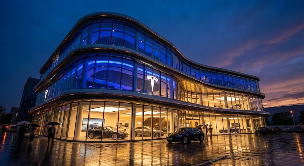
The Visual & Narrative Approach
Here, we leverage cinematic language to elevate the perceived value of the platform. A low-angle shot captures a futuristic dealership at dusk, glowing with Midnight Blue and Gold—colors associated with premium finance and luxury. The wet pavement reflecting warm interior lights suggests a high-end, established environment. The narrative is "heroic," framing the dealership not as a car lot, but as a pillar of the community and a center of commerce.
Psychological Impact & KPI Focus
- Niche Psychology: This style targets the Shaping of Brand Perception. Dealer Principals often view their businesses as legacies; this visual style aligns your SaaS platform with that legacy. It says, "We are robust, we are premium, and we are here to stay."
- Operational Impact: It counters the fear of partnering with a "fly-by-night" startup, visually validating the investment in Enterprise-grade software.
Strategic Implementation & Trade-offs
- Best Use Case: Social Media Ads (Instagram/LinkedIn) where stopping the scroll requires high visual fidelity.
- Duration: 15-20 seconds.
- Trade-off: While visually stunning, it is low on information density. It builds prestige but communicates zero feature benefits. It must be paired with clear, concise copy to be effective.
Companies using similar video content -
Tekion – Automotive Retail Cloud – Establishing a futuristic, premium dealership experience.
Roadster – Express Store – Cinematic vision of high-end digital car buying.
Impel – AI Merchandising – Elevating brand perception with advanced AI visuals.
4. Bold Kinetic Typography (Visual)
TOFU | Vertical Social Organic

The Visual & Narrative Approach
Designed for the vertical scroll of TikTok and Reels, this style uses text as the main character. Words like "SPEED" and "SALES" are represented as heavy blocky shapes that physically crash into each other, spawning abstract speed lines and sparks. The Electric Lime on Deep Black palette screams urgency. The camera zooms and shakes on impact, mimicking the adrenaline of closing a deal.
Psychological Impact & KPI Focus
- Niche Psychology: This appeals to the sales floor culture—high energy, competitive, and fast-paced. It’s designed for Vertical Social Organic reach, cutting through the noise of passive content.
- Operational Impact: It taps into the anxiety of "losing the deal" by emphasizing Transaction Velocity and responsiveness.
Strategic Implementation & Trade-offs
- Best Use Case: TikTok or Instagram Reels to attract younger sales talent or progressive Sales Managers.
- Duration: 10-15 seconds (Snappy).
- Trade-off: It can appear aggressive or "shouty" if used in a boardroom setting. It lacks nuance and is strictly for generating immediate, visceral excitement about speed/efficiency.
Companies using similar video content -
ProMax Online – CRM & Desking – Visualizing urgent sales velocity and deal closing.
AutoRaptor – CRM – High-energy text for rapid lead response.
PureCars – Digital Advertising – Kinetic display of accelerated ad performance.
5. AI Generated Mixed Media Video
TOFU | Skippable Pre-Roll Ad
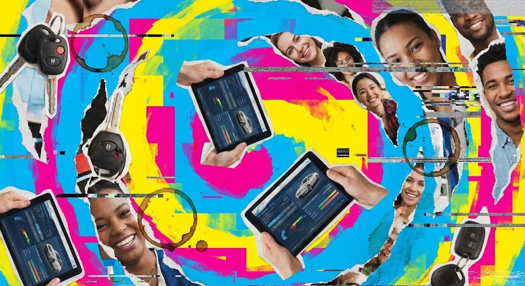
The Visual & Narrative Approach
This style embraces the messiness of dealership operations to show you understand it. It uses a collage aesthetic—torn paper edges, coffee ring stains, and digital glitches—layered over Cyan, Magenta, and Yellow backgrounds. Elements like car keys, tablets, and faces merge and separate rhythmically. It visually represents the disparate parts of a dealership (service, sales, parts) trying to come together.
Psychological Impact & KPI Focus
- Niche Psychology: By acknowledging the "chaos," you build empathy. You are saying, "We know your inventory is a mess, and your keys are missing." This prepares the viewer for the solution.
- Operational Impact: It is excellent for Skippable Pre-Roll Ads because the visual complexity hooks the eye instantly before the "Skip" button appears, focusing on Operational Reality.
Strategic Implementation & Trade-offs
- Best Use Case: YouTube ads targeting users researching "inventory management software."
- Duration: 30 seconds.
- Trade-off: The "glitchy" aesthetic might be perceived as "unprofessional" by more traditional, conservative Dealer Groups who prefer clean lines. It requires a balance between "cool chaos" and "messy."
Companies using similar video content -
vAuto – Provision – Visualizing complex inventory data and market chaos.
HomeNet Automotive – Merchandising – Mixed media for disparate inventory data points.
AutoIMS – Wholesale Management – Organized chaos of wholesale inventory logistics.
6. Minimalist Flat 2D Vector
TOFU | LinkedIn Organic
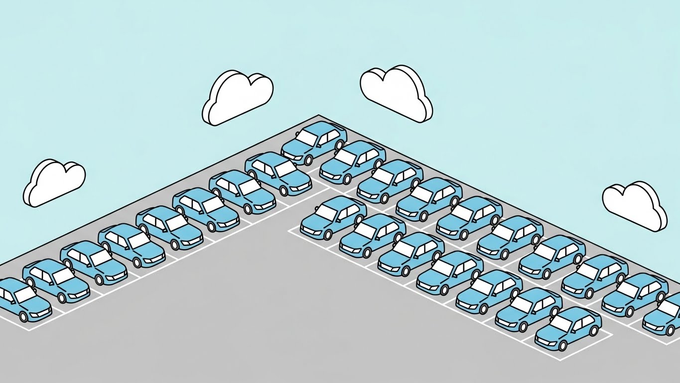
The Visual & Narrative Approach
In stark contrast to the chaos of Style 5, this style projects perfect order. An isometric wide-angle view shows a dealership lot where every car is identical and aligned perfectly on clean gray pavement. Soft Pastel Blue and Gray tones dominate. Simple white cloud shapes float above. It is a visual promise of what the software delivers: organization, structure, and peace of mind.
Psychological Impact & KPI Focus
- Niche Psychology: This targets the LinkedIn Organic audience—professionals seeking competence and structure. It reduces anxiety by visualizing a "perfect state" of operations.
- Operational Impact: It suggests that your platform handles the complexity of Lot Management (aging, rotation) so the manager doesn't have to, focusing on Operational Efficiency.
Strategic Implementation & Trade-offs
- Best Use Case: LinkedIn posts accompanying whitepapers on "Inventory Turn Rates" or "Lot Management."
- Duration: 30-60 seconds.
- Trade-off: It risks oversimplifying complex problems. If the software implementation is actually difficult, this "perfect world" visual might set unrealistic expectations.
Companies using similar video content -
KeyTrak – Key Management Systems – Visualizing perfect organization of dealership assets.
DealerBuilt – LightYear DMS – Minimalist view of structured dealership operations.
PBS Systems – DMS – Isometric order for efficient lot and inventory management.
7. Wireframe to Reality Transition
MOFU | Product Differentiation
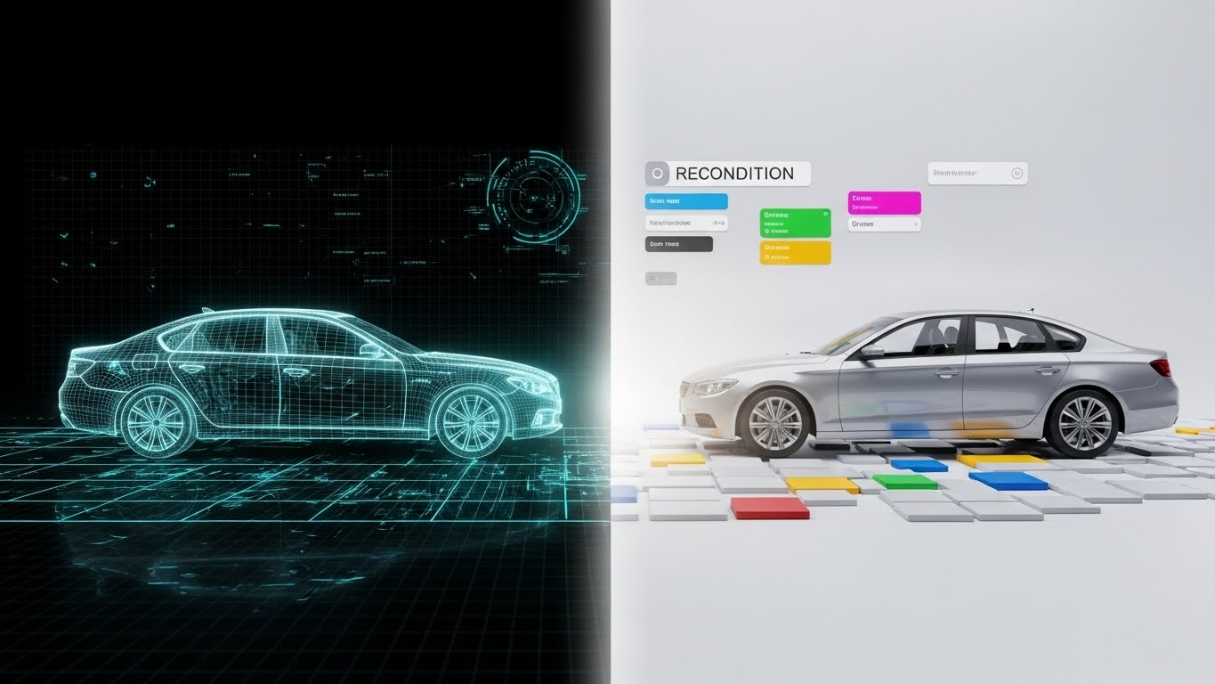
The Visual & Narrative Approach
This style addresses the "black box" of Reconditioning. A split-screen composition shows a Neon Teal wireframe blueprint of a sedan on the left (the data/plan) transitioning into a Metallic Silver photorealistic render on the right (the retail-ready car). The glowing transition point symbolizes the value your software adds—turning a raw trade-in (data) into a sellable asset (reality).
Psychological Impact & KPI Focus
- Niche Psychology: Reconditioning is often where profit dies due to delays. This visual differentiation proves your software bridges the gap between the Service Department (wireframe/technical) and the Sales Department (photoreal/retail).
- Operational Impact: It focuses on Product Differentiation by highlighting the process of value creation, directly addressing Time-to-Market.
Strategic Implementation & Trade-offs
- Best Use Case: Website "Features" page, specifically under the Reconditioning or Used Car module sections.
- Duration: 45-60 seconds.
- Trade-off: Requires high-quality 3D assets. If the "Reality" side looks like a bad video game, the effect creates distrust. The transition must look expensive to imply the software creates value.
Companies using similar video content -
Rapid Recon – Recon Software – Blueprint to reality for reconditioning efficiency.
ReconVelocity – Recon Management – Visualizing value creation in vehicle reconditioning.
Dealer Specialties – Merchandising – Transforming raw inventory into retail-ready assets.
8. Isometric 3D Workflow
MOFU | Feature Education
The Visual & Narrative Approach
Fixed Operations (Service) is complex. This style simplifies it by turning the service bay into a pristine, isometric 3D diorama. Using a tilt-shift effect, cars and tools look like detailed miniatures. The palette is Industrial Orange and Steel Gray. We see organized tools and clutter-free bays, emphasizing the "organized workflow" that your digital appointment system or electronic inspection tools facilitate.
Psychological Impact & KPI Focus
- Niche Psychology: Service Directors deal with grease, noise, and clutter. This visual style offers them a sanitized, manageable view of their domain.
- Operational Impact: It facilitates Feature Education (e.g., explaining how a digital RO travels through the shop) without the visual noise of a real garage, focusing on Bay Utilization.
Strategic Implementation & Trade-offs
- Best Use Case: Email marketing campaigns introducing new Service Scheduler features.
- Duration: 60-90 seconds.
- Trade-off: The "toy-like" aesthetic must be handled carefully. It should feel like a sophisticated architectural model, not a cartoon, to maintain authority with technical directors.
Companies using similar video content -
MyKaarma – Service Communication – Isometric view of streamlined service workflow.
AutoServe1 – Digital Inspections – Visualizing organized digital inspection processes.
Shop-Ware – Shop Management System – Diorama of efficient service bay operations.
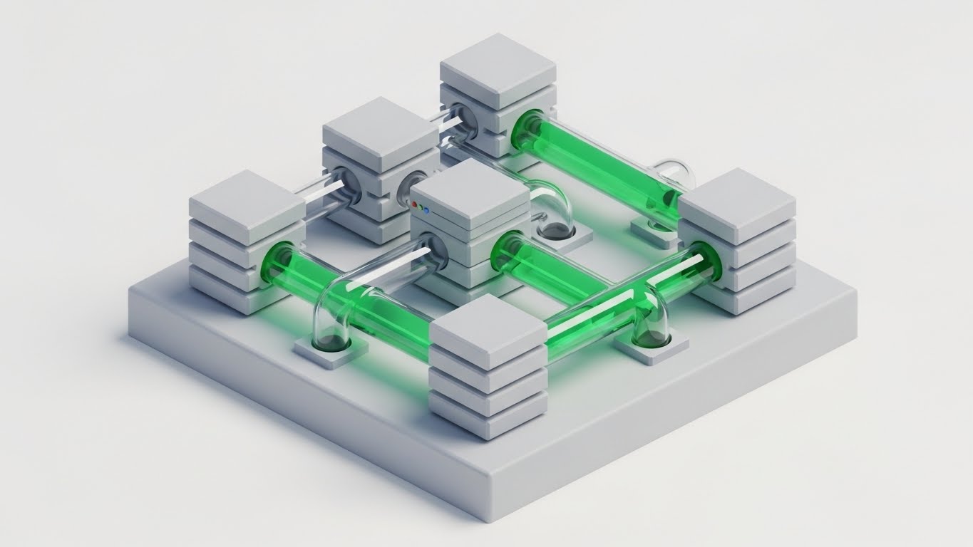
9. Abstract 3D AI Visualization
MOFU | Category Creation

The Visual & Narrative Approach
This style visualizes the "API Economy." It places the viewer inside a neural network within a white void. Glowing Fiber Optic Blue nodes, shaped like abstract engine pistons, connect via Deep Purple data streams. It represents the dealership's "brain"—the DMS—connecting to third-party apps (CRM, Marketing, Inventory) via seamless API integrations.
Psychological Impact & KPI Focus
- Niche Psychology: This addresses the fear of fragmentation by showing all systems connected to a central brain. It appeals to the CTO or IT Director who cares about connectivity and data integrity.
- Operational Impact: This supports Category Creation—positioning your platform not just as software, but as the "Intelligence Layer" of the business.
Strategic Implementation & Trade-offs
- Best Use Case: Technical blog posts or whitepapers about "Open API Architecture" or "Ecosystem Integration."
- Duration: 45-60 seconds.
- Trade-off: It is highly abstract. You must overlay specific text labels (e.g., "CRM Node," "DMS Core") or the viewer will not understand that the "pistons" represent software modules.
Companies using similar video content -
Tekion – Automotive Retail Cloud – Visualizing API network intelligence and ecosystem.
Dominion DMS – VXT – Abstract 3D for open API architecture and connectivity.
ComplyAuto – Compliance Platform – Glowing nodes representing integrated compliance data.
10. Split Screen: Optimized Reality and UI
MOFU | Competitive Displacement
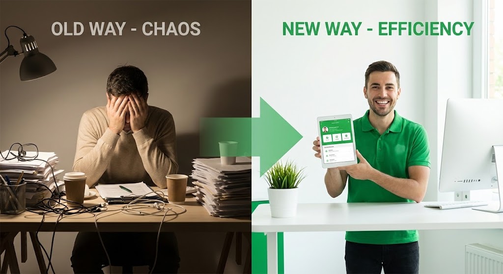
The Visual & Narrative Approach
The classic "Before and After," elevated. The left side (Old Way) is dim, colored in Muted Beige, showing a cluttered desk and a stressed person. The right side (New Way) is bright, Vivid Green, showing a clean, minimalist white desk with a happy service advisor using a tablet. It visually quantifies the "Efficiency Gain" (that 14% improvement mentioned in the introduction).
Psychological Impact & KPI Focus
- Niche Psychology: This is a direct Competitive Displacement play. It forces the viewer to identify with the stressed person on the left and aspire to be the person on the right.
- Operational Impact: It visualizes the emotional benefit of the software (peace of mind) alongside the functional benefit (efficiency), directly targeting Employee Satisfaction and Productivity.
Strategic Implementation & Trade-offs
- Best Use Case: Social Ads (Retargeting) for users who visited the pricing page but didn't convert.
- Duration: 15-30 seconds.
- Trade-off: It is a common trope. To avoid feeling like a cheesy infomercial, the production quality of the "Old Way" must be cinematic and realistic, not exaggeratedly comical.
Companies using similar video content -
CDK Global – Fortellis – Visualizing efficiency gains from modernizing operations.
Reynolds and Reynolds – ERA-IGNITE – Split-screen showing chaos of old vs order of new DMS.
DealerSocket – CRM – Demonstrating efficiency gains in sales workflow.
11. 2D Line Art Animation
MOFU | ABM Awareness

The Visual & Narrative Approach
This style utilizes the elegance of a continuous single black line drawing on a textured paper-white background, simulating the ink bleed of a fountain pen. The animation is fluid and sophisticated: the line traces the silhouette of a sports car, which seamlessly morphs into an upward-trending sales graph. This minimalist approach strips away the noise, focusing purely on the direct correlation between inventory quality and financial results.
Psychological Impact & KPI Focus
- Niche Psychology: Aimed at the "Purist" Dealer Principal who values fundamentals over flash. It cuts through the noise of "shouty" marketing, offering a moment of sophisticated clarity.
- Operational Impact: By visually linking the asset (car) directly to the metric (graph), it reinforces the Inventory Turn Rate KPI. It subtly suggests that your software is the direct link between metal and money.
Strategic Implementation & Trade-offs
- Best Use Case: Account-Based Marketing (ABM) campaigns targeting high-net-worth Dealer Groups on LinkedIn.
- Duration: 15-20 seconds.
- Trade-off: Its simplicity is its double-edged sword. It creates a premium "brand feel" but cannot communicate complex feature sets or UI workflows. Use it to open doors, not to train users.
Companies using similar video content -
vAuto – Provision – Elegant line art showing inventory quality to sales correlation.
Stockwave – Inventory Acquisition – Morphing visuals linking acquisition to profit.
TradePending – Trade-in Tool – Visualizing direct correlation of trade-ins to sales.
12. 2D Character-Driven Story
MOFU | Reducing Implementation Friction
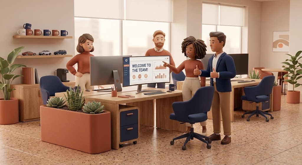
The Visual & Narrative Approach
Implementation anxiety is real; dealers fear new software will alienate their staff. This style counters that fear with warmth. We see a stylized 3D team—diverse and approachable—gathered around a screen in a modern dealership office. The palette uses Warm Terracotta and Navy, colors that evoke stability and human connection. The lighting is soft and diffuse. The narrative is one of collaboration: the team isn't fighting the software; they are celebrating a win ("Welcome to the Team!" dashboard) facilitated by it.
Psychological Impact & KPI Focus
- Niche Psychology: This directly addresses Change Management resistance. It visualizes the "Ideal State" of your dealership culture: stress-free, collaborative, and happy. It tells the General Manager, "Your people will like this."
- Operational Impact: It focuses on Adoption Rates and Staff Retention. By humanizing the software experience, you lower the perceived barrier to entry.
Strategic Implementation & Trade-offs
- Best Use Case: The "About Us" or "Implementation Process" page on your website.
- Duration: 60-90 seconds.
- Trade-off: If the characters are too "cartoony," you risk trivializing the seriousness of the business. The rendering (Pixar-esque) must be high-quality to maintain professional credibility.
Companies using similar video content -
Auto/Mate – DMS – Character-driven story for reducing implementation friction.
VinSolutions – Connect CRM – Visualizing happy, collaborative dealership teams.
Elead CRM – CRM – Stylized characters showing positive culture fit and adoption.
13. Rapid UI Feature Montage
MOFU | LinkedIn Video Ads
The Visual & Narrative Approach
Designed for the short attention spans of social scrolling, this style is all about speed and density. Against a clean dark background, UI widgets in Bright Amber and Charcoal scale rapidly into the center frame. We see "snap" transitions: cursors clicking, buttons rippling, and data bars filling instantly. It creates a rhythm of productivity—click, done, click, done.
Psychological Impact & KPI Focus
- Niche Psychology: This appeals to the "Power User"—the Internet Sales Manager or BDC Director who lives for speed. It visualizes Workflow Efficiency and responsiveness.
- Operational Impact: It demonstrates Feature Depth without being boring. It promises that the software can keep up with the high-velocity demands of a busy BDC (Business Development Center).
Strategic Implementation & Trade-offs
- Best Use Case: Retargeting ads on LinkedIn for users who have visited your "Features" page.
- Duration: 15 seconds (Square 1:1 aspect ratio).
- Trade-off: It is too fast for actual learning. It creates an impression of capability but doesn't teach how to use the tool. It creates desire, not competence.
Companies using similar video content -
ProMax Online – Desking – Rapid UI montage for high-velocity deal structuring.
AutoAlert – Equity Mining – Snap focus on rapid data insights and customer outreach.
Gubagoo – Chat & Digital Retailing – Visualizing fast customer interactions and feature velocity.
14. Dynamic Data Visualization
BOFU | ROI Justification

The Visual & Narrative Approach
When speaking to the CFO or Owner, you need to talk money. This style moves beyond standard Excel charts into surrealist 3D art. Bar charts are constructed not from pixels, but from stacks of gold coins and metallic car parts (pistons, gears). The Emerald Green and Gold palette signals profit and wealth. As the chart grows, we see reflections of luxury cars in the coins. It literally builds the argument that "Parts + Process = Profit."
Psychological Impact & KPI Focus
- Niche Psychology: This validates the investment. It transforms the software subscription from an "Expense" line item into a "Profit Generator" visual.
- Operational Impact: It squarely targets ROI (Return on Investment) and Net Profit. It visualizes the financial outcome of operational efficiency.
Strategic Implementation & Trade-offs
- Best Use Case: The climax of a Sales Deck or a "Pricing" page video.
- Duration: 30-45 seconds.
- Trade-off: It can feel overly salesy if not backed by real data. This style is the "closer"; it must be accompanied by hard numbers (e.g., "Average $40k lift in Gross Profit").
Companies using similar video content -
PureCars – Digital Advertising – Surrealist data viz for tangible advertising ROI.
AutoAlert – Equity Mining – Visualizing profit generation from customer data.
KPA – Risk Management – Dynamic data visualization of compliance ROI and savings.
15. Photorealistic 3D Renders
BOFU | Building Trust

The Visual & Narrative Approach
Trust is the currency of the enterprise deal. This style uses a sterile, high-key laboratory aesthetic to project absolute security and precision. A Cool Platinum server rack with subtle blue status lights stands next to a luxury sedan. The lighting is clinical. It visualizes the "Back End" of your SaaS—the part the dealer never sees but worries about. It says, "Your data is as secure as a bank vault."
Psychological Impact & KPI Focus
- Niche Psychology: This speaks to the IT Director and the risk-averse Dealer Principal. It assuages fears about data breaches and Compliance.
- Operational Impact: It focuses on Data Security and Infrastructure Reliability. It positions your platform as an Enterprise-grade solution, not a startup experiment.
Strategic Implementation & Trade-offs
- Best Use Case: The "Security" or "Architecture" section of your website.
- Duration: Loopable background video (15-30s).
- Trade-off: It is cold and impersonal. It builds respect but not affection. Use it to tick the "Safe" box during due diligence.
Companies using similar video content -
CDK Global – Security Solutions – Photorealistic renders for infrastructure security and trust.
Reynolds and Reynolds – Data Security – Visualizing secure data lab for enterprise trust.
Tekion – Automotive Retail Cloud – High-key lab aesthetic for cloud infrastructure security.
16. 3D X-Ray Visualization
BOFU | Risk Mitigation

The Visual & Narrative Approach
Some value is hidden deep inside the system. This style uses a Translucent Blue X-ray effect to reveal the internal structure of the software's architecture, represented here as a nested cubic vault. Inside, a glowing golden padlock is locked securely deep within the core. It metaphorically visualizes how your software integrates deep into the dealership's operations to unlock value while locking down compliance.
Psychological Impact & KPI Focus
- Niche Psychology: This appeals to the "Technical Buyer"—the Service Manager or IT Lead who wants to know how the system protects PII (Personally Identifiable Information).
- Operational Impact: It highlights Risk Mitigation and Internal Compliance. It shows that your software doesn't just skim the surface; it protects the core data assets.
Strategic Implementation & Trade-offs
- Best Use Case: Embedded in technical whitepapers or compliance guides (e.g., FTC Safeguards Rule).
- Duration: 30-45 seconds.
- Trade-off: It is highly abstract. Without voiceover or text explaining "This lock represents our 256-bit encryption," the viewer might just see a cool graphic. Context is key.
Companies using similar video content -
ComplyAuto – Compliance Platform – 3D X-ray for deep tech and PII protection.
Dealer Safeguard Solutions – Compliance Training – Internal vision for risk mitigation and regulatory adherence.
RouteOne – eContracting – Visualizing secure internal processes for digital contracts.
17. 3D Parallax UI Presentation
BOFU | Sales Cycle Acceleration

The Visual & Narrative Approach
Paperwork slows down deals. This style visualizes the "Paperless" dream. Floating UI screens suspended in a Vivid Violet and White cloud-like space are arranged in depth. The camera dollies forward through the layers. We see "Deal Approved" notifications on glass-like panels casting soft shadows on the layers behind them. It turns the boring F&I (Finance & Insurance) process into a futuristic, frictionless glide path.
Psychological Impact & KPI Focus
- Niche Psychology: This targets the F&I Director's desire for speed and the Customer's desire to get out of the box. It visualizes Sales Cycle Acceleration.
- Operational Impact: It demonstrates the Digital Contracting workflow, emphasizing that digital approvals are faster, cleaner, and cooler than paper.
Strategic Implementation & Trade-offs
- Best Use Case: Email campaigns sent to prospects who have stalled in the sales pipeline ("Get deals done faster").
- Duration: 20-30 seconds.
- Trade-off: It idealizes the process. Real F&I involves rejection and negotiation. This visual represents the "Happy Path," which is great for selling the vision but must be tempered with realistic training later.
Companies using similar video content -
Dealertrack – F&I – Parallax UI for visualizing paperless F&I workflow.
RouteOne – eContracting – Floating approvals for accelerated digital contracting.
Darwin Automotive – F&I Menu – Visualizing frictionless F&I presentations.
18. Lifestyle Stock with UI Overlay
BOFU | The Economic Buyer

The Visual & Narrative Approach
Ultimately, software is bought by people. This style blends high-quality human photography with digital assets. We look over the shoulder of a dealership executive in a Navy suit, standing in a blurred, sunlit showroom. He holds a tablet displaying a sharp dashboard with Leather Brown accents. It anchors the digital tool in the hands of a decision-maker, visualizing the moment of insight.
Psychological Impact & KPI Focus
- Niche Psychology: This reflects the Dealer Principal's self-image. It isn't about the car; it's about the business of cars. It validates their role as the informed captain of the ship.
- Operational Impact: It bridges the Physical/Digital Divide by placing the data literally in the physical environment. It focuses on Executive Reporting and real-time decision-making.
Strategic Implementation & Trade-offs
- Best Use Case: LinkedIn organic posts regarding "Leadership" or "Management Strategy."
- Duration: Static image or subtle cinemagraph (screen animating).
- Trade-off: Stock photography can feel generic. The UI overlay must be perfectly tracked and perspective-matched, or it looks like a cheap sticker, destroying credibility.
Companies using similar video content -
CDK Global – Executive Dashboards – Lifestyle overlay for informed leadership and control.
Reynolds and Reynolds – ERA-IGNITE – Visualizing executive control with real-time data.
AutoAlert – Equity Mining – Lifestyle stock showing executives making data-driven decisions.
19. Holographic UI over 3D Render
BOFU | Driving Demo Requests
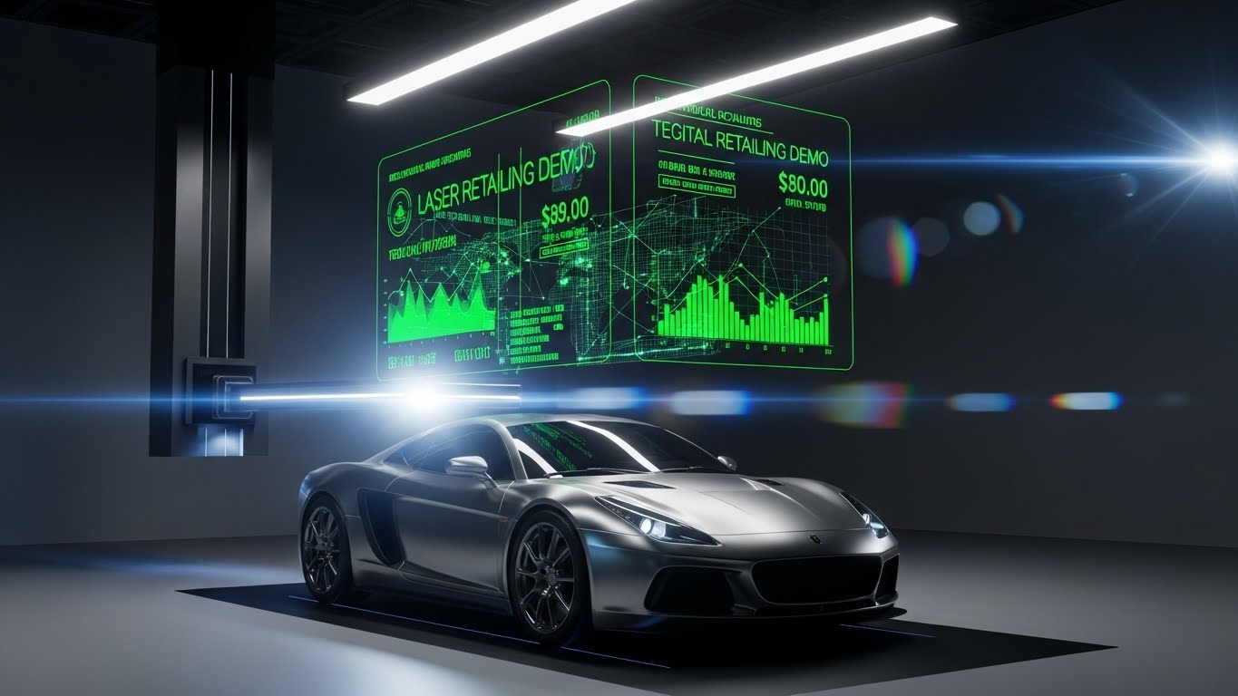
The Visual & Narrative Approach
This is the "Wow" factor. In a pristine white laboratory, a realistic Silver sports car sits under a scanning light. Above it, a Laser Green wireframe holographic UI projects technical specs, pricing, and monthly payments. It visualizes the concept of "Digital Retailing"—where the physical car and the digital deal are one and the same.
Psychological Impact & KPI Focus
- Niche Psychology: This triggers the "Fear Of Missing Out" (FOMO) regarding future tech. It positions your platform as the bridge to the future of automotive retail.
- Operational Impact: It strongly supports Digital Retailing initiatives and Merchandising. It proves your software can handle the complex data-layering required for modern online sales.
Strategic Implementation & Trade-offs
- Best Use Case: The Hero section of your website to drive immediate "Request Demo" clicks.
- Duration: 15-20 seconds (Loop).
- Trade-off: It promises a sci-fi level of integration. Ensure your actual product interface is modern enough that the drop from this video to the real demo isn't disappointing.
Companies using similar video content -
Impel – AI Merchandising – Holographic UI over 3D renders for future-ready retail.
Tekion – Digital Retail – Digital twin visualization for driving demo requests.
Upstart Auto Retail – Digital Showroom – Holographic overlay for advanced digital merchandising.
20. Clean UI Workflow (Light Mode)
Onboarding | Self-Serve Onboarding
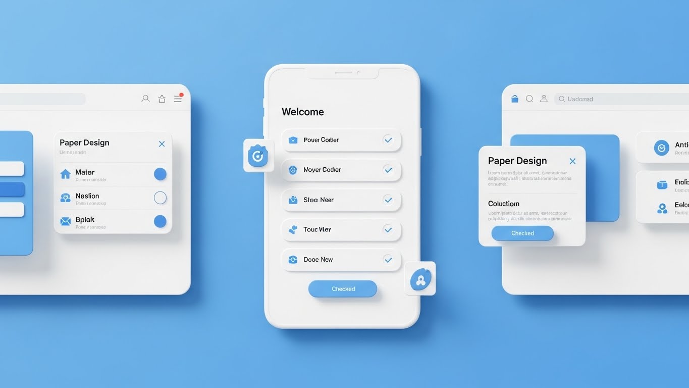
The Visual & Narrative Approach
The deal is signed; now the work begins. This style is designed to lower the heart rate of the new user. Using a clean Material Design aesthetic with Sky Blue and Paper White, it displays a symmetrical "Welcome" checklist. Soft shadows give the interface a tactile, card-like feel. Checks appear one by one. It whispers, "This is easy. You can do this."
Psychological Impact & KPI Focus
- Niche Psychology: This addresses Implementation Friction—the moment a user logs in and feels overwhelmed. It provides visual order and a clear path forward.
- Operational Impact: It is critical for Self-Serve Onboarding and Time-to-Value. It reduces support tickets by visually guiding the user through the first critical steps.
Strategic Implementation & Trade-offs
- Best Use Case: The first video a user sees inside the application or in the "Welcome" email.
- Duration: 30-60 seconds.
- Trade-off: It is functional, not exciting. It won't sell the deal, but it will save the retention. Do not use this for high-energy ads; use it for high-value support.
Companies using similar video content -
Auto/Mate – DMS Onboarding – Clean UI for visualizing onboarding simplicity.
Selly Automotive – CRM – Material Design UI for self-serve onboarding.
MyKaarma – Service Platform – Welcome checklist for easy user adoption.
21. 2D Graphics Over Live Action
Onboarding | Accelerating Time-to-Value

The Visual & Narrative Approach
This style bridges the gap between the grease of the service bay and the grace of your software. We use high-quality live-action footage of a technician in a real workshop. Overlaid on this reality are playful, sketch-style 2D animations in Black ink—speed lines appearing as they type, checkmarks popping up as they inspect a tire, and sparks flying when they hit "Complete." It visualizes the technician's job enhanced by software, not replaced by it.
Psychological Impact & KPI Focus
- Niche Psychology: Technicians often view new software as a burden or a "time clock" designed to police them. This style reframes the narrative: the software is a tool that amplifies their skill, giving them "superpowers" to finish jobs faster.
- Operational Impact: It targets Time-to-Value and User Sentiment. By making the software look "magical" and lightweight, you reduce resistance on the shop floor and encourage immediate adoption.
Strategic Implementation & Trade-offs
- Best Use Case: "Welcome Aboard" emails sent specifically to Service Technicians and Advisors immediately after implementation.
- Duration: 30-45 seconds.
- Trade-off: It feels casual. While great for end-users (techs), it might feel too whimsical for a formal presentation to a CFO. Keep this style contained to user-focused training and onboarding materials.
Companies using similar video content -
AutoServe1 – Digital Inspections – 2D graphics over live action for augmented tech in service.
Xtime – Inspect – Mixed reality for visualizing service technician speed.
Dealer-FX – Service Experience – Playful 2D animations enhancing live service bay action.
22. Macro UI Micro-Interactions
Onboarding | Trial Activation

The Visual & Narrative Approach
Adoption happens one click at a time. This style utilizes extreme macro cinematography (or photorealistic 3D) to focus on the tactile experience of using the app. We see a finger hovering over a glowing "Submit" button, revealing the texture of the skin and the pixels of the screen. The lighting is dramatic. The narrative isolates the moment of action—the "click"—celebrating it as a moment of power and completion.
Psychological Impact & KPI Focus
- Niche Psychology: It triggers a dopamine response. It visualizes the "satisfaction of completion," addressing the user's desire for closure and progress. It makes the software feel responsive and tangible.
- Operational Impact: This is designed for Trial Activation and Feature Engagement. It makes the critical "First Action" (e.g., submitting the first Repair Order) feel momentous.
Strategic Implementation & Trade-offs
- Best Use Case: In-app tooltips or "Feature Highlight" shorts on mobile apps that appear when a user accesses a new module.
- Duration: 5-10 seconds (Micro-content).
- Trade-off: It provides zero context about the broader workflow. It is purely about the action of the interface, not the reason for it. Use it only to highlight specific interactions.
Companies using similar video content -
Podium – Messaging Platform – Macro cinematography for tactile click and instant gratification.
Gubagoo – Chat – Visualizing instant responses and micro-interactions.
Darwin Automotive – F&I Menu – Tactile click for immediate F&I option selection.
23. 2D Animation & UI Composition
Retention | Reducing Support Overhead

The Visual & Narrative Approach
Support shouldn't be stressful. This style uses friendly, cel-shaded 2D characters in Soft Yellow and Vector Black to humanize the help desk experience. A stylized user stands next to a floating, simplified UI "Help Menu." As they point to an issue, floating question marks (?) magically transform into checkmarks (✓). The background is minimal, keeping the focus strictly on the logic: Issue → Click → Solved.
Psychological Impact & KPI Focus
- Niche Psychology: When things break, anxiety spikes. This calm, friendly aesthetic lowers the user's blood pressure. It reinforces the idea that "help is right here," reducing the urge to angrily call the support hotline.
- Operational Impact: It directly targets Support Ticket Volume and Self-Service Rate. It positions the knowledge base as an approachable, easy-to-use resource rather than a technical maze.
Strategic Implementation & Trade-offs
- Best Use Case: Embedded video headers in your Knowledge Base articles or the "Help" widget inside the dashboard.
- Duration: 30-60 seconds.
- Trade-off: The "cartoon" look can diminish authority if the issue is critical (e.g., "System Outage"). Use this for "How-To" content, not for "Critical Error" communications.
Companies using similar video content -
CDK Learning – Training Portal – Cel-shaded 2D for self-serve problem-solving.
DealerBuilt – Support Center – Visualizing easy access to help and reducing support overhead.
Dominion DMS – Knowledge Base – Friendly 2D animation for self-service support.
24. Futuristic Neon/Dark Mode
Retention | Knowledge Base/FAQ

The Visual & Narrative Approach
Your platform is vast; this style visualizes it as a navigable city. We fly through a "Tron-like" landscape of Neon Purple circuit boards and data highways against a deep void. This isn't just a list of FAQs; it is a structured, glowing metropolis of information. It creates a visual metaphor for the depth and organization of your documentation, turning a boring wiki into a high-tech "Command Center."
Psychological Impact & KPI Focus
- Niche Psychology: It appeals to the "Super User" or System Admin who takes pride in mastering the system. It validates their expertise by presenting the back-end knowledge as a sophisticated digital domain.
- Operational Impact: It drives adoption of the Knowledge Base and reduces Churn by showing the user the immense value of the resources available to them.
Strategic Implementation & Trade-offs
- Best Use Case: The landing page of your "Academy" or "University" training portal.
- Duration: 15-30 seconds (Loopable).
- Trade-off: It is abstract. It sets a mood of sophistication but doesn't actually show text. It functions best as an intro bumper to get users excited about learning.
Companies using similar video content -
Tekion – Learning Center – Dark Mode Tron for visualizing organized knowledge.
ComplyAuto – Knowledge Base – Futuristic neon for navigating compliance information.
RouteOne – Support Portal – Data metropolis aesthetic for structured documentation.
25. Abstract 2D Motion Graphics
Retention | Reducing Churn

The Visual & Narrative Approach
To combat churn, you must visualize continuity. This style uses fluid, morphing shapes in gradients of Blue and White. The shapes move in a slow, hypnotic loop, transitioning seamlessly from circles to infinity symbols. There are no hard edges, no stops, and no jars—symbolizing the uninterrupted service and value your platform provides to the dealership.
Psychological Impact & KPI Focus
- Niche Psychology: This is a subconscious play for Peace of Mind. It visually reinforces the stability and reliability of your service. It tells the dealer, "We are always running, always smooth, always here."
- Operational Impact: It targets Churn Reduction and Customer Sentiment. It is excellent for "We are updating our systems" communications to prevent panic.
Strategic Implementation & Trade-offs
- Best Use Case: Background visuals for "System Status" pages or "Renewal Reminder" emails.
- Duration: 10-20 seconds (Loop).
- Trade-off: It is purely emotive. It conveys no data. It is "brand wallpaper"—excellent for tone, useless for instruction.
Companies using similar video content -
CDK Global – System Status – Fluid motion for visualizing continuity and reliability.
Reynolds and Reynolds – Platform Updates – Abstract motion graphics for uninterrupted service.
AutoLoop – Retention Marketing – Infinite loop for continuous customer engagement.
26. Isometric 2D Motion Design
Retention | Proactive Support

The Visual & Narrative Approach
Dealers hate surprises. This style visualizes the orderly flow of information. A clean, flat isometric grid shows server racks (your cloud) sending tiny white envelope icons along orderly lines to miniature car/dealership icons. It is a clockwork world. The palette is Flat Blue and White. It visualizes the proactive delivery of patches, updates, and reports before the dealer even asks for them.
Psychological Impact & KPI Focus
- Niche Psychology: It builds trust in the "Invisible Machinery." It shows the user that work is happening in the background to keep their business running.
- Operational Impact: It focuses on Proactive Support and Communication. It visualizes the value of the subscription fee beyond just the software interface.
Strategic Implementation & Trade-offs
- Best Use Case: "New Feature Release" notifications or monthly "Performance Report" headers.
- Duration: 15-20 seconds.
- Trade-off: It can feel a bit "techy" or generic. To make it effective, the "packets" being delivered should be labeled (e.g., "Q3 Update," "Security Patch").
Companies using similar video content -
DealerBuilt – DMS Updates – Flat isometric for visualizing system updates and patches.
Dominion DMS – Feature Releases – Connected grid for proactive support and communication.
Xtime – Service Reminders – Isometric motion design for proactive customer outreach.
27. Low-Poly 3D Modeling
Expansion | Driving Deep Feature Adoption
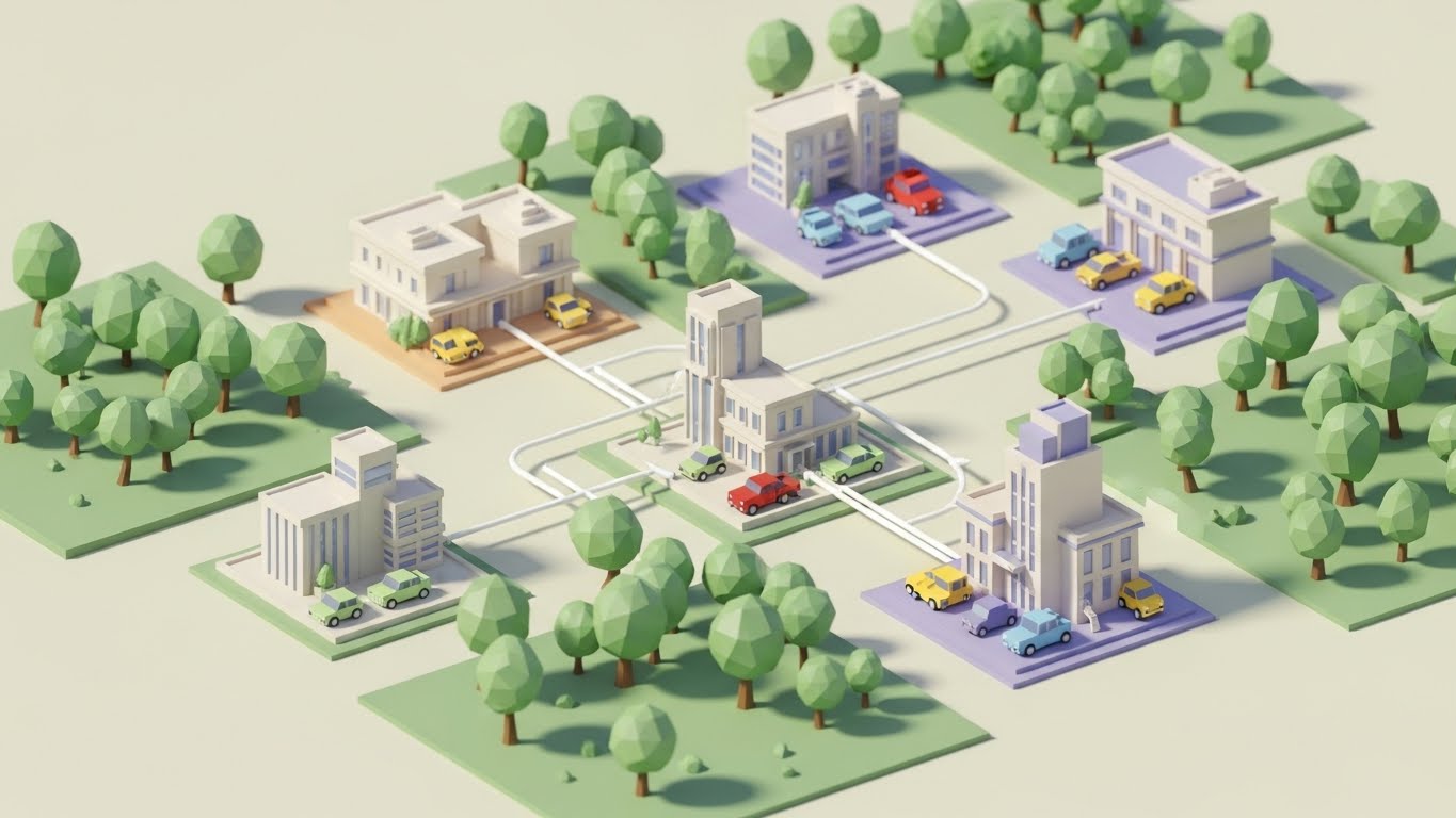
The Visual & Narrative Approach
For dealer groups expanding to new locations, scale is the challenge. This style uses a playful yet structural "Low-Poly" 3D aesthetic to show a map connecting multiple dealership "cities." Faceted trees and blocky cars populate the world. White data lines connect the cities, visualizing the centralized management of inventory and staff across multiple rooftops.
Psychological Impact & KPI Focus
- Niche Psychology: This appeals to the Empire Building ambition of large Dealer Groups. It makes the complex task of managing five stores look like a fun, manageable strategy game.
- Operational Impact: It targets Deep Feature Adoption (specifically Enterprise/Multi-store modules) and Expansion Revenue. It simplifies the visual complexity of multi-site logistics.
Strategic Implementation & Trade-offs
- Best Use Case: Blog posts or sales decks pitching "Enterprise" tier features to growing Dealer Groups.
- Duration: 45-60 seconds.
- Trade-off: The "game-like" look might trivialize the financial gravity of expansion. Ensure the voiceover remains professional to balance the playful visual.
Companies using similar video content -
CDK Global – Enterprise Solutions – Low-poly world for visualizing multi-location scale.
Reynolds and Reynolds – ERA-IGNITE – Dealer empire aesthetic for managing multiple rooftops.
PBS Systems – DMS – Low-poly modeling for simplifying multi-store logistics.
28. Dark Mode UI Showcase
Expansion | Driving Upsell/Cross-sell
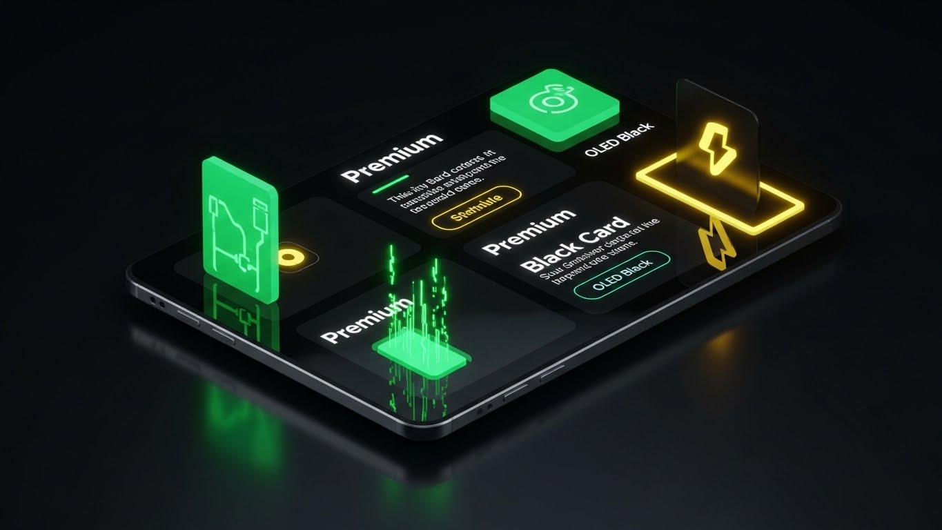
The Visual & Narrative Approach
How do you sell the "Pro" version? You make it look expensive. This style showcases your premium features in a sleek Dark Graphite and OLED Black environment. The UI screen is viewed from a tilted perspective, catching reflections of a studio light box. High-contrast white text and neon accents highlight "Premium" exclusive features. It evokes the feeling of unboxing a high-end smartphone or receiving an exclusive credit card.
Psychological Impact & KPI Focus
- Niche Psychology: This leverages Status and Exclusivity. It triggers the desire for the "best" version of the tool. It makes the Standard version feel "basic" and the Premium version feel "essential."
- Operational Impact: It directly targets Upsell/Cross-sell revenue and Average Revenue Per User (ARPU) increase.
Strategic Implementation & Trade-offs
- Best Use Case: In-app "Locked Feature" screens (paywalls) or upgrade promotion emails.
- Duration: 15-20 seconds.
- Trade-off: It relies entirely on the UI being "dark mode" compatible. If your actual software is only available in bright white/grey, this style is deceptive and will cause disappointment.
Companies using similar video content -
Tekion – Premium Modules – Dark Mode UI for showcasing tier upgrades and exclusivity.
Dealertrack – Advanced F&I – Premium gloss for visualizing upsell opportunities.
Darwin Automotive – F&I Menu – Black card aesthetic for driving cross-sell features.
29. Generative AI Realistic Character
Expansion | Driving Referrals

The Visual & Narrative Approach
People buy from people. This style uses high-fidelity Generative AI to simulate a "face-to-camera" testimonial. A professional woman with a genuine expression speaks directly to the lens. The background is a blurred, busy dealership office (bokeh), establishing context without distraction. The lighting is soft and flattering. It simulates a peer recommendation—the most powerful driver of B2B sales.
Psychological Impact & KPI Focus
- Niche Psychology: It builds Social Trust. In an industry rife with "vaporware," seeing a (simulated or real) human face validating the success lowers the risk barrier for new buyers.
- Operational Impact: It is a key driver for Referral Generation and Brand Credibility.
Strategic Implementation & Trade-offs
- Best Use Case: Instagram Stories or LinkedIn Shorts inviting users to "Join the Community."
- Duration: 15-30 seconds (Vertical 9:16).
- Trade-off: The Uncanny Valley. The AI generation must be flawless (lip-sync, eye movement). If it looks robotic, it damages trust. Transparency (labeling it as "AI-enacted story") is often a safe policy.
Companies using similar video content -
Friendemic – Reputation Management – AI testimonial for building social trust and referrals.
Podium – Customer Reviews – Visualizing trusted peer recommendations through AI characters.
Impel – Conversational AI – Generative AI character for authentic customer validation.
30. Aspirational Stock Montage
Expansion | The Champion
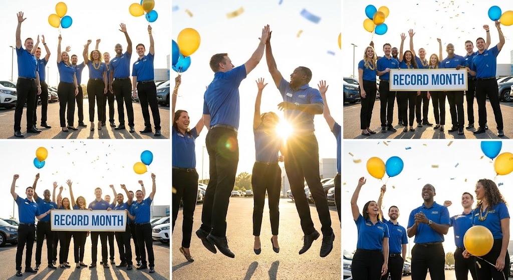
The Visual & Narrative Approach
The ultimate goal of your software is dealer success. This style visualizes that victory. We use high-energy stock photography of a diverse dealership team celebrating—high-fives, smiles, holding a "Record Month" sign. The palette is Sunlight Gold and Success Blue. The camera angle is low, looking up at the heroes. It captures the emotional high of hitting a sales target, positioning your software as the coach that helped them win the championship.
Psychological Impact & KPI Focus
- Niche Psychology: It appeals to the Champion persona—the leader who wants their team to win. It associates your brand not with "data entry," but with "victory."
- Operational Impact: It reinforces Customer Lifetime Value (LTV) by reminding the client of the ultimate outcome: success, morale, and profit.
Strategic Implementation & Trade-offs
- Best Use Case: "Case Study" summary videos or "Year in Review" personalized videos for clients.
- Duration: 30-60 seconds.
- Trade-off: It can feel cheesy. To avoid the "generic corporate stock" trap, the montage must be fast-paced, rhythmically edited to upbeat music, and ideally mixed with real photos from actual client dealerships.
The Visual Operations Doctrine: A Strategic Knowledge Base
Having curated 30 distinct visual styles across the SaaS lifecycle, the question remains: How do you deploy this asset library to drive tangible business outcomes? This section moves beyond style into strategy. It outlines a 3-Segment Framework for integrating these visuals into the very fabric of your dealership operations and software ecosystem.
Strategic Alignment & Visual Architecture (Pre-Production)
- The "Why" and "Who"*
- The Cognitive Load Audit: Before creating a single video, audit your current training PDFs and wikis. If a process takes more than 3 text paragraphs to explain, it requires a visual style (likely Style 8 or Style 13).
- Role-Based Visual Mapping: Do not use the same style for everyone. A Service Technician needs high-contrast, "glanceable" visuals (e.g., Style 21) they can view on a tablet under bright bay lights. A Dealer Principal needs executive polish (e.g., Style 18) that looks good in a boardroom.
- The "Glanceability" Standard: In a high-velocity dealership, no one has 5 minutes. Design "glanceable" visuals—videos that convey the core message in the first 5 seconds without audio.
- Brand Voice Consistency: Ensure that the "Fun" styles (like Style 1) and the "Serious" styles (like Style 15) share a common color palette and typography. This creates a unified brand experience across the disparate chaos of the dealership.
- The Advids Strategic Audit: Partner with Advids during this phase to define your "Visual Operating System." We help you select the core 3-5 styles that will define your brand before you spend budget on production.
- Standardization vs. Customization: For generic features (Login, Settings), use high-quality standardized assets (Style 6). For high-value differentiators (your proprietary AI Inspection tool), invest in bespoke visualization (Style 7, Style 19) to create a competitive moat.
- The Cross-Departmental Bridge: Use visuals to unify terminology. If Sales calls it a "Trade-in" and Service calls it an "RO #," use a visual connector (like Style 11) to show they are the same asset.
- Legacy System Integration: Dealerships rarely rip and replace everything. Use "Wireframe" styles (like Style 7) to visually represent legacy systems, showing how your modern SaaS wraps around them without breaking them.
- Accessibility in Retail: Your users are diverse. Ensure motion graphics (especially Style 13) rely on icons and clear visuals, not just English text, to support a multi-lingual workforce.
- The Mobile-First Mandate: 60% of DMS usage happens on mobile (Sales on the lot, Techs in the bay). Ensure all 30 styles are legible on a 6-inch screen. If the text is too small for mobile, it’s too small for the dealership.
Operational Adoption & Implementation (Deployment)
- The "How"*
- Overcoming "Big Brother" Anxiety: When introducing tracking tools (like CRM or Geofencing), use empathy-driven visuals (like Style 12) to frame the tech as a "Assistant," not a "Policeman."
- The Micro-Learning Shift: Kill the 1-hour webinar. Slice training into 30-second "Micro-Interactions" (using Style 13 or Style 22) and embed them directly into the software interface.
- Just-in-Time Support: Embed specific visual styles into the context of the work. If a user is on the "F&I Menu" screen, a Style 17 video should be one click away.
- Gamification of Training: Use high-energy styles (Style 4) to create "Hype Reels" for internal sales contests. Visualizing the leaderboard drives engagement more than a spreadsheet ever could.
- Reducing Support Ticket Volume: There is a direct correlation: for every high-quality "Self-Serve" video (like Style 23) you deploy, you can expect a measurable drop in Tier-1 support calls.
- Remote Onboarding: Use Style 2 and Style 8 to create "Virtual Tours" of the software workflow. This allows you to train staff across 20 locations without flying a trainer to each site.
- Visual SOPs: Transform text-based Standard Operating Procedures into visual process flows. A video showing "How to inspect a brake pad" (Style 21) is infinitely more effective than a checklist.
- Feedback Loops: Use interactive video elements. After a "Feature Update" video (Style 26), add a simple "Thumbs Up/Down" to gather immediate sentiment from the field.
- Scalable Localization: When expanding to new markets, use styles that rely on imagery over text (Style 1 or Style 9) to minimize the cost of translation and localization.
- Leadership Communication: When the CEO needs to communicate a shift in strategy, don't send a memo. Use a "Broadcast Quality" style (Style 18 or Style 30) to signal the importance of the message.
Measuring Impact & Future-Proofing (ROI)
- The "What" and "Next"*
- Beyond "Views": Do not measure video success by "View Count." Measure it by "Action Taken." Did the user click the feature after watching the Style 22 video? That is the only metric that matters.
- The "Idle Time" Metric: Monitor how long a user sits idle on a screen. If idle time is high, deploy a helper video (Style 20) to that specific page to unblock the workflow.
- Compliance Velocity: How fast can you get 100% of your staff to understand a new FTC regulation? Using visuals (Style 16), you can compress "Compliance Training" from days into minutes.
- Retention and Churn: High-quality UX visualization (Style 25) subconsciously builds trust. Customers are less likely to churn from a platform that feels modern and responsive.
- The AI Visual Frontier: Prepare for real-time video generation. Soon, you will be able to generate Style 29 testimonials dynamically based on real customer reviews. Start building your asset library now.
- Scalability of Assets: Build a library, not a graveyard. Organize your source files and assets so that when your UI updates (as it always does), you can update the "Clean UI" videos (Style 20) without starting from scratch.
- The Advids Partnership: Visual communication is not a one-time project; it is a discipline. Advids serves as your long-term strategic partner, ensuring your visual library scales with your feature set, evolves with design trends, and consistently drives business outcomes.
- Benchmarking Success: "Good enough" is a competitive risk. If your competitor uses "Holographic 3D" (Style 19) to sell their vision and you use static screenshots, you lose the perception war before the demo even starts.
- The ROI of Safety & Compliance: Quantify the reduction in liability. Better visual training on data privacy and compliance helps dealerships avoid costly fines. This "Risk Mitigation" value is a powerful ROI story for the CFO.
- Final Call to Innovation: Treat video as infrastructure, not content. When you embed high-quality, strategic visualization into the DNA of your SaaS platform, you do more than just explain software—you bridge the physical-digital divide, empower your users, and secure your place as the central nervous system of the modern dealership.
Companies using similar video content -
Proactive Dealer Solutions – BDC Training – Heroic montage visualizing sales team victories.
NCM Associates – Dealership Consulting – Aspirational stock for celebrating record-breaking months.
AutoLoop – Customer Engagement – Visualizing the win and customer lifetime value.
Author & Editor Bio


