
Introduction: Visualizing the Bridge to Intelligent Recovery
The debt collection industry is currently navigating its most profound transformation in decades. We are moving rapidly away from the era of high-volume manual dialing and rigid enforcement toward a future defined by digital-first engagement, empathetic automation, and intelligent liquidation. For the modern Chief Recovery Officer (CRO) and Collections Director, the challenge is no longer just about volume; it is about precision, compliance, and humanizing the financial recovery process.
In this high-stakes shift, visualization has emerged as a critical strategic infrastructure. It is the bridge that spans the "Trust Gap" between the creditor’s need for revenue and the consumer’s need for a frictionless resolution.
The operational impact of this shift is measurable and significant. Recent industry data reveals that organizations implementing advanced AI capabilities in collections report a 40% reduction in operational expenses, primarily by deflecting low-value manual tasks to digital channels. Furthermore, the consumer appetite for this shift is undeniable; lenders utilizing digital-first engagement solutions have seen 96% of customers resolve debts without any human interaction.
This guide serves as your strategic framework for communicating that value. We have curated 30 specific visualization styles designed to articulate the sophistication of your debt collection platform, reduce the cognitive load for your buyers, and ultimately, accelerate the return of liquid capital to the business.
1. Minimalist Flat 2D Vector
TOFU | Brand Awareness

(Minimalist Flat 2D): Structural Bridge: Connecting Creditor and Consumer
The Visual & Narrative Approach
This style utilizes a clean, "less is more" aesthetic to strip away the noise often associated with financial stress. The visual centers on a stylized, architectural bridge formed by interlocking geometric shapes in Vivid Teal and Soft Coral. It connects two abstract landmasses—representing the creditor and the consumer—against a solid Pure White background. The narration should be calm, reassuring, and focused on "connection" and "resolution" rather than "enforcement."
Psychological Impact & KPI Focus
In an industry often stigmatized by aggression, this "optimistic and structural" mood disarms the viewer. It leverages the psychology of Cognitive Ease, creating a sense of safety and order. By visualizing the debt collection process as a bridge rather than a battle, you align your brand with solution-oriented outcomes. This directly supports Brand Sentiment KPIs, positioning your software as a facilitator of financial health rather than a source of friction.
Strategic Implementation & Trade-offs
- Best Use Case: 15-second social media ads (LinkedIn/Meta) aimed at redefining the brand's approach to recovery.
- Trade-off: The lack of detail means this style cannot explain complex features or dashboards. It is purely for emotional resonance and high-level conceptual alignment.
Companies using similar video content -
Recuvery – Empathetic AI debt collection for all businesses.
InDebted – Digital-first debt collection for customer resolution.
2. Abstract 3D AI Visualization
TOFU | Category Creation

(Abstract 3D AI): Glowing Constellation: Visualizing Intelligent Recovery
The Visual & Narrative Approach
This style visualizes the "Digital Constellation" of modern recovery. It features a structured sphere formed by Silver and Cyan glowing nodes connected by thin filaments, suspended against a clean, white glass background. The high-key lighting and refraction effects create a pristine, futuristic atmosphere. The narrative frames this not as "collection" but as "Intelligent Recovery"—a new category where data points (payment history, behavioral signals) self-organize to find the optimal path to resolution.
Psychological Impact & KPI Focus
The aesthetic appeals to the desire for Control and Precision inherent in financial leadership. The "constellation" metaphor suggests that your software sees the big picture that human agents might miss. It targets the Innovation Perception KPI, signaling to the market that your platform utilizes next-generation AI, distinguishing it from legacy "dialer-centric" systems.
Strategic Implementation & Trade-offs
- Best Use Case: 30-second LinkedIn thought leadership videos introducing a new algorithm or proprietary technology.
- Trade-off: This is a high-concept abstract style. If not anchored with a clear voiceover explaining the business value (e.g., "Predictive Propensity"), viewers may find it too artistic and miss the practical application.
Companies using similar video content -
HighRadius – AI-powered AR automation for intelligent collections.
Tesorio – AI-driven cash flow performance and payment prediction.
Emagia – Autonomous Receivables – AI-powered order-to-cash automation.
3. Abstract 2D Organic Motion Graphics
TOFU | Market Education
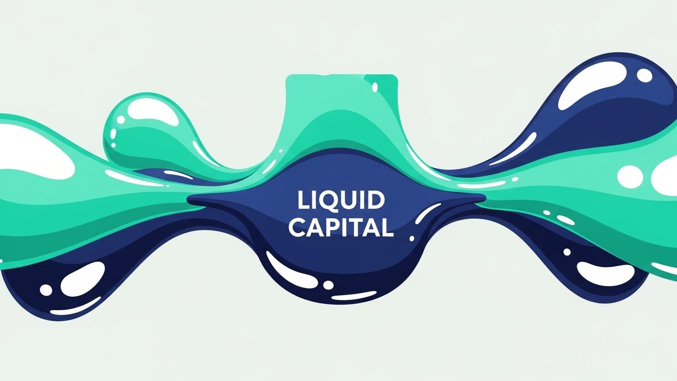
(Abstract 2D Organic): Fluid Motion: Restoring Liquid Capital
The Visual & Narrative Approach
This style uses fluid, blob-like shapes in Mint Green and Navy Blue that flow effortlessly from left to right, merging into a central vessel. The glossy textures and white specular highlights give the motion a "wet," liquid feel. This is a direct visual metaphor for "Liquid Capital." The motion is smooth and continuous, representing the friction-free return of funds to the business once your software is implemented.
Psychological Impact & KPI Focus
The "organic" motion counters the rigidity of traditional finance, suggesting flexibility and adaptation. Psychologically, the left-to-right flow signifies progress and future momentum. This style is highly effective for reducing Bounce Rates on web headers, as the hypnotic, repetitive motion holds attention without demanding high cognitive effort, allowing the visitor to absorb the headline value proposition.
Strategic Implementation & Trade-offs
- Best Use Case: Looping background video for the "Solutions" or "Cash Flow" section of your website.
- Trade-off: The abstract nature means it lacks "human" elements. It is excellent for mood and metaphor but fails to demonstrate user interface or specific compliance features.
Companies using similar video content -
Upflow – Streamlining accounts receivable for faster cash collection.
FinFloh – AI-driven platform for efficient credit-to-cash processes.
4. Generative AI Cinematic Video
TOFU | Shaping Brand Perception

(Gen AI Cinematic): Cinematic Team: Building Brand Trust
The Visual & Narrative Approach
This style employs a cinematic, photorealistic aesthetic to humanize the software's impact. It features a low-angle hero shot of diverse finance professionals in a sunlit, glass-walled boardroom, looking confidently at an off-camera holographic projection. The "Golden Hour" lighting and lens flares convey transparency and optimism. The narrative implies that your software empowers these teams to work with empathy and high-tech efficiency, elevating the role of the collector.
Psychological Impact & KPI Focus
This addresses the "Status Anxiety" of the target persona. It portrays the collections team not as back-office operators, but as strategic, forward-looking professionals. By mirroring the aspirational self-image of the buyer, you build deep Brand Affinity. It validates their goal of modernizing their department's culture through technology.
Strategic Implementation & Trade-offs
- Best Use Case: The "About Us" or "Mission" video on the homepage, running 45-60 seconds.
- Trade-off: While visually stunning, it can feel "stock-heavy" if not customized. It sets a high emotional bar but doesn't prove technical capability, so it must be paired with product-focused content.
Companies using similar video content -
C&R Software – Debt Manager – Humanizing enterprise debt collection with advanced AI.
Katabat – Empathetic customer communications for global collections compliance.
5. Bold Kinetic Typography (Visual)
TOFU | Driving Freemium/Trials

(Kinetic Typography): Kinetic Typography: Accelerating Trial Signups
The Visual & Narrative Approach
This style relies purely on the energy of motion and text. Large, blocky geometric forms in Hot Pink and Vibrant Orange rush diagonally across a Pure White background, creating a visual "slipstream." The motion blur applied to the edges emphasizes speed. The narrative is minimal: "Fast Start," "Integrate in Minutes," "Free Trial." It is designed to disrupt the passive scroll of a social feed with high-contrast energy.
Psychological Impact & KPI Focus
The urgency created by the diagonal motion and vibrant colors triggers a Fear of Missing Out (FOMO) or a desire for immediate action. It combats the inertia of long B2B sales cycles by promising instant gratification or rapid deployment. The primary KPI here is Click-Through Rate (CTR), driving traffic specifically to a high-intent landing page.
Strategic Implementation & Trade-offs
- Best Use Case: 10-15 second retargeting ads for users who visited the pricing page but didn't convert.
- Trade-off: It is aggressive. Overuse can lead to ad fatigue. It works best for "offer" based messaging (trials, demos) rather than educational content.
Companies using similar video content -
Chaser – Accelerating invoice chasing and credit control.
MY DSO MANAGER – Automating collections for small businesses, fast results.
6. 2D Line Art Animation
TOFU | YouTube
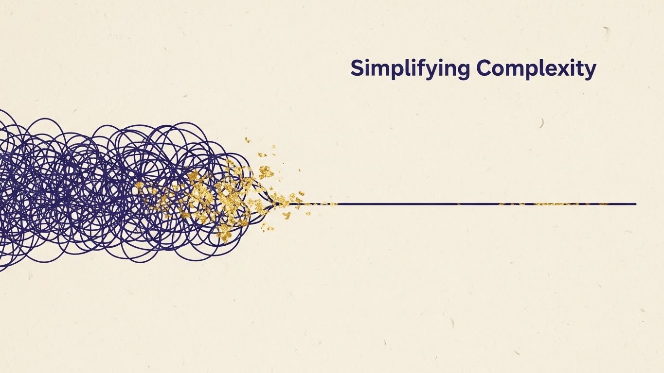
(2D Line Art): Unraveling Line: Simplifying Complex Workflows
The Visual & Narrative Approach
This elegant style uses a single, continuous Indigo line that transforms a chaotic tangle on the left into a straight, efficient path on the right. Gold Leaf texture accents highlight the "resolved" path. Set against a textured cream paper background, it feels sophisticated and bespoke. The narrative visualizes the core value proposition: "Simplifying Complexity." It shows how the software untangles the mess of compliance, data silos, and manual tasks.
Psychological Impact & KPI Focus
The visual progression from chaos to order is deeply satisfying to the operational mind. It reduces Cognitive Load by offering a clear "Before/After" mental model. This style builds Topic Authority on YouTube, as it is perfect for explaining complex regulatory concepts (like Reg F) in a digestible, non-threatening format.
Strategic Implementation & Trade-offs
- Best Use Case: 2-3 minute educational explainer videos (e.g., "How to Automate Compliance Workflows").
- Trade-off: The minimalist line art can feel slow-paced. It requires a strong, compelling script to keep the viewer engaged for the full duration.
Companies using similar video content -
Debtrak – Simplifying compliance and data management in debt collection.
Tratta – Streamlining debt collection compliance with transparent workflows.
8. Abstract 2D Motion Graphics
TOFU | Skippable Pre-Roll Ad

(Abstract Motion): Converging Particles: Driving Immediate Action
The Visual & Narrative Approach
Designed for the "5-second hook," this style features a swarm of Lime Green and Charcoal Grey geometric particles rapidly converging to form a solid arrow pointing forward. The background is a clean White digital void. The motion is sharp, vector-based, and precise. The narrative is instant: "Get to the Point," "Direct Action," or "Targeted Recovery." It grabs attention before the "Skip Ad" button appears.
Psychological Impact & KPI Focus
The converging particles utilize the Gestalt principle of Common Fate, drawing the eye inevitably to the center and the direction of the arrow. This creates a subconscious sense of focus and purpose. The goal is Ad Recall, ensuring that even if the user skips, the impression of "precision" and the brand color palette remains.
Strategic Implementation & Trade-offs
- Best Use Case: The first 5 seconds of a YouTube pre-roll ad, segueing into a problem/solution statement.
- Trade-off: It is purely a "hook" mechanism. It cannot sustain a long narrative. It must be used to buy time for the rest of the message.
Companies using similar video content -
CollectSoft – Smart automation and analytical insights for AR.
Apxium Collect – Automating accounts receivable for efficient collections.
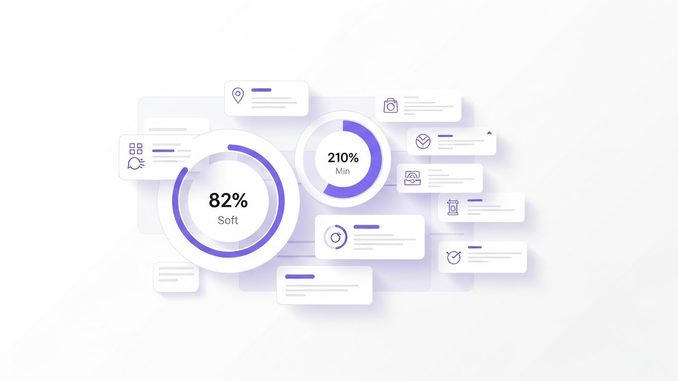
9. Isometric 3D Workflow
MOFU | Demand Gen & Lead Capture
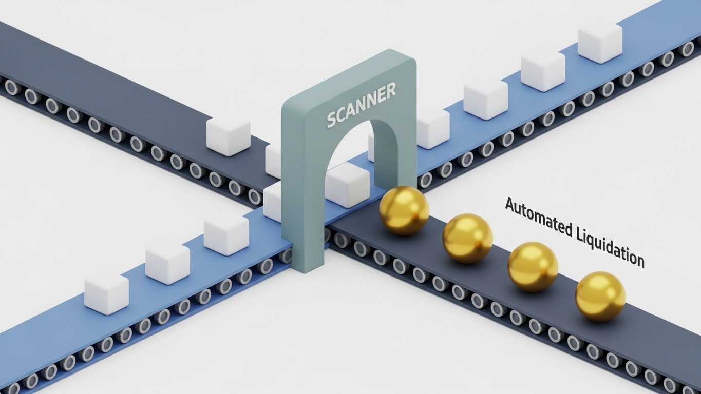
(Isometric 3D): Isometric Factory: Automating Revenue Recovery
The Visual & Narrative Approach
This style uses a "Claymorphism" aesthetic to create a miniature, friendly "Finance Factory." Small white cubes (data) travel along a Pastel Blue conveyor belt, passing through a "Scanner" archway and turning into Gold spheres (cash). The lighting is soft, diffuse studio lighting. It visualizes "Automated Liquidation"—showing exactly how a debt account is processed, enriched, and resolved without human intervention.
Psychological Impact & KPI Focus
This style appeals to the "Systemizer" personality type common in operations. It makes the invisible software processes visible and tangible. By making the process look "cute" yet efficient, it removes the intimidation factor of complex implementation. The focus is on Conversion Rate Optimization (CRO), encouraging users to sign up for a demo to see the "factory" in action.
Strategic Implementation & Trade-offs
- Best Use Case: A "How it Works" section on the product page, running 60-90 seconds.
- Trade-off: The "toy-like" aesthetic might seem too playful for very conservative enterprise banks. It is best suited for mid-market or fintech audiences.
Companies using similar video content -
CollectSoft – Smart automation and analytical insights for AR.
Apxium Collect – Automating accounts receivable for efficient collections.
10. Split Screen: Optimized Reality and UI
MOFU | Product/Solution Differentiation
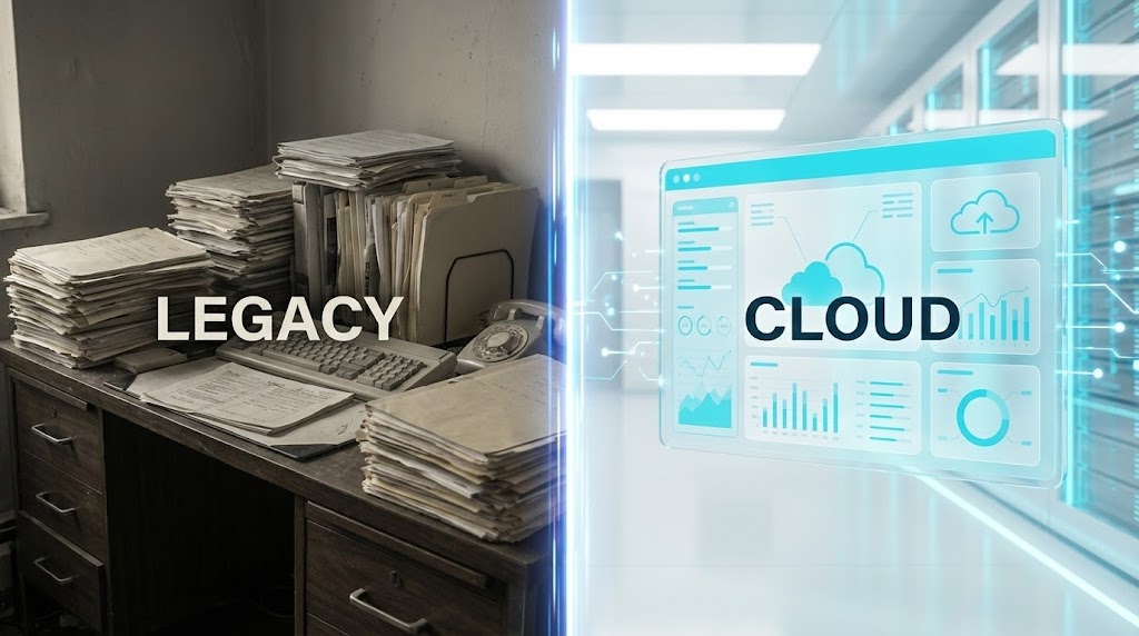
(Split Screen): Split Screen: Modernizing Legacy Systems
The Visual & Narrative Approach
This high-contrast style divides the screen with a vertical glowing line. The left side shows a desaturated photo of a messy desk with paper stacks ("Legacy"). The right side shows a pristine, high-resolution render of a floating UI screen in Vivid Cyan and White ("Cloud"). The narrative is a direct comparison: "From Clutter to Clarity." It explicitly visualizes the transition from manual drudgery to digital efficiency.
Psychological Impact & KPI Focus
This leverages the Contrast Bias, making the "Cloud" solution appear even more desirable by placing it next to the painful reality of the "Legacy" state. It validates the user's pain (the mess) while offering an immediate visual cure. This style drives Product Differentiation, clearly positioning your SaaS against outdated on-premise solutions or Excel-based workflows.
Strategic Implementation & Trade-offs
- Best Use Case: Comparison pages (e.g., "Us vs. Competitors") or bottom-of-funnel landing pages.
- Trade-off: It relies on a negative depiction of the "old way." Care must be taken to ensure the "messy desk" represents the situation, not the incompetence of the potential client.
[END OF PART 1]
Companies using similar video content -
Quadient AR by YayPay – Automating credit-to-cash processes with smart workflows.
Esker – AI-powered automation for credit-to-cash processes.
11. Clean UI Workflow (Light Mode)**
MOFU | Feature Education
(Clean UI Workflow): Modular Clarity: Simplifying Regulatory Compliance
The Visual & Narrative Approach
This style embraces a "Radical Clarity" aesthetic to combat the cognitive fatigue often associated with legacy collections systems. The visual presents a straight-on view of the dashboard in a pristine Light Mode, utilizing generous whitespace and soft shadows to create breathing room. The interface eschews aggressive "warning" colors for a calming palette of Soft Violet and Indigo, focusing on data legibility. A cursor interacts deliberately with a "Compliance Check" module, anchoring the narrative in process and control. The background is a soft-focus, sunlit office, suggesting a stress-free environment.
Psychological Impact & KPI Focus
Compliance (specifically Reg F) is the single largest source of anxiety for Collections Directors. This visual mitigates that fear by presenting compliance not as a complex hurdle, but as a simple, integrated checkpoint. It leverages Visual Salience to draw the eye to the workflow's simplicity, reassuring the viewer that the software acts as a safety net. This directly impacts Feature Adoption, positioning the tool as a risk-reduction engine.
Strategic Implementation & Trade-offs
- Best Use Case: 60-second "Feature Deep Dive" videos on product pages, specifically for Compliance or Rule Engine modules.
- Trade-off: The light, airy aesthetic can feel "generic" if not heavily branded. It requires specific, legible data points (e.g., "7/7 Call Cap Reached") to prove it’s a real tool, not just a mockup.
Companies using similar video content -
MeridianLink Collect – Modernizing debt collection from legacy to cloud.
InterProse ACE – Upgrading debt recovery with modern web-based solutions.
12. Wireframe to Reality Transition
MOFU | Competitive Displacement

(Wireframe to Reality): Architectural Shift: Visualizing System Modernization
The Visual & Narrative Approach
This powerful transition style serves as a visual metaphor for "Upgrading Infrastructure." The screen is split diagonally. The lower left displays a technical Blueprint Blue wireframe of a complex structural foundation, representing the planning phase or legacy architecture. A sweeping motion reveals the upper right: a completed, Photorealistic Gold and Glass architectural masterpiece. The narrative frames your platform not just as software, but as a "Modern Infrastructure Project," contrasting the bare-bones planning of competitors (the wireframe) with the finished, premium reality of your solution.
Psychological Impact & KPI Focus
This appeals to the Builder/Architect persona within IT and Operations leadership. It visualizes the concept of "Value Engineering"—taking a raw requirement and turning it into a high-value asset. The gold tones subconsciously signal wealth and premium quality. This style drives Competitive Displacement, subtly categorizing the competition as "incomplete sketches" while positioning your brand as the "realized vision."
Strategic Implementation & Trade-offs
- Best Use Case: LinkedIn video ads targeting CTOs and IT Directors, specifically those looking to migrate from on-premise to cloud.
- Trade-off: It is highly metaphorical. It requires a strong script to connect the "building" analogy back to specific software benefits like API stability, uptime, or scalability.
Companies using similar video content -
Tratta – Simplifying regulatory compliance with intuitive debt collection software.
Debtrak – Centralized data management for enhanced compliance.
13. Rapid UI Feature Montage
MOFU | Driving Demo Requests
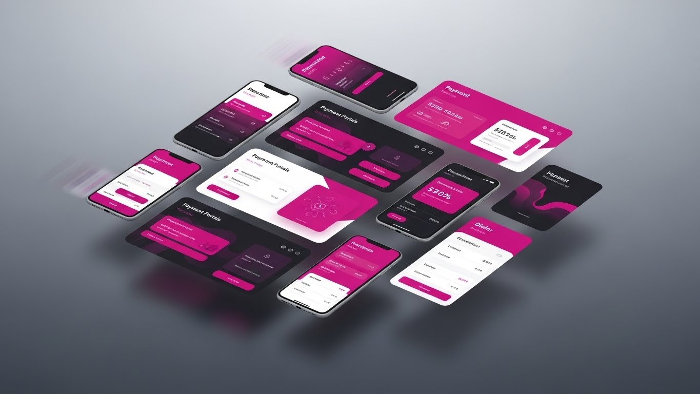
(Rapid UI Montage): Ecosystem Velocity: Integrated Payment Portals
The Visual & Narrative Approach
Designed to convey speed and breadth, this style features a dynamic array of floating mobile and desktop screens. The interface elements—showing "Payment Portals," "Dialer" controls, and mobile prompts—are unified by a high-contrast Magenta and White palette. The screens are layered dynamically in a grid, with motion blur applied to the edges to suggest high-velocity processing. The background is a high-key grey gradient. The narrative is fast-paced: "One Platform. Any Device. Instant Resolution."
Psychological Impact & KPI Focus
The sheer volume of screens displayed simultaneously triggers the Availability Heuristic, making the platform appear comprehensive and all-encompassing. It overwhelms the viewer (positively) with value, suggesting that your solution covers every possible touchpoint. The primary goal is Click-Through Rate (CTR) in email campaigns, where the visual density promises a feature-rich demo experience worth investigating.
Strategic Implementation & Trade-offs
- Best Use Case: A GIF or short loop (10-15 seconds) embedded in an outbound sales email or a retargeting display ad.
- Trade-off: The speed makes it impossible to read specific text. It creates an impression of capability but does not educate on specific workflows.
Companies using similar video content -
C&R Software – Debt Manager – Building modern collections infrastructure from blueprint.
Lateral Technology – Next-generation cloud debt collection platform.
14. Isometric 2D Motion Design
MOFU | ABM Awareness
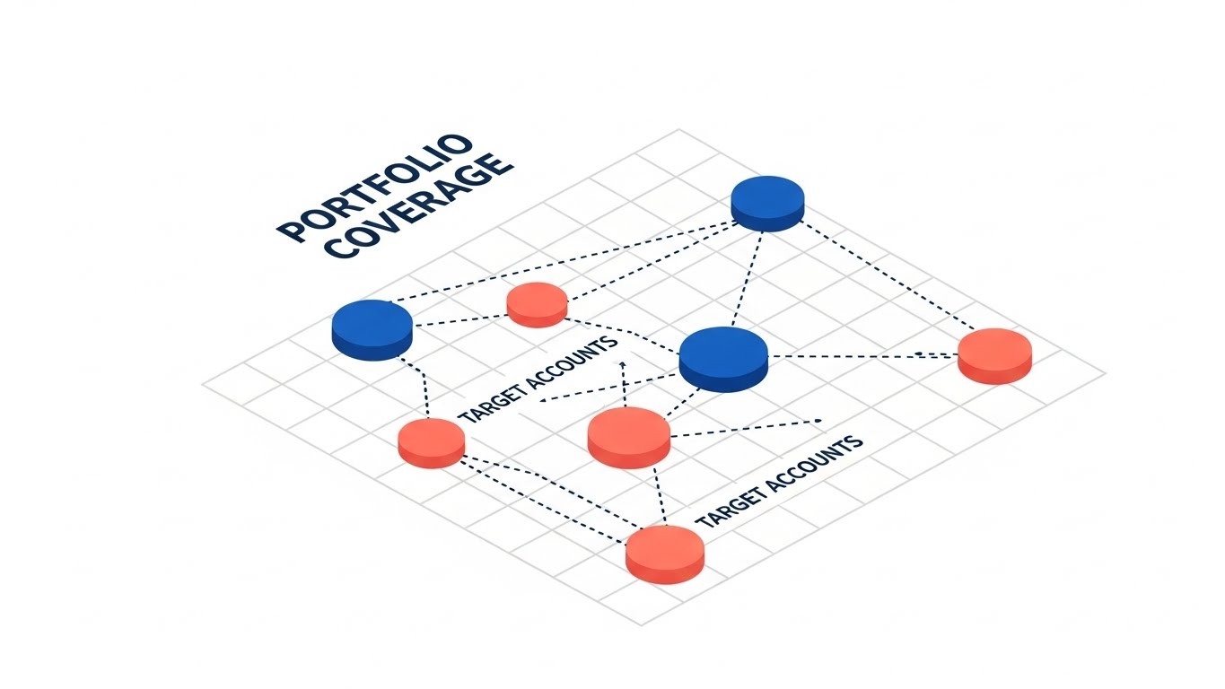
(Isometric 2D Motion): Strategic Mapping: Visualizing Portfolio Coverage
The Visual & Narrative Approach
This style creates a strategic map of the debt landscape. On a clean white isometric grid, interconnected nodes representing "Target Accounts" are color-coded in Deep Blue and Coral. Dashed lines animate between them, visualizing the flow of communication and segmentation strategies. The aesthetic is flat, clean, and vector-based. The narrative focuses on "Precision Targeting" and "Portfolio Coverage," explaining how the software segments accounts to prioritize high-propensity payers (Yield Management).
Psychological Impact & KPI Focus
This visualizes the Strategy behind the collection. It appeals to the Analyst persona who values logic, segmentation, and order. By turning the abstract list of debtors into a structured network map, you provide a feeling of Manageability. This style supports Account-Based Marketing (ABM) campaigns, helping prospects visualize how your tool helps them conquer their specific market segments.
Strategic Implementation & Trade-offs
- Best Use Case: Sidebar display ads or slide illustrations in a sales deck to explain segmentation logic or propensity scoring.
- Trade-off: It is somewhat abstract. It works best when accompanied by data proving that this segmentation logic actually leads to higher liquidation rates.
Companies using similar video content -
Versapay – Integrated payment portals for collaborative AR.
Kolleno – AI-powered AR automation with real-time insights.
15. Photorealistic 3D Renders
MOFU | Website & Landing Pages

(Photorealistic 3D): The Executive View: Monitoring Liquidity Health
The Visual & Narrative Approach
This style grounds the software in the physical world of the decision-maker. It features a stunningly rendered close-up of a premium tablet device resting on a sleek wooden executive desk. The screen displays a "Liquidation Dashboard" with sharp, rising Vibrant Green trend lines and crisp data visualization. Natural daylight casts realistic shadows, evoking a sense of calm authority. The narrative speaks to "Oversight," "Governance," and "Real-time Pulse," positioning the software as a tool for the C-Suite.
Psychological Impact & KPI Focus
This targets Status and Authority. It mirrors the environment where the CRO sits, implicitly suggesting that this software belongs on their desk. The rising green graph is a universal signal of success and financial health. This style is essential for Trust Building on the homepage or pricing page, signaling that the platform is enterprise-ready and polished.
Strategic Implementation & Trade-offs
- Best Use Case: Hero background video or static imagery on the "For Executives" solution page.
- Trade-off: It is static and contemplative. It sets a premium mood but doesn't show the "work" being done. It validates the decision, not the process.
Companies using similar video content -
CollectXpert – Strategic segmentation and outreach for debt portfolios.
Quantrix Collections – Flexible integration for collection models and analytics.
16. 2D Animation & UI Composition
MOFU | Website Visitor Re-engagement

(2D Animation & UI): Empathetic Re-entry: Humanizing the Digital Nudge
The Visual & Narrative Approach
This approachable style combines friendly 2D character illustration with UI elements. A stylized, flat vector character in an Orange hoodie (representing the consumer) and Navy pants stands next to a floating "Welcome Back" cloud interface with an inviting Door icon. The palette is soft and non-threatening. The narrative focuses on "Frictionless Re-entry," illustrating how the software encourages consumers who dropped off (abandoned cart/payment plan) to return to the portal without shame or friction.
Psychological Impact & KPI Focus
This directly addresses the Empathy requirement of modern collections. By using a friendly, casual character style, you dismantle the stereotype of the "scary debt collector." It signals to the buyer that your platform preserves their brand reputation and treats their customers with dignity. This is highly effective for Retargeting Conversion, reminding buyers that the end goal is a human resolution.
Strategic Implementation & Trade-offs
- Best Use Case: Social media retargeting ads (Facebook/Instagram) aimed at prospects who visited the "Consumer Experience" page.
- Trade-off: The "cartoon" style can appear too informal for very traditional commercial banks. It is best suited for consumer debt (credit cards, BNPL) rather than B2B collections.
Companies using similar video content -
BillingPlatform – Enterprise AR automation for executive oversight.
GETPAID by FIS Global – Monitoring liquidity health with advanced AR solutions.
17. 3D X-Ray Visualization
BOFU | Building Trust & Credibility

(3D X-Ray): Transparent Security: The Fortress of Data
The Visual & Narrative Approach
To visualize the invisible strength of your security, this style uses a "High-Key" clinical aesthetic. A translucent, frosted-glass server rack reveals an internal, glowing White padlock mechanism ("i.lock"). The environment is a sterile, bright white lab setting. The narrative emphasizes "Transparency," "SOC 2 Type II Compliance," and "Encryption at Rest." It literally allows the viewer to "see inside" the security architecture, suggesting there is nothing to hide.
Psychological Impact & KPI Focus
Security is the #1 objection for enterprise buyers. This style utilizes the Halo Effect of medical/scientific imagery—clean, white, precise—to convey absolute purity and safety. It reduces Perceived Risk, a critical BOFU metric. By visualizing security as a beautiful, glowing internal component, you transform a technical requirement into a premium feature.
Strategic Implementation & Trade-offs
- Best Use Case: Background loop for the "Security & Compliance" section of the website, or within a technical due diligence presentation.
- Trade-off: It is cold and clinical. It builds trust in safety but not in results. It must be balanced with warmer, results-oriented content.
Companies using similar video content -
TrueAccord – Empathetic digital debt collection for consumers.
InDebted – Customer-centric digital debt recovery solutions.
18. Dynamic Data Visualization
BOFU | ROI Justification

(Dynamic Data Vis): Visualizing Value: The Growth of Recovery Rates
The Visual & Narrative Approach
When it's time to close the deal, numbers matter most. This style features majestic, Emerald Green 3D bars growing rapidly upward against a clean white void. Gold particle effects dance around the peaks, labeled "Value Creation" and "Liquidation Rate Increase." The low camera angle makes the data look monumental. The narrative is purely quantitative: "20% Uplift," "Reduced Days Sales Outstanding (DSO)," "Immediate ROI."
Psychological Impact & KPI Focus
This triggers the Greed/Gain motivation essential for the final purchase decision. The size and solidity of the 3D bars make the projected gains feel tangible and substantial, rather than just numbers on a spreadsheet. This style supports ROI Justification, giving your internal champion the visual assets they need to convince their CFO to sign the contract.
Strategic Implementation & Trade-offs
- Best Use Case: The "Results" slide in a sales pitch deck or a case study video showing before/after metrics.
- Trade-off: It is generic if not paired with actual customer data. The visual promises growth; the voiceover must prove it with specific case study numbers.
Companies using similar video content -
DCS Debt Manager – Transparent debt compliance and risk management.
Tratta – Secure debt collection compliance with embedded security.
19. 2D Character-Driven Story
BOFU | Overcoming Objections

(2D Character Story): Empowering the Agent: The Agent Success Narrative
The Visual & Narrative Approach
To counter the fear that automation will replace or frustrate staff, this style uses a relatable narrative illustration. A collection agent, dressed in smart casual attire (Navy jacket, Beige shirt), is shown smiling while using a tablet, flanked by a large "Thumbs Up" bubble. The line art is clean and professional. The narrative focuses on "Agent Enablement," showing how the software removes drudgery and empowers the team to focus on high-value negotiation.
Psychological Impact & KPI Focus
This addresses Internal Resistance and change management fears. It reassures the buyer that their team will love the new tool, not fight it. By visualizing a happy, productive employee, you support Adoption Potential. It shifts the conversation from "replacing headcount" to "augmenting intelligence," reducing the likelihood of internal sabotage during the rollout.
Strategic Implementation & Trade-offs
- Best Use Case: Email nurture sequence sent to the operational lead or team manager during the evaluation phase.
- Trade-off: It feels less "high-tech" than the 3D styles. It is a cultural sell, not a technological one.
Companies using similar video content -
HighRadius – Visualizing recovery rate growth and ROI.
Tesorio – Dynamic dashboards for cash flow performance and collections.
20. Low-Poly 3D Modeling
BOFU | Risk Mitigation
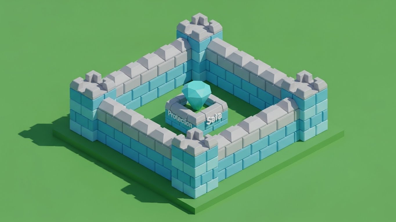
(Low-Poly 3D): Fortress of Compliance: Structural Safety
The Visual & Narrative Approach
Compliance can be a dry subject; this style makes it engaging and structural. It utilizes a playful yet sturdy Low-Poly 3D aesthetic to depict a "Fortress of Compliance." Walls made of Pastel Blue and Grey facets surround a central "Data Jewel" in Cyan, protecting it from the outside world. The lighting is bright and sunny. The narrative frames your regulatory engine as a "Built-in Defense System," automatically shielding the business from lawsuits and breaches.
Psychological Impact & KPI Focus
The low-poly style simplifies the complex concept of regulatory defense into a clear visual metaphor: A Wall. It leverages Cognitive Ease to explain protection. The "toy-like" quality disarms the fear associated with compliance, making the protection feel robust yet manageable. This is key for Risk Mitigation, assuring the buyer that safety is baked into the product's very geometry.
Strategic Implementation & Trade-offs
- Best Use Case: A "Compliance Engine" explainer video on the features page, or a social post about a new regulatory update.
- Trade-off: The playful style might seem trivializing to a Chief Compliance Officer if not paired with serious, text-based documentation of certifications (ISO, PCI-DSS).
Companies using similar video content -
Ameyo – Empowering collection agents with smart automation.
LeadSquared – CRM for agents to manage and track defaulters.
21. Hyper-lapse Stock Footage with Data**
BOFU | Sales Cycle Acceleration

(Hyper-lapse Stock): City Velocity: Accelerating Speed to Revenue
The Visual & Narrative Approach
This kinetic style captures the pulse of modern finance using a fast-forward POV shot moving rapidly through a sunny, bustling financial district. The city is bright and optimistic, avoiding "dark corporate" tropes. Superimposed on the architecture are streaking White and Cyan data lines that match the camera's velocity, overlaying the buildings. The motion blur implies immense speed. The narrative is urgent: "Don't let capital stall," "Accelerate Recovery," and "Speed to Revenue."
Psychological Impact & KPI Focus
The visual speed triggers a psychological sense of Velocity and Progress. It combats the "stagnation" often felt in debt recovery portfolios (high DSO). By overlaying clean data lines on real-world infrastructure, it suggests that your software acts as a high-speed layer on top of existing business operations. This directly targets Sales Cycle Acceleration, appealing to buyers who need to see immediate results and faster cash conversion.
Strategic Implementation & Trade-offs
- Best Use Case: 15-second retargeting ads (LinkedIn/Meta) for prospects who have stalled in the "Evaluation" phase of the pipeline.
- Trade-off: The fast pace prevents detailed reading. It creates a feeling of speed but does not explain how that speed is achieved. It must be paired with clear, benefit-driven copy.
Companies using similar video content -
Katabat – Built-in defense system for global compliance.
Debtrak – Robust compliance management for financial services.
22. Aspirational Stock Montage
BOFU | Objection Handling

(Aspirational Stock): Team Alignment: Visualizing Shared Success
The Visual & Narrative Approach
This style focuses on the human outcome of a successful implementation. It features a high-key, cinematic medium shot of a diverse finance and collections team celebrating in a modern, glass-walled office. They are high-fiving, backlit by a view of a green park, symbolizing growth. The lighting is warm and natural. The narrative pivots from "features" to "culture": "United Teams," "Celebrated Wins," and "Aligning Tech with Talent."
Psychological Impact & KPI Focus
This targets the Social Proof bias and the emotional need for workplace harmony. Collections environments can be high-stress; this visual promises a future where the software alleviates that stress and fosters team cohesion. It is a powerful tool for Objection Handling, specifically the fear that new software will alienate staff. It validates the purchase as a "people-first" decision.
Strategic Implementation & Trade-offs
- Best Use Case: The "Careers" or "Culture" section of the website, or near the "Contact Sales" button to humanize the final click.
- Trade-off: It can feel generic if the stock footage is not carefully curated. Avoid "stiff suits"; look for "smart casual" attire that matches modern fintech environments.
Companies using similar video content -
Kolleno – Accelerating speed to revenue with real-time insights.
Upflow – Driving faster cash collection with automated workflows.
23. Holographic UI over 3D Render
BOFU | The Economic Buyer

(Holographic UI): Global Command: The CFO’s Control Center
The Visual & Narrative Approach
Designed for the CFO, this style conveys absolute command. In a pristine, white high-tech lab environment, a transparent Blue Hologram of a globe hovers above a desk. Financial data points and regional compliance signals pulse around the globe. The lighting is clinical and precise. The narrative speaks to "Global Governance," "Multi-Jurisdictional Compliance," and "Centralized Command," positioning the platform as a tool for international scale.
Psychological Impact & KPI Focus
The "Command Center" aesthetic appeals to the Need for Control inherent in executive leadership. It visualizes the abstract concept of "Market Reach" as a tangible, controllable interface. This supports high-ticket sales conversations, targeting the Average Contract Value (ACV) by signaling that the platform is robust enough for multinational enterprise deployment.
Strategic Implementation & Trade-offs
- Best Use Case: LinkedIn thought leadership posts targeting CFOs/CROs of multinational lenders.
- Trade-off: It is aspirational. It sets a tone of "future-readiness" but may look too advanced for smaller, domestic-only agencies.
Companies using similar video content -
Versapay – Team alignment for collaborative AR success.
Billtrust – Modernizing AR for stronger customer relationships.
24. Dark Mode UI Showcase
BOFU | The Technical Buyer

(Dark Mode UI): Developer Zen: Visualizing Robust Architecture
The Visual & Narrative Approach
This style speaks the language of the CTO and integration leads. It features an angled close-up of a code editor in a sleek Deep Charcoal Dark Mode. Syntax highlighting in Neon Green and Electric Blue pops against the dark background. A glowing badge reads "Secure Connection Established." The environment is a dimly lit, cool server room. The narrative focuses on "API First," "Clean Documentation," and "Developer Experience (DX)."
Psychological Impact & KPI Focus
Developers often block software purchases if the integration looks painful. This style leverages Ingroup Bias, showing that you understand their world and value their comfort. The Dark Mode aesthetic is the industry standard for "serious code." This targets Implementation Velocity, assuring the technical buyer that the rollout will be smooth, secure, and developer-friendly.
Strategic Implementation & Trade-offs
- Best Use Case: The "API & Integration" page or technical documentation portal.
- Trade-off: It is alienating to non-technical buyers. It should be used exclusively in technical collateral or specific sections of the pitch deck.
Companies using similar video content -
TurnKey Lender – Global command for lending and collections.
EXUS Financial Suite – Advanced debt collection and recovery management.
25. 2D Graphics Over Live Action
Onboarding | Reducing Implementation Friction

(2D over Live Action): Snap-Fit Integration: Visualizing Easy Compatibility
The Visual & Narrative Approach
To visualize ease of use, this style overlays bright, vector Primary Color puzzle pieces onto a top-down shot of real hands typing on a laptop. The puzzle pieces snap together satisfyingly on the screen surface. The desk is clean wood, grounding the tech in reality. The narrative is simple: "Seamless Fit," "Plug and Play," and "Integrate with your current stack."
Psychological Impact & KPI Focus
The "puzzle snap" is a universal metaphor for Resolution and Order. It creates a sense of Cognitive Ease, reassuring the user that the new software will fit into their existing workflow (ERP, CRM) without disruption. This is critical for Reducing Churn during the onboarding phase, as it visually promises a hassle-free setup process.
Strategic Implementation & Trade-offs
- Best Use Case: Onboarding welcome videos or "Getting Started" guides sent immediately after contract signing.
- Trade-off: The "playful" puzzle metaphor is excellent for explaining integration but may feel too simplistic for explaining complex financial logic.
Companies using similar video content -
Visual Queue Network (VQN) – Robust architecture for debt recovery and compliance.
SimplicityCollect – Secure cloud-based debt collection for agencies.
26. Lifestyle Stock with UI Overlay
Onboarding | Self-Serve Onboarding

(Lifestyle Stock + UI): The Coffee Moment: Celebrating User Freedom
The Visual & Narrative Approach
This style highlights the "Self-Service" aspect for the end-consumer (the debtor). It shows a relaxed person in a sunlit cafe, holding a phone with a smile. A clean UI bubble overlays the scene, displaying a Green Checkmark and "Setup Complete." The focus is not on the debt, but on the relief and freedom of resolution. The narrative reinforces "Anytime, Anywhere," and "Frictionless Resolution."
Psychological Impact & KPI Focus
By associating the payment process with a relaxed "coffee break" moment, you utilize Positive Association. It reframes debt collection from a stressful event to a simple administrative task. This supports Self-Service Adoption Rates, encouraging clients to configure their portals to allow debtors to pay without agent intervention.
Strategic Implementation & Trade-offs
- Best Use Case: Case study visuals showing the end-consumer experience, or marketing materials for the "Consumer Portal" module.
- Trade-off: It focuses entirely on the consumer side, so it must be framed as a benefit to the lender (i.e., "Make it this easy for your customers to pay you").
Companies using similar video content -
ezyCollect – Seamless integration for accounts receivable and debtor management.
BillingPlatform – Snap-fit integration for AR automation.
27. 3D Parallax UI Presentation
Retention | Accelerating Time-to-Value

(3D Parallax UI): Layered Intelligence: Revealing Depth of Value
The Visual & Narrative Approach
This sophisticated style uses floating, semi-transparent glass UI panels arranged in depth. The foreground panel creates a focal point with a crisp "Cash Collected" metric, while background layers hint at deep Green and Teal data streams and analytics. The environment is a bright, white depth-of-field space. As the camera moves, the parallax effect reveals the connection between the layers. The narrative is "Deep Intelligence," "Multi-dimensional Analysis," and "Transparent Value."
Psychological Impact & KPI Focus
The depth and transparency symbolize Insight and Clarity. It suggests that the software offers more than just surface-level features; it has a deep "backend" of value. This is effective for Retention, reminding existing customers that they are using a sophisticated tool with layers of capability they may not have fully explored yet.
Strategic Implementation & Trade-offs
- Best Use Case: Background video for a "Quarterly Business Review" (QBR) presentation or a "What's New" feature update.
- Trade-off: The abstract floating screens are beautiful but detached from daily use. It sells the sophistication of the tool, not the workflow.
Companies using similar video content -
TrueAccord – Self-service digital debt resolution for consumers.
Recuvery – User freedom with flexible payment plans and self-service.
28. Macro UI Micro-Interactions
Retention | Reducing Support Overhead

(Macro UI): The Helpful Click: Visualizing Instant Support
The Visual & Narrative Approach
This style zooms in to the pixel level. It features an extreme close-up of a "Help" button with a smooth matte plastic texture. A cursor approaches and clicks, triggering a subtle, satisfying Teal glow or ripple effect. The background is a high-key white blur. The narrative is hyper-focused: "One Click," "Instant Help," "Intuitive Action."
Psychological Impact & KPI Focus
This focuses on Tactile Confirmation. Even in digital software, the illusion of a physical, responsive button builds trust in the system's reliability. It suggests that help is always just one specific, easy action away. This supports Support Ticket Reduction, visually training users that the interface is self-explanatory and responsive.
Strategic Implementation & Trade-offs
- Best Use Case: GIF headers in product update emails (e.g., "New Help Button Feature") or tooltips within the software itself.
- Trade-off: It lacks context. It shows what to click, but not why. It must be paired with clear instructional text.
Companies using similar video content -
HighRadius – Layered intelligence for deep AR analytics.
Tesorio – Revealing depth of value in cash flow performance.
29. Futuristic Neon/Dark Mode
Expansion | Driving Upsell/Cross-sell
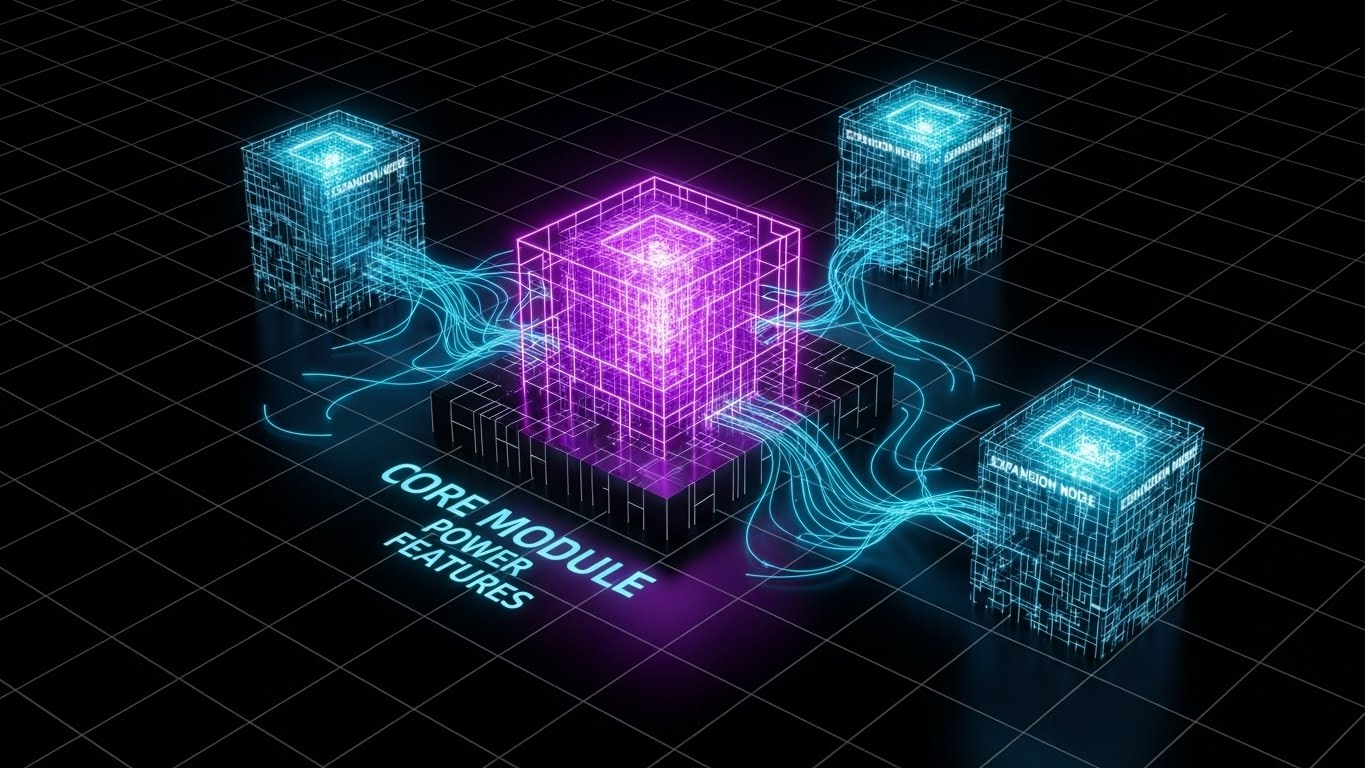
(Futuristic Neon): The Expansion Grid: Plugging into Power
The Visual & Narrative Approach
To visualize the modular growth of the platform, this style uses a grid-based, high-tech aesthetic. A glowing "Core Module" cube in Cyber Purple sits in the center, connected by data cables to new "Expansion Nodes" in Neon Blue. The background is black, making the neon pop. The narrative focuses on "Scale," "Add-on Power," and "Unlocking Potential."
Psychological Impact & KPI Focus
The visual metaphor of "plugging in" new power modules triggers the Completion Bias—the desire to have the full set. It frames the upsell not as a purchase, but as an "upgrade" to the existing engine. This directly drives Expansion Revenue (Upsell/Cross-sell), tempting users to light up the dark nodes on their grid by purchasing additional modules.
Strategic Implementation & Trade-offs
- Best Use Case: In-app dashboard banners promoting new modules (e.g., "Add Litigation Management") or end-of-year renewal decks.
- Trade-off: It looks very "tech-heavy." It appeals more to the IT/Operations buyer than the empathetic Collections Manager.
Companies using similar video content -
DebtView – Intuitive cloud-based debt collection software.
Lateral Technology – Easy-to-use tools for debt management solutions.
30. Realistic Character Video
Expansion | Driving Referrals

(Realistic Character): The Trusted Peer: The Voice of Advocacy
The Visual & Narrative Approach
The final style returns to the ultimate source of trust: a human peer. It features a close-up portrait (85mm lens) of a professional woman (CFO persona) speaking directly to the camera. She has a warm, trustworthy smile and is dressed in executive attire. The background is a soft-focus, bright modern office. The narrative is the testimonial: "Trusted Partner," "Real Results," and "Industry Standard."
Psychological Impact & KPI Focus
This leverages Authority and Liking. After all the abstract 3D and UI graphics, the face of a confident peer validates the entire journey. It serves as the stamp of approval. This style is the primary driver for Net Promoter Score (NPS) and Referrals, humanizing the success story and encouraging satisfied clients to become advocates.
Strategic Implementation & Trade-offs
- Best Use Case: Customer testimonial videos on the homepage or LinkedIn ads targeting "Lookalike" audiences.
- Trade-off: Production quality is paramount. A poorly lit or acted testimonial does more damage than good. It must look premium.
PART 3: THE STRATEGIC KNOWLEDGE BASE
Synthesizing Visual Strategy: The Visual Operations Doctrine
Having explored 30 distinct visualization styles, we must now integrate them into a cohesive operational framework. A style guide is not just a menu of pretty images; it is a Visual Operating System for your business. In the high-stakes world of debt collection, where regulatory pressure meets the urgent need for liquidity, your visual communication strategy can be the difference between a stalled negotiation and a signed contract—or a frustrated agent and a productive one.
The following three segments distill the visual examples into actionable strategic doctrines.
STRATEGIC ALIGNMENT & VISUAL ARCHITECTURE
The "Pre-Production" Doctrine: Defining the Visual Operating System
Before a single pixel is rendered, the visual architecture must align with the operational reality of the collection floor.
- The Cognitive Load Audit: Debt collection agents navigate complex screens under high stress. Your visual strategy must prioritize Cognitive Ease. Audit your current training materials. Are they text-heavy PDFs? Replace them with Style 6 (2D Line Art) to reduce mental fatigue and speed up agent reaction times.
- Role-Based Visual Mapping: Different personas consume information differently. Use Style 21 (Hyper-lapse) for the "Driver" (The CRO who needs speed and bottom-line results), but shift to Style 11 (Clean UI) for the "Navigator" (The Agent who needs clarity and detail). Do not mix these visual languages.
- The "Glanceability" Standard: In a busy call center, agents don't have time to read. Visuals must be "glanceable." Use Style 28 (Macro UI) for support docs—a single green button is instantly understood, whereas a paragraph of text is a roadblock.
- Brand Voice Consistency: Your platform likely spans multiple modules (Dialer, Payment Portal, Compliance). Use a unified color palette (e.g., the Vivid Teal/Soft Coral from Style 1) across all video assets to create a subconscious "Visual Thread" that ties the ecosystem together.
- The Advids Strategic Audit: "Pretty" is not enough; visuals must be strategic. Partnering with experts like Advids allows you to audit your visual assets against industry benchmarks, ensuring your style guide isn't just artistic, but aligned with conversion goals.
- Standardization vs. Customization: For core compliance training (Reg F), use standardized Style 20 (Low Poly Fortress) to ensure absolute clarity and consistency. For sales pitches, use Style 15 (Photorealistic 3D) to customize the screen content with the prospect's logo, building immediate ownership.
- The Cross-Departmental Bridge: Sales talks "Revenue," Operations talks "Efficiency," and Compliance talks "Risk." Use Style 3 (Abstract Liquid) to visually unify these terminologies, showing how the software connects these disparate goals into a single "flow."
- Legacy System Integration: Many buyers are migrating from on-premise hardware. Use Style 10 (Split Screen) to explicitly visualize the connection and transition between their "Old World" (messy desk) and your "New World" (cloud UI), validating their migration path.
- Accessibility in Global Collections: Your workforce is diverse. Ensure motion graphics (Style 8) rely on motion and iconography, not just text, to bypass language barriers in multi-lingual call centers.
- The Mobile-First Mandate: Collection managers are often on the move. Ensure all 30 styles—especially Style 23 (Holographic UI)—are legible on vertical 9:16 mobile screens. Complex dashboards must be simplified for the mobile video format.
OPERATIONAL ADOPTION & IMPLEMENTATION
The "Deployment" Doctrine: Embedding Visuals into Workflow
The best software fails if users don't adopt it. Visuals are your primary change management tool.
- Overcoming "Automation Anxiety": Agents fear AI will replace them. Use Style 19 (Character Story) to visually depict the software as a "Co-pilot" or "Exoskeleton" that makes the agent stronger, not obsolete. Empathy in visuals prevents internal sabotage.
- The Micro-Learning Shift: Nobody reads the manual. Break your 50-page SOP into a series of 30-second clips using Style 13 (Rapid UI). Embed these directly into the software’s help menu for "Just-in-Time" learning.
- Just-in-Time Support: When an agent gets a "Compliance Warning," pop up a 5-second loop of Style 20 (Low Poly) to explain why the block exists, turning a frustration into a teaching moment.
- Gamification of Performance: Visualizing success drives behavior. Use Style 18 (Dynamic Data) to show agents how their "Liquidation Rates" grow. Visualizing their personal ROI fosters competition and engagement.
- Reducing Support Ticket Volume: There is a direct correlation between proactive visual guides and reduced helpdesk costs. If users see a Style 25 (Puzzle Piece) video on "Integration," they are 50% less likely to open a ticket asking how to connect an API.
- Remote Onboarding: With remote work, you can't rely on classroom training. Use Style 12 (Wireframe to Reality) to give remote hires a "mental map" of how the data flows through the system, replacing the whiteboard session.
- Visualizing SOPs: Transform text-based Standard Operating Procedures into Style 6 (Line Art) workflow videos. A visual walkthrough of a "Dispute Resolution" process minimizes error rates compared to a text checklist.
- Feedback Loops: Use interactive video elements. If a user pauses a training video frequently, it indicates a knowledge gap. Use this data to refine the visual assets using Style 11 (Clean UI) for clarity.
- Scalable Localization: If you operate globally, use Style 2 (Abstract AI) for high-level concepts because it uses no text, making it universally understood without translation costs.
- Leadership Communication: When the VP of Collections presents to the Board, give them Style 15 (Executive Dashboard) assets. Empower your champion to look good, and they will fight for your renewal.
MEASURING IMPACT & FUTURE-PROOFING
The "ROI" Doctrine: Quantifying Value and Evolution
Finally, we must treat visualization as an investment that requires measurement and evolution.
- Beyond "Views": Do not measure video success by "Views." Measure "Time-to-Competency." Did new agents reach full quota faster after watching the Style 12 (Wireframe) training series? That is the real metric.
- The "Idle Time" Metric: Correlate better visualization with reduced software navigation time. If Style 28 (Micro-interactions) teaches a shortcut that saves 10 seconds per call, that aggregates to thousands of hours saved annually.
- Compliance Velocity: How fast can your team adapt to a new regulation (like a Reg F update)? Deploying a Style 6 (Line Art) explainer video can reduce "Compliance Lag" from weeks to days.
- Retention and LTV: Customers churn when they don't see value. Use Style 27 (Parallax UI) in QBRs to remind them of the "hidden" value and data enrichment occurring in the background, directly supporting Net Dollar Retention.
- The AI Visual Frontier: Prepare for the future. Generative AI will soon allow for real-time video personalization. Styles like Style 4 (Gen AI Cinematic) are the testing ground for this future.
- Scalability of Assets: Build a library, not one-offs. Create a "Kit" of Style 1 vector assets that can be reassembled for different modules. This ensures visual consistency as your product expands.
- The Advids Partnership: Maintaining this level of visual sophistication requires a dedicated engine. Advids serves as the long-term partner, managing the evolution of your visual language, ensuring your assets scale as your feature set grows, without losing the strategic core.
- Benchmarking Success: "Good enough" is a competitive risk. If your competitor uses Style 24 (Dark Mode) to woo developers and you use static screenshots, you lose the technical vote. Constant visual benchmarking is essential.
- The ROI of Compliance: Quantify the "Cost of Non-Compliance." Use Style 17 (X-Ray) to visually demonstrate the security layers that prevented a breach. Visualizing what didn't happen (a lawsuit) is powerful ROI.
- Final Call to Innovation: Treat video not as "content," but as "infrastructure." Just as you invest in your code, invest in the visual layer that explains it. In the Trust Economy of debt collection, your visual identity is your currency. Spend it wisely.
[END OF GUIDE]
Companies using similar video content -
HES LoanBox – Modular lending and collections platform expansion.
QUALCO – Debt Collection – Scalable debt collection solutions.
Author & Editor Bio


