
 /home/wwwroot/advids.co/design/index.php on line 425
Introduction: Visualizing the Path from Debt to Freedom
The debt settlement industry is undergoing a seismic shift. We are moving away from the era of aggressive cold-calling and into an age of empathetic, digital-first financial wellness. For SaaS platforms and settlement firms, the challenge is no longer just "getting leads"—it is about bridging the Physical/Digital Divide. You must convince a distressed user, often paralyzed by financial anxiety, that your digital interface is as secure as a bank vault and as compassionate as a human counselor.
The opportunity for visualization here is massive. The global debt settlement market size accounted for USD 9.83 billion in 2024, driven by rising consumer debt and a surge in demand for transparent, digital relief options. Yet, many platforms still rely on dense text and generic stock imagery to explain complex concepts like "Escrow" and "Creditor Matrices." This is a missed opportunity.
Visual communication is the most powerful lever you have to reduce cognitive load. By replacing abstract legal jargon with clear, comforting motion design, you don't just educate; you lower cortisol levels. Recent data confirms that technology is the efficiency driver: AI-powered automation in collections and settlement reduces operational costs by 30-50% while significantly boosting productivity. Your video strategy should reflect this efficiency—using precise, high-end visuals to explain your value proposition instantly, without the need for a 45-minute sales call.
This guide acts as your visual blueprint. We have curated 30 distinct video styles, from "Claymorphism" that humanizes banking to "Wireframe Transitions" that validate security. These aren't just pretty pictures; they are strategic assets designed to build trust, reduce churn, and turn a complex financial process into a clear, navigable journey.
1. The Anxiety-Reducer: Abstract 2D flat vector organic
TOFU | Brand Awareness

The Visual & Narrative Approach
This style utilizes a modern, organic aesthetic to tackle the industry's core psychological barrier: the feeling of being "trapped." The visualization centers on a complex, tangled knot—represented in vivid coral, deep teal, and pure white—floating in a calm, off-white void. Through smooth, fluid animation, the knot gently loosens and unties itself, transforming into parallel, flowing lines. The movement is slow and deliberate, avoiding any jerky or aggressive motions that might trigger anxiety. The shapes feature subtle glossy highlights, giving them a premium, tactile quality that feels "expensive" and trustworthy.
Psychological Impact & KPI Focus
- Niche Psychology: Distressed clients are often in a state of "fight or flight." Sharp edges and red colors (often used in debt warnings) exacerbate this. This style uses "Organic Shapes" and a calming palette to lower the viewer's heart rate.
- Operational Impact: By visually summarizing the feeling of relief (the untying), you bypass the skepticism associated with verbal promises. This style is highly effective for Top-of-Funnel (TOFU) awareness ads where the goal is simply to stop the scroll and offer a moment of visual peace.
Strategic Implementation & Trade-offs
- Best Use: Social Media Ads (Instagram/Facebook) and Brand Awareness spots.
- Duration: 6–12 Seconds.
- Trade-off: This style is metaphorical, not literal. It is excellent for Brand Awareness but poor for explaining how the settlement works. It sets the mood, not the method.
Companies using similar video content -
GreenPath Financial Wellness – Debt Management Program – Empathetic financial counseling.
PayPlan – Debt Help & Advice – Consolidating monthly debt payments.
2. The Chaos-Sorter: Abstract 2D Motion Graphics
TOFU | Market Education
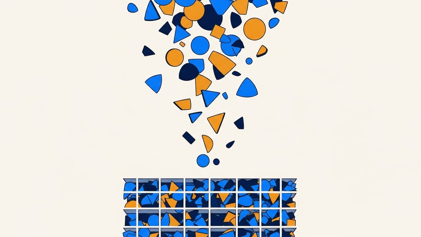
The Visual & Narrative Approach
This vertical visual is designed specifically for mobile-first consumption (YouTube Shorts/TikTok). It captures the essence of "algorithmic organization." We see a chaotic rain of scattered geometric shards—triangles, circles, and polygons in electric blue and lime green—drifting from the top of the frame. As they descend, they are magnetically pulled into a rigid, perfectly organized grid structure at the bottom. The motion is rhythmic and satisfying, suggesting a "sorting" process where mess becomes order. The aesthetic is clean and flat, with smooth easing curves that imply a frictionless software backend.
Psychological Impact & KPI Focus
- Niche Psychology: Debt feels like chaos. The user’s financial life feels scattered. This visualization validates the user's desire for control. Seeing the scattered pieces snap into a grid provides a dopamine hit of satisfaction (closure).
- Operational Impact: It visualizes the abstract concept of "Debt Consolidation" or "Creditor Organization" without needing to show sensitive financial documents. It positions the software as the "Ordering Agent" in the client's messy life.
Strategic Implementation & Trade-offs
- Best Use: YouTube Shorts, TikTok Ads, Mobile App Loading Screens.
- Duration: 5–10 Seconds (Loopable).
- Trade-off: The high abstraction means it requires a voiceover or text overlay to contextualize what is being sorted (e.g., "Organize your creditors instantly"). Without context, it is just abstract art.
Companies using similar video content -
Upflow – Accounts Receivable – Automating cash collection workflows.
Kolleno – Accounts Receivable Platform – Consolidating receivables and payments.
3. The Trust Factory: Isometric 2D Motion Design
TOFU | Shaping Brand Perception

The Visual & Narrative Approach
This style brings the "black box" of debt settlement to life. We utilize an isometric perspective to reveal a stylized digital office. The roof is removed (cut-away view) to show the internal workflow of a settlement agency. Miniature desks in professional shades of sky blue and slate grey are arranged in a logical flow. Tiny abstract documents travel along conveyor belts, moving from "Intake" to "Negotiation" to "Settled" bins. The lighting is soft and shadowless, creating a clean, clinical (but not sterile) environment. The rendering uses precise geometric edges to convey accuracy and competence.
Psychological Impact & KPI Focus
- Niche Psychology: Clients often fear that debt settlement companies do nothing but take fees. This "Digital Factory" visual proves that work is happening. It visualizes the labor—the processing, the moving, the settling—justifying the service fees.
- Operational Impact: This style is critical for Shaping Brand Perception. It creates a mental model of the company as a well-oiled machine, reducing the "Trust Gap" significantly.
Strategic Implementation & Trade-offs
- Best Use: Website Hero Section, "How It Works" Explainer Videos.
- Duration: 15–30 Seconds.
- Trade-off: Isometric animation is labor-intensive to produce. It is an investment asset, meant to live on your homepage for 12-24 months, not a disposable social post.
Companies using similar video content -
C&R Software – Debt Manager – Comprehensive debt collections solution.
Stacc Debt Collection – Data-driven Collections Platform – Connecting systems, data, workflows.
4. The Guardian: Minimalist Flat 2D Vector
TOFU | Category Creation

The Visual & Narrative Approach
This visual is a masterclass in semiotic efficiency. It uses a minimalist flat 2D vector style with thick, bold outlines to convey unshakeable strength. A large, stylized shield—rendered in emerald green and gold—stands guard in front of a neat stack of coin-like cylinders (representing the client's escrow savings). The background is a stark, clean white void, ensuring zero distraction. There are no gradients; the strength comes from the solid blocks of color and the "Hard-Edged" vector shapes.
Psychological Impact & KPI Focus
- Niche Psychology: The number one fear in debt settlement is "Is my money safe?" This image addresses that fear head-on using the universal symbol of the Shield. The gold coins imply value, while the green shield implies "Go/Safety."
- Operational Impact: This style supports Category Creation by establishing the platform not just as a negotiator, but as a protector. It is highly effective for LinkedIn images or static ad headers where immediate comprehension is required.
Strategic Implementation & Trade-offs
- Best Use: LinkedIn Static Posts, Email Signatures, Trust Badges on Checkout Pages.
- Duration: Static Image or 3-Second Micro-loop.
- Trade-off: It is very static. It lacks the nuance to explain how the protection works (e.g., FDIC insurance), it only asserts that it exists.
Companies using similar video content -
Ncontracts – Fair Lending Compliance Software – Ensuring regulatory adherence.
ComplyAdvantage – AML Risk Detection – AI-driven financial crime risk management.
6. The Human Network: Isometric 3D Workflow
MOFU | Product Differentiation

The Visual & Narrative Approach
This style uses a "Claymorphism" aesthetic—soft, matte 3D shapes that look like high-end toys—to visualize the intimidating banking network. We see a "Creditor Matrix" where miniature cylindrical nodes (representing banks) connect via soft tubes to a central hub. The color palette is cyan, magenta, and deep purple. The lighting is soft and diffuse, creating a friendly, approachable vibe. It turns the "Cold Banking System" into a "Connected Ecosystem."
Psychological Impact & KPI Focus
- Niche Psychology: Clients view banks as hostile giants. This style shrinks them down to "toy size," reducing the fear factor. The soft textures imply flexibility and negotiability, subtly reinforcing the idea that debts can be settled.
- Operational Impact: Supports Feature Education. It is perfect for explaining the "Backend Negotiation" process without using boring flowcharts. It makes the connectivity look sophisticated yet harmless.
Strategic Implementation & Trade-offs
- Best Use: Product Pages, Investor Pitch Decks.
- Duration: 10–20 Seconds.
- Trade-off: This specific aesthetic (Claymorphism) is very trendy. While effective now, it may look dated in 3-5 years, requiring a brand refresh.
Companies using similar video content -
Fenergo – Client Lifecycle Management – Streamlining onboarding, compliance for financial institutions.
Perfios – DPI Stack – Digitally connecting Indian financial landscape.
7. The Reality Bridge: Wireframe to Reality Transition
MOFU | Feature Education
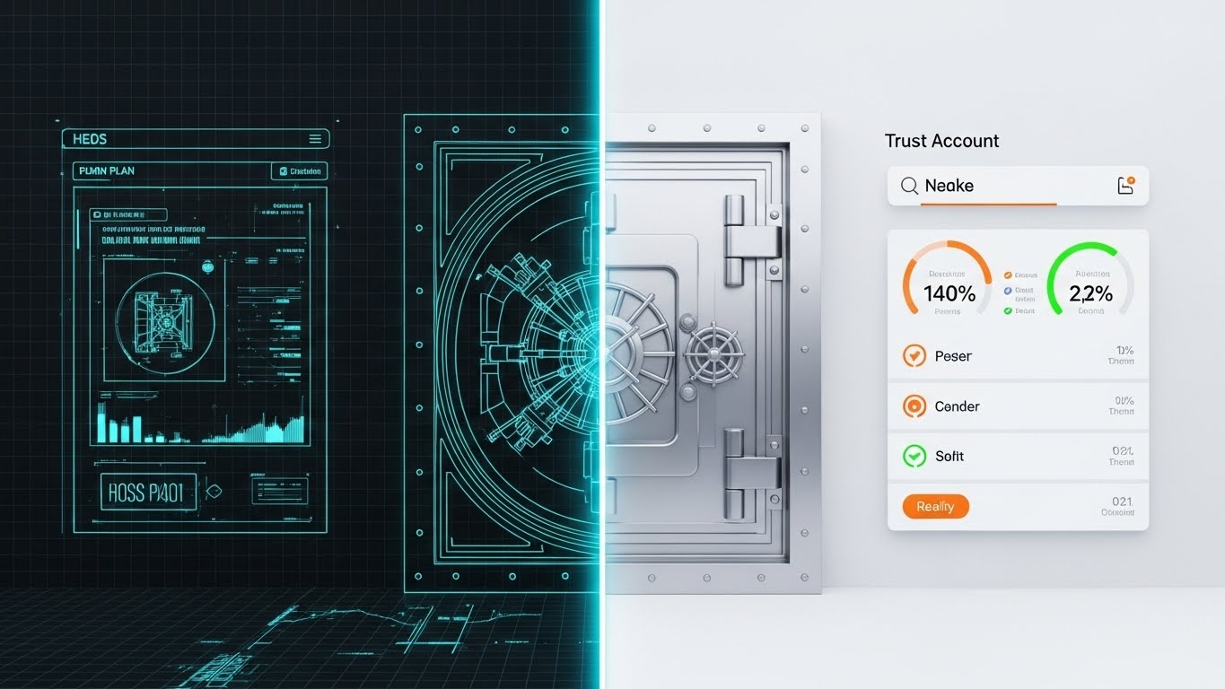
The Visual & Narrative Approach
This powerful split-screen composition visualizes the engineering behind the promise. The left half shows a technical blue-print wireframe of a bank vault door. The right half shows a glossy, photorealistic 3D render of the same vault door, fully finished in silver and steel. A vertical glowing line separates the two worlds. This transition visualizes the "Trust Account" setup process moving from plan to reality.
Psychological Impact & KPI Focus
- Niche Psychology: This style appeals to the skeptic who needs "proof." The wireframe says "We have a plan/technology," and the photorealism says "It is real/secure." It bridges the gap between digital code and physical security.
- Operational Impact: Targeted at Reducing Friction during the onboarding phase. It reassures the client that the "Digital Account" they are funding has real-world solidity.
Strategic Implementation & Trade-offs
- Best Use: Email Headers (Onboarding Sequence), Security Page on Website.
- Duration: 3–5 Seconds (Transition Loop).
- Trade-off: Requires high-end 3D modeling skills to ensure the "Reality" side looks truly photorealistic. If it looks fake, the security metaphor fails.
Companies using similar video content -
Mitek Systems – Mobile Document Capture – Seamless mobile identity verification.
Jumio – Identity Verification – AI-powered authentication and fraud prevention.
8. The Growth Curve: Dynamic Data Visualization
MOFU | Reducing Friction
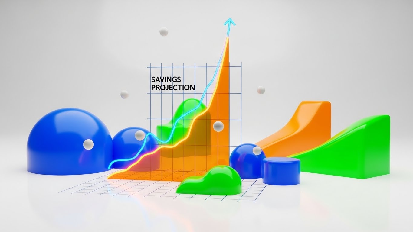
The Visual & Narrative Approach
Data is boring until it is beautiful. This style presents a "Savings Projection" graph as a dynamic, 3D art piece. A central line graph in bright orange rises exponentially, cutting through the scene. It is surrounded by floating, glossy geometric data points in soft grey. The background is a clean, bright white studio ramp, emphasizing the colorful data. The aesthetic is modern and minimalist, utilizing fine grid lines and sharp vector edges to suggest precision.
Psychological Impact & KPI Focus
- Niche Psychology: Humans struggle to visualize "future compound savings." This image makes that future gain tangible and desirable. The "Up and to the Right" motion is the universal symbol of success, triggering an optimistic response.
- Operational Impact: Drives Demand Gen. It is the perfect visual for "Savings Calculators" or "Results" pages. It validates the ROI of the program instantly.
Strategic Implementation & Trade-offs
- Best Use: LinkedIn Ads, Retargeting Ads (for users who dropped off the calculator page).
- Duration: 6–10 Seconds.
- Trade-off: Care must be taken not to imply guaranteed returns, which could violate FTC regulations. The data should always be labeled as "Projections" or "Estimates."
Companies using similar video content -
HighRadius – AI-powered Collections Automation – Projecting reduced past dues, increased productivity.
Tesorio – Cash Flow Performance Platform – Automating AR with AI/ML for insights.
11. The Legal Validator: 2D Line Art Animation
BOFU | ROI Justification
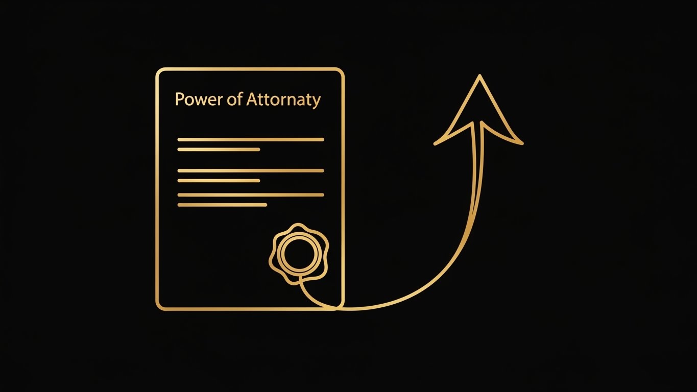
The Visual & Narrative Approach
This style strips away the noise to focus on the elegance of legal validity. Against a premium matte black background, a single, continuous line rendered in metallic gold animates effortlessly. It begins by tracing the outline of a formal document, swirling inward to form a wax seal—symbolizing the "Power of Attorney"—before seamlessly extending upward to form a sharp, rising growth arrow. The animation is fluid and unbroken, suggesting a frictionless transition from legal commitment to financial success.
Psychological Impact & KPI Focus
- Niche Psychology: At the signing stage, the client’s anxiety shifts from "Can they help?" to "Is this legitimate?" The gold-on-black aesthetic triggers associations with luxury credit cards and high-end law firms, subconsciously signaling premium compliance and authority.
- Operational Impact: This style drives ROI Justification. By visually connecting the legal document (the input) directly to the upward trend line (the output), it creates a semiotic link between signing the contract and achieving financial freedom.
Strategic Implementation & Trade-offs
- Best Use: Investor Pitch Decks, Contract Signing Pages, "Legal" section of the website.
- Duration: 5–8 Seconds (Loop).
- Trade-off: The minimalism is extreme. It validates the feeling of legality but cannot explain the details of the compliance process. It is a seal of approval, not an educational tool.
12. The Encryption Core: 3D X-Ray Visualization
BOFU | Risk Mitigation
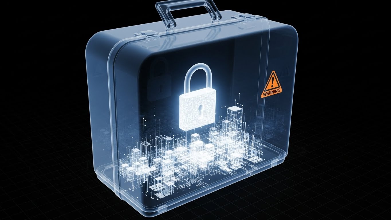
The Visual & Narrative Approach
To sell a digital financial product, you must make security visible. This style uses a "3D X-Ray" technique to render a translucent, glass-like suitcase or server unit. The outer shell is clear blue glass, revealing the internal architecture: a glowing, solid gold padlock physically locking down a digital city of data blocks. The lock engages with a sense of weight. This visualizes "Zero-Knowledge Encryption"—showing that while the process is transparent, the data remains untouchable.
Psychological Impact & KPI Focus
- Niche Psychology: Security is the ultimate objection in Fintech. A "Glass Box" metaphor satisfies the psychological need for transparency ("I can see inside") while validating safety ("The lock is solid"). It reduces the fear of the "Black Box" algorithm.
- Operational Impact: Directly addresses Risk Mitigation. It serves as visual proof of compliance (SOC2, AES-256), crucial for convincing Compliance Officers that the platform is a fortress for client PII (Personally Identifiable Information).
Strategic Implementation & Trade-offs
- Best Use: Security Whitepapers, Trust Center, BOFU Email Signatures.
- Duration: 10–15 Seconds.
- Trade-off: Requires high-fidelity rendering. If the "glass" texture looks like cheap plastic, the metaphor fails. It must look like high-end hardware.
13. The Success Signal: Lifestyle Stock with UI Overlay
BOFU | Building Trust

The Visual & Narrative Approach
Technology serves humans, not the other way around. This style grounds the software in emotional reality. We feature a high-quality, candid shot of a professional woman in a modern, sunlit office, smiling with genuine relief at her laptop. Floating in the 3D space around her are semi-transparent, "Glassmorphism" notification bubbles displaying critical success metrics: "Negotiation Success," "Payment Cleared," and "Debt Resolved." The warm beige and soft blue tones of the UI match the natural lighting.
Psychological Impact & KPI Focus
- Niche Psychology: Prospects want to know what it feels like to be debt-free. This visual provides "Emotional Mirroring." Seeing a relatable professional experiencing relief triggers a similar response in the viewer, validating their hope for a solution.
- Operational Impact: Powerful for Building Trust. It bridges the gap between the interface and the emotional result, proving that the software isn't just processing numbers—it's delivering peace of mind.
Strategic Implementation & Trade-offs
- Best Use: Website Testimonials, Case Study Headers, Retargeting Ads.
- Duration: Static Image or Parallax Scroll.
- Trade-off: Reliance on stock photography is risky. Avoid "Over-posed" models. The expression must feel authentic to the stressful context of debt relief.
Companies using similar video content -
New Era Debt Solutions – Debt Settlement Services – Quick debt resolution with legal assistance.
Freedom Debt Relief – Debt Settlement Services – Legal support for debt settlement.
14. The Clarity Split: Split Screen Optimized Reality
BOFU | Competitive Displacement

The Visual & Narrative Approach
This is the ultimate "Before and After" comparison. The screen is sliced diagonally. The left side (Sepia/Desaturated) reveals the nightmare of the status quo: a desk overflowing with paper files, sticky notes, and physical folders—the "Manual Settlement" era. The right side (Vivid/Clean) shows a pristine white desk with a single monitor displaying your colorful, organized SaaS dashboard. The contrast is sharp and immediate.
Psychological Impact & KPI Focus
- Niche Psychology: Operational leaders are exhausted by chaos. This image validates their fatigue (left side) and offers an immediate, accessible cure (right side). It leverages the brain's preference for order and symmetry.
- Operational Impact: A primary tool for Competitive Displacement. It visually argues that sticking with legacy methods is a regression. It positions the software as the only logical evolution for a modern firm.
Strategic Implementation & Trade-offs
- Best Use: Comparison Ads (LinkedIn/Meta), "Why Switch" Landing Pages.
- Duration: Static Image or Interactive Slider.
- Trade-off: It is binary and aggressive. It effectively kills the competition but lacks nuance. Use it when you know the prospect is suffering from "Spreadsheet Fatigue."
Companies using similar video content -
Onfido – AI-powered Identity Verification – Biometric authentication and fraud detection.
Trulioo – GlobalGateway – Global identity verification and AML screening.
15. The Gamified Path: 2D Character-Driven Story
BOFU | Overcoming Objections

The Visual & Narrative Approach
Debt settlement is a marathon full of obstacles. This style uses a stylized 2D vector character (in calming mint and orange tones) to visualize the process as a navigable journey. The character is depicted effortlessly stepping over low hurdles labeled with abstract red blocks (representing "Creditor Pushback" or "Audits"), holding a glowing map that represents your software. The background is a clean, abstract obstacle course.
Psychological Impact & KPI Focus
- Niche Psychology: Fear of the unknown paralyzes action. By visualizing the roadmap as a path with surmountable obstacles, you reduce the perceived effort. The "Gamification" aesthetic implies that the user has the tools to win.
- Operational Impact: Excellent for Overcoming Objections regarding the complexity of the program. It says, "We have a map, and the hurdles are smaller than you think."
Strategic Implementation & Trade-offs
- Best Use: Blog Posts (Educational), Onboarding Welcome Video.
- Duration: 30–60 Seconds.
- Trade-off: Can feel "childish" if not executed with a premium color palette. Ensure the character looks like a professional adult to maintain B2B credibility.
Companies using similar video content -
Accredited Debt Relief – Debt Settlement Services – High customer satisfaction.
TurboDebt – Debt Settlement Services – Customer-focused debt relief.
16. The Boardroom Deal: Generative AI Cinematic Video
BOFU | Demo Requests

The Visual & Narrative Approach
This style speaks the language of "Big Business." Using high-end Generative AI video, we create a cinematic scene inside a skyscraper boardroom. A diverse group of C-level executives is locked in a slow-motion handshake, bathed in dramatic teal and orange lighting. The textures of the mahogany table and the fabric of the suits are palpable. It conveys the gravity and success of a "Bulk Settlement" deal being closed.
Psychological Impact & KPI Focus
- Niche Psychology: B2B buyers want to feel like industry titans. This visual mirrors their aspiration. It positions your software not as a utility, but as a catalyst for high-level, boardroom success.
- Operational Impact: Drives Demo Requests from Enterprise leads. It signals that your platform is "Institutional Grade" and suitable for high-volume, high-value negotiations.
Strategic Implementation & Trade-offs
- Best Use: Landing Page Backgrounds (Enterprise Tier), Brand Anthem Video.
- Duration: 10–20 Seconds (Loop).
- Trade-off: Generative AI can sometimes produce "uncanny valley" artifacts. Strict quality control is needed to ensure the handshake looks natural and professional.
Companies using similar video content -
MeridianLink Collect – Cloud-based Debt Collection Software – Replacing tedious workflows with automation.
Lateral Technology – Cloud-based Debt Collection Software – Automating collections cycle.
17. The Developer's View: Dark Mode UI Showcase
BOFU | ABM Awareness
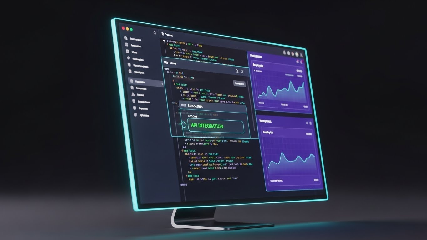
The Visual & Narrative Approach
Targeting the CTO or Technical Lead requires a specific visual language. This style features an angled, close-up view of a monitor displaying the platform in "Dark Mode." Neon cyan and violet accents pop against the charcoal grey background. We see a terminal window executing a successful "API INTEGRATION" script with green success text. It emphasizes code quality and modern architecture.
Psychological Impact & KPI Focus
- Niche Psychology: Developers trust code, not marketing copy. A "Dark Mode" UI signals low latency and developer-friendliness. It differentiates you from "Legacy" banking software that looks outdated.
- Operational Impact: Critical for ABM Awareness campaigns targeting technical decision-makers. It answers the question "Is this API-first?" visually, before they even read the technical specs.
Strategic Implementation & Trade-offs
- Best Use: LinkedIn Ads (Targeting Job Titles: CTO, Developer), API Documentation Page.
- Duration: Static or Micro-animation (Cursor blinking).
- Trade-off: It may alienate non-technical users who find code intimidating. Use strictly for segmented technical audiences.
Companies using similar video content -
Apprisen – Debt Management Plans – Guiding through credit counseling.
Money Management International – Debt Management Plans – Helping clients pay off debt.
18. The Executive Vision: Generative AI Realistic Character
BOFU | Economic Buyer

The Visual & Narrative Approach
This visual targets the person signing the check. We see a distinguished CEO (Male, 50s) standing by a floor-to-ceiling window in a skyscraper, bathing in the golden hour light of sunset. He holds a tablet, smiling subtly as he reviews a dashboard. The reflection of the city skyline implies dominance and vision. The aesthetic is aspirational and commanding.
Psychological Impact & KPI Focus
- Niche Psychology: The Economic Buyer cares about oversight and results. This image validates their role as the "Overseer." It suggests that your software gives them the high-level visibility they need to govern their empire from a tablet, effortlessly.
- Operational Impact: Focuses on the Economic Buyer. It sells the benefit of "Executive Control" and "Peace of Mind" rather than operational details.
Strategic Implementation & Trade-offs
- Best Use: LinkedIn Video Ads, Annual Report Covers, Executive Summary Slides.
- Duration: 6–10 Seconds.
- Trade-off: It is purely aspirational. It does not show what the software does, only who uses it. It must be paired with copy about "Executive Dashboards" to be effective.
Companies using similar video content -
Billtrust – AI-powered Collections Platform – Streamlining overdue payment recovery for enterprises.
Esker – Collections Management – Automating accounts receivable for efficiency.
19. The Augmented Workforce: 2D Graphics Over Live Action
BOFU | The Champion

The Visual & Narrative Approach
This style celebrates the mid-level manager who advocates for your software. We use a real photo of a confident office worker in a busy environment. Popping up around him are 2D flat vector icons (Green Checkmarks, Shields, "Approved" stamps). The contrast between the realistic photo and the bright, cartoony graphics creates a sense of energy and "Winning," suggesting the software gives them superpowers.
Psychological Impact & KPI Focus
- Niche Psychology: Your internal champion wants to look good to their boss. This visual validates that buying your software makes them the hero. The green checkmarks symbolize tasks completed, risks avoided, and efficiency gained.
- Operational Impact: Supports The Champion by providing them with visuals that make them look productive and smart. It serves as "Social Proof" for the internal sell.
Strategic Implementation & Trade-offs
- Best Use: Internal Presentation Decks (for the Champion to use), Team Culture Pages.
- Duration: Static or Stop-Motion Animation.
- Trade-off: The "Mixed Media" style is informal. It works great for internal advocacy but might feel too playful for a formal contract review with Legal.
Companies using similar video content -
Shape Software – AI-powered Debt Settlement CRM – Technical robustness for debt settlement teams.
Middesk – Fintech Client Onboarding – Easy-to-integrate API for business verification.
20. The Velocity Montage: Rapid UI Feature Montage
BOFU | Sales Cycle Acceleration
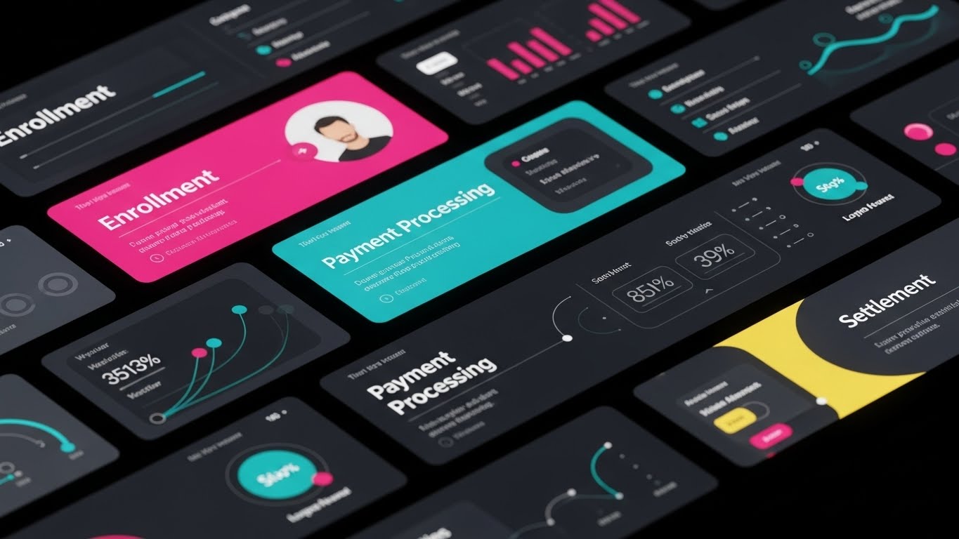
The Visual & Narrative Approach
When you need to convey "All-in-One" capability fast, this style is the answer. We use a diagonal composition of multiple UI screens (Enrollment, Payment Processing, Settlement) arranged in strips. They slide rapidly across the screen with motion blur, creating a dynamic "Whoosh" effect. The color palette utilizes the full spectrum of your brand colors to differentiate modules, creating a "Wall of Value."
Psychological Impact & KPI Focus
- Niche Psychology: "Does it handle X? What about Y?" This visual answers "Yes" to everything instantly. The sheer volume of screens implies a comprehensive, end-to-end solution, overwhelming objections about missing features.
- Operational Impact: Drives Sales Cycle Acceleration. It visually summarizes the entire feature set in 5 seconds, saving the sales rep from having to click through every tab during a demo.
Strategic Implementation & Trade-offs
- Best Use: Video Ad End Cards, YouTube Pre-roll (First 5 seconds), Trade Show Booth Loops.
- Duration: 3–5 Seconds.
- Trade-off: The screens are moving too fast to be read detailedly. It relies on the impression of features, not the readability of data. Do not use this if you need to explain a specific metric.
Companies using similar video content -
Gaviti – Invoice-to-Cash Automation – Centralizing collections for enterprises.
Versapay – Collaborative AR Platform – Automating tasks and improving communication.
21. The Instructional Guide: 2D Animation & UI Composition
Onboarding | Self-Serve Onboarding

The Visual & Narrative Approach
This style bridges the gap between the user and the interface. We utilize a split-composition: a friendly, flat cel-shaded character (a woman with glasses, projecting competence) interacts directly with a floating, stylized UI panel. She physically grabs a data block labeled with a "Creditor" icon from a "Red Zone" (Risk) and drags it to a "Green Zone" (Settlement). The background is a soothing, abstract blue gradient. The animation is deliberate and instructional, mimicking the exact mouse movements the user needs to perform.
Psychological Impact & KPI Focus
- Niche Psychology: New users often feel "Tech Shame"—the fear of breaking the software. This "Digital Hand-Holding" technique removes that fear by showing a human character successfully manipulating the interface. It validates their ability to act.
- Operational Impact: Directly drives Self-Serve Onboarding. By visualising the "Happy Path," you reduce the need for "How-to" support tickets and live chat requests during the critical first 7 days.
Strategic Implementation & Trade-offs
- Best Use: In-App "Welcome" Modals, First-Login Tooltips.
- Duration: 15–20 Seconds.
- Trade-off: It is highly prescriptive. If your UI changes (e.g., button placement moves), the video becomes obsolete and must be re-animated.
Companies using similar video content -
Vymo – AI & Automation for Debt Collection – Enhancing efficiency for collection officers.
Recuvery – Automated Debt Collection Software – AI chatbots for debt recovery.
22. The Future Projection: Holographic UI over 3D Render
Onboarding | Time-to-Value
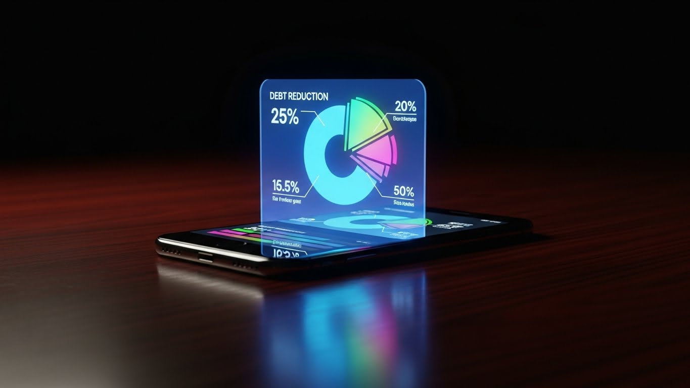
The Visual & Narrative Approach
To keep a client motivated, you must show them the finish line. This style features a photorealistic 3D render of a high-end smartphone resting on a dark mahogany desk. Projecting upwards from the screen is a futuristic, translucent holographic pie chart in glowing cyan and magenta. The hologram animates to show "Debt" shrinking and "Savings" expanding. The lighting is moody and premium, emphasizing the glow of the data as the only light source.
Psychological Impact & KPI Focus
- Niche Psychology: Debt settlement is a long process (12-48 months). Clients lose motivation. This "Sci-Fi" aesthetic frames the process not as "repairing a mess" but as "building the future." It makes the savings feel tangible and high-tech.
- Operational Impact: Improved Time-to-Value (TTV) perception. Even if the settlement hasn't happened yet, seeing the projected outcome in high-fidelity 3D gives the user the emotional "value" immediately.
Strategic Implementation & Trade-offs
- Best Use: Onboarding Email Sequences ("What to Expect"), Investor Updates.
- Duration: 5–10 Seconds (Loop).
- Trade-off: The holographic effect must look expensive. If it looks like a cheap filter, it undermines the perceived value of the financial projection.
Companies using similar video content -
Quadient Accounts Receivable by YayPay – Credit-to-Cash Automation – Comprehensive AR features.
Growfin – AI-powered AR Automation – Accelerating cash flow with intelligent automation.
23. The Activator: Bold Kinetic Typography
Onboarding | User Activation

The Visual & Narrative Approach
Sometimes, you just need action. This style eschews characters and interfaces for pure typographic energy. Bold, blocky 3D letters spelling "START" or "SAVE" fill the frame, rendered in aggressive Red, Black, and White. Speed lines and motion blur surround the text as it slams into position, accompanied by a camera shake effect. The aesthetic is high-energy, borrowing from sports marketing to inject adrenaline into the financial process.
Psychological Impact & KPI Focus
- Niche Psychology: Financial paralysis is real. Users sign up and then do nothing. This visual acts as a "Pattern Interrupt." The sheer size and speed of the text demand attention and trigger a biological urge to move/act.
- Operational Impact: Drives User Activation. Perfect for that critical moment when a user needs to upload a document or link a bank account but is hesitating. It screams "Do it now."
Strategic Implementation & Trade-offs
- Best Use: In-App Push Notification Media, Retargeting Ads for "Stalled" Leads.
- Duration: 3 Seconds (Impact Loop).
- Trade-off: It is loud. Use sparingly. If used too often, it becomes annoying and can be perceived as aggressive "shouting."
Companies using similar video content -
Uniify – Digital Client Onboarding – Simplifying onboarding for accountants.
Rocketlane – B2B Fintech Customer Onboarding – Templatizing project plans for new customers.
24. The Deep Dive: 3D Parallax UI Presentation
Retention | Deep Feature Adoption

The Visual & Narrative Approach
As users mature, they need to understand the software's depth. This style places multiple semi-transparent glass UI screens in a deep indigo 3D space. The camera glides through them using a parallax effect. The front layer shows a simple dashboard, the middle reveals a workflow chart, and the back layer reveals a complex database grid. Subtle data particles float between the layers, connecting them. It visualizes the "Full Stack" of the platform's capability.
Psychological Impact & KPI Focus
- Niche Psychology: Users often only use 10% of a platform's power. This visual intrigues them by showing "what lies beneath." The depth cues suggest that there is more value to unlock if they just dig deeper.
- Operational Impact: Supports Deep Feature Adoption. It visually creates a roadmap for the user, enticing them to explore advanced modules (e.g., Legal Automation) that are "behind" the basic dashboard.
Strategic Implementation & Trade-offs
- Best Use: "New Feature" Announcement Videos, Webinar Backdrops.
- Duration: 10–20 Seconds.
- Trade-off: Requires a clear visual hierarchy. If the layers are too dense, it becomes visual noise. The "Front" layer must always be the most legible.
Companies using similar video content -
Moveo.AI – AI Collection Agents – Revolutionizing debt recovery with conversational AI.
Chainalysis – Blockchain Analytics – Monitoring cryptocurrency transactions for compliance.
25. The Support Bot: Low-Poly 3D Modeling
Retention | Reducing Support Overhead
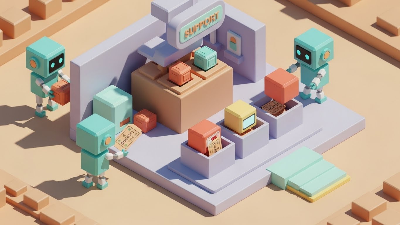
The Visual & Narrative Approach
Tech support can feel cold. This style warms it up using "Low-Poly" art—a geometric, faceted style that looks like a charming video game. We see a miniature, pastel-colored support center where cute, cubic robot agents are busily moving "Ticket" blocks into sorting bins. The lighting is bright, soft, and cheerful. It reframes "Automated Support" from a frustration into a delightful, efficient ecosystem.
Psychological Impact & KPI Focus
- Niche Psychology: Clients hate talking to bots because they feel ignored. This visual gives the bot a "body" and a "job." It makes the automated process feel industrious and cute, reducing the frustration of waiting.
- Operational Impact: Critical for Reducing Support Overhead. By making the help center visually engaging, you encourage users to stay and use self-help tools rather than rage-dialing the phone line.
Strategic Implementation & Trade-offs
- Best Use: Help Center Loading Screen, Chatbot Avatar, "Ticket Submitted" Confirmation.
- Duration: Loopable Animation.
- Trade-off: The "Cute" factor must not undercut seriousness. If a client is facing a lawsuit, a cute robot might seem tone-deaf. Use for technical support, not legal crises.
Companies using similar video content -
DebtBlue – Debt Relief – Encouraging action with transparent pricing.
Precision Tax Relief – Tax Debt Relief – Prompting users to start tax relief.
26. The Knowledge Hub: Hyper-lapse Stock Footage with Data
Retention | Knowledge Base

The Visual & Narrative Approach
Debt settlement agencies are high-speed environments. This visual mirrors that reality. We use hyper-lapse footage of a busy agency floor—people blurring past in fast motion. Overlaid on this chaos are sharp, static, glowing green "FAQ" icons and data streams that remain perfectly still. This creates a powerful contrast: the world moves fast, but your Knowledge Base is the stable anchor.
Psychological Impact & KPI Focus
- Niche Psychology: Agents feel overwhelmed by the speed of operations. This visual tells them, "The answers are right here, stable and ready." It provides a visual anchor in a sea of motion.
- Operational Impact: Promotes Knowledge Base Usage. It positions the KB not as a dusty library, but as a real-time HUD (Heads Up Display) for the active agent, directly correlating to faster resolution times.
Strategic Implementation & Trade-offs
- Best Use: Internal Training Portal, Knowledge Base Header, YouTube Tutorials.
- Duration: 5–10 Seconds.
- Trade-off: The stock footage must match a modern office. Old carpets or CRTs in the background will destroy credibility.
Companies using similar video content -
LexisNexis Risk Solutions – Risk Management – In-depth risk assessment and fraud prevention.
Refinitiv – Risk Intelligence – Comprehensive risk intelligence database.
27. The Ecosystem: Abstract 3D AI Visualization
Expansion | Upsell/Cross-sell

The Visual & Narrative Approach
To sell an enterprise tier, you must sell the "Network Effect." This abstract 3D visualization shows a complex, biological-looking network of metallic silver nodes connected by electric blue laser lines. The camera slowly pushes in towards a central, dense cluster—the "Affiliate Network." The background is deep black, making the connections pop. It looks like a neural brain or a galaxy, implying infinite connectivity.
Psychological Impact & KPI Focus
- Niche Psychology: Enterprise buyers fear isolation. They want to be plugged into the largest network of creditors and lawyers. This image validates that desire. It says, "We are the hub. Everyone else is a spoke."
- Operational Impact: Drives Upsell/Cross-sell. It visualizes the value of the "Pro" tier (access to the full network) without needing a spreadsheet of features. It sells the power of the connection.
Strategic Implementation & Trade-offs
- Best Use: Enterprise Sales Deck, "Partners" Page, Email Backgrounds.
- Duration: 10–15 Seconds.
- Trade-off: It is highly abstract. It serves as "Mood" lighting for a pitch, but cannot carry the pitch alone. It needs strong voiceover accompaniment.
Companies using similar video content -
Acuant – Identity Verification – AI and human expertise for customer verification.
IDnow – Identity Verification-as-a-Service – Automated and video-based identification.
28. The Long Road: Futuristic Neon/Dark Mode
Expansion | Reducing Churn

The Visual & Narrative Approach
Retention is about the long game. This style features an infinite tunnel formed by neon purple and pink grid lines (Retro-wave aesthetic) on the floor and ceiling. The perspective lines lead the eye inevitably forward to a bright white light at the end. It is hypnotic and forward-moving. The "Dark Mode" aesthetic suggests modern, comfortable viewing for long-term usage.
Psychological Impact & KPI Focus
- Niche Psychology: When a client feels stuck, they churn. This visual subconsciously reinforces "Momentum." The tunnel effect creates a visual pull, dragging the viewer toward the future (Financial Freedom), reminding them why they started.
- Operational Impact: Aids in Reducing Churn. Used in re-engagement emails, it subtly signals that the journey isn't over and the light at the end of the tunnel is visible.
Strategic Implementation & Trade-offs
- Best Use: Re-engagement Campaigns, "Year in Review" Personalized Videos.
- Duration: Loop.
- Trade-off: The "Retro-wave" style appeals to a specific demographic (25-45). It might feel too "Video Game" for older, conservative clients.
Companies using similar video content -
American Consumer Credit Counseling (ACCC) – Debt Management Plans – Providing resources and guidance.
Cambridge Credit Counseling – Debt Management Plans – Reducing interest rates and monthly payments.
29. The Strategist: Photorealistic 3D Renders
Expansion | Thought Leadership

The Visual & Narrative Approach
Thought leadership requires gravitas. We use a photorealistic Octane render of a high-end glass chess set on a reflective obsidian surface. A single King piece, rendered in marble white with gold accents, stands in sharp focus. The other pieces are artfully blurred in the background (bokeh effect). The lighting is soft, cinematic studio lighting. It screams "Strategy," "Patience," and "Victory."
Psychological Impact & KPI Focus
- Niche Psychology: In a chaotic industry, the client wants a wise guide. The Chess metaphor is universal for "Thinking Steps Ahead." It positions the SaaS provider not just as a toolmaker, but as a Grandmaster of debt strategy.
- Operational Impact: Builds Thought Leadership. Use this for whitepaper covers or high-level strategic advice columns. It separates you from the "tactical" lead generators.
Strategic Implementation & Trade-offs
- Best Use: eBook Covers, LinkedIn Articles, Webinar Waiting Screens.
- Duration: Static or Slow Pan.
- Trade-off: It is a cliché. To work, the execution must be flawless—photorealistic textures, perfect lighting. If it looks like a stock vector, it fails.
Companies using similar video content -
Perfios – AI-driven Intelligence Suite – Smart decisioning and fraud detection.
Agicap – Cash Flow Management – Visualizing financial health and growth.
30. The Triumph: Aspirational Stock Montage
Expansion | Referrals

The Visual & Narrative Approach
Finally, we return to humanity. This style is a high-key, vibrant montage using "Authentic Stock." We see a diverse group of office workers in a sunlit, modern glass conference room. They are genuinely laughing, high-fiving, and pointing at a screen (implied success). Fresh green plants frame the shot. It captures the specific emotion of "Zero Delinquency" or "Audit Passed."
Psychological Impact & KPI Focus
- Niche Psychology: People refer products that make them feel successful. This image mirrors the result of the software: a happy, stress-free team. It validates the user's decision to buy, making them likely to recommend it to peers.
- Operational Impact: Drives Referrals. By associating the software with "Team Celebration," you tap into the social desire to share success.
Strategic Implementation & Trade-offs
- Best Use: "Thank You" Pages, Referral Program Landing Pages, Case Studies.
- Duration: Static or Slideshow.
- Trade-off: Authenticity is key. If the smiles look fake (dead eyes), it creates dissonance. You need "Candid" style photography, not "Posed" style.
Strategic Knowledge Base: The Visual Operations Doctrine
To bridge the gap between "pretty pictures" and "profitable operations," we have synthesized a 3-part strategic framework. This is your implementation doctrine.
Visual Architecture & Trust Engineering (Pre-Production)
The "Why" and "Who" of Visual Strategy
Before a single pixel is rendered, you must define the visual laws that govern your platform. In the debt settlement industry, trust is the currency. A disorganized visual style implies a disorganized financial process.
- The Cognitive Load Audit: Advids recommends auditing your current training materials. If a concept takes 3 paragraphs to explain (e.g., "Escrow Waterfall"), it must be converted to a Style 2 (Abstract Motion) or Style 6 (Isometric Workflow). Stop forcing users to read legal density.
- Color Theory for Cortisol: Avoid "Warning Red" in your UI and videos unless absolutely necessary. Shift your palette to "Safe Blues," "Growth Greens," and "Stabilizing Teals" (Style 1). Your visuals should physically lower the viewer's heart rate.
- The "Glass Box" Standard: To combat the "Black Box" fear of algorithms, use transparency in your 3D design (Style 12). Show the inner workings. Glass textures imply: "We have nothing to hide."
- Device-Agnostic Design: Your distressed clients are on mobile phones (YouTube Shorts/TikTok). Your operations managers are on dual 4K monitors. Your visual strategy must adapt. Use Style 2 (Vertical) for clients and Style 26 (Hyper-lapse) for desktop-based agents.
- Standardization vs. Bespoke: Use consistent "Stock" styles (Style 30) for generic emotions, but invest in "Bespoke" 3D (Style 3) for your core value proposition. Do not skimp on the visuals that explain your "Secret Sauce."
- The Advids Strategic Audit: We partner with firms to define this "Visual Operating System" before production begins, ensuring that every asset, from a GIF to a Brand Anthem, speaks the same trust-language.
- Legacy Bridging: Use "Split Screen" visuals (Style 7) to validate the transition from "Old Spreadsheets" to "New SaaS." Visually acknowledge the past to sell the future.
- Accessibility as Trust: Ensure all motion graphics (Style 23) are legible for older users or those with visual impairments. High contrast isn't just an accessibility rule; it's a clarity rule.
- The "Glanceability" Metric: In a call center, an agent has 2 seconds to understand a visual aid. Design for "Glanceability"—bold icons, clear text, zero clutter (Style 26).
- Unified Terminology: Use your visuals to enforce standard terms. If the video labels it "Creditor Matrix," the sales team must not call it "Bank List." Visuals create the vocabulary.
Operational Adoption & Implementation (Deployment)
The "How" of Embedding Visuals into Workflow
A video that sits on a server is useless. A video embedded in a workflow is a weapon. This segment focuses on deployment.
- The Micro-Learning Shift: Replace your 40-page PDF "Onboarding Manual" with a playlist of twenty 30-second clips (Style 21). Agents will actually watch them. Retention rates for video are 95% vs 10% for text.
- Just-in-Time Support: Embed Style 25 (Support Bot) animations directly into the "Loading" states of your software. Turn "Waiting Time" into "Learning Time."
- Gamification of Compliance: Use Style 15 (Level Design) visuals to track agent compliance. Visualize "Audit Prep" not as a chore, but as filling a progress bar.
- Overcoming "Big Brother" Anxiety: When introducing AI monitoring, use Style 19 (Augmented Reality) to show the AI helping the human, not watching them. Frame it as an "Iron Man Suit" for the agent.
- Visualizing the "Happy Path": For self-service portals, use Style 5 (Clean UI) to show the user exactly what a "Perfect Settlement" looks like. Priming them with the visual result increases completion rates.
- Remote Onboarding: For distributed sales teams, use Style 16 (Cinematic AI) to convey company culture and prestige without a physical HQ visit.
- Turning SOPs into flows: Convert every Standard Operating Procedure (SOP) into a Style 6 (Isometric Flow). If the process is too complex to draw, it is too complex to execute.
- Feedback Loops: Use interactive video elements (Style 14 sliders) to let users "Show" you what they prefer, rather than filling out a survey.
- Scalable Localization: Strategies for translating visual assets for global fleets (Rule 39). Design your Style 4 (Vector) assets without embedded text. This allows you to swap out voiceovers and text overlays for Spanish/French markets without re-rendering the animation.
- Leadership Communication: When the CEO speaks, use Style 29 (High-End 3D) backgrounds. Elevate the visual standard of internal comms to match the ambition of the company.
Measuring Impact & Future-Proofing (ROI)
The "Value" of Visual Investment
How do you prove to the CFO that "Motion Graphics" are a capital expenditure, not a marketing expense?
- Beyond "Views": Stop counting views. Start counting "Time-to-Competency." If a new agent reaches full quota in 2 weeks instead of 4 because of your video library, that is the ROI.
- The "Idle Time" Metric: Correlate better visualization with reduced software navigation time. If Style 5 (Clean UI) videos reduce the average "Time on Screen" for a task by 20%, you have effectively given the client time back—a massive value add.
- Support Ticket Deflection: Correlate the launch of a Style 21 (Instructional) video with the drop in "How-to" tickets. This is direct operational savings.
- Churn Prevention: Use Style 28 (Retention Loops) in your off-boarding flow. A visual reminder of the "Sunk Cost" or "Future Gain" can save a cancelling client.
- Compliance Velocity: How fast can your fleet of agents adapt to a new law? Test it. Send a text memo to Group A and a Style 2 video to Group B. Measure the error rates.
- Asset Scalability: Build a "Visual Component Library" (Style 13). Re-use the same 3D models of "Coins" or "Vaults" across 50 videos. Advids specializes in building these reusable assets to lower long-term costs.
- The Advids Partnership: We don't just make videos; we build your visual infrastructure. As your platform evolves, we update the "Digital Twin" of your UI in our library, ensuring your training materials never rot.
- Benchmarking Success: Compare your visuals to the "Neo-Banks" (Revolut, Chime), not your legacy competitors. The consumer standard is high. Style 22 (Holographic) signals you are part of the future.
- The ROI of Trust: High-end production (Style 16) signals solvency. In debt settlement, looking "Expensive" is actually a safety feature. It tells the client, "We have the resources to protect you."
- Final Call to Innovation: The Physical/Digital divide is closing. The winners in the next decade of Debt Settlement will be the firms that can visualize the path to freedom so clearly that the client feels the relief before they even sign the contract. Treat your visual strategy as critical infrastructure.
[END OF PART 3]
Companies using similar video content -
GreenPath Financial Wellness – Debt Management Program – Long-term financial wellness journey.
PayPlan – Debt Management Plan – Guiding through long-term debt solutions.
Author & Editor Bio


