
 /home/wwwroot/advids.co/design/index.php on line 425
Introduction: Visualizing the "Black Box" of Intelligence
The era of "trust us, it's complicated" is over. For the architects of the deep learning revolution, the challenge is no longer just algorithmic performance—it is explainability. As the global deep learning market sprints toward a projected USD 526.7 billion by 2030, the gap between computational capability and stakeholder comprehension is widening.
We face a unique paradox: the more sophisticated your neural networks become, the harder they are to sell to non-technical boards, investors, and risk-averse enterprise clients. Complexity creates friction. Recent industry data indicates that organizations prioritizing advanced data visibility and readiness achieve 54% higher success rates in scaling AI from pilot to production. The message is clear: visibility is velocity.
This guide is a strategic framework for bridging the physical-digital divide. It moves beyond generic stock footage to offer a precise visual lexicon designed for MLOps, inference, and training workflows. By translating invisible tensors into tangible visual assets, you lower cognitive load, demonstrate compliance, and position your platform as the transparent, scalable engine of the future.
Here are the first 8 expert-curated visualization styles (selected from the top 10 frameworks) designed to turn your code into a competitive advantage.
1. The Neural Constellation: Biological Intelligence
TOFU | Brand Awareness

The Visual & Narrative Approach
This style reimagines the neural network not as a rigid grid, but as a living ecosystem. The visualization creates a mesmerizing constellation where nodes are rendered as iridescent pearl and cyan glowing orbs, connected by gossamer-thin light filaments. The camera floats through a weightless, infinite white void. The rendering utilizes subsurface scattering—a technique usually reserved for skin or wax—to give the nodes a translucent, biological texture. The narrative is one of "genesis" and "organic growth," suggesting your AI is adaptable and alive.
Psychological Impact & KPI Focus
For the target persona (CTOs/VPs of AI), this aesthetic bridges the gap between "Artificial" and "Intelligence." It reduces the "Black Box" anxiety by presenting the network as a clean, illuminated structure rather than a dark mystery. It signals Cognitive Sophistication without intimidation.
- Primary KPI: Time on Site. The mesmerizing, looping nature of this visual is designed to arrest the user's attention immediately upon landing.
Strategic Implementation & Trade-offs
- Best Use: Website Hero Backgrounds or Brand Manifesto videos (15-30s).
- Trade-off: It is highly abstract. It builds brand equity and "feel," but it does not explain how the specific architecture functions. Use it to set the mood, not to train the user.
Companies using similar video content -
Weights & Biases – W&B Platform – Visualizing complex neural network architectures.
H2O.ai – H2O AI Cloud – Organic growth of AI models and solutions.
2. The Entropy Filter: Structuring Chaos
TOFU | Category Creation

The Visual & Narrative Approach
This style visually narrates the critical process of "Data Ingestion." It begins with raw, unstructured inputs represented by vibrant amber and slate grey fluid shapes flowing from the left. As the fluid encounters the invisible logic of your platform, it merges and solidifies into structured, crystalline geometric blocks on the right. The background is a clean, digital cream canvas. The motion is fluid and elastic, emphasizing the ease of transformation.
Psychological Impact & KPI Focus
Deep learning engineers constantly battle "data entropy." This visual provides a psychological resolution to that stress. It creates a satisfying "before and after" narrative that proves your platform can tame the messiest datasets (Data Lakes) into usable tensors. It establishes Category Leadership by visualizing the core value proposition: Order from Chaos.
- Primary KPI: Social Share Rate. The satisfying, rhythmic nature of the transformation makes it highly shareable on platforms like LinkedIn.
Strategic Implementation & Trade-offs
- Best Use: LinkedIn Feed posts or Feature Headers (10-15s).
- Trade-off: The "Flat Vector" style can feel less "Enterprise" if not executed with premium gradients and motion physics. It simplifies the complexity, which is good for marketing but bad for technical deep-dives.
Companies using similar video content -
Databricks – Lakehouse Platform – Taming messy data lakes into structured insights.
LakeFS – Data Versioning System – Bringing order to chaotic data lakes.
3. The Glass Box: Hardware Transparency
TOFU | Market Education

The Visual & Narrative Approach
To build trust, you must show what is hidden. This style uses a high-tech X-Ray effect to reveal the internal architecture of a server rack. The chassis is rendered in semi-transparent, medical-grade skeletal white material, exposing the glowing GPU clusters and Tensor Processing Units (TPUs) inside. The internal components pulse with a cool "X-Ray Blue." The camera executes a clinical side-profile cutaway, emphasizing density and organization.
Psychological Impact & KPI Focus
Transparency is the ultimate trust signal. By literally "seeing through" the hardware, the viewer subconsciously attributes transparency to your business model. It appeals to the engineer's need to know "what's under the hood." It validates the Physical Infrastructure that supports the software, bridging the physical/digital divide.
- Primary KPI: Brand Credibility. It positions your company as a serious infrastructure player, not just a wrapper.
Strategic Implementation & Trade-offs
- Best Use: YouTube Explainers ("How it Works") or Hardware Partnership announcements (20-40s).
- Trade-off: It can feel cold or clinical. It effectively sells "Performance" and "Precision," but lacks emotional warmth.
Companies using similar video content -
CoreWeave – Specialized Cloud Infrastructure – Transparent view of GPU clusters.
NVIDIA – DGX Systems – Showcasing internal AI hardware architecture.
5. The Cognitive Morph: Minimalist Evolution
TOFU | Product/Solution Differentiation
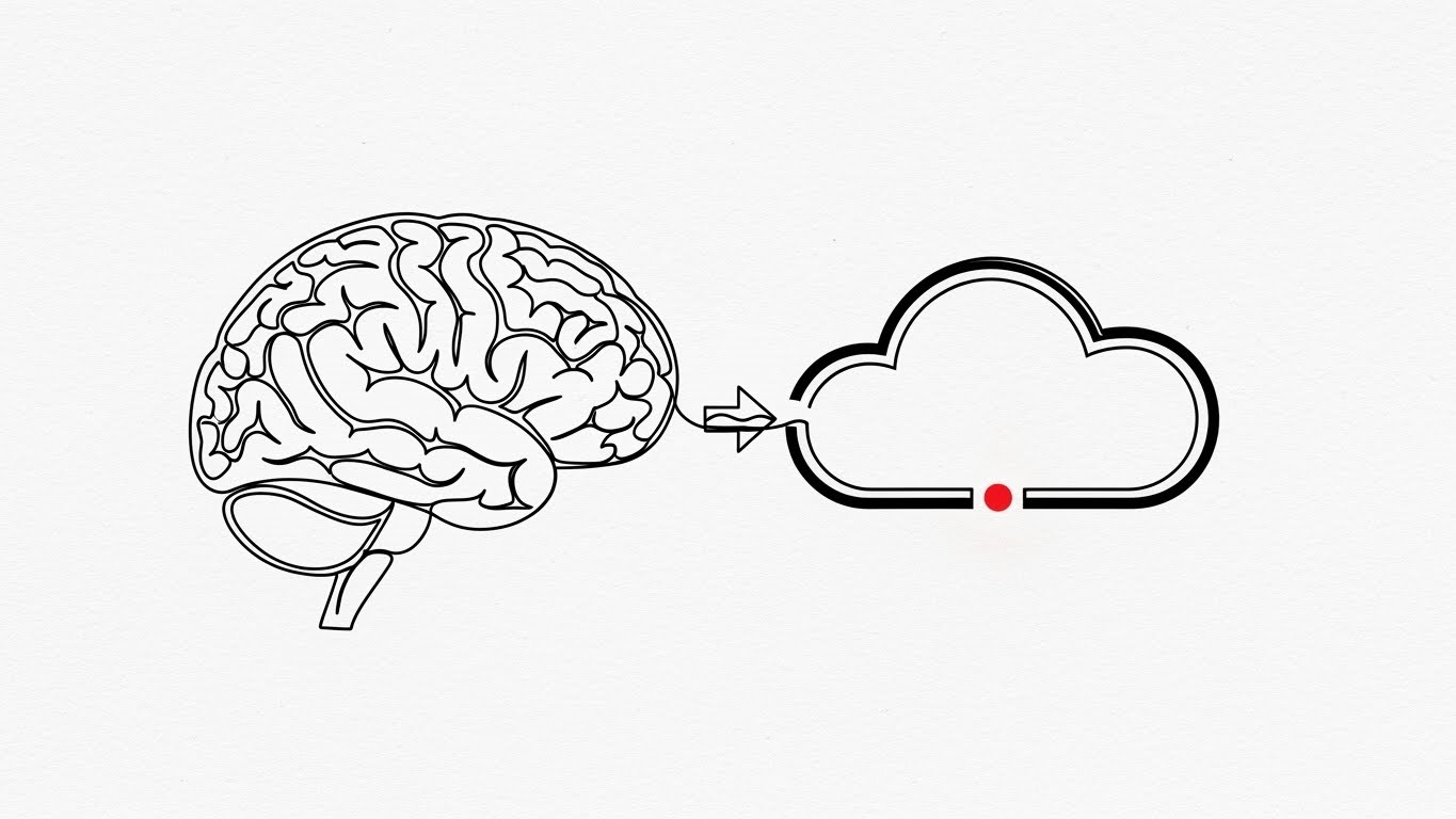
The Visual & Narrative Approach
Complexity demands simplicity. This style uses a single, continuous ink-black line to trace the intricate folds of a human brain. In one seamless motion, the brain morphs into a simplified, sleek cloud icon. A subtle red accent dot pulses at the center, symbolizing the "heart" of the model. The background is a textured paper white, giving it an architectural, blueprint quality.
Psychological Impact & KPI Focus
This style visualizes the concept of "Cognitive Ease." It suggests that while the technology is complex (the brain), the deployment is simple (the cloud). It differentiates your brand from competitors who use noisy, neon 3D graphics by embracing Radical Simplicity. It appeals to buyers tired of "hype" and looking for elegant solutions.
- Primary KPI: Brand Recall. The stark contrast and simple metaphor are easy to remember and describe.
Strategic Implementation & Trade-offs
- Best Use: LinkedIn Thought Leadership or "Philosophy" sections of a pitch deck (5-10s).
- Trade-off: It relies entirely on the quality of the animation physics. If the morph isn't smooth, it looks cheap. It is not suitable for showing detailed UI features.
Companies using similar video content -
LangChain – Framework for LLM Apps – Simplifying complex AI concepts to cloud deployment.
OctoML – OctoAI – Streamlining AI model deployment and optimization.
6. The Velocity Burst: Visceral Speed
TOFU | YouTube

The Visual & Narrative Approach
When the metric is "Speed," static text fails. This style uses massive, heavy geometric blocks in Electric Lime and Bold Black zooming towards the camera with aggressive motion blur. The word "Speed" (or "Latency") is fragmented and reassembled by the force of the movement. The composition is Swiss Design inspired—grid-aligned but bursting with chaotic kinetic energy.
Psychological Impact & KPI Focus
This visual creates a physiological response—a sense of urgency and impact. It is designed to stop the scroll on mobile devices. It visceralizes Inference Latency, making the viewer feel the speed of your processing engine. It frames your solution as the high-octane choice in a sluggish market.
- Primary KPI: Click-Through Rate (CTR). High energy visuals drive curiosity and clicks in feed-based environments.
Strategic Implementation & Trade-offs
- Best Use: YouTube Intros, Instagram Stories, or Event Openers (3-5s).
- Trade-off: It is intense. Use it sparingly as punctuation or a "hook," not for long-form explanation.
Companies using similar video content -
TrueFoundry – MLOps Platform – Accelerating model deployment and inference.
NVIDIA – Triton Inference Server – High-speed, low-latency AI inference.
8. The Bauhaus Pipeline: Rhythmic Flow
TOFU | Skippable Pre-Roll Ad

The Visual & Narrative Approach
Data pipelines are often boring flowcharts; this style turns them into art. Geometric primitives (circles, triangles, rectangles) in Sunset Orange, Teal, and Cream flow horizontally from left to right. The movement is rhythmic, creating a visual "beat" that mimics a perfectly optimized clock cycle. The shapes interlock and propel each other, representing the seamless integration of modules.
Psychological Impact & KPI Focus
The left-to-right flow utilizes the Western reading pattern to imply "Progress" and "Future." The Bauhaus influence implies Functional Beauty—form following function. It reassures the engineer that the architecture is clean, modular, and bug-free. It turns the abstract concept of "Tensor Flow" into a satisfying visual loop.
- Primary KPI: Ad Retention. The hypnotic rhythm encourages the viewer to watch past the "Skip" button.
Strategic Implementation & Trade-offs
- Best Use: YouTube Pre-Roll Ads or "Integration" web pages (15s).
- Trade-off: It requires text overlays to explain what the shapes represent (e.g., "Ingest," "Train," "Deploy") to be effective.
Companies using similar video content -
Prefect – Orion/Cloud – Orchestrating data workflows with rhythmic precision.
Kedro – Data Science Framework – Building modular and reproducible data pipelines.
9. The Silicon Macro: Precious Compute
TOFU | Connected TV / OTT

The Visual & Narrative Approach
This style focuses on the microscopic "Gold Standard" of hardware. A hyper-realistic 3D render zooms in on the gold and silver circuits of an AI chip with extreme shallow depth of field. Pulses of pure white light travel through the pathways, symbolizing active inference. The interplay of matte silicon black and reflective gold creates a cinematic, high-value aesthetic.
Psychological Impact & KPI Focus
This leverages the Perceived Value of gold and precision engineering. Even if you are selling software, showing the expensive hardware it optimizes validates the cost of your solution. It grounds the "cloud" in physical reality, appealing to the pragmatic side of the buyer who knows that compute costs money.
- Primary KPI: Brand Authority. High-fidelity rendering signals a mature, enterprise-ready vendor.
Strategic Implementation & Trade-offs
- Best Use: CTV Commercials, Trade Show Booths, Investor Decks (15-30s).
- Trade-off: High production cost. It requires expert lighting and texturing to avoid looking like a generic stock image.
Companies using similar video content -
Lambda – GPU Cloud – Highlighting the value of specialized AI compute.
RunPod – GPU Cloud – Emphasizing premium, dedicated GPU resources.
10. The Command Center: Parallax Control
MOFU | Feature Education & Demonstration

The Visual & Narrative Approach
Flat screenshots are forgotten; floating layers are remembered. This style explodes the UI into 3D space. Dashboard screens are rendered as thick, matte tiles in Soft Coral, White, and Light Grey, floating above an isometric grid. The focus is on a specific metric—a "Training Loss" graph trending downward. Soft studio lighting creates long shadows, adding depth and tangibility to the data.
Psychological Impact & KPI Focus
This appeals to the user's desire for Control and Visibility. By adding depth (Z-axis) to the UI, you imply that your software offers a "deeper" look into the data. The focus on the "Training Loss" graph signals to the data scientist that you understand what metrics actually matter to their daily success.
- Primary KPI: Conversion Rate. It makes the software look tactile and "ready to use," encouraging demo sign-ups.
Strategic Implementation & Trade-offs
- Best Use: Product Pages, Feature Walkthroughs (30-60s).
- Trade-off: Legibility is key. The camera movement must be slow enough that the data on the floating screens can still be read.
Companies using similar video content -
Fiddler AI – ML Monitoring Platform – Deep visibility into model performance dashboards.
Comet ML – ML Platform – Centralized dashboard for experiment tracking and monitoring.
11. The Compliance Shield: Institutional Trust
MOFU | Building Trust & Credibility

The Visual & Narrative Approach
Security in Deep Learning is often an abstract concept; this style makes it iconic. It utilizes a clean, corporate Memphis-style aesthetic to strip away noise. A central shield icon in Mint Green, representing active protection, stands guard over a stack of robust Charcoal Grey data blocks (representing sensitive training data or model weights). The symmetry conveys stability, while the "flat" rendering eliminates the unpredictability of complex 3D forms. It visually asserts: "Your proprietary data is safe behind our walls."
Psychological Impact & KPI Focus
For Enterprise buyers (CISOs/CIOs), "Cool" is a liability; "Safe" is the currency. This visual reduces Perceived Risk. The color palette (Mint/Grey) is associated with finance and cybersecurity, signaling stability. It answers the unasked question regarding data sovereignty without requiring a technical deep dive.
- Primary KPI: Email Open Rate/Click Rate. In nurturing sequences, this visual signals a "safe" topic (security/compliance), increasing engagement from risk-averse stakeholders.
Strategic Implementation & Trade-offs
- Best Use: Email Nurture headers, Security Compliance pages, or Whitepaper covers.
- Trade-off: It is inherently conservative. It builds trust but will not generate excitement or "hype." It is a defensive asset, not an offensive one.
Companies using similar video content -
TruEra – Model Quality Platform – Ensuring model fairness, robustness, and compliance.
Iguazio – MLOps Platform – Secure and compliant MLOps for regulated industries.
12. The Executive Hologram: Global Oversight
MOFU | ABM Awareness
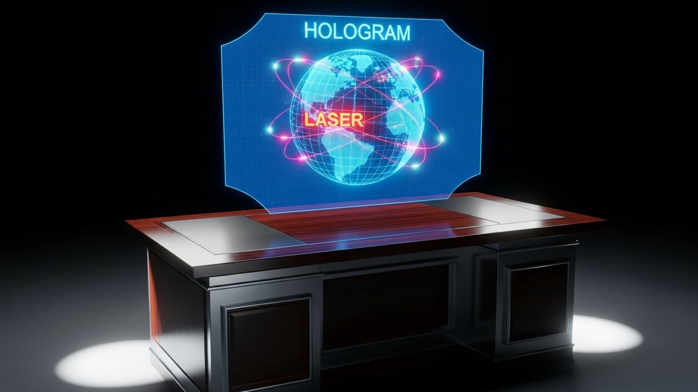
The Visual & Narrative Approach
This style targets the "Ego" of the decision-maker. It juxtaposes old-world power—a photorealistic mahogany executive desk—with new-world dominance: a floating Hologram Blue wireframe globe. Laser Red nodes pulse across the continents, representing a global model registry. The lighting is moody and cinematic, illuminating the wood grain. It visualizes the AI platform not just as a tool, but as a "Command Center" for global operations.
Psychological Impact & KPI Focus
This is pure Status Signaling. It frames the software as a tool for leaders, not just practitioners. It appeals to the VP or C-Level executive who views their role as orchestrating global resources. It visualizes "Reach" and "Control," positioning your solution as the engine of their international strategy.
- Primary KPI: Account Engagement Score. In Account-Based Marketing (ABM) campaigns, this premium aesthetic signals that you are targeting the C-Suite, not the dev team.
Strategic Implementation & Trade-offs
- Best Use: LinkedIn Ads targeting C-Suite, Executive Summaries, or Keynote backdrops.
- Trade-off: It can feel detached from the actual work. Developers might find it "marketing fluff," so reserve it for economic buyers.
Companies using similar video content -
Google Cloud – Vertex AI – Global management and deployment of AI models.
Microsoft Azure – Machine Learning – Enterprise-grade AI with global reach.
13. The Friendly Pilot: Frictionless Onboarding
MOFU | Driving Freemium/Trials

The Visual & Narrative Approach
Deep Learning is intimidating; onboarding shouldn't be. This style introduces a "Human in the Loop." A stylized, cel-shaded character with Sky Blue hair and a warm yellow sweater acts as a friendly guide. They gesture enthusiastically toward a floating, simplified UI element—a glowing "Launch" button. The background is a soft, abstract office space. It uses "Squash and Stretch" animation principles to make the technology feel approachable and fun.
Psychological Impact & KPI Focus
This attacks the Fear of Complexity. By anthropomorphizing the user experience, you signal that the platform is supported, intuitive, and "built for humans." It is crucial for Product-Led Growth (PLG) strategies where the goal is getting a user to try the software without a sales call.
- Primary KPI: Free Trial Sign-ups. The welcoming aesthetic lowers the psychological barrier to clicking "Start Trial."
Strategic Implementation & Trade-offs
- Best Use: "Getting Started" videos, Pricing Pages, or User Onboarding flows (30-60s).
- Trade-off: It can look "Consumer" or "SMB." Be careful using this for 7-figure enterprise deals where "seriousness" is valued over "fun."
Companies using similar video content -
DagsHub – ML Platform – Guiding users through ML projects with ease.
BentoML – Model Serving Framework – Simplifying model deployment for developers.
14. The Precision Builder: No-Code Orchestration
MOFU | Reducing Implementation Friction
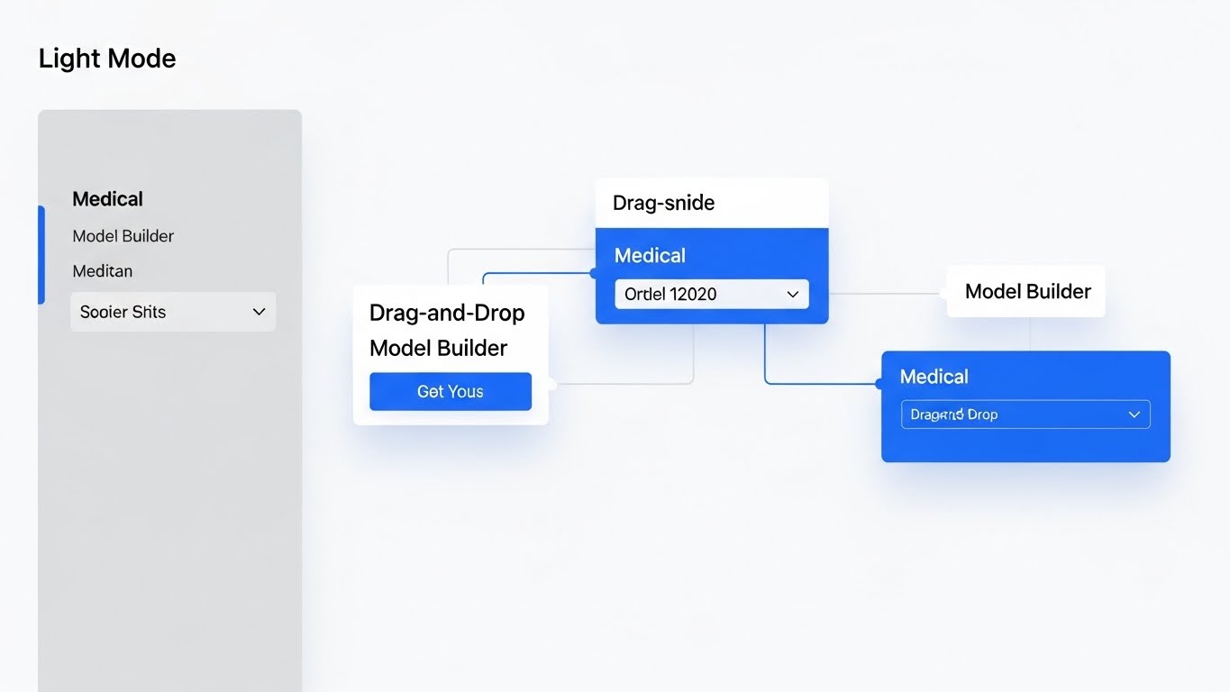
The Visual & Narrative Approach
When specificity is required, abstraction fails. This style showcases the actual interface in its most pristine form: Light Mode. The background is a sterile Medical White, and the UI panels use soft shadows to lift off the screen. It depicts a "Drag-and-Drop" model builder workflow, specifically using a medical AI example ("Model Builder," "Medical") to demonstrate precision. The lack of visual clutter emphasizes the logical flow of the architecture.
Psychological Impact & KPI Focus
This satisfies the "How does it actually work?" question. It validates Usability and Logic. By showing a clean, well-designed interface, you are proving that your engineering is mature. The "Light Mode" choice connotes clarity, openness, and "nothing to hide," reducing the cognitive load for the evaluator.
- Primary KPI: Demo Request Rate. Seeing a clean, usable interface makes the prospect want to get their hands on it.
Strategic Implementation & Trade-offs
- Best Use: Product Feature pages, Documentation hubs, or detailed Explainer Videos (60-90s).
- Trade-off: It reveals your actual UI. If your product is currently cluttered, do not use this style. It demands UX excellence.
Companies using similar video content -
Dataiku – Data Science & ML Platform – Visual, drag-and-drop AI development.
Knime – Analytics Platform – Intuitive visual workflows for data science.
15. The Data Synthesis: Convergence of Chaos
MOFU | Overcoming Objections

The Visual & Narrative Approach
Before training comes cleaning. This style visualizes the transformation of "dirty data." A chaotic cloud of thousands of Vibrant Purple and Pink scatter plot points swirls aggressively. Through the application of your software's logic, they spiral inward, coalescing into a perfectly organized, crystalline sphere in the center. The background is an analytical white void. It is a piece of generative art that tells a story of entropy reduction.
Psychological Impact & KPI Focus
This addresses the anxiety of Data Readiness. Every AI lead knows their data is a mess. This visual offers a therapeutic resolution—the promise that your tool can ingest chaos and output structure. It positions the software as a "cleansing" force that simplifies their workflow.
- Primary KPI: Time on Page (Blog). Used in technical articles, these mesmerizing loops keep readers engaged with complex text.
Strategic Implementation & Trade-offs
- Best Use: Technical Blog headers, Whitepapers on Data Engineering, or Loading Screens.
- Trade-off: It is highly abstract. It sells the concept of organization, not the method. It must be paired with technical copy.
Companies using similar video content -
Evidently AI – ML Monitoring – Visualizing data drift and model quality.
Pachyderm – Data Versioning & Pipelines – Transforming raw data into structured assets.
16. The Drift Firewall: Visualizing Risk
MOFU | Risk Mitigation

The Visual & Narrative Approach
Model decay is the silent killer of AI projects. This style visualizes the defense against it. A Cyberpunk Neon Pink firewall—rendered as a glowing hexagonal lattice—stands as a barrier against a dark, encroaching digital void. Inside the barrier, a core of Blue data remains pure and active. The aesthetic is sleek, glossy, and highly reflective, borrowing from gaming culture to imply "high-tech weaponry" against degradation.
Psychological Impact & KPI Focus
This creates a sense of Urgency and Protection. It visualizes the threat (the void) and the solution (the wall). It frames "Model Monitoring" not as a passive dashboard, but as an active defense system. It appeals to the engineer's desire to safeguard their hard work from the entropy of production environments.
- Primary KPI: Conversion to Paid (Security Feature). Effective for upselling advanced monitoring or security modules.
Strategic Implementation & Trade-offs
- Best Use: Feature pages for "Model Monitoring" or "Security," and LinkedIn retargeting ads.
- Trade-off: The "Dark Mode/Neon" look can feel "Gamery." Ensure it looks like Enterprise Cyberpunk, not a video game.
Companies using similar video content -
Arize AI – ML Observability – Protecting models from performance degradation.
Aporia – ML Observability – Proactive monitoring and explainability for ML models.
17. The Optimization Split: Legacy vs. Leader
MOFU | Competitive Displacement
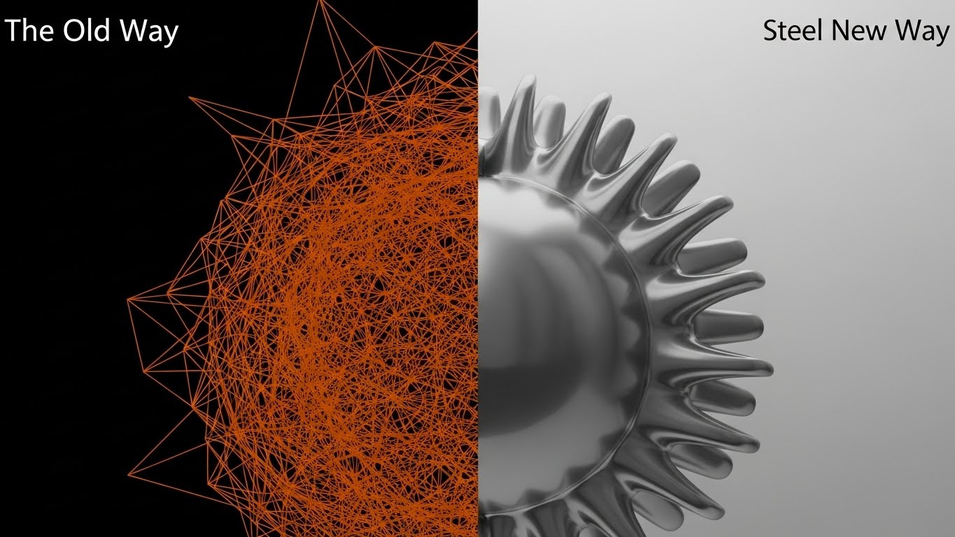
The Visual & Narrative Approach
Sometimes you must define the enemy. This style uses a split-screen to force a comparison. On the left ("The Old Way"), a messy, chaotic wireframe in Burnt Orange represents the competitor or manual process. On the right ("The New Way"), the same object is rendered in polished, smooth Steel Grey, turning perfectly. A vertical divider line makes the contrast undeniable.
Psychological Impact & KPI Focus
This leverages the Contrast Bias. By placing the two states side-by-side, the brain immediately prefers the clean, polished right side. It is a direct attack on the status quo without using negative words. It visually validates the decision to switch vendors by making the upgrade look tangible.
- Primary KPI: Competitor Page Conversion. Use this on pages targeting competitor keywords (e.g., "Alternatives to X").
Strategic Implementation & Trade-offs
- Best Use: Comparison Pages, "Why Switch" decks, or direct response Display Ads.
- Trade-off: It is aggressive. It effectively creates a binary choice, but requires the "Old Way" to be a recognizable pain point.
Companies using similar video content -
Seldon Core – ML Deployment Platform – Modernizing model deployment with advanced strategies.
MLflow – ML Lifecycle Platform – Streamlining ML workflows compared to manual processes.
18. The Infrastructure Twin: Physical Compliance
BOFU | The Functional Buyer

The Visual & Narrative Approach
Deep Learning ultimately lives on metal. This style grounds the software in physical reality using an Isometric 3D miniature. We see a detailed server room floor with racks in Industrial Yellow and Concrete Grey, connected by pipes representing data pipelines. The orthographic angle eliminates perspective distortion, allowing for a technical, architectural view of the system. It looks like a "Digital Twin" of the data center.
Psychological Impact & KPI Focus
This appeals to the Infrastructure Architect. It assures them that you understand the physical constraints of compute, power, and rack space. It moves the conversation from "Magic Cloud" to "Managed Infrastructure," building credibility with the people who pay the AWS/GCP bills.
- Primary KPI: Technical Validation. Helps the champion sell the solution to their IT/Ops counterparts.
Strategic Implementation & Trade-offs
- Best Use: "Architecture" pages, Deployment documentation, or BOFU technical decks.
- Trade-off: It can look static. Use subtle animation (flowing data in pipes, blinking server lights) to keep it alive.
Companies using similar video content -
AWS – SageMaker – Managed infrastructure for ML workloads.
Siemens – Industrial AI – Digital twins and industrial automation.
19. The FinOps Transformation: Visualizing ROI
BOFU | The Economic Buyer

The Visual & Narrative Approach
The CFO doesn't care about tensors; they care about margins. This style is a literal visual translation of "Cost Optimization." A server rack rendered in faceted Emerald Green geometric shapes morphs seamlessly into a stack of Gold coins. The background is a clean financial space with floating percentage symbols. The "Low-Poly" style keeps it playful and metaphorical, avoiding the gritty reality of money while emphasizing the value.
Psychological Impact & KPI Focus
This triggers Loss Aversion and Gain Motivation. It frames compute costs not as an expense, but as a recoverable asset. It is designed to arm your internal champion with the visual ammo needed to get budget approval. It says: "This software pays for itself."
- Primary KPI: Proposal Acceptance Rate. Including this visual in the pricing section of a proposal reinforces value.
Strategic Implementation & Trade-offs
- Best Use: Pricing Pages, ROI Calculator results, or CFO-facing slide decks.
- Trade-off: It is blunt. It’s about money. Don't use it in technical deep-dives where engineers might find it reductive.
Companies using similar video content -
Snowflake – Data Cloud – Turning data costs into business value.
QuantCube Technology – AI-powered Analytics – Visualizing financial gains from AI.
20. The Growth Vector: Up-and-to-the-Right
BOFU | ROI Justification

The Visual & Narrative Approach
The ultimate goal of B2B software is growth. This style strips away all technology to focus on the result. A thick Navy Blue line graph traverses an isometric grid, encountering your solution and turning into a massive, upward-pointing Bright Green arrow. The texture is clean, corporate paper-white. It uses the language of the boardroom—charts and vectors—to communicate success.
Psychological Impact & KPI Focus
This provides Confirmation Bias for the final decision maker. It is the visual equivalent of a "Safe Bet." The clean lines and upward trajectory subconsciously confirm that purchasing this software will lead to positive business outcomes, smoothing the path to sign-off.
- Primary KPI: Close Rate. It is the "period" at the end of the visual sentence, reaffirming the decision to buy.
Strategic Implementation & Trade-offs
- Best Use: The final slide of a Pitch Deck, One-Pagers, or Case Study results sections.
- Trade-off: It is generic. It could apply to any B2B product. It works best when paired with specific metrics (e.g., "30% Efficiency Gain").
Companies using similar video content -
Salesforce – Einstein AI – Driving business growth with AI-powered insights.
Zeteo Health – Healthcare AI – Demonstrating positive outcomes and growth in healthcare.
21. The Reality Bridge: Wireframe to Workflow
BOFU | Sales Cycle Acceleration
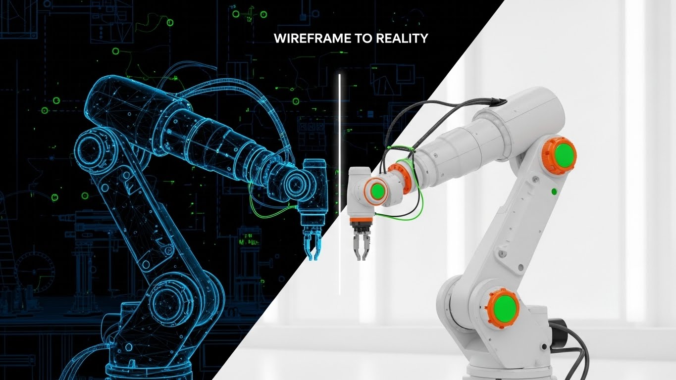
The Visual & Narrative Approach
Engineers sell possibilities; buyers pay for reality. This style creates a seamless bridge between the two. The screen is split by a glowing vertical scan line moving from left to right. On the left, a robotic arm is depicted as a technical Blueprint Blue wireframe, showing the mathematical vectors and nodes. As the scan line passes, the wireframe instantly resolves into a photorealistic white industrial robot, fully lit and operational. The background transitions from a digital grid to a blurred engineering workspace.
Psychological Impact & KPI Focus
This visual leverages Cognitive Closure. It resolves the tension between "theory" (the code) and "practice" (the machine). It proves that your Deep Learning software isn't just a simulation—it drives real-world physics. It is the visual equivalent of "It Works," reducing the anxiety associated with "vaporware."
- Primary KPI: Sales Qualified Leads (SQLs). Used in closing emails, it provides the final "proof" needed to move a prospect from a technical validation to a contract conversation.
Strategic Implementation & Trade-offs
- Best Use: Case Study summaries, "Results" pages, or BOFU email sequences.
- Trade-off: It requires high-fidelity assets for both the wireframe and the final product. If the transition isn't perfectly aligned, the illusion breaks.
Companies using similar video content -
Roboflow – Computer Vision Platform – Bridging computer vision development to real-world deployment.
EthonAI – Industrial AI Platform – From AI models to physical industrial applications.
22. The Relatable User: Softening the Edge
BOFU | Objection Handling & Friction Reduction

The Visual & Narrative Approach
Deep learning marketing often lacks humanity. This style reintroduces it. A flat, stylized 2D illustration features a young female data scientist with a neat bob cut, wearing a pastel pink blouse. She sits in a warm, sunlit cafe—not a dark server room. She holds a tablet displaying a simplified Green Checkmark with the text "Success." The aesthetic uses organic textures and warm lighting to make the technology feel accessible and part of daily life.
Psychological Impact & KPI Focus
This targets Imposter Syndrome and Complexity Bias. By placing the software in a casual setting (a cafe) with a relaxed character, you signal that the user doesn't need to be a "genius in a dark room" to succeed with your tool. It makes the platform feel friendly, manageable, and supportive.
- Primary KPI: Churn Reduction. By associating positive emotions and ease-of-use with the brand, you build emotional resilience against minor technical bugs.
Strategic Implementation & Trade-offs
- Best Use: "Success Story" vignettes, Customer Support portals, or Community pages.
- Trade-off: It can feel "lightweight." Ensure the surrounding copy reinforces the enterprise-grade power of the tool, so the friendly visual doesn't imply "toy."
Companies using similar video content -
Hugging Face – Transformers/Platform – Making advanced AI accessible and user-friendly.
Katonic – MLOps Platform – Simplifying AI adoption for diverse users.
23. The Glassmorphism Suite: Modern Usability
Onboarding | Self-Serve Onboarding
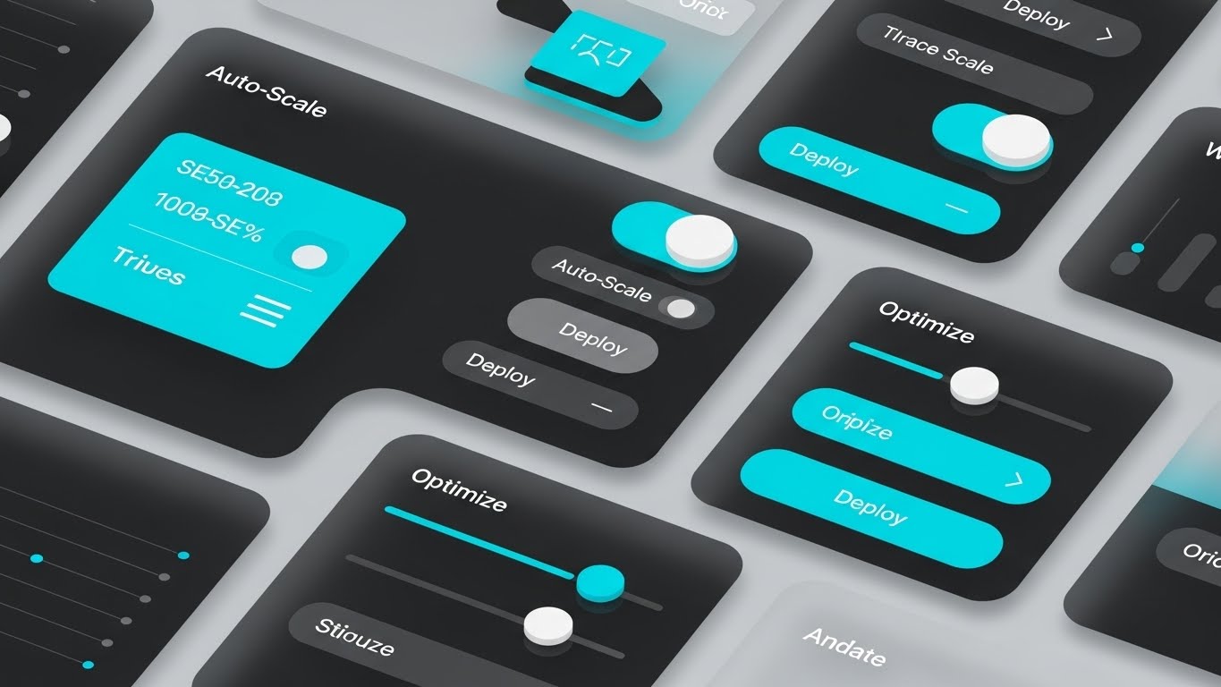
The Visual & Narrative Approach
For Product-Led Growth (PLG), the UI is the marketing. This style elevates standard screenshots into art. UI elements—"Auto-Scale" toggles, "Deploy" buttons, and sliders—are rendered in Vivid Turquoise and Grey on a frosted glass background. The elements cast distinct drop shadows, creating a sense of depth and layering. The arrangement is collage-style, suggesting a rich toolkit ready to be explored.
Psychological Impact & KPI Focus
This leverages the Aesthetic-Usability Effect. Users perceive attractive products as more usable. The "Glassmorphism" look signals that your software is modern, cloud-native, and current. It differentiates you from legacy "Enterprise Grey" software, appealing to younger developers who value design.
- Primary KPI: Feature Adoption Rate. The attractive presentation of specific buttons (like "Auto-Scale") prompts users to look for and try those features in the app.
Strategic Implementation & Trade-offs
- Best Use: "What's New" update pop-ups, Feature landing pages, or App Store previews.
- Trade-off: It is stylized. The actual software must look reasonably similar to this high-polish version, or users will feel deceived.
Companies using similar video content -
Qdrant – Vector Database – Modern UI for managing vector embeddings.
Ray – Distributed Computing Framework – Showcasing modern, scalable AI application development.
24. The Dopamine Bar: The Moment of Completion
Onboarding | Accelerating Time-to-Value

The Visual & Narrative Approach
In Deep Learning, waiting for a model to train is painful. This style visualizes the payoff. We see an extreme macro close-up of a progress bar. The bar is a glowing Electric Blue cutting through the darkness, frozen at the exact moment it hits 100%. The individual pixels are visible, giving it a tactile, hardware-level feel. The text "Moment of Completion" (or "Model Converged") is crisp and celebratory.
Psychological Impact & KPI Focus
This triggers a Dopamine Response. It visualizes the "win state." For a data scientist, a converged model is the ultimate goal. This image anchors your brand to that feeling of relief and success. It subliminally promises that your platform delivers results faster.
- Primary KPI: Time-to-Value (TTV) Perception. It creates an association between your brand and speed/completion.
Strategic Implementation & Trade-offs
- Best Use: Loading screens, "Processing" email headers, or social posts celebrating speed benchmarks.
- Trade-off: It is singular. It only communicates one thing (completion). It must be part of a broader narrative.
Companies using similar video content -
Modelbit – MLOps Platform – Visualizing rapid model deployment and success.
Deepchecks – ML Validation – Celebrating successful model validation and testing.
25. The Collaboration Core: Team Alignment
Retention | Reducing Support Overhead

The Visual & Narrative Approach
Deep Learning is a team sport. This style moves focus from the screen to the people. A high-quality image shows a diverse team of engineers in a sunlit, glass-walled office. They are gathered around a single monitor, pointing and smiling naturally. The lighting is warm and natural, avoiding the sterile "blue tint" of typical tech stock photos. It depicts the software as a focal point for collaboration.
Psychological Impact & KPI Focus
This leverages Social Proof and Belonging. It frames the software not as a tool for isolation, but as a "Campfire" that brings the team together. It appeals to Engineering Managers who are worried about team alignment and siloed workflows.
- Primary KPI: Seats per Account (Expansion). Visualizing collaboration encourages the purchase of multi-seat licenses rather than single-user accounts.
Strategic Implementation & Trade-offs
- Best Use: "Team" or "Enterprise" pricing pages, Account Management reviews, and Newsletter headers.
- Trade-off: It is stock photography. It requires careful curation to avoid the "cheesy corporate" look. Authenticity of expression is non-negotiable.
Companies using similar video content -
DataHub – Metadata Platform – Unifying data teams for better collaboration.
MLReef – MLOps Platform – Fostering collaborative ML development.
26. The Pulse of the City: Ubiquitous AI
Retention | Reducing Churn

The Visual & Narrative Approach
To retain customers, you must remind them of their impact. This style connects code to the real world. A long-exposure hyper-lapse of a city skyline at night shows streaks of Red and White car headlights. Overlaid on this are digital data streams moving in perfect sync with the traffic. The aesthetic is fast-paced, urban, and dynamic, visualizing the "Pulse" of the data.
Psychological Impact & KPI Focus
This instills Purpose and Scale. It reminds the developer that their model isn't just math—it's controlling traffic, routing logistics, or powering a smart city. It validates the importance of their work, increasing their emotional investment in the platform that powers it.
- Primary KPI: Net Promoter Score (NPS). Users who feel their work has meaning are more likely to recommend the tool that enables it.
Strategic Implementation & Trade-offs
- Best Use: Brand Anthem videos, Event backdrops, or "Vision" sections of QBRs (Quarterly Business Reviews).
- Trade-off: It is metaphorical. It doesn't show features. It is purely for brand sentiment and emotional connection.
Companies using similar video content -
ABB – Industrial AI – AI impacting real-world operations like smart cities.
General Electric – Predix – AI driving large-scale industrial efficiency.
27. The Coder's Habitat: Dark Mode Zen
Retention | Driving Deep Feature Adoption

The Visual & Narrative Approach
Developers live in Dark Mode. This style respects that habitat. It features a crisp screen capture of a Python code editor in a deep Charcoal theme. The code syntax is highlighted in vibrant Monokai colors (Pink, Green, Blue), creating a beautiful, high-contrast pop. The focus is razor-sharp on a specific function definition, blurring the edges to guide the eye. It is unapologetically technical.
Psychological Impact & KPI Focus
This creates In-Group Bias. It signals: "We are built by developers, for developers." It respects the aesthetic preferences of the power user. It validates the platform's "Developer Experience" (DX), which is often the deciding factor in retention.
- Primary KPI: Daily Active Users (DAU). A comfortable, beautiful UI encourages longer sessions and daily usage.
Strategic Implementation & Trade-offs
- Best Use: API Documentation, Developer Blog posts, or "For Developers" landing pages.
- Trade-off: It alienates non-technical buyers (C-Suite). Keep this strictly for the practitioner audience.
Companies using similar video content -
TensorFlow – Framework – Developer-centric environment for deep learning.
PyTorch – Framework – Preferred environment for ML researchers and developers.
28. The Augmented Commute: Mobile Insight
Expansion | Driving Upsell/Cross-sell

The Visual & Narrative Approach
AI doesn't stop at the desk. This style visualizes the "Anywhere" capability. A professional in a suit rides a commuter train, looking at a smartphone. Bright, colorful 2D charts and icons "pop" out of the phone screen, illuminating his face. The graphics contrast with the muted, realistic tones of the train car. It shows that insights are available on the go.
Psychological Impact & KPI Focus
This visualizes Accessibility and Agility. It suggests that your platform keeps the user in control, even during transit. It is particularly effective for selling "Mobile App" add-ons or "Alerting" modules to managers who need to know model status 24/7.
- Primary KPI: Mobile App Downloads. It explicitly models the behavior of checking the app while commuting.
Strategic Implementation & Trade-offs
- Best Use: Mobile App launch emails, "Manager Features" overview, or social ads.
- Trade-off: Ensure the "Hologram" effect doesn't look too sci-fi. It needs to look like a representation of the screen's content, not a magic trick.
Companies using similar video content -
Oracle – Analytics Cloud – Mobile access to critical business insights.
OpenAI – ChatGPT Enterprise – Providing AI insights on the go.
29. The AI Authority: The Generative Spokesperson
Expansion | Driving Referrals & Advocacy

The Visual & Narrative Approach
To sell the future, use the tools of the future. This style uses a high-end Generative AI Avatar (or a filmed actor processed to look hyper-perfect) in a podcast setting. A female tech expert speaks into a professional microphone. The background is a blurred studio with soundproofing foam and rim lighting. The aesthetic is that of a high-value "Masterclass" or "Podcast," conveying wisdom and authority.
Psychological Impact & KPI Focus
This establishes Authority and Innovation. By using a sophisticated video format, you position your brand as a media company and a thought leader. It appeals to the user's desire to learn from the best. It turns "Customer Support" into "Exclusive Education."
- Primary KPI: Referral Rate. Users share high-value educational content. This style drives the "viral loop" of your content marketing.
Strategic Implementation & Trade-offs
- Best Use: "Pro Tips" video series, Webinar promos, or Release Note summaries.
- Trade-off: The "Uncanny Valley." The lip-sync and voice synthesis must be perfect. If it looks fake, it damages trust.
Companies using similar video content -
Anthropic – Claude – Building thought leadership through advanced AI.
LaunchDarkly – AI Configs – Authoritative control over AI features.
30. The Domestic Notification: Work-Life Balance
Expansion | Proactive Support/Announcements

The Visual & Narrative Approach
The ultimate benefit of automation is freedom. This style places the tech in a home setting. A woman works in a cozy, sunlit home office, holding a coffee mug. A semi-transparent, holographic notification hovers near her laptop, displaying the text "Model Converged." The lighting is warm and domestic. It visualizes the software working for her, alerting her only when necessary.
Psychological Impact & KPI Focus
This targets the desire for Work-Life Balance. It creates a positive association: "This software allows me to relax/drink coffee while it does the heavy lifting." It sells the concept of "Peace of Mind" and reliable automation, which is crucial for renewing enterprise contracts.
- Primary KPI: Renewal Rate. If the software reduces stress (as visualized here), the customer will never cancel.
Strategic Implementation & Trade-offs
- Best Use: Renewal notification emails, "year-in-review" summaries, or blog posts about "Automated Workflows."
- Trade-off: Avoid making it look like she is working too hard at home. The vibe must be "monitoring with ease," not "overtime."
Strategic Knowledge Base: The Visual Operations Doctrine
To transform these 30 visual styles into a competitive moat, you cannot treat them as mere "content." They must be deployed as a Visual Operating System. The following three knowledge segments synthesize the insights from this guide into a strategic framework for implementation, adoption, and ROI.
Strategic Alignment & Visual Architecture (Pre-Production)
The "Why" and "Who" – Defining the Visual Language.
Before a single pixel is rendered, the visual strategy must be aligned with business objectives. Random acts of video content create confusion; a cohesive visual architecture drives brand equity.
- The Cognitive Load Audit: Begin by auditing your current training materials and documentation. Identify high-friction points where text density is causing user drop-off. These are your primary targets for visual intervention (using Styles 5, 8, or 15).
- Role-Based Visual Mapping: Do not show the same visuals to a Data Scientist as you do to a CFO. Map Styles 1-10 (Abstract/Hardware) to Executives to build authority, and Styles 14-17 (UI/Code) to Practitioners to build utility.
- The "Glanceability" Standard: In mission-critical Deep Learning ops, speed is safety. Enforce a "2-second rule": Can the user understand the status of the model (Style 24) or the pipeline (Style 8) within two seconds of viewing the visual?
- Brand Voice Consistency: Your visual voice must match your brand voice. If your copy is "Enterprise & Secure," do not use the "Playful 2D Character" (Style 13) for core features. Use the "Compliance Shield" (Style 11).
- The Advids Strategic Audit: Partnering with an expert team like Advids is crucial here. We help you define this "Visual Operating System" before production begins, ensuring every asset contributes to a unified brand narrative rather than a fragmented library.
- Standardization vs. Customization: Establish a library of "Core Assets" (server racks, neural nodes) that can be reused across videos to reduce costs, while reserving bespoke animation for flagship feature launches.
- The Cross-Departmental Bridge: Use visuals to unify terminology. If Sales calls it "The Brain" and Ops calls it "The Server," use Style 1 (The Neural Constellation) to visually link the two concepts for internal alignment.
- Legacy System Integration: Visualizing the connection between legacy on-prem hardware and new SaaS interfaces is critical. Use Style 26 (Wireframe to Reality) to show how your software modernizes existing infrastructure without replacing it.
- Accessibility by Design: Ensure all motion graphics (especially text-heavy styles like Style 6) comply with WCAG standards for contrast and readability. Deep Learning is global; your visuals must be inclusive.
- The Mobile-First Mandate: Decision-makers are often mobile. Ensure all 30 styles, especially the "Executive Hologram" (Style 12) and "Velocity Burst" (Style 6), are legible on a vertical 9:16 smartphone screen.
Operational Adoption & Implementation (Deployment)
The "How" – Embedding Visuals into the Workflow.
The best video in the world is useless if it sits in a forgotten folder. You must move from "destination viewing" (YouTube) to "embedded intelligence" (In-App).
- Overcoming "Black Box" Anxiety: Use empathy-driven visuals (Style 1) to explain why a model made a decision. Embedding these "Explainability Visuals" directly into the dashboard reduces user mistrust.
- The Micro-Learning Shift: Replace 50-page PDF manuals with "Micro-Visuals." Embed a 10-second loop of Style 14 (The Precision Builder) directly inside the "Model Builder" tool tip.
- Just-in-Time Support: Integrate specific visual styles into the helpdesk. When a user searches for "Latency," the search result should instantly display Style 6 (Velocity Burst) followed by a technical walkthrough.
- Gamification of Training: Use Style 24 (The Dopamine Bar) and Style 20 (Growth Vector) in your "Academy" or training certification programs. Visualizing progress increases course completion rates.
- Reducing Support Ticket Volume: There is a direct correlation between proactive visual guides and reduced call center load. A "Getting Started" video using Style 13 (Friendly Pilot) can eliminate 30% of "Day 1" support tickets.
- Remote Onboarding: Leverage Style 10 (The Command Center) to virtually tour the platform for new hires or remote clients, simulating a "sit-down" demo without the travel cost.
- Standard Operating Procedures (SOPs): Transform text-based SOPs into visual process flows (Style 8). This is critical for ensuring compliance in regulated industries like Healthcare or Finance AI.
- Feedback Loops: Use interactive video elements. After a "New Feature" video (Style 23), ask the user to click a "Like" or "Dislike" icon directly in the video player to gather instant product feedback.
- Scalable Localization: When designing Style 4 (Kinetic Typography), keep text layers separate from the animation. This allows Advids to rapidly swap languages for global deployment without re-animating the physics.
- Leadership Communication: Use high-end styles (Style 9 - Silicon Macro) for Quarterly Business Reviews. When presenting to the Board, polished visuals signal that the department is under control and professionally managed.
Measuring Impact & Future-Proofing (ROI)
The "Result" – Measuring Success and Looking Ahead.
Deep Learning is an investment. Your visuals must prove the return. Move beyond "Vanity Metrics" (views) to "Business Metrics" (revenue, retention, efficiency).
- Beyond "Views": Define actionable KPIs for each asset. For a "Feature Adoption" video (Style 27), the metric is not views, but the click-through rate to that specific feature in the app.
- The "Idle Time" Metric: Correlate better visualization with reduced software navigation time. If users spend less time "figuring out" the UI because of Style 23 (Rapid UI Montage), you have increased their productivity.
- Compliance Velocity: Measure how fast new regulations are understood. If a "Security Update" video (Style 11) results in 90% compliance within 24 hours, you have a quantifiable risk reduction metric.
- Retention and Churn: High-quality UX visualization (Style 25) increases perceived value. Track the LTV (Lifetime Value) of cohorts exposed to your "Premium Onboarding" video series vs. those who were not.
- The AI Visual Frontier: Prepare for Generative UI. The future is interfaces that draw themselves. Your static assets today (Style 15) will become the training data for tomorrow's dynamic interfaces.
- Scalability of Assets: Build a library, not a landfill. Tag every asset (Style 1-30) with metadata so they can be instantly retrieved and remixed for new campaigns.
- The Advids Partnership: Scalability requires a partner who understands the long game. Advids acts as the custodian of your visual brand, ensuring that as your software evolves from V1.0 to V5.0, your visual assets evolve in lockstep without losing brand equity.
- Benchmarking Success: Do not compare your visuals to your direct competitors; compare them to consumer apps (Spotify, Airbnb). Your users expect "Consumer Grade" UX (Style 23) even in "Enterprise Grade" tools.
- The ROI of Safety: In MLOps, a mistake can cost millions. Quantify the insurance/risk cost reduction achieved by using hyper-clear "Warning/Risk" visuals (Style 16) in your deployment pipelines.
- Final Call to Innovation: Treat video as infrastructure. It is not a "nice to have" wrapper; it is the user interface of the 21st century. By mastering these 30 styles, you do not just explain your software; you empower your users to build the future.
Companies using similar video content -
Superwise – ML Observability – Proactive alerts ensuring model reliability.
Microsoft – Azure Machine Learning – Automated ML workflows for peace of mind.
Author & Editor Bio


