
 /home/wwwroot/advids.co/design/index.php on line 425
Introduction: Bridging the Physical/Digital Divide
The modern supply chain is a miracle of logistics, yet it remains plagued by a costly disconnect between data and reality. While algorithms process petabytes of demand signals in the cloud, physical inventory often sits invisible in siloed warehouses. The cost of this "Physical/Digital Divide" is staggering: inventory distortion—the combined cost of overstocks and out-of-stocks—cost the retail industry an estimated $1.77 trillion in 2023 alone.
For the Demand Planning Architect, the challenge is no longer just accessing data, but trusting it. The "Black Box" anxiety surrounding AI forecasting often prevents adoption; stakeholders hesitate to hand over the keys to an algorithm they cannot see or understand. To modernize operations, we must first modernize how we communicate. We must move beyond static spreadsheets and embrace a visual language that makes the invisible logic of AI tangible, transparent, and trustworthy.
The opportunity for those who get this right is immense. Companies that successfully implement AI-driven forecasting and visualization strategies can reduce lost sales by up to 65%, transforming their supply chain from a cost center into a competitive weapon.
This guide presents a strategic framework of 30 expert-curated visualization styles (Part 1 covers Styles 1-10). Each style is selected not just for aesthetics, but for its specific ability to lower cognitive load, build trust in simulation, and bridge the gap between digital code and physical assets.
1. The Kinetic Minimalist
TOFU | Brand Awareness
The Visual & Narrative Approach
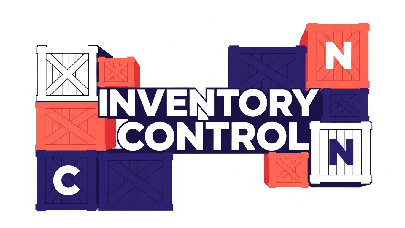
This style abandons traditional voiceover-heavy exposition in favor of a "Show, Don't Tell" philosophy. It utilizes a 2D vector illustration style where bold, kinetic typography literally builds the narrative. The letters of "INVENTORY CONTROL" are constructed from the silhouettes of stacked shipping crates in vivid coral and deep indigo. The motion is snappy and rhythmic, with shapes snapping into place to simulate the feeling of organized logistics.
Psychological Impact & KPI Focus
- Niche Psychology: Supply chain professionals operate in environments of high entropy (chaos). This minimalist aesthetic appeals to their deep psychological desire for Order. The clean, hard edges and symmetrical balance subconsciously signal stability, precision, and control.
- Operational Impact: It addresses the "Cognitive Load" challenge. By merging the word (Inventory) with the image (Crates), it exploits Dual Coding Theory to maximize brand recall during rapid social scrolling.
Strategic Implementation & Trade-offs
- Best Use Case: LinkedIn Organic feeds (4:5 ratio) where sound-off viewing is common.
- Duration: 10-15 Seconds (Loop).
- Trade-off: This style is excellent for high-level concepts but fails if you need to explain complex features or specific UI workflows. It creates a feeling, not deep understanding.
Companies using similar video content -
Manhattan Associates – Warehouse Management System – Streamlines warehouse operations for order.
Körber Supply Chain – K.Motion Warehouse Automation – Automates logistics for precision.
2. The Architectural Blueprint
TOFU | Category Creation

The Visual & Narrative Approach
This style mimics the aesthetic of a high-end architectural blueprint. It uses an isometric projection to map out a logistics network on a chalk-white grid. Clean "Blueprint Blue" lines connect distinct nodes—factories, distribution centers, and retail stores—symbolizing the Network Design concept. The animation is deliberate and linear, tracing the path of a product from raw material to final sale, highlighting key nodes in solid white to draw the eye.
Psychological Impact & KPI Focus
- Niche Psychology: Supply chain architects view themselves as engineers of value. This style validates that self-image. The "blueprint" aesthetic triggers the Authority Bias, positioning the software not just as a tool, but as the foundational infrastructure of the business.
- Operational Impact: It visualizes End-to-End Visibility. It demonstrates that your software doesn't just manage a warehouse; it orchestrates the entire ecosystem, breaking down the visual silos between upstream suppliers and downstream retail.
Strategic Implementation & Trade-offs
- Best Use Case: Whitepapers, "Solution Architecture" pages, or deep-dive explainer videos.
- Duration: 45-60 Seconds.
- Trade-off: It can feel clinical or cold. It lacks the emotional hook of human-centric styles, so it relies entirely on intellectual engagement.
Companies using similar video content -
o9 Solutions – Digital Brain – Designs integrated business planning networks.
Blue Yonder – Luminate Planning – Maps and optimizes supply chain networks.
3. The Fluid Data Stream
TOFU | Market Education

The Visual & Narrative Approach
Here, we visualize "Data" as a fluid, organic substance. Using glassmorphism effects and soft reflections, shapes in electric cyan and lime green merge into a cohesive river against a dark digital void. This abstract motion graphics style symbolizes Supply Chain Flow. The motion blur suggests high velocity and throughput, moving away from rigid boxes to show the agility of modern demand sensing.
Psychological Impact & KPI Focus
- Niche Psychology: The brain processes fluid motion as "natural" and "frictionless." This visual metaphor subtly suggests that your software removes the friction (stockouts, delays) from the user's daily life. It appeals to the aspiration for a "Touchless Supply Chain."
- Operational Impact: It helps market abstract concepts like Data Integration. The liquid merging represents disparate data streams (Sales, Marketing, Logistics) unifying without manual Excel intervention.
Strategic Implementation & Trade-offs
- Best Use Case: Website Hero Backgrounds or event booth screens. It creates a high-tech vibe without demanding deep focus.
- Duration: 10-20 Seconds (Looping).
- Trade-off: It is purely metaphorical. If used to explain how the software works, it will confuse the viewer. Use it for "Brand Promise," not education.
Companies using similar video content -
Kinaxis – RapidResponse – Visualizes real-time data flow for agile planning.
E2open – Network Platform – Connects disparate data streams for unified flow.
4. The Aspirational Hero
TOFU | Vertical Social

The Visual & Narrative Approach
This style bridges the gap between human intuition and machine intelligence. It features a high-end editorial photograph of a confident professional woman in a modern office, bathed in softbox lighting. Seamlessly integrated into the real footage are abstract, floating data halos in teal and magenta. These graphics do not obscure her; they surround her, visualizing Data Science as an aura of insight that empowers, rather than replaces, the human planner.
Psychological Impact & KPI Focus
- Niche Psychology: Many planners fear AI will make them obsolete. This style flips that narrative: it positions the software as an Exoskeleton for the Mind, making them faster and smarter. It targets the "Talent Gap" by showing a sophisticated, modern work environment.
- Operational Impact: It drives Brand Affinity and recruitment. It tells the viewer that using this software elevates their status from "Data Entry" to "Strategic Analyst."
Strategic Implementation & Trade-offs
- Best Use Case: Instagram/LinkedIn Ads targeting HR or Director-level roles.
- Duration: 15-30 Seconds.
- Trade-off: Risk of "Stock Photo Fatigue." The photography must be bespoke or highly curated to avoid looking like a generic corporate ad.
Companies using similar video content -
Anaplan – Connected Planning – Empowers planners with data-driven insights.
ToolsGroup – Service Optimizer 99+ – Augments human decision-making with AI.
5. The Neural Network Reveal
TOFU | Skippable Ad

The Visual & Narrative Approach
To visualize the invisible "Black Box" of AI, this style utilizes a deep, cinematic 3D render. Glowing nodes and particle effects in violet and neon pink float in a digital void, connected by pulsing lines that resemble a neural network. The use of depth of field and volumetric glow creates a sense of massive scale and high-tech intelligence, representing AI Algorithms processing millions of variables simultaneously.
Psychological Impact & KPI Focus
- Niche Psychology: Skepticism about AI is high. By giving the algorithm a tangible, beautiful form, we create a Trust Signal. The sophisticated rendering implies that the underlying math is equally sophisticated and robust, countering the fear of "vapourware."
- Operational Impact: It visualizes Demand Sensing. It shows how the system detects faint signals (a small glow) and amplifies them into actionable insights before they become obvious trends.
Strategic Implementation & Trade-offs
- Best Use Case: Landing Page headers for "Technology" or "Forecast Accuracy" pages.
- Duration: 30-45 Seconds.
- Trade-off: High production cost. It creates a "Premium" perception but must be backed up by actual performance data (e.g., "98% Accuracy") to be effective.
Companies using similar video content -
Relex Solutions – Unified Retail Planning – Leverages AI for accurate demand forecasting.
Solvoyo – Supply Chain Planning Platform – Utilizes advanced AI for optimization.
6. The Tangible Data Stack
TOFU | Aspiration Hook

The Visual & Narrative Approach
This style literally bridges the gap between data and physical reality. It starts as a flat 2D bar chart in vibrant orange and navy. As the animation progresses, the bars extrude and morph into stylized 3D shipping containers stacked in a port. The "peaks" of the data chart become the physical stacks of inventory. A dotted trend line connects the tops, reinforcing the link between Forecast Accuracy and Physical Stock.
Psychological Impact & KPI Focus
- Niche Psychology: Planners deal with the disconnect between what's on the screen (Excel) and what's in the yard (Containers). This visual unifies those two worlds. It satisfies the need for Tangibility, reminding the viewer that a number on a screen equals a real asset on a dock.
- Operational Impact: It directly visualizes Inventory Optimization. It shows the direct correlation between good data (the chart) and efficient logistics (the containers), making the ROI visible.
Strategic Implementation & Trade-offs
- Best Use Case: LinkedIn Video Ads. It acts as a "Scroll Stopper" by turning a boring chart into an exciting 3D animation.
- Duration: 15-20 Seconds.
- Trade-off: The "Low Poly" style can sometimes look playful. It needs sharp, professional rendering to maintain B2B credibility and avoid looking like a mobile game.
Companies using similar video content -
Logility – Digital Supply Chain Platform – Links data insights to physical inventory.
Tecsys – Warehouse Management System – Optimizes physical stock based on data.
7. The Digital Twin Transformation
MOFU | Brand Perception

The Visual & Narrative Approach
This is the definitive visual for the Digital Twin concept. A sharp split-screen divides the frame. The left half shows a wireframe mesh of a semi-truck on a glowing digital grid (the plan); the right half shows the exact same truck, perfectly aligned, in vivid photorealism on a highway (the execution). The transition line is sharp. This visualizes the ability to Simulate Reality before executing it.
Psychological Impact & KPI Focus
- Niche Psychology: Risk aversion is a primary driver in supply chain decision-making. This style offers a Psychological Safety Net. It visually proves that the user can fail safely in the simulation (wireframe) without hurting the real supply chain.
- Operational Impact: It addresses the need for Scenario Planning. It implies precision and predictive power, differentiating the software from competitors who only show historical reporting.
Strategic Implementation & Trade-offs
- Best Use Case: Product pages and high-value demos. It creates a "wow" moment that defines the software's sophistication.
- Duration: 45-60 Seconds.
- Trade-off: Requires high-fidelity rendering on the "realistic" side. If the truck looks like a low-budget video game, the promise of "accuracy" is broken.
Companies using similar video content -
Dassault Systèmes – DELMIA Quintiq – Creates digital twins for supply chain simulation.
Siemens Digital Logistics – Supply Chain Suite – Simulates logistics scenarios with digital twins.
8. The Feature Sprint
MOFU | Demand Gen
The Visual & Narrative Approach
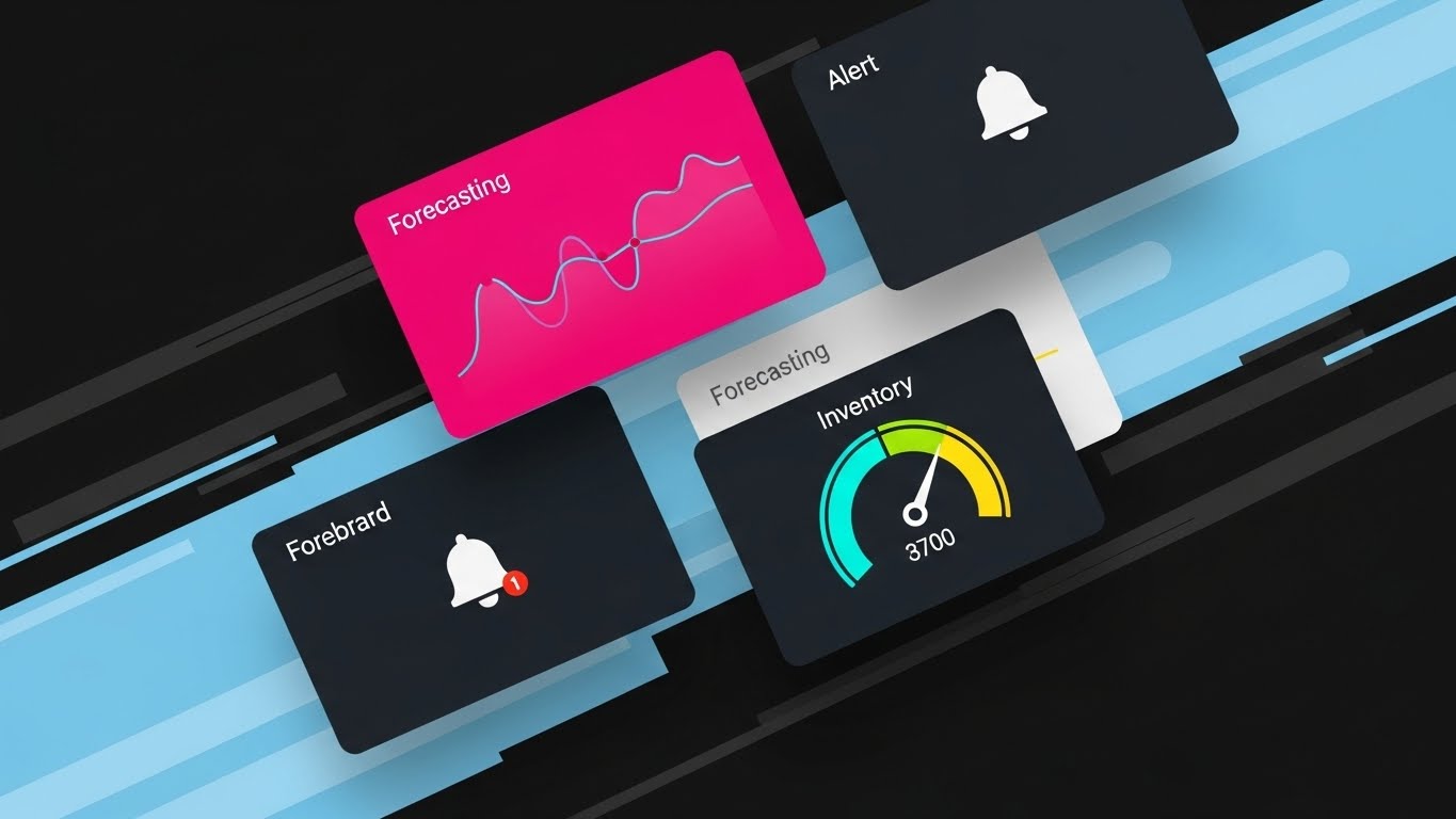
Designed for the "Skimmer," this style uses a rapid-fire montage of tilted, overlapping UI screens floating against abstract speed lines. The screens are simplified, highlighting only key icons: a "Forecasting" graph, an "Alert" bell with a red dot, and a green "Inventory" gauge. The camera flies past them, suggesting a rapid workflow. The rendering is sharp, vector-like, and aggressive, suggesting Speed and comprehensive feature coverage.
Psychological Impact & KPI Focus
- Niche Psychology: The target persona often hates "clunky" legacy ERPs. This modern, floating UI style signals Usability and Agility. It promises a user experience that matches the speed of the consumer apps they use at home.
- Operational Impact: It visualizes Exception-Based Management. The focus on the "Red Alert" dot and "Green Gauge" emphasizes that the user only needs to look at what's wrong, not the whole dataset.
Strategic Implementation & Trade-offs
- Best Use Case: Email marketing campaigns or retargeting ads. It reminds the prospect of the tool's modern interface.
- Duration: 10-15 Seconds.
- Trade-off: It is impressionistic. It generates excitement but does not teach the user how to use the feature. It works best when the user is already aware of the problem.
Companies using similar video content -
FourKites – Real-Time Visibility Platform – Provides rapid updates for exception management.
Project44 – Movement by project44 – Offers quick, actionable insights via modern UI.
11. The Competitive Contrast
MOFU | Competitive Displacement
The Visual & Narrative Approach
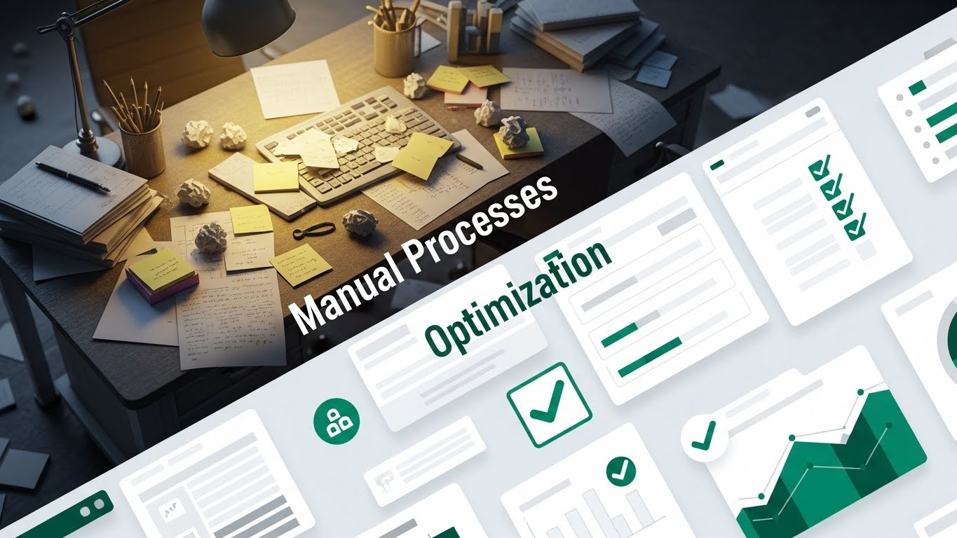
This style leverages the immediate power of simultaneous comparison. The screen is bisected diagonally. The upper-left quadrant depicts the "Status Quo": a dimly lit, chaotic desk cluttered with scattered papers, sticky notes, and analog tools, explicitly labeled "Manual Processes." In sharp contrast, the lower-right quadrant reveals the "Optimized State": a pristine, floating digital interface featuring clean white panels, emerald green verification checkmarks, and organized data visualization, labeled "Optimization." The transition isn't just visual; it represents a migration from Manual Chaos to Digital Order.
Psychological Impact & KPI Focus
- Niche Psychology: Demand planners are often overwhelmed by "Excel Hell" and manual data entry. This visual utilizes the Contrast Principle, effectively triggering a desire to escape the cognitive friction of the "Before" state. It validates their struggle while immediately offering a solution.
- Operational Impact: It visually quantifies Efficiency Gains. By juxtaposing the static clutter with the dynamic, clean interface, it implies a drastic reduction in manual processing time and an increase in forecast accuracy.
Strategic Implementation & Trade-offs
- Best Use Case: LinkedIn Feed Ads or Retargeting Campaigns aimed at users of legacy systems.
- Duration: 15-20 Seconds.
- Trade-off: It acts as a blunt instrument. While effective for immediate differentiation, it lacks nuance. It frames the competitor as "messy" rather than analyzing feature parity, so it works best for displacing manual processes.
Companies using similar video content -
Celonis – Process Mining – Highlights inefficiencies of manual processes vs. optimized.
UiPath – Automation Platform – Contrasts manual tasks with robotic process automation.
12. The Precision Macro
MOFU | Functional Buyer

The Visual & Narrative Approach
Here, the camera acts as a magnifying glass for functionality. We utilize a macro lens effect to focus exclusively on the beauty of the data. The frame is filled with a high-fidelity render of a demand curve, smooth and flowing in soft sky blue and mint green against a sterile white background. The depth of field is aggressively shallow, blurring the peripheral menus to force the viewer’s eye onto the "Demand Forecasting Clarity" header and the upward trajectory of the graph.
Psychological Impact & KPI Focus
- Niche Psychology: For the functional buyer (the daily user), clarity is the ultimate luxury. This style appeals to the Aesthetic-Usability Effect, suggesting that a tool that looks this clean and precise will work with equal precision. It promises a frictionless workday.
- Operational Impact: It highlights Granularity. By zooming in, we subtly suggest that the software handles the details—the SKU-level nuances—that other broad-brush tools miss.
Strategic Implementation & Trade-offs
- Best Use Case: Website Product Features page or specific "Forecasting" module explainer videos.
- Duration: 6-10 Seconds (Looping).
- Trade-off: It sacrifices context for focus. The viewer sees the graph but not the workflow. It validates the quality of the interface but not the utility of the entire suite.
Companies using similar video content -
Demand Solutions – DSX – Focuses on granular forecast accuracy and clarity.
ToolsGroup – Service Optimizer 99+ – Emphasizes precise, detailed demand curves.
13. The Digital Guardian
MOFU | Objections

The Visual & Narrative Approach
To address the often-dry topic of data security, this style adopts a stylized, approachable vector aesthetic. A character, designed with modern geometric proportions in corporate lavender and charcoal, stands resolutely holding a shield. This shield deflects incoming "spikes"—visual metaphors for cyber threats or data breaches. A prominent, soft yellow padlock icon floats securely in a speech bubble, reinforcing the message. The animation is smooth and reassuring, transforming "Security" from a technical spec into a visual story.
Psychological Impact & KPI Focus
- Niche Psychology: Implementation fear often stems from data vulnerability. This style uses Anthropomorphism to humanize the software, positioning it not just as a tool, but as a partner that protects the user. It lowers the defensiveness of IT stakeholders using the Affect Heuristic.
- Operational Impact: It visualizes Data Integrity. It reassures the viewer that while the demand planning algorithms are open and flexible, the core enterprise data remains unassailable behind a shield of enterprise-grade security.
Strategic Implementation & Trade-offs
- Best Use Case: Email nurture sequences addressing "Security FAQs" or bottom-of-page website trust signals.
- Duration: 15-30 Seconds.
- Trade-off: The illustrative style can skew "young." Care must be taken to ensure the character design remains professional and doesn't drift into a "consumer app" aesthetic, which might undermine enterprise authority.
Companies using similar video content -
TraceLink – Opus Platform – Ensures data integrity and security in pharma supply chain.
Resilinc – Resilinc Platform – Protects supply chain data from disruptions and threats.
14. The Tangible ROI
BOFU | ROI Justification

The Visual & Narrative Approach
This style abandons abstraction for hyper-reality. It presents a wide-angle, photorealistic 3D render of a pristine logistics distribution center. We see rows of pallets stacked with industrial precision on towering racks, illuminated by linear LED lighting that reflects off polished concrete. The scale is massive. There are no cartoons here; this is the physical manifestation of capital. The camera glides slowly, emphasizing the sheer volume of inventory being managed perfectly.
Psychological Impact & KPI Focus
- Niche Psychology: The CFO and VP of Supply Chain need to see where the money goes. This style triggers Social Proof and Authority by simulating the scale of a Tier-1 operation. It implies, "This is what a successful, optimized warehouse looks like."
- Operational Impact: It anchors the software in Physical ROI. It reminds the viewer that better demand planning leads to optimized space utilization (the perfectly stacked racks) and higher throughput, moving the conversation from software costs to operational savings.
Strategic Implementation & Trade-offs
- Best Use Case: Executive presentations, pitch decks, and "Case Study" video headers.
- Duration: 15-20 Seconds (Loop).
- Trade-off: It is generic by design. Unless customized with the client’s specific branding on the boxes, it creates a mood of success rather than explaining a specific process. It is a backdrop for a financial conversation.
Companies using similar video content -
Dematic – Automated Warehouse Solutions – Showcases large-scale automated logistics.
Honeywell Intelligrated – Intelligrated Solutions – Visualizes efficient material handling at scale.
15. The Transparent Box
BOFU | Risk Mitigation

The Visual & Narrative Approach
To visualize the concept of "Total Visibility," we use a high-end 3D X-Ray effect. A standard shipping container, outlined in glowing neon cyan, becomes translucent, revealing a perfectly organized grid of white boxes inside. The background is a stark, studio black to maintain focus. The visual metaphor is direct: the software allows you to see through the walls of closed systems (suppliers, transit containers) to understand exactly what inventory is available.
Psychological Impact & KPI Focus
- Niche Psychology: The "Black Swan" event is the planner's nightmare—not knowing what stock is actually in transit. This style satisfies the deep craving for Certainty. It visually promises that there are no secrets in the supply chain; everything is revealed.
- Operational Impact: It targets Inventory Accuracy and In-Transit Visibility. It demonstrates that the digital record matches the physical reality, reducing the need for safety stock buffering caused by uncertainty.
Strategic Implementation & Trade-offs
- Best Use Case: Whitepapers on "Supply Chain Visibility" or detailed solution pages.
- Duration: 10-15 Seconds.
- Trade-off: Highly abstract. It works perfectly as a metaphor for "Seeing Inside," but it doesn't show the interface that provides this data. It sells the benefit, not the feature.
Companies using similar video content -
Elementum – Supply Chain Incident Management – Provides visibility into in-transit inventory.
Blume Global – Digital Platform – Offers end-to-end visibility for containers and shipments.
16. The Strategic Anchor
BOFU | Building Trust

The Visual & Narrative Approach
Trust is ultimately human. This style utilizes high-end cinematic live-action (or hyper-realistic generation). We see a distinguished executive (CFO/Director persona) in a glass-walled office at sunset—the "Golden Hour" lighting casting a warm, successful glow. He looks at a tablet with an expression of calm, confident approval. The blurred city skyline in the background implies global reach. There is no frantic data entry here; only strategic oversight.
Psychological Impact & KPI Focus
- Niche Psychology: This appeals to the Self-Actualization needs of the buyer. It reflects who they want to be: the calm strategist, not the frantic firefighter. It builds Brand Trust by associating the software with stability and executive control using Mirroring.
- Operational Impact: It visualizes Strategic Alignment. It moves the value proposition up the ladder, suggesting that this software is a tool for boardroom decision-making, not just warehouse management.
Strategic Implementation & Trade-offs
- Best Use Case: "About Us" videos, homepage hero sections, or testimonials.
- Duration: 10-15 Seconds.
- Trade-off: Risk of "Stock Footage" inauthenticity. The casting and lighting must be premium. If it looks like a generic bank ad, it loses credibility.
Companies using similar video content -
SAP – Integrated Business Planning – Positions software for C-suite strategic oversight.
Oracle – Fusion Cloud SCM – Supports executive decision-making with comprehensive data.
17. The Infinite Loop
BOFU | Competitive Switcher

The Visual & Narrative Approach
This style simplifies the complex supply chain into a clean, understandable loop. Using a "toy-like" isometric 3D aesthetic with a matte finish, we see a factory (Blue), a retail store (Yellow), and a red truck travelling on a smooth, infinite loop between them. The colors are primary and distinct. A tilt-shift blur effect focuses attention on the continuous movement. It visually proves that the software connects the ends of the chain, closing the loop between demand (Retail) and supply (Factory).
Psychological Impact & KPI Focus
- Niche Psychology: Complexity causes paralysis. This style utilizes Cognitive Ease (Gestalt Theory) to make the entire supply chain feel manageable, contained, and harmonious. It reassures the buyer that the integration will be seamless.
- Operational Impact: It visualizes End-to-End Integration. It combats the "Silo" mentality by showing a single, unbroken road connecting disparate departments, representing the unified data model of the software.
Strategic Implementation & Trade-offs
- Best Use Case: Competitive comparison pages ("Us vs. Them") or high-level architecture diagrams.
- Duration: 20-30 Seconds.
- Trade-off: It is a simplification. It works well to sell the concept of integration, but technical buyers might find it too playful or lacking in specific detail about how the API integration actually works.
Companies using similar video content -
One Network Enterprises – Business Network – Connects entire supply chain in a continuous loop.
Nulogy – Agile Customization Platform – Ensures continuous flow in co-packing operations.
18. The Global Commander
BOFU | Economic Buyer

The Visual & Narrative Approach
This style bridges the gap between the executive and the data. It features a professional in a high-rise setting, interacting with a tablet. The key visual differentiator is the implied or overlaid "Digital Layer"—a holographic 3D map of the globe hovers slightly above the desk surface (augmented reality style). The warm lighting and relaxed posture convey that the global supply chain is under control, viewable from anywhere.
Psychological Impact & KPI Focus
- Niche Psychology: The Economic Buyer (CEO/CFO) fears losing control as the business scales. This visual triggers the Illusion of Control in a positive way, reinforcing the idea that the software provides a "Control Tower" view of the entire global operation from a single device.
- Operational Impact: It focuses on Scalability and Remote Visibility. It sells the promise of managing global complexity without needing to be physically present in every warehouse.
Strategic Implementation & Trade-offs
- Best Use Case: LinkedIn Ads targeting C-Suite job titles.
- Duration: 15-20 Seconds.
- Trade-off: Like Style 16, it relies on mood. It validates the purchase decision at an emotional level ("This is the tool for a leader") rather than a rational feature level.
Companies using similar video content -
Descartes Systems Group – Global Logistics Network – Provides control over global operations.
C.H. Robinson – Navisphere – Offers global visibility and management for logistics.
19. The Developer's Canvas
BOFU | Technical Buyer
The Visual & Narrative Approach
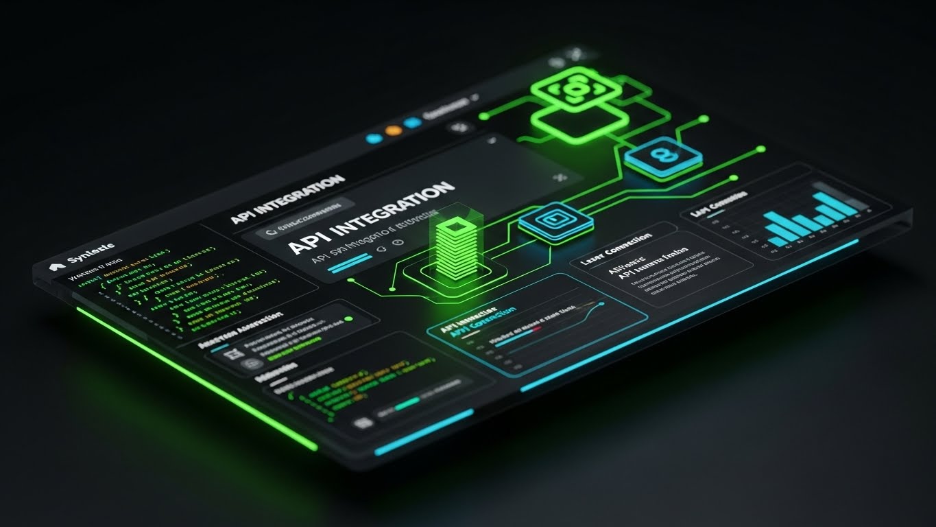
To win over the IT Director, we must speak their language. This style features a high-fidelity "Dark Mode" UI floating in a void. Neon green and laser blue syntax highlighting illuminates code snippets and API connection nodes. A central glowing cube represents the "Core Logic." It looks like a developer's IDE (Integrated Development Environment) rather than a business dashboard. It signifies robustness, modern architecture, and "under the hood" power.
Psychological Impact & KPI Focus
- Niche Psychology: Technical buyers are skeptical of "Low Code" marketing fluff. They want to see the plumbing. This style validates their expertise, using the visual language of Engineering Precision. It signals that the platform is developer-friendly and extensible.
- Operational Impact: It visualizes API Interoperability. It proves that this software isn't a closed garden; it is designed to plug into their existing ERP stack (SAP, Oracle) via robust, clean code.
Strategic Implementation & Trade-offs
- Best Use Case: Technical documentation pages, API integration sections, or developer blogs.
- Duration: 30-45 Seconds.
- Trade-off: It alienates the non-technical business user. A demand planner might find this intimidating or "too technical," so it must be segmented strictly for the IT/Ops audience.
Companies using similar video content -
AWS Supply Chain – AWS Supply Chain – Emphasizes API-first approach for developers.
Google Cloud Supply Chain – Supply Chain Twin – Provides developer tools for integration.
20. The Velocity Streak
Onboarding | Time-to-Value

The Visual & Narrative Approach
The sale is closed; now speed is everything. This style utilizes a long-exposure hyper-lapse of a highway interchange at night. The headlights and taillights smear into continuous, electric ribbons of red and white light, curving elegantly through the frame. The word "VELOCITY" is superimposed in bold, clean typography. The image captures pure kinetic energy, symbolizing the accelerated flow of goods and data.
Psychological Impact & KPI Focus
- Niche Psychology: Post-purchase anxiety often centers on "Implementation Drag"—the fear that software deployment will take years. This style counters that with a visual of Momentum. It assures the client that the switch will be fast, fluid, and continuous.
- Operational Impact: It visualizes Time-to-Value. It suggests that the data highway is already built and moving; they just need to merge onto it. It reinforces the agility of the onboarding process.
Strategic Implementation & Trade-offs
- Best Use Case: "Welcome" emails, onboarding kick-off presentations, or "Fast Implementation" guarantee ads.
- Duration: 5-10 Seconds (Loop).
- Trade-off: It is purely atmospheric. It creates excitement about speed but sets high expectations. The actual onboarding experience must live up to this promise of friction-free velocity.
Companies using similar video content -
Acumatica – Cloud ERP – Promotes rapid deployment and quick time-to-value.
NetSuite – SuiteSuccess – Focuses on accelerated implementation for business value.
21. The Instructional Flow
Onboarding | Implementation
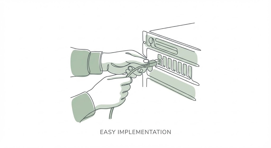
The Visual & Narrative Approach
Implementation is the most anxiety-inducing phase of the software lifecycle. This style counters that with radical simplicity. It utilizes a continuous line art aesthetic in calming sage green and charcoal. We see a pair of stylized hands gently connecting a cable into a server port. The movement is slow, fluid, and deliberate. The ample whitespace suggests "breathing room," visually promising that the integration process is a "Plug and Play" experience rather than a chaotic overhaul.
Psychological Impact & KPI Focus
- Niche Psychology: The "Implementation Dip" is a known psychological valley where buyers regret the complexity of their purchase. This style triggers Cognitive Ease. By stripping away detail and focusing on a simple mechanical connection, it reassures the stakeholder that the integration will be frictionless.
- Operational Impact: It targets Time-to-Value (TTV). It visually simplifies the complex reality of API integration into a singular, manageable action, reducing the perceived barrier to entry for IT teams.
Strategic Implementation & Trade-offs
- Best Use Case: Support Portals, "Getting Started" guides, or the first screen of the installation wizard.
- Duration: 5-10 Seconds (Loop).
- Trade-off: It is highly stylized. It works for concepts and high-level instructions but lacks the detail needed for troubleshooting specific error codes.
Companies using similar video content -
Odoo – ERP Modules – Highlights simple, modular integration and setup.
Zoho Inventory – Inventory Management – Emphasizes user-friendly, plug-and-play setup.
22. The Success Catalyst
Onboarding | Self-Serve

The Visual & Narrative Approach
To drive adoption, we must reward engagement. This style uses a flat 2D vector aesthetic in energetic berry and turquoise. A stylized user character high-fives a floating UI element—a checkmark inside a circle—after completing a task. Geometric "confetti" shapes float in the background. It gamifies the workflow, turning mundane data entry or forecast approval into a moment of small celebration.
Psychological Impact & KPI Focus
- Niche Psychology: Demand planning is often a thankless task. This style taps into the Reward System (Dopamine loops). By visually celebrating small wins, it reinforces positive behavior and encourages the user to continue exploring the platform.
- Operational Impact: It drives Feature Adoption and Self-Serve Success. It encourages users to complete training modules or profile setups without needing a Customer Success Manager's intervention.
Strategic Implementation & Trade-offs
- Best Use Case: In-app pop-ups upon task completion ("First Forecast Created!") or "Success" state screens.
- Duration: 3-5 Seconds (Loop).
- Trade-off: Risk of being patronizing. The animation must be professional enough for B2B users; if it feels too much like a mobile game, it may annoy serious analysts.
Companies using similar video content -
Fishbowl Inventory – Inventory Software – Encourages task completion with clear success indicators.
Unleashed Software – Inventory Management – Rewards users for efficient inventory tasks.
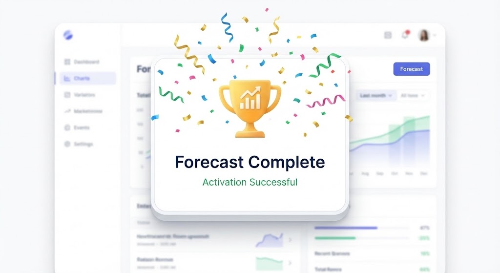
23. The Activation Pop
Onboarding | Activation

The Visual & Narrative Approach
This style visualizes the "Aha!" moment. We see a pristine, white-label UI layout. A central modal window pops forward with a subtle 3D depth effect. Inside, a gold trophy icon and a rising chart signify "Forecast Complete." The background interface blurs slightly to focus attention on the success message. It effectively says, "You have done the work; here is the result."
Psychological Impact & KPI Focus
- Niche Psychology: Users need confirmation that their inputs have meaning. This style provides Closure. It signals that a complex process has been successfully executed, giving the user a sense of competence and mastery over the tool.
- Operational Impact: It visualizes Activation Rate. It marks the transition from a "user who logs in" to a "user who derives value," a critical metric for SaaS retention.
Strategic Implementation & Trade-offs
- Best Use Case: "Congratulations" emails after the first week of usage or in-app milestones.
- Duration: 5-10 Seconds.
- Trade-off: It is static in nature. It confirms a past action but doesn't necessarily guide the user to the next step unless paired with a clear Call to Action (CTA).
Companies using similar video content -
Cin7 – Inventory Management – Celebrates successful order fulfillment or inventory updates.
Brightpearl – Retail Operating System – Signals successful task completion and milestones.
24. The Holographic Visionary
Expansion | Thought Leadership

The Visual & Narrative Approach
To upsell the enterprise, you must sell the future. This style employs a futuristic, holographic aesthetic. A glowing blue projection of the globe floats above a sleek silver podium on a blurred conference stage. Supply chain routes orbit the planet in light. It looks like a prop from a high-budget sci-fi film, positioning the software not just as a tool for today, but as the command center for tomorrow's global logistics.
Psychological Impact & KPI Focus
- Niche Psychology: Executives want to partner with innovators. This style leverages the Halo Effect, transferring the perceived sophistication of the visual style onto the brand itself. It makes the vendor look like a "Category King."
- Operational Impact: It supports Market Expansion. It visualizes the software's capability to handle complex, cross-border trade and next-generation logistics challenges (like drone delivery or autonomous trucking networks).
Strategic Implementation & Trade-offs
- Best Use Case: Webinar intros, Keynote presentations, or "Vision 2030" whitepaper headers.
- Duration: 15-30 Seconds.
- Trade-off: It sets a very high bar. If the actual product UI is dated, this marketing style will create a jarring "Expectation Gap."
Companies using similar video content -
Plex Systems – Smart Manufacturing Platform – Presents a futuristic vision for manufacturing.
Rootstock – Cloud ERP – Showcases advanced, visionary manufacturing control.
25. The Deep Dive Interface
Retention | Deep Feature

The Visual & Narrative Approach
This style is designed to show off power. It uses a 3D parallax effect where multiple semi-transparent glass UI screens float in a deep ocean-blue digital space. The camera pushes through the layers. The front screen shows detailed "Scenario Modeling" controls—sliders, knobs, and switches. The depth suggests that there are layers of functionality waiting to be discovered, inviting the advanced user to explore.
Psychological Impact & KPI Focus
- Niche Psychology: Power users get bored with simple tools. This style appeals to their Curiosity and need for Complexity. It suggests that the software has "depth" and can handle the most nuanced, difficult planning scenarios they face.
- Operational Impact: It drives Stickiness. By highlighting advanced features (like multi-variable regression sliders), it encourages users to embed the software more deeply into their critical workflows.
Strategic Implementation & Trade-offs
- Best Use Case: Feature release newsletters or "Pro Tips" video series.
- Duration: 10-20 Seconds (Loop).
- Trade-off: It can be overwhelming for a novice. It creates a sense of sophistication but might scare off a user who just wants a simple baseline forecast.
Companies using similar video content -
Coupa – Business Spend Management – Offers deep analytics and scenario planning for spend.
Ivalua – Source-to-Pay – Provides layered insights for complex procurement scenarios.
26. The Hybrid Human
Retention | Reducing Churn
The Visual & Narrative Approach
Retention is about people, not just code. This style overlays flat, cheerful 2D vector graphics (hearts, rising charts) onto a high-quality photo or video of a smiling warehouse manager. The contrast between the real human face and the playful graphics creates a warm, approachable vibe. It visually links the software (the graphics) to the happiness of the employee (the photo).
Psychological Impact & KPI Focus
- Niche Psychology: Churn often happens when users feel ignored or frustrated. This style triggers Empathy and Belonging. It reminds the buyer that the software makes their team's life easier, reducing burnout and improving job satisfaction.
- Operational Impact: It targets Net Promoter Score (NPS). It reinforces the emotional connection to the brand, making it harder for a competitor to displace you purely on price.
Strategic Implementation & Trade-offs
- Best Use Case: Customer Success stories, LinkedIn "Community" posts, or year-end review videos.
- Duration: 15-30 Seconds.
- Trade-off: Requires authentic photography. Using a generic stock model will backfire; it needs to look like a real user in a real environment.
Companies using similar video content -
Zebra Technologies – Workforce Connect – Integrates human workers with digital tools.
Locus Robotics – Autonomous Mobile Robots – Shows robots assisting human warehouse staff.
27. The Infinite Data Grid
Expansion | Upsell

The Visual & Narrative Approach
To sell the "Enterprise Tier," we show infinite capacity. This style uses a "worm's eye view" looking up at a massive, infinite ceiling of glowing data nodes connected by laser red and neon blue lines. It implies a cyberpunk, "Matrix-like" infrastructure. The darkness of the void suggests that the space for growth is limitless. It creates a feeling of awe and massive computing power.
Psychological Impact & KPI Focus
- Niche Psychology: Enterprise buyers fear hitting a "ceiling" with their software. This style triggers the Grandeur Bias, assuring them that no matter how big they grow, the system is bigger. It represents "Future-Proofing."
- Operational Impact: It visualizes Scalability. It suggests the system can handle millions of SKUs and locations without latency, supporting the upsell conversation for "Unlimited" data packages.
Strategic Implementation & Trade-offs
- Best Use Case: Email campaigns for upgrading to "Enterprise" plans or background visuals for pricing pages.
- Duration: 10-15 Seconds (Loop).
- Trade-off: It is abstract. It sells the capacity of the system, not the usability. It works best for the IT Director who cares about infrastructure robustness.
Companies using similar video content -
Microsoft Dynamics 365 – Supply Chain Management – Emphasizes scalability for large enterprises.
IFS – Cloud ERP – Highlights robust capacity for growing global operations.
28. The Organic Network
Expansion | Referrals

The Visual & Narrative Approach
Referrals grow organically, like a network. This style uses a clean, abstract 2D composition where a central orange node radiates outward to create smaller nodes, which then spawn their own connections. It looks like a blooming flower or a rapidly expanding crystal. The gradient from orange to pink adds warmth. It visualizes the spread of influence and value through a professional network.
Psychological Impact & KPI Focus
- Niche Psychology: Professionals like to be the "hub" of their network. This style appeals to Social Capital. It suggests that by sharing this tool, the user becomes the center of a valuable ecosystem, spreading best practices to their peers.
- Operational Impact: It visualizes Viral Growth and Ecosystem Value. It implicitly argues that the software is more valuable when more partners/suppliers are connected to it.
Strategic Implementation & Trade-offs
- Best Use Case: "Refer a Friend" program landing pages or social media posts encouraging community joining.
- Duration: 5-10 Seconds (Loop).
- Trade-off: Very metaphorical. It needs clear copy ("Grow your network," "Invite your suppliers") to anchor the visual in a specific action.
Companies using similar video content -
Tealbook – Supplier Intelligence Platform – Visualizes network growth through supplier connections.
riskmethods – Supply Chain Risk Management – Shows how risk intelligence spreads through a network.
29. The Insight Architect
Retention | Knowledge Base

The Visual & Narrative Approach
Support shouldn't be a panic; it should be enlightenment. This style uses high-contrast line art in electric yellow and black. An isometric icon combines a lightbulb (Idea) and a brain (Logic), floating above an open book or tablet. The lines are precise and consistent. It conveys intelligence, clarity, and instant access to answers. It brands the "Help Center" not as a place for problems, but as a library of wisdom.
Psychological Impact & KPI Focus
- Niche Psychology: When users are stuck, they feel incompetent. This style uses the competence-affirming aesthetic of technical blueprints. It frames the search for help as "learning," not "fixing," preserving the user's professional ego.
- Operational Impact: It targets Support Ticket Reduction. By making the self-service knowledge base look attractive and authoritative, it encourages users to find their own answers, lowering the cost of support.
Strategic Implementation & Trade-offs
- Best Use Case: Header images for the Knowledge Base, Help Center, or "Academy" section of the site.
- Duration: Static or Micro-motion (3-5 sec).
- Trade-off: It is functional art. It doesn't sell a feature; it sells the support infrastructure. It is a hygiene factor, not a differentiator.
Companies using similar video content -
QAD – Adaptive ERP – Provides extensive knowledge base for self-service support.
Epicor – Kinetic – Offers comprehensive learning resources for users.
30. The Macro Focus
Expansion | Announcements

The Visual & Narrative Approach
When a new feature launches, it needs to feel like a new product. This style uses an extreme macro close-up (1:1 magnification) of a single UI element—a glossy, pill-shaped "New Feature" button in vivid red. The texture is hyper-realistic, looking like expensive hardware or a premium app icon. The lighting highlights the curve of the button. It creates a tactile desire to "press" or engage with the update.
Psychological Impact & KPI Focus
- Niche Psychology: The "New" triggers the Novelty Bias. Even in B2B, users crave freshness. This style treats a software update with the same visual reverence as an Apple product launch, signaling quality and excitement.
- Operational Impact: It drives Feature Awareness. It cuts through the noise of standard email updates, signaling that this specific update is significant and worthy of attention.
Strategic Implementation & Trade-offs
- Best Use Case: In-App notification modals, "What's New" email headers, or social teasers.
- Duration: 5-8 Seconds (Looping light sweep).
- Trade-off: It creates hype. If the feature is minor (e.g., a bug fix), using this premium style will feel like false advertising. Save it for major module releases.
Strategic Knowledge Base: The Visual Operations Doctrine
To bridge the gap between "aesthetic appeal" and "business outcome," we must move beyond simply creating videos. We must implement a Visual Operating System (VOS). This framework, developed by the Advids strategic team, synthesizes the 30 styles into a cohesive doctrine for Supply Chain and Demand Planning leaders.
Strategic Alignment & Visual Architecture
The "Pre-Production" Strategy – Laying the Foundation.
- The Cognitive Load Audit: Before commissioning a single pixel, audit your current training materials. If a concept takes 500 words to explain in a PDF, it qualifies for a Kinetic Minimalist (Style 1) video. Reduce cognitive load to increase retention.
- Role-Based Visual Mapping: Do not use the same visuals for the CFO and the Demand Planner. Map Tangible ROI (Style 14) to the executive stakeholders to validate investment, while deploying Precision Macro (Style 12) for the daily users who value interface clarity.
- The "Glanceability" Standard: In high-stress logistics environments, information must be absorbed in milliseconds. Design your "Alert" and "Status" visuals with the high contrast of The Kinetic Minimalist—legible at a glance on a mobile tablet in a moving forklift.
- Brand Voice Consistency: Your software likely spans multiple modules (Demand, Supply, Inventory). Ensure a unified visual language. If "Demand" is Blue/Geometric, and "Supply" is Red/Organic, the user will feel the friction of disjointed tools.
- The Advids Strategic Audit: Partner with Advids to define this "Visual Operating System" before production begins. A scattered library of 30 pretty videos is less effective than 5 videos that share a cohesive, strategic visual language.
- Standardization vs. Customization: For core features, use standardized Clean UI (Style 12) visuals. For client-specific workflows (like a custom warehouse layout), invest in Architectural Blueprint (Style 2) templates that can be easily updated without a full reshoot.
- The Cross-Departmental Bridge: Use visuals to unify terminology. Sales calls it "Backlog," Ops calls it "Pending." A Fluid Data Stream (Style 3) animation showing the same data flowing between them resolves this semantic ambiguity visually.
- Legacy System Integration: Visualizing the connection between old on-prem hardware and new SaaS interfaces is crucial. Use the Digital Twin (Style 7) to show how the new software mirrors and respects the old physical reality, reducing fear of "rip and replace."
- Accessibility in Global Supply Chains: Your workforce is diverse and multi-lingual. Kinetic Minimalist (Style 1) and 2D Animation (Style 22) rely on icons and motion, not voiceover. This makes them universally understood without expensive translation costs.
- The Mobile-First Mandate: Planners and Logistics managers are increasingly mobile. All 30 styles must be legible on a 5-inch screen. Avoid tiny text; embrace the bold typography of The Kinetic Minimalist.
Operational Adoption & Implementation
The "Deployment" Phase – Embedding Visuals into Workflow.
- Overcoming "Big Brother" Anxiety: When introducing AI monitoring or driver tracking, fear is the default reaction. Use The Digital Guardian (Style 13) to frame the technology as a protector (shield) rather than a watcher, shifting the narrative from surveillance to safety.
- The Micro-Learning Shift: Replace the 50-page "Implementation Manual" with a library of 30-second Feature Sprint (Style 10) clips. Embed these directly into the software's "Help" tooltips for contextual learning.
- Just-in-Time Support: When a user encounters an error, pop up a Insight Architect (Style 29) micro-video. This deflects a support ticket and empowers the user to solve the issue instantly.
- Gamification of Training: Use The Success Catalyst (Style 22) visuals in your training modules. Awarding a digital "Trophy" for completing a forecasting cycle encourages consistent system usage.
- Reducing Support Ticket Volume: There is a direct correlation between proactive visual guides and reduced call center load. Analyze your top 10 tickets, and create a Precision Macro (Style 12) video for each one.
- Remote Onboarding: For distributed teams, physical seminars are impossible. Use The Digital Twin (Style 7) and Aspirational Hero (Style 4) styles to create an immersive, remote onboarding experience that feels as high-touch as an in-person event.
- Visualizing SOPs: Transform text-based SOPs into Architectural Blueprint (Style 2) process flows. A visual map of the "Order-to-Cash" cycle is far less ambiguous than a bulleted list.
- Feedback Loops: Use The Activation Pop (Style 23) to encourage feedback. When a user submits a bug report, show them a "Success" animation. It proves their input went somewhere, encouraging future collaboration.
- Scalable Localization: By separating the text layers in styles like The Kinetic Minimalist, you can use Advids to rapidly generate the same video in Spanish, French, and Mandarin for global fleet rollout at a fraction of the cost.
- Leadership Communication: When the VP of Supply Chain needs to communicate a new strategy, don't send an email. Use The Global Commander (Style 18) aesthetic to visually map the new strategy over the globe, commanding attention and signaling importance.
Measuring Impact & Future-Proofing
The "ROI" Phase – Measuring Success and Scaling.
- Beyond "Views": Do not measure video success by "Views." Measure it by Time-to-Competency. Did the Feature Sprint (Style 10) video reduce the time it takes a new planner to generate their first forecast?
- The "Idle Time" Metric: Correlate better visualization with reduced software navigation time. If users spend less time "looking" for buttons because of Precision Macro (Style 12) training, that is calculated productivity ROI.
- Compliance Velocity: How fast are new regulations (e.g., ESG reporting) understood? Use The Kinetic Minimalist (Style 1) to break down complex regulations. Measure the speed of compliance adoption pre- and post-video.
- Retention and Churn: High-quality UX visualization directly impacts Customer Lifetime Value (LTV). Regular exposure to The Hybrid Human (Style 26) keeps the relationship warm and reduces the likelihood of churn to a "cheaper, colder" competitor.
- The AI Visual Frontier: Prepare for the future where video is generated in real-time. The Neural Network Reveal (Style 5) is not just a style; it is a precursor to dashboards that generate visual explanations of anomalies on the fly.
- Scalability of Assets: Build a library, not a graveyard. Use the Advids component-based approach so that when your UI updates, you only need to swap the screen layer in The Feature Sprint (Style 10), not re-shoot the entire video.
- The Advids Partnership: Scale requires a partner. Advids serves as the "Visual Supply Chain," ensuring that as your software features grow, your visual asset library grows in lockstep, without quality degradation.
- Benchmarking Success: "Good enough" visuals are a competitive risk. If your competitor uses The Digital Twin (Style 9) to show simulation, and you use a static screenshot, you lose the "Innovation" argument before you speak.
- The ROI of Safety: For logistics components, better visual training means fewer accidents. Quantify the insurance cost reduction achieved through high-retention Kinetic Minimalist safety briefings.
- Final Call to Innovation: Treat video as infrastructure. It is not "Marketing Content"; it is the User Interface of Knowledge. Investing in this visual doctrine is investing in the efficiency, safety, and future of your entire supply chain operation.
Companies using similar video content -
Gartner – Supply Chain Research – Uses polished visuals to highlight key insights/features.
McKinsey & Company – Operations Insights – Employs high-fidelity visuals for new thought leadership.
Author & Editor Bio


