
Introduction: Visualizing the Mathematics of Alpha
The derivatives market is operating at a velocity that the human mind can scarcely comprehend, let alone track in real-time. With trading in FX markets reached $9.6 trillion per day in April 2025, the pressure to execute faster and smarter is not just a goal—it is an existential imperative. For SaaS platforms and trading venues, the challenge is no longer just about execution speed; it is about explanation speed.
We are witnessing a "Black Box" crisis. Sophisticated algorithms, volatility surfaces, and liquidity pools are the engines of modern finance, yet they remain opaque and intangible to many stakeholders. When a product is defined by lines of code and mathematical probability, selling it requires a bridge between the abstract and the tangible. This is where strategic video visualization moves from a marketing "nice-to-have" to a critical Go-To-Market asset.
The stakes for differentiation are equally high. As the global algorithmic trading market is projected to reach USD 42.99 billion by 2030, the marketplace is becoming crowded with platforms claiming superior latency and intelligence. In this noise, the platforms that win are those that can reduce the cognitive load of their prospects. They use visual storytelling to simplify the complex, making the intangible value of their technology immediately perceptible.
At Advids, we have analyzed the visual strategies of the world's leading fintech and SaaS platforms. We found that the most successful brands do not just "show screens"; they visualize concepts. This guide presents "Gold Standard" visual frameworks designed to help derivatives platforms articulate their value, shorten sales cycles, and build institutional trust.
1. Abstract 2D Motion + Bold Kinetic
TOFU | Brand Awareness

The Visual & Narrative Approach
This style abandons the literal representation of screens in favor of raw energy and mathematical precision. It utilizes a palette of Electric Indigo, Stark White, and Jet Black to create a high-contrast environment. Abstract representations of "Order Flow" are depicted as streaming arrow vectors and shifting blocks that assemble into a cohesive structure. The composition is dynamic, with elements appearing to fly towards the viewer from a central point. No text is legible; the focus is entirely on the velocity and precision of the shapes.
Psychological Impact & KPI Focus
For a derivatives audience, "speed" is often an abstract claim. This style makes speed felt. By stripping away the UI, we reduce the Cognitive Load, allowing the viewer to focus purely on the sensation of efficiency and architectural soundness. It directly addresses the anxiety of "slippage" or "latency" by visually demonstrating tight, snap-to-grid accuracy. The primary KPI impact here is Ad Recall; the bold, kinetic nature of the motion is designed to stop the scroll on social feeds.
Strategic Implementation & Trade-offs
- Best Use Case: 15-second social media teasers (Instagram/LinkedIn) announcing a new matching engine or low-latency infrastructure upgrade.
- Trade-off: This style is purely metaphorical. It builds hype and brand sentiment but fails to educate the user on how to use the platform.
Companies using similar video content -
XTX Markets – Algorithmic trading, market making, price forecasts.
SpeedTrader – Direct market access, fast execution, robust platforms.
2. Cinematic Video
TOFU | Category Creation
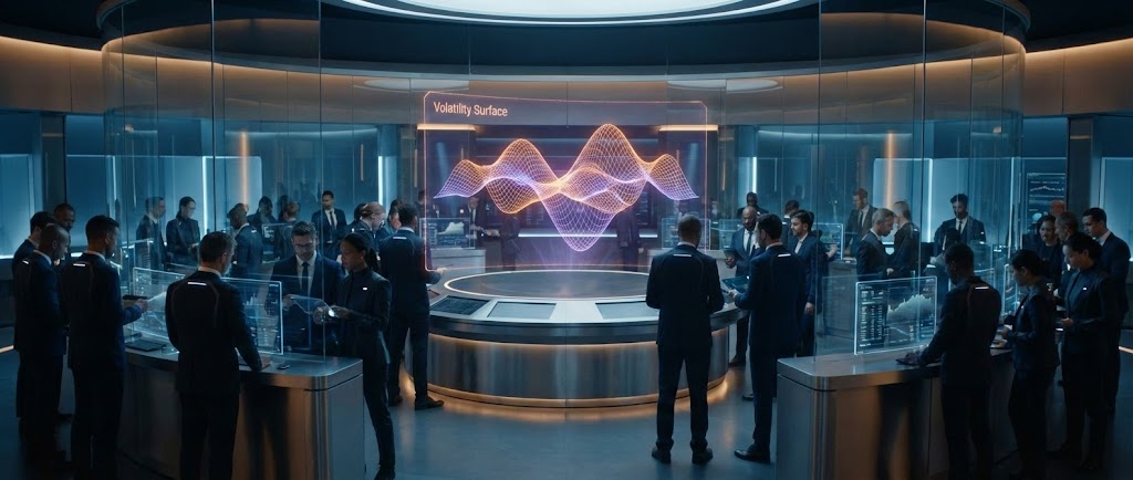
The Visual & Narrative Approach
This visual framework elevates the trading platform from software to "Command Center." A wide, anamorphic shot reveals a futuristic, high-tech trading floor. The environment is sleek, utilizing glass, brushed steel, and soft ambient lighting in Steel Blue and Amber. In the center, a holographic projection displays a complex "Volatility Surface" 3D mesh, glowing softly. Diverse professionals are seen in the background, focused on transparent screens. The lighting is dramatic, implying a 24/7 global operation.
Psychological Impact & KPI Focus
This style targets the Status and Security drivers of the C-Suite persona. It signals that the platform is "Enterprise Grade" and robust enough for institutional volume. By placing the data in a physical, high-tech environment, we bridge the Physical/Digital Divide, making the software feel like tangible infrastructure. It is powerful for Brand Equity, positioning the platform not just as a tool, but as the central nervous system of a trading desk.
Strategic Implementation & Trade-offs
- Best Use Case: The "Hero Video" on the homepage or an opening segment for a keynote presentation at a major fintech conference.
- Trade-off: High production value requires significant budget and render time. It risks looking "sci-fi" if not grounded by realistic UI elements within the holograms.
Companies using similar video content -
BlackRock – Aladdin – Unifies investment management, whole portfolio view.
FlexTrade – FlexOMS – Global derivatives trading, order management, risk.
3. Dynamic Data Visualization
TOFU | Market Education
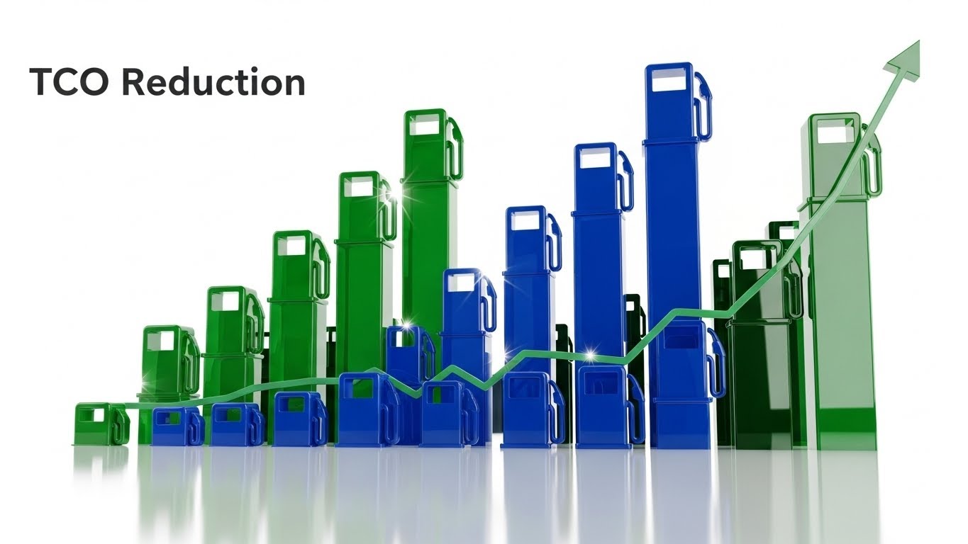
The Visual & Narrative Approach
Here, the focus shifts to the elegance of data interpretation. The visual transforms flat "Market Heat Maps" into a glossy, 3D terrain map set against a deep void. Peaks (representing high volatility or cost) and valleys (representing stability) are rendered with a glass-like material. An isometric camera angle provides a "God's eye view" of the data landscape. Floating data points and connecting lines weave through the terrain, glowing with Teal and Magenta light. Note: As seen in the example image, this glossy 3D aesthetic can also be effectively used to visualize comparative metrics like TCO Reduction.
Psychological Impact & KPI Focus
Derivatives traders deal in probability and multi-variable risks. This style appeals to the Analytical side of the persona, promising clarity. By converting raw numbers into a 3D landscape, it exploits the brain's spatial processing capabilities, making trends instantly recognizable without reading fine print. It validates the platform's ability to simplify complex data, directly influencing Engagement Rates for educational content.
Strategic Implementation & Trade-offs
- Best Use Case: LinkedIn thought-leadership posts explaining a specific market phenomenon (e.g., "Navigating the Volatility Smile").
- Trade-off: While visually stunning, it can be abstract. It is crucial to label the axes so the viewer understands exactly what the "terrain" represents.
Companies using similar video content -
FactSet – Workstation – Financial data, analytics, market insights.
S&P Capital IQ – Platform – Financial data, analytics, market intelligence.
4. Abstract 3D AI Visualization
TOFU | Shaping Brand Perception

The Visual & Narrative Approach
To visualize the invisible force of "Algorithmic Execution," this style employs a macro-lens view of an Artificial Intelligence neural network. Thousands of glowing nodes and connecting filaments—rendered in Cyan, Silver, and Obsidian—pulse with light. The camera uses a shallow depth of field, highlighting a specific cluster of connections that represent the "decision moment." The style is ethereal and high-tech, utilizing particle effects to create a sense of depth and intelligence.
Psychological Impact & KPI Focus
This style addresses the "Black Box" anxiety by visualizing the intelligence inside the box. It frames the AI not as a cold machine, but as a sophisticated, glowing brain. This builds Trust in the algorithm's capability. It is particularly effective for Brand Perception, shifting the narrative from "automated trading" (which can imply lack of control) to "intelligent augmentation."
Strategic Implementation & Trade-offs
- Best Use Case: Website background headers or the introductory section of a product page for AI-driven execution tools.
- Trade-off: It is heavily conceptual. If the platform's actual UI is clunky, this high-end abstract visual can create an "expectations gap."
Companies using similar video content -
Axyon AI – AI-Based Signals – AI for hedge funds, enhances decision-making.
Blueflame AI – AI Platform for Hedge Funds – Agentic AI for research, execution, insights.
5. Futuristic Neon/Dark Mode
TOFU | YouTube

The Visual & Narrative Approach
Embracing the "Dark Mode" aesthetic favored by crypto-native traders, this style uses a Deep Violet and Neon Green palette. The scene visualizes a digital tunnel or circuit board where "Crypto Derivative" transactions are represented as interlocking, floating chain-link structures (blockchain). The camera moves with a Dutch tilt, adding a sense of speed. Surfaces are highly reflective, mimicking polished black metal. The aesthetic is "Cyberpunk-lite," professional yet edgy.
Psychological Impact & KPI Focus
This style signals "Modernity" and "Native Crypto Capabilities." It resonates with a younger demographic of traders who associate Dark Mode with professional-grade software. It avoids the sterile "bank look" in favor of something edgier, helping to position the brand as an Innovator. The high contrast is excellent for Video Completion Rates on platforms like YouTube.
Strategic Implementation & Trade-offs
- Best Use Case: Explainer videos for crypto-derivative products, API documentation intros, or feature reels for night-mode interfaces.
- Trade-off: It can feel "gaming-centric." Care must be taken to ensure typography remains clean and professional to retain institutional credibility.
Companies using similar video content -
Deribit – Crypto options and futures exchange.
Coinbase Institutional – Institutional crypto trading, custody services.
6. Isometric 2D Motion Design
TOFU | Vertical Social Organic
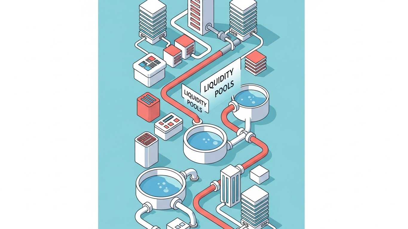
The Visual & Narrative Approach
This style simplifies market infrastructure into a clean, orthographic model. "Liquidity Pools" are visualized literal reservoirs of blue liquid, connected by pipes to server stacks and data blocks. The palette is soft—Pastel Blue, Coral, and White. The composition is arranged vertically to fit mobile screens. The mood is playful yet organized, simplifying complex infrastructure into a transparent model where the "flow" of capital is visible.
Psychological Impact & KPI Focus
By using an isometric perspective, we reduce the "scary" factor of complex infrastructure. It creates a "God-view" where the viewer feels in complete control. This "gamification" of the concept lowers the barrier to entry for understanding topics like smart contract routing. It is highly effective for Social Shares on mobile devices (Vertical Video), where clarity beats detail.
Strategic Implementation & Trade-offs
- Best Use Case: TikTok or YouTube Shorts explaining "How it Works" concepts (e.g., "What is a Liquidity Pool?").
- Trade-off: It is inherently simplified. It is not suitable for demonstrating the granular details of a risk management dashboard.
Companies using similar video content -
OpenAlgo – Open-source algorithmic trading platform, API integration.
Chainlink – Oracle platform for blockchain applications, interoperability.
8. Photorealistic 3D Renders
TOFU | Connected TV

The Visual & Narrative Approach
This style grounds the software in the physical world of the decision-maker. It features a photorealistic render of a high-end tablet device resting on an executive Mahogany desk. The screen displays a sophisticated "Risk Dashboard" with abstract charts and gauges in Platinum, Glass, and Soft Grey tones. The lighting is soft morning sunlight streaming from the side, casting realistic shadows. The depth of field is shallow, focusing sharp attention on the data visualization while blurring the office background.
Psychological Impact & KPI Focus
This visualization targets the Executive persona (CRO, CEO). It subconsciously communicates that this software belongs in the C-Suite. By showing the software on a tablet, it implies Mobility and Accessibility—the ability to monitor risk from anywhere. The realistic lighting creates a sense of "Truth" and "Premium Quality," directly supporting High-Ticket Sales Conversations.
Strategic Implementation & Trade-offs
- Best Use Case: CTV (Connected TV) ads or ABM (Account-Based Marketing) campaigns targeting specific executive accounts.
- Trade-off: The screen content must be pixel-perfect. Any generic placeholder text on the screen breaks the immersion immediately.
9. Minimalist Flat + Abstract Glossy
MOFU | Demand Gen


The Visual & Narrative Approach
A hybrid illustration combining minimalist flat vector shapes with abstract glossy textures. A central funnel shape, rendered in Mint Green with a glossy finish, is shown collecting raw geometric shapes (leads) from the top and converting them into organized gold tokens at the bottom. The background is a matte Charcoal Grey to make the colors pop. The composition is perfectly symmetrical and centered.
Psychological Impact & KPI Focus
This style is pure Process Visualization. It removes all distraction to focus on the concept of "Transformation." Whether illustrating lead generation or data normalization, the symmetry implies Stability and Predictability. It drives Conversion Rates in display ads by communicating the core benefit (Output > Input) in milliseconds.
Strategic Implementation & Trade-offs
- Best Use Case: Display ads (Banner/sidebar) or interstitial graphics within a longer whitepaper video.
- Trade-off: It lacks human element and environmental context. It is strictly a diagrammatic tool.
Companies using similar video content -
Bloomberg Terminal – Comprehensive market data, analytics, trading tools.
Refinitiv (LSEG) – Eikon – Financial markets data, analysis, trading tools.
10. Wireframe to Reality Transition
MOFU | Product Differentiation
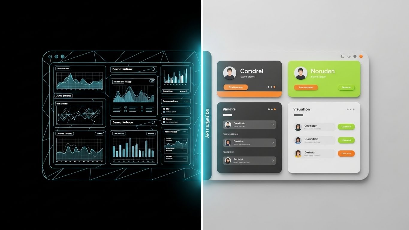
The Visual & Narrative Approach
A split-screen composition showing the transition from code to product. The left half displays a 3D wireframe blueprint of a software interface in Blueprint Blue and White lines. The right half shows the fully rendered, high-fidelity UI in full color, featuring realistic lighting and shadows. A vertical glowing line divides the two halves. The image visualizes "API integration" becoming a tangible user experience. The camera angle is straight-on, allowing for a direct comparison of the structure versus the finish.
Psychological Impact & KPI Focus
For technical buyers (CTOs), the wireframe represents Robustness and Architecture. For business buyers, the high-fidelity UI represents Usability. This style satisfies both personas. It proves that the beautiful interface is backed by solid engineering. It effectively communicates "What you see is what you get," reducing skepticism during the Consideration Phase.
Strategic Implementation & Trade-offs
- Best Use Case: Landing pages for API-first products or "Developer" documentation pages.
- Trade-off: Requires having both the design assets (wireframes) and the final product polished and perfectly aligned.
Companies using similar video content -
Nvestiq – AI-driven algorithmic trading, strategy prototyping.
AlphaSense – AI search for financial data, expedites research.
11. Macro UI Micro-Interactions
MOFU | Feature Education

The Visual & Narrative Approach
This style zooms in to the molecular level of the interface, celebrating the "Micro-Interaction." The visual is a macro close-up of a single, stylized "Execute" button. The palette utilizes a high-contrast Vivid Orange against a Dark Grey background to command attention. As the cursor hovers and clicks, the button doesn't just change color; it emits sparks of digital energy (particle effects), visually symbolizing the power and immediacy of trade execution. The lighting is artificial and screen-based, emphasizing the sub-pixel texture of the digital environment.
Psychological Impact & KPI Focus
For active traders, the "feel" of the platform is paramount. This style provides a sensory simulation of the software's responsiveness. By focusing on a micro-interaction, we subconsciously communicate Attention to Detail and Engineering Quality. If the button feels this good, the matching engine must be equally precise. This style drives Click-Through Rates (CTR) in email campaigns by offering a tangible "taste" of the user experience.
Strategic Implementation & Trade-offs
- Best Use Case: Embedded GIFs in feature-release emails or changelogs to highlight specific UI updates. Duration: 0:03–0:05 (Looping).
- Trade-off: It is hyper-focused. It showcases design quality but cannot explain complex workflows or broader platform utility.
Companies using similar video content -
Alpaca – Brokerage API for algorithmic trading.
Devexperts – DXcharts – Integratable charting library, financial data feeds.
12. Split Screen: Optimized Reality
MOFU | Competitive Displacement

The Visual & Narrative Approach
A high-contrast comparative visual designed to displace legacy habits. The screen is split down the middle. The left side (The Old Way) is tinted in dull Beige and Sepia, depicting a cluttered desk, piles of paper, and a stressed hand manually inputting data—symbolizing error-prone manual entry. The right side (The New Way) is pristine, rendered in Clean Blue and bright White, showing a sleek digital workspace with organized trading grids. The lighting shifts from dim and yellow (left) to cool and clinical (right).
Psychological Impact & KPI Focus
This framework leverages the Contrast Principle. It does not just show the solution; it forces the viewer to confront the pain of their current situation. It visually quantifies the "Opportunity Cost" of sticking with the status quo (Excel/Legacy systems). The immediate visual relief provided by the right side triggers a desire for Cognitive Ease, driving Conversion Rates on comparison landing pages.
Strategic Implementation & Trade-offs
- Best Use Case: LinkedIn Image Ads or Carousel Ads targeting users of competitor legacy software.
- Trade-off: It can appear slightly reductive. Ensure the "Chaos" side represents a realistic pain point, not a caricature, to maintain professional credibility.
Companies using similar video content -
tastytrade – Options trading platform, intuitive trade setup.
TradeStation – TITAN X – Advanced trading platform, enhanced charting.
13. Holographic UI over 3D Render
MOFU | ABM Awareness

The Visual & Narrative Approach
This style brings the software into the client's physical reality. It features a realistic 3D render of a high-end boardroom table made of polished black marble. Hovering above it is a semi-transparent holographic projection of an "Account Hierarchy" organization tree, glowing in Electric Pink and Magenta (aligning with high-velocity data aesthetics). The hologram casts a soft, realistic reflection onto the marble surface. The background implies a premium corporate environment, establishing the software as a strategic asset for decision-makers.
Psychological Impact & KPI Focus
This visual speaks the language of the C-Suite (CRO/CTO). It frames the software not as a tool for traders, but as an asset for leaders. The holographic presentation implies Top-Down Visibility and Governance, key drivers for enterprise adoption. It elevates the Perceived Value of the platform, justifying premium pricing tiers by associating the interface with high-level strategic planning.
Strategic Implementation & Trade-offs
- Best Use Case: Account-Based Marketing (ABM) campaigns targeting decision-makers at Tier-1 banks or hedge funds.
- Trade-off: The "hologram" trope must be executed elegantly. If the UI looks too sci-fi or unreadable, it loses its connection to actual business utility.
Companies using similar video content -
Interactive Brokers – Global multi-asset trading, low-cost execution.
NinjaTrader – Futures and forex trading, automated strategies.
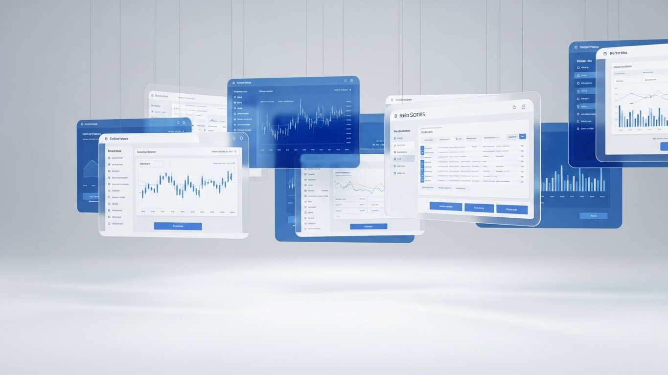
14. 3D Parallax UI Presentation
MOFU | Website & Landing Pages
The Visual & Narrative Approach
To visualize the breadth of the platform without overwhelming the viewer, we use a 3D parallax composition. Multiple UI screens—displaying charts, order entry tickets, and risk modules—are suspended in a clean, white studio space. The screens are layered with physical depth; some are close to the camera, others further back, creating a sense of immersion. As the camera tracks sideways, the parallax effect reveals the connectivity between modules. The palette is professional Sapphire Blue and White, with soft, shadowless studio lighting.
Psychological Impact & KPI Focus
This style addresses the Integration concern. By showing multiple screens floating in a unified space, it visually demonstrates that this is a cohesive ecosystem, not just a disparate collection of tools. The depth cues (parallax) engage the brain’s spatial processing, making the platform feel "deep" and feature-rich. It is a staple for Time on Site, encouraging users to explore the various modules presented in the hero section.
Strategic Implementation & Trade-offs
- Best Use Case: Website "Hero" headers or the central visual anchor for a "Platform Overview" landing page.
- Trade-off: Text legibility on the floating screens can be a challenge. The UI assets must be simplified versions of the real interface to ensure readability at a glance.
Companies using similar video content -
Adaptive – Hydra Platform – Cloud-native electronic trading platform.
smartTrade Technologies – LiquidityFX – FX trading platform, smart order routing.
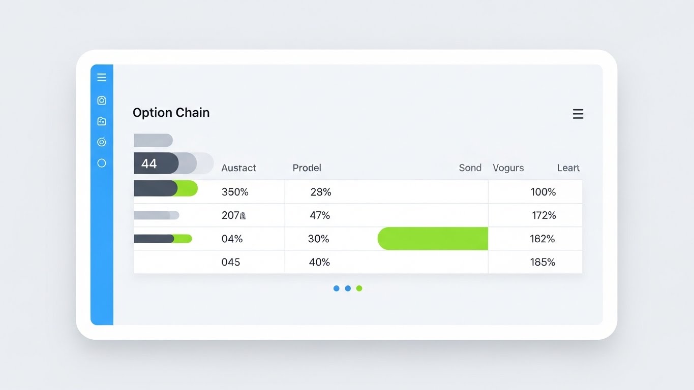
15. Clean UI Workflow (Light Mode)
MOFU | The Functional Buyer
The Visual & Narrative Approach
Stripping away the abstract, this style presents the product exactly as the user will see it—but better. It features a clean, flat vector representation of the interface in Light Mode, favored for its readability in daylight operations. The palette uses Sky Blue, Slate Grey, and functional accents of Lime Green. The screen displays an "Option Chain" data grid, where row and column headers are clear and organized. The perspective is front-on with a very slight tilt to add a touch of dynamism without distorting the data.
Psychological Impact & KPI Focus
For the Functional Buyer (the daily user), clarity is king. This style validates Usability and Efficiency. It reassures the prospect that the learning curve is manageable and that the data presentation is fatigue-free. By using "Light Mode," we subconsciously signal transparency and openness. This style is critical for moving prospects through the Consideration Phase by proving the platform handles complexity with elegance.
Strategic Implementation & Trade-offs
- Best Use Case: Sales decks and product documentation where specific feature validation is required.
- Trade-off: It lacks emotional "punch." It is purely functional and should be used to support claims of usability rather than to generate initial excitement.
Companies using similar video content -
Charles Schwab – thinkorswim – Multiple trading platforms, extensive tools.
Fidelity – Comprehensive investment platform, diverse tools.
16. 3D X-Ray Visualization
MOFU | The Technical Buyer

The Visual & Narrative Approach
To visualize the invisible layer of "Enterprise Security," we utilize a 3D X-Ray aesthetic. A server rack or hardware module is rendered with a transparent, glassy casing, revealing the internal components glowing in Dark Grey and Laser Red. Integrated into the circuitry are lock icons and shield shapes, representing "Secure Encryption" and hardware-level protection. The background is a dark, technical void, focusing all attention on the glowing red "active monitoring" elements within the machine.
Psychological Impact & KPI Focus
This style directly addresses the Security and Compliance anxieties of the Technical Buyer (CTO/CISO). "Security" is often an abstract promise; this visual makes it a physical, structural reality. The "X-Ray" view implies transparency—that the vendor has nothing to hide and the architecture is robust to the core. It is a powerful asset for Trust Building in the technical due diligence phase.
Strategic Implementation & Trade-offs
- Best Use Case: Technical whitepapers, security compliance pages, or "Architecture" sections of a pitch deck.
- Trade-off: It can look ominous if the "Red" is too aggressive. It is important to frame the glowing elements as "active protection" rather than "danger."
Companies using similar video content -
*ETRADE – User-friendly investment platform, intuitive trading tools.
Webull** – Smart investing tools, advanced charts, commission-free.
17. Realistic Character Video
BOFU | Building Trust

The Visual & Narrative Approach
Moving to the Bottom of the Funnel, we reintroduce the human element. This style features a high-fidelity cinematic shot of a professional woman in her 30s, standing in a sunlit, modern glass office. She wears a navy blazer and looks at an off-camera screen with a subtle, confident smile. The reflection of a city skyline in the glass wall behind her connects the individual to the global market. The lighting is warm and natural, contrasting with the cool tones of the software screens seen in previous stages.
Psychological Impact & KPI Focus
Ultimately, people buy from people. This style validates Social Proof and Competence. It subconsciously communicates, "Smart, successful professionals use this platform." It counters the coldness of fintech with warmth and relatability, fostering Brand Affinity. For late-stage prospects, seeing a calm, confident user mirrors the emotional state they hope to achieve by adopting the solution.
Strategic Implementation & Trade-offs
- Best Use Case: "About Us" pages, customer testimonial thumbnails, or the login screen background to welcome users.
- Trade-off: Generic stock photography can destroy trust. The image must feel authentic and high-end, avoiding "cheesy" corporate poses.
Companies using similar video content -
Anchorage Digital – Federally chartered crypto bank, qualified custodian.
Options Technology – Managed trading infrastructure, cloud services.
18. Aspirational Stock Montage
BOFU | ROI Justification

The Visual & Narrative Approach
This style visualizes the result of using the platform: collective success. A high-quality photo montage shows a diverse group of corporate professionals in a high-rise meeting room, actively collaborating. They gesture towards a whiteboard that implies profit growth. Overlay graphics in Forest Green and Gold—minimal vector arrows and trend lines—trace the upward trajectory of their discussion. The composition puts the humans in the foreground and the metrics in the upper third, linking the team's effort to financial outcomes.
Psychological Impact & KPI Focus
This appeals to the Economic Buyer and the desire for Organizational Growth. It shifts the focus from "trading features" to "business outcomes." The Gold and Green accents trigger associations with wealth and stability. This visual serves as ROI Validation, reassuring the buyer that the investment will yield tangible dividends for the entire team, not just the individual trader.
Strategic Implementation & Trade-offs
- Best Use Case: Case study headers, "Results" sections of a proposal, or year-end review reports.
- Trade-off: Like Style 17, authenticity is key. The overlay graphics must be subtle to avoid looking like a low-budget infographic.
Companies using similar video content -
AmplifyME – Finance career simulations, attracts talent.
Quant Academy – Quantitative finance education, algorithmic trading.
19. 2D Animation & UI Composition
BOFU | Overcoming Objections

The Visual & Narrative Approach
To address late-stage friction and "Implementation Anxiety," we use a friendly, stylized 2D animation. A character, rendered in flat vectors with a brand-aligned Purple and Yellow palette, is depicted physically pushing away a large, tangled knot of grey scribbles (representing complexity) to reveal a clean, organized UI panel behind it. The background is a simple abstract gradient. The mood is helpful and energetic.
Psychological Impact & KPI Focus
This style is a Cognitive Relief tool. It visually acknowledges the prospect's fear ("This is going to be hard to switch") and immediately resolves it ("We handle the mess"). The friendly vector style disarms skepticism and lowers defensive barriers. It is highly effective for Objection Handling in the final stages of a sales cycle, visualizing the transition from "messy current state" to "clean future state."
Strategic Implementation & Trade-offs
- Best Use Case: "Switching is Easy" explainer videos, onboarding welcome emails, or FAQ sections regarding implementation.
- Trade-off: It is not "enterprise" in tone. It works best for communicating process and service, not for demonstrating the hardcore trading engine itself.
Companies using similar video content -
LMAX Group – Institutional FX and crypto exchange, deep liquidity.
Integral – FX trading solutions, workflow automation.
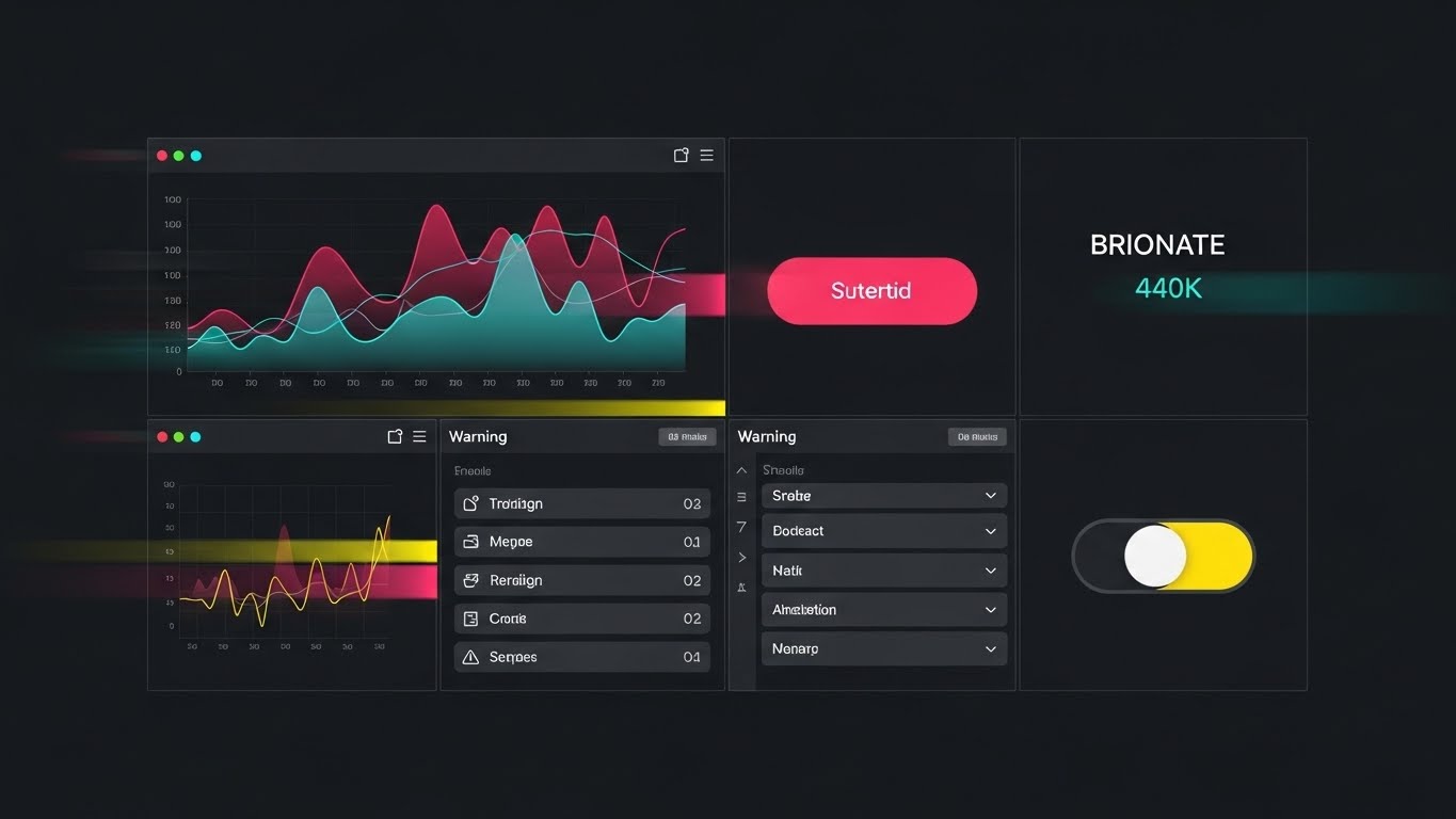
20. Dark Mode UI Showcase
BOFU | Risk Mitigation

The Visual & Narrative Approach
In the final validation stage, we must prove the platform handles crisis. This style features a close-up of the UI in Dark Mode (Charcoal/Black), focusing on a critical alert notification. The visual captures the exact moment of resolution: a "Risk Breach" alert transitions from Alert Red to Safe Green, symbolizing the system's ability to mitigate danger. Neon glows emphasize the status change. A vignette effect darkens the edges, forcing the viewer's eye strictly to the "Resolved" message.
Psychological Impact & KPI Focus
Derivatives trading is risk management. This visual targets the Fear of Loss. It provides Emotional Reassurance that when things go wrong (as they inevitably do), the platform provides the clarity and speed to fix it. It validates the platform as a Safety Net. This is a closing argument visual, designed to remove the final "what if" doubts preventing the signature.
Strategic Implementation & Trade-offs
- Best Use Case: The "Risk Management" section of a final proposal or a feature highlight on the pricing page (justifying the Enterprise tier).
- Trade-off: It focuses on the negative (the breach), so the resolution (Green) must be the dominant visual element to leave a positive impression.
Companies using similar video content -
5paisa – Flat fee brokerage, integrated experience, smart options.
IIFL Securities – Trading app, research, options strategy builder.
21. Lifestyle Stock with UI Overlay
BOFU | Sales Cycle Acceleration

The Visual & Narrative Approach
This style bridges the gap between the trading desk and the executive lifestyle. It features a high-quality photo taken from over the shoulder of a professional in a business suit, seated in a premium airport lounge. He holds a tablet displaying a vector overlay in Bronze and Denim Blue, representing a simplified but functional "Risk Command" dashboard. The background is softly blurred, showing the tarmac and aircraft, while the lighting mixes warm indoor tones with cool daylight.
Psychological Impact & KPI Focus
For the high-level decision-maker or the traveling portfolio manager, Accessibility is a key value driver. This visual subconsciously communicates that the platform’s power is not tethered to a multi-monitor desk setup. It validates the "anytime, anywhere" promise of modern SaaS. By integrating the UI into a realistic, aspirational setting, it triggers the desire for Freedom and control, directly supporting Sales Cycle Acceleration by removing the objection of immobility.
Strategic Implementation & Trade-offs
- Best Use Case: Email nurture sequences targeting C-level executives or Retargeting ads during major industry travel seasons.
- Trade-off: The UI overlay must look believable. If the perspective tracking is off, the image will look like a cheap mockup, damaging credibility.
Companies using similar video content -
Crystal Ball Markets – Online trading platform, AI automation, zero slippage.
Quant Tekel – Multi-asset trading, transparent pricing, advanced platforms.
22. 2D Graphics Over Live Action
BOFU | Driving Demo Requests

The Visual & Narrative Approach
To create a sense of immediacy, this style blends the tactile reality of live-action with the clarity of digital graphics. A point-of-view (POV) shot focuses on hands typing on a laptop keyboard in a modern coworking space. Floating above the hardware are 2D pop-up icons in Cyan and White, explicitly labeling actions like "Demo Request" and "Instant Access." These graphics track perfectly with the hand movements, creating an augmented reality feel.
Psychological Impact & KPI Focus
This style is a Call to Action (CTA) engine. It visualizes the act of signing up as simple, magical, and rewarding. By overlaying the digital benefit onto the physical action, it reduces the perceived friction of filling out a form. It appeals to the prospect's desire for Speed and Modernity. The primary goal is to drive Click-Through Rates (CTR) for demo sign-ups by making the process look effortless.
Strategic Implementation & Trade-offs
- Best Use Case: Bottom-of-funnel Retargeting ads on LinkedIn or pre-roll YouTube ads targeting users who abandoned the sign-up page.
- Trade-off: It can feel "gimmicky" if overused. It works best for short, punchy ads rather than long-form content.
Companies using similar video content -
Robinhood – Commission-free trading, streamlined interface, crypto.
moomoo – Smart trading platform, global access, advanced tools.
23. 2D Line Art Animation
Onboarding | Self-Serve Onboarding

The Visual & Narrative Approach
When a user first enters a complex platform, clarity is essential. This style uses an elegant, continuous black line on a white background. The line winds across the screen, transforming into a staircase that leads to a door or a dollar sign (representing value). Variable line thickness adds sophistication, while small dots along the path represent "Milestones" in the onboarding journey. The aesthetic is minimalist and sophisticated, devoid of distracting details.
Psychological Impact & KPI Focus
This style is designed to lower Cognitive Load. By stripping away color and heavy textures, it focuses the user's attention strictly on the process. It frames the onboarding journey as a clear, linear path to success, reducing Implementation Anxiety. The "continuous line" metaphor subconsciously suggests a smooth, unbroken experience, encouraging the user to complete the setup process (improving Activation Rates).
Strategic Implementation & Trade-offs
- Best Use Case: In-app onboarding progress bars, empty state screens, or "Welcome" modal windows.
- Trade-off: It is very abstract. It sets a tone of elegance but cannot be used to teach specific UI mechanics.
Companies using similar video content -
Just2Trade – Brokerage services, low commissions, Open API.
AvaTrade – User-friendly interface, innovative features, AvaProtect.
24. 2D Character-Driven Story
Onboarding | Accel. Time-to-Value

The Visual & Narrative Approach
To humanize the technical milestone of the "First Trade," we use a stylized vector illustration. A character, rendered in Soft Pastel Blue and Pink, stands at the peak of an abstract geometric mountain, planting a flag. The background features stylized clouds and birds, creating a sense of height and achievement. The composition is wide and open, symbolizing the possibilities now available to the user.
Psychological Impact & KPI Focus
The first successful trade is the "Aha!" moment. This visual amplifies that emotional win. It utilizes Positive Reinforcement to dopamine-tag the user's success. By depicting the user as an explorer conquering a peak, it validates their competence and encourages them to continue using the platform. This emotional connection is critical for Accelerating Time-to-Value and turning a trial user into a committed advocate.
Strategic Implementation & Trade-offs
- Best Use Case: The "Success" screen after the first trade is executed, or a "Congratulations" email sent immediately post-activation.
- Trade-off: If the character style is too juvenile, it may alienate institutional traders. The art direction must remain clean and adult-oriented.
Companies using similar video content -
QuantConnect – Open-source algorithmic trading, backtesting, live execution.
Sierra Chart – Live and simulated trading, customizable interface.
25. Isometric 3D Workflow
Onboarding | Reducing Implementation

The Visual & Narrative Approach
This style visualizes the implementation of complex derivatives strategies as a modular assembly process. An isometric 3D miniature diorama depicts a "Digital Factory" in Industrial Grey and Safety Yellow. Cubic data blocks move along a conveyor belt, snapping together to form a structured product. The lighting is precise, with soft shadows emphasizing the dimensionality. It presents the software as a well-oiled machine where inputs logically lead to outputs.
Psychological Impact & KPI Focus
For operations teams, implementation is often a chaotic fear. This style imposes Order and Structure. It visually proves that the platform processes data systematically. The "snap-together" visual metaphor implies Interoperability and ease of integration. It is highly effective for technical documentation, helping users mentally map the workflow, thereby reducing support tickets and Implementation Time.
Strategic Implementation & Trade-offs
- Best Use Case: API documentation headers, "How It Works" diagram sections in the help center, or whitepapers on system architecture.
- Trade-off: Creating bespoke 3D assets for every workflow is expensive. It is best reserved for core architectural concepts.
Companies using similar video content -
Mindful Trader – Algorithm-based trade alerts, swing trading.
Numerai – AI-run crowdsourcing hedge fund, data scientists.
26. Rapid UI Feature Montage
Onboarding | Trial User Activation
The Visual & Narrative Approach
To showcase the sheer breadth of the platform, this style simulates a high-speed video montage in a single static composition. The frame is divided into a grid, each section showing a different, Vibrant Multi-colored UI fragment—a volatility chart, an execution button, a watchlist, a risk toggle. Motion blur lines suggest the images are cycling rapidly. The aesthetic is energetic, diverse, and overwhelming in a positive way.
Psychological Impact & KPI Focus
This appeals to the Power User who wants a tool that "does it all." It triggers a sense of Abundance and value. The rapid-fire presentation suggests a platform with deep functionality waiting to be discovered. It combats the "feature blindness" where users only use 10% of the tool, encouraging them to explore deeper features and increasing Trial User Activation rates.
Strategic Implementation & Trade-offs
- Best Use Case: In-app "What's New" splash screens, intro videos for trial users, or sizzle reels at trade shows.
- Trade-off: It risks looking cluttered. The color palette must be harmonized so the grid doesn't look like a mistake.
Companies using similar video content -
oneZero Financial Systems – FX liquidity, aggregation, risk management.
Match-Trade Technologies – Forex and crypto brokerage solutions.
27. Low-Poly 3D Modeling
Retention | Deep Feature Adoption

The Visual & Narrative Approach
Gamifying the exploration of the platform, this style uses a low-poly 3D landscape rendered in Green, Brown, and Blue. The terrain represents "Market Coverage," with low-poly trees and hills. A complex network of glowing roads connects every part of the map, representing the deep features and connectivity of the software. The view is top-down, resembling a strategy game map, inviting the user to "unlock" new territories.
Psychological Impact & KPI Focus
This style leverages the Explorer archetype. It reframes "learning software" as "mapping a world." By visualizing the software as a vast landscape, it subtly suggests that there is always more to find, which improves Retention. The game-like aesthetic makes the learning process feel less like work and more like discovery, driving Deep Feature Adoption.
Strategic Implementation & Trade-offs
- Best Use Case: Newsletters highlighting underused features, or a visual map in the "Academy" or training section of the user portal.
- Trade-off: It is a metaphor. It doesn't show the actual UI, so it must be paired with links to actual tutorials.
Companies using similar video content -
TC2000 Software & Brokerage – Advanced charting, fast responsiveness.
Tiger Brokers – Global markets, new functions, quantitative investing.
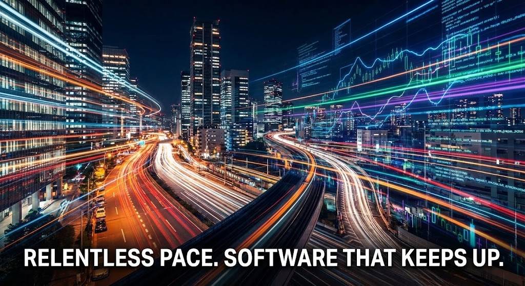
28. Hyper-lapse Stock Footage with Data
Retention | Reducing Churn
The Visual & Narrative Approach
To remind the user of the market's relentless nature—and the platform's ability to keep up—we use a static image that captures the essence of a hyper-lapse video. A busy financial district at night is shown with car headlights streaked into long lines of Urban Night Colors (Orange, Red, White). Overlaid on the sky are digital data lines moving in sync with the city's flow. The image conveys speed, continuity, and the 24/7 nature of global finance.
Psychological Impact & KPI Focus
This visual reinforces the platform's role as a Fundamental Utility. It aligns the software with the pulse of the city itself—essential, always on, and moving fast. It subtly reminds the client that the market doesn't sleep, and neither does their infrastructure. This builds Institutional Trust and reinforces the decision to renew, directly targeting Churn Reduction.
Strategic Implementation & Trade-offs
- Best Use Case: Background visuals for "Year in Review" reports, login screens, or renewal reminder emails.
- Trade-off: It is atmospheric rather than informative. It sets a mood but doesn't communicate specific value propositions.
Companies using similar video content -
Quandl (Nasdaq) – Financial, economic, alternative datasets.
QuantNet – Algorithmic trading forum, courses, blog.
29. Minimalist Flat 2D Vector
Retention | Knowledge Base

The Visual & Narrative Approach
When a user is frustrated and seeking help, visual noise is the enemy. This style employs a minimalist flat vector illustration in Navy Blue and White. A large, simple shield icon is centered, containing a magnifying glass. The lines are clean and uniform; there are no gradients, shadows, or distracting textures. The image serves as an instantly recognizable visual anchor for a "Help Center" or Knowledge Base.
Psychological Impact & KPI Focus
This style prioritizes Clarity and Calm. It signals to the distressed user that the answer is simple and accessible. The shield icon subconsciously communicates Safety and Protection. By making the support entry point clean and obvious, we reduce user frustration, lowering the temperature of support interactions and improving Customer Satisfaction Scores (CSAT).
Strategic Implementation & Trade-offs
- Best Use Case: Icons for the Support Portal, category headers in the Knowledge Base, or empty states in search results.
- Trade-off: It is purely functional. It is not designed to "wow" the user, but to serve them efficiently.
Companies using similar video content -
FOREX.com – Major FX pairs, indices, shares, exclusive technology.
IPC – Connexus Cloud – Multi-cloud platform, interconnects capital markets.
30. Abstract 2D Glossy
Expansion | Driving Upsell

The Visual & Narrative Approach
To visualize the concept of "growth" and "premium value," this style uses fluid, glossy textures. Silver and Iridescent spheres are depicted merging together to form larger, more complex shapes. The background is a soft, blurred gradient. The lighting creates high-contrast reflections on the glossy surfaces, making them look like liquid metal. The aesthetic is expensive, fluid, and high-end.
Psychological Impact & KPI Focus
This visual targets the desire for Evolution and Status. It creates a visual association between the platform's higher tiers and "premium" material qualities. The "merging spheres" metaphor suggests that upgrading is a natural coalescence of value, leading to something greater. It effectively supports Upsell Campaigns by making the next tier feel like a luxurious, necessary evolution of the user's current capabilities.
Strategic Implementation & Trade-offs
- Best Use Case: In-app pop-ups announcing new Enterprise features, or the header graphic for a "Pro Tier" upgrade landing page.
- Trade-off: It is highly abstract. It relies on the user associating "glossy" with "valuable." The accompanying copy must be very clear about the tangible benefits.
Strategic Knowledge Base: The Visual Operations Doctrine
To transform these 30 visual styles from "marketing assets" into a cohesive business strategy, we must implement a Visual Operations Doctrine. This framework bridges the gap between the screen and the bottom line, ensuring that every pixel serves a strategic purpose in the high-stakes world of derivatives trading.
Strategic Alignment & Visual Architecture
The "Pre-Production" Phase: Defining the Visual Operating System.
- The Cognitive Load Audit: Before designing a single asset, audit the "Mental Bandwidth" of your user. A derivatives trader monitoring 12 screens has zero capacity for visual clutter. Your visual strategy must be subtractive—removing noise to highlight signal (Alpha).
- Role-Based Visual Mapping: Differentiate your visual language. Execution Traders (Style 11, 15) need high-contrast, data-dense visuals for reaction speed. Risk Managers (Style 8, 16) need calm, aggregated visualizations (heat maps) for contemplation and analysis.
- The "Glanceability" Standard: In high-frequency environments, comprehension must be instantaneous. Adopt a standard where the core message of any video frame or graphic (Trend, Alert, Status) is decipherable within 150 milliseconds.
- Brand Voice Consistency: Your "Dark Mode" trading interface (Style 5) and your "Light Mode" investor deck (Style 18) must feel like the same brand. Use a unified "Accent Color" (e.g., Electric Blue) that cuts through all styles to maintain identity.
- The Advids Strategic Audit: Partner with Advids early to define this "Visual Operating System." We don't just animate; we align your visual output with your technical architecture to ensure the "promise" of the video matches the "reality" of the platform.
- Standardization vs. Customization: Use standardized "Stock" elements (Style 21, 28) for top-of-funnel emotion, but strictly use "Bespoke" visualizations (Style 1, 3, 11) for core product features. Never use stock footage to represent your Matching Engine.
- The Cross-Departmental Bridge: Use these visuals to unify terminology. If Sales calls it "Smart Routing," and Ops calls it "Algo Logic," use a visual metaphor (Style 4) to create a shared mental model that both teams can point to.
- Legacy System Integration: Visualizing the invisible link between "Old" and "New" is critical. Use Style 10 (Wireframe to Reality) to show prospects exactly how your modern SaaS platform wraps around and beautifies their legacy mainframe data.
- Accessibility in Trading: Trading floors are diverse. Ensure your motion graphics (Style 23) rely on shape and motion, not just color, to convey status, accommodating color-blind traders (e.g., avoid Red/Green reliance; use Blue/Orange).
- The Mobile-First Mandate: Even if the platform is desktop-native, the buying decision often happens on mobile (LinkedIn/Email). Ensure all 30 styles are legible on a vertical smartphone screen (Style 6) for the C-Suite on the move.
Operational Adoption & Implementation
The "Deployment" Phase: Embedding Visuals into the Workflow.
- Overcoming "Black Box" Anxiety: Traders fear what they can't see. Use Style 4 (AI Visualization) and Style 16 (X-Ray) during onboarding to transparently "open the box," explaining the logic behind the algorithm to build trust in the machine.
- The Micro-Learning Shift: Replace the 200-page PDF "User Manual" with a library of 15-second looping GIFs (Style 11, 15). Traders will not read; they will watch a 5-second clip showing "How to configure an OCO order."
- Just-in-Time Support: Embed specific visual styles directly into the trading turret. When a "Margin Call" alert triggers, a pop-up using Style 20 (Risk Resolution) should appear, visually guiding the resolution steps instantly.
- Gamification of Training: Use Style 24 (Character Achievement) and Style 27 (Strategy Map) to visualize trader progress during platform training. Award "Visual Badges" for mastering complex order types to drive engagement.
- Reducing Support Ticket Volume: There is a direct correlation between proactive visualization and support costs. A well-placed "Process Flow" animation (Style 19) inside the 'Help' menu prevents the "How do I do this?" call to the desk.
- Remote Onboarding: For distributed trading teams, physical seminars are dead. Leverage Style 14 (Parallax UI) and Style 25 (Isometric Workflow) to create immersive, self-paced video onboarding tracks that simulate the trading desk experience.
- Standard Operating Procedures (SOPs): Transform text-based Compliance SOPs into visual narratives. Use Style 2 (Cinematic) to dramatize the importance of compliance, making the rules memorable rather than mundane.
- Feedback Loops: Use interactive video elements (Style 22) to gather feedback. If a trader pauses a tutorial video, pop up a simple visual query: "Was this helpful?" to refine your educational assets.
- Scalable Localization: Financial markets are global. Design your visual assets (Style 23, 29) to be text-light. This allows you to deploy the same "Visual Guide" to desks in London, Tokyo, and New York without expensive re-recording.
- Leadership Communication: When the CTO presents a roadmap to the Board, they should not use bullet points. They should use Style 13 (Holographic UI) to visually project the future state of the enterprise, securing budget through "Visionary Credibility."
Measuring Impact & Future-Proofing
The "ROI" Phase: Quantifying Success and Evolution.
- Beyond "Views": Vanity metrics don't matter. Measure Time-to-Competency. Does the new video library reduce the time it takes for a junior trader to execute their first complex option strategy?
- The "Idle Time" Metric: Correlate better visualization with reduced "Navigation Time." If clear UI visuals (Style 15) help a trader find a liquidity pool 2 seconds faster, that efficiency aggregates into millions in operational savings.
- Compliance Velocity: Measure how fast new regulations (e.g., MiFID II updates) are understood. A visual explainer (Style 3) can disseminate regulatory changes to a global desk faster and more accurately than a memo.
- Retention and Churn: High-quality UX visualization (Style 28, 30) directly impacts Lifetime Value (LTV). Clients don't leave platforms that make them feel smart and powerful. Visual polish is a retention anchor.
- The AI Visual Frontier: Prepare for the next wave. Generative AI will soon allow traders to "ask" for a chart. Your visual library must be tagged and structured so AI can assemble custom "Video Reports" on the fly.
- Scalability of Assets: Build a component library. If you change your UI color from Blue to Purple, your video assets (Style 10, 26) should be built in a way that allows for global color replacement without re-rendering from scratch.
- The Advids Partnership: This is where we thrive. Advids acts as your long-term "Visual Governance" partner. We ensure that as your platform scales from V1 to V10, your visual assets evolve in lockstep, maintaining a "Gold Standard" consistency.
- Benchmarking Success: "Good enough" is a competitive risk. Periodically audit your visual stack against the "Gold Standard" frameworks in this guide. If your competitor uses Style 4 (AI Vis) and you use static screenshots, you are losing the narrative war.
- The ROI of Safety: For risk platforms, the ultimate ROI is the disaster avoided. Quantify the value of "Clarity." If a Style 20 (Risk Alert) video prevents one fat-finger error, the ROI of your video strategy is infinite.
- Final Call to Innovation: Treat video not as "Marketing Content" but as Digital Infrastructure. In a world defined by abstract data, the winner is the platform that can make the invisible visible, the complex simple, and the future tangible.
[End of Part 3 - Final Guide]
Companies using similar video content -
Cloud9 – Open and interoperable framework, fintech connectivity.
Itiviti – NYFIX – Broker independent FIX community, order routing.
Author & Editor Bio


