
 /home/wwwroot/advids.co/design/index.php on line 425
Introduction: Bridging the Physical-Digital Divide in Global Logistics
The logistics industry stands at a critical juncture. We are transitioning from an era defined by physical assets—ships, trucks, and containers—to one governed by digital intelligence. For Operations VPs and CIOs, the mandate is no longer just to move cargo, but to orchestrate the data that moves the cargo. However, a significant friction point remains: the "Physical-Digital Divide."
Your workforce operates in a high-pressure, tangible environment of port congestion and tight delivery windows. When they are forced to interact with complex, abstract software interfaces, adoption stalls. This hesitation is expensive. According to recent industry data, 76% of logistics transformations fail to meet critical performance metrics, often because the end-users—the dispatchers and dock managers—find the new digital tools burdensome rather than beneficial.
The solution lies in how we visualize value. A Digital Adoption Platform (DAP) is not just a training tool; it is an efficiency engine. To drive adoption, your video content must visually dismantle the complexity of the software, proving that it aligns with the physical reality of the supply chain. The ROI of getting this right is undeniable: studies show that effective, structured onboarding can improve employee productivity by over 60%.
This guide presents expert-curated visual styles designed to bridge this gap. By leveraging techniques like isometric projection to simulate "control towers" and kinetic typography to convey "velocity," we can transform your software from a source of frustration into a strategic competitive advantage.
1. The Clarity Engine
TOFU | Brand Awareness
1. The Visual & Narrative Approach
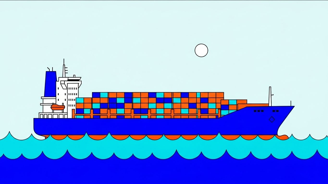
Scenario: We strip the logistics world of its inherent rust, noise, and chaos. The screen presents a massive container ship, but it is an icon of perfection—constructed from sharp, flat blocks of cobalt blue and safety orange. It glides effortlessly across jagged turquoise waves under a perfect white sun. There are no shadows, no grime, no delays.
Narration: The tone is crisp and rhythmic. "Logistics, simplified." It speaks to the aspiration of a frictionless supply chain, using the clean visuals to metaphorically clean up the viewer's mental model of their operation.
2. Psychological Impact & KPI Focus
Niche Psychology: Logistics professionals suffer from high cognitive load. They deal with messy reality 24/7. This style offers Cognitive Relief. By presenting a simplified, orderly world, you subconsciously signal that your software imposes order on chaos.
Operational Impact: Highly effective for Brand Awareness on mobile feeds (LinkedIn). It disrupts the pattern of "realistic" industry photos, standing out as a beacon of modern efficiency.
3. Strategic Implementation & Trade-offs
- Best Use Case: 15-second LinkedIn Organic posts or "Philosophy" videos.
- Trade-off: Depth vs. Clarity. This style cannot convey complex UI features or data density. It is purely for emotional and brand alignment.
Companies using similar video content -
Flexport – Platform – Streamlining global freight forwarding with digital solutions.
Zencargo – Digital freight forwarding for supply chain clarity.
2. The Fluid Network
TOFU | Market Education

1. The Visual & Narrative Approach
Scenario: To visualize the invisible network of global trade, we use fluid dynamics. A stylized globe is rendered in deep liquid silver, with trade routes represented as flowing, viscous lines of glowing teal and electric cyan connecting continents. The background is a clean, deep navy void. The lighting mimics studio soft-box reflections on the glossy surfaces, creating a high-end, modern tech feel.
Narration: "The fluid intelligence of modern trade." The voiceover focuses on connectivity, speed, and the seamless transfer of data across borders.
2. Psychological Impact & KPI Focus
Niche Psychology: This taps into the "Premium Tech" Heuristic. It borrows the visual language of high-end consumer electronics to position the logistics platform as a sophisticated, futuristic tool, rather than a utilitarian backend system.
Operational Impact: Supports Market Education by visualizing concepts like "API Connectivity" or "Global Synergy" without using boring server diagrams.
3. Strategic Implementation & Trade-offs
- Best Use Case: Website Hero backgrounds or "Vision" videos.
- Trade-off: Abstraction vs. Specificity. It looks beautiful but explains nothing about the actual product. Must be anchored with strong value-prop copy.
Companies using similar video content -
E2open – Global Trade Management – Connecting global trade and supply chains.
One Network Enterprises – Real Time Value Network – Orchestrating multi-party supply chains in real-time.
3. The Approachable Port
TOFU | Shaping Brand Perception

1. The Visual & Narrative Approach
Scenario: We adopt a "God-mode" view of a busy port. The style is "Low Poly"—geometric and faceted. Cranes painted in soft coral and pastel yellow lift geometric cubes (containers) onto a low-poly ship. The water is rendered as crystalline, faceted blue triangles. The lighting is bright and warm. It looks like a high-end simulation game, making the complex machinery of the port look approachable and manageable.
Narration: Friendly and inviting. "Manage your world." It invites the user to step into a role of easy oversight, contrasting with the stressful reality of port management.
2. Psychological Impact & KPI Focus
Niche Psychology: This leverages Gamification. By making the port look like a "toy" or a game, we lower the intimidation barrier. It suggests that using the software is as intuitive as playing a city-builder game.
Operational Impact: Perfect for Instagram and culture-focused content. It humanizes the B2B brand, making it appear design-forward and user-centric.
3. Strategic Implementation & Trade-offs
- Best Use Case: Social media shorts or recruitment videos.
- Trade-off: Tone Mismatch. Can be seen as too "playful" for serious security or compliance features.
Companies using similar video content -
Cargowise – Cargowise One – Integrated logistics operations management globally.
Magaya – Logistics Software – Streamlining freight forwarding and warehousing operations.
4. The Digital Twin Reveal
TOFU | Category Creation

1. The Visual & Narrative Approach
Scenario: A split-screen composition visualizing the transition from traditional to digital logistics. The screen is divided vertically. The left side shows a technical white wireframe blueprint of a container ship hull on a blueprint blue background. As the image crosses to the right side, the wireframe transforms seamlessly into a photorealistic, steel-plated ship hull in daylight. The transition point glows with a digital white light.
Narration: "From digital intent... to physical reality." The narrative positions the DAP as the bridge between the two worlds.
2. Psychological Impact & KPI Focus
Niche Psychology: This speaks to the Engineer's Mindset. It validates the importance of the planning phase (wireframe) while proving the tangible outcome (reality). It visually defines the "Digital Twin" concept.
Operational Impact: A powerhouse for Category Creation. It creates a "lightbulb moment" for the viewer, showing exactly how the software underpins physical operations.
3. Strategic Implementation & Trade-offs
- Best Use Case: LinkedIn Video Ads and Product Launch trailers.
- Trade-off: Production Rigor. The alignment between the 3D wireframe and the photo/video plate must be perfect, or the effect fails.
Companies using similar video content -
Blue Yonder – Luminate Platform – Bridging planning and execution with AI.
Kinaxis – RapidResponse – Concurrent planning for supply chain agility.
5. The Velocity Vector
TOFU | Vertical Social Organic

1. The Visual & Narrative Approach
Scenario: A visual representation of bold kinetic typography utilizing dynamic shapes to convey speed. Large, blocky diagonal shapes in electric lime green and deep purple slash across the screen against a stark white background. Speed lines and motion blur effects suggest rapid movement from left to right. The composition is energetic and aggressive, symbolizing the speed of expedited freight.
Narration: Sound design led. Whooshes, snaps, and a driving beat. No voiceover needed; the speed speaks for itself.
2. Psychological Impact & KPI Focus
Niche Psychology: Triggers Urgency. Logistics is a time-critical industry. This style mimics the high-pressure, high-speed nature of expedited freight, aligning the brand with "velocity."
Operational Impact: Optimized for TikTok/Shorts. It is a pattern interrupt designed to stop the scroll through sheer visual energy.
3. Strategic Implementation & Trade-offs
- Best Use Case: Event hype reels or "New Feature" teasers.
- Trade-off: Information Density. It conveys emotion, not facts. Use it to drive traffic to longer explanations.
Companies using similar video content -
Uber Freight – Platform – Accelerating freight matching and movement.
Convoy – Digital Freight Network – Optimizing truckload shipping efficiency.
6. The Command Tower
TOFU | YouTube

1. The Visual & Narrative Approach
Scenario: A highly detailed isometric 3D render of a "Logistics Control Tower" room in a cutaway diorama style. Inside, sleek white desks are arranged in a grid, with miniature server racks glowing in amber. On the walls, large abstract screens display heatmaps of global ports in slate blue and cool grey. The lighting is soft and ambient.
Narration: "Total visibility, from one room." The camera lingers on the details, allowing the viewer to absorb the sense of order.
2. Psychological Impact & KPI Focus
Niche Psychology: This visualizes the "Command Center" Fantasy. Every operations manager wants this level of clean, centralized control. It visually promises that the software will organize their chaotic reality.
Operational Impact: Increases View Duration on pre-roll ads. The detail invites scrutiny and exploration, keeping the viewer watching past the 5-second skip mark.
3. Strategic Implementation & Trade-offs
- Best Use Case: YouTube Ads and Product Overview pages.
- Trade-off: Static Risk. Isometric scenes can feel dead if nothing moves. Needs subtle animation (blinking lights, spinning fans) to feel alive.
Companies using similar video content -
FourKites – Real-Time Visibility Platform – Centralizing global supply chain visibility.
project44 – Advanced Visibility Platform – Providing end-to-end shipment tracking.
7. The Neural Supply Chain
MOFU | Skippable Pre-Roll Ad

1. The Visual & Narrative Approach
Scenario: An abstract 3D visualization of artificial intelligence in logistics. A central node, rendered as a glowing sphere of bioluminescent blue, connects to hundreds of smaller nodes via thin, pulsing magenta fiber-optic lines. The background is a deep void black. The camera focuses on the macro details of the connections, simulating a neural network or a digital supply chain brain.
Narration: "Thinking ahead of the supply chain." Focuses on predictive capabilities and machine learning.
2. Psychological Impact & KPI Focus
Niche Psychology: Demystifies the "Black Box" of AI. It gives physical form to the algorithm, making it look beautiful and benevolent rather than cold and calculating. It builds trust in the system's automated decisions.
Operational Impact: Critical for Product Differentiation. It visually claims the "AI Leader" space, separating your platform from basic database tools.
3. Strategic Implementation & Trade-offs
- Best Use Case: Paid Social ads targeting tech-savvy buyers (CIOs).
- Trade-off: Vagueness. Must be paired with a concrete benefit (e.g., "Predicts delays 24 hours in advance") to have meaning.
Companies using similar video content -
o9 Solutions – Integrated Business Planning – AI-powered supply chain planning and execution.
Logility – Digital Supply Chain Platform – Optimizing supply chains with AI and analytics.
8. The Glass Interface
MOFU | Product Differentiation
1. The Visual & Narrative Approach
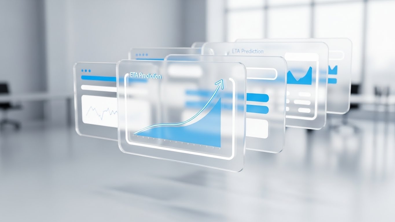
Scenario: A 3D parallax composition of floating UI screens. The screens are rendered as semi-transparent, frosted glass panels with glowing white and sky blue interface elements. They hover in a 3D space with a shallow depth of field. The foremost screen displays a stylized "ETA Prediction" curve graph ascending.
Narration: "Crystal clear insights." Walks through specific dashboard features (ETA, Cost Analysis) with a focus on clarity.
2. Psychological Impact & KPI Focus
Niche Psychology: Perceived Value. By giving the UI physical properties (glass, light refraction), we make the software feel like a premium, high-value asset. It combats "screen fatigue."
Operational Impact: Ideal for Feature Education. It showcases the UI without the boredom of a flat screen recording, keeping retention high during technical demos.
3. Strategic Implementation & Trade-offs
- Best Use Case: "Features" page on the website or detailed explainer videos.
- Trade-off: Legibility. Text on floating glass can be hard to read. Use simplified UI representations for the video, then show the real UI in the final demo.
Companies using similar video content -
SAP – SAP SCM – Delivering intelligent supply chain management solutions.
Oracle – Oracle SCM Cloud – Providing comprehensive cloud supply chain solutions.
9. The Reality Check
MOFU | Feature Education
1. The Visual & Narrative Approach
Scenario: A split-screen comparison. The left half depicts "The Old Way": a gritty, desaturated sepia-toned photo of a messy desk piled high with crumpled paper manifests and a landline phone. The right half depicts "The New Way": a vivid, technicolor, high-gloss 3D render of a pristine tablet displaying a clean, organized logistics dashboard in bright white and blue.
Narration: "Stop managing the mess." (Left). "Start managing the movement." (Right).
2. Psychological Impact & KPI Focus
Niche Psychology: Cognitive Dissonance. The viewer recognizes the pain of the left side and instantly desires the relief of the right side. It creates a "migration instinct."
Operational Impact: High-converting for Competitive Displacement ads on LinkedIn. It makes the choice simple: Chaos or Order?
3. Strategic Implementation & Trade-offs
- Best Use Case: Retargeting ads for users who visited the pricing page but didn't convert.
- Trade-off: Respect. Don't make the "Old Way" look incompetent, just outdated. The user likely still works in the "Old Way," so don't insult them.
Companies using similar video content -
Manhattan Associates – Manhattan Active Omni – Transforming omnichannel commerce and fulfillment.
Körber Supply Chain – Momentum WMS – Modernizing warehouse operations with advanced software.
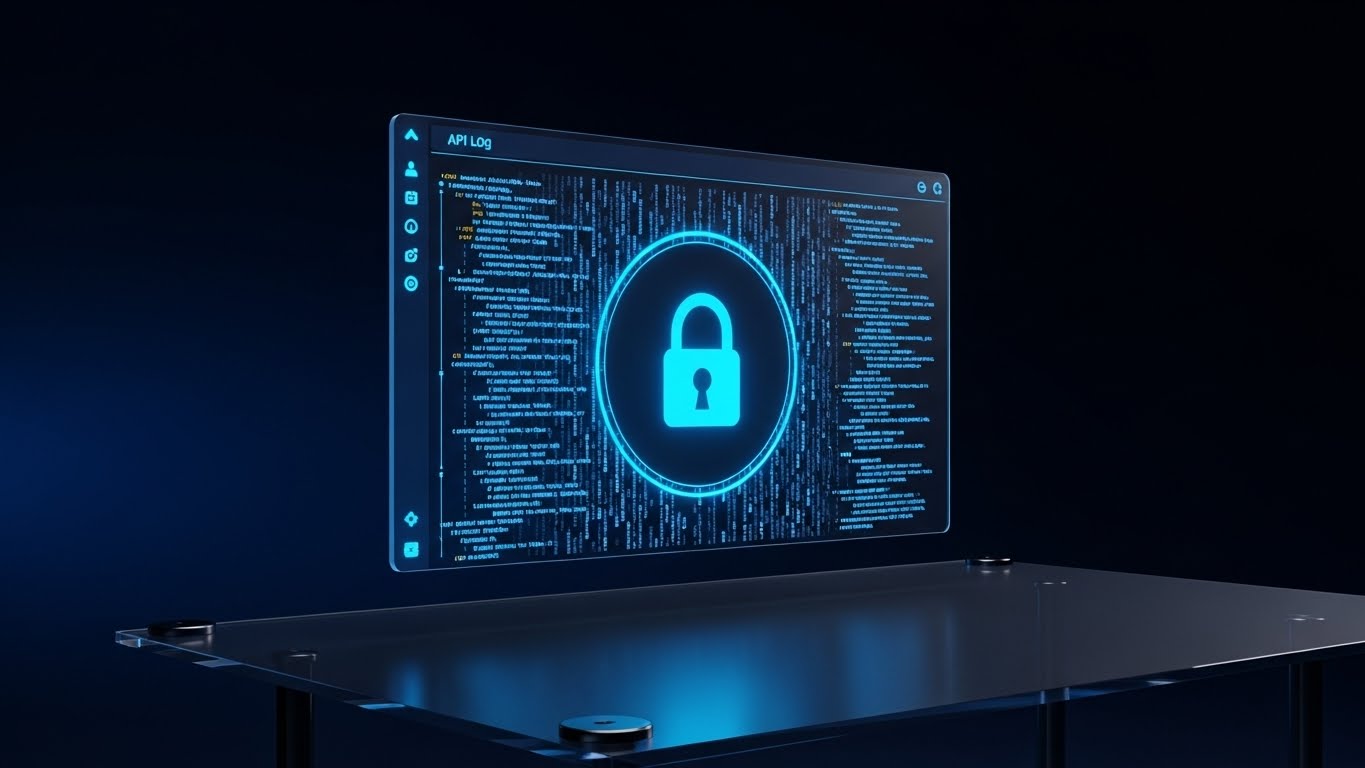
11. Futuristic Neon/Dark Mode: Visualizing Secure Global Infrastructure
MOFU | ABM Awareness

This style utilizes a "Cyberpunk Corporate" aesthetic to visualize the often-invisible layer of data security and global connectivity. By employing a dark charcoal grid background with high-contrast neon elements, we visually align the platform with cutting-edge cybersecurity standards. The visualization centers on a global map where pulsing laser red dots identify key port cities. These nodes are connected by animated arcs of light in neon blue and green, representing encrypted, high-speed data transmission.
The Aesthetics of Unbreakable Connectivity
Visualization Scenario: A display ad targeting CIOs. The camera pans across the dark, stylized globe. As a potential cyber-threat approaches a node, the glowing neon blue laser lines pulse intensely, creating a protective shield that visualizes the platform's encryption protocols (e.g., SOC 2 Compliance) in action.
Narration Style and Tone: Serious, secure, and sophisticated. The sound design features deep, resonant bass and digital chimes, reinforcing a sense of impenetrable infrastructure.
Signaling Enterprise-Grade Security
Niche Psychology: For IT decision-makers in logistics, data security is a primary anxiety. This style alleviates that fear by giving "security" a physical form. It suggests that the platform is not just a tool, but a fortified ecosystem.
Operational Impact: Visualizes Data Integrity and Network Security. It moves the conversation from "moving boxes" to "protecting intelligence," aligning the platform with the strategic priorities of IT leadership.
Precision Targeting for High-Value Accounts
Use Cases and Duration: Highly effective for Account-Based Marketing (ABM) display ads and MOFU retargeting. Short loops of 0:10-0:15 work best to maintain visual interest without requiring audio.
Strategic Trade-offs: Optimal for signaling security and global reach. Suboptimal for humanizing the brand or explaining simple UI tasks, as the aesthetic can feel "cold" or overly abstract.
From the abstract security of the network, we move to the tangible security of the asset itself.
12. Photorealistic 3D Renders: Tangible Security in a Digital World
MOFU | Building Trust

This style bridges the gap between digital software and physical hardware with extreme visual fidelity. By rendering physical textures—like weathered rust red corrugated steel and industrial grey accents—we ground the viewer in the reality of shipping. The juxtaposition of this gritty reality with a glowing, digital holographic padlock in sunlight yellow creates a powerful metaphor for "Smart Security."
Visualizing the Phygital Merge
Visualization Scenario: A website trust-building section. The camera focuses closely on the heavy metal latch of a shipping container. The texture of the peeling paint is visible. A digital lock manifests over the latch, clicking shut with a satisfying, metallic sound effect, symbolizing the activation of a smart contract or digital seal.
Narration Style and Tone: Assuring, solid, and factual. "Physical assets, digitally secured."
Building Trust Through Hyper-Realism
Niche Psychology: Logistics is a tactile industry. Professionals trust what they can see and touch. By rendering the container with photorealistic imperfections, we signal that we understand their gritty reality, while the pristine digital lock represents the solution's precision.
Operational Impact: Directly visualizes Asset Protection and Smart Locking. It demonstrates that the software has direct control over physical security mechanisms, reducing theft and tampering.
Strategic Implementation for Website Conversion
Use Cases and Duration: Ideal for "Security" or "Features" pages on the website. A 0:15 loop serves as a powerful visual anchor for text explaining blockchain or IoT features.
Strategic Trade-offs: Optimal for building trust and visualizing hardware integration. Suboptimal for explaining complex workflows or intangible software features like billing.
While security protects value, the next style focuses on generating it.
Companies using similar video content -
Descartes Systems Group – Global Logistics Network – Securing global trade and logistics operations.
OpenText – Information Management – Protecting supply chain data and documents securely.
13. Dynamic Data Visualization: The Financial Architecture of Logistics
MOFU | Demand Gen

This style abstracts the supply chain into its financial components. We utilize a clean, abstract white studio space where data is king. Vertical bars representing financial growth are constructed not from generic geometry, but from stacks of stylized gold coins and miniature shipping containers. This visual blend, rendered in emerald green and mint, explicitly links operational volume to financial performance.
The Language of the CFO
Visualization Scenario: A presentation slide for a Demand Generation webinar. The camera adopts a low worm's eye view, looking up at the soaring graphs to convey dominance. As the "Efficiency" metric climbs, the stacks of containers transform into stacks of gold, visually calculating the cost savings of reduced deadhead miles.
Narration Style and Tone: Professional, results-oriented, and rhythmic. "Every mile optimized is margin realized."
Connecting Operations to the Balance Sheet
Niche Psychology: This speaks directly to the "Economic Buyer" (CFO/VP Finance). It translates operational jargon (miles, fuel, dwell time) into the universal language of business: Profit. It validates the software as a financial asset, not just an operational expense.
Operational Impact: Clearly visualizes ROI and Profitability. It moves the conversation from "managing trucks" to "managing margins," crucial for justifying enterprise-level contracts.
Strategic Implementation for Demand Gen
Use Cases and Duration: Perfect for investor pitch decks, webinar intros, and ROI calculator landing pages. 0:30-0:45 allows time to build the data narrative.
Strategic Trade-offs: Optimal for financial discussions and executive summaries. Suboptimal for driver training or operational staff who need to see the actual interface.
To drive financial growth, one needs visibility into the details. The next style offers x-ray insight.
Companies using similar video content -
Tive – In-transit Visibility – Monitoring cargo with real-time trackers and sensors.
Sensitech – Cold Chain Monitoring – Ensuring temperature-controlled logistics and product integrity.
14. 3D X-Ray Visualization: The Power of Radical Transparency
MOFU | Visitor Re-engagement

This style uses transparency to metaphorically and visually demonstrate "Total Visibility." By rendering a standard 40-foot shipping container with semi-transparent, skeletal white mesh walls, we reveal what is hidden. The cargo inside is shown as glowing, geometric crates in x-ray blue, set against a dark grey background to maximize contrast.
Seeing the Unseen
Visualization Scenario: A visitor re-engagement ad. The view starts with a standard container, which then dissolves into the X-ray view, revealing specific cargo details (temperature, weight, fragility) glowing inside. This visualizes the ability to track SKU-level data without opening the doors.
Narration Style and Tone: Revelatory and insightful. "See what others can't."
Addressing the Fear of the Unknown
Niche Psychology: "Black swan" events and hidden cargo damage are constant worries. This style addresses the anxiety of the unknown by visually granting the user "superpowers" (X-ray vision). It promises that nothing is hidden from the platform.
Operational Impact: Visualizes Compliance and Cold Chain Integrity. It effectively demonstrates features that track the condition of freight, not just its location.
Strategic Implementation for Re-engagement
Use Cases and Duration: Highly effective for retargeting users who visited "Compliance" or "Tracking" pages. 0:15-0:20 provides a quick "Aha!" moment.
Strategic Trade-offs: Optimal for highlighting depth of data and compliance. Suboptimal for broad, high-level ecosystem overviews.
Transparency leads to trust, but integration leads to action. The next style simplifies the complex connectivity of API integration.
Companies using similar video content -
Coupa – Business Spend Management – Optimizing spend and supply chain finance.
Tradeshift – Supply Chain Payments – Streamlining procure-to-pay processes and financing.
15. 2D Line Art Animation: The Elegance of Seamless Integration
MOFU | Overcoming Objections
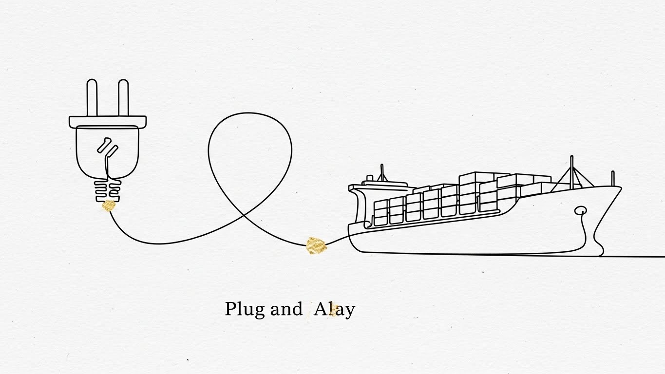
This style strips away all noise to focus on the elegance of connection. Using a sophisticated ink black continuous line on a textured paper-white background, it visualizes the concept of "Plug and Play." The line morphs effortlessly from a wall plug into the outline of a cargo ship, with gold leaf texture accenting the connection points.
Simplifying the Integration Narrative
Visualization Scenario: A whitepaper support video explaining API architecture. The single line draws a complex problem (a knot), which then untangles itself to form the ship and plug, symbolizing how the software resolves complexity through elegant code.
Narration Style and Tone: Sophisticated, calm, and minimalist. "Complexity, untangled."
Overcoming the "Integration Nightmare" Objection
Niche Psychology: Technical buyers fear "integration hell"—long, expensive, buggy implementations. This minimalist style subliminally communicates that the solution is lightweight, elegant, and frictionless. It is the visual opposite of "bloatware."
Operational Impact: Perfect for visualizing API Interoperability. It removes the intimidation of code and servers, presenting integration as a fluid, natural evolution.
Strategic Implementation for Technical Consideration
Use Cases and Duration: Best for whitepapers, technical documentation summaries, and "Integrations" pages. 0:30-0:45 is sufficient to convey the elegance of the solution.
Strategic Trade-offs: Optimal for communicating ease of integration and elegance. Suboptimal for showing feature depth or UI density.
Once the system is integrated, it must empower the user. The next style places the human at the center of the technology.
Companies using similar video content -
Orbcomm – IoT Solutions – Providing asset tracking and monitoring globally.
SkyBitz – Trailer Tracking – Enhancing trailer and asset visibility.
16. Lifestyle Stock with UI Overlay: Empowering the Modern Logistics Leader
MOFU | The Functional Buyer

This style humanizes the technology by placing it in the hands of a decision-maker. We use cinematic footage of a professional in a navy blue suit, standing in a high-rise office overlooking a harbor. The key visual element is a futuristic, holographic HUD (Heads Up Display) floating above their tablet, displaying metrics in UI blue and white.
The Visionary Leader Persona
Visualization Scenario: A LinkedIn ad targeting C-Suite executives. The executive looks from the chaotic harbor below to the orderly holographic data on the tablet. The HUD organizes the chaos into clear charts, validating their control over the operation.
Narration Style and Tone: Empowering and aspirational. "Command your fleet from anywhere."
Appealing to Professional Aspiration
Niche Psychology: This appeals to the "Functional Buyer's" ego and aspiration. It positions the software not just as a tool, but as a career accelerator that transforms them into a modern, data-driven leader.
Operational Impact: Visualizes Remote Management and Strategic Oversight. It connects the user's physical presence (office) with digital control (HUD).
Strategic Implementation for the Functional Buyer
Use Cases and Duration: Ideal for LinkedIn feeds and case study headers. 0:15-0:30 clips work well to set the mood.
Strategic Trade-offs: Optimal for emotional connection and persona alignment. Suboptimal for detailed feature training.
From high-level leadership, we zoom in to the daily user's moment of success.
Companies using similar video content -
Alpega Group – TMS Solutions – Connecting transport logistics ecosystems efficiently.
Transporeon – Platform – Digitizing freight procurement and execution.
17. Clean UI Workflow (Light Mode): Validating Instant Operational Success
MOFU | Time-to-Value
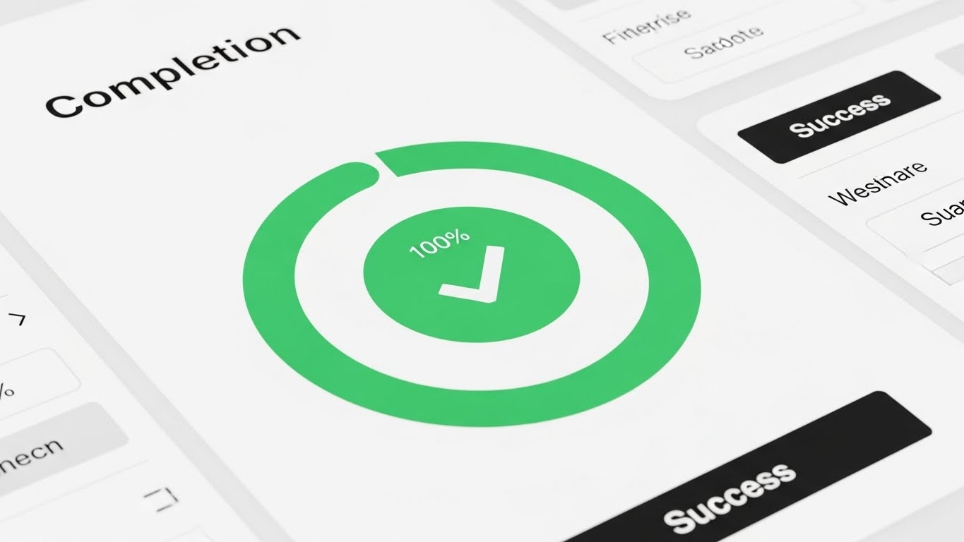
This style is pure functional validation. It utilizes a pristine, high-key UI presentation with a stark hospital white background to emphasize clarity. The focus is on a specific moment of truth: the "Task Completion" screen. Soft shadows (neumorphism) add tactile depth, while soft blues and safe greens signal correctness and safety.
The Dopamine of Done
Visualization Scenario: A "Time-to-Value" showcase on the pricing page. The cursor moves decisively, clicks "Submit," and a large, satisfying Green Success Circle animates with a checkmark. The animation is smooth and responsive, signaling a lag-free experience.
Narration Style and Tone: Crisp, quick, and satisfying. "Click. Done. Next."
Reducing the Cognitive Load of Daily Tasks
Niche Psychology: Dispatchers and admins are overworked. They crave simplicity. This style visually promises that the software is not an obstacle, but a frictionless path to finishing their work. It triggers the psychological reward of task completion.
Operational Impact: Demonstrates Usability and Speed. It counters the fear of clunky, outdated ERP interfaces.
Strategic Implementation for Conversion
Use Cases and Duration: Essential for "Feature" pages, free trial sign-up flows, and BOFU comparison sheets. Short 0:05-0:10 gifs are perfect here.
Strategic Trade-offs: Optimal for proving usability. Suboptimal for storytelling or brand building.
To justify the investment, however, the buyer needs to see the full breadth of the platform.
Companies using similar video content -
Samsara – Fleet Management – Empowering fleet operations with data and IoT.
Geotab – Telematics Platform – Connecting vehicles with actionable insights.
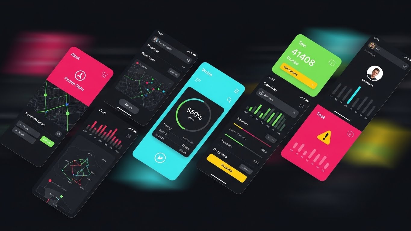
18. Rapid UI Feature Montage: Demonstrating Comprehensive Coverage
BOFU | ROI Justification
This style creates a sense of overwhelming value through volume. We use a dynamic collage where angled slices of different UI screens—maps, cost tables, tracking bars, profiles—cut across the frame diagonally. The palette uses the full alert red, safe green, and info blue spectrum to convey a living, active system.
The All-in-One Value Proposition
Visualization Scenario: An email nurture video for warm leads. The screen creates a rhythmic montage, cutting on the beat. "Dispatch?" (Slice 1: Map). "Compliance?" (Slice 2: Logs). "Billing?" (Slice 3: Invoice). The speed suggests the platform covers every angle.
Narration Style and Tone: Fast-paced, energetic, and comprehensive. "Everything you need, in one place."
Triggering the FOMO and Value Heuristic
Niche Psychology: Buyers want to know they aren't missing out. By showing a density of features rapidly, we trigger the "Value Heuristic"—the feeling that they are getting a massive robust system for their investment. It combats the "one-trick pony" objection.
Operational Impact: Visualizes the End-to-End Ecosystem. It shows that this single tool can replace multiple disconnected legacy apps.
Strategic Implementation for ROI Justification
Use Cases and Duration: Best for BOFU email campaigns ("Why Choose Us") and event booth loops. 0:15-0:30 is the sweet spot.
Strategic Trade-offs: Optimal for showing breadth and quantity of features. Suboptimal for teaching how to use any single feature.
Once bought, the fear shifts to implementation. The next style assures support.
Companies using similar video content -
ShipStation – Shipping Software – Streamlining e-commerce shipping for businesses.
Shippo – Shipping API – Simplifying shipping for businesses of all sizes.
19. 2D Animation & UI Composition: Humanizing the Onboarding Journey
BOFU | Risk Mitigation

This style addresses the "post-purchase anxiety." We combine friendly 2D vector illustrations with stylized UI elements. A character with deep skin tones and a purple blouse interacts with a floating Checklist panel, where green checkmarks animate encouragingly. The background features soft yellow abstract blobs, creating a warm, non-threatening atmosphere.
The "You Are Not Alone" Promise
Visualization Scenario: An in-app welcome video. The friendly character points to the "Checklist," guiding the user. As the user (implied) completes a step, the character smiles or gives a thumbs up. It feels like a partnership, not a test.
Narration Style and Tone: Warm, supportive, and patient. "Let's get you moving."
Mitigating Implementation Risk
Niche Psychology: Change management is the #1 reason SaaS fails. This style uses "Cuteness" and warmth to lower cortisol levels associated with learning new tools. It frames onboarding as a guided, supported journey rather than a technical hurdle.
Operational Impact: Increases User Adoption. It visualizes the "Customer Success" team's presence and makes the learning curve look approachable.
Strategic Implementation for Retention
Use Cases and Duration: Critical for the "Welcome" email series and the first login modal. 0:45-1:00 allows for a calm, paced introduction.
Strategic Trade-offs: Optimal for onboarding and culture building. Suboptimal for high-stakes executive sales pitches where "seriousness" is prized.
Finally, we visualize the ultimate benefit: Freedom.
Companies using similar video content -
Infor – Infor Nexus – Orchestrating multi-enterprise supply chains in the cloud.
Microsoft Dynamics 365 – Supply Chain Management – Unifying business operations and supply chain.
20. 2D Character-Driven Story: Visualizing the Work-From-Anywhere Reality
BOFU | Sales Cycle Acceleration

This style sells the lifestyle outcome of the software. A relatable 2D vector illustration shows a logistics manager sitting on a dock crate, not a desk chair, using a laptop. The background is a beautiful sunset gradient of denim blue and orange, with stylized cranes in silhouette. The laptop screen glows with a bright "Success" icon.
The Promise of Balance
Visualization Scenario: A closing-stage sales video. The character closes their laptop on the dock, takes a breath of fresh air, and smiles. The narrative implies they have successfully managed a crisis remotely and can now enjoy their evening.
Narration Style and Tone: Relatable, human, and concluding. "Logistics doesn't stop. But now, you can."
Selling the "Peace of Mind"
Niche Psychology: Logistics professionals burn out. They don't just want efficiency; they want their lives back. This style sells the "Work-Life Balance" that the software's efficiency makes possible. It connects the feature (Cloud Access) to the human benefit (Freedom).
Operational Impact: Visualizes Cloud Mobility. It proves the platform is truly cloud-native, allowing for remote dispatch and management.
Strategic Implementation for Sales Acceleration
Use Cases and Duration: Powerful for "Success Stories" and closing emails. 0:30-0:60 tells a complete micro-story.
Strategic Trade-offs: Optimal for emotional closing and relatability. Suboptimal for detailed technical specs or data visualization.
Companies using similar video content -
WalkMe – Digital Adoption Platform – Guiding users through software with ease.
Whatfix – Digital Adoption Platform – Simplifying software adoption and user onboarding.
21. The Clearance Velocity
BOFU | The Economic Buyer

1. The Visual & Narrative Approach
Scenario: A static representation of a hyper-lapse shot captures a busy port gate from a high angle at dusk. The physical world—trucks, cranes, and gantries—is rendered with heavy motion blur to indicate intense speed and volume. Overlaid on this blurred reality are sharp, static, glowing neon green UI tags reading "CLEARANCE GRANTED" that track specific trucks. The contrast is stark: the world is chaotic, but the data is stable and precise.
Narration: "The world moves fast. Your data moves faster." The sound design features the accelerated hum of the city overlaid with crisp, digital 'success' chimes.
2. Psychological Impact & KPI Focus
Niche Psychology: The Economic Buyer (CFO/COO) fears bottlenecks. They associate speed with revenue. This style visually proves that the software doesn't just record events; it accelerates them. It triggers the desire for "Flow State"—a friction-free operation.
Operational Impact: Directly visualizes Throughput Velocity. It validates the ROI of the software by showing how digital clearance removes physical barriers at the gate.
3. Strategic Implementation & Trade-offs
- Best Use Case: Social Retargeting Ads (LinkedIn/Instagram) for users who have visited "Pricing" pages.
- Trade-off: Realism vs. Legibility. Hyper-lapses look dynamic but can mask the gritty details of inspection protocols. Use this to sell the feeling of speed, not the process of inspection.
Companies using similar video content -
Motive – Fleet Management Platform – Empowering remote fleet operations with AI.
Trimble Transportation – TMS Solutions – Enabling mobile logistics management and optimization.
22. The Activation Spark
BOFU | The Technical Buyer

1. The Visual & Narrative Approach
Scenario: A pure celebration of a "Job Well Done." Against a clean cream background, a central explosion of geometric shapes—squares, circles, and triangles in brand teal, celebration gold, and deep blue—bursts outward to form a star. It is a visual metaphor for successful system activation or the completion of a complex setup wizard.
Narration: "You are live." Short, punchy, and triumphant. It marks the transition from "buying" to "using."
2. Psychological Impact & KPI Focus
Niche Psychology: Implementation fatigue is real. The Technical Buyer often dreads the "go-live" moment. This style utilizes Gamification psychology to trigger a dopamine response, framing the setup process as a victory rather than a chore.
Operational Impact: Increases Activation Rates. By associating the completion of technical tasks with visual celebration, you encourage users to finish the onboarding sequence.
3. Strategic Implementation & Trade-offs
- Best Use Case: In-App "Success" modals or "Welcome" emails upon account verification.
- Trade-off: Context. It is abstract. Do not use this to explain how to do something; only to celebrate that it is done.
Companies using similar video content -
Port of Rotterdam – Portbase – Accelerating port logistics and data exchange.
Navis – N4 Terminal Operating System – Optimizing container terminal operations globally.
23. The Human Helpdesk
BOFU | Objection Handling

1. The Visual & Narrative Approach
Scenario: We bridge the gap between automated software and human empathy. A high-quality photo shows a smiling customer support agent in a headset. The background is blurred. Surrounding her are playful, hand-drawn white vector doodles: arrows solving problems, speech bubbles turning from "?" to "!", and gears clicking into place. The doodles animate around her gestures, visualizing her problem-solving thought process.
Narration: "Real people, powered by smart tech." The tone is empathetic and reassuring, countering the frustration of automated chatbots.
2. Psychological Impact & KPI Focus
Niche Psychology: Objection Handling. Buyers fear being abandoned after the sale. This style visually answers the "What if things break?" objection. It combines the warmth of human connection with the efficiency of digital tools (the doodles).
Operational Impact: Reduces Support Anxiety. It positions the helpdesk as a proactive partner in success, rather than a last resort for failures.
3. Strategic Implementation & Trade-offs
- Best Use Case: The "Support" section of a proposal or the "Help Center" landing page.
- Trade-off: Scalability. Using real actors requires consistent casting if you update the video series later.
Companies using similar video content -
AppLearn – Digital Adoption Platform – Celebrating successful software onboarding and activation.
Spekit – Digital Adoption Platform – Activating user knowledge and productivity in-app.
24. The Night Shift Sentinel
RETENTION | Reducing Friction
1. The Visual & Narrative Approach
Scenario: A cinematic macro view of the interface in "Dark Mode." The background is deep midnight blue. Floating in the center is a holographic padlock icon surrounded by streaming API logs in electric blue. A subtle "System Healthy" pulse glows. This isn't just a screen; it's a cockpit view for the night shift, monitoring the unseen digital security layer.
Narration: "While you sleep, we secure." The voice is low and guarded. It speaks to the 24/7 nature of global logistics.
2. Psychological Impact & KPI Focus
Niche Psychology: Cognitive Load Reduction. Logistics never stops. For the night dispatcher or IT admin working at 2 AM, Dark Mode is a feature of empathy. It reduces eye strain and signals that the platform is designed for heavy users, not just 9-to-5 sales demos.
Operational Impact: Improves User Retention among power users. It frames the software as an enterprise-grade tool that respects the user's working environment.
3. Strategic Implementation & Trade-offs
- Best Use Case: "Pro Tips" email newsletters or "New Feature" announcements targeting admin users.
- Trade-off: Legibility. Dark mode visuals can be hard to see in bright rooms. Ensure high contrast for text elements.
Companies using similar video content -
C.H. Robinson – Navisphere – Providing human-backed logistics support and solutions.
XPO Logistics – Managed Transportation – Offering expert logistics solutions and services.
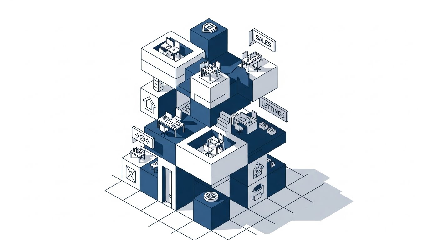
25. The Scalability Staircase
RETENTION | Reducing Churn
1. The Visual & Narrative Approach
Scenario: A clean, flat isometric illustration showing a "Logistics HQ" growing over time. We see an ascending staircase of cubic office blocks and server nodes in corporate blue and white. As the camera pans up, new modules (Sales, Lettings, Ops) snap onto the structure seamlessly. It visualizes the platform as a modular foundation that grows with the client.
Narration: "Built to scale." The narrative focuses on future-proofing, assuring the client they won't outgrow the system.
2. Psychological Impact & KPI Focus
Niche Psychology: Churn Reduction. Clients leave when they feel limited. This style visually reinforces the "Platform" concept—an ecosystem that expands. It triggers the Commitment Consistency principle, encouraging long-term investment.
Operational Impact: Supports Upsell/Cross-sell. It subtly introduces add-on modules (like "Lettings" in the visual) as natural next steps in the growth journey.
3. Strategic Implementation & Trade-offs
- Best Use Case: Quarterly Business Review (QBR) presentations or "Year in Review" customer emails.
- Trade-off: Simplicity. It simplifies complex integrations into "building blocks," which may understate the technical effort required.
Companies using similar video content -
Lytx – DriveCam – Monitoring fleet safety 24/7 with AI video.
Netradyne – Driveri – Enhancing driver safety with AI vision technology.
26. The Tactile Response
RETENTION | Knowledge Base

1. The Visual & Narrative Approach
Scenario: An extreme close-up of the UI—so close you can see the pixel grid. A soft-focus finger hovers over a "Help" button which glows in a vibrant safety orange upon hover. The click is instant, triggering a smooth, expanding modal. The focus is on the responsiveness and the tactile feel of the interface.
Narration: "Help, one click away." Emphasizes speed and accessibility.
2. Psychological Impact & KPI Focus
Niche Psychology: Frustration Mitigation. When a user is stuck, seconds feel like hours. This style visually promises that support is not buried in a footer but is immediate and tactile. It builds trust in the "Knowledge Base."
Operational Impact: Increases Self-Service Resolution. By making the help button look inviting and responsive, you drive users to solve problems within the app, reducing ticket volume.
3. Strategic Implementation & Trade-offs
- Best Use Case: Social Ads (Instagram/LinkedIn) targeting current users, or loading screen tips.
- Trade-off: Context. Shows the button, not the answer. Best used to promote the existence of support features.
Companies using similar video content -
IFS – Cloud ERP – Scaling enterprise resource planning for growth.
Epicor – Kinetic ERP – Growing manufacturing and distribution businesses efficiently.
27. The Holographic War Room
RETENTION | Proactive Support

1. The Visual & Narrative Approach
Scenario: Inside a sleek, modern conference room, a tablet sits on the table. Projected upwards from the screen is a volumetric 3D hologram of the Earth in laser blue and magenta. Arcs of light represent active trade lanes. It looks like a scene from a sci-fi command center, elevating the humble tablet into a strategic weapon.
Narration: "See the world, solve the problem." The tone is commanding and strategic.
2. Psychological Impact & KPI Focus
Niche Psychology: Proactive Support. High-value clients want to feel like they are ahead of the curve. This style appeals to the "Master of the Universe" fantasy, where the user has god-like oversight of their global operations.
Operational Impact: Reinforces the value of Real-Time Analytics. It moves the perception of the software from a "recording tool" to a "monitoring system."
3. Strategic Implementation & Trade-offs
- Best Use Case: Website Hero section for the "Enterprise" tier or high-stakes investor decks.
- Trade-off: Realism. It sets a very high expectation for the UI. Ensure the actual product has a map view that is at least somewhat comparable.
Companies using similar video content -
Zebra Technologies – Savanna Platform – Providing immediate data insights for operations.
Honeywell Intelligrated – Momentum WMS – Offering responsive warehouse control systems.
29. The Victory Lap
EXPANSION | Driving Upsell

1. The Visual & Narrative Approach
Scenario: A low-angle "Hero Shot" of a diverse logistics team standing in a glass-walled boardroom. They are looking at an off-camera screen showing a graph trending up. Their expressions are a mix of pride, relief, and shared success. The lighting is bright, using corporate blue flares to create a feeling of optimism.
Narration: "Your team, aligned." Focuses on the human outcome of software adoption: unity and success.
2. Psychological Impact & KPI Focus
Niche Psychology: Social Proof & Advocacy. People buy software, but teams use it. This style visualizes the emotional result of a successful implementation: a happy, cohesive team. It targets the "Champion" persona who wants to look good to their peers.
Operational Impact: Drives Internal Referrals. It encourages the champion to roll out the software to other departments (Expansion) by showing the cultural benefit.
3. Strategic Implementation & Trade-offs
- Best Use Case: Case Study headers and "Why Us" pages.
- Trade-off: Generic Risk. Stock photos can feel cheesy. Use high-quality, candid-style photography to maintain authenticity.
Companies using similar video content -
FreightWaves – SONAR – Projecting real-time freight market intelligence.
T-Systems – Connected Logistics – Monitoring global supply chains proactively.
30. The Futurist's Keynote
EXPANSION | Driving Referrals

1. The Visual & Narrative Approach
Scenario: A photorealistic AI-generated video of a charismatic female speaker on a conference stage. She wears smart business attire. Behind her, blurred screens display abstract data nodes. Floating near her hands are subtle augmented reality particles, emphasizing her visionary status. She speaks directly to the camera with authority.
Narration: "The future isn't just coming. It's traceable." She articulates the long-term vision of AI in logistics, positioning the platform as the vehicle for that future.
2. Psychological Impact & KPI Focus
Niche Psychology: Authority Bias. Logistics leaders listen to experts. By using a "Futurist" persona, the brand transcends being a software vendor and becomes a strategic partner. It signals innovation and leadership.
Operational Impact: Drives Category Design. It helps frame the conversation around future trends (AI, Automation), moving the sales discussion away from price and towards strategic value.
3. Strategic Implementation & Trade-offs
- Best Use Case: Thought Leadership videos, Webinar intros, and "Vision 2026" campaigns.
- Trade-off: Uncanny Valley. Generative video must be high quality. If the lip-sync fails, the authority is lost.
Strategic Knowledge Base: The Visual Operations Doctrine
To bridge the gap between "watching a video" and "transforming a supply chain," we must move beyond aesthetics. The following framework synthesizes the 30 styles into a cohesive Visual Operations Doctrine. This is your blueprint for deploying these assets to drive measurable business outcomes: ROI, Adoption, and Efficiency.
Strategic Alignment & Visual Architecture
The "Pre-Production" Strategy. Defining the Why and Who.
- The Cognitive Load Audit: Before creating a single frame, audit your current training materials. If a PDF manual takes 15 minutes to read, the video replacement must convey the same value in 90 seconds. Use styles like The Clarity Engine (Style 1) to strip away non-essential visual noise.
- Role-Based Visual Mapping: A "one-size-fits-all" video strategy fails in logistics.
- For Drivers (Mobile): Use high-contrast, large-text styles like The Velocity Vector (Style 5) that are legible on a phone mount in bright sunlight.
- For Fleet Managers (Desktop): Use data-dense styles like The Command Tower (Style 6) that utilize the full real estate of a 27-inch monitor.
- The "Glanceability" Standard: In a high-stress dispatch room, "glanceability" is a safety metric. Design visuals where the status (Red/Green/Amber) is understood in under 0.5 seconds.
- Brand Voice Consistency: Your platform likely consists of disparate modules (Billing, Tracking, Compliance). Use a unified visual language (e.g., the Cobalt Geometry of Style 1) to visually stitch these modules into a single, cohesive brand experience.
- The Advids Strategic Audit: Partner with Advids during this phase to define your "Visual Operating System." We help map your complex workflows to specific visual archetypes, ensuring that every asset you produce aligns with a broader operational goal before production begins.
- Standardization vs. Customization: For universal concepts (e.g., "What is Cloud?"), use polished, abstract styles (Style 7). For specific operational tasks (e.g., "How to unhitch a trailer"), use hyper-realistic styles (Style 12) or annotated live-action to ensure safety compliance.
- The Cross-Departmental Bridge: Visuals are the only common language between Sales (who sell the dream) and Ops (who manage the reality). Use The Reality Check (Style 9) to acknowledge the Ops team's pain while validating the Sales team's promise.
- Legacy System Integration: You are likely replacing or integrating with green-screen AS/400 systems. Use The Digital Twin Reveal (Style 4) to visually demonstrate how your modern UI respects and connects with their legacy backend, reducing the fear of "ripping and replacing."
- Accessibility in Trucking: The logistics workforce is global and multilingual. Prioritize styles that rely on Visual Iconography (Style 22) rather than heavy voiceover or text. Motion graphics should be universally understood without audio.
- The Mobile-First Mandate: 80% of your end-users (drivers/warehouse staff) will consume this content on mobile devices. Every style from 1-30 must be "squint-tested" on a 5-inch screen to ensure legibility.
Operational Adoption & Implementation
The "Deployment" Phase. Embedding visuals into the daily workflow.
- Overcoming "Big Brother" Anxiety: Driver monitoring (AI dashcams) is a sensitive topic. Use empathy-driven styles like The Neural Supply Chain (Style 7) to frame AI as a "Co-pilot" that protects them, rather than a "Spy" that punishes them.
- The Micro-Learning Shift: Kill the hour-long webinar. Break training into "Micro-Moments." A driver facing an error code needs a 15-second loop of The Instant Answer (Style 26), not a PDF.
- Just-in-Time Support: Embed these video assets directly into the software's "Help" widgets. Context-aware delivery means showing the Billing Workflow (Style 17) only when the user is actually on the Billing tab.
- Gamification of Training: Use The Activation Burst (Style 22) visuals to celebrate small wins. When a driver completes their first digital log, reward them with visual confetti. This small dopamine hit builds the habit of compliance.
- Reducing Support Ticket Volume: There is a direct correlation between proactive visual guides and reduced call center load. If 30% of tickets are "How to reset password," a prominent, looping GIF of that process in the login screen eliminates those calls.
- Remote Onboarding: You cannot fly trainers to every depot. Use The Holographic War Room (Style 27) and screen-cast styles to conduct "virtual ride-alongs," allowing you to scale onboarding globally without travel costs.
- Visualizing SOPs: Text-based Standard Operating Procedures are ignored. Transform them into Isometric Workflow (Style 6) animations. A visual flow of a warehouse layout is instantly understood; a text description is not.
- Feedback Loops: Use 2D Character Stories (Style 20) to solicit feedback. "Is this you?" narratives encourage users to share their own struggles, providing your product team with invaluable user research.
- Scalable Localization: When expanding to new regions, separate the text layers from the animation in your source files. This allows you to swap English labels for Spanish or French without re-rendering the complex 3D assets.
- Leadership Communication: When pitching a renewal or upsell to the C-Suite, do not use training videos. Use The Aspirational Stock Montage (Style 29) to remind them of the strategic partnership and the human success story you are building together.
Measuring Impact & Future-Proofing
The "ROI" Phase. Quantifying success and looking ahead.
- Beyond "Views": Do not measure video success by "views." Measure Time-to-Competency. If a new dispatcher using your video-assisted training reaches full productivity in 2 weeks instead of 4, you have quantified the ROI of your visual strategy.
- The "Idle Time" Metric: Correlate better visualization with reduced software navigation time. If The Clarity Engine (Style 1) reduces the time spent on the "Order Entry" screen by 20%, that is reclaimable margin for the client.
- Compliance Velocity: How fast can you roll out a new regulation (e.g., ELD mandate)? Measure the time from "Video Release" to "Fleet-wide Compliance." Visual learning significantly accelerates this curve compared to written memos.
- Retention and Churn: User Experience (UX) is a leading indicator of retention. High-quality visuals like Dark Mode Showcase (Style 24) signal a premium experience, increasing the switching costs for the client.
- The AI Visual Frontier: Prepare for the next wave: Generative Video. Soon, you will generate personalized training videos for each driver on the fly. Styles like The Futurist (Style 30) are just the beginning.
- Scalability of Assets: Build a "Visual Component Library." Don't create one-off videos; create a library of 3D trucks, port assets, and UI widgets that can be remixed endlessly.
- The Advids Partnership: This is where Advids becomes your long-term efficiency partner. We manage and update this asset library for you, ensuring that when your UI changes in v2.0, your entire video library is updated seamlessly without starting from scratch.
- Benchmarking Success: "Good enough" visuals are a competitive risk. If your competitor uses 3D X-Ray (Style 14) to explain their tech and you use screen recordings, you lose the "Innovation" argument before the demo starts.
- The ROI of Safety: For logistics, safety is money. Quantify the reduction in accidents or cargo claims among drivers trained with Hyper-realistic Scenarios (Style 12). This data point alone can pay for your entire content marketing budget.
- Final Call to Innovation: Treat video not as "content," but as Infrastructure. Just as you invest in servers and trucks, invest in the visual layer that connects your human workforce to your digital intelligence. It is the final mile of your digital transformation.
[END OF MASTER GUIDE]
Author & Editor Bio


