
 /home/wwwroot/advids.co/design/index.php on line 425
Introduction: Navigating the Digital Terrain of Global Logistics
The infrastructure of global trade is undergoing a seismic shift. We are moving from a world of static hydrographic charts and paper manifests to a dynamic, living "Digital Terrain." For leaders in Port Construction, Dredging, and Logistics SaaS, the challenge is no longer just moving earth or freight—it is about visualizing the invisible data layers that govern these complex environments.
The industry possesses terabytes of precise data—from LiDAR scans of port basins to real-time AIS tracking of container ships. Yet, a "Physical-Digital Divide" remains. Stakeholders struggle to translate this density of data into actionable insight. The engineer sees a point cloud; the investor sees noise. This "Interpretation Gap" is the primary driver of rework, delays, and the staggering statistic that 69% of operations and supply chain officers feel their technology investments haven't fully delivered the expected results.
However, the opportunity for those who bridge this gap is immense. The global digital logistics market is projected to surge to USD 120.33 billion by 2032. The winners in this space will not just be those with the best algorithms, but those who can visualize their value—transforming complex bathymetry and routing data into clear, intuitive narratives that drive faster decision-making.
This guide explores 30 distinct video styles designed to help Digital Terrain and Logistics platforms communicate their value. From the "Engineering Truth" of wireframe-to-reality transitions to the "Neural Intelligence" of AI visualization, these examples serve as a strategic blueprint for mapping your product’s story onto the digital terrain of the future.
1. Minimalist Flat 2D Vector
TOFU | Brand Awareness

The Visual & Narrative Approach
In a sector often cluttered with gritty job site photos, this style offers a radical counter-signal: absolute order. A massive container ship is depicted in profile, constructed from simple, sharp geometric blocks of Cobalt Blue and Safety Orange. It rests on a stylized ocean of jagged turquoise waves, set against a pale icy blue sky with a single perfect white circle for the sun. The composition is symmetrical and devoid of textures or shadows.
Psychological Impact & KPI Focus
- Niche Psychology: Logistics directors are overwhelmed by chaos. This aesthetic triggers a sense of "Cognitive Ease." By stripping away the noise of the real world, it subconsciously tells the viewer: "Our software simplifies the complex." It signals precision, standardization, and modern control.
- Operational Impact: This style is optimized for Brand Recall. The high-contrast color blocking creates a memorable visual anchor that stands out in a busy LinkedIn feed, positioning your brand as a beacon of clarity in a messy industry.
Strategic Implementation & Trade-offs
- Best Use Case: High-frequency brand awareness posts or "Feature Flash" announcements.
- Trade-off: It lacks emotional depth and technical detail. Do not use this style to explain complex bathymetric modeling features; use it to sell the feeling of organized logistics.
Companies using similar video content -
BuyCo – Container Shipping Platform – Simplifies global container logistics operations.
Linbis Logistics – Freight Forwarding Software – Streamlines freight operations with AI automation.
2. Abstract 2D Glossy
TOFU | Market Education

The Visual & Narrative Approach
Moving from geometry to fluidity, this style visualizes the connectivity of the supply chain. A stylized globe is rendered in deep liquid silver. Trade routes appear not as rigid lines, but as flowing, viscous veins of glowing teal and electric cyan connecting continents. The background is a clean, deep navy void. The lighting mimics studio soft-box reflections on the glossy surfaces, creating a premium, high-tech feel.
Psychological Impact & KPI Focus
- Niche Psychology: It appeals to the aspiration of "Frictionless Trade." The viscous flow of the lines suggests that your software removes bottlenecks, allowing data and goods to move organically. The "glass-morphism" texture aligns your brand with high-end consumer technology, elevating perceived value.
- Operational Impact: It visualizes the intangible value of a network. It helps stakeholders see the "Digital Terrain" of global trade as a unified ecosystem rather than a collection of isolated ports.
Strategic Implementation & Trade-offs
- Best Use Case: Website hero backgrounds or "Vision" videos for investors.
- Trade-off: It is highly abstract. It sets a mood of sophistication but explains nothing about how the software works. It must be paired with concrete text or followed by a UI demo.
Companies using similar video content -
Infor Nexus – Supply Chain Visibility – Visualizes end-to-end network connectivity and flow.
PartnerLinQ – Unified Supply Chain Platform – Connects enterprise systems for seamless data flow.
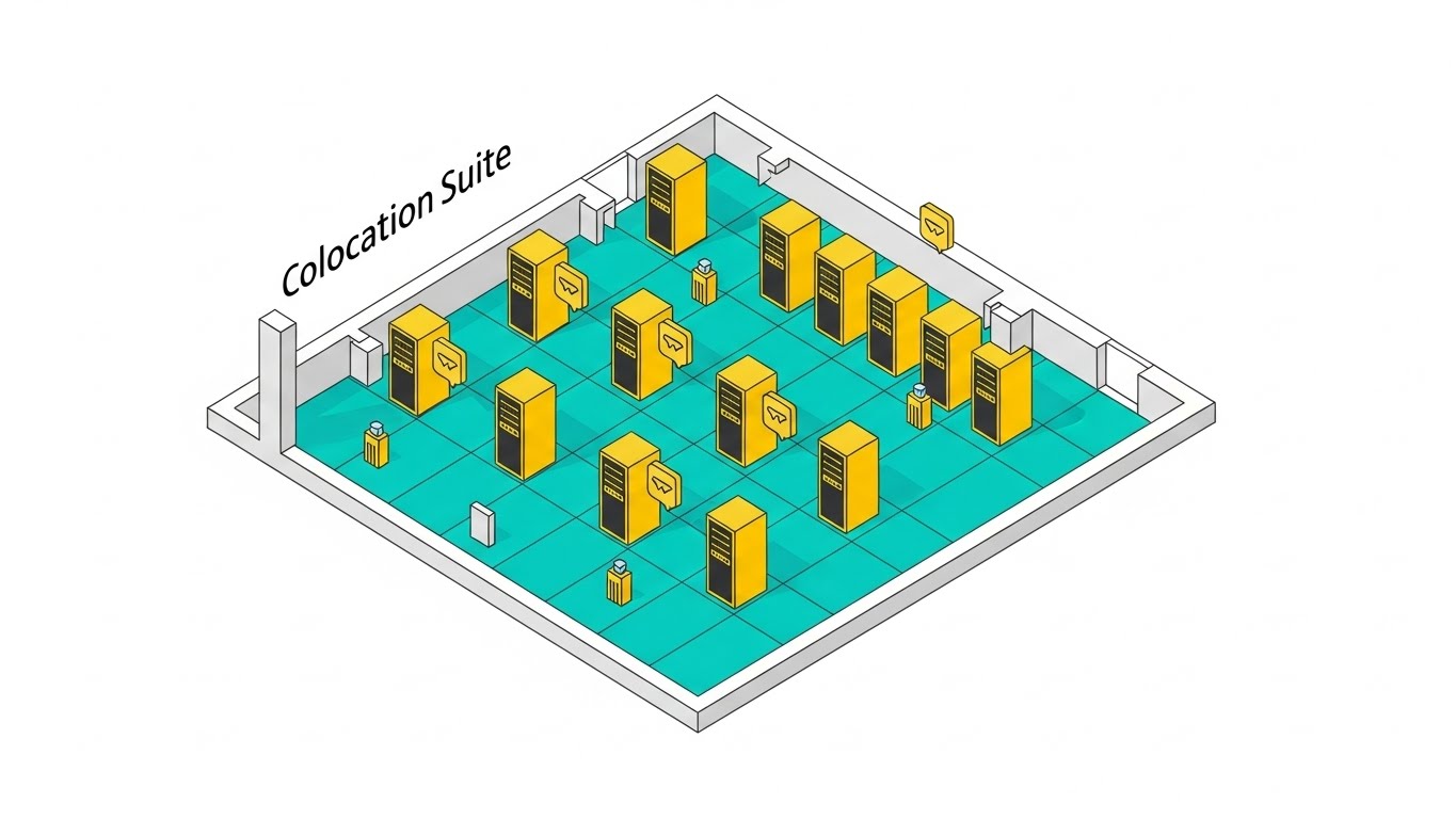
3. Isometric 3D + Low Poly
TOFU | Shaping Brand Perception

The Visual & Narrative Approach
This style reimagines the heavy infrastructure of a port as a pristine, approachable digital model. We view a miniature shipping port from a 45-degree top-down angle. Faceted cranes painted in soft coral and pastel yellow lift geometric cubes (containers) onto a low-poly ship. The water is rendered as crystalline, faceted blue triangles. The lighting is bright and warm, casting sharp, defined shadows.
Psychological Impact & KPI Focus
- Niche Psychology: Large-scale infrastructure projects can feel daunting. The "Low Poly" aesthetic acts as a visual euphemism, making the massive scale of port construction feel manageable and "toy-like." It reduces the intimidation factor of complex software.
- Operational Impact: The isometric perspective is native to engineers and planners. It allows them to see the spatial relationships of the yard layout clearly, without the visual noise of photorealism.
Strategic Implementation & Trade-offs
- Best Use Case: Social media engagement or "Onboarding" videos where a friendly, welcoming tone is required.
- Trade-off: It can risk looking "unserious" to conservative C-suite executives. Use it to build brand affinity, not to close a multi-million dollar government contract.
Companies using similar video content -
Marine Digital – Warehouse Management System – Manages port terminal cargo efficiently and clearly.
AVANTE International Technology, Inc. – Yard Management System – Optimizes container yard operations with precision.
4. Wireframe to Reality
TOFU | Category Creation
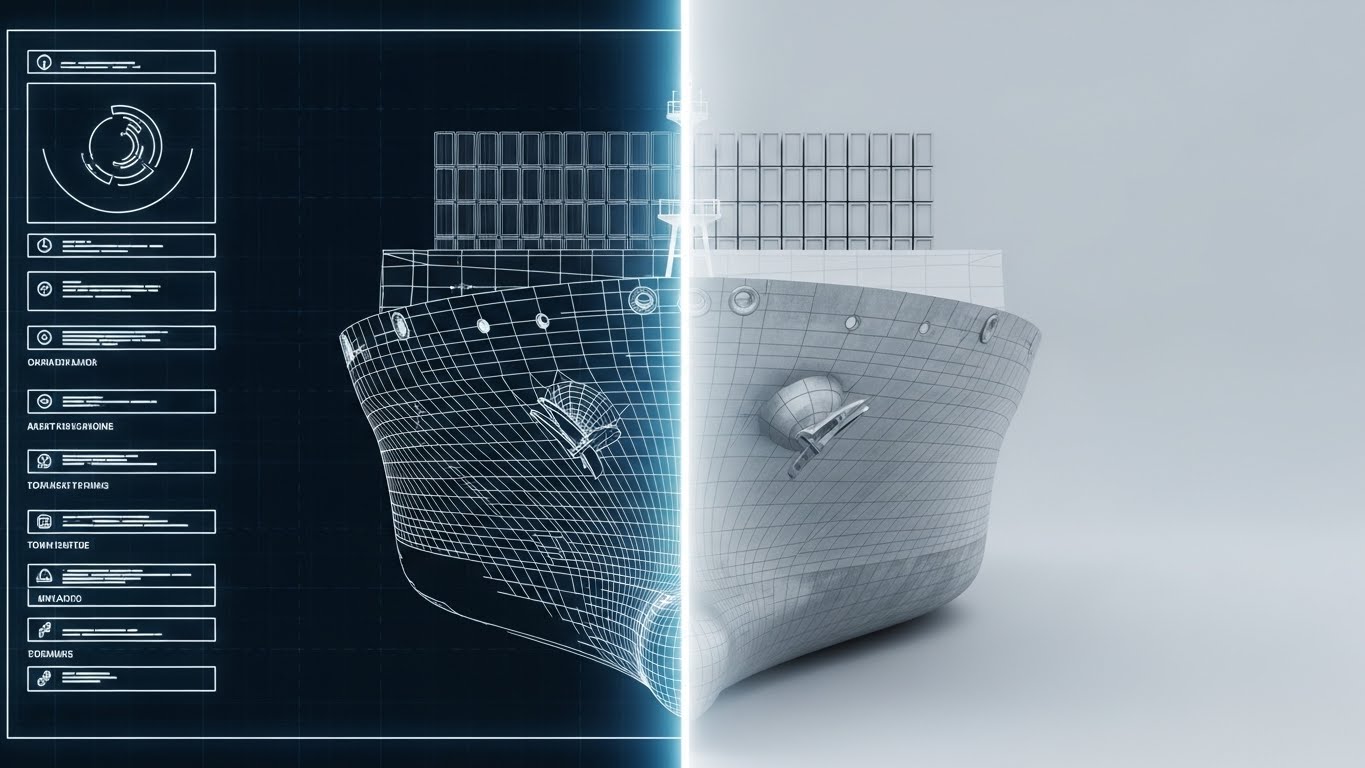
The Visual & Narrative Approach
This visual metaphor directly addresses the "Physical-Digital Divide." The screen is divided vertically. The left side shows a technical white wireframe blueprint of a container ship hull on a "blueprint blue" background. As the image crosses to the right side, the wireframe transforms seamlessly into a photorealistic, steel-plated ship hull in daylight. The transition point glows with a digital white light.
Psychological Impact & KPI Focus
- Niche Psychology: It validates the engineer's work. It visually proves that the "Digital Model" (Wireframe) is an accurate predictor of the "Physical Reality" (Steel). This builds Cognitive Trust in the software's precision.
- Operational Impact: It defines the category of "Digital Twins" without using jargon. It demonstrates that your platform is the bridge between the design studio and the shipyard.
Strategic Implementation & Trade-offs
- Best Use Case: Product launch videos or "Accuracy" case studies.
- Trade-off: High production value is non-negotiable. If the photorealistic side looks fake, the promise of "Reality" is broken.
Companies using similar video content -
Teqplay – Digital Twin Solutions – Bridges digital models to physical maritime reality.
Digital Twin Marine – Digital Twin Marine – Creates digital replicas of vessels for remote management.
5. Bold Kinetic Typography (Visual)
TOFU | Vertical Social Organic
The Visual & Narrative Approach
Speed is the only metric that matters here. The visual utilizes large, blocky diagonal shapes in electric lime green and deep purple that slash across a stark white background. Speed lines and motion blur effects suggest rapid movement from left to right. Abstract arrowheads point forward, creating a sense of aggressive momentum. There is no legible text, only the feeling of velocity.
Psychological Impact & KPI Focus
- Niche Psychology: In expedited freight and logistics, latency is the enemy. This style triggers a physiological response—an adrenaline hit that aligns your brand with Urgency and Speed.
- Operational Impact: It captures attention in low-attention environments (TikTok/Shorts). It visually differentiates your "agile" software from the "sluggish" legacy systems of competitors.
Strategic Implementation & Trade-offs
- Best Use Case: Hype teasers for new "Instant Quote" features or "Real-Time Tracking" updates.
- Trade-off: It conveys zero information. It stops the scroll but must be followed immediately by educational content to retain the user.
Companies using similar video content -
Project44 – Multimodal Visibility – Accelerates freight operations with real-time data velocity.
Sensos – Supply Chain Visibility – Provides rapid, real-time shipment telemetry data.
6. Isometric 3D Workflow
TOFU | YouTube
The Visual & Narrative Approach
We cut away the walls to reveal the "Brain" of the operation. A detailed isometric 3D render shows a "Logistics Control Tower." Inside, sleek white desks are arranged in a grid, with miniature server racks glowing in amber. On the walls, large abstract screens display heatmaps of global ports in slate blue and cool grey. The lighting is soft and ambient, simulating a high-tech office environment.
Psychological Impact & KPI Focus
- Niche Psychology: It targets the chaos of the operations room. It sells the Fantasy of Order—a clean, centralized space where all data is visible and under control. It appeals to the director's desire for a "God's Eye View."
- Operational Impact: It visualizes the concept of Centralization. It shows that your software isn't just a tool for one person, but the infrastructure that organizes the entire team and data flow.
Strategic Implementation & Trade-offs
- Best Use Case: YouTube Pre-Rolls targeting keywords like "Supply Chain Management" or "Port Operations."
- Trade-off: Can feel static. Ensure the screens on the walls are animated to show that the data is "live."
Companies using similar video content -
Neurored TMS & SCM – Port & Terminal Management Software – Centralizes operational control for port workflows.
CargoWise – Logistics Software – Streamlines global trade and customs compliance workflows.
7. Abstract 3D AI Visualization
MOFU | Skippable Pre-Roll Ad

The Visual & Narrative Approach
How do you visualize an algorithm? You visualize its connections. A central node, rendered as a glowing sphere of bioluminescent blue, connects to hundreds of smaller nodes via thin, pulsing magenta fiber-optic lines. The background is a deep void black to contrast the luminosity. The camera focuses on the macro details of the connections, simulating a neural network or a digital supply chain brain.
Psychological Impact & KPI Focus
- Niche Psychology: It demystifies AI. Instead of a scary "Black Box," AI is presented as a beautiful, organic network that connects disparate data points. It signals Intelligence and Optimization.
- Operational Impact: It differentiates your platform as "AI-Native." It visually claims that your software is "thinking" and "predicting," not just recording data.
Strategic Implementation & Trade-offs
- Best Use Case: Explaining "Predictive Analytics" or "Dynamic Routing" features where the value is invisible math.
- Trade-off: Purely metaphorical. It must be grounded with a specific use case (e.g., "Predicting Siltation Rates") to be effective.
Companies using similar video content -
Bronson.AI – AI for Smart Ports – Visualizes AI-driven predictive analytics for port optimization.
Orca AI – Digital Twins in Maritime Operations – Connects data for AI-powered maritime insights.
8. 3D Parallax UI Presentation
MOFU | Product Differentiation

The Visual & Narrative Approach
This style treats the UI as a physical object. Screens are rendered as semi-transparent, frosted glass panels with glowing white and sky blue interface elements. They hover in a 3D space with a shallow depth of field; the background is a blurred, bright modern office. The foremost screen displays a stylized "ETA Prediction" curve graph ascending.
Psychological Impact & KPI Focus
- Niche Psychology: Users judge software quality by its interface. The "Frosted Glass" look implies a modern, premium user experience (similar to high-end OS design). It reassures the buyer that the tool will be pleasant and intuitive to use.
- Operational Impact: The shallow depth of field focuses the eye on Key Metrics (the graph), filtering out the noise of a complex dashboard to highlight specific value drivers.
Strategic Implementation & Trade-offs
- Best Use Case: Feature pages on your website or product tour videos.
- Trade-off: If your actual software UI looks dated, this style will create a gap between expectation and reality.
Companies using similar video content -
SAP Integrated Business Planning (IBP) – Supply Chain Planning – Presents clear, interactive planning dashboards.
Oracle Supply Chain Management – SCM Cloud – Offers intuitive interfaces for complex supply chain operations.
9. Split Screen: Optimized Reality
MOFU | Feature Education
The Visual & Narrative Approach
A direct visual argument for modernization. The left half ("The Old Way") depicts a gritty, desaturated sepia-toned photo of a messy desk piled high with crumpled paper manifests and a landline phone. The right half ("The New Way") is a vivid, technicolor, high-gloss 3D render of a pristine tablet displaying a clean, organized logistics dashboard in bright white and blue.
Psychological Impact & KPI Focus
- Niche Psychology: It triggers the Pain of Chaos. It reminds the user of the stress of manual processes and offers an immediate visual cure (the clean tablet). It forces a binary choice: stay in the past or move to the future.
- Operational Impact: It visually demonstrates Competitive Displacement. It labels competitors (or spreadsheets) as obsolete without naming them.
Strategic Implementation & Trade-offs
- Best Use Case: Retargeting ads for users who visited your pricing page but didn't convert.
- Trade-off: Can feel aggressive. Ensure the "Old Way" feels realistic (a struggle many still face) rather than a caricature.
Companies using similar video content -
KlearNow.AI – Customs Clearance Software – Transforms manual customs to digital efficiency.
Logipulse – Customs Clearance Software – Digitizes and streamlines customs documentation processes.
11. Futuristic Neon/Dark Mode
MOFU | ABM Awareness

The Visual & Narrative Approach
This style visualizes the "Digital Nervous System" of global trade. Against a dark, data-rich charcoal grid background, a world map is outlined in glowing Neon Blue laser lines. Key port hubs are identified not by names, but by pulsing Laser Red nodes. Connecting them are animated, arcing streams of light that symbolize secure data encryption. The aesthetic is unapologetically "Cyberpunk Corporate," blending the coolness of high-tech security with the scale of global logistics.
Psychological Impact & KPI Focus
- Niche Psychology: IT Directors and CTOs in logistics crave security and real-time connectivity. The "Dark Mode" aesthetic is the native visual language of developers and security ops. It signals Robustness and Encryption, reassuring the technical buyer that your platform is enterprise-grade.
- Operational Impact: It visualizes Network Latency and Connectivity. By showing the active, glowing connections, it implies a live, "always-on" system that never sleeps, directly addressing the KPI of Uptime Assurance.
Strategic Implementation & Trade-offs
- Best Use Case: Retargeting display ads for technical decision-makers or ABM campaigns targeting enterprise logistics firms.
- Trade-off: It can feel cold or impersonal. Avoid using this for driver-facing apps or customer service features; reserve it for backend infrastructure and security messaging.
Companies using similar video content -
Cydome – Maritime Cybersecurity – Visualizes secure, encrypted fleet networks and protection.
Globetech – Maritime Cybersecurity Solutions – Protects fleets with real-time threat monitoring.
12. Photorealistic 3D Renders
MOFU | Building Trust

The Visual & Narrative Approach
To sell digital security for physical assets, you must honor the physical reality. This style presents a hyper-realistic close-up of a shipping container's locking mechanism. The corrugated steel is textured in weathered Rust Red with Industrial Grey accents, showing the wear of ocean travel. Hovering over the physical latch is a glowing, Holographic Yellow digital padlock. The lighting is harsh, natural daylight, casting sharp shadows that ground the digital overlay in the real world.
Psychological Impact & KPI Focus
- Niche Psychology: Logistics operators are skeptical of "vaporware." They trust steel and iron. By rendering the container with imperfections (rust, scratches), you validate their reality. The glowing padlock visually anchors the concept of Digital Custody—showing that your software is the guardian of their physical hardware.
- Operational Impact: It visually represents Asset Protection and Compliance. It tells the viewer: "Our code is as strong as your steel." This is critical for overcoming objections regarding the reliability of digital locking systems.
Strategic Implementation & Trade-offs
- Best Use Case: Website "Security" feature pages or brochures explaining IoT smart-lock integrations.
- Trade-off: The render quality must be flawless. If the rust looks fake, the message of "authenticity" is lost.
Companies using similar video content -
DNV – Maritime Cyber Security Services – Grounds digital security in physical asset reality.
Maritime CyberSecurity Solutions (MCS) – Cyber Risk Assessment – Secures physical maritime assets digitally.
13. Dynamic Data Visualization
MOFU | Demand Gen

The Visual & Narrative Approach
This style translates "Efficiency" into "Currency." In a pristine, abstract white studio space, a bar graph rises aggressively from a reflective floor. The bars are unique hybrids: stacks of stylized Gold Coins seamlessly fused with miniature Mint Green shipping containers. The camera utilizes a low "worm's eye view," looking up at the soaring graph to convey dominance and scale. The palette of Emerald Green and Gold triggers immediate associations with profit and growth.
Psychological Impact & KPI Focus
- Niche Psychology: Ultimately, every logistics purchase is a financial decision. This style speaks the language of the CFO. It visually equates "Moving More Boxes" with "Generating More Revenue," triggering the Growth Motivation. It reframes the software from a "Cost Center" to a "Profit Generator."
- Operational Impact: It visualizes ROI and Throughput Efficiency. It strips away the operational complexity to focus purely on the output: financial growth driven by optimized logistics.
Strategic Implementation & Trade-offs
- Best Use Case: Investor pitch decks, ROI Calculator landing pages, or Quarterly Business Reviews (QBRs).
- Trade-off: It is purely symbolic. It sells the result, not the method. It must be paired with data-driven copy to be effective.
Companies using similar video content -
Llamasoft (a Coupa Company) – Supply Chain Analytics – Visualizes financial impact of supply chain optimization.
Datahub Analytics – AI for Smart Ports – Shows ROI through optimized port operations data.
14. 3D X-Ray Visualization
MOFU | Visitor Re-engagement
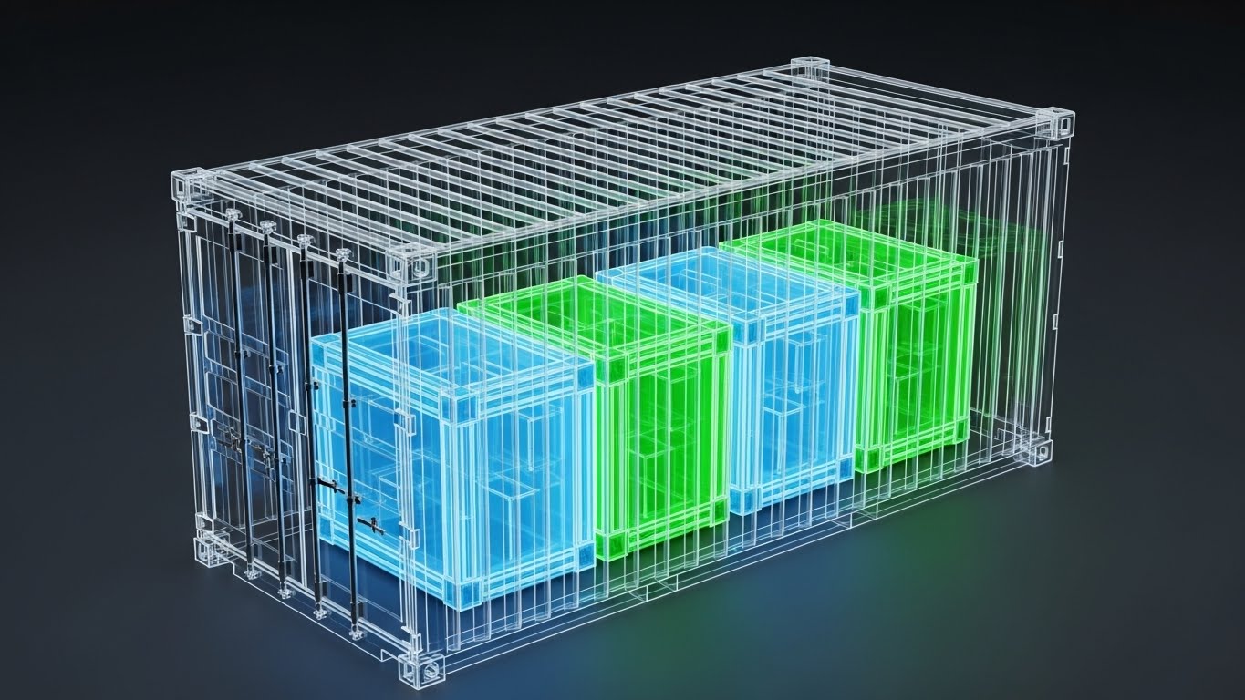
The Visual & Narrative Approach
The "Black Box" problem—not knowing what is inside the container—is a constant source of anxiety. This style solves it with a visual superpower. A standard 40-foot shipping container is rendered as a semi-transparent, Skeletal White mesh. Inside, the cargo is revealed as glowing, geometric crates in X-Ray Blue and Signal Green. The dark grey background ensures the internal data glows vividly. This metaphor visually grants the viewer "X-Ray Vision" into their inventory.
Psychological Impact & KPI Focus
- Niche Psychology: It provides Cognitive Relief from the fear of the unknown. It serves as a powerful metaphor for "Radical Transparency," telling the user: "With our platform, nothing is hidden from you—not the location, and not the contents."
- Operational Impact: It visualizes Compliance and Manifest Accuracy. It is particularly effective for explaining features like temperature monitoring (Cold Chain) or hazardous material tracking, where internal conditions are critical.
Strategic Implementation & Trade-offs
- Best Use Case: Re-engagement ads for users who viewed "Tracking" features, or headers for "Visibility" solution pages.
- Trade-off: It implies a depth of data that you must deliver. If your platform only tracks GPS coordinates but not manifest details, this metaphor is misleading.
Companies using similar video content -
IBM – Supply Chain Visibility Solutions – Provides deep visibility into cargo and inventory.
Tradelens – Data Sharing Platform – Offers transparency into container contents and movement.
15. 2D Line Art Animation
MOFU | Overcoming Objections
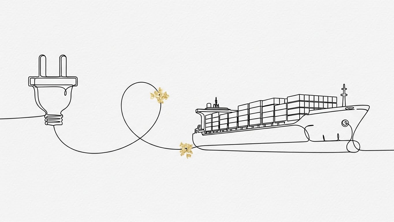
The Visual & Narrative Approach
To counter the fear of complex integration, this style uses radical simplicity. An elegant, continuous line art illustration in Ink Black flows across a textured paper-white background. The line morphs from a standard wall plug, loops intricately, and transforms seamlessly into the outline of a cargo ship. Touches of Gold Leaf texture accent the connection points.
Psychological Impact & KPI Focus
- Niche Psychology: "Integration Hell" is a major objection. Buyers fear that new software will break their existing ERP ecosystem. This fluid, unbroken line subliminally communicates Frictionless Continuity. It suggests that connecting via API is not a messy engineering project, but a simple, elegant act.
- Operational Impact: It visualizes Interoperability. It creates a visual shorthand for "Plug-and-Play," positioning your platform as a flexible layer that fits seamlessly into their existing tech stack.
Strategic Implementation & Trade-offs
- Best Use Case: Technical whitepapers, API documentation headers, or "Integration" pages.
- Trade-off: It is highly stylized and abstract. It builds a feeling of ease but does not explain the technical specifications.
Companies using similar video content -
Fleetbase – Open-Source Logistics OS – Illustrates seamless API integration and workflows.
Apache OFBiz – SCM Module – Shows fluid integration of warehouse and fulfillment processes.
16. Lifestyle Stock with UI Overlay
MOFU | The Functional Buyer

The Visual & Narrative Approach
This style targets the aspirational self-image of the buyer. We see a cinematic shot of a professional executive in a Navy Blue suit, standing in a high-rise office overlooking a blurred city harbor. He focuses on a tablet, but the key element is the futuristic, Holographic HUD floating above it, displaying high-level financial and logistics metrics in UI Blue and White.
Psychological Impact & KPI Focus
- Niche Psychology: Every Logistics Director wants to feel like the "Captain of the Industry"—in control, foresighted, and modern. This visual sells that Identity. It places the viewer in the shoes of the visionary leader who commands the port from a "Control Tower" perspective.
- Operational Impact: It visualizes Strategic Oversight and Decision Velocity. It shows that the data is portable and accessible, empowering high-level decision-making without being tethered to a desk.
Strategic Implementation & Trade-offs
- Best Use Case: LinkedIn Sponsored Content targeting C-Suite or VP-level titles.
- Trade-off: Avoid generic stock photography. The UI overlay must look custom and highly relevant to logistics to maintain credibility.
Companies using similar video content -
Flexport – Global Logistics Platform – Positions executives with strategic oversight of logistics.
GoFreight – Freight Forwarding SaaS – Empowers leaders with intuitive control over operations.
17. Clean UI Workflow (Light Mode)
MOFU | Time-to-Value
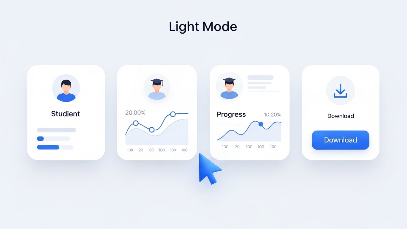
The Visual & Narrative Approach
For the daily user, clarity is king. This style presents a pristine, high-key UI design on a stark Hospital White background. The interface elements—showing a "Vessel Schedule" or "Progress" card—utilize soft shadows (neumorphism) to create depth. Colors are restricted to Soft Blues and Dark Greys, ensuring maximum readability.
Psychological Impact & KPI Focus
- Niche Psychology: Users are fatigued by clunky, legacy software. This "Clean UI" aesthetic signals Cognitive Hygiene. It promises a tool that is easy on the eyes, intuitive to navigate, and respects the user's attention.
- Operational Impact: It visualizes Usability and Efficiency. It demonstrates that your platform organizes data intelligently, reducing the "Time-to-Value" for every task performed.
Strategic Implementation & Trade-offs
- Best Use Case: "Ease of Use" sections on product pages, pricing pages, or free-trial signups.
- Trade-off: It is utilitarian. It appeals to the practical user who will use the tool daily, rather than the visionary executive.
Companies using similar video content -
Fresa Gold – ERP for Freight Forwarders – Presents a clear, intuitive interface for daily tasks.
Logitude World Ltd. – Freight Forwarding Solutions – Offers a clean UI for streamlined operations.
18. Rapid UI Feature Montage
BOFU | ROI Justification
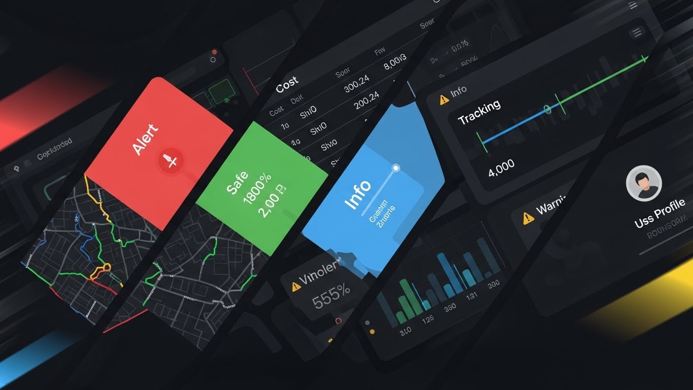
The Visual & Narrative Approach
When closing the deal, you need to show scale. This style uses a dynamic collage of diagonal slices. We see parts of a map, a cost table, a tracking bar, and a user profile cutting across the frame. The palette is a vivid spectrum of status colors: Alert Red, Safe Green, Info Blue, and Warning Yellow. Motion blur at the edges suggests speed.
Psychological Impact & KPI Focus
- Niche Psychology: This triggers the Value Perception. It visually overwhelms the viewer with the sheer volume of capabilities, reinforcing the idea that this is a robust, enterprise-grade solution that replaces multiple fragmented tools.
- Operational Impact: It visualizes Platform Comprehensiveness. It argues that your solution covers the entire lifecycle—from tracking and safety to costs and personnel—justifying the investment.
Strategic Implementation & Trade-offs
- Best Use Case: "Closing" emails, retargeting ads, or the final slide of a sales deck.
- Trade-off: It is chaotic by design. Do not use this to teach a specific feature; use it to impress with volume.
Companies using similar video content -
Descartes – Logistics Software Suite – Showcases comprehensive features for customs and transport.
Magaya – Freight Management Software – Highlights a wide range of integrated logistics capabilities.
19. 2D Animation & UI Composition
BOFU | Risk Mitigation

The Visual & Narrative Approach
To mitigate the fear of implementation failure, we introduce a friendly human element. A stylized 2D illustration features a female character in a Purple Blouse, interacting with floating, oversized UI elements. She points to a "Checklist" panel where Green Checkmarks animate into existence. The background features soft Yellow abstract blobs, adding warmth.
Psychological Impact & KPI Focus
- Niche Psychology: "Change Management" is the silent killer of SaaS deals. This style uses Approachability to disarm that fear. The character acts as a visual guide, reassuring the user that they will be supported and that success is just a checklist away.
- Operational Impact: It visualizes Guided Onboarding. It reframes the setup process from a daunting technical challenge to a manageable, human-centric journey.
Strategic Implementation & Trade-offs
- Best Use Case: Welcome emails, onboarding screens, or "Customer Success" brochures.
- Trade-off: It can look "tech-lite." Ensure the UI elements shown are accurate representations of business tasks to maintain professional relevance.
Companies using similar video content -
Odoo – Inventory Management – Guides users through easy onboarding and setup.
O2b Technologies – Open Source SCM – Simplifies setup for smooth logistics operations.
20. 2D Character-Driven Story
BOFU | Sales Cycle Acceleration

The Visual & Narrative Approach
Finally, we visualize the ultimate benefit: freedom. A 2D vector illustration depicts a logistics manager sitting casually on a wooden shipping crate, working on a laptop. The background is a stylized port at sunset, rendered in gradients of Denim Blue and Orange. The laptop screen glows with a bright green "Success" icon.
Psychological Impact & KPI Focus
- Niche Psychology: It sells the Lifestyle Benefit of the software. It tells the user: "Our tool gives you freedom." It disconnects the manager from the desk, promising that they can manage the port's complexity from anywhere.
- Operational Impact: It visualizes Remote Mobility and Cloud Accessibility. It validates the shift from on-premise servers to cloud-based SaaS, highlighting the ability to execute tasks remotely.
Strategic Implementation & Trade-offs
- Best Use Case: "Why Switch" campaigns, social media culture posts, or mobile app splash screens.
- Trade-off: It prioritizes emotion over function. It validates the decision to buy, rather than explaining the mechanics of the purchase.
Companies using similar video content -
QuickMove – Freight Forwarding Software – Visualizes remote management and operational freedom.
Freightview – TMS – Depicts managers achieving control from anywhere with data.
21. Hyper-lapse Stock Footage
BOFU | The Economic Buyer
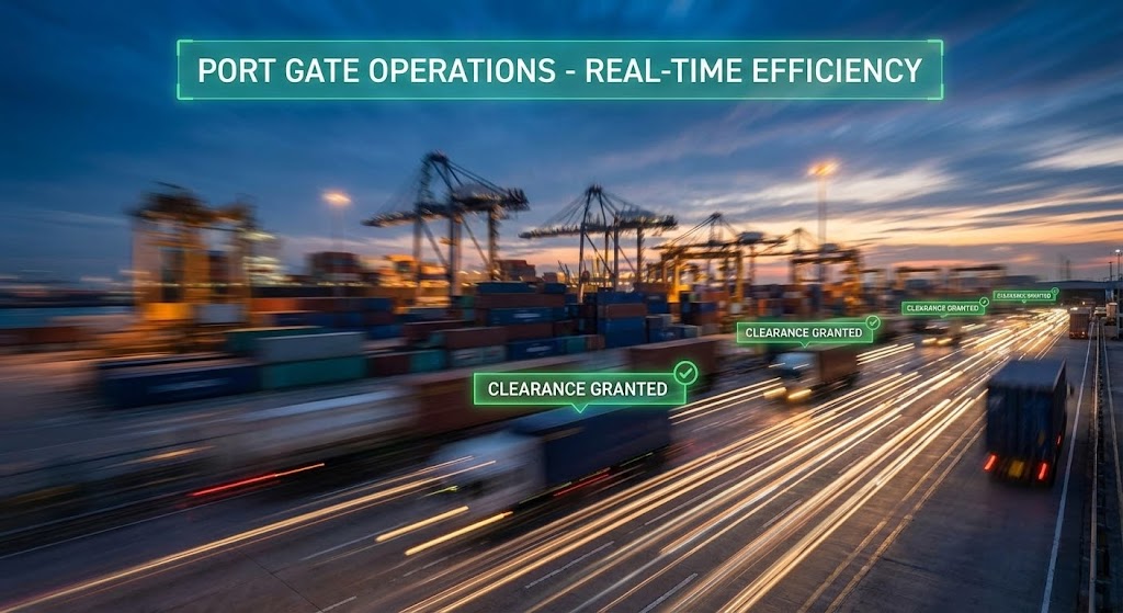
The Visual & Narrative Approach
This style visually validates the promise of speed. We utilize a hyper-lapse technique (time-lapse with camera movement) focusing on a busy port gate at dusk. The physical world—trucks, gantries, and ocean tides—is rendered with heavy motion blur to symbolize high-volume activity. Overlaid on this frenetic reality are sharp, static UI tags in Traffic Green. As trucks zip past, the tags instantly snap to "Clearance Granted." The contrast between the blurred reality and the sharp data emphasizes that the software is faster than the hardware.
Psychological Impact & KPI Focus
- Niche Psychology: For the Economic Buyer (CFO/COO), "Time is Money" is literal (demurrage charges). This visual creates a sense of Flow Assurance. It subconsciously proves that the digital layer (the software) stabilizes and accelerates the physical chaos, ensuring zero friction at entry points.
- Operational Impact: It directly visualizes Gate Turnaround Time and Processing Velocity. It demonstrates that compliance checks happen instantaneously, directly addressing the KPI of reducing truck idle time.
Strategic Implementation & Trade-offs
- Best Use Case: High-impact LinkedIn ads targeting Operations Directors or Terminal Managers concerned with congestion.
- Trade-off: It is depersonalized. It sells the system's capacity, not the user experience. Use it to prove volume handling, not ease of use.
Companies using similar video content -
AVANTE International Technology, Inc. – Port Terminal Monitoring – Visualizes accelerated gate turnaround and throughput.
Foreshore Technology – Dredging Software – Shows rapid, efficient dredging operations in action.
22. Abstract 2D Motion Graphics
BOFU | The Technical Buyer

The Visual & Narrative Approach
Software implementation is often tedious; completing it should feel like a victory. This style injects a micro-dose of dopamine to reward progress. A central burst of geometric "confetti"—circles, triangles, and arrows in Celebration Gold, Bright Teal, and Deep Purple—explodes outward from the center against a clean cream background. The shapes briefly form a "Star" or an upward trend line before settling. The motion is bouncy (whisk-style), elastic, and energetic.
Psychological Impact & KPI Focus
- Niche Psychology: This triggers the Reward Circuit. In a heavy industrial workflow, these moments of "Delight" reduce user fatigue. It tells the technical user (who just spent hours configuring an API) that they have achieved a "Win" and the system is ready.
- Operational Impact: It drives User Activation and Completion Rates. By visually rewarding the completion of boring tasks (like data entry or integration setup), you encourage users to finish the onboarding process.
Strategic Implementation & Trade-offs
- Best Use Case: "Success" screens inside the application (e.g., after "First Shipment Created" or "Integration Connected").
- Trade-off: It is purely emotional. It offers no data. Use it only as a reward mechanism, never for informational content.
Companies using similar video content -
Measutronics – ConnectedDredge – Celebrates successful dredging project milestones and progress.
Teledyne Marine – Dredge Monitoring Software – Rewards completion of complex construction tasks.
23. 2D Graphics Over Live Action
BOFU | Objection Handling

The Visual & Narrative Approach
This style bridges the gap between "Tech Support" and "Human Connection." We see a high-quality photo of a customer support agent with a warm, genuine smile in a blurred office setting. Surrounding her are whimsical, hand-drawn White 2D Vector Doodles: speech bubbles, connecting lines, and question marks transforming into exclamation points. These animations float playfully, symbolizing the flow of conversation and problem-solving.
Psychological Impact & KPI Focus
- Niche Psychology: Users fear being trapped in "Chatbot Hell." This mixed-media style reassures them that there is Human Agency behind the code. The playful doodles make the support process feel approachable and creative, rather than bureaucratic.
- Operational Impact: It addresses the objection of Support Availability. It visually promises that while the platform is digital, the backup is human, directly impacting Trust Scores and reducing anxiety during the buying phase.
Strategic Implementation & Trade-offs
- Best Use Case: "Contact Us" pages, Help Center headers, or "Premium Support" upsell brochures.
- Trade-off: The talent matters. The person in the photo must look genuine and professional. Avoid "Model with Headset" clichés; use real employee photos if possible.
Companies using similar video content -
Inttra – e-marketplace platform – Humanizes support for complex shipping processes.
Tradeverifyd – Supply Chain Visibility – Shows human support behind compliance automation.
24. Dark Mode UI Showcase
RETENTION | Reducing Friction

The Visual & Narrative Approach
In the 24/7 world of logistics, operators work night shifts. This style respects that reality. A macro close-up of the UI is shown in Dark Mode—deep charcoal and midnight blues. The rest of the screen is blurred, focusing intense attention on a single Pulsing Red Notification Bell and a text bubble reading "Delay Alert." The glow effects are exaggerated to mimic the look of a screen in a dark room.
Psychological Impact & KPI Focus
- Niche Psychology: It signals Operational Empathy. It shows you understand the environment of the user (dimly lit control rooms, night driving). The red alert against the dark background triggers immediate Vigilance without the eye strain of a bright white screen.
- Operational Impact: It focuses on Exception Management. It highlights the platform's ability to cut through the noise and deliver critical information (delays, accidents) instantly, improving Response Time.
Strategic Implementation & Trade-offs
- Best Use Case: Feature release emails for "Dark Mode" or "Mobile App" updates, or re-engagement emails for inactive users.
- Trade-off: It can feel somber. Use it specifically for "Alerts" and "Night Ops" features, not for general marketing.
Companies using similar video content -
Nozomi Networks – Maritime Cybersecurity – Highlights critical alerts in a dark mode interface.
Cydome – Maritime Cybersecurity – Focuses on instant threat detection in low-light environments.
25. Isometric 2D Motion Design
RETENTION | Reducing Churn
The Visual & Narrative Approach
To keep a customer, you must remind them of their growth. This style uses a clean, flat isometric perspective. A staircase formed of stylized Yellow and Orange shipping crates ascends from left to right across a soothing Mint Green floor. A small digital flag plants itself at the summit. The aesthetic is stable, balanced, and incremental, symbolizing steady progress.
Psychological Impact & KPI Focus
- Niche Psychology: This calms "Churn Anxiety." It visualizes Stability and Accumulated Value. It reminds the customer that their logistics operations are "leveling up" over time by using your platform. It frames the software as a partner in their journey, not just a vendor.
- Operational Impact: It reinforces Lifetime Value (LTV). By visualizing growth as a climb, it subtly encourages the user to keep going to reach the next "level" (upsell tier).
Strategic Implementation & Trade-offs
- Best Use Case: "Year in Review" emails, milestone celebration messages, or "Quarterly Report" covers.
- Trade-off: It is metaphorical. It needs to be paired with actual data (e.g., "You moved 5,000 containers this year") to have weight.
Companies using similar video content -
xTuple – Postbooks SCM – Visualizes incremental growth and stable inventory management.
OpenPro ERP – SCM Module – Shows steady progress in wholesale/distribution operations.
26. Macro UI Micro-Interactions
RETENTION | Knowledge Base

The Visual & Narrative Approach
Sometimes, the most powerful feature is the "Help" button. This style uses an extreme macro lens. We see the sub-pixel texture of a screen. A finger (softly out of focus) hovers over a "Get Help" button, which glows in a warm, inviting Safety Orange. The surrounding pixels are cool dark blues. The image captures the split-second before engagement, emphasizing readiness.
Psychological Impact & KPI Focus
- Niche Psychology: Users abandon software when they feel stuck. This visual communicates Accessibility. It tells the user: "Help is never more than one pixel away." It lowers the psychological barrier to asking for assistance.
- Operational Impact: It promotes Self-Service Support. By highlighting the ease of accessing the knowledge base, you drive traffic to automated support tools, reducing the burden on live agents.
Strategic Implementation & Trade-offs
- Best Use Case: Social media ads retargeting current users, or in-app tooltips introducing new support features.
- Trade-off: It is very specific. It sells the support function, not the core product value.
Companies using similar video content -
CargoNet – AI-based Freight Software – Emphasizes instant access to help and features.
FreightPOP – Freight Management Software – Highlights intuitive micro-interactions for complex tasks.
27. Holographic UI over 3D Render
RETENTION | Proactive Support
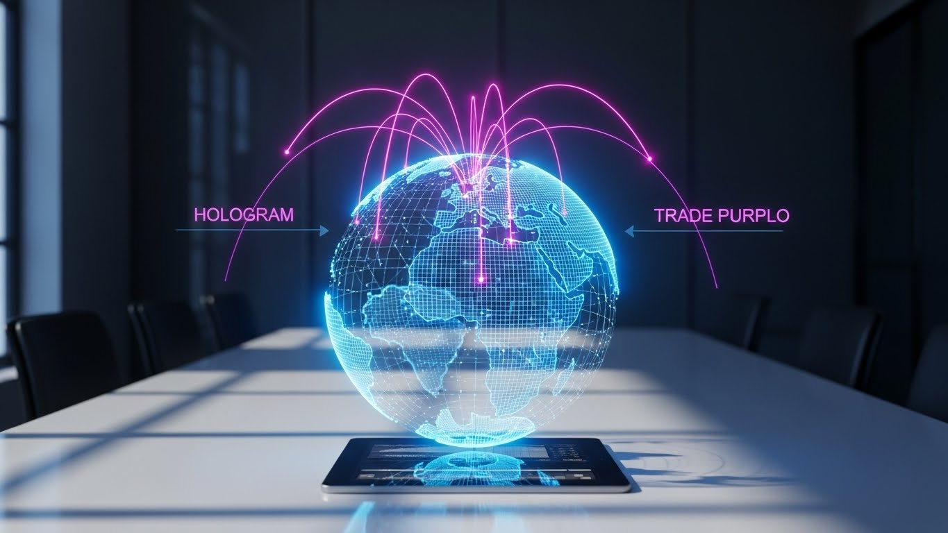
The Visual & Narrative Approach
This is the view from the top. In a sunlit, high-end boardroom, a tablet rests on a table. It projects a volumetric 3D Hologram of the Earth in wireframe Electric Blue and Laser Purple. Arcing lines connect continents, showing active trade lanes. The hologram feels ethereal yet grounded in the reality of the office, suggesting that the user holds the whole world in their hands.
Psychological Impact & KPI Focus
- Niche Psychology: This appeals to the Strategic Ego. It moves the conversation from "managing trucks" to "orchestrating global trade." It aligns your software with the future of work—predictive, panoramic, and powerful.
- Operational Impact: It visualizes Proactive Monitoring. The "God's Eye View" implies that the system sees problems (weather, political unrest) before they happen, allowing for strategic rerouting.
Strategic Implementation & Trade-offs
- Best Use Case: Enterprise landing pages, "Vision" decks for QBRs (Quarterly Business Reviews), or high-tier pricing pages.
- Trade-off: It looks expensive. If your software is a budget tool for small fleets, this visual will create a disconnect.
Companies using similar video content -
Bentley Systems – iTwin Platform – Projects global port operations as a strategic hologram.
SailPlan – Digital Twin Technology – Offers a holographic view of vessel performance.
29. Aspirational Stock Montage
EXPANSION | Driving Upsell

The Visual & Narrative Approach
Software doesn't just move boxes; it aligns people. This style features a heroic, low-angle shot of a diverse logistics team standing in a glass-walled boardroom. They look off-camera at a large screen (implied to be your dashboard), expressions filled with pride and satisfaction. The lighting is bright, with Lens Flares and cool blue tones reflecting off the glass, conveying a modern, transparent corporate culture.
Psychological Impact & KPI Focus
- Niche Psychology: This sells Organizational Harmony. It suggests that your software solves the friction between departments (Sales vs. Ops), creating a unified "Dream Team." It appeals to the leader's desire for a happy, productive workforce.
- Operational Impact: It visualizes Cross-Functional Collaboration. It shifts the focus from "individual productivity" to "team success," which is crucial for selling enterprise-wide licenses (Upsell).
Strategic Implementation & Trade-offs
- Best Use Case: "Enterprise" plan pages, testimonials, or recruiting videos for your clients.
- Trade-off: It can feel generic. The "Stock Photo Team" is a cliché. Ensure the diversity and setting feel authentic to the logistics industry (e.g., safety vests mixed with suits).
Companies using similar video content -
BlueYonder – Supply Chain Management – Depicts unified teams achieving operational excellence.
Transporeon – Cloud Logistics Platform – Shows collaborative success in logistics management.
30. Generative AI Realistic Character video
EXPANSION | Driving Referrals
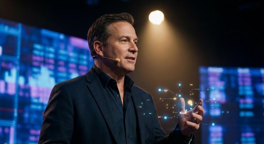
The Visual & Narrative Approach
To position your brand as a thought leader, you need a spokesperson. This style uses a high-end Generative AI Avatar (or realistic video) of an industry futurist. He stands on a stage with dramatic spotlighting. Behind him, out of focus, are screens of abstract data. Floating near his hand are subtle Augmented Reality (AR) particles in gold and light blue. He looks directly at the camera, speaking with authority and vision.
Psychological Impact & KPI Focus
- Niche Psychology: People follow leaders. By associating your brand with a charismatic, visionary figure, you build Authority. The AR elements suggest that this person (and by extension, your software) is ahead of the curve, possessing "Secret Knowledge" about the future of logistics.
- Operational Impact: It drives Brand Evangelism. It gives your customers a "Visionary Story" to share with their peers, turning them into referrals. It positions your platform not just as a tool, but as a movement.
Strategic Implementation & Trade-offs
- Best Use Case: "State of the Industry" keynotes, product launch announcements, or high-level thought leadership videos.
- Trade-off: The "Uncanny Valley." The AI generation must be perfect. If the lip-sync or eye movement is off, trust evaporates instantly.
Strategic Knowledge Base: The Visual Operations Doctrine
Synthesized by the Advids Expert Team
To transform these 30 visual styles from "aesthetic choices" into "business assets," we have developed a 3-segment strategic framework. This doctrine bridges the gap between the pixel and the port, providing a blueprint for Logistics and Digital Terrain leaders to implement a "Visual Operating System" that drives ROI.
Strategic Alignment & Visual Architecture
The "Pre-Production" Strategy – Why and Who.
The primary cause of "Shelfware" (software that is bought but not used) is not a lack of features, but a lack of visual fit. Before a single pixel is rendered, the visual architecture must be aligned with the cognitive reality of the user.
- The Cognitive Load Audit: Before selecting a style (e.g., Complex Dashboard vs. Minimalist Vector), audit the user's environment. A driver in a moving cab needs "High-Contrast, Low-Detail" visuals (Style 1), while a port planner in a quiet office needs "High-Density, Isometric" data (Style 6). Match the visual complexity to the user's stress level.
- Role-Based Visual Mapping: Do not use one style for all users. Create a "Visual Style Matrix." Operations Directors get Holographic Global Views (Style 27) to satisfy their need for oversight. Ground crews get Minimalist Flat Vector (Style 1) for rapid clarity on mobile devices.
- The "Glanceability" Standard: In logistics, seconds cost money. Define a standard for your visuals: "Can this be understood in 1.5 seconds?" If a dashboard or explainer video takes longer to decode, it fails the operational test. Use Bold Kinetic Typography (Style 5) for critical alerts.
- Brand Voice Consistency: While styles vary, the palette must not. Establish a "Global Color Code" (e.g., Warning Red is always #FF0000) that persists across your 2D animations, 3D renders, and UI mockups. This reduces cognitive friction as users switch between marketing content and the actual product.
- The Advids Strategic Audit: We recommend engaging a strategic partner to define this "Visual Operating System" early. A third-party audit can identify where your current visuals are creating "Interpretation Gaps" that your internal team, too close to the product, might miss.
- Standardization vs. Customization: For general marketing, use polished Isometric 3D (Style 3). But for specific client pitches, use Wireframe to Reality (Style 4) using their actual port data. The cost of customization is justified by the massive increase in conversion probability.
- The Cross-Departmental Bridge: Use visuals to unify terminology. A "Container" to Sales might be a "TEU" to Ops. A visual can serve as the Rosetta Stone that aligns both departments on the product's core value.
- Legacy System Integration: Visuals must bridge the gap between the old and new. When training staff on new SaaS tools, use visuals that explicitly show the connection to their legacy hardware (see Style 9). This reduces the "Fear of Replacement" and positions the software as an evolution of their existing skills.
- Accessibility in Trucking: Your workforce is global and multilingual. Prioritize Visuals over Text. A 3D X-Ray (Style 14) showing a damaged container is universally understood; a text alert is not.
- The Mobile-First Mandate: 60% of logistics access happens on mobile. Ensure all 30 styles—even complex 3D renders—are legible when scaled down to a smartphone screen. If Style 7 (Abstract AI) looks like a blur on mobile, it fails.
Operational Adoption & Implementation
The "Deployment" Phase – How to embed visuals into the workflow.
The best video content fails if it sits unwatched in a forgotten folder. Strategic implementation means embedding these visual assets directly into the operational workflow.
- Overcoming "Big Brother" Anxiety: Driver monitoring systems often face resistance. Use empathy-driven visuals (2D Graphics Over Live Action, Style 23) to frame these features as "Co-Pilots" for safety, rather than surveillance tools. Show the AI protecting the driver from false claims, rather than policing their breaks.
- The Micro-Learning Shift: The days of the 40-page PDF manual are over. Break down complex Standard Operating Procedures (SOPs) into 30-second "Micro-Interactions" (Style 26) or "Workflow Montages" (Style 6). These clips should be accessible "Just-in-Time"—embedded directly in the driver's tablet or the dispatcher's help menu.
- Just-in-Time Support: Embed specific visual styles into the helpdesk. When a user clicks "Error," trigger a Style 26 video overlay that visually guides them to the solution, keeping them in the flow of work.
- Gamification of Training: Use "Level Up" visuals (Style 22) to reward drivers for completing safety modules or achieving efficiency targets. Visualizing progress triggers dopamine and competitive engagement, transforming dry compliance tasks into achievable milestones.
- Reducing Support Ticket Volume: There is a direct correlation between the quality of your "Self-Serve" visuals and support costs. A well-placed Isometric 3D Workflow video (Style 6) explaining a complex routing feature can eliminate thousands of "How do I do this?" support tickets.
- Remote Onboarding: With distributed fleets, physical seminars are impossible. Use Generative AI Characters (Style 30) to deliver consistent, high-quality onboarding presentations in multiple languages, ensuring every driver gets the same high-standard welcome.
- Standard Operating Procedures (SOPs) as Visual Flows: Convert text-based SOPs into Line Art Animations (Style 15). A flowing line connecting steps A, B, and C is easier to memorize than a numbered list.
- Feedback Loops: Use interactive video elements. After a Feature Montage (Style 18), ask the user "Was this helpful?" The data gathered helps refine your visual strategy continuously.
- Scalable Localization: Strategies for translating visual assets for global fleets. When creating Photorealistic 3D Renders (Style 12), avoid embedding text in the render. Use floating UI layers for text. This allows you to swap languages for different regions without re-rendering the expensive 3D background.
- Leadership Communication: Use high-end Holographic UI (Style 27) visuals for Quarterly Business Reviews (QBRs). When showing ROI to the C-Suite, the visual fidelity must match the importance of the meeting.
Measuring Impact & Future-Proofing
The "ROI" Phase – Measuring success and looking ahead.
How do we prove that better visuals equal better business? You stop measuring "Views" and start measuring "Competency."
- Beyond "Views" to "Time-to-Competency": The metric that matters is how quickly a new user becomes productive. Measure the reduction in onboarding time for fleets trained with Wireframe to Reality videos (Style 4) versus those trained with text manuals. The delta represents significant operational savings.
- The "Idle Time" Metric: Poor software UX leads to trucks sitting idle at gates while drivers fumble with apps. High-contrast, clear visualization (Style 24) directly correlates to faster gate processing. Track the reduction in support tickets related to "UI Confusion" after deploying clearer visual guides.
- Compliance Velocity: When a new regulation (like ELD mandates) hits, measure how fast your fleet reaches 100% compliance after releasing a Minimalist Flat 2D (Style 1) explainer. Speed of information transfer is a competitive advantage.
- Retention and LTV: In SaaS, the renewal is won on adoption. Use Isometric 2D Motion (Style 25) during Quarterly Business Reviews to remind clients of the invisible value—uptime, security, and backend reliability—that they rarely see but always pay for.
- The AI Visual Frontier: The industry is moving toward Generative AI and Augmented Reality. Preparing your visual asset library now means you will be ready to overlay "Holographic Trade Lanes" (Style 27) onto real-world camera feeds in the near future.
- Scalability of Assets: Build a library that grows with the feature set. If you create a 3D container asset for Style 3, ensure it is rigged and ready for use in Style 12 and Style 21. Reusability drives down the cost-per-asset over time.
- The Advids Partnership: Visual trends evolve rapidly. Maintaining a relationship with a dedicated partner like Advids ensures your library doesn't become "Legacy Art." We help you pivot your existing assets into new formats (e.g., turning a 16:9 explainer into a 9:16 Short) efficiently.
- Benchmarking Success: Compare your visual engagement against industry standards. If your Lifestyle Stock (Style 16) ads have a lower CTR than the industry average, it’s a signal to refresh the visual metaphor.
- The ROI of Safety: Quantify the unquantifiable. If 3D X-Ray (Style 14) training videos help prevent one hazmat leak due to better cargo understanding, the ROI of that video is effectively infinite.
- Final Call to Innovation: Treat video and visualization not as "Marketing Content" but as "Operational Infrastructure." In the Digital Terrain of the future, the company that communicates the clearest will move the fastest.
Companies using similar video content -
IBM – Supply Chain Solutions – Features an AI-driven spokesperson for future vision.
Trademo – Global Supply Chain Intelligence – Presents a visionary leader for trade insights.
Author & Editor Bio


