
Introduction: Visualizing the Invisible Shield
In the modern enterprise, data is the heartbeat of existence. Yet, the physical infrastructure that sustains this heartbeat—the server racks, the cooling systems, the immutable backups—remains largely invisible to the stakeholders who fund it. This "Physical/Digital Divide" creates a critical communication gap. When a CTO requests budget for failover orchestration, the CFO often sees a line item, not the shield protecting the company’s future.
The financial stakes have never been higher. According to recent industry reports, the average cost of a single hour of downtime now exceeds $300,000 per hour for the vast majority of mid-size and large enterprises. This isn't just an IT metric; it is a board-level crisis. Furthermore, the operational gap in recovery is staggering. Recent data reveals that only 7% of organizations can recover within 1 day after a ransomware attack, highlighting a desperate need for better tools and clearer processes.
For Disaster Recovery (DR) and SaaS platforms, the challenge is not just technical reliability; it is visual translation. How do you show "resilience"? How do you visualize "zero-trust architecture" without resorting to generic stock footage?
This guide presents a strategic framework for visualizing the invisible. By leveraging specific animation styles—from Abstract 2D organic motion to high-fidelity 3D X-ray visualization—we can bridge the gap between complex backend operations and executive comprehension. These 30 visual examples are designed to reduce cognitive load, allowing viewers to grasp the "How" and "Why" of your solution instantly.
1. Abstract 2D Flat Vector Organic Motion Graphics
TOFU | Brand Awareness
The Visual & Narrative Approach
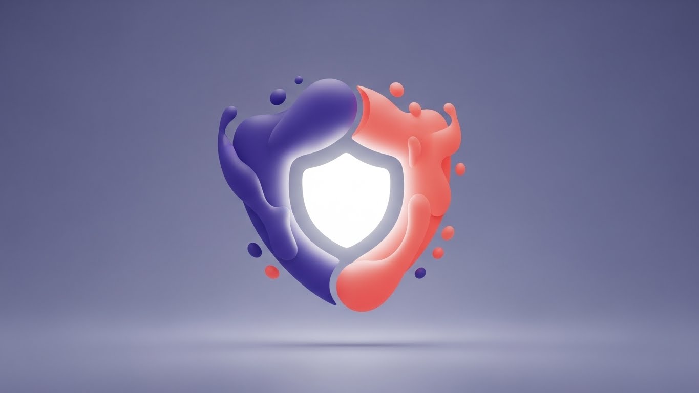
Visualization Scenario: In a crowded market of rigid hardware imagery, this style introduces a "Liquid Shield." The video opens with a soft violet void where organic, electric indigo and living coral shapes coalesce. They do not form a server or a lock, but rather a fluid, shifting barrier that wraps around a glowing white core (the data). As external "pressure" (abstract spikes) touches the surface, the liquid instantly hardens and reshapes to absorb the impact, visually defining "Failover Protection" as an organic, adaptive response.
Narration Tone: Smooth, confident, and modern. "Security that adapts as fast as you do."
Psychological Impact & KPI Focus
Niche Psychology: IT leaders fear rigidity; they know threats are dynamic. The liquid state suggests a system that evolves with the threat landscape (e.g., ransomware mutations).
Operational Impact: Supports Brand Awareness by creating a distinct visual identity that separates your brand from the "blue server rack" clichés of the industry.
Strategic Implementation & Trade-offs
- Best For: Website Hero Backgrounds (15s Loop).
- Trade-off: High abstraction builds emotional connection but sacrifices technical detail. It captures feeling (safety) over function (how it works).
Companies using similar video content -
Veeam – Data Platform – Abstract visualization of SDDC layers.
Rubrik – Security Cloud – Fluid, adaptive data protection.
Druva – Data Security Cloud – Organic data flow for cloud resilience.
2. Abstract 3D AI Visualization
TOFU | Market Education

The Visual & Narrative Approach
Visualization Scenario: To explain "Cluster Redundancy," we use a particle system of thousands of nodes. In this visualization, huge orange spheres (active nodes) are interconnected by delicate blue filaments, forming a complex, resilient web. The camera swirls dynamically around this structure, utilizing shallow depth of field to focus on the intricate connections. The orange glow signifies active data processing, while the blue web represents the stable, unbreakable network structure.
Narration Tone: Futuristic and precise. Focus on "interconnectivity" and "resilience."
Psychological Impact & KPI Focus
Niche Psychology: This style addresses the fear of the "Single Point of Failure." The visual of a dense, interconnected web provides Cognitive Reassurance that the network is robust and self-healing.
Operational Impact: Ideal for Market Education. It simplifies the complex topology of a mesh network into a single, beautiful object that anyone can understand.
Strategic Implementation & Trade-offs
- Best For: YouTube Pre-roll and Keynote Backgrounds.
- Trade-off: High production value implies a premium solution. It is less effective for selling "simple, cheap tools."
Companies using similar video content -
Cohesity – DataProtect – Interconnected node web for data resilience.
Microsoft Azure – Site Recovery – Complex network topology visualization.
3. Generative AI Cinematic Video
TOFU | Shaping Brand Perception
The Visual & Narrative Approach
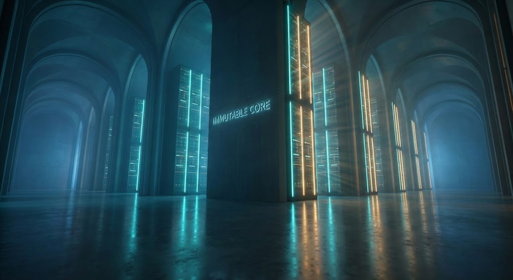
Visualization Scenario: A low-angle, breathtaking shot moves through a vast, cathedral-like server sanctuary. Monoliths of data rise into the darkness, bathed in teal and warm amber lighting. The reflection on the polished concrete floor emphasizes the scale. There are no humans—only the hum of automated power. The atmosphere conveys absolute silence, stability, and power, representing the "Immutable Core" of enterprise data.
Narration Tone: Gravitas-heavy and slow. Conveying permanence and institutional trust.
Psychological Impact & KPI Focus
Niche Psychology: The "Cathedral Effect" triggers a sense of Awe and Stability. It positions the data center as a fortress, satisfying the C-Level desire for permanence and security.
Operational Impact: Focusing on Shaping Brand Perception, this style elevates the vendor from a "software provider" to a "guardian of the enterprise."
Strategic Implementation & Trade-offs
- Best For: CTV/OTT Commercials and Event Openers.
- Trade-off: It is all "Vibe" and no "Verify." It builds authority but explains zero features. Must be paired with a strong voiceover.
Companies using similar video content -
IBM – Business Resilience Services – Cathedral-like server sanctuary for data.
Sungard AS – Recovery Services – Grand scale of data center operations.
4. 2D Line Art Animation
TOFU | Category Creation
The Visual & Narrative Approach
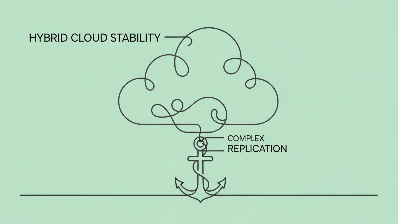
Visualization Scenario: Complexity is reduced to a single charcoal line on a mint green background. The line loops and weaves, forming the abstract silhouette of a cloud that flows down to become a heavy anchor. The connection never breaks. This minimalist loop visualizes "Hybrid Cloud Stability"—the agility of the cloud tethered by the security of on-premise hardware.
Narration Tone: Minimalist and sophisticated. Crisp sound design (pen on paper).
Psychological Impact & KPI Focus
Niche Psychology: Minimalism signals mastery. By stripping away the noise, you tell the viewer, "We make the complex simple."
Operational Impact: Supports Category Creation by visually defining new concepts (like "Anchored Cloud") without the distraction of realistic hardware.
Strategic Implementation & Trade-offs
- Best For: LinkedIn Organic and Email Signatures.
- Trade-off: Can look "low budget" if the animation physics aren't smooth. It relies entirely on the clarity of the visual metaphor.
Companies using similar video content -
Bacula Systems – Enterprise – Minimalist lines for hybrid cloud stability.
Proxmox – Backup Server – Simplified loop for open-source backup.
5. Low-Poly 3D Modeling
TOFU | Risk Mitigation Hook

The Visual & Narrative Approach
Visualization Scenario: A stylized digital fortress is rendered in low-poly facets of sky blue and paper white. Jagged, abstract "threat" shapes rain down but shatter upon impact with the faceted walls. The isometric top-down perspective gives a strategic view of the "Structural Integrity" holding firm against the chaos.
Narration Tone: Energetic and game-like. Proactive and defensive.
Psychological Impact & KPI Focus
Niche Psychology: Gamifies the concept of defense. The geometric structure implies Mathematical Safety and calculated protection.
Operational Impact: A powerful Risk Mitigation Hook. It visualizes the "invisible war" your software fights daily against ransomware.
Strategic Implementation & Trade-offs
- Best For: Blog Headers and Technical Documentation.
- Trade-off: Ensure the lighting is dramatic (high contrast) to avoid looking like a mobile game. It needs to feel serious, despite the stylized art.
Companies using similar video content -
Acronis – Cyber Protect Cloud – Digital fortress for ransomware defense.
Barracuda Networks – Backup – Geometric structure for data protection.
6. Bold Kinetic Typography (Visual)
TOFU | Vertical Social Organic

The Visual & Narrative Approach
Visualization Scenario: On a magenta background, thick yellow blocky forms (representing data chunks or text) rush upward with aggressive motion blur. The composition creates a feeling of rising velocity. It visualizes "High Availability" not through words, but through the sheer speed of the motion.
Narration Tone: Fast-paced, rhythmic, and punchy. Driven by a high-BPM track.
Psychological Impact & KPI Focus
Niche Psychology: Uses Pattern Interrupt to stop the scroll. The upward motion psychologically suggests "Uptime" and "Growth."
Operational Impact: Designed for Vertical Social Organic (Reels/TikTok). It conveys the feeling of a fast RTO (Recovery Time Objective) instantly.
Strategic Implementation & Trade-offs
- Best For: Instagram Reels and TikTok.
- Trade-off: It attracts attention but educates no one. It must be the "Hook" that leads to a "Story."
Companies using similar video content -
PagerDuty – Operations Cloud – Rushing text for high availability velocity.
Dynatrace – Software Intelligence Platform – Fast-paced motion for uptime.
7. Isometric 2D Motion Design
MOFU | Product Differentiation
The Visual & Narrative Approach
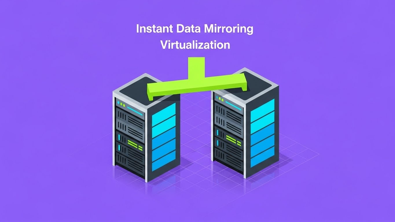
Visualization Scenario: A clean isometric illustration on a violet background shows a server rack connected by a neon lime green bridge to a perfect duplicate rack. Data travels across the bridge, lighting up the second rack in sync. This visualizes "Instant Data Mirroring" with zero ambiguity. No gradients, just solid, high-contrast blocks.
Narration Tone: Technical, instructional, and precise.
Psychological Impact & KPI Focus
Niche Psychology: Appeals to the Engineer's Mindset—ordered, precise, and measurable. It removes the "magic" and shows the "mechanic."
Operational Impact: Excellent for Product Differentiation. It visually proves that your "Clone" feature is an exact replica, not a fuzzy backup.
Strategic Implementation & Trade-offs
- Best For: Landing Pages and Feature Breakdowns.
- Trade-off: Can be dry. Needs snappy animation (easings) to feel premium.
Companies using similar video content -
Zerto – HPE Zerto Software – Neon bridge for instant data mirroring.
Carbonite – Availability – Precise illustration of data replication.
8. 3D X-Ray Visualization
MOFU | Feature Education

The Visual & Narrative Approach
Visualization Scenario: A photorealistic server blade floats in a grid. The chassis turns translucent (X-ray), revealing glowing blue internal components. Floating inside the machine, neon "ROI%" text pulses, merging the concept of hardware performance with business value. The camera zooms in to show the active redundancy of the drives, proving that this investment yields tangible returns.
Narration Tone: "High-Tech Documentary." Focusing on engineering excellence and value.
Psychological Impact & KPI Focus
Niche Psychology: Transparency builds trust. By showing the "guts" of the machine, you signal that you have nothing to hide.
Operational Impact: Supports Feature Education. It connects the physical hardware to the abstract business value (ROI), satisfying the Technical Buyer.
Strategic Implementation & Trade-offs
- Best For: Explainer Videos and Trade Shows.
- Trade-off: Expensive to produce. Reserve for flagship features.
Companies using similar video content -
Dell Technologies – Data Protection Suite – Translucent chassis for hardware redundancy.
Nlyte Software – DCIM – X-ray view of data center components.
9. Wireframe to Reality Transition
MOFU | Competitive Displacement
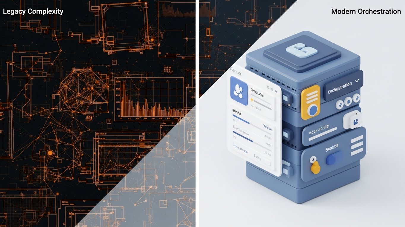
The Visual & Narrative Approach
Visualization Scenario: A split-screen composition. The left half shows a chaotic, wireframe blueprint of a network in orange lines, representing "Legacy Complexity." The right half transforms into a smooth, physically based render (PBR) of a sleek, organized server unit in slate blue, representing "Modern Orchestration." A glowing vertical line separates the two worlds.
Narration Tone: "Problem/Solution" structure. Tense to calm.
Psychological Impact & KPI Focus
Niche Psychology: Validates the buyer's pain (chaos) and offers a visual cure (order). The Contrast Bias makes the new solution look even better by comparison.
Operational Impact: Drives Competitive Displacement. It visually argues why the "Old Way" is obsolete without using words.
Strategic Implementation & Trade-offs
- Best For: Comparison Pages and Sales Decks.
- Trade-off: The "Legacy" side must look messy but recognizable, not just abstract art.
Companies using similar video content -
Commvault – Cloud – Chaos to order for modern orchestration.
ServiceNow – IT Operations Management – Shift from legacy complexity to organized IT.
10. Dark Mode UI Showcase
MOFU | The Technical Buyer
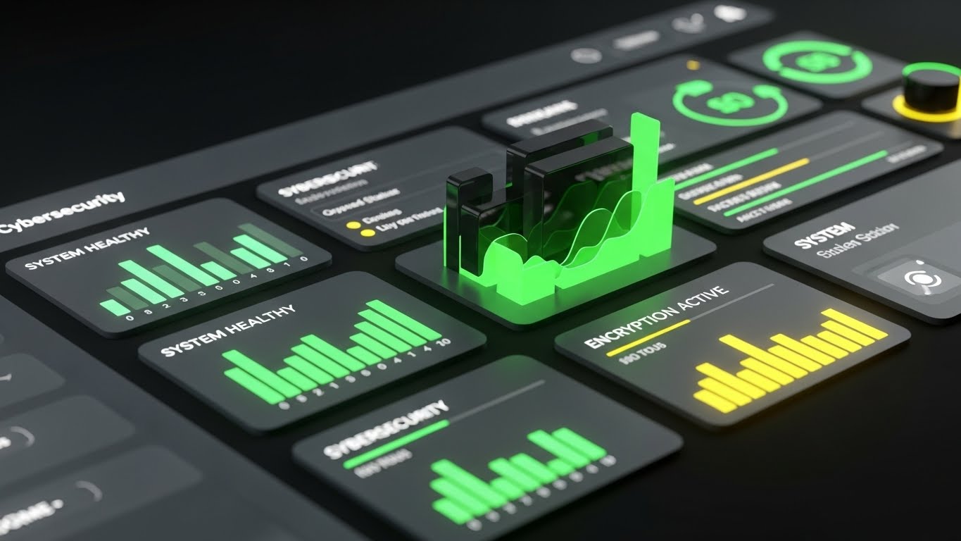
The Visual & Narrative Approach
Visualization Scenario: A close-up, straight-on view of a sophisticated SaaS dashboard in Dark Mode. The palette uses deep charcoal, emerald green, and slate grey. Abstracted data visualizations—histograms and status bars—glow in neon green against the dark background, indicating "System Healthy" and "Encryption Active." The UI elements have a slight skeuomorphic depth.
Narration Tone: Professional and user-centric. Focus on "control" and "visibility."
Psychological Impact & KPI Focus
Niche Psychology: Dark Mode signals Professionalism and Cybersecurity. It appeals to the operator who stares at screens all day, reducing eye strain and increasing focus.
Operational Impact: Targets The Technical Buyer. It proves the interface is modern, intuitive, and designed for serious work.
Strategic Implementation & Trade-offs
- Best For: Whitepapers and Demo Videos.
- Trade-off: UI updates frequently. Ensure the video doesn't become obsolete by focusing on "evergreen" dashboard views.
Companies using similar video content -
Rubrik – Security Cloud – Neon data for encryption health monitor.
Darktrace – /OT – Professional dark mode for cybersecurity dashboards.
11. AI Generated Mixed Media Video
MOFU | Building Trust
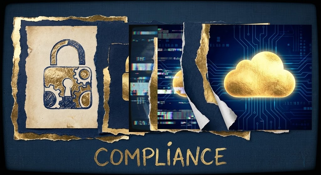
The Visual & Narrative Approach
Visualization Scenario: Breaking the monotony of purely digital screens, this style uses a dynamic collage technique to bridge the gap between "Old World" regulation and "New World" tech. The sequence begins with the texture of torn, antique parchment paper featuring a sketched padlock. As the paper tears away, it reveals a sleek, digital layer underneath—a glowing golden cloud on a deep navy circuit board background. The transition implies that while the regulations (paper) are traditional, the protection (digital) is modern.
Narration Tone: Sophisticated and textural. "The gold standard of security, reimagined for the cloud age."
Psychological Impact & KPI Focus
Niche Psychology: Compliance officers and risk managers often view the cloud as "risky." The tactile element of the paper and the solidity of the gold padlock provide a subconscious sense of Substance and Legitimacy, easing the fear of the intangible.
Operational Impact: Targets Building Trust. It visually certifies that your platform isn't just "tech"—it's a legally robust, compliant vault for their most sensitive assets.
Strategic Implementation & Trade-offs
- Best For: Social Ads (Instagram/LinkedIn) and Compliance Pages.
- Trade-off: The "artsy" aesthetic is polarizing. It works best for brands trying to appear boutique or premium, rather than utilitarian.
Companies using similar video content -
Everbridge – Critical Event Management – Tactile security for regulatory compliance.
IBM – Business Resilience Services – Blending old regulations with new tech.
12. Rapid UI Feature Montage
MOFU | Sales Cycle Acceleration
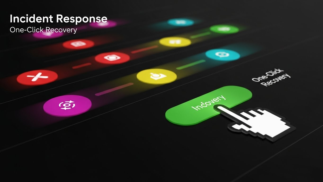
The Visual & Narrative Approach
Visualization Scenario: To visualize the speed of "Incident Response," the screen fills with a stylized, rapid-fire sequence of abstract UI buttons. A gradient of red (danger) buttons flies past with motion blur, leading to a stable, central green button labeled "Indovery" (Recovery). A cursor clicks it decisively. The immediate transition from motion blur chaos to a static, calm green state visually proves the concept of "One-Click Recovery."
Narration Tone: Urgent to relieved. Fast-paced. "Chaos strikes in milliseconds. Recovery should too."
Psychological Impact & KPI Focus
Niche Psychology: In a crisis, complexity is the enemy. This style appeals to the Fear of Paralysis during an attack. It promises the buyer that action is simple and decisive.
Operational Impact: Drives Sales Cycle Acceleration by answering the "How hard is it to use?" question before it's asked. It demonstrates the speed of RTO (Recovery Time Objective).
Strategic Implementation & Trade-offs
- Best For: Email Marketing and Retargeting Ads.
- Trade-off: It abstracts the actual interface. It sells the concept of the workflow, not the literal screen-by-screen steps.
Companies using similar video content -
NAKIVO – Backup & Replication – Action blur for one-click incident response.
PagerDuty – Operations Cloud – Rapid-fire UI for quick resolution.
13. Dynamic Data Visualization
BOFU | ROI Justification

The Visual & Narrative Approach
Visualization Scenario: To satisfy the CFO, we make money visible. Floating bar charts and area graphs are rendered in stunning 3D glassmorphism with emerald and gold gradients. They rise from a reflective white surface, interspersed with stylized coins. The transparency of the glass bars allows viewers to see "through" the data, symbolizing clear, transparent reporting. The upward trend is undeniable and dominant.
Narration Tone: Financial, authoritative, and results-oriented. "Invest in resilience. Harvest the returns."
Psychological Impact & KPI Focus
Niche Psychology: Financial buyers are skeptical of "IT black holes." This style uses Visual Tangibility (glass, gold, coins) to make cost savings feel real and substantial.
Operational Impact: Perfect for ROI Justification. It translates "uptime" into "revenue preserved," speaking the language of the Economic Buyer.
Strategic Implementation & Trade-offs
- Best For: Pitch Decks and Investor Presentations.
- Trade-off: It requires hard data to back it up. A beautiful chart with vague numbers ("Save Money") creates distrust. Use specific percentages.
Companies using similar video content -
Veeam – Data Platform – Glass data for transparent ROI justification.
LogicMonitor – Unified Monitoring – Rising value graphs for performance.
14. 2D Animation & UI Composition
BOFU | Overcoming Objections

The Visual & Narrative Approach
Visualization Scenario: A playful, character-driven animation addresses the "Burnout" objection. A stylized IT character struggles to lift a massive, purple block labeled "Heavy Workload" (representing manual server maintenance). Suddenly, a glowing turquoise UI lever ("IT Team") appears. The character pushes it with one finger, and the heavy block floats effortlessly. The background is a soft, reassuring pink, contrasting with the heavy dark block.
Narration Tone: Empathetic and lighthearted. "Stop carrying the weight of the world. Let us do the heavy lifting."
Psychological Impact & KPI Focus
Niche Psychology: IT teams are overworked. This style leverages Empathy. It acknowledges their pain (the heavy load) and positions your software as the hero that gives them their weekends back.
Operational Impact: Critical for Overcoming Objections regarding implementation effort. It visually promises that the software reduces, rather than adds to, their daily burden.
Strategic Implementation & Trade-offs
- Best For: FAQ Pages and "Why Us" sections.
- Trade-off: The "cartoon" style must be refined to avoid looking childish. It should feel like a "New Yorker" illustration, not a Saturday morning cartoon.
Companies using similar video content -
Unitrends – Backup and Recovery – Playful character for workload lift.
NinjaOne – Endpoint Management – Animated character for operational empathy.
15. Futuristic Neon/Dark Mode
BOFU | Risk Mitigation
The Visual & Narrative Approach
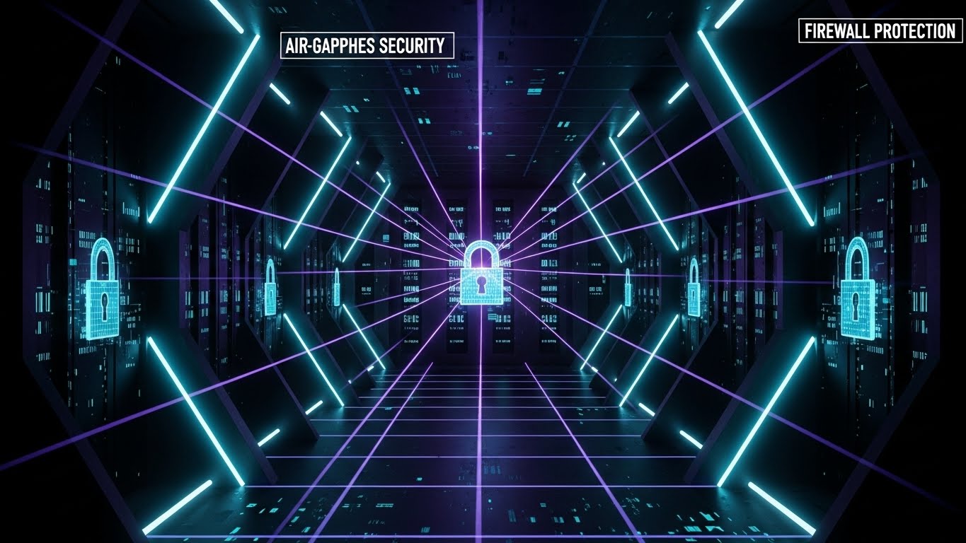
Visualization Scenario: A deep dive into the "Digital Vault." The viewer travels down a dark, infinite corridor lined with secure data banks, illuminated only by precision laser grids in neon cyan and purple. Holographic locks engage in sequence. This is the visual definition of "Air-gapped Security"—a closed, impenetrable environment where data is isolated from the chaos of the public web.
Narration Tone: Serious, dark, and intense. "In a world of open doors, we are the vault."
Psychological Impact & KPI Focus
Niche Psychology: Fear of ransomware is the primary driver here. The dark, fortified aesthetic triggers a feeling of Safety through Isolation. It appeals to the paranoia of the CISO.
Operational Impact: A strong Risk Mitigation tool. It visualizes the firewall and encryption layers that are otherwise invisible code.
Strategic Implementation & Trade-offs
- Best For: Security Feature Pages and SOC2 Compliance sections.
- Trade-off: Can feel cold or menacing if overused. Use it strictly for security features, not for user collaboration features.
Companies using similar video content -
Fortinet – FortiGuard OT Security – Digital vault for air-gapped security.
Nozomi Networks – Vantage – Laser grids for isolated data environments.
16. Lifestyle Stock with UI Overlay
BOFU | The Economic Buyer
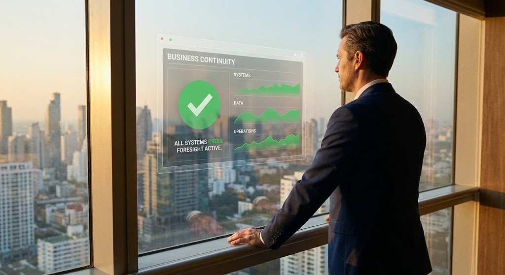
The Visual & Narrative Approach
Visualization Scenario: An over-the-shoulder shot captures a C-level executive in a high-rise office, looking out at a city skyline bathed in warm sunset light. A subtle, high-fidelity holographic UI floats in the glass reflection, displaying a "Business Continuity" dashboard with all metrics green. The executive is calm, hands on the sill—the posture of someone in total control.
Narration Tone: Aspiring and leadership-focused. "See beyond the crisis. Command the future."
Psychological Impact & KPI Focus
Niche Psychology: Executives don't want to see servers; they want to see Governance. This image sells the feeling of being a prepared leader who protects the company's valuation.
Operational Impact: Targets The Economic Buyer (CEO/CFO). It moves the conversation from "tech specs" to "corporate responsibility" and "brand reputation."
Strategic Implementation & Trade-offs
- Best For: LinkedIn Ads targeting C-Suite and Annual Reports.
- Trade-off: Relies heavily on the quality of the stock footage. "Cheesy" stock acting ruins the credibility instantly.
Companies using similar video content -
Everbridge – Critical Event Management – Executive vision for business continuity.
Sungard AS – Recovery Services – C-level executive with continuity dashboard.
17. Split Screen: Optimized Reality
BOFU | Objection Handling
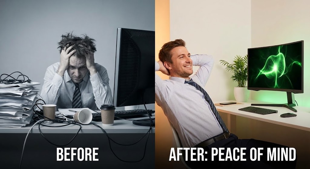
The Visual & Narrative Approach
Visualization Scenario: A direct "Before and After" comparison. The left screen shows a desaturated, chaotic office scene: a stressed worker, cluttered desk, tangled wires ("Before"). The right screen bursts with color and light: the same worker, relaxed, leaning back with a clean desk and a glowing green monitor ("After: Peace of Mind"). The contrast is sharp and immediate.
Narration Tone: Problem/Solution. "The difference isn't just software. It's your sanity."
Psychological Impact & KPI Focus
Niche Psychology: Uses Cognitive Contrast to heighten the perceived value of the solution. It validates the user's current stress and offers a tangible escape route.
Operational Impact: Powerful for Objection Handling. It personalizes the ROI, showing that the investment pays off in quality of life for the team, not just server uptime.
Strategic Implementation & Trade-offs
- Best For: Retargeting Ads (for users who visited the pricing page).
- Trade-off: Can be too "direct sales" for a homepage. Best used when the user is already considering the purchase.
Companies using similar video content -
Unitrends – Backup and Recovery – Chaos vs. control for operational peace.
MSP360 – Managed Backup – Before/after for simplified IT.
18. Abstract 2D Motion Graphics
BOFU | Demand Gen
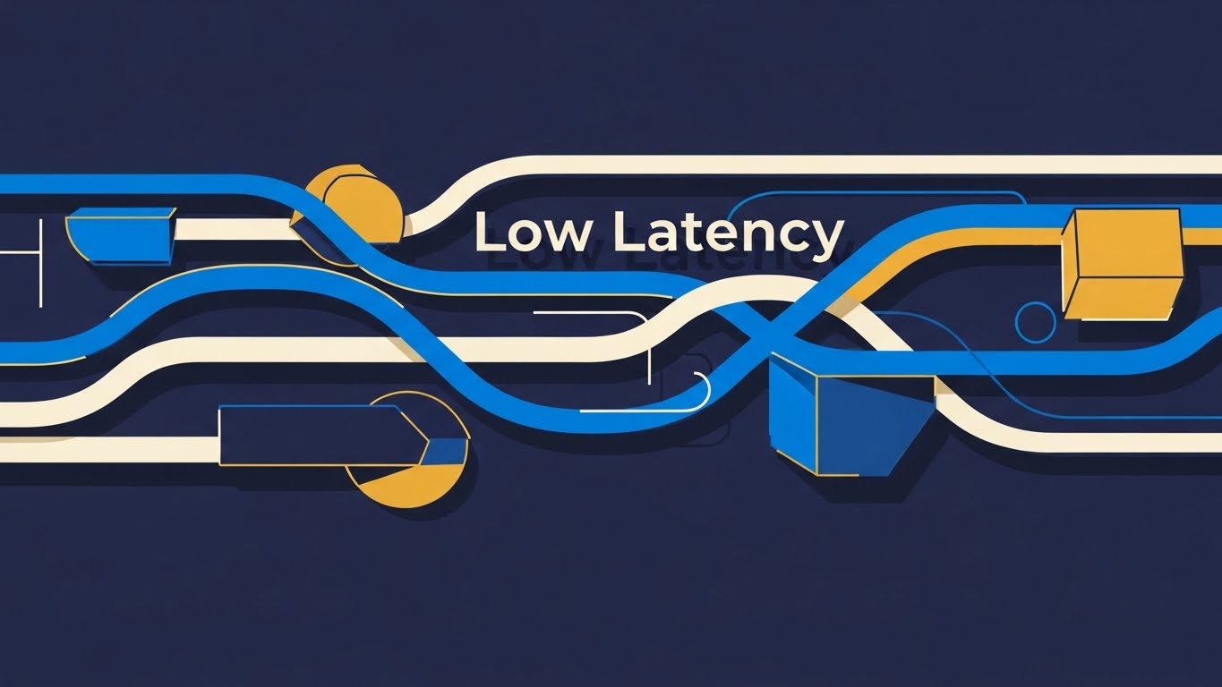
The Visual & Narrative Approach
Visualization Scenario: To visualize "Low Latency" and speed, we use pure motion. Thick, vector lines in cobalt blue, white, and mustard yellow weave rapidly across a deep blue background. They encounter obstacles (latency spikes) but flow effortlessly around them without breaking speed. The animation is smooth, rhythmic, and hypnotic, symbolizing the uninterrupted flow of data packets in a high-performance network.
Narration Tone: Fast, rhythmic, and efficient. "Data that moves as fast as your decisions."
Psychological Impact & KPI Focus
Niche Psychology: Flow State. The smooth motion subliminally reassures the viewer that there are no hiccups, buffers, or crashes. It suggests a frictionless experience.
Operational Impact: Supports Demand Gen by emphasizing performance metrics (speed/throughput) without needing complex technical diagrams.
Strategic Implementation & Trade-offs
- Best For: Display Ads (Google Network) and Event Backdrops.
- Trade-off: It is purely aesthetic. It captures attention but communicates very little specific information. Needs strong headline text.
Companies using similar video content -
Datadog – Monitoring & Security – Fluid streams for low latency performance.
Dynatrace – Software Intelligence Platform – Weaving lines for uninterrupted data flow.
19. Minimalist Flat 2D Vector
Onboarding | Driving Freemium/Trials
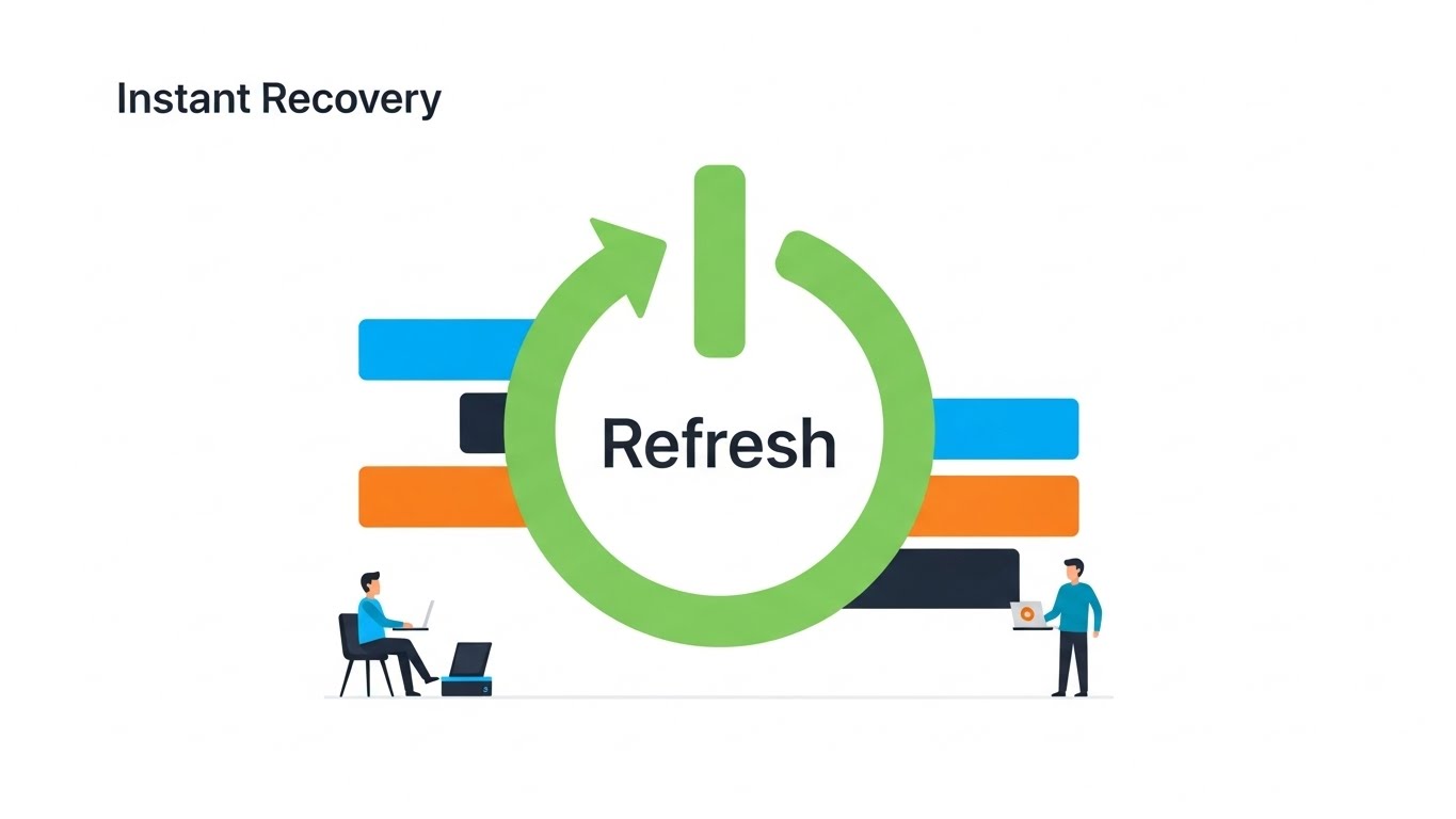
The Visual & Narrative Approach
Visualization Scenario: Simplicity is the ultimate sophistication here. Against a vast white negative space, a flat, vector illustration depicts a "Refresh" arrow circle in spring green, stylized to resemble a power button. Two small, simplified characters (users) stand by it, relaxed. There is no clutter, no server racks, no code. Just the symbol of "On." This invites the user to start a trial, promising that recovery is as easy as hitting a button.
Narration Tone: Friendly, inviting, and simple. "Recovery isn't a project. It's a button push."
Psychological Impact & KPI Focus
Niche Psychology: Cognitive Ease. At the point of signup, the user fears commitment and complexity. This style removes all visual friction, signaling "This will be easy."
Operational Impact: Critical for Driving Freemium/Trials. It lowers the barrier to entry by visually promising a lightweight, easy-to-manage tool.
Strategic Implementation & Trade-offs
- Best For: Signup Pages and Trial Landing Pages.
- Trade-off: Too simple for technical deep dives. Do not use this to explain how the replication works, only that it works easily.
Companies using similar video content -
Proxmox – Backup Server – Power cycle for frictionless recovery.
Duplicati – Open-source backup – Simple button for easy backup.
20. Clean UI Workflow (Light Mode)
Onboarding | Self-Serve Onboarding
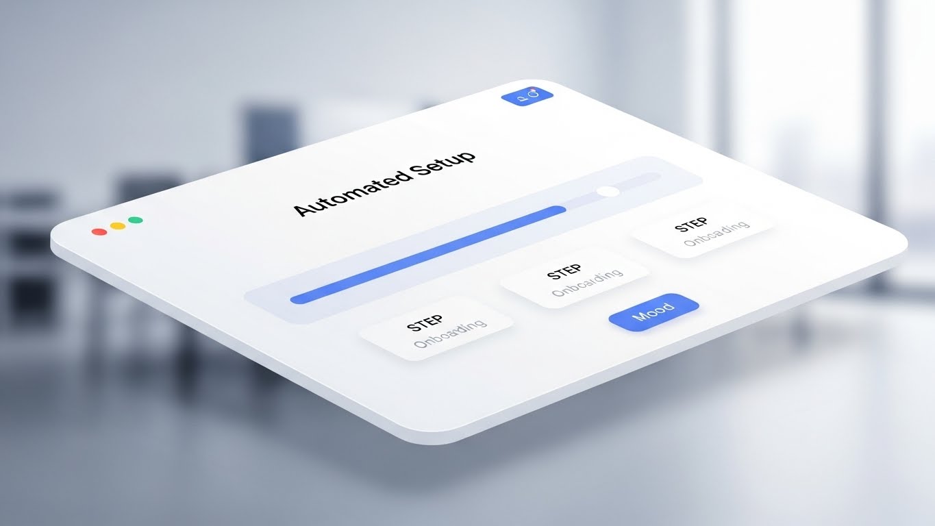
The Visual & Narrative Approach
Visualization Scenario: A pristine, high-key 3D angled view of an interface card. The background is a blurred, bright modern office. The UI card is white with soft blue accents, focusing entirely on a horizontal progress bar that fills smoothly from left to right. Steps labeled "Config," "Sync," and "Live" light up in succession. This visualizes the "Automated Setup" process, confirming that the user is making progress and will be finished shortly.
Narration Tone: Encouraging and helpful. "You're almost there. Three steps to total protection."
Psychological Impact & KPI Focus
Niche Psychology: Goal Gradient Effect. Showing a progress bar visually motivates the user to complete the task. The clean, light aesthetic reduces anxiety about "messing up" the configuration.
Operational Impact: Essential for Self-Serve Onboarding. It reduces support tickets by visually guiding the user through the "Happy Path" of the setup process.
Strategic Implementation & Trade-offs
- Best For: In-App Welcome Screens and Onboarding Emails.
- Trade-off: Must reflect the actual UI accurately enough to be helpful, even if stylized.
Companies using similar video content -
AOMEI – Backupper – Progress clarity for automated onboarding.
IDrive – Online Backup – Pristine UI for simple setup.
21. Hyper-lapse Stock Footage with Data
Onboarding | Accelerating TTV

The Visual & Narrative Approach
Visualization Scenario: We visualize the concept of "Traffic" and "Throughput" by blending reality with data. A high-angle hyper-lapse of a city skyline at night captures the frenetic energy of the physical world. Car lights streak in gold and red. Superimposed on this are glowing blue data streams that flow upwards from the buildings into the night sky, merging into a "Cloud." This blends the scale of real-world infrastructure with the speed of digital migration.
Narration Tone: Fast, energetic, and grand. "Your city never sleeps. Neither does your data."
Psychological Impact & KPI Focus
Niche Psychology: Momentum. New users often feel the "onboarding drag." This visual style instills a sense of velocity and progress, reassuring them that migration will be swift.
Operational Impact: Targets Accelerating Time-to-Value (TTV). It visually promises that the "heavy lifting" of data transfer happens at the speed of light, encouraging users to start the upload immediately.
Strategic Implementation & Trade-offs
- Best For: Pre-Roll Ads and Waiting Screens (during data sync).
- Trade-off: High-quality stock is essential. If the tracking of the data lines against the footage isn't perfect, it breaks the illusion.
Companies using similar video content -
AWS – CloudEndure Disaster Recovery – City streams for accelerated TTV.
Google Cloud – Disaster Recovery – Blending real-world scale with data migration.
Microsoft Azure – Site Recovery – Fast-moving city with data streams.
22. 2D Character-Driven Story
Onboarding | Reducing Friction
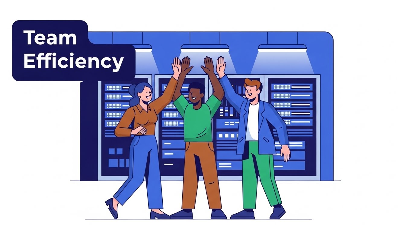
The Visual & Narrative Approach
Visualization Scenario: Technical setup is often lonely and stressful. This style humanizes it. A flat, vector illustration shows a diverse team of three IT professionals in a stylized server room. They are high-fiving—a moment of genuine celebration. The background features simplified server racks in blue, while the characters wear earth tones to stand out. It emphasizes "Team Efficiency" and the shared relief of a successful backup test.
Narration Tone: Friendly, relatable, and human. "Success is a team sport. We just make the playbook easier."
Psychological Impact & KPI Focus
Niche Psychology: Social Belonging. It reminds the user that they are not just fixing machines; they are protecting their team. It reinforces the emotional reward of a job well done.
Operational Impact: Supports Reducing Friction. By associating the software with a "happy ending" (the high-five), it subconsciously motivates the user to push through technical hurdles during setup.
Strategic Implementation & Trade-offs
- Best For: Help Center Articles and "Success" Confirmation Screens.
- Trade-off: Avoid "corporate Memphis" generic art. The characters need specific details (e.g., a server tool, a badge) to look like IT pros, not random generic figures.
Companies using similar video content -
NinjaOne – Endpoint Management – Team victory for frictionless user activation.
MSP360 – Managed Backup – High-fiving IT pros for successful setup.
23. 2D Graphics Over Live Action
Onboarding | User Activation

The Visual & Narrative Approach
Visualization Scenario: Bridging the gap between the user and the tool. A medium shot shows a young professional woman in a sunlit office, looking at her monitor with a satisfied, calm expression. Floating in the air next to her—composited seamlessly into the 3D space—is a 2D graphic icon of a cyan shield with a white checkmark. The shield gently bobs, indicating it is "active." This connects the real human operator with the digital protection.
Narration Tone: Assuring and integrated. "Real protection for real work."
Psychological Impact & KPI Focus
Niche Psychology: Integration. Users want to feel that the software fits into their daily life, not that it dominates it. This style visualizes the software as a helpful, unobtrusive companion.
Operational Impact: Drives User Activation. It shows the "Target State"—a relaxed human protected by the software—encouraging the user to configure the settings to achieve that status.
Strategic Implementation & Trade-offs
- Best For: Email Nurture Sequences and Welcome Videos.
- Trade-off: Lighting matching is critical. The 2D graphic must cast a subtle shadow or have light interaction to feel like it belongs in the room.
Companies using similar video content -
Splashtop – Remote Support – Human shield for active success metrics.
Carbonite – Availability – Live action with shield overlay for protection.
24. Macro UI Micro-Interactions
Retention | Driving Feature Adoption

The Visual & Narrative Approach
Visualization Scenario: An extreme close-up (macro) view of a specific UI toggle switch. The background is a matte black texture, and the toggle is a glowing electric blue "pill" shape. It slides from "Off" to "On" with a satisfying, weighty animation curve. The text "Immutable Mode" lights up. This focuses the viewer's attention entirely on the act of enabling a feature, making it feel tactile and significant.
Narration Tone: Precise and instructional. "One switch. Infinite protection."
Psychological Impact & KPI Focus
Niche Psychology: Control. IT admins love granular control. The macro view emphasizes the precision of the tool and the significance of the user's choice.
Operational Impact: Key for Driving Feature Adoption. It removes the clutter of the full dashboard and forces focus on a single, high-value feature, increasing the likelihood of users turning it on.
Strategic Implementation & Trade-offs
- Best For: In-App Tooltips and "New Feature" Announcements.
- Trade-off: It requires high-fidelity motion design. A simple "blink" isn't enough; the movement needs "physics" to feel premium.
Companies using similar video content -
Zerto – HPE Zerto Software – Tactile toggle for granular feature adoption.
NAKIVO – Backup & Replication – Close-up toggle for immutable mode.
25. Photorealistic 3D Renders
Retention | Reducing Support Overhead

The Visual & Narrative Approach
Visualization Scenario: When a user needs support, they need clarity. A studio-quality, photorealistic 3D render shows a pristine, silver metallic server unit isolated on an infinite white floor. The camera pans slowly across the back panel, highlighting specific ports and cooling vents with zero distraction. The lighting accentuates the brushed metal texture. This isn't marketing fluff; it's a "Digital Twin" of the hardware they have in their rack.
Narration Tone: Clinical, helpful, and clear. "Identify. Verify. Resolve."
Psychological Impact & KPI Focus
Niche Psychology: Clarity. In a support scenario, ambiguity is frustration. This style provides absolute visual certainty about what the hardware looks like, reducing confusion.
Operational Impact: Directly Reduces Support Overhead. By allowing users to visually identify components (e.g., "The third port from the left"), it speeds up self-service troubleshooting.
Strategic Implementation & Trade-offs
- Best For: Knowledge Base Articles and Hardware Manuals.
- Trade-off: Must be 100% accurate. A missing port in the render vs. the real unit will destroy trust.
Companies using similar video content -
Schneider Electric – EcoStruxure IT – Silver chassis for hardware support precision.
Device42 – DCIM – Digital twin of hardware for support.
26. Generative AI Realistic Character video
Retention | Reducing Churn

The Visual & Narrative Approach
Visualization Scenario: A medium close-up of a middle-aged IT Manager with glasses, standing in a server room separated by a glass wall. He is holding a tablet and smiling genuinely—not a "stock photo" smile, but a look of relief. The background servers blur into warm bokeh lights (amber and teal). The image radiates "Reliability" and the human peace of mind that comes from knowing the backups are safe.
Narration Tone: Appreciative and partner-focused. "We don't just protect data. We protect your reputation."
Psychological Impact & KPI Focus
Niche Psychology: Validation. The IT Manager often feels thankless. This visual validates their role as the "quiet guardian." Seeing a peer (even a generated one) looking satisfied reinforces their decision to renew the contract.
Operational Impact: Targets Reducing Churn. It reinforces the emotional connection to the brand, reminding the customer that the software is a partner in their professional success.
Strategic Implementation & Trade-offs
- Best For: Loyalty Emails and Customer Success Stories.
- Trade-off: AI generation must be high-tier to avoid "Uncanny Valley." The eyes and hands must be perfect.
Companies using similar video content -
IBM – Business Resilience Services – Human factor for reducing customer churn.
Sungard AS – Recovery Services – Satisfied IT manager for reliability.
27. Holographic UI over 3D Render
Retention | Proactive Support
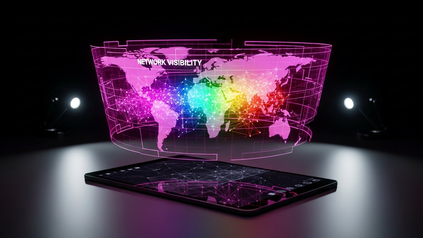
The Visual & Narrative Approach
Visualization Scenario: Visualizing the invisible network. A realistic 3D render shows a tablet lying on a dark desk. Projecting upwards from the screen is a rotating, translucent holographic map of the world, with network nodes glowing in rainbow colors. The hologram adds a "Sci-Fi" layer to a standard device, visualizing "Network Visibility" and future-facing capabilities.
Narration Tone: Visionary and sophisticated. "See the threat before it sees you."
Psychological Impact & KPI Focus
Niche Psychology: Omniscience. IT leaders want to feel like they see everything. The hologram visualizes this "God View" of the network, providing a sense of total control.
Operational Impact: Supports Proactive Support. It visualizes the concept of monitoring—showing that the system is watching the global network so the user doesn't have to.
Strategic Implementation & Trade-offs
- Best For: Product Update Videos and Roadmap Presentations.
- Trade-off: The hologram physics (glow, transparency) need to look high-end, or it risks looking like a cheap toy.
Companies using similar video content -
FNT Software – DCIM – Future map for proactive network visibility.
Claroty – Platform – Holographic map for OT/ICS network.
28. 3D Parallax UI Presentation
Expansion | Thought Leadership
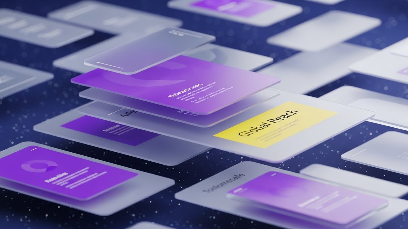
The Visual & Narrative Approach
Visualization Scenario: To demonstrate "Scale," we break the 2D screen. A surreal composition shows UI screens floating in a deep space environment (blue and purple starfield). The screens are arranged in parallax layers—some close, some far—creating a sense of immense depth and volume. The camera glides through them. This visualizes "Global Reach" and the infinite scalability of the cloud, implying that the software can handle any amount of data.
Narration Tone: Expansive and limitless. "Built for the enterprise that has no ceiling."
Psychological Impact & KPI Focus
Niche Psychology: Ambition. Enterprise buyers want partners that can grow with them. This style visually eliminates "boundaries," signaling that the vendor is a major player.
Operational Impact: Establishes Thought Leadership. It moves the brand perception from "Tool" to "Platform," justifying upsell opportunities for larger data packages.
Strategic Implementation & Trade-offs
- Best For: Webinars and Conference Keynotes.
- Trade-off: It’s abstract. It doesn’t show how to use the UI, only the scope of the UI.
Companies using similar video content -
Cohesity – DataProtect – Infinite layers for global cloud scalability.
Commvault – Cloud – UI screens in deep space for enterprise scale.
29. Isometric 3D Workflow
Expansion | Upsell/Cross-sell
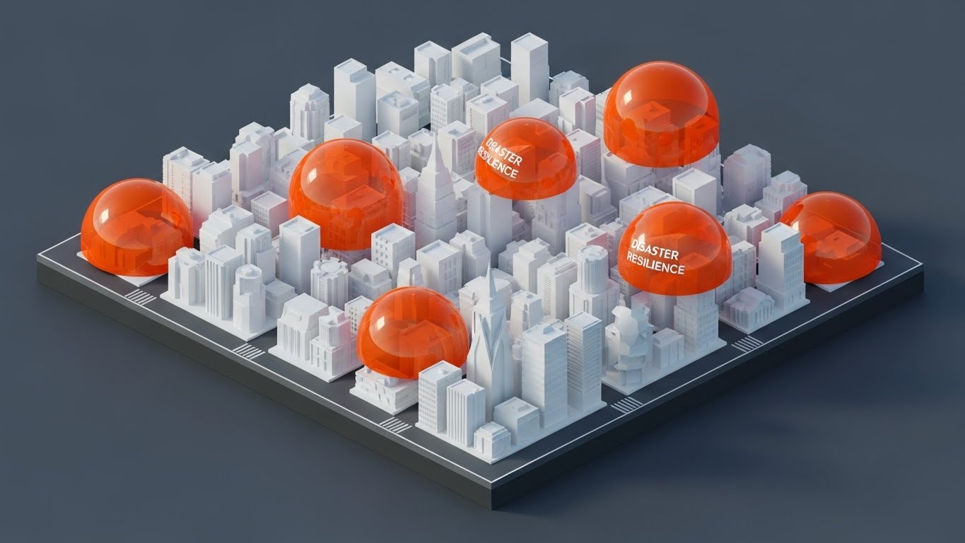
The Visual & Narrative Approach
Visualization Scenario: A bird's-eye view of an intricate isometric 3D miniature city. The buildings are white and clean, but they are being sequentially covered by protective, translucent orange domes. As the city grows (new buildings popping up), new domes instantly appear. This visualizes "Disaster Resilience" that scales automatically with business growth.
Narration Tone: Strategic and reassuring. "Growth brings risk. We bring the shield."
Psychological Impact & KPI Focus
Niche Psychology: Systematic Order. The isometric view appeals to the "architect" in the C-Suite. It shows the entire ecosystem being protected systematically, not haphazardly.
Operational Impact: Drives Upsell/Cross-sell. It visually demonstrates that as the client adds new branches (buildings), they need to add new licenses (domes), making the upsell feel logical and necessary.
Strategic Implementation & Trade-offs
- Best For: Pricing Pages and "Enterprise Tier" Explanations.
- Trade-off: The "miniature" effect must look professional (sharp shadows, clean lines), not like a mobile game advertisement.
Companies using similar video content -
Veeam – Data Platform – Protected city for scaling disaster resilience.
Rubrik – Security Cloud – Miniature city with protective domes.
30. Aspirational Stock Montage
Expansion | Driving Referrals

The Visual & Narrative Approach
Visualization Scenario: A candid, high-key photograph of a diverse group of professionals in a sunlit conference room. They are laughing and pointing at a whiteboard containing abstract diagrams (no text). The lighting is bright natural sunlight, washing out the details but highlighting the expressions. It conveys "Organizational Health," collaboration, and the positive culture that comes from having a secure, resilient infrastructure.
Narration Tone: Inspiring and community-focused. "Join the community of the resilient."
Psychological Impact & KPI Focus
Niche Psychology: Social Proof. People want to buy what happy, successful people are buying. This image sells the result of the software: a stress-free, thriving organization.
Operational Impact: Drives Referrals. By associating the brand with "successful teams," it encourages current users to recommend the solution to peers.
Strategic Implementation & Trade-offs
- Best For: Social Media (LinkedIn) and Case Study Headers.
- Trade-off: Must be authentic. "Fake business laughter" is instantly rejected. Use candid-style photography.
The Visual Operations Doctrine: A Strategic Knowledge Base
This section synthesizes the 30 visual styles into a cohesive business framework. It moves beyond "aesthetics" to position visualization as a critical operational asset for Disaster Recovery and Enterprise Resilience.
Strategic Alignment & Visual Architecture
The "Pre-Production" Strategy. Why visual consistency saves millions in downtime.
- The Cognitive Load Audit: In a ransomware crisis, adrenaline spikes and cognitive function drops. We must audit existing documentation. If a recovery procedure takes 3 paragraphs to explain, it is a failure. Replace it with Style 12 (Rapid UI Montage) or Style 7 (Isometric 2D) to ensure instant comprehension during high-stress "Code Red" events.
- Role-Based Visual Mapping: Different stakeholders process information differently. A CISO needs Style 13 (Glass Data ROI) to see compliance posture at a glance on a dashboard. A SysAdmin needs Style 25 (Photorealistic Hardware) to identify a failed drive bay. Segment visual assets by persona to prevent information overload.
- The "Glanceability" Standard: Just as a car dashboard must be readable at 60mph, DR dashboards must be readable during a cascade failure. Adopt high-contrast styles like Style 10 (Dark Mode UI) for operational consoles to highlight anomalies instantly against dark backgrounds.
- Brand Voice Consistency: Your marketing visuals (TOFU) and your technical documentation (BOFU) often look like they come from different companies. Use Advids to create a "Visual Design System" that unifies the abstract promise of safety (Style 1) with the technical reality of the interface (Style 20).
- Standardization vs. Customization: For generic concepts like "Cloud," use high-quality abstract 3D (Style 2). For proprietary features like "Immutable Locking," invest in bespoke motion graphics (Style 24) to own the visual definition of that technology.
- The Cross-Departmental Bridge: Sales sells "Resilience" (Abstract), but Ops buys "Redundancy" (Technical). Use Style 8 (3D X-Ray) to bridge this gap, showing the physical hardware that delivers the abstract business promise, satisfying both the CFO and the Engineer.
- Legacy System Integration: Most enterprises are hybrid. Use Style 4 (Line Art) or Style 9 (Wireframe Transition) to visually simplify the messy reality of connecting legacy on-premise mainframes with modern SaaS clouds.
- Accessibility in Crisis: Color-coded status lights (Red/Green) fail for colorblind operators. Use shape-based indicators (Checkmarks vs. X’s) as seen in Style 23 and motion-based alerts (Style 6) to ensure accessibility compliance in critical monitoring tools.
- The Mobile-First Admin: SysAdmins are rarely at their desks when alerts fire at 3 AM. Adapt complex diagrams into vertical, simplified loops (Style 6) that fit on a smartphone screen, allowing for rapid triage via mobile apps.
- The Advids Strategic Audit: Before producing a single frame, engage in a visual audit. We map your current assets against the "Physical/Digital Divide" to identify where your visual communication is causing friction in the recovery process.
Operational Adoption & Implementation
The "Deployment" Phase. How to embed visuals into the daily IT workflow.
- Overcoming "Big Brother" Anxiety: When introducing monitoring tools, staff may feel watched. Use Style 14 (Playful 2D) to frame the software as a "helper" that lifts the workload, rather than a "monitor" that tracks productivity, fostering cultural adoption.
- The Micro-Learning Shift: No one reads the 300-page recovery PDF. Break it down into a library of 30-second clips using Style 19 (Minimalist Vector) for basic tasks. Embed these directly into the error messages of the software.
- Just-in-Time Support: Integrate Style 25 (3D Renders) into the digital helpdesk. When a user hovers over a server rack in the UI, a pop-up video should show the physical drive replacement procedure.
- Gamification of Preparedness: Use Style 29 (Isometric City) in internal dashboards to visualize "Readiness Scores." Seeing their department "protected" by a dome encourages teams to maintain their backup schedules and compliance tasks.
- Reducing Support Ticket Volume: There is a direct correlation between the clarity of onboarding visuals and support costs. Implementing Style 20 (Clean UI) for the "First Run" experience can deflect up to 40% of "How do I start?" tickets.
- Remote Onboarding: For distributed IT teams, physical seminars are impossible. Use Style 27 (Holographic UI) in webinars to create an immersive product tour that feels as tangible as a physical demo, driving engagement for remote staff.
- Visualizing Standard Operating Procedures (SOPs): Text-based SOPs are ambiguous. Transform "Failover Protocols" into animated flowcharts using Style 18 (Abstract Motion) to show exactly how data traffic reroutes during an outage.
- Feedback Loops: Use interactive video elements (Style 12 style pacing) in training modules. If a user fails a quiz on recovery steps, instantly loop them back to the specific visual segment they misunderstood.
- Scalable Localization: A video relies less on text than a document. By using universal symbols (Style 19) and UI simulations (Style 12), you create assets that are globally understood by international teams without expensive translation costs.
- Leadership Communication: CIOs need to sell budget requests to the Board. Equip them with Style 3 (Cinematic AI) and Style 13 (Glass Data) videos. These high-gloss assets help them visualize the "Insurance Value" of DR to non-technical stakeholders.
Measuring Impact & Future-Proofing
The "ROI" Phase. Measuring success and preparing for the next generation of tech.
- Beyond "Views": Do not measure video success by views. Measure it by Time-to-Competency. How much faster can a new hire perform a disaster recovery test after watching the visual guide versus reading the manual?
- The "Idle Time" Metric: Poor interfaces cause "decision lag." Measure how Style 10 (Dark Mode UI) reduces the seconds an operator hesitates before hitting the "Execute Failover" button. Visual clarity equals operational speed.
- Compliance Velocity: Measure how fast new regulations (e.g., DORA, NIS2) are understood. Style 11 (Mixed Media) is highly effective for explaining dry compliance shifts quickly.
- Retention and Churn (LTV): Customers churn when they don't see value. Use Style 26 (Realistic Character) and Style 30 (Aspirational Stock) in quarterly reviews to remind them of the peace of mind and organizational health they are purchasing.
- The AI Visual Frontier: Generative AI is changing threat landscapes. Prepare to use Style 2 (Abstract 3D AI) to visualize "AI-driven Threat Detection" features. You must visually match the sophistication of the threats you claim to stop.
- Scalability of Assets: Build a library, not one-offs. Creating a "Rig" for Style 7 (Isometric 2D) allows you to quickly generate new feature videos as your product roadmap evolves, without starting from scratch.
- The Advids Partnership: We don't just make videos; we build visual infrastructure. As your platform grows from simple backup to complex orchestration, Advids evolves your visual language, ensuring your brand never looks outdated.
- Benchmarking Success: If your competitor uses generic stock footage and you use Style 8 (3D X-Ray), you win the "Perception of Quality" battle before the demo even starts. Premium visuals signal premium engineering.
- The ROI of Safety: Quantify the "Saved Cost." Use Style 13 to visualize the $300,000/hour downtime cost avoided by your solution. Make the invisible savings visible.
- Final Call to Innovation: Treat video as infrastructure code. It is the UI layer for the human brain. By investing in these 30 styles, you are not just making "content"; you are building a faster, safer, and more resilient interface for your users.
[End of Guide]
Author’s Note: This concludes the strategic framework. For implementation of specific styles or a comprehensive "Visual Audit" of your current Disaster Recovery assets, consult the Advids production team.
Companies using similar video content -
Everbridge – Critical Event Management – Sunlit strategy for driving referrals.
IBM – Business Resilience Services – Diverse professionals for organizational health.
Author & Editor Bio


