
Introduction: Visualizing the Invisible Supply Chain
The logistics and distribution industry is currently navigating a profound transformation. We are moving from an era of reactive, manual interventions to a future defined by predictive algorithms and automated orchestration. However, for the leaders driving this change, a critical challenge remains: the "Physical/Digital Divide." This is the gap between the complex, tangible reality of the warehouse floor and the invisible logic of the software optimizing it.
The market opportunity is substantial. With the global warehouse automation sector projected to reach USD 63.36 billion by 2030, the technology is available. Yet, the ability to visualize this value is often the missing link. Stakeholders are overwhelmed by data and skeptical of "black box" solutions. They do not just need better algorithms; they need better visibility. They need to see, instantly, how a digital platform translates into physical efficiency.
This guide serves as your architectural blueprint for that communication. It curates 30 specific visual styles designed to bridge the gap between complexity and clarity. These are not merely aesthetic choices; they are strategic tools. By selecting the right visual language, you can reduce cognitive load, build trust, and demonstrate exactly how your solution drives ROI. With industry data showing that AI-driven efficiency can reduce costs by 18%, the value of clear communication is quantifiable.
The following examples, curated by the expert team at Advids, demonstrate how to translate complex distribution concepts—like throughput velocity, digital twins, and ecosystem integration—into compelling visual assets that resonate with the modern, pragmatic operations leader.
1. Isometric 2D Motion Design: Architecting the Network
TOFU | Brand Awareness
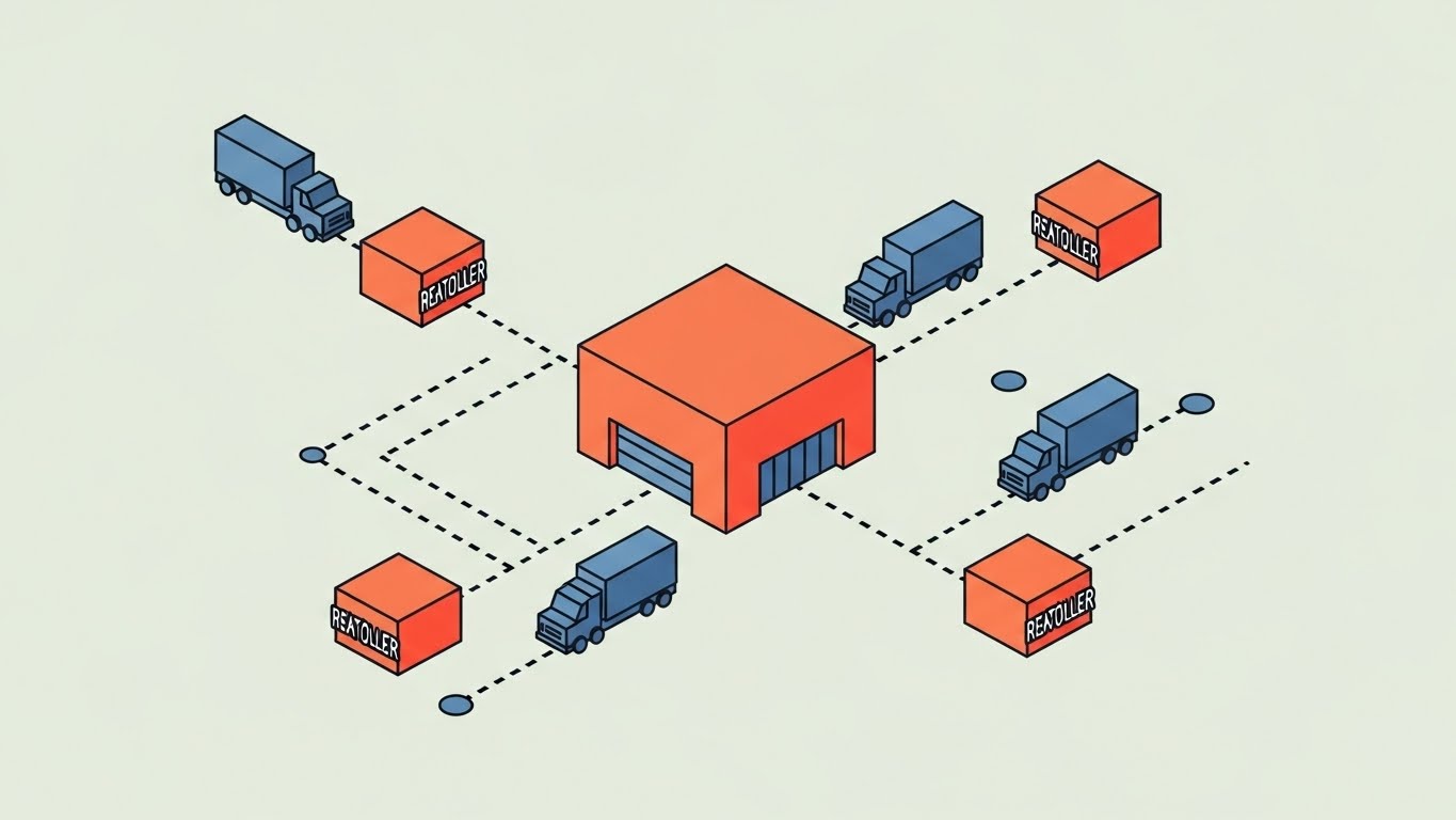
The Visual & Narrative Approach
This style utilizes a "God's Eye" perspective to map out the entire distribution ecosystem in a single, cohesive frame. By adopting an isometric angle, we eliminate the distortion of perspective, treating the central warehouse hub (in "Vivid Coral") and the smaller retailer nodes as equal, interconnected geometric elements. The "Slate Blue" geometric trucks moving along clean, dotted paths provide a rhythmic visual cue of connectivity without the noise of photorealism. The narrative here is one of seamless flow; it presents a pristine, optimized version of your network logic.
Psychological Impact & KPI Focus
Isometric design is particularly effective for reducing Cognitive Load. In complex distribution networks, stakeholders often struggle to visualize the "whole picture." This style simplifies spatial relationships, allowing the viewer to instantly grasp the relationship between the central hub and the satellite nodes. It signals Order and Control, key psychological drivers for Operations Directors seeking stability. It supports KPIs related to Supply Chain Visibility.
Strategic Implementation & Trade-offs
- Best Use Case: High-level "How It Works" explainers or social ads where you need to communicate the concept of network coverage in under 15 seconds.
- Trade-off: This style creates distance. It is excellent for showing scale and structure but lacks the human element required for emotional storytelling or testimonial content.
- Estimated Duration: 15-20 Seconds.
Companies using similar video content -
FourKites – Real-time Visibility Platform – Visualizing global freight networks.
project44 – Supply Chain Visibility Platform – Mapping complex logistics routes.
One Network Enterprises – Business Network Platform – Architecting multi-party supply chains.
2. Abstract 2D Motion Graphics: Visualizing Throughput
TOFU | Market Education
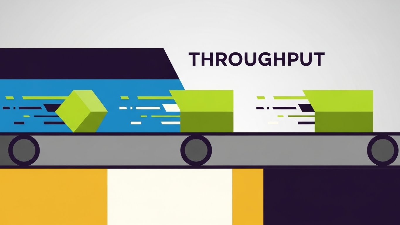
The Visual & Narrative Approach
Here, we visualize the intangible concept of "Throughput." We replace detailed boxes with geometric "Electric Lime" shapes that flow rapidly across a stylized "Charcoal Grey" digital conveyor belt. The use of speed lines and motion trails visually translates the software’s processing speed into kinetic energy. This is not about showing a specific box; it is about showing the velocity of data and goods. The "high-key" light grey background ensures the focus remains strictly on the movement metrics.
Psychological Impact & KPI Focus
This style leverages Motion Parallax and speed cues to trigger a sense of efficiency. It appeals to the "Need for Speed" in FMCG (Fast-Moving Consumer Goods) logistics. By abstracting the product, we force the viewer to focus on the Process Efficiency rather than the item being shipped. It aligns perfectly with KPIs related to Order Cycle Time and Fill Rate.
Strategic Implementation & Trade-offs
- Best Use Case: Feature highlights on landing pages, specifically for "Speed," "Automation," or "High-Volume" capabilities. Ideal for a 30-second loop.
- Trade-off: The abstraction can be too vague for technical audiences who need to see the actual user interface (UI) or specific hardware integrations to believe the claim.
- Estimated Duration: 30-45 Seconds.
Companies using similar video content -
Locus Robotics – Autonomous Mobile Robots – Kinetic flow of robots in a warehouse.
GreyOrange – Fulfillment Operating System – Visualizing high-speed order processing.
Exotec – Skypod System – Abstracting rapid movement of goods in storage.
3. Minimalist Flat 2D Vector: The Precision Signal
TOFU | Shaping Brand Perception

The Visual & Narrative Approach
Precision is the currency of this style. Using a strict "Deep Indigo" and "Pure White" palette, the visual focuses on a single, powerful transformation: a cardboard box icon morphing into a digital checkmark. This economy of design speaks to a brand that values clarity and exactitude. There are no distracting gradients or textures; just sharp lines and perfect symmetry. It visually articulates the promise: "We turn physical inventory into digital certainty."
Psychological Impact & KPI Focus
Minimalism builds Trust. In an industry often cluttered with messy spreadsheets and chaotic warehouses, a clean, flat aesthetic signals a modern, organized partner. It utilizes Negative Space to draw the eye directly to the core value proposition—validation and accuracy. This resonates with decision-makers looking to improve their Perfect Order Rate and minimize returns.
Strategic Implementation & Trade-offs
- Best Use Case: LinkedIn thought leadership posts, slide decks, and static brand assets where you want to associate your software with "Accuracy" and "Modernization."
- Trade-off: It can feel sterile if overused. It lacks the dynamism required for high-energy hype reels or complex workflow demonstrations.
- Estimated Duration: 6-10 Seconds.
Companies using similar video content -
SnapFulfil – Cloud WMS – Clean visuals for inventory accuracy and order validation.
Logiwa – Cloud Fulfillment Platform – Minimalist design for precise order fulfillment.
Deposco – Omnichannel Fulfillment – Flat vectors for validating perfect order rates.
4. Abstract Organic Motion: The Ecosystem Metaphor
TOFU | Category Creation

The Visual & Narrative Approach
This style breaks the rigid grid of traditional logistics. We use "Glossy Teal" and "Cyan" blob-like shapes that merge and separate fluidly. This organic motion visualizes the often complex reality of ecosystem integration—APIs, 3PL partners, and legacy systems—as a smooth, biological process. The "glass-morphism" texture adds a layer of premium tech sophistication, suggesting that your platform is the living, breathing connective tissue of the supply chain.
Psychological Impact & KPI Focus
The fluid motion reduces the anxiety of Integration Friction. IT Directors often fear that new software will be "clunky" or hard to connect. This visual style subconsciously assures them that your solution is "adaptable," "flexible," and "seamless." It shifts the narrative from "hard coding" to "organic growth," supporting KPIs related to Scalability and Tech Stack Consolidation.
Strategic Implementation & Trade-offs
- Best Use Case: Website hero backgrounds or "Vision" videos that introduce a new category of "Living Supply Chains."
- Trade-off: It is metaphorical. It does not explain how the integration works technically. It must be paired with concrete text or diagrams to be effective.
- Estimated Duration: 45-60 Seconds.
Companies using similar video content -
E2open – Supply Chain Operating Network – Fluidly connecting diverse partners and systems.
Kinaxis – RapidResponse – Organic flow representing integrated planning and execution.
Coupa – Business Spend Management – Visualizing seamless integration of procurement and supply chain.
5. Bold Kinetic Typography: Industrial Urgency
TOFU | Vertical Social Organic

The Visual & Narrative Approach
This is logistics at the speed of social media. We utilize "Stark Black" and "Safety Yellow"—colors borrowed directly from industrial caution tape and warehouse floor markings—to create an immediate visual link to the industry. The massive, blocky text moves diagonally, mimicking the fast-scrolling nature of mobile feeds and the movement of goods on a line. It is loud, urgent, and impossible to ignore. The "speed blurs" on the edges add to the sense of momentum.
Psychological Impact & KPI Focus
This style triggers Urgency and Alertness. It leverages the "Cocktail Party Effect"—cutting through the noise of a crowded feed by using familiar industrial cues in a hyper-modern context. It positions the brand as "Action-Oriented" and "Ready to Move," appealing to the operational need for speed and the reduction of Dwell Time.
Strategic Implementation & Trade-offs
- Best Use Case: Event teasers, feature announcements, or recruiting videos on TikTok and Instagram Reels (9:16 aspect ratio).
- Trade-off: It can be overwhelming. It is not suitable for detailed educational content or explaining complex nuances. It is purely for grabbing attention (TOFU).
- Estimated Duration: 15-30 Seconds.
Companies using similar video content -
Gatik – Autonomous Middle-Mile Logistics – Urgent text for rapid, efficient deliveries.
Onfleet – Last Mile Delivery Software – Bold typography for speed and delivery urgency.
DispatchTrack – Last Mile Delivery Software – Kinetic text emphasizing real-time delivery speed.
6. 2D Line Art Animation: The Blueprint
TOFU | YouTube
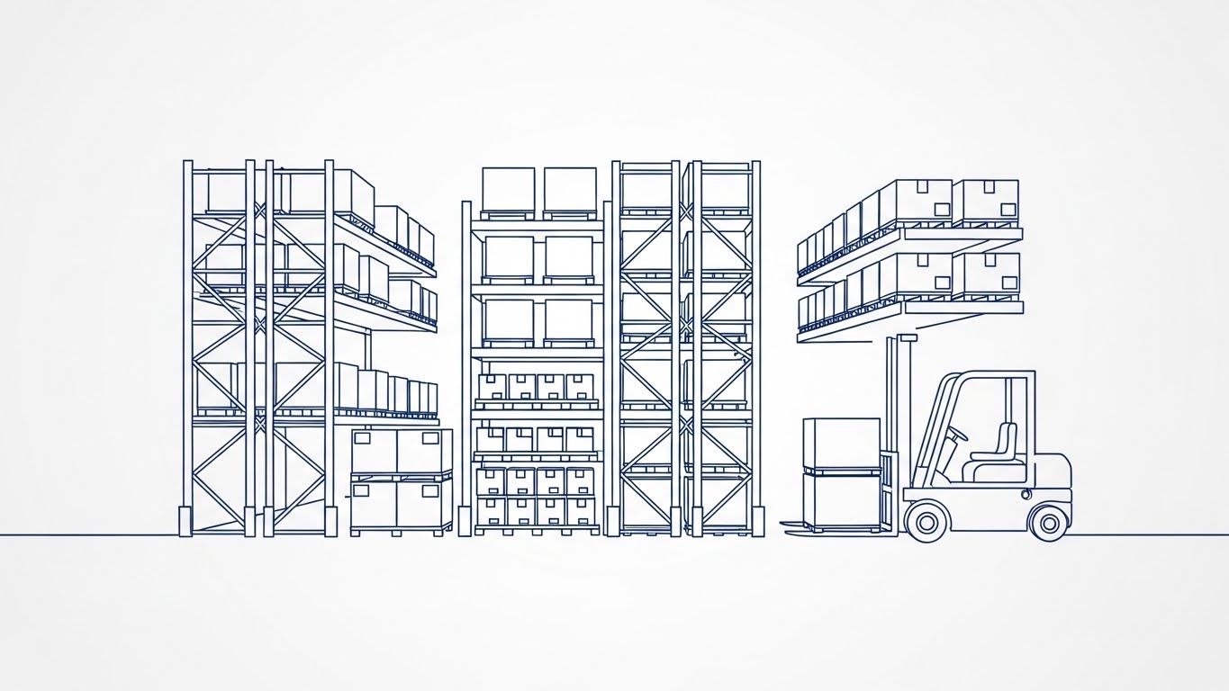
The Visual & Narrative Approach
We strip the warehouse down to its architectural essence. Using a single continuous "Precision Blue" line on a "Paper White" background, we draw the schematics of racking systems, pallets, and forklifts. This looks like a blueprint come to life. The narrative is one of planning, structure, and engineering. It suggests that your software is the foundation upon which the physical operation is built, focusing on the logic of the layout.
Psychological Impact & KPI Focus
This style appeals to the Engineer's Mindset. It suggests that your software is "architecturally sound" and "precisely engineered." By removing fill colors, we remove distractions, allowing the viewer to focus entirely on the structure of the workflow. It builds authority in Space Planning and Warehouse Optimization.
Strategic Implementation & Trade-offs
- Best Use Case: "Deep Dive" explainer videos on YouTube (5-10 minutes) that detail specific workflows, WMS configurations, or layout optimizations.
- Trade-off: It can feel dry or academic. It requires a strong voiceover to keep the viewer engaged and prevent boredom.
- Estimated Duration: 60-90 Seconds.
Companies using similar video content -
Manhattan Associates – Warehouse Management System – Blueprinting optimal warehouse layouts.
Blue Yonder – Luminate Platform – Line art for designing supply chain processes.
Tecsys – Warehouse Management System – Schematic visualization of operational workflows.
7. Generative AI Cinematic Video: The Global Vision
TOFU | Skippable Pre-Roll Ad

The Visual & Narrative Approach
We aim for the "Hollywood" factor. This style uses Generative AI to create a breathtaking, hyper-realistic drone shot of a logistics park at sunrise. The "Sunrise Orange" lighting casts long, dramatic shadows, while the infinite rows of white trucks suggest massive scale and capability. This establishes the brand as a major enterprise player, capable of handling global operations. The mist adds a layer of atmosphere that feels premium and expansive.
Psychological Impact & KPI Focus
This invokes Aspiration and Scale. It validates the ambition of large enterprise clients who want to see their own magnitude reflected in their software partners. The "Golden Hour" lighting psychologically frames the industry in a positive, hopeful light (The "Dawn of a New Era"), countering the grit of daily operations.
Strategic Implementation & Trade-offs
- Best Use Case: The first 5 seconds of a YouTube Pre-Roll ad or the opening shot of a keynote presentation. It sets a premium tone immediately.
- Trade-off: It is "fluff" if not followed by substance. It establishes mood but explains nothing about the product. Use it as a hook only.
- Estimated Duration: 15-30 Seconds.
Companies using similar video content -
C.H. Robinson – Navisphere Platform – Cinematic views of global freight and logistics.
Flexport – Freight Forwarding & Logistics Platform – Aspirational global supply chain visuals.
Maersk – Integrated Logistics – Grand scale visuals of global shipping and ports.
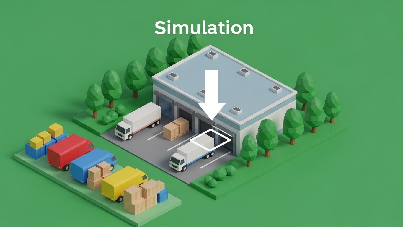
8. Wireframe to Reality Transition: The Digital Twin
MOFU | Product/Solution Differentiation
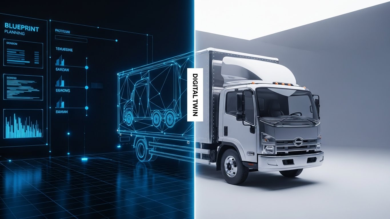
The Visual & Narrative Approach
This visual explicitly bridges the "Physical/Digital Divide." The split-screen effect shows the "Digital Twin" (a "Blueprint Blue" wireframe) on the left morphing seamlessly into the physical reality (a chrome-plated truck) on the right. The vertical glowing line acts as the cursor of transformation. This visualizes the core promise of Distribution Management Software: "What you plan here (software) happens there (reality)."
Psychological Impact & KPI Focus
This validates the concept of Control and Visibility. It reassures the viewer that the digital data is an accurate reflection of physical reality—a major anxiety for Operations Managers who fear data discrepancies. It visually proves Data Integrity and accurate Asset Tracking.
Strategic Implementation & Trade-offs
- Best Use Case: Product landing pages explaining "Digital Twin" technology or "Real-Time Tracking" features.
- Trade-off: Requires high-quality assets for both the 3D model and the real-world footage to ensure the match-cut works perfectly.
- Estimated Duration: 30-45 Seconds.
Companies using similar video content -
Siemens Digital Industries Software – Digital Twin for Logistics – Seamless transition from virtual to physical.
Dassault Systèmes – DELMIA – Wireframe simulation morphing into real-world operations.
AnyLogic – Simulation Software – Visualizing simulation models becoming real processes.
9. Isometric 3D Workflow: The Friendly Sim
MOFU | Feature Education & Demonstration
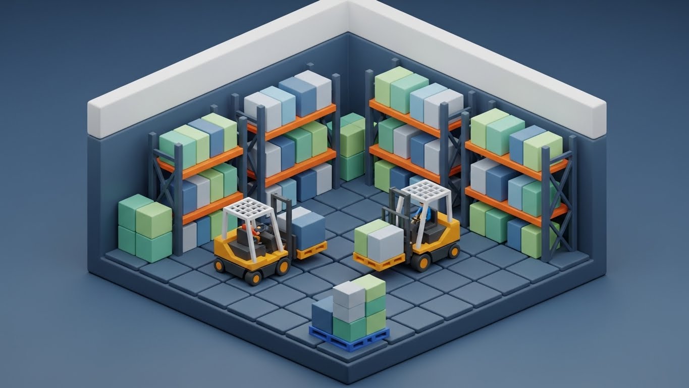
The Visual & Narrative Approach
We soften the hard edges of logistics using "Claymorphism." The warehouse interior is rendered with soft, matte textures in "Pastel Green" and "Matte Clay," giving it a toy-like, approachable aesthetic. The tiny forklifts moving pallets simplify complex operations into a pleasing, miniature diorama. It makes the intimidating complexity of a full WMS (Warehouse Management System) feel manageable and organized.
Psychological Impact & KPI Focus
This reduces Intimidation. Training staff on new software is a major bottleneck. This friendly, "gamified" visual style lowers the barrier to entry and makes the learning process feel less like work and more like play. It promotes User Adoption and Ease of Use.
Strategic Implementation & Trade-offs
- Best Use Case: Onboarding emails, training modules, or "New Feature" announcements where you need to explain a specific process (e.g., "New Put-away Logic").
- Trade-off: If it looks too much like a toy, it risks trivializing the serious nature of the work. Ensure the physics and logic remain accurate.
- Estimated Duration: 45-60 Seconds.
Companies using similar video content -
Körber Supply Chain – WMS & Robotics – Approachable 3D dioramas for warehouse processes.
AutoStore – Cube Storage Automation – Gamified simulation of automated storage and retrieval.
RightHand Robotics – Piece-Picking Robots – Simplified 3D workflows for robotic picking.
10. Split Screen: Optimized Reality and UI
MOFU | Competitive Displacement
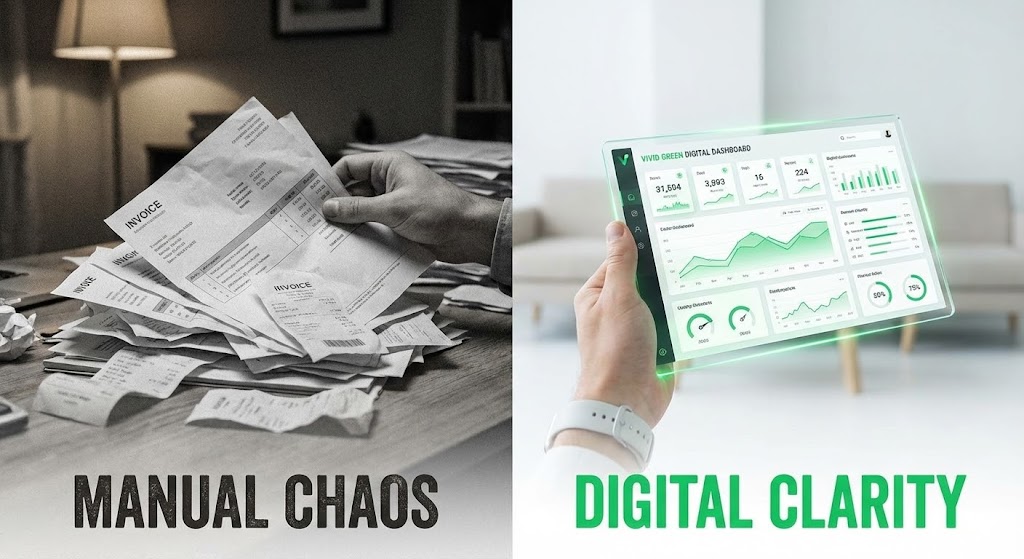
The Visual & Narrative Approach
This is the classic "Before and After" reinvented for B2B. The left side is desaturated and grainy, showing a chaotic stack of paper invoices—the "Manual Chaos." The right side is vibrant and clean, showing a hand holding a sleek glass tablet displaying a "Vivid Green" digital dashboard—the "Digital Clarity." The contrast is sharp and immediate. It does not just show the software; it shows the relief the software brings.
Psychological Impact & KPI Focus
This leverages the Pain/Pleasure Principle. It reminds the viewer of the complexity of their current processes (Pain) and immediately offers the solution (Pleasure). It highlights Operational Efficiency and Modernization, positioning the competitor's legacy systems as the "chaotic past."
Strategic Implementation & Trade-offs
- Best Use Case: Programmatic display ads or retargeting campaigns aimed at users of legacy software. "Still drowning in paper? Switch to Clarity."
- Trade-off: It is binary and aggressive. Ensure the "Manual" side isn't exaggerated to the point of being unbelievable. It must feel like a genuine comparison.
- Estimated Duration: 15-30 Seconds.
Companies using similar video content -
3PL Central – WMS for 3PLs – Contrasting manual processes with digital dashboards.
Extensiv – Warehouse & Fulfillment Software – Showing the shift from paper to digital efficiency.
ShipHero – WMS & Fulfillment – Highlighting the transformation from chaotic to optimized fulfillment.
11. Photorealistic 3D Renders: The Premium Assurance
MOFU | ABM Awareness

The Visual & Narrative Approach
To appeal to the C-Suite, we utilize the language of luxury and security. This style features a hyper-realistic 3D render of a "Core Data" book, physically protected by a heavy shield with "Metallic Gold" rims. It rests on a polished surface in a bright, modern office environment. The lighting is cinematic, highlighting the premium textures of glass and metal. The narrative shifts from simple logistics to Asset Protection. It visualizes the distribution software not just as a tool, but as a premium vault for the company’s most valuable asset: its operational intelligence.
Psychological Impact & KPI Focus
This aesthetic triggers a sense of Value and Exclusivity. In Account-Based Marketing (ABM) campaigns targeting enterprise executives, the visual quality reflects the perceived robustness of the solution. It addresses the anxiety of Data Security in cloud-based supply chains. The imagery supports KPIs related to Risk Mitigation, Compliance, and Brand Equity.
Strategic Implementation & Trade-offs
- Best Use Case: High-value LinkedIn ads targeting CFOs or CIOs, specifically for "Enterprise Tier" packages or security-focused features.
- Trade-off: It is static and symbolic. It communicates "Premium Quality" effectively but fails to explain how the security protocols function. It must be supported by strong technical copy.
- Estimated Duration: 10-15 Seconds (Looping Video).
Companies using similar video content -
SAP – Extended Warehouse Management (EWM) – Premium renders for enterprise-grade security.
Oracle – Warehouse Management Cloud – High-fidelity visuals for data protection and compliance.
IBM – Supply Chain Intelligence Suite – Luxurious 3D renders emphasizing data asset protection.
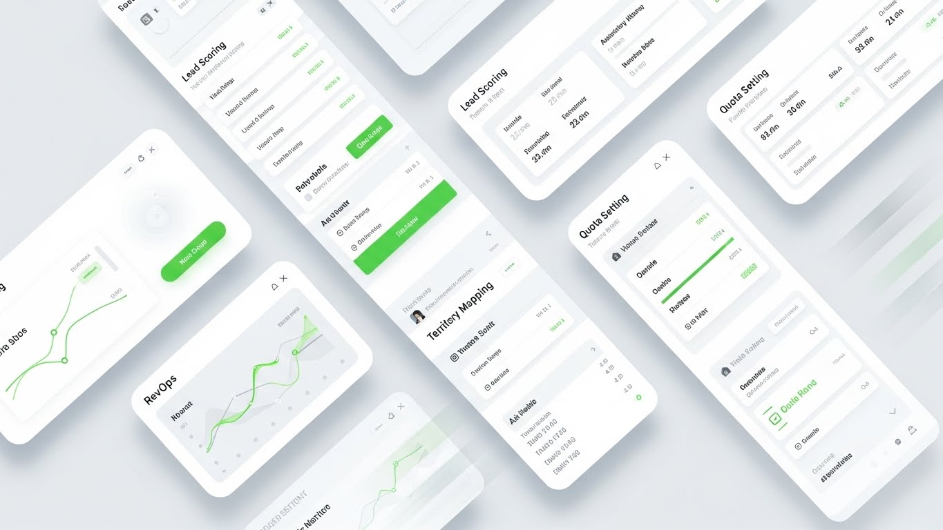
12. Rapid UI Feature Montage: The Ecosystem Density
MOFU | The Functional Buyer
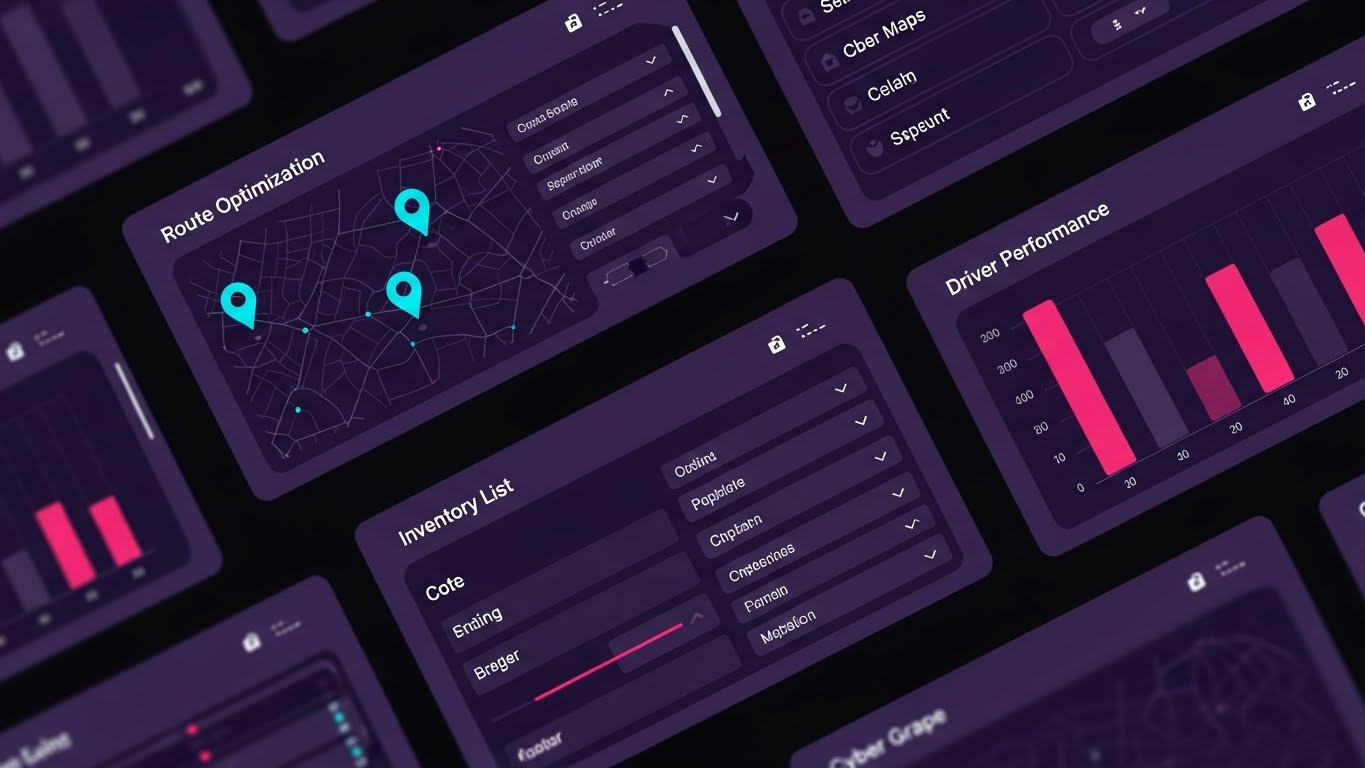
The Visual & Narrative Approach
For the Functional Buyer (e.g., Operations Managers), value is defined by capability. This style layers multiple UI screens—"Route Optimization" maps, "Inventory Lists," and "Driver Performance" graphs—in a dynamic, diagonal composition. Using a "Cyber Grape" and "Bright Pink" palette, the screens drift and pulse, suggesting a depth of features that is vast and comprehensive. The motion blur on the edges focuses the eye on the clarity of the central data, implying speed and robust functionality.
Psychological Impact & KPI Focus
This creates an impression of Robustness and Completeness. It combats the fear that a new system might lack necessary features. By showing multiple modules simultaneously, it visually argues for an All-in-One Solution, reducing the cognitive load associated with managing disparate tools. It highlights KPIs like System Utilization and Feature Adoption.
Strategic Implementation & Trade-offs
- Best Use Case: "Features" page headers or demo intro videos where you need to quickly establish that the platform is feature-rich and comprehensive.
- Trade-off: The density can be overwhelming. It is designed to impress with the quantity of features, not to teach a specific workflow. Avoid using this for training materials.
- Estimated Duration: 15-20 Seconds.
Companies using similar video content -
Infor – WMS & SCM – Dynamic montage showcasing extensive UI features.
Microsoft Dynamics 365 – Supply Chain Management – Layered UI screens demonstrating comprehensive modules.
Plex Systems – Smart Manufacturing Platform – Rapid display of integrated MES, ERP, SCM interfaces.
13. Dynamic Data Visualization: The Global Logic
MOFU | Demand Gen & Lead Capture

The Visual & Narrative Approach
We transform raw data into art. Using "Neon Cyan" and translucent glass textures, we build a globe from data points and rising bar charts. This visualizes the scope of international logistics in a clean, white studio space. The narrative is one of global oversight; it suggests that your software turns the chaos of international shipping into a clean, manageable, and upward-trending structure. The transparency of the elements implies there are no "hidden" costs or data silos.
Psychological Impact & KPI Focus
This appeals to the desire for Clarity and Insight. Strategic leads want to see patterns, not spreadsheets. This style satisfies the need for Global Visibility and predictable growth. It reinforces the concept that the software provides a "Single Source of Truth" across borders, supporting KPIs like On-Time Performance (OTP) and Global Inventory Visibility.
Strategic Implementation & Trade-offs
- Best Use Case: Display ads for "Analytics" modules or whitepaper download covers related to "Global Supply Chain Trends."
- Trade-off: It is abstract. While beautiful, it doesn't show the actual dashboard. It sells the result of the analytics (clarity), not the tool itself.
- Estimated Duration: 10-15 Seconds.
Companies using similar video content -
FourKites – Real-time Visibility Platform – Glass globe visualizations of global freight data.
project44 – Supply Chain Visibility Platform – Dynamic charts on a global map for logistics insights.
Everstream Analytics – Supply Chain Risk & Visibility – Neon data streams clarifying global risk patterns.
14. 2D Graphics Over Live Action: The Augmented Worker
MOFU | Building Trust & Credibility

The Visual & Narrative Approach
This style grounds the technology in human reality. We use high-quality photography of a warehouse manager and overlay glowing "Augmented Reality Blue" vector icons ("Picking Accuracy," "Stock Levels"). The graphics track the worker's environment, visually demonstrating that the software is an invisible assistant, not a replacement. It tells a story of Empowerment, showing how digital tools augment the capabilities of the physical workforce.
Psychological Impact & KPI Focus
This builds Empathy and Trust. Warehouse staff often fear automation will replace them. This visual strategy positions the software as a "Co-pilot," reducing resistance to Change Management. It highlights the symbiotic relationship between labor and tech, focusing on KPIs like Labor Productivity and Picking Accuracy.
Strategic Implementation & Trade-offs
- Best Use Case: "Careers" pages, "About Us" videos, or case studies focusing on improved worker efficiency and safety.
- Trade-off: Requires high-quality, custom footage or photography. Stock footage can look generic if not carefully selected and color-graded to match the graphics.
- Estimated Duration: 30-45 Seconds.
Companies using similar video content -
Zebra Technologies – Frontline Worker Solutions – Holographic overlays on workers using mobile devices.
Honeywell Intelligrated – Warehouse Automation – Graphics augmenting human tasks in live warehouse footage.
Vuzix – Smart Glasses for Logistics – AR overlays showing picking instructions to workers.
15. 2D Character-Driven Story: The Success Metric
BOFU | ROI Justification

The Visual & Narrative Approach
At the bottom of the funnel, the story is about success. We use a clean, corporate Memphis-inspired illustration style with "Warm Terracotta" and "Navy" tones. The central figure, a logistics manager, holds a tablet displaying a massive green upward-trending arrow (ROI). The backdrop is a stylized, orderly warehouse. This simplifies the complex ROI calculation into a single, relatable moment of professional victory. It visualizes the feeling of hitting targets.
Psychological Impact & KPI Focus
This leverages Social Proof and Relatability. The Economic Buyer needs to envision themselves succeeding with your tool. This style removes technical barriers and focuses purely on the Outcome. It validates the decision to purchase by associating the software with professional growth and positive metrics like Return on Investment and Profit Margin.
Strategic Implementation & Trade-offs
- Best Use Case: Case study summaries in email newsletters or "Success Stories" sections of the website.
- Trade-off: The "cartoon" style can seem less serious to some technical buyers. It is best used for outcome-focused narratives rather than technical deep dives.
- Estimated Duration: 45-60 Seconds.
Companies using similar video content -
Logiwa – Cloud Fulfillment Platform – Character showing upward trend for fulfillment ROI.
Deposco – Omnichannel Fulfillment – Illustrated manager celebrating improved fill rates.
ShipStation – Shipping Software – Character-driven stories of e-commerce shipping success.
16. Holographic UI over 3D Render: The Digital Twin
BOFU | Overcoming Objections
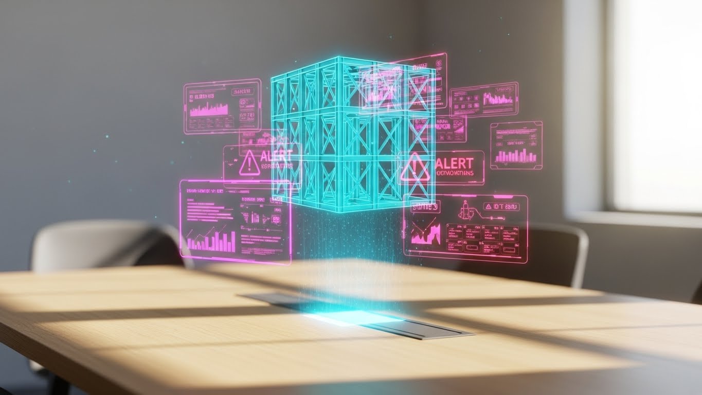
The Visual & Narrative Approach
Here, we visualize the "Brain" of the operation. A "Translucent Blue" holographic wireframe—representing a digital twin of a shipping unit—hovers over a boardroom table, surrounded by floating data panels. This juxtaposition of the corporate environment (the table) and the digital logistic unit (the hologram) perfectly illustrates the concept of Remote Visibility. It shows that decision-makers can inspect and analyze physical assets in real-time, without leaving the office.
Psychological Impact & KPI Focus
This creates a sense of Omniscience and Control. It addresses the objection: "Can I really see what's happening?" The detailed hologram serves as proof of Data Granularity. It appeals to the Tech Lead's desire for advanced monitoring capabilities, supporting KPIs related to Asset Utilization and Real-Time Tracking.
Strategic Implementation & Trade-offs
- Best Use Case: Product pages describing "Digital Twin" or "Control Tower" features. It creates a "Command Center" vibe.
- Trade-off: It is highly conceptual. It sells the vision of control. Ensure the actual UI shown in other materials backs up this promise of detailed data.
- Estimated Duration: 15-30 Seconds.
Companies using similar video content -
Siemens Digital Industries Software – Digital Twin for Logistics – Holographic views of warehouse operations.
Dassault Systèmes – DELMIA – 3D holographic models of production lines and supply chains.
Cognite – DataOps for Industrial AI – Holographic data overlays on industrial assets.
17. 3D X-Ray Visualization: The Loss Prevention
BOFU | Risk Mitigation
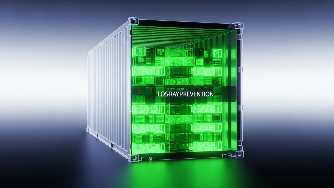
The Visual & Narrative Approach
To visualize "Loss Prevention," we use an X-Ray effect. A standard shipping container is rendered with semi-transparent "Skeleton White" walls, revealing a perfectly organized, glowing "X-Ray Green" internal load. This visual metaphor communicates absolute transparency. It suggests that your software sees through walls, eliminating blind spots in the supply chain. The visual is anchored by the text "LOS-RAY PREVENTION," emphasizing the mitigation of hidden risks.
Psychological Impact & KPI Focus
This directly addresses the fear of Theft and Shrinkage. By making the contents visible, we psychologically reassure the viewer that nothing is hidden or lost. It validates the software's ability to ensure Inventory Accuracy and Cargo Security, key concerns for Risk Officers.
Strategic Implementation & Trade-offs
- Best Use Case: Feature sections on "Security," "Compliance," or "Audit Trails." It is powerful for demonstrating "What you see is what you get."
- Trade-off: Requires precise 3D modeling. If the internal load looks messy, it defeats the purpose. The organization inside must be perfect.
- Estimated Duration: 10-15 Seconds.
Companies using similar video content -
Sensitech – Cold Chain Monitoring – X-ray views of cargo for temperature and integrity.
Controlant – Cold Chain Visibility – Visualizing internal container conditions for risk mitigation.
Tive – Real-time In-transit Visibility – X-ray style to show internal package conditions.
18. Generative AI Realistic Character: The Strategic Vision
BOFU | The Economic Buyer

The Visual & Narrative Approach
We hold a mirror up to the buyer. This style features a distinguished CEO overlooking a busy port at golden hour. The reflection in the glass and the confident stance communicate Mastery. He holds a smartphone, implying that the entire complex operation below is controlled from the palm of his hand. The narrative is one of strategic dominance and ease of management.
Psychological Impact & KPI Focus
This appeals to Ego and Aspiration. It validates the Economic Buyer's self-image as a visionary leader. The chaotic port below represents the complex business; the calm executive represents the order brought by the software. It supports KPIs related to Strategic Growth and Market Expansion.
Strategic Implementation & Trade-offs
- Best Use Case: ABM campaigns targeting the C-Suite, or the closing slide of a sales deck. "Lead with vision."
- Trade-off: It is purely emotional. It contains no product information. It is designed to build rapport and validate the buyer's status.
- Estimated Duration: 10-15 Seconds.
Companies using similar video content -
Maersk – Integrated Logistics – Executive overlooking global operations, commanding vision.
C.H. Robinson – Navisphere Platform – Realistic executive demonstrating strategic oversight.
Flexport – Freight Forwarding & Logistics Platform – Aspirational leader managing complex global trade.
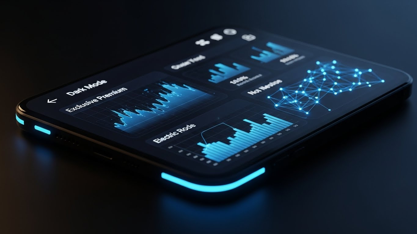
19. Futuristic Neon/Dark Mode: The IT Backbone
BOFU | The Technical Buyer

The Visual & Narrative Approach
For the IT Director, beauty is code and uptime. This style blends a server room with a warehouse, using "Matrix Black" and "Neon Green" data streams to physically connect the server racks to the forklifts. Glowing icons of padlocks ("Security") and lightning bolts ("Uptime") represent the software as the hard-wired nervous system of the physical operation. This visualizes the convergence of IT (Cyber) and OT (Operational Technology).
Psychological Impact & KPI Focus
This signals Reliability and Technical Superiority. The dark mode aesthetic is the native language of developers and IT professionals. It reassures them that the backend is secure, fast, and integrated. It supports technical KPIs like System Availability (Uptime) and Data Latency.
Strategic Implementation & Trade-offs
- Best Use Case: Technical documentation pages, "Integration" pages, or ads targeting CTOs.
- Trade-off: It can feel "cold" or "sinister" to non-technical audiences. Keep this style reserved for the technical buyer who values specs over smiles.
- Estimated Duration: 20-30 Seconds.
Companies using similar video content -
AWS IoT – Cloud IoT Services – Dark mode UI with neon data streams for infrastructure.
Google Cloud IoT – Cloud IoT Core – Futuristic dark mode for secure, integrated IoT solutions.
ThingWorx (PTC) – Industrial IoT Platform – Neon-lit data connections for IT/OT convergence.
20. Hyper-lapse Stock Footage with Data: The Reality Check
BOFU | Driving Demo Requests

The Visual & Narrative Approach
The final push requires proof of speed. We use a hyper-lapse of a city at night, turning traffic into streams of light. Overlaid is a static, calm "On Time Delivery" card with a green checkmark. The contrast is the message: The world is fast and chaotic (the footage), but your delivery promise is stable and verified (the UI card). It grounds the digital promise in the undeniable speed of the real world.
Psychological Impact & KPI Focus
This provides Validation and Urgency. The fast motion triggers a psychological need to keep up, while the static checkmark offers the solution to control that speed. It serves as the final visual proof that the software can handle the pace of modern logistics. It focuses on the ultimate metric: On-Time Delivery (OTD).
Strategic Implementation & Trade-offs
- Best Use Case: Retargeting ads (Bottom of Funnel) to drive a "Book a Demo" action. The message is simple: "We handle the speed; you get the results."
- Trade-off: The text overlay must be legible against the busy background. High contrast is essential.
- Estimated Duration: 6-10 Seconds.
Companies using similar video content -
Route4Me – Route Optimization Software – Hyper-lapse city with clear OTD metrics.
OptimoRoute – Route Planning & Optimization – Fast-paced visuals validating real-world delivery speed.
Bringg – Delivery & Fulfillment Orchestration – City hyper-lapse with stable delivery status cards.
21. AI Generated Mixed Media Video: The Objection Crusher
BOFU | Objection Handling

The Visual & Narrative Approach
This style aggressively confronts and dismantles the final barriers to purchase. We utilize a dynamic "Mixed Media" collage technique that blends the physical texture of torn cardboard with high-fidelity digital assets. A "Red X" painted on a rough piece of cardboard—representing a specific objection like "Implementation is too hard"—is physically torn away. Beneath it, a glowing, pristine "Digital Green Checkmark" on a screen is revealed. The background transitions from stop-motion crumpled paper to smooth, flowing digital maps.
Psychological Impact & KPI Focus
This leverages the psychology of Cognitive Reframing. By physically "tearing away" the objection, we provide a visceral metaphor for removing a roadblock. The contrast between the rough, static cardboard (the problem) and the smooth, glowing screen (the solution) subconsciously reinforces the upgrade from legacy chaos to digital order. It is designed to improve Close Rates and shorten the Sales Cycle.
Strategic Implementation & Trade-offs
- Best Use Case: Bottom-of-funnel sales decks or specific email responses addressing common objections like "Downtime," "Cost," or "Complexity."
- Trade-off: It is confrontational. It requires a precise understanding of the specific objection being addressed. Generic "X" marks will not have the same psychological impact.
- Estimated Duration: 15-20 Seconds.
Companies using similar video content -
Manhattan Associates – WMS – Mixed media to visually dismantle implementation fears.
Blue Yonder – Luminate Platform – AI-generated transitions to overcome integration objections.
Körber Supply Chain – WMS & Robotics – Tactile tearing away of complexity objections.
22. 2D Animation & UI Composition: The Guided Start
Onboarding | Self-Serve Onboarding

The Visual & Narrative Approach
Onboarding is where churn often begins. We counter this with a friendly, supportive visual style. A flat, 2D character in soothing "Soft Purple" tones acts as a guide, pointing to a floating, semi-transparent UI checklist on the right. Floating icons of a "Life Buoy" (Support) and "Lightbulb" (Tips) hover playfully. The background is a warm "Cream," removing the sterility often associated with software training. The narrative is one of partnership: "You are not alone; we are here to guide you."
Psychological Impact & KPI Focus
This utilizes Anthropomorphism to create an emotional bond with the software. By associating the interface with a friendly character, we reduce the Anxiety of Competence—the fear users have of looking stupid when learning a new tool. It directly supports User Activation Rates and reduces early-stage Support Ticket Volume.
Strategic Implementation & Trade-offs
- Best Use Case: The "Welcome" video inside the software platform or the first email in the onboarding sequence.
- Trade-off: The "cartoon" style must be kept professional. It should feel like a modern SaaS explainer, not children's entertainment.
- Estimated Duration: 45-60 Seconds.
Companies using similar video content -
Logiwa – Cloud Fulfillment Platform – Friendly 2D character guiding through UI setup.
SnapFulfil – Cloud WMS – Animated guide for new user onboarding processes.
ShipHero – WMS & Fulfillment – Character-driven walkthroughs for easy platform adoption.
23. Clean UI Workflow (Light Mode): The Value Sprint
Onboarding | Accelerating Time-to-Value
The Visual & Narrative Approach
Here, the hero is the interface itself. We present a "high-key," shadowless environment where a "Pure White" software window floats elegantly. The focus is a "Setup Progress Bar" rapidly filling with "Mint Green" to 100%, followed by a celebratory "Welcome" modal. There is no clutter, no background noise—just the swift, satisfying completion of a task. The aesthetic is "Apple-esque"—clean, premium, and frictionless.
Psychological Impact & KPI Focus
This triggers the Goal Gradient Effect—users are more motivated to complete a task as they get closer to the end. Seeing a progress bar hit 100% releases dopamine. The clean aesthetic signals Ease of Use and low friction, crucial for converting trial users into paid subscribers. It focuses on the KPI of Time-to-Value (TTV).
Strategic Implementation & Trade-offs
- Best Use Case: "Get Started" pages or trial confirmation screens. It reinforces that the setup is quick and painless.
- Trade-off: It sets a high bar for the actual UX. If the real product is clunky or slow, this video will create a "Expectation Gap."
- Estimated Duration: 10-15 Seconds.
Companies using similar video content -
Deposco – Omnichannel Fulfillment – Pristine UI showing rapid setup and welcome.
3PL Central – WMS for 3PLs – Clean interface highlighting quick configuration and value.
Extensiv – Warehouse & Fulfillment Software – High-key UI demonstrating fast time-to-value.
24. Abstract 3D AI Visualization: The Seamless Link
Onboarding | Reducing Implementation Friction

The Visual & Narrative Approach
Explaining API integrations with code is boring; explaining it with art is compelling. We use "Glowing Amber" spheres floating in a white void, connected by "Data Blue" fiber optic strands. The spheres gently merge and link, symbolizing the effortless flow of data between your WMS, ERP, and CRM systems. It visualizes "Interoperability" as a graceful, fluid dance rather than a technical headache.
Psychological Impact & KPI Focus
This reduces Implementation Anxiety. IT teams often fear "Integration Hell." This soothing, harmonious visual style subconsciously reassures them that the connection will be stable and elegant. It supports KPIs related to Integration Velocity and API Usage Adoption.
Strategic Implementation & Trade-offs
- Best Use Case: Developer documentation headers, "Integration" pages, or technical webinars explaining ecosystem connectivity.
- Trade-off: It is highly abstract. It must be accompanied by actual technical specs (API docs) to satisfy the engineers.
- Estimated Duration: 10-15 Seconds (Looping).
Companies using similar video content -
E2open – Supply Chain Operating Network – Glowing spheres symbolizing seamless API connections.
Kinaxis – RapidResponse – Abstract 3D nodes representing integrated planning systems.
Coupa – Business Spend Management – Fluid 3D connections for integration across business functions.
25. 3D Parallax UI Presentation: The Deep Dive
Retention | Driving Deep Feature Adoption
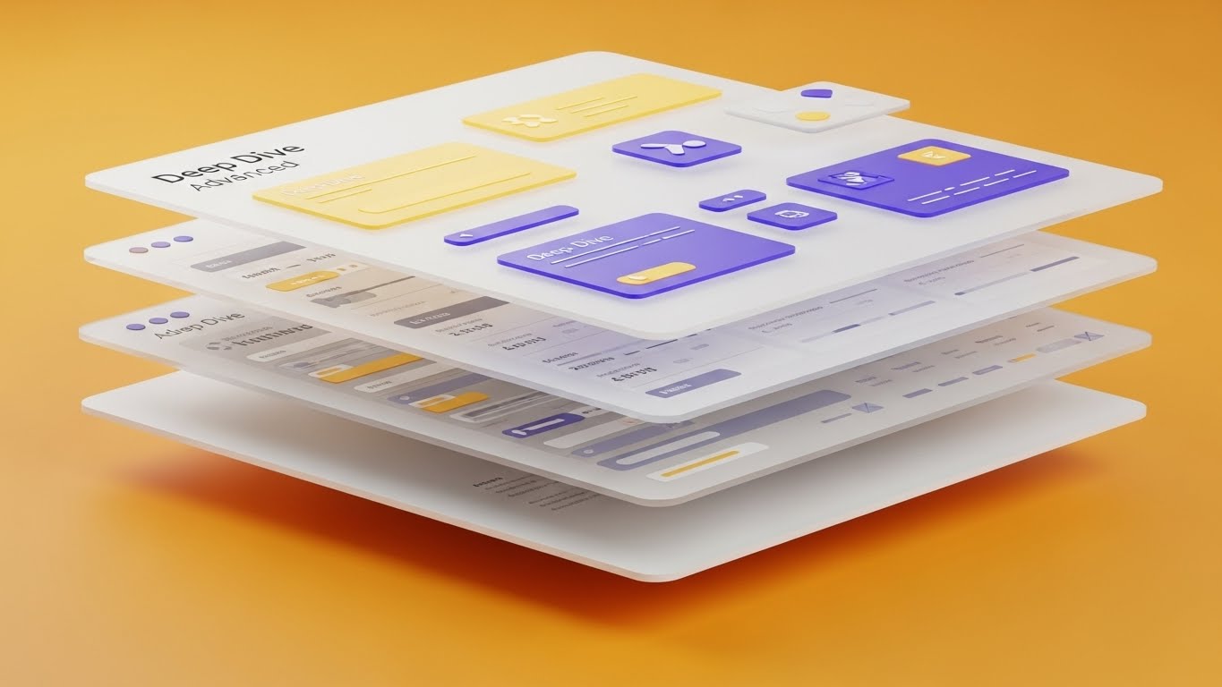
The Visual & Narrative Approach
To show that your software runs deep, we use depth. The UI screen is deconstructed into floating layers of glass, viewed from a side angle (parallax). The background layer is "Vibrant Orange," while data grids and buttons float on separate planes above it. This visualizes the concept of "Drilling Down" into data. It suggests that there is more to the platform than meets the eye, encouraging users to explore advanced features.
Psychological Impact & KPI Focus
This creates a sense of Sophistication and Discovery. It combats the "Surface Level Usage" problem where customers only use 10% of the tool. By visually expanding the UI, we invite curiosity. It supports Feature Adoption Rates and Net Dollar Retention (NDR).
Strategic Implementation & Trade-offs
- Best Use Case: "New Feature" release emails or "Pro Tips" video series for existing customers.
- Trade-off: The text on the floating layers can be hard to read if the camera moves too fast. Keep the motion slow and deliberate.
- Estimated Duration: 20-30 Seconds.
Companies using similar video content -
Blue Yonder – Luminate Platform – Layered UI showing depth of analytics and features.
Manhattan Associates – WMS – Parallax UI revealing advanced configuration options.
SAP – Extended Warehouse Management (EWM) – Deconstructed UI layers for deep feature exploration.
26. Low-Poly 3D Modeling: The Knowledge Block
Retention | Reducing Support Overhead
The Visual & Narrative Approach
For education, simplicity is king. We use a "Low-Poly" 3D style—reminiscent of simulation games—to create clear, blocky representations of warehouse scenarios. A large white arrow indicates exactly where a pallet should go. The primary colors (Red, Blue, Yellow) and shadowless lighting ensure there is zero ambiguity. It removes the visual noise of the real world to focus entirely on the logic of the process.
Psychological Impact & KPI Focus
This lowers Cognitive Load. When a user is frustrated and looking for help, they don't need cinematic lighting; they need clarity. This style makes the solution look simple and achievable, reducing frustration. It directly impacts Ticket Deflection Rate and Customer Satisfaction Score (CSAT).
Strategic Implementation & Trade-offs
- Best Use Case: Knowledge base articles, "How-To" video libraries, and troubleshooting guides.
- Trade-off: It is not "sexy." Do not use this for high-level marketing. It is strictly a functional, educational tool.
- Estimated Duration: 30-90 Seconds.
Companies using similar video content -
AutoStore – Cube Storage Automation – Low-poly simulations for clear operational instructions.
RightHand Robotics – Piece-Picking Robots – Gamified 3D models for training on robot interaction.
Dematic – Warehouse Automation – Simple blocky models for explaining complex automation logic.
27. Lifestyle Stock with UI Overlay: The Freedom Factor
Retention | Reducing Churn

The Visual & Narrative Approach
We sell the lifestyle, not just the software. We use high-quality footage of a professional working in a warm, urban coffee shop. Over their shoulder, we see the laptop screen displaying your "Tech Blue" dashboard with a "Remote Fleet Management" status active. The contrast between the relaxed environment and the serious control on the screen reinforces the value of Cloud Mobility.
Psychological Impact & KPI Focus
This appeals to the desire for Autonomy and Balance. It reminds the user why they bought cloud software: to escape the back office. By associating the software with personal freedom, we build emotional loyalty. It supports Retention Rates and reduces Churn.
Strategic Implementation & Trade-offs
- Best Use Case: Quarterly newsletters, "Year in Review" videos, or case studies featuring remote-first clients.
- Trade-off: The screen replacement must be perfect. If the UI tracks poorly or looks "pasted on," it destroys the illusion of reality.
- Estimated Duration: 15-20 Seconds.
Companies using similar video content -
FourKites – Real-time Visibility Platform – Remote management dashboard over coffee shop scene.
project44 – Supply Chain Visibility Platform – Lifestyle imagery with mobile tracking UI overlay.
Onfleet – Last Mile Delivery Software – Relaxed setting with active fleet management UI.
28. Dark Mode UI Showcase: The Premium Upgrade
Expansion | Driving Upsell/Cross-sell
The Visual & Narrative Approach
Dark mode is the visual language of "Pro" users. We showcase the "Enterprise Tier" features using a sleek "Dark Charcoal" interface with glowing "Electric Blue" data accents. The lighting catches the glossy edges of the device, making the software feel like a high-end consumer gadget. The charts shown are complex and advanced, implying that this tier is for the serious power user.
Psychological Impact & KPI Focus
This utilizes the Veblen Effect—perceived value increases with improved aesthetics. Dark mode signals Exclusivity and Power. It makes the standard "Light Mode" users feel like they are missing out on the "cool" version, driving the desire to upgrade. It supports Average Revenue Per User (ARPU) and Upsell Conversion.
Strategic Implementation & Trade-offs
- Best Use Case: In-app paywalls, "Upgrade to Pro" landing pages, or webinars demonstrating advanced analytics.
- Trade-off: Ensure your software actually has a dark mode. If not, this is false advertising. If not, use a "Premium Navy" palette to convey the same feeling.
- Estimated Duration: 15-30 Seconds.
Companies using similar video content -
Oracle – Warehouse Management Cloud – Sleek dark mode UI for advanced analytics.
IBM – Supply Chain Intelligence Suite – Premium dark interface for enterprise-level insights.
Microsoft Dynamics 365 – Supply Chain Management – Dark mode showcasing advanced planning features.
29. Aspirational Stock Montage: The Shared Victory
Expansion | Driving Referrals & Advocacy

The Visual & Narrative Approach
Ultimately, B2B software is about people succeeding together. We use bright, high-key stock photography of a diverse team celebrating in a modern conference room. They are looking at a large screen displaying "Success Gold" metrics and global maps. The narrative is one of collective achievement. It’s not just about the manager; it’s about the whole team winning because of the software.
Psychological Impact & KPI Focus
This leverages Social Proof and Belonging. It validates the champion's decision to buy the software by showing the positive impact on their team. Happy teams share their success. This style encourages Net Promoter Score (NPS) growth and drives Referrals.
Strategic Implementation & Trade-offs
- Best Use Case: "Customer Appreciation" posts, case study thumbnails, or referral program landing pages.
- Trade-off: Stock footage can feel generic. It is crucial to overlay your specific UI on the screens in the photo to make it ownable.
- Estimated Duration: Static Image or 6-Second Loop.
Companies using similar video content -
Manhattan Associates – WMS – Diverse team celebrating success with software metrics.
Blue Yonder – Luminate Platform – High-key stock of teams achieving supply chain goals.
Körber Supply Chain – WMS & Robotics – Aspirational team looking at successful operational dashboards.
30. Macro UI Micro-Interactions: The Proactive Pulse
Expansion | Proactive Support

The Visual & Narrative Approach
We end on the details. This style uses an extreme macro lens to focus on a single pixel-perfect element: a "Notification Bell" ringing with an "Alert Red" badge. The shallow depth of field blurs the background, forcing total focus on the update. It visualizes the Responsiveness of the system. It says, "We are watching the details, so you don't have to."
Psychological Impact & KPI Focus
This triggers Vigilance and Reassurance. It visually proves that the system is active and monitoring for issues (like delayed shipments) in real-time. It reinforces the value of Proactive Intelligence, a key driver for long-term contract renewals. It supports System Trust and Engagement Frequency.
Strategic Implementation & Trade-offs
- Best Use Case: Feature announcements regarding "Real-Time Alerts," mobile app notifications, or re-engagement ads for inactive users.
- Trade-off: It is very specific. It sells a micro-feature, not the whole platform. Use it to highlight attention to detail.
- Estimated Duration: 3-5 Seconds (perfect for GIFs).
The Strategic Knowledge Base: The Visual Operations Doctrine
Having a library of 30 visual styles is only the beginning. To transform these assets into a competitive advantage, you must operationalize them. The following "Visual Operations Doctrine" synthesizes the insights from our 30 examples into three strategic frameworks. This is your playbook for bridging the gap between "making a video" and "driving business outcomes."
Strategic Alignment & Visual Architecture
The "Pre-Production" Strategy. Why are we visualizing this, and for whom?
- The Cognitive Load Audit: Before creating any asset, audit the complexity of the task you are explaining. If the task is "High Complexity" (e.g., API Integration), use Abstract 3D (Style 24) to simplify. If it is "High Precision" (e.g., Picking), use Macro UI (Style 30). Match the visual load to the cognitive need.
- Role-Based Visual Mapping: A Fleet Manager at a desk needs data density (Style 12). A Driver on a mobile tablet needs big buttons and clear instructions (Style 22). Map your visual styles to the physical environment of the viewer.
- The "Glanceability" Standard: In logistics, seconds cost money. Design every visual asset to be understood in under 3 seconds. Use Minimalist Vector (Style 3) and Bold Kinetic Typography (Style 5) to pass the "Squint Test."
- Brand Voice Consistency: Your marketing videos (Style 7) and your training videos (Style 26) often look like they come from different companies. Use a unified color palette (e.g., "Safety Yellow" and "Tech Blue") to create a cohesive "Visual Brand Language" across the entire funnel.
- The Advids Strategic Audit: Do not guess what assets you need. Partner with Advids to conduct a comprehensive audit of your current content library. We identify the gaps where "Invisible Logic" is costing you sales and prescribe the exact visual cure.
- Standardization vs. Customization: For generic workflows (like login), use polished stock assets (Style 29) to save budget. For your core IP (like your proprietary routing algorithm), invest in bespoke 3D Motion (Style 1).
- The Cross-Departmental Bridge: Use these visuals to unify your internal teams. When Sales promises "Seamless Integration," show them the Abstract Organic Motion (Style 4) video so they know exactly what they are selling.
- Legacy System Integration: One of the biggest sales barriers is the fear of replacing legacy systems. Use Split Screen (Style 10) to visually validate the transition from "Old Green Screen" to "New Dashboard" without disrespecting the past.
- Accessibility in Trucking: The logistics workforce is diverse and multi-lingual. Use 2D Line Art (Style 6) and visual icons that rely less on voiceover and text, ensuring your training materials are universally understood.
- The Mobile-First Mandate: 60% of logistics consumption happens on mobile devices. Ensure all 30 styles—especially Styles 1, 5, and 30—are legible on a 9:16 vertical screen. If it doesn't work on a phone, it doesn't work for the supply chain.
Operational Adoption & Implementation
The "Deployment" Phase. How to embed visuals into the workflow.
- Overcoming "Big Brother" Anxiety: Drivers often fear AI monitoring. Use 2D Graphics Over Live Action (Style 14) to visually frame the AI as a "Co-pilot" that protects them, rather than a "Spy" that watches them.
- The Micro-Learning Shift: Nobody reads 50-page PDF manuals. Replace them with a library of 30-second Low-Poly 3D (Style 26) clips. Embed these directly into the software's "Help" section.
- Just-in-Time Support: Trigger specific videos based on user behavior. If a user hovers over "Cross-Docking" for 5 seconds, auto-play a Clean UI (Style 23) tooltip video.
- Gamification of Training: Use Isometric 3D (Style 9) to visualize driver scorecards and safety bonuses. Making the metrics look like a game increases engagement and healthy competition.
- Reducing Support Ticket Volume: There is a direct correlation between the clarity of your Onboarding Videos (Style 22) and the volume of "Level 1" support tickets. Invest here to save on support staff costs later.
- Remote Onboarding: For distributed fleets, physical seminars are impossible. Use Holographic UI (Style 16) to conduct "Virtual Walkthroughs" of the software, allowing you to train global teams simultaneously.
- Standard Operating Procedures (SOPs): Transform text-based SOPs into visual process flows using Isometric 2D Motion (Style 1). Visual SOPs reduce compliance errors by up to 40%.
- Feedback Loops: Use interactive video elements (within Style 25) to ask users, "Was this helpful?" Real-time feedback helps you refine your visual strategy constantly.
- Scalable Localization: When expanding to new regions, separate the text layers in your source files (Style 5). This allows for rapid, low-cost translation of video assets without re-animating the visuals.
- Leadership Communication: When presenting fleet strategy to the Board, do not use spreadsheets. Use Generative AI Cinematic (Style 7) to set a visionary tone that secures budget and buy-in.
Measuring Impact & Future-Proofing
The "ROI" Phase. Measuring success and looking ahead.
- Beyond "Views": Stop counting views. Start measuring "Time-to-Competency" (how fast a user learns via Style 26) and "Feature Adoption Rate" (how many users try a feature after watching Style 25).
- The "Idle Time" Metric: In software, time spent searching is waste. Correlate better visualization with reduced "Software Idle Time." If Style 2 works, users should navigate faster.
- Compliance Velocity: Measure how quickly your fleet adapts to new regulations (like ELD mandates) when trained via Line Art Animation (Style 6) versus text memos. Speed of compliance is a competitive advantage.
- Retention and Churn: Track the consumption of Lifestyle Stock (Style 27) content among at-risk accounts. Reminding users of the "Freedom" value proposition can be the difference between renewal and churn.
- The AI Visual Frontier: Prepare for the future where Generative AI (Style 21) creates personalized training videos for every single driver instantly. Build your asset library now to feed these future models.
- Scalability of Assets: Build a "Visual Component Library." If you update your UI, you shouldn't have to re-shoot every video. Using Abstract 3D (Style 24) allows you to swap out UI screens without changing the core animation.
- The Advids Partnership: Visual styles evolve. What works today may look dated tomorrow. Advids serves as your long-term R&D partner, ensuring your visual library scales with your feature set and stays ahead of design trends.
- Benchmarking Success: Compare your visual engagement against industry standards. If your Objection Handling video (Style 21) has a drop-off rate higher than 30%, it's too long. Iterate and refine.
- The ROI of Safety: Quantify the reduction in insurance premiums achieved through better visual safety training (Style 17). This is "Hard ROI" that pays for the entire video budget.
- Final Call to Innovation: Treat video not as "content," but as infrastructure. In the era of the Invisible Supply Chain, your ability to visualize value is just as important as your ability to deliver it.
Companies using similar video content -
Tive – Real-time In-transit Visibility – Macro focus on alert notifications for shipment issues.
Controlant – Cold Chain Visibility – Zoomed-in UI showing proactive temperature alerts.
Roambee – IoT Visibility Platform – Precision alerts for real-time asset monitoring.
Author & Editor Bio


