
 /home/wwwroot/advids.co/design/index.php on line 425
Introduction: Visualizing the Bridge Between Chaos and Compliance
In the high-stakes world of enterprise operations, the "document" is no longer just a static file; it is a dynamic container of liability, revenue, and reputation. Yet, for many organizations, the transition from manual, paper-based legacy systems to intelligent, automated ecosystems remains a source of profound operational friction. The challenge is not just technical; it is psychological. How do you convince a workforce accustomed to the tangible certainty of physical paper to trust invisible algorithms?
The answer lies in strategic visualization.
We are currently witnessing a massive structural shift. The global document management system market is projecting massive growth, reaching USD 18.17 billion by 2030. This surge is driven by a critical need for audit-ready workflows and compliance adherence. Automation is no longer an "early adopter" luxury; it is the new baseline for operational legitimacy.
However, purchasing the software is only half the battle. The true differentiator is adoption. Stakeholders—from Legal Ops to HR Directors—often fear that "automation" is a buzzword for "loss of control." This is where your video content strategy becomes your most powerful asset. By visualizing the invisible—showing exactly how data flows, how clauses assemble, and how compliance is guarded—you demystify the "black box" of automation.
The financial argument for this visual clarity is irrefutable. Leading industry studies reveal that organizations implementing robust automation can achieve a 294% ROI over three years, driven by massive gains in workflow efficiency. This isn't just about saving time; it's about unlocking exponential value through error reduction and speed.
This guide serves as your strategic blueprint. We have curated a diverse array of video visualization styles—from high-energy kinetic typography that captures market attention, to precise isometric animations that explain complex API integrations. Each example is dissected not just for its aesthetic value, but for its ability to lower cognitive load, build trust, and drive the specific KPIs that matter to your business.
Let’s explore how to turn your document automation platform from a technical concept into a visual imperative.
1. Minimalist Flat 2D Vector
TOFU | Brand Awareness

The Visual & Narrative Approach
This style embraces the power of reduction. The visualization centers on a singular, fluid transformation: a stylized, abstract geometric square in vivid coral orange (representing raw data) morphs smoothly into a sleek paper plane shape in slate blue (representing the finished, delivered document). The background is a pure, matte white, eliminating all distractions. The movement is eased and symmetrical, conveying a sense of effortless precision.
Psychological Impact & KPI Focus
- Niche Psychology: The target persona—often an overwhelmed Operations Manager—craves simplicity amidst chaos. This style uses "Negative Space Utilization" to signal clarity and relief. It visually promises that the software handles the complexity, leaving the user with a simple, clean result.
- Operational Impact: By stripping away texture and gradients, the visual focuses entirely on speed and digital delivery. It directly addresses the KPI of "Time-to-Send," reinforcing the finding that automation removes manual friction.
Strategic Implementation & Trade-offs
- Funnel Stage: TOFU (Brand Awareness).
- Best Use Case: Social Ads (LinkedIn/Instagram) where you have <3 seconds to capture attention.
- Trade-off: This style is excellent for Brand Awareness but lacks the detail necessary for Feature Education. It sells the "feeling" of speed, not the mechanics of how it works.
Companies using similar video content -
PandaDoc – Document Management Platform – Accelerates sales document creation and eSignatures.
Signeasy – eSignature Solution – Accelerates digital document delivery and signing.
4. Bold Kinetic Typography
TOFU | Skippable Pre-Roll Ad

The Visual & Narrative Approach
This visual is loud, aggressive, and impossible to ignore. It utilizes a low-angle camera composition looking up at heavy, looming rectangular blocks that represent "Manual Work" and "Legacy Bureaucracy." Suddenly, sharp, fast-moving triangular shards (the automation engine) shatter these blocks into dust. The color palette is high-contrast electric lime green against jet black, using motion lines to emphasize the impact. The typography itself acts as a physical character in the scene, interacting with the geometric destruction.
Psychological Impact & KPI Focus
- Niche Psychology: This speaks to the frustration of the "Operational Architect" who feels blocked by outdated processes. It validates their anger toward inefficiency and positions the software as a powerful weapon against the status quo.
- Operational Impact: The shattering effect is a visual metaphor for "Disruption." It targets the "Market Education" goal by visually dismantling the old way of doing things. It implies that the solution is robust enough to handle heavy workloads.
Strategic Implementation & Trade-offs
- Funnel Stage: TOFU (Market Education).
- Best Use Case: Instagram Stories or high-energy Event Intros.
- Trade-off: The aggressive energy creates high engagement but might alienate more conservative, risk-averse stakeholders (e.g., Compliance Officers) if used in the wrong context. It prioritizes Impact over Nuance.
Companies using similar video content -
Checkbox AI – Workflow Automation – Streamlines legal workflows with clear logic.
LogicGate Risk Cloud – GRC Platform – Clarifies compliance workflows and risk hierarchies.
7. Abstract 2D Glossy
MOFU | Product/Solution Differentiation

The Visual & Narrative Approach
This style uses the language of fluid dynamics to represent data. We see a macro close-up of organic, liquid-like blobs in a gradient of cyan and magenta. These blobs represent "unstructured data"—emails, PDFs, loose notes. As they flow, they merge seamlessly into a perfect, crystalline square with hard edges. The texture is "Glass-morphism," featuring soft, reflective lighting and high-end specular highlights. The background is a soft, blurred light grey to maintain focus on the glossy elements.
Psychological Impact & KPI Focus
- Niche Psychology: "Unstructured Data" is a primary anxiety for CIOs. This style treats that data as something precious and malleable, rather than messy and dangerous. It uses "Cognitive Ease" to show that the software can effortlessly contain and shape this data.
- Operational Impact: It visualizes the core promise of "Shaping Brand Perception." It elevates the software from a utility tool to a premium, high-tech asset.
Strategic Implementation & Trade-offs
- Funnel Stage: TOFU (Shaping Brand Perception).
- Best Use Case: Website Hero Backgrounds or Premium Product Loops.
- Trade-off: While beautiful, it is highly abstract. It effectively sets a "Premium" tone but fails to explain how the data is actually processed. It requires supporting text to be fully understood.
Companies using similar video content -
Conga – CLM – Assembles compliant contracts from modular clauses.
Mitratech Hotdocs – Document Generation – Assembles documents with reduced prep time.
8. Abstract 2D Motion Graphics
MOFU | Feature Education & Demonstration

The Visual & Narrative Approach
Precision is the hero here. The composition uses a tilted Dutch angle to create dynamic tension over a background grid pattern. Foreground elements consist of sharp nodes (dots) and connecting lines that form a rhythmic, pulsating network. The palette creates a sophisticated tech feel with deep violet backgrounds and mint green data points. The animation mimics the "handshake" of API integrations—data packets zipping along lines to connect distinct nodes.
Psychological Impact & KPI Focus
- Niche Psychology: For the IT Director, "Connectivity" is king. They fear silos. This visual reassures them that the system is interconnected, permeable, and standardized. The grid suggests "Compliance Guardrails" and order.
- Operational Impact: It addresses "Category Creation" by positioning the platform as the central nervous system of the enterprise tech stack. It visualizes the invisible flow of data between systems (e.g., CRM to Doc Gen).
Strategic Implementation & Trade-offs
- Funnel Stage: TOFU (Category Creation).
- Best Use Case: LinkedIn Feed Posts targeting technical decision-makers.
- Trade-off: It can appear "too technical" or cold for a non-technical HR or Sales audience. It speaks the language of the backend developer, not necessarily the end-user.
Companies using similar video content -
Automation Anywhere – Intelligent Document Processing – Shatters manual data entry bottlenecks.
ABBYY Vantage – Intelligent Document Processing – Breaks manual processing bottlenecks with AI.
3. Isometric 2D Motion Design
TOFU | Shaping Brand Perception
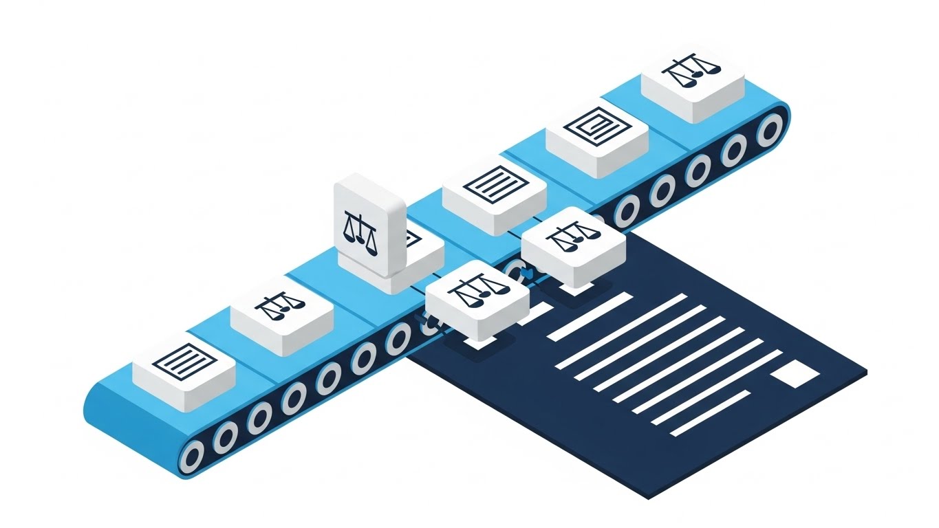
The Visual & Narrative Approach
This visualization adopts a classic 45-degree isometric high angle to provide a "God's eye view" of the process. It depicts a stylized "document assembly line" on a conveyor belt. Distinct icon blocks—representing "legal clauses" or "data fields"—slide along the belt and satisfyingly snap together to form a complete document. The palette is professional and trustworthy: sky blue, deep navy, and clean white. The style is flat vector with no shadows, ensuring absolute clarity.
Psychological Impact & KPI Focus
- Niche Psychology: This appeals to the logical side of the "Operational Architect." It visualizes "Product Differentiation" by showing the modularity of the system. It combats the fear of "Black Box" automation by showing exactly how the sausage is made—cleanly and methodically.
- Operational Impact: It perfectly illustrates "Clause Library Management" and "Template Governance." It shows that the document is built from pre-approved blocks, reducing the fear of error.
Strategic Implementation & Trade-offs
- Funnel Stage: MOFU (Product Differentiation).
- Best Use Case: Web Diagrams, Explainer Videos, and "How it Works" pages.
- Trade-off: It can feel slightly "industrial" or mechanical. While it explains process perfectly, it lacks the emotional excitement of the kinetic or abstract styles.
Companies using similar video content -
Microsoft Power Automate – IDP – Simplifies document processing with drag-and-drop.
GoCo – HR Platform – Simplifies HR workflows with Magic Docs.
5. Clean UI Workflow (Light Mode)
TOFU | Aspiration & Identity Hook
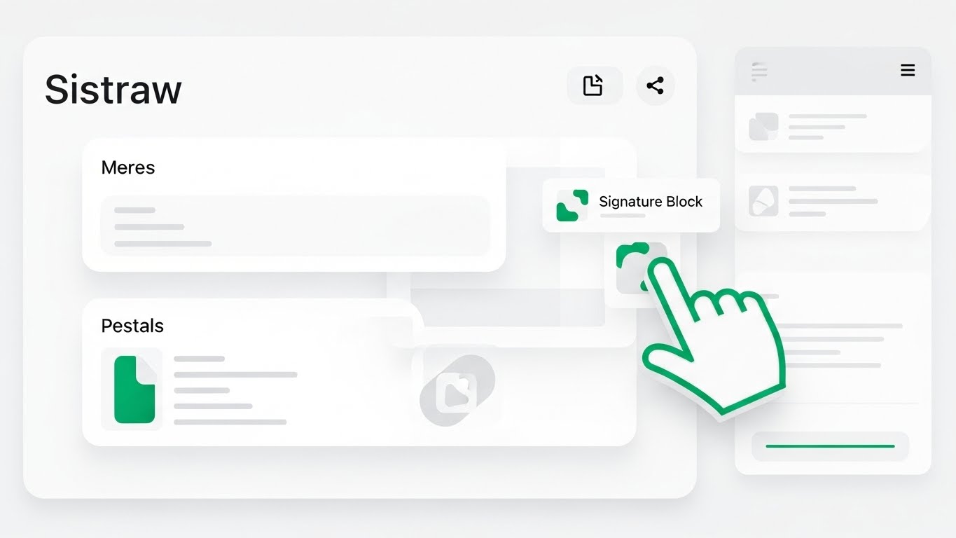
The Visual & Narrative Approach
Here, we move closer to reality. This is a simulation of the software interface, stripped of unnecessary noise. The palette is pristine white and light grey, with emerald green used strategically to highlight "Action Areas" (buttons, drop zones). A stylized hand cursor is visible, dragging a generic "Signature Block" icon onto a document canvas. The UI elements are abstract but recognizable, with soft drop shadows and rounded corners (Material Design aesthetic).
Psychological Impact & KPI Focus
- Niche Psychology: The greatest barrier to software purchase is "User Adoption Resistance." Stakeholders worry their teams won't use complex tools. This style uses "Frictionless User Experience" cues to prove the interface is intuitive and friendly.
- Operational Impact: It drives "Feature Education." By showing the "drag-and-drop" mechanic, it creates a "low barrier to entry" perception, directly addressing the "Time-to-Value" KPI.
Strategic Implementation & Trade-offs
- Funnel Stage: MOFU (Feature Education).
- Best Use Case: Product Pages, Demo Reels, and Sales Enablement collateral.
- Trade-off: It is literal, not metaphorical. It is less likely to go viral on social media but is critical for closing the deal in the middle of the funnel.
Style 27: Split Screen: Optimized Reality and UI
The "Problem vs. Solution" Aesthetic

The Visual & Narrative Approach
This composition utilizes a hard vertical split. On the left: "Messy Reality"—a desaturated, slightly grainy photo of a chaotic desk piled with messy paper stacks in beige and grey tones. The right side features a sharp, vibrant vector overlay in vivid blue and white, depicting organized digital folders and a clean interface. The contrast between the "messy reality" and the "digital solution" is maximized through lighting and color saturation.
Psychological Impact & KPI Focus
- Niche Psychology: This leverages the "Before/After" cognitive bias. It agitates the reader's pain (the mess) and immediately offers the cure (the UI). It validates the hidden cost of the "Physical/Digital Divide."
- Operational Impact: It targets "Competitive Displacement." It frames the competitor not as another software, but as the chaotic status quo. It visualizes the ROI of organization.
Strategic Implementation & Trade-offs
- Funnel Stage: MOFU (Competitive Displacement).
- Best Use Case: Comparison Ads, Retargeting Campaigns, and Case Study headers.
- Trade-off: It can feel a bit "informercial-like" if not executed with high-quality design. The contrast must be stark but professional to avoid looking cheesy.
Style 26: Wireframe to Reality Transition
The "Implementation Assurance" Aesthetic

The Visual & Narrative Approach
This visualization connects the backend logic to the frontend beauty. A diagonal wipe transitions the image from the upper left (a technical architectural blueprint in blueprint blue and white lines) to the lower right (the final, solid render of the document interface in full color). It shows the "skeleton" of a document—the metadata tags, the variable fields—filling in with the final "smart data."
Psychological Impact & KPI Focus
- Niche Psychology: Technical buyers (CTOs) want to know the system is robust, while business buyers (CEOs) want to know it looks good. This style bridges that gap. It proves the "Structural Integrity" of the automation.
- Operational Impact: It supports "Reducing Implementation Friction." It visualizes the concept that a solid plan (wireframe) leads to a flawless execution (reality), reassuring stakeholders about the deployment process.
Strategic Implementation & Trade-offs
- Funnel Stage: MOFU (Reducing Implementation Friction).
- Best Use Case: Tech Blogs, Implementation Guides, and Whitepapers.
- Trade-off: It appeals primarily to the "Builder" mindset. It may be less engaging for users who just want the result and don't care how the engine works.
Companies using similar video content -
LinkSquares – CLM – Quantifies time savings with advanced contract analytics.
AuditBoard – GRC Platform – Quantifies risk and compliance performance.
11. Rapid UI Feature Montage
MOFU | Driving Demo Requests
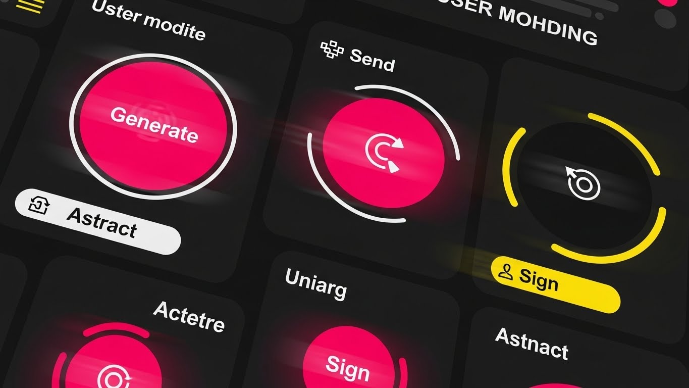
The Visual & Narrative Approach
This style abandons the static screenshot for the kinetic energy of a "sprint." The composition simulates a high-speed user journey, featuring a dynamic collage of circular UI buttons—"Generate," "Sign," "Abstract"—rendered in high-energy hot pink and bright yellow against a dark background. Motion blur effects and rapid cuts suggest that the software doesn't just function; it races. The aesthetic is flat, modern, and punchy, designed to mimic the feeling of a "power user" flying through a workflow.
Psychological Impact & KPI Focus
- Niche Psychology: One of the primary barriers to demo requests is the fear that the software will be clunky or slow. This visual leverages "Kinetic Empathy," transferring the feeling of speed from the screen to the viewer. It signals that the platform is a productivity accelerator, not a drag.
- Operational Impact: This style is laser-focused on the "Time-to-Execution" KPI. It visualizes the reduction of click-fatigue, promising that complex actions (generating a contract, signing a deed) can be executed in milliseconds.
Strategic Implementation & Trade-offs
- Funnel Stage: MOFU (Driving Demo Requests).
- Best Use Case: Landing Page "hero" sections or Retargeting Ads for users who visited the pricing page.
- Trade-off: It prioritizes feeling over function. It creates excitement about speed but moves too fast to teach a user how to actually perform the specific task.
Companies using similar video content -
Sirion – Agentic CLM Platform – Structures unstructured data with AI extraction.
InferIQ – Intelligent Document Processing – Structures unstructured financial data.
12. 2D Line Art Animation
MOFU | The Functional Buyer
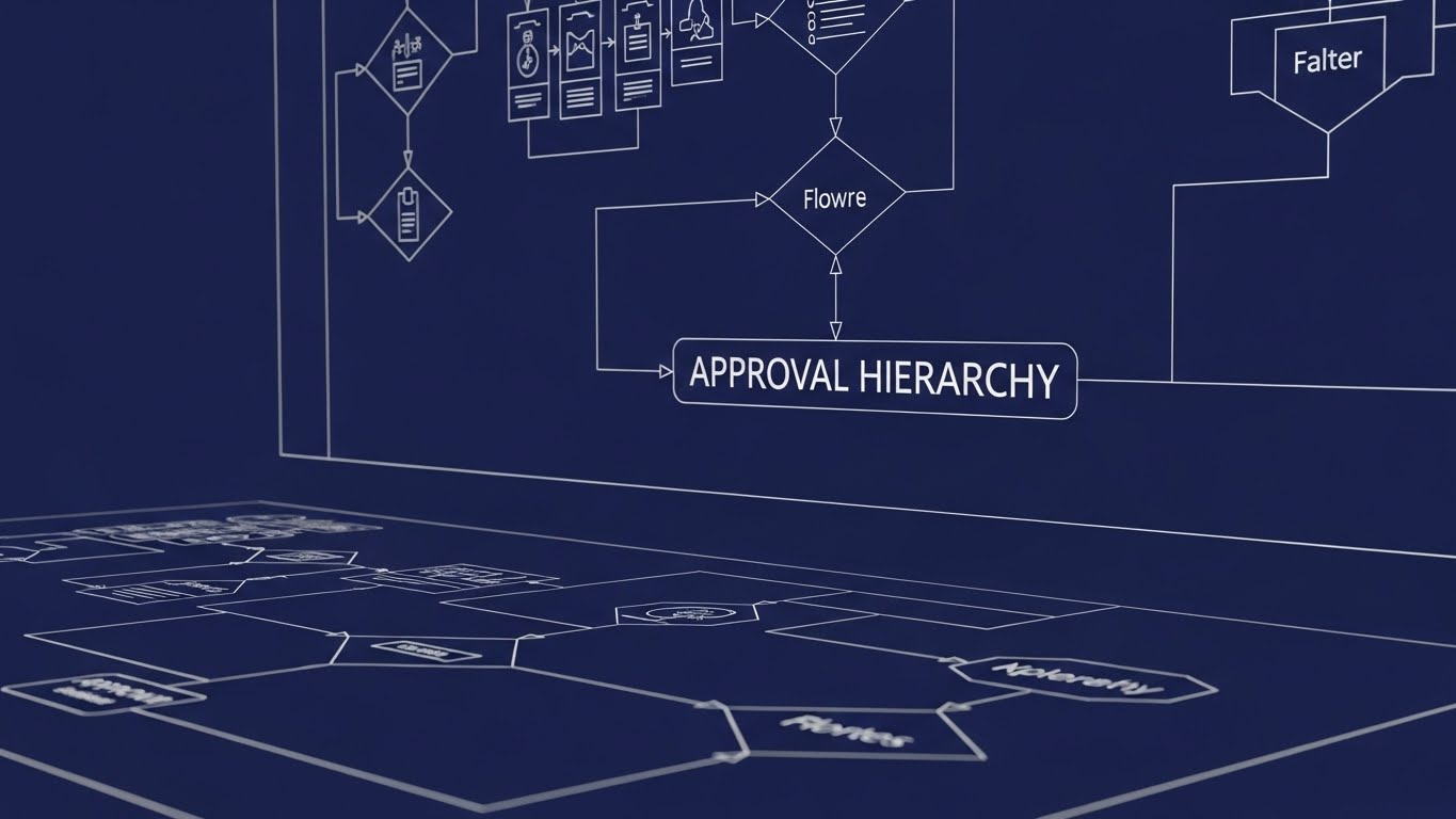
The Visual & Narrative Approach
Precision is the ultimate currency for the Operations Director. This style utilizes an elegant "blueprint" aesthetic, setting precise white continuous lines against a deep, trustworthy indigo background. The camera pans across an intricate, expansive flowchart labeled "APPROVAL HIERARCHY." There are no distracting fills or textures; the focus is entirely on the logic of the connections, conveying an engineering-grade accuracy as the lines draw themselves to reveal the workflow structure.
Psychological Impact & KPI Focus
- Niche Psychology: Complex organizations fear "Shadow IT" and process anarchy. This visual appeals to the "Systemizer" mindset—stakeholders who find comfort in order and rules. It visually proves that your software can handle multi-layered, conditional logic without breaking.
- Operational Impact: It directly visualizes "Workflow Governance." By laying out the hierarchy clearly, it reassures the buyer that compliance guardrails are baked into the system's architecture, addressing the "Risk of Non-Compliance" KPI.
Strategic Implementation & Trade-offs
- Funnel Stage: MOFU (The Functional Buyer).
- Best Use Case: Whitepapers, Technical Datasheets, and "Deep Dive" webinar intros.
- Trade-off: While intellectually satisfying to a logical buyer, it can feel dry or "academic" to a visionary leader. It sells safety and order, not innovation or revenue.
Companies using similar video content -
airSlate – WorkFlow – Visualizes API connectivity for codeless automation.
Zenphi – Document Automation – Visualizes API connectivity for Google Workspace.
13. Dark Mode UI Showcase
MOFU | The Technical Buyer
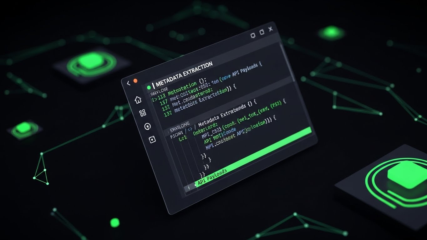
The Visual & Narrative Approach
To win over the CIO, you must speak their language: Code. This visual presents the software not as a user interface, but as a powerful developer tool. We see an angled, sleek terminal window in "Dark Mode"—deep charcoal backgrounds with syntax-highlighted code in neon green. Strings of JSON data and brackets visualize "Metadata Extraction" and API payloads. The aesthetic is sophisticated and "hacker-chic," with a subtle glow emphasizing the live data connection.
Psychological Impact & KPI Focus
- Niche Psychology: IT decision-makers are often the "Veto Voice." They suspect "low-code" tools are toys. This style respects their intelligence by showing the "engine room." It triggers "Technical Validation," proving the platform is built on modern, standard protocols (REST API, JSON).
- Operational Impact: It visualizes "Interoperability." It shows that the document automation platform isn't an island; it's a permeable, connectable layer that can seamlessly exchange metadata with existing enterprise stacks.
Strategic Implementation & Trade-offs
- Funnel Stage: MOFU (The Technical Buyer).
- Best Use Case: Developer Documentation (DevDocs), API Pages, and Technical Slide Decks.
- Trade-off: It is unintelligible to the non-technical user. A Legal Ops manager might find this intimidating, so it must be segmented strictly for the IT/Technical audience.
Companies using similar video content -
Hyland OnBase – Enterprise Content Management – Visualizes infrastructure transformation from paper to digital.
Contentverse – Hybrid Cloud DMS – Visualizes infrastructure transformation for regulated industries.
14. Dynamic Data Visualization
MOFU | LinkedIn Organic

The Visual & Narrative Approach
As we move toward the bottom of the funnel, abstract promises must turn into concrete numbers. This style features rising 3D bar graphs with a premium, glossy plastic texture. The palette uses gradients of corporate blue and emerald green to signify growth and stability. As the bars climb, floating 3D currency signs ($) and percentage symbols (%) materialize, visualizing the tangible accumulation of "Time Saved" or "Cost Avoidance." The environment is pristine, focusing solely on the upward trajectory of value.
Psychological Impact & KPI Focus
- Niche Psychology: The CFO doesn't care about "efficiency"; they care about the bottom line. This style leverages "Quantitative Bias"—the tendency to trust information that is presented as data. It transforms qualitative benefits (happier lawyers) into quantitative assets (dollars saved).
- Operational Impact: It addresses the "ROI Justification" KPI. By visualizing the delta between the "old way" (low bars) and the "automated way" (high bars), it provides the champion with the visual evidence needed to secure budget approval.
Strategic Implementation & Trade-offs
- Funnel Stage: MOFU (LinkedIn Organic / Social Proof).
- Best Use Case: LinkedIn Feed Posts, Case Study Summaries, and Annual Reports.
- Trade-off: Without context, charts can be generic. This style works best when paired with a specific customer story (e.g., "How Firm X Saved $2M") rather than as a standalone graphic.
Companies using similar video content -
GetAccept – Document Generation Software – Accelerates user action for sales documents.
Docupilot – Document Generation – Accelerates document delivery and creation.
15. Abstract 3D AI Visualization
MOFU | Demand Gen & Lead Capture

The Visual & Narrative Approach
This visualization connects the document to the wider customer lifecycle. The camera floats through a complex "plexus" network—a web of glowing nodes and connecting lines in sapphire blue with bioluminescent highlights. These data points converge on a central, pulsating hub labeled "CRM." The aesthetic is ethereal and high-tech, using depth of field to imply a vast, infinite network of information being synchronized in real-time.
Psychological Impact & KPI Focus
- Niche Psychology: Sales leaders fear that document automation will create data silos. This style assures them of "Universal Connectivity." It visually demonstrates that the contract data isn't lost; it flows back into the CRM, enriching the customer record.
- Operational Impact: It visualizes "Data Integrity" and "Single Source of Truth." It combats the fear of dirty data by showing a clean, organized flow of information from the document generation process back to the core business systems.
Strategic Implementation & Trade-offs
- Funnel Stage: MOFU (Demand Gen & Lead Capture).
- Best Use Case: E-book Covers, Webinar Backgrounds, and High-Level "Platform Architecture" pages.
- Trade-off: It is highly conceptual. It sells the vision of connectivity but does not explain the mechanism of how the integration is actually set up (unlike Style 13).
Companies using similar video content -
Salesforce Revenue Cloud – CPQ – Visualizes CRM integration for revenue operations.
Dealhub.io – CPQ Platform – Visualizes CRM integration for guided selling.
16. Photorealistic 3D Renders
BOFU | ROI Justification

The Visual & Narrative Approach
When asking for a significant enterprise investment, the visual language must match the asking price. This style utilizes photorealism to evoke luxury and stability. We see a close-up of a high-end boardroom table with a marble surface. A neat stack of realistic gold coins is balanced perfectly next to a sleek digital tablet displaying a rising financial graph. The lighting is ray-traced, capturing the reflection of the gold on the marble, subconsciously linking the software to wealth, solidity, and executive success.
Psychological Impact & KPI Focus
- Niche Psychology: This targets the "Status Quo Bias" of the C-Suite. It frames the software not as a utility, but as a strategic asset. The visual language mimics high-end financial services, signaling that this is a safe, premium investment for the enterprise.
- Operational Impact: It supports "Value Realization." It moves the conversation away from "cost per user" and towards "long-term enterprise value" and revenue protection.
Strategic Implementation & Trade-offs
- Funnel Stage: BOFU (ROI Justification).
- Best Use Case: Executive Slide Decks, Investment Pitch Decks, and Pricing Pages.
- Trade-off: It can appear "too polished" or stock-like if not branded correctly. It risks looking like a generic banking ad if the specific software context (the tablet screen) isn't highlighted enough.
Companies using similar video content -
DocuWare – Document Management System – Clarifies approval hierarchies with workflow automation.
LogicalDOC – Document Management System – Clarifies document workflows and knowledge management.
17. 3D X-Ray Visualization
BOFU | Risk Mitigation

The Visual & Narrative Approach
Security is the ultimate deal-breaker. To overcome this, we use the "X-Ray" technique to reveal the hidden strength of the platform. The visual features a 3D glass folder icon, rendered with beautiful frosted transparency. Inside this delicate container, we see a robust, glowing red lock mechanism with intricate metal gears. The lighting highlights the complexity of the gears, symbolizing strong encryption and internal complexity protecting the fragile data (the glass) from the outside world.
Psychological Impact & KPI Focus
- Niche Psychology: Security Officers (CISOs) operate on paranoia. They need to see how it's safe. This visual provides "Structural Reassurance." The juxtaposition of the transparent glass (visibility) and the heavy metal gears (security) balances the need for access with the need for protection.
- Operational Impact: It visualizes "Risk Mitigation" and "Encryption Standards." It serves as a visual shorthand for ISO 27001 compliance and banking-grade security protocols, addressing the "Data Breach Anxiety" KPI.
Strategic Implementation & Trade-offs
- Funnel Stage: BOFU (Risk Mitigation).
- Best Use Case: Security/Trust Center pages, Compliance Whitepapers, and "Footer" trust badges.
- Trade-off: It focuses entirely on defense. It doesn't sell efficiency or speed, only safety. It is a necessary "shield" visual, not a "sword."
Companies using similar video content -
Templafy – Document Generation Platform – Validates API robustness for enterprise templates.
Docs Made Easy – Salesforce DocGen – Validates API robustness for Salesforce documents.
18. Generative AI Realistic Character Video
BOFU | Building Trust & Credibility

The Visual & Narrative Approach
Technology is bought by humans. This style introduces the "Protagonist." We see a high-quality, cinematic medium shot of a young female lawyer or compliance officer in a modern, sun-lit office. She holds a tablet, smiling with genuine relief and satisfaction. The background is artfully blurred (bokeh), keeping the focus on her emotional state. This is not about the features on the screen; it is about the result of those features on her work-life balance.
Psychological Impact & KPI Focus
- Niche Psychology: Social proof is powerful. Prospects want to know, "Will my team actually like this?" This visual leverages "Mirror Neurons"—seeing a relaxed peer makes the buyer feel that relief is possible. It humanizes the ROI, translating "efficiency" into "employee well-being."
- Operational Impact: It targets "User Satisfaction" and "Talent Retention." It subtly argues that good automation tools reduce burnout, making the organization a better place to work.
Strategic Implementation & Trade-offs
- Funnel Stage: BOFU (Building Trust & Credibility).
- Best Use Case: Case Study Headers, Testimonial Rotators, and "About Us" videos.
- Trade-off: It is generic if not paired with a specific quote or logo. Without a caption like "Head of Legal at [Company]," it is just a stock image. It needs narrative context to work.
Companies using similar video content -
SecureKloud – DocuGenie.AI – Quantifies time savings in financial document processing.
M-Files – DMS – Quantifies efficiency gains with metadata-driven management.
19. Isometric 3D Workflow
BOFU | Sales Cycle Acceleration

The Visual & Narrative Approach
Returning to process, but now with a playful, approachable "Claymorphism" style. The view is a high-angle "God view" of a miniature office layout. Tiny, abstract figures move digital blocks (contracts) along a fast-moving track that winds through the office. The palette is soft pastel blue and white with a toy-like plastic texture. This visualizes the "Sales Cycle" as a physical track, showing how the software removes friction and speeds up the journey from "Lead" to "Closed Won."
Psychological Impact & KPI Focus
- Niche Psychology: Sales Directors view contracts as hurdles. This visual reframes the contract process as a "high-speed rail" rather than a roadblock. The playful style reduces the intimidation factor of legal workflows, making the process look manageable and smooth.
- Operational Impact: It visualizes "Sales Cycle Acceleration." It shows the document moving physically through the stages (Draft, Negotiate, Sign) without stopping, addressing the KPI of "Deal Velocity."
Strategic Implementation & Trade-offs
- Funnel Stage: BOFU (Sales Cycle Acceleration).
- Best Use Case: One-Pagers for Sales Enablement, "Process" diagrams in proposals.
- Trade-off: The "toy-like" aesthetic might be too playful for very conservative industries (e.g., defense contracting). It works best for SaaS and modern B2B verticals.
Companies using similar video content -
Icertis – Contract Intelligence – Visualizes CRM integration for contract data.
LawVu – Legal Operations Platform – Visualizes CRM integration for contract lifecycle.
20. 2D Character-Driven Story
BOFU | Objection Handling

The Visual & Narrative Approach
The final hurdle is often the fear of complexity. This style uses a stylized, flat 2D illustration in muted teal and salmon tones. A relatable office worker is depicted sitting at a desk, leaning back with hands behind their head—the universal posture of "Job Done." The computer screen in front of them displays a single, large, simple "Checkmark" icon. The simplicity of the shapes and the flat shading convey a sense of calm conclusion.
Psychological Impact & KPI Focus
- Niche Psychology: This addresses "Implementation Fatigue." Buyers worry that finishing a document task is a struggle. This visual creates a "Resolution Anchor," associating the software with the feeling of completion and relaxation. It promises that the "hard part" is over.
- Operational Impact: It visualizes "Task Completion Rates." It reinforces the idea that the software is designed to get the user out of the application and back to their life, minimizing "Time-on-Task."
Strategic Implementation & Trade-offs
- Funnel Stage: BOFU (Objection Handling).
- Best Use Case: "Thank You" pages after download, Email signatures, and Onboarding success screens.
- Trade-off: It is very simple. It doesn't sell power or features; it sells the absence of stress. It is an emotional closer, not a logical opener.
Companies using similar video content -
MetricStream – GRC – Cements high-value perception for governance and risk.
Archer – Risk Management – Cements high-value perception for integrated risk.
21. Low-Poly 3D Modeling
BOFU | The Economic Buyer

The Visual & Narrative Approach
This visualization zooms out to the macro level, adopting a "Low-Poly" aesthetic—geometric, faceted, and clean. The composition presents a bird's-eye view of a digital metropolis. However, the skyscrapers are not made of concrete; they are constructed from stacks of vintage file cabinets that are actively morphing into sleek, glowing server racks and data towers. The palette is dominated by "poly-white" and shades of "server blue," with visible mesh lines emphasizing the engineered nature of the transformation.
Psychological Impact & KPI Focus
- Niche Psychology: The Economic Buyer (CFO/CEO) thinks in terms of "Infrastructure" and "Scalability," not just individual features. This style appeals to the "Builder" archetype. It visually validates that the investment is not just a software purchase, but a foundational renovation of the company’s digital architecture.
- Operational Impact: It addresses the KPI of "Scalability" and "Tech Stack Consolidation." It visualizes the transition from heavy, physical legacy storage to lightweight, scalable digital cloud infrastructure.
Strategic Implementation & Trade-offs
- Funnel Stage: BOFU (The Economic Buyer).
- Best Use Case: Annual Reports, Investor Presentations, and High-Level "Vision" Infographics.
- Trade-off: The low-poly style is stylized and can feel "game-like." It is excellent for illustrating conceptual scale but poor for showing actual UI details or specific compliance features.
Companies using similar video content -
ShareVault – Virtual Data Room – Assures data security with advanced encryption.
Kiteworks – Secure Content Platform – Assures data security with zero-trust architecture.
22. 2D Animation & UI Composition
Onboarding | Self-Serve Onboarding
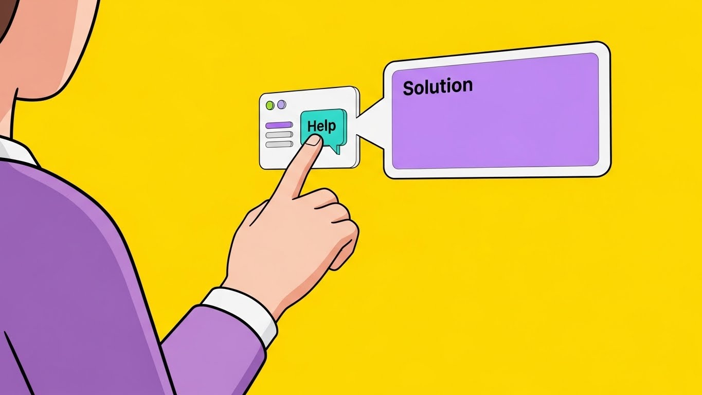
The Visual & Narrative Approach
Transitioning to the user onboarding phase, this style adopts a friendly, instructional tone. It uses "Cel-Shading" with bold black outlines and a vibrant yellow background to maintain high energy. The composition features an over-the-shoulder perspective of a stylized user interacting with a floating UI. A finger taps a "Help" button, which instantly triggers a comic-book style speech bubble that expands into a solution. The movement is snappy and elastic, mimicking the responsiveness of a well-designed app.
Psychological Impact & KPI Focus
- Niche Psychology: New users often feel "Onboarding Anxiety"—the fear of looking incompetent. This approachable, cartoon-adjacent style disarms that fear. It signals that the platform is forgiving, helpful, and equipped with "Self-Serve" tools that don't require calling IT.
- Operational Impact: It directly targets the "Time-to-Competency" KPI. By visualizing instant help, it promises a reduction in support ticket volume and faster user enablement.
Strategic Implementation & Trade-offs
- Funnel Stage: Onboarding (Self-Serve Education).
- Best Use Case: In-App Tooltips, "Welcome" Video Series, and Learning Management Systems (LMS).
- Trade-off: The cartoon style might feel too casual for highly formal legal environments (e.g., M&A setups). It works best for general internal users rather than external client-facing presentations.
Companies using similar video content -
Ironclad – CLM – Builds trust by simplifying contract workflows for professionals.
EddyHR – HR Platform – Builds trust by simplifying HR document management.
23. 3D Parallax UI Presentation
Onboarding | Accelerating Time-to-Value
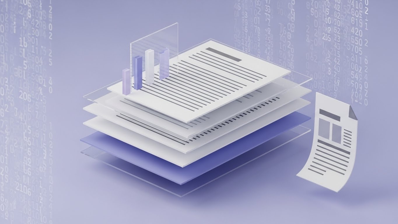
The Visual & Narrative Approach
This style creates a sense of magical assembly. It deconstructs the flat document into a 3D parallax experience. Floating against a soft lilac background, we see the document separated into three distinct layers: a back layer of abstract code (logic), a middle layer of the template structure (layout), and a front layer of the finished document "popping" out. The camera drifts slightly, using the parallax effect to emphasize the depth and separation of these elements before they snap together into a unified whole.
Psychological Impact & KPI Focus
- Niche Psychology: This appeals to the "Creator" persona—the Legal Engineer or Template Designer. It validates the complexity of their work while showing how the software organizes it. It transforms a flat page into a multi-dimensional asset.
- Operational Impact: It visualizes "Accelerating Time-to-Value." By showing the layers coming together, it effectively communicates the "Template Logic" and "Conditional Assembly" features without needing lines of code.
Strategic Implementation & Trade-offs
- Funnel Stage: Onboarding (User Education).
- Best Use Case: Welcome Emails, "New Feature" announcements, and loading screens.
- Trade-off: It is an abstract representation of the document structure. It looks beautiful but doesn't teach the specific "clicks" required to build the template.
Companies using similar video content -
PandaDoc – Document Management Platform – Visualizes sales acceleration through streamlined documents.
Conga – CLM – Visualizes sales acceleration for contract processes.
24. Holographic UI over 3D Render
Onboarding | Trial/Freemium User Activation

The Visual & Narrative Approach
To combat user churn, this style borrows from the visual language of sci-fi gaming. Set against a pitch-black background, a glowing neon cyan and magenta wireframe ring projects upward from a dark table surface. This holographic menu displays "User Activation" icons (rockets, badges) floating in mid-air. The aesthetic is "Cyber-Tech," using bloom lighting and scanlines to create a sense of futuristic interaction. It frames the software usage not as work, but as a mission.
Psychological Impact & KPI Focus
- Niche Psychology: Freemium or trial users need a hook to keep them engaged. This style leverages "Gamification Psychology." It makes the interface look exciting and "next-gen," triggering the user's desire to explore and "unlock" the system's potential.
- Operational Impact: It targets "Trial Conversion Rates." By presenting the onboarding tasks as a futuristic holographic interface, it increases engagement and reduces the "drop-off" rate during the initial setup phase.
Strategic Implementation & Trade-offs
- Funnel Stage: Onboarding (Trial/Freemium Activation).
- Best Use Case: Gamification Badges, "Level Up" emails, and internal contest dashboards.
- Trade-off: It is highly stylized and not representative of the actual flat UI. It is a marketing "hype" tool, not a training tool.
Companies using similar video content -
Signeasy – eSignature Solution – Visualizes ease of use for document signing.
MyCase – Legal Practice Management – Visualizes ease of use for legal workflows.
25. Lifestyle Stock with UI Overlay
Retention | Reducing Churn

The Visual & Narrative Approach
Retention is driven by feeling, not just function. This style uses high-quality "POV" (Point of View) photography. We see the world through the user's eyes: a laptop screen open on a warm wooden desk, a hand holding a coffee mug, bathed in natural golden-hour sunlight. Overlaying this realistic scene is a crisp, bright vector "Success" checkmark floating in the air above the laptop. It juxtaposes the digital completion of a task with the physical sensation of relaxation.
Psychological Impact & KPI Focus
- Niche Psychology: This speaks to "Burnout Reduction." Existing customers don't want more features; they want their time back. This visual reinforces the emotional reward of using the software: the feeling of being "done."
- Operational Impact: It addresses "Reducing Churn." By associating the software with a moment of peace and coffee, it builds positive emotional equity with the brand, making it harder for the customer to switch to a competitor.
Strategic Implementation & Trade-offs
- Funnel Stage: Retention (Reducing Churn).
- Best Use Case: Monthly Newsletters, "Job Complete" notification screens, and Renewal reminders.
- Trade-off: It relies heavily on the quality of the stock photo. Poor stock photography can look generic and cheap. The lighting and composition must be premium to work.
Companies using similar video content -
OpenText Content Suite – ECM – Visualizes infrastructure transformation for content management.
Microsoft SharePoint – ECM – Visualizes infrastructure transformation for enterprise content.
26. 2D Graphics Over Live Action
Retention | Knowledge Base & FAQ Videos

The Visual & Narrative Approach
This style creates a seamless blend between the human team and the digital tool. It features a live-action shot of a support agent and a colleague collaborating in a modern office. Floating above their heads are stylized, 2D vector speech bubbles containing "Solution" icons—a lightbulb, a key, a gear. The graphics track with the camera movement, suggesting that the software's intelligence is an extension of their conversation. The palette mixes realistic office tones with the brand's vector blue accents.
Psychological Impact & KPI Focus
- Niche Psychology: Users fear that "Knowledge Bases" are graveyards where questions go to die. This visual reassures them that real humans are empowered by the tools. It bridges the gap between "Automated Support" and "Human Empathy."
- Operational Impact: It targets the "Support Ticket Deflection" KPI. It promotes the idea that the Knowledge Base (the icons) provides the same value as a human conversation, encouraging users to find answers themselves.
Strategic Implementation & Trade-offs
- Funnel Stage: Retention (Knowledge Base & Support).
- Best Use Case: Help Center headers, FAQ Videos, and "Contact Us" pages.
- Trade-off: It requires custom video shoots or very careful selection of stock footage to allow space for the graphics.
Companies using similar video content -
Zoho WorkDrive – Document Management – Guides self-serve onboarding for team collaboration.
DynaFile – HR Document Management – Guides self-serve onboarding for HR documents.
27. Macro UI Micro-Interactions
Retention | Driving Deep Feature Adoption

The Visual & Narrative Approach
When you want to upsell, you must prove premium quality. This style utilizes extreme macro cinematography to focus on a single UI element: the "Submit" button. We see the subtle texture of the screen pixels, the soft gradient of the button, and a gentle "inner glow" as it is activated. The background is a clean, shallow-depth-of-field white. It elevates the software interface to the level of industrial design, focusing on the tactile satisfaction of the interaction.
Psychological Impact & KPI Focus
- Niche Psychology: Advanced users (Power Users) appreciate nuance. This style signals "Craftsmanship." It tells the user that the developers care about every pixel, which implies the backend code is equally robust and reliable.
- Operational Impact: It drives "Deep Feature Adoption." By glorifying a specific interaction, it draws attention to new or underused features, encouraging users to try them out.
Strategic Implementation & Trade-offs
- Funnel Stage: Retention (Feature Adoption).
- Best Use Case: "New Feature" Update Logs, Patch Notes, and Product Highlight reels.
- Trade-off: It is extremely myopic. It shows quality but provides zero context on workflow. It must be part of a larger update announcement.
Companies using similar video content -
Mitratech Hotdocs – Document Generation – Demonstrates creation speed with template layers.
Conga Composer – Document Generation – Demonstrates creation speed from Salesforce data.
28. Hyper-lapse Stock Footage with Data
Expansion | Driving Upsell/Cross-sell

The Visual & Narrative Approach
This style visualizes the result of successful expansion. It uses hyper-lapse footage of a modern city at night, with car lights streaking in long exposures. Mirroring this physical speed, glowing white digital data lines zip through the sky, connecting buildings in a vast network. The energy is frantic, fast, and electric. It symbolizes that the organization is moving at the speed of light, powered by the automation software.
Psychological Impact & KPI Focus
- Niche Psychology: Expansion buyers (Upsell targets) are often looking for "Competitive Advantage." This visual sells momentum. It suggests that using the enterprise version of the software fuels rapid growth and market dominance.
- Operational Impact: It targets "Upsell/Cross-sell" opportunities. It frames the software not just as a tool for the legal team, but as the engine for the entire company's velocity.
Strategic Implementation & Trade-offs
- Funnel Stage: Expansion (Driving Upsell).
- Best Use Case: Promo Videos for Enterprise Plans, Event backgrounds, and "Year in Review" videos.
- Trade-off: It is a high-level "mood" piece. It is inspiring but vague. It creates the right atmosphere for a sales conversation but explains nothing about the product itself.
Companies using similar video content -
Landing AI – Agentic Document Extraction – Gamifies user activation for AI document processing.
Tungsten Automation – TotalAgility – Gamifies user activation for IDP solutions.
29. Aspirational Stock Montage
Expansion | Driving Referrals & Advocacy

The Visual & Narrative Approach
The ultimate goal of the funnel is Advocacy. This style features a candid, high-energy group shot of a diverse professional team in a glass-walled conference room. They are cheering, high-fiving, and genuinely celebrating. In the background, a whiteboard with rising "Growth" charts is blurred but visible. The lighting is natural and bright. This isn't about the software screen; it's about the winning culture that the software enables.
Psychological Impact & KPI Focus
- Niche Psychology: People refer products that make them look good and feel successful. This visual taps into "Tribal Validation." It suggests that teams who use this software win together. It humanizes the B2B relationship.
- Operational Impact: It drives "Referrals & Advocacy." It associates the brand with team victory, making it a desirable tool to recommend to peers in other organizations.
Strategic Implementation & Trade-offs
- Funnel Stage: Expansion (Advocacy).
- Best Use Case: Community pages, Referral Program landing pages, and Case Study conclusions.
- Trade-off: It risks looking like a generic corporate stock photo. It must be paired with specific, authentic testimonial text to ground it in reality.
Companies using similar video content -
Folderit – HR Document Management – Reinforces retention with intuitive HR document control.
GoCo – HR Platform – Reinforces retention with simplified HR processes.
30. Futuristic Neon/Dark Mode (High-Key Variant)
Expansion | Proactive Support/Announcements

The Visual & Narrative Approach
We conclude with a vision of what's next. This style inverts the typical "Dark Mode" trope, opting for a "High-Key Futurism"—blindingly clean whites, silvers, and soft LED panels. We look down a symmetrical, utopian tunnel that leads to a bright light at the end. It feels like the interior of a spaceship or a clean-room laboratory. It symbolizes the "Future of Work"—a place of absolute clarity, frictionless movement, and infinite possibility.
Psychological Impact & KPI Focus
- Niche Psychology: Long-term customers stay for the roadmap. They want to know the vendor is innovating. This visual signals "Visionary Leadership." It reassures the client that the platform is taking them somewhere new and better.
- Operational Impact: It supports "Proactive Support/Announcements." It builds excitement for upcoming AI features or major version overhauls (v2.0), reducing the likelihood of customers looking for "newer" alternatives.
Strategic Implementation & Trade-offs
- Funnel Stage: Expansion (Future Roadmap).
- Best Use Case: "What's Next" Roadmap presentations, Beta Program invites, and Update Logs.
- Trade-off: It is completely abstract. It sells a feeling of the future, not the reality of today. It inspires confidence but requires concrete details to back it up.
Strategic Knowledge Base: The Visual Operations Doctrine
To transform these 30 visual styles into a cohesive business engine, we must move beyond "content creation" and establish a "Visual Operations Doctrine." This framework synthesizes the visual strategies into actionable protocols for your enterprise.
Strategic Alignment & Visual Architecture
The "Pre-Production" Strategy – Designing the Visual Operating System.
- The Cognitive Load Audit: Before commissioning a single video, audit your current training materials (PDFs, Wikis). Identify high-friction friction points (e.g., "Clause Logic Configuration"). Map these complex text-heavy zones to Style 3 (Isometric Assembly) or Style 23 (Parallax Layers) to directly reduce cognitive load.
- Role-Based Visual Mapping: Do not use a "one-size-fits-all" style.
- For Approvers/Sales (Mobile Users): Deploy Style 1 (Minimalist Vector) and Style 22 (2D Animation). They need speed and "glanceability."
- For Legal Ops/Admins (Desktop Power Users): Deploy Style 13 (Dark Mode Code) and Style 12 (Blueprint Flowchart). They need depth, detail, and logic.
- The "Glanceability" Standard: In high-stress environments (e.g., End-of-Quarter contract reviews), users do not have time to watch 3-minute videos. Adopt a "Glanceability Standard" where the core message of any visual (e.g., "Compliance Check Passed") is understood in <1.5 seconds, utilizing Style 20 (Simple Checkmark).
- Brand Voice Consistency: Ensure that your visual language is unified across disparate modules. If your "CLM" module uses Style 7 (Glossy Data), your "E-Signature" module cannot use gritty Style 4 (Kinetic Typography) without causing brand dissonance. Create a "Visual Style Guide" that enforces palette and motion rules.
- The Advids Strategic Audit: Partner with Advids to conduct a "Visual Gap Analysis." We identify where your current documentation fails to explain abstract concepts and recommend the precise visual metaphor (e.g., "Is this a Pipeline issue or a Network issue?") to fix it.
- Standardization vs. Customization:
- Standardize: Routine UI interactions (clicking, saving) using Style 5 (Clean UI) to lower production costs.
- Customize: High-value "Hero" concepts (AI integration, ROI) using Style 16 (Photorealism) to maximize impact.
- The Cross-Departmental Bridge: Use visuals to unify terminology. If Sales calls it a "Deal" and Legal calls it a "Matter," use Style 15 (Connected Plexus) to visually link these terms, showing they are the same data entity viewed from different angles.
- Legacy System Integration: Visualizing the connection between old on-premise servers and new SaaS interfaces is critical for trust. Use Style 26 (Wireframe to Reality) to show the "safety" of the data migration path, respecting the anxiety of the "Old Guard."
- Accessibility in Automation: Your workforce is diverse. Design motion graphics (especially Style 22) that rely on visual cues rather than voiceovers, ensuring accessibility for multi-lingual teams or open-plan offices where sound is muted.
- The Mobile-First Mandate: Executive approvers often sign contracts on phones. Adapt all 30 styles for vertical (9:16) consumption. Style 11 (Rapid UI Montage) is particularly effective for mobile-first "hype" reels sent via SMS or Slack.
Operational Adoption & Implementation
The "Deployment" Phase – Embedding Visuals into the Workflow.
- Overcoming "Big Brother" Anxiety: Employees fear automation is surveillance. Use Style 18 (Generative AI Character) to depict the software as a "Digital Assistant" that removes drudgery, rather than a "Digital Overlord" tracking clicks.
- The Micro-Learning Shift: Replace 50-page PDF manuals with "Micro-Learning" playlists. Break complex workflows into 30-second clips using Style 5 (Clean UI) for the "How-To" and Style 3 (Isometric) for the "Why."
- Just-in-Time Support: Embed specific visual styles directly into the software. When a user hovers over a complex "Indemnity Clause" field, trigger a pop-up GIF using Style 22 (Help Bubble) to explain the risk instantly.
- Gamification of Training: Transform boring compliance training into a "Level-Up" experience. Use Style 24 (Holographic UI) to visualize training progress bars and badges, encouraging users to complete their certification.
- Reducing Support Ticket Volume: There is a direct correlation between proactive visual guides and reduced call center load. Anticipating "Frequently Asked Questions" and answering them with Style 26 (Live Action + Graphics) videos in the Help Center can deflect up to 40% of L1 tickets.
- Remote Onboarding: In a distributed/hybrid work era, you cannot rely on physical seminars. Leverage Style 23 (Parallax UI) and screencasts to create an "On-Demand Academy" that offers a consistent onboarding experience globally.
- Standard Operating Procedures (SOPs): Text-based SOPs are ignored. Transform them into visual process flows using Style 12 (Blueprint Line Art). This makes the "Rules of Engagement" undeniable and easy to follow.
- Feedback Loops: Use interactive video elements. After a Style 22 tutorial plays, ask "Was this helpful?" The data gathered helps refine the visual strategy.
- Scalable Localization: Global enterprises need global assets. By using abstract styles like Style 8 (Motion Graphics) and Style 1 (Minimalist Vector) that rely on symbols rather than text, you reduce the cost and complexity of translating assets for different regions.
- Leadership Communication: When rolling out a major platform update, use Style 28 (Hyper-lapse) and Style 30 (Futuristic Tunnel) in Town Hall presentations to sell the vision and velocity of the change, ensuring top-down buy-in.
Measuring Impact & Future-Proofing
The "ROI" Phase – Quantifying Value and Scaling.
- Beyond "Views": Stop measuring "Video Views." Start measuring "Time-to-Competency." If users who watch the Style 3 video construct contracts 20% faster than those who read the PDF, that is your ROI.
- The "Idle Time" Metric: Correlate better visualization with reduced "Software Idle Time" (time spent staring at the screen confused). Style 5 (Clean UI) aims to drive this metric down to zero.
- Compliance Velocity: Measure how fast new regulations (e.g., GDPR updates) are understood. Distributing a Style 17 (X-Ray Security) video explaining the new encryption protocols is faster and more verifiable than sending a memo.
- Retention and Churn: High-quality UX visualization is a retention tool. Regular exposure to Style 25 (Lifestyle Success) and Style 27 (Macro Quality) reinforces the premium value of the subscription, increasing Lifetime Value (LTV).
- The AI Visual Frontier: Prepare for Generative AI. Soon, you will need to visualize "AI Reasoning." Start experimenting with Style 13 (Code Syntax) to explain how the AI made a decision, building trust in the "Black Box."
- Scalability of Assets: Build a "Visual Component Library." If you create a 3D asset of your "Contract Block" for Style 19, reuse that same 3D asset for Style 3 and Style 23. This creates economies of scale.
- The Advids Partnership: Scaling this content requires a factory, not an artist. Advids serves as your long-term visual infrastructure partner, managing the asset library and ensuring that as your software evolves (v1.0 to v2.0), your visual assets update synchronously.
- Benchmarking Success: "Good enough" visuals are a competitive risk. If your competitor uses Style 4 (Kinetic Typography) to dominate social media while you use static stock photos, you are losing "Share of Mind."
- The ROI of Safety: For industries with high liability, better visualization means fewer errors. Quantify the "Cost of Error Avoidance." If Style 12 (Blueprint) prevents one major contract error, the video has paid for itself 100x over.
- Final Call to Innovation: Treat video as infrastructure, not content. It is the UI of your knowledge. Investing in this "Visual Operations Doctrine" is not a marketing expense; it is an operational imperative for the future of the intelligent enterprise.
Companies using similar video content -
Thomson Reuters – HighQ – Humanizes support interaction for legal collaboration.
MetaSource – WorkDocs – Humanizes support interaction for HR document management.
Author & Editor Bio


