
Introduction: The Visual Bridge to Digital Efficiency
In the modern enterprise, data is the lifeblood of operations, but for many organizations, it flows through clogged arteries. The "Operational Architect"—the IT Director, the CIO, the Operations Lead—is currently fighting a war on two fronts: the exploding volume of unstructured data and the paralyzing friction of legacy systems. The stakes are high; the global document management system market is projected to reach USD 24.34 billion by 2032, signaling a massive, universal shift toward automated intelligence.
However, the barrier to adoption is rarely the technology itself—it is the perception of complexity. Employees and decision-makers alike are exhausted by "Information Chaos." Research indicates that employees waste an average of 1.8 hours every single day just searching for and gathering information. This "Search Tax" is a silent killer of productivity, yet it is difficult to visualize in a spreadsheet.
This is where strategic video visualization becomes your most powerful Go-To-Market asset. To sell the cure, you must first visualize the disease (Chaos) and then vividly demonstrate the remedy (Order). You must move beyond generic screen recordings to use visual metaphors—Kinetic Typography to show speed, Isometric Motion to show automation, and High-Fidelity UI to show precision—to bridge the gap between the physical paperwork of the past and the digital efficiency of the future.
This guide presents 30 distinct visual styles (Part 1 covers 1-10) designed to reduce cognitive load, build trust, and articulate the value of your Document Management platform to the buyers who need it most.
1. Bold Kinetic Typography (Visual)
TOFU | Market Education
The Visual & Narrative Approach
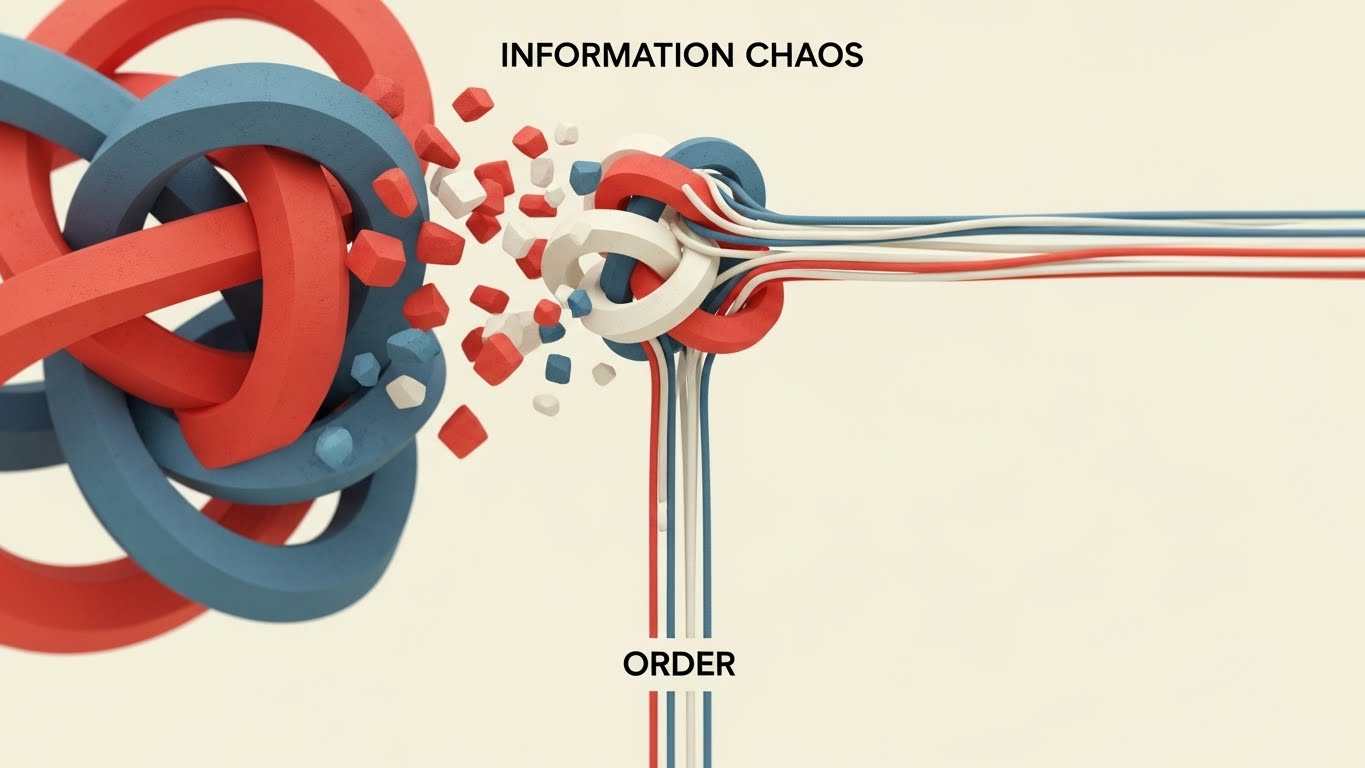
This style creates a visceral "Before and After" experience without using a single spoken word. The scene opens on a stark, minimalist void where tangled geometric knots—rendered in rough, vibrating textures—represent the anxiety of "Information Chaos." Through a violent yet satisfying animation, these knots untie and snap into perfectly straight, parallel lines in Vivid Coral and Slate Blue. The motion transitions from erratic vibration to smooth, linear flow, visually proving the concept of "Order."
Psychological Impact & KPI Focus
- Cognitive Relief: The brain craves pattern recognition. By resolving the visual tension of the "knot," you provide a subconscious sense of relief to the viewer, associating your brand with "solutions."
- Market Education: It simplifies the complex value proposition of "Workflow Optimization" into a universally understood metaphor: straightening out the mess.
Strategic Implementation & Trade-offs
- Duration: 10-15 Seconds.
- Best For: Instagram Reels / Stories (9:16).
- Trade-off: This style is purely conceptual. It builds brand affinity and awareness but does not show how the software works. It requires a follow-up asset (like Style 10) to validate the promise.
Companies using similar video content -
M-Files – Intelligent Information Management – Organizes unstructured content, streamlines workflows.
DocuWare – Cloud-based DMS – Digitizes, secures, and processes electronic documents.
2. Abstract 2D Motion Graphics
TOFU | Brand Awareness

The Visual & Narrative Approach
This style visualizes the "Single Source of Truth." From a top-down perspective, we see a "Digital Void" where flowing rivers of abstract binary code blocks (Electric Teal and Magenta dots) swirl spirally towards a central, glowing white hub. The aesthetic is fluid and vector-based, utilizing negative space to imply a clean, cloud-native environment. The converging streams symbolize the unification of siloed data (Email, Drive, Desktop) into one secure repository.
Psychological Impact & KPI Focus
- Authority: The central hub metaphor establishes your platform as the core of the enterprise ecosystem.
- Fluidity: The smooth, liquid motion alleviates the fear of "clunky" integration, suggesting that data migration will be frictionless and organic.
Strategic Implementation & Trade-offs
- Duration: 15-30 Seconds.
- Best For: LinkedIn Feed / Facebook (1:1).
- Trade-off: Abstract visuals can feel generic. Ensure your brand colors (Teal/Magenta) are prominent to claim ownership of the style.
Companies using similar video content -
OpenText – Content Suite – Comprehensive content management, archiving, data governance.
Alfresco – Content Services – Manages content and documents, powerful AI engine.
3. Abstract 2D Flat Vector Organic
TOFU | Shaping Brand Perception

The Visual & Narrative Approach
This style tackles the concept of "Structuring Unstructured Data." In a clean white studio, amorphous blobs in Soft Sage and Peach float aimlessly, representing raw, unclassified files. As they pass through a "processing" zone, they solidify into sharp, crystalline cubes with "glassmorphism" textures. The transformation is slow and deliberate, emphasizing the precision and value-add of the software’s indexing engine.
Psychological Impact & KPI Focus
- Tangibility: Software is invisible. This style gives "data" a physical form (Crystal), subtly implying that your platform turns "messy" data into "valuable" assets.
- Premium Perception: The glossy, high-end textures position the brand as an Enterprise-grade solution, differentiating it from cheaper, utilitarian tools.
Strategic Implementation & Trade-offs
- Duration: 10-15 Seconds (Loop).
- Best For: Website Hero Background (16:9).
- Trade-off: High production cost due to texture rendering. It is an atmospheric style, not an explainer.
Companies using similar video content -
Egnyte – Financial Services DMS – AI-driven automation, secure portals, compliance tools.
RecordsKeeper.AI – Records Management – AI-powered categorization, blockchain for data integrity.
4. Minimalist Flat 2D Vector
TOFU | Skippable Pre-Roll Ad
The Visual & Narrative Approach
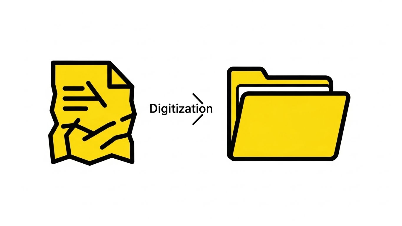
Speed is the priority. On a stark white background, a crumpled paper document icon (thick black outlines) moves linearly from left to right. Mid-motion, it morphs smoothly into a sleek, Canary Yellow digital folder. There are no backgrounds, no textures, and no distractions. It is the visual shorthand for "Digitization."
Psychological Impact & KPI Focus
- Cognitive Ease: The viewer understands "Paper to Digital" in less than 1 second. This style respects the viewer's time and reduces the cognitive load required to understand the offer.
- Action-Oriented: The linear movement implies progress and forward momentum.
Strategic Implementation & Trade-offs
- Duration: 5-6 Seconds.
- Best For: YouTube Bumper Ads / Pre-Roll.
- Trade-off: It lacks nuance. It cannot explain how the digitization happens (OCR, etc.), only that it does happen.
Companies using similar video content -
ARC Document Solutions – Document Digitization – Large-scale scanning, secure archiving.
Flatworld Solutions – Document Digitization Services – AI-based OCR/ICR, robotic scanning.
5. Rapid UI Feature Montage
TOFU | Vertical Social Organic
The Visual & Narrative Approach
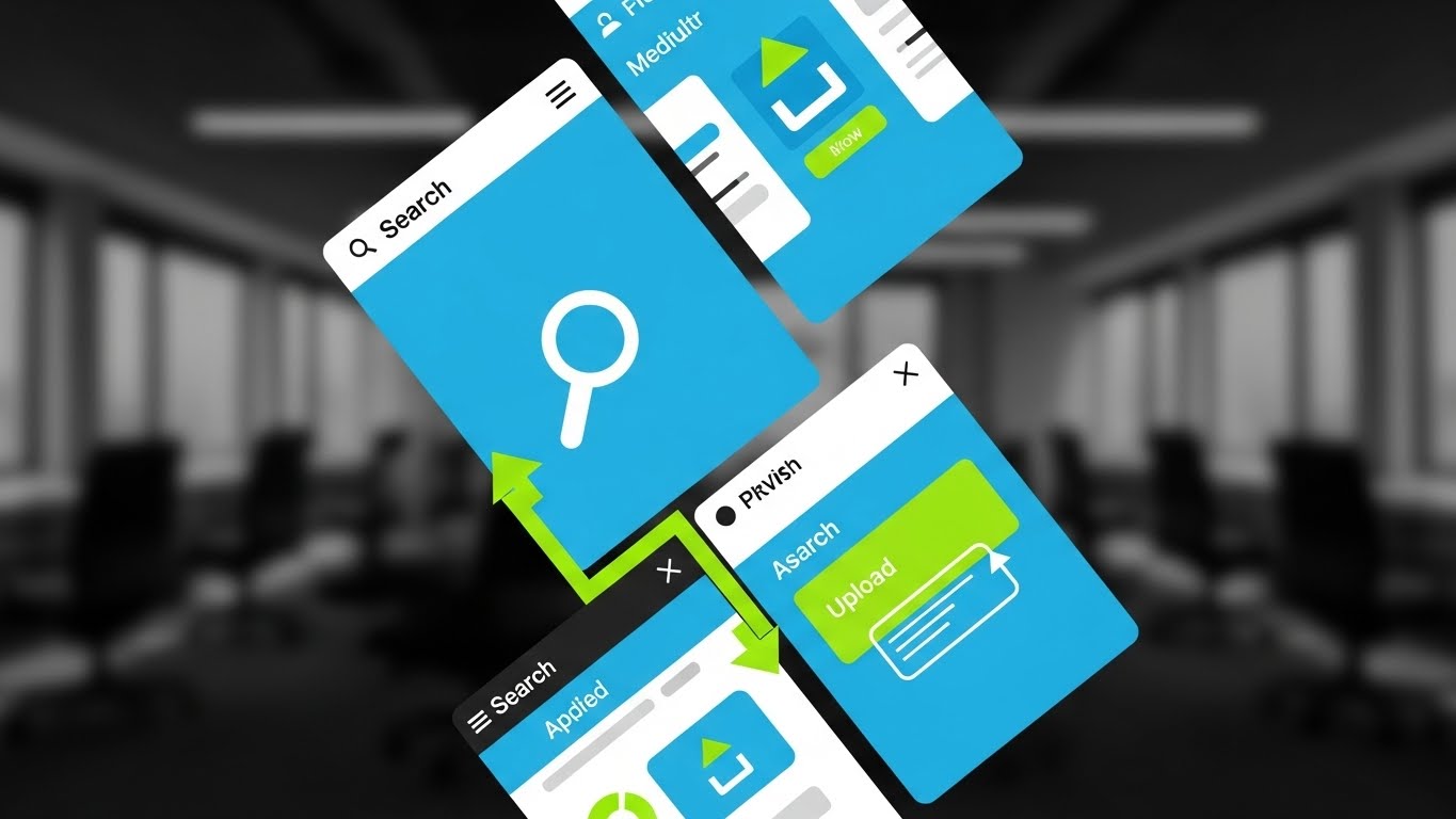
Designed for the vertical scroll, this style uses diagonal split-screens to showcase the interface's speed. High-contrast UI mockups are slashed with Vivid Lime Green highlights that pinpoint specific actions: a "Search Magnifying Glass" or an "Upload Arrow." The background is a blurred office context. The editing is rhythmic and fast, matching a high-energy beat.
Psychological Impact & KPI Focus
- Perceived Velocity: The fast cuts transfer the feeling of speed to the product. It combats the stereotype of "slow enterprise software."
- Feature Anchoring: By highlighting specific icons (Search), you train the user to look for those features, increasing feature awareness.
Strategic Implementation & Trade-offs
- Duration: 15-20 Seconds.
- Best For: TikTok / Shorts (9:16).
- Trade-off: It moves too fast for deep learning. It is an "impression" asset, not a training asset.
Companies using similar video content -
Microsoft SharePoint – Document Management – Collaboration, file sharing, workflow automation.
Box – Cloud Content Management – Secure storage, collaboration, workflow automation.
6. 2D Line Art Animation
TOFU | Product/Solution Differentiation
The Visual & Narrative Approach
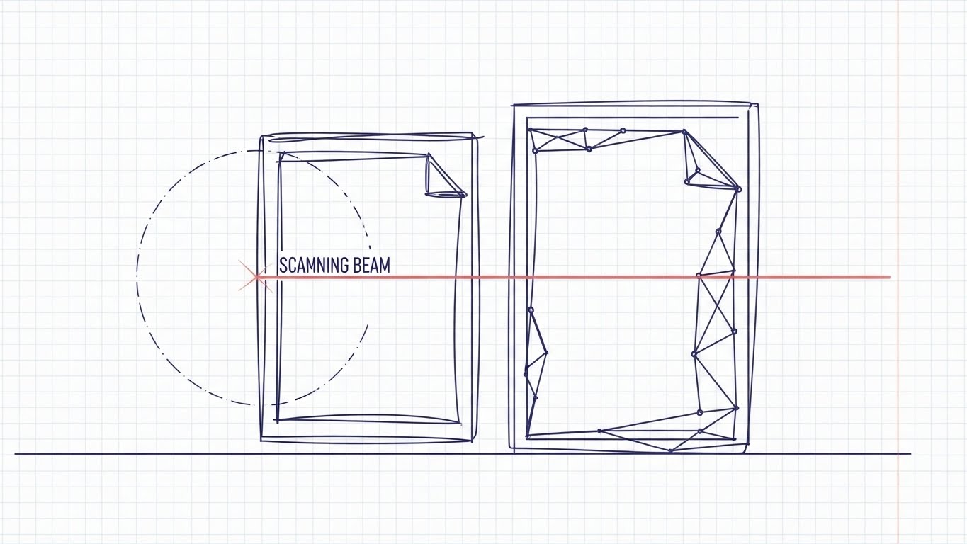
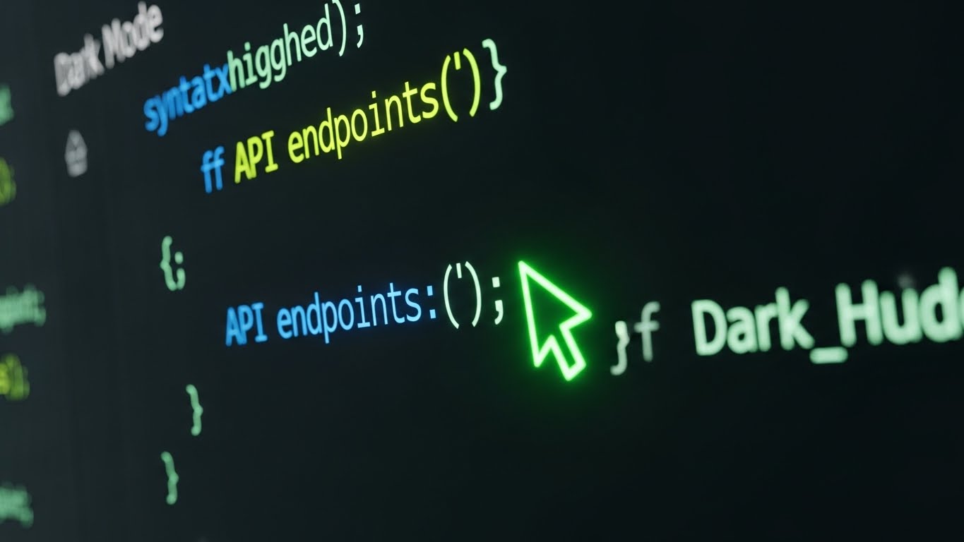
This style appeals to the engineer. Against a blueprint grid, a "Scanning Beam" (laser line) moves across a rough sketch of a document. As it passes, the sketch transforms into a precise, geometric digital wireframe in Indigo. The aesthetic is technical, clean, and accurate.
Psychological Impact & KPI Focus
- Trust & Precision: The blueprint aesthetic signals "Engineering Grade" accuracy. It reassures the Technical Buyer that the OCR technology is robust and reliable.
- Transparency: The wireframe look implies that the software captures the "DNA" of the document (metadata), not just the image.
Strategic Implementation & Trade-offs
- Duration: 30 Seconds.
- Best For: Website Feature Section (16:9).
- Trade-off: It can feel "cold" or clinical. Best used for technical differentiation, not brand bonding.
Companies using similar video content -
Abbyy FineReader – OCR Software – High-accuracy text recognition and document conversion.
FabSoft – DeskConnect – Document capture, OCR, and distribution software.
7. Isometric 2D Motion Design
TOFU | Driving Freemium/Trials
The Visual & Narrative Approach
Set on a faint isometric grid, a "Digital Filing Cabinet" (open geometric box) sits waiting. Abstract colorful folders slide automatically along invisible tracks, slotting perfectly into the box. The motion is rhythmic and self-sorting. The colors are matte Terracotta and Forest Green, creating a calm, organized atmosphere.
Psychological Impact & KPI Focus
- Automation Assurance: The "invisible tracks" visualize background automation. It promises the user that they can "set it and forget it."
- Order: The satisfying way the folders slot into place triggers a desire for organization, driving sign-ups.
Strategic Implementation & Trade-offs
- Duration: 10-15 Seconds (Loop).
- Best For: Email Marketing Headers.
- Trade-off: Isometric style is common; use unique brand colors to stand out.
Companies using similar video content -
DocuPhase – Cloud-based DMS – Automates accounts payable, document processing.
Laserfiche – Process Automation – Automates workflows, manages digital documents.
8. 2D Character-Driven Story
TOFU | ROI Justification Hook

The Visual & Narrative Approach
A stylized professional character (Deep Skin Tones, Sky Blue suit) holds a tablet and smiles. A rising green bar chart grows physically out of the tablet screen. The background features abstract pastel shapes representing "Growth."
Psychological Impact & KPI Focus
- Social Proof: The confident character acts as a mirror for the target persona. It validates their aspiration to be a successful leader.
- ROI Visualization: The physical growth chart connects the software (Tablet) directly to business results (Green Bars).
Strategic Implementation & Trade-offs
- Duration: 30-45 Seconds.
- Best For: LinkedIn Organic.
- Trade-off: Characters can be polarizing. Ensure the style is professional, not cartoony.
Companies using similar video content -
Clio Manage – Legal Practice Management – Automates tasks, improves firm efficiency.
Templafy – Document Automation – Streamlines document workflows, ensures compliance.
9. Futuristic Neon/Dark Mode
MOFU | Risk Mitigation

The Visual & Narrative Approach
To visualize "Security," we switch to Dark Mode. A "Digital Padlock" made of glowing Neon Purple lines clamps shut around a cluster of floating data cubes. The background is a dark void with volumetric fog. The look is high-tech and impenetrable.
Psychological Impact & KPI Focus
- Fear Alleviation: The robust, glowing lock visually answers the anxiety about data breaches. It looks "hardened" and secure.
- Modernity: Dark mode appeals to IT security personas who associate it with developer tools and encryption.
Strategic Implementation & Trade-offs
- Duration: 15 Seconds.
- Best For: LinkedIn Paid Ads (Targeting CISOs).
- Trade-off: Can look "scary" or aggressive. Use selectively for security messaging.
Companies using similar video content -
Docsvault – Compliance Document Management – Strong security controls, regulatory compliance.
DocuXplorer – Compliance Document Management – HIPAA, GDPR, ISO compliance, audit trails.
10. Clean UI Workflow (Light Mode)
MOFU | The Functional Buyer
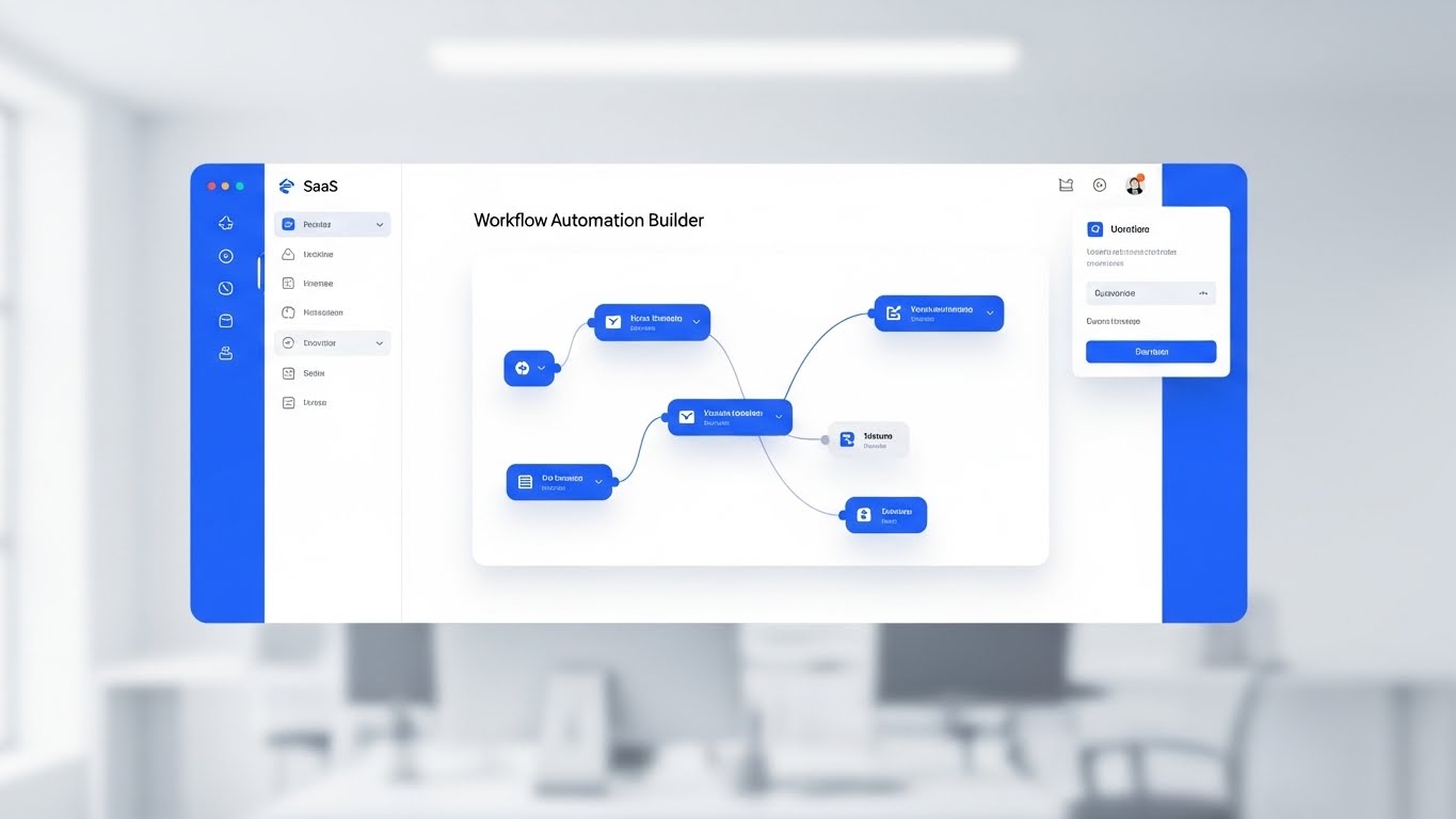
The Visual & Narrative Approach
A high-fidelity, straight-on view of the "Workflow Automation Builder" interface. Nodes and lines connect on a clean white canvas in Royal Blue. The background is a soft, bokeh-blurred office, keeping focus on the UI clarity.
Psychological Impact & KPI Focus
- Usability Trust: It proves the interface is clean and intuitive, lowering the fear of a steep learning curve.
- Logic Visualization: It shows that complex automation is manageable and logical.
Strategic Implementation & Trade-offs
- Duration: 60 Seconds.
- Best For: Landing Pages.
- Trade-off: Requires frequent updates as the software UI changes.
Companies using similar video content -
Process Street – Workflow Automation – Manages recurring checklists and standard operating procedures.
airSlate – Document Automation – AI-powered workflow automation, no-code form building.
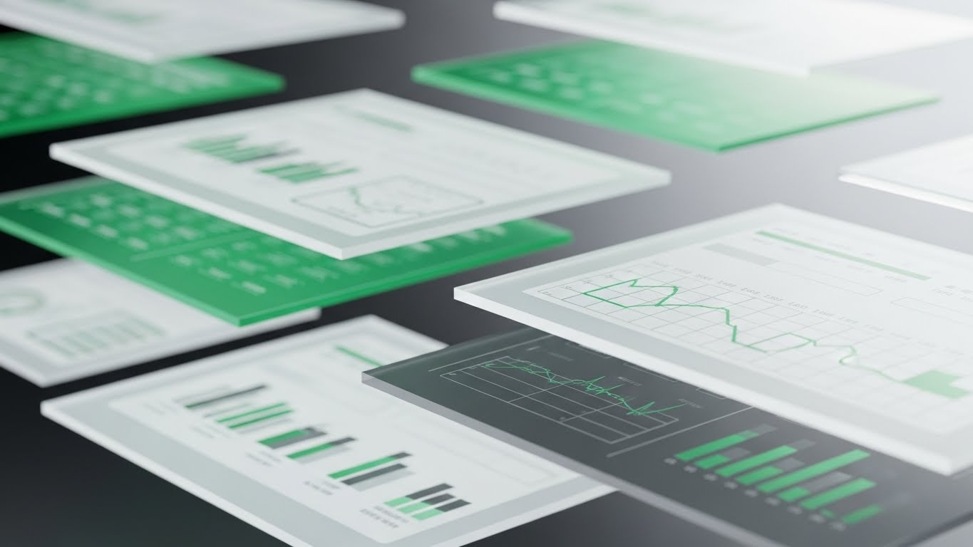
11. Dynamic Data Visualization
MOFU | Competitive Displacement
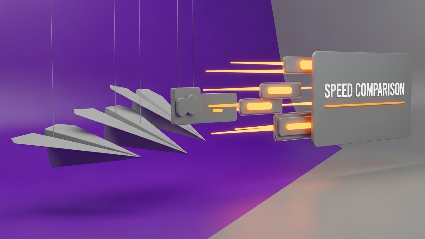
The Visual & Narrative Approach
To displace legacy competitors or manual processes, we must visualize the "Cost of Waiting." This style uses a direct comparative metaphor set in a clean studio environment with Violet and Matte Grey tones. On the left, heavy, grey cardboard paper planes drift sluggishly, weighed down by the friction of physical handling. On the right, streamlined, glowing Orange data packets zip past them at high speed, leaving aerodynamic light trails. The camera rotates dynamically, emphasizing the sheer velocity difference between the "Old Way" and the "Digital Way."
Psychological Impact & KPI Focus
- Comparative Anchoring: By placing the slow paper plane next to the fast data packet, you force the viewer to categorize their current manual process as "obsolete" without using negative words.
- Efficiency Validation: It visually validates the KPI of "Reduced Cycle Time," showing that the digital path is the only logical choice for speed and throughput.
Strategic Implementation & Trade-offs
- Duration: 15-20 Seconds.
- Best For: Blog Posts / Competitor Comparison Pages (16:9).
- Trade-off: It is an aggressive style. It focuses on "New vs. Old" rather than specific features, so it works best when you need to disturb a prospect's complacency.
Companies using similar video content -
Imaging Office Systems – Document Management Solutions – Transitions from paper to cloud, workflow automation.
MHC Automation – Healthcare ECM – Streamlines processes, integrates with existing systems.
12. Abstract 3D AI Visualization
MOFU | The Technical Buyer

The Visual & Narrative Approach
To address the Technical Buyer's anxiety about "siloed systems," we must visualize the "Handshake." Set in a deep space environment, a complex network of Emerald Green and Gold wireframe nodes floats in the void. The camera performs a slow dolly zoom into the center, where glowing "Fiber Optic" cables snap together with a spark of Gold energy. This abstract moment represents the seamless API connection between your Document Management System and their ERP or CRM.
Psychological Impact & KPI Focus
- Integration Assurance: The "snap" and the gold spark provide visual gratification, symbolizing a successful, tight connection. It removes the fear of broken integrations or data fragmentation.
- Systemic Unity: It shifts the perception of the software from a standalone "tool" to a connected "central nervous system" for the enterprise.
Strategic Implementation & Trade-offs
- Duration: 30-45 Seconds.
- Best For: Integration Documentation / Developer Portal (16:9).
- Trade-off: High abstraction. It appeals to Architects and IT Leads but may feel too conceptual for end-users who just want to see the dashboard.
Companies using similar video content -
Contentful – Headless CMS – API-first content platform, multi-channel delivery.
Strapi – Open-source Headless CMS – API-first architecture, custom integrations.
13. Wireframe to Reality Transition
MOFU | Demand Gen & Lead Capture
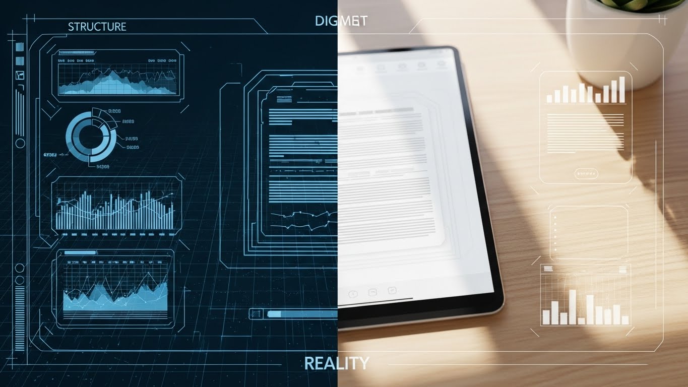
The Visual & Narrative Approach
This style bridges the gap between the "Backend Structure" and the "Frontend Experience." The screen is split vertically. The left side, in technical Blueprint Blue, shows a wireframe schematic of a document's metadata structure. The right side reveals the photorealistic final render: a sleek tablet on a wooden desk displaying the same document in a user-friendly interface. A sweeping light bar moves across the screen, visually proving that the complex blueprint (Structure) creates the simple, beautiful reality (Experience).
Psychological Impact & KPI Focus
- Tangibility: It grounds the software in reality. The wooden texture and natural light on the right side make the digital tool feel part of the physical workspace.
- Competence Signaling: The wireframe demonstrates that the simplicity on the right is powered by robust, thoughtful engineering on the left.
Strategic Implementation & Trade-offs
- Duration: 15 Seconds (Loopable).
- Best For: Social Media Ads (LinkedIn/Meta) (1:1).
- Trade-off: Requires high-quality rendering to ensure the "Reality" side looks authentic. If the tablet looks fake, the trust metric drops.
Companies using similar video content -
Kontent.ai – Headless CMS – Cloud-native, composable architecture, scalable governance.
Adobe Experience Manager – Digital Experience Platform – Content management, digital asset management.
14. Isometric 3D Workflow
MOFU | Feature Education & Demonstration
The Visual & Narrative Approach
Utilizing a trendy "Claymorphism" aesthetic (soft, rounded 3D shapes), this style depicts a miniature, toy-like office factory floor in Mint Green and White. A stylized conveyor belt moves digital documents (represented as clean white tablets) through a "processing gate" where they are stamped, sorted, and routed to a central server block. The motion is rhythmic and smooth, visualizing the invisible workflow of "Automatic Indexing" as a physical, tangible manufacturing process.
Psychological Impact & KPI Focus
- Process Clarity: By turning "data processing" into a "factory line," you make the workflow instantly understandable. It leverages the brain's familiarity with physical sorting to explain digital sorting.
- Friendliness: The soft, clay-like textures reduce the intimidation factor of enterprise software, making automation seem accessible and easy to implement.
Strategic Implementation & Trade-offs
- Duration: 30-60 Seconds.
- Best For: Website "How it Works" Page (16:9).
- Trade-off: The stylized "toy" look can seem less "enterprise" if not balanced with professional narration and branding.
Companies using similar video content -
LogicalDOC – Open Source DMS – Manages, shares, and organizes documents across languages.
Mayan EDMS – Open Source DMS – Stores, categorizes, and manages files with OCR.
15. Photorealistic 3D Renders
BOFU | ROI Justification

The Visual & Narrative Approach
When speaking to the CFO, you need to visualize value. This style uses a high-end, photorealistic render of a pristine server room with cool blue ambient light. The camera angles low, looking up at a metallic silver server rack. However, instead of blinking lights, the server trays are stacked with neat rows of realistic Gold Coins. The metaphor is subtle but powerful: your data repository is not a cost center; it is a vault of value.
Psychological Impact & KPI Focus
- Value Association: It subconsciously links "Data Storage" with "Wealth Preservation." It reframes the purchase from an "IT Expense" to an "Asset Investment."
- Premium Positioning: The high-fidelity texture of the gold and metal signals a top-tier, enterprise-ready solution worth the budget.
Strategic Implementation & Trade-offs
- Duration: 10-15 Seconds.
- Best For: Sales Presentations / Pitch Decks (16:9).
- Trade-off: It is a static concept brought to life. It works best as a background visual while a presenter speaks to specific ROI metrics.
Companies using similar video content -
FutureVault – DMS for Financial Services – Securely stores and manages corporate and client documents.
Document Logistix – DMS for Financial Services – Manages sensitive information, ensures compliance.
16. Low-Poly 3D Modeling
BOFU | Objection Handling

The Visual & Narrative Approach
To counter the objection that "Security makes files hard to find," this style uses a playful, Low-Poly aesthetic. Against a clean Pastel Pink background, a faceted geometric padlock springs open with a satisfying "pop," revealing a stack of bright, colorful files inside. The hard edges and simple geometry make the concept of "Permission-Based Access" feel lightweight and frictionless, rather than heavy and bureaucratic.
Psychological Impact & KPI Focus
- Simplicity: The low-poly style strips away detail, suggesting that the user experience is uncluttered and straightforward.
- Disarming: The pastel palette and playful animation disarm the user's anxiety about "lock-outs" or complex password barriers.
Strategic Implementation & Trade-offs
- Duration: 6-10 Seconds (Loop).
- Best For: Email Nurture Sequences (4:5).
- Trade-off: The aesthetic is casual. It is excellent for "Ease of Use" messaging but perhaps too light for "Military-Grade Defense" messaging.
Companies using similar video content -
OpenDocMan – Open Source DMS – Fine-grained control of access to files, web-based.
Paperless-ngx – Open Source DMS – Multi-user permissions system, searchable archive.
17. Dark Mode UI Showcase
BOFU | Building Trust & Credibility
The Visual & Narrative Approach
For the security-conscious buyer, "Dark Mode" signifies a developer-centric, serious environment. This close-up shot focuses on a Dark Slate interface displaying a "Compliance Checklist." As the unseen system runs its audit, items on the list are checked off with vivid Neon Green tick marks and code snippets. The high contrast between the dark background and the glowing green success indicators creates a feeling of precision, verification, and "systems go."
Psychological Impact & KPI Focus
- Verification: The green tick is the universal symbol of "Good." Seeing a list of green ticks triggers a dopamine response associated with task completion and safety.
- Technical Competence: The dark UI aesthetic aligns with the tools used by IT professionals (terminal, code editors), signaling that this is a robust, admin-friendly platform.
Strategic Implementation & Trade-offs
- Duration: 15-20 Seconds.
- Best For: Website Security/Compliance Page (16:9).
- Trade-off: It is text-heavy. Ensure the "Tick Marks" are large and animated dynamically to maintain visual interest.
Companies using similar video content -
MasterControl – Compliance Software – FDA 21 CFR Part 11 compliant, audit trails.
Microsoft Purview Records Management – Records Management – Automated retention, eDiscovery, compliance.
18. 3D Parallax UI Presentation
BOFU | The Economic Buyer
The Visual & Narrative Approach
To sell the "Executive Overview," we use depth. The scene features multiple semi-transparent glass UI screens floating in a Deep Purple and White void. The camera pans sideways, revealing the layers: the front screen shows a high-level Executive Dashboard with widgets, while the layers behind show the detailed data sources. The parallax effect (layers moving at different speeds) creates a sense of deep, multidimensional insight, implying that the software offers both the "Big Picture" and the "Granular Detail."
Psychological Impact & KPI Focus
- Control & Oversight: The stacked layers visually represent "Drill-Down" capabilities. It reassures the executive that they can see the summary and the source data.
- Modernity: The glassmorphism and floating screens feel futuristic, positioning the buying company as a forward-thinking organization.
Strategic Implementation & Trade-offs
- Duration: 20-30 Seconds.
- Best For: LinkedIn Organic / Executive Briefs (16:9).
- Trade-off: Requires a simplified UI design. Real UI often has too much text to look good in a parallax shot; use "UI abstractions" for clarity.
Companies using similar video content -
Sitecore – Digital Experience Platform – Content management, personalization, marketing automation.
Optimizely – Digital Experience Platform – Content management, personalization, marketing automation.
19. Macro UI Micro-Interactions
BOFU | Sales Cycle Acceleration

The Visual & Narrative Approach
Sometimes, the sale comes down to the feeling of the click. This style uses extreme macro photography (virtual camera) to focus on a single, Vibrant Red button labeled "Sign Now." The background is heavily blurred (bokeh). We see a stylized cursor press the button, sending a ripple effect of light across the surface. This single moment crystallizes the entire value proposition: the ease of digital execution.
Psychological Impact & KPI Focus
- Decisiveness: The visual focuses entirely on the action. It subliminally encourages the viewer to take action themselves (Click through, Buy, Sign).
- Tactile Satisfaction: By simulating the "press," you provide a sensory preview of the user experience, making the software feel responsive and tangible.
Strategic Implementation & Trade-offs
- Duration: 5-6 Seconds.
- Best For: Social Retargeting Ads (1:1).
- Trade-off: It is a "closer" asset. It offers no context or education, only a call to action. Use it only for audiences who already know the product.
Companies using similar video content -
PandaDoc – Document Workflow Automation – Automates document generation and e-signing.
DealHub – Sales Workflow Automation – Accelerates sales processes, integrates systems.
20. Generative AI Cinematic Video
BOFU | Establishing Thought Leadership
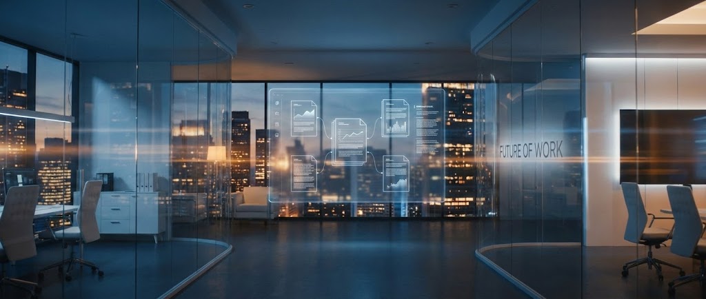
The Visual & Narrative Approach
To close the deal, you must sell the future. This cinematic style depicts a high-tech glass office at dusk, overlooking a city skyline. In the center of the room, a holographic projection of complex document workflows floats in mid-air, glowing in Steel Blue and Amber. There are no people, just the environment of "The Future of Work." The camera dollies forward slowly, inviting the viewer to step into this optimized, paperless reality.
Psychological Impact & KPI Focus
- Aspiration: It appeals to the buyer's ego and desire to be a visionary leader. It frames the software purchase not as "buying a tool" but as "building the future office."
- Scale: The city skyline and open glass space imply unlimited growth and scalability, reassuring the buyer that the platform will grow with them.
Strategic Implementation & Trade-offs
- Duration: 45-60 Seconds (Anthem Video).
- Best For: YouTube Channel Trailer / Event Opener (16:9).
- Trade-off: It is purely atmospheric. It builds brand gravity and trust but explains zero features. It is the "emotional wrapper" for your technical solution.
Companies using similar video content -
IBM Enterprise Records – Records Management – Deep governance, analytics, enterprise integration.
ZL Tech Platform – Information Governance – Manages data risks, ensures compliance.
21. 2D Animation & UI Composition
Onboarding | Self-Serve Onboarding

The Visual & Narrative Approach
To combat the "Empty State" anxiety new users feel, this style blends friendly 2D flat vector characters with simplified UI elements. Set against a clean, geometric background in Orange and Turquoise, a stylized character (waist up) enthusiastically points to a floating "Lightbulb" icon that pops out of a UI speech bubble. The animation is bouncy and inviting, transforming the intimidation of a new dashboard into a guided, supportive experience.
Psychological Impact & KPI Focus
- Approachability: The use of characters and bright colors lowers the "affective filter," making the user feel safe to explore and make mistakes during the learning curve.
- Feature Discovery: By visually spotlighting the "Help" or "Guide" icons, you condition the user to seek self-serve solutions before submitting a support ticket.
Strategic Implementation & Trade-offs
- Duration: 30-45 Seconds.
- Best For: In-App Welcome Modals / Onboarding Checklists (16:9).
- Trade-off: It feels "entry-level." As users become power users, this style should be phased out in favor of more efficient, direct UI tutorials.
Companies using similar video content -
ONLYOFFICE DocSpace – Web-based DMS – Collaborative features, easy document editing.
Bit.ai – Knowledge Management – Collaborative document creation, content organization.
22. Split Screen: Optimized Reality and UI
Onboarding | Accelerating Time-to-Value
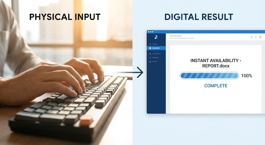
The Visual & Narrative Approach
This style visually synchronizes the physical input with the digital output. The screen is split vertically. The left side features high-quality 4K footage of hands typing rapidly in a sunlit office (emphasizing the physical work). The right side displays a sharp, static UI render of a document appearing instantly on a screen, with a "100% Complete" progress bar in Blue. The visual timing is locked: as the hands finish typing, the file instantly verifies, reinforcing the speed of the system.
Psychological Impact & KPI Focus
- Instant Gratification: It creates a direct mental link between the user's action and the system's immediate, successful response.
- Operational Transparency: It demystifies the "black box" of processing by showing the direct cause-and-effect relationship, boosting user confidence in the tool's responsiveness.
Strategic Implementation & Trade-offs
- Duration: 10-15 Seconds.
- Best For: Website Home Page / Feature Headers (16:9).
- Trade-off: Requires high-quality stock footage to match the crispness of the UI. If the footage looks dated, the software looks dated.
Companies using similar video content -
Fluix – AI Document Management – Operational efficiency, mobile data collection.
Taskade – AI Document Management – Intelligent document organization and retrieval.
23. 3D X-Ray Visualization
Onboarding | Reducing Implementation Friction

The Visual & Narrative Approach
To reassure technical teams during implementation, we use an "X-Ray" aesthetic. A stylized server unit is rendered with a translucent, glass-like shell in Cyan and Blue. Inside, we see glowing rows of data blocks organized in perfect symmetry, visible through the casing. The camera rotates slowly around the object, revealing that there is no "mess" hidden inside—only structured, clean architecture.
Psychological Impact & KPI Focus
- Structural Integrity: The visual metaphor of "seeing inside" builds deep trust. It tells the IT Architect that the system is clean to the core, not a patch-work of legacy code.
- Logic & Order: The perfect symmetry of the internal blocks alleviates anxiety about data corruption or disorganized databases.
Strategic Implementation & Trade-offs
- Duration: 15-20 Seconds (Loop).
- Best For: Technical Blog / Developer Documentation / API Section (16:9).
- Trade-off: It is highly abstract. It sells the quality of the engineering, not the utility of the features.
Companies using similar video content -
Astera Software – API Management – API-first design, secure and consistent APIs.
AvePoint Confidence Platform – Data Governance – Data security, governance, resilience technology.
24. 2D Graphics Over Live Action
Retention | Knowledge Base & FAQ Videos

The Visual & Narrative Approach
This style bridges the gap between the user and the help center. A high-quality photo shows a woman with curly hair at a desk in a modern office (Yellow and Black tones). Floating 2D vector icons—a Lightbulb, a Book, a Search Glass—hover around her in Bright Yellow, overlaid on the live-action scene. The icons bob gently, suggesting that "Answers" and "Ideas" are readily accessible within her physical workspace.
Psychological Impact & KPI Focus
- Empowerment: The visuals suggest that knowledge is not hidden in a manual, but floating readily at hand. It reframes "Support" from a burden to a tool for empowerment.
- Contextual Relevance: By placing the icons in a real office setting, it emphasizes that the software solves real-world problems in real-time.
Strategic Implementation & Trade-offs
- Duration: 30-60 Seconds.
- Best For: Help Center Articles / Knowledge Base Video Headers (16:9).
- Trade-off: Must be carefully composited. If the icons look "stuck on," it lowers the production value. They must track with the camera motion (if video) or float naturally (if static).
Companies using similar video content -
Docsie – Knowledge Sharing Platform – AI-powered chatbots, documentation management.
Google Drive – Cloud Storage – Securely stores documents, facilitates sharing.
25. Hyper-lapse Stock Footage with Data
Retention | Reducing Support Overhead

The Visual & Narrative Approach
To visualize "Stability," we use contrast. The background is a hyper-lapse video of a busy open-plan office, with people moving as motion-blurred streaks (Urban Grey tones). Overlaid on this chaotic motion are sharp, static, Neon Blue shield icons hovering over specific workstations. While the world moves frantically, the shields remain perfectly still and unshakeable, representing the software's reliability.
Psychological Impact & KPI Focus
- Dependability: The visual contrast forces the brain to focus on the static elements (the Shields). It subliminally messages that no matter how chaotic the business gets, the security remains constant.
- Churn Reduction: It reinforces the "Peace of Mind" value proposition, which is a key driver for renewing enterprise contracts.
Strategic Implementation & Trade-offs
- Duration: 10-12 Seconds.
- Best For: Social Media (LinkedIn) / Login Screen Background (9:16).
- Trade-off: Visual noise. The background must be blurred enough to ensure the icons are legible, or the viewer will be distracted by the moving people.
Companies using similar video content -
Exterro Data Retention – Data Retention – AI-driven solutions for data privacy and governance.
Collabspace CONTINUUM – Records Management – Intelligent archiving, legislative compliance.
26. Mobile UI Interaction Close-Up
Retention | Reducing Churn

The Visual & Narrative Approach
Work doesn't happen just at the desk. This style features a close-up of a hand holding a smartphone against a blurred warehouse or field background. The screen displays the Document Management Mobile App UI, showing a thumb scrolling through a file list and tapping "Approve." A subtle "Success" animation plays on the screen. This validates the "Anytime, Anywhere" promise.
Psychological Impact & KPI Focus
- Freedom: It appeals to the user's desire for flexibility and remote work capabilities.
- Responsiveness: Showing the UI on a phone proves the system is modern and responsive, not a legacy desktop-only anchor.
Strategic Implementation & Trade-offs
- Duration: 15-20 Seconds.
- Best For: Feature Updates / App Store Preview (9:16).
- Trade-off: Must accurately reflect the actual mobile app UI. If the real app is clunky, a polished video will create a "gap of disappointment."
Companies using similar video content -
Box – Mobile App – Access, edit, and share files on the go.
M-Files – Mobile App – Access and manage documents from any device.
27. Holographic UI over 3D Render
Expansion | Trial/Freemium User Activation

The Visual & Narrative Approach
To drive user activation and upgrades, we visualize "Achievement." A sleek, dark tech laptop sits on a desk. Projecting upwards from the screen is a semi-transparent, holographic 3D trophy (or City) built from data points in glowing Purple and Cyan. The hologram illuminates the keyboard below. This visual elevates the software from a "tool" to a "platform for success," gamifying the user journey.
Psychological Impact & KPI Focus
- Aspiration: The hologram looks futuristic and rewarding. It triggers the user's desire to "unlock" the full potential of the platform (and thus, the upgrade).
- Premium Status: The aesthetic borrows from high-end consumer tech (gaming/cybersecurity), appealing to the user's desire for top-tier tools.
Strategic Implementation & Trade-offs
- Duration: 15 Seconds.
- Best For: Mobile App Splash Screen / Upgrade Nurture Emails (16:9).
- Trade-off: High rendering cost. The hologram must look luminous and volumetric, not flat.
Companies using similar video content -
Hyland Content Innovation Cloud – ECM Platform – Manages content, automates processes.
Gimmal Records – Records Management – Manages information lifecycle.
28. Lifestyle Stock with UI Overlay
Expansion | Driving Upsell/Cross-sell

The Visual & Narrative Approach
This style targets the Executive Buyer for premium features. A professional man in a Navy Blue suit stands in a luxury glass office. He looks at his smartphone with a satisfied smile. Floating slightly above the phone is a sharp, abstract UI overlay displaying a "Diamond" icon or "Premium Status" badge. The lighting is soft and cinematic. It connects the "Premium Tier" of the software with the personal success of the executive.
Psychological Impact & KPI Focus
- Ego Alignment: It mirrors the target persona's self-image—successful, in control, and using the best tools available.
- Exclusivity: The "Diamond" visual cue signals that the upsell isn't just more features; it's a higher status level within the ecosystem.
Strategic Implementation & Trade-offs
- Duration: Static or 6 Seconds.
- Best For: Account-Based Marketing (ABM) / Email Campaigns (4:5).
- Trade-off: Generic stock photography risks "banner blindness." The UI overlay must be distinctive and branded to ground it in your product.
Companies using similar video content -
Egnyte – Financial Services DMS – Secure portals, compliance tools for executives.
Standley Systems – DMS for Financial Services – Enhances security, compliance for financial firms.
29. Aspirational Stock Montage
Expansion | Driving Referrals & Advocacy

The Visual & Narrative Approach
To drive referrals, you must sell the result of the software: a happy team. This style uses a high-key, sun-drenched montage of a diverse team high-fiving and smiling in a plant-filled office. The camera angle is low and wide, capturing the energy of a "Win." It moves away from screens and interfaces to focus purely on the human benefit: collaboration and stress-free operations.
Psychological Impact & KPI Focus
- Social Proof: It visualizes the emotional end-state of using the software—harmony. Happy teams refer products; frustrated teams do not.
- Cultural alignment: It positions the software as a "Culture Builder," not just a productivity tool.
Strategic Implementation & Trade-offs
- Duration: 15-30 Seconds.
- Best For: Case Study Headers / Referral Landing Pages (16:9).
- Trade-off: It can feel cheesy if the acting is poor. Authenticity is key—avoid "forced" handshakes.
Companies using similar video content -
WorldView Ltd. – ECM Healthcare Solutions – Improves information centralization, compliance.
Gordon Flesch Company – ECM Healthcare – Streamlines processes, improves patient care.
30. Generative AI Realistic Character Video
Expansion | Driving Deep Feature Adoption

The Visual & Narrative Approach
For complex, data-heavy features (like Advanced Analytics), we use a Generative AI Avatar. A highly realistic female character in professional attire (Grey Blazer) stands in a virtual newsroom. She gestures, and a floating digital data chart appears in mid-air next to her. The realism establishes authority; she looks like a news anchor or a top-tier consultant.
Psychological Impact & KPI Focus
- Authority Bias: We are conditioned to trust "News Anchors." This style lends immediate credibility to the feature being explained.
- Retention: The direct eye contact and human face hold attention significantly longer than voice-over screen recordings.
Strategic Implementation & Trade-offs
- Duration: 60-120 Seconds.
- Best For: Product Update Logs / Quarterly Business Reviews (16:9).
- Trade-off: AI avatars can sometimes fall into the "Uncanny Valley." Ensure the lip-sync and skin texture (Subsurface Scattering) are of the highest quality.
The Visual Operations Doctrine: Strategic Knowledge Base
Having defined the 30 visual styles, we now transition to the Strategic Implementation. A style guide is useless if it sits in a drawer; it must be operationalized. This section synthesizes the visual cues into a coherent business framework designed to reduce cognitive load, accelerate adoption, and prove ROI in the Document Management sector.
Strategic Alignment & Visual Architecture
Goal: Defining the "Visual Operating System" before a single pixel is rendered.
- The Cognitive Load Audit: Before creating assets, audit your current training materials. If a PDF takes 10 minutes to read, replace it with Style 4 (Minimalist Flat) or Style 21 (2D Animation). The goal is a 50% reduction in "Time-to-Comprehension."
- Role-Based Visual Mapping: Do not use the same visuals for the CIO and the End-User. Use Style 12 (Abstract 3D AI) for the CIO to show architecture, but use Style 5 (Rapid UI Montage) for the End-User to show speed. Tailor the complexity to the viewer’s role.
- The "Glanceability" Standard: In document management, speed is currency. Design assets (especially Style 19 and Style 25) so the core message is understood in under 1.5 seconds—the speed of a glance.
- Brand Voice Consistency: Your visual language must be consistent across the funnel. If your TOFU ads are Neon/Dark Mode (Style 9), do not switch abruptly to Pastel Line Art (Style 6) in the product. Establish a "Visual Thread"—a consistent accent color or motion behavior—that ties them together.
- The Advids Strategic Audit: Partnering with an expert team like Advids allows you to define this "Visual Operating System" holistically. We analyze your entire content library to identify where visual disconnects are causing funnel leakage.
- Standardization vs. Customization: Use standardized templates (like Style 10 Clean UI) for frequent product updates to lower costs. Save bespoke, high-end production (like Style 20 Cinematic) for "Flagship" feature launches.
- The Cross-Departmental Bridge: Sales uses "Value" visuals (Style 15); Support uses "Instructional" visuals (Style 24). Create a shared asset library so Sales can use Support’s visuals to overcome "Ease of Use" objections during the pitch.
- Legacy System Integration: Visually acknowledge the past. Use Style 13 (Wireframe to Reality) to show the transition from "Green Screen" legacy tools to your modern UI. It validates the user's history while selling the future.
- Accessibility by Design: Ensure all motion graphics (especially Style 1 and Style 5) are accessible. Avoid flashing patterns that trigger photosensitivity and ensure high contrast for visually impaired users.
- The Mobile-First Mandate: Decision-makers approve on desktops; users learn on mobiles. Ensure all 30 styles, especially the UI showcases, are legible when scaled down to a 9:16 smartphone screen.
Operational Adoption & Implementation
Goal: Embedding visuals into the workflow to drive usage and reduce friction.
- Overcoming "Big Brother" Anxiety: When introducing audit trails or activity logs, use Style 16 (Low-Poly Unlocking) to frame it as "Security" rather than "Surveillance." Visual tone dictates emotional response.
- The Micro-Learning Shift: Kill the hour-long webinar. Break training into 30-second "Micro-Visuals" (using Style 14 Isometric Workflow) and embed them directly into the software’s tooltips.
- Just-in-Time Support: Embed Style 24 (Graphics Over Live Action) videos into your 404 pages or "Empty States." Meet the user with help exactly when they are stuck, reducing support ticket volume.
- Gamification of Training: Use Style 27 (Holographic Trophy) visuals in your learning management system (LMS). Visualizing progress with high-fidelity badges increases course completion rates.
- Reducing Support Ticket Volume: There is a direct correlation between the clarity of your visual library and the load on your call center. Investing in Style 21 (2D Guidance) is cheaper than hiring new support agents.
- Remote Onboarding: For distributed teams, you cannot rely on in-person seminars. Use Style 20 (Cinematic) to sell the vision and Style 10 (Clean UI) to teach the mechanics, creating a virtual onboarding experience that scales.
- Visual SOPs: Transform text-based Standard Operating Procedures into Style 14 (Conveyor Belt) animations. Processes that are visualized are remembered; processes that are read are forgotten.
- Feedback Loops: Use interactive video elements. If a user watches a Style 5 (Rapid UI) tutorial, have a "Was this helpful?" interaction at the end to gather data on visual effectiveness.
- Scalable Localization: When expanding globally, avoid on-screen text in complex animations (Style 1). Use universal icons and abstract metaphors (Style 2 Abstract Motion) to reduce the cost of translating assets for different regions.
- Leadership Communication: When the CTO presents the roadmap to the Board, provide them with Style 12 (Abstract 3D AI) and Style 15 (Photorealistic Server) assets. Equip your champions with the visual tools they need to sell your renewal.
Measuring Impact & Future-Proofing
Goal: Moving from "Vanity Metrics" to "Business Impact" and preparing for AI.
- Beyond "Views": Do not measure success by video views. Measure "Time-to-Competency" and "Feature Adoption Rate." Did the release of the Style 26 video correlate with a spike in usage of that feature?
- The "Idle Time" Metric: Track how long users spend "pausing" to think in the UX. High-quality visuals (Style 22 Split Screen) should reduce this idle time, smoothing the workflow.
- Compliance Velocity: In regulated industries, measure how fast the workforce acknowledges new compliance protocols. Visualizing regulations via Style 17 (Dark Mode Checklist) often results in 3x faster sign-off than text memos.
- Retention and Churn: Correlate user engagement with your Knowledge Base videos (Style 24) to churn rates. Educated users are sticky users.
- The AI Visual Frontier: Prepare for Generative UI. Soon, interfaces will build themselves. Your style guide must evolve to include Style 30 (Gen AI) to ensure your brand remains at the cutting edge of tech perception.
- Scalability of Assets: Build a "component library" of 3D assets (Server racks, Folders, Shields). This allows you to generate new variations of Style 14 or Style 16 rapidly without starting from scratch.
- The Advids Partnership: As AI creates a flood of content, quality becomes the differentiator. Advids acts as your quality control engine, ensuring that while the volume of assets scales, the strategic intent remains sharp and effective.
- Benchmarking Success: Consistently audit your visuals against competitors. If they are using Style 5 (Rapid UI) and you are using static screenshots, you are losing the "Perceived Value" war before the demo even starts.
- The ROI of Safety: For data security features, quantify the "Cost of a Breach" vs. the "Cost of Education." Using Style 9 (Neon Lock) to ensure 100% adoption of 2FA is an investment that pays for itself instantly.
- Final Call to Innovation: Treat video not as "Marketing Content" but as "Digital Infrastructure." Just as you invest in servers and code, invest in the Visual Layer that bridges the gap between your machine and the human mind.
Companies using similar video content -
Digitech Systems – Healthcare ECM – Integrates with EHR, manages patient records.
Micro Records Company – Healthcare ECM – Easily accesses and stores important records.
Author & Editor Bio


