
Introduction: Visualizing the $1.9 Trillion Opportunity
The global supply chain is no longer just about moving boxes; it is about moving information with absolute precision. As the global e-commerce logistics market is projected to reach USD 1,903.08 billion by 2032, the pressure on logistics platforms to deliver speed, accuracy, and transparency is at an all-time high. For Supply Chain Directors and Operations Heads, this growth represents a paradox: the opportunity is massive, but the complexity is blinding.
The core challenge facing modern logistics is the "Physical/Digital Divide"—the gap between the tangible reality of a warehouse and the digital data representing it. Traditional spreadsheets and static reports fail to bridge this gap, leading to cognitive overload and "blind spots" in the network. In fact, 57% of professionals cite insufficient visibility as the biggest challenge facing their operations in 2025.
This guide serves as a strategic intervention. It moves beyond generic marketing assets to provide a "Gold Standard" library of visualization styles designed specifically for the E-commerce Logistics and SaaS sector. These visual strategies are not just aesthetic choices; they are cognitive tools designed to translate complex algorithms, routing logic, and inventory flows into intuitive formats. By reducing cognitive load, you build trust, accelerate stakeholder alignment, and position your platform as the architect of a frictionless global trade network.
Let’s explore the first set of standards for excellence in logistics visualization.
1. Visualizing Network Harmony
TOFU | Brand Awareness

(Abstract 2D flat vector organic): Fluid Nodes - Seamless Global Network Connectivity
1. The Visual & Narrative Approach
Visualization Scenario: This style abandons the rigid, mechanical grids typically associated with logistics in favor of a fluid, organic aesthetic. The visual features abstract, glossy shapes in "Electric Teal" and "Soft Coral" that interlock to form a stylized global network. Smooth lines connect circular nodes, representing the seamless flow of data across borders. The background is a clean, shadowless white void, ensuring the focus remains entirely on the connectivity and relationship between the nodes.
Narrative Tone: Optimistic, fluid, and effortless.
2. Psychological Impact & KPI Focus
Niche Psychology: Logistics leaders are often anxious about fragmentation and "brittle" supply chains. This organic style provides a psychological counterweight, suggesting Resilience and Adaptability. It frames the network as a living ecosystem rather than a rigid machine.
Operational Impact: By stripping away geographical constraints, this style focuses purely on the Logic of Connectivity. It effectively visualizes abstract KPIs like "Network Uptime" and "API Integration Health."
3. Strategic Implementation & Trade-offs
- Best Use Case: High-level Brand Awareness campaigns on LinkedIn or Instagram (TOFU).
- Duration: 15-30 Seconds.
- Strategic Trade-off: While excellent for mood and sentiment, it lacks technical specificity. Do not use this style to demonstrate dashboard UI or specific features.
Companies using similar video content -
Project44 – Movement by project44 – Global real-time supply chain visibility.
FourKites – Real-Time Visibility Platform – End-to-end supply chain visibility.
2. Structuring the Operational Pipeline
TOFU | Category Creation
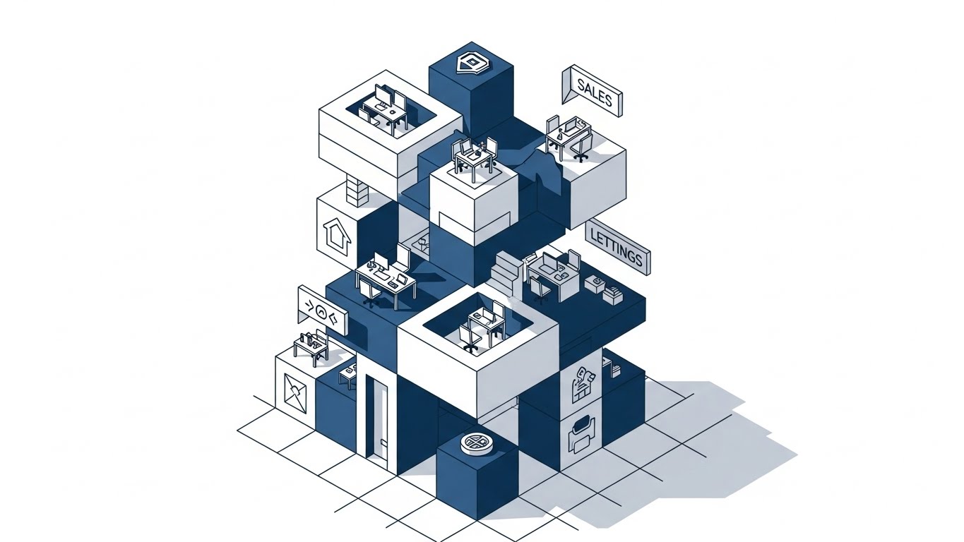
(Isometric 2D Motion Design): Digital Grid - Organized Operational Pipeline Precision
1. The Visual & Narrative Approach
Visualization Scenario: This style utilizes a strict 45-degree isometric angle to depict a digital logistics facility as a perfectly organized machine. Uniform cubic packages in "Vivid Lime Green" travel along a grid-based conveyor system, navigating through a multi-level structure of Sky Blue cubes. The floor is a subtle digital grid, reinforcing the concept of organized infrastructure. The hard edges and flat shading create a sense of order and architectural stability.
Narrative Tone: Structured, precise, and authoritative.
2. Psychological Impact & KPI Focus
Niche Psychology: This appeals to the "Architect" persona—the stakeholder who values structure, modularity, and scalability. It visually validates the concept of SOP Compliance and Workflow Standardization.
Operational Impact: The isometric perspective eliminates depth distortion, making it perfect for comparing volumes. It visualizes Throughput Rates and demonstrates that the platform imposes order on chaos.
3. Strategic Implementation & Trade-offs
Best Use Case: "How It Works" sections on the website or introductory explainer videos.
Duration: 60-90 Seconds.
Strategic Trade-off: The rigid geometry can feel impersonal. It demonstrates structure beautifully but may lack the human element of customer service.
Companies using similar video content -
Manhattan Associates – Warehouse Management – Optimizing warehouse operations and flow.
Körber Supply Chain – WMS – Structured warehouse and logistics solutions.
4. Asserting Velocity
TOFU | Skippable Pre-Roll Ad

(Bold Kinetic Typography): Kinetic Blocks - High-Speed Throughput Velocity
1. The Visual & Narrative Approach
Visualization Scenario: Here, the concept of "speed" is visualized not through a vehicle, but through the monumental arrangement of data itself. Bold, blocky 3D shapes in "Vibrant Orange" and "Deep Charcoal" rise like a cityscape against a Pure White background. Motion blur lines streak horizontally, physically representing the kinetic energy of high-speed fulfillment. The composition is low-angle, giving the shapes a monumental presence.
Narrative Tone: Urgent, powerful, and dynamic.
2. Psychological Impact & KPI Focus
Niche Psychology: Speed is the ultimate currency in e-commerce. This style taps into the "Fear of Stagnation." The aggressive upward and forward motion psychologically primes the viewer to associate the brand with Growth and Rapid Execution.
Operational Impact: This is a metaphorical visualization of Order-to-Delivery (OTD) Time. It does not show how the speed is achieved, but rather feels the impact of that speed.
3. Strategic Implementation & Trade-offs
Best Use Case: YouTube Pre-Roll Ads (Bumper Ads). The goal is instant brand recall within 5 seconds.
Duration: 6-15 Seconds.
Strategic Trade-off: It is purely impressionistic. It communicates "Fast," but it doesn't explain "How." It must be followed by content that substantiates the claim.
Companies using similar video content -
FarEye – Intelligent Delivery Platform – Accelerating last-mile logistics operations.
Bringg – Delivery & Fulfillment Cloud – Orchestrating fast, efficient deliveries.
5. Simplifying the Promise
TOFU | Market Education
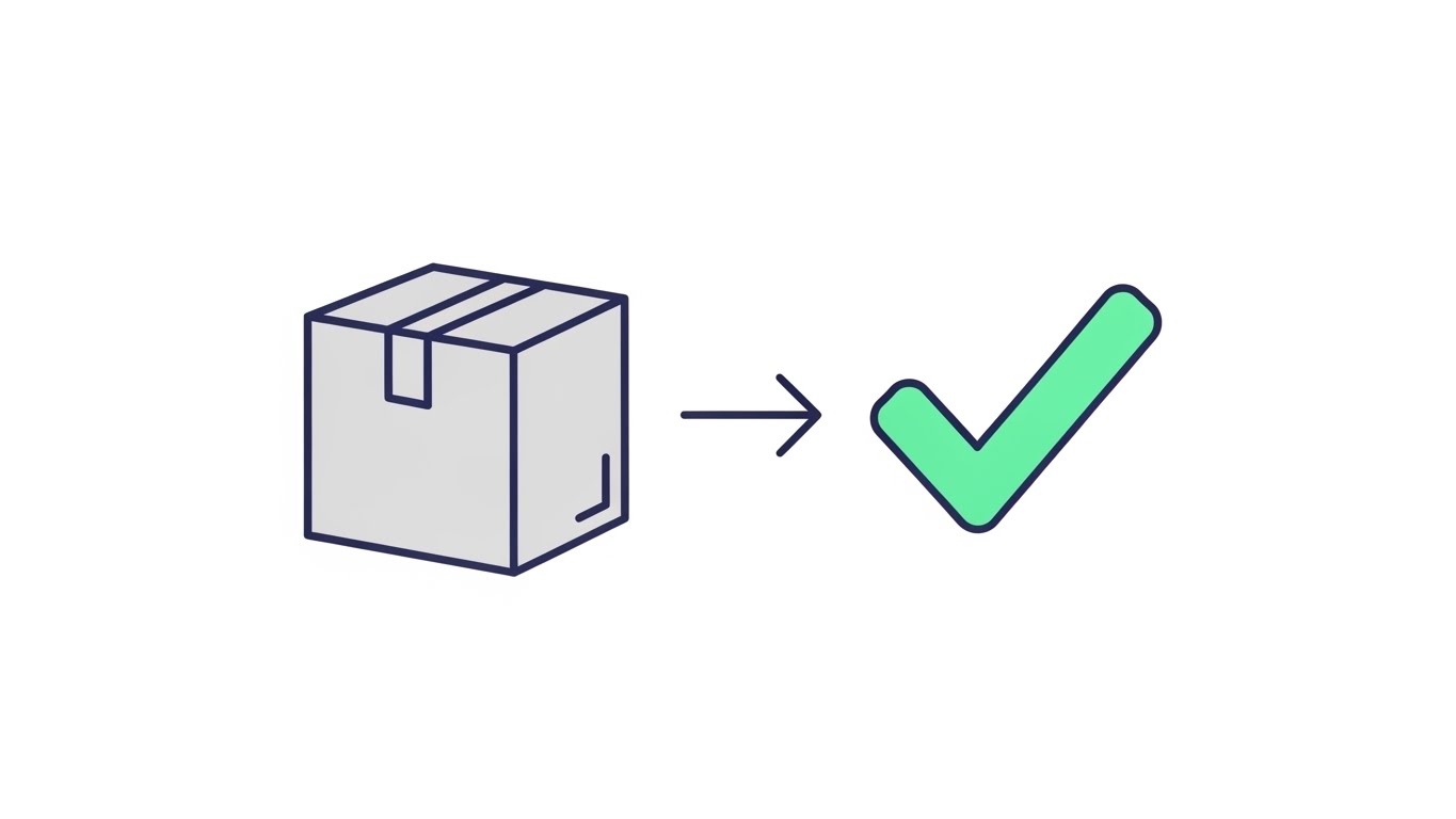
(Minimalist Flat 2D Vector): Checkmark Morph - Error-Free Fulfillment Assurance
1. The Visual & Narrative Approach
Visualization Scenario: Simplicity is the ultimate sophistication. This style features a minimalist flat vector illustration where a brown cardboard box transforms seamlessly into a stylized "Mint Green" checkmark. The composition is symmetrical and centered on a "Pale Grey" canvas. The lighting is flat and even, removing any ambiguity or distraction from the central message: Task Complete.
Narrative Tone: Calm, binary, and reassuring.
2. Psychological Impact & KPI Focus
Niche Psychology: This targets the "Completion Bias" of operations managers. The visual metaphor (Box → Checkmark) triggers a sense of relief and closure, subconsciously reinforcing the idea of Accuracy and Reliability.
Operational Impact: It creates a visual shorthand for Perfect Order Rate, making complex verification protocols feel simple and binary.
3. Strategic Implementation & Trade-offs
Best Use Case: Blog headers, email newsletters, or educational content modules where clarity is paramount.
Duration: Loopable GIFs or 10-second micro-videos.
Strategic Trade-off: The extreme simplicity risks oversimplifying the complexity of logistics. It is best for high-level concepts, not detailed feature breakdowns.
Companies using similar video content -
ShipStation – Shipping Software – Streamlining e-commerce shipping processes.
Shippo – Shipping API – Simplifying shipping for online businesses.
6. Modernizing the Fleet
TOFU | Shaping Brand Perception

(Low-Poly 3D Modeling): Faceted Truck - Modernized Fleet Asset Tracking
1. The Visual & Narrative Approach
Visualization Scenario: A stylized delivery truck, rendered in "Low-Poly" geometric facets of Bright Violet and Cyan, traverses a digital wireframe terrain. The camera follows the truck from a chase view perspective. The environment is an abstract digital landscape with polygonal trees, symbolizing the modernization of traditional transport.
Narrative Tone: Innovative, tech-forward, and gamified.
2. Psychological Impact & KPI Focus
Niche Psychology: This style appeals to the "Modernizer" persona who wants to upgrade legacy fleets. It reframes the truck not as a vehicle, but as a Data Node in a smart network. It bridges the gap between physical assets and digital management.
Operational Impact: Excellent for visualizing Fleet Telematics and Route Modernization. It signals that the company is a tech-forward partner capable of navigating the future of transport.
3. Strategic Implementation & Trade-offs
Best Use Case: Website "Features" pages, specifically for Fleet Management or Last-Mile Tracking.
Duration: 30-45 Seconds.
Strategic Trade-off: The "game-like" aesthetic might feel too playful for conservative, heavy freight logistics firms. Ensure branding remains professional.
Companies using similar video content -
Samsara – Connected Operations Cloud – Modernizing fleet and equipment management.
Geotab – Telematics Platform – Advanced fleet tracking and management.
7. Illuminating the Control Tower
TOFU | ABM Awareness
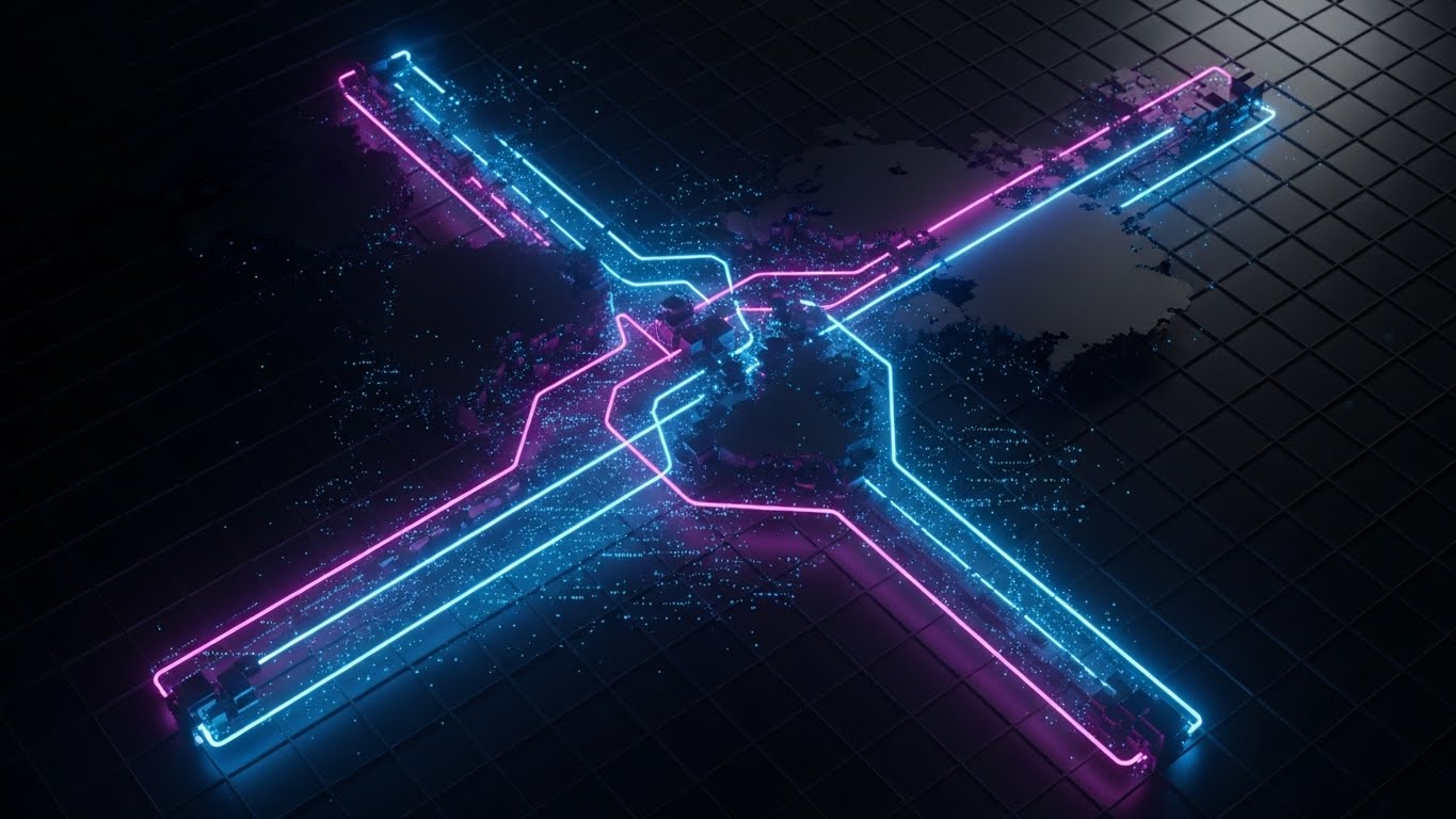
(Futuristic Neon/Dark Mode): Glowing Routes - Real-Time Control Tower Visibility
1. The Visual & Narrative Approach
Visualization Scenario: This style adopts a "Dark Mode" aesthetic. A high bird's-eye view reveals a global supply chain map where shipping routes are represented by glowing neon tubes in "Neon Blue" and "Deep Purple." The aesthetic is sleek and high-tech, with light blooming effects against the Deep Black background. It mimics the interface of a premium command center.
Narrative Tone: Sophisticated, ominous, and omniscient.
2. Psychological Impact & KPI Focus
Niche Psychology: This leverages the "Omniscience" fantasy of the C-Suite. It visually grants them the power to see everything, everywhere, in real-time. It addresses the fear of the dark (blind spots) by illuminating the network.
Operational Impact: This is the definitive style for Supply Chain Visibility (SCV). It positions the platform as a premium, strategic asset for global monitoring.
3. Strategic Implementation & Trade-offs
Best Use Case: Account-Based Marketing (ABM) campaigns on LinkedIn targeting CTOs and COOs.
Duration: 15-20 Seconds (Vertical).
Strategic Trade-off: Can appear "cold" if not balanced with human-centric messaging. It implies a high level of sophistication that the actual UI must match.
Companies using similar video content -
One Network Enterprises – Digital Supply Chain Network – Real-time control tower for global operations.
MPO – Multi-Party Orchestration Platform – End-to-end supply chain orchestration.
8. Demystifying the Algorithm
MOFU | Demand Gen & Lead Capture

(Abstract 2D Motion Graphics): Sorting Shapes - Algorithmic Logic Demystified
1. The Visual & Narrative Approach
Visualization Scenario: This style takes a macro view of the sorting process. Abstract geometric shapes (circles and lines) in "Emerald Green" and "Metallic Silver" interact in a fluid, precise dance. It represents a sorting algorithm in action—organizing, categorizing, and optimizing flow. The background is a clean, abstract laboratory setting.
Narrative Tone: Scientific, calculated, and intelligent.
2. Psychological Impact & KPI Focus
Niche Psychology: It appeals to the analytical mind. It visualizes the invisible "brain" of the software. By showing the moment of decision (sorting), it builds trust in the algorithm's capability to handle complexity without error.
Operational Impact: Best for visualizing invisible processes like Batch Picking Logic or Inventory Allocation. It gives form to the mathematical calculations happening in the backend.
3. Strategic Implementation & Trade-offs
Best Use Case: Retargeting Ads (MOFU) focused on specific features like "Smart Batching" or "Routing Logic."
Duration: 20-30 Seconds.
Strategic Trade-off: Being highly abstract, it requires a strong voiceover to connect the moving shapes to specific business outcomes.
Companies using similar video content -
Logility – Digital Supply Chain Platform – Algorithmic optimization for supply chain.
Solvoyo – Supply Chain Analytics & Planning – AI-driven supply chain optimization.
9. Proving the Digital Twin
MOFU | Product/Solution Differentiation

(Wireframe to Reality Transition): Split-Screen - Validating Digital Twin Accuracy
1. The Visual & Narrative Approach
Visualization Scenario: A powerful split-screen composition. The left side depicts a blueprint wireframe sketch of a warehouse in "Blueprint Blue." The right side seamlessly transitions into a realistic, full-color photo of the same modern organized warehouse. The focal length is matched perfectly. The composition demonstrates the journey from the planning phase to the tangible, optimized reality.
Narrative Tone: Proven, trustworthy, and tangible.
2. Psychological Impact & KPI Focus
Niche Psychology: This directly addresses the Implementation Gap—the fear that software won't work in the real world. By showing the wireframe and the reality as one cohesive image, you visually prove fidelity and reliability.
Operational Impact: The ultimate visualization for Digital Twin technology and Warehouse Planning. It demonstrates Implementation Accuracy and the bridge between CapEx planning and OpEx execution.
3. Strategic Implementation & Trade-offs
Best Use Case: Product Differentiation pages and Case Study videos.
Duration: 45-60 Seconds.
Strategic Trade-off: Requires high-quality photography to match the wireframe. Any misalignment breaks the illusion of accuracy.
Companies using similar video content -
Twinlode Automation – Warehouse Design & Automation – Designing and implementing warehouse solutions.
Flexe – On-Demand Warehousing & Tech – Digital twin for flexible warehouse networks.
10. Contextualizing Analytics
MOFU | Feature Education

(Dynamic Data Visualization): Floating Charts - Live Inventory Analytics Context
1. The Visual & Narrative Approach
Visualization Scenario: Floating 3D isometric bar charts rise from the surface of a metallic shipping container. The charts are rendered in translucent glassmorphism style using "Amber" and "Slate Grey." The composition is clean and isolated, visualizing live analytics and inventory metrics physically growing from the stock itself.
Narrative Tone: Insightful, valuable, and integrated.
2. Psychological Impact & KPI Focus
Niche Psychology: This style visualizes Value-Added Intelligence. It suggests that the shipping container (a commodity) is being elevated by the data (the value). It appeals to stakeholders looking for ROI and Inventory Visibility.
Operational Impact: Perfect for showcasing Live Analytics, Inventory Turnover, and Unit Economics. It visualizes the concept that "every SKU tells a story."
3. Strategic Implementation & Trade-offs
Best Use Case: LinkedIn Feeds to educate on "Feature Updates" or "Analytics Modules."
Duration: 10-15 Seconds.
Strategic Trade-off: Overloading the visual with too many charts can be overwhelming. Focus on one or two key metrics per container to maintain clarity.
Companies using similar video content -
Stord – Omnichannel Fulfillment Platform – Integrated software and fulfillment network.
ShipHero – WMS & Fulfillment Software – Live inventory and order analytics.
11. The Feature Ecosystem
MOFU | Feature Education
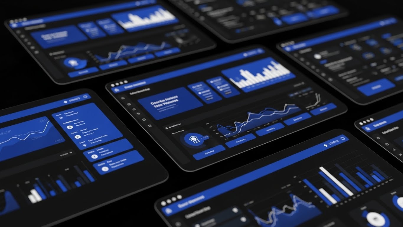
(Rapid UI Feature Montage): Robust Tech Stack - Comprehensive Feature Velocity
1. The Visual & Narrative Approach
Visualization Scenario: A dynamic, high-energy montage of floating tablet devices in a dark void. Each screen displays a different module of the software—dashboard analytics, route maps, and driver logs—glowing in "Electric Blue" against the dark glass hardware. The composition uses depth of field and angled perspectives to suggest a vast, interconnected ecosystem of tools. The transition style is rapid and zooming, implying speed and comprehensiveness.
Narrative Tone: Fast-paced, robust, and all-encompassing.
2. Psychological Impact & KPI Focus
Niche Psychology: This addresses "Feature Anxiety"—the fear that a platform might be a "one-trick pony." The sheer volume of screens and the slick, dark-mode aesthetic signal enterprise-grade depth and Scalability. It visually overwhelms objections about missing features.
Operational Impact: It serves as a visual metaphor for a Unified Tech Stack. It doesn't teach a specific workflow but effectively communicates the breadth of the solution, impacting metrics related to Module Adoption and Platform Consolidation.
3. Strategic Implementation & Trade-offs
- Best Use Case: Retargeting Video Ads designed to remind prospects of the platform's power.
- Duration: 15 Seconds (Fast cuts).
- Strategic Trade-off: The rapid pace sacrifices detail for impression. It effectively says "We do everything," but requires subsequent content to explain "How we do it."
Companies using similar video content -
SAP – SAP SCM – Comprehensive suite for supply chain management.
Oracle – Oracle SCM Cloud – Integrated suite of supply chain applications.
12. Clarifying the Daily Workflow
MOFU | Dashboard Overview
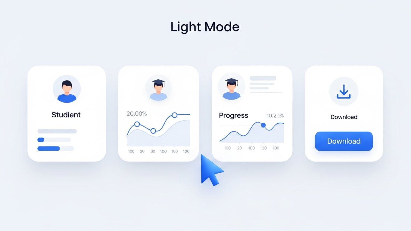
(Clean UI Workflow - Light Mode): Minimalist Interface - Frictionless User Experience
1. The Visual & Narrative Approach
Visualization Scenario: A high-fidelity, clean UI mockup presented in "Light Mode." The design is airy, utilizing "Clean White" cards with soft shadows and "Soft Blue" accents to highlight progress curves and download actions. The camera angle is a static, flat-lay view, stripping away all cinematic distraction to focus purely on the interface's legibility and logic. A stylized cursor demonstrates a simple "Click-to-Download" action.
Narrative Tone: Helpful, clear, and professional.
2. Psychological Impact & KPI Focus
Niche Psychology: This targets the User Experience (UX) concerns of daily operators. Logistics software is notoriously clunky and gray; this style offers a psychological "breath of fresh air." It validates Ease of Use and lowers the perceived barrier to entry for non-technical staff.
Operational Impact: Directly correlates to Training Time Reduction and User Adoption Rates. It visually promises that the software is intuitive enough to require minimal onboarding.
3. Strategic Implementation & Trade-offs
- Best Use Case: Website "Platform" Pages and Help Center articles.
- Duration: Loopable GIFs or 30-Second Walkthroughs.
- Strategic Trade-off: While approachable, "Light Mode" can sometimes feel less "Enterprise" or "Deep Tech" than Dark Mode. Use this for generalist audiences, not IT/Developer personas.
Companies using similar video content -
Logiwa – Cloud WMS & Fulfillment – Intuitive cloud-based warehouse management.
Extensiv – 3PL Warehouse Manager – User-friendly WMS for third-party logistics.
13. Mobilizing the Workforce
MOFU | Mobile App Usage

(2D Animation & UI Composition): Pop-Out Notifications - On-the-Go Fleet Management
1. The Visual & Narrative Approach
Visualization Scenario: A lively 2D animated scene from the first-person perspective of a hand holding a smartphone. As the thumb interacts with the screen, UI elements—tracking icons, alerts, and chat bubbles—physically "pop" out of the device in 3D space. The color palette is vibrant, using "Pastel Pink," "Yellow," and "Blue" to create an energetic, friendly atmosphere. The background features abstract floating shapes, emphasizing motion and agility.
Narrative Tone: Agile, connected, and liberating.
2. Psychological Impact & KPI Focus
Niche Psychology: This appeals to the desire for Freedom and Control. It reassures managers that they are not tethered to their desks. It validates the Mobile-First capability of the platform, addressing the reality of distributed logistics teams.
Operational Impact: Visualizes Real-Time Responsiveness and Remote Management. It highlights the platform's ability to keep the "Human in the Loop" regardless of location.
3. Strategic Implementation & Trade-offs
- Best Use Case: Instagram Reels or TikTok content targeting younger logistics managers or drivers.
- Duration: 10-15 Seconds (Vertical).
- Strategic Trade-off: The playful, cartoon-like aesthetic may not resonate with conservative enterprise buyers (e.g., procurement officers). Keep this channel-specific.
Companies using similar video content -
Verizon Connect – Fleet Management Software – Mobile solutions for fleet tracking.
Omnitracs – Intelligent Vehicle Gateway – Mobile fleet management and compliance.
14. Visualizing Growth & Yield
MOFU | Driving Demo Requests

(2D Line Art Animation): Organic Growth - Data-Driven Yield Optimization
1. The Visual & Narrative Approach
Visualization Scenario: A sophisticated continuous line drawing in "Black Ink" on a textured "White Paper" background. The line elegantly morphs from a stylized wheat stalk (representing raw material/input) into a rising bar chart (representing data/profit). A single "Gold" trend line weaves through the composition, guiding the eye upward. The motion is smooth and uninterrupted, symbolizing a seamless transformation of physical goods into valuable business intelligence.
Narrative Tone: Elegant, essential, and profitable.
2. Psychological Impact & KPI Focus
Niche Psychology: This abstract style speaks to the Business Owner. It moves away from the "grime" of logistics to focus on the result of logistics: Growth. It simplifies the value proposition into a clear "Input → Output" metaphor.
Operational Impact: Perfect for visualizing Yield Management, Unit Economics, and the financial upside of optimization. It suggests that the platform nurtures business growth naturally.
3. Strategic Implementation & Trade-offs
- Best Use Case: Email Signatures or subtle background loops in Demo Request forms.
- Duration: 5-8 Second Loop.
- Strategic Trade-off: Highly abstract. It creates a "premium" feel but explains zero features. It acts as a brand seal of quality rather than an explainer.
Companies using similar video content -
O9 Solutions – Digital Brain Platform – Driving integrated business planning and growth.
Anaplan – Connected Planning Platform – Financial and operational planning for growth.
15. The "Before & After" Proof
MOFU | Competitive Displacement

(Split Screen: Optimized Reality): Chaos vs. Order - Operational Clarity Validation
1. The Visual & Narrative Approach
Visualization Scenario: A split-screen composition. The left half shows a gritty, slightly desaturated photo of a disorganized warehouse floor—the "Old Way." The right half shows the same space but overlaid with a crisp, high-contrast Vector UI in "Vivid Green" and "White." The UI overlay highlights organized zones, picking paths, and inventory counts. The lighting on the right is artificially brightened to suggest clarity.
Narrative Tone: Comparative, superior, and remedial.
2. Psychological Impact & KPI Focus
Niche Psychology: This leverages Contrast Bias. By placing the "Pain" (chaos) directly next to the "Cure" (software), it triggers an immediate desire for resolution. It validates the feeling that the current manual process is "broken."
Operational Impact: The definitive visual for Process Optimization and Competitive Displacement. It visually proves the platform's ability to impose order on entropy.
3. Strategic Implementation & Trade-offs
- Best Use Case: "Why Us?" Pages and Sales Decks aimed at replacing legacy systems.
- Duration: Static image or sliding "wiper" animation (10 Seconds).
- Strategic Trade-off: It can be aggressive. Ensure the "Chaos" side doesn't look too much like the prospect's current reality, or it might feel insulting. Frame it as "The Industry Challenge."
Companies using similar video content -
C3 Solutions – Yard Management System – Transforming chaotic yards into organized operations.
Pinc Solutions – YMS & Asset Tracking – Bringing order to yard and trailer management.
16. The Developer's Darkroom
BOFU | The Technical Buyer

(Dark Mode UI Showcase): Syntax Highlighting - Seamless API Integration
1. The Visual & Narrative Approach
Visualization Scenario: A close-up, angled shot of a code editor interface in "Dark Mode." The focus is on the syntax highlighting—lines of API code in "Neon Green," "Red," and "Blue" pop against the "Deep Charcoal" background. Depth of field blurs the edges, focusing the viewer's attention on the clean structure of the JSON response. It feels like a "digital darkroom" where the backend magic happens.
Narrative Tone: Technical, precise, and robust.
2. Psychological Impact & KPI Focus
Niche Psychology: This targets the CTO and Developer persona. To them, a beautiful UI is secondary to clean documentation and robust APIs. This style signals Developer Experience (DX) and respect for the engineering craft.
Operational Impact: Validates Integrability and API Robustness. It visually assures the technical buyer that the platform plays well with their existing ERP/WMS ecosystem.
3. Strategic Implementation & Trade-offs
- Best Use Case: API Documentation, Developer Portals, and Technical Whitepapers.
- Duration: Static or slow scroll (10-20 Seconds).
- Strategic Trade-off: Alienating to non-technical users. Never use this for a general marketing hook; it is strictly for the technical validation stage (BOFU).
Companies using similar video content -
Flexport – Platform API – API for digital freight forwarding.
17. Visualizing the Data Flow
BOFU | ROI Justification
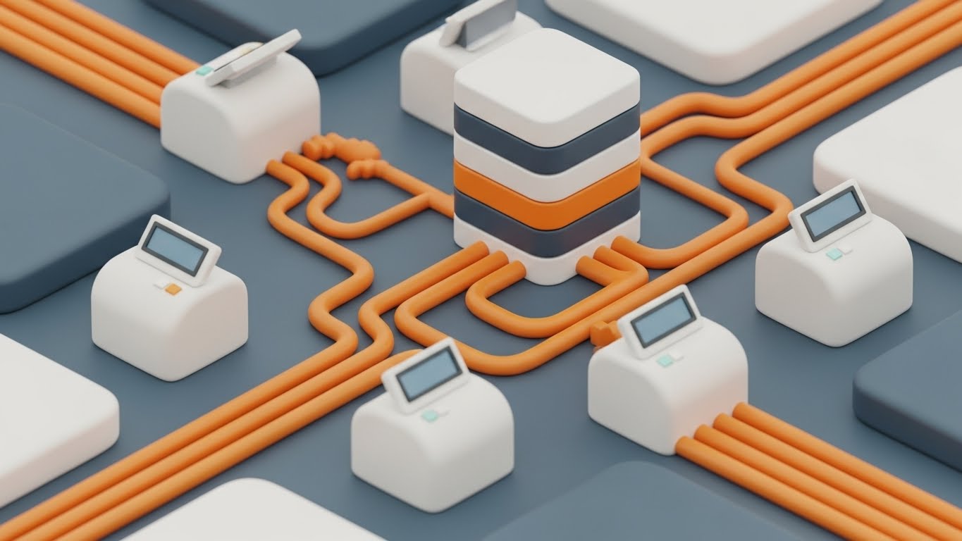
(Isometric 3D Abstract): Connected Infrastructure - Modular System Architecture
1. The Visual & Narrative Approach
Visualization Scenario: An isometric 3D render of a stylized data infrastructure. Smooth, matte white blocks (representing servers or nodes) are connected by intricate orange piping (representing data pipelines). A central "stack" represents the core database. The aesthetic is clean, soft, and toy-like but organized, set against a "Slate Blue" floor. It visualizes the unseen architecture of the software as a physical, well-plumbed machine.
Narrative Tone: Structured, modular, and reliable.
2. Psychological Impact & KPI Focus
Niche Psychology: This appeals to the System Architect's love for modularity. It simplifies the complexity of cloud infrastructure into a neat, understandable model. It suggests that the system is Scalable and "plug-and-play."
Operational Impact: Visualizes Data Integrity and System Architecture. It helps explain how different modules (Order Management, Inventory, Shipping) connect without "spaghetti code" messiness.
3. Strategic Implementation & Trade-offs
- Best Use Case: Investment Decks or "Architecture" slides in Enterprise proposals.
- Duration: Static or subtle animation of flow (Loop).
- Strategic Trade-off: It is an abstraction. It explains the structure of the data, not the value of the data. Best used as a supporting visual for technical discussions.
Companies using similar video content -
E2open – Network Platform – Connecting global supply chain data flows.
Descartes – Global Logistics Network – Modular solutions for logistics operations.
18. Future-Proofing the Warehouse
BOFU | Building Trust & Credibility

(Photorealistic 3D Renders): Automated Aisle - Infrastructure Reliability
1. The Visual & Narrative Approach
Visualization Scenario: A cinematic, photorealistic render (Unreal Engine 5 style) of a futuristic automated warehouse aisle. The lighting is cool and industrial, reflecting off the metallic surfaces of conveyor belts and robotic arms. "Safety Orange" LED strips guide the eye down the infinite perspective of the aisle. The scene is perfectly still or moving slowly, conveying a sense of monumental stability and high-tech precision.
Narrative Tone: Premium, futuristic, and industrial.
2. Psychological Impact & KPI Focus
Niche Psychology: This addresses the need for Trust in high-stakes infrastructure. It signals that the software is designed for Enterprise Scale. The visual fidelity implies that the company has invested heavily in R&D and understands the physical reality of Tier-1 logistics.
Operational Impact: Visualizes Automation Readiness and Hardware Agnosticism. It positions the software as the brain capable of running this level of sophisticated hardware.
3. Strategic Implementation & Trade-offs
- Best Use Case: Website Hero Backgrounds or high-stakes Trade Show Booth screens.
- Duration: Slow cinematic pans (30-60 Seconds).
- Strategic Trade-off: High production cost. It creates an expectation of "Enterprise" pricing. Ensure the actual product UI lives up to this level of polish.
Companies using similar video content -
Locus Robotics – Autonomous Mobile Robots – Automating warehouse fulfillment.
GreyOrange – Fulfillment Operating System – AI-powered robotics for warehouses.
19. Seeing Inside the Box
BOFU | Risk Mitigation

(3D X-Ray Visualization): Transparent Cargo - Total Asset Visibility
1. The Visual & Narrative Approach
Visualization Scenario: A striking 3D visualization of a standard shipping container. The container walls are rendered as a glowing, translucent wireframe in "Electric Blue" and "Green." Inside, solid white cubic shapes represent the cargo, perfectly stacked and secure. The view is a side-profile cutaway, literally revealing what is hidden inside the steel box.
Narrative Tone: Insightful, secure, and revealing.
2. Psychological Impact & KPI Focus
Niche Psychology: This speaks directly to the fear of Theft, Damage, and Loss. By giving the viewer "X-Ray vision," you psychologically empower them. It validates the promise of Total Visibility—not just of the truck, but of the goods inside.
Operational Impact: The perfect visual metaphor for Cargo Integrity Monitoring and Load Optimization. It demonstrates that the platform provides granular visibility down to the SKU level, reducing risk.
3. Strategic Implementation & Trade-offs
- Best Use Case: Security/Compliance Pages and features related to claims reduction.
- Duration: 10-15 Seconds.
- Strategic Trade-off: While visually cool, it is metaphorical. Make sure to pair it with actual UI screens showing how this visibility is reported (e.g., sensor logs, load manifests).
Companies using similar video content -
Zebra Technologies – Visibility Solutions – Tracking assets and inventory with precision.
Honeywell Intelligrated – Intelligent Material Handling – Solutions for internal visibility of goods.
20. The Feedback Loop
BOFU | Contract/Signing

(Abstract Data Loop): Continuous Flow - The End-to-End Value Cycle
1. The Visual & Narrative Approach
Visualization Scenario: A seamless, looping animation where abstract icons (Truck → Warehouse → Dollar Sign → Graph) morph into one another in a circular motion. The palette uses "Brand Primary" colors on a clean white background. The motion is smooth and never-ending, symbolizing the continuous nature of supply chain optimization.
Narrative Tone: Infinite, sustainable, and partnership-focused.
2. Psychological Impact & KPI Focus
Niche Psychology: This reinforces the Flywheel Effect. It moves the conversation from a one-time "implementation" to a continuous "partnership." It appeals to the desire for Continuous Improvement and long-term strategic alignment.
Operational Impact: Visualizes Lifetime Value (LTV) and the Optimization Feedback Loop. It demonstrates that data from the final delivery optimizes the next pickup, creating an engine of compounding efficiency.
3. Strategic Implementation & Trade-offs
- Best Use Case: QBR Presentations and Customer Success check-ins.
- Duration: Loopable GIF (5-10 Seconds).
- Strategic Trade-off: Too abstract for acquisition (TOFU), but perfect for retention (BOFU) to remind clients of the ongoing value cycle.
Companies using similar video content -
Coupa – Business Spend Management – Continuous optimization across the supply chain.
Jaggaer – Autonomous Commerce – Driving continuous value in procurement and supply chain.
21. Humanizing the Setup
Onboarding | Self-Serve Onboarding

(2D Character-Driven Story): Friendly Launch - Frictionless Activation Success
1. The Visual & Narrative Approach
Visualization Scenario: Entering the critical onboarding phase, this style utilizes the "Corporate Memphis" aesthetic—flat, fluid vector characters with exaggerated proportions. A stylized logistics manager with "Soft Lavender" skin and professional navy attire stands in a clean, abstract office environment. She smiles confidently while interacting with a floating, oversized "Launch" button. The background is a simplified abstraction of office shapes in "Clean White" and "Soft Grey," creating an inviting, airy atmosphere.
Narrative Tone: Welcoming, celebratory, and accessible.
2. Psychological Impact & KPI Focus
Niche Psychology: New software often triggers "Setup Anxiety"—the fear of breaking the system or facing a steep learning curve. This approachable, non-threatening style disarms that fear. It psychologically frames the "Launch" not as a complex technical configuration, but as a simple, joyful button press.
Operational Impact: This style directly targets Time-to-First-Value (TTFV). By making the start feel effortless, you encourage users to take that first critical step independently, improving Self-Serve Activation Rates.
3. Strategic Implementation & Trade-offs
- Best Use Case: Welcome Emails, "Day 1" Login Screens, and Setup Wizards.
- Duration: Static Images or 5-Second Micro-Loops.
- Strategic Trade-off: The illustrative style is designed for friendliness, not technical precision. Use it to welcome the user, but switch to UI-focused styles (like Style 12) when teaching specific workflows.
Companies using similar video content -
ShipBob – Fulfillment Platform – Easy onboarding for e-commerce fulfillment.
Flowspace – Omnichannel Fulfillment – Simple setup for distributed fulfillment.
22. The Virtual Assistant
Onboarding | Accelerating Time-to-Value

(Holographic UI over 3D Render): Augmented Guidance - Intelligent Support Automation
1. The Visual & Narrative Approach
Visualization Scenario: A photorealistic 3D render of a heavy industrial pump or logistics hardware serves as the anchor. Hovering in front of it is a futuristic "Holographic Blue" UI panel projecting upwards. The interface glows with "Electric Cyan" data points, displaying maintenance schedules and a helpful "Support Bot" avatar. The glow illuminates the machinery, visually representing how the digital intelligence (the software) augments and protects the physical asset.
Narrative Tone: Advanced, helpful, and omnipresent.
2. Psychological Impact & KPI Focus
Niche Psychology: Users fear being left alone with complex machinery or software. This style visually represents "Always-On Support." It reassures the operator that intelligence and guidance are overlaid directly onto their physical reality, available instantly without needing to call a help desk.
Operational Impact: This is a strong visual metaphor for Contextual Support and Ticket Deflection. It correlates with reduced support costs by showing that the system answers questions before they are even asked.
3. Strategic Implementation & Trade-offs
- Best Use Case: In-App Tooltips, Feature Announcements for IoT integrations, and "Help" modules.
- Duration: 10-20 Seconds.
- Strategic Trade-off: The holographic look implies a high level of AI maturity. Ensure your actual support bot or help center is robust enough to back up this promise of futuristic ease.
Companies using similar video content -
Symphony RetailAI – AI-Powered Solutions – Virtual assistants for retail and supply chain.
Veridian – Supply Chain AI – AI-driven insights and support.
23. Precision Support
Retention | Knowledge Base & FAQ

(Macro UI Micro-Interactions): Focused Interaction - Granular Support Accessibility
1. The Visual & Narrative Approach
Visualization Scenario: An extreme close-up "Macro" shot of a specific UI interaction. The camera focuses entirely on a single, glowing "Offer" or "Help" button in "Vivid Magenta." A stylized cursor enters the frame to press it, releasing a burst of "Cyan" particle effects. The depth of field is razor-thin, blurring the rest of the interface into a dark, premium texture. This elevates a simple click into a distinct, high-value decision.
Narrative Tone: Precise, satisfying, and responsive.
2. Psychological Impact & KPI Focus
Niche Psychology: In a complex dashboard, users can feel overwhelmed. This style uses Visual Isolation to guide attention to the single most important action. It validates the user's interaction as powerful and meaningful, triggering a dopamine response with the "satisfying click."
Operational Impact: Visualizes Ease of Use and Micro-interactions. It effectively communicates that help is just "one click away," reducing the perceived effort of finding solutions and improving User Engagement.
3. Strategic Implementation & Trade-offs
- Best Use Case: Knowledge Base Headers, FAQ videos, and Feature Highlight reels.
- Duration: 3-5 Seconds (Loop).
- Strategic Trade-off: It is hyper-specific. It shows one button, not the workflow. Use it to punctuate a broader narrative or to highlight a specific Call to Action (CTA).
Companies using similar video content -
Loop Returns – Returns Management – Streamlined, precise returns process.
ReverseLogix – Returns Management System – Granular control over returns.
24. The Pulse of Operations
Retention | Reducing Support Overhead

(Hyper-lapse Stock Footage): Kinetic Flow - High-Volume System Reliability
1. The Visual & Narrative Approach
Visualization Scenario: A high-speed hyper-lapse video of a bustling fulfillment center floor. Staff and packages move as colorful blurs of motion, conveying the frenetic pace of reality. Superimposed over this chaos is a calm, static "White" and "Lime Green" graphical HUD (Heads-Up Display) that tracks the flow rates and zones. The contrast between the fast-moving background and the stable data overlay is the core visual hook.
Narrative Tone: Stable, capable, and observant.
2. Psychological Impact & KPI Focus
Niche Psychology: This addresses the anxiety of Volume Overload. It shows that while the physical world is chaotic and fast, the digital platform remains calm and in control. It validates the system's ability to handle Peak Season traffic without crashing.
Operational Impact: Visualizes System Uptime and Throughput Capacity. It proves that the software captures data accurately regardless of physical speed.
3. Strategic Implementation & Trade-offs
- Best Use Case: System Status Pages, Reliability Case Studies, and "Peak Season" readiness campaigns.
- Duration: 10-15 Seconds.
- Strategic Trade-off: Requires high-quality production footage. Poorly lit warehouse video can look gritty and unprofessional; ensure the stock footage is premium.
Companies using similar video content -
Dematic – Automation Solutions – High-volume material flow in warehouses.
25. Celebrating the Team
Retention | Reducing Churn

(Aspirational Stock Montage): Heroic Success - Empowered Workforce Morale
1. The Visual & Narrative Approach
Visualization Scenario: A cinematic, slow-motion shot of a warehouse manager high-fiving a driver or staff member. The lighting is "Warm Sunlight," flaring artistically through skylights. They wear branded "Corporate Blue" vests and look genuinely happy. The camera angle is low, looking up at them to frame them as heroes of the supply chain. The image conveys genuine human connection and the joy of a job well done.
Narrative Tone: Human, triumphant, and emotional.
2. Psychological Impact & KPI Focus
Niche Psychology: SaaS churn often happens when the humans using the software feel undervalued or frustrated. This style reconnects the software to Human Success. It reminds the buyer that the ultimate goal of the platform is to make their team's life easier and happier.
Operational Impact: Visualizes Employee Satisfaction and Team Efficiency. It implicitly argues that better tools lead to better culture, directly impacting Retention.
3. Strategic Implementation & Trade-offs
- Best Use Case: Customer Success Newsletters, Holiday Greetings, and "Year in Review" videos.
- Duration: 15-30 Seconds.
- Strategic Trade-off: It can feel like generic stock photography if not carefully selected. Ensure diversity and realistic warehouse environments to maintain authenticity.
Companies using similar video content -
Convoy – Digital Freight Network – Empowering carriers and drivers.
Loadsmart – Digital Freight Broker – Supporting truckers and shippers.
26. Deep Dive Configuration
Retention | Driving Deep Feature Adoption
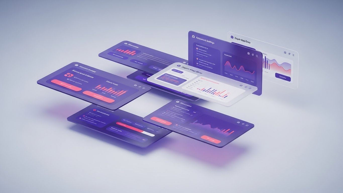
(3D Parallax UI Presentation): Layered Depth - Power User Customization
1. The Visual & Narrative Approach
Visualization Scenario: A sophisticated 3D composition where UI screens are deconstructed into floating layers. The background is a "Soft Grey" depth map. The foreground features semi-transparent glass panels displaying advanced settings, API keys, and configuration toggles in "Deep Purple" and "Pink." The camera drifts slowly through these layers, creating a parallax effect that implies depth, complexity, and richness.
Narrative Tone: Deep, configurable, and robust.
2. Psychological Impact & KPI Focus
Niche Psychology: Power users and IT administrators want control. They fear "black box" simple solutions. This style visually validates the Depth of Functionality. It shows that "under the hood," the system creates infinite possibilities for customization.
Operational Impact: Perfect for visualizing Advanced Configuration, Custom Rules Engines, and API Integrations. It drives adoption of "Pro" features and prevents churn to more "customizable" competitors.
3. Strategic Implementation & Trade-offs
- Best Use Case: "Advanced Features" Web Pages and webinar backdrops for technical deep dives.
- Duration: Loopable Backgrounds.
- Strategic Trade-off: Too complex for a general audience. This is strictly for the "Retention" and "Expansion" phase where users are ready for complexity.
Companies using similar video content -
MercuryGate – TMS – Highly configurable transportation management.
Trimble Transportation – TMS Solutions – Deep customization for fleet and logistics.
27. Augmented Reality Tracking
Retention | Website Visitor Re-engagement

(2D Graphics Over Live Action): Hybrid Reality - Tangible Asset Tracking
1. The Visual & Narrative Approach
Visualization Scenario: A top-down, high-resolution photo of a standard brown cardboard box sitting on a wooden table. Superimposed over this real-world object are popping, animated 2D vector icons: a "Red" location pin, a "Green" shield, and a "Blue" checkmark. The style mimics an Augmented Reality (AR) interface. It visually bridges the gap between the physical package and the digital status updates.
Narrative Tone: Innovative, connected, and reassuring.
2. Psychological Impact & KPI Focus
Niche Psychology: This targets the "Disconnection Anxiety" of shipping. It visually restores the link between the sender and the package. The playful pop of the icons adds a layer of Delight to the mundane tracking process and triggers Memory Recall.
Operational Impact: Visualizes Real-Time Tracking Accuracy and Claims Reduction. It reminds the user that the software is the "guardian" of the physical good.
3. Strategic Implementation & Trade-offs
- Best Use Case: Remarketing Ads (Instagram/Facebook) to bring visitors back to the site.
- Duration: 6-10 Seconds.
- Strategic Trade-off: Keep the motion snappy. If the animation is too slow, it loses the "AR" feel and just looks like a cartoon.
Companies using similar video content -
AfterShip – Tracking & Returns – Visualizing package status with AR-like elements.
ParcelLab – Operations Experience Platform – Enhancing post-purchase tracking.
28. Visualizing the Brain
Expansion | Driving Upsell/Cross-sell

(Abstract 3D AI Visualization): Neural Network - Artificial Intelligence Expansion
1. The Visual & Narrative Approach
Visualization Scenario: An abstract, high-end 3D simulation of a particle system. Thousands of "Silver" and "Chrome" spheres are connected by thin, glowing white lines, forming a complex, brain-like neural network. The camera orbits this structure as it expands outwards into an infinite white void. Bursts of "Cyan" light travel along the connections, symbolizing learning and data processing.
Narrative Tone: Intelligent, evolving, and premium.
2. Psychological Impact & KPI Focus
Niche Psychology: This appeals to the desire for Future-Proofing. It visualizes the AI not as a static tool, but as a growing, learning entity. It justifies the cost of premium "AI Modules" by showing the complexity and beauty of the underlying intelligence.
Operational Impact: Visualizes Machine Learning Capabilities, Route Optimization Algorithms, and Predictive Analytics. It supports the upsell narrative of "Upgrade to AI."
3. Strategic Implementation & Trade-offs
- Best Use Case: Product Launch Emails for new AI features and Enterprise Tier landing pages.
- Duration: 15-20 Seconds.
- Strategic Trade-off: Extremely abstract. It must be paired with clear copy explaining what the AI actually improves (e.g., "Reduce fuel costs by 15%").
Companies using similar video content -
Blue Yonder – Luminate Platform – AI/ML-driven supply chain optimization.
Tecsys – Omni-Channel Platform – AI-powered decision-making in logistics.
29. The Referral Engine
Expansion | Driving Referrals & Advocacy
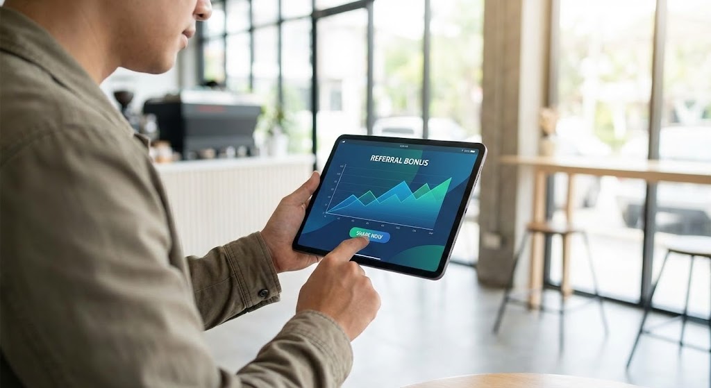
(Lifestyle Stock with UI Overlay): Mobile Success - Social Proof Activation
1. The Visual & Narrative Approach
Visualization Scenario: A lifestyle shot of a modern business owner or logistics manager in a coffee shop. The lighting is natural and bright. They are holding a tablet, and the view is over-the-shoulder. Superimposed on the tablet screen is a sharp, high-contrast UI showing a "Referral Bonus" graph spiking upwards in "Green." The composition suggests that the platform gives them the freedom to work (and earn) from anywhere.
Narrative Tone: Rewarding, mobile, and social.
2. Psychological Impact & KPI Focus
Niche Psychology: This targets the Advocacy drive. It frames the software as a partner in the user's personal success and income. It suggests that sharing the tool is not just helpful to others, but profitable for them.
Operational Impact: Visualizes Net Promoter Score (NPS) and Referral Loop Velocity. It turns the user base into a growth engine.
3. Strategic Implementation & Trade-offs
- Best Use Case: LinkedIn and Instagram posts targeting existing customers.
- Duration: Static Image.
- Strategic Trade-off: Ensure the UI overlay is legible even on small mobile screens. The graph must clearly read as "Growth/Bonus."
Companies using similar video content -
3PL Central – WMS for 3PLs – Empowering 3PLs to grow their business.
30. The Champion's Voice
Expansion | The Champion
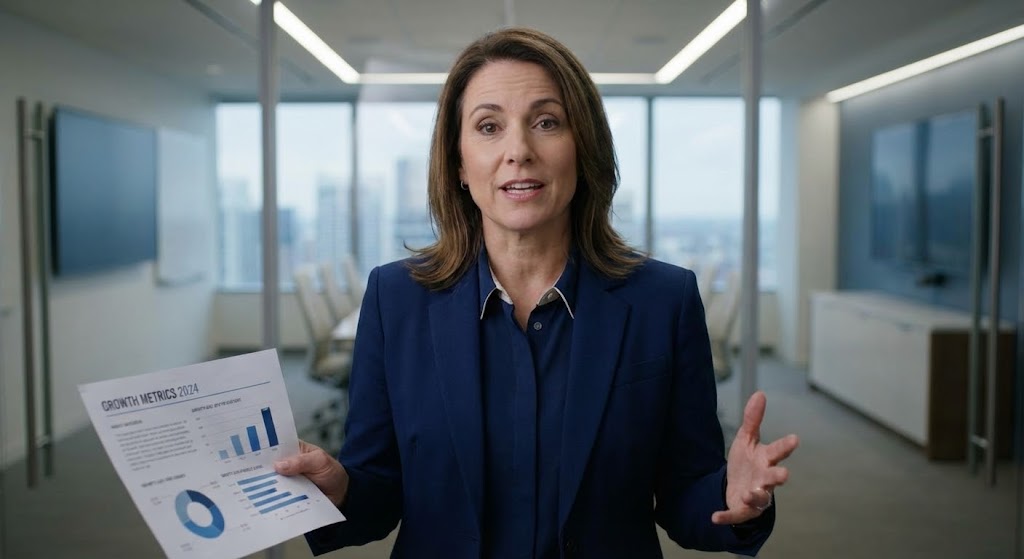
(Generative AI Realistic Character): The Director - Authoritative Executive Validation
1. The Visual & Narrative Approach
Visualization Scenario: A photorealistic video generated via Gen AI. A confident Supply Chain Director (female, 40s) stands in a blurred, modern glass-walled conference room. She wears a navy blazer and speaks directly to the camera with passion and authority. In her hand, she holds a printed report with visible charts showing "Growth Metrics." The lighting is studio-quality "Rembrandt" style.
Narrative Tone: Experienced, credible, and convincing.
2. Psychological Impact & KPI Focus
Niche Psychology: People buy from people. This style creates a Peer Avatar—someone the target buyer aspires to be. It provides social proof without the logistical nightmare of filming actual client case studies. It validates the decision to buy at an executive level.
Operational Impact: Visualizes Leadership Buy-In and Strategic Success. It serves as a proxy for a Case Study, driving Conversion Rates at the bottom of the funnel.
3. Strategic Implementation & Trade-offs
- Best Use Case: Case Study pages and Sales Enablement decks.
- Duration: 30-60 Seconds.
- Strategic Trade-off: Ethical transparency is key. Ensure the audience knows this is a dramatization or a "persona" representation, or use it to narrate anonymized success stories.
Strategic Knowledge Base: The Visual Operations Doctrine
To transition from "creating assets" to "building a visual infrastructure," we must move beyond style and focus on strategy. This section synthesizes the 30 visual styles into a cohesive Visual Operations Doctrine—a framework for embedding these visuals into the very DNA of your logistics platform to drive adoption, efficiency, and growth.
STRATEGIC ALIGNMENT & VISUAL ARCHITECTURE
Goal: Defining the "Visual Operating System" before production begins.
- The Cognitive Load Audit: Before commissioning any assets (like Style 2 or 17), conduct an audit of your current training materials. If a concept takes 3 paragraphs to explain, it qualifies for a visual intervention using Isometric Schematics (Style 2) or 2D Motion (Style 8).
- Role-Based Visual Mapping: Differentiate your visual strategy by user role. Drivers on mobile devices require high-contrast, large-element visuals like Style 13 (Pop-Out Notifications) for glanceability. Conversely, Fleet Managers on desktop need high-density data visualizations like Style 7 (Control Tower).
- The "Glanceability" Standard: In logistics, speed is safety. Establish a "3-Second Rule" for all operational visuals. If a driver or warehouse packer cannot understand the status (Green/Red/Yellow) within 3 seconds, the visual style is too complex. Use Style 5 (Checkmark Morph) for these binary status updates.
- Brand Voice Consistency: Your visual language must be unified across the "Physical/Digital Divide." The iconography used on the warehouse floor signage should match the icons inside the SaaS dashboard. Advids recommends creating a "Visual Lexicon" that creates a shared language between the software engineers and the forklift operators.
- Standardization vs. Customization: Use standardized styles (like Style 21 Corporate Memphis) for general onboarding to lower production costs. Save bespoke, high-budget 3D styles (like Style 18 Future-Proofing) for high-stakes investor pitches or Tier-1 sales assets where differentiation is critical.
- The Cross-Departmental Bridge: Visuals are the only language that Sales, Operations, and Customer Support all speak fluently. Use Style 15 (Before & After) to align Sales promises with Operational reality, ensuring that what is sold is exactly what is delivered.
- Legacy System Integration: Many logistics firms run on legacy hardware. Use Style 9 (Digital Twin) to visually demonstrate how your modern SaaS platform integrates with their existing "Green Screen" or on-premise hardware, bridging the gap between old Capex and new Opex.
- Accessibility in Trucking: The logistics workforce is global and multilingual. Prioritize visual-first storytelling (like Style 14 2D Line Art) that relies on universal symbols (arrows, nodes, checks) rather than voiceovers or heavy text, reducing localization costs and training friction.
- The Mobile-First Mandate: With 70% of logistics operations happening in the field, every visual style must be audit-tested on a mobile screen. Style 29 (Lifestyle Overlay) and Style 13 are specifically designed to validate the mobile experience for distributed teams.
- The Advids Strategic Audit: Partnering with a specialized agency like Advids allows you to define this architecture upfront. We map your user journey against these 30 styles to create a production roadmap that ensures every video asset serves a specific business KPI, rather than just filling a content calendar.
OPERATIONAL ADOPTION & IMPLEMENTATION
Goal: Embedding visuals into the daily workflow to drive behavior change.
- Overcoming "Big Brother" Anxiety: The introduction of driver monitoring AI can cause friction. Use Style 1 (Network Harmony) and Style 25 (Team Success) to frame the technology as a "Co-pilot" that ensures safety, rather than a "Policeman" that punishes errors. Empathy in visualization is crucial for adoption.
- The Micro-Learning Shift: Replace 50-page PDF manuals with a library of 30-second video loops. Embed Style 12 (Clean UI Workflow) directly into the software's "Tooltip" or "Help" section. This "Just-in-Time" learning reduces the cognitive burden of memorizing SOPs.
- Reducing Support Ticket Volume: There is a direct correlation between the quality of your visual library and your support costs. Proactively deploying Style 23 (Macro UI) videos for common friction points (e.g., "How to Reset Password" or "How to Sync Device") can deflect up to 40% of Tier-1 support tickets.
- Gamification of Training: Use Style 6 (Low-Poly Fleet) to gamify driver training. Visualizing a "Perfect Route" or a "Safety Score" with video game aesthetics increases engagement among younger drivers and turns compliance into a competitive achievement.
- Remote Onboarding: For distributed fleets, physical training seminars are costly. Use Style 22 (Holographic Guide) and Style 21 (Friendly Setup) to create a fully remote, self-serve onboarding experience that feels personal and high-touch without the travel expense.
- Visualizing SOPs: Text-based Standard Operating Procedures are rarely read. Transform them into Style 2 (Isometric Grid) animations. The rigid structure of the isometric view perfectly mirrors the strict logic of a warehouse packing protocol, ensuring higher compliance rates.
- Feedback Loops: Use interactive video elements (Style 20) to gather feedback. If a user watches a "How-To" video three times, trigger a proactive support chat. This data turns your video library into a listening tool for Customer Success.
- Scalable Localization: When expanding to new regions, Style 1 (Abstract) and Style 4 (Kinetic Typography) are your most scalable assets. By separating on-screen text from the background animation, you can swap languages in post-production without re-rendering the complex 3D assets.
- Leadership Communication: When rolling out a new fleet strategy, PDFs don't inspire confidence. Use Style 30 (The Champion) and Style 18 (Automated Aisle) to communicate the vision to regional directors. High-production values signal that the initiative is a strategic priority, not just an IT update.
- Visual Anchoring: Use consistent visual metaphors (e.g., the "Glowing Blue Line" for data flow) across all training materials. This creates a "Visual Anchor" that helps staff instantly recognize the topic, reducing mental fatigue during long shifts.
MEASURING IMPACT & FUTURE-PROOFING
Goal: Quantifying the ROI of visualization and preparing for the AI era.
- Beyond "Views": In B2B logistics, "Views" are a vanity metric. The true KPIs for these styles are Time-to-Competency (how fast a new packer reaches full speed) and Feature Adoption Rate (percentage of users utilizing the features shown in Style 11).
- The "Idle Time" Metric: Measure the reduction in software "Idle Time" (time spent staring at a screen confused) after implementing Style 12 (Clean UI) walkthroughs. A reduction in idle time directly correlates to an increase in operational throughput.
- Compliance Velocity: How quickly does the fleet adapt to a new regulation (like ELD mandates)? Delivering the training via Style 4 (Kinetic Typography) creates urgency and clarity, measurable by the speed of fleet-wide compliance certification.
- Retention and LTV: High-quality UX visualization (Style 17 - Dark Room) communicates that the product is premium and robust. This perception builds trust with the technical buyer (CTO), directly impacting Net Revenue Retention (NRR) and reducing churn to competitors with "prettier" interfaces.
- The AI Visual Frontier: Prepare your asset library for Generative AI. Styles like Style 28 (Neural Network) and Style 30 (Gen AI Character) are the precursors to real-time, personalized video generation where every driver gets a custom briefing based on their specific route data.
- Scalability of Assets: Build a "Modular Asset Library." By creating individual 3D assets (Trucks, Boxes, Nodes) in Style 6 or Style 2, you can remix them into new videos indefinitely. This approach, championed by Advids, turns video production from a "Project" into a scalable "Infrastructure."
- The Advids Partnership: Scalability requires a partner who understands both the Art of motion design and the Science of logistics. Advids acts as the custodian of your visual brand, ensuring that as your platform evolves from V1 to V2, your visual library evolves seamlessly without needing a complete rebuild.
- Benchmarking Success: Do not just compare your visuals to other logistics companies. Compare them to B2C consumer apps. Your drivers use Instagram and TikTok; if your training video looks like it was made in 1990, you lose their attention. Style 13 (Mobile App) sets the standard for consumer-grade B2B UX.
- The ROI of Safety: Safety incidents are the single biggest cost in logistics. Investing in high-fidelity Style 19 (X-Ray) and Style 24 (Hyper-lapse) videos to demonstrate safety protocols can lower insurance premiums and liability claims, offering a hard ROI on production spend.
- Final Call to Innovation: The future of logistics is visible. The platforms that succeed will not just be the ones with the best code, but the ones with the best story. By adopting these 30 styles, you are not just making videos; you are building a Visual Infrastructure that accelerates understanding, builds trust, and drives the global flow of goods. Treat your visuals as a strategic asset, and the market will treat you as the leader.
End of Part 3.
This concludes the comprehensive Video Style Guide for E-commerce Logistics & SaaS Platforms.
Companies using similar video content -
FreightWaves – Logistics Intelligence – Providing authoritative insights and data.
Author & Editor Bio


