
Introduction: Visualizing the Invisible Engine of Commerce
The architecture of modern commerce is invisible. It lives in API calls, headless frameworks, and automated routing logic. Yet, for the "Architects of Scale"—the CTOs and VPs of Operations driving this industry—the challenge isn't just building the technology; it's explaining its magnitude to stakeholders who cannot read code.
We are operating in a high-stakes environment. The global B2B e-commerce market is a $20.4 trillion market opportunity, creating unprecedented demand for software platforms that can articulate their value. However, complexity is the enemy of conversion. When a buyer cannot see the solution, they retreat to the safety of the status quo.
Visualization is the bridge. It turns the "Black Box" of SaaS into a transparent, trustworthy engine of growth. This is not merely about aesthetics; it is about cognitive efficiency. Research shows that 96% of people have watched an explainer video to learn more about a product, confirming that video is the preferred medium for digesting complex operational concepts.
This guide is your strategic blueprint. Over the following 30 examples, we will dissect specific visual styles—from minimalist vectors to cinematic AI—that solve the unique communication challenges of the e-commerce and logistics sector. We will explore how to visualize latency, throughput, and integration, moving beyond generic marketing to create assets that drive true market understanding.
Let’s begin with the foundations of clarity in the Top of the Funnel.
1. Minimalist Flat 2D Vector
TOFU | Brand Awareness
The Visual & Narrative Approach
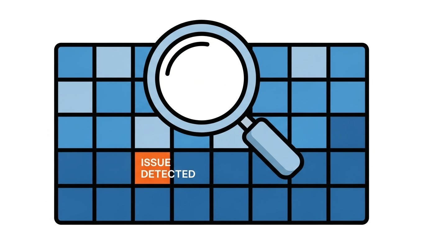
This style utilizes a "Blueprint" aesthetic to communicate precision and control. While intended to represent "Global Reach," the visual zooms in on the granularity of that network. A simplified digital landscape rendered in a Bright Cyan grid sits on a Pure White background. A magnifying glass acts as the focal point, identifying a single "Issue Detected" node in Vivid Tangerine. The composition is symmetrical and clinical. The narrative focus here is on "Observability"—the ability of the software to find a needle in a global haystack instantly.
Psychological Impact & KPI Focus
For a technical buyer, "noise" is a red flag. This ultra-clean style reduces cognitive load, signaling that the platform organizes chaos rather than adding to it. It addresses the Risk Mitigation KPI by visually proving that the system is vigilant. The contrast of the orange alert against the blue grid triggers immediate attention, reinforcing the value proposition of "Proactive Monitoring" without inducing panic.
Strategic Implementation & Trade-offs
- Best Use Case: Meta / General Ads (Square 1:1) where the viewer is scrolling quickly.
- Strategic Trade-off: While excellent for clarity, this style can feel "cold" or purely functional. It builds trust in the mechanism, but lacks the emotional resonance needed for higher-level brand storytelling.
Companies using similar video content -
Samsara – Connected Operations Cloud – Real-time fleet and asset monitoring.
Z2Data – Supply Chain Mapping – Visualizing multi-tier supplier networks.
3. Abstract 2D Motion Graphics
TOFU | Market Education

The Visual & Narrative Approach
This style visualizes the invisible "Nervous System" of a supply chain. Thin, elegant lines in Mint Green and Cool Grey weave complex, non-intersecting patterns on a Matte White background. Geometric shapes (circles and squares) travel along the lines like packets of data. The motion is smooth and rhythmic. The aesthetic is modern, tech-forward, and airy, representing the logic of API Orchestration.
Psychological Impact & KPI Focus
This aesthetic targets the "Engineer" mindset. It validates the complexity of the ecosystem (the web of lines) while presenting the software as the elegant solution (the smooth flow). It addresses the anxiety of Operational Efficiency, proving visually that the platform can orchestrate complex routing logic without bottlenecks. The Mint Green accents subtly convey "Healthy System" status signals.
Strategic Implementation & Trade-offs
- Best Use Case: Blog headers or "How it Works" sections explaining connectivity.
- Strategic Trade-off: It is highly abstract. Viewers must already understand the concept of supply chain routing to appreciate the metaphor. It explains the logic, but not the interface.
Companies using similar video content -
Kinaxis – Maestro – Orchestrating real-time supply chain planning.
Infor Nexus – Supply Chain Platform – Connecting global trade partners.
4. Abstract 2D Flat Vector Organic
TOFU | Shaping Brand Perception

The Visual & Narrative Approach
To counter the perception that enterprise software is "clunky" or "rigid," this style employs fluid dynamics. Fluid, blob-like shapes in Soft Pink and Vibrant Orange merge and flow together on a Creamy White background. The shapes represent "Seamless Integration." They have subtle white specular highlights to give them a glossy, liquid plastic look. The movement is calming and frictionless.
Psychological Impact & KPI Focus
This style leverages the psychology of "Soft Physics" to lower resistance. It frames integration not as a mechanical collision of codebases, but as a natural, effortless blending. It targets the Time-to-Value KPI by implying that setup is frictionless. The warm color palette makes the brand feel approachable and modern, distinguishing it from the "Blue and Grey" of legacy competitors.
Strategic Implementation & Trade-offs
- Best Use Case: Website / LP Hero sections focusing on "Partnerships" or "Ecosystem."
- Strategic Trade-off: It is purely metaphorical. It conveys a feeling of ease but offers zero technical proof. Use it to open doors, not to close technical reviews.
Companies using similar video content -
commercetools – Composable Commerce – Fluid integration for headless commerce.
Elastic Path – Composable Commerce Hub – Seamlessly blending e-commerce components.
5. Generative AI Cinematic Video
TOFU | Vertical Social Organic

The Visual & Narrative Approach
This style brings the physical reality of logistics to the screen with high-fidelity impact. A high-speed drone shot flies through a hyper-modern, sterile logistics warehouse. The racking is Clean White, and the packages are uniform Silver boxes. Electric Blue robotic arms move with blur-inducing speed. The lighting is high-key and bright, resembling a sci-fi laboratory. The camera movement is aggressive, emphasizing "Velocity" and "Scale."
Psychological Impact & KPI Focus
This style stops the scroll on platforms like TikTok or Reels. It appeals to the Aspiration of the Operations Director—the dream of a fully automated, dark warehouse running at peak efficiency. It links the software code to the physical result: moving goods faster. The aggressive pacing signals Market Leadership and Innovation.
Strategic Implementation & Trade-offs
- Best Use Case: TikTok / Reels (Vertical 9:16) for hype and brand awareness.
- Strategic Trade-off: It creates high expectations. It is a "Vision" piece, not a product demo. Ensure the actual product delivers on the promise of speed implied by the visuals.
Companies using similar video content -
VTEX – Commerce Platform – Flexible, cloud-native e-commerce solutions.
Spryker – Composable Commerce OS – Modular, adaptable commerce architecture.
6. Bold Kinetic Typography (Visual)
TOFU | Skippable Pre-Roll Ad

The Visual & Narrative Approach
A visual representation of bold kinetic typography designed for sound-off environments. Massive, blocky text shapes (abstracted) in Canary Yellow and Jet Black dominate the screen against a Solid White background. The shapes slide and lock together with mechanical precision, symbolizing "Structure" and "Reliability." Hard shadows create depth. The energy is loud and impactful.
Psychological Impact & KPI Focus
This style utilizes "Visual Weight" to build trust. In the SaaS world, downtime is a disaster. By giving the text physical weight and interlocking mechanics, you subconsciously communicate that the platform is solid, grounded, and unbreakable. It addresses the Uptime and Security KPIs, assuring the viewer that this is enterprise-grade infrastructure.
Strategic Implementation & Trade-offs
- Best Use Case: YouTube Pre-Roll Ad (16:9) where capturing attention in 5 seconds is critical.
- Strategic Trade-off: It is loud and aggressive. It works for making a statement but lacks nuance. It should be used to grab attention before transitioning to a more educational style.
Companies using similar video content -
Manhattan Associates – Active Warehouse Management – Automated, high-speed warehouse operations.
Körber – Supply Chain Solutions – Visionary automation for logistics.
7. 3D X-Ray Visualization
MOFU | Product Differentiation

The Visual & Narrative Approach
A 3D X-Ray visualization of a server rack unit. The outer casing is rendered as Frosted White Glass, revealing the internal components. Inside, a glowing core of Neon Teal fibers represents the "Data Engine." The background is a clean, clinical Pale Grey. The image conveys the robust, hidden complexity of the software infrastructure in a sophisticated, medical-grade aesthetic.
Psychological Impact & KPI Focus
This style appeals to the "Engineer's Curiosity." It differentiates the product by visualizing quality "under the hood." It implies that while the interface is simple (the glass), the engine is robust (the glowing core). It builds Technical Trust and justifies premium pricing by showcasing the depth of the technology.
Strategic Implementation & Trade-offs
- Best Use Case: Product Page or Technical Whitepaper visuals.
- Strategic Trade-off: It requires high-fidelity 3D assets. Poorly rendered glass can look cheap. It demands a premium execution to maintain credibility.
Companies using similar video content -
Oracle SCM Cloud – Logistics – Robust, enterprise-grade supply chain foundation.
SAP Commerce Cloud – B2B Platform – Unbreakable e-commerce infrastructure.
8. Rapid UI Feature Montage
MOFU | Feature Education

The Visual & Narrative Approach
A rapid montage composition of UI screens. Slices of clean, White and Light Grey user interfaces are layered diagonally. Key elements like "Inventory Toggles" and "Sales Graphs" are highlighted in Coral Red. The background is a heavily blurred, bright modern office. Motion blur lines suggest the screens are sliding into place quickly.
Psychological Impact & KPI Focus
This visualizes Productivity. The diagonal composition and rapid pacing suggest a "Power User" experience—a tool designed for speed. The abundance of screens suggests a comprehensive feature suite, addressing the Feature Completeness KPI. It assures the buyer that the platform is robust enough to handle their entire workflow.
Strategic Implementation & Trade-offs
- Best Use Case: Social Ads (Retargeting) showing "How much faster you could be."
- Strategic Trade-off: The speed makes it impossible to read specific text. It creates an impression of the UI, not a tutorial. Use it to sell the workflow, not the buttons.
Companies using similar video content -
Logility – Decision Intelligence Platform – Uncovering deep supply chain insights.
SAP Integrated Business Planning – IBP – Visualizing complex planning data.
9. Wireframe to Reality Transition
MOFU | Competitive Displacement
The Visual & Narrative Approach
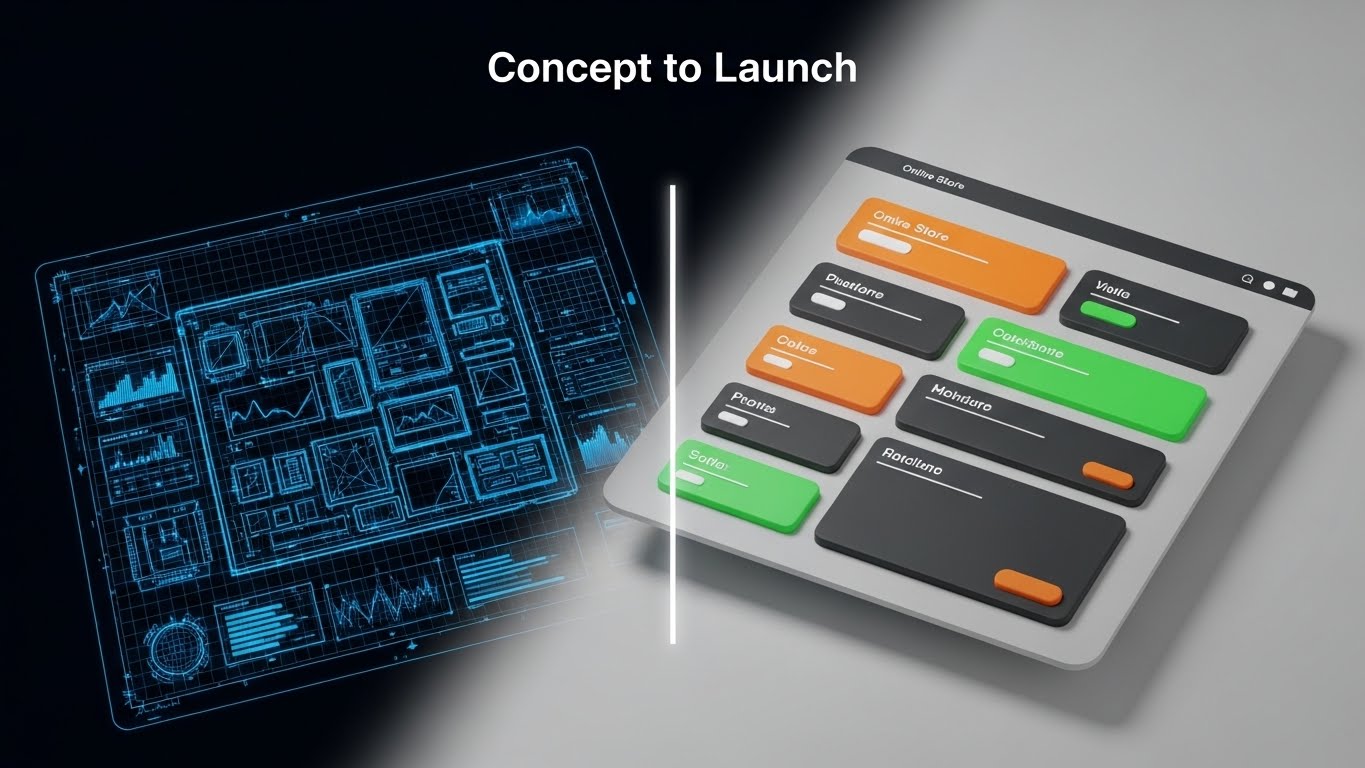
A split-screen composition. The left half shows a technical Blueprint Blue wireframe sketch of an online store layout on a grid. The right half transforms into a photorealistic, vibrant 3D Render of the finished storefront with realistic lighting and textures. A glowing vertical scanner line divides the two. Visualizes "Concept to Launch."
Psychological Impact & KPI Focus
This targets the pain point of Development Lag. Buyers fear that new software will take months to implement. This visual provides instant gratification, proving that the platform bridges the gap between "Plan" and "Product" seamlessly. It drives the Time-to-Value KPI, positioning the software as an accelerator of business goals.
Strategic Implementation & Trade-offs
- Best Use Case: Email nurture campaigns or Case Study videos.
- Strategic Trade-off: Requires a strong visual contrast between the wireframe and the final render. If the transformation isn't dramatic, the point is lost.
Companies using similar video content -
BigCommerce – Enterprise B2B Edition – Rapidly showcasing comprehensive e-commerce features.
Adobe Commerce – Magento Open Source – Highlighting diverse platform capabilities.
10. Dynamic Data Visualization
MOFU | Demand Gen

The Visual & Narrative Approach
A 3D data visualization of "Revenue Growth." Rising bar charts are rendered as translucent Emerald Green glass blocks on a reflective Pure White floor. Golden light refracts through the glass. The camera angle is low, looking up at the towering charts. Floating geometric percentage symbols add detail. The aesthetic is premium and financial.
Psychological Impact & KPI Focus
This appeals to the CFO Mindset. Green is the universal code for "Profit." The crystalline structure implies Transparency and Truth in reporting. It moves the conversation from "features" to "outcomes," directly validating the Return on Investment (ROI) of the platform.
Strategic Implementation & Trade-offs
- Best Use Case: LinkedIn Feed ads targeting senior decision-makers.
- Strategic Trade-off: It is aspirational. It works best when overlaid with actual client metrics (e.g., "+200% Growth") to ground the beautiful visual in hard facts.
Companies using similar video content -
Vendure – Headless Commerce – Transforming design concepts into live stores.
Medusa – Open-Source Commerce – Building custom e-commerce experiences from scratch.
11. Isometric 3D Workflow
MOFU | The Functional Buyer

The Visual & Narrative Approach
This style employs a "Claymorphism" aesthetic—soft, rounded 3D shapes in Pastel Blue and Yellow—to render a miniature fulfillment center on a White surface. The lighting uses soft Global Illumination, eliminating harsh shadows. The narrative visualizes the software not as complex code, but as a modular, manageable physical system. It breaks down the intimidating complexity of multi-node order routing into friendly, snap-together components.
Psychological Impact & KPI Focus
The Functional Buyer (e.g., Operations Director) fears disruption. They worry that new software will break existing workflows. This soft, orderly aesthetic lowers Cognitive Load and reduces "Implementation Anxiety." It signals that the system is organized, contained, and user-friendly. By visualizing the process as a toy-like model, it makes the task of re-engineering the supply chain feel achievable and safe, directly addressing the System Throughput and Ease of Adoption KPIs.
Strategic Implementation & Trade-offs
- Best Use Case: Technical Whitepapers or "Solution Architecture" pages where clarity is paramount.
- Strategic Trade-off: The "toy-like" aesthetic runs the risk of looking too playful for enterprise-grade security solutions. It is best used for process explanation (Order to Delivery), not for selling high-security infrastructure.
Companies using similar video content -
Anaplan – Connected Planning – Visualizing financial and operational performance.
Board – Enterprise Planning Platform – Driving confident, data-aligned decisions.
13. Photorealistic 3D Renders
BOFU | ROI Justification

The Visual & Narrative Approach
To speak the language of the CFO, we must visualize value as physical wealth. This style features a photorealistic close-up of Platinum and Gold bars arranged like a rising bar chart on a sleek White Lacquer desk. The lighting is sharp and studio-quality, creating high-contrast reflections that scream "Premium." The narrative is purely financial: the software is not a cost center; it is a revenue generator. It transforms data points into hard assets.
Psychological Impact & KPI Focus
This style targets the Economic Buyer. For the C-suite, software is an intangible expense. By rendering the outcome (Growth/Savings) as precious metals, you provide Fiscal Tangibility. It subliminally triggers the association between the platform and "Wealth Creation," moving the conversation from "Price" to "Value." It validates the Gross Merchandise Value (GMV) and ROI in the most literal visual terms possible.
Strategic Implementation & Trade-offs
- Best Use Case: Pitch Decks and Investment Memorandums aimed at the C-Suite.
- Strategic Trade-off: It is highly metaphorical. If used without hard data overlays (e.g., "+15% Margin"), it can feel like generic stock imagery. It requires a strong data narrative to ground the gloss.
Companies using similar video content -
Cin7 – Inventory & Order Management – Streamlining multi-channel order flows.
Brightpearl – Retail Operating System – Orchestrating retail operations end-to-end.
14. Clean UI Workflow (Light Mode)
BOFU | Driving Demo Requests
The Visual & Narrative Approach
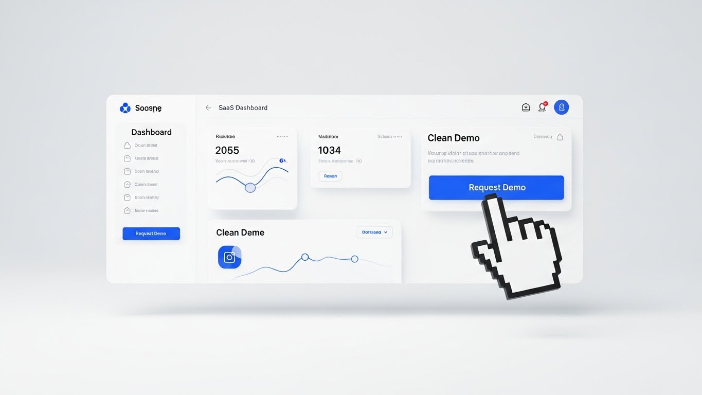
The final barrier to conversion is often the fear of a clunky interface. This style presents a pristine, high-key view of the SaaS dashboard in Light Mode. The interface is Clean White with Royal Blue call-to-action accents, floating in a bright studio space. A stylized 3D cursor hand hovers over a "Request Demo" button. The look is airy, frictionless, and inviting, creating a "Happy Path" narrative where every interaction is intuitive.
Psychological Impact & KPI Focus
This visualizes Usability. It targets "Click Anxiety"—the hesitation a user feels before committing to a form. By showing a simplified, beautiful interface with a clear, oversized cursor, it visually guides the user to the conversion point. It reinforces the User Experience (UX) quality, assuring the buyer that their team will actually enjoy using the tool, which is critical for adoption.
Strategic Implementation & Trade-offs
- Best Use Case: Landing Pages (High-Intent) and Retargeting Ads.
- Strategic Trade-off: It sanitizes the UI. Real-world dashboards are rarely this clean. While great for conversion, ensure the actual demo manages expectations regarding data density.
Companies using similar video content -
Coupa – Business Spend Management – Representing financial savings as assets.
Oracle SCM Cloud – Financials – Tangibly showing supply chain cost reduction.
15. Aspirational Stock Montage
BOFU | The Economic Buyer

The Visual & Narrative Approach
This style shifts focus from the software to the user of the software. A high-end shot features a diverse executive standing in a sun-drenched, glass-walled office, looking confidently at a tablet. The background is a blurred city skyline, implying "Global Reach." The lighting is natural and high-key. The narrative is one of Empowerment: "This software makes you the visionary leader you aspire to be."
Psychological Impact & KPI Focus
This appeals to the Ego and Identity of the decision-maker. Buyers don't just buy tools; they buy better versions of themselves. This visual validates their status as a "Modern Executive" who uses cutting-edge technology to command their commerce empire. It addresses the Strategic Control KPI, implying that the platform gives them the oversight needed to dominate the market.
Strategic Implementation & Trade-offs
- Best Use Case: LinkedIn Thought Leadership posts and Case Study headers.
- Strategic Trade-off: It can feel generic if the stock photography is not premium. It relies heavily on the quality of the model and the environment to carry the brand's authority.
Companies using similar video content -
Coupa – Business Spend Management – Representing financial savings as assets.
Oracle SCM Cloud – Financials – Tangibly showing supply chain cost reduction.
16. Dark Mode UI Showcase
BOFU | The Technical Buyer
The Visual & Narrative Approach
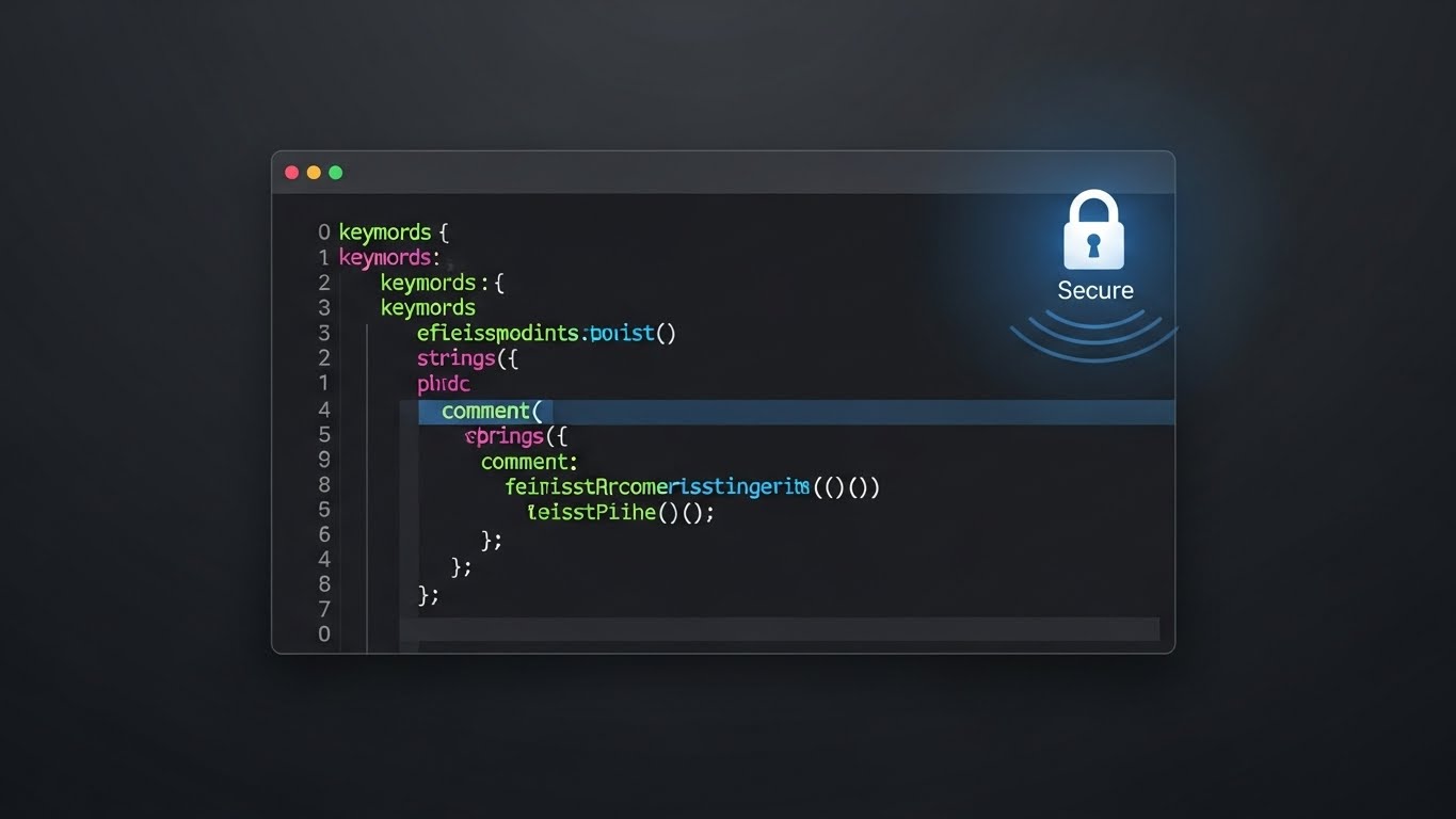
To win over the CTO and the dev team, we must speak their visual language: Code. This style features a sleek Dark Mode UI on a Matte Charcoal background. The center focus is a code editor window with syntax-highlighted text in Neon Green, Pink, and Cyan. A glowing "Secure" padlock icon sits in the corner. The narrative is "Built by Developers, for Developers."
Psychological Impact & KPI Focus
This targets Technical Trust. Developers are skeptical of "marketing fluff." They trust code. The Dark Mode aesthetic signals that this is a "Pro Tool," not just a business app. By highlighting clean syntax and security icons, it addresses the Integrability and Headless Architecture KPIs, assuring the technical team that the platform is robust, secure, and ready for API orchestration.
Strategic Implementation & Trade-offs
- Best Use Case: Developer Documentation (DevDocs), API pages, and Security portals.
- Strategic Trade-off: It alienates non-technical buyers. A CEO might find this intimidating or "too in the weeds." It must be segmented strictly for the technical audience.
Companies using similar video content -
Shopify Plus – B2B Commerce – Showcasing intuitive e-commerce dashboards.
NetSuite Commerce – SuiteCommerce – Presenting a clean, integrated business view.
17. Holographic UI over 3D Render
BOFU | Risk Mitigation

The Visual & Narrative Approach
Security is invisible until it fails. This style makes protection visible. A 3D render of a generic white credit card rests on a lab table, protected by a hovering, semi-transparent Holographic Blue shield made of digital hexagons. The shield emits a faint glow. The narrative is Defense: the software actively guards your financial transactions and customer data against invisible threats.
Psychological Impact & KPI Focus
This addresses the Fear of Breach. In e-commerce, fraud is a massive liability. This visual metaphor provides "Peace of Mind." It tangibly demonstrates the concept of a firewall or encryption layer, satisfying the PCI Compliance KPI. It tells the buyer, "We are the barrier between your revenue and the hackers."
Strategic Implementation & Trade-offs
- Best Use Case: Security compliance pages ("Trust Center") and Checkout feature descriptions.
- Strategic Trade-off: It is highly stylized "CSI-style" tech. It works for a high-level overview of security but shouldn't replace detailed compliance certifications (SOC2 badges) which are also needed.
Companies using similar video content -
Salesforce Commerce Cloud – B2B Edition – Empowering leaders with strategic oversight.
IBM – Supply Chain Intelligence – Positioning executives as visionary leaders.
18. Split Screen: Optimized Reality
BOFU | Overcoming Objections
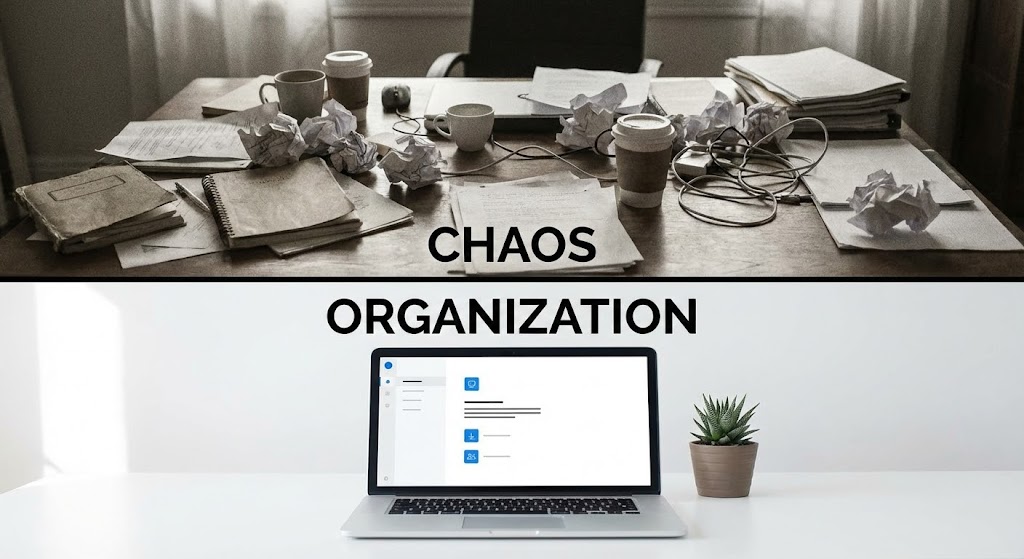
The Visual & Narrative Approach
The most powerful sales argument is "Before vs. After." This style uses a horizontal split-screen. The top half shows a desaturated, grainy photo of a cluttered desk labeled "CHAOS." The bottom half shows a sharp, bright photo of a clean minimalist setup with a laptop displaying a Crisp White UI, labeled "ORGANIZATION." The narrative is Transformation: from legacy data silos to centralized PIM (Product Information Management) clarity.
Psychological Impact & KPI Focus
This targets Pain Agitation. It forces the viewer to acknowledge the stress of their current situation (the clutter) before offering the relief of the solution. It validates the Operational Efficiency KPI by visually proving that the software eliminates mess—both physical and digital. It is a direct visual rebuttal to the objection, "Is it really worth the switch?"
Strategic Implementation & Trade-offs
- Best Use Case: Comparison Pages ("Us vs. Them") and Email Nurture Sequences.
- Strategic Trade-off: It is blunt. It lacks nuance. It is a hard-hitting sales tactic that works well for conversion but lacks the sophistication for brand building.
Companies using similar video content -
Strapi – Headless CMS – Highlighting developer-centric API interfaces.
Nautical Commerce – Headless Platform – Showcasing flexible, code-driven commerce.
19. Lifestyle Stock with UI Overlay
BOFU | Sales Cycle Acceleration

The Visual & Narrative Approach
Modern commerce is mobile. This style blends a high-quality lifestyle shot of a business person in a sunny cafe with floating, clean vector UI widgets in Vivid Orange and White. The widgets display "Sales Alerts" and "Global Team Active." The narrative is Freedom: the software allows you to run your e-commerce empire from a coffee shop, decoupling productivity from the office desk.
Psychological Impact & KPI Focus
This appeals to the desire for Work-Life Balance and Mobility. It suggests that the software is cloud-native and responsive. It addresses the Real-Time Analytics KPI, proving that critical data is available anytime, anywhere. This creates a sense of "always-on" control without the stress of being tied to a server room.
Strategic Implementation & Trade-offs
- Best Use Case: Email Footers and "Features" pages highlighting Mobile App capabilities.
- Strategic Trade-off: The UI elements must be legible. If the widgets are too small, the message is lost. It requires a careful balance between the background image and the data overlay.
Companies using similar video content -
Sana Commerce Cloud – ERP Integrated E-commerce – Visualizing secure transaction layers.
Adyen – Payments Platform – Illustrating advanced payment fraud protection.
20. Low-Poly 3D Modeling
Onboarding | Reducing Friction
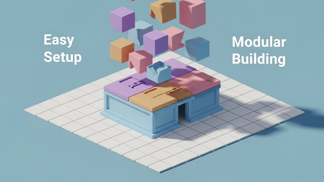
The Visual & Narrative Approach
The final hurdle is implementation time. This style utilizes a Low-Poly 3D scene in Pastel colors where a digital storefront self-assembles from falling geometric blocks on a White Grid floor. The blocks snap together perfectly. The narrative is Composable Commerce: the system is modular, pre-configured, and builds itself. It promises that "Setup is a snap," not a marathon.
Psychological Impact & KPI Focus
This targets Time-to-Value. Buyers fear months-long integration nightmares. This animation visually accelerates that timeline, suggesting a "Plug-and-Play" experience. It reduces Implementation Friction, making the "Day 1" experience look delightful rather than daunting.
Strategic Implementation & Trade-offs
- Best Use Case: "Getting Started" guides, Onboarding emails, and Setup Wizards.
- Strategic Trade-off: It simplifies the reality of backend integration. It is excellent for the concept of modularity but should be supported by technical docs that explain the actual API connections.
Companies using similar video content -
Akeneo – Product Information Management – Transforming chaotic data to organized PIM.
UnoPim – Open Source PIM – Demonstrating data cleanup and enrichment.
21. 2D Animation & UI Composition
Onboarding | Self-Serve Onboarding

The Visual & Narrative Approach
Onboarding is the most critical phase for retention. This style utilizes a friendly, instructional aesthetic to bridge the gap between "learning" and "doing." A stylized, flat vector character in Red and White interacts directly with a large, floating UI window. The character physically drags a "Payment" widget into a designated slot, visually demonstrating the "Drag-and-Drop" simplicity of the platform. The background is a clean, abstract workspace in Yellow, keeping the focus entirely on the action.
Psychological Impact & KPI Focus
This style leverages Observational Learning. By showing a character successfully performing a task, it triggers the "I can do that" response in the user, lowering the barrier to entry for complex configuration tasks. This directly impacts Time-to-Competency, ensuring that new users reach their "Aha!" moment without needing a scheduled call with a Customer Success Manager. It mitigates implementation anxiety by making the process look playful rather than technical.
Strategic Implementation & Trade-offs
- Best Use Case: In-App Tooltips, "Welcome" modal videos, and "Getting Started" wizards.
- Strategic Trade-off: The stylized character can feel "young" or casual. It is excellent for functional training and reducing friction but should not be used for high-level executive strategy updates where gravitas is required.
Companies using similar video content -
Pepperi – B2B Sales Platform – Enabling mobile sales and order management.
WooCommerce – B2B Plugin – Showing flexible, on-the-go e-commerce management.
22. 2D Character-Driven Story
Onboarding | Trial Activation

The Visual & Narrative Approach
Software adoption relies on emotional reinforcement. This style visualizes the emotional payoff of using the platform. Two vector characters in Blue and Yellow high-five in a modern office setting, surrounded by floating confetti. A laptop displays a green "Launch Successful" screen. The aesthetic is vibrant and celebratory. The narrative shifts focus from "configuring settings" to "celebrating results."
Psychological Impact & KPI Focus
This targets Dopamine & Reward. In the grueling process of setting up enterprise software, users need encouragement. Visualizing the moment of success creates positive reinforcement. It addresses the Activation Rate KPI, encouraging users to push through the final steps of setup to achieve the promised result. It humanizes the B2B experience, reminding the user that the software is a partner in their success.
Strategic Implementation & Trade-offs
- Best Use Case: "Congratulations" emails after key milestones (e.g., first product upload) or end-of-trial nudges.
- Strategic Trade-off: It is purely emotional and offers no technical value. It builds morale and brand affinity but doesn't teach the software. Use it as a "reward" visual, not an instructional one.
Companies using similar video content -
Spryker – Composable Commerce OS – Visualizing modular system assembly.
Odoo – ERP & E-commerce – Demonstrating easy, snap-together business apps.
23. Macro UI Micro-Interactions
Retention | Reducing Support

The Visual & Narrative Approach
When users get stuck, they panic. This style offers a microscopic view of the solution. An extreme close-up focuses on a UI button labeled "HELP" or a chat widget. The button is pristine White with soft grey text. A finger (or cursor) presses it, triggering a subtle, reassuring Blue glow. The texture of the screen pixels is faintly visible, grounding the digital action in reality.
Psychological Impact & KPI Focus
This visualizes Accessibility. It subconsciously trains the user on where to go when they have a problem, reducing the instinct to send an angry email to their account rep. It targets Ticket Deflection and Net Promoter Score (NPS) by positioning the help function as an integrated, immediate part of the experience. It creates a sensory promise that support is tangible and responsive.
Strategic Implementation & Trade-offs
- Best Use Case: FAQ Video headers, "Help Center" loading screens, or Chatbot intros.
- Strategic Trade-off: It is very specific. It only works to highlight specific micro-interactions. It acts as a visual anchor for support availability but cannot explain complex workflows on its own.
Companies using similar video content -
OpenCart – B2B E-commerce – Guiding users through setup with animated tutorials.
Frappe – ERPNext – Simplifying complex ERP workflows with visual steps.
24. Minimalist Flat 2D Vector
Retention | Reducing Churn

The Visual & Narrative Approach
In volatile markets, reliability is the ultimate retention tool. This style uses a stark, minimalist visual metaphor: a heavy Navy Blue anchor sitting securely on a Pure White background, connected upwards by a gold chain. It eschews all noise to focus on a single concept: "We are your bedrock." The use of negative space suggests clarity and lack of clutter.
Psychological Impact & KPI Focus
This appeals to the Risk Averse mindset of the long-term customer. It reminds them that while other tools might be "flashy," this platform is "foundational." It addresses Churn Mitigation by reinforcing the perceived switching costs and the safety of staying put. It positions the software not as a utility, but as infrastructure that secures the business against market storms.
Strategic Implementation & Trade-offs
- Best Use Case: Renewal emails, "Year in Review" performance reports, and Uptime guarantee pages.
- Strategic Trade-off: It is static and symbolic. It reinforces existing trust but rarely generates new excitement. It is a "maintenance" visual best paired with reliability statistics.
Companies using similar video content -
nopCommerce – Open Source E-commerce – Celebrating successful store launches.
X-Cart – B2B E-commerce – Humanizing the achievement of going live.
25. 2D Graphics Over Live Action
Retention | Knowledge Base

The Visual & Narrative Approach
Text-based support articles are dry and impersonal. This style blends the warmth of a human face with the clarity of graphics. A live-action support agent smiles at the camera in a bright office. Floating around them are clean, white 2D speech bubbles containing icons: a Lightbulb (Idea), a Gear (Settings), and a Checkmark (Solution). This hybrid style bridges the gap between "Human Empathy" and "Technical Precision."
Psychological Impact & KPI Focus
This builds Relational Capital. Users prefer learning from people, not bots. By putting a face to the knowledge base, you increase engagement with help content. This directly impacts Customer Satisfaction (CSAT) and Self-Serve Resolution Rates. It tells the user, "Real people are here to help you succeed," reducing the isolation of remote troubleshooting.
Strategic Implementation & Trade-offs
- Best Use Case: YouTube "How-To" playlists, Academy course intros, and personalized support responses.
- Strategic Trade-off: Production logistics are higher. You need a consistent actor or presenter. If they leave the company, the video library may feel dated.
Companies using similar video content -
BigCommerce – Support Center – Highlighting in-app help and chat features.
Shopify Plus – Admin Panel – Emphasizing accessible support within the UI.
26. Futuristic Neon/Dark Mode
Retention | Proactive Support
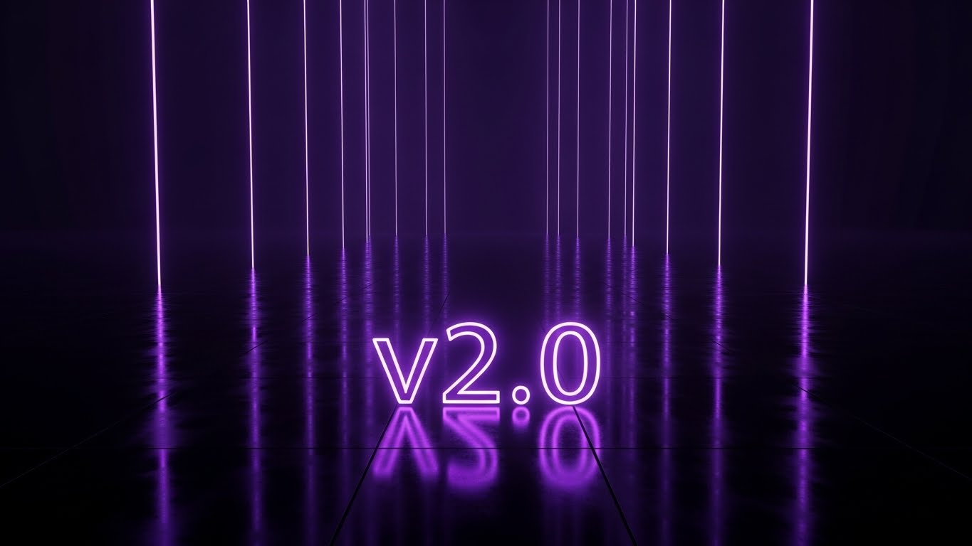
The Visual & Narrative Approach
Software updates often feel like a chore. This style reframes them as an "Event." A sleek, dark environment features a reflective floor mirroring glowing Neon Purple text that reads "v2.0". Beams of vertical light shoot upwards into the void. The aesthetic borrows from consumer tech (like phone launches) to create hype around B2B patch notes.
Psychological Impact & KPI Focus
This targets Feature Adoption. It combats "Version Fatigue" by making the update look cutting-edge and desirable. It signals that the platform is constantly evolving, increasing the perceived value of the subscription. It validates the recurring cost by showing that the product is getting better, not stagnating, and creates a sense of "Future-Proofing."
Strategic Implementation & Trade-offs
- Best Use Case: Product Update Emails, "What's New" in-app splash screens, and Release Webinars.
- Strategic Trade-off: It relies on hype. If the update is minor (bug fixes), this dramatic style can feel like over-promising. Save it for major feature drops to maintain credibility.
Companies using similar video content -
Descartes Systems Group – Logistics Solutions – Representing reliable global logistics.
Blue Yonder – Luminate Platform – Signifying stable supply chain operations.
27. 3D Parallax UI Presentation
Expansion | Upsell/Cross-sell
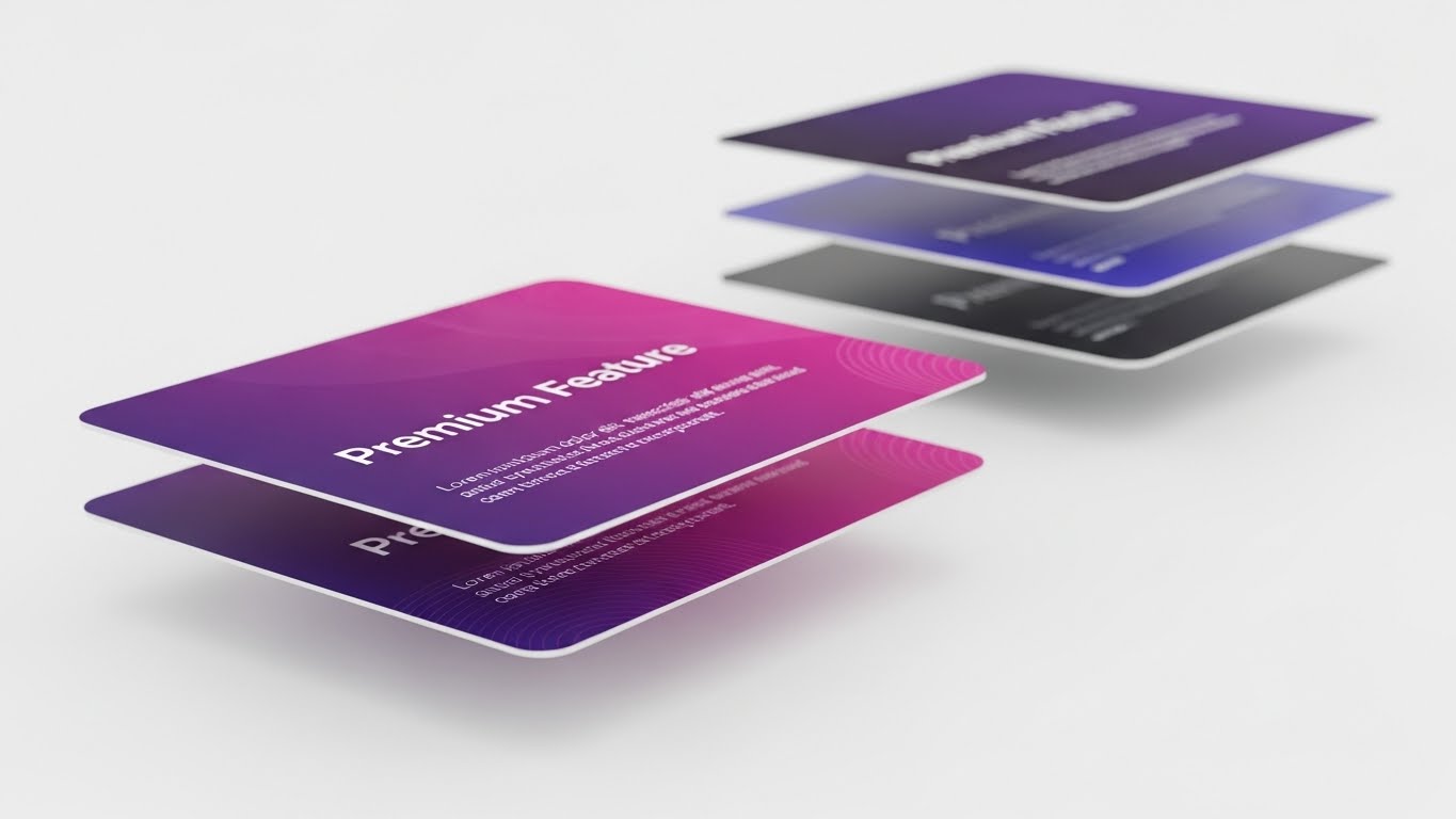
The Visual & Narrative Approach
To upsell, you must show the customer what they are missing. This style uses depth to represent "Next Level" access. Three layers of UI screens float in a white void. The background layers are blurred (depth of field), representing the current plan. The front layer is razor-sharp, showcasing a "Premium Feature" card in Deep Purple and Pink. The parallax movement emphasizes that this feature is within reach but distinct from the standard tier.
Psychological Impact & KPI Focus
This utilizes the FOMO (Fear Of Missing Out) psychology but in a professional context. It visually separates the "Basic" from the "Pro." It targets Net Dollar Retention (NDR) and Average Revenue Per User (ARPU). It visually argues that the upgrade is not just "more of the same," but a distinct, elevated layer of functionality that provides clarity and focus.
Strategic Implementation & Trade-offs
- Best Use Case: In-App "Locked Feature" modals, Upgrade Landing Pages, and Plan Comparison sections.
- Strategic Trade-off: It highlights limitations. Be careful not to make the current user feel like their existing plan is inadequate, but rather that the new plan offers additional power.
Companies using similar video content -
SAP – Support Portal – Blending human experts with clear instructional graphics.
Oracle – Cloud Support – Providing approachable guidance for complex systems.
28. Abstract 3D AI Visualization
Expansion | Driving Referrals

The Visual & Narrative Approach
Referrals are about networks. This style visualizes the power of connection. Silver and Chrome spheres hang in a white void, connected by thin, glowing Electric Blue filaments. The structure resembles a molecule or a constellation. It represents the "Ecosystem" or "Community" of users. The aesthetic is clean, high-tech, and interconnected.
Psychological Impact & KPI Focus
This appeals to the user's desire for Status and Belonging. It frames the act of referring not as a sales tactic, but as inviting peers into an elite, interconnected high-tech network. It targets the Viral Coefficient. The premium chrome finish implies that recommending this software reflects positively on the referrer's own taste and professional standing.
Strategic Implementation & Trade-offs
- Best Use Case: Referral Program pages, "Invite a Colleague" screens, and Partner Certification badges.
- Strategic Trade-off: It is highly abstract. It sets a tone of "Growth" but doesn't explain the referral reward mechanism (e.g., "$50 credit"). Text overlays are needed for the offer details.
Companies using similar video content -
VTEX – Commerce Platform – Announcing cutting-edge platform updates.
commercetools – API Updates – Generating hype for new developer features.
29. Hyper-lapse Stock Footage
Expansion | Feature Adoption
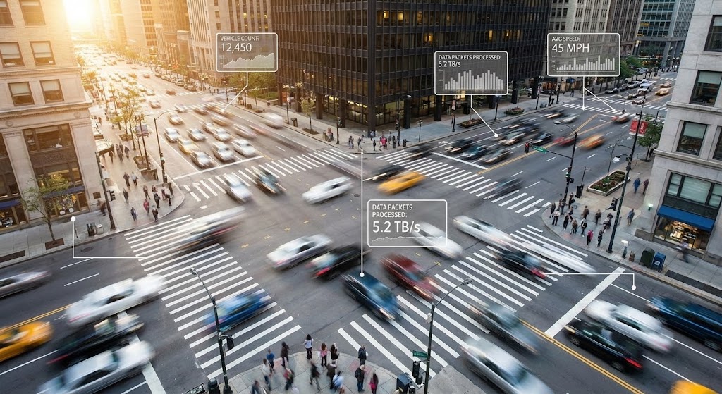
The Visual & Narrative Approach
To sell advanced features (like high-volume API limits), we return to the real world. A hyper-lapse video shows a busy city intersection. Cars and people move in fast-motion blurs. Overlaid on this chaotic reality are static, clean White data boxes tracking the movement (e.g., "Vehicle Count: 12,450"). This contrasts the chaos of reality with the order of the software.
Psychological Impact & KPI Focus
This visualizes Scale and Control. It proves that the software can handle "Real World" volume without blinking. It targets Usage Expansion—encouraging clients to pump more data through the system. It reassures the Operations Director that the system is robust enough to handle their peak season traffic, directly validating the need for Enterprise-tier throughput.
Strategic Implementation & Trade-offs
- Best Use Case: Performance Reporting videos, Case Studies for Enterprise clients, and "Scale" feature ads.
- Strategic Trade-off: Requires high-quality stock footage. Low-res or shaky footage destroys the "Enterprise" feel. The motion tracking must be precise to look integrated.
Companies using similar video content -
Shopify Plus – Enterprise Features – Showcasing advanced capabilities for growth.
BigCommerce – Pro/Enterprise Plans – Highlighting tiered feature sets.
30. Generative AI Realistic Character
Expansion | Thought Leadership

The Visual & Narrative Approach
The final stage of expansion is brand evangelism. This style utilizes a high-fidelity, photorealistic AI portrait of a female tech visionary. She has realistic skin texture, subtle expressions, and is lit by soft, flattering studio lighting against a blurred white background. She looks directly at the lens. This is the "Face of the Future."
Psychological Impact & KPI Focus
This builds Brand Authority. It moves beyond the software to the philosophy behind it. It targets Share of Voice and Market Influence. By presenting a confident, human (yet AI-perfected) face, it associates the brand with wisdom, foresight, and leadership. It prepares the market for the next big product shift, establishing the vendor as a strategic partner rather than just a tool provider.
Strategic Implementation & Trade-offs
- Best Use Case: YouTube Thought Leadership series, Keynote intros, and Vision Statements.
- Strategic Trade-off: The "Uncanny Valley." AI characters must be generated with the highest quality tools to avoid looking robotic. Authenticity is key here, even if the image is synthetic.
Strategic Knowledge Base: The Visual Operations Doctrine
We have analyzed 30 distinct visual styles, ranging from the granular precision of minimalist vectors to the aspirational scale of cinematic AI. However, style without strategy is merely decoration. To transform these assets from "content" into an engine of commerce, we must apply a cohesive operational framework.
The following three segments synthesize the insights from all 30 styles into the "Visual Operations Doctrine"—an actionable blueprint for E-commerce Software leaders to drive efficiency, adoption, and revenue through visualization.
Strategic Alignment & Visual Architecture
The "Pre-Production" Strategy. Defining the Visual Operating System.
Before a single pixel is rendered, the "Architects of Scale" must align the visual strategy with business reality. In the fragmented world of e-commerce—where data flows between warehouse floors, merchant dashboards, and executive boardrooms—inconsistency is a risk vector.
- The Cognitive Load Audit: Do not just "make a video." Audit the complexity of the task you are explaining. If the user task is "High Load" (e.g., API Mapping), use "Low Load" visuals (Style 1: Minimalist Vector). If the task is mundane (e.g., Daily Reporting), use "High Engagement" visuals (Style 29: Hyper-lapse) to maintain attention.
- Role-Based Visual Mapping: Differentiate your visual language based on the user persona. "Drivers" on mobile devices need high-contrast, large-element visuals (Style 19). "Fleet Managers" on desktops need density and detail (Style 1). One style does not fit all.
- The "Glanceability" Standard: In logistics and operations, time is currency. Visuals must pass the "Glance Test." Can the viewer understand the status (Success/Error) in under 1.5 seconds? Prioritize high-contrast alerts and clear micro-interactions (Style 23) for these operational touchpoints.
- Brand Voice Consistency: Whether it's a Fun Character (Style 22) for onboarding or a Serious Cinematic Video (Style 5) for the C-Suite, the color palette and font hierarchy must remain rigid to build subconscious brand recognition.
- The Advids Strategic Audit: Internal teams often suffer from "product blindness"—they know the features too well. Partnering with Advids early in this phase allows for an objective audit of your current assets, ensuring you define a unified "Visual Operating System" that scales consistently from your API docs to your Super Bowl ad.
- Standardization vs. Customization: Use standardized "Stock + Overlay" styles (Style 29) for general market education to keep costs low. Reserve bespoke 3D (Style 7, 11) for your core proprietary technology—the "Black Box" that justifies your premium pricing.
- The Cross-Departmental Bridge: Use visuals to unify terminology. If Sales calls it "The Engine" and Support calls it "The Core," you have a problem. Create a definitive 3D X-Ray (Style 7) visual that labels the component, forcing all departments to use the same visual reference.
- Legacy System Integration: Many clients operate hybrid models. Use Wireframe to Reality (Style 9) visuals to show how your modern SaaS interface wraps around their legacy on-premise hardware, respecting their past investments while selling the future.
- Accessibility in Logistics: Your end-users (drivers, warehouse staff) may be multilingual. Rely heavily on Visual Metaphor (Style 24) and Character Action (Style 21) rather than text-heavy motion graphics. Visuals are a universal language.
- The Mobile-First Mandate: 60% of logistics operations happen on tablets or phones. Ensure detailed styles like Data Viz (Style 10) are simplified for small screens. If the data isn't legible on a 6-inch screen, it doesn't exist for the driver.
Operational Adoption & Implementation
The "Deployment" Phase. Embedding Visuals into the Workflow.
A video that sits unwatched in a YouTube channel is wasted capital. The operational goal is to embed these 30 styles directly into the user's workflow—delivering the right visual stimulus at the exact moment of friction.
- Overcoming "Big Brother" Anxiety: Driver monitoring tools face resistance. Use Empathy-Driven Visuals (Style 25) to frame these tools as "Safety Partners" rather than "Surveillance." Show the driver benefiting from the system, not just the manager watching them.
- The Micro-Learning Shift: Kill the hour-long webinar. Break training into 30-second "Micro-Visuals" using UI Montage (Style 8) or 2D Animation (Style 21). Embed these directly into the software's "Help" tooltips for Just-in-Time learning.
- Just-in-Time Support: Embed Macro UI (Style 23) GIFs directly into error messages. If a payment fails, show the visual of the fix inside the error modal. Don't make the user leave the app to search for a solution.
- Gamification of Training: Use Character Story (Style 22) visuals to celebrate training milestones. Visualizing progress bars and "Level Up" animations increases engagement with boring compliance modules.
- Reducing Support Ticket Volume: There is a direct correlation between proactive visualization and reduced support costs. Deploy Minimalist Diagnostics (Style 1) videos in your chatbot flow to deflect Level 1 queries regarding "System Status."
- Remote Onboarding: For distributed fleets, physical seminars are impossible. Use Low-Poly 3D (Style 20) to simulate the physical setup of hardware devices remotely, allowing drivers to self-onboard from their cabs.
- Visualizing SOPs: Transform text-based Standard Operating Procedures into Isometric 3D Workflows (Style 11). A visual map of "Order to Cash" is instantly referenced, whereas a text document is ignored.
- Feedback Loops: Use interactive video elements. At the end of a Feature Montage (Style 8), ask "Did this help?" The data gathered here allows you to refine the visual strategy iteratively.
- Scalable Localization: Logistics is global. A text-heavy video is a translation nightmare. Prioritize Abstract Motion (Style 3) and 3D Visualization (Style 10) which rely on symbols and numbers, requiring no voiceover translation.
- Leadership Communication: When rolling out strategic shifts, the CTO should not send a text email. Use High-End Realistic Character (Style 30) or Cinematic AI (Style 5) to visually demonstrate the "Future Vision," securing buy-in from internal stakeholders.
Measuring Impact & Future-Proofing
The "ROI" Phase. Quantifying Success and Scaling.
Ultimately, every pixel must justify its existence on the P&L sheet. We move beyond "View Counts" to measure the metrics that actually matter to a SaaS growth engine.
- Beyond "Views" – The Real KPIs: Vanity metrics are dead. Measure Time-to-Competency (how fast a user performs a task after watching Style 21) and Feature Adoption Rate (clicks on a feature after watching Style 18).
- The "Idle Time" Metric: In B2B, confusion causes idle time. If a user spends 5 minutes figuring out a dashboard, that is lost productivity. We measure the effectiveness of our UI Workflow (Style 14) videos by correlating them with reduced "Time-on-Task" within the app.
- Compliance Velocity: When regulations change (e.g., new tax laws or ELD mandates), how fast can you retrain the user base? Video (Style 6, Style 8) is the fastest vector for mass knowledge transfer.
- Retention and LTV: High-quality UX visualization reduces frustration. Monitor the churn rate of cohorts exposed to Onboarding Visuals (Styles 21-22) versus those who were not. The LTV delta is your ROI.
- The AI Visual Frontier: Prepare for real-time video generation. Soon, support videos will be generated on the fly, customized to the user's specific data. Start building a structured asset library now to feed these future AI models.
- Scalability of Assets: Build a "Visual Component Library." Don't render a full video; render the "Truck," the "Warehouse," and the "UI" as separate layers. This allows rapid reassembly into new assets as your product updates.
- The Advids Partnership: Scale requires a partner. Advids acts as the custodian of your Visual Operating System, ensuring that as you scale from 10 to 100 videos, the quality and strategic alignment remain unbreakable, preventing asset decay.
- Benchmarking Success: "Good enough" is a competitive risk. If your competitor uses 3D X-Ray (Style 7) to explain their tech and you use a screenshot, you lose the "Quality War." Constantly benchmark your visual fidelity against the market leaders.
- The ROI of Safety: For logistics, safety is a bottom-line metric. Quantify the reduction in accidents or insurance claims following the rollout of visual safety training modules using Simulation Styles (Style 20).
- Final Call to Innovation: Treat video as infrastructure, not content. In a $20 trillion market, the platform that is easiest to understand is the platform that wins. By investing in a strategic, diverse, and high-fidelity visual language, you are not just marketing your software; you are accelerating the entire engine of global commerce.
The Blueprint is now yours. Build visibility. Build trust. Build scale.
Companies using similar video content -
DJUST – B2B Marketplace Platform – Visualizing interconnected buyer-seller networks.
Globy – Wholesale Marketplace – Representing a global community of traders.
Author & Editor Bio


