
Introduction: Visualizing the "Invisible" Bridge in Modern Dermatology
The dermatology sector is undergoing a profound structural shift, moving rapidly from purely physical consultations to a sophisticated hybrid model where digital efficiency is paramount. For SaaS platforms and e-prescribing solutions, the challenge is no longer just about functionality—it is about articulating how software bridges the tactile reality of skin care with the precision of digital data. As the industry evolves, the ability to visualize this "Physical-Digital Bridge" has become a critical Go-To-Market lever.
The opportunity for platform adoption is unprecedented. Recent market data indicates that the tele-dermatology prescription market size is poised for explosive expansion, projected to grow at a CAGR of 22.4% through 2025. This surge reflects a fundamental change in how clinicians diagnose and prescribe, demanding tools that can handle high-resolution imaging, seamless e-prescribing (eRx), and complex prior authorization workflows without friction.
However, the complexity of these digital ecosystems often creates a barrier to adoption. Dermatologists, accustomed to visual assessment, are often skeptical of software that feels abstract or cumbersome. The solution lies in high-impact video visualization that reduces cognitive load and demonstrates immediate value. The impact is measurable: studies show that primary adherence rates are 16% higher adherence among patients receiving electronic prescriptions compared to traditional paper methods.
This guide provides a curated analysis of high-performance visual styles designed to articulate value, build trust, and drive adoption in the e-prescribing and dermatology SaaS landscape.
1. The Biological-Digital Interface
TOFU | Brand Awareness

**(Abstract 2D flat vector organic): Biomorphic Cell Morphing + Simplifying Data Chaos**
The Visual & Narrative Approach
This style utilizes a sophisticated "biomorphic" aesthetic where abstract shapes resembling organic skin cells in Living Coral and Soft Beige seamlessly morph into structured digital nodes. The animation begins with fluid, soft-edged cellular forms that gradually sharpen and align into a geometric grid, colored in Bio-Luminescent Teal. The background remains a clean, creamy Off-White. Glossy highlights and fluid gradients suggest a biological transformation into digital efficiency.
Psychological Impact & KPI Focus
- Niche Psychology: Dermatologists think in terms of tissue and texture. Purely "tech" visuals can feel alien. This style bridges that gap by starting with the familiar organic form and guiding the viewer to the digital solution, reducing the psychological resistance to "replacing" tactile care with software.
- Operational Impact: It visually metaphors the "Interoperability" of the platform—showing how messy biological inputs are organized into efficient digital outputs without data loss.
Strategic Implementation & Trade-offs
- Best Use Case: TOFU Social Media (Instagram/LinkedIn) to build Brand Awareness. It disrupts the feed without requiring audio.
- Duration: 6-10 seconds (Looping).
- Trade-off: This style is excellent for sentiment and branding but suboptimal for explaining complex features. It creates a feeling, not a tutorial.
Companies using similar video content -
Health Gorilla – Health Gorilla Platform – Organizes messy health data into structured insights.
Redox Engine – Redox Platform – Transforms disparate healthcare data into interoperable formats.
2. Visualizing Cloud Migration
TOFU | Category Creation

**(2D Line Art Animation): Gold Contour Cloud + Elevating Precision Logistics**
The Visual & Narrative Approach
A sophisticated 2D line art animation still, utilizing continuous, elegant thin lines in Metallic Gold on a Cream background. The lines form the abstract outline of a prescription bottle that evolves into a cloud shape, symbolizing the shift to cloud-based e-prescribing. The movement is mathematically precise with no fill, conveying architectural precision and high-end engineering.
Psychological Impact & KPI Focus
- Niche Psychology: The "Gold" line suggests a premium, "Gold Standard" of care. The continuous line implies an unbroken workflow, addressing the physician's anxiety about data fragmentation or lost prescriptions during cloud migration.
- Operational Impact: It simplifies the complex concept of SaaS migration into a single, graceful transition, lowering the perceived effort of switching platforms.
Strategic Implementation & Trade-offs
- Best Use Case: Website Header or Hero Section. It establishes immediate sophistication and modernity.
- Duration: 10-15 seconds.
- Trade-off: The minimalist nature means it cannot display UI density. It is a strategic concept piece, not a product demo.
Companies using similar video content -
athenahealth – athenaClinicals – Guides practices to seamless cloud-based EHR operations.
AdvancedMD – AdvancedMD EHR – Elevates practice management to a secure cloud environment.
4. Accelerating Urgency
TOFU | Shaping Brand Perception

**(Bold Kinetic Typography): High-Speed Geometric + Accelerating Urgency Perception**
The Visual & Narrative Approach
A visual representation of bold kinetic typography using heavy, blocky geometric shapes to represent text without actual letters. The shapes are colored in high-contrast Fire Engine Red and Absolute White, angled dynamically to suggest rapid forward motion and urgency. Speed lines and motion blur effects in Jet Black add to the high-energy atmosphere, mimicking the rush of a "Stat" order.
Psychological Impact & KPI Focus
- Niche Psychology: It taps into the practitioner's desire for speed. The visual aggression matches the frustration of administrative bottlenecks, offering the platform as the "accelerator" that breaks through red tape.
- Operational Impact: It visually represents "Velocity"—the speed of ePA approvals or prescription processing—making the intangible benefit of "time saved" visceral.
Strategic Implementation & Trade-offs
- Best Use Case: LinkedIn Ad (Demand Gen). It is designed to stop the scroll and create immediate cognitive arousal.
- Duration: 6-10 seconds.
- Trade-off: High energy can be exhausting. Use sparingly for "Problem/Solution" hooks, not for long-form education.
Companies using similar video content -
Phreesia – Phreesia Platform – Speeds up patient intake and administrative tasks.
Luma Health – Luma Health Platform – Accelerates patient communication and scheduling efficiency.
5. The Touch of Trust
TOFU | Demand Gen

**(Macro UI Micro-Interactions): Fingerprint Approval Glow + Tangible Decision Confirmation**
The Visual & Narrative Approach
An extreme macro close-up of a UI "Approve" button on a glass touchscreen. The button is a gradient of Oceanic Teal to Emerald Green, glowing softly against a Brushed Silver metallic background. A stylized fingerprint ridge pattern in translucent white is visible on the point of contact, emphasizing touch capability and biometric security.
Psychological Impact & KPI Focus
- Niche Psychology: Security (EPCS) is a major anxiety. Seeing the biometric fingerprint visually reassures the doctor that the system is secure and compliant, yet effortless to use.
- Operational Impact: It highlights "Ease of Use" and "Mobile Compliance," demonstrating that complex security protocols are handled with a simple, elegant interaction.
Strategic Implementation & Trade-offs
- Best Use Case: TikTok or Vertical Social Shorts. It focuses on a single, satisfying moment of user interaction.
- Duration: 5-8 seconds.
- Trade-off: Extremely narrow focus. It sells the feeling of the interface, not the breadth of the workflow.
Companies using similar video content -
DrFirst – EPCS Gold – Ensures secure, compliant electronic prescribing with biometric ease.
RxNT – *RxNT
6. Operationalizing Logistics
TOFU | Vertical Social Organic
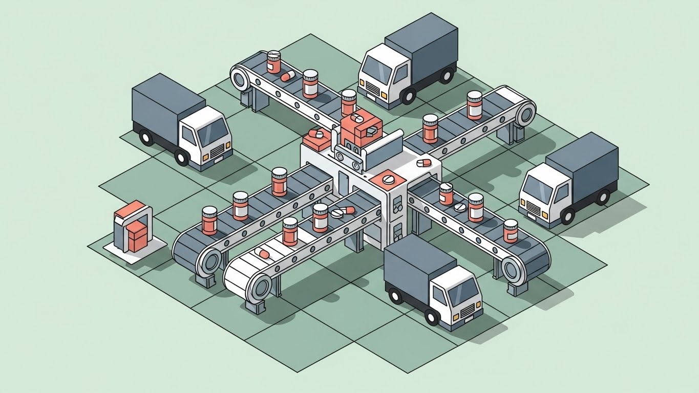
**(Isometric 2D Motion Design): Pastel Logistics Grid + Unburdening Supply Chains**
The Visual & Narrative Approach
A flat isometric 2D design set on a pale Mint Green grid. A stylized digital pharmacy dispatch center is depicted with miniature trucks and conveyor belts moving pill bottles. The color palette uses Pastel Coral, Slate Grey, and White. Clean, hard shadows and a vector style convey organized logistics and "God-Mode" oversight of the supply chain.
Psychological Impact & KPI Focus
- Niche Psychology: Logistics are a headache for practices. This "God's Eye View" gives the practitioner a sense of control and oversight, reassuring them that the external logistics are handled systematically.
- Operational Impact: It visualizes the "Supply Chain" integration, showing how the software connects the practice to the broader pharmacy network seamlessly.
Strategic Implementation & Trade-offs
- Best Use Case: YouTube Pre-Roll Ad (Skippable). It quickly explains the ecosystem value proposition.
- Duration: 15-30 seconds.
- Trade-off: Can feel "cartoony" if not executed with sharp, professional vector lines. It simplifies complexity, which is good for overviews but bad for technical detail.
Companies using similar video content -
Surescripts – Surescripts Network – Streamlines prescription routing and pharmacy logistics.
Waystar – Waystar Platform – Optimizes revenue cycle management and claims processing.
7. The Efficiency Contrast
TOFU | Skippable Pre-Roll Ad

**(Split Screen: Optimized Reality): Chaos vs. Clarity + Visualizing Operational ROI**
The Visual & Narrative Approach
A split-screen composition. On the left, a desaturated, grainy photo of a cluttered desk with stacks of paper files (Greyscale). On the right, a vibrant, high-resolution vector graphic of a clean, cloud-based dashboard in shades of Sky Blue and Bright White. The dividing line is a sharp diagonal slash in Vivid Yellow, creating a stark visual boundary between the "old way" and the "new way."
Psychological Impact & KPI Focus
- Niche Psychology: It validates the pain point of "Chart Fatigue" and administrative burnout. The contrast creates an immediate desire to move from the stressful left side to the calm right side.
- Operational Impact: It acts as a direct "differentiation" tool, visually quantifying the ROI of digitization by contrasting chaos with structured analytics.
Strategic Implementation & Trade-offs
- Best Use Case: Landing Page Hero. It instantly communicates the value proposition without reading copy.
- Duration: Static or subtle motion (10 seconds).
- Trade-off: It is a comparative tactic. It focuses on "moving away from pain" rather than "moving toward innovation," which is powerful but reactive.
Companies using similar video content -
Modernizing Medicine – EMA – Transforms chaotic paper charts into clear digital workflows.
Nextech – Dermatology EHR – Contrasts old systems with modern, efficient practice management.
8. Simplifying Clinical Workflows
MOFU | Differentiation
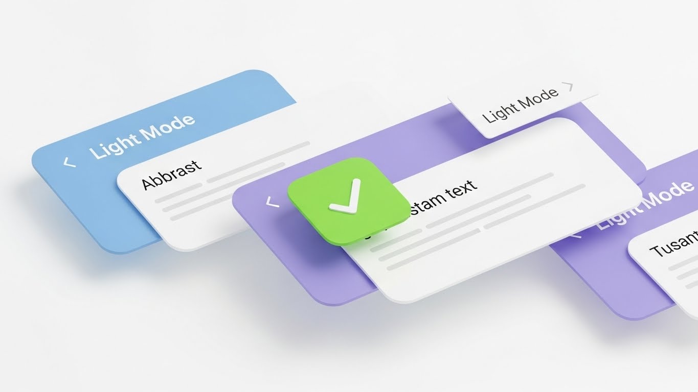
**(Clean UI Workflow): Minimalist Success Cards + Reducing Cognitive Friction**
The Visual & Narrative Approach
A clean, light-mode UI mockup on a Pure White background. The interface design is minimal, utilizing soft rounded rectangles in Powder Blue and Lavender. Abstract grey lines represent text. A bright Lime Green "Checkmark" icon is the focal point, signifying task completion. Soft, diffuse shadows create a sense of depth and cleanliness, removing all visual clutter.
Psychological Impact & KPI Focus
- Niche Psychology: The "Checkmark" triggers a dopamine hit associated with task completion. The clean, light aesthetic mirrors a sterile, hygienic clinical environment, reinforcing professionalism.
- Operational Impact: It serves as "Feature Education," showing exactly what the interface looks like and how it reduces screen clutter (Cognitive Load).
Strategic Implementation & Trade-offs
- Best Use Case: Email Marketing (GIF embedded). It is clean, low-bandwidth, and communicates a "Job to be Done" instantly.
- Duration: 3-5 seconds (Looping).
- Trade-off: It can feel generic if the UI design isn't distinctive. It relies entirely on the quality of the interface design.
Companies using similar video content -
Practice Fusion – Practice Fusion EHR – Offers minimalist UI for quick task completion.
Doxy.me – Doxy.me Telehealth – Provides a clean interface for simple, secure virtual visits.
9. The Tangible Digital Workspace
MOFU | Feature Education
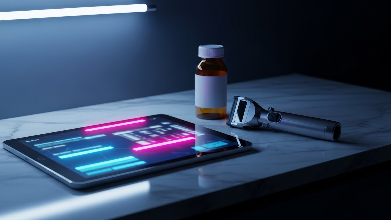
**(Photorealistic 3D Renders): Marble Desktop Context + Anchoring Digital Trust**
The Visual & Narrative Approach
A photorealistic 3D render of a pristine medical workspace. A polished Marble countertop features a high-end tablet displaying a blurred medical interface, sitting next to a generic Amber prescription bottle and a dermatoscope. The lighting is soft, natural daylight streaming from the left, creating realistic caustic reflections on the glass surfaces. This grounds the software in the high-end reality of a successful practice.
Psychological Impact & KPI Focus
- Niche Psychology: It builds "Trust." By placing the software in a realistic, high-end environment, it elevates the perceived value of the product. It suggests that this software belongs in a top-tier practice.
- Operational Impact: It contextualizes the software as a "Point of Care" tool, not just a back-office admin system.
Strategic Implementation & Trade-offs
- Best Use Case: Website "About Us" or "Product Overview" section.
- Duration: Static or slow camera pan (10-15 seconds).
- Trade-off: Expensive to produce. It sets a high expectation for the product's actual aesthetic polish.
Companies using similar video content -
DermLite – DermLite DL4 – Integrates dermoscopy with digital imaging in clinical settings.
Canfield Scientific – Vectra 3D Imaging – Grounds advanced imaging in a realistic medical environment.
11. The Velocity of Care**
MOFU | Competitive Displacement
The Visual & Narrative Approach
This style abandons the slow, deliberate pacing of educational content for a high-energy "Rapid UI Feature Montage." Multiple abstract UI screens are arranged in a dynamic, cascading "card deck" formation, rushing from left to right to symbolize forward momentum. The data charts on the screens are simplified into bold Bright Magenta and Cyan graphics against a Clean White background, ensuring high legibility even in motion. Silver motion blur streaks accentuate the feeling of speed, suggesting a platform that outpaces legacy systems.
Psychological Impact & KPI Focus
- Niche Psychology: In a high-volume dermatology practice, "slowness" is the enemy. This visual style directly attacks the pain point of "laggy" legacy EHRs/EMRs. It visually equates the software with speed, triggering a desire for a snappier, more responsive workflow.
- Operational Impact: It visually demonstrates "Workflow Velocity" and "Throughput." The rapid succession of screens implies that the user can process prescriptions, authorizations, and chart notes faster, directly impacting patient volume and revenue.
Strategic Implementation & Trade-offs
- Best Use Case: Display Ads (Google/LinkedIn) targeting users of competitor platforms. The motion grabs attention peripherally.
- Duration: 6-10 seconds (Looping).
- Trade-off: The speed makes it impossible to read specific data points. It conveys the feeling of efficiency, not the details of the features.
Companies using similar video content -
Modernizing Medicine – EMA – Showcases rapid navigation through patient charts and notes.
Nextech – Dermatology EHR – Visualizes swift processing of clinical documentation.
12. Humanizing the Metric
MOFU | Driving Demo Requests

The Visual & Narrative Approach
A balanced composition blending high-quality lifestyle photography with digital augmentation. A female dermatologist is shown in a sunlit, modern clinic, smiling warmly while holding a tablet. Floating in the air around her are semi-transparent, augmented reality (AR) style widgets in glowing Orange and Blue. These widgets display positive metrics: "Patient Satisfaction Score: 96%," "Positive Feedback: 98%," and "Appointment Availability: 5.0/5." The visual blends the warmth of human care with the precision of data analytics.
Psychological Impact & KPI Focus
- Niche Psychology: Many practitioners fear that technology erects a wall between them and their patients. This style reverses that narrative, showing the doctor empowered by the data, not obscured by it. It builds an emotional connection that pure screenshots cannot, positioning the software as a partner in clinical wellness.
- Operational Impact: It highlights "Patient Experience" (PX) metrics. By visualizing intangible feedback as concrete data floating in the room, it links the software directly to practice reputation and patient retention.
Strategic Implementation & Trade-offs
- Best Use Case: Social Media Feeds (Instagram/Facebook) or Case Study Headers. It serves as social proof.
- Duration: Static or Micro-motion (floating hover effect).
- Trade-off: It relies heavily on the quality of the stock model. If the photo feels staged or generic, the "authenticity" factor collapses.
Companies using similar video content -
eClinicalWorks – eClinicalWorks EHR – Demonstrates fast, responsive clinical workflow processing.
Greenway Health – Intergy EHR – Highlights quick data entry and retrieval for efficiency.
13. The Networked Ecosystem
MOFU | LinkedIn Organic

The Visual & Narrative Approach
A clean, abstract visualization of a healthcare network. A central hub, representing the clinic, is glowing in Electric Blue and is connected by thin, pulsating lines of light in Gold to surrounding nodes representing pharmacies, labs, and insurance payers. The background is a sterile, professional White. The animation shows data packets traveling effortlessly back and forth, symbolizing the continuous, invisible flow of e-prescriptions and authorizations.
Psychological Impact & KPI Focus
- Niche Psychology: The fragmentation of care—faxing labs, calling pharmacies—is a major stressor for practice managers. This visual alleviates that anxiety by visualizing "Connectivity." It reassures the buyer that this platform plays well with others and eliminates data silos.
- Operational Impact: It visualizes "Interoperability" and "Seamless Integration." The smooth flow of gold light implies a reduction in administrative friction, directly addressing the KPI of reduced phone volume and manual faxing.
Strategic Implementation & Trade-offs
- Best Use Case: LinkedIn Organic Posts or "Integration" Webpages.
- Duration: 10-15 seconds (Looping).
- Trade-off: It is abstract. It explains the network architecture well but tells the viewer nothing about the actual user interface or the specific APIs involved.
Companies using similar video content -
Solutionreach – Solutionreach Platform – Visualizes patient satisfaction and engagement scores.
PatientPop – PatientPop Platform – Augments patient feedback with positive practice metrics.
14. Augmented Efficiency
MOFU | The Functional Buyer

The Visual & Narrative Approach
This style uses a mixed-media approach to anchor functional benefits in reality. Over a sharp, professional photograph of a male doctor engaging positively with a patient, stylized flat 2D vector icons in Brand Blue and White pop up dynamically. A "Lightning Bolt" signifies speed, a "Checkmark" indicates accuracy, and a "Shield" represents safety. These icons visually label the "invisible" benefits of the software occurring during the actual patient consultation.
Psychological Impact & KPI Focus
- Niche Psychology: It appeals to the "Functional Buyer"—often the Lead Nurse or Office Manager—who wants to know: "What does this actually do for us?" The iconography serves as visual shorthand for the three pillars of e-prescribing: Efficiency, Compliance, and Safety.
- Operational Impact: It visualizes "Clinical Decision Support" and "Risk Reduction" in a relatable, human-centric context, showing that safety checks happen in real-time without interrupting the exam.
Strategic Implementation & Trade-offs
- Best Use Case: Social Media Carousel Ads or Explainer Video segments.
- Duration: 6-12 seconds (Pop-up animation).
- Trade-off: The icons must be high-quality design. If they look like clipart, it cheapens the perceived value of the enterprise software.
Companies using similar video content -
Health Gorilla – Health Gorilla Platform – Connects clinics to a vast health information network.
Redox Engine – Redox Platform – Visualizes seamless data flow between disparate systems.
15. The Calculus of Time
BOFU | ROI Justification

The Visual & Narrative Approach
As we move to the Bottom of the Funnel (BOFU), ambiguity must be eliminated. This style is a "Hard Data" visualization. A solid, rising bar graph in Vivid Emerald Green dominates the frame against a Pale Cream background. A sharp Matte Black arrow ascends across the bars, indicating a positive financial trajectory. Crucially, a simple icon of a "Broken Clock" sits to the side, visually equating the growth in revenue to the reduction in wasted time. No gradients, no fluff—just data.
Psychological Impact & KPI Focus
- Niche Psychology: The Economic Buyer (CFO or Practice Owner) creates decisions based on spreadsheets, not feelings. This visual speaks their language. The "Broken Clock" specifically targets the pain of administrative overhead, positioning the software as a time-creation machine.
- Operational Impact: It focuses entirely on "ROI" and "Efficiency Gains." It visually proves the thesis: Less Time on Admin = More Revenue.
Strategic Implementation & Trade-offs
- Best Use Case: PDF Proposals, Pitch Decks, or Pricing Pages.
- Duration: Static Illustration.
- Trade-off: It is dry. It lacks emotion and human element. It is a closing tool, not an opening hook.
Companies using similar video content -
VisualDx – VisualDx Diagnostic Tool – Overlays diagnostic insights during patient consultations.
DermEngine – DermEngine Platform – Highlights AI-powered analysis during skin examinations.
16. Architectural Transparency
BOFU | Risk Mitigation

The Visual & Narrative Approach
Security in SaaS is often a "black box," creating anxiety. This style uses a "3D X-Ray" aesthetic to reveal the robust architecture within. The visual depicts a stack of secure server blades or data layers, rendered with Translucent Glass surfaces and glowing Neon Green edges. Within the layers, nodes of light represent encrypted data at rest and in transit. The background is a dark, technical void, emphasizing the glowing security infrastructure.
Psychological Impact & KPI Focus
- Niche Psychology: For the Technical Buyer (CTO/IT Director), "trust" is built through transparency. This visual metaphor implies that there is nothing to hide; the architecture is robust, layered, and impenetrable. It turns the abstract concept of "SOC2 Compliance" into a tangible, fortified structure.
- Operational Impact: It visualizes "Risk Mitigation" and "Data Integrity." It reassures the stakeholder that the platform is not just a pretty interface, but a hardened enterprise-grade fortress.
Strategic Implementation & Trade-offs
- Best Use Case: Whitepapers, Security Compliance pages, or IT Review documentation.
- Duration: Static or slow rotation loop.
- Trade-off: It is highly technical and abstract. It will not resonate with the average dermatologist but is critical for the gatekeepers who approve the purchase.
Companies using similar video content -
Waystar – Waystar Platform – Quantifies revenue growth from streamlined billing processes.
Kareo – Kareo Clinical EHR – Illustrates time savings leading to increased practice revenue.
17. The Developer’s Canvas
BOFU | Sales Cycle Acceleration

The Visual & Narrative Approach
A sleek, developer-centric visualization designed to signal a modern tech stack. The interface is presented in a deep Dark Mode, utilizing a Charcoal Grey background. The focus is on precision analytics, with sharp line graphs in Electric Cyan and Teal glowing against the dark surface. A cursor interaction highlights specific data points. Code-like elements or "API status" indicators suggest a platform that is developer-friendly and integration-ready.
Psychological Impact & KPI Focus
- Niche Psychology: In large hospital systems, the software must play nice with existing EMRs. This aesthetic signals "API-First" and "Modern Stack." It tells the technical team that this isn't legacy software wrapped in a new skin; it is built for the modern, dark-mode-preferring power user.
- Operational Impact: It accelerates the sales cycle by preemptively answering the "Is this modern?" question. It positions the platform as a high-performance tool for power users.
Strategic Implementation & Trade-offs
- Best Use Case: API Documentation, Integration Partners page, or "For Developers" section.
- Duration: 6-10 seconds.
- Trade-off: Dark mode can feel intimidating or "too techy" for some older, traditional practitioners who prefer paper-like interfaces.
Companies using similar video content -
Epic Systems – EpicCare Ambulatory – Reveals robust security architecture for patient data.
Cerner Corporation – Cerner Millennium – Showcases layered data protection and compliance.
18. The Executive Vision
BOFU | The Economic Buyer

The Visual & Narrative Approach
This style targets the ultimate decision-maker: the Hospital Executive or Practice Owner. It features a photorealistic, generative AI character—a dignified male executive in a grey suit—standing in a high-rise office with a city skyline at dusk. He holds a transparent glass tablet, looking at it with quiet confidence. The lighting is cinematic and dramatic. It doesn't show the UI in detail; it shows the feeling of control and oversight.
Psychological Impact & KPI Focus
- Niche Psychology: This is pure "Aspiration." It mirrors the self-image of the economic buyer—the visionary leader who oversees the organization with clarity. It moves the conversation from "features" to "governance" and "strategic advantage."
- Operational Impact: It visualizes "Executive Oversight" and "Scalability." It implies that this software is the lens through which leadership can view and manage the entire organization's performance.
Strategic Implementation & Trade-offs
- Best Use Case: High-level Brand Video, Investor Relations, or Home Page Hero.
- Duration: 10-15 seconds.
- Trade-off: It is expensive to produce well (avoiding the "Uncanny Valley") and communicates zero functional information. It is purely for brand positioning/authority.
Companies using similar video content -
Innovaccer – Innovaccer Health Cloud – Presents advanced analytics in a sleek dark mode UI.
Health Catalyst – Health Catalyst Data Platform – Signals modern codebase with precision data visualization.
19. The Neural Backbone
BOFU | The Technical Buyer

The Visual & Narrative Approach
As AI becomes a standard requirement, visualizing it becomes essential. This style uses an abstract 3D representation of a neural network. Crystalline nodes in Ruby Red and Sapphire Blue are suspended in a White Fog, connected by crackling beams of white energy. It represents the "Brain" of the system—the clinical decision support engine that learns and adapts.
Psychological Impact & KPI Focus
- Niche Psychology: It validates the "AI" claim. Instead of just saying "We use AI," this visual shows a complex, active, learning network. It appeals to the desire for "Smart" software that acts as a second pair of eyes on prescriptions.
- Operational Impact: It visualizes "Clinical Decision Support" and "Error Prevention." The connections imply that the system is constantly cross-referencing data to prevent drug interactions (Red nodes) and suggest optimizations (Blue nodes).
Strategic Implementation & Trade-offs
- Best Use Case: "How it Works" page or AI Feature Deep Dive deck.
- Duration: 10-20 seconds (Slow, mesmerizing motion).
- Trade-off: Extremely abstract. It requires voiceover or text to explain that this "web" represents actual clinical safety checks.
Companies using similar video content -
Epic Systems – EpicCare Ambulatory – Visualizes strategic oversight for hospital executives.
Cerner Corporation – Cerner Millennium – Conveys leadership control over large healthcare systems.
20. The Focus Hook
BOFU | ROI Justification Hook
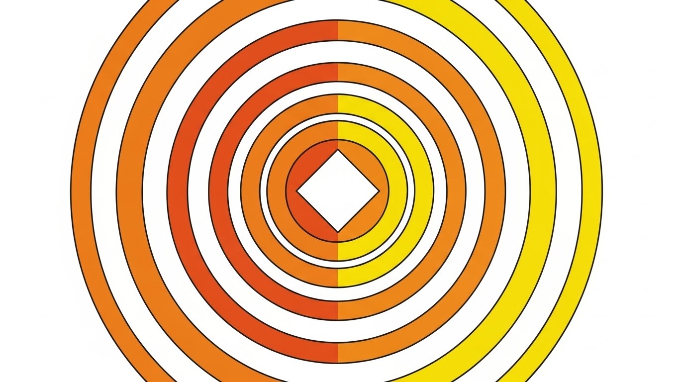
The Visual & Narrative Approach
A hypnotic, abstract 2D motion graphic designed to focus the viewer's attention. Concentric circles expand outward from the center like ripples in a pond, colored in warm gradients of Sunrise Orange and Yellow. A solid white diamond anchors the center. It is clean, modern, and rhythmic—a "visual metronome" that keeps the viewer's eye centered while they listen to the final ROI pitch.
Psychological Impact & KPI Focus
- Niche Psychology: At the end of a presentation (BOFU), cognitive fatigue sets in. Complex visuals are ignored. This simple, rhythmic visual reduces cognitive load to near zero, allowing the auditory message (the price, the offer, the guarantee) to take center stage.
- Operational Impact: It serves as a "Focus Anchor." It prevents the viewer from tabbing away during the crucial final seconds of an ad or video.
Strategic Implementation & Trade-offs
- Best Use Case: Background for Final CTA, Quote Screens, or Audio-heavy ROI explanations.
- Duration: Looping (Indefinite).
- Trade-off: It conveys no information on its own. It is purely a supporting visual carrier for text or audio.
Companies using similar video content -
DermEngine – DermEngine Platform – Demystifies AI-powered clinical decision support.
Skin Analytics – Skin Analytics AI – Visualizes the learning network for skin cancer detection.
21. The Guardian’s Gaze
BOFU | Risk Mitigation Hook

The Visual & Narrative Approach
This style leverages high-end Generative AI video to create a cinematic, emotive moment. It features a dramatic extreme close-up of a female dermatologist’s eyes, framed by a surgical cap and mask. The lighting is moody and high-key, with a cool Bio-Metric Blue rim light enhancing the seriousness of the atmosphere. Reflected in her irises is the faint, steady glow of a secure digital interface featuring a "Lock" icon. It captures the intense focus required in clinical care, merging human vigilance with digital security.
Psychological Impact & KPI Focus
- Niche Psychology: At the final decision stage, fear drives the bus. "Will this software get me sued? Will I lose patient data?" This visual speaks directly to the responsibility the doctor feels. It positions the software not just as a tool, but as a guardian that shares their burden of vigilance.
- Operational Impact: It visualizes "Compliance & Security." It shifts the conversation from technical specs (encryption standards) to the outcome of those specs: the peace of mind to focus entirely on the patient.
Strategic Implementation & Trade-offs
- Best Use Case: The "Closer" Video in a sales meeting or the opening of a Security Compliance web page.
- Duration: 5-8 seconds (Slow motion).
- Trade-off: It is emotionally heavy. It should be used to validate seriousness, not to explain features.
Companies using similar video content -
AdvancedMD – AdvancedMD EHR – Anchors attention for crucial ROI discussions.
Compulink Healthcare Solutions – Advantage EHR – Focuses viewers on key financial benefits.
22. The Clarity of Completion
Onboarding | Accelerating Time-to-Value

The Visual & Narrative Approach
A powerful contrast between the chaos of the physical world and the stability of the digital one. The background is a hyper-lapse video of a busy hospital hallway; doctors and nurses are streaks of motion blur, representing the frantic pace of clinic life. Superimposed in the center is a crystal-clear, semi-transparent glass UI panel. It displays a large Vivid Green checkmark and the word "COMPLETED." The UI is perfectly still, offering a visual anchor in the storm.
Psychological Impact & KPI Focus
- Niche Psychology: New users are often overwhelmed. They fear the software will add to the chaos. This visual proves the opposite: the software is the calm within the chaos. It promises that while the clinic moves fast, the admin work can be finished instantly.
- Operational Impact: It targets "Time-to-Value." It visualizes the speed at which a task (like an e-prescription renewal) can be closed, reinforcing the "efficiency" promise made during the sales cycle.
Strategic Implementation & Trade-offs
- Best Use Case: Login Screens, Loading States, or "Welcome" emails during onboarding.
- Duration: 3-6 seconds (Looping).
- Trade-off: The background footage must be generic enough to apply to any clinic but chaotic enough to provide contrast.
Companies using similar video content -
DrFirst – EPCS Gold – Visualizes intense compliance vigilance for secure prescribing.
Surescripts – Surescripts Network – Captures the seriousness of regulatory adherence.
23. From Blueprint to Reality
Onboarding | Reducing Friction

The Visual & Narrative Approach
This style is an educational reveal. It begins with a split-screen or sliding transition. The left side (or start state) is a technical wireframe grid of the dashboard on Blueprint Blue graph paper, representing the "structure" of the data. As a glowing scanning line moves across, it seamlessly transforms the wireframe into the final, high-fidelity 3D render of the interface in Glossy White and Brand Orange. It connects the abstract concept of the software to the concrete reality the user will see.
Psychological Impact & KPI Focus
- Niche Psychology: "Learning Curve" anxiety is high during onboarding. By showing the skeletal structure first, the user cognitively maps the interface before they are overwhelmed by the full visual. It says, "See? It’s just a simple structure."
- Operational Impact: It aids in "User Adoption." It deconstructs complex dashboards into understandable components, making the software feel engineered and logical rather than arbitrary and confusing.
Strategic Implementation & Trade-offs
- Best Use Case: Interactive Product Tours or "Getting Started" guides.
- Duration: 5-10 seconds.
- Trade-off: It is purely educational. It lacks emotional resonance but is highly effective for cognitive mapping.
Companies using similar video content -
Phreesia – Phreesia Platform – Shows instant task completion amidst busy clinic life.
Luma Health – Luma Health Platform – Reinforces efficiency with rapid appointment confirmations.
24. The Friendly Guide
Onboarding | Self-Serve Onboarding

The Visual & Narrative Approach
A shift away from high-tech gloss to approachable warmth. This style uses flat, clean 2D vector illustration to depict a friendly female character (a stylized nurse or practice manager) wearing scrubs and glasses. She smiles warmly and gestures toward a floating, pill-shaped "Start" button in Bright Magenta. The background is simple, using soft geometric shapes in Pastel Blue and White. The aesthetic is explicitly non-intimidating and "app-like."
Psychological Impact & KPI Focus
- Niche Psychology: Medical staff are often intimidated by "Enterprise Software." This style borrows the visual language of consumer apps (like Duolingo or Headspace) to signal that this tool is easy, friendly, and forgiving. It lowers the barrier to entry.
- Operational Impact: It drives "Self-Serve Onboarding." A friendly avatar encourages users to click through tutorials without waiting for a live trainer, reducing the burden on the implementation team.
Strategic Implementation & Trade-offs
- Best Use Case: In-app tooltips, "First Login" modals, or email newsletters.
- Duration: Static or Micro-animation (waving/pointing).
- Trade-off: Can be perceived as "childish" if not balanced with professional copy. Avoid over-using cartoons for serious clinical features.
Companies using similar video content -
Modernizing Medicine – EMA – Demystifies the EHR interface from wireframe to final.
Nextech – Dermatology EHR – Guides users through interface structure for adoption.
25. The Holographic Invitation
Onboarding | Trial Activation
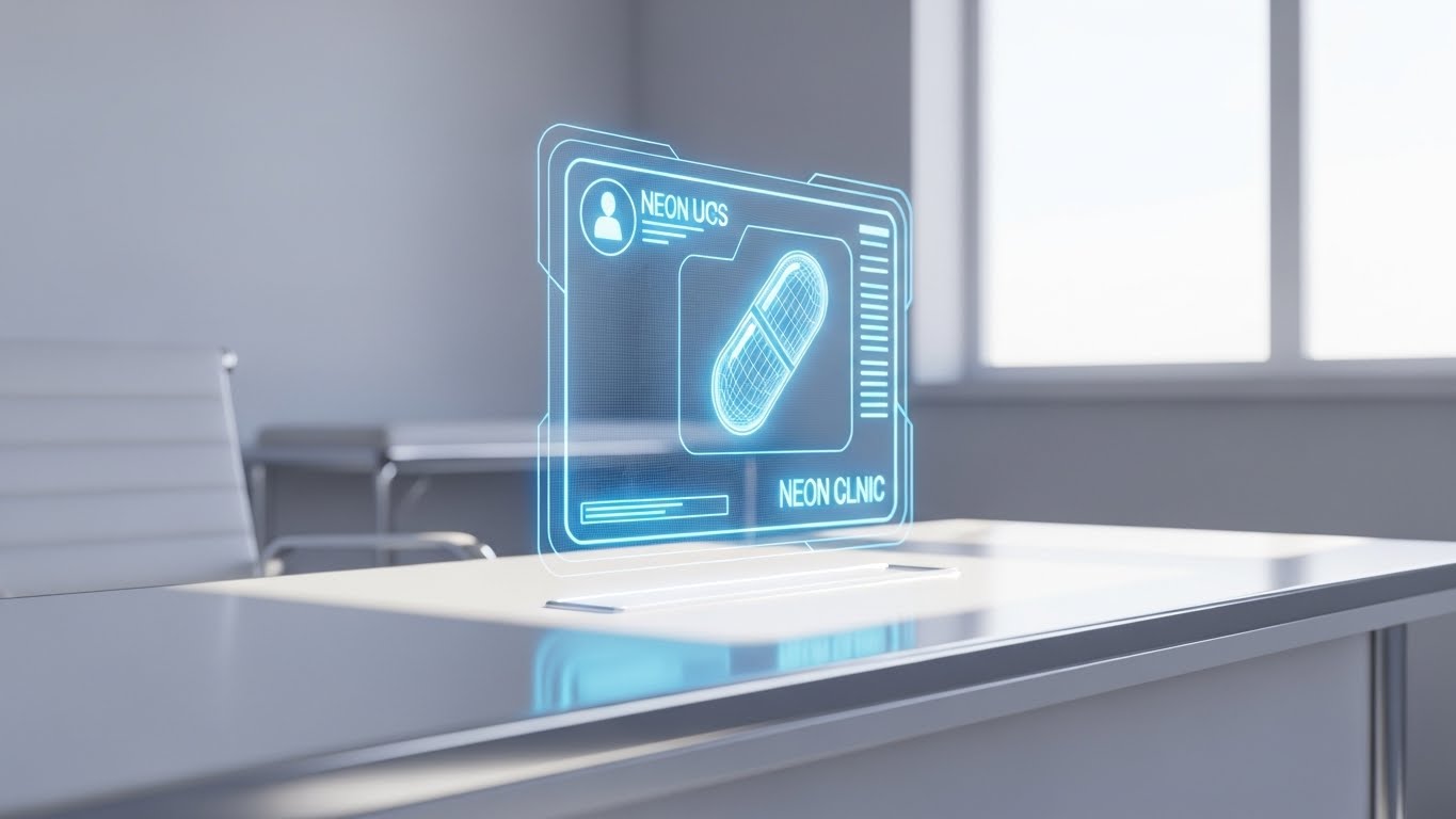
The Visual & Narrative Approach
A seamless blend of the physical and virtual to create a "wow" moment during the trial phase. A realistic 3D render of a clean, sunlit medical desk serves as the stage. Projecting upwards from the surface is a detailed, holographic wireframe notification in Neon Blue. The icon is a stylized prescription pill. The hologram rotates slowly, inviting the user to interact. It treats the software notification not as a nuisance, but as a futuristic event.
Psychological Impact & KPI Focus
- Niche Psychology: Notifications are usually annoying. This visual rebrands them as "Intelligence." It appeals to the user's desire to be on the cutting edge of medical technology. It turns a "task" into an "interaction."
- Operational Impact: It increases "Trial Activation Rates." By making the interface look premium and futuristic, it encourages the user to engage with the notification rather than dismiss it.
Strategic Implementation & Trade-offs
- Best Use Case: Feature Announcement pop-ups or "New Update" release notes.
- Duration: 6-10 seconds (Looping).
- Trade-off: High production value. If the actual in-app notifications are ugly text boxes, this creates a disconnect (Expectation Gap).
Companies using similar video content -
Doxy.me – Doxy.me Telehealth – Offers an approachable avatar for easy onboarding.
SimplePractice – SimplePractice EHR – Humanizes the learning curve for new users.
26. The Support Signal
Retention | Reducing Support Overhead

The Visual & Narrative Approach
A clean, reassuring 2D animation designed to signal help is at hand. On the left, a stylized avatar of a support agent (wearing a headset) smiles. On the right, a large chat bubble interface pops up. A "typing" animation resolves instantly into a Vibrant Orange and Purple checkmark with the text "Ticket Resolved." The lines are thick and confident. The background is Pure White, keeping the focus strictly on the interaction.
Psychological Impact & KPI Focus
- Niche Psychology: Nothing frustrates a doctor more than being stuck with a software bug while a patient waits. This visual promises immediacy. It reassures the user that support is human, accessible, and fast.
- Operational Impact: It targets "Net Promoter Score (NPS)" and "Support Satisfaction." It visually reinforces the value of the support subscription or premium tier.
Strategic Implementation & Trade-offs
- Best Use Case: The "Help" section of the dashboard or Chatbot headers.
- Duration: 3-5 seconds (Looping).
- Trade-off: It promises a speed of resolution that the support team must actually deliver.
Companies using similar video content -
DermEngine – DermEngine Platform – Gamifies new feature announcements with holographic UI.
VisualDx – VisualDx Diagnostic Tool – Invites interaction with futuristic diagnostic notifications.
27. The Culture of Retention
Retention | Reducing Churn

The Visual & Narrative Approach
This style steps back from the screen to show the human result of good software. It features a high-quality stock montage of a diverse medical team (doctors, nurses, admins) standing in a modern, sunlit hospital atrium. They are laughing and looking at a tablet together. The lighting is the warm, "Golden Hour" glow, conveying relief, success, and unity. It associates the software with a happy, friction-free workplace.
Psychological Impact & KPI Focus
- Niche Psychology: Burnout is the #1 enemy in dermatology. This visual sells the antidote: a harmonious practice. It suggests that using this platform leads to better team dynamics and less stress.
- Operational Impact: It targets "Churn Reduction." A happy staff doesn't switch software. This visual reminds the decision-maker that the tool is integral to their team's well-being.
Strategic Implementation & Trade-offs
- Best Use Case: Monthly Newsletters, Success Stories, or Login Screens.
- Duration: Static.
- Trade-off: It is generic. It relies entirely on the emotional resonance of the photography. It must not look like "cheesy stock."
Companies using similar video content -
Updox – Updox Platform – Visualizes instant resolution for support queries.
Kareo – Kareo Clinical EHR – Signals responsive, accessible customer support.
28. Building Knowledge
Retention | Knowledge Base

The Visual & Narrative Approach
A playful, abstract representation of learning. Using a "Low-Poly" 3D style, the visual depicts a digital construction site on a white floor. Blocks colored in Primary Red, Blue, and Yellow are self-assembling into a larger structure (representing the platform). It is geometric, faceted, and sharp. The aesthetic is reminiscent of toys or puzzles, suggesting that "building" knowledge is a creative, engaging process, not a chore.
Psychological Impact & KPI Focus
- Niche Psychology: "Continued Education" is often boring. This style gamifies it. It implies that learning new features is like adding blocks to a fortress—it makes the practice stronger.
- Operational Impact: It drives traffic to the "Knowledge Base" or "Academy." It visually metaphors the platform as a modular system that grows with the user.
Strategic Implementation & Trade-offs
- Best Use Case: LMS (Learning Management System) headers, "New Feature" educational videos, or webinar intros.
- Duration: 10-15 seconds.
- Trade-off: Can feel too abstract. Needs clear text overlays (e.g., "Module 1 Complete") to ground it.
Companies using similar video content -
athenahealth – athenaClinicals – Fosters team unity and a harmonious practice environment.
Allscripts – TouchWorks EHR – Associates software with a happy, friction-free workplace.
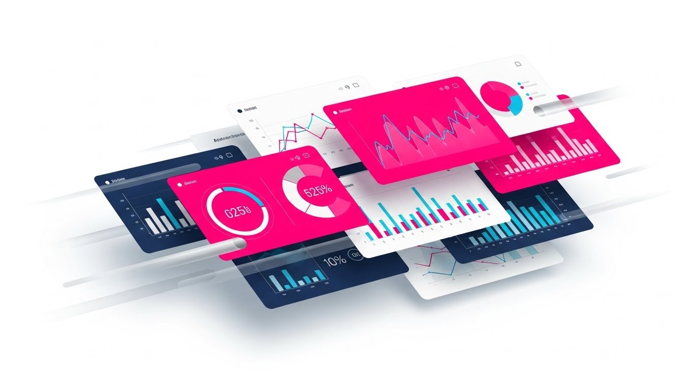
29. The Deep Dive
Expansion | Driving Upsell
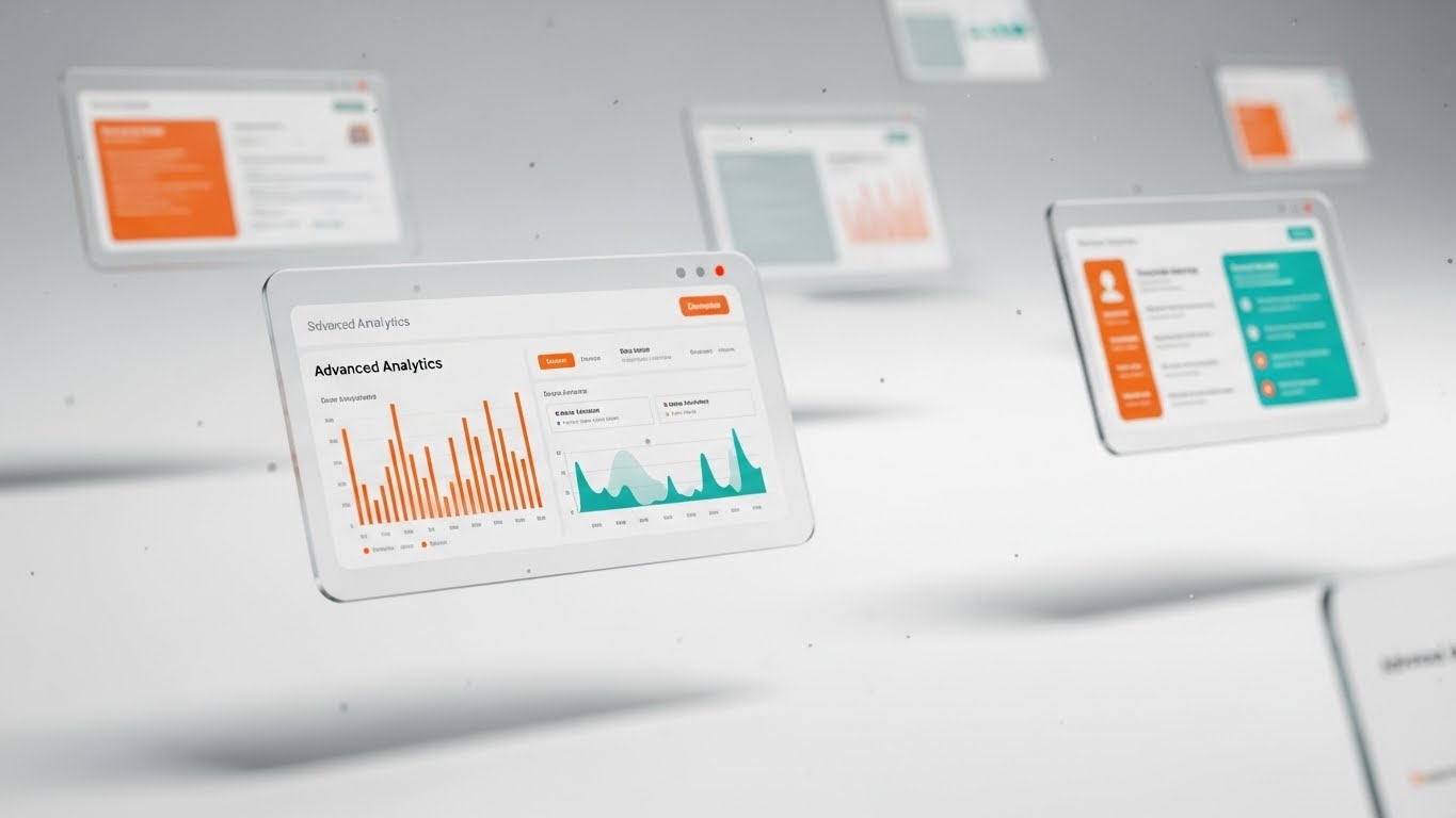
The Visual & Narrative Approach
To sell "Premium" tiers, you must show depth. This style uses a 3D parallax effect where multiple glass UI screens are suspended in a bright, clean airspace. The foreground screens are sharp, displaying advanced analytics and revenue graphs in Brand Orange and Teal. The background screens are artfully blurred. Dust motes float gently, adding atmosphere. The camera drifts slowly, creating a sense of immersion and high-value data density.
Psychological Impact & KPI Focus
- Niche Psychology: Practice owners want to feel like they have "God-Mode" visibility into their business. This visual style communicates depth, sophistication, and total oversight. It makes the "Basic" tier look flat by comparison.
- Operational Impact: It supports "Upsell" campaigns. It visually differentiates the "Pro" or "Enterprise" features by giving them a 3D, premium treatment that implies deeper insights.
Strategic Implementation & Trade-offs
- Best Use Case: "Upgrade to Pro" landing pages or Pricing Tables.
- Duration: 10-20 seconds (Looping).
- Trade-off: It requires high-fidelity UI assets. You cannot fake this with low-res screenshots.
Companies using similar video content -
OpenEMR – OpenEMR – Gamifies learning new features through modular construction.
Medsphere Systems Corporation – ChartLogic EHR – Builds user capabilities with engaging educational content.
30. The Network Effect
Expansion | Driving Referrals
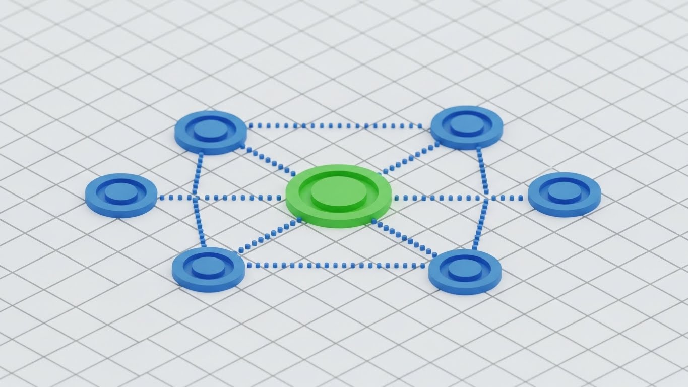
The Visual & Narrative Approach
A clean, mathematical visualization of growth. On a white isometric grid, a central circular node in Community Green (representing the user's clinic) pulses. It shoots out dotted lines to connect with outer circles in Circle Blue (representing referred peers or satellite clinics). The composition is perfectly symmetrical and balanced. The motion is rhythmic and expansive, visually demonstrating how the network grows and stabilizes.
Psychological Impact & KPI Focus
- Niche Psychology: Doctors trust other doctors. This visual maps that trust. It shows the user at the center of a thriving ecosystem. It appeals to the desire for professional connection and influence.
- Operational Impact: It drives "Referral Programs." It visualizes the abstract concept of a "Network Effect," showing that adding more users makes the system stronger for everyone.
Strategic Implementation & Trade-offs
- Best Use Case: Referral Program landing pages or "Invite a Colleague" in-app prompts.
- Duration: 5-10 seconds.
- Trade-off: It is symbolic. It doesn't show how to refer, just the result of referring.
Strategic Knowledge Base: The Visual Operations Doctrine
To bridge the gap between "aesthetic style" and "business outcome," this section synthesizes the 30 styles into three actionable strategic frameworks. These segments provide the "How-To" for implementing a visual strategy that drives adoption, efficiency, and revenue in the E-Prescribing Dermatology SaaS sector.
Strategic Alignment & Visual Architecture
Pre-Production & Strategy | Goal: Standardization & Clarity
Before a single pixel is rendered, the visual architecture must be aligned with the clinical reality of the dermatology practice. This phase defines the "Visual Operating System" of the brand.
- The Cognitive Load Audit: Conduct a review of current training materials. If a PDF manual takes 10 minutes to read, replace it with a Style 15 (Clean UI Workflow) video that takes 30 seconds. Measure the reduction in "Time-to-Comprehension."
- Role-Based Visual Mapping: Differentiate visual delivery. Use Style 4 (Bold Kinetic Typography) for mobile-first alerts targeting fast-moving nurses, but reserve Style 17 (Dark Mode UI Showcase) for the data-heavy desktop dashboards used by Practice Managers.
- The "Glanceability" Standard: In a busy clinic, a doctor has 3 seconds to understand a visual. Enforce a "Glanceability" rule: if the key message (e.g., "Prescription Sent") isn't understood in 2 seconds (like Style 8), the asset fails.
- Brand Voice Consistency: Ensure that the "Visual Voice" matches the "Brand Voice." If your copy is clinical and serious, avoid Style 24 (Cartoon Characters). If your brand is "disruptive," lean heavily into Style 3 (Neon/Dark Mode).
- The Advids Strategic Audit: Partner with specialized agencies like Advids during this phase to define a "Visual Style Guide" that scales. A third-party audit often reveals inconsistencies that internal teams miss.
- Standardization vs. Customization: For core features (e-prescribing), use standardized, high-polish assets (Style 12). For niche features (Mohs surgery workflows), use simpler, scalable styles (Style 23) to save budget.
- The Cross-Departmental Bridge: Use visuals to unify terminology. If Sales calls it "The Hub" and Support calls it "The Dashboard," confusion reigns. Create a Style 13 (Networked Ecosystem) video that establishes the official visual lexicon for both teams.
- Legacy System Integration: Visualizing the invisible connection between the new SaaS and the old on-prem server is crucial. Use Style 1 (Biomorphic) to metaphorically show how the new system "wraps around" and digests the old data, reducing fear of data loss.
- Accessibility in Visuals: Ensure all motion graphics (Style 4, Style 11) rely on shape and contrast, not just color, to accommodate color-blind practitioners (approx. 8% of male doctors).
- The Mobile-First Mandate: 60% of interactions happen on tablets or phones. Ensure detailed styles like Style 29 (Parallax) act as "Hero" content on desktop, but automatically switch to simpler Style 5 (Macro UI) variants on mobile screens.
Operational Adoption & Implementation
Deployment & Workflow | Goal: Usage & Satisfaction
A visual asset is only valuable if it is seen at the exact moment of need. This phase focuses on embedding visuals into the clinical workflow.
- Overcoming "Big Brother" Anxiety: When introducing analytics features, doctors may feel monitored. Use Style 20 (Lifestyle with UI Overlay) to frame data as "Empowerment" rather than "Surveillance," focusing on patient outcomes rather than productivity metrics.
- The Micro-Learning Shift: Replace hour-long webinars with a library of 30-second "Micro-Drills" using Style 19 (Rapid UI Montage). Tag these videos in the Help Center so they are searchable by specific error codes.
- Just-in-Time Support: Embed Style 26 (Support Signal) animations directly into the empty states of the dashboard. If a user visits the "Prior Auth" tab for the first time, trigger a 10-second explainer video automatically.
- Gamification of Training: Use Style 28 (Low-Poly Building) to visualize training progress. Award digital badges or visual "blocks" as users complete training modules, tapping into the desire for completion.
- Reducing Support Ticket Volume: Analyze the top 5 support queries. Create specific Style 14 (Augmented Efficiency) videos for each. If "Password Reset" is #1, a 5-second GIF in the login error field can eliminate 20% of tickets.
- Remote Onboarding: For distributed clinics, physical seminars are impossible. Use Style 9 (Tangible Digital Workspace) to create a "Virtual Lobby" experience in the onboarding email sequence, setting a professional tone before the first login.
- Visualizing SOPs: Transform text-based Standard Operating Procedures into Style 6 (Operational Logistics) animations. A visual flow of "Patient Check-in to Prescription Output" ensures adherence better than a checklist.
- Feedback Loops: Use interactive video elements. At the end of a Style 25 (Holographic UI) feature announcement, include a simple "Thumbs Up/Down" button to gather immediate sentiment on the new feature.
- Scalable Localization: If the platform expands globally, ensure text-heavy styles like Style 4 are built with separate text layers for easy translation, while relying on universal icons (Style 5) for core navigation.
- Leadership Communication: When the CEO communicates a roadmap shift, don't use a text email. Use Style 18 (Executive Vision) to visually signal the strategic importance and stability of the decision to investors and key accounts.
Measuring Impact & Future-Proofing
ROI & Evolution | Goal: Growth & Innovation
The final phase is validating the investment and preparing for the next wave of technology.
- Beyond "Views": Stop measuring video "views." Measure "Feature Adoption Rate" post-viewing. If a user watches the Style 11 (Neural Backbone) AI explainer, do they activate the AI feature within 24 hours?
- The "Idle Time" Metric: Correlate visual quality with software navigation speed. High-quality UI visualizations (Style 15) should lead to reduced "Idle Time" (time spent staring at the screen confused) in the logs.
- Compliance Velocity: Measure how fast a clinic achieves 100% compliance after a regulatory change (like a new EPCS mandate). Video-based training using Style 16 (Architectural Transparency) typically achieves compliance 3x faster than text memos.
- Retention and Churn: Track the LTV of cohorts exposed to the "Culture of Retention" (Style 27) content vs. those who were not. Emotional connection to the brand is a leading indicator of retention.
- The AI Visual Frontier: Prepare for Generative UI. As interfaces start to build themselves per user, the style guide must evolve from "Static UI" (Style 2) to "Fluid/Morphing" visuals (Style 1) that represent adaptive interfaces.
- Scalability of Assets: Build a "Visual Component Library." Don't render every video from scratch. Reuse the 3D assets from Style 25 to create the background for Style 29. Efficiency in production equals scalability in marketing.
- The Advids Partnership: As the library grows to hundreds of assets, internal teams will bottleneck. Maintain a strategic relationship with Advids to handle the heavy lifting of high-fidelity rendering (Styles 12, 18, 28) while internal teams handle quick edits.
- Benchmarking Success: Regularly audit competitor visuals. If the market shifts to Style 3 (Dark Mode) and you remain in "Clinical White," you risk looking dated. Visuals are a competitive moat.
- The ROI of Safety: Quantify the reduction in medication errors. Use Style 14 (Augmented Efficiency) to highlight safety checks. If the software catches 1,000 interactions, visualize that data in a Style 15 (Calculus of Time) report for the client.
- Final Call to Innovation: Treat video not as "Marketing Content" but as "Visual Infrastructure." In an industry defined by visual diagnosis (dermatology), the software that wins will be the one that communicates as visually and precisely as the doctors themselves.
Companies using similar video content -
Health Catalyst – Health Catalyst Data Platform – Showcases advanced analytics for deeper insights.
Innovaccer – Innovaccer Health Cloud – Presents premium data layers for strategic oversight.
Author & Editor Bio


