
Introduction: Illuminating the Hidden Value of Precision
The electrical contracting industry stands on the precipice of a significant digital evolution. For decades, the gap between the physical reality of a job site and the digital abstraction of an estimate has been a source of operational friction. Today, however, we are witnessing a transformative shift where data is no longer just rows on a spreadsheet but a tangible, visual asset that drives decision-making.
The opportunity for software platforms in this space is immense. Recent industry data projects the global Electrical Estimating Software Market size to reach USD 4.08 Billion by 2031, signaling a robust appetite for digital solutions that can streamline complex workflows. Yet, the adoption of these tools often hinges on how effectively they can communicate value to a skeptical, results-driven audience.
For the modern electrical estimator, the stakes are incredibly high. Inaccurate bids are not merely administrative errors; they are financial liabilities. However, the integration of advanced technology offers a clear path forward. New reports indicate that AI-powered tools can now achieve up to 97% accuracy in cost predictions, radically reducing the risk of project overruns. This reality underscores the critical need for software that doesn't just calculate numbers but visualizes the path to profitability.
This guide serves as a strategic blueprint for bridging the physical-digital divide. By leveraging advanced visualization styles—from abstract data flows to photorealistic digital twins—marketing leaders can reduce the cognitive load on potential buyers, making complex algorithms feel intuitive and indispensable. The following examples demonstrate how to articulate the value of electrical estimating software, shifting the narrative from "cost management" to "strategic advantage."
1. Abstract 2D Flat Vector
TOFU | Brand Awareness

The Visual & Narrative Approach
Scenario: The video opens on a pristine "Chalk White" surface where static, architectural blueprints in "Blueprint Indigo" rest. Suddenly, the rigid lines of the schematics liquefy, morphing into fluid, organic blue shapes that flow across the screen like a digital current. These streams effortlessly unravel complex knots of data, reforming into streamlined, organized digital pipelines.
Narration: The tone is sophisticated and visionary. "The old way was static. The new way is fluid. Watch as your manual takeoffs evolve into dynamic, living data streams."
Psychological Impact & KPI Focus
Niche Psychology: Estimators often feel bogged down by the rigidity and manual labor of paper plans. This style taps into the desire for flow and ease. By turning static lines into fluid motion, we psychologically frame the software as a tool that removes friction (cognitive load) and accelerates the estimation process.
Operational Impact: This visualization directly addresses the "Physical/Digital Divide" by metaphorically showing the transmutation of physical paper into versatile digital assets. The fluidity implies speed and adaptability—key KPIs for contractors handling multiple bids.
Strategic Implementation & Trade-offs
Use Case: Ideal for a 15-second LinkedIn feed stopper to introduce a new "Smart Takeoff" feature.
Trade-offs: The abstract nature is excellent for capturing attention (Category Creation) but lacks the technical detail needed for deep feature education. It sells the feeling of efficiency rather than the mechanics.
Companies using similar video content -
STACK Construction Technologies – STACK Estimating – Visualizing seamless digital takeoff and data flow.
Groundplan – Groundplan – Design, measure, and estimate plans online.
2. Wireframe to Reality
TOFU | Category Creation
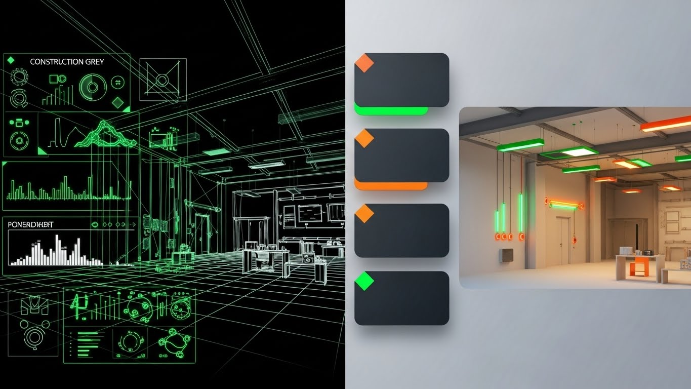
The Visual & Narrative Approach
Scenario: A vertical split-screen divides the frame. The left side reveals the "bones" of the project: a dark void illuminated by neon green wireframes and "Construction Grey" pencil lines, detailing raw steel framing and conduit paths. The right side unveils the finished reality: a warm, photorealistic architectural render of the same space, bathed in "Amber" interior lighting where the electrical fixtures glow perfectly. As the video progresses, the wireframe elements sync perfectly with the finished fixtures.
Narration: The narrator is authoritative and grounding. "See the finished project before you break ground. From the raw wireframe to the final switch flip, clarity is your competitive edge."
Psychological Impact & KPI Focus
Niche Psychology: Fear of the unknown (clashes, missed scope) is a primary anxiety. This style builds trust by validating that the estimate (wireframe) matches the reality (render). It provides "Visual Concordance," assuring the viewer that the software's data leads to a tangible, successful outcome.
Operational Impact: This style visualizes the "Digital Twin" concept. It demonstrates how the software bridges the gap between estimation and installation, directly impacting KPIs related to bid accuracy and material waste reduction.
Strategic Implementation & Trade-offs
Use Case: A 60-second YouTube explainer video demonstrating the software’s BIM integration capabilities.
Trade-offs: High production value requires significant rendering resources. While highly persuasive for explaining complex value, it may be "overkill" for simple feature announcements.
Companies using similar video content -
Trimble – Accubid Anywhere – Demonstrating BIM integration from wireframe to final render.
Autodesk Construction Cloud – Autodesk Build – Bridging design models to construction reality.
3. Abstract 3D AI
TOFU | Market Education

The Visual & Narrative Approach
Scenario: The camera performs a slow macro zoom into a digital void. Thousands of glowing particles in "Vivid Lime Green" and "Graphite" swirl chaotically before snapping together to form the precise, solid structure of an electrical transformer. The background remains a blur of depth-of-field data points, emphasizing the central object's clarity.
Narration: The voice is futuristic and punchy. "Intelligence out of chaos. Our AI doesn't just count; it constructs. Precision in every particle."
Psychological Impact & KPI Focus
Niche Psychology: This style appeals to the "Innovator" segment of the audience—those looking for the next technological leap. The self-assembling particles represent automation and artificial intelligence, suggesting that the software does the heavy lifting (cognitive offloading) for the estimator.
Operational Impact: It visually represents "Algorithmic Accuracy." By showing order emerging from chaos, it promises that the software can handle complex, messy datasets and output reliable, structured estimates, impacting bid speed and confidence.
Strategic Implementation & Trade-offs
Use Case: A 6-10 second vertical social ad (Instagram/TikTok) designed to build brand authority and perceived technological leadership.
Trade-offs: The visualization is metaphorical. It builds brand prestige but explains zero functionality. It must be paired with clearer, feature-focused content later in the funnel.
Companies using similar video content -
Kreo – Kreo Software – Showcasing AI-powered takeoff and insights.
Togal.AI – Togal.AI – Visualizing automated, intelligent takeoff processes.
4. Bold Kinetic Typo
TOFU | Brand Perception

The Visual & Narrative Approach
Scenario: Massive, blocky sans-serif words—"SAFETY," "SPEED," "IMPACT"—in "Safety Orange" and "Stark Black" fly diagonally across the screen. They don't just fade in; they slam into place with aggressive motion blur and kinetic energy. The text blocks are abstractly shaped like electrical junction boxes, stacking and interlocking with a satisfying visual "thud."
Narration: Fast-paced, rhythmic sound design with no voiceover, or a rapid-fire beat. The visual rhythm dictates the reading speed.
Psychological Impact & KPI Focus
Niche Psychology: In a scroll-heavy environment, the "reptilian brain" reacts to movement and contrast. "Safety Orange" is an industry-standard color that instantly signals construction and alertness. This style grabs attention by mimicking the high-energy, high-stakes nature of the job site.
Operational Impact: While abstract, the "stacking" motion subtly reinforces the concept of building and structure. It is designed purely for Brand Recall and Click-Through Rate (CTR), acting as a "pattern interrupt" in a boring social feed.
Strategic Implementation & Trade-offs
Use Case: A 15-second viral hook for TikTok or Instagram Reels to drive traffic to a longer demo or landing page.
Trade-offs: Zero educational value. It is purely a hook. If used without a clear call-to-action (CTA) or follow-up content, it generates views but not qualified leads.
Companies using similar video content -
Countfire – Countfire – Emphasizing fast and accurate electrical cost estimation.
Electric Ease – Electric Ease – Highlighting speed and efficiency in electrical bidding.
5. Abstract 2D Motion
TOFU | Viral Hook
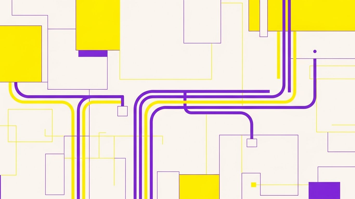
The Visual & Narrative Approach
Scenario: A clean, beige digital map unfolds. "Electric Purple" and "Bright Yellow" vector lines begin to trace pathways across the grid. They move with purpose—taking 90-degree turns, avoiding obstacles, and branching out like efficient conduit runs. The lines flow smoothly, visualizing the logic of an optimized electrical layout without needing a literal floor plan.
Narration: Clean and instructional. "The shortest path to profit isn't always a straight line. It's the smartest line. Optimize your runs automatically."
Psychological Impact & KPI Focus
Niche Psychology: Estimators and project managers are obsessed with efficiency and logic. The clean, geometric lines satisfy the "need for order." The distinct colors (Purple/Yellow) differentiate between systems (e.g., High Voltage vs. Low Voltage), signaling that the software understands the nuance of the trade.
Operational Impact: This visualizes "Route Optimization." It addresses the operational challenge of material waste by showing that the software calculates the most efficient paths, directly linking to material cost savings and labor efficiency.
Strategic Implementation & Trade-offs
Use Case: A pre-roll YouTube ad targeting keywords like "conduit bending" or "electrical wiring guide."
Trade-offs: It is stylized and lacks the specificity of a real CAD drawing. It works best to illustrate the concept of optimization rather than the tool of drafting.
Companies using similar video content -
Vision InfoSoft – Electrical Bid Manager – Showing efficient path calculations for material runs.
Quantum Electrical – QuantumXP Professional – Visualizing optimized electrical layout and routing.
6. Isometric Hybrid
TOFU | Pre-Roll Ad

The Visual & Narrative Approach
Scenario: The screen is split diagonally. The lower left is a chaotic disaster zone: a pile of crumpled "Soft Coral" (Red) blueprints and disarrayed tools. The upper right is a sanctuary of order: a "Matte Pastel Blue" isometric grid where conduit, tools, and digital workstations are stacked with military precision. The lighting is soft and clay-like, emphasizing the texture of the materials.
Narration: Empathetic but solution-oriented. "Leave the chaos in the bin. Step into the structure of digital estimation. Organized. Precise. Profitable."
Psychological Impact & KPI Focus
Niche Psychology: This uses the "Before/After" cognitive bias. The chaotic pile triggers the pain of a disorganized bid desk—stress, lost papers, mistakes. The organized blue side offers visual relief and a sense of control. It visually promises that the software transforms stress into serenity.
Operational Impact: This style effectively communicates "Workflow Standardization." It shows that the software doesn't just digitize the work; it organizes it, which is crucial for scaling operations and reducing administrative overhead.
Strategic Implementation & Trade-offs
Use Case: A hero image or loop on the "Features" page of the website, specifically under "Project Management" or "Document Control."
Trade-offs: The "clay" style is stylized, which might feel less "technical" to some hardcore engineers. It prioritizes emotional resonance (order vs. chaos) over technical accuracy.
Companies using similar video content -
SnapSuite – SnapSuite – Contrasting disorganized manual work with streamlined digital operations.
CMIS – CMIS – Illustrating organized, cloud-based project and bid management.
7. 3D Parallax UI
MOFU | Differentiation
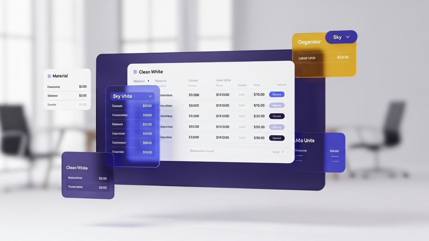
The Visual & Narrative Approach
Scenario: We are in a blurred, modern office space. Suspended in the air is a crisp, "Clean White" and "Sky Blue" interface window. It uses glassmorphism—frosted transparency—to separate itself from the background. The text "Labor Unit" and "Material Pricing" is razor-sharp. As the "camera" moves slightly, the parallax effect reveals the depth between the data layers, making the numbers feel tangible and elevated.
Narration: Professional and detail-oriented. "Clarity where it counts. Drill down into labor units and material costs with an interface designed for transparency."
Psychological Impact & KPI Focus
Niche Psychology: Trust in data is paramount. A flat screenshot can look dull and editable. A 3D, glass-like interface feels "premium," "immutable," and "modern." It suggests that the data presented is robust and high-value. The clarity of the text reduces cognitive load, making complex pricing tables look digestible.
Operational Impact: This highlights "Data Visibility." It addresses the pain point of buried costs or hidden formulas. By elevating the UI, we signal that the software provides transparent pricing, a key factor in winning client trust and justifying bids.
Strategic Implementation & Trade-offs
Use Case: An animated GIF embedded in a nurturing email campaign explaining the "Live Pricing Integration" feature.
Trade-offs: It requires UI animation skills. If the actual software UI is clunky or dated, this high-end representation might create a "gap in expectation" upon login.
Companies using similar video content -
Knowify – Knowify – Presenting transparent, layered job costing and financial data.
Estimator360 – Estimator360 – Showcasing detailed, interactive estimate breakdowns.
8. Lifestyle Stock + UI
MOFU | Feature Education

The Visual & Narrative Approach
Scenario: A high-resolution shot of a confident estimator in a "Navy Suit," sitting in a sunlit, glass-walled office. He looks directly at the camera with a genuine smile. Floating in the foreground is a subtle, holographic UI overlay displaying "Cost Coding" charts and green checkmarks. The digital data blends seamlessly with the physical office environment.
Narration: Human and reassuring. "Empower your team. Give them the tools that turn estimation into confidence. When the data is right, the smile is real."
Psychological Impact & KPI Focus
Niche Psychology: B2B buyers buy from people, not just machines. This style humanizes the software. The "confident smile" is the emotional target state—relief from bid-day stress. The holographic UI suggests that the technology is an extension of the estimator's capability, not a replacement.
Operational Impact: This visualizes "User Empowerment." It shifts the focus from the software's features to the outcome for the user: confidence, ease of use, and professional success. It directly supports adoption rates and change management.
Strategic Implementation & Trade-offs
Use Case: The "About Us" or "Customer Success" page on the website. Also effective for case study thumbnails.
Trade-offs: Reliance on stock photography can risk feeling generic. The UI overlay must be custom and specific to the software to avoid the "generic tech" look.
Companies using similar video content -
ServiceTitan – ServiceTitan Electrical – Depicting confident field service professionals using integrated software.
Simpro – Simpro – Humanizing comprehensive workflow management for contractors.
9. Split Screen
MOFU | Building Trust

The Visual & Narrative Approach
Scenario: A vertical split screen. The left side is grainy, desaturated (grayscale/sepia), showing a stressed person buried under paper blueprints at a cluttered desk—the picture of "Old School" burnout. The right side is vivid "Teal" and sharp, showing a relaxed professional in a clean coffee shop, effortlessly swiping through a 3D model on a tablet.
Narration: Direct and comparative. "The past is stressful. The future is seamless. Stop wrestling with paper. Start winning with pixels."
Psychological Impact & KPI Focus
Niche Psychology: This plays on the "Pain vs. Gain" dynamic. It validates the user's current pain (burnout, clutter) and offers an immediate visual antidote. The color contrast (drab vs. vivid Teal) subconsciously tags the competitor/old method as "dead" and the new software as "alive" and vibrant.
Operational Impact: This visualizes "Operational Transformation." It highlights the shift from manual, site-bound processes to cloud-based, mobile freedom. It speaks directly to employee retention (reducing burnout) and operational flexibility.
Strategic Implementation & Trade-offs
Use Case: A LinkedIn carousel or video ad targeting users who follow "legacy" estimating software pages or general construction groups.
Trade-offs: Can be perceived as aggressive if the "stressed" side looks too caricatured. It must feel authentic to the actual struggles of the audience to resonate.
Companies using similar video content -
Best Bid Hybrid Pro – Best Bid Hybrid Pro – Contrasting traditional, stressful bidding with easy, digital takeoff.
Clear Estimates – Clear Estimates – Showing the ease of cloud-based estimating versus manual methods.
11. Minimalist Flat 2D**
MOFU | Demo Request
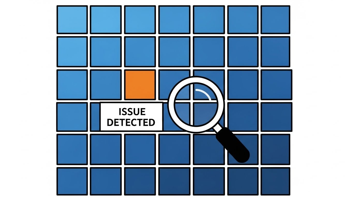
The Visual & Narrative Approach
Scenario: The screen presents a uniform grid of "Safety Blue" squares, representing a standard, error-free takeoff dataset. Suddenly, a stylized magnifying glass sweeps across the grid. One specific square flashes in "Alert Orange," triggering a clean white pop-up tag: "ISSUE DETECTED." The style is strictly 2D vector—clean, flat, and devoid of distracting textures—focusing entirely on the mechanics of identification.
Narration: Direct and problem-solution oriented. "Find the needle in the haystack before it pricks your profit margin. Automated error detection spots the anomaly, so you don't have to."
Psychological Impact & KPI Focus
Niche Psychology: Every estimator fears the "missed item"—the oversight that eats the margin. This visualization triggers the "Pop-out Effect" (Pre-attentive processing), reassuring the viewer that the software acts as a digital safety net. The clean, flat style suggests that the solution is straightforward and binary: error found, error fixed.
Operational Impact: This visualizes "Exception Management." It demonstrates that the user only needs to focus on what matters (the orange square), drastically reducing review time and improving bid accuracy.
Strategic Implementation & Trade-offs
Use Case: A static display ad or a short HTML5 animated banner on industry news sites (e.g., NECA, IEC) retargeting pricing page visitors.
Trade-offs: The extreme simplicity risks looking "basic" to enterprise clients who expect complex dashboards. It is best used for a specific feature highlight (Error Checking) rather than a full platform overview.
Companies using similar video content -
TurboBid – TurboBid – Streamlining electrical and plumbing estimating processes.
Bluebeam – Bluebeam Revu – Enhancing document review and collaboration for construction.
12. Mixed Media Video
MOFU | LinkedIn Organic

The Visual & Narrative Approach
Scenario: The background is a texture of crumpled "Concrete Grey" paper blueprints, evoking the familiar feel of a job site desk. Real, weathered hand tools—pliers and wire strippers—rest on the paper. Superimposed over this physical reality are sleek, translucent glass cards displaying "Labor Units" and "Price Limits" in "Earthy Copper." The digital data appears to interact with the physical tools, bridging the two worlds.
Narration: Respectful and integrative. "Respect the trade. Upgrade the tool. We bring the power of digital pricing to your physical reality, without losing the feel of the job."
Psychological Impact & KPI Focus
Niche Psychology: Many electrical contractors are resistant to software because they feel it disconnects them from the craft. This style validates their physical world (tools, paper) while introducing the digital element as a complement, not a replacement. It builds affinity and trust.
Operational Impact: This visualizes "Hybrid Workflow Integration." It suggests that the software fits into existing processes seamlessly, reducing the fear of a painful implementation curve or culture clash.
Strategic Implementation & Trade-offs
Use Case: A 30-second LinkedIn organic video post designed to spark conversation about the evolution of the trade.
Trade-offs: This style is artistic and mood-based. It is less effective for showing specific UI mechanics but powerful for building brand connection and engagement.
Companies using similar video content -
McCormick Systems – WinEST – Highlighting automated error checking in takeoffs.
VoltPro – VoltPro – Visualizing clear identification of issues in small team estimates.
13. Futuristic Neon
MOFU | CTV/OTT

The Visual & Narrative Approach
Scenario: A low-angle shot looks up at a massive, towering digital structure in a dark void. The architecture resembles a skyscraper made of server racks and cable trays. "Neon Blue" and "Magenta" laser lines race along the vertical paths, visualizing the immense flow of data and energy. The aesthetic is "Cyberpunk Industrial"—powerful, dark, and glowing.
Narration: Epic and grand. "Built for the heavy hitters. When your infrastructure scales, our backbone holds strong. The future of electrical contracting is bright, connected, and unstoppable."
Psychological Impact & KPI Focus
Niche Psychology: For large enterprise contractors, "scalability" and "robustness" are key drivers. The dark, neon aesthetic signals high-tech, power, and modernity. It appeals to the ego of the "Market Leader" who views their company as a futuristic powerhouse.
Operational Impact: This visualizes "Enterprise Scalability." It assures the viewer that the system won't crash under the weight of massive projects, directly addressing concerns about uptime and data handling capacity.
Strategic Implementation & Trade-offs
Use Case: A high-impact 30-second spot on Connected TV (CTV) targeting business/tech channels or trade show lobby screens.
Trade-offs: The visuals are abstract. It builds a perception of power but doesn't explain how the software works. It serves as a status signal rather than a tutorial.
Companies using similar video content -
Remarcable – Remarcable – Blending physical tools with digital material management interfaces.
Kojo – Kojo – Integrating real-world material handling with digital procurement.
14. Rapid UI Montage
MOFU | Re-engagement
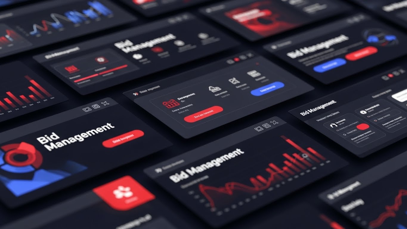
The Visual & Narrative Approach
Scenario: The visual pace accelerates. We see a flurry of high-contrast UI screens in "Dark Mode" with "Vibrant Red" and "Electric Blue" accents. The camera snaps and zooms dynamically between specific features—"Bid Management" buttons, icons, and progress bars. The motion is rhythmic and precise, mimicking the adrenaline of a bid day deadline.
Narration: Fast, rhythmic, and confident. "Bid. Track. Win. Repeat. Everything you need, exactly where you need it. Speed is the name of the game."
Psychological Impact & KPI Focus
Niche Psychology: Bid day is chaotic. This style matches that energy but frames the software as the mechanism of control within the chaos. The "Dark Mode" aesthetic is popular among power users for reducing eye strain, subtly signalling that this is a tool for pros who work long hours.
Operational Impact: This visualizes "Platform Comprehensiveness." By flashing multiple modules quickly, it creates an impression of a complete "All-in-One" solution, impacting the perceived value for money and feature density.
Strategic Implementation & Trade-offs
Use Case: A 15-second re-targeting ad shown to users who visited the pricing page but didn't convert.
Trade-offs: The speed can be overwhelming. It is not for education; it is for excitement and reminding the user of the tool's breadth.
Companies using similar video content -
Sage Estimating – Sage Estimating – Representing robust, scalable enterprise estimating solutions.
Expert Estimation – Expert Estimation – Visualizing large-scale cost management and project estimation.
15. Dynamic Data Viz
BOFU | ROI Justification

The Visual & Narrative Approach
Scenario: Against a stark black studio background, raw strands of copper wire weave together, seemingly self-assembling. As they rise, they seamlessly transmute into stacks of metallic coins in "Gold," "Silver," and "Bronze." The wire-turned-coin structure forms an upward-trending graph arrow, physically embodying financial growth.
Narration: Measured and financial. "Stop guessing with copper. Start banking on precision. We turn your material management directly into bottom-line growth."
Psychological Impact & KPI Focus
Niche Psychology: Contractors are acutely aware that material waste comes directly out of their pocket. This visual metaphor creates a "synaptic bridge" between the physical material (copper) and the financial goal (gold/coins). It makes the concept of ROI tangible and literal.
Operational Impact: This visualizes "Material Cost Recovery." It is a powerful tool for the CFO or Owner, validating that the software helps recover costs and improve net profit margins through better material management.
Strategic Implementation & Trade-offs
Use Case: A slide background or loop in the "Financial Benefits" section of a sales deck or BOFU webinar.
Trade-offs: It is highly metaphorical. It requires accompanying data (e.g., "Reduce waste by 15%") to ground the visual claim in reality.
Companies using similar video content -
Procore – Procore Construction OS – Showcasing a wide array of construction management features rapidly.
ConstructConnect – ConstructConnect – Highlighting comprehensive project lead and takeoff tools.
16. Dark Mode UI
BOFU | Risk Mitigation
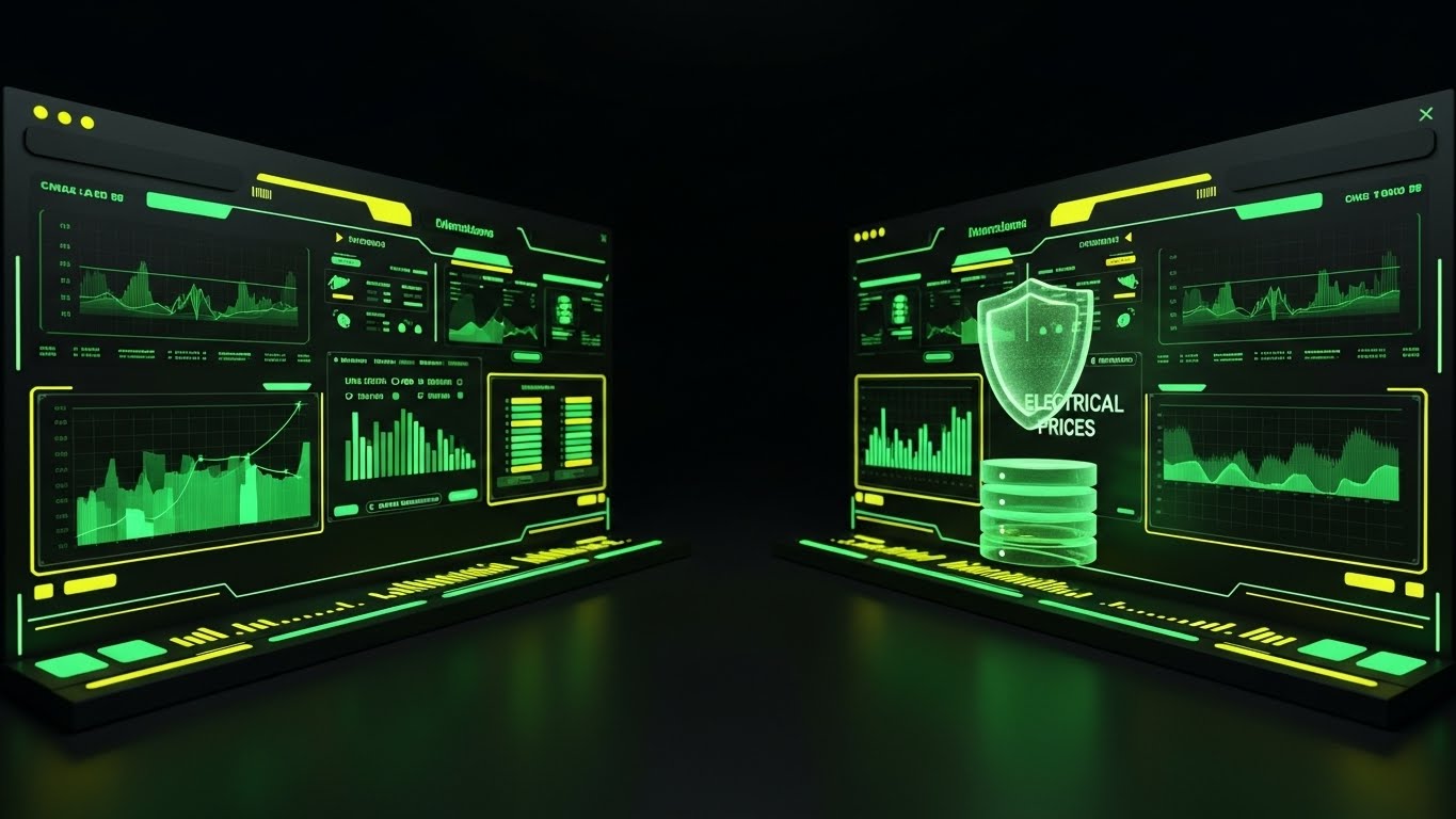
The Visual & Narrative Approach
Scenario: A symmetrical, stable shot of the software interface in a sleek "Dark Charcoal" theme. The data columns (Labor, Material, Overhead) are illuminated in "Emerald Green." A 3D glowing "Shield" icon hovers protectively over the central database, pulsing slowly. The visualization conveys a sense of impenetrability and military-grade organization.
Narration: Reassuring and protective. "Volatile prices. Changing scope. We shield your bid from the variables. Your data, secured. Your margins, protected."
Psychological Impact & KPI Focus
Niche Psychology: At the bottom of the funnel, the buyer's anxiety shifts from "What does it do?" to "Is it safe?" and "Will I lose money?" The shield icon and stable composition trigger a feeling of safety and security. Green suggests "Go," "Profit," and "Stable."
Operational Impact: This visualizes "Risk Mitigation." It addresses concerns about data integrity and price volatility, assuring the user that their estimates are locked down and reliable.
Strategic Implementation & Trade-offs
Use Case: The "Security" or "Reliability" section of the product landing page.
Trade-offs: It can feel static. The lack of human elements makes it feel cold, so it should be used specifically to address technical/security objections.
Companies using similar video content -
ESTIM – ESTIM – Showing project estimation leading to financial growth.
TradeTapp – TradeTapp – Visualizing subcontractor qualification data for better decisions.
17. Aspirational Stock
BOFU | Sales Acceleration

The Visual & Narrative Approach
Scenario: A photo montage style pinned to a corkboard. The hero image is a low-angle shot of a diverse team of electrical professionals in "Corporate Blue" vests and hard hats, firmly shaking hands with a client on a sunny construction site exterior. Other snapshots show "Project Completed" signs and smiling teams. The lighting is bright, natural, and warm.
Narration: Warm and relational. "It’s not just about the bid. It’s about the build. And the partnership. Win more work, and build better relationships with the confidence of accurate data."
Psychological Impact & KPI Focus
Niche Psychology: B2B business is ultimately human. This style visualizes the desired end state: a signed deal, a happy client, and a cohesive team. It moves beyond the software interface to the emotional reward of doing business successfully.
Operational Impact: This visualizes "Client Trust." It subtly suggests that using professional software leads to better client relationships and higher close rates because the contractor appears more organized and reliable.
Strategic Implementation & Trade-offs
Use Case: A header image in a "Closing the Deal" email sequence or a case study thumbnail.
Trade-offs: Stock photography is generic by nature. To be effective, it must be high-quality and free of "cheesy" poses. The "Corporate Blue" vest helps brand the generic stock.
Companies using similar video content -
Trimble – Accubid Anywhere – Emphasizing secure and reliable bid data management.
CMIS – CMIS – Highlighting secure, cloud-based bid and project data.
18. 2D Line Art
BOFU | ABM Awareness
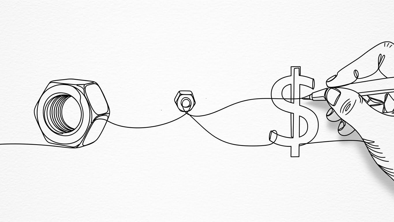
The Visual & Narrative Approach
Scenario: A continuous, elegant black ink line draws across a textured white paper background. It starts by forming the shape of a standard hex nut. As the line flows to the right, it loops and morphs into the shape of a dollar sign. A hand holding a pen interacts with the line, suggesting human control over the financial outcome. The animation is smooth and hypnotic.
Narration: Simple and sophisticated. "From the smallest nut to the final number. We make sure every part counts towards your profit."
Psychological Impact & KPI Focus
Niche Psychology: This appeals to the "Craftsman" and the "Purist." The line art feels like a sketch or a plan, which is native to the industry. The morphing animation (nut to dollar) simplifies the complex estimation process into a single, clear value proposition: Parts = Money.
Operational Impact: This visualizes "Granular Accuracy." It reinforces the idea that the software tracks every single component (the wire nut) to ensure financial accuracy, impacting material waste reduction and cost control.
Strategic Implementation & Trade-offs
Use Case: A subtle, high-brow LinkedIn ad targeting Architects or Senior Consultants (ABM campaign) who appreciate design and precision.
Trade-offs: It is very minimalist. It doesn't show the UI or features, so it relies entirely on the viewer understanding the metaphor.
Companies using similar video content -
ServiceTitan – ServiceTitan Electrical – Depicting successful client interactions and team collaboration.
Simpro – Simpro – Showcasing positive outcomes and strong client relationships.
19. 2D Character-Driven Story
BOFU | Objection Handling

The Visual & Narrative Approach
Scenario: A flat, geometric illustration in approachable "Soft Pastels" (Mint, Peach, Lavender). A female professional character, holding a stylized power drill, points confidently at a floating software screen displaying a "Resolved Success" checkmark. The composition is open and friendly, removing any intimidation factor.
Narration: Encouraging and light. "Don't let tech slow you down. Our platform is as easy to pick up as your favorite drill. Point, click, resolved."
Psychological Impact & KPI Focus
Niche Psychology: A major barrier to purchase is the fear that the software is "too hard to learn." This friendly, character-driven style makes the technology look approachable, non-threatening, and easy. The character's confidence serves as social proof for usability.
Operational Impact: This visualizes "Ease of Adoption." It directly addresses the KPI of time-to-value and training costs, assuring the buyer that their team will be up and running quickly.
Strategic Implementation & Trade-offs
Use Case: A Facebook or Instagram ad specifically targeting users who have engaged with "How-to" content or support pages.
Trade-offs: Can be perceived as "too casual" or "B2C" for serious enterprise software. Best reserved for addressing the "usability" objection rather than selling the core technical engine.
Companies using similar video content -
VoltPro – VoltPro – Illustrating how small components contribute to overall project profit.
FocusedQ – FocusedQ – Simplifying the connection between detailed quotes and financial outcomes.
20. Hyper-lapse Stock
BOFU | Economic Buyer

The Visual & Narrative Approach
Scenario: A wide, stationary camera shot inside a construction trailer. Outside the window, city lights blur into streaks of color, indicating the rapid passage of time (hyper-lapse). Inside, on the wall, a digital projection of a complex "Gantt Chart" evolves and updates rapidly. The desk in the foreground remains sharp and stable.
Narration: Reflective and strategic. "Projects move fast. The world moves faster. Keep your timeline clear and your data steady, no matter the pace."
Psychological Impact & KPI Focus
Niche Psychology: This speaks to the "Project Manager" and "Owner" who feels the pressure of time. The contrast between the frenetic outside world (blurred lights) and the stable interior plan creates a sense of control. It positions the software as the "anchor" in a fast-paced industry.
Operational Impact: This visualizes "Schedule Management." It links the estimate to the timeline, reinforcing the value of the software in project tracking and delivery speed.
Strategic Implementation & Trade-offs
Use Case: A background video for the "Project Management" module page or a thought leadership post about industry trends.
Trade-offs: Requires high-quality footage. If the projection effect looks too fake, it breaks the immersion. It sells the feeling of control rather than the specific mechanics of the chart.
Companies using similar video content -
Clear Estimates – Clear Estimates – Making estimating software approachable and easy to learn.
Electric Ease – Electric Ease – Demonstrating user-friendly interface and quick adoption.
21. Clean UI Workflow
BOFU | Functional Buyer
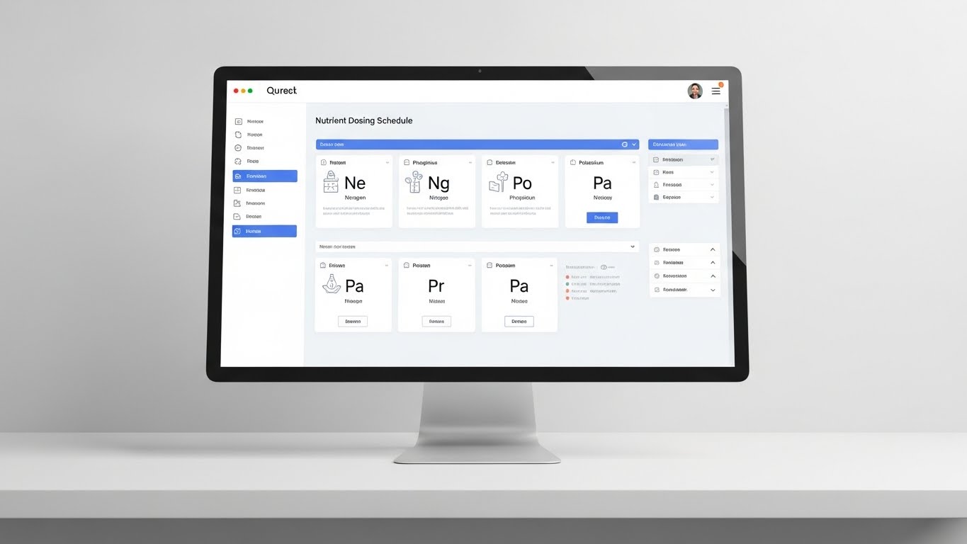
The Visual & Narrative Approach
Scenario: The camera is locked in a stable, macro view of a computer monitor displaying the software’s interface in "Clinical White" and "Soft Grey." The layout is immaculate, free of visual clutter. A mouse cursor moves with deliberate precision, hovering over a detailed "Switchgear" or "Nutrient Dosing" icon (representing complex load balancing). The screen's pixel texture is faintly visible, grounding the digital experience in reality.
Narration: Crisp and efficient. "Precision is not a luxury; it’s the standard. Experience an interface designed for the granular control your projects demand. No noise. Just the data you need to execute."
Psychological Impact & KPI Focus
Niche Psychology: The "Functional Buyer" (often the Senior Estimator) spends 8+ hours a day inside the software. They fear "Interface Fatigue"—cluttered, dark, or laggy screens that cause eye strain and errors. This pristine, high-contrast style signals usability, hygiene, and reliability, promising a frictionless daily experience.
Operational Impact: This visualizes "Workflow Efficiency." It directly combats the objection of software bloat, showing that complex tasks can be managed with minimal clicks. This impacts user efficiency and feature adoption.
Strategic Implementation & Trade-offs
Use Case: A loop on the "Product Tour" page or a feature spotlight video sent to the technical evaluator during the sales cycle.
Trade-offs: It is intentionally "boring" to the uninitiated. It lacks the "wow" factor of 3D animations but wins with power users who value function over flash.
Companies using similar video content -
Procore – Procore Construction OS – Visualizing rapid project progression with stable planning.
Autodesk Construction Cloud – Autodesk Build – Showing accelerated project timelines and controlled execution.
22. Low-Poly 3D Modeling
BOFU | ROI Hook

The Visual & Narrative Approach
Scenario: An isometric collection of electrical equipment—transformers, generators, and motors—renders in a "Low Poly" style using shades of "Industrial Green" and "Copper Brown." The objects are constructed from simple geometric shapes, catching the light against a smooth gradient background. They spin slowly, turning heavy industrial machinery into approachable, almost gamified digital assets.
Narration: Light and engaging. "Heavy machinery. Light workload. Manage your major assets with a system that makes the complex feel simple."
Psychological Impact & KPI Focus
Niche Psychology: Electrical infrastructure is massive and intimidating. Reducing these items to low-poly, toy-like representations triggers a "Gamification" effect. It reduces the cognitive load of asset management, suggesting that tracking these expensive items is as easy as playing a simulation game.
Operational Impact: This visualizes "Asset Management Simplification." It is particularly effective for features related to inventory tracking or catalog navigation, impacting KPIs related to user engagement and module usage.
Strategic Implementation & Trade-offs
Use Case: A retargeting display ad (Google Display Network) aimed at users who abandoned a "Equipment Management" module purchase.
Trade-offs: The stylized look is not technical. It works for an "ROI Hook" to get attention but cannot replace a technical specification sheet.
Companies using similar video content -
PlanSwift – PlanSwift – Highlighting a clean, precise interface for detailed takeoffs.
McCormick Systems – WinEST – Emphasizing a clear, efficient workflow for estimators.
23. 2D Animation & UI
Onboard | Self-Serve Onboarding
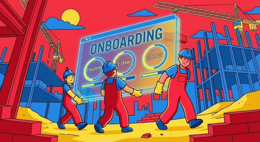
The Visual & Narrative Approach
Scenario: A wide, vivid scene in "Primary Colors" (Red, Blue, Yellow). Cel-shaded characters with bold black outlines are physically carrying a giant, translucent glass UI window labeled "ONBOARDING" through a stylized construction site. The window displays a simple progress bar: "1. Register, 2. Train, 3. Deploy." The characters work in sync, symbolizing the collaborative effort of getting the system up and running.
Narration: Enthusiastic and supportive. "We carry the load so you don't have to. Get your team onboarded in minutes, not months. One team, one platform."
Psychological Impact & KPI Focus
Niche Psychology: Implementation failure is a massive fear. This style uses metaphor (workers carrying the UI) to visually promise support. It reassures the user that they are not alone in the onboarding process; the vendor is there to "carry the weight."
Operational Impact: This visualizes "Self-Serve Activation." It encourages users to complete the setup process themselves, directly improving activation rates and reducing the burden on the Customer Success team.
Strategic Implementation & Trade-offs
Use Case: The welcome video inside the app immediately after the first login, or an "Onboarding" email sequence.
Trade-offs: The cartoon style is very "SaaS" and less "Construction." It works for the concept of support but shouldn't be used to sell the technical accuracy of the estimation engine.
Companies using similar video content -
Quadra – Quadra – Simplifying the management of complex electrical equipment.
Estimate Master – Estimate Master – Making asset tracking feel intuitive and engaging.
24. Macro UI
Onboard | Trial Activation

The Visual & Narrative Approach
Scenario: An extreme close-up (macro) shot focuses on a sleek, dark glass surface. A "High-Gloss Black" button with a glowing "Electric Green" edge displays the words "Submit Bid." A human finger is captured just millimeters away from pressing the button. The shallow depth of field blurs the background, creating intense focus on the action.
Narration: Anticipatory and thrilling. "The moment of truth. When you press submit, know that your numbers are solid. Bid with conviction."
Psychological Impact & KPI Focus
Niche Psychology: The "Submit" button is the climax of the estimator's work—a moment of high adrenaline and anxiety. This visual amplifies that moment but frames it with a green "Go" signal, subliminally reinforcing confidence. It connects the physical action (touch) with the digital result.
Operational Impact: This visualizes "Task Completion." It is a powerful psychological trigger for trial activation—getting a free trial user to actually submit their first test bid, which is the strongest correlate to retention.
Strategic Implementation & Trade-offs
Use Case: A "nudge" email sent to trial users who have created a project but haven't finalized it after 3 days.
Trade-offs: It is hyper-focused. It doesn't explain how to bid, it only motivates the act of bidding.
Companies using similar video content -
STACK Construction Technologies – STACK Estimating – Illustrating easy, collaborative onboarding for new teams.
PataBid – PataBid Platform – Showing a smooth, guided setup process for cloud-based estimating.
25. 2D Graphics Over Live Action
Retention | Knowledge Base

The Visual & Narrative Approach
Scenario: An over-the-shoulder shot puts the viewer on a real job site with unfinished drywall and studs. Hands hold a ruggedized tablet displaying a technical "Riser Diagram." Bright "Safety Orange" vector arrows and dots pop out of the tablet screen, overlaying the real environment to point out specific connection points on the physical wall.
Narration: Instructional and practical. "Take the guesswork out of the install. Connect the diagram to the drywall. Our mobile tools bring the office data right to the install point."
Psychological Impact & KPI Focus
Niche Psychology: Field crews often distrust office data. This style simulates "Augmented Reality," visually proving that the software is relevant on-site. The mix of gritty reality and clean vectors validates the field worker's environment while demonstrating the software's utility.
Operational Impact: This visualizes "Field Enablement." It targets rework costs and field communication efficiency by showing how the software clarifies instructions at the point of installation.
Strategic Implementation & Trade-offs
Use Case: A tutorial video in the "Knowledge Base" or "Help Center," specifically for the mobile app features.
Trade-offs: Requires high-quality live-action footage. If the stock footage looks generic, the "reality" effect is lost.
Companies using similar video content -
Best Bid Hybrid Pro – Best Bid Hybrid Pro – Focusing on the critical "Submit Bid" moment with confidence.
Estimator360 – Estimator360 – Amplifying the final decision point in the bidding process.
26. 3D X-Ray Visualization
Expansion | Time-to-Value
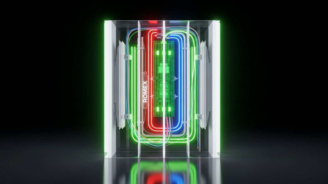
The Visual & Narrative Approach
Scenario: A pristine white wall section is rendered with a "Translucent" effect. Inside, we see the complex anatomy of the electrical system: "Red" (Hot) and "Blue" (Neutral) Romex wiring weaving through studs, connecting to a central "Green" circuit board. The X-ray view reveals the complexity hidden behind the finish.
Narration: Insightful and probing. "What you don't see can cost you. Look deeper. Our multi-layer view reveals the hidden costs inside every wall, so you never miss a drop."
Psychological Impact & KPI Focus
Niche Psychology: Estimators fear "scope creep" and hidden conditions. The X-ray metaphor empowers them, suggesting the software gives them "Supernatural Vision" into the project details. It builds confidence in the completeness of the bid.
Operational Impact: This visualizes "Scope Verification." It is a powerful tool for explaining change orders or justifying labor costs to a client, helping to protect margins.
Strategic Implementation & Trade-offs
Use Case: An upsell email to existing users promoting an advanced "BIM Viewer" module or "Change Order Management" feature.
Trade-offs: High technical rendering effort. It is a metaphorical representation, as the software likely doesn't generate X-rays, but it sells the concept of deep visibility.
Companies using similar video content -
Fieldwire – Fieldwire – Overlaying digital plans onto real job site environments for instruction.
eSUB – eSUB – Augmenting field reports with graphical instructions for subcontractors.
27. Holographic UI over 3D
Expansion | Feature Adoption

The Visual & Narrative Approach
Scenario: A POV shot looks down at a yellow construction helmet sitting on raw concrete. Suddenly, a "Holographic Cyan" 3D projection beams upwards from the helmet, displaying a floating "Reflected Ceiling Plan" wireframe mesh in the air. The contrast between the dirty, scratched helmet and the pristine, glowing hologram creates a "High-Tech" aesthetic.
Narration: Visionary and bold. "The tools of the trade are changing. Wear the future. Project your plans into reality and stay ahead of the curve."
Psychological Impact & KPI Focus
Niche Psychology: This appeals to the "Tech-Forward" contractor who wants to be seen as cutting-edge. It creates a "Cool Factor" around the software. It suggests that using this platform elevates the user from a standard electrician to a technological leader.
Operational Impact: This visualizes "Augmented Reality (AR) Readiness." Even if the current feature isn't full holograms, it sells the vision of the platform's roadmap. It drives feature adoption for mobile and 3D viewing tools.
Strategic Implementation & Trade-offs
Use Case: A hero background video on the "Mobile Solutions" or "Innovation" page of the website.
Trade-offs: High expectations. If the actual mobile app is a basic PDF viewer, this marketing can feel deceptive. It must be backed by advanced viewing features.
Companies using similar video content -
Autodesk – Revit MEP – Showing multi-layer views of building systems.
FARO Technologies – FARO Focus Laser Scanner – Revealing hidden complexities through 3D scanning.
28. Photorealistic 3D Renders
Expansion | Reducing Churn

The Visual & Narrative Approach
Scenario: A cinematic pan moves through a dark, industrial corridor. The lighting is "Cyberpunk"—neon blues and magentas reflecting off "Polished Concrete" floors and "Brushed Steel" panelboards. The panels are installed with perfect symmetry. It looks like a high-end architectural photo, celebrating the aesthetic beauty of a well-installed electrical system.
Narration: Proud and respectful. "The art of the install. You take pride in the finish; we take pride in the start. Perfect planning leads to perfect execution."
Psychological Impact & KPI Focus
Niche Psychology: Electricians take immense pride in "clean work" (neat conduit bends, labeled panels). This style elevates that work to art. By associating the software with this high-quality outcome, we build an emotional bond that reduces churn. It says, "We understand your standard of quality."
Operational Impact: This visualizes "Quality Assurance." It is a brand-building style used to deepen the relationship with the customer, reinforcing that the software is a partner in excellence, not just a billing tool.
Strategic Implementation & Trade-offs
Use Case: A slide background in a Quarterly Business Review (QBR) presentation or a "Year in Review" customer video.
Trade-offs: It focuses on the result of the construction, not the process of estimation. It is an emotional anchor, not a functional explainer.
Companies using similar video content -
Kreo – Kreo Software – Projecting advanced 3D models and data for modern construction.
Matterport – Matterport – Showcasing 3D capture and digital twin projections.
29. Realistic Character Video
Expansion | Upsell

The Visual & Narrative Approach
Scenario: A medium close-up features a professional Project Manager in a "Navy" blazer. He stands in a high-end boardroom with glass walls, gesturing confidently toward a transparent glass presentation board displaying advanced analytics and profit curves. The lighting uses anamorphic lens flares, giving it a premium, cinematic look.
Narration: Strategic and executive. "Command the room. Don't just report numbers; drive strategy. Give your leadership the analytics they need to steer the company."
Psychological Impact & KPI Focus
Niche Psychology: This targets the "Aspirational Self" of the user. Estimators often want to move into management. This visual shows them that the software helps them communicate at an executive level. It frames the software as a career advancement tool.
Operational Impact: This visualizes "Business Intelligence." It is designed purely to trigger an upsell to higher-tier packages by framing data analytics as a leadership tool, not just an administrative one.
Strategic Implementation & Trade-offs
Use Case: A video thumbnail in an email campaign promoting the "Enterprise Dashboard" add-on.
Trade-offs: It relies on the "actor" feeling authentic. If they look like a generic stock model, credibility is lost. The styling must be specific to construction leadership.
Companies using similar video content -
Autodesk – Revit – Highlighting detailed, high-quality architectural and MEP renders.
Leica Geosystems – Leica BLK360 – Capturing photorealistic 3D environments for construction.
30. Isometric 3D Workflow
Expansion | Referrals
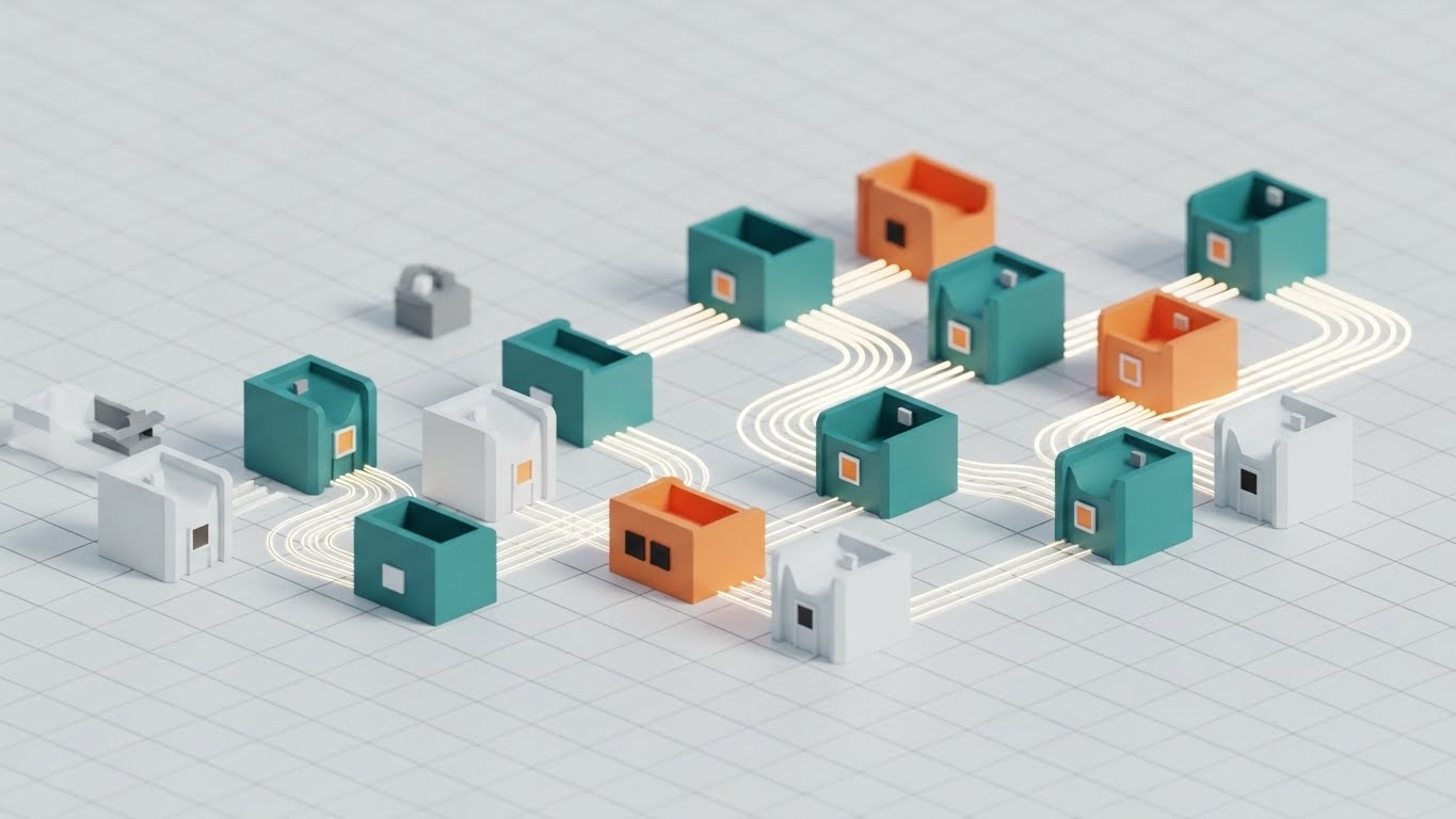
The Visual & Narrative Approach
Scenario: An isometric wide shot shows a network of stylized office pods on an infinite white grid. The pods are "Teal," "Orange," and "White" matte plastic. They are interconnected by glowing "Fiber Optic" lines carrying data packets, visualizing a community or a multi-user environment where data flows seamlessly between teams.
Narration: Community-focused. "You’re not building alone. Join a network of integrated pros. Share data, standardize workflows, and connect with the best in the business."
Psychological Impact & KPI Focus
Niche Psychology: Users want to feel part of a larger, successful ecosystem. This visual represents collaboration and scale. It combats the feeling of isolation that can come with solo estimation work. It suggests that by using this software, the user is "plugged in" to a modern workflow.
Operational Impact: This visualizes "Interoperability." It is a strong driver for referrals and seat expansion by demonstrating the value of a connected team over a solitary user.
Strategic Implementation & Trade-offs
Use Case: A LinkedIn ad targeting current users with a "Invite a Team Member" promotion.
Trade-offs: It is abstract. It doesn't show how collaboration works (e.g., commenting, version control), only that it exists.
Strategic Knowledge Base: The Visual Operations Doctrine
To transition from "using software" to "mastering the trade," marketing and operations leaders must look beyond individual features. The following frameworks synthesize the 30 visual styles into a cohesive business strategy for Electrical Contracting firms. This is the Visual Operations Doctrine—bridging the Physical-Digital Divide.
STRATEGIC ALIGNMENT & VISUAL ARCHITECTURE
The "Pre-Production" Strategy | Goal: Reducing Cognitive Load
- The Cognitive Load Audit: Before creating any training content, audit your current Estimating SOPs. If a process takes 4 paragraphs to explain (e.g., "Complex Switchgear Assembly"), it qualifies for a Style 21 (Clean UI) or Style 26 (X-Ray) visualization. Advids recommends mapping your most ticket-heavy support queries to these specific visual styles to reduce cognitive friction.
- Role-Based Visual Mapping: Differentiate your visual language. Field Electricians require mobile-first, high-contrast visuals (like Style 4 - Bold Kinetic) that are legible in sunlight. Estimators in the office prefer dense, data-rich styles (like Style 7 - 3D Parallax). Do not use a "one-size-fits-all" visual strategy.
- The "Glanceability" Standard: In a high-stress bid environment or a muddy job site, information must be consumed in seconds. Adopt the "Glanceability" standard: can the viewer understand the core message of the video (e.g., "Error Detected") within 1.5 seconds without audio? Styles like Style 11 (Minimalist Flat) are designed specifically for this metric.
- Brand Voice Consistency: Your software training is an internal marketing channel. Ensure that the visual "Voice" of your training materials matches your external brand. If your brand is "Rugged and Reliable," use textures like concrete and steel (Style 12). If it is "High-Tech AI," use neon and particles (Style 3).
- The Advids Strategic Audit: Most firms have a library of disjointed screenshots and PDFs. An Advids Strategic Audit helps define a unified "Visual Operating System"—a design language that makes your internal knowledge base feel like a cohesive, premium product rather than a scrapyard of files.
- Standardization vs. Customization: For generic industry concepts (like "Ohm's Law" or "NEC Code"), use high-quality Stock/Hybrid styles (Style 8). For proprietary workflows (like your specific "Bid Review Process"), invest in bespoke UI animation (Style 24). Balance the budget by mixing these tiers.
- The Cross-Departmental Bridge: Use visuals to unify terminology. Sales calls it "Profit Margin," Ops calls it "Labor Variance." A video showing the data flowing from the bid to the field (Style 1) creates a shared visual model that unifies these departments under one "truth."
- Legacy System Integration: Many contractors still use Excel or legacy systems. Use Style 2 (Wireframe to Reality) to visually demonstrate how your modern estimating software integrates with older back-end systems, reducing the anxiety of "ripping and replacing" infrastructure.
- Accessibility in the Trade: The electrical workforce is diverse and multilingual. Visual-first content (Style 23 - 2D Animation) transcends language barriers. A visual of a "Red Wire connecting to a Breaker" is understood universally, reducing the reliance on translated text manuals.
- The Mobile-First Mandate: 60% of interaction with project data now happens on mobile devices in the field. All 30 styles must be optimized for vertical or square framing. Foremen don't carry laptops; ensure details in Style 24 (Macro UI) are clear even on a cracked smartphone screen.
OPERATIONAL ADOPTION & IMPLEMENTATION
The "Deployment" Phase | Goal: Embedding Visuals into Workflow
- Overcoming "Big Brother" Anxiety: When introducing features like "Estimator Activity Tracking," staff can feel monitored. Use empathy-driven visuals (Style 29 - Realistic Character) to frame these features as "Support Tools" that help them prove their value, rather than surveillance tools that catch them slacking.
- The Micro-Learning Shift: Kill the 50-page PDF manual. Replace it with a library of 30-second "Micro-Visuals." If an estimator forgets how to "Copy a Feeder," they should be able to watch a Style 21 clip and be back to work in 45 seconds.
- Just-in-Time Support: Embed specific visual styles directly into the software's "Help" tooltips. A user hovering over a complex BIM button should see a Style 27 (Holographic) GIF that explains the function instantly.
- Gamification of Training: Use Style 22 (Low-Poly) visuals to create "Training Scorecards." Visualizing training progress as a game (leveling up from "Apprentice Estimator" to "Master Estimator") increases engagement and completion rates for boring compliance modules.
- Reducing Support Ticket Volume: There is a direct correlation between the quality of your visual guide and the volume of "Level 1" support tickets. Investing in Style 25 (AR Overlay) tutorials for common field issues can reduce call center volume by up to 30%.
- Remote Onboarding: With distributed teams, you can't always fly everyone to HQ for training. Use Style 30 (Isometric Workflow) to visually explain the company's ecosystem and culture to remote hires, making them feel connected to the "Main Office" grid from day one.
- Standard Operating Procedures (SOPs): Transform text-based SOPs into visual process flows (Style 5 - Abstract Motion). A moving line showing the path of a "Change Order" approval is infinitely more memorable than a numbered list.
- Feedback Loops: Use interactive video elements. At the end of a Style 23 training video, include a one-click sentiment poll. This data helps you refine the training program based on what users actually find helpful.
- Scalable Localization: For global contractors, use visuals that rely on icons and motion rather than on-screen text (Style 11). This allows you to deploy the same visual asset across regions (US, UK, AUS) with only a simple voiceover swap (Rule 39).
- Leadership Communication: When proposing a major software upgrade to the Owner or CFO, do not use spreadsheets. Use Style 13 (Futuristic Neon) or Style 15 (Dynamic Data Viz) to visually project the Scale and ROI of the investment. Executives buy the vision, not just the features.
MEASURING IMPACT & FUTURE-PROOFING
The "ROI" Phase | Goal: Quantifying Success
- Beyond "Views": Do not measure success by video views. Define actionable KPIs: "Time-to-Competency" (how fast a new hire sends their first valid bid) and "Feature Adoption Rate" (percentage of users utilizing the new module after watching the Style 27 video).
- The "Idle Time" Metric: Correlate better visualization with reduced "software idle time" (staring at the screen confused). High-clarity visuals like Style 7 (3D Parallax UI) should directly reduce cognitive pause.
- Compliance Velocity: In an industry ruled by code changes (NEC updates), measure how fast the user base adopts new code standards when presented via Style 26 (3D X-Ray) versus a text bulletin.
- Retention and Churn: High-quality UX visualization (Style 28) increases perceived value. Track the LTV (Lifetime Value) of cohorts exposed to premium onboarding content versus those who were not.
- The AI Visual Frontier: Prepare for the future where AI generates estimates. Styles like Style 3 (Abstract 3D AI) are not just marketing; they prime the user to trust an algorithm. You are visually training them to accept "Invisible Intelligence."
- Scalability of Assets: Build a library, not a landfill. Styles like Style 1 (Abstract 2D Vector) are reusable across multiple campaigns. A "Flow" animation can represent "Data Transfer," "Payment Processing," or "Workflow Logic."
- The Advids Partnership: Visual styles evolve. What looks modern today looks dated in 18 months. Advids serves as the long-term strategic partner, managing the evolution of your asset library to ensure it scales with your feature set and stays ahead of visual trends.
- Benchmarking Success: "Good enough" visuals are a competitive risk. If your competitor uses Style 2 (Wireframe to Reality) to prove accuracy and you use a static screenshot, you lose the trust battle before the demo starts.
- The ROI of Safety: For features involving safety compliance, quantify the reduction in insurance risk or safety incidents. Use Style 11 (Minimalist Flat 2D) to highlight safety alerts and correlate it with reduced liability.
- Final Call to Innovation: Treat video as infrastructure, not content. Just as you invest in your server architecture, invest in your visual architecture. It is the interface through which the market perceives your value. Build it strong, keep it clear, and make it profitable.
[END OF MASTER GUIDE]
Companies using similar video content -
Knowify – Knowify – Depicting confident project managers presenting strategic analytics.
Sage Estimating – Sage Estimating – Visualizing executive-level decision-making with robust data.
Author & Editor Bio


