
Introduction: Visualizing the Nervous System of Modern Healthcare
The healthcare industry is currently navigating a profound paradox. While digital transformation promises unprecedented efficiency, the physical reality for many practitioners is one of increasing friction. We are building sophisticated digital cathedrals, yet the doors often feel too heavy to open. The challenge for Healthcare CIOs and Marketing Directors is no longer just about building better software; it is about communicating that utility in a way that reduces, rather than adds to, the cognitive load of healthcare professionals.
The market potential is immense, with the global EHR market projected to reach USD 52.57 billion by 2034. However, capitalizing on this growth requires overcoming a significant barrier: the "usability gap." Currently, physicians spend more than five hours in the EHR for every eight hours scheduled with patients. This statistic is not just a measure of time; it is a measure of friction. It represents the skepticism your content must overcome.
When a Hospital Administrator views your video strategy, they are asking one silent question: "Will this complicate my life, or simplify it?"
This guide is your strategic blueprint for answering that question. We have curated 30 distinct visual styles, mapped to the buyer's journey, designed to translate complex back-end interoperability into clear, front-end value. From the high-energy kinetics of brand awareness to the granular precision of feature education, these visualization strategies are the bridge between your code and their care.
1. The Architecture of Trust
TOFU | Brand Awareness

The Visual & Narrative Approach
Scenario: This style abandons traditional imagery for a purely structural approach. We visualize the concept of a "digital hospital" being built from the ground up. Large, matte plastic blocks in Electric Cyan and Pure White—as seen in the reference image—self-assemble into abstract architectural forms.
Narration: There is no voiceover; the narrative is driven by the rhythmic "thud" and "click" of the blocks locking into place, symbolizing the robust, modular nature of your software architecture.
Psychological Impact & KPI Focus
- Niche Psychology: Healthcare administrators often view legacy systems as "clunky" and "fragile." This visual style uses weight and impact to subconsciously communicate stability and modern infrastructure.
- Operational Impact: By stripping away the UI, we reduce cognitive load. The focus is entirely on the feeling of innovation—speed, structure, and reliability—without getting bogged down in feature details.
Strategic Implementation & Trade-offs
- Duration: 15-20 Seconds (Social Ads).
- Trade-off: This style is excellent for stopping the scroll and establishing a "Big Tech" aura. However, it is suboptimal for explaining specific clinical workflows or features, as it lacks the necessary detail. Use it to announce a launch or a rebrand.
Strategic Transition: While kinetic typography captures attention through motion, our next style slows the pace to visualize the seamless nature of data interoperability.
Companies using similar video content -
Epic Systems – EpicCare – Robust, scalable EHR for large health systems.
Meditech – Expanse – Comprehensive EHR suite for hospitals.
AWS for Healthcare – AWS HealthLake – Foundational cloud data platform.
2. The Fluid Integration Hero
TOFU | Market Education

The Visual & Narrative Approach
Scenario: Here, we address the challenge of "Interoperability." The scene features fluid, organic shapes in Pastel Mint Green and Coral Orange that morph and merge effortlessly. As depicted in the visual, these glossy blobs represent disparate data silos (Lab results, Radiology, Pharmacy) dissolving into a single, unified ecosystem.
Narration: The tone is calm and reassuring, emphasizing "flow" and "connection" rather than technical specs.
Psychological Impact & KPI Focus
- Niche Psychology: The anxiety of "fragmented care" is real. This soft, shadowless aesthetic provides a visual "antidote" to chaos. It feels therapeutic and approachable, suggesting that your software harmonizes data rather than forcing it.
- Operational Impact: It visually solves the "Silo Problem" without needing complex technical diagrams. It frames the software as an organic facilitator of care.
Strategic Implementation & Trade-offs
- Duration: 30-45 Seconds (Website Hero).
- Trade-off: Perfect for high-level concepts like "Holistic Care" or "Population Health." It is less effective for demonstrating security protocols or rigid compliance standards, where "harder" edges might be preferred to show strength.
Strategic Transition: To bridge the gap between this soft vision and corporate reliability, we shift to a style that pulses with the heartbeat of modern business.
Companies using similar video content -
Redox – Redox Platform – API-first healthcare integration.
InterSystems – HealthShare – Unifying health data for connected care.
Zus Health – Zus Platform – Shared health data for interoperability.
3. The Digital Pulse
TOFU | Brand Perception

The Visual & Narrative Approach
Scenario: This style visualizes the "heartbeat" of a healthcare network. Using the Deep Royal Blue and Metallic Gold palette shown in the reference, we create a high-contrast animation of rhythmic, pulsing lines. These waveforms mimic a patient monitor but are stylized to represent digital data streams—admissions, discharges, and billing cycles—flowing in perfect synchronization.
Narration: High-energy and rhythmic, matching the beat of the visual pulse to create a sense of momentum.
Psychological Impact & KPI Focus
- Niche Psychology: Hospital executives are driven by metrics and "uptime." This style appeals to the desire for precision and control. The gold accents against the midnight blue suggest premium value and executive-tier intelligence.
- Operational Impact: It reinforces the concept of "Real-Time Analytics." The constant, fluid motion implies that the software is always on, always monitoring, and always optimizing.
Strategic Implementation & Trade-offs
- Duration: 15 Seconds (YouTube Bumper).
- Trade-off: Strong for conveying speed and intelligence. Avoid this style if you are trying to convey "human-centric care" or empathy, as the abstract lines can feel cold and purely metric-driven.
Strategic Transition: From abstract lines, we zoom into a photorealistic future to show where this technology physically lives.
Companies using similar video content -
Qlik – Qlik Sense for Healthcare – Real-time healthcare analytics and BI.
Splunk – Splunk for Healthcare – Operational intelligence and security monitoring.
Innovaccer – Data Activation Platform – Unifying healthcare data for insights.
4. The Future Pathways
TOFU | Pre-Roll Ad

The Visual & Narrative Approach
Scenario: We step into the hospital of the future. The video features a photorealistic, pristine hospital hallway where the physical and digital worlds converge. As the camera performs a slow dolly zoom, streams of ethereal silver and white light (as seen in the image) flow rapidly along the walls and ceiling.
Narration: Cinematic and aspirational, focusing on the "invisible infrastructure" that powers modern care.
Psychological Impact & KPI Focus
- Niche Psychology: This taps into the "Aspiration Hook." It validates the target audience's vision of themselves as pioneers of modern medicine. It turns the sterile hospital environment into a place of wonder and high technology.
- Operational Impact: It dramatically visualizes the concept of "Invisible Infrastructure"—showing that the technology surrounds and supports the staff without obstructing them.
Strategic Implementation & Trade-offs
- Duration: 15-30 Seconds (YouTube Pre-Roll).
- Trade-off: Incredible for capturing attention and setting a futuristic tone. However, relying solely on AI video can sometimes lead to minor visual artifacts; ensure the quality control is rigorous to maintain the "pristine" medical aesthetic.
Strategic Transition: Now, let's zoom out from the hallway to view the entire ecosystem as a connected logistical machine.
Companies using similar video content -
Google Cloud for Healthcare – Healthcare API – AI-native platform for advanced analytics.
Microsoft Azure for Healthcare – Azure IoT Hub – Cloud solutions for connected health.
Verily – Onduo – Chronic condition management with advanced tech.
5. The Logistic Ecosystem
TOFU | Aspiration Hook
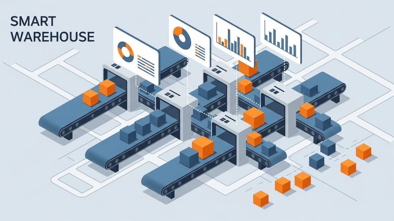
The Visual & Narrative Approach
Scenario: This style uses a "God's Eye View" to manage complexity. We create a miniature connected city of tiny clinics and hospitals on a Vibrant Orange and Teal grid. Data packets move along the grid lines like boxes on a conveyor belt, showing the logistical mastery your software provides.
Narration: Analytical and process-driven, explaining how the software connects the disparate nodes of the healthcare network.
Psychological Impact & KPI Focus
- Niche Psychology: Administrators are often overwhelmed by the scale of their operations. The isometric perspective gives them a sense of control and oversight. It makes the massive healthcare network look manageable, organized, and tidy.
- Operational Impact: Ideal for visualizing "Patient Journey Mapping" or "Supply Chain Management" within the hospital. It simplifies the chaos of the emergency room into a predictable, mathematical flow.
Strategic Implementation & Trade-offs
- Duration: 30-60 Seconds (Social Explainer).
- Trade-off: Excellent for logic and process. Suboptimal for emotional connection; the characters are usually faceless "meeples," so it won't trigger an empathetic response regarding patient care quality.
Strategic Transition: To counter the "factory" feel, we re-introduce the human element, blending the tactile with the digital in a trendy format.
Companies using similar video content -
TeleTracking – Capacity Management – Optimizing patient flow and resource use.
Central Logic – Transfer Center – Streamlining patient transfers and capacity.
Infosys – Hospital Capacity Management – Real-time planning and asset tracking.
6. The Digital Shift
TOFU | Vertical Social

The Visual & Narrative Approach
Scenario: This style directly addresses the transition from paper to pixels. It uses a dynamic collage technique, blending stop-motion paper textures (torn paper, cardboard) with sleek, glowing digital overlays. As seen in the visual, a real doctor's hand holding a paper chart is abruptly morphed into a glowing digital tablet.
Narration: Fast-paced and energetic, acknowledging the "messiness" of change while celebrating the upgrade.
Psychological Impact & KPI Focus
- Niche Psychology: It acknowledges the "messiness" of change. By mixing textures, it feels more authentic and less sterile than a pure 3D render. It appeals to the younger, mobile-first generation of practitioners (residents/nurses) on platforms like TikTok.
- Operational Impact: It visualizes "Digital Transformation" not as a cold switch, but as an energetic upgrade. It makes the software feel accessible and "hands-on."
Strategic Implementation & Trade-offs
- Duration: 15-30 Seconds (TikTok/Reels).
- Trade-off: Highly engaging for social feeds. Risky for boardroom presentations to conservative boards, who might find the "jerky" social media aesthetic too informal or chaotic.
Strategic Transition: Moving from the social feed to the core of the technology, we dive deep into the "brain" of the system to explain its intelligence.
Companies using similar video content -
Hyland Healthcare – OnBase – Content services for digital transformation.
Kofax – TotalAgility for Healthcare – Automating document-intensive workflows.
Iron Mountain – Digital Solutions – Securely digitizing and managing health records.
7. The Neural Core
MOFU | Category Creation

The Visual & Narrative Approach
Scenario: To explain "Clinical Decision Support" (AI-assisted diagnosis), we use a high-tech representation of a neural network. Glowing nodes in Neon Purple and Electric Blue connect via thin filaments to form the shape of a human brain. The camera dives into the network, showing the depth and density of the connections.
Narration: Sophisticated and expert, focusing on "deep learning," "patterns," and "predictive insights."
Psychological Impact & KPI Focus
- Niche Psychology: This appeals to the "Scientific Innovator." It reassures the viewer that the software isn't just a database; it's an intelligent partner. It validates the high cost of AI modules by showing the complexity under the hood.
- Operational Impact: It positions the product as a "Category Creator"—moving beyond simple record-keeping to active intelligence and predictive analytics.
Strategic Implementation & Trade-offs
- Duration: 45-60 Seconds (Website Tech Page).
- Trade-off: Best for selling high-end AI features. Avoid using this for simple administrative features (like scheduling), as it over-complicates the visual narrative and sets false expectations of complexity.
Strategic Transition: From the complexity of AI, we simplify the narrative completely to focus on the patient journey with elegant minimalism.
Companies using similar video content -
Tempus – Tempus Platform – AI for precision medicine and oncology.
PathAI – PathAI Platform – AI-powered digital pathology for diagnostics.
Aidoc – Aidoc AI – AI platform for medical imaging analysis.
8. The Elegant Flow
MOFU | Differentiation

The Visual & Narrative Approach
Scenario: In stark contrast to the complex 3D styles, this approach uses a single, continuous black line on a Cream background. The line elegantly morphs from a patient's silhouette to a hospital bed, then to a stethoscope, and finally into a digital shield icon. There is no shading or clutter.
Narration: Calm, clear, and reassuring, emphasizing "simplicity" and "continuity."
Psychological Impact & KPI Focus
- Niche Psychology: For decision-makers suffering from "feature fatigue," this minimalism is a breath of fresh air. It communicates ease of use, clarity, and a "zen-like" user experience. It promises that the software will simplify their complex world.
- Operational Impact: It visually reinforces "User-Centric Design." It suggests that despite the complex backend, the frontend experience is seamless and unbroken.
Strategic Implementation & Trade-offs
- Duration: 60-90 Seconds (Explainer Video).
- Trade-off: The "Gold Standard" for explaining concepts clearly. However, it lacks "wow factor" or technological hype. It relies entirely on the strength of the script and the elegance of the motion.
Strategic Transition: To prove that this simplicity is backed by a robust interface, we use a split-screen technique to reveal the reality behind the design.
Companies using similar video content -
Lumeon – Care Pathway Management – Automating and optimizing patient journeys.
Health Catalyst – Data Operating System – Data-informed healthcare improvement.
Notable Health – Intelligent Automation – AI for patient intake and workflow.
9. The Fidelity Split
MOFU | Feature Education
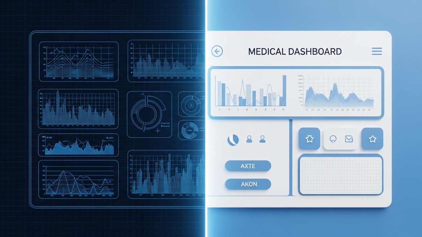
The Visual & Narrative Approach
Scenario: This split-screen composition creates a direct link between engineering and user experience. The left side shows the "blueprint"—a blue wireframe grid of a medical dashboard. The right side reveals the "reality"—the final, glossy white and sky-blue UI with realistic shadows and textures. A glowing vertical line sweeps across, transforming the wireframe into the finished product.
Narration: Technical and confident, focusing on "architecture," "stability," and "user-centric engineering."
Psychological Impact & KPI Focus
- Niche Psychology: CTOs and IT Directors love this style. It respects their language (wireframes, architecture) while proving the high fidelity of the end-user product. It builds trust in the process.
- Operational Impact: It effectively demonstrates "Customizability" and "Robust Design." It shows that the pretty interface is backed by a solid, well-engineered logical framework.
Strategic Implementation & Trade-offs
- Duration: 30 Seconds (LinkedIn Ad).
- Trade-off: Excellent for B2B trust-building. Less effective for non-technical audiences (like doctors or nurses) who only care about the final interface and not the wireframe "blueprint."
Strategic Transition: Finally, we look at the result of all this data—measurable growth—through a dynamic, scale-focused lens.
Companies using similar video content -
Modernizing Medicine – modmed® EHR – Specialty-specific, intuitive EHR design.
DrChrono – EHR/PM – Customizable EHR with robust mobile features.
Practice Fusion – EHR – Cloud-based EHR with user-friendly interface.
10. The Growth Tower
MOFU | Competitive Displacement

The Visual & Narrative Approach
Scenario: To displace competitors, this style focuses on results. It features towering 3D bar charts and floating pie graph segments in Bright Chartreuse and Cool Grey. The camera angle is low, looking up at the towering charts to emphasize growth and scale. The materials are semi-transparent glass and matte plastic.
Narration: Bold and results-oriented, focusing on "ROI," "efficiency gains," and "revenue recovery."
Psychological Impact & KPI Focus
- Niche Psychology: CFOs and Hospital Administrators are the target here. They want to see growth, efficiency, and savings. The "up and to the right" visual language triggers a positive response regarding financial health and scalability.
- Operational Impact: It directly visualizes "Competitive Displacement"—showing how your software drives better metrics than the status quo. It turns abstract percentages into tangible, physical structures.
Strategic Implementation & Trade-offs
- Duration: 10-15 Seconds (Blog Header Loop).
- Trade-off: It is purely quantitative. It lacks the "care" aspect of healthcare. It must be paired with narrative text that explains what data is growing (e.g., "Patient Recovery Rates" or "Revenue Collection").
Companies using similar video content -
Waystar – Revenue Cycle Management – Maximizing financial performance for providers.
R1 RCM – Revenue Cycle Management – End-to-end RCM solutions.
Strata Decision Technology – StrataJazz – Financial planning and performance analytics.
11. The Icon of Care
MOFU | YouTube SEO

The Visual & Narrative Approach
Scenario: In a world of noise, we cut through with radical simplicity. This style utilizes a clean, icon-based aesthetic. A stylized white cloud icon seamlessly overlaps with a simple stethoscope in Soft Lilac against a vibrant Purple background. The negative space is deliberate, allowing the symbols to breathe.
Narration: There is no complex voiceover; just a sharp, satisfying sound design—a "pop" or a "chime"—as the elements align, symbolizing the effortless convergence of cloud technology and clinical care.
Psychological Impact & KPI Focus
- Niche Psychology: Healthcare professionals are bombarded with complex information. This "Visual Shorthand" respects their cognitive bandwidth. It signals that your brand is modern, agile, and free of the "bloat" associated with legacy enterprise software.
- Operational Impact: It reinforces "Brand Recall." By distilling the value proposition down to two merging icons (Cloud + Care), you create a memorable visual anchor for YouTube thumbnails or retargeting ads.
Strategic Implementation & Trade-offs
- Duration: 5-10 Seconds (YouTube Thumbnail / Intro).
- Trade-off: Ideal for quick brand imprinting. Ineffective for explaining feature sets or nuance. It is a flag, not a map.
Strategic Transition: While icons capture the brand, we need a more dimensional way to discuss the complex topic of financial return without being dry.
Companies using similar video content -
Doximity – Doximity App – Professional network for clinicians.
Teladoc Health – Virtual Care – Accessible telehealth services.
Amwell – Telehealth Platform – On-demand virtual consultations.
12. The Gamified ROI
MOFU | ROI Hook
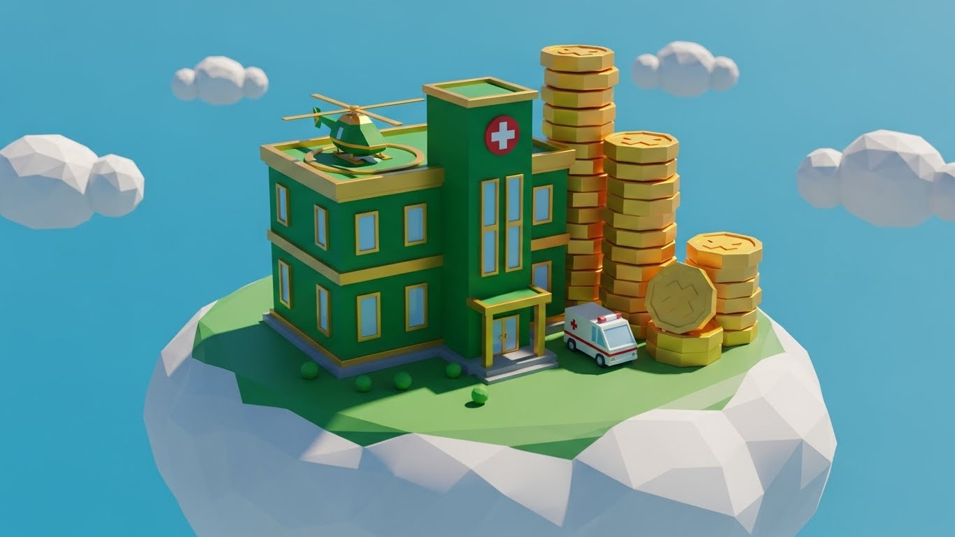
The Visual & Narrative Approach
Scenario: To make the discussion of "Revenue Cycle Management" approachable, we use a playful, low-poly aesthetic. A stylized hospital sits on a floating green island. As the video progresses, gold coins—rendered as simple geometric shapes—stack rapidly beside the building, physically visualizing "Revenue Recovery." The Emerald Green and Gold palette evokes financial health.
Narration: Upbeat and energetic. It frames the financial health of the hospital not as a spreadsheet, but as a "level up" achievement, making the objective of profitability feel tangible and rewarding.
Psychological Impact & KPI Focus
- Niche Psychology: Financial discussions can be stressful and dry. This style "gamifies" the concept of ROI, reducing the anxiety around budget discussions. It subconsciously frames the software as the tool that helps the hospital "win."
- Operational Impact: It visualizes "Capital Efficiency" and "Accumulation." Seeing the physical stack of coins grow provides a much stronger dopamine hit than seeing a percentage increase on a line graph.
Strategic Implementation & Trade-offs
- Duration: 15-30 Seconds (Social Ads).
- Trade-off: Excellent for simplifying financial concepts. Risky for very serious clinical safety topics, where the "game-like" aesthetic might feel trivializing.
Strategic Transition: Financial health allows for a better provider experience. Let's shift from the building to the people inside it to address the critical issue of burnout.
Companies using similar video content -
Cotiviti – Payment Accuracy – Driving financial integrity in healthcare.
HealthEquity – HSA Platform – Empowering health savings and financial wellness.
Welltok – CafeWell – Engaging population health management.
13. The Provider's Joy
BOFU | Demand Gen

The Visual & Narrative Approach
Scenario: We tackle the narrative of "Physician Burnout" head-on, but with positivity. We introduce a relatable protagonist—a young female doctor in a white coat, rendered in a clean "Corporate Memphis" style with Sky Blue and Warm Beige tones. She holds a tablet and gives a confident "thumbs up," surrounded by abstract shapes representing a smooth, organized workflow.
Narration: Empathetic and story-driven. It focuses on "reclaiming time," "balance," and the "joy of practicing medicine" again, positioning the software as a partner in wellness.
Psychological Impact & KPI Focus
- Niche Psychology: It leverages "Social Proof" and relatability. Seeing a calm, happy physician triggers a mirror neuron response in the viewer—"I want to feel that way about my work." It counters the dread of "clunky" EHRs.
- Operational Impact: It visualizes "User Satisfaction" and "Retention." It moves the conversation from feature lists to the emotional benefit of the software: a happier, more efficient workforce.
Strategic Implementation & Trade-offs
- Duration: 45-60 Seconds (Landing Page / Testimonial).
- Trade-off: Great for emotional connection and culture. Less effective for proving technical specs. It sells the feeling of the software, not the code.
Strategic Transition: To validate this happiness, we must show the specific tools they use. We move to a split-screen to bridge their physical actions with digital results.
Companies using similar video content -
Suki AI – Suki Assistant – AI voice assistant reducing documentation burden.
Augmedix – Live AI Medical Scribe – AI-powered clinical documentation.
Nuance (Microsoft) – Dragon Medical One – Ambient clinical intelligence.
14. The Hybrid Reality
BOFU | Building Trust
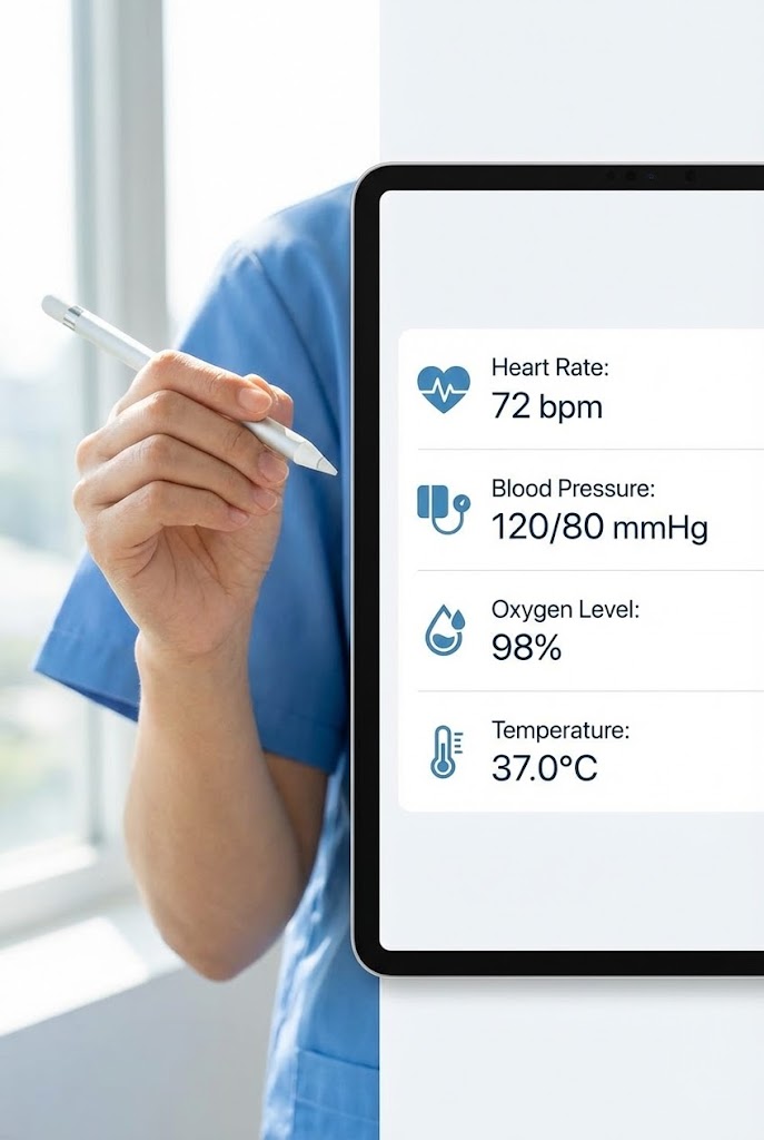
The Visual & Narrative Approach
Scenario: This style validates the "Hybrid Workflow." We use a vertical split-screen. The left side is a high-quality photograph of a nurse's hand using a stylus, grounding the action in physical reality. The right side shows the corresponding digital result: a crisp, vector-based UI screen instantly populating patient vitals in a clean list format. The lighting is matched perfectly across both sides to imply a single, unified action.
Narration: Instructional yet fluid. It emphasizes "natural input," "handwriting recognition," and "speed," proving that digitization doesn't mean abandoning muscle memory.
Psychological Impact & KPI Focus
- Niche Psychology: Many practitioners fear that digital tools will slow them down. This visual proves the "Best of Both Worlds." It respects their traditional methods (writing) while demonstrating the immediate digital benefit.
- Operational Impact: It effectively demonstrates "Data Entry Efficiency." By showing the cause (writing) and effect (digitized data) simultaneously, it proves the speed of the interface.
Strategic Implementation & Trade-offs
- Duration: 30-45 Seconds (Case Study / Feature Highlight).
- Trade-off: Powerful for specific features like handwriting recognition or dictation. Suboptimal for high-level ecosystem overviews, as it is very task-specific.
Strategic Transition: Now that the data is entered, we zoom out to the executive suite to show how leadership utilizes this information for high-level decision making.
Companies using similar video content -
Mend – Telehealth Platform – Integrating virtual care with EHR workflows.
Imprivata – GroundControl – Secure, fast access to clinical applications.
smartData – IoT & Medical Device Integrations – Connecting physical devices to digital records.
15. The Executive Insight
BOFU | ROI Deep Dive

The Visual & Narrative Approach
Scenario: Targeted at the C-Suite, this style exudes premium authority. A photorealistic 3D render focuses on a high-end glass tablet resting on a pristine white desk in a modern office. The screen displays complex financial analytics graphs in Glassy White and Blue. The shallow depth of field blurs the background, forcing focus on the data's precision.
Narration: Authoritative, confident, and concise. It uses the language of the boardroom: "forecasting," "variance analysis," and "strategic oversight."
Psychological Impact & KPI Focus
- Niche Psychology: Executives need to feel that the software is "Enterprise Grade." The photorealistic quality and sophisticated data visualization signal maturity, stability, and high value. It looks like a tool for leaders.
- Operational Impact: It visualizes "Business Intelligence." It creates a desire for that level of clarity—showing the dashboard that every CEO wishes they had on their desk every morning.
Strategic Implementation & Trade-offs
- Duration: 60 Seconds (Whitepaper Companion Video).
- Trade-off: High impact for decision-makers. Potentially alienating for frontline staff, who may view this "polished" look as disconnected from the messy reality of the ER.
Strategic Transition: With such valuable data on display, the immediate question is security. We use X-Ray vision to reveal the safeguards within.
Companies using similar video content -
Kaufman Hall – Performance Management – Strategic financial planning for hospitals.
Premier Inc. – Performance Services – Driving operational and financial improvement.
Clarify Health – Clarify Platform – Healthcare analytics for value-based care.
16. The Transparent Vault
BOFU | Risk Mitigation

The Visual & Narrative Approach
Scenario: To visualize the invisible concept of "Cybersecurity," we use an X-ray aesthetic. A server rack is rendered with a semi-transparent outer casing, revealing glowing Blue internal components. A central, robust padlock mechanism locks into place. The background is Clinical White, ensuring the image feels clean and medical, not dark and ominous.
Narration: Reassuring and technical. It speaks to "encryption at rest," "SOC2 compliance," and "patient privacy," turning abstract protocols into physical barriers.
Psychological Impact & KPI Focus
- Niche Psychology: Security is a source of anxiety. This style alleviates fear by making the protection visible. The X-ray effect suggests transparency—that you have nothing to hide and that the architecture is solid through and through.
- Operational Impact: It visualizes "Risk Mitigation." It transforms a checkbox compliance item into a robust, tangible feature of the product architecture.
Strategic Implementation & Trade-offs
- Duration: 15-30 Seconds (LinkedIn / Security Page).
- Trade-off: Essential for the IT buyer. Dry for the clinical user. It serves a specific function in the sales cycle: removing the security objection.
Strategic Transition: Security enables trust, and trust enables advanced technology. We move from the server room to the exam room to see the future of diagnostics.
Companies using similar video content -
Fortified Health Security – Cybersecurity Services – Protecting patient data.
CynergisTek – Privacy & Security Consulting – Risk management and compliance.
Clearwater Compliance – Cybersecurity Solutions – HIPAA compliance and risk analysis.
17. The Diagnostic Future
BOFU | Demo Requests
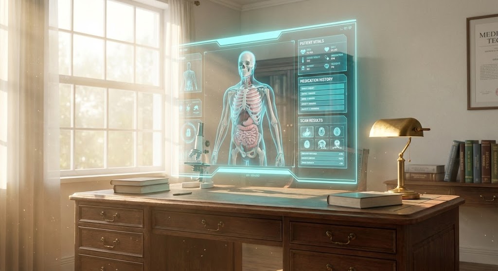
The Visual & Narrative Approach
Scenario: We showcase the "cutting edge" of clinical support. In a realistic, sunlit doctor's office, a futuristic holographic interface floats above the desk. It displays a detailed 3D anatomy scan and patient data widgets in bright Cyan. The lighting is airy and optimistic, suggesting that this advanced tech is accessible and user-friendly, not cold or alien.
Narration: Inspiring and forward-looking. It focuses on "augmented intelligence," "precision medicine," and "seeing the unseen."
Psychological Impact & KPI Focus
- Niche Psychology: Doctors want to feel they are practicing at the top of their license. This visualization appeals to their identity as scientists and innovators. It promises that the software will enhance their diagnostic capabilities.
- Operational Impact: It visualizes "Advanced Clinical Decision Support." It demonstrates how the software aggregates complex data into a clear, visual model for better patient outcomes.
Strategic Implementation & Trade-offs
- Duration: 30-60 Seconds (Product Demo / Ad).
- Trade-off: High "Wow" factor. Caution required: Ensure the hologram looks functional, not just decorative. If it looks too much like a movie effect, it may lose credibility as a real tool.
Strategic Transition: While holograms are the future, the daily reality requires absolute clarity. We strip back the effects to focus on the purity of the interface design.
Companies using similar video content -
Philips Healthcare – IntelliSpace Discovery – Advanced medical imaging and AI.
Siemens Healthineers – AI-Rad Companion – AI-powered radiology solutions.
GE Healthcare – Caption Care – AI-guided ultrasound technology.
18. The Clinical Hygiene
BOFU | Economic Buyer
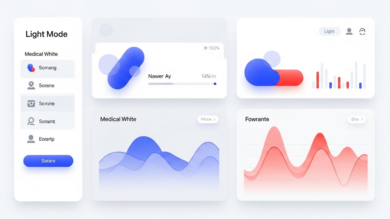
The Visual & Narrative Approach
Scenario: This is the direct answer to "clunky software." We present a pristine, Light Mode UI dashboard. It features soft rounded corners, gentle drop shadows, and a calming palette of Medical White and Light Grey. Data is organized into abstract colorful pills and smooth wave graphs. There is no clutter—only the necessary information.
Narration: Calm, methodical, and clear. It emphasizes "intuitive design," "reduced clicks," and "visual hygiene."
Psychological Impact & KPI Focus
- Niche Psychology: For a burnt-out user, "White Space" looks like relief. This style communicates that the software is easy to learn and easy to use. It signals respect for the user's eye and attention.
- Operational Impact: It visualizes "Usability." It is the most direct way to prove that the learning curve is short and that daily usage will be friction-free.
Strategic Implementation & Trade-offs
- Duration: 60-90 Seconds (Detailed Demo / Deck).
- Trade-off: The most practical style for closing the deal. Lacks emotional hook on its own; it relies on the viewer appreciating the nuances of good UI design.
Strategic Transition: A good UI isn't just for the desktop. We take this clarity into the hallway to show how it supports mobile workflows.
Companies using similar video content -
athenahealth – athenaOne – Intuitive, cloud-based EHR.
NextGen Healthcare – NextGen Enterprise EHR – User-friendly for specialty practices.
eClinicalWorks – EHR – Streamlined, affordable clinical workflows.
19. The Ambient Intelligence
BOFU | Functional Buyer
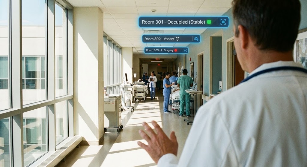
The Visual & Narrative Approach
Scenario: We visualize the concept of "Data Portability." An over-the-shoulder shot follows a doctor walking down a sunlit hospital corridor. Floating Augmented Reality (AR) widgets overlay the scene, displaying room numbers and real-time patient status (e.g., "Room 301 - Stable") in Tech Blue.
Narration: Dynamic and active. It speaks to "mobility," "real-time awareness," and "information at the point of care."
Psychological Impact & KPI Focus
- Niche Psychology: Hospital work is mobile, yet most software is static. This style validates the mobile nature of the job. It reassures the staff that the information follows them, rather than them having to run back to a station to find it.
- Operational Impact: It visualizes "Operational Efficiency" and "Situational Awareness." It shows how the software reduces steps and improves reaction times.
Strategic Implementation & Trade-offs
- Duration: 30-45 Seconds (Website Hero / Social).
- Trade-off: Extremely engaging for showing workflow. Must be realistic: The AR overlays should look like helpful annotations, not a distracting video game HUD.
Strategic Transition: Finally, we acknowledge the immense power required to run all these mobile, holographic, and cloud-based ecosystem running.
Companies using similar video content -
Vocera Communications – Vocera Platform – Clinical communication and workflow.
TigerConnect – Clinical Collaboration Platform – Secure messaging and care coordination.
Imprivata – Mobile Device Access – Fast, secure access on mobile devices.
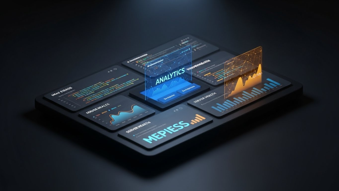
20. The Infrastructure Power
BOFU | Technical Buyer

The Visual & Narrative Approach
Scenario: We end with a display of raw power and reliability. We enter a stylized data center where rows of server racks stretch into the distance. Neon Green data lines stream along the floor and connect the racks in a Deep Charcoal environment. It evokes the aesthetic of "Dark Mode" and high-performance computing.
Narration: Deep, powerful, and resonant. It emphasizes "uptime," "redundancy," "speed," and the "unwavering backbone" of the healthcare network.
Psychological Impact & KPI Focus
- Niche Psychology: For the CTO and IT Director, this is the "muscle car" shot. It communicates that the system is robust, fast, and capable of handling massive data loads without crashing.
- Operational Impact: It visualizes "System Reliability" and "Scalability." It reassures the technical buyer that the pretty UI is backed by a serious, industrial-grade engine.
Strategic Implementation & Trade-offs
- Duration: 15-20 Seconds (Technical Spec Sheet / Intro).
- Trade-off: builds immense technical credibility. Too aggressive for patient-facing or clinical-facing content, where a softer touch is required. Use exclusively for the IT stakeholder.
Companies using similar video content -
Oracle Health – Millennium – Robust EHR platform for large systems.
Google Cloud for Healthcare – Cloud Infrastructure – Scalable, secure healthcare cloud.
AWS for Healthcare – Cloud Services – Foundational cloud for digital health.
21. The Night Shift Ally
BOFU | ABM Display
The Visual & Narrative Approach
Scenario: We address a specific, practical reality of hospital life: the night shift. The visual presents a tilted 3D view of the software’s "Dark Mode." The background is a sophisticated Matte Black. The UI elements are rendered as Dark Grey cards with high-contrast Amber and Neon Blue text accents for readability. A spotlight subtly sweeps across a central analytics widget, emphasizing clarity in low-light conditions.
Narration: Quiet, focused, and empathetic. It speaks to "circadian rhythms," "visual comfort," and "24/7 reliability," acknowledging the physical toll of overnight care.
Psychological Impact & KPI Focus
- Niche Psychology: For nurses and doctors working the graveyard shift, bright white screens are physically painful. This style signals deep empathy. It says, "We understand your working environment." It transforms a simple color theme into a feature of occupational health.
- Operational Impact: It visualizes "Occupational Health" and "User Endurance." It positions the software as a tool that adapts to the human condition, not the other way around.
Strategic Implementation & Trade-offs
- Duration: 15-20 Seconds (Display Ad / Social).
- Trade-off: Excellent for niche targeting (nurses, ER staff). Less effective for general daylight admin staff who may prefer the "cleanliness" of light mode.
Strategic Transition: From the ergonomics of the interface, we move to the depth of the architecture to explain how the modules fit together.
Companies using similar video content -
Epic Systems – MyChart – Patient portal with customizable themes.
Meditech – Expanse Mobile – Mobile EHR designed for 24/7 use.
Doximity – Doximity App – Mobile-first professional network.
22. The Modular Deep Dive
Onboarding | Freemium/Trials

The Visual & Narrative Approach
Scenario: To explain the "stack" of technology without using boring diagrams, we use an exploded 3D view. Three distinct layers of the interface hover apart from each other: a bottom layer showing a map view, a middle layer of data cards, and a top layer of notification badges. The palette is a futuristic gradient of Blue to Purple.
Narration: Educational and structural. It explains how the "data layer," "logic layer," and "action layer" interact to create a seamless experience.
Psychological Impact & KPI Focus
- Niche Psychology: Complexity can be intimidating during onboarding. Breaking the interface into floating layers makes it feel manageable and modular. It satisfies the intellectual curiosity of the user—showing them "how it works" under the hood.
- Operational Impact: It visualizes "Interconnectivity." It helps new users understand the relationship between different modules (e.g., how the map connects to the patient card), reducing the mental leap required to navigate the system.
Strategic Implementation & Trade-offs
- Duration: 30-45 Seconds (Email Onboarding Sequence).
- Trade-off: Great for education. Abstract: It represents the concept of the UI rather than a direct screen recording, so it shouldn't replace a "how-to" tutorial.
Strategic Transition: Understanding the layers is crucial, but users also need to know the breadth of tools available. We use a rapid montage to show scale.
Companies using similar video content -
Infor Healthcare – CloudSuite Healthcare – Modular enterprise solutions.
Salesforce Health Cloud – Health Cloud – CRM platform with integrated modules.
Commure – Commure Platform – Healthcare platform for building applications.
23. The Feature Matrix
Onboarding | Self-Serve Onboarding
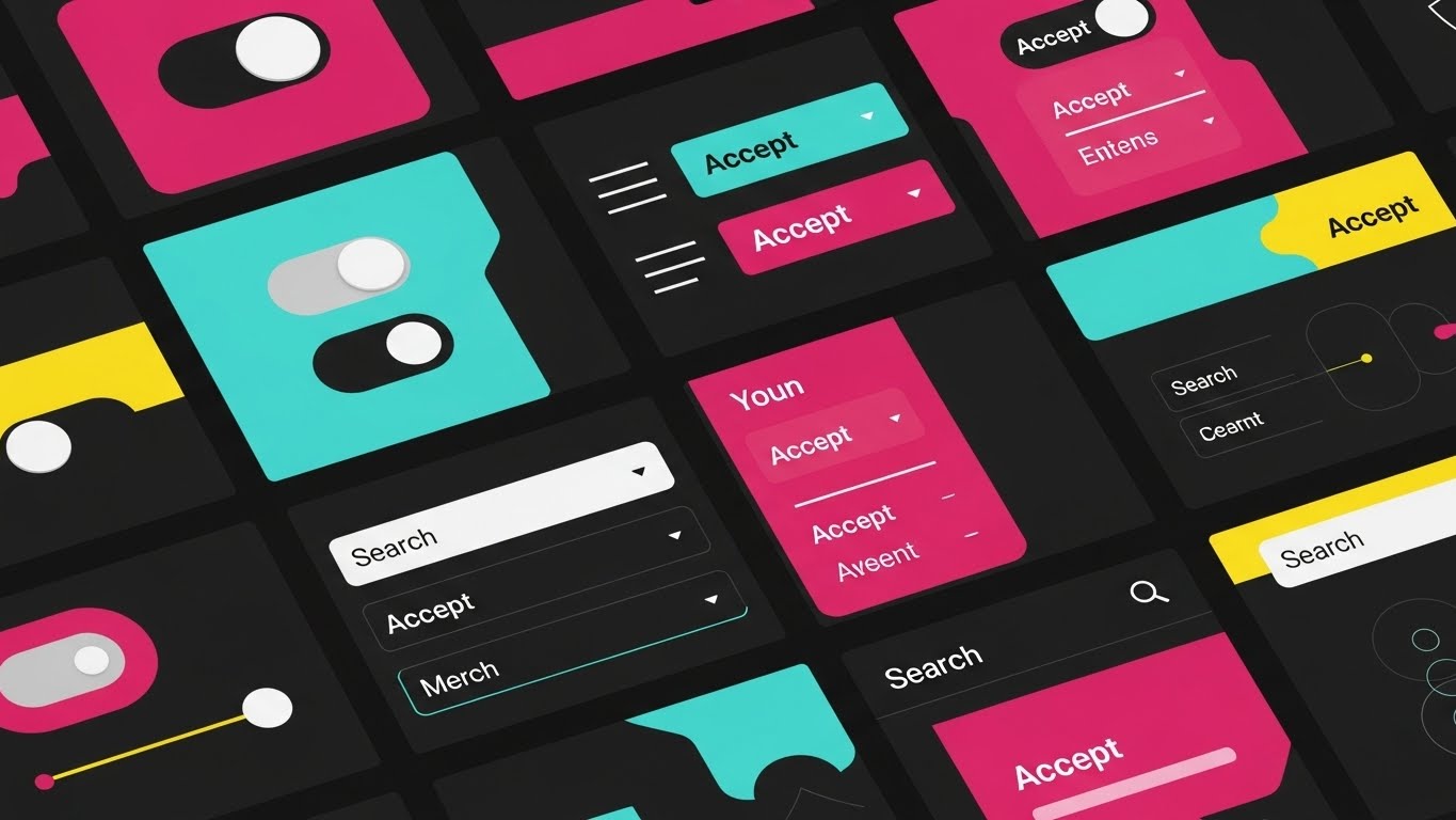
The Visual & Narrative Approach
Scenario: This style screams "Versatility." We see a grid composition featuring a montage of various UI elements: toggle switches, "Accept" buttons, drop-down menus, and search bars. The elements pop in and out in rhythm with the music, rendered in Vivid Primary Colors (Red, Blue, Yellow) on a dark background. It feels like a high-speed inventory of tools.
Narration: Fast-paced and rhythmic. It lists verbs: "Toggle," "Search," "Filter," "Accept"—emphasizing the speed and modularity of the system.
Psychological Impact & KPI Focus
- Niche Psychology: Users want to feel equipped. This visual barrage suggests that for every problem, there is a specific, well-designed tool. It builds confidence in the software's comprehensiveness.
- Operational Impact: It visualizes "Configurability" and "Feature Depth." It is particularly effective for showing that the software can be tailored to different specialties (e.g., distinct toggles for Pediatrics vs. Oncology).
Strategic Implementation & Trade-offs
- Duration: 10-15 Seconds (App Store Preview).
- Trade-off: High energy, but low specific detail. Use it to generate excitement about the amount of features, not to explain how to use them.
Strategic Transition: Excitement is key to activation. We now introduce a character to celebrate the user's first major win in the system.
Companies using similar video content -
AdvancedMD – EHR/PM – Comprehensive, customizable practice solutions.
Kareo (Tebra) – Kareo Clinical – Feature-rich EHR for small practices.
Veradigm (Allscripts) – Sunrise EHR – Flexible, customizable enterprise EHR.
24. The First Win
Onboarding | User Activation

The Visual & Narrative Approach
Scenario: We tackle "User Activation." A flat 2D animated character (a young professional) interacts with a giant, floating UI panel. The character reaches out to touch a "Complete" button that glows Warm Yellow. Upon contact, confetti and success checkmarks burst onto the screen. The background is a simple, non-distracting abstract pattern.
Narration: Celebratory and encouraging. "Your first patient admission—done. Simple as that."
Psychological Impact & KPI Focus
- Niche Psychology: The first interaction with a new EHR is usually stressful. This style flips the script, rewarding the user with a dopamine hit. It frames the software as supportive and encouraging rather than judgmental.
- Operational Impact: It visualizes "Ease of Adoption." By showing a successful interaction, it lowers the barrier to entry and encourages users to complete their initial training tasks.
Strategic Implementation & Trade-offs
- Duration: 15-20 Seconds (In-App Welcome Video).
- Trade-off: Very casual. While perfect for welcoming new users, it is likely too informal for serious clinical safety training modules.
Strategic Transition: To further bridge the gap between the user's physical world and the software, we overlay the magic of digital onto a real desk.
Companies using similar video content -
HealthStream – Learning & Talent Management – Healthcare workforce education.
Relias – Relias Platform – Training and performance management.
Caspio – Low-Code Platform – Building custom healthcare applications.
25. The Magic Desk
Onboarding | Accelerating TTV

The Visual & Narrative Approach
Scenario: This style blends the tangible with the imaginative. We see a top-down photo of a real wooden desk with a coffee cup and a tablet. The tablet screen is black, but bright Neon Pink 2D doodles—rockets, sparks, arrows, and checkmarks—are exploding out of the screen and onto the wooden surface.
Narration: Energetic and inspiring. It focuses on "launching," "ideas," and "breaking boundaries."
Psychological Impact & KPI Focus
- Niche Psychology: It appeals to the "Innovator" persona within the hospital staff—the ones who want to improve processes. The mix of real-world objects (coffee, wood) and neon graphics makes the tech feel integrated into their daily grind but capable of adding "magic" to it.
- Operational Impact: It visualizes "Accelerated Time-to-Value." It suggests that the software is not just a repository for data, but a launchpad for productivity and speed.
Strategic Implementation & Trade-offs
- Duration: 10-15 Seconds (Social / Instagram Reels).
- Trade-off: Trendy and attention-grabbing. Limited utility for explaining complex workflows. Use it to keep engagement high during the boring parts of the rollout.
Strategic Transition: Once onboarded, users need support. We visualize the help desk not as a call center, but as a dedicated, organized ecosystem.
Companies using similar video content -
Innovaccer – Data Activation Platform – Sparking innovation with data.
Olive AI – AI Workforce – Automating administrative tasks.
Babylon Health – Digital-First Primary Care – AI-powered virtual consultations.
26. The Support Village
Retention | Reducing Support

The Visual & Narrative Approach
Scenario: To alleviate the fear of being "stranded" with broken software, we visualize the support infrastructure. An isometric 3D render shows a miniature support center. Tiny avatars sit at desks; above them, chat bubbles and question marks float in Info Blue. The floor is a clean grid. It looks like a well-oiled machine.
Narration: Reassuring and constant. "Help is never more than a click away," emphasizing "24/7 availability" and "dedicated success teams."
Psychological Impact & KPI Focus
- Niche Psychology: "Lack of support" is a top reason for EHR churn. This cute, organized visual reduces that anxiety. It makes the support team look accessible, friendly, and tireless.
- Operational Impact: It visualizes "Service Level Agreements (SLAs)." It translates the abstract promise of "customer support" into a tangible, visible department that looks ready to work.
Strategic Implementation & Trade-offs
- Duration: 30 Seconds (Help Center / Portal).
- Trade-off: The "toy-like" aesthetic is disarming and friendly, which is great for reducing frustration. However, ensure it doesn't look too playful, or it might minimize the seriousness of technical issues.
Strategic Transition: Support keeps the hospital moving. Now, let's visualize the speed of that movement in the physical world.
Companies using similar video content -
Nordic Consulting – EHR Implementation – Expert support for EHR projects.
Optimum Healthcare IT – Managed Services – Comprehensive IT support for healthcare.
Medix Technology – IT Solutions – Staffing and technology services.
27. The Velocity of Care
Expansion | Feature Adoption

The Visual & Narrative Approach
Scenario: We show the software keeping pace with reality. A hyper-lapse video shows a busy hospital lobby with staff and gurneys blurring past in fast motion. Overlaying this chaos are sharp, static, glowing data lines and analytics widgets in Bright Green and Orange. The data remains rock-steady while the world rushes by.
Narration: Fast, rhythmic, and driving. "The world moves fast. Your data moves faster."
Psychological Impact & KPI Focus
- Niche Psychology: Hospital work is adrenaline-fueled. This style matches that energy. It validates the user's perception of their workplace as a high-speed environment and positions the software as the anchor of stability in the chaos.
- Operational Impact: It visualizes "Real-Time Synchronization." It demonstrates that no matter how fast the patient flow is, the digital record captures every detail without lag.
Strategic Implementation & Trade-offs
- Duration: 15-20 Seconds (Social / Event Opener).
- Trade-off: High energy. Avoid using this for sensitive topics like hospice care or mental health, where "speed" is not the desired feeling.
Strategic Transition: From the macro view of the lobby, we zoom in to the most microscopic interaction to prove the quality of the design.
Companies using similar video content -
CenTrak – RTLS Solutions – Real-time location for asset and patient flow.
TeleTracking – Patient Flow – Accelerating patient movement and care.
QGenda – Provider Scheduling – Optimizing workforce deployment and efficiency.
28. The Tactile Touch
Expansion | Upsell

The Visual & Narrative Approach
Scenario: We focus on the "feel" of the product. An extreme macro close-up 3D render shows a single UI toggle switch. As it flips from "Off" to "On," we see the glossy white texture and a satisfying glow of Green light. The background is blurred. We almost feel the click.
Narration: Intimate and precise. Sound design is key here—a crisp, high-quality "click." The voiceover talks about "precision," "control," and "decisive action."
Psychological Impact & KPI Focus
- Niche Psychology: Quality is often judged by the smallest details. If the buttons feel "mushy" or cheap, the user assumes the code is cheap. This visual implies "Premium Engineering." It triggers a subconscious association with high-end consumer electronics (like Apple).
- Operational Impact: It visualizes "UX Refinement." It suggests that if this much care went into a single switch, the rest of the massive system must be equally polished.
Strategic Implementation & Trade-offs
- Duration: 5-10 Seconds (Email Signature / GIF).
- Trade-off: Purely aesthetic. It conveys no information about features, only about quality. Use it as a brand texture.
Strategic Transition: Quality software builds trust, and trust builds a strong team. We broaden our scope to the people who use it.
Companies using similar video content -
Modernizing Medicine – modmed® EMA – Polished, specialty-specific EHR.
DrChrono – EHR/PM – Intuitive mobile EHR experience.
Apple Health – Health App – Seamless user experience for health data.
29. The United Front
Expansion | Referrals

The Visual & Narrative Approach
Scenario: We sell the "Dream Team." A cinematic, wide-angle photograph shows a diverse group of medical professionals (doctors, nurses, admins) standing in a sunlit hospital atrium. They are looking confidently at a large invisible screen (the viewer). The lighting is Golden Hour warm; the vibe is triumph and collaboration.
Narration: Inspiring and collective. "One team. One truth. One platform."
Psychological Impact & KPI Focus
- Niche Psychology: Silos create conflict. This visual sells the antidote: Unity. It appeals to leadership's desire for a cohesive culture where IT, Admin, and Clinical staff are all on the same page.
- Operational Impact: It visualizes "Organizational Alignment." It moves the value proposition from "software" to "culture." The software is the invisible thread binding this team together.
Strategic Implementation & Trade-offs
- Duration: 15-30 Seconds (LinkedIn / About Us Page).
- Trade-off: It is generic "Corporate Happiness." To be effective, it must be paired with specific testimonials or case study data (e.g., "How Hospital X unified their team").
Strategic Transition: Finally, we introduce the face of the future—a personalized, intelligent guide for every user.
Companies using similar video content -
TigerConnect – Clinical Collaboration – Connecting care teams securely.
Vocera Communications – Vocera Engage – Unifying communication for care teams.
Microsoft Teams for Healthcare – Teams – Collaborative platform for healthcare professionals.
30. The AI Assistant
Expansion | Announcements

The Visual & Narrative Approach
Scenario: We conclude with the human face of AI. A highly realistic, AI-generated female doctor in her 40s speaks directly to the camera. She has a friendly, reassuring expression. The background is a soft-focus modern clinic. She is not an actor; she is the "Avatar" of the system's help and guidance.
Narration: Personal and direct. She introduces new features or updates: "Hello, I'm [System Name]. Here is what we've learned this week..."
Psychological Impact & KPI Focus
- Niche Psychology: People prefer learning from people, not text. This persona humanizes the software. It makes the "System" feel like a "Colleague." It reduces the loneliness of interacting with a machine.
- Operational Impact: It visualizes "Personalized Support." It opens the door for scalable, video-based communication (e.g., personalized onboarding messages) without the cost of hiring live actors for every update.
Strategic Implementation & Trade-offs
- Duration: 30-60 Seconds (Newsletter / Product Updates).
- Trade-off: The "Uncanny Valley" is a risk. The lip-sync and eye movement must be perfect. If executed well, it is a game-changer for scalable communication.
Strategic Knowledge Base: The Visual Operations Doctrine
Having explored 30 distinct visual styles, the question remains: How do you weave these disparate styles into a cohesive business strategy?
We do not believe in "random acts of video." We believe in a Visual Operating System—a strategic layer that sits between your complex code and your human users. This section synthesizes the insights from the entire guide into three actionable frameworks designed for the Healthcare CIO and Marketing Director.
Strategic Alignment & Visual Architecture
The "Pre-Production" Strategy. Why are we visualizing, and who is it for?
- The Cognitive Load Audit: Before commissioning a single pixel, audit your current training materials. If a PDF manual requires 40% of a nurse's cognitive bandwidth to decode, your video strategy must target a "Glanceability Standard" of under 5 seconds for comprehension (see Style 11: The Icon of Care).
- Role-Based Visual Mapping: Do not use the same visual style for a CFO and an ER Nurse.
- The Driver (Nurse/Clinician): Needs mobile-first, high-contrast, "Dark Mode" styles (Style 21) that respect their tired eyes and hurried pace.
- The Fleet Manager (CIO/Admin): Needs "God’s Eye View" isometric styles (Style 5) and dense data visualizations (Style 15) that convey control and oversight.
- The "Glanceability" Standard: In a Code Blue situation, nobody watches a 2-minute video. Design "Micro-Interactions" (Style 28) and "Holographic Overlays" (Style 19) that function as instant visual cues, not cinema.
- Brand Voice Consistency: Your marketing videos (Style 1) and your internal training videos (Style 18) must share a visual DNA. If marketing is "High-Tech Neon" and training is "Boring Beige," you create a "Trust Gap" where the product feels older than the promise.
- The Advids Strategic Audit: This is where a partner like Advids becomes essential. We don't just animate; we map your entire user journey to identify where visual friction is highest. We define the "Visual Operating System" before a single frame is rendered.
- Standardization vs. Customization: Use cost-effective "Stock Montages" (Style 29) for cultural messaging, but invest in bespoke "3D Wireframe Transitions" (Style 9) for proprietary features where accuracy is non-negotiable.
- The Cross-Departmental Bridge: Use "Fluid Integration" visuals (Style 2) to force Sales, Ops, and Support to agree on terminology. If the video shows data "flowing," the engineers must ensure the code actually flows. The visual becomes the spec.
- Legacy System Integration: Don't hide the old hardware. Use "Mixed Media" (Style 6) to show the honest, gritty connection between legacy paper charts and your new cloud system. Authenticity builds more trust than a fake, pristine 3D render.
- Accessibility in Healthcare: "Dark Mode" (Style 21) is not just a trend; it is an accessibility requirement for night-shift workers. Motion graphics must be designed with high contrast and clear typography for a diverse, multi-generational workforce.
- The Mobile-First Mandate: 70% of your users are not at a desk. All 30 styles—from the "Pulse" (Style 3) to the "Character Story" (Style 13)—must be legible on a 6-inch smartphone screen.
Operational Adoption & Implementation
The "Deployment" Phase. How to embed visuals into the clinical workflow.
- Overcoming "Big Brother" Anxiety: When introducing AI monitoring (Style 7), use warm, soft visuals ("The Fluid Integration") rather than cold, hard lines. Frame it as "Safety" and "Support," not "Surveillance."
- The Micro-Learning Shift: Replace the 50-page implementation guide with a library of 30-second "Rapid UI Montages" (Style 23). Staff will watch a 15-second clip; they will not read a manual.
- Just-in-Time Support: Embed "Isometric Support" loops (Style 26) directly into the software's help widget. When a user hovers over a complex feature, a 5-second GIF should play instantly.
- Gamification of Training: Use "Level Up" visuals (Style 12) and "Celebration Animations" (Style 24) during the onboarding phase. Turn the drudgery of learning a new EHR into a series of small, visual wins.
- Reducing Support Ticket Volume: There is a direct correlation between the clarity of your "Clean UI" videos (Style 18) and the volume of "How do I do this?" tickets. Invest in video to save on call center costs.
- Remote Onboarding: For large hospital networks, you cannot fly trainers to every site. Use "Parallax UI Presentations" (Style 22) and "Generative AI Avatars" (Style 30) to deliver consistent, high-fidelity training to thousands of staff simultaneously.
- Standard Operating Procedures (SOPs): Transform text-based SOPs into "Line Art Animations" (Style 8). The "Continuous Line" style is perfect for showing linear processes (Admit -> Treat -> Discharge) without distraction.
- Feedback Loops: Use interactive video elements overlays on styles like Style 25 in your beta testing to let doctors "draw" on the screen where they feel friction. Make the feedback process visual.
- Scalable Localization: Healthcare is global. By using "Abstract Motion Graphics" (Style 3) and "Iconography" (Style 11), you reduce the reliance on on-screen text, making it cheaper and faster to localize your assets for different languages.
- Leadership Communication: When the CIO presents to the Board, give them "Photorealistic Executive" renders (Style 15). Equip your internal champions with the high-end visual ammo they need to defend the budget.
Measuring Impact & Future-Proofing
The "ROI" Phase. Measuring success and looking ahead.
- Beyond "Views": Do not measure video success by "Views." Measure "Time-to-Competency." If a "Hybrid Reality" video (Style 14) reduces the time it takes a nurse to learn handwriting recognition by 50%, that is your ROI.
- The "Idle Time" Metric: Correlate the viewing of "Workflow" videos (Style 27) with a reduction in "Idle Time" (time spent staring at the screen figuring out what to click). Visual clarity equals clinical speed.
- Compliance Velocity: How fast can you get 10,000 staff members compliant with a new HIPAA regulation? A "Transparent Vault" video (Style 16) spreads faster and sticks better than a compliance memo.
- Retention and Churn: High-quality "Tactile Micro-interactions" (Style 28) signal quality. Users are less likely to churn from a product that feels expensive and well-made.
- The AI Visual Frontier: Prepare for the future where "Generative AI Characters" (Style 30) are generated in real-time to answer patient questions. Your video strategy must be ready to integrate with real-time data API feeds.
- Scalability of Assets: Build a library, not a landfill. Ensure your "Isometric Assets" (Style 5) and "3D Models" (Style 12) are reusable. A well-built 3D server rack can be used in twenty different videos over five years.
- The Advids Partnership: This is where we thrive. We help you build a "Visual Asset Library" that grows with your software. We ensure that as your features evolve, your visual language evolves with them, preventing the "Visual Debt" of outdated tutorials.
- Benchmarking Success: If your competitor is using "Screen Recordings" and you are using "Cinematic Mixed Media" (Style 6), you have already won the perception war. "Good enough" visuals are a competitive risk in a $50 billion market.
- The ROI of Safety: Quantify the reduction in medical errors. If a "Diagnostic Future" visualization (Style 17) helps a doctor notice an anomaly on a scan, the value of that video is incalculable.
- Final Call to Innovation: Treat video as infrastructure, not content. It is the fiber-optic cable that carries the signal of your innovation into the minds of your users. Build it strong, build it clear, and build it to last.
End of Guide.
Companies using similar video content -
Suki AI – Suki Assistant – AI-powered voice assistant for clinicians.
Hyro – Conversational AI – AI assistants for patient communication.
Glass Health – Glass AI – AI agent for clinical decision support.
Author & Editor Bio


