
 /home/wwwroot/advids.co/design/index.php on line 425
Introduction: Visualizing the Future of Operational Harmony
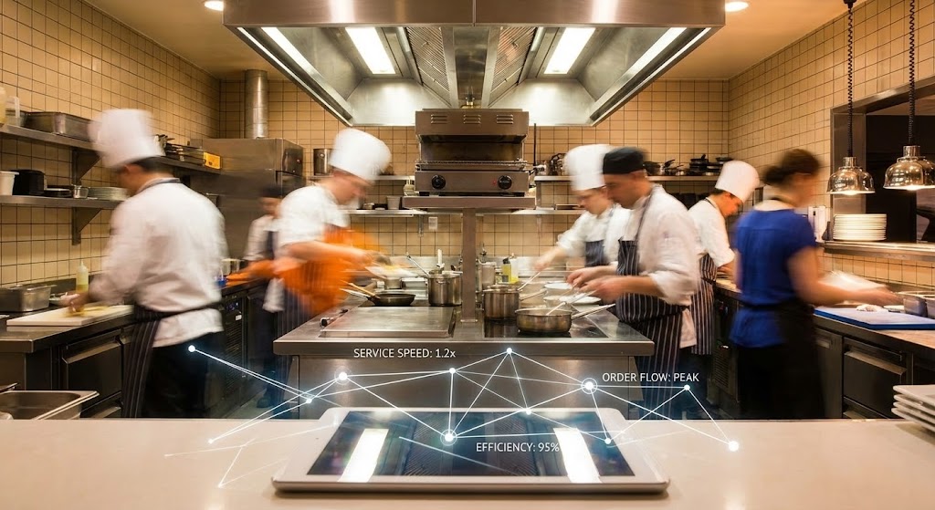
The landscape of workforce management is undergoing a profound shift. We are moving away from the era of reactive "fire-fighting"—where managers dread the morning call-in—toward a future of "Operational Harmony." In this new paradigm, the schedule is not merely a spreadsheet; it is a dynamic, living system that orchestrates the complex dance of a deskless workforce with elegance and precision.
For Operations Directors and HR leaders, the challenge has never been the complexity of the data, but rather the friction of the interface. The "Physical/Digital Divide" creates a gap between the chaotic reality of the shop floor and the rigid digital tools used to manage it. Bridging this gap requires more than just code; it requires a strategic visualization language that reduces cognitive load and turns scheduling into an intuitive, almost tactile experience.
The opportunity for transformation is quantifiable. Scheduling errors typically increase labor costs by 15 percent through unnecessary overtime payments and emergency staffing expenses. This is the silent leak in profitability that intelligent visualization can plug. Yet, the impact goes beyond the bottom line. Research confirms that deskless workers who enjoy their work are 62% less likely to consider a new job than those who don't. Your software's interface is the primary touchpoint for that experience.
This guide serves as your visual blueprint for this transformation. We explore distinct video styles, each selected to solve specific communication challenges in the B2B funnel. From the empathy-driven realism of Gen AI characters to the precise logic of isometric workflows, these examples demonstrate how to visualize "Operational Harmony" and position your platform not just as a tool, but as the essential engine of business growth.
1. Bold Kinetic Typography (Visual)
TOFU | Brand Awareness

**Center-Aligned Caption:** (Style 4): Dynamic Text Organization - Organizing Chaos Instantly
The Visual & Narrative Approach
This style abandons traditional imagery to focus purely on the energy of organization. Imagine a 2D vector environment where vivid coral and slate grey blocks—representing "time slots"—collide and shuffle with a satisfying, magnetic weight. They don't just appear; they snap into place, building a perfect, interlocking wall of productivity. The aesthetic is flat, modern, and aggressively clean, using hard edges to convey precision. There is no voiceover; the narrative is driven entirely by the rhythmic, percussive movement of the typography and shapes, signaling that your software turns chaos into order instantly.
Psychological Impact & KPI Focus
- Niche Psychology: The "Snapping" motion utilizes haptic visual cues, triggering a sense of satisfaction and completion in the viewer's brain. It visually scratches the itch for organization that every Operations Manager feels.
- Operational Impact: This style creates a "Category Anchor," positioning your brand as the definitive solution for speed and structure. It directly addresses the anxiety of fragmented schedules by showing them becoming whole.
Strategic Implementation & Trade-offs
- Duration: 10-15 Seconds.
- Best Use: High-impact LinkedIn feed interruptions where sound-off viewing is common.
- Trade-off: Excellent for capturing attention but lacks specific feature education. It sells the feeling of the solution, not the mechanics.
Companies using similar video content -
Sling – Employee Scheduling – Organizes shifts and reduces labor costs instantly.
When I Work – Employee Scheduling – Builds work schedules in minutes, shares instantly.
Homebase – Employee Scheduling – Simplifies and streamlines scheduling with quick actions.
2. Abstract 2D flat vector organic
TOFU | Market Education

**Center-Aligned Caption:** (Style 7): Abstract Vector - Solving The Scheduling Puzzle
The Visual & Narrative Approach
Here, we soften the edges to introduce a more human, consultative tone. The scene depicts a top-down view of an abstract desktop surface in mustard yellow and teal, evoking a creative workspace. We see geometric "puzzle pieces," each representing a specific shift or employee skill, scattered across the surface. Disembodied, stylized vector hands gently slide these pieces into a grid, finding the perfect fit for each unique shape. The texture is matte and paper-cut, suggesting that while the process is digital, the care taken is personal.
Psychological Impact & KPI Focus
- Niche Psychology: The "Puzzle" metaphor reduces the cognitive load of understanding complex algorithms. It reframes "scheduling" from a tedious chore into a solvable, satisfying logic game.
- Operational Impact: This visual approach educates the market on "Smart Rostering." It subtly implies that your software handles the complexity (the varying shapes) so the manager doesn't have to force square pegs into round holes.
Strategic Implementation & Trade-offs
- Duration: 30-45 Seconds.
- Best Use: Embedded in blog posts about "Overcoming Scheduling Complexity" or "Fair Workweek Compliance."
- Trade-off: The abstract nature requires a voiceover to ground the metaphor in reality. Without narration, the connection to specific software features might be too loose.
Companies using similar video content -
Connecteam – Employee Scheduling – Simplifies shift planning with intuitive puzzle-like interface.
Homebase – Employee Scheduling – Automates scheduling based on availability and costs.
ZoomShift – Employee Scheduling – Creates reusable templates and allows self-scheduling.
3. Generative AI Realistic Character video
TOFU | Skippable Pre-Roll Ad

**Center-Aligned Caption:** (Style 30): Realistic Lifestyle - Humanizing Employee Flexibility
The Visual & Narrative Approach
This style leverages the power of mirror neurons by showing the face of the end-user. We open on a vertical, cinematic shot of a young barista in a warm-lit, trendy coffee shop. We see the details—the tattoos on her arm, the texture of her denim apron, and the soft bokeh lights in the background. The focus is on her genuine, unscripted smile as she looks at her smartphone. The screen glow illuminates her face, capturing the exact moment of relief when a shift swap is approved. It’s hyper-realistic, intimate, and immediately relatable.
Psychological Impact & KPI Focus
- Niche Psychology: Humans connect with faces. Seeing the barista's relief triggers empathetic resonance in the viewer (likely an HR manager who cares about employee retention).
- Operational Impact: This addresses the "Retention" KPI. It visualizes the intangible benefit of "Employee Empowerment"—showing that the software doesn't just manage shifts; it improves lives, thereby reducing churn.
Strategic Implementation & Trade-offs
- Duration: 9-12 Seconds (Loopable).
- Best Use: TikTok or Instagram Reels where authenticity outperforms polished corporate motion graphics.
- Trade-off: This style relies heavily on the quality of the AI generation. Any "uncanny valley" artifacts can break the emotional connection. It is specific to the employee experience, not the manager's dashboard.
Companies using similar video content -
Deputy – Employee Scheduling – Empowers employees with self-service shift management.
Planday – Workforce Management – Manages teams with a tap, empowering shift swaps.
Connecteam – Workforce Management – Focuses on mobile-first employee experience and engagement.
4. Abstract 2D Motion Graphics
TOFU | Vertical Social Organic
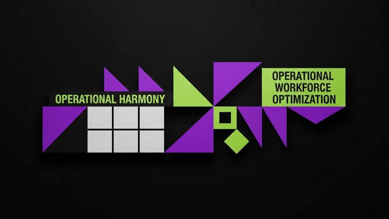
**Center-Aligned Caption:** (Style 8): Kinetic Abstract - Visualizing Operational Harmony
The Visual & Narrative Approach
This visualization takes a high-level, strategic view. Using a bold palette of Electric Purple, Lime Green, and Black, we enter a digital void where geometric shapes—triangles and squares—move in a rhythmic, kaleidoscopic pattern. These abstract forms represent different data points (labor demand, staff availability). As the motion accelerates, they interlock perfectly to form a stylized, stable calendar grid. The text "OPERATIONAL HARMONY" anchors the composition, transforming the visual chaos into a structured, symmetrical system.
Psychological Impact & KPI Focus
- Niche Psychology: The transition from "floating chaos" to "locked grid" utilizes process fluency, making the concept of workforce optimization feel inevitable and smooth.
- Operational Impact: This style supports "Category Creation" by elevating the conversation from "scheduling tools" to "Workforce Optimization Systems." It appeals to the Functional Buyer who wants to see a system that creates order from entropy.
Strategic Implementation & Trade-offs
- Duration: 15-20 Seconds.
- Best Use: LinkedIn operational thought leadership posts or high-level brand headers.
- Trade-off: Highly abstract. It establishes a "Premium" brand feel but explains zero functionality. It must be paired with clear, benefit-driven copy.
Companies using similar video content -
Workforce.com – Workforce Management – Provides a consistent view of all schedules and labor costs.
Quinyx – Workforce Management – Optimizes workforce planning and operational efficiency.
UKG Dimensions – Workforce Management – Offers comprehensive workforce optimization solutions.
5. Rapid UI Feature Montage
TOFU | Category Creation
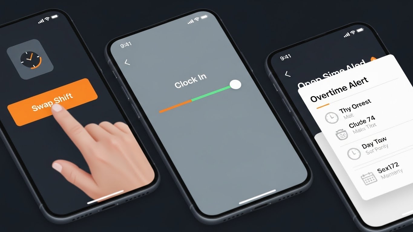
**Center-Aligned Caption:** (Style 19): Rapid UI - Instant Gratification Workflow
The Visual & Narrative Approach
Speed is the currency here. In a square (1:1) format designed for mobile feeds, we see a rapid-fire montage of high-fidelity mobile UI screens. The palette is high-contrast: Bright Orange action buttons against Slate Grey backgrounds. The view features extreme close-ups and quick pans across interface elements: a finger tapping a "Swap Shift" button, a "Clock In" slider sliding to green, and an "Overtime Alert" popping up. The style is flat, clean, and sharp, emphasizing speed and ease of use.
Psychological Impact & KPI Focus
- Niche Psychology: The "Rapid Fire" editing triggers an alertness response, preventing the user from scrolling past. The focus on single taps emphasizes "Ease of Use" and low friction.
- Operational Impact: This targets the "Efficiency" KPI. It proves to the skeptic that the software is "Plug and Play," directly addressing the fear of long training times or complex adoption curves.
Strategic Implementation & Trade-offs
- Duration: 6-10 Seconds.
- Best Use: Meta (Facebook/Instagram) retargeting ads aimed at decision-makers who have visited the pricing page.
- Trade-off: The pace is too fast for deep comprehension. It serves as a "Hook" to drive clicks, not a "Guide" to teach workflows.
Companies using similar video content -
Jibble – Time Tracking – Offers smarter time tracking with effortless, rapid actions.
7shifts – Restaurant Scheduling – Creates shift templates and schedules in minutes.
OnTheClock – Employee Scheduling – Simple drag-and-drop scheduling for small teams.
6. Isometric 2D Motion Design
TOFU | Instant Gratification Hook
**Center-Aligned Caption:** (Style 3): Orthographic View - The Manager's Eye View
The Visual & Narrative Approach
We zoom out to an orthographic, isometric perspective, presenting a "God's eye view" of the operation. The visual is a miniature, tangerine and white coffee shop diorama with the roof cut away. We see the floor plan and tiny staff members moving efficiently. Floating above them are clean geometric icons representing shift assignments and status updates. The motion is precise and mechanical, visualizing the software as the invisible engine running the physical location.
Psychological Impact & KPI Focus
- Niche Psychology: Isometric views provide a sense of omniscience and control. It satisfies the manager's desire to "see everything at once" without feeling overwhelmed.
- Operational Impact: This style differentiates the product by visualizing the "Physical/Digital Bridge." It connects the software (icons) directly to the physical reality (the shop floor), validating the operational complexity the buyer manages daily.
Strategic Implementation & Trade-offs
- Duration: 20-30 Seconds.
- Best Use: Website "Solutions" pages or "How it Works" sections.
- Trade-off: Requires custom asset creation for different industries (e.g., a coffee shop scene doesn't resonate with a hospital buyer).
Companies using similar video content -
MyMobileWorkers – Field Service Management – Digitizes field operations, replacing paperwork.
Skedulo – Deskless Workforce Management – Manages and engages deskless workforce with intelligent scheduling.
Workever – Field Service Management – Simplifies field service with drag-and-drop scheduling.
7. Clean UI Workflow (Light Mode)
MOFU | Product Differentiation
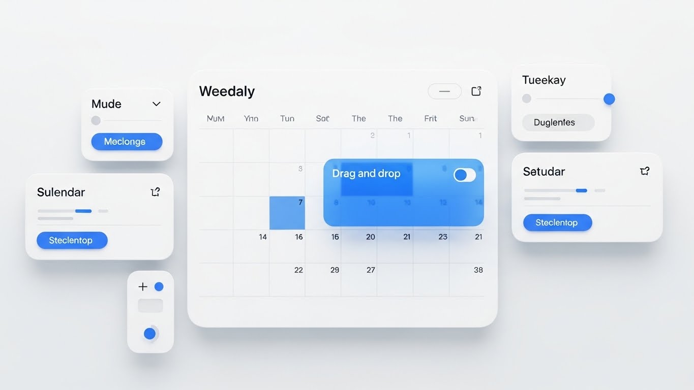
**Center-Aligned Caption:** (Style 15): Pristine UI - Frictionless Scheduling Control
The Visual & Narrative Approach
This is the "Gold Standard" of product demos. We see a pristine, high-resolution rendering of the SaaS UI screen in a clean white, light blue, and soft gray palette. The interface shows a weekly calendar grid with rounded corners and soft drop shadows. Visual cues indicate a "drag-and-drop" action in progress, with a translucent colored block hovering over a specific time slot. Floating panels like "Sulendar" (Calendar) and toggle switches reinforce the depth and modernity of the UI.
Psychological Impact & KPI Focus
- Niche Psychology: The minimalist aesthetic reduces visual noise, allowing the viewer to focus entirely on the workflow logic. The "Soft Shadow" depth cues suggest a modern, high-quality build.
- Operational Impact: This addresses "Usability Trust." By showing the actual interface in a polished state, it removes the fear of clunky, legacy software. It proves the tool is "Enterprise Grade" yet "Consumer Simple."
Strategic Implementation & Trade-offs
- Duration: 30-60 Seconds.
- Best Use: Core landing pages and "Feature Deep Dive" videos.
- Trade-off: It requires a high-fidelity UI mock-up. If the actual software doesn't look this clean, it risks creating a "Expectation vs. Reality" gap.
Companies using similar video content -
Shiftbase – Workforce Management – Provides an easy-to-use platform for online schedules.
Humanity Schedule by TCP – Employee Scheduling – Creates balanced schedules with a user-friendly interface.
Connecteam – Workforce Management – Offers intuitive user experience for scheduling and communication.
8. Minimalist Flat 2D Vector
MOFU | Feature Education
**Center-Aligned Caption:** (Style 1): Minimalist Activation Touch - Triggering Instant Action
The Visual & Narrative Approach
This style is hyper-focused on conversion. Using a Mint Green and Charcoal palette, the frame is dominated by a macro view of a stylized vector hand. The index finger extends to press a large, inviting, circular "Start" button on a device screen. The background is a solid color field, eliminating all distractions. The animation is subtle—just the press and a satisfying "pulse" ripple effect from the button—visualizing the moment of activation.
Psychological Impact & KPI Focus
- Niche Psychology: The "Big Button" theory suggests that clear, singular calls to action reduce decision fatigue. The visual simplicity commands the user to take the next step.
- Operational Impact: This supports the "Conversion" KPI. It visually lowers the barrier to entry, suggesting that starting a trial or activating a feature is as easy as a single tap.
Strategic Implementation & Trade-offs
- Duration: 3-5 Seconds (GIF).
- Best Use: Embedded in email newsletters or onboarding welcome sequences.
- Trade-off: It is purely functional and directive. It tells no story and explains no value; it simply commands an action.
Companies using similar video content -
Coast – Employee Scheduling – Offers a free plan with easy scheduling and communication.
OpenSimSim – Employee Scheduling – Provides basic scheduling needs with a simple interface.
FindMyShift – Employee Scheduling – Simplifies shift planning with a clear, reliable interface.
9. Isometric 3D Workflow
MOFU | Driving Freemium/Trials
**Center-Aligned Caption:** (Style 10): 3D Clay Workflow - Scaling Enterprise Operations
The Visual & Narrative Approach
We return to the isometric perspective but upgrade to a "Claymorphism" 3D style. The surfaces are soft, matte, and tactile, rendered in Corporate Blue and Silver. The scene depicts an open-plan office floor where small, pill-shaped avatars move in synchronized patterns, resembling game pieces on a board. The lighting is soft and global, casting gentle shadows that emphasize the volume of the space. This isn't just a coffee shop; it's a complex operational floor, yet the movement is frictionless and perfectly choreographed.
Psychological Impact & KPI Focus
- Niche Psychology: The "Clay" texture makes the environment feel friendly and malleable, countering the perception of corporate software being cold or rigid. The synchronized movement implies predictability.
- Operational Impact: This appeals to the "Functional Buyer" (IT/Ops Directors) who needs to visualize scalability. It shows that the software can handle complex, multi-agent environments without breaking a sweat.
Strategic Implementation & Trade-offs
- Duration: 15-25 Seconds.
- Best Use: "Enterprise" tier service pages or background video assets for website hero sections.
- Trade-off: Higher production cost due to 3D rendering. It must be abstract enough to apply to multiple sectors (office, warehouse, retail) to justify the ROI.
Companies using similar video content -
Legion – AI-Powered Workforce Management – Optimizes labor efficiency with AI scheduling.
Workday – Workforce Planning – Models, forecasts, and budgets from a unified data core.
Orgvue – Organizational Design Software – Optimizes workforce structure with data visualization.
11. Wireframe to Reality Transition
MOFU | Competitive Displacement
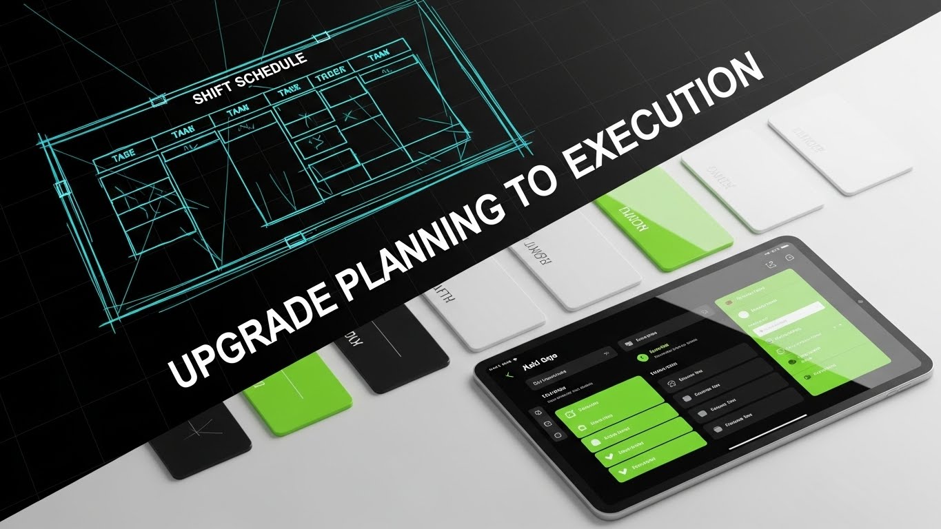
**Center-Aligned Caption:** (Style 26): Conceptual Morph - From Sketch to Solution
The Visual & Narrative Approach
This style tells a story of evolution in a single frame. The composition utilizes a dynamic diagonal split-screen. On the left, we see the "blueprint" stage: a rough, architectural wireframe sketch of a shift schedule in electric blue and white. As our eyes move right, crossing the diagonal threshold, the sketch resolves instantly into a photorealistic, glossy tablet screen displaying the final, polished app interface in Neon Green and Black. The transition isn't static; the wireframe lines literally "fill in" to become the high-fidelity UI, visualizing the journey from a rough plan to a flawless execution.
Psychological Impact & KPI Focus
- Niche Psychology: This appeals to the buyer's desire for modernization and closure. It subtly categorizes competitors (or current manual processes) as "drafts" or "sketches," while positioning your software as the "finished masterpiece."
- Operational Impact: This targets "Implementation Confidence." It visually demonstrates that your robust architecture (the wireframe) is the foundation for a beautiful, usable experience (the UI), bridging the gap between IT requirements and user satisfaction.
Strategic Implementation & Trade-offs
- Duration: 10-15 Seconds.
- Best Use: "Versus" comparison ads or "Why Switch" campaigns on LinkedIn retargeting users of legacy systems.
- Trade-off: It is a comparative style. It implies that what came before was incomplete, which is powerful for displacement but aggressive for general brand awareness.
Companies using similar video content -
Rippling – Workforce Platform – Unifies HR, payroll, IT, and spending in one system.
ADP Workforce Now – Human Capital Management – Integrates HR, payroll, and workforce management.
Vena – FP&A Software – Connects HRIS and ERP systems for workforce insights.
12. 2D Line Art Animation
MOFU | Rapid UI Montage
**Center-Aligned Caption:** (Style 2): Continuous Line - Time Is Profit
The Visual & Narrative Approach
Sophistication often lies in simplicity. Set against a deep Black background, a single, elegant line in Gold and White begins to move. It fluidly draws the outline of a clock face, ticking rapidly. Without breaking the stroke, the line morphs, transforming the circular clock into the sharp angles of a rising financial trend graph. The animation is silky and continuous, suggesting an unbroken link between workforce management and the bottom line. It creates a sophisticated, almost luxury feel for the concept of "efficiency," elevating the conversation above the tactical grind of rostering.
Psychological Impact & KPI Focus
- Niche Psychology: The "Continuous Line" utilizes processing fluency. By connecting "Time" (the clock) and "Money" (the graph) with a single stroke, it subconsciously plants the idea that they are the same thing, bypassing logical resistance to cost arguments.
- Operational Impact: This addresses the "ROI" KPI. It visualizes the financial argument for the Financial Buyer (CFO), simplifying the complex relationship between overtime reduction and profitability into a single, elegant gesture.
Strategic Implementation & Trade-offs
- Duration: 15-20 Seconds.
- Best Use: Pre-roll ads on business/finance content or as a segment in a longer sales deck.
- Trade-off: It is conceptual and metaphorical. It does not show the actual product interface, so it must be used to sell the value, not the feature.
Companies using similar video content -
Combo – Employee Scheduling & HR – Transforms chaotic Excel schedules into compliant digital solutions.
ClearCompany – Talent Management – Centralizes headcount forecasting and staffing scenarios.
SAP SuccessFactors – Human Capital Management – Streamlines HR processes from planning to execution.
13. 2D Animation & UI Composition
MOFU | Demand Gen

**Center-Aligned Caption:** (Style 25): Character & UI - The User Success Moment
The Visual & Narrative Approach
This style injects energy and human validation into the workflow. In a bold Yellow, Black, and White palette, a stylized 2D character profile points enthusiastically at a floating UI panel. The panel displays a massive, satisfying Green Checkmark—the universal symbol of "Done." The background is a dynamic geometric pattern that adds urgency. This isn't just about the software; it's about the feeling of the manager clearing their to-do list. The character acts as a proxy for the user, celebrating the ease of approval.
Psychological Impact & KPI Focus
- Niche Psychology: The giant checkmark provides a dopamine hit. It visualizes the emotional relief of resolving a scheduling conflict or approving a time-off request, associating the software with positive reinforcement.
- Operational Impact: This focuses on "Adoption." It visually promises that the software is responsive and rewarding to use, directly countering the fear that staff will resist new technology.
Strategic Implementation & Trade-offs
- Duration: 6-10 Seconds.
- Best Use: High-frequency Facebook/Instagram feed ads where character-driven creative stops the scroll.
- Trade-off: The "cartoon" style may feel too casual for enterprise clients. It is best suited for SMB or mid-market segments where approachability is key.
Companies using similar video content -
Workforce.com – Workforce Management – Drives efficiency and predicts labor costs.
Planful – Financial Performance Management – Models workforce scenarios to assess financial impact.
ActivTrak – Workforce Analytics – Provides productivity insights to optimize workflows.
14. Lifestyle Stock with UI Overlay
BOFU | Establishing Thought Leadership

**Center-Aligned Caption:** (Style 20): Augmented Reality - Contextualizing The Workforce
The Visual & Narrative Approach
We ground the digital tool in the physical world. The shot is cinematic and high-quality: a bustling warehouse floor with industrial grey racking and Safety Orange accents. We view the scene over the shoulder of a floor manager holding a tablet. Crucially, the focus is split—the background is slightly blurred, emphasizing the sharp, crisp Blue and White UI overlay hovering above the tablet. This "Heads-Up Display" (HUD) effect visualizes the roster data not as a spreadsheet, but as an active layer of intelligence governing the physical space.
Psychological Impact & KPI Focus
- Niche Psychology: This bridges the Physical/Digital Divide. It validates the manager's reality (the noisy, complex floor) while presenting the software as the lens through which they control it.
- Operational Impact: This targets "Situational Awareness." It demonstrates that the software doesn't detach the manager from the floor; it enhances their vision and control over real-time operations.
Strategic Implementation & Trade-offs
- Duration: 10-15 Seconds (Loopable).
- Best Use: LinkedIn background banners or silent autoplay videos in case studies.
- Trade-off: Requires high-quality stock footage that matches your specific vertical. A generic office shot won't resonate with a deskless workforce buyer.
Companies using similar video content -
Blink – Employee Experience Platform – Connects people, systems, and culture in a super-app.
Connecteam – Workforce Management – Streamlines communication and employee engagement.
Zoho People – HR Software – Empowers employees with self-service options and clear indicators.
15. Photorealistic 3D Renders
BOFU | Building Trust

**Center-Aligned Caption:** (Style 12): Premium Finish - Enterprise-Grade Security
The Visual & Narrative Approach
At the Bottom of the Funnel, trust is the currency. This style uses photorealistic 3D rendering to convey premium value. A sleek glass tablet rests on a dark mahogany desk, the lighting dramatic and moody. On the screen, a high-fidelity dashboard in Deep Navy and Gold glows softly. Hovering physically above the glass is a 3D "Shield" icon, emitting a protective light. The texture of the wood and the refraction of the glass signal "Enterprise Quality" and substantiality.
Psychological Impact & KPI Focus
- Niche Psychology: The "Premium Materiality" (wood, glass, gold) triggers a quality heuristic. It subconsciously tells the buyer that this is not a cheap, fly-by-night app; it is a serious, secure business tool.
- Operational Impact: This addresses "Security & Compliance." The shield metaphor visually physicalizes the abstract concept of data protection (SOC2, GDPR), making safety feel tangible and robust.
Strategic Implementation & Trade-offs
- Duration: 5-10 Seconds (Cinemagraph).
- Best Use: The "Security" or "Enterprise" section of your pricing page.
- Trade-off: High rendering costs. It is a static or slow-moving asset designed for prestige, not for explaining complex workflows.
Companies using similar video content -
Lystloc – Field Workforce Management – Tracks on-field workers with real-time location features.
Udext – Mobile Workforce Management – Streamlines communication with frontline and deskless workers.
Hubstaff – Time Tracking – Monitors work hours and activity for remote teams.
16. Dynamic Data Visualization
BOFU | ROI Justification

**Center-Aligned Caption:** (Style 6): Monumental Growth - The Scale of Success
The Visual & Narrative Approach
When speaking to the CFO, you speak in charts—but make them monumental. In an infinite white room, abstract 3D data bars rise like skyscrapers. Rendered in high-gloss Emerald Green plastic and Light Grey, they trend sharply upwards. The camera angle is low, looking up at the soaring graph, giving the data a sense of scale and awe. An arrow arcs dynamically over the peaks, confirming the trajectory. This isn't just a chart; it's a monument to financial performance.
Psychological Impact & KPI Focus
- Niche Psychology: The low-angle perspective evokes a sense of dominance and ambition. It aligns the software purchase with the viewer's aspiration for aggressive company growth.
- Operational Impact: This visualizes "ROI Scalability." It argues that the software doesn't just save a few dollars; it scales with the business, supporting massive structural growth.
Strategic Implementation & Trade-offs
- Duration: 10-20 Seconds.
- Best Use: Investor decks, Quarterly Business Reviews (QBRs), or the "Results" section of a case study video.
- Trade-off: It is abstract. It needs to be paired with hard numbers (e.g., "300% ROI") in the accompanying text or voiceover to have real weight.
Companies using similar video content -
SAP SuccessFactors – Human Capital Management – Offers robust HCM suite with workforce analytics.
Oracle HCM Cloud – Human Capital Management – Provides comprehensive HR and workforce solutions.
Ceridian Dayforce – Workforce Management – Delivers enterprise-grade security and compliance.
17. 3D X-Ray Visualization
BOFU | Risk Mitigation

**Center-Aligned Caption:** (Style 14): X-Ray Tech - Infrastructure Security Transparency
The Visual & Narrative Approach
To reassure the technical buyer (CTO/CIO), we need to look under the hood. This style utilizes a "Transparency" aesthetic. We see a stylized server rack casing in semi-transparent white. Inside, the "guts" of the system—glowing Red and skeletal Grey data structures—are visible. Floating securely in the center of this complex machinery is a glowing "Lock" icon. The aesthetic is clinical, clean, and high-tech, stripping away the mystery to show robust internal architecture.
Psychological Impact & KPI Focus
- Niche Psychology: The "X-Ray" effect utilizes the disclosure effect. By showing the "insides," you signal that you have nothing to hide. It builds deep technical trust with skeptical IT buyers.
- Operational Impact: This targets "Infrastructure Reliability." It visually proves that the system is engineered, not just designed. It validates claims about uptime, redundancy, and architectural integrity.
Strategic Implementation & Trade-offs
- Duration: 15-20 Seconds.
- Best Use: Embedded in technical whitepapers or compliance documentation.
- Trade-off: Too technical for the average HR buyer. It speaks a specific visual language meant for the gatekeepers of technology implementation.
Companies using similar video content -
Visier – Workforce Planning – Uses AI for predictive analytics and workforce insights.
Anaplan – Planning Platform – Connects HR, finance, and operations for workforce planning.
Board – Enterprise Planning – Tracks headcount, models scenarios, and optimizes talent.
18. Generative AI Cinematic Video
BOFU | The Economic Buyer

**Center-Aligned Caption:** (Style 28): Cinematic Healthcare - Invisible Algorithmic Care
The Visual & Narrative Approach
For high-stakes environments like healthcare, the story is about care, not calendars. This cinematic Gen AI video features a slow-motion dolly shot down a busy hospital emergency room hallway. The lighting is a cool, muted Hospital Blue and White, with anamorphic lens flares adding a sense of drama. Doctors and nurses rush to attend patients, but their movement is fluid, not chaotic. Overlaid in the air are thin, Silver data lines connecting the staff—visualizing the invisible algorithmic coordination that ensures the right skills are at the right bedside instantly.
Psychological Impact & KPI Focus
- Niche Psychology: This triggers high-stakes resonance. It acknowledges the gravity of the work the audience manages. It portrays the software not as a scheduler, but as a critical part of the patient care ecosystem.
- Operational Impact: This focuses on "Service Level Assurance" (SLA). It shows that "Operational Harmony" in this context saves lives, positioning the platform as mission-critical infrastructure.
Strategic Implementation & Trade-offs
- Duration: 30-60 Seconds.
- Best Use: Brand anthem videos for specific verticals (Healthcare, Emergency Services) on YouTube or homepage headers.
- Trade-off: The tone is serious and dramatic. It is inappropriate for lower-stakes industries like retail or fast food, where it would feel hyperbolic.
Companies using similar video content -
ActivTrak – Workforce Analytics – Provides productivity insights and team performance tracking.
Ceridian Dayforce – Workforce Management – Offers robust, integrated HCM solutions.
UKG Shiftboard – Employee Scheduling – Provides rule-based scheduling for complex operations.
19. Futuristic Neon/Dark Mode
BOFU | The Champion
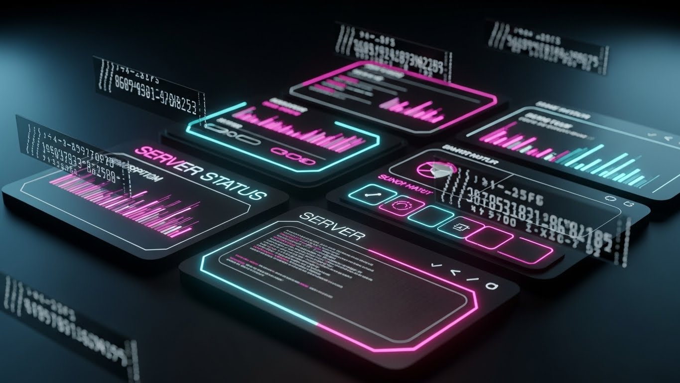
**Center-Aligned Caption:** (Style 13): Dark Mode Command - The IT Power User
The Visual & Narrative Approach
This style is a love letter to the power user. The background is deep OLED Black, designed to pop on high-end screens. The interface elements are defined by glowing Neon Cyan and Magenta outlines, reminiscent of a command terminal or a sci-fi dashboard. We see floating code streams and "Server Status" graphs updating in real-time. The aesthetic is sleek, high-contrast, and aggressively modern, visualizing the platform as a powerful engine that hums quietly in the dark.
Psychological Impact & KPI Focus
- Niche Psychology: Dark mode is a status signal in the tech world. It implies professional-grade tools used by experts. It appeals to the internal "Champion" who wants to bring a cool, cutting-edge tool into their boring corporate environment.
- Operational Impact: This targets "System Performance." The high-contrast data visualization implies precision monitoring and real-time responsiveness, key for IT Ops dashboards.
Strategic Implementation & Trade-offs
- Duration: 10-15 Seconds.
- Best Use: Feature release trailers for "Dark Mode" or "Advanced Analytics" modules, shared via email to power users.
- Trade-off: It can look "gamer-esque." Ensure it retains enough professional polish to be taken seriously by the C-suite, even if the end-users love it.
Companies using similar video content -
QGenda – Healthcare Staff Scheduling – Optimizes healthcare staff scheduling and resource management.
ShiftWizard (HealthStream) – Healthcare Staff Scheduling – Simplifies staffing and improves efficiency in healthcare.
Skedulo – Healthcare Workforce Management – Matches employees to jobs based on proximity and skills.
20. Split Screen: Optimized Reality
BOFU | Objection Handling
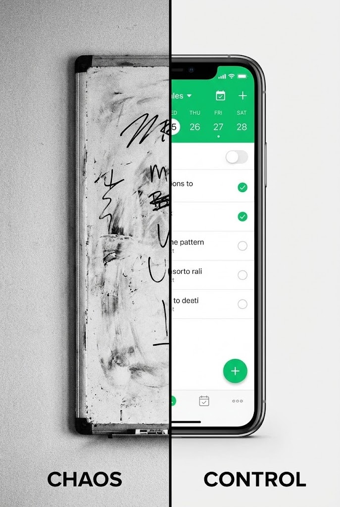
**Center-Aligned Caption:** (Style 27): Chaos vs. Control - The Transformation
The Visual & Narrative Approach
Sometimes, the best way to sell the future is to show the past. This style uses a hard vertical split-screen. On the left, in gritty Black and White, is a messy whiteboard covered in confusing marker scribbles—the "Old Way." On the right, in pristine 4K color, is a smartphone displaying your clean, organized scheduling app in Vivid Green—the "Control." A hard vertical line separates the worlds. The visual argument is instant and undeniable.
Psychological Impact & KPI Focus
- Niche Psychology: The Contrast Principle is powerful here. By placing the pain (chaos) directly next to the cure (control), the brain instinctively recoils from the left and moves toward the right.
- Operational Impact: This handles the "Inertia" objection. It visualizes the cost of doing nothing (staying with the whiteboard) versus the clarity of upgrading, making the choice to switch feel obvious and urgent.
Strategic Implementation & Trade-offs
- Duration: 6-10 Seconds.
- Best Use: Retargeting ads on Meta (Facebook/Instagram) for users who viewed the demo but haven't converted.
- Trade-off: It is blunt. It lacks nuance but is incredibly effective at driving a binary "Old vs. New" decision.
Companies using similar video content -
WebWork Tracker – Workforce Analytics – Offers AI-powered time tracking and productivity insights.
Runn – Resource Management – Provides resource scheduling and project forecasting.
ChartHop – People Operations Platform – Visualizes team structure and headcount changes.
21. Macro UI Micro-Interactions
Onboarding | Driving Freemium/Trials

**Center-Aligned Caption:** (Style 17): Tactile Connection - The Activation Moment
The Visual & Narrative Approach
This style zooms in closer than ever before—literally. We utilize an extreme macro photography aesthetic (rendered in 3D) to focus on a single human fingertip hovering millimeters above a glowing touchscreen. The skin has texture; the screen pixels are visible. As the finger connects with a button labeled "Publish Schedule," we see a burst of Electric Blue light and a subtle ripple, simulating a physical button press. It visualizes "Digital Tactility"—making the software feel substantial, responsive, and real.
Psychological Impact & KPI Focus
- Niche Psychology: This leverages haptic visualization. Even without physical feedback, seeing the "press" triggers the sensory areas of the brain, creating a "phantom touch" sensation that makes the interaction feel satisfying and definite.
- Operational Impact: This targets the "Time-to-Value" (TTV) KPI. It creates a psychological anchor for the "First Win" (publishing the first roster), marking the transition from "setting up" to "using."
Strategic Implementation & Trade-offs
- Duration: 3-5 Seconds.
- Best Use: "Success State" animations inside the app (e.g., after completing a setup wizard) or as the closing shot of a welcome video.
- Trade-off: It is purely sensory. It explains nothing about the process, only emphasizing the satisfaction of the result.
Companies using similar video content -
Homebase – Employee Management – Simplifies and streamlines scheduling, time tracking, and communication.
Deputy – Workforce Management – Transforms manual processes into effortless management.
Combo – Employee Scheduling & HR – Replaces Excel chaos with fluid, intuitive scheduling.
22. 2D Graphics Over Live Action
Onboarding | Self-Serve Onboarding

**Center-Aligned Caption:** (Style 23): Augmented Empathy - Humanizing Onboarding
The Visual & Narrative Approach
To reduce the intimidation of learning new software, we blend reality with playfulness. A high-quality live-action shot features a nurse or retail manager smiling at the camera in a real workspace. Surrounding them are hand-drawn, pop-colored 2D animations—yellow stars, pink speech bubbles with checkmarks, and energetic motion lines. These "doodles" highlight key success moments. It feels like a friend annotating the world, making the software seem approachable rather than clinical.
Psychological Impact & KPI Focus
- Niche Psychology: This style reduces technophobia. The "hand-drawn" aesthetic signals informality and forgiveness, countering the rigidity of enterprise software and encouraging users to experiment without fear of breaking things.
- Operational Impact: This addresses "User Adoption." By associating the learning process with positive, human emotion, it reduces abandonment rates during self-serve training modules.
Strategic Implementation & Trade-offs
- Duration: 45-90 Seconds.
- Best Use: "Getting Started" video series or "Academy" intro videos.
- Trade-off: High production complexity. It requires shooting professional live-action footage and then tracking custom animation over it.
Companies using similar video content -
Connecteam – Workforce Management – Mobile-first design for easy, instant interactions.
When I Work – Employee Scheduling – Intuitive mobile app for quick employee actions.
Jibble – Time Tracking – Effortless time tracking with facial recognition and GPS.
23. 3D Parallax UI Presentation
Onboarding | Accelerating Time-to-Value
**Center-Aligned Caption:** (Style 18): Spatial Depth - Frictionless Cloud Logic
The Visual & Narrative Approach
We visualize the "Cloud" not as a buzzword, but as an environment. In a soft, ethereal space with a Peach-to-Blue gradient, UI elements (employee cards, calendar grids, shift blocks) float on separate planes. As the "camera" moves, a parallax effect creates a deep sense of dimensionality. The elements drift together to form a cohesive stack. It suggests that while the data is complex, the system holding it is light, airy, and effortlessly organized.
Psychological Impact & KPI Focus
- Niche Psychology: The floating, weightless motion utilizes spatial fluency. It visually assures the user that the software handles the "heavy lifting," leaving them with a lightweight, manageable interface.
- Operational Impact: This targets "Perceived Ease of Use." It counters the "Spreadsheet Fatigue" operational managers feel, positioning the platform as a breath of fresh air compared to their legacy manual processes.
Strategic Implementation & Trade-offs
- Duration: 10-15 Seconds (Loopable GIF).
- Best Use: Embedded in "Day 1" onboarding emails to reinforce the decision to purchase.
- Trade-off: It is stylistic, not instructional. It sets a mood but doesn't teach a specific workflow.
Companies using similar video content -
Beekeeper – Mobile Workforce Management – Enhances internal communication for non-desk employees.
Zoho People – HR Software – Manages HR tasks with a user-friendly, engaging interface.
Connecteam – Workforce Management – Streamlines communication and employee engagement with visual tools.
24. Aspirational Stock Montage
Onboarding | Trial/Freemium User Activation

**Center-Aligned Caption:** (Style 21): Unified Vision - Cross-Industry Scalability
The Visual & Narrative Approach
This style builds a community of success. We use a high-key, warm-lit montage of diverse professionals—a chef wiping his brow with a smile, a construction foreman looking at a tablet, a retail associate laughing with a customer. Subtle, abstract geometric shapes in your brand colors overlay the "seams" between the shots, visually stitching these different worlds together. The message is clear: "You are part of a global movement of modernized managers."
Psychological Impact & KPI Focus
- Niche Psychology: This triggers social proof and belonging. It validates the user's role, elevating them from "scheduler" to "workforce leader," and assures them that the software works for "people like me."
- Operational Impact: This supports "Activation Rate." By showing the end result (happy, relaxed professionals), it motivates the user to push through the friction of initial data entry and setup.
Strategic Implementation & Trade-offs
- Duration: 15-30 Seconds.
- Best Use: "Welcome to the Community" emails or waiting room screens for webinars.
- Trade-off: It relies on stock footage, which can feel generic if not carefully curated and branded with the overlay graphics.
Companies using similar video content -
UKG Ready – Workforce Management – Provides cloud-based HCM solutions with ease of use.
Planday – Workforce Management – Simplifies employee scheduling and staff management.
Workday – Workforce Planning – Offers unified data core for modeling and forecasting.
25. Low-Poly 3D Modeling
Retention | Reducing Support Overhead

**Center-Aligned Caption:** (Style 9): Low-Poly Friendliness - De-escalating Support Friction
The Visual & Narrative Approach
Support documentation is usually boring. We make it delightful. Using a "Low-Poly" 3D style (faceted, geometric shapes with soft lighting), we render a miniature isometric helpdesk scene. A cute, blocky character sits at a computer with a floating speech bubble. The palette is soft Pastels—Mint, Lavender, and Cream. The aesthetic is reminiscent of a toy set, instantly lowering the blood pressure of a frustrated user looking for answers.
Psychological Impact & KPI Focus
- Niche Psychology: The "Toy" aesthetic triggers a playfulness response, actively de-escalating frustration. It reframes a "problem" as a "tinkerable" situation, making the user more patient with troubleshooting.
- Operational Impact: This addresses "Support Ticket Deflection." By making the help center visually inviting, users are more likely to engage with self-help content rather than immediately calling support.
Strategic Implementation & Trade-offs
- Duration: 5-10 Seconds (Looping Headers).
- Best Use: Headers for "Knowledge Base" articles or loading animations for the support chat widget.
- Trade-off: The "cute" factor must be balanced. It works for interface/process explanation but should not be used for critical failure/error messages.
Companies using similar video content -
Workforce.com – Workforce Management – Trusted by businesses of every size and shape.
The Access Group – Hospitality Workforce Management – Provides integrated HR and WFM for hospitality.
Connecteam – Workforce Management – All-in-one solution for diverse deskless teams.
26. Holographic UI over 3D Render
Retention | Reducing Churn
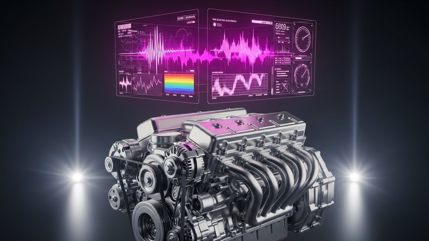
**Center-Aligned Caption:** (Style 24): The Operational Engine - Visualizing The Power Source
The Visual & Narrative Approach
To retain the enterprise client, you must show them the engine that powers their success. We use a photorealistic 3D render of a metallic mechanical engine block—representing the customer's complex operations. Hovering above it is a vibrant, Holographic UI projection in Neon Pink and Purple. The hologram displays complex waveforms and data charts that seem to be "tuning" the engine in real-time. This visualizes the software not just as a calendar, but as the intelligence layer that optimizes the physical machinery of the company.
Psychological Impact & KPI Focus
- Niche Psychology: This appeals to the mechanistic mindset of Operations Directors. It validates their view that their workforce is a complex machine that requires fine-tuning and constant monitoring.
- Operational Impact: This targets "Executive Buy-in" and "Churn Reduction." It elevates the conversation from "shift swaps" to "organizational efficiency," reminding the client that removing the software would be like removing the Engine Control Unit (ECU) from a car.
Strategic Implementation & Trade-offs
- Duration: 15-20 Seconds.
- Best Use: Backgrounds for Quarterly Business Review (QBR) presentations or "Enterprise Features" webinar intros.
- Trade-off: Very high production value required. The 3D tracking must be perfect to sell the illusion of the hologram.
Companies using similar video content -
Staffjoy – Open-Source Scheduling – Provides open-source workforce scheduling apps.
evQueue – Open-Source Scheduling – Offers open-source gig and event staffing solutions.
Auto Shift Planner – Open-Source Scheduling – Simplifies shift planning for small teams.
27. Abstract 3D AI Visualization
Retention | Driving Deep Feature Adoption

**Center-Aligned Caption:** (Style 11): Algorithmic Trust - Visualizing The Neural Network
The Visual & Narrative Approach
How do you visualize an auto-scheduling algorithm? We use the "Plexus" effect. In a deep void, thousands of glowing dots (Deep Purple and Pink) are connected by thin, shifting white lines. The camera flies through this complex, beautiful web. As it pulls back, the web resolves into the shape of a stable grid or shield. This represents the "Neural Network" of the software—millions of calculations happening instantly to find the perfect schedule.
Psychological Impact & KPI Focus
- Niche Psychology: This utilizes the complexity heuristic—if it looks complex and beautiful, it must be intelligent. It builds trust in the "Black Box" of AI, reassuring the user that the "Auto-Schedule" button is backed by robust logic.
- Operational Impact: This supports "Feature Adoption" (specifically AI features). It helps overcome the "manual override" habit where managers don't trust the auto-scheduler, showing them the beauty of the logic they are bypassing.
Strategic Implementation & Trade-offs
- Duration: 10-15 Seconds.
- Best Use: Announcing new AI/Machine Learning updates in product newsletters.
- Trade-off: Extremely abstract. It requires clear copy to explain that "This is our AI engine at work."
Companies using similar video content -
Legion – AI-Powered Workforce Management – Optimizes labor efficiency with AI scheduling.
Fourth – Workforce Management & Inventory – Manages workforce and inventory for hospitality.
UKG Dimensions – Workforce Management – Provides real-time insights for operational control.
28. Hyper-lapse Stock Footage with Data
Expansion | Driving Upsell/Cross-sell
**Center-Aligned Caption:** (Style 22): Operational Velocity - Data Pacing Reality
The Visual & Narrative Approach
We demonstrate that the software moves as fast as the business. We use a "Hyper-lapse" (accelerated time-lapse) video of a busy environment—a restaurant kitchen or a warehouse floor. The staff are blurs of motion, emphasizing high volume and speed. Superimposed on this chaotic chaos are crisp, stable White data lines and counters that track the action perfectly. The data doesn't blink; it stays synchronized with the chaos.
Psychological Impact & KPI Focus
- Niche Psychology: This triggers a sense of synchronicity. It proves that the software isn't a bottleneck; it's a pacemaker. It aligns with the Operations Director's pride in their high-speed environment.
- Operational Impact: This targets "Upsell Potential" for real-time analytics modules. It visualizes the need for live data in high-velocity environments, making the case for upgrading to the "Pro" tier.
Strategic Implementation & Trade-offs
- Duration: 10-20 Seconds.
- Best Use: Hero sections for specific vertical pages (e.g., "For High-Volume Retail").
- Trade-off: The footage must be high energy. A slow office environment won't work for this style; it needs kinetic energy.
Companies using similar video content -
Visier – Workforce Planning – Uses AI for predictive analytics and workforce insights.
Cube – FP&A Platform – Simplifies workforce planning with AI-powered financial intelligence.
Deel – Global HR & Payroll – Offers AI-driven insights for strategic workforce planning.
29. 3D X-Ray Visualization (API Focus)
Expansion | Shaping Brand Perception

**Center-Aligned Caption:** (Style 14): Integration Architecture - The Connected Ecosystem
The Visual & Narrative Approach
To sell the platform as a "Hub," we look inside the device. We see a sleek tablet with a semi-transparent, Translucent Green casing. Inside, we don't see battery packs; we see a glowing network of nodes and data streams connecting to the outside world. Icons representing "Payroll," "POS," and "HRIS" flow into the tablet via these glowing green arteries. It visualizes the API connectivity, showing that the software is not an island, but the heart of the tech stack.
Psychological Impact & KPI Focus
- Niche Psychology: The "X-Ray" aesthetic appeals to the systemizer mindset of IT Directors. It visualizes "Interoperability," removing the fear of data silos.
- Operational Impact: This addresses "Ecosystem Stickiness." By visualizing deep integrations, it implies that removing this software would disconnect the entire operation, thereby increasing retention and perceived value.
Strategic Implementation & Trade-offs
- Duration: 10-15 Seconds.
- Best Use: The "Integrations" or "Developers" page of the website.
- Trade-off: It is technical. It speaks to the person setting up the API, not necessarily the person making the schedule.
Companies using similar video content -
7shifts – Restaurant Scheduling – Provides analytics to predict staffing requirements in fast-paced environments.
Canary – Hospitality Management System – Streamlines operations and boosts revenue for hotels.
Hubstaff – Time Tracking – Tracks activity levels and application usage for productivity.
30. Dark Mode UI Showcase
Expansion | Driving Deep Feature Adoption
**Center-Aligned Caption:** (Style 16): Pro-User Interface - Advanced Analytical Control
The Visual & Narrative Approach
We conclude with the ultimate "Power User" flex: Dark Mode. We present the UI in a sleek Midnight Blue and Slate Grey palette, viewed from a dynamic, canted angle. The screen is dense with "Advanced Analytics"—variance reports, labor curves, and forecasting widgets—glowing in crisp Cyan and Green. The lighting is cool and cinematic, like a control room. This isn't for the novice; this is the cockpit for the shift management expert.
Psychological Impact & KPI Focus
- Niche Psychology: Dark Mode functions as a status symbol in SaaS. It implies "Pro" level work, long hours, and seriousness. It appeals to the user who wants to feel like a master of their domain.
- Operational Impact: This targets "Feature Depth" awareness. It showcases the complex reporting tools that often go unused, encouraging users to explore the "Analytics" tab they usually ignore.
Strategic Implementation & Trade-offs
- Duration: 10-15 Seconds.
- Best Use: Launch video for a "Pro" feature update or a re-engagement email to dormant admins.
- Trade-off: It can look intimidating to a new user. It should be targeted only at established users who are ready to "level up."
Strategic Knowledge Base: The Visual Operations Doctrine
To transform these 30 visual styles from a "collection of assets" into a "revenue engine," we must organize them into a strategic framework. This section outlines the Visual Operations Doctrine—a 3-part guide to implementing, managing, and measuring your visual strategy.
Strategic Alignment & Visual Architecture
The "Pre-Production" Strategy – Defining the Visual Operating System (VOS).
Before a single pixel is rendered, the visual strategy must be aligned with operational reality. A disconnected visual language creates friction; a unified one creates momentum.
- The Cognitive Load Audit: Begin by auditing your current training materials. If a text-based manual takes 10 minutes to read, can a Style 19 (Rapid UI) video convey the same in 10 seconds? Map every visual asset against the "Cognitive Cost" it saves the user.
- Role-Based Visual Mapping: Do not use the same visuals for all personas. Use "High-Contrast/Mobile" styles (Style 5) for deskless workers who view schedules on the fly, and "Data-Dense/Desktop" styles (Style 30) for Operations Directors managing budgets.
- The "Glanceability" Standard: In high-stress environments like healthcare or retail, information must be understood instantly. Adopt a "Glanceability Standard" for all video assets—if the main value prop isn't visible in a silent, 3-second loop (Style 5), it fails the operational test.
- Brand Voice Consistency: Ensure your software’s "Visual Voice" matches its "UI Voice." If your UI is clean and minimal (Style 7), do not use chaotic, cartoonish marketing videos. Consistency builds subconscious trust in the platform's stability.
- The Advids Strategic Audit: Defining this "Visual Operating System" is complex. Partnering with a specialized agency like Advids allows for a comprehensive audit of your current assets against these 30 styles, ensuring your visual language scales as your software features grow.
- Standardization vs. Customization: For core features (Login, Shift Swap), use standardized, polished assets (Style 7). For vertical-specific marketing (Healthcare vs. Construction), use customized "wrapper" visuals (Style 22 or 28) to retain relevance without rebuilding the core product demos.
- The Cross-Departmental Bridge: Use these visuals to unify terminology. If Sales calls it "Smart Rostering" and Support calls it "Auto-Fill," confusion reigns. A shared visual dictionary (e.g., the "Puzzle Piece" metaphor from Style 2) aligns all teams around a single concept.
- Legacy System Integration: When replacing legacy hardware (e.g., punch clocks), visually acknowledge the transition. Use "Transformation" styles (Style 11 or 20) to validate the user's journey from their old "Wireframe" reality to your new "High-Fidelity" solution.
- Accessibility by Design: For a diverse, often multi-lingual workforce, rely less on text-heavy styles (Style 1) and more on universal symbols and Character Animation (Style 13). Visuals are the universal language of the deskless workforce.
- The Mobile-First Mandate: 80% of your users will view these assets on a smartphone. All 30 styles must be legible on a 5-inch screen. Avoid complex Data Visualization (Style 16) for mobile-first channels; reserve those for desktop-based decision makers.
Operational Adoption & Implementation
The "Deployment" Phase – Embedding Visuals into the Workflow.
A video that is only seen once is a wasted asset. This segment details how to embed these styles into the daily operational flow to drive usage.
- Overcoming "Big Brother" Anxiety: Tracking features (GPS, Time Clocks) generate anxiety. Use Abstract Vector (Style 2) or Friendly Low-Poly (Style 25) to explain these features gently. Avoid hyper-realistic styles here; abstraction reduces the feeling of surveillance.
- The Micro-Learning Shift: Replace 50-page PDF manuals with a library of Rapid UI (Style 5) clips. A 6-second loop showing "How to Request Time Off" is infinitely more effective than a text guide.
- Just-in-Time Support: Embed Macro UI (Style 21) videos directly into the app's "Help" tooltips. When a user hovers over "Publish Schedule," a 3-second GIF should show them exactly what happens next.
- Gamification of Training: Use 2D Motion Graphics (Style 13) with "Level Up" imagery to reward users for completing training modules. Visualizing progress bars and "Success" states encourages completion.
- Reducing Support Ticket Volume: There is a direct correlation between proactive visual guides (Style 25) and reduced call center volume. Deploy "Troubleshooting" GIFs in the chat support window to deflect common queries.
- Remote Onboarding: For distributed teams (e.g., home care nurses), you cannot do in-person seminars. Use 3D Parallax (Style 23) and Live Action (Style 22) to create a "virtual welcome" that feels personal and warm.
- SOP Digitization: Transform Standard Operating Procedures (SOPs) into Isometric Workflows (Style 6). Instead of reading about "Opening Procedures," show the team moving through the shop floor in a synchronized animation.
- Feedback Loops: Use interactive video elements (end cards) on Lifestyle (Style 3) videos to ask drivers/staff, "Did this help?" This data is crucial for refining your content strategy.
- Scalable Localization: When expanding globally, use Abstract Motion Graphics (Style 4) and UI Montages (Style 7) which require no translation. Keep text layers separate to allow for easy swapping of languages.
- Leadership Communication: When rolling out a new strategy to Regional Directors, do not send a memo. Send a Cinematic Data Visualization (Style 16) video that visualizes the projected growth. It commands attention and signals importance.
Measuring Impact & Future-Proofing
The "ROI" Phase – Measuring Success and Looking Ahead.
Visuals are an investment, not an expense. This segment defines how to measure their return and prepare for the next wave of technology.
- Beyond "Views": Do not measure success by YouTube views. Measure "Time-to-Competency" (how fast a new user logs their first shift) and "Feature Adoption Rate" (how many users try the new feature after seeing the Style 30 email).
- The "Idle Time" Metric: In operations, time is money. Correlate the use of clear Clean UI (Style 7) visuals with a reduction in "Software Idle Time" (time spent staring at the screen confused).
- Compliance Velocity: When labor laws change, measure how quickly the workforce adapts. A Kinetic Typography (Style 1) video explaining the new rule should result in faster compliance than a text email.
- Retention and LTV: High-quality Onboarding (Style 22) and Support (Style 25) visuals directly impact User Satisfaction (CSAT) and Lifetime Value (LTV). Users who feel supported stay longer.
- The AI Visual Frontier: Prepare for Generative AI. Soon, Abstract AI (Style 27) won't just be a video style; it will be a real-time interface layer. Start educating your users on AI concepts now so they trust the future tools.
- Scalability of Assets: Build a "Modular Asset Library." If you change your brand color, you shouldn't have to re-shoot. Vector styles (Style 2) and 3D projects (Style 10) allow for global color updates in clicks.
- The Advids Partnership: Building this library is not a one-time project; it is an ongoing infrastructure evolution. Advids serves as the long-term partner, managing the asset library and ensuring that as your software scales, your visual language evolves without fracturing.
- Benchmarking Success: Compare your visual engagement against industry standards. If your Feature Montage (Style 5) retention rate is below 50%, the pacing is too slow. Iterate constantly.
- The ROI of Safety: For industries with physical risks (construction, warehousing), quantify the reduction in accidents or insurance claims correlated with better Visual Safety Training (Style 20).
- Final Call to Innovation: Treat your visual strategy as infrastructure, just like your server architecture. In the battle for the deskless workforce, the software that is easiest to understand—the one that achieves "Operational Harmony"—wins. Visuals are the bridge to that victory.
Companies using similar video content -
Rippling – Workforce Platform – Supports integrations with training, finance, and other business tools.
Vena – FP&A Software – Integrates with Excel, HRIS, and ERP systems for workforce planning.
ClearCompany – Talent Management – Integrates with payroll and HRIS systems in real time.
Author & Editor Bio


