
Introduction: Visualizing the "Self-Driving" Enterprise
The landscape of B2B operations is undergoing a seismic shift, moving from fragmented, manual interventions to cohesive, automated ecosystems. For the modern "Orchestrator"—the CTOs and Operation Leaders driving this change—the challenge is no longer just about digitizing tasks; it is about knitting together a "Self-Driving Enterprise." However, as legacy systems clash with cloud-native architectures, the sheer complexity of this integration creates a "Visibility Gap." Stakeholders struggle to trust an automation process they cannot see.
The market reflects this desperate need for coherence. The global intelligent process automation market is currently growing at a CAGR of 22.6%, signaling that we are past the early adoption phase; automation is now the industrial standard. Yet, the hesitation in the boardroom often stems from a lack of clear ROI visibility. By using high-fidelity visuals that demonstrate control and speed, we can unlock the confidence needed to invest. Organizations that effectively deploy these structured automation frameworks are reporting a 240% average ROI within the first 6-9 months, a gain that compounds across every operational unit.
To bridge this Physical/Digital divide, your video content must do more than list features. It must reduce cognitive load, visually untangle the "spaghetti" of backend logic, and position your platform as the central nervous system of the business. This guide presents 30 distinct visual styles designed to translate invisible algorithms into visible business value, ensuring your message resonates with both the visionary C-Suite and the pragmatic implementer.
1. Abstract 3D AI Visualization
TOFU | Brand Awareness

The Visual & Narrative Approach
This style visualizes the "invisible" intelligence of your platform. Set in a pristine, infinite digital void, the scene features hundreds of glowing Porcelain White spherical "nodes" connected by laser-thin, pulsating Electric Blue and Cyan data lines. The camera uses a wide-angle lens with a central convergence point, creating a sense of infinite, airy depth. The nodes gently undulate, representing a living, breathing automation ecosystem that is clean, clinical, and error-free.
Psychological Impact & KPI Focus
- Niche Psychology: For a CTO, the "black box" of AI is a source of anxiety. This style reduces cognitive load by abstracting complex code into a clean, organized visual metaphor. It signals Scalability and Purity, assuring the viewer that the system is robust enough to handle infinite complexity without clutter.
- Operational Impact: Visualizes Network Latency and Interoperability. The pulsating lines imply real-time data transfer and seamless API connections between disparate silos.
Strategic Implementation & Trade-offs
- Best Use Case: Website Landing Page Backgrounds or Event Openers (16:9). It establishes a high-tech premium feel immediately.
- Trade-off: It is purely atmospheric. It excels at conveying "sophistication" but fails at explaining "functionality." Do not use this to explain how a specific feature works; use it to sell the feeling of the ecosystem.
Companies using similar video content -
NVIDIA – AI Enterprise – Visualizing complex AI model training and deployment.
C3.ai – AI Platform – Abstract representation of enterprise AI application ecosystems.
2. Abstract 2D Motion Graphics
TOFU | Category Creation

The Visual & Narrative Approach
This style captures the essence of "Order from Chaos." It begins with a scattered array of chaotic triangles and circles in Coral Pink and Soft Teal. Through a fluid, mandala-like expansion, these shapes magnetically merge to form a perfect, organized hexagon structure in the center of a Cream White void. The style is flat with smooth gradients, conveying a sense of fluid evolution and effortless resolution.
Psychological Impact & KPI Focus
- Niche Psychology: It addresses the "Entropy Anxiety" of operations managers. The visual transformation triggers a "cognitive ease" response, subconsciously reassuring the viewer that your platform brings harmony to their disorderly processes.
- Operational Impact: Visualizes Data Standardization and Governance. It shows how messy, unstructured inputs are ingested and transformed into structured, actionable outputs.
Strategic Implementation & Trade-offs
- Best Use Case: Social Media Ads (Instagram/LinkedIn) (1:1). The satisfying "snap" of the geometry acts as a visual hook to stop the scroll.
- Trade-off: The abstract nature can be too vague for technical audiences who want to see the UI. It requires strong supporting copy to drive home the specific business application.
Companies using similar video content -
H2O.ai – AI Cloud – Organizing chaotic data into structured AI models.
Talend – Data Fabric – Fluidly transforming messy data into clean, governed outputs.
3. 2D Line Art Animation
TOFU | Market Education

The Visual & Narrative Approach
Utilizing a precise, architectural drawing style, this animation acts as a living blueprint. Against a Stark White background, Jet Black mono-weight lines sketch out a side-scrolling narrative. On the left, a chaotic, scribbled knot represents manual work; on the right, the line untangles into a perfectly straight, structured grid representing automation. Key elements are highlighted in Safety Orange.
Psychological Impact & KPI Focus
- Niche Psychology: This appeals to the "Logical Buyer"—engineers and implementation specialists. It looks like a schematic or whiteboard session, signaling honesty and technical clarity.
- Operational Impact: Visualizes Bottleneck Resolution and Workflow Efficiency. It strips away the marketing fluff to show exactly what the software does: straightens the line.
Strategic Implementation & Trade-offs
- Best Use Case: YouTube Explainer Videos (16:9). It builds credibility through clarity and is perfect for accompanying a voiceover.
- Trade-off: It lacks emotional punch. It is functional and educational, but not "exciting." Avoid using this for brand anthems or culture videos.
Companies using similar video content -
Camunda – Platform – Untangling complex business processes into clear workflows.
4. Generative AI Realistic Character Video
TOFU | Shaping Brand Perception
The Visual & Narrative Approach
This style puts a face to the technology. A professional female CTO in her late 30s, wearing a Soft Beige blazer, stands confidently in a modern, blurred open-plan office. The lighting is cinematic, utilizing a 50mm lens to create a shallow depth of field. A subtle, translucent holographic chart is faintly visible in the background. She looks off-camera with a gaze of visionary leadership.
Psychological Impact & KPI Focus
- Niche Psychology: B2B buying decisions are emotional. This style leverages "Mirroring"—the viewer sees the calm, successful leader and aspires to be her. It shifts the conversation from "tasks" to "strategy."
- Operational Impact: Visualizes Executive Control. It implies that the software empowers leadership to look up from the weeds and focus on the big picture.
Strategic Implementation & Trade-offs
- Best Use Case: LinkedIn Thought Leadership (9:16). It builds trust and persona alignment in a people-centric feed.
- Trade-off: High dependency on the quality of the AI generation. If the micro-expressions are unnatural ("Uncanny Valley"), it destroys trust immediately.
Companies using similar video content -
Workday – Enterprise Management Cloud – Empowering leaders with strategic insights.
Salesforce – Einstein AI – Humanizing AI's role in strategic decision-making.
5. 2D Character-Driven Story
TOFU | YouTube
The Visual & Narrative Approach
Adopt a high-angle isometric perspective to visualize the "birds-eye view" of a business process. A stylized male character (Pale Yellow skin, Lavender shirt) stands at the entrance of a complex maze with Mint Green walls. He holds a glowing digital map (your software) and looks ready to navigate the obstacles effortlessly.
Psychological Impact & KPI Focus
- Niche Psychology: Gamification of work. It treats the complexity of business logic as a puzzle that is easily solvable with the right tool, reducing the fear of complexity.
- Operational Impact: Visualizes Process Mapping and Decision Logic. It shows that while the path (market conditions) is complex, the navigation (user experience) is simple.
Strategic Implementation & Trade-offs
- Best Use Case: YouTube Educational Content (16:9). It helps break down complex topics (like compliance or supply chain routing) into relatable narratives.
- Trade-off: Can be perceived as "too playful" for very conservative enterprise industries if the character design is too cartoony.
Companies using similar video content -
Nintex – Process Platform – Guiding users through complex workflow automation.
Bizagi – BPM Suite – Simplifying business process navigation with visual stories.
6. Bold Kinetic Typography (Visual)
TOFU | Vertical Social Organic

The Visual & Narrative Approach
Speed is the currency here. Large, blocky geometric shapes representing text fly towards the camera with aggressive motion blur. The palette is high-contrast Vivid Red, Stark Black, and White. The composition is tilted at diagonal angles to suggest velocity. Harsh shadows cast by the shapes add depth to the solid color background.
Psychological Impact & KPI Focus
- Niche Psychology: In the scroll-heavy environment of TikTok, you have milliseconds to grab attention. This style utilizes Visual Salience to trigger an immediate physiological response.
- Operational Impact: Visualizes Throughput and Speed. It suggests that your platform injects energy and velocity into stagnant legacy workflows.
Strategic Implementation & Trade-offs
- Best Use Case: TikTok/Reels Teasers (9:16). Perfect for product launches or announcing new features.
- Trade-off: Zero educational value. It communicates energy, not information. It must be paired with a caption or link that provides context.
Companies using similar video content -
Splunk – Enterprise Security – High-velocity data ingestion and threat detection.
Datadog – Monitoring & Security – Aggressive motion for real-time performance metrics.
7. Generative AI Cinematic Video
TOFU | Skippable Pre-Roll Ad
The Visual & Narrative Approach
This is a "Big Picture" establishing shot. An aerial drone sweeps over a futuristic cityscape where skyscrapers are built from glowing circuit board patterns in Steel Blue and Chrome Silver. Bridges of Sunset Orange light connect the structures. Anamorphic lens flares streak across the frame. The camera moves rapidly forward.
Psychological Impact & KPI Focus
- Niche Psychology: Targets the C-Suite's aspiration for "Modernization." It visualizes the end-state of digital transformation: a seamless, glowing, interconnected metropolis of commerce.
- Operational Impact: Visualizes Scalability and Infrastructure Reliability. The solidity of the buildings implies that the platform is enterprise-grade and won't crash under load.
Strategic Implementation & Trade-offs
- Best Use Case: YouTube Pre-Roll Ads (16:9). The cinematic quality builds immediate brand authority.
- Trade-off: It sets a very high bar. If your actual software UI looks dated, the disconnect between this futuristic promise and the reality can lead to disappointment.
Companies using similar video content -
AWS – Cloud Infrastructure – Futuristic cityscape representing vast cloud infrastructure.
Azure – Cloud Services – Cinematic view of interconnected, scalable cloud architecture.
8. Aspirational Stock Montage
TOFU | Aspiration & Identity Hook

The Visual & Narrative Approach
Focus on the outcome of time saved. The "Hero" shot is a low-angle perspective looking up at a diverse group of three professionals on a rooftop garden workspace. They are laughing naturally, bathed in Golden Hour Yellow sunlight. The sky is a clear Sky Blue, and plants add touches of Fresh Green.
Psychological Impact & KPI Focus
- Niche Psychology: Addresses Burnout. The ultimate promise of automation isn't just "efficiency"; it's "relief." This image sells the freedom to do high-value work (or go home on time).
- Operational Impact: Visualizes Employee Retention and Culture. It subtly suggests that good tools lead to happier, more collaborative teams.
Strategic Implementation & Trade-offs
- Best Use Case: Instagram Feed (4:5). It humanizes the brand and works well for recruitment or "Culture" posts.
- Trade-off: Generic stock footage is the enemy. It must be authentic (no forced handshakes) and color-graded to match your brand palette.
Companies using similar video content -
Workato – Integration & Automation Platform – Celebrating time saved and high-value work.
Zapier – Automation Platform – Highlighting freedom and collaboration through automation.
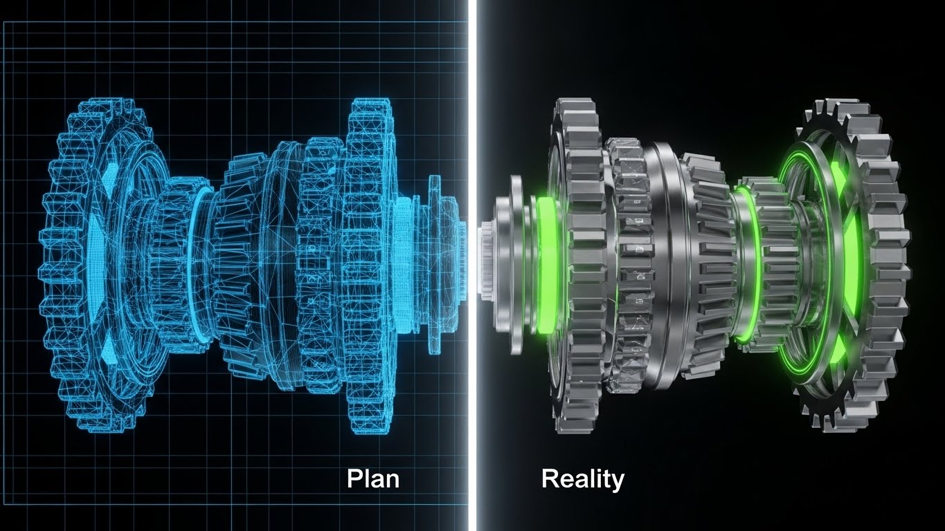
10. Wireframe to Reality Transition
MOFU | Product/Solution Differentiation

The Visual & Narrative Approach
A split-screen composition divided vertically. The left side shows a wireframe blueprint of an industrial gear mechanism in Blueprint Blue with White Lines. The right side shows the same mechanism as a fully rendered, polished 3D metallic object with Neon Green energy cores. The transition line in the center is glowing. The camera is static to allow for direct comparison.
Psychological Impact & KPI Focus
- Niche Psychology: Critical for the "Consideration" phase. It addresses the "Execution Gap"—the fear that the plan won't match the reality. This style provides visual proof of Fidelity.
- Operational Impact: Visualizes Digital Twin technology and Rapid Prototyping. It assures the implementer that "what you see is what you get."
Strategic Implementation & Trade-offs
- Best Use Case: Website Product Pages (16:9). It serves as a powerful visual metaphor for the core promise of the software.
- Trade-off: Requires precise alignment between the wireframe and render. If they don't match perfectly, it subconsciously suggests a "disconnect" in the software's accuracy.
11. Lifestyle Stock with UI Overlay
MOFU | Building Trust & Credibility

The Visual & Narrative Approach
This style bridges the critical gap between "Digital" security and "Physical" flexibility. The scene features an over-the-shoulder perspective of a professional working on a tablet in a bustling, blurred coffee shop environment. While the setting is casual, the screen is sharp, overlaid with a sophisticated holographic interface displaying Amber Gold security shields and Transparent White verification checkmarks. The "VERIFIED" stamp glows, confirming that despite the public setting, the enterprise data remains ironclad.
Psychological Impact & KPI Focus
- Niche Psychology: Addresses the "Security vs. Flexibility" paradox. IT leaders often fear that remote work expands the attack surface. This visual reassures them that the "Self-Driving Enterprise" extends security protocols to the edge, enabling Mobility without compromising Governance.
- Operational Impact: Visualizes Endpoint Security and Role-Based Access. It confirms that mission-critical workflows—approvals, dispatching, or compliance checks—can be executed securely from anywhere, reducing bottleneck delays caused by executive travel.
Strategic Implementation & Trade-offs
- Best Use Case: Case Studies or "Day in the Life" Testimonials (16:9). It creates a narrative that feels authentic and aspirational.
- Trade-off: The overlay must look integrated, not plastered on. If the tracking slides or the perspective is off, it breaks the immersion immediately.
Companies using similar video content -
PTC – ThingWorx – Bridging digital design (wireframe) to physical IoT reality.
Siemens Digital Industries – Xcelerator – Showing digital twin fidelity from blueprint to operation.
12. Split Screen: Optimized Reality and UI
MOFU | Competitive Displacement
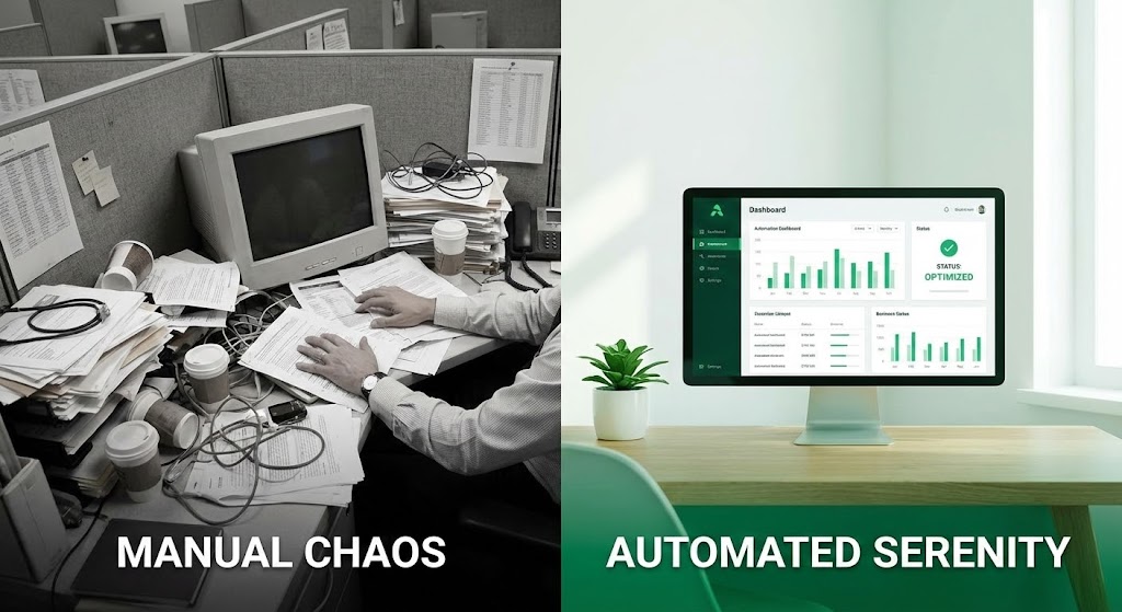
The Visual & Narrative Approach
A powerful direct comparison that visualizes the "Cost of Inaction." The screen is split vertically. The left side, graded in desaturated Gritty Gray, captures a Dutch-angle shot of a chaotic cubicle—piles of paper, tangled wires, and "Manual Chaos." The right side is stabilized, bright, and graded in Emerald Green and Clean White, showing a Zen-like minimalist workspace with a single monitor displaying your sleek automation dashboard ("Automated Serenity").
Psychological Impact & KPI Focus
- Niche Psychology: Leverages Cognitive Ease. The brain naturally prefers the organized, clean image on the right. It subconsciously associates your software with mental clarity and the removal of workplace stress (Cognitive Load).
- Operational Impact: Visualizes Process Standardization and Paperless Transformation. It starkly highlights the difference between legacy manual processing and modern digital orchestration.
Strategic Implementation & Trade-offs
- Best Use Case: Comparison Ads (LinkedIn/Instagram) (1:1). The visual dichotomy is an instant hook that communicates value without a single word of copy.
- Trade-off: It is a binary simplification. It works for "Shock and Awe" marketing but lacks the nuance needed for deep technical explanations.
Companies using similar video content -
Cisco – Meraki – Secure mobile operations with integrated network management.
Fortinet – FortiClient – Verified security and access for remote workforces.
13. Isometric 3D Workflow
MOFU | ABM Awareness

The Visual & Narrative Approach
To explain complex interconnectivity, we utilize an isometric "God-Mode" perspective. A miniature, stylized factory floor sits on a floating island, rendered in smooth Matte Plastic textures. The palette uses Royal Purple and Dark Blue to signify deep tech, while Neon Pink conveyor belts transport glowing data packets between machines. The lighting is soft and studio-quality, making the complex process look like a perfectly tuned engine.
Psychological Impact & KPI Focus
- Niche Psychology: Appeals to the "Architect" mindset of the Systems Integrator. Seeing the entire process at once gives a sense of Control and Predictability. It turns a scary, sprawling problem into a manageable, contained model.
- Operational Impact: Visualizes End-to-End Visibility and Bottleneck Detection. It shows how the platform sits above individual tasks to orchestrate the entire flow of value.
Strategic Implementation & Trade-offs
- Best Use Case: Display Ads or Website Hero Banners (16:9). It quickly communicates "We handle the whole process, not just one part."
- Trade-off: Detail vs. Clarity. If you add too many micro-elements, it becomes "busy." The stylization must remain clean to be effective.
Companies using similar video content -
Kofax – TotalAgility – Contrasting manual chaos with automated serenity.
Blue Prism – Digital Workforce – Highlighting efficiency gains over legacy processes.
14. Photorealistic 3D Renders
MOFU | LinkedIn Video Ads

The Visual & Narrative Approach
This style zooms in to the microscopic level to sell quality and precision. A macro shot focuses on a Metallic Silver fiber optic connector. The tip glows with pulsating Electric Blue energy as it prepares to insert into a port. The background is a shallow depth-of-field blur of server racks. The texture work is hyper-realistic, highlighting brushed metal and light refractions.
Psychological Impact & KPI Focus
- Niche Psychology: Targets the "Quality Assurance" buyer. High-fidelity visuals transfer a perception of High-Fidelity Code. If the marketing visual is this precise, the API integration must be equally robust.
- Operational Impact: Visualizes Integration Readiness and Seamless Connectivity. It represents the moment your platform "clicks" into their existing stack—fast, clean, and powerful.
Strategic Implementation & Trade-offs
- Best Use Case: LinkedIn Video Ads (1:1). The premium aesthetic stands out in a feed full of stock photos and low-effort graphics.
- Trade-off: It is metaphorical. It sells the concept of connectivity, not the method. It must be paired with technical copy to validate the promise.
Companies using similar video content -
Manhattan Associates – Supply Chain Solutions – "God-mode" view of logistics and warehouse operations.
Kinaxis – RapidResponse – Visualizing end-to-end supply chain orchestration.
15. Abstract 2D Flat Vector Organic Modern
MOFU | Website Visitor Re-engagement

The Visual & Narrative Approach
Moving away from rigid machinery, this style emphasizes adaptability. Pastel Peach, Soft Lilac, and Cream organic shapes float and morph like liquid in a Clean void. The motion is slow and hypnotic. Despite being flat vectors, subtle glossy highlights give them a tactile, friendly quality. This contrasts sharply with the "hard" tech visuals usually seen in B2B.
Psychological Impact & KPI Focus
- Niche Psychology: Addresses "Rigidity Anxiety." Buyers fear that automation will lock them into a process they can't change. This visual metaphor suggests Agility—a system that molds to the business, not the other way around.
- Operational Impact: Visualizes Scalability and User-Centric Design. It implies a low-code/no-code environment where workflows can be reshaped effortlessly as market needs evolve.
Strategic Implementation & Trade-offs
- Best Use Case: Remarketing Ads (1:1). After a user has visited your technical pages, this gentle visual serves as a non-intrusive, calming reminder to return.
- Trade-off: Too soft for the "Hard" sale. Avoid using this when pitching to IT security teams who want to see rigid firewalls, not floating blobs.
Companies using similar video content -
MuleSoft – Anypoint Platform – Precision integration and seamless API connectivity.
Dell Boomi – Integration Platform – Highlighting robust, clean data connections.
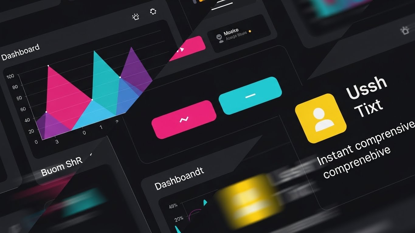
16. Clean UI Workflow (Light Mode)
MOFU | The Functional Buyer
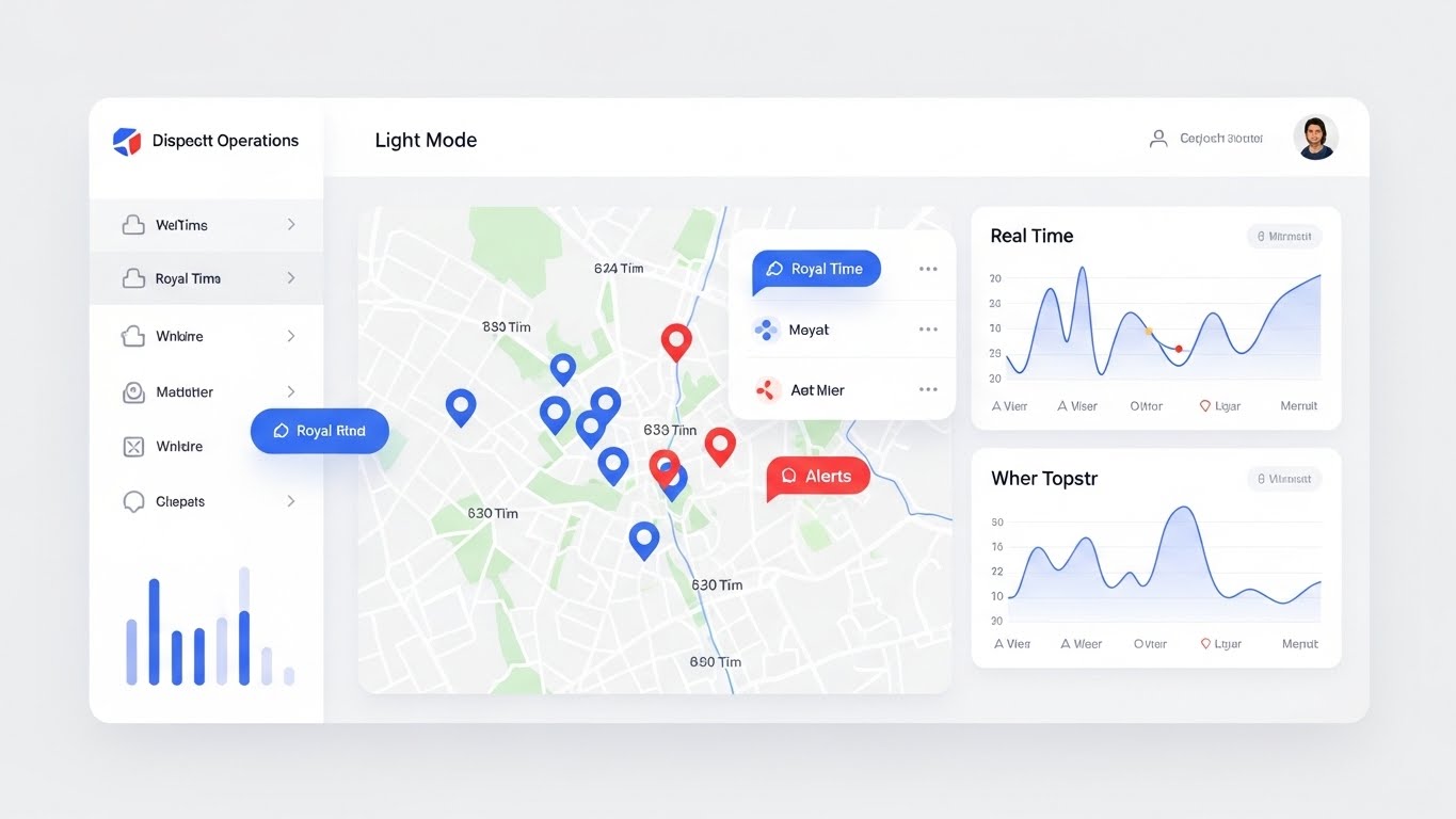
The Visual & Narrative Approach
Here we strip away the metaphors and show the tool itself. A direct, front-on view of the dashboard in "Light Mode." The background is Pure White, with Cobalt Blue interactive elements and clear, readable data viz. The composition includes a map view ("Royal Time") and real-time graphs. The perspective is flat and honest, mimicking the exact experience a user will have on their screen.
Psychological Impact & KPI Focus
- Niche Psychology: Appeals to the "Pragmatist." They don't want 3D fluff; they want to know: "Is this intuitive?" This style reduces Adoption Friction by proving the UI is clean, modern, and familiar.
- Operational Impact: Visualizes Usability and Information Hierarchy. It shows exactly how the platform presents complex data (alerts, location, trends) in a digestible format for rapid decision-making.
Strategic Implementation & Trade-offs
- Best Use Case: Landing Pages and Product Demos (16:9). It is the visual "proof of pudding."
- Trade-off: It reveals your actual UI. If your product looks dated or cluttered, this style will hurt you. Use this only if your UX design is top-tier.
Companies using similar video content -
HashiCorp – Terraform – Fluid adaptability for infrastructure as code.
17. 3D Parallax UI Presentation
BOFU | Feature Education & Demonstration
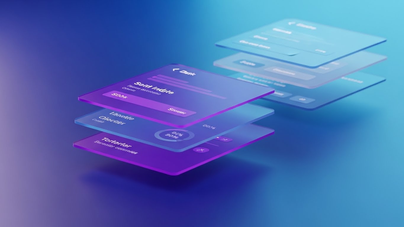
The Visual & Narrative Approach
To visualize the depth of the software, we explode the UI into floating layers. Suspended in a Deep Indigo and Bright Cyan void, the interface screens separate to reveal the data architecture underneath. Glassmorphism techniques add a semi-transparent, premium feel. The camera pans dynamically through the layers, turning a static screenshot into an immersive 3D journey.
Psychological Impact & KPI Focus
- Niche Psychology: Targets the "Technical Evaluator" in the BOFU stage. It signals that the platform isn't just a pretty surface; it has Depth and robust architecture supporting the front end.
- Operational Impact: Visualizes Multi-Module Integration and Data Granularity. It shows how different layers of data (user view, admin view, code view) stack together to form the complete solution.
Strategic Implementation & Trade-offs
- Best Use Case: Product Pages or Investment Decks (16:9). It adds a "Wow Factor" to standard feature lists.
- Trade-off: Readability. The parallax effect and angles can make the actual text on the screens hard to read. Use it to sell the complexity, not specific data points.
Companies using similar video content -
ServiceNow – ITSM – Radical clarity in IT service management dashboards.
LogicMonitor – Observability Platform – Intuitive display of real-time infrastructure data.
18. Dynamic Data Visualization
BOFU | ROI Justification

The Visual & Narrative Approach
This style is pure energy. A 3D bar graph, rendered in glossy Vivid Orange and Chartreuse, doesn't just rise; it explodes upwards. The bars crash through a glass ceiling pane, sending shards flying. The camera follows this upward trajectory against a clean grid background. It is a violent, triumphant visualization of growth that exceeds expectations.
Psychological Impact & KPI Focus
- Niche Psychology: Taps into Ambition. It visualizes the "Breakthrough" moment every leader craves—where automation stops being a cost center and becomes a growth engine.
- Operational Impact: Visualizes Exponential Growth and ROI Realization. It metaphorically demonstrates shattering the "manual ceiling" that limits throughput in legacy systems.
Strategic Implementation & Trade-offs
- Best Use Case: Sales Presentations and Quarterly Reviews (16:9). It creates an emotional high point when discussing financial projections.
- Trade-off: It is aggressive. Use it for "Growth" metrics (Revenue, Output), not for "Safety" metrics (Risk, Compliance), where "shattering glass" implies danger.
Companies using similar video content -
Dynatrace – Software Intelligence Platform – Revealing deep architecture of application performance.
Appian – Low-Code Platform – Showcasing multi-layered process and data integration.
19. Minimalist Flat 2D Vector
BOFU | Overcoming Objections

The Visual & Narrative Approach
Simplicity is the ultimate sophistication here. A stylized Slate Blue padlock clicks open to reveal a Mustard Yellow interior against a stark White background. No gradients, no shadows, just clean geometry. The motion is a sharp, satisfying "click." This visual acts as a punctuation mark in the narrative.
Psychological Impact & KPI Focus
- Niche Psychology: Addresses Loss Aversion. It frames the purchase not as "buying software" but as "unlocking value" that is currently trapped. It signals the removal of barriers and objections.
- Operational Impact: Visualizes Access Control and Opportunity Realization. It represents the unlocking of data silos or the unleashing of employee potential previously locked in manual tasks.
Strategic Implementation & Trade-offs
- Best Use Case: Email Signatures or Closing Slides (16:9). It is a subtle, subconscious "Yes" trigger.
- Trade-off: Too simple to stand alone. It relies entirely on the surrounding context to give it meaning.
Companies using similar video content -
DataRobot – AI Platform – Visualizing breakthrough ROI from AI model deployment.
Palantir – Foundry – Dynamic visualization of data-driven operational growth.
20. 3D X-Ray Visualization
BOFU | Risk Mitigation

The Visual & Narrative Approach
To close the deal, we must eliminate the fear of the unknown. This style uses an X-Ray effect to look inside a machine (or process). The outer shell is Bone White and semi-transparent, revealing a complex, glowing X-Ray Blue internal circuitry. A Translucent Red anomaly is identified and neutralized by an internal shield. It is clinical, medical-grade, and hyper-detailed.
Psychological Impact & KPI Focus
- Niche Psychology: Addresses Trust. It offers "Radical Transparency," assuring the buyer that there are no hidden flaws. It positions the platform as a diagnostic tool that sees what the human eye cannot.
- Operational Impact: Visualizes Root Cause Analysis and Threat Detection. It demonstrates the platform's ability to peer into the "black box" of operations and identify risks before they become failures.
Strategic Implementation & Trade-offs
- Best Use Case: Security Whitepapers or Deep-Dive Webinars (16:9). It builds authority by showing the "guts" of the system.
- Trade-off: Can be intimidating. It looks complex. Ensure the narrative focuses on how the software handles this complexity, so the user doesn't have to.
Companies using similar video content -
Okta – Identity Cloud – Unlocking potential through secure access management.
21. Rapid UI Feature Montage
BOFU | Sales Cycle Acceleration
The Visual & Narrative Approach
This style is designed to overwhelm the viewer—in a positive way—with value. The frame is dynamically split into diagonal shards, creating a high-energy mosaic. Each shard contains a different, razor-sharp close-up of a specific UI element: a trend chart, a user profile, an API toggle, and a permission lock. The palette uses high-energy Magenta, Cyan, and Yellow (CMYK style) to differentiate modules. Motion blur on the shard edges suggests that the software is moving faster than the camera can capture.
Psychological Impact & KPI Focus
- Niche Psychology: Targets the "Feature FOMO" (Fear Of Missing Out) common in the final decision stages. It visually answers the question, "Does it have everything we need?" by showing an abundance of tools in a single glance.
- Operational Impact: Visualizes Feature Density and Suite Comprehensiveness. It demonstrates that the platform is not a point solution but a complete operating system for the enterprise.
Strategic Implementation & Trade-offs
- Best Use Case: Sales Decks (16:9). Use this as the "Mic Drop" visual after explaining specific pain points to show the sheer breadth of the solution.
- Trade-off: It sacrifices detail for volume. The viewer cannot read the specific data in the shards; the goal is to convey capacity, not specific information.
Companies using similar video content -
Palo Alto Networks – Cortex XSOAR – X-ray vision into security incidents and automation.
IBM Security – QRadar SOAR – Radical transparency in threat detection and response.
22. Isometric 2D Motion Design
BOFU | Reducing Implementation Friction

The Visual & Narrative Approach
To counter the fear of complex integration, we use a clean, instructional aesthetic. On a White infinite grid, modular blocks colored in Turquoise and Light Grey float and "snap" together with satisfying mechanical precision. There are no cast shadows, maintaining a flat, readable "technical manual" look. Small lightning bolt icons appear at the connection points to signify immediate activation.
Psychological Impact & KPI Focus
- Niche Psychology: Addresses "Implementation Paralysis." Buyers often delay signing because they fear a 6-month integration nightmare. This visual uses the "Lego Effect"—subconsciously telling the brain that building this stack is as easy (and satisfying) as clicking blocks together.
- Operational Impact: Visualizes Modularity and API Interoperability. It demonstrates that your platform fits seamlessly into their existing architecture without requiring a "rip and replace" overhaul.
Strategic Implementation & Trade-offs
- Best Use Case: Technical Documentation or Implementation Guides (16:9). It simplifies complex architecture into a digestible, approachable logic.
- Trade-off: It is clinical. It appeals strictly to the logical brain of the implementer and lacks the emotional hook needed for brand awareness.
Companies using similar video content -
Microsoft – Dynamics 365 – Comprehensive toolkit for enterprise business applications.
SAP – S/4HANA – Showcasing the breadth of an integrated ERP suite.
23. 2D Animation & UI Composition
BOFU | Objection Handling & Friction Reduction

The Visual & Narrative Approach
This style blends reality with digital assistance. A medium shot shows a real person (live action) in a slightly desaturated office setting, looking at a monitor. A friendly, cel-shaded animated hand in Teal and Burnt Sienna overlays the scene, pointing helpfully to a specific button on a floating, simplified UI. The contrast between the "real" user and the "animated" guide creates a warm, supportive vibe.
Psychological Impact & KPI Focus
- Niche Psychology: Targets Support Anxiety. The fear of being left alone with new software is a major barrier. This visual personifies "Customer Success," assuring the buyer that they will be guided through every click.
- Operational Impact: Visualizes Guided Onboarding and In-App Assistance. It suggests that the platform includes "training wheels" that empower users to self-correct, reducing the burden on IT support.
Strategic Implementation & Trade-offs
- Best Use Case: Remarketing Ads (1:1). It effectively targets users who visited the pricing page but didn't convert, offering them a "helping hand."
- Trade-off: Tone management. The animated element must look like a high-tech assistant, not a child's cartoon, to maintain B2B credibility.
Companies using similar video content -
Red Hat – Ansible Automation Platform – Modular snap-fit for IT automation.
Apache Airflow – Workflow Management Platform – Plug-and-play promise for data pipelines.
24. Holographic UI over 3D Render
BOFU | The Economic Buyer

The Visual & Narrative Approach
This visual targets the C-Suite by placing the software in their natural habitat. A photorealistic render shows a polished, light oak executive boardroom table in a sunlit room. Hovering above it is a complex, luminous holographic dashboard in Holographic Blue and Transparent Green. The hologram displays a global map with arcing connectivity lines.
Psychological Impact & KPI Focus
- Niche Psychology: Appeals to Status and Vision. It frames the software not as a utility for the back office, but as a strategic asset for the boardroom. It validates the executive's role as the "Orchestrator" of a global empire.
- Operational Impact: Visualizes Global Governance and Real-Time Visibility. It implies that leadership can monitor the entire global footprint of the operation from a single pane of glass.
Strategic Implementation & Trade-offs
- Best Use Case: Executive Briefs and Investor Decks (16:9). It sets the tone for high-value enterprise contracts.
- Trade-off: It is aspirational. If the actual reporting module is a simple spreadsheet, this visual sets an expectation of futuristic control that you must manage carefully.
Companies using similar video content -
WalkMe – Digital Adoption Platform – Human-centric guidance for software adoption.
25. Macro UI Micro-Interactions
Onboarding | Self-Serve Onboarding
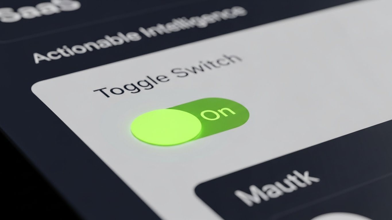
The Visual & Narrative Approach
We zoom in to the extreme—a macro shot of a fingertip just millimeters from a sleek glass touchscreen. The screen displays a glowing LED Green toggle switch in the "ON" position against a Macro Lens Black background. The focus is razor-sharp on the gap between the finger and the screen, capturing the kinetic anticipation of activation.
Psychological Impact & KPI Focus
- Niche Psychology: Focuses on Tactile Satisfaction. In a world of abstract cloud software, this visual grounds the user experience in a physical action. It triggers the brain's desire for closure and control.
- Operational Impact: Visualizes Ease of Use and System Responsiveness. It suggests that complex backend automations can be triggered with a simple, decisive human touch.
Strategic Implementation & Trade-offs
- Best Use Case: In-App Welcome Screens (16:9). Use it to celebrate the user's first successful action (e.g., "Automation Activated").
- Trade-off: Extremely narrow focus. It conveys "feeling," not "information." Use it as a punctuation mark in your onboarding flow, not a tutorial.
Companies using similar video content -
Oracle – Cloud ERP – Executive oversight with a global command center view.
Infor – CloudSuite – Holographic dashboards for strategic enterprise management.
26. Hyper-lapse Stock Footage with Data
Onboarding | Accelerating Time-to-Value

The Visual & Narrative Approach
To prove the software impacts the real world, we use a hyper-lapse aesthetic. A high-angle view of a bustling city street shows traffic blurring into Car Trail Red long-exposure lines. Overlaying this organic flow are bright White digital data lines moving in perfect sync with the traffic, but even faster. The overall grade is Day City Blue.
Psychological Impact & KPI Focus
- Niche Psychology: Validates Impact. New users often wonder, "Is this actually working?" This visual confirms that their digital inputs are having real-world effects, orchestrating the flow of goods and services in the physical economy.
- Operational Impact: Visualizes Throughput Velocity and Digital/Physical Convergence. It shows that the platform operates at the speed of the city, processing data as fast as reality happens.
Strategic Implementation & Trade-offs
- Best Use Case: Welcome Emails (16:9). It creates excitement and reinforces the scale of the tool the user has just adopted.
- Trade-off: Requires high-quality stock. If the city footage looks generic, the premium feel of the data overlay is lost. The tracking must be perfect.
Companies using similar video content -
UiPath – Automation Cloud – Zero latency response for triggering automations.
Automation Anywhere – Automation 360 – Capturing the kinetic anticipation of bot activation.
27. Futuristic Neon/Dark Mode
Retention | Knowledge Base & FAQ Videos

The Visual & Narrative Approach
This style is a love letter to the technical user. We see a close-up of a code editor environment in a "Dark Theme." The background is Deep Black, providing high contrast for the Lime Green and Matrix Green syntax highlighting. The code flows like a structured waterfall. A soft glow emanates from the text, signaling that this is the living DNA of the platform.
Psychological Impact & KPI Focus
- Niche Psychology: Appeals to Technical Mastery. Developers and IT leads respect "clean code." This style validates the platform's robustness and gives them a visual environment that feels like "home."
- Operational Impact: Visualizes Customizability and API Robustness. It assures technical teams that the platform is not a "black box" but an open, extensible environment they can control.
Strategic Implementation & Trade-offs
- Best Use Case: Support Portals and API Documentation (16:9). It builds credibility where it matters most: with the people maintaining the system.
- Trade-off: Intimidating to non-technical users. Keep this strictly for the "Developer Docs" or advanced configuration sections.
Companies using similar video content -
Blue Yonder – Luminate Platform – Real-world synchronization of supply chain logistics.
E2open – Network Platform – Kinetic infrastructure for global trade and supply.
28. Dark Mode UI Showcase
Retention | Driving Deep Feature Adoption
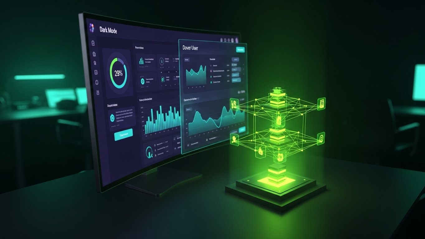
The Visual & Narrative Approach
This visual highlights the "Power User" experience. We see a sleek, curved monitor from a side angle displaying the dashboard in "Dark Mode." The interface uses Deep Purple and Black backgrounds with Bioluminescent Blue accents for data visualization. "Glassmorphism" effects create semi-transparent panels. It looks like the cockpit of a spaceship, situated in a dimly lit, high-tech workspace.
Psychological Impact & KPI Focus
- Niche Psychology: Targets User Comfort and Exclusivity. Dark mode is often associated with "Pro" features and reduced eye strain during long shifts. It signals that you care about the user's daily experience.
- Operational Impact: Visualizes Ergonomics and Advanced Analytics. It highlights the complex, data-heavy dashboards that power users need, presented in a way that minimizes visual fatigue.
Strategic Implementation & Trade-offs
- Best Use Case: Product Update Emails (16:9). Announcing "Dark Mode" or new analytics features with this style drives re-engagement.
- Trade-off: Readability. Ensure the contrast ratios are high enough so the UI elements don't disappear into the dark background.
Companies using similar video content -
GitLab – DevOps Platform – The code matrix for robust CI/CD pipelines.
Temporal – Workflow Platform – Power under the hood for resilient applications.
29. Low-Poly 3D Modeling
Expansion | Driving Upsell/Cross-sell

The Visual & Narrative Approach
To sell an upgrade, we shift to a playful, inviting tone. A faceted, papercraft-style rocket ship in Pink and Yellow launches from a data pad platform against a Pastel Blue background. Geometric icospheres form smoke clouds. The lighting is bright and cheerful. It looks like a collectible toy or a game achievement.
Psychological Impact & KPI Focus
- Niche Psychology: Leverages Gamification. Upgrading software usually feels like a billing hassle. This visual reframes the upgrade as "leveling up" or "launching a new adventure," reducing the Pain of Paying.
- Operational Impact: Visualizes Scalability and New Capabilities. It metaphorically represents the launch of new modules or the expansion of the business into new territories.
Strategic Implementation & Trade-offs
- Best Use Case: In-App Upsell Ads (1:1). The friendly, non-aggressive aesthetic makes the "Ask" feel like an opportunity, not a sales pitch.
- Trade-off: Too "cute." Ensure it doesn't trivialize the business value. Use it for "Growth" features, not "Security" upgrades.
Companies using similar video content -
BMC Software – Helix Operations Management – Pro console for executive intelligence.
Broadcom – CA Automic – Advanced analytics in a dark mode, high-tech workspace.
30. 2D Graphics Over Live Action
Expansion | Driving Referrals & Advocacy

The Visual & Narrative Approach
The final style celebrates the human connection. A candid, high-res photo shows two colleagues in a sunlit office high-fiving. Overlaid exactly at the point of contact is a stylized 2D "Thumbs Up" or "Heart" icon in Pop Art Red and Denim Blue. The icon has varied opacity, blending digital approval with physical celebration.
Psychological Impact & KPI Focus
- Niche Psychology: Leverages Social Proof and Tribal Belonging. It validates that successful teams use this software. It encourages the user to share their "wins" with their network.
- Operational Impact: Visualizes Collaboration and Team Efficiency. It moves the focus from "software performance" to "team performance," which is the ultimate metric for business leaders.
Strategic Implementation & Trade-offs
- Best Use Case: Social Media Advocacy Campaigns (4:5). Perfect for LinkedIn/Instagram stories celebrating client wins or case studies.
- Trade-off: Authenticity is key. The stock photo must look candid. If it looks staged, the "social proof" backfires.
The Visual Operations Doctrine: A Strategic Synthesis
The 30 visual styles outlined above are not merely aesthetic choices; they are the vocabulary of a "Visual Operating System" designed to bridge the gap between complex automation and human adoption. To convert these visuals into tangible business value (ROI), we must move beyond creation to strategic application.
The following three knowledge segments provide the Advids framework for deploying these assets to drive the "Self-Driving Enterprise."
Strategic Alignment & Visual Architecture
Goal: Defining the "Visual Operating System" before a single pixel is rendered.
The journey to automation begins with alignment. In the Pre-Production phase, the goal is to reduce the "Cognitive Load" of your future users by establishing a consistent visual language.
- 1. The Cognitive Load Audit: Conduct an audit of your current training materials. If a concept takes three paragraphs to explain (e.g., API integration), replace it with Style 22 (Isometric Modular Snap). Measure the reduction in "Time-to-Comprehension."
- 2. Role-Based Visual Mapping: Differentiate visual styles for different personas. Use Style 24 (Holographic Boardroom) to sell strategy to the C-Suite, but stick to Style 16 (Clean UI Light) for the daily users who need clarity, not flash. "Field Agents" on mobile need high-contrast Style 6 (Kinetic Type), while "Operations Managers" need data-dense Style 17 (Parallax UI).
- 3. The "Glanceability" Standard: In high-stress operational environments (like logistics dispatch), information must be consumed in milliseconds. Visuals must use "Alert Colors" and clear typography to convey status in under 3 seconds.
- 4. Brand Voice Consistency: Automation platforms often span multiple modules (HR, Logistics, Finance). Use a unified color palette (e.g., The "Electric Blue" data lines) across all video styles to visually stitch these disparate silos into one cohesive platform.
- 5. The Advids Strategic Audit: This is where a partner like Advids becomes critical. Rather than just "making videos," the goal is to define a "Visual Schematics" for your brand—ensuring that a "user" looks the same in a sales deck as they do in a tutorial video.
- 6. Standardization vs. Customization: For core platform features, use "Iconic" styles (Like Style 19) that remain consistent. For client-specific workflows, use Style 10 (Wireframe Transitions) to show how the standard platform adapts to their unique needs.
- 7. The Cross-Departmental Bridge: Use these visuals to unify terminology. If Sales uses Style 13 (Isometric God-Mode) to promise "End-to-End Visibility," Product and Support must use the same visual metaphor to explain how to achieve it.
- 8. Legacy System Integration: Visually acknowledge the "old world." Use Style 10 (Wireframe Transitions) to show how the new SaaS interface respects and integrates with legacy hardware (like on-prem servers or fleets), reducing friction from veteran staff.
- 9. Accessibility by Design: Ensure all motion graphics are designed for a diverse workforce. Style 6 (Kinetic Type) and Style 3 (Line Art) must be legible on mobile devices and rely on visual cues rather than just audio.
- 10. The Mobile-First Mandate: Your users are increasingly mobile. Verify that intricate styles like Style 17 (Parallax UI) retain their clarity even when compressed onto a smartphone screen for executive review on the go.
Operational Adoption & Implementation
Goal: Embedding visuals into the workflow to drive "Unconscious Competence."
The best software fails if users refuse to adopt it. Visual content is the primary tool for Change Management, reducing the friction of new habits.
- 11. Overcoming "Monitoring" Anxiety: Automation and tracking can feel intrusive. Use Style 11 (Lifestyle Verified) and Style 30 (Social Success) to frame the software as a tool for empowerment and safety, not surveillance.
- 12. The Micro-Learning Shift: Replace 50-page PDF manuals with a library of 30-second clips using Style 25 (Macro UI) for specific actions. This "Just-in-Time" support reduces the cognitive barrier to entry.
- 13. Just-in-Time Support: Embed Style 23 (Guided Support) loops directly into the helpdesk ticketing system. When a user encounters an error, the relevant visual guide should auto-populate, resolving the issue before a ticket is filed.
- 14. Gamification of Training: Utilize Style 29 (Low-Poly Rocket) and Style 5 (Character Story) to turn onboarding into a progression system. Award visual badges for completing training modules to drive engagement.
- 15. Reducing Support Ticket Volume: There is a direct correlation between proactive visual guides and reduced helpdesk load. Pre-empting questions with Style 22 (Modular Snap) videos can drastically lower support costs.
- 16. Remote Onboarding: For distributed teams, physical seminars are impossible. Use Style 4 (Gen AI Persona) and Style 14 (Photorealistic Renders) to create a high-fidelity virtual onboarding experience that feels personal and premium.
- 17. Visual SOPs: Transform text-based Standard Operating Procedures into Style 16 (Clean UI) loops. A looping video of the correct workflow is more effective than a binder on the shelf.
- 18. Feedback Loops: Use interactive video elements to gather user feedback. If a user pauses a Style 21 (Rapid UI) video repeatedly, it signals a UI friction point that Product needs to address.
- 19. Scalable Localization: Design your Style 2 (Abstract Motion) assets to be text-free or easily swappable. This allows you to deploy the same visual logic to global teams by simply changing the voiceover language.
- 20. Leadership Communication: When the CTO needs to explain a pivot, use Style 24 (Holographic Boardroom). It elevates the message, signaling that the change is strategic, well-planned, and under control.
Measuring Impact & Future-Proofing
Goal: Quantifying the ROI of "Visual Capital" and scaling for the AI era.
To justify the investment in high-end visualization, you must correlate visual performance with business KPIs. This moves video from "Marketing Expense" to "Capital Asset."
- 21. Beyond "Views" – Defining Actionable KPIs: Stop measuring "Views." Measure Time-to-Competency (how fast a new user reaches full productivity) and Feature Adoption Rate (how many users activate a new feature after seeing the Style 21 highlight reel).
- 22. The "Idle Time" Metric: In operations, time spent figuring out the software is waste. Correlate the deployment of Style 3 (Line Art) explainers with a reduction in "Software Idle Time" or "Navigation Lag."
- 23. Compliance Velocity: When new regulations (like GDPR or Industry Mandates) hit, how fast can you retrain the workforce? Visuals like Style 20 (X-Ray Transparency) allow for rapid dissemination of complex compliance logic.
- 24. Retention and LTV: A user who understands the tool is a user who stays. The "Pro" feel of Style 28 (Dark Mode) increases perceived value, directly impacting Net Dollar Retention (NDR).
- 25. The AI Visual Frontier: Prepare for the future where Generative AI creates visuals on the fly. Clean, structured visuals like Style 13 (Isometric Workflow) can be easily read by future AI agents to auto-generate personalized support content.
- 26. Scalability of Assets: Build a modular library. Creating a "Design System" for your video assets (standardized colors, motion curves) ensures that new videos can be produced at 50% of the cost and time.
- 27. The Advids Partnership: Future-proofing requires a pipeline. Partnering with Advids allows for the creation of a "Living Library" of assets. As your UI updates, the underlying motion projects can be rapidly re-rendered, ensuring your documentation never becomes obsolete.
- 28. Benchmarking Success: Compare your "Visual/Text Ratio" against industry leaders. If your knowledge base is 90% text, you are falling behind competitors who use Style 26 (Hyper-lapse Data) to explain complex flows.
- 29. The ROI of Safety: In operational contexts, clarity equals safety. Quantify the reduction in critical errors or safety incidents following the rollout of clear, high-contrast visual training (Style 6).
- 30. Final Call to Innovation: The "Self-Driving Enterprise" is not a destination; it is a standard of excellence. By systematically applying these 30 styles, you build a cohesive, confident narrative that turns viewers into power users, and power users into evangelists.
Companies using similar video content -
Harness – Software Delivery Platform – Gamified growth for feature deployment and upgrades.
CircleCI – CI/CD Platform – Launchpad for new capabilities and continuous integration.
Author & Editor Bio


