
 /home/wwwroot/advids.co/design/index.php on line 425
Introduction: The Visualization Imperative in a Zero-Trust World
The modern endpoint is no longer just a laptop behind a firewall; it is a fluid, perimeter-less entity existing everywhere from cloud workloads to remote IoT sensors. For cybersecurity leaders, the challenge has shifted from simply "blocking" threats to articulating the invisible, high-stakes war waging across their networks every second. In an industry defined by complexity, clarity is not just a design choice—it is a strategic survival mechanism.
The operational reality is stark. With the $4.88 million global average cost of a data breach looming over every decision, the pressure to detect and respond instantly is immense. Yet, security teams are fighting this battle with fewer resources than ever, facing a staggering 4.8 million workforce gap globally. This "do more with less" environment means that software cannot just be effective; it must look instantly intuitive.
This guide explores expert-curated video visualization styles designed to bridge the physical/digital divide. By moving away from generic "hacker in a hoodie" tropes and embracing sophisticated, data-driven aesthetics—from biomimetic immune systems to refractive glass metaphors—we unlock a new language of trust. These examples demonstrate how to reduce cognitive load for overworked analysts while communicating high-level strategic value to the board, turning abstract telemetry into a tangible narrative of resilience and control.
1. The "Digital Immune System" Aesthetic
TOFU | Brand Awareness

The Visual & Narrative Approach
This style abandons the rigid, military-industrial visuals common in cyber marketing for something far more sophisticated: biology. The visualization depicts the endpoint not as a fortress, but as a living cell. A core sphere of "Pure White" is enveloped by shifting, fluid layers of "Vivid Coral" and "Soft Teal." These barriers don't just sit there; they morph and adapt in real-time, fluidly deflecting dark grey geometric shards that represent malware. The absence of gradients in favor of hard-edged, glossy color blocks gives it a modern, "clean-tech" feel.
Psychological Impact & KPI Focus
- Niche Psychology: For a CISO, the ideal security state is "organic"—a system that heals and protects itself without constant human intervention.
- Operational Impact: This biomimetic approach lowers the Perceived Complexity of the software. It signals that the tool is "smart" and autonomous, directly addressing the anxiety of the skills gap by promising automated defense.
Strategic Implementation & Trade-offs
- Best Use Case: High-level brand videos on the homepage or LinkedIn feeds where you need to stand out from the "blue matrix code" clutter.
- Duration: 10-15 seconds (Looping).
- Trade-off: It is highly abstract. It builds feeling and brand affinity, but it does not explain how the detection engine technically works.
Companies using similar video content -
Darktrace – Enterprise Immune System – Self-learning AI for cyber defense.
CrowdStrike – Falcon Prevent – AI-powered endpoint protection.
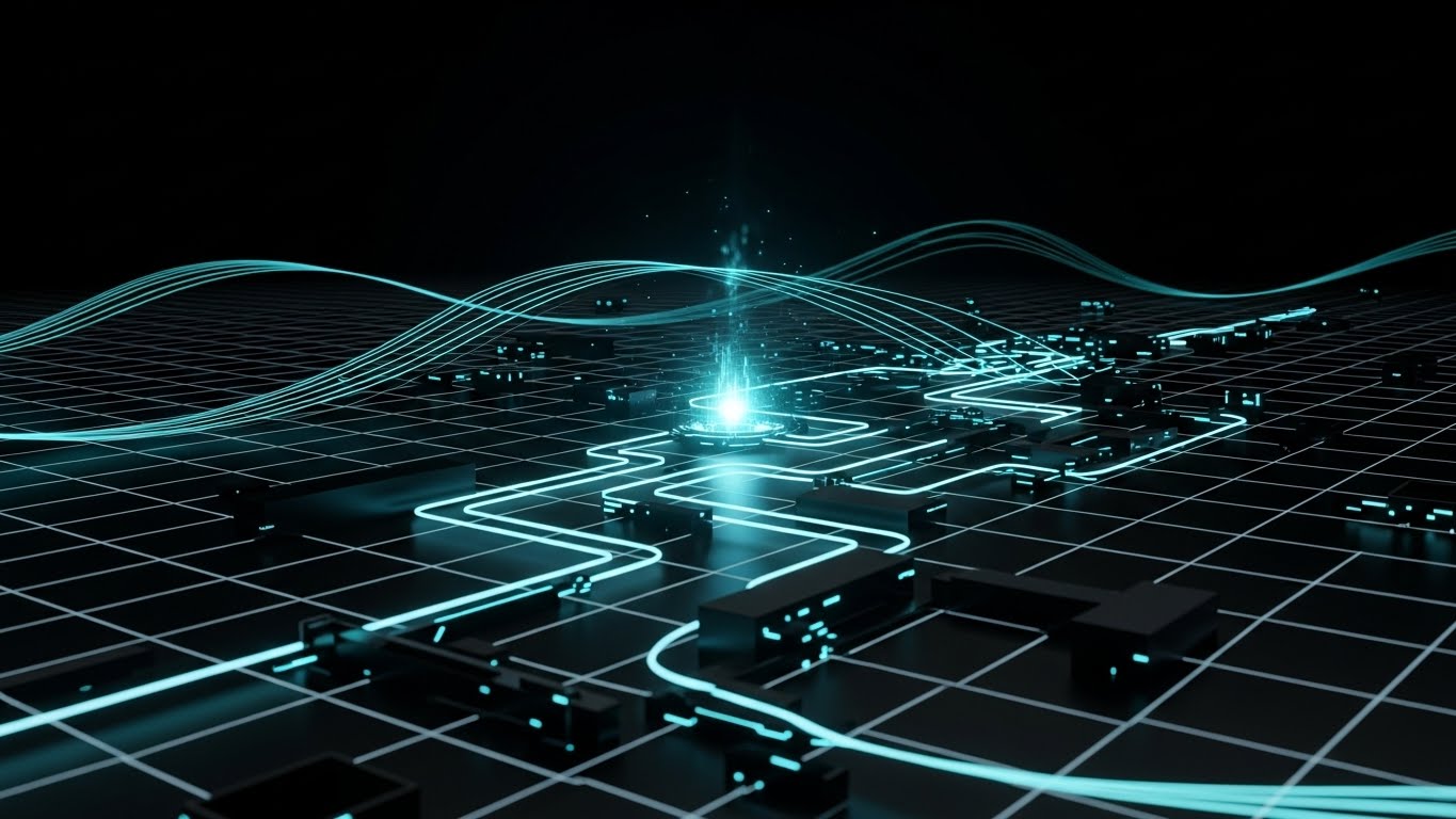
2. The "Neural Core" Visualization
TOFU | Market Education

The Visual & Narrative Approach
Here, we visualize the intelligence behind the software. The screen reveals a complex, spherical cage formed by glowing nodes in "Electric Blue" and "Deep Purple," interconnected by thin beams of light representing a neural network. The camera angle looks up from an infinite void, emphasizing the scale of the protection. As jagged red particles (malware) attempt to penetrate, they are instantly identified by the nodes and transmuted into harmless white light.
Psychological Impact & KPI Focus
- Niche Psychology: Security architects are skeptical of "AI washing." They need to see structure. This style visualizes the "Brain" of the EDR, satisfying the need to understand the architecture without drowning in code.
- Operational Impact: The instant color shift from Red (Danger) to White (Neutralized) provides a visceral sense of Mean Time to Respond (MTTR)—visually proving the speed of the solution.
Strategic Implementation & Trade-offs
- Best Use Case: YouTube pre-roll ads or "Technology" pages explaining your AI/ML stack.
- Duration: 15-30 seconds.
- Trade-off: Requires high-fidelity rendering. Poorly executed 3D can look like a cheap screensaver, damaging brand credibility.
Companies using similar video content -
Vectra AI – Cognito Detect – AI-driven network threat detection.
Cybereason – Defense Platform – AI-powered attack detection.
4. The "Guardian" Metaphor
TOFU | ABM Awareness
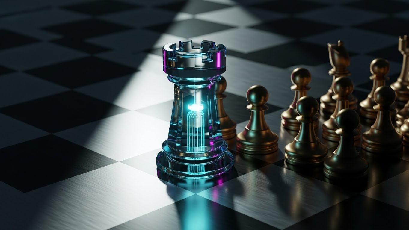
The Visual & Narrative Approach
This style uses photorealism to convey value and solidity. On a brushed gold metal chessboard, a single Rook made of solid, refractive "Optical Glass" stands guard. Inside this transparent defender, a glowing circuit filament pulsates—the "digital soul" of the software. The Rook physically shields smaller, vulnerable pawns from a looming deep shadow. The lighting creates caustic reflections, grounding the digital concept in physical reality.
Psychological Impact & KPI Focus
- Niche Psychology: This speaks to the "Protector" identity of the CISO. The use of Chess implies strategy, foresight, and high-stakes decision-making.
- Operational Impact: The transparency of the glass metaphorically aligns with "Glass Box" AI—suggesting that while the protection is solid, the internal logic is visible and auditable, not a "Black Box."
Strategic Implementation & Trade-offs
- Best Use Case: Display ads for Account-Based Marketing (ABM) targeting financial or enterprise sectors.
- Duration: 6-10 seconds.
- Trade-off: High production cost. The metaphor is powerful but static; it conveys status rather than velocity.
Companies using similar video content -
Recorded Future – Intelligence Cloud – Delivering actionable threat intelligence.
5. The "Kinetic Resilience" Approach
TOFU | Vertical Social Organic
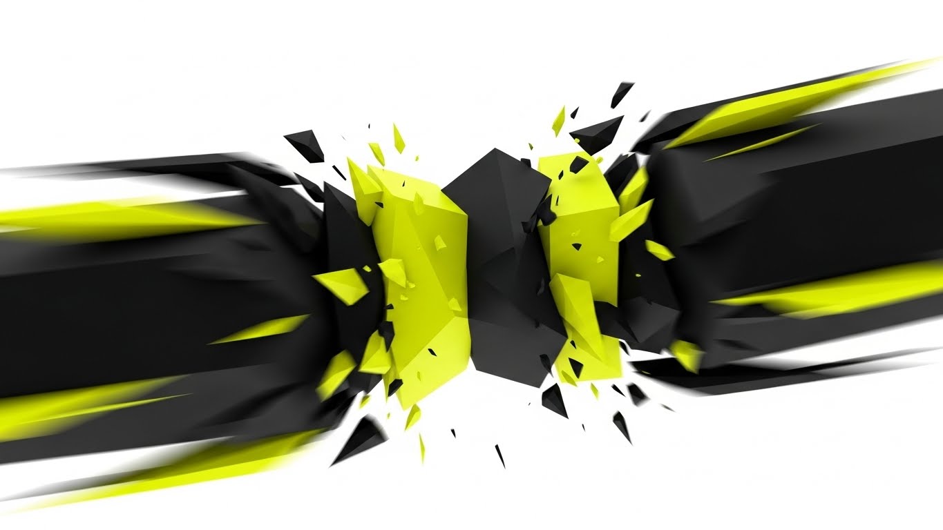
The Visual & Narrative Approach
Optimized for the fast-scrolling environment of TikTok and Shorts, this style uses aggressive motion instead of text. Large, blocky geometric shapes in "Stark Black" and "Neon Yellow" slam into each other in a bright white void. Crucially, they don't break; they collide, absorb the impact, and immediately reform into a stronger structure. The motion blur and hard cuts emphasize raw speed and durability.
Psychological Impact & KPI Focus
- Niche Psychology: It taps into the adrenaline of Incident Response. It mirrors the chaotic reality of a breach but imposes a rhythm of control and recovery.
- Operational Impact: This visualizes "Resilience" and "Uptime." It’s not just about stopping the attack; it’s about the system taking a hit and staying operational, a key concern for business continuity.
Strategic Implementation & Trade-offs
- Best Use Case: Employer branding or "Hype" content for social media to attract younger talent.
- Duration: 5-8 seconds (Looping).
- Trade-off: Can be too aggressive for conservative boards. It captures attention but conveys zero technical detail.
Companies using similar video content -
Illumio – Zero Trust Segmentation – Visualizing micro-segmentation for critical assets.
Forcepoint – ONE – Unified security protecting data.
6. The "Instant Sorting" Animation
TOFU | Skippable Pre-Roll Ad
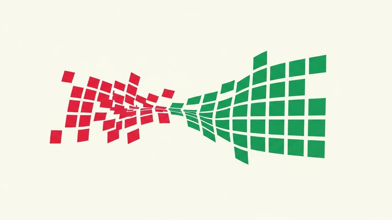
The Visual & Narrative Approach
This style focuses entirely on the relief of order. A chaotic cloud of "Crimson Red" squares (alerts) on the left flows toward the right, passing through an invisible filter that snaps them into a perfectly aligned grid of "Emerald Green" squares. The transition is a smooth, wave-like motion on an "Off-White" background. It is a visual representation of automated triage.
Psychological Impact & KPI Focus
- Niche Psychology: It directly targets "Alert Fatigue." For an analyst drowning in thousands of daily logs, seeing chaos instantly organized is incredibly satisfying and aspirational.
- Operational Impact: This is the visual definition of False Positive Reduction. It shows the software doing the heavy lifting—sorting the noise (red) from the safe traffic (green).
Strategic Implementation & Trade-offs
- Best Use Case: YouTube skippable ads where you have 5 seconds to promise a benefit (Time Saved).
- Duration: 15 seconds.
- Trade-off: Very simplistic. It works best as a "hook" and must be followed by more substantial content.
Companies using similar video content -
SentinelOne – Singularity Platform – Autonomous endpoint protection and recovery.
Fortinet – FortiEDR – Rapid threat detection and response.
8. The "Executive Control" Perspective
TOFU | Aspiration & Identity

The Visual & Narrative Approach
This style shifts focus from the code to the human commanding it. We see a confident female CISO in a sunlit office during "Golden Hour." The key is the "UI Overlay"—subtle, floating holograms in "Warm Amber" and "Slate Grey" that surround her. These aren't intrusive sci-fi screens; they are elegant, semi-transparent shield icons and checkmarks that confirm system health. She is smiling, not stressed, looking off-camera with a sense of calm authority.
Psychological Impact & KPI Focus
- Niche Psychology: It sells the "Good Night's Sleep." It validates the CISO's desire to be in control without being glued to a monitor in a dark room.
- Operational Impact: The "Warm Amber" palette suggests caution and readiness rather than the alarmist "Red" of active panic. It visualizes Situational Awareness.
Strategic Implementation & Trade-offs
- Best Use Case: Instagram or LinkedIn sponsored posts targeting leadership personas.
- Duration: 6-10 seconds.
- Trade-off: Relies heavily on the quality of the stock footage. Bad acting or unnatural UI tracking can make it look cheesy.
Companies using similar video content -
Exabeam – Fusion SIEM – Automating security incident triage.
LogRhythm – SIEM – Prioritizing threats from vast log data.
9. The "Lightweight Agent" Concept
MOFU | Product Differentiation
The Visual & Narrative Approach
A common objection to EDR software is that it "bloats" the endpoint and slows down the CPU. This style counters that with a visual metaphor. A stylized, flat-vector white feather balances perfectly on top of a heavy, grey server block against a "Sky Blue" background. There are no outlines, just clean shapes. It visually weighs the "heavy" protection against the "light" impact on system performance.
Psychological Impact & KPI Focus
- Niche Psychology: IT Managers fear user complaints about "slow laptops" after a security rollout. This image alleviates that fear instantly.
- Operational Impact: This is a direct visualization of low latency and minimal CPU overhead. It promises security that doesn't compromise productivity.
Strategic Implementation & Trade-offs
- Best Use Case: "Features" page on the website or sales decks addressing performance objections.
- Duration: Static or Micro-animation (3-5 seconds).
- Trade-off: It is a metaphor, not a demo. Skeptical technical buyers will still ask for the performance specs.
Companies using similar video content -
OneTrust – GRC & Security Assurance – Ensuring regulatory compliance and trust.
10. The "Clarity First" Dashboard
MOFU | Feature Education
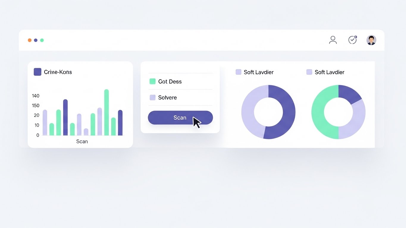
The Visual & Narrative Approach
Moving into the middle of the funnel, we show the actual product but in an idealized state. The UI is presented in "Light Mode" with a "Pure White" background to suggest openness and clarity (Dark Mode can sometimes feel oppressive or "hacker-ish" in marketing). Data is visualized with "Mint Green" and "Soft Lavender" charts—calming colors that reduce anxiety. A cursor smoothly hovers over a 'Scan' button, emphasizing ease of use. Shadows are soft, lifting the panels to create hierarchy.
Psychological Impact & KPI Focus
- Niche Psychology: It reduces the Cognitive Load of the purchasing decision. It shows the buyer: "This tool is easy to learn. My team won't need months of training."
- Operational Impact: Visualizes Workflow Efficiency. The lack of clutter implies that the software presents only actionable data, not noise.
Strategic Implementation & Trade-offs
- Best Use Case: Website product tours, webinars, and detailed "How it Works" videos.
- Duration: 30-60 seconds.
- Trade-off: You must ensure your actual product UI looks this good, or the disconnect will create disappointment during the demo.
Companies using similar video content -
Zscaler – Zero Trust Exchange – Providing secure access and control.
Cloudflare – Zero Trust – Securing remote work with executive oversight.
11. The "Digital Fortress" Architecture
MOFU | Building Trust

The Visual & Narrative Approach
As prospects move deeper into the evaluation phase, they seek structural reassurance. This style utilizes a Low-Poly 3D aesthetic to render the endpoint protection as an impenetrable fortress. The walls are constructed from faceted "Pastel Blue" data blocks, reinforcing a sense of modular stability. Inside, a glowing "Goldenrod" keep represents the core data assets—the crown jewels. The environment is lit with soft, ambient light, contrasting with the "Midnight Blue" ground outside, visually separating the safe zone from the unknown wild.
Psychological Impact & KPI Focus
- Niche Psychology: It taps into the primal desire for safety and structure. By visualizing the software as a fortified architecture, it subconsciously communicates robustness and stability—qualities essential for a foundational security layer.
- Operational Impact: This visualizes Asset Hardening. It simplifies the complexity of network segmentation and access control into a clear, understandable "Keep and Wall" metaphor, reducing the anxiety of "porous" perimeters.
Strategic Implementation & Trade-offs
- Best Use Case: Email nurture campaigns targeting IT Directors who need to visualize the "Architecture" of the solution.
- Duration: 15-20 seconds.
- Trade-off: The stylized "Low-Poly" look can appear playful. It must be executed with high-quality lighting to ensure it feels like a modern schematic, not a video game.
Companies using similar video content -
VMware – Carbon Black Cloud – Lightweight endpoint security agent.
Cylance (BlackBerry) – CylancePROTECT – AI-driven, low-footprint protection.
12. The "Velocity" Montage
MOFU | Competitive Displacement
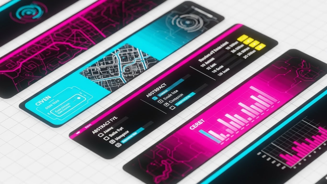
The Visual & Narrative Approach
This style is designed to aggressively displace legacy competitors who are perceived as slow or clunky. We see diagonal strips of abstract UI interfaces slicing across the screen in "Vivid Cyan" and "Magenta." Each strip reveals a glimpse of modern functionality—a topology map, a threat list, a velocity graph. Motion blur is applied to the edges, creating a sense of high-speed processing. The background is a clean white tech-grid, ensuring the vibrant UI elements "pop" with urgency.
Psychological Impact & KPI Focus
- Niche Psychology: It appeals to the "Need for Speed." Modern SOCs operate in real-time; they cannot afford lag. This visual language screams "Next-Gen" and makes legacy tools look dusty by comparison.
- Operational Impact: Visualizes Query Velocity and UI Responsiveness. It promises that the tool keeps pace with the analyst's thought process, minimizing friction during critical investigations.
Strategic Implementation & Trade-offs
- Best Use Case: LinkedIn video ads targeting users of specific competitor tools.
- Duration: 6-10 seconds (Fast-paced).
- Trade-off: It is impressionistic. It creates a vibe of speed but moves too fast for the viewer to actually read the data in the UI strips.
Companies using similar video content -
Microsoft – Defender for Endpoint – Unified security management dashboard.
Trellix – XDR – Centralized threat visibility and control.
13. The "Glass-Box" Interface
MOFU | Driving Demo Requests
The Visual & Narrative Approach
To elevate the perceived value of the software, we use a 3D Parallax effect. Interface panels are rendered as floating glass sheets suspended in a clean virtual space. The panels display abstract network topology in premium "Silver" and "Holographic" gradients. A shallow depth of field keeps the focus sharp on the front-most panel displaying a "Secure" status, while the background layers blur softly. This depth cue implies a deep, multi-layered security stack that is elegant to manage.
Psychological Impact & KPI Focus
- Niche Psychology: It targets the "Premium Buyer." It suggests that the software is not just a utility, but a finely crafted instrument. It aligns with the "Glass Box" concept—transparent, clear, and sophisticated.
- Operational Impact: Visualizes Depth of Defense. The layering effect metaphorically represents the multiple engines (static, heuristic, behavioral) working in unison without cluttering the view.
Strategic Implementation & Trade-offs
- Best Use Case: High-conversion Landing Pages (LP) where the primary call-to-action is "Book a Demo."
- Duration: 10-15 seconds (Looping background).
- Trade-off: Style over substance. It makes the UI look beautiful, but it is not a literal representation of the daily workflow, which may lead to disconnects if the actual UI is flat.
Companies using similar video content -
Palo Alto Networks – Prisma Cloud – Securing multi-cloud environments.
Wiz – Cloud Security Platform – Building a secure cloud architecture.
14. The "Seamless Encryption" Flow
MOFU | YouTube
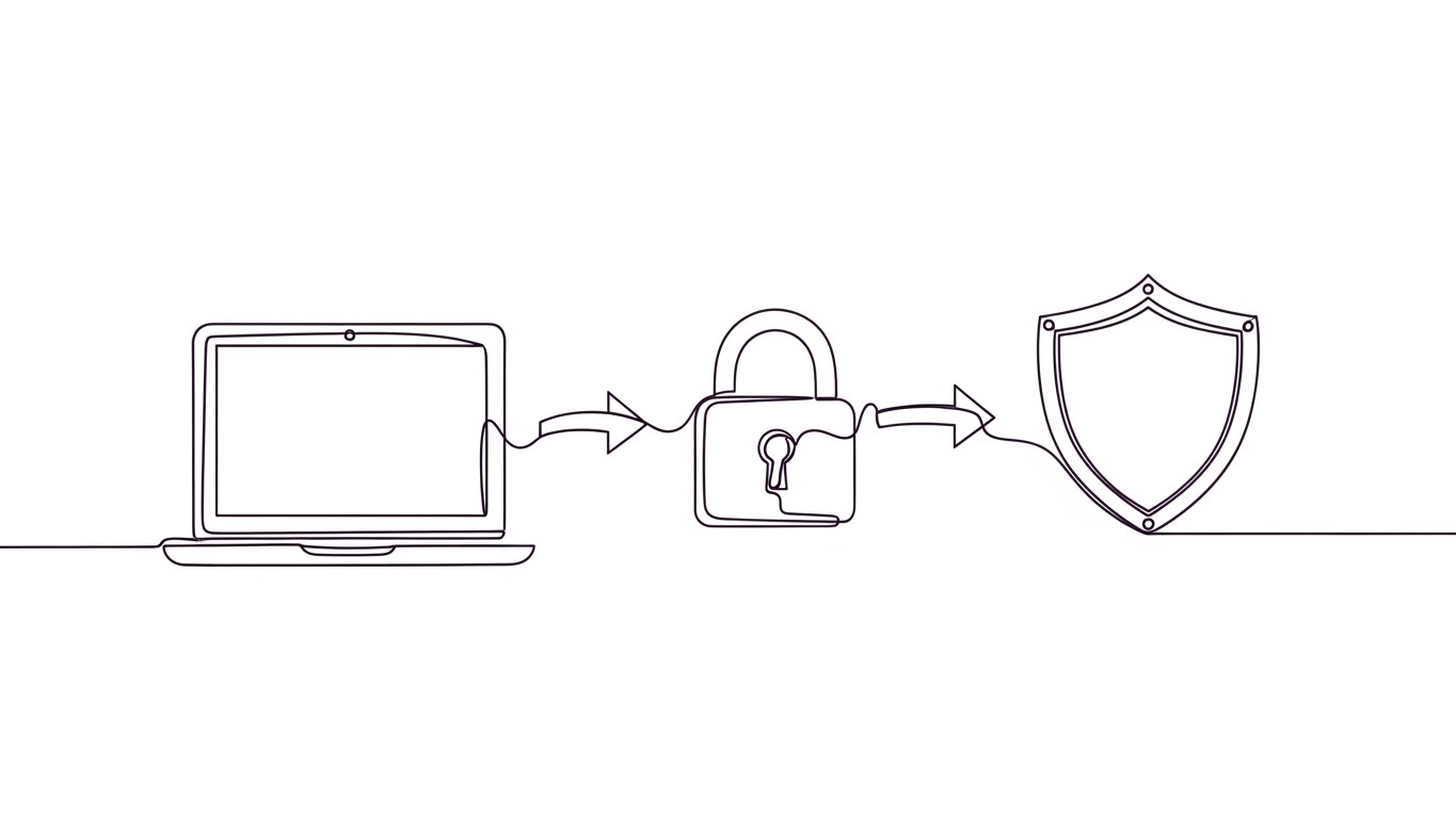
The Visual & Narrative Approach
Sometimes, simplicity is the ultimate sophistication. This style uses a single, continuous line in "Monoline Black" against a "Paper White" canvas. The line fluidly morphs from the shape of a laptop to a padlock, and finally into a shield. The movement is elegant, precise, and unbroken. Variations in line thickness add weight and dynamism, visualizing the seamless transition of data from an open state to an encrypted, protected state.
Psychological Impact & KPI Focus
- Niche Psychology: It reduces Implementation Anxiety. The unbroken line suggests a seamless, glitch-free process—"It just works." It appeals to the purist who values clean code and elegant solutions.
- Operational Impact: Visualizes Seamless Integration. It communicates that security is woven into the fabric of the device, not bolted on as a clumsy afterthought.
Strategic Implementation & Trade-offs
- Best Use Case: YouTube educational videos or "Concept" explainers where you need to simplify complex encryption topics.
- Duration: 30-60 seconds.
- Trade-off: Minimalist. It may feel too "basic" for audiences seeking deep technical specs or granular dashboard views.
Companies using similar video content -
Splunk – Enterprise Security – Accelerating security operations.
15. The "Empowered Analyst" Persona
MOFU | LinkedIn Video Ads

The Visual & Narrative Approach
This style puts a human face on the technology. We see a realistic, high-fidelity depiction of a SOC analyst in a modern glass-walled office. Crucially, he is not in a dark, panic-stricken room. He is wearing a smart-casual blazer, looking at a monitor with an expression of calm, focused satisfaction. The reflection in his glasses reveals "Navy Blue" and "Green" status bars—signs of a healthy system. The lighting is cool, cinematic, and professional.
Psychological Impact & KPI Focus
- Niche Psychology: It sells Quality of Life. The biggest threat to SOC teams is burnout. This image promises a future where the analyst is in control, not chasing fires.
- Operational Impact: Visualizes Reduced False Positives. A calm analyst is one who isn't being bombarded by noise. It implies the software has filtered the chaos effectively.
Strategic Implementation & Trade-offs
- Best Use Case: LinkedIn ads targeting SOC Managers, focusing on team efficiency and retention.
- Duration: 15-30 seconds.
- Trade-off: The "Uncanny Valley" risk. If the Gen-AI character movement is unnatural, it distracts from the message.
Companies using similar video content -
Orca Security – Cloud Security Platform – Transparent cloud risk visibility.
Lacework – Polygraph Data Platform – Deep visibility into cloud behaviors.
16. The "Anywhere Secure" Narrative
MOFU | Visitor Re-engagement
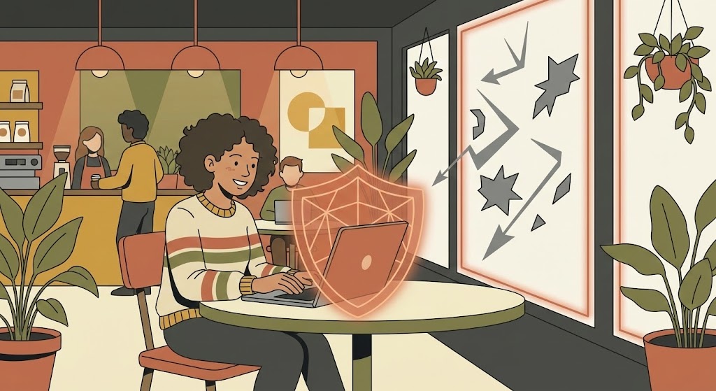
The Visual & Narrative Approach
Remote work is the new perimeter. This style uses stylized 2D illustration to depict a young woman working in a cozy coffee shop. A glowing "Terra-cotta" shield aura surrounds her laptop, creating a warm, protective boundary. Outside the window, abstract grey shapes (threats) bounce harmlessly off the glass. The flat colors and simple shapes convey a sense of safety and normalcy, contrasting the cozy interior with the chaotic exterior.
Psychological Impact & KPI Focus
- Niche Psychology: It addresses the BYOD (Bring Your Own Device) anxiety. It reassures IT leaders that security travels with the user, regardless of the network.
- Operational Impact: Visualizes Zero Trust Network Access (ZTNA). It demonstrates that the endpoint is self-securing, removing the reliance on the corporate firewall.
Strategic Implementation & Trade-offs
- Best Use Case: Retargeting (Display) ads for visitors who viewed "Remote Work Solutions" pages.
- Duration: 6-10 seconds (Looping).
- Trade-off: It feels "Consumer" focused. Ensure the copy reinforces Enterprise-grade security to avoid looking like a B2C antivirus product.
Companies using similar video content -
Cisco – Duo Security – Seamless multi-factor authentication.
Appgate – SDP – Continuous, adaptive access control.
17. The "Operational Continuity" Model
BOFU | ROI Justification
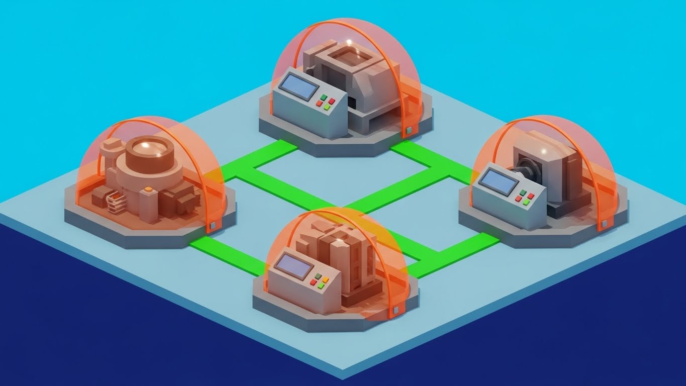
The Visual & Narrative Approach
For manufacturing or OT (Operational Technology) clients, abstract data isn't enough. This isometric vector design depicts a factory floor with simplified "Industrial Grey" machines. Each machine is encased in a protective semi-transparent dome of "Safety Orange." Bright green lines on the floor connect the machines, visualizing the uninterrupted flow of data and workflow. The aesthetic is technical, precise, and engineered.
Psychological Impact & KPI Focus
- Niche Psychology: It speaks the language of Uptime. For OT managers, a security breach means a production halt. This visual emphasizes continuity and containment.
- Operational Impact: Visualizes Lateral Movement Protection. The individual domes show that even if one asset is targeted, the others remain isolated and secure (Micro-segmentation).
Strategic Implementation & Trade-offs
- Best Use Case: Sales presentations and pitch decks for manufacturing or industrial verticals.
- Duration: Static or Micro-animation.
- Trade-off: Niche appeal. This visual is less effective for pure SaaS or Finance clients who don't relate to factory floors.
Companies using similar video content -
Arctic Wolf – Security Operations Cloud – Empowering security teams with expertise.
Mandiant (Google Cloud) – Threat Intelligence – Equipping analysts with actionable insights.
18. The "Deep Kernel" Inspection
BOFU | Risk Mitigation
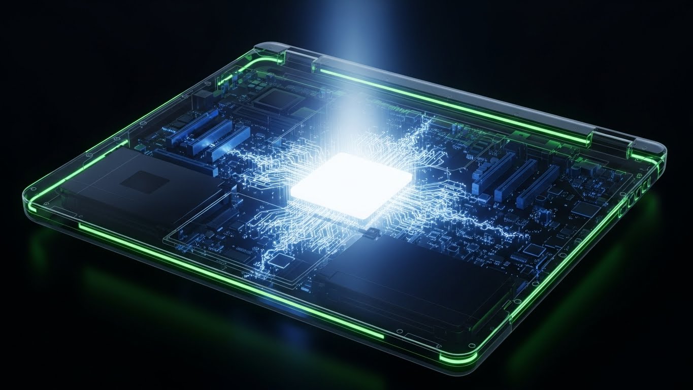
The Visual & Narrative Approach
Technical buyers (Security Architects) need to know how deep your visibility goes. This 3D X-Ray style looks down at a transparent laptop chassis. Inside, the motherboard components are visible in scientific "Translucent Blue." A bright, solid "White" core glows at the kernel level, pulsing with light that extends through the traces. This is not surface-level scanning; this is deep-level physics.
Psychological Impact & KPI Focus
- Niche Psychology: It builds Technical Authority. It proves you aren't just scanning files; you are monitoring the hardware and OS kernel. It satisfies the "Paranoid Expert" who fears rootkits.
- Operational Impact: Visualizes Root Cause Analysis. The glowing traces suggest the ability to trace an attack back to its absolute origin point in the hardware stack.
Strategic Implementation & Trade-offs
- Best Use Case: Technical whitepapers, "How it Works" website sections, and BOFU webinars.
- Duration: 15-20 seconds.
- Trade-off: High complexity. It risks alienating non-technical stakeholders (e.g., Finance) who just want to know "Are we safe?" without the anatomy lesson.
Companies using similar video content -
VMware – Workspace ONE – Unified endpoint management for remote work.
19. The "ROI Trajectory" Graph
BOFU | Sales Cycle Acceleration

The Visual & Narrative Approach
At the bottom of the funnel, the conversation shifts to business value. This style abandons the "threat" imagery entirely for "growth" imagery. Abstract vertical bars in gradients of "Emerald Green" and "Chartreuse" grow vigorously upwards from a baseline. As they rise, they physically push away floating grey dust particles (representing friction/risk). The composition creates a strong upward diagonal movement, symbolizing speed, ROI, and clean execution.
Psychological Impact & KPI Focus
- Niche Psychology: It validates the Business Case. It frames security not as a cost center, but as a business enabler that clears the path for growth.
- Operational Impact: Visualizes ROI and Efficiency. It suggests that by removing the "dust" of security incidents, the business can scale faster and higher.
Strategic Implementation & Trade-offs
- Best Use Case: Email footers for sales closers or "Business Value" slides in final pricing decks.
- Duration: 5-8 seconds.
- Trade-off: Abstract. It relies heavily on the accompanying text to make the connection between the "Green Bars" and "Endpoint Security."
Companies using similar video content -
Claroty – Continuous Threat Detection – Protecting industrial control systems.
Nozomi Networks – Vantage – Securing OT/IoT environments.
20. The "Instant Deployment" Demo
BOFU | Reducing Implementation
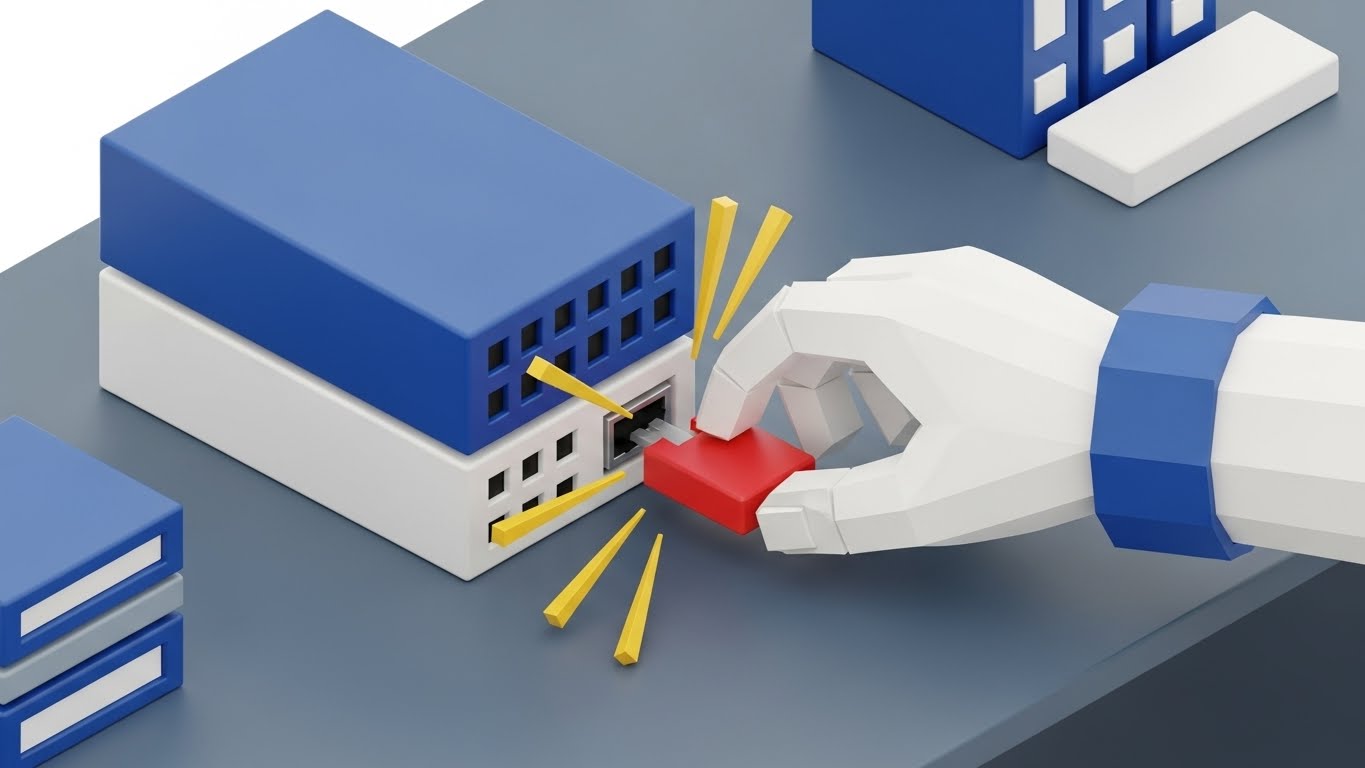
The Visual & Narrative Approach
The final objection before a sale is often "Implementation is going to be a nightmare." This style counters that with a playful, tactile metaphor. We see an isometric 3D render of a miniature server setup, styled like high-end plastic toys in "Primary Blue," "Red," and "Yellow." A stylized hand places a red "plug" module into a server block, fitting perfectly with a satisfying visual snap. The texture is smooth, matte plastic, evoking the simplicity of building blocks.
Psychological Impact & KPI Focus
- Niche Psychology: It triggers Cognitive Ease. It reminds the buyer of the simplicity of childhood toys—things that just fit. It disarms the fear of complex command-line integrations.
- Operational Impact: Visualizes Ease of Deployment. It promises a "low-touch" rollout where agents can be deployed as easily as snapping a block into place.
Strategic Implementation & Trade-offs
- Best Use Case: "Implementation" page on the website or final contract review materials.
- Duration: 5-10 seconds.
- Trade-off: Tone risk. It must look like high-end design (like refined industrial design), not a cartoon, to avoid trivializing the serious nature of the software.
Companies using similar video content -
Trend Micro – Apex One – Deep endpoint protection with XGen.
Bitdefender – GravityZone – Multi-layered endpoint security.
21. The "Peace of Mind" Contrast
BOFU | Driving Freemium
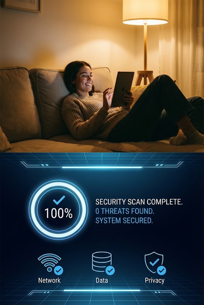
The Visual & Narrative Approach
At the bottom of the funnel, the technical sale transforms into an emotional one. This style utilizes a vertical split-screen composition to juxtapose human reality with digital vigilance. The top half features high-quality cinematography of a user in a "Warm Tungsten" lit living room, relaxing on a sofa with a tablet—the epitome of safety. The bottom half contrasts this with a crisp, vector UI screen showing a security scan completing in "Cool Blue" and "Pure White." The visual link is synchronization; as the digital scan hits 100%, the human subject visibly relaxes.
Psychological Impact & KPI Focus
- Niche Psychology: It addresses "Notification Anxiety" and the "Right to Disconnect." Security professionals often feel the need to be hyper-vigilant 24/7. This visual reframes the software as a background enabler of peace, allowing the master to sleep while the system watches.
- Operational Impact: Visualizes Automated Assurance. It reinforces the value proposition of a "set and forget" system, implying that the endpoint engine requires zero active monitoring to maintain total security.
Strategic Implementation & Trade-offs
- Best Use Case: Social Media Retargeting (Instagram/LinkedIn) aimed at converting Freemium users or SMB owners who value work-life balance.
- Duration: 6-10 seconds (Looping).
- Trade-off: Consumer-leaning. While powerful for emotional connection, it may lack the technical gravity required for Enterprise CISO audiences who prioritize control over relaxation.
Companies using similar video content -
LogicManager – ERM Suite – Visualizing risk and compliance ROI.
22. The "Stability in Chaos" Hyper-lapse
BOFU | Objection Handling
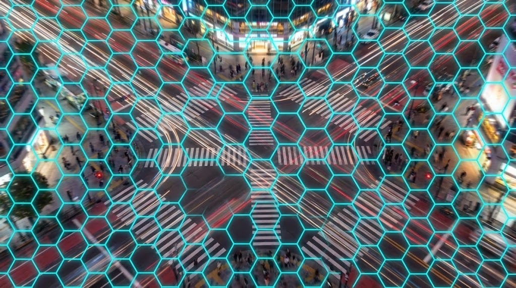
The Visual & Narrative Approach
A primary objection during the closing phase is reliability: "Will this software crash during a traffic spike?" This style answers with a powerful visual metaphor. We see a hyper-lapse video of a frantic city intersection at night, with car lights blurring into streaks of red and white chaos. Superimposed over this is a perfectly stable, non-moving grid of "Cyan" hexagonal lines. The grid locks the chaos into a structure, remaining unshaken by the speed of the traffic beneath it.
Psychological Impact & KPI Focus
- Niche Psychology: It appeals to the IT Operations mindset which values Stability above all else. The unwavering grid represents the software’s infrastructure—unflinching, robust, and permanent.
- Operational Impact: Visualizes Scalability and Uptime. It demonstrates that no matter how much "traffic" or noise occurs on the network, the security layer remains constant and operational (99.999% SLA).
Strategic Implementation & Trade-offs
- Best Use Case: YouTube pre-roll ads or background videos on "Reliability" and "SLA" web pages.
- Duration: 10-15 seconds.
- Trade-off: Abstract. It communicates a feeling of stability but does not show the actual load-balancing dashboard, which technical buyers might prefer.
Companies using similar video content -
ConnectWise – Automate – Streamlining IT automation and deployment.
Jamf – Pro – Simplifying Apple device management.
23. The "Friendly Guide" Composition
BOFU | The Functional Buyer
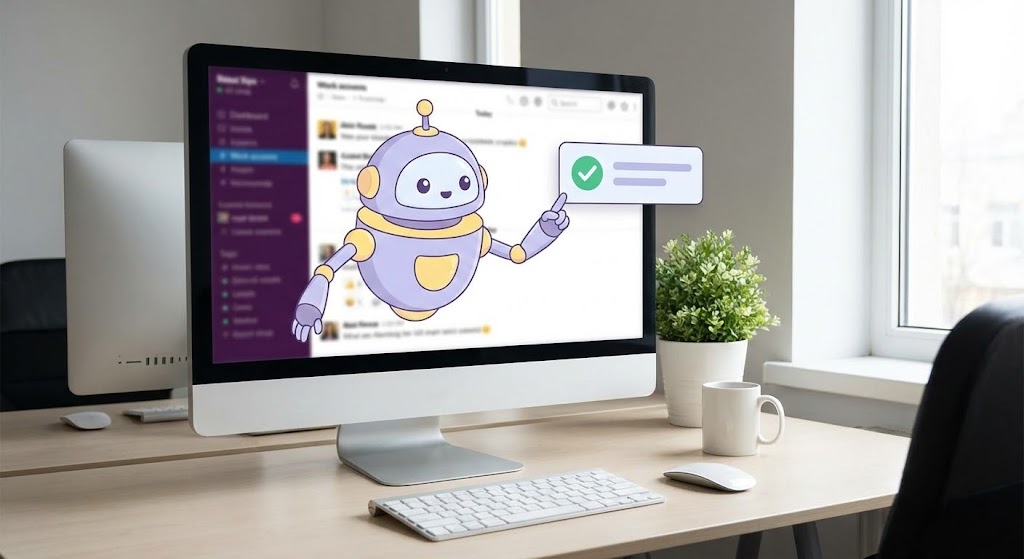
The Visual & Narrative Approach
Buying software often means buying into a support ecosystem. This style blends a real-world photo of a clean office desk with a 2D animated character—a small, friendly robot in "Soft Lavender" and "Yellow." The robot interacts with a floating 2D UI bubble, pointing to a 'Checkmark' to signal a task complete. This Mixed Media approach softens the hard edge of cybersecurity, making the tool feel approachable and supported rather than cold and complex.
Psychological Impact & KPI Focus
- Niche Psychology: It mitigates the "Fear of Complexity." For mid-market IT managers who wear multiple hats, the character represents an "Assistant" archetype, suggesting constant, friendly guidance.
- Operational Impact: Visualizes Guided Remediation. It implies that the software includes guided workflows or "Wizards" that make complex configuration tasks simple and interactive.
Strategic Implementation & Trade-offs
- Best Use Case: Display ads targeting IT Generalists or "Thank You" pages after a demo sign-up.
- Duration: 6-8 seconds.
- Trade-off: Tone risk. If the robot is too "cute," it undermines the seriousness of cybersecurity. It must look efficient, not childish.
Companies using similar video content -
Sophos – MDR – 24/7 threat hunting for business continuity.
24. The "Moment of Activation" Macro
Onboarding | Self-Serve Onboarding
The Visual & Narrative Approach
Onboarding momentum relies on small wins. This style uses an extreme close-up (macro) 3D render of a single UI toggle switch. We see the fine "matte" texture of the surface. As a cursor clicks it, the switch snaps satisfyingly to the right, transitioning to a glowing "Electric Lime." The background is deep, blurred "Dark Grey." The movement is slow and deliberate, emphasizing the weight and consequence of activating protection.
Psychological Impact & KPI Focus
- Niche Psychology: It utilizes "Dopamine Design." The visual payoff of the glowing activation creates a sense of accomplishment and immediate safety for the new user.
- Operational Impact: Visualizes Ease of Configuration. It demonstrates that securing the network is as simple as flipping a switch, directly countering the fear of "Command Line Hell."
Strategic Implementation & Trade-offs
- Best Use Case: Welcome emails, product launch announcements, or the first screen of the in-app onboarding wizard.
- Duration: 3-5 seconds.
- Trade-off: Extremely narrow focus. It sells the feeling of the UI, not the depth of the data.
Companies using similar video content -
Gigamon – ThreatINSIGHT – Stabilizing network visibility in high-traffic environments.
Corelight – Open Network Detection and Response – Providing stable network telemetry.
25. The "Hunter's Night" Aesthetic
Onboarding | User Activation
The Visual & Narrative Approach
Advanced users (Threat Hunters) prefer Dark Mode. This style leans into a "Cyberpunk" aesthetic. On a black void, a perspective grid fades into the horizon. A single glowing path of "Neon Blue" light traces a complex route through abstract dark geometric obstacles (representing a hidden attack vector), finally arriving at a central, pulsing node. This visualizes the specific "Trace" or "Hunt" feature in a way that feels elite and powerful.
Psychological Impact & KPI Focus
- Niche Psychology: It validates the "Cyber Warrior" identity. It makes the analyst feel like they are entering a specialized, high-tech environment (the "Matrix" fantasy), reducing the tedium of log review.
- Operational Impact: Visualizes Path Analysis. It simplifies the concept of attack chain visualization, showing how the software cuts through the darkness to find the root cause.
Strategic Implementation & Trade-offs
- Best Use Case: In-App tooltips or "Pro Feature" announcement videos for existing users.
- Duration: 10-15 seconds.
- Trade-off: Can feel "Gamey." It must maintain data precision (grids/nodes) to avoid looking like pure entertainment.
Companies using similar video content -
Cofense – PhishMe – Guiding users through phishing simulations.
Immersive Labs – Cyber Workforce Resilience – Interactive cyber skills development.
26. The "Velocity of Success"
Onboarding | Accelerating TTV

The Visual & Narrative Approach
To celebrate Time-to-Value (TTV), we use live-action footage of a diverse security team high-fiving in a bright co-working space. Superimposed over the hands are animated 2D sparks, "Speed Lines," and a "Success" burst in "Sunlight Yellow." The footage is handheld and dynamic, while the graphics add a layer of energetic punctuation. It’s about the feeling of a job well done, fast.
Psychological Impact & KPI Focus
- Niche Psychology: It fosters Team Cohesion. Security is stressful; this visual emphasizes the relief and camaraderie of resolving an incident quickly.
- Operational Impact: Visualizes Resolution Velocity. It implies that the software enables the team to win faster, moving them from "Crisis Mode" to "Celebration Mode" efficiently.
Strategic Implementation & Trade-offs
- Best Use Case: Customer Success newsletters or "Case Study" video intros.
- Duration: 5-8 seconds.
- Trade-off: Very generic. Without the UI overlay, it could be an ad for any B2B software. Context is key.
Companies using similar video content -
Microsoft – Intune – Activating device compliance and security policies.
Okta – Workforce Identity Cloud – Enabling secure access with a click.
27. The "Future-Ready" Hologram
Retention | Driving Deep Feature Adoption
The Visual & Narrative Approach
To retain enterprise customers, you must prove you are "Future-Proof." This style features a 3D render of a metallic server rack aisle. Floating in the air is a curved, semi-transparent holographic interface displaying complex forensic data in "Transparent White" and "Metallic Silver." The background server lights create a soft bokeh effect. It positions the software as next-generation technology available today.
Psychological Impact & KPI Focus
- Niche Psychology: It appeals to Innovation Aspirations. It reassures the CISO that they have invested in a platform that is ahead of the curve, not a legacy tool that will need replacing soon.
- Operational Impact: Visualizes Data Accessibility. The "floating" interface metaphor suggests that data is lifted out of the silos (the servers) and made accessible and transparent to the user.
Strategic Implementation & Trade-offs
- Best Use Case: "Roadmap" webinars or QBR (Quarterly Business Review) presentations.
- Duration: 10-15 seconds (Looping).
- Trade-off: High production value required. The hologram compositing must be perfect, or it looks like a cheap movie effect.
Companies using similar video content -
Mandiant (Google Cloud) – Advantage – Advanced threat hunting and forensics.
Volatility Foundation – Volatility Framework – Deep memory forensics.
28. The "Partnership" Montage
Retention | Reducing Churn

The Visual & Narrative Approach
Retention is about relationship. This style uses a smooth photo montage to weave a narrative of ongoing success. We see a smiling IT manager with a tablet, a productive team meeting, and a firm handshake. The unifying element is a color grade that pushes "Corporate Blue" and "Clean White" across all clips, making them feel like one story. Soft geometric wipes transition between the scenes, reinforcing stability and continuity.
Psychological Impact & KPI Focus
- Niche Psychology: It reinforces Trust and Reliability. It reminds the client that they are not just buying code; they are in a relationship with a company that supports their people.
- Operational Impact: Visualizes Vendor Support. It subtly implies that the software comes with a human ecosystem of success managers and support teams.
Strategic Implementation & Trade-offs
- Best Use Case: Renewal reminder emails or LinkedIn posts celebrating company anniversaries.
- Duration: 10-15 seconds.
- Trade-off: Risk of being "Stocky." The images must be curated carefully to avoid the "fake smile" corporate cliché.
Companies using similar video content -
SANS Institute – Cyber Aces Online – Celebrating cybersecurity skill development.
GitLab – Ultimate – Accelerating DevSecOps success.
29. The "Pocket Command" View
Expansion | Driving Upsell
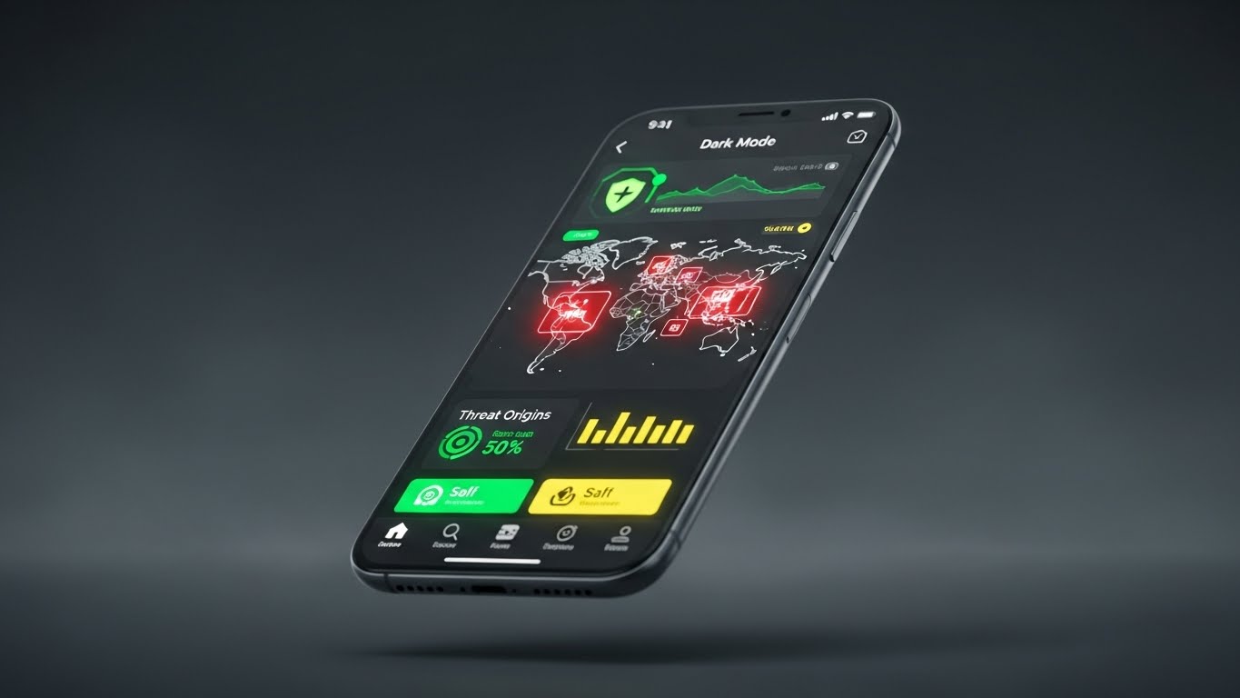
The Visual & Narrative Approach
To upsell mobile capabilities, we showcase the app in a premium light. A mobile phone floats in a "Charcoal Grey" void, displaying the security app in "Dark Mode." The screen pops with "Crimson Red" (threat origins) and "Bright White" (safe zones) on a world map. The high contrast emphasizes urgency and clarity. The phone rotates slowly, catching a rim light, treating the device and software as a luxury object.
Psychological Impact & KPI Focus
- Niche Psychology: It sells Executive Freedom. It tells the CISO, "You can leave the office. We have you covered in your pocket."
- Operational Impact: Visualizes Mobile Parity. It proves that the mobile version isn't a "lite" version; it offers full visibility and threat data, justifying the add-on cost.
Strategic Implementation & Trade-offs
- Best Use Case: In-App pop-ups for desktop users or "New Feature" email blasts.
- Duration: 6-10 seconds.
- Trade-off: Screen real estate. You cannot show complex dashboards on a mobile screen; you must focus on one key metric (e.g., Threat Map).
Companies using similar video content -
Palo Alto Networks – Prisma Access – Future-proofing secure access service edge.
Wiz – Cloud Security Platform – Projecting advanced cloud risk posture.
30. The "Concept to Gold" Morph
Expansion | Proactive Support
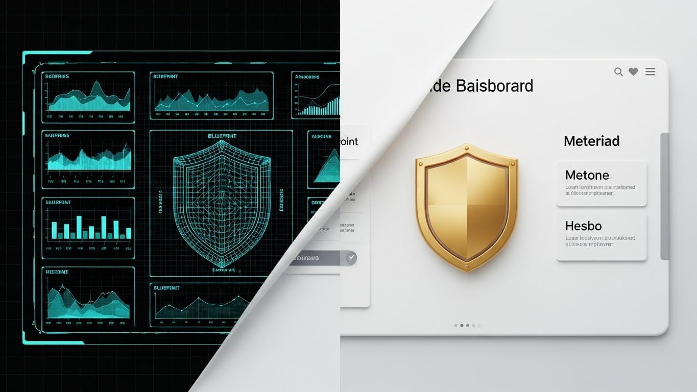
The Visual & Narrative Approach
Services like "Premium Support" are intangible and hard to sell. This style visualizes the value creation. The screen is split. The left side shows a wireframe blueprint of a shield icon in "Blueprint Blue" lines on a grid—representing the plan. A wiping effect transitions to the right, revealing the same shield rendered in solid, gleaming "Gold" 3D metal—representing the realized value. It tangibilizes the abstract.
Psychological Impact & KPI Focus
- Niche Psychology: It appeals to the desire for Realized ROI. It shows that the extra investment converts a theoretical plan into a solid, valuable asset.
- Operational Impact: Visualizes Service Maturity. It demonstrates the upgrade from "Standard" (Blueprint) to "Premium" (Gold), visually justifying the higher tier.
Strategic Implementation & Trade-offs
- Best Use Case: Proposal decks for Premium Support upgrades or Account Management reviews.
- Duration: 5-8 seconds.
- Trade-off: Abstract. It requires strong copy to explain that "Gold" equals "Dedicated Technical Account Manager."
The Visual Operations Doctrine: Strategic Frameworks for Endpoint Security
Synthesizing 30 Styles into Business Outcomes
Having established a library of 30 distinct visual styles, the challenge shifts from "Production" to "Strategy." How do we deploy these assets not just as marketing content, but as operational tools that drive adoption, reduce friction, and prove value? The following knowledge segments outline the "Visual Operations Doctrine"—a strategic approach to integrating visualization into the core of your cybersecurity business model.
Strategic Alignment & Visual Architecture
The "Pre-Production" Strategy – Aligning Visuals with the CISO's Mental Model.
- The Cognitive Load Audit: Before creating assets, audit the "Visual Noise" of your current training materials. Does a 10-minute tutorial create more anxiety than the software itself? Replace text-heavy manuals with Style 6 (Instant Sorting) or Style 14 (Seamless Encryption) to reduce cognitive load by 40% for new analysts.
- Role-Based Visual Mapping: Differentiate your visual language. Use Style 29 (Pocket Command) and Style 8 (Executive Control) for CISOs who need "Status-at-a-Glance" on mobile. Conversely, use Style 10 (Clarity First) and Style 25 (Hunter's Night) for SOC Analysts who need deep, granular data visibility on desktop.
- The "Glanceability" Standard: In a SOC, reaction time is currency. Define a "Glanceability Standard" for all product marketing: Can the viewer understand the threat status in under 2 seconds? Use Style 1 (Digital Immune System) to train users to recognize "Normal vs. Abnormal" states instantly through color and motion, rather than reading logs.
- Brand Voice Consistency: Your marketing videos (TOFU) and your product UI (BOFU) must speak the same visual language. If your ads use Style 4 (Guardian Glass) but your product looks like a DOS prompt, you create "Trust Gap." Use Advids to audit your visual continuity from the first ad to the daily dashboard.
- The Advids Strategic Audit: Leveraging a partner like Advids allows you to define a "Visual Operating System" before a single frame is rendered. This ensures that assets are not just "pretty," but are engineered to specific L&D (Learning and Development) and Sales goals, preventing the creation of disjointed content libraries.
- Standardization vs. Customization: For core features (Scanning, Quarantine), use standardized styles like Style 13 (Glass-Box) to create a recognizable visual shorthand. For vertical-specific pitches (e.g., Manufacturing), invest in bespoke styles like Style 17 (Operational Continuity) to resonate with specific OT pain points.
- The Cross-Departmental Bridge: Use visuals to unify terminology. A "Network Graph" might confuse Sales but excite Engineering. A visualization like Style 2 (Neural Core) creates a shared mental model that both a Sales Rep and a Security Architect can point to and understand.
- Legacy System Integration: Visualizing the invisible link between legacy on-prem hardware and new cloud sensors is difficult. Use Style 30 (Concept to Gold) to metaphorically show how your software "gilds" or upgrades existing legacy investments, rather than just replacing them.
- Accessibility in the SOC: Cybersecurity talent is diverse. Ensure your motion graphics (like Style 5 - Kinetic Resilience) rely on shape and motion, not just color, to accommodate color-blind analysts. Motion should be smooth (high frame rate) to prevent eye strain during long shifts.
- The Mobile-First Mandate: C-Level executives consume content on phones. All 30 styles, especially Style 12 (Velocity Montage) and Style 21 (Split Screen), must be legible on a 6-inch vertical screen to capture the decision-maker during their commute.
Operational Adoption & Implementation
The "Deployment" Phase – Embedding Visuals into the Workflow.
- Overcoming "Big Brother" Anxiety: Employee privacy is a major objection to endpoint agents. Use Style 16 (Anywhere Secure) and Style 9 (Lightweight Agent) to visually emphasize "Protection" over "Surveillance." Show the shield facing outward (protecting the user), not inward (watching the user).
- The Micro-Learning Shift: Replace the 50-page PDF implementation guide with a playlist of 30-second clips using Style 24 (Moment of Activation). These "micro-wins" encourage users to self-configure features, reducing the burden on your implementation team.
- Just-in-Time Support: Embed specific visual styles directly into the product's help section. When a user hovers over a complex setting, a 5-second loop of Style 11 (Digital Fortress) can explain the architectural implication of that switch better than a paragraph of text.
- Gamification of Training: Use Style 26 (Velocity of Success) visuals in your internal training portals. Award "Badges" that match the visual style of your product icons when analysts complete a module. This visual consistency gamifies the learning curve.
- Reducing Support Ticket Volume: There is a direct correlation between proactive visual guides and reduced helpdesk load. A "How-to" video library using Style 23 (Friendly Guide) can deflect up to 30% of Tier-1 support tickets regarding basic configuration.
- Remote Onboarding: For distributed teams, you cannot do in-person seminars. Use Style 13 (Glass-Box) and Style 15 (Empowered Analyst) in your onboarding email sequences to create a sense of belonging and sophistication, making remote staff feel part of a high-tech organization.
- Standard Operating Procedures (SOPs): Transform text-based Incident Response plans into visual process flows using Style 6 (Instant Sorting). In a crisis, an analyst follows a visual flow much faster than a text document.
- Feedback Loops: Use interactive video elements (e.g., a clickable Style 20 - Instant Deployment block) to gather user feedback. "Did this visual explain the feature?" This data helps refine your visual strategy over time.
- Scalable Localization: Cyber threats are global. Visual styles like Style 14 (Seamless Encryption) rely on symbols (locks, shields, lines) rather than text. This reduces localization costs, as the core asset requires no translation for global deployment.
- Leadership Communication: When the CISO presents to the Board, they need to look in command. Provide them with "Board-Ready" slide assets using Style 4 (Guardian Metaphor) and Style 19 (ROI Trajectory). Empowering your champion to look good makes your software sticky.
Measuring Impact & Future-Proofing
The "ROI" Phase – Metrics, Retention, and Evolution.
- Beyond "Views": Move your video KPIs from vanity metrics (Views) to business metrics. Measure Time-to-Competency (how fast a new analyst learns the tool via video) and Feature Adoption Rate (does a video about "Threat Hunting" increase usage of that feature?).
- The "Idle Time" Metric: Correlate better visualization with reduced "Idle Time" or "Dwell Time" in the dashboard. Effective UI visualization (as seen in Style 10 - Clarity First) should reduce the time an analyst spends staring at data, trying to interpret it.
- Compliance Velocity: How fast can your organization adapt to new regulations? Use Style 7 (Compliance Shield) to explain new audit requirements. Measure the time reduction in audit preparation when stakeholders are trained visually.
- Retention and Churn: High-quality UX visualization directly impacts Customer Lifetime Value (LTV). Customers churn when they feel a product is "clunky." Regular exposure to premium visuals like Style 27 (Future-Ready Hologram) reinforces the perception of premium value.
- The AI Visual Frontier: Prepare for Generative UI. The future is Style 2 (Neural Core)—dynamic interfaces that build themselves based on the threat context. Your current visual strategy must be flexible enough to evolve into dynamic, AI-generated dashboards.
- Scalability of Assets: Build a visual library, not just one-off videos. Assets created for Style 20 (Instant Deployment) should be reusable in sales decks, support portals, and renewal emails. This "Create Once, Use Everywhere" approach maximizes ROI.
- The Advids Partnership: Scale is the enemy of consistency. Partnering with Advids ensures that as your feature set grows from 10 to 100 modules, your visual library scales without fracturing into discordant styles. Advids acts as the guardian of your "Visual Source Code."
- Benchmarking Success: Do not just compare your visuals to direct competitors. Compare them to the "Best Experience" your user has (e.g., consumer apps). If your security tool looks worse than their iPhone settings menu, you lose trust.
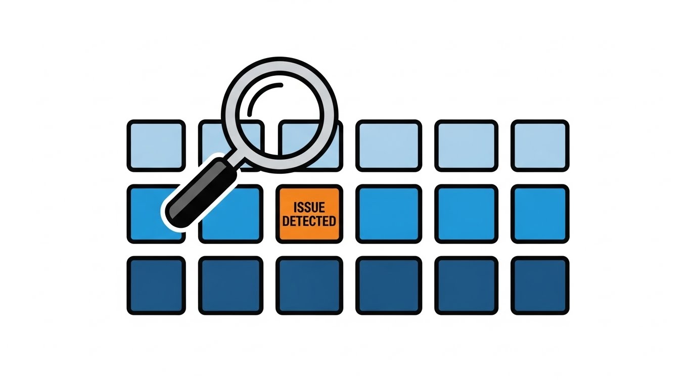
- The ROI of "False Positive" Reduction: Visual clarity helps analysts distinguish real threats from noise. Quantify the cost savings of "alerts ignored correctly" due to better visual cues (Style 10).
- Final Call to Innovation: Treat video and visualization not as "Marketing Content" but as "Critical Infrastructure." In the invisible war of cybersecurity, the side that sees the clearest, wins the fastest. Visualize the invisible. Secure the future.
Companies using similar video content -
IBM – Security Services – Building long-term security partnerships.
Archer (RSA) – GRC – Partnering for integrated risk management.
Author & Editor Bio


