
Introduction: The Visibility Imperative
The engineering and construction landscape is undergoing a radical shift. We are moving from a world of disjointed spreadsheets and reactive firefighting to an era of predictive intelligence and Digital Twins. For the modern Systems Integrity Director, the challenge is no longer just about gathering data; it is about visualizing it in a way that creates immediate, actionable clarity.
However, a critical gap remains. There is often a disconnect between the precise, tangible reality of the job site and the abstract, often chaotic data living in project tracking software. This "Physical/Digital Divide" is costly. Industry research reveals that 14% of all rework is caused specifically by bad data and miscommunication. When information is ambiguous, costs spiral and timelines fracture. Furthermore, the operational drag of poor data quality costs organizations an average of $12.9 million per year.
Visualization is the bridge. It is not merely a marketing tactic; it is a strategic translation layer. By visualizing complex Work Breakdown Structures (WBS), Critical Path dependencies, and Throughput Velocities, we do more than just show the software; we demonstrate control. We prove to the skeptical stakeholder that the digital platform is as robust and precise as the physical assets it manages.
This guide presents the first 10 of 30 distinct visual styles designed to bridge this gap. These aren't just aesthetic choices; they are strategic tools engineered to reduce cognitive load and build trust with a highly technical audience.
1. Hybrid: Isometric 3D + Low Poly
TOFU | Brand Awareness

The Visual & Narrative Approach
This style creates a clean, architectural world where the chaos of a construction site is distilled into elegant geometry. Imagine a Work Breakdown Structure (WBS) coming to life: floating blocks of "International Orange" and "Steel Grey" drift together to self-assemble a central girder. There is no dust or grit here—only the satisfying click of digital precision. The lighting is soft and ambient (ambient occlusion), emphasizing the volume of the shapes without harsh contrast.
Psychological Impact & KPI Focus
Niche Psychology: Engineering leads are often overwhelmed by messy data. This style signals "We organize chaos." By stripping away photorealistic detail, we focus the viewer’s brain entirely on the process of assembly.
Operational Impact: It visually promises that your platform turns fragmented tasks into a cohesive whole, directly appealing to the desire for Structural Order.
Strategic Implementation & Trade-offs
- Best Use Case: LinkedIn feed loops to introduce the concept of "automated project organization."
- Duration: 15–20 Seconds.
- Trade-off: This style is excellent for conceptual alignment but poor for showing specific UI features. Use it to sell the philosophy of your system rather than the dashboard itself.
Companies using similar video content -
Alice Technologies – Alice Platform – AI-powered construction planning and optimization.
RIB Software (Schneider Electric) – RIB MTWO – Cloud platform for construction project lifecycle.
InEight – InEight Platform – Project controls for capital projects.
2. Hybrid: Kinetic Type + Abstract
TOFU | Category Creation

The Visual & Narrative Approach
Speed is the currency of modern engineering. This style abandons static structures for pure momentum. Bold, hard-edged geometric shapes in vivid yellow (warning/action) and deep black slice across the screen in diagonal trajectories. It mimics the energy of Kinetic Typography but uses data blocks instead of words. The motion blur and speed lines visualize Throughput Velocity—the rate at which your platform processes decisions.
Psychological Impact & KPI Focus
Niche Psychology: Project Managers worry that software will slow them down. This visual style creates a visceral sense of acceleration, countering that objection before it’s voiced.
Operational Impact: It positions your SaaS not as a storage repository, but as a high-performance engine that drives the project forward.
Strategic Implementation & Trade-offs
- Best Use Case: Short, punchy 6-10 second bumper ads to disrupt the scroll on mobile devices.
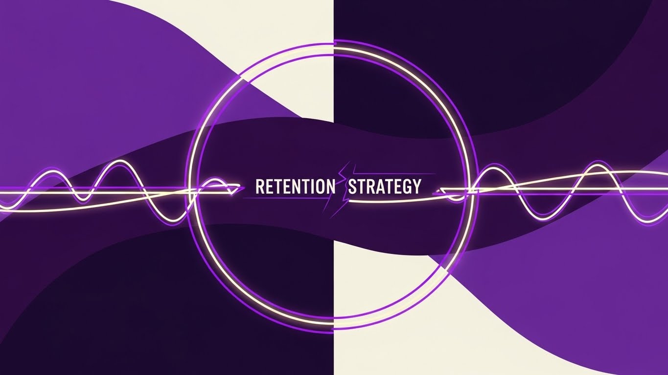
- Duration: 6–10 Seconds.
- Trade-off: High energy, but low information density. Perfect for a "hype" teaser, but avoid using it for detailed tutorials.
Companies using similar video content -
C3.ai – C3 AI Platform – Enterprise AI for accelerating business outcomes.
Uptake – Uptake Platform – Industrial AI for asset performance.
3. Abstract 2D flat vector organic modern motion graphics
TOFU | Market Education

The Visual & Narrative Approach
Engineering is often rigid, but workflows are fluid. This style uses organic, liquid-like shapes in cool purples and blues to represent the unpredictable nature of human collaboration. The visual narrative shows these messy, oscillating blobs gently merging and solidifying into a perfect, stable cube. It is a soothing, satisfying metaphor for Workflow Automation—taking the mess of daily operations and resolving it into a singular, structured output.
Psychological Impact & KPI Focus
Niche Psychology: This style lowers Cognitive Load. It taps into the satisfaction of seeing things fit together. For an Instagram audience, it provides a "visual break" from technical diagrams.
Operational Impact: It subtly communicates that your software creates harmony among stakeholders, transforming unstructured data into a Single Source of Truth.
Strategic Implementation & Trade-offs
- Best Use Case: Instagram Stories focusing on "soft skills" like team collaboration or change management.
- Duration: 15–30 Seconds.
- Trade-off: It is highly abstract. You must pair this with a clear voiceover that connects the "fluid" to "unstructured data."
Companies using similar video content -
ServiceNow – Field Service Management – Streamlining complex field operations.
Connecteam – Connecteam Platform – All-in-one app for deskless teams.
4. Futuristic Neon/Dark Mode
TOFU | Brand Perception

The Visual & Narrative Approach
This is the "Cinematic Hero" shot. We see a towering suspension bridge, but instead of steel, it is constructed from glowing electric cyan and purple neon lines against a deep charcoal void. The camera angle is low and wide, emphasizing the scale and grandeur of the structure. The pulsing lights represent data flowing through the physical assets. It visualizes the concept of Smart Infrastructure and the Digital Twin—where every beam and bolt has a digital pulse.
Psychological Impact & KPI Focus
Niche Psychology: This appeals to Professional Aspiration. It makes the engineer feel like a futurist. By using a "Dark Mode" aesthetic, it aligns with premium developer tools, signaling an enterprise-grade solution.
Operational Impact: It visualizes IoT Integration and real-time monitoring, validating the user's identity as a builder of the future.
Strategic Implementation & Trade-offs
- Best Use Case: 30-60 second "Vision" videos on a website homepage or YouTube channel trailer.
- Duration: 30–60 Seconds.
- Trade-off: The high-tech look can feel distant. It needs to be grounded with voiceover that speaks to practical benefits.
Companies using similar video content -
Bentley Systems – iTwin Platform – Digital twin solutions for infrastructure.
Siemens Digital Industries Software – Xcelerator – Comprehensive digital twin portfolio.
5. Abstract 3D AI Visualization
TOFU | Aspiration

The Visual & Narrative Approach
SaaS platforms often claim to be the "central hub," but this style proves it visually. A stunning network of glass spheres and fiber optic lines connects to a central, pulsating cluster. The depth of field blurs the periphery, forcing the eye to the center—the Collaborative Ecosystem. The sapphire blue lighting conveys trust and data security. It mimics a neural network, suggesting that the system is intelligent, learning, and evolving.
Psychological Impact & KPI Focus
Niche Psychology: This targets the Anxiety of Fragmentation. Engineers hate data silos. This visual reassures them that your platform connects the dots.
Operational Impact: It is a powerful representation of Interoperability, showing that while there are many nodes (stakeholders/tools), there is only one core brain holding it all together.
Strategic Implementation & Trade-offs
- Best Use Case: Website Headers and Investor Pitch Decks.
- Duration: Loopable.
- Trade-off: It is purely symbolic. If the user is looking for specific feature utility, this style offers no functional information.
Companies using similar video content -
Palantir Technologies – Foundry Platform – Data integration and analytics for complex ecosystems.
AVEVA – AVEVA Unified Operations Center – Centralized view of industrial operations.
6. 2D Line Art Animation
MOFU | Demand Gen

The Visual & Narrative Approach
Returning to the roots of engineering, this style uses precise, thin chalk-white lines on a midnight blue background (the classic blueprint aesthetic). It creates a Schematic Layering effect, where a complex mechanical engine or project timeline is drawn line-by-line. It visualizes the logic behind the project. The animation is deliberate and methodical, emphasizing accuracy over speed.
Psychological Impact & KPI Focus
Niche Psychology: This builds Technical Credibility. It speaks the native language of the engineer. Unlike the abstract 3D styles, this feels familiar and functional.
Operational Impact: It suggests that your software respects the fundamentals of engineering design. It is highly effective for explaining specific features or Compliance workflows.
Strategic Implementation & Trade-offs
- Best Use Case: Explainer videos detailing specific workflows or compliance features.
- Duration: 45–60 Seconds.
- Trade-off: It can feel "traditional." Ensure the animation is smooth (60fps) to keep it modern.
Companies using similar video content -
Autodesk Construction Cloud – BIM 360 – Project management and design coordination.
Esri – ArcGIS Platform – GIS mapping and spatial analytics.
7. Minimalist Flat 2D Vector
MOFU | Differentiation

The Visual & Narrative Approach
This is a pure "Problem/Solution" visualization. Using a clean palette of mint green and slate blue, the image tells a linear story. On the left, a dark, tangled knot of wire represents the status quo (manual spreadsheets, email chains). As the eye moves right, the wire unravels and straightens into a smooth, streamlined cable. It is a stark, undeniable metaphor for Streamlined Workflow.
Psychological Impact & KPI Focus
Niche Psychology: This targets Operational Efficiency. It reduces the value proposition to its simplest form: Chaos vs. Order. It requires zero cognitive effort to understand.
Operational Impact: For a blog post, where the reader is skimming text, this visual acts as a powerful anchor that reinforces the written argument instantly.
Strategic Implementation & Trade-offs
- Best Use Case: Embedded within blog posts or case studies to break up dense text.
- Duration: Static or 5-Second GIF.
- Trade-off: It is too simple for technical deep dives. It works best as a summary graphic.
Companies using similar video content -
PlanRadar – PlanRadar Platform – Construction documentation and defect management.
Fieldwire (Hilti) – Fieldwire – Field management for construction teams.
8. Isometric 3D Workflow
MOFU | Feature Education
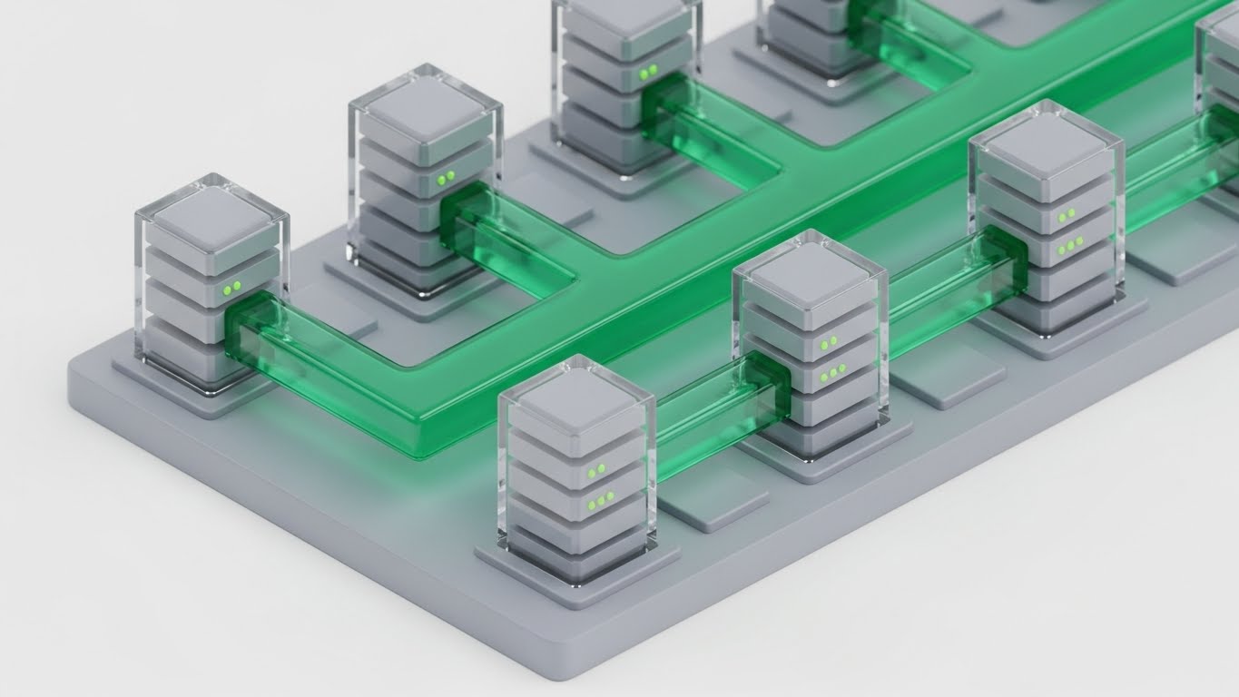
The Visual & Narrative Approach
This isometric render visualizes the digital infrastructure powering the project. We see pristine grey server blocks connected by transparent pipes carrying a flow of vivid green liquid. This visualizes Resource Allocation and "Data Pipelining" in a tactile way. It makes the abstract concept of server load and data transfer feel physical and manageable, showing the backend robustness of the SaaS platform.
Psychological Impact & KPI Focus
Niche Psychology: This appeals to the System Architect. It visualizes the stability of the platform's backend. The clean, laboratory-like aesthetic suggests hygiene, security, and efficiency.
Operational Impact: It answers the question, "Is this platform stable enough to handle our data?" with a visual "Yes," emphasizing System Reliability.
Strategic Implementation & Trade-offs
- Best Use Case: Product pages and feature walkthrough videos.
- Duration: 30–45 Seconds.
- Trade-off: By visualizing the digital side (servers), you risk disconnecting from the physical side (construction). Ensure text explains this powers the site tools.
Companies using similar video content -
AWS IoT Core – AWS IoT Core – Cloud service for connecting IoT devices.
PTC – ThingWorx – Industrial IoT platform.
9. 3D X-Ray Visualization
MOFU | Building Trust
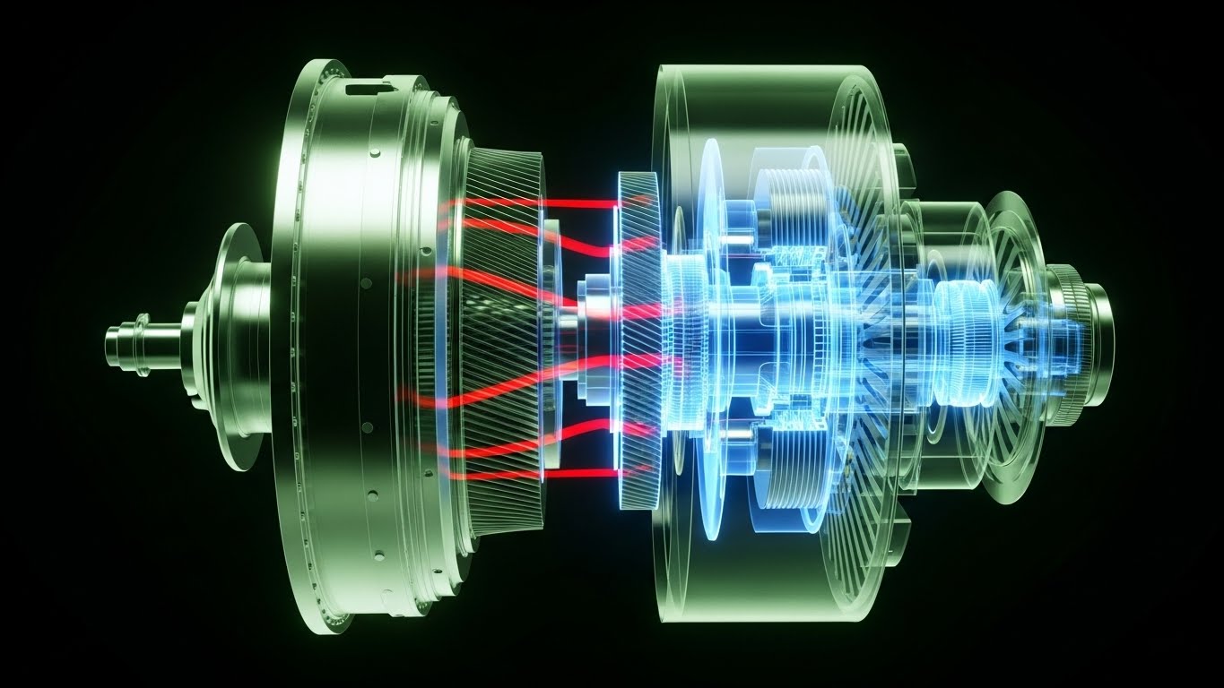
The Visual & Narrative Approach
Trust in engineering comes from verification. This style offers an X-Ray cutaway view of a complex turbine engine. The outer casing is semi-transparent silver, revealing the internal gears glowing in blue and red. The red areas highlight "heat" or friction points. This is a powerful metaphor for your platform's ability to provide Deep Observability—identifying risks (budget overruns, schedule slips) that are hidden deep within the project data before they cause failure.
Psychological Impact & KPI Focus
Niche Psychology: This targets Risk Aversion. Every Project Director fears the unknown variable. This visual style promises X-Ray vision for their project. It says, "We see what you can't."
Operational Impact: It creates a sense of safety and control, positioning your software as a diagnostic tool that ensures Structural Integrity.
Strategic Implementation & Trade-offs
- Best Use Case: "How it Works" website sections or technical deep dives.
- Duration: 60–90 Seconds.
- Trade-off: High production cost. It requires high-fidelity assets and rendering.
Companies using similar video content -
Ansys – Ansys Simulation Software – Engineering simulation and analysis.
Senseye (Siemens) – Senseye PdM – Predictive maintenance software.
10. Dynamic Data Visualization
MOFU | Functional Buyer

The Visual & Narrative Approach
Data often feels flat. This style reinvents charts as physical, matte plastic objects. Burnt orange and navy blue ring charts and bar graphs float in a gravity-defying arrangement, physically interlocking with each other. The elements snap together to form a cohesive structure, visualizing Data-Driven Insights as tangible building blocks of the project.
Psychological Impact & KPI Focus
Niche Psychology: This targets the Functional Buyer (the analyst or finance lead). It makes data feel valuable and tangible. By rendering charts as physical objects, it suggests that the insights generated by the platform are substantial.
Operational Impact: It suggests that your data isn't just noise; it is a structural component of the project's success, elevating the value of your Reporting Modules.
Strategic Implementation & Trade-offs
- Best Use Case: LinkedIn carousel ads or downloadable whitepaper covers.
- Duration: 10–15 Seconds.
- Trade-off: It is stylized abstract data. Use this for ads to promise "Tangible Insights," but switch to actual UI screencasts when showing the product interface.
Companies using similar video content -
Microsoft – Power BI – Business intelligence and data visualization.
Salesforce – Tableau Desktop – Data visualization and analytics.
11. Wireframe to Reality Transition
MOFU | Competitive Displacement
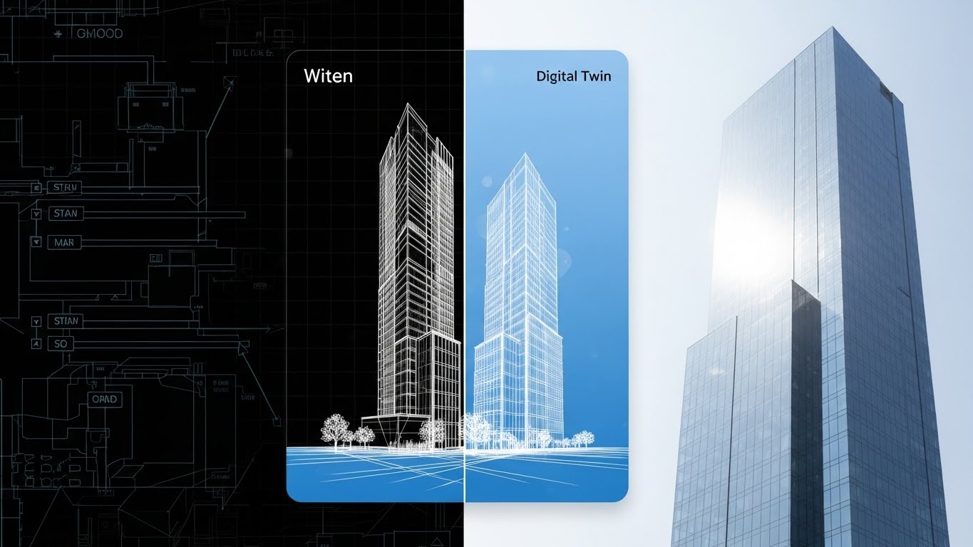
The Visual & Narrative Approach
This style creates a powerful "Before and After" narrative within a single frame. A vertical split-screen divides the visual field. On the left, labeled "Witen" (Concept), we see a precise white wireframe schematic of a skyscraper on dark blueprint paper. As the eye crosses the divide to the right, labeled "Digital Twin", the structure seamlessly resolves into a completed, photorealistic building reflecting bright daylight. It creates a direct visual lineage from the abstract data to the concrete reality.
Psychological Impact & KPI Focus
Niche Psychology: Engineering leads are skeptical of "vaporware." They need to know that the digital model accurately predicts physical outcomes. This visual proves Fidelity. It reassures them that what is planned in your software is exactly what gets built in the field.
Operational Impact: It visualizes Predictive Accuracy, demonstrating that your platform eliminates the "translation errors" that typically occur between the design office and the construction site.
Strategic Implementation & Trade-offs
- Best Use Case: Retargeting display ads for users who have visited "Features" pages but haven't converted.
- Duration: Static Image or 5-Second Loop.
- Trade-off: It is binary. It shows the start and end, but not the process. Use it to sell the result, not the workflow.
Companies using similar video content -
Matterport – Matterport Digital Twin – 3D digital twins of spaces.
OpenSpace – OpenSpace Platform – 360° photo documentation and progress tracking.
12. 3D Parallax UI
MOFU | Economic Buyer
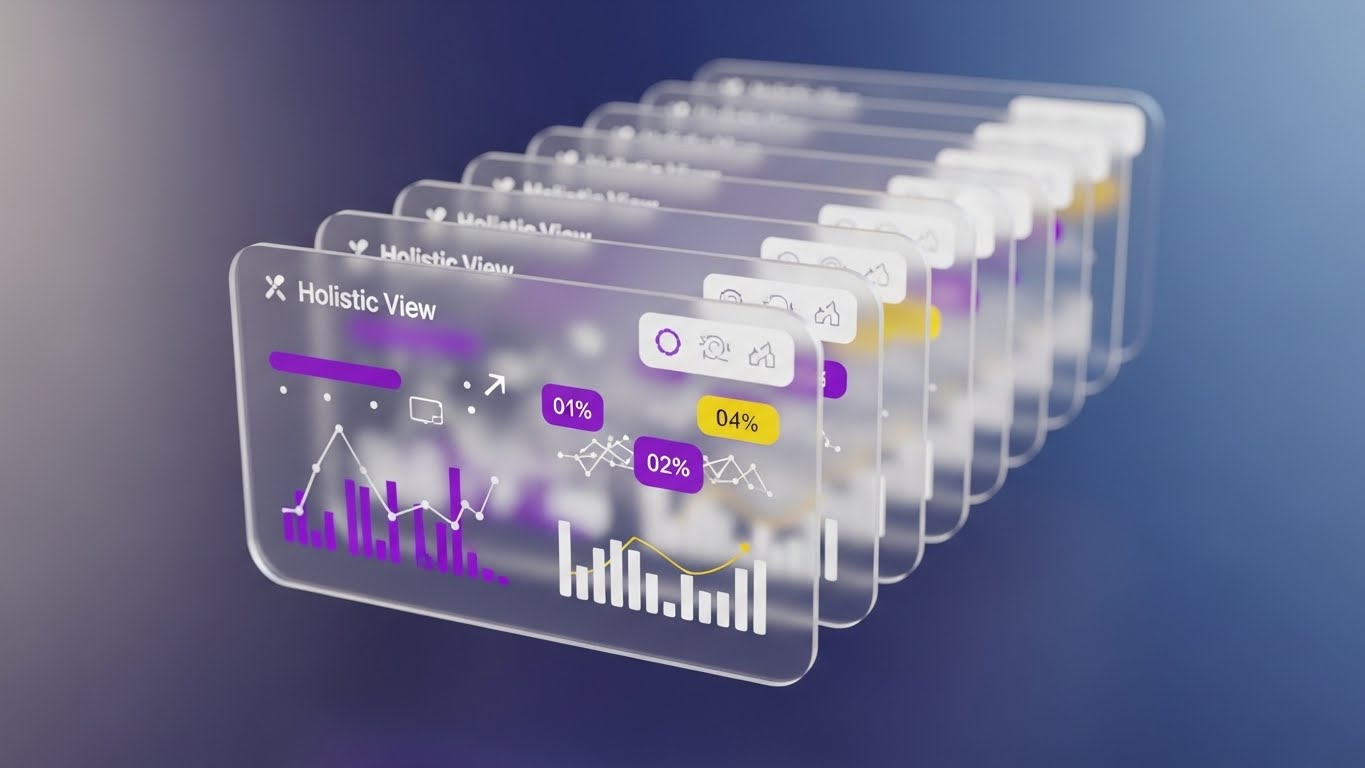
The Visual & Narrative Approach
To sell to the C-Suite, you must show the "Big Picture." This style uses a 3D parallax composition to float multiple UI interface cards in a deep perspective tunnel. The frontmost card is razor-sharp, displaying abstract financial graphs and critical data points like "Holistic View" percentages, while the background layers fade into a soft blur. The gentle, floating motion combined with the glass-like transparency of the cards creates a sense of depth and sophistication.
Psychological Impact & KPI Focus
Niche Psychology: The Economic Buyer (CFO/VP) fears blind spots. They don't care about individual buttons; they care about Oversight. This visual style tells them, "We give you perspective." It frames the software as a strategic asset rather than a tactical tool.
Operational Impact: It represents Data Aggregation, showing how your platform layers distinct data sets (finance, schedule, resources) into a single, cohesive line of sight.
Strategic Implementation & Trade-offs
- Best Use Case: Background loops for keynote presentations or high-stakes sales decks.
- Duration: Loopable.
- Trade-off: The "tunnel" effect can obscure specific data details. It is a mood-setter, not a tutorial.
Companies using similar video content -
Oracle – Primavera Cloud – Project portfolio management.
IFS – IFS Cloud – Enterprise software for asset-centric industries.
13. Holographic UI over 3D
MOFU | Objections

The Visual & Narrative Approach
Security is a primary objection in SaaS adoption. This style visualizes protection physically. A realistic, low-angle 3D render of a black server rack tower stands as the hero. Surrounding it is a glowing, holographic forcefield shield in deep purple and cyan, constructed from geometric mesh data. The text "ENTERPRISE SECURITY" floats within the barrier. The dramatic rim lighting emphasizes the solidity of the hardware while the hologram casts a protective glow.
Psychological Impact & KPI Focus
Niche Psychology: IT Directors are risk-averse. They need to feel that the data is safe. By visualizing security as a forcefield, you trigger the primal association of "shielding." It moves cybersecurity from a compliance checklist to a robust defense system.
Operational Impact: It effectively communicates Data Sovereignty and protection against cyber threats without needing complex diagrams of encryption protocols.
Strategic Implementation & Trade-offs
- Best Use Case: LinkedIn posts addressing "Data Privacy" or "Cloud Security" concerns.
- Duration: 10–15 Seconds.
- Trade-off: It is highly metaphorical. Ensure the accompanying text clarifies specific certifications (e.g., ISO 27001, SOC 2).
Companies using similar video content -
IBM – IBM Security QRadar – Security information and event management.
Honeywell – Honeywell Forge Cybersecurity – Industrial cybersecurity solutions.
14. Macro UI Micro-Interactions
MOFU | Implementation

The Visual & Narrative Approach
Implementation fatigue is real. This style zooms in—extreme macro—on a single, decisive moment. We see a sleek, dark grey UI screen where the focus is razor-sharp on a cursor hovering over a glowing, electric blue "Execute" button. The background falls into a soft bokeh blur, eliminating all distractions. The lighting highlights the texture of the screen pixels, making the digital action feel tactile and precise.
Psychological Impact & KPI Focus
Niche Psychology: Users fear that new software will be clunky or difficult to learn. This style offers visual relief. It focuses on the Micro-Moment of success, suggesting that the system is intuitive, responsive, and satisfying to use.
Operational Impact: It highlights User Experience (UX) and efficiency, countering the objection that the platform will require weeks of training.
Strategic Implementation & Trade-offs
- Best Use Case: Email nurture sequences welcoming new trial users.
- Duration: 3–5 Second GIF.
- Trade-off: It lacks context. You can't see what the button does, only that it is easy to press. Use it to sell "Ease of Use."
Companies using similar video content -
UpKeep – UpKeep CMMS – Maintenance management software.
MaintainX – MaintainX CMMS – Work order and maintenance software.
15. Clean UI Workflow (Light)
MOFU | Trials
The Visual & Narrative Approach
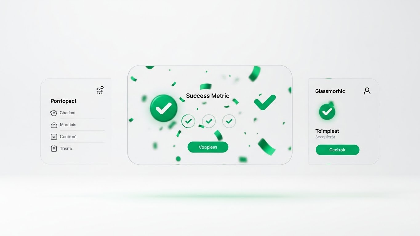
This is the "Validation" shot. Using a pristine, emerald green and light grey palette, the visual showcases a clean UI composition with glassmorphism effects. A central modal window pops up, labeled "Success Metric", displaying abstract green checkmarks and confetti shapes. It symbolizes a project milestone completed or a compliance check passed. The soft drop shadows on the white background convey clarity, hygiene, and order.
Psychological Impact & KPI Focus
Niche Psychology: Project Managers crave closure. In a job filled with endless tasks, visualizing "Done" is powerful. This style triggers a dopamine hit, associating your platform with the feeling of Achievement and progress.
Operational Impact: It emphasizes Workflow Completion and the clarity of the interface, proving that the software helps teams finish what they start.
Strategic Implementation & Trade-offs
- Best Use Case: "Thank You" pages after a demo request or within a case study section on a landing page.
- Duration: Static or subtle animation.
- Trade-off: It is optimistic. It shows the "Happy Path" only. Ensure you also have content that shows how the system handles errors or exceptions.
Companies using similar video content -
Procore – Procore Platform – Construction management software.
e-Builder – e-Builder Enterprise – Construction program management.
16. 2D Character Story
BOFU | ROI

The Visual & Narrative Approach
Data implies the result; people prove it. This style introduces a human protagonist: a female engineering manager in professional attire. She stands confidently in a modern office, pointing to a steep, upward-trending graph line on a wall projection labeled "ROI ACCELERATION". The flat 2D vector style eliminates distraction, focusing entirely on her expression of satisfaction and the clear trajectory of the graph.
Psychological Impact & KPI Focus
Niche Psychology: Bottom-of-funnel buyers (Champions) need to visualize themselves succeeding. This style acts as a Mirror, allowing the prospect to see themselves as the hero who brought efficiency to the organization.
Operational Impact: It connects the software adoption to Personal & Organizational Success, moving the conversation from "features" to "business outcomes."
Strategic Implementation & Trade-offs
- Best Use Case: Case study thumbnails or slide decks presenting "Success Stories."
- Duration: Static.
- Trade-off: It is less "high-tech" than the 3D styles. Use it to build emotional connection, not technical authority.
Companies using similar video content -
Jonas Construction Software – Jonas Enterprise – Integrated construction management.
CMiC – CMiC Platform – ERP for construction.
17. Dark Mode UI Showcase
BOFU | Risk Mitigation

The Visual & Narrative Approach
To win the technical veto, you must speak their language. This style adopts a "hacker-chic" aesthetic: high-contrast obsidian black backgrounds with neon green status indicators. The screen displays abstract representations of code syntax, terminal command lines, and server logs connecting in a flow. It looks complex, dense, and powerful. It visualizes the DevOps Pipeline and backend robustness that IT teams demand before approving a new enterprise tool.
Psychological Impact & KPI Focus
Niche Psychology: Developers and IT leads distrust "pretty" interfaces. They trust code. This aesthetic signals Technical Depth and transparency. It says, "We aren't hiding anything; we are built for power users."
Operational Impact: It serves as visual proof of Configurability and API accessibility, essential for convincing the technical stakeholders who manage integrations.
Strategic Implementation & Trade-offs
- Best Use Case: Technical whitepapers, API documentation headers, or "Developer Portal" landing pages.
- Duration: Static or slow scrolling code.
- Trade-off: It alienates non-technical users. Never use this for a general marketing email to a CEO; it looks too complicated.
Companies using similar video content -
GitHub – GitHub Actions – CI/CD and automation platform.
Datadog – Datadog Monitoring – Cloud monitoring and security platform.
18. AI Mixed Media Video
BOFU | Switcher

The Visual & Narrative Approach
When convincing a prospect to switch platforms, you must align their business goals with your digital execution. This style uses a dynamic montage to bridge that gap. It transitions smoothly from a high-quality photograph of a business handshake (the agreement) to a 3D wireframe of a building (the plan), and finally to a vector graph spiking upwards (the result), anchored by the text "STRATEGIC ALIGNMENT". The corporate blue and gold palette unifies these disparate elements.
Psychological Impact & KPI Focus
Niche Psychology: Switching costs are high. The "Switcher" needs to see that the transition will be seamless and profitable. This style blends the human element (trust) with the digital element (execution), reducing the perceived friction of change.
Operational Impact: It visualizes the Value Chain, showing how a handshake agreement translates directly into digital performance and measurable growth.
Strategic Implementation & Trade-offs
- Best Use Case: Retargeting ads for users who have engaged with competitor comparison pages.
- Duration: 15–30 Seconds.
- Trade-off: It is complex to produce. It requires matching lighting and perspective across different media types (photo, 3D, vector).
Companies using similar video content -
Autodesk – Autodesk Platform – Design and make software.
Dassault Systèmes – 3DEXPERIENCE Platform – Business experience platform.
19. Split Screen: Reality/UI
BOFU | Champion
The Visual & Narrative Approach
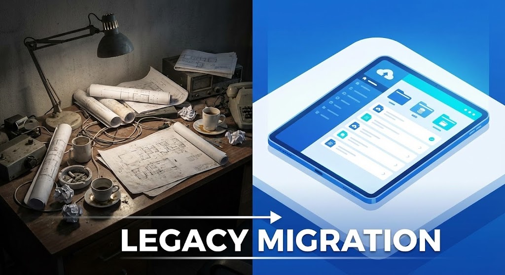
This is the ultimate "Before and After." The screen is split symmetrically. The left side is a gritty, desaturated photo of a chaotic desk piled with rolled blueprints, coffee cups, and sticky notes—the nightmare of legacy systems. The right side is a clean, vivid blue vector illustration of a tablet displaying an organized list labeled "LEGACY MIGRATION". The contrast in lighting (dim vs. bright) and clutter (mess vs. order) creates a visceral desire for change.
Psychological Impact & KPI Focus
Niche Psychology: It leverages the user's frustration with their current mess. It validates their pain (the messy desk) and offers an immediate, accessible cure (the tablet). It appeals to the desire for Operational Hygiene.
Operational Impact: It visually quantifies the Efficiency Gain. The viewer instantly understands that the chaos on the left is costing them time and money.
Strategic Implementation & Trade-offs
- Best Use Case: LinkedIn video ads targeting "Digital Transformation" keywords.
- Duration: Static or sliding wipe transition.
- Trade-off: Be careful not to make the "Before" state look too incompetent, or you risk insulting the prospect's current way of working. Frame it as "The Old Way," not "Your Way."
Companies using similar video content -
StructionSite – StructionSite Platform – 360° progress tracking and documentation.
Holobuilder – Holobuilder Platform – 360° jobsite documentation.
20. Rapid UI Montage
BOFU | Sales Acceleration
The Visual & Narrative Approach
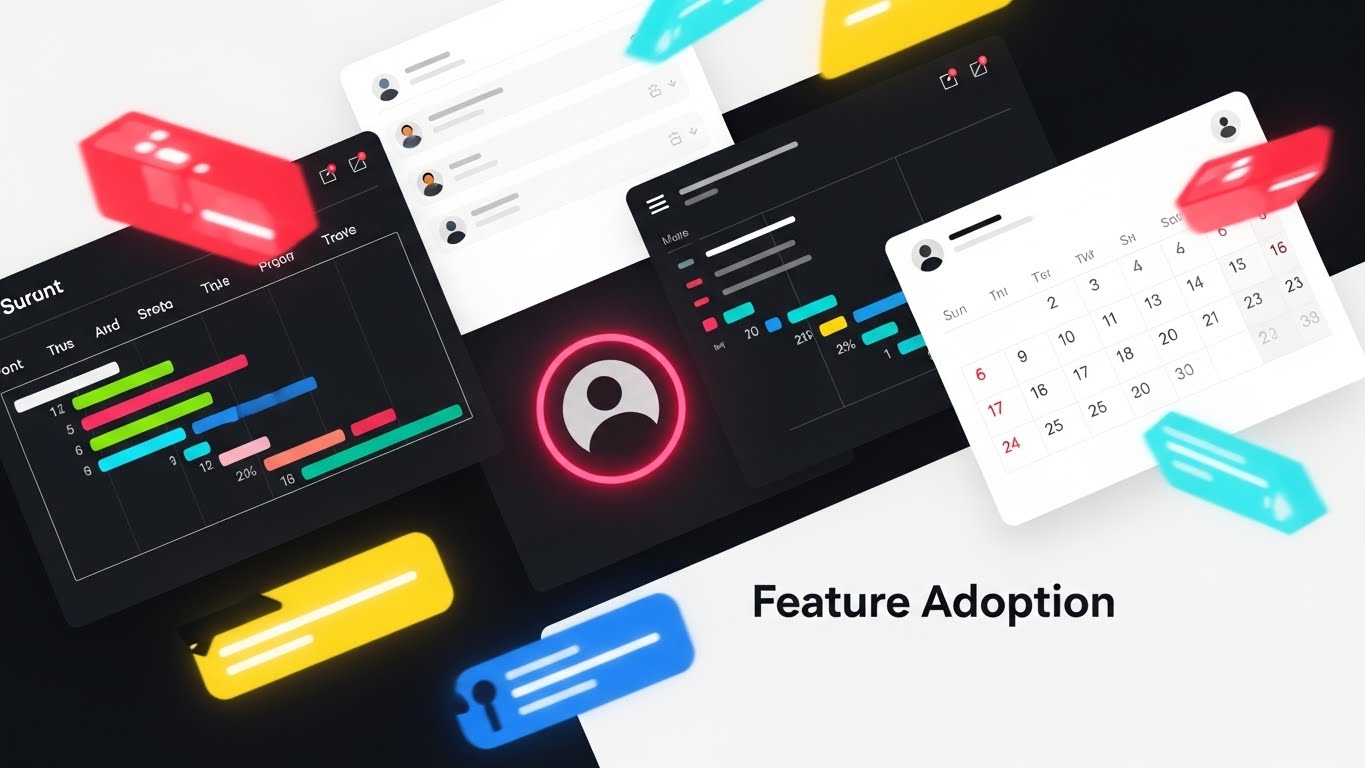
In the final push for the sale, you need to show volume and value. This style creates a vibrant, high-energy montage. Fragments of UI elements—Gantt charts, user avatar circles, calendar grids—in vibrant red, blue, and yellow fly into the frame, overlapping and interlocking around the text "Feature Adoption". It is chaotic but energetic, visualizing the ecosystem as an exciting explosion of capability.
Psychological Impact & KPI Focus
Niche Psychology: This triggers the "Fear Of Missing Out" (FOMO) on a functional level. It suggests that the platform is packed with features the user hasn't even discovered yet. It creates a sense of Abundance and value for money.
Operational Impact: It suggests that the platform is a comprehensive Ecosystem, not a point solution. It visually justifies the license cost by showing the sheer volume of utility available.
Strategic Implementation & Trade-offs
- Best Use Case: "Last Chance" emails or end-of-quarter sales pushes.
- Duration: 10–15 Seconds.
- Trade-off: It is overwhelming. It conveys quantity of features, not quality of workflow. Use it only when the user already understands the core value proposition.
Companies using similar video content -
Trimble – Trimble Connect – Cloud-based collaboration platform.
Kojo – Kojo Platform – Construction procurement and materials management.
21. Lifestyle Stock + UI
Onboarding | Self-Serve

The Visual & Narrative Approach
The biggest barrier to adoption is the belief that software disconnects engineers from the field. This style shatters that myth. We see a high-quality photograph of a civil engineer on an active construction site, bathed in natural sunlight. He holds a rugged tablet. A glowing, semi-transparent UI Overlay hovers above the screen, displaying critical data widgets that align with the physical structure behind him. It seamlessly blends the grit of the job site with the elegance of the software.
Psychological Impact & KPI Focus
Niche Psychology: Site managers often feel "policed" by office software. This visual flips the script, positioning the tool as an Enabler, not a monitor. It validates their environment while enhancing their capabilities.
Operational Impact: It visually demonstrates Field Mobility and real-time data access, proving that the system provides value at the point of work, not just in the boardroom.
Strategic Implementation & Trade-offs
- Best Use Case: Login screens or "Welcome" modals within the mobile app.
- Duration: Static Image.
- Trade-off: It relies on stock photography quality. If the stock photo looks "staged" or inauthentic (e.g., pristine hard hats), it loses credibility.
Companies using similar video content -
Hilti – Hilti ON!Track – Asset management for tools and equipment.
Topcon – Topcon Magnet Suite – Construction software for field operations.
22. 2D Animation & UI
Onboarding | TTV
The Visual & Narrative Approach
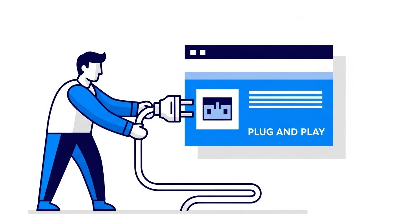
New software can be intimidating. This style disarms that anxiety with whimsy. Using a pastel blue and soft pink palette, a cheerful, stylized character (a "Plug" connector) floats in the center. It is surrounded by "speech bubble" style UI elements offering helpful tips. The aesthetic is flat, rounded, and friendly. It transforms the complex task of system integration into a simple, "Plug and Play" narrative.
Psychological Impact & KPI Focus
Niche Psychology: This targets Learning Anxiety. By using a playful, non-technical aesthetic, you lower the user's defenses. It signals, "This is easy. You won't break anything."
Operational Impact: It directly supports Self-Serve Adoption. By making the first steps feel approachable, you reduce the burden on your customer success team and accelerate Time-to-Value.
Strategic Implementation & Trade-offs
- Best Use Case: The first email in a "Welcome" sequence or empty states within the dashboard.
- Duration: Static or Micro-Animation (Loop).
- Trade-off: It is "cute." Avoid using this style for serious alerts or compliance failures; it is strictly for the "Hand-holding" phase.
Companies using similar video content -
FMX – FMX CMMS – Facilities and maintenance management.
Connecteam – Connecteam Training – Training and onboarding modules.
23. Hyper-lapse Stock + Data
Retention | In-App Upsell

The Visual & Narrative Approach
Once a user is active, you must remind them of the system's power. This style uses a hyper-lapse of a city skyline at dusk, with traffic streaking in long-exposure light trails. Overlaid on the static buildings are crisp white wireframe edges and data lines that appear to "scan" the structures. The contrast between the organic motion of the city and the static precision of the data visualizes Real-Time Processing at an enterprise scale.
Psychological Impact & KPI Focus
Niche Psychology: Users take backend speed for granted. This visual brings Latency (or lack thereof) to the forefront. It reminds the user that while they sleep, the system is processing millions of data points.
Operational Impact: It reinforces the value of Continuous Monitoring and the system's ability to handle massive data loads without slowing down.
Strategic Implementation & Trade-offs
- Best Use Case: Loading screens or background visuals for "Year in Review" reports.
- Duration: 5–10 Second Loop.
- Trade-off: It is ambient. It sets a mood of "High Performance" but conveys no specific information.
Companies using similar video content -
Nearmap – Nearmap Impact – Aerial imagery and location intelligence.
Bosch Building Technologies – Building Integration System – Smart building solutions.
24. Photorealistic 3D Renders
Retention | Deep Feature

The Visual & Narrative Approach
To sell an advanced module (like Predictive Maintenance), you need to show detail. This style features a hyper-realistic 3D render of a chrome and steel mechanical gear, zoomed in to show the texture of oil and scratches. Small, glowing yellow sensor lights are attached to the machinery. The dramatic studio lighting emphasizes the weight and reality of the asset. It visualizes the connection between the software sensors and the physical hardware.
Psychological Impact & KPI Focus
Niche Psychology: Asset managers care about the details. A cartoon gear won't work here. This level of fidelity signals Industrial Grade capability. It respects the complexity of the machinery they maintain.
Operational Impact: It visualizes Predictive Intelligence, showing that the software is deeply embedded in the physical assets, monitoring health at a granular level.
Strategic Implementation & Trade-offs
- Best Use Case: Newsletters announcing new "Asset Management" or "IoT" features.
- Duration: Static.
- Trade-off: High production value is required. The textures must be perfect, or it will look like a video game.
Companies using similar video content -
GE Digital – APM (Asset Performance Management) – Predictive maintenance for industrial assets.
Augury – Machine Health Platform – AI-powered machine health.
25. Generative AI Realistic Character video
Retention | Churn

The Visual & Narrative Approach
When a customer is frustrated, they want a human, not a bot. This style uses a Generative AI video of a highly realistic support agent. She wears smart-casual office attire in a soft-focus modern office. Her expression is attentive and empathetic. She appears ready to listen. This visualizes the concept of "Concierge Support," even if the actual interface is AI-driven. It puts a face to the helpdesk.
Psychological Impact & KPI Focus
Niche Psychology: Churn often happens when users feel abandoned. This visual triggers the Social Connection circuitry. It reassures the user that there is empathy and intelligence behind the "Submit Ticket" button.
Operational Impact: It humanizes the Support SLA, subtly promising that their issues will be heard and addressed by a competent professional.
Strategic Implementation & Trade-offs
- Best Use Case: "We're Here to Help" social posts or the header of a Support Portal.
- Duration: 5–10 Seconds (Breathing/Listening loop).
- Trade-off: Use carefully. If the AI looks too uncanny, it can be unsettling. Ensure the expression is warm and natural.
Companies using similar video content -
Intercom – Intercom Platform – Customer messaging and support.
ServiceNow – Virtual Agent – AI-powered chatbot for support.
26. 2D Graphics Over Live Action
Retention | Support

The Visual & Narrative Approach
Software training can be dry. This style injects energy by overlaying bright, flat 2D vector graphics (neon stars, checkmarks, level-up arrows) onto a photo of a real software engineer at a standing desk. The graphics track his movements, creating an Augmented Reality (AR) effect. It visually represents the "dopamine hit" of completing tasks and mastering the workflow.
Psychological Impact & KPI Focus
Niche Psychology: This targets User Engagement. It reframes the mundane task of data entry as a game where progress is celebrated. It appeals to the desire for mastery and recognition.
Operational Impact: It supports Gamification Strategies, visualizing user scorecards or certification badges to encourage deeper platform usage.
Strategic Implementation & Trade-offs
- Best Use Case: "Academy" or "Certification" course headers.
- Duration: Static or Micro-Animation.
- Trade-off: It is playful. Ensure it doesn't trivialize the work. Use it for training contexts, not reporting contexts.
Companies using similar video content -
Genda.ai – Genda.ai Platform – Construction progress monitoring.
Procore – Procore Certification – Certification programs for users.
27. Generative AI Cinematic Video
Expansion | Re-engagement

The Visual & Narrative Approach
To upsell an enterprise plan, you must sell a bigger vision. This style uses a sweeping aerial drone shot of a futuristic smart city at sunset, rendered in gold and violet hues. Streams of digital data visibly connect the skyscrapers, forming a web of light. It is grand, expensive, and visionary. It moves the conversation from "tracking a project" to "Orchestrating a Smart City."
Psychological Impact & KPI Focus
Niche Psychology: This appeals to Executive Ambition. It aligns your platform with the future of the industry. It makes the buyer feel like a visionary leader who is building the next generation of infrastructure.
Operational Impact: It visualizes Global Synchronicity and multi-site management, demonstrating that your platform can handle complex, city-scale data ecosystems.
Strategic Implementation & Trade-offs
- Best Use Case: Pre-roll ads for industry events or the background of an "Enterprise Solutions" page.
- Duration: 10–15 Seconds.
- Trade-off: It is aspirational. It sells the future state, not the current UI.
Companies using similar video content -
Hexagon – HxGN Smart City – Smart city solutions.
Siemens – Siemens Smart Infrastructure – Electrification, automation, digitalization.
28. Hybrid Abstract
Expansion | Upsell

The Visual & Narrative Approach
How do you visualize an ecosystem growing? This style uses a hybrid abstract composition. Organic, rainbow-colored liquid shapes explode outward from a center point, transforming mid-air into precise digital nodes and lines. The movement is radial and expansive. It is a metaphor for the Network Effect—as more users join the platform (the organic center), the structured value (the digital nodes) multiplies for everyone.
Psychological Impact & KPI Focus
Niche Psychology: This targets the desire for Scalability. It reassures the client that the platform grows with them. The vibrant colors signal energy, diversity, and innovation.
Operational Impact: It visualizes Integration Potential, showing how a central core can expand to connect with unlimited external tools and partners.
Strategic Implementation & Trade-offs
- Best Use Case: Intro animations for webinars or "Partner Program" announcements.
- Duration: 5–10 Seconds.
- Trade-off: It is purely metaphorical. It requires a voiceover to connect the "explosion" to "business growth."
Companies using similar video content -
HashiCorp – HashiCorp Cloud Platform – Multi-cloud infrastructure automation.
Cisco Meraki – Meraki Platform – Cloud-managed IT solutions.
29. Abstract 2D Motion
Expansion | Proactive Support
The Visual & Narrative Approach
Retention is about keeping the cycle going. This style uses abstract 2D motion graphics in indigo and violet. Glowing light trails move in a circular motion, leaving neon tracers. Crucially, the trails are shown reconnecting to close a broken loop, forming a perfect, humming circle. This is a visual metaphor for Closing the Feedback Loop—taking user data, learning from it, and feeding it back into the system to improve performance.
Psychological Impact & KPI Focus
Niche Psychology: This creates a sense of Continuity and wholeness. It is visually satisfying. It suggests that your platform prevents information leakage and keeps the project lifecycle intact.
Operational Impact: It visualizes Iterative Improvement and the continuous value delivery that justifies an annual contract renewal.
Strategic Implementation & Trade-offs
- Best Use Case: Blog headers discussing "Customer Success" or "Continuous Improvement."
- Duration: Loopable GIF.
- Trade-off: Highly abstract. It works best as a decorative element to break up text, rather than a standalone educational asset.
Companies using similar video content -
New Relic – New Relic One – Observability platform for software.
Datadog – Datadog Observability – Continuous monitoring and feedback loops.
30. Aspirational Stock Montage
Expansion | Referrals

The Visual & Narrative Approach
Ultimately, software is about people working better together. This style returns to humanity. It is a bright, high-key photo montage of a diverse group of engineers and architects high-fiving in a glass-walled conference room. The lighting is airy, natural, and optimistic. It doesn't show screens; it shows smiles. It visualizes the Cultural Impact of good software: a friction-free, collaborative, and successful team.
Psychological Impact & KPI Focus
Niche Psychology: This targets Social Proof and belonging. It reminds the buyer that the ultimate ROI is a happy, productive workforce. It is the "Victory Lap" visual.
Operational Impact: It connects the tool to Cross-Functional Collaboration, implying that your platform eliminates the silos and arguments that usually plague construction projects.
Strategic Implementation & Trade-offs
- Best Use Case: "Refer a Friend" landing pages or "Case Study" conclusions.
- Duration: Static Montage.
- Trade-off: It can feel generic if the stock photos are too "corporate." Select images that feel candid and genuine.
Strategic Knowledge Base: The Visual Operations Doctrine
The 30 visual styles above are not merely "content"; they are the vocabulary of a new Visual Operating System for your enterprise. To transition from "using video" to "thinking visually," we must organize these styles into a strategic framework that drives Business Intelligence, Adoption, and ROI.
This section synthesizes the visual examples into three actionable knowledge segments, bridging the gap between aesthetic choice and business outcome.
Strategic Alignment & Visual Architecture (The Blueprint)
Before a single pixel is rendered, the visual strategy must be aligned with the operational reality of the engineering organization. This "Pre-Production" phase is where the Physical/Digital Divide is truly bridged.
- The Cognitive Load Audit: Engineering teams are drowning in data. Before requesting a video, conduct an audit of the complexity of the task. If a workflow (e.g., Compliance Check) requires high concentration, use Style 7 (Minimalist Flat 2D) to reduce noise. If the goal is to inspire innovation, use Style 4 (Futuristic Neon). Match the visual density to the user's available cognitive bandwidth.
- Role-Based Visual Mapping: A Site Manager on a tablet in bright sunlight needs high-contrast, large-element visuals like Style 21 (Lifestyle + UI) or Style 2 (Kinetic Type). A Data Analyst in a dim office needs dense, dark-mode visuals like Style 17 (Dark Mode UI). Don't use one style for all personas. Map the visual style to the environment of consumption.
- The "Glanceability" Standard: In high-stress construction environments, information must be understood in under 2 seconds. Adopt a "Glanceability Standard" for all field-facing videos. If the core message isn't visible in a thumbnail (like Style 10 - Dynamic Data), it fails the field test.
- The Advids Strategic Audit: Defining this visual architecture requires an outside perspective. Advids specializes in auditing your current asset library against your user personas, identifying where "Style Drift" is confusing your users and helping you define a unified "Visual Language" before production begins.
- Brand Voice Consistency: Your software likely spans multiple modules (Finance, Ops, Safety). Ensure a common visual thread (e.g., a specific "International Orange" hex code or a recurring Style 6 - Blueprint motif) ties them together. This reinforces the Single Source of Truth narrative.
- Legacy System Integration: Visualizing the connection between old on-premise hardware and new SaaS interfaces is critical. Use Style 19 (Split Screen) to visually validate the bridge between the "Old World" and the "New World," respecting the legacy while selling the upgrade.
- The Cross-Departmental Bridge: Use visuals to unify terminology. Sales often sells "Digital Twins," while Ops manages "Asset Lists." Use Wireframe to Reality (Style 11) to visually prove they are the same thing. This visual concordance aligns expectations between the promise sold and the product delivered.
- Standardization vs. Customization: Know when to scale. Universal concepts (Login, Password Reset) should use standardized Style 15 (Clean UI Workflow). Highly specific, differentiating features (Proprietary Algorithms) deserve bespoke Style 9 (3D X-Ray Visualization).
- Accessibility in Engineering: Your workforce is diverse and often multi-lingual. Visuals must transcend language. Rely on Style 22 (2D Animation) with clear visual metaphors (plugs, checkmarks, traffic lights) so that a driver in one region understands the safety protocol just as clearly as a manager in another, without relying on voiceover.
- The Mobile-First Mandate: 80% of your users are likely deskless. Every visual style selected—from Style 1 to Style 30—must be legible on a 5-inch screen. Avoid tiny text overlays. Design for the "Thumb Zone."
Operational Adoption & Implementation (The Build)
Once the assets are created, their value is determined by how they are embedded into the daily workflow. This is the "Deployment" phase, where visuals become tools.
- Overcoming "Big Brother" Anxiety: Site teams often fear that digital tracking is purely for surveillance. Use Style 21 (Lifestyle + UI) and Style 26 (Gamified Overlay) to frame the technology as assistive rather than restrictive. Show the software helping the engineer, not just reporting on them.
- The Micro-Learning Shift: Abandon the 50-page PDF manual. Break training into 30-second "Micro-Learning" clips using Style 14 (Macro UI). Embed these directly into the software's tooltips. When a user hovers over a complex feature, they see a 5-second GIF, not a wall of text.
- Just-in-Time Support: Embed Style 25 (Gen AI Character) or Style 22 (2D Animation) into the helpdesk logic. If a user fails a login three times, trigger a friendly, non-judgmental animation offering help. This reduces frustration and support ticket volume.
- Gamification of Training: Use Style 26 (Gamified Overlay) to visualize training progress. Create "Digital Merit Badges" for mastering specific modules. This taps into the competitive nature of engineering teams and drives deeper platform exploration.
- Reducing Support Ticket Volume: There is a direct correlation between the quality of your visual library and your support costs. A well-placed Style 25 (AI Character) video explaining a complex workflow can eliminate thousands of "How do I...?" emails per year.
- Remote Onboarding: For distributed teams that cannot attend physical seminars, use Style 8 (Isometric 3D Workflow) and Style 5 (Abstract 3D AI) to explain complex system architectures remotely. These visuals act as a "Virtual Tour" of the system's logic.
- SOP Transformation: Text-based Standard Operating Procedures (SOPs) are rarely read. Convert them into Style 6 (2D Line Art) animations. Visual process flows are unambiguous and leave no room for interpretation, which is critical for safety compliance.
- Feedback Loops: Use interactive video elements (Style 29: Abstract Motion) to gather user feedback. At the end of a tutorial video, ask the user to click a "thumbs up" or "thumbs down" graphic. This data helps you refine your training assets continuously.
- Scalable Localization: Engineering projects are global. Avoid text-heavy videos. Use Style 1 (Isometric 3D) and Style 7 (Minimalist Vector), which rely on visual metaphor rather than English text. This ensures your training assets are "Global Ready" from day one.
- Leadership Communication: When rolling out a major update, don't send an email. Send a Style 4 (Futuristic Neon) video from the CTO. High-production value visuals signal to the company that this initiative is a strategic priority, not just a routine patch.
Measuring Impact & Future-Proofing (The Asset Management)
Finally, we must move beyond "Vanity Metrics" (views/likes) and measure the real business impact of this visual strategy. This is the "ROI" phase.
- Beyond "Views" – The Compliance Velocity Metric: Don't just count views. Measure Compliance Velocity—how quickly does a site team adopt a new safety protocol after watching the video vs. reading the memo? High-quality visualization (e.g., Style 9 - X-Ray) should correlate directly with faster adherence.
- The "Idle Time" Metric: In software, confusion equals idle time. Measure the reduction in "Time spent on screen" for specific tasks after embedding Style 15 (Clean UI Workflow) guides. Effective visualization should reduce the time users spend trying to figure out the UI.
- Retention and Churn: Use Style 29 (Abstract 2D Motion) and Style 24 (Photorealistic Renders) in your Quarterly Business Reviews (QBRs). Remind the client of the sophistication and "Deep Value" they are paying for. High-fidelity visuals correlate with high perceived value, directly impacting renewal rates (LTV).
- The Advids Partnership – Scaling Assets: As your feature set grows, your video library must scale. You cannot reinvent the wheel for every release. Advids acts as your long-term repository and style guardian, ensuring that Video #100 feels just as premium and consistent as Video #1, allowing for rapid asset generation at scale.
- The AI Visual Frontier: Prepare for the future. The styles in this guide (like Style 25 and Style 27) utilize Generative AI. Start experimenting with these workflows now. The future of project tracking will involve real-time Digital Twins overlaid on AR glasses. The visual styles you establish today are the foundation for that future reality.
- Scalability of Assets: Don't build throwaway content. Build a "Visual Component Library." The 3D asset of the gear in Style 24 should be reusable in your marketing, your training, your manual, and your VR simulation.
- Benchmarking Success: "Good enough" visuals are a competitive risk. If your competitor uses Style 11 (Wireframe to Reality) to sell their Digital Twin, and you use screen grabs, you lose the perception war. Regularly benchmark your Visual Style against the top 10% of SaaS players, not just your direct rivals.
- The ROI of Safety: For engineering firms, safety is a financial metric. Better visual training (Style 6: Schematics) leads to fewer accidents. Work with your insurance provider to see if a robust, video-based safety certification program can lower your premiums.
- Final Call to Innovation: Treat your visual assets as Infrastructure, not marketing fluff. Just as you invest in servers and code, invest in the visual layer that translates that code for the human mind. In the era of the Digital Twin, visibility is not just a feature—it is the product.
Companies using similar video content -
Trimble – Trimble Viewpoint – Construction ERP and project management.
Autodesk – Autodesk AEC Collection – Tools for building design and construction.
Author & Editor Bio


