
Introduction: Visualizing the Nervous System of the Modern Enterprise
The modern enterprise is no longer defined by physical walls, but by a sprawling, invisible nervous system of code. From microservices spinning up in milliseconds to hybrid cloud architectures spanning continents, the "digital factory" never sleeps. However, for the CTOs and DevOps leaders tasked with keeping this engine running, the sheer complexity has created a new operational paradox: as systems become more powerful, they become harder to see.
We are witnessing a shift where the primary challenge is no longer just building infrastructure, but observing it. The cognitive load required to decipher raw telemetry data—logs, metrics, and traces—is overwhelming. The physical/digital bridge is fractured; stakeholders struggle to connect the abstract concept of "latency" with the concrete reality of lost revenue. This is where strategic video visualization moves from a marketing asset to a business imperative. It is the only medium capable of translating the chaotic "noise" of millions of events into the "signal" of actionable intelligence.
The stakes could not be higher. In the current high-velocity landscape, the cost of opacity is tangible. Recent industry analysis reveals that unplanned downtime now costs Global 2000 companies $400 billion annually. This financial hemorrhage is often exacerbated by the labyrinthine nature of modern stacks, where a single broken dependency can trigger a cascade of failures.
For SaaS platforms in the Application Performance Monitoring (APM) and Observability space, the opportunity is to position your solution not just as a tool, but as the lens of clarity. Data shows that comprehensive observability strategies can deliver a 4x median return on investment by enabling teams to preempt issues before they impact the user. By utilizing the specific visual styles outlined in this guide—from precise isometric schematics to emotive abstract representations—you can bypass skepticism and speak directly to the aspirations of IT leaders. You offer them the one thing they crave most: Control.
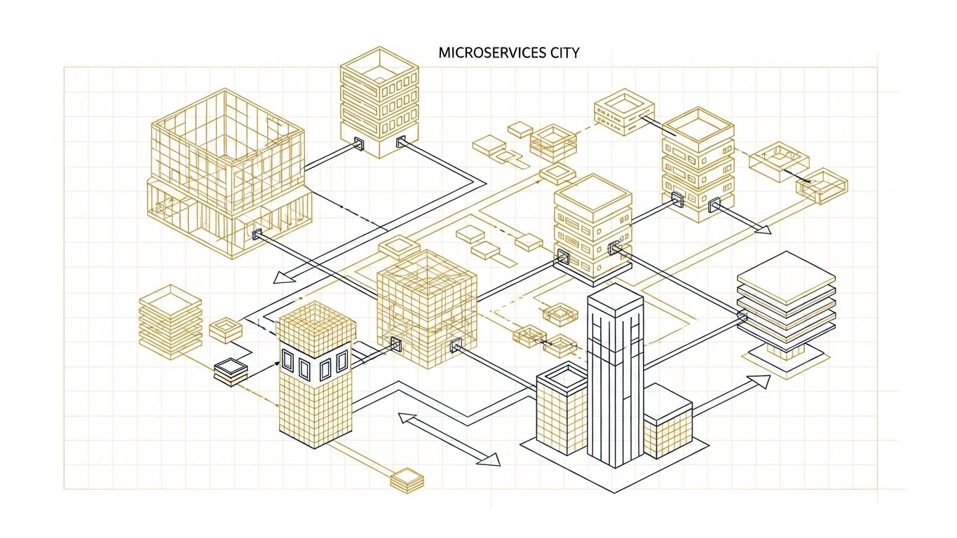
1. Isometric 2D Motion Design
TOFU | Brand Awareness

The Visual & Narrative Approach
This style employs a "God’s Eye View" of the digital infrastructure. By utilizing an isometric grid, we transform abstract concepts—like data centers, cloud regions, and hybrid environments—into tangible, architectural structures. The specific visual execution contrasts broken, grey pillars (representing legacy or fragmented systems) on the left with a robust, interconnected orange ecosystem on the right. This visualizes the transition from "Fragility" to "Resilience." The motion is deliberate and linear, tracing the flow of data packets along fixed pathways, reinforcing the idea of order and engineered stability.
Psychological Impact & KPI Focus
- Niche Psychology: The target persona (The Architect) craves structure. Isometric design appeals to their engineering mindset by presenting the complex "Microservices Sprawl" as an organized, buildable city. It suggests that your platform imposes order on their chaotic stack.
- Operational Impact: This style effectively visualizes Infrastructure Scalability. It shows that no matter how complex the system grows, the underlying grid (your platform) remains stable. It serves as a visual metaphor for the "Single Pane of Glass" promise.
Strategic Implementation & Trade-offs
- Best Use Case: High-level brand anthems or explaining "How It Works" in 60-90 seconds. It simplifies the "Global Data Ecosystem" without dumbing it down.
- Trade-off: While excellent for structural clarity, it lacks emotional depth. It is less effective for urgent, pain-point-driven narratives and better suited for calm, confident market positioning.
Companies using similar video content -
Datadog – Visualizing interconnected cloud infrastructure and services.
VMware – Cloud Foundation – Structured connectivity for software-defined data centers.
LogicMonitor – LM Envision – Unified observability across hybrid cloud environments.
2. Abstract 2D Flat Vector Organic Modern Motion Graphics
TOFU | Category Creation

The Visual & Narrative Approach
Moving away from rigid grids, this style embraces the fluidity of modern data. The visualization focuses on connectivity, using nodes (spheres) and rigid bonds to represent the dynamic structure of a network. The aesthetic borrows from chemistry—visualizing the "molecules" of data that make up the enterprise. The interplay of glossy black, bronze, and teal elements creates a premium, high-tech feel. The motion should be organic yet snappy, showing nodes linking up to form a stronger whole.
Psychological Impact & KPI Focus
- Niche Psychology: IT leaders often feel their infrastructure is chaotic. This style reframes that chaos as "organic complexity." It validates the feeling that their system is alive and evolving, rather than a static machine.
- Operational Impact: It solves the challenge of visualizing Observability vs. Monitoring. Monitoring is checking a box; Observability is understanding the relationships between the nodes. This style visualizes the relationship (the bond) as the hero, not just the server (the dot).
Strategic Implementation & Trade-offs
- Best Use Case: Category Creation videos and "Philosophy of Product" segments where the goal is to elevate the brand perception.
- Trade-off: The abstract nature requires a strong voiceover or accompanying text to ground the visuals in specific technical benefits (e.g., "Auto-Scaling" or "Dependency Mapping").
Companies using similar video content -
New Relic – Fluidly connecting application components for full-stack observability.
Dynatrace – Organic data flow for AI-powered observability and automation.
Honeycomb – Visualizing dynamic relationships in complex distributed systems.
3. 2D Line Art Animation
TOFU | Market Education
The Visual & Narrative Approach
This style is the visual language of the engineer. It strips away all "marketing gloss" to reveal the skeleton of the infrastructure. Using ultra-thin gold and navy lines on a grid background, it depicts a "Microservices City," where server clusters and APIs are drawn as intricate, wireframe structures. The key here is transparency—zero fill colors allow the viewer to see the internal pathways of the architecture. Narrative tone should be educational and peer-to-peer.
Psychological Impact & KPI Focus
- Niche Psychology: Engineers trust blueprints; they are the source of truth. This style signals Transparency and Accuracy. It appeals to the skepticism of the SRE who wants to know exactly how the API gateway connects to the database.
- Operational Impact: It directly addresses "Unknown Unknowns." By rendering everything as a transparent wireframe, the visual metaphor is "Full Visibility." It dramatically lowers cognitive load, allowing the viewer to focus strictly on the logic of the data flow.
Strategic Implementation & Trade-offs
- Best Use Case: YouTube tutorials or deep-dive webinars explaining complex routing, service mesh topologies, or dependency mapping.
- Trade-off: The lack of solid colors can make it hard to read on small mobile screens. It requires a high-resolution display to appreciate the intricate details.
Companies using similar video content -
Elastic – Elastic Observability – Blueprint schematics for log, metric, and trace analysis.
Prometheus – Wireframe views of cloud-native monitoring architectures.
Jaeger – Tracing distributed transactions with precise, transparent data flows.
5. Minimalist Flat 2D Vector
TOFU | Demand Gen & Lead Capture

The Visual & Narrative Approach
In the crowded space of display advertising, clarity is the only currency. This style reduces the value proposition to a single, iconic visual anchor. The image centers on a stylized "Report Document" in pastel coral, flanked by a prominent downward-pointing arrow indicating a download action. Surrounding symbols—pie charts, lightning bolts—are simplified to their essence. There is no narrative here—only a visual imperative: "Get the Data."
Psychological Impact & KPI Focus
- Niche Psychology: The "Cognitive Load" on IT professionals is immense. They ignore complex ads. This style works because it respects their time. It says, "Here is a resource. It is simple. Take it."
- Operational Impact: This connects directly to the KPI of Time to Value. It promises that the report (and by extension, the software) is easy to consume and will not add to their daily complexity.
Strategic Implementation & Trade-offs
- Best Use Case: Demand Generation Display Ads and Retargeting banners where the primary goal is Lead Capture (CTR) rather than deep education.
- Trade-off: It is purely functional and transactional. It does not build deep brand equity or explain complex features; it simply facilitates an exchange (contact info for content).
6. Bold Kinetic Typography (Visual)
TOFU | LinkedIn Organic

The Visual & Narrative Approach
This style visualizes the feeling of an outage. It eschews traditional imagery for the raw energy of typography and physics. Large, heavy geometric blocks of text—representing "Alerts"—crash into the frame. The word "IMPACT" is shown shattering under the weight of "ALERT FATIGUE," with letters fracturing and crumbling like concrete. The color palette is high-contrast black and warning-yellow (OSHA colors). The motion is jagged and staccato, mimicking the stress of an incident response scenario.
Psychological Impact & KPI Focus
- Niche Psychology: It triggers a Loss Aversion response. By visualizing the chaos of an outage (crumbling infrastructure), it reminds the viewer of the stakes involved in ignoring observability. It’s a "wake-up call" aesthetic.
- Operational Impact: Connects directly to MTTR (Mean Time To Resolution). By visualizing the chaos of "Alert Fatigue," you implicitly position your streamlined solution as the calm after the storm.
Strategic Implementation & Trade-offs
- Best Use Case: LinkedIn Organic posts designed to disrupt the "doom scroll." It effectively visualizes the problem (Outages, Fatigue) to set up the solution.
- Trade-off: High intensity can be exhausting if overused. It works best as a hook, not a long-form explainer.
Companies using similar video content -
Splunk – Splunk Observability Cloud – Iconic visuals for actionable insights and reports.
PagerDuty – Simple, direct calls to action for incident response.
Opsgenie (Atlassian) – Clear iconography for alert management and on-call scheduling.
7. Split Screen: Optimized Reality and UI
TOFU | Skippable Pre-Roll Ad

The Visual & Narrative Approach
This style uses a stark split-screen composition to contrast the "Before" and "After" states. The left side ("Panic") is washed in alarming red tones, showing a motion-blurred, chaotic scene of a stressed IT worker overwhelmed by paper and mess. The right side ("Control") uses calming mint and cool green tones, featuring a crystal-clear focus on a hand calmly holding a coffee cup next to a laptop displaying organized data. A tear-paper effect divides the two worlds.
Psychological Impact & KPI Focus
- Niche Psychology: The "Panic vs. Control" dynamic is a classic persuasion technique. It forces the viewer to identify with one side (the panic) and aspire to the other (the control). The color psychology (Red = Danger/Stop, Green = Safe/Go) functions subconsciously to associate the SaaS platform with peace of mind.
- Operational Impact: Visualizes the intangible benefit of Quality of Life and Operational Efficiency. It argues that the software doesn't just fix servers; it fixes the workflow and sanity of the team.
Strategic Implementation & Trade-offs
- Best Use Case: YouTube TrueView ads or introductory sales slides. It quickly frames the value proposition: "We sell sanity, not just software."
- Trade-off: It relies on a binary simplification of complex problems. Authenticity in the "calm" side is key to avoiding an "infomercial" feel.
Companies using similar video content -
VictorOps (Splunk) – High-impact text for urgent incident alerts and fatigue.
Grafana Labs – Grafana Alerting – Emphasizing critical alerts and notifications.
Better Stack – Disruptive typography for log management and uptime monitoring.
8. Photorealistic 3D Renders
TOFU | Objection Handling
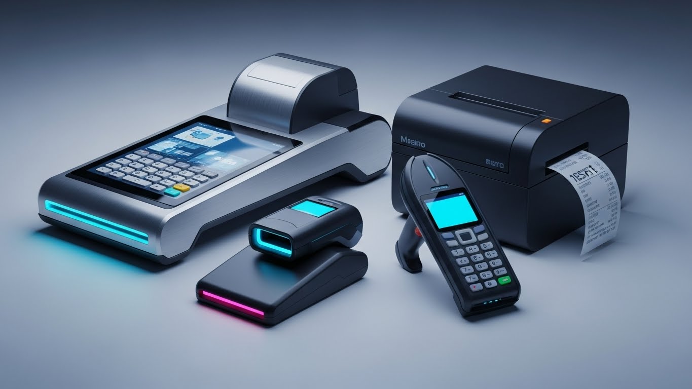
The Visual & Narrative Approach
While the initial definition envisioned server monoliths, the visual reality of modern APM often extends to the "Edge." This execution uses high-fidelity, photorealistic rendering to showcase these physical assets—POS systems, scanners, and IoT endpoints—with sleek, matte aluminum textures and studio lighting. It grounds the software in the physical world. The narrative focuses on "Reliability at the Edge," reinforcing that the software protects business-critical hardware.
Psychological Impact & KPI Focus
- Niche Psychology: It builds Trust and Tangibility. For industries like Retail or Logistics (IoT), monitoring isn't just about cloud servers; it's about the device in the store. Seeing the physical device renders the solution "real" and robust.
- Operational Impact: Specifically targets Endpoint Visibility and IoT Fleet Management. It assures the buyer that the platform can handle the "edge" of the network, not just the core.
Strategic Implementation & Trade-offs
- Best Use Case: Retargeting ads and Product Pages for specific industry verticals (e.g., "Monitoring for Retail").
- Trade-off: Less relevant for pure cloud-native SaaS companies. It is niche-specific to hardware-dependent operations.
Companies using similar video content -
Cisco AppDynamics – Contrasting panic of outages with control of APM.
SolarWinds – AppOptics – Before-and-after of IT chaos versus streamlined operations.
ManageEngine – Site24x7 – Visualizing stress reduction through comprehensive monitoring.
9. Abstract 3D AI Visualization
MOFU | Shaping Brand Perception

The Visual & Narrative Approach
This style visualizes the "brain" of the platform. Using a macro-lens depth of field, we see luminous violet and magenta nodes connected by glowing filaments of light in a deep void. The central node pulses with light, suggesting data processing or "thought." The aesthetic is ethereal, scientific, and futuristic (Dark Mode aesthetic). It represents the AI/ML layer of the software—the part that predicts issues before they happen.
Psychological Impact & KPI Focus
- Niche Psychology: It appeals to the desire for Innovation and Sophistication. It positions the tool not as a simple logger, but as a "Predictive Intelligence" partner. It validates the buyer's choice of a "Next-Gen" solution.
- Operational Impact: Visualizes Anomaly Detection and AIOps. Since AI algorithms are invisible, this style gives them a visual form, making the concept of "automated root cause analysis" easier to grasp.
Strategic Implementation & Trade-offs
- Best Use Case: Website hero backgrounds and "Platform Architecture" pages where you want to impress with the sophistication of the tech stack.
- Trade-off: It is purely metaphorical. It creates a brand "halo" but must be supported by technical content.
Companies using similar video content -
AWS – AWS IoT Core – Tangible hardware monitoring for edge devices.
Azure Monitor – Realistic renders of physical server health and performance.
IBM – Instana Observability – Grounding software insights in physical infrastructure.
10. 3D X-Ray Visualization
MOFU | Product Differentiation
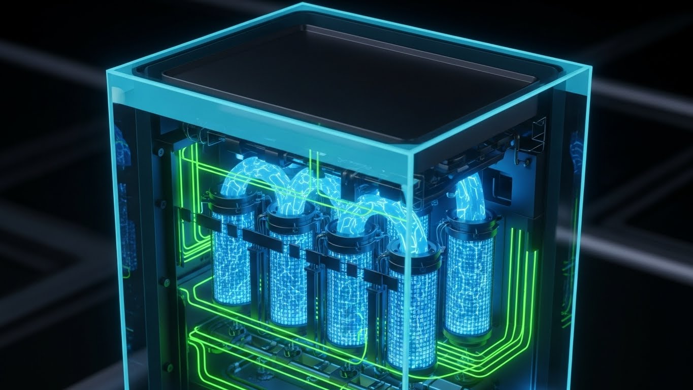
The Visual & Narrative Approach
This powerful visualization uses the metaphor of an X-Ray. We see a modern server tower, but the casing is rendered in translucent, frosted glass. Inside, instead of hardware, we see glowing layers of code syntax and floating data cubes in vibrant orange and electric blue. This represents "Full-Stack Visibility"—seeing the software inside the hardware. The background is a clean, clinical studio grey with soft spotlighting.
Psychological Impact & KPI Focus
- Niche Psychology: It satisfies the engineer's need to "Look Under the Hood." It promises that the tool provides deep, granular access to the inner workings of the system, hiding nothing.
- Operational Impact: Perfectly visualizes Infrastructure Performance Monitoring (IPM) combined with APM. It shows the correlation between hardware health (cooling/power) and software performance (code execution).
Strategic Implementation & Trade-offs
- Best Use Case: Landing pages focusing on "Full-Stack" features. It bridges the gap between the Infra team (hardware) and the Dev team (code).
- Trade-off: High production cost. Requires high-fidelity 3D assets to differentiate the "glass" texture from the "code" glow.
Companies using similar video content -
Dynatrace – Davis AI – Neural network visualization for predictive intelligence and AIOps.
BMC Helix – Abstract representation of AI-powered IT operations management.
Chronosphere – Ethereal visuals for data complexity reduction and optimization.
11. Dynamic Data Visualization**
MOFU | Feature Education
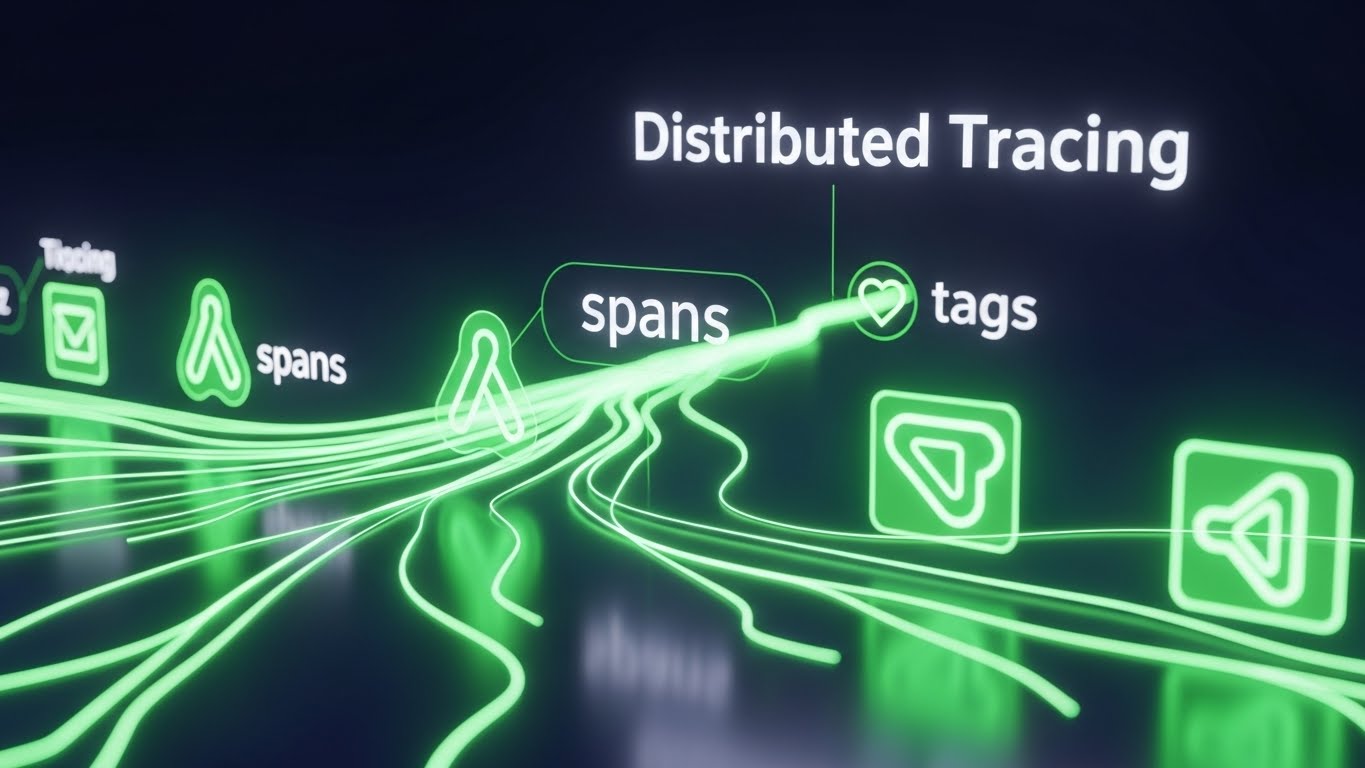
The Visual & Narrative Approach
This style abandons the physical metaphor of servers for the digital reality of data flow. Against a deep navy background, "Distributed Tracing" is visualized as rivers of neon green light, branching organically like a root system or a river delta. These lines represent individual requests traveling across microservices. Interspersed throughout the flow are abstract, glowing icons representing "spans" (specific operations) and "tags" (metadata). The aesthetic is reminiscent of a Heads-Up Display (HUD)—sleek, precise, and data-dense, with glowing edges conveying deep technical insight.
Psychological Impact & KPI Focus
- Niche Psychology: Developers often feel like they are searching for a "needle in a haystack" when debugging distributed systems. This style offers a psychological balm: Total Illuminance. It visually asserts that your platform lights up the dark corners of the code, making the invisible path of a request obvious.
- Operational Impact: Directly visualizes Latency Reduction and Root Cause Analysis (RCA). By showing the "branches" of the trace, you are visually demonstrating how the tool isolates bottlenecks in complex, multi-service environments.
Strategic Implementation & Trade-offs
- Best Use Case: Feature pages on "Distributed Tracing" or technical deep-dive videos targeting backend engineers. It bridges the gap between high-level monitoring and code-level debugging.
- Trade-off: It is highly abstract. Without technical context (voiceover or copy explaining "spans" and "traces"), it may look like generic "tech background" art to a non-technical buyer.
Companies using similar video content -
Sysdig – Translucent views of container security and cloud-native visibility.
Lightstep (ServiceNow) – X-ray into distributed tracing for full-stack insights.
Instana (IBM) – Deep, granular visibility into application and infrastructure internals.
12. Low-Poly 3D Modeling
MOFU | Feature Education

The Visual & Narrative Approach
Kubernetes and container orchestration can be intimidatingly complex topics. This style counters that anxiety with playfulness and simplicity. It uses a "Low-Poly" aesthetic—geometric, flat-shaded 3D shapes—to render the infrastructure not as a chaotic mess, but as a defensible "Fortress." A stylized pink castle sits on a floating isometric island, surrounded by organized trees and pathways. The soft, diffuse lighting creates a friendly, inviting atmosphere, transforming a complex infrastructure task into a manageable, structured environment.
Psychological Impact & KPI Focus
- Niche Psychology: It reduces Cognitive Overload. By stripping away the gritty details of YAML files and command lines, it presents the concept of orchestration as manageable, organized, and even delightful. It appeals to the desire for a "clean" environment.
- Operational Impact: Visualizes Stability and Governance. The castle walls imply security and boundary control, reinforcing the idea that the platform protects the integrity of the cluster against chaotic external forces.
Strategic Implementation & Trade-offs
- Best Use Case: Blog headers, educational explainer videos about "Container Monitoring," or social media content aimed at demystifying Cloud-Native concepts.
- Trade-off: The "cute" aesthetic risks trivializing the enterprise nature of the product. It must be paired with robust technical copy to ensure it doesn't feel like a consumer app.
Companies using similar video content -
SigNoz – Flowing traces for distributed system debugging and root cause analysis.
OpenTelemetry – Visualizing standardized telemetry data collection and flow.
Lumigo – Animated distributed tracing for serverless and microservices.
13. Rapid UI Feature Montage
MOFU | Feature Education
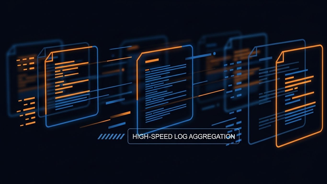
The Visual & Narrative Approach
Speed is the central theme of this visualization. It addresses the challenge of "High-Speed Log Aggregation." The image is an artistic composition of semi-transparent "digital documents" (logs) flying through a dark void. Abstract lines of code zip past in energetic orange and deep blue hues, with motion blur effects applied to the edges to convey high velocity. The composition suggests a massive stream of data being ingested and processed instantaneously.
Psychological Impact & KPI Focus
- Niche Psychology: DevOps teams fear the "firehose"—the overwhelming volume of logs during an incident. This style reassures them that the platform has the Throughput and Performance to handle the load without choking.
- Operational Impact: Visualizes Ingestion Rates and Real-Time Analysis. It conveys that the platform offers zero latency between an event occurring and it being searchable in the logs.
Strategic Implementation & Trade-offs
- Best Use Case: Social media "shorts" (TikTok/Reels/LinkedIn) or intro sequences for webinars on Log Management. It grabs attention quickly.
- Trade-off: It prioritizes "feeling" over "detail." It creates hype about speed but doesn't show the user how to query the logs.
Companies using similar video content -
Kubecost – Simplified views of Kubernetes cost allocation and optimization.
K9s – Playful, structured representation of Kubernetes cluster management.
Tigera – Calico – Fortress architecture for Kubernetes security and observability.
14. Futuristic Neon/Dark Mode
MOFU | Building Trust

The Visual & Narrative Approach
Security in the enterprise is often abstract. This style gives it a physical form: the "Digital Vault." A central processing core, glowing in cyan, is surrounded by three concentric, rotating energy shields in translucent blue. The environment is a reflective, high-tech fortress. This visualization signals "Enterprise-Grade Security," "Zero Trust," and "Data Sovereignty." The lighting is cool and clinical, devoid of shadows where threats could hide.
Psychological Impact & KPI Focus
- Niche Psychology: It appeals to the CISO’s (Chief Information Security Officer) need for Protection and Compliance. The visual language of "shields" and "cores" is a universal metaphor for safety.
- Operational Impact: Visualizes Threat Detection and Security Posture. It suggests that the monitoring platform is not just observing performance, but actively guarding the perimeter.
Strategic Implementation & Trade-offs
- Best Use Case: "Security & Compliance" pages on the website or background loops for trade show booths.
- Trade-off: It can feel generic to the "Cyberpunk" genre. To be effective, it must be branded subtly with the company's specific color palette to avoid looking like stock footage.
Companies using similar video content -
Coralogix – Velocity streams for high-speed log aggregation and analysis.
Sumo Logic – Quick cuts of real-time log management and security analytics.
Mezmo (formerly LogDNA) – Fast-paced UI showcasing rapid log ingestion and search.
15. Abstract 2D Motion Graphics
MOFU | Overcoming Objections

The Visual & Narrative Approach
This style addresses the objection that "Adding another tool just adds complexity." It visualizes the outcome of using the platform: total alignment. A central white node (the Single Source of Truth) connects cleanly to surrounding orange nodes via sturdy blue bonds in a radial network. The symmetry is perfect. It contrasts with the "tangled knot" of the problem state. The flat, vector-based style with sharp edges conveys precision and the elimination of "spaghetti dependencies."
Psychological Impact & KPI Focus
- Niche Psychology: It satisfies the craving for Order. IT environments are entropic; they naturally degrade into chaos. This visual promises that the platform acts as a normalizing force, bringing symmetry to the stack.
- Operational Impact: Visualizes Consolidation. It argues that this single platform can replace multiple disparate tools, serving as the central hub for all telemetry data.
Strategic Implementation & Trade-offs
- Best Use Case: Email nurture campaigns targeting "Tool Sprawl" or "Vendor Consolidation."
- Trade-off: It is highly abstract. Without context, it could represent anything from a network topology to a chemical molecule. It requires strong copy to anchor the meaning.
Companies using similar video content -
Palo Alto Networks – Prisma Cloud – Digital vault for enterprise cloud security.
CrowdStrike – Neon-lit core for endpoint protection and threat detection.
Lacework – Futuristic shields for cloud security posture management.
16. Dark Mode UI Showcase
MOFU | Competitive Displacement
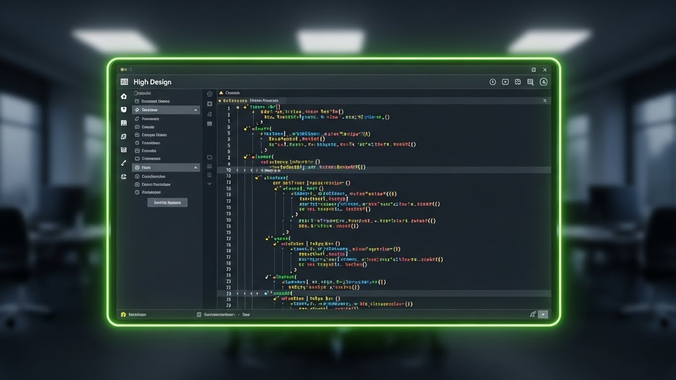
The Visual & Narrative Approach
To win over the developer, you must speak their visual language. This style features a high-fidelity mockup of the platform's "Dark Mode" interface. The screen displays a code editor interface with vibrant syntax highlighting (pink, blue, yellow) popping against the dark grey background. The background behind the screen is a blurred office bokeh, focusing all attention on the tool. This signals that the platform is a modern, developer-first tool, distinct from the clunky, "grey-box" enterprise software of the past.
Psychological Impact & KPI Focus
- Niche Psychology: "Dark Mode" is a cultural signal in the developer community. It signifies Modernity and Ergonomics. It says, "We built this for people who stare at screens for 10 hours a day."
- Operational Impact: Visualizes Developer Experience (DX) and Ease of Use. It suggests that the tool is comfortable to use and helps maintain "Flow State."
Strategic Implementation & Trade-offs
- Best Use Case: Competitive comparison pages ("Us vs. Them") and product documentation.
- Trade-off: It appeals strongly to the end-user (the dev) but may seem "too technical" to a non-technical buyer (the VP of Ops) who prefers high-level dashboards.
Companies using similar video content -
HashiCorp – Consul – Radial order for service mesh and connectivity.
Red Hat – OpenShift – Visualizing complexity reduction in container platforms.
Cloudflare – Abstracting network security and performance for global scale.
17. Lifestyle Stock with UI Overlay
BOFU | The Functional Buyer

The Visual & Narrative Approach
As we move to the Bottom of the Funnel (BOFU), we re-introduce the human element. This style features a high-quality photo of a young male DevOps engineer with glasses, sitting at a modern glass desk. He is looking intently but calmly at a point in the air. Overlaid in his line of sight is a sleek, semi-transparent holographic UI displaying server health metrics in warm amber and grey. This composition creates a narrative of "Augmented Intelligence"—the software isn't replacing the engineer; it is giving him superpowers.
Psychological Impact & KPI Focus
- Niche Psychology: It addresses the anxiety of Job Displacement vs. Empowerment. It positions the tool as a partner that makes the engineer look good—competent, in control, and forward-thinking.
- Operational Impact: Visualizes Proactive Monitoring. The engineer is looking ahead, suggesting he is seeing issues before they become outages.
Strategic Implementation & Trade-offs
- Best Use Case: "Careers" page, "Our Story" video, or case study headers. It humanizes the brand.
- Trade-off: Requires high production value to avoid the "cheesy stock photo" look. The holographic overlay must look integrated, not plastered on.
Companies using similar video content -
Sentry – Syntax clarity for developer-focused error tracking and performance.
GitLab – Monitor – Dark mode UI for integrated DevOps observability.
Datadog – APM – Developer-centric interface for code-level performance insights.
18. 2D Animation & UI Composition
BOFU | The Economic Buyer

The Visual & Narrative Approach
This style is tailored for the CFO or the VP of Engineering—the "Economic Buyer." It uses clean, corporate tech art (flat vector, primary colors like Red, Blue, Yellow) to depict a female character in professional attire presenting a large floating UI panel. She points confidently to a trend line on the panel that is moving sharply upwards in green. The visual language is crisp, professional, and devoid of clutter, focusing entirely on the metric of success.
Psychological Impact & KPI Focus
- Niche Psychology: The Economic Buyer cares about Certainty and Growth. This style speaks the language of business results, not just technical specs. The upward trend line is the universal symbol of "Good Investment."
- Operational Impact: Visualizes ROI (Return on Investment) and Business Health. It connects the technical act of monitoring to the business outcome of revenue growth or efficiency gains.
Strategic Implementation & Trade-offs
- Best Use Case: Pitch decks, quarterly business review (QBR) templates, and ROI calculator landing pages.
- Trade-off: It can feel "dry" or overly corporate. It lacks the excitement of the 3D or Neon styles but excels at communicating stability.
Companies using similar video content -
Splunk – ITSI – Human insight augmented by intelligent IT operations.
PagerDuty – Empowering engineers with proactive incident management.
ServiceNow – ITOM – Augmenting IT teams with intelligent automation and insights.
19. Wireframe to Reality Transition
BOFU | Driving Freemium/Trials
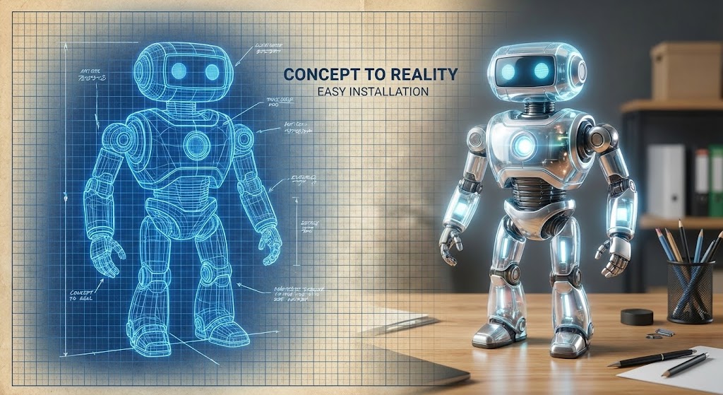
The Visual & Narrative Approach
One of the biggest barriers to adoption is the fear of a difficult setup. This split-image style tackles that objection head-on. The left side shows a blue wireframe blueprint of a software agent (stylized as a geometric robot). As the eye moves right, the wireframe transitions seamlessly into a fully rendered, glowing, photorealistic version of the agent glowing with life. This visualizes the concept of "Concept to Reality" or "Easy Installation"—turning a plan into a working tool in moments.
Psychological Impact & KPI Focus
- Niche Psychology: It reduces Implementation Anxiety. It promises that the "Time to Value" is short. "It's as easy as sketching it out."
- Operational Impact: Visualizes Auto-Instrumentation and Rapid Deployment. It conveys that the agent installation is automated and requires minimal configuration.
Strategic Implementation & Trade-offs
- Best Use Case: "Get Started" pages, trial signup screens, or social ads promoting a "Free Tier."
- Trade-off: It simplifies the process significantly. It works best as a hook to get them to try the product, rather than a technical manual.
Companies using similar video content -
AppDynamics – Economic value visualization for business transaction monitoring.
New Relic – Growth trajectory for application performance and business health.
Dynatrace – Quantifying ROI through AI-powered observability.
20. Aspirational Stock Montage
BOFU | ROI Justification

The Visual & Narrative Approach
The final visual in the guide focuses on the ultimate result: Organizational Success. It features a cinematic shot of a diverse boardroom team smiling and clapping. In the foreground, slightly out of focus, a tablet displays a large, glowing green percentage number (abstracted ROI data, e.g., "845%"). The warm "Golden Hour" lighting suggests the end of a long, successful project. This is the emotional payoff of the entire buyer's journey.
Psychological Impact & KPI Focus
- Niche Psychology: It validates the buyer's decision. It suggests that choosing this platform will make them a hero in their organization. It triggers Social Proof and the desire for team cohesion.
- Operational Impact: Visualizes SLA Compliance and Team Efficiency. It implies that the tool has eliminated the "Blame Game" and united Dev and Ops teams.
Strategic Implementation & Trade-offs
- Best Use Case: Case study thumbnails, "Success Stories" pages, and the final slide of a sales presentation.
- Trade-off: It is the most generic style if not anchored by specific data (the number on the tablet). Without the data, it's just people clapping; with the data, it's a celebration of a specific win.
Companies using similar video content -
Grafana Labs – Grafana Cloud – Seamless onboarding for instant observability setup.
Spacelift – Rapid deployment of infrastructure as code agents.
Terraform (HashiCorp) – Concept to reality for infrastructure provisioning.
21. Clean UI Workflow (Light Mode)**
Onboarding | Self-Serve Onboarding

The Visual & Narrative Approach
The "First Run Experience" is the most fragile moment in the user lifecycle. This style combats abandonment by visualizing the "Happy Path." Utilizing a pristine, high-key "Light Mode" aesthetic, the screen displays a simplified dashboard where the primary focus is a large, vibrant emerald green checkmark pulsing gently, surrounded by subtle confetti elements. Below, a checklist of three critical setup steps (Account, Profile, Welcome) is shown as fully completed. The narrative is purely visual: "You have arrived. It is done."
Psychological Impact & KPI Focus
- Niche Psychology: New users often feel anxiety about "breaking" complex enterprise software during setup. This style leverages Positive Reinforcement. The clean whitespace and celebratory graphics release dopamine, validating the user's competence and signaling that the hard work is over.
- Operational Impact: Directly targets Time-to-First-Value (TTFV). By visualizing the "Success State" rather than the "Configuration State," you encourage users to push through the final steps of registration to achieve this result.
Strategic Implementation & Trade-offs
- Best Use Case: "Welcome" emails, the final screen of a signup wizard, or progress trackers within the app.
- Trade-off: It is not educational; it is motivational. It confirms success but doesn't explain how to use the complex features that follow.
Companies using similar video content -
Cisco – Collective success and measurable ROI for enterprise solutions.
IBM – Celebrating organizational achievements with advanced technology.
Microsoft – Azure – Aspirational outcomes of cloud adoption and innovation.
22. Isometric 3D Workflow
Onboarding | Reducing Implementation Friction

The Visual & Narrative Approach
Enterprise integrations (e.g., connecting AWS, Azure, and on-prem servers) are often viewed as a headache of API keys and config files. This style reimagines integration as a physical, tactile act of "plugging in." Using smooth, matte grey cubes (representing external services) and a central orange hub (your platform), we see the cubes snapping satisfyingly into place with magnetic precision. The lighting is soft and premium. There is no friction, only a perfect fit.
Psychological Impact & KPI Focus
- Niche Psychology: It appeals to the Builder Mindset. Engineers love modularity. This visual metaphor suggests that your platform is a well-engineered hub that respects the integrity of their existing tools. It transforms "Integration Hell" into "Plug-and-Play."
- Operational Impact: Visualizes Interoperability and Ecosystem Support. It tacitly promises that the platform plays well with others, reducing the fear of vendor lock-in or compatibility issues.
Strategic Implementation & Trade-offs
- Best Use Case: Documentation headers, "Integrations" library pages, and technical onboarding guides.
- Trade-off: The abstraction hides the specific technical details of how the integration works (e.g., OAuth flow), focusing instead on the ease of the connection.
Companies using similar video content -
Zabbix – Verified success for open-source monitoring setup.
Datadog – Onboarding – Instant activation and positive reinforcement for new users.
Grafana – Dashboards – Clean UI for successful data visualization and exploration.
23. Macro UI Micro-Interactions
Onboarding | Accelerating Time-to-Value

The Visual & Narrative Approach
Sometimes, the barrier to action is the perception of lag or complexity. This style uses an extreme macro close-up to make the software feel tactile and responsive. We focus on a single UI element—a pill-shaped "Deploy" button in electric lime. The camera captures the button being depressed, the subtle shadow shift, and the sub-pixels of the screen. It emphasizes the moment of action. The background is stark white, ensuring the green button is the sole protagonist.
Psychological Impact & KPI Focus
- Niche Psychology: It creates a sense of Tangibility. In a world of abstract cloud concepts, making a digital button feel like a physical switch creates a sense of agency and control. It triggers the impulse to "click."
- Operational Impact: Targets Feature Activation Rate. It simplifies the complex action of "Deployment" down to a single, confident keystroke, reducing the hesitation associated with major operational changes.
Strategic Implementation & Trade-offs
- Best Use Case: Email nurture campaigns driving a specific action (e.g., "Deploy your first agent") or in-app tooltips.
- Trade-off: It is hyper-focused. It lacks context about what happens after the click, serving purely as a trigger for the action itself.
Companies using similar video content -
HashiCorp – Vault – Modular plug-in for secure secrets management.
Red Hat – Ansible – Effortless integration for automation and orchestration.
GitLab – CI/CD – Visualizing seamless integration in the DevOps pipeline.
24. 3D Parallax UI Presentation
Retention | Driving Deep Feature Adoption
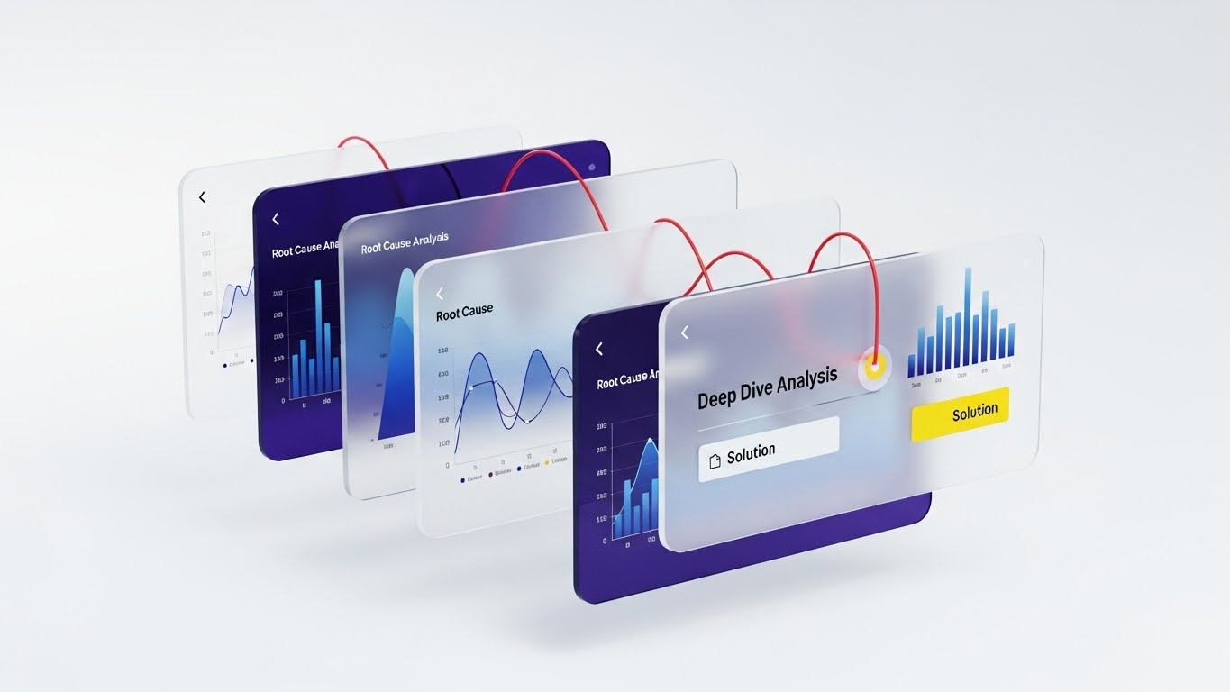
The Visual & Narrative Approach
To explain "Deep Dive" capabilities without overwhelming the viewer, this style uses depth. Floating glass UI screens are arranged in a parallax stack. A bright red "thread" (representing a trace or query) physically weaves through these layers—starting from a high-level graph in the back and threading through to a specific line of code or "Solution" in the front. This visually demonstrates the platform's ability to cut through layers of data to find the answer.
Psychological Impact & KPI Focus
- Niche Psychology: It satisfies the need for Thoroughness. SREs are investigators; they need to know they can drill down indefinitely. The "layered glass" metaphor suggests transparency at every level of the stack.
- Operational Impact: Visualizes Granularity and Contextual Analysis. It shows that the platform preserves the context of an error as it moves from the macro (infrastructure) to the micro (code) level.
Strategic Implementation & Trade-offs
- Best Use Case: "What's New" product update videos or feature pages for advanced analytics modules.
- Trade-off: The complexity of the composition requires a larger screen (desktop/laptop) to be fully appreciated; less effective on mobile.
Companies using similar video content -
Sentry – Tactile feedback for immediate error resolution actions.
Rollbar – Emphasizing the click for instant crash reporting.
Raygun – Focusing on the moment of action for error diagnosis.
25. Hyper-lapse Stock Footage with Data
Retention | Reducing Support Overhead

The Visual & Narrative Approach
This style contrasts the chaos of the world with the stability of the platform. It uses a hyper-lapse of a city highway at night—streaks of light moving at breakneck speed, representing high traffic/throughput. Superimposed over this chaotic energy is a calm, glowing golden grid structure, locked in place. The text "STABILITY AMIDST HIGH TRAFFIC" anchors the message. The visual implies that while the environment (user traffic) is wild, the infrastructure (monitored by you) is contained and secure.
Psychological Impact & KPI Focus
- Niche Psychology: It addresses Scale Anxiety. During Black Friday or product launches, traffic spikes are terrifying. This visual offers reassurance: "We are the guardrails."
- Operational Impact: Visualizes Scalability and Uptime Reliability. It reinforces the message that the monitoring solution effectively manages load without degradation.
Strategic Implementation & Trade-offs
- Best Use Case: Knowledge Base articles on "Scaling," status pages, or reassurance emails during peak seasons.
- Trade-off: It is a high-level metaphor. It doesn't show how the scaling happens (e.g., autoscaling groups), only that it remains stable.
Companies using similar video content -
Dynatrace – Layered insight for deep root cause analysis.
New Relic – One observability platform – Exploring data depth across the stack.
Elastic – Kibana – Multi-layered data exploration for logs and metrics.
26. 2D Character-Driven Story
Retention | Reducing Churn

The Visual & Narrative Approach
Retention often comes down to "Quality of Life." This style uses a warm, grainy, 2D vector illustration to depict a "maintenance-free" life. We see a cozy home office in soft earth tones. A character is relaxing, reading a book, feet up. On the monitor in the background, a small, friendly robot icon is animated, diligently sweeping away a "bug." The narrative is clear: "We work so you don't have to." It humanizes the software as a helpful assistant.
Psychological Impact & KPI Focus
- Niche Psychology: It targets Burnout. IT professionals are overworked. This style sells "Time Back." It moves the value prop from "better data" to "better work-life balance."
- Operational Impact: Visualizes Automation and Self-Healing. It suggests that routine maintenance and minor incident resolution are handled automatically, reducing the "toil" metric.
Strategic Implementation & Trade-offs
- Best Use Case: Customer newsletters, "Year in Review" emails, or renewal campaigns emphasizing the "peace of mind" value.
- Trade-off: It is stylized and "soft." It may not appeal to hard-core technical buyers looking for specs, but works wonders for the emotional retention of the user.
Companies using similar video content -
Cloudflare – Stability amidst high traffic for network performance.
Akamai – Traffic resilience for content delivery and security.
Fastly – Visualizing stability under extreme network load.
27. 2D Graphics Over Live Action
Retention | Proactive Support/Announcements
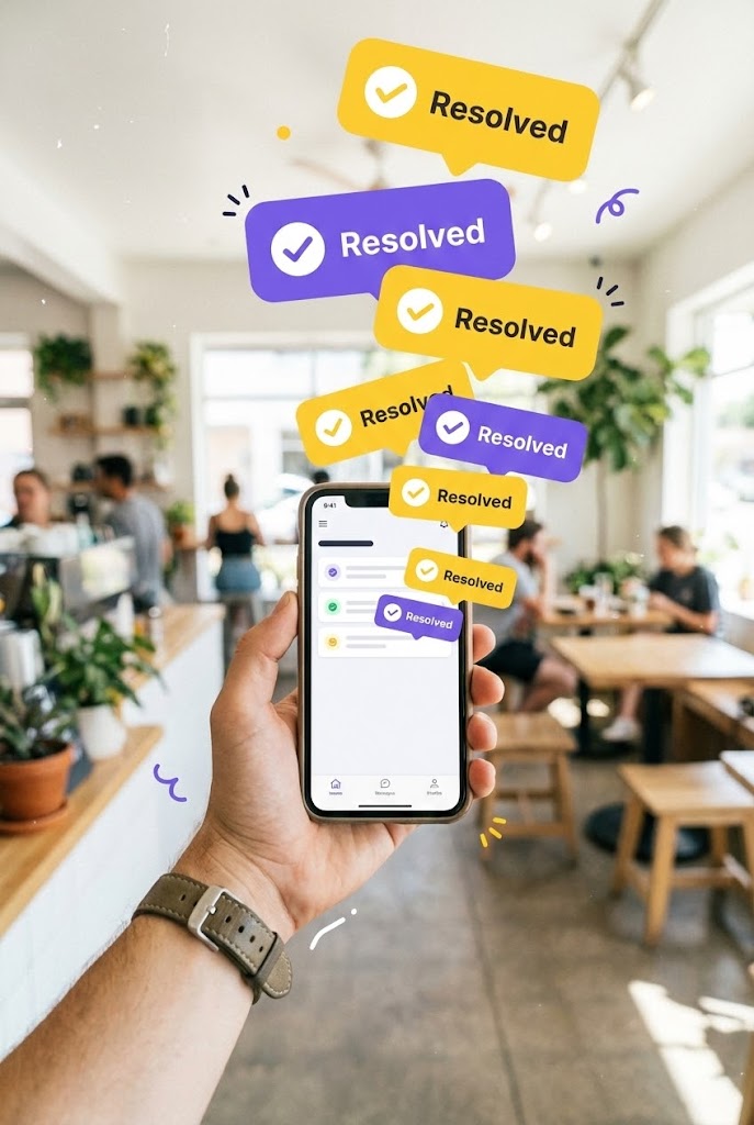
The Visual & Narrative Approach
Modern DevOps is mobile. This style uses a vertical POV shot of a hand holding a smartphone in a casual setting (coffee shop). Bursting from the screen are vibrant, 2D "Resolved" notification bubbles in yellow and purple. They float effortlessly into the air. This blends the real world (the user's life) with the digital solution (the app), emphasizing that the platform keeps them informed and problems resolved, wherever they are.
Psychological Impact & KPI Focus
- Niche Psychology: It appeals to the desire for Mobility and Freedom. The "tether to the desk" is a major pain point. This visual promises that the platform enables a "work from anywhere" reality without losing control.
- Operational Impact: Visualizes Mobile Alerting and Remote Management. It highlights the effectiveness of the mobile app in handling incidents on the go.
Strategic Implementation & Trade-offs
- Best Use Case: Mobile app store previews, social media stories, or feature announcements regarding mobile capabilities.
- Trade-off: The vertical format is specific to mobile consumption. It is less effective on desktop landing pages.
Companies using similar video content -
PagerDuty – Automated agent for maintenance freedom and peace of mind.
Atlassian – Jira Service Management – Humanizing IT support workflows.
Freshservice – Character-driven narratives for IT service automation.
29. Holographic UI over 3D Render
Expansion | Driving Upsell/Cross-sell

The Visual & Narrative Approach
To upsell a "Security Module" to an existing database monitoring customer, you must visualize the added value. This style shows a pristine, chrome database cylinder (the existing asset). Suddenly, a glowing, holographic blue padlock icon materializes and locks firmly around it. The lighting shifts to a secure, cool blue. This visualizes the concept of "wrapping" existing infrastructure in a new layer of protection.
Psychological Impact & KPI Focus
- Niche Psychology: It triggers the Endowment Effect. The customer already "owns" the database (the cylinder). The visual shows them how to protect their asset. It frames the upsell not as a new purchase, but as an essential upgrade to what they already have.
- Operational Impact: Visualizes Data Sovereignty and Compliance. It explicitly links the monitoring of performance with the monitoring of security, bridging the gap between DevOps and SecOps.
Strategic Implementation & Trade-offs
- Best Use Case: In-app upsell modals, "Security Feature" landing pages, or direct sales presentations for account expansion.
- Trade-off: It is somewhat aggressive. It implies that without the lock, the database is vulnerable. It must be balanced with educational copy about specific threats.
Companies using similar video content -
Datadog – Mobile App – Mobile resolution with proactive support notifications.
Splunk – On-Call – Augmented reality UI for remote incident management.
Opsgenie – Mobile alerting and on-the-go incident resolution.
30. Generative AI Realistic Character video
Expansion | Driving Referrals & Advocacy

The Visual & Narrative Approach
The strongest expansion driver is word-of-mouth. This style utilizes a high-fidelity, Gen-AI created avatar of a "Peer Expert"—a confident female DevOps leader. She is depicted in a high-tech environment, speaking directly and passionately to the camera (and thus, the viewer). She isn't selling; she is advocating. The lighting is cinematic, highlighting her expression of genuine enthusiasm. This style mimics a high-budget customer testimonial or a "Keynote Speaker" moment, lending authoritative human voice to the brand's success stories.
Psychological Impact & KPI Focus
- Niche Psychology: It leverages Social Proof and Authority. People buy from people. Seeing a peer (a fellow executive) articulate the value of the platform validates the buyer's choice and encourages them to become an advocate themselves.
- Operational Impact: Visualizes Community Leader Status. It positions the user not just as a customer, but as a thought leader who uses the best tools in the industry.
Strategic Implementation & Trade-offs
- Best Use Case: Community landing pages, "Ambassador Program" invites, and case study video summaries.
- Trade-off: The AI generation must be flawless. Any "uncanny valley" effect will destroy trust. It requires top-tier generation tools to ensure lip-sync and expression are natural.
Strategic Knowledge Base: The Visual Operations Doctrine
This final section synthesizes the 30 visual styles into a cohesive business framework. It moves beyond "design" to "strategy," outlining how Enterprise Application Monitoring platforms can use visual language to drive adoption, reduce operational friction, and secure ROI.
Strategic Alignment & Visual Architecture
The "Pre-Production" Phase: Defining the Visual Operating System.
- The Cognitive Load Audit: Before creating any assets, conduct an audit of your current training materials and dashboards. If a concept takes more than 3 paragraphs to explain (e.g., Kubernetes orchestration), it requires a visual intervention (See Style 12 or 22).
- Role-Based Visual Mapping: Do not use the same visuals for the C-Suite and the SRE.
- The Architect (CTO): Needs "Isometric 2D" (Style 1) and "Abstract 2D" (Style 2) to see the system and value.
- The Operator (SRE): Needs "Dark Mode UI" (Style 16) and "Dynamic Data" (Style 11) to see the syntax and truth.
- The "Glanceability" Standard: In an incident response scenario, seconds matter. Visuals used in alerts or dashboards must be "glanceable." Use high-contrast styles like Bold Kinetic Typography (Style 6) or Split Screen (Style 7) to convey status instantly without requiring deep reading.
- Brand Voice Consistency: Your "Visual Voice" must match your "Code Voice." If your platform is "Open Source and Community-Led," use Style 2 (Abstract Organic) to show connectivity. If you are "Enterprise Guardrails & Compliance," lean into Style 14 (Futuristic Neon) to project security.
- The Advids Strategic Audit: Partnering with a strategic agency like Advids allows you to define this "Visual Operating System" before production begins. This ensures that every asset—from a 6-second pre-roll ad to a 10-minute tutorial—adheres to a unified visual logic, preventing brand fragmentation.
- Standardization vs. Customization: For core infrastructure concepts (Cloud, Database), use standardized, recognizable 3D metaphors (Style 10). For unique proprietary features (e.g., your specific AI Algorithm), invest in bespoke abstract motion (Style 9) to own the mental real estate.
- The Cross-Departmental Bridge: Use these visuals to unify your internal teams. When Sales and Engineering share a common visual language (e.g., a specific Style 3 Schematic explaining the architecture), miscommunication drops.
- Legacy System Integration: Many buyers are hybrid. Use Style 1 (Isometric) to visually respect their "Legacy Grey" on-prem hardware while showing your "Bright Orange" cloud agents connecting to it. Do not alienate them by only showing cloud-native visuals.
- Accessibility in Ops: Operations teams are global. Visuals transcend language. A well-executed Style 21 (Clean UI Workflow) explains "Success" to a Japanese engineer just as clearly as to an American one, reducing localization costs.
- The Mobile-First Mandate: Ops doesn't always happen at a desk. Ensure all styles—especially complex data visualizations like Style 11—are legible on a 6-inch screen. Complex topological maps (Style 2) must have a "simplified" variant for mobile consumption (Style 27).
Operational Adoption & Implementation
The "Deployment" Phase: Embedding Visuals into the Workflow.
- The Micro-Learning Shift: Replace 50-page PDF manuals with a library of 30-second "Micro-Interaction" videos (Style 23) and "Rapid UI Montages" (Style 13). Embed these directly into the SaaS interface (e.g., a "Watch How" tooltip on the deployment button) to provide Just-in-Time learning.
- Overcoming "Big Brother" Anxiety: When introducing User Monitoring or Session Replay features, use empathetic, "2D Character-Driven Stories" (Style 26) to frame the technology as a support tool ("helping the user") rather than a surveillance tool.
- Reducing Support Ticket Volume: There is a direct correlation between the availability of "Clean UI Workflow" visuals (Style 21) and reduced Level 1 support tickets. If users can see the "Happy Path," they are less likely to open a ticket for basic configuration issues.
- Gamification of Training: Use "Isometric 3D Workflow" (Style 22) animations to visualize the completion of onboarding tasks. Treating the setup process as building a "city" or "structure" taps into the engineer's desire for completion and order.
- Standard Operating Procedures (SOPs) as Visual Flows: Transform static text SOPs into "2D Line Art Animations" (Style 3). A wireframe animation showing exactly how data flows through a gateway is far less ambiguous than a text description, reducing configuration errors during critical incidents.
- Remote Onboarding: In a distributed workforce, you cannot rely on "over the shoulder" training. Use 3D Parallax UI (Style 24) videos to simulate a deep-dive demo. These assets allow remote employees to explore the depth of the product at their own pace, ensuring consistent training quality across all time zones.
- Just-in-Time Support: Deflect support tickets by embedding visual answers. When a user hovers over a complex setting, trigger a tooltip with a Macro UI animation (Style 23) that explains the function. By placing the "Visual Help" inside the problem space, you solve the issue before a ticket is ever filed.
- Feedback Loops: Use interactive visual elements to gather sentiment. After a workflow is completed, present a simple 2D Graphic (Style 27) asking for a "Thumbs Up/Down." This visual feedback mechanism is frictionless for the user but provides invaluable data on which features are causing friction.
- Scalable Localization: Enterprise SaaS is global. By relying on abstract visuals (Style 2) and iconic imagery (Style 5) rather than heavy on-screen text, you drastically reduce localization costs. A well-designed visual metaphor for "Connectivity" is understood equally well in Tokyo, Berlin, and San Francisco without translation.
- Leadership Communication: CTOs need to sell the value of the platform to the Board. Equip them with high-end Photorealistic 3D (Style 8) and Aspirational Stock (Style 20) assets. These "Executive Ready" visuals allow your internal champions to communicate the strategic ROI of the platform in a language that Finance and the CEO understand.
Measuring Impact & Future-Proofing
The "ROI" Phase: Quantifying Success and Scaling Up.
- Defining Actionable KPIs: Do not measure "Views." Measure "Time-to-Competency" (how fast a new hire can deploy an agent after watching the onboarding video) and "Feature Adoption Rate" (the spike in usage of a specific module, like Security, after releasing a Style 29 video).
- The "Idle Time" Metric: Poor interfaces cause "Operational Idle Time"—seconds wasted staring at a screen trying to understand the data. Measure how the implementation of clearer visuals (Style 16) reduces the time between "Alert Received" and "Action Taken."
- Scalability of Assets: As your platform grows, your visual library must scale. Using "Generative AI" styles (Style 30) allows for the rapid creation of localized or persona-specific content without the cost of live-action shoots.
- The Advids Partnership for Scale: Maintaining this level of visual consistency requires a dedicated engine. Advids acts as the custodian of your Visual Operations Doctrine. We don't just produce videos; we manage the lifecycle of your visual assets, ensuring they evolve with your product roadmap and continue to deliver ROI long after the initial launch.
- The ROI of Trust: Ultimately, the investment in high-end visuals like "Photorealistic 3D" (Style 8) and "Futuristic Neon" (Style 14) is an investment in Brand Trust. In the enterprise, buyers do not purchase "tools"; they purchase "infrastructure." Your visuals must convey the weight, stability, and sophistication of a partner capable of upholding their digital business.
- Compliance Velocity: New regulations (GDPR, SOC2) require rapid team education. Measure how fast your organization achieves compliance certification when training is delivered via Futuristic Neon security visualizations (Style 14) versus text memos. Speed of compliance is a competitive advantage.
- Retention and Churn (LTV): Churn often happens because users don't understand the full value of what they are paying for. Use 2D Character Stories (Style 26) to visualize the "Invisible Value"—the threats blocked, the downtime prevented. Correlate exposure to these "Value Reinforcement" visuals with renewal rates.
- The AI Visual Frontier: Prepare for the next wave: Generative UI. The styles in this guide (Style 9, 30) are just the beginning. The future is real-time, AI-generated dashboards that adapt their visual complexity based on the user's stress level. Start building a "Visual Data Lake" now to train these future models.
- Benchmarking Success: Compare your "Visual Maturity" against the industry. Are your competitors still using generic stock footage while you use 3D X-Ray (Style 10)? "Good enough" visualization is a competitive risk. In a crowded SaaS market, the company with the clearest visual story wins the trust of the buyer.
- Final Call to Innovation: Treat video and visualization not as "Marketing Content," but as "Critical Infrastructure." In the Age of AI and Complexity, the ability to see and understand the system is the system's most valuable feature. By adopting this guide, you are not just making your software look better; you are making your enterprise think faster.
Author & Editor Bio


