
Introduction: Visualizing the Invisible Risk
The environmental compliance landscape is undergoing a seismic shift. We are moving from an era of reactive "box-checking" to one of proactive, data-driven resilience. For today’s EHS leaders, the challenge is no longer just about gathering data—it’s about making that data instantly visible, understandable, and actionable across a global enterprise.
Yet, a dangerous gap remains. There is often a disconnect between the physical reality of a job site—the emissions, the waste drums, the safety hazards—and the digital reports that land on a boardroom table. This "Physical/Digital Divide" is where risk accumulates. The cost of this disconnect is staggering; research indicates that the cost of non-compliance averages $14.82 million annually, dwarfing the investment required to maintain robust systems.
Video visualization is the strategic bridge across this divide. It is not merely a marketing asset; it is a translation tool. By choosing the right visual style, you can transform abstract regulatory frameworks into concrete operational realities. You can show exactly how a digital twin mirrors a physical asset, or how an automated workflow reduces the cognitive load on a field engineer. This is why 49% of EHS practitioners now have active plans to invest in AI and advanced digital tools—they recognize that superior visibility leads to superior compliance.
The following guide curates distinct visualization styles, mapped specifically to the EHS user journey. From the "Eco-Tech" visuals that build brand awareness to the "High-Fidelity UI" that proves technical capability, each style serves a specific strategic function in turning compliance into a competitive advantage.
1. The Eco-Tech Identity
TOFU | Brand Awareness
The Visual & Narrative Approach
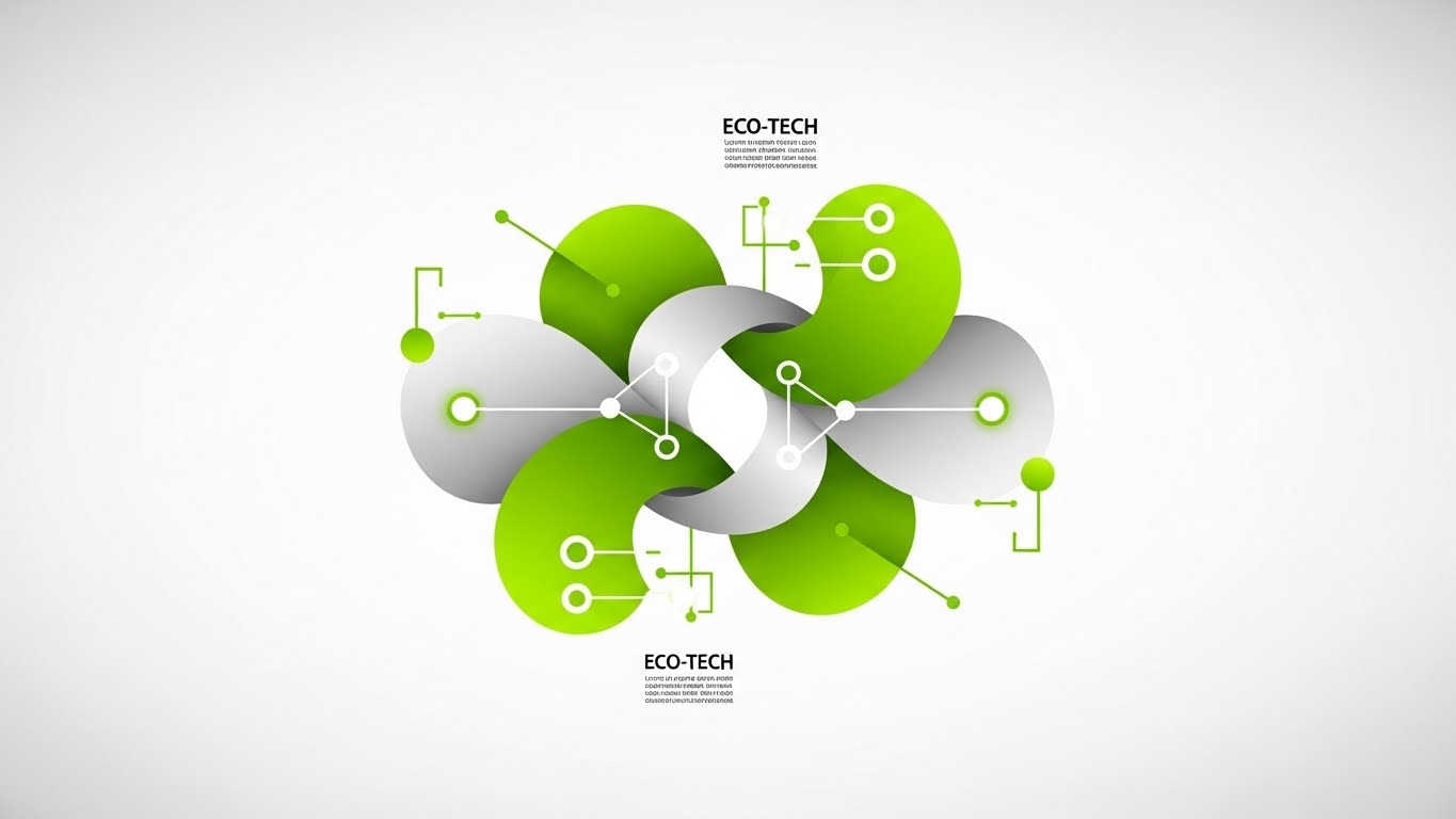
Visualization Scenario: This style abandons the literal for the symbolic, creating a sophisticated "Eco-Tech" aesthetic. The composition features a symmetrical, centralized arrangement where abstract shapes—resembling organic leaves—seamlessly interlock with sharp, digital nodes. The palette creates a fresh blend of Vivid Lime Green and Pure White. The narrative is one of harmony: visualizing the seamless integration of environmental stewardship (Nature) with robust SaaS infrastructure (Technology).
Narration Style: Smooth, high-level, and aspirational. "Where compliance meets ecosystem."
Psychological Impact & KPI Focus
Niche Psychology: EHS managers often feel their work is a battle between chaotic nature and rigid rules. This style uses Symmetry and Balance to psychologically resolve that tension, suggesting that the platform brings order to the ecosystem.
Operational Impact: By avoiding literal depictions of waste or smokestacks, this style reduces "regulatory anxiety." It targets Brand Awareness, positioning the software as a modern, forward-thinking partner rather than a legacy burden.
Strategic Implementation & Trade-offs
Use Case: Social Media Ads (LinkedIn/Instagram) and Brand Anthem videos (10-15 seconds).
Strategic Trade-off: This style is excellent for establishing mood but poor for explaining mechanics. Do not use this to demonstrate specific features like permit filing; it lacks the granular detail necessary for technical education.
Companies using similar video content -
Greenly – Carbon accounting for emissions reduction.
Aclymate – Environmental management, tracking GHG emissions.
2. The Operational Simplifier
TOFU | Category Creation
The Visual & Narrative Approach
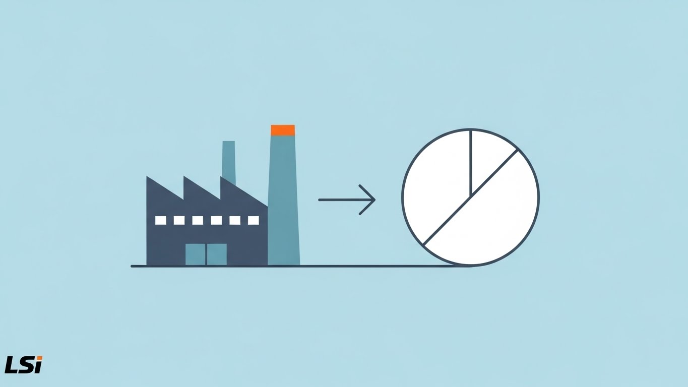
Visualization Scenario: This style is a visual engine for "Operational Transformation." It utilizes a strictly flat 2D vector approach with a palette of Sky Blue and Safety Orange. The scene depicts a simplified silhouette of a factory on the left, transforming into a clean, geometric circle (pie chart) on the right via a horizontal transition line. It visually translates the complex LSI concept of "converting physical risk into actionable data."
Narration Style: Direct, crisp, and problem-solution oriented. "Complexity in. Clarity out."
Psychological Impact & KPI Focus
Niche Psychology: The target audience is often overwhelmed by "alert fatigue" and data noise. This style offers Cognitive Relief. By stripping away shadows and depth, it underscores the promise of simplicity and clarity.
Operational Impact: This style directly supports Market Education. It helps potential buyers visualize the outcome of using the software (clarity) before they need to understand the process.
Strategic Implementation & Trade-offs
Use Case: Blog Headers, Whitepaper Covers, and Introductory Explainer Videos (6-10 seconds).
Strategic Trade-off: The lack of detail means this style cannot support claims about "granular data" or "complex reporting." It is a strategic view, not a tactical one.
Companies using similar video content -
GoCanvas – Simplifies mobile forms for EHS inspections.
Sitemate – Dashpivot – Transforms paper-based workflows into digital processes.
3. The Audit Trail Map
TOFU | Market Education
The Visual & Narrative Approach
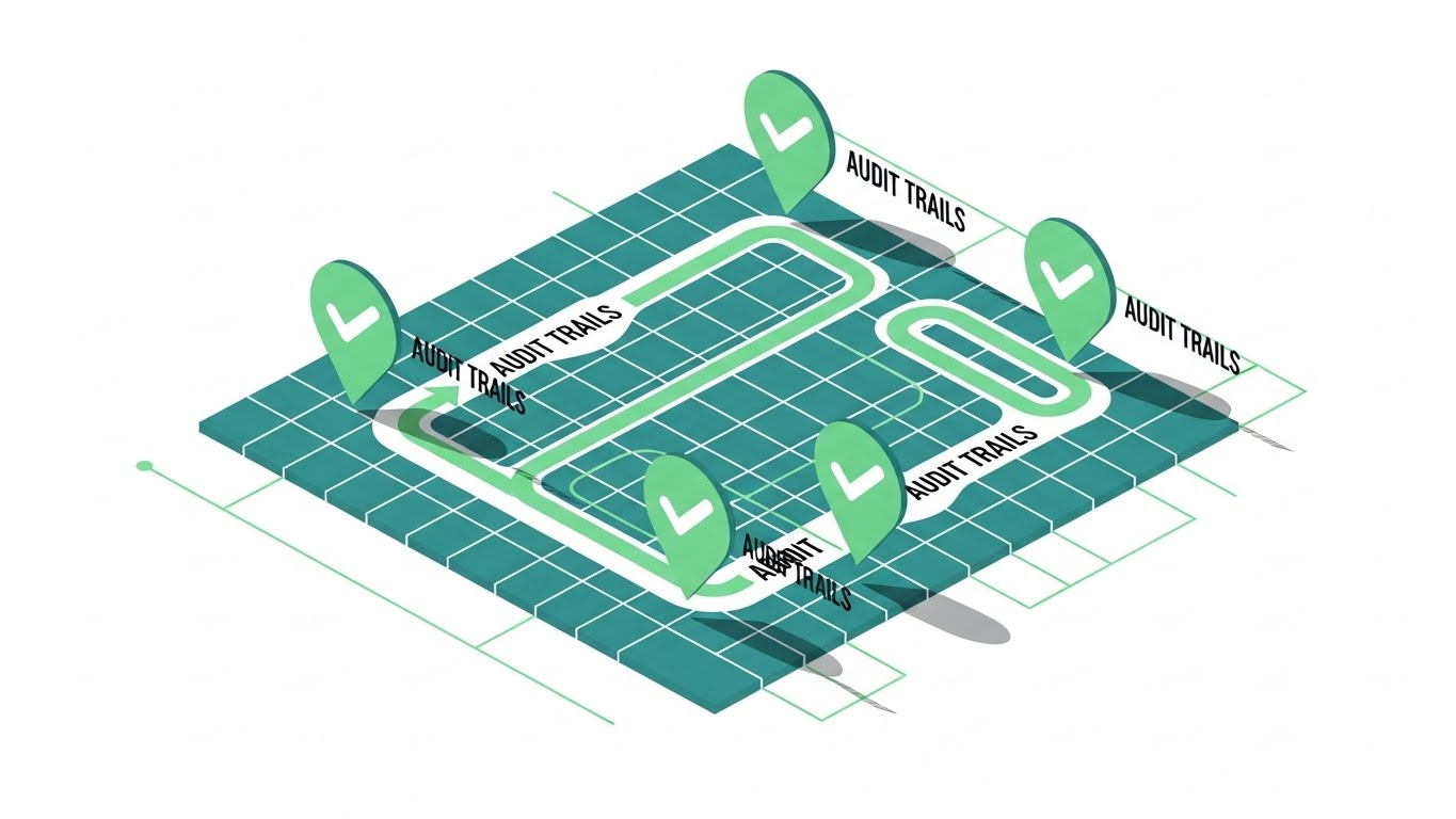
Visualization Scenario: Isometric projection offers a "God's Eye View" of operations, which is exactly the perspective a Compliance Director craves. The visual places a supply chain route on a clean isometric grid. As the process flows, stylized green checkmark icons pop up at key nodes, representing "Audit Trails." The drop shadows create a layered paper-cut effect, adding tactile depth.
Narration Style: Rhythmic and reassuring. "Tracked. Verified. Reported."
Psychological Impact & KPI Focus
Niche Psychology: This style addresses the anxiety of "The Unobserved Gap." By showing a continuous line with checkpoints, it provides Positive Reinforcement that there are no blind spots in the supply chain.
Operational Impact: It shapes Brand Perception as thorough and precise. It visually validates the "Chain of Custody," a critical component of ISO 14001 certification.
Strategic Implementation & Trade-offs
Use Case: Website Hero Sections and "How it Works" pages (15-20 seconds).
Strategic Trade-off: Isometric views can feel detached. While great for showing process, they lack the human element, so they should be paired with lifestyle content elsewhere in the funnel.
Companies using similar video content -
Intelex – EHS Platform – Manages EHS, Quality, ESG with clear workflows.
EcoPortal – ecoPortal Health and Safety Software – Manages HSEQ and risk processes.
4. The Compliance Fortress
TOFU | Shaping Brand Perception

The Visual & Narrative Approach
Visualization Scenario: Here, the word "COMPLIANCE" is not just text; it is physical infrastructure. Large, heavy rectangular blocks in Electric Blue and Deep Charcoal crash together with motion blur, fusing into a solid, unshakeable wall. The text acts as a structural element, reinforcing the concept of a strong foundation.
Narration Style: Sound design led. Heavy thuds and locking mechanisms. "Build your defense."
Psychological Impact & KPI Focus
Niche Psychology: In a volatile regulatory environment, stability is a key selling point. This style uses Motion Semantics—heavy, fast, interlocking movements—to subconsciously signal robustness and reliability.
Operational Impact: Designed for LinkedIn Organic, where sound-off autoplay requires strong visual contrast to grab attention. It positions the software as an enterprise-grade "Fortress" against risk.
Strategic Implementation & Trade-offs
Use Case: Social Media Teasers and Event Intro Loops (5-8 seconds).
Strategic Trade-off: This is a pure "hype" style. It conveys confidence but zero technical information. It must be used to drive traffic to a more detailed asset.
Companies using similar video content -
VelocityEHS – Accelerate Platform – Unifies safety, risk, and compliance.
Sphera – SpheraCloud – Enterprise Sustainability Management, operational risk.
5. The Green Infrastructure Vision
TOFU | LinkedIn Organic

The Visual & Narrative Approach
Visualization Scenario: This style leverages Generative AI to create an aspirational "North Star." A wide-angle aerial drone shot reveals a futuristic industrial park bathed in natural sunlight. The facility features gleaming solar panels, vertical gardens, and smokestacks emitting only clear steam. It paints a picture of "Green Infrastructure" perfection.
Narration Style: Grandiose and visionary. "The future of industry is clean, compliant, and profitable."
Psychological Impact & KPI Focus
Niche Psychology: It taps into the Aspiration of the Sustainability Director. It validates their mission to transform their company into an ESG leader.
Operational Impact: Highly effective for Pre-Roll Ads, reducing skip rates by offering a cinematic, high-value visual experience that contrasts with typical B2B software screenshots.
Strategic Implementation & Trade-offs
Use Case: YouTube Pre-Roll and Website Background Video (15-30 seconds).
Strategic Trade-off: Authenticity is the risk. If the AI generation looks too "dreamy" or physically impossible, it can alienate practical engineers. The prompt must ensure structural realism.
Companies using similar video content -
PlanA – ESG reporting, carbon accounting, decarbonization pathways.
IBM – Envizi ESG Suite – Cloud-based ESG reporting and data management.
6. The Digital Twin Bridge
TOFU | Skippable Pre-Roll Ad
The Visual & Narrative Approach
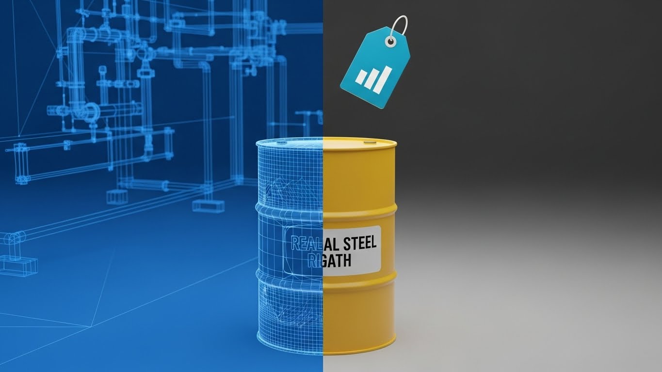
Visualization Scenario: This style directly addresses the "Physical/Digital Divide." The screen is split vertically. The left side shows a technical wireframe blueprint of a hazardous waste drum. The right side seamlessly transitions into a photorealistic 3D render of the same drum with a digital data tag. The transition represents the "Digital Twin" concept—showing that the software's data is a perfect mirror of physical reality.
Narration Style: Technical and precise. "What you plan is what you manage."
Psychological Impact & KPI Focus
Niche Psychology: For the skeptical MOFU audience, "accuracy" is the watchword. This visual proves that the software understands the physical asset, bridging the gap between Planning and Reality.
Operational Impact: It differentiates the solution from competitors who only show spreadsheets. It visualizes Asset Verification, a key value driver for inventory management.
Strategic Implementation & Trade-offs
Use Case: Landing Pages and Solution Deep Dives (10-15 seconds).
Strategic Trade-off: This requires high-quality 3D assets. The "Reality" side must be near-photorealistic to maintain the promise of accuracy.
Companies using similar video content -
Bentley Systems – iTwin – Digital twin platform for infrastructure assets.
Dassault Systèmes – DELMIA – Manufacturing operations management, digital twin.
7. The Clarity Dashboard
MOFU | Product/Solution Differentiation
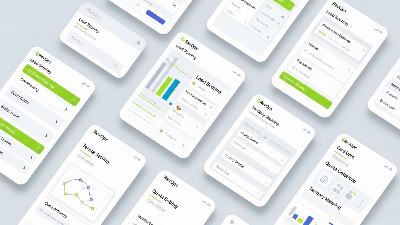
The Visual & Narrative Approach
Visualization Scenario: This style showcases the "Light Mode" aesthetic as the industry gold standard. It features a high-fidelity screen design with floating cards, soft shadows, and clear color-coded accents. Note: While the example image shows sales metrics, the architectural principle applies directly to EHS. In your context, these cards represent "Permit Renewals" and "Risk Scores," demonstrating how complex data is organized into a clean, digestible hierarchy.
Narration Style: Instructional and calm. "Focus on the data that matters."
Psychological Impact & KPI Focus
Niche Psychology: EHS users are used to "clunky" legacy software. A Clean UI style signals Usability and Modernity. It lowers the Cognitive Load, assuring the viewer that this tool will make their life easier, not harder.
Operational Impact: It demonstrates Reporting Efficiency, showing that key indicators can be monitored without digging through endless menus.
Strategic Implementation & Trade-offs
Use Case: Product Pages and Feature Highlight Videos (20-30 seconds).
Strategic Trade-off: Static UI can be disengaging. Use subtle animations (cursor movement, hover states) to simulate a "live" environment.
Companies using similar video content -
EHS Insight – EHS management with clear, intuitive dashboards.
Safetymint – EHS audit management, intuitive dashboards and reports.
8. The Augmented Engineer
MOFU | Feature Education

The Visual & Narrative Approach
Visualization Scenario: This style humanizes the technology. It features a high-quality photo of a female environmental engineer in full PPE on a construction site. A holographic UI overlay projects from her tablet, displaying "Safety Check" icons. The lighting emphasizes natural outdoor daylight, rim-lighting the subject to separate her from the industrial background.
Narration Style: Empathetic and empowering. "Empower your field team with the data they need, right where they need it."
Psychological Impact & KPI Focus
Niche Psychology: Field adoption is a major hurdle. This visualizes the Augmented Worker—showing the technology as a superpower rather than a burden.
Operational Impact: It builds Trust & Credibility by showing the software in its actual use context. It proves that the solution is Mobile-First and field-ready.
Strategic Implementation & Trade-offs
Use Case: Case Studies and Customer Stories (15-20 seconds).
Strategic Trade-off: The "hologram" effect must be subtle. It should look like an advanced AR interface, not a sci-fi special effect, to maintain professional credibility.
Companies using similar video content -
SafetyCulture – iAuditor – Mobile-first inspections, empowering field teams.
Field1st – Mobile-first EHS for high-risk field operations.
9. The Feature Grid
MOFU | Building Trust & Credibility
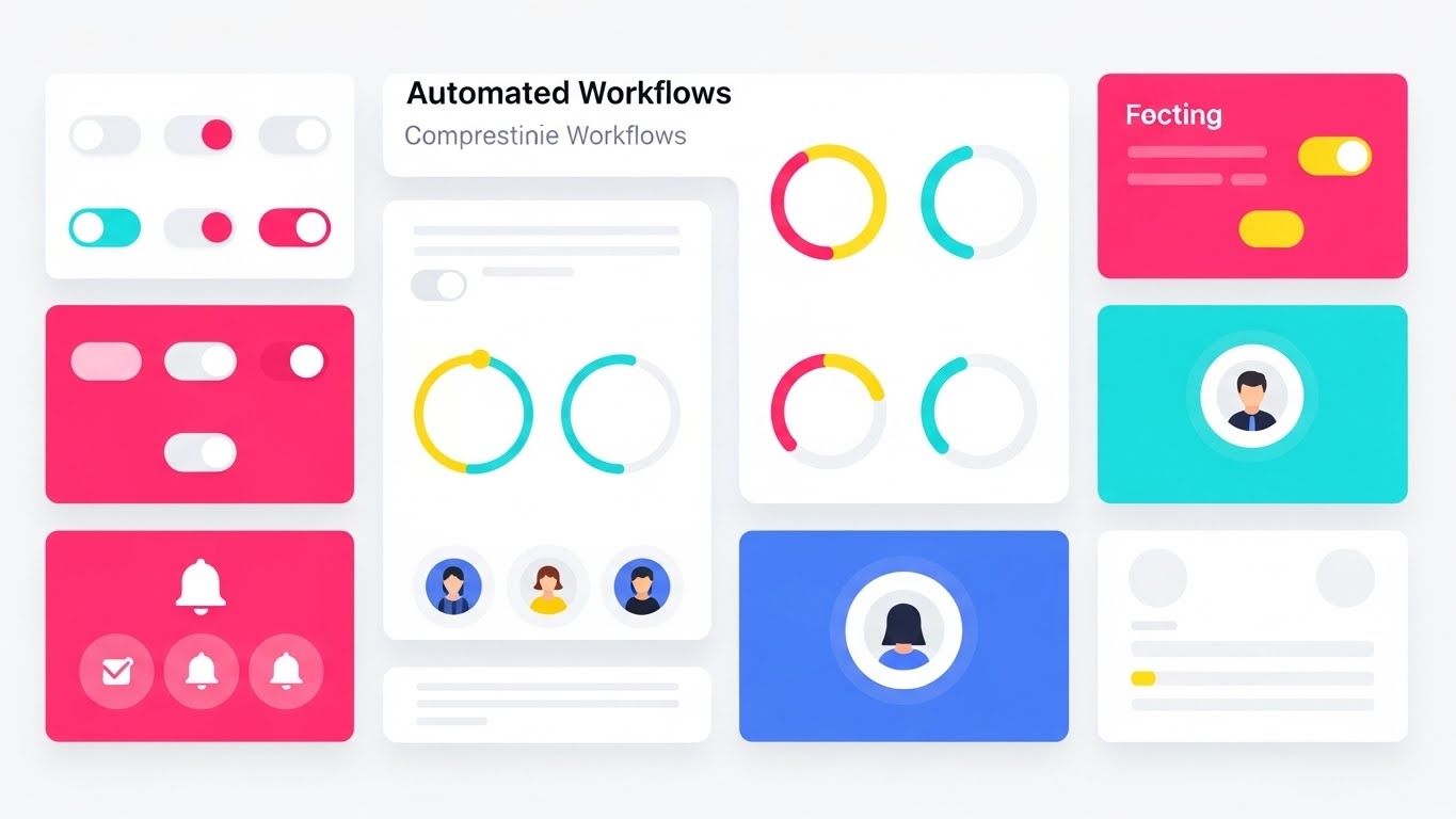
The Visual & Narrative Approach
Visualization Scenario: When a buyer asks, "Does it do X, Y, and Z?", this style is the answer. It uses a grid composition to show 9 distinct UI elements simultaneously: toggle switches, circular progress bars, notification bells, and profile avatars. The style is flat, modern, and moves with a rapid rhythm.
Narration Style: Fast-paced and rhythmic. "Automate. Track. Report. Resolve."
Psychological Impact & KPI Focus
Niche Psychology: This style overcomes the objection of "Is this a point solution or a platform?" It visually demonstrates Comprehensiveness. The "bento box" grid layout suggests a modular, organized architecture.
Operational Impact: It conveys Velocity and Automation, implying that the software is constantly working in the background to manage workflows.
Strategic Implementation & Trade-offs
Use Case: Video Ad Outros and Sales Deck Closers (5-10 seconds).
Strategic Trade-off: Can be overwhelming if too fast. It creates a "feeling" of features rather than explaining any single one in depth. Use it to impress, not to teach.
Companies using similar video content -
HSI – HSI EHS Management Software – Comprehensive EHS solution with numerous modules.
KPA – KPA Flex – Safety management, workforce compliance, training modules.
11. The Complexity Unraveler
MOFU | Competitive Displacement

The Visual & Narrative Approach
Visualization Scenario: This style acts as a powerful visual metaphor for the migration process. Using a stark, elegant 2D continuous line animation on a white background, the screen is split. On the left, a frantic, tangled knot of black lines represents the current state of disjointed spreadsheets and manual entry. As the line flows to the right, it self-corrects, unraveling into a precise, unwavering straight vector. It visually proves the promise of "Untangling Complexity."
Narration Style: Minimalist, therapeutic, and definitive. "Stop managing the knot. Start following the path."
Psychological Impact & KPI Focus
Niche Psychology: EHS managers often stick with inefficient legacy systems because they fear the migration will be messy. This visual offers immediate Cognitive Relief. It acknowledges their pain (the knot) and visually guarantees a frictionless transition to order.
Operational Impact: It targets Competitive Displacement. By stripping away UI details and focusing on the feeling of simplicity, it positions the competitor's point-solution as "clutter" and your platform as the "clarity."
Strategic Implementation & Trade-offs
Use Case: Email Nurture Sequences and "Switching" Landing Pages (6-10 seconds).
Strategic Trade-off: This is purely symbolic. It sells the outcome, not the mechanics. It must be followed by a hard-proof asset (like Style 12) to validate the claim of simplicity.
Companies using similar video content -
Workiva – Unifies financial, ESG, auditing, and risk management.
ETQ – ETQ Reliance – Quality management, EHS, simplifying compliance.
12. The Deep Analytics Suite
MOFU | Visitor Re-engagement
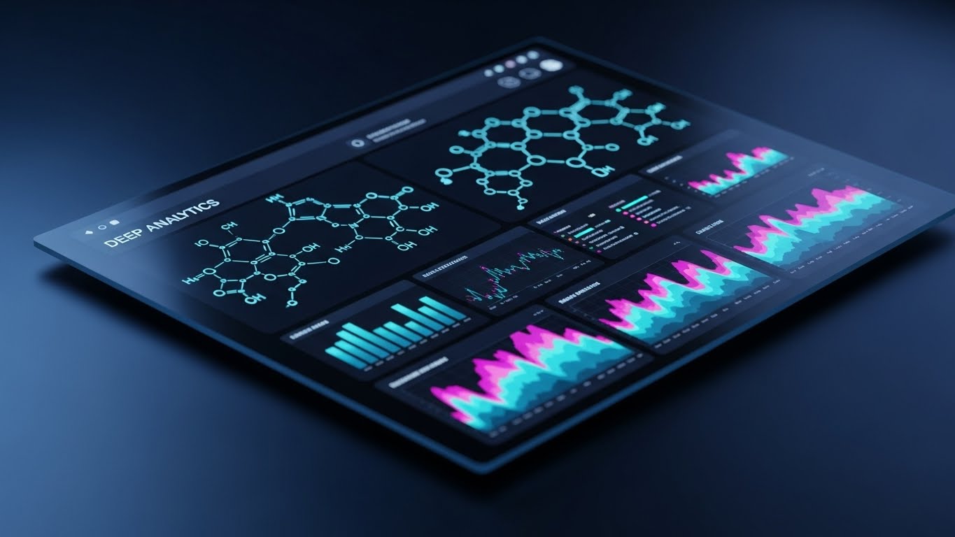
The Visual & Narrative Approach
Visualization Scenario: To re-engage the technical buyer who demands power, we switch to a "Dark Mode" aesthetic. The visual features an angled perspective of a dashboard glowing against a Deep Midnight Blue background. Neon Cyan and Magenta accents highlight complex molecular structures and spectral heatmaps. The reflective glass surface adds a premium, lab-grade feel. It signals that this is not just a reporting tool; it is a scientific instrument.
Narration Style: Sophisticated and analytical. "Data as deep as your science."
Psychological Impact & KPI Focus
Niche Psychology: For the Environmental Engineer or Industrial Hygienist, "simple" can sometimes look "weak." This style leverages Technical Authority. The dark mode aesthetic implies a tool designed for heavy, extended use and complex data processing.
Operational Impact: It drives Visitor Re-engagement (Retargeting) by offering a visually distinct "power user" experience. It confirms the platform's ability to handle granular chemical inventory data and Tier II reporting.
Strategic Implementation & Trade-offs
Use Case: Retargeting Display Ads and Technical Deep-Dive Webinars (10-15 seconds).
Strategic Trade-off: Dark mode can feel intimidating to non-technical stakeholders (like Finance). Use this style specifically when targeting user personas who value data density over simplicity.
Companies using similar video content -
Urbint – AI-first risk management, deep predictive analytics.
Persefoni – AI-powered climate management, carbon accounting.
13. The Augmented Safety View
MOFU | The Functional Buyer

The Visual & Narrative Approach
Visualization Scenario: This style bridges the gap between the boardroom and the boiler room. It uses gritty, handheld live-action footage of a worker in a chemical processing plant. Overlaid on this reality are crisp, floating 2D icons: a Safety Orange triangle pulsating "HAZARD" near a pressure valve, and a Green checkmark indicating a "SAFE" zone. It visualizes "Augmented Awareness"—showing how the software acts as a guardian angel for the frontline worker.
Narration Style: Protective and urgent. "The eyes you need, exactly where you need them."
Psychological Impact & KPI Focus
Niche Psychology: Safety Directors worry constantly about the "Human Factor"—distracted workers missing risks. This style reassures them that the software actively aids Risk Perception at the point of work, reducing the cognitive burden on the employee.
Operational Impact: It appeals to the Functional Buyer (Plant Manager) by demonstrating Field Adoption. It proves the tool isn't just for the office; it integrates into daily rounds to prevent incidents.
Strategic Implementation & Trade-offs
Use Case: LinkedIn Video Ads and Safety Culture Presentations (15-20 seconds).
Strategic Trade-off: Authenticity is critical. The live-action footage must match the prospect's specific vertical (e.g., Oil & Gas vs. Manufacturing). Generic footage will break the trust.
Companies using similar video content -
Evotix – Evotix EHS Software – AI analyzes activity streams for proactive safety.
Field iD – EHS compliance, asset tracking, safety dashboards.
14. The Retrofit Reality
MOFU | ABM Awareness

The Visual & Narrative Approach
Visualization Scenario: A common objection is, "Our facility is too old to be smart." This style visually refutes that. It features a hyper-realistic close-up of a rusted, weathered metal pipe—representing legacy infrastructure. Clamped onto it is a pristine, Metallic Silver IoT sensor with a glowing Green LED status light. The contrast between the old rust and the new chrome symbolizes the "Retrofit" capability.
Narration Style: Transformative and practical. "Old assets. New intelligence."
Psychological Impact & KPI Focus
Niche Psychology: This addresses the Sunk Cost Fallacy and the fear of expensive hardware overhauls. It provides visual proof that Digital Transformation can happen via retrofit, alleviating the anxiety of a "rip-and-replace" project.
Operational Impact: Ideal for Account-Based Marketing (ABM) targeting heavy industries. It visualizes Connected Infrastructure and continuous monitoring without needing to show a generic cloud graphic.
Strategic Implementation & Trade-offs
Use Case: Display Ads and Hardware Integration Pages (Static or 6-second loop).
Strategic Trade-off: The 3D render must be indistinguishable from a photograph. If the textures look "CG," the promise of real-world applicability fails.
Companies using similar video content -
Locus Technologies – Locus Platform – EHS software with SCADA integration.
Honeywell – Connected Plant – Industrial IoT solutions for existing infrastructure.
15. The ROI Monument
BOFU | ROI Justification

The Visual & Narrative Approach
Visualization Scenario: As we move to the Bottom of the Funnel, the conversation shifts to finance. This style uses abstract 3D motion graphics to visualize "Growth." Translucent glass blocks in Emerald Green and Gold rapidly assemble, growing upwards into a monumental bar chart. Floating "plus" symbols and upward-trending arrows reinforce the momentum. It translates "avoided fines" and "efficiency gains" into a tangible, high-value structure.
Narration Style: Triumphant and quantitative. "Compliance isn't a cost center. It's a growth engine."
Psychological Impact & KPI Focus
Niche Psychology: The CFO often views EHS as an expense. This style reframes it as an investment. The Gold and Green palette triggers subconscious associations with Profitability and Wealth, arming the internal champion with the visual language needed to secure budget.
Operational Impact: Specifically designed for ROI Justification in pitch decks. It helps visualize the "Return on Resilience," making the intangible benefits of compliance look solid and measurable.
Strategic Implementation & Trade-offs
Use Case: Pitch Decks and Investor Reports (10-15 seconds).
Strategic Trade-off: It is abstract. To be effective, the accompanying text or voiceover must cite specific financial metrics (e.g., "300% ROI"). Without data, it is just decorative.
Companies using similar video content -
Benchmark Gensuite – EHS, sustainability, ESG reporting, ROI focus.
Prophix – Prophix One – ESG reporting, financial performance integration.
16. The Risk X-Ray
BOFU | Risk Mitigation
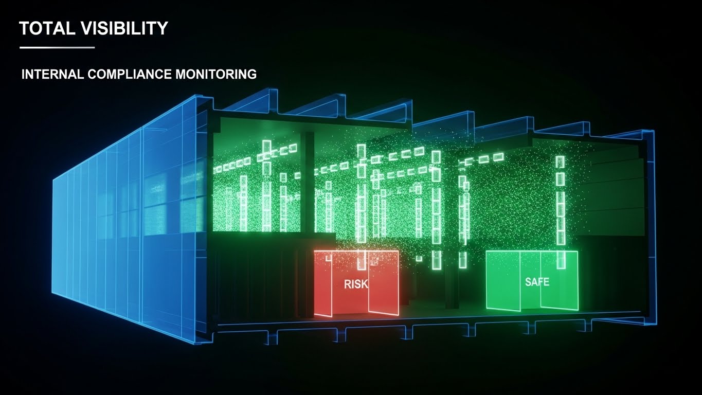
The Visual & Narrative Approach
Visualization Scenario: The greatest risk to an enterprise is what they can't see. This style offers "Super-Vision." A factory building is rendered in Translucent Blue "X-Ray" materials, revealing the internal skeleton. Inside, particle streams visualize airflow, while specific zones glow Soft Red (Risk) or Green (Safe). It visualizes the ability to see through walls and identify non-compliance before it becomes a violation.
Narration Style: Forensic and revealing. "Total visibility. Zero blind spots."
Psychological Impact & KPI Focus
Niche Psychology: This taps into the Fear of Unknown Risk. By showing the "insides" of the building, it visually guarantees Transparency. It assures the buyer that the software provides a layer of oversight that manual inspections simply cannot achieve.
Operational Impact: It effectively demonstrates Internal Compliance Monitoring and is highly effective for Whitepapers discussing risk management strategies.
Strategic Implementation & Trade-offs
Use Case: Whitepapers and Final-Stage Demos (20-30 seconds).
Strategic Trade-off: This requires a custom 3D model that resembles an industrial facility. A generic office building model will not resonate with a manufacturing audience.
Companies using similar video content -
Verisk 3E – 3E Protect – Chemical regulations, SDS management, risk visibility.
Simple But Needed (SBN) – Global EHS platform, comprehensive risk management.
17. The Collaboration Ecosystem
BOFU | Sales Cycle Acceleration
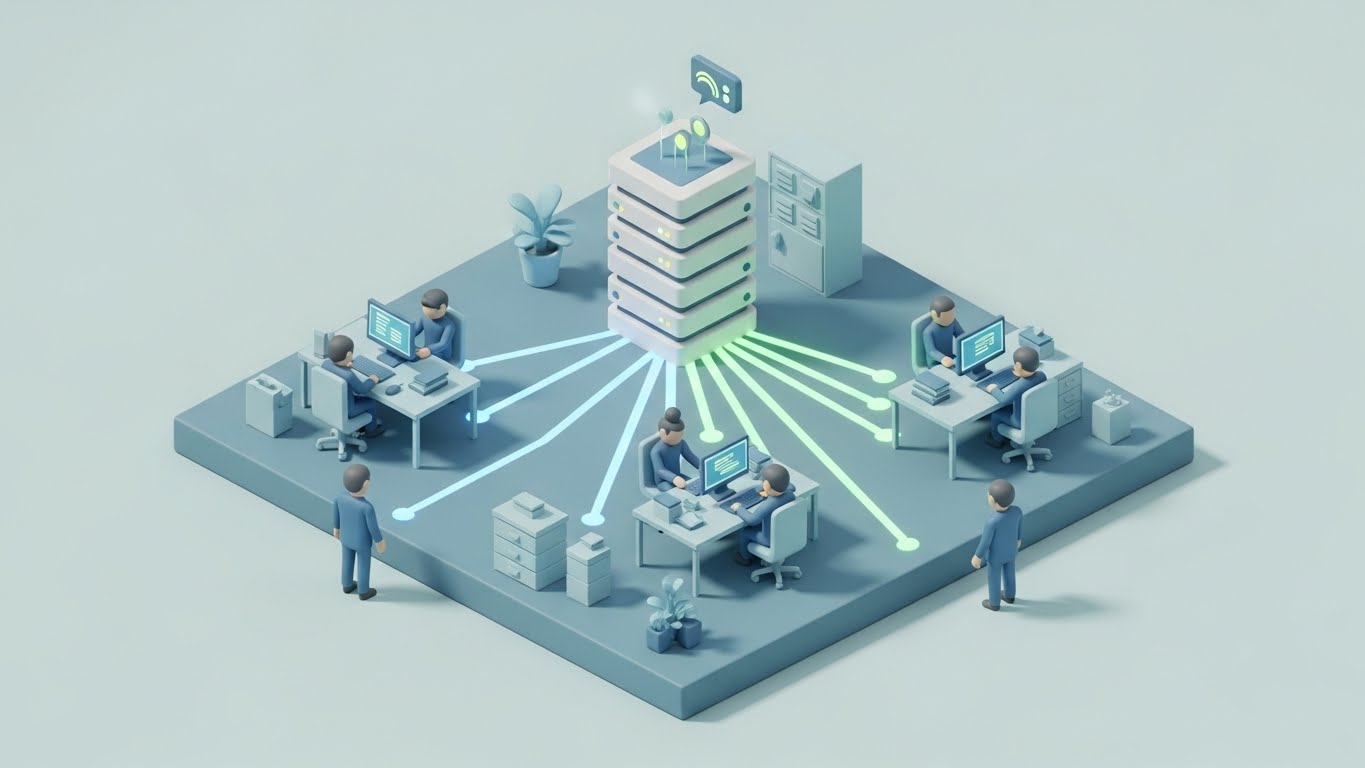
The Visual & Narrative Approach
Visualization Scenario: As the deal closes, the concern shifts to "adoption." This style uses a "Claymorphism" aesthetic—soft, tactile, and friendly—to visualize a miniature open-plan office. Tiny, stylized figures work at computers, connected by glowing lines to a central server block. It transforms the intimidating concept of "Enterprise Integration" into a charming, manageable ecosystem of collaboration.
Narration Style: Cooperative and fluid. "One platform. One truth. Everyone aligned."
Psychological Impact & KPI Focus
Niche Psychology: Enterprise software is often feared for being "clunky" and difficult to learn. This soft, toy-like aesthetic reduces Adoption Anxiety. It signals that the platform is user-friendly and designed for humans, fostering a sense of organizational harmony.
Operational Impact: It aids Sales Cycle Acceleration by getting buy-in from non-technical stakeholders (HR, Admin) who influence the final decision. It visualizes Centralized Data without the coldness of a server room.
Strategic Implementation & Trade-offs
Use Case: Website Feature Sections and Onboarding Videos (15-20 seconds).
Strategic Trade-off: The "cute" factor of claymorphism is excellent for "Ease of Use" messaging but should not be used to depict critical safety warnings or hazardous events.
Companies using similar video content -
Workhub – EHS software, employee training, SOP, policies, collaboration.
SiteDocs – Workplace safety, recordkeeping, team collaboration.
18. The Executive Vision
BOFU | The Economic Buyer

The Visual & Narrative Approach
Visualization Scenario: This style speaks directly to the C-Suite. It uses high-end corporate photography, featuring a confident executive (silver hair, navy suit) standing in a glass-walled corner office. The lighting is Warm Sunset Gold. He looks out at a clean, modern city skyline, reflecting on a job well done. A subtle reflection in the glass displays "Visionary Analytics."
Narration Style: Leadership-focused. "Lead with confidence. Report with pride."
Psychological Impact & KPI Focus
Niche Psychology: The Economic Buyer buys Outcomes, not features. They want to be seen as visionary leaders who steered the company toward sustainability. This visual validates that self-image, associating the software purchase with Strategic Resilience.
Operational Impact: It anchors the Annual Report or high-level pitch. It steps away from the tool's mechanics and focuses entirely on the executive benefit: Confidence and Control.
Strategic Implementation & Trade-offs
Use Case: Annual Reports and Executive Summaries (Static or Slow Pan).
Strategic Trade-off: It can feel generic. The voiceover must tie the "vision" specifically to EHS outcomes to avoid looking like a generic banking advertisement.
Companies using similar video content -
SAP – SAP EHS Management – Integrated EHS within ERP, C-suite focus.
Diligent – ESG reporting, GRC, board-level insights.
19. The Data Fortress
BOFU | Objection Handling

The Visual & Narrative Approach
Visualization Scenario: One of the final objections in any enterprise deal is "Is our data safe?" This style visualizes the answer. It features floating, Glassy Transparent UI screens suspended in a pristine digital void. The screens are layered (parallax), and prominent "Shield" and "Lock" icons are etched into the frosted blue frames. The aesthetic is clean, crystalline, and impenetrable.
Narration Style: Assured and solid. "Your data. Secured. Encrypted. Yours."
Psychological Impact & KPI Focus
Niche Psychology: IT Directors are the gatekeepers at the end of the funnel. This style addresses Security Anxiety. The "Glass and Steel" aesthetic subconsciously conveys Transparency regarding protocols, yet Hardness regarding defense.
Operational Impact: It is a dedicated tool for Objection Handling, specifically for SOC2 and ISO 27001 compliance discussions. It visualizes Data Integrity as a core architecture, not an afterthought.
Strategic Implementation & Trade-offs
Use Case: Security Page Headers and IT Procurement Emails (8-12 seconds).
Strategic Trade-off: It is functional, not emotional. Use it strictly to remove a barrier to sale during the security review process.
Companies using similar video content -
AuditBoard – ESG and sustainability management, data security.
Novisto – Novisto ESG – ESG data management, automated workflows.
20. The Personal Concierge
BOFU | Driving Demo Requests

The Visual & Narrative Approach
Visualization Scenario: Finally, the technology must step back to let the human connection shine. This style features a hyper-realistic, AI-generated professional presenter. She stands in a modern, blurred office environment, making direct eye contact with a welcoming smile. She gestures to the empty space beside her (reserved for dynamic text overlays), bridging the gap between digital content and personal interaction.
Narration Style: Conversational and inviting. "Ready to see how it fits your facility? Let's walk through it together."
Psychological Impact & KPI Focus
Niche Psychology: Ultimately, people buy from people. This style builds Trust and lowers the barrier to entry for a sales call. It signals that there are real experts (Customer Success) behind the software who will guide the implementation.
Operational Impact: It is laser-focused on Driving Demo Requests. By humanizing the "Call to Action," it increases conversion rates on landing pages where users might otherwise hesitate to fill out a static form.
Strategic Implementation & Trade-offs
Use Case: Landing Page Footers and Retargeting Video Ads (15-30 seconds).
Strategic Trade-off: The "Uncanny Valley" is the risk. The AI generation must be of the highest tier (perfect lip-sync and micro-expressions) to maintain professionalism. If it looks robotic, it damages the trust built by the previous styles.
Companies using similar video content -
Xenia – Workforce Operations Platform, EHS compliance, personalized support.
CloudApper – EHS management, incident management, user-friendly.
21. The "Aha!" Moment
Onboarding | Accel. Time-to-Value

The Visual & Narrative Approach
Visualization Scenario: Onboarding is the most fragile stage of the customer lifecycle. This style uses a vibrant "Cel-Shaded" 2D animation technique to create an immediate sense of accomplishment. A stylized EHS manager character (flat vector) is shown high-fiving a floating UI window that displays a large, satisfying "Permit Approved" checkmark. Geometric confetti in Turquoise and Yellow explodes gently around the interaction. It visualizes the psychological relief of "Getting it done."
Narration Style: Enthusiastic and validating. "First permit filed. Zero friction. You’re on your way."
Psychological Impact & KPI Focus
Niche Psychology: EHS professionals often dread the "setup phase," anticipating months of configuration hell. This style uses Gamification Psychology—rewarding small wins—to release dopamine and create a positive association with the software.
Operational Impact: It targets Time-to-Value (TTV). By visually flagging the "First Success," it reinforces the feeling of progress, crucial for ensuring the implementation team stays motivated during the initial data entry phase.
Strategic Implementation & Trade-offs
Use Case: Welcome Emails and "First Task Completion" In-App Modals (5-8 seconds).
Strategic Trade-off: This is purely emotional. It does not teach how to do the task, only celebrates that it was done. It must be paired with instructional content.
Companies using similar video content -
Donesafe – HSI Donesafe – Cloud-based safety platform, quick wins.
EASE – Layered process audits, safety inspections, immediate feedback.
22. The Process Gamifier
Onboarding | Reducing Friction
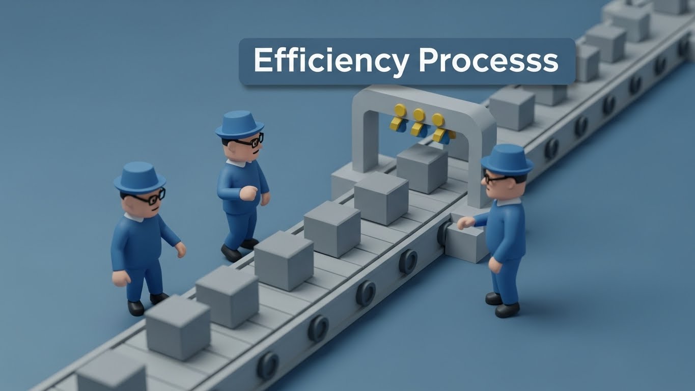
The Visual & Narrative Approach
Visualization Scenario: To combat the fear of complexity, we use a Low-Poly 3D "Gaming" aesthetic. The scene depicts a simplified, toy-like factory assembly line in Industrial Blue and Grey. Generic cubic boxes (representing waste manifests or data packets) glide smoothly along a conveyor belt without bottlenecks. The camera tracks alongside, emphasizing the smooth, linear flow. It visualizes "Efficiency" in its purest, most stripped-down form.
Narration Style: Simple and rhythmic. "Flow, not friction. Compliance on autopilot."
Psychological Impact & KPI Focus
Niche Psychology: Complexity is the enemy of adoption. This playful, low-fidelity style lowers the Intimidation Barrier. It suggests that the software renders complex regulatory workflows as simple and manageable as a toy conveyor belt.
Operational Impact: It supports Reducing Friction during the setup phase. It is excellent for "Process Overview" guides where you need to explain the logic of a workflow without getting bogged down in UI screenshots.
Strategic Implementation & Trade-offs
Use Case: "Getting Started" Guides and Implementation Kick-off Decks (15-20 seconds).
Strategic Trade-off: The low-poly look can appear "cheap" if not lit correctly. It effectively communicates flow, but fails to communicate precision. Do not use this for technical compliance reporting demos.
Companies using similar video content -
Quentic – EHS, Quality, ESG management, streamlined processes.
BasicSafe – Cloud solution for EHS, training, simplified workflows.
23. The Digital Growth Journey
Onboarding | Self-Serve Onboarding

The Visual & Narrative Approach
Visualization Scenario: This style frames software adoption as a journey of cultivation. Using a friendly Flat 2D Vector style, a diverse character kneels to plant a "digital sapling"—a tree whose branches are made of glowing circuit lines. As they nurture it, the tree grows, symbolizing the accumulation of data and compliance history. The palette matches the brand's sustainability focus: Bright Orange and Leaf Green.
Narration Style: Warm and nurturing. "Plant your data today. Watch your compliance culture grow."
Psychological Impact & KPI Focus
Niche Psychology: Users need to feel ownership over the system. This visual metaphor of Cultivation shifts the mindset from "data entry" (boring) to "growing an asset" (rewarding). It appeals to the environmental steward's natural values.
Operational Impact: It promotes Self-Serve Onboarding. By depicting the user as the active gardener, it subtly encourages autonomy, reducing reliance on your support team for basic setup tasks.
Strategic Implementation & Trade-offs
Use Case: In-App Empty States (e.g., "Add your first site") and Onboarding Progress Bars (10-15 seconds).
Strategic Trade-off: It is metaphorical. It works best for "soft" encouragement. For "hard" training (e.g., "How to export a CSV"), you need a screencast, not a cartoon tree.
Companies using similar video content -
SustainIQ – Sustainability and ESG data, growth tracking.
KeyESG – ESG management software, performance improvement.
24. The Micro-Search Focus
Retention | Knowledge Base & FAQ Videos

The Visual & Narrative Approach
Visualization Scenario: When a user is stuck, they need clarity, not fluff. This style uses a Macro Photography approach, focusing tightly on a single UI element—a "Search" button or a "Filter" toggle. The background is blurred (bokeh), forcing the eye to focus entirely on the interaction. The Vivid Green button pops against the Dark Grey background, highlighting the precise action required to solve a problem.
Narration Style: Instructional and concise. "Find it. Fix it. Fast."
Psychological Impact & KPI Focus
Niche Psychology: Frustrated users have zero patience. This style respects their time by stripping away all peripheral noise. It signals Precision and Speed, reassuring the user that the answer is one click away.
Operational Impact: It drives Knowledge Base/FAQ effectiveness. High-clarity micro-videos like this significantly improve Information Retention compared to text articles, reducing repeat support tickets.
Strategic Implementation & Trade-offs
Use Case: Help Center Headers and Tooltip Videos (3-6 seconds).
Strategic Trade-off: Extremely narrow focus. It lacks context. You cannot see where on the screen this button sits, so it must be embedded directly next to the relevant feature in the UI.
Companies using similar video content -
Vector Solutions – Vector EHS Management – Compliance, safety, performance, quick access.
CORE EHS – Digital EHS solutions, real-time analytics, quick info.
25. The Fluid Operations State
Retention | Reducing Churn

The Visual & Narrative Approach
Visualization Scenario: To remind long-term customers why they stay, we visualize the feeling of a compliant enterprise. This style uses Abstract Fluid Simulation. Smooth, organic waves of Seafoam Green and Ocean Blue undulate gently from left to right. There are no jagged edges, no stops, and no chaos. It represents the "Steady State" of a risk-free, compliant operation running in the background.
Narration Style: Calming and hypnotic. "The peace of mind that comes with total visibility."
Psychological Impact & KPI Focus
Niche Psychology: EHS is often high-stress. This style offers Visual Therapy. It subliminally reinforces the value proposition of "Tranquility" and "Continuity," associating the software with a lack of drama.
Operational Impact: Targeted at Churn Reduction in newsletters. It doesn't ask the user to do anything; it simply reminds them that the system is working, creating a positive emotional anchor during renewal discussions.
Strategic Implementation & Trade-offs
Use Case: Customer Newsletters and Screensavers/Waiting Room Loops (Loopable).
Strategic Trade-off: It is non-informational. It conveys a vibe, not data. Never use this when you need to communicate a critical update or an urgent alert.
Companies using similar video content -
EcoOnline – EcoOnline EHS – EHS, chemical management, ESG/sustainability, continuous compliance.
SustainIQ – Sustainability and ESG data, real-time reporting.
26. The Holographic Support Bot
Retention | Reducing Support Overhead
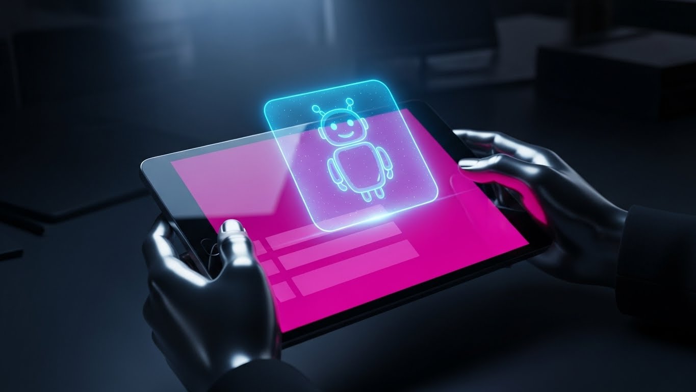
The Visual & Narrative Approach
Visualization Scenario: To encourage users to use AI support tools, we visualize them as advanced, helpful assistants. A POV shot shows a user holding a tablet. A 3D Holographic "Helper Bot" icon projects upward from the screen in glowing Hologram Blue. The background is a blurred, realistic office. It blends the physical device with a futuristic "Genie in a Bottle" metaphor for digital assistance.
Narration Style: Futuristic and helpful. "Expertise, instantly summoned."
Psychological Impact & KPI Focus
Niche Psychology: Users often ignore "Help" buttons, assuming they are useless. This "Holographic" treatment elevates the perceived value of the automated support, framing it as Next-Gen Intelligence rather than a static FAQ.
Operational Impact: It aims to reduce Support Overhead. By making the AI assistant look capable and advanced, it increases user engagement with self-service tools, deflecting tickets from human agents.
Strategic Implementation & Trade-offs
Use Case: Feature Release Videos and "Help" Tab Intros (10-15 seconds).
Strategic Trade-off: The hologram must look "anchored" to the tablet. If it floats incorrectly, it looks like a cheap filter and loses credibility.
Companies using similar video content -
Aligned Incentives – GenAI-powered sustainability planning.
FlyPix AI – Geospatial analysis, AI for environmental monitoring.
27. The Supply Chain Pulse
Retention | Proactive Support/Announcements

The Visual & Narrative Approach
Visualization Scenario: When announcing major updates (like Scope 3 tracking), we need to show scale. This style uses Hyper-lapse footage of a busy logistics port at night—representing the global supply chain. Fast-moving streaks of light from cranes and trucks create energy. Rigid, tracking Data White text lines and bounding boxes lock onto containers, displaying "Emissions Data" and "Origin IDs." It visualizes "Real-Time Tracking" on a planetary scale.
Narration Style: High-energy and rhythmic. "Tracking every link in your chain. In real-time."
Psychological Impact & KPI Focus
Niche Psychology: Enterprise clients want to feel they are running a world-class operation. This visual validates their Global Ambition. It connects their specific compliance task to the pulse of global commerce.
Operational Impact: Perfect for Proactive Announcements (Product Updates). It signals that the platform is evolving to handle "Big Data" and complex supply chain logistics.
Strategic Implementation & Trade-offs
Use Case: "What's New" Update Videos and Conference Keynote Openers (20-30 seconds).
Strategic Trade-off: Requires high-quality stock footage. The motion tracking must be perfect—if the text "slips" off the object, the illusion of precision is broken.
Companies using similar video content -
Salesforce – Net Zero Cloud – Emissions tracking across all scopes.
Watershed – ESG data platform, carbon accounting, supply chain focus.
28. The Neural Analytics Web
Expansion | Driving Deep Feature Adoption

The Visual & Narrative Approach
Visualization Scenario: To sell advanced AI add-ons, we visualize the "brain" of the software. A complex network of glowing nodes and fiber-optic lines floats in a void. The palette is High-Key Silver, White, and Cyan. The camera pushes slowly into the center of the web, revealing that the nodes are connected in a neural network structure. It represents "Deep Learning" and the discovery of hidden patterns in EHS data.
Narration Style: Scientific and profound. "See the patterns others miss."
Psychological Impact & KPI Focus
Niche Psychology: Advanced users want to feel they are on the cutting edge. This style appeals to Intellectual Curiosity. It suggests that the software is not just a database, but a "thinking partner."
Operational Impact: It drives Deep Feature Adoption. It entices users to explore premium modules like predictive risk scoring by visualizing the complexity and power of the underlying AI.
Strategic Implementation & Trade-offs
Use Case: Webinars on AI capabilities and Premium Module Landing Pages (15-20 seconds).
Strategic Trade-off: It is abstract. It explains how it works (neural net) but not what it does (prevent spills). Always pair this with a concrete case study.
Companies using similar video content -
Urbint – AI-first risk management, predictive analytics.
Evotix – Evotix EHS Software – AI analyzes activity streams, highlights patterns.
29. The Future-Proof Scale
Expansion | Driving Upsell/Cross-sell
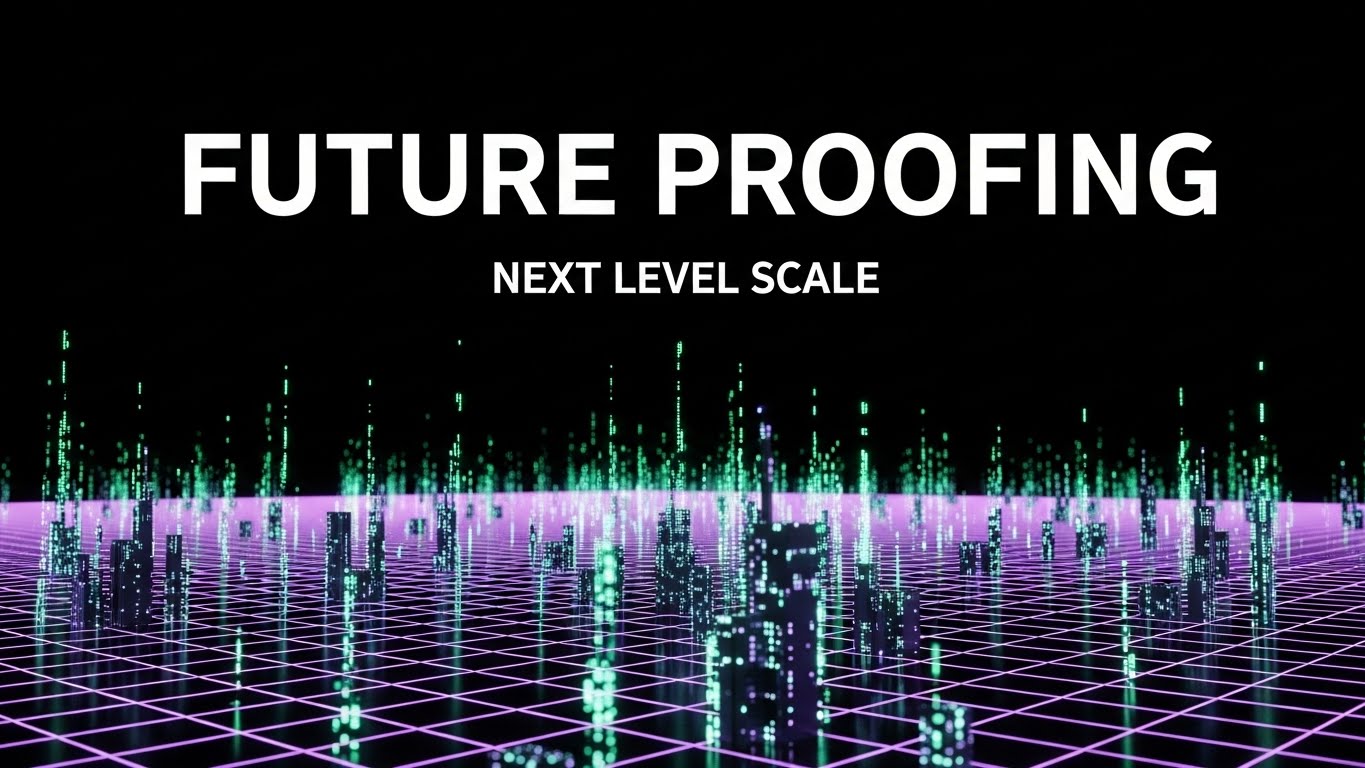
The Visual & Narrative Approach
Visualization Scenario: To pitch the "Enterprise Tier," we visualize the future state of the client's business. We use a "Cyberpunk" aesthetic: a dark void illuminated by a glowing Neon Purple and Cyber Green grid. The grid forms the topography of a limitless digital city, with buildings represented by rising columns of data. The camera flies over this metropolis, visualizing "Unlimited Scale."
Narration Style: Aggressive and forward-looking. "Built for the scale of tomorrow."
Psychological Impact & KPI Focus
Niche Psychology: CIOs fear buying software that they will outgrow. This style sells Future-Proofing. The "infinite grid" visualizes that the platform can handle any amount of data, sites, or users the client adds.
Operational Impact: It drives Upsell/Cross-sell conversations. It positions the platform as the robust foundation for the client's next decade of growth, justifying a larger contract value.
Strategic Implementation & Trade-offs
Use Case: Product Launch Trailers and Executive Business Reviews (EBRs) (20-30 seconds).
Strategic Trade-off: Can look "too sci-fi" for conservative industries like mining. Ensure the voiceover grounds the visual in practical business benefits like "Scalability" and "Security."
Companies using similar video content -
VelocityEHS – Accelerate Platform – Scalable EHS & ESG platform.
Sphera – SpheraCloud – Enterprise Sustainability Management, robust solutions.
30. The Advocacy Bridge
Expansion | Driving Referrals & Advocacy

The Visual & Narrative Approach
Visualization Scenario: The ultimate goal is to turn customers into advocates. This style uses a Split Screen. The left side features a high-quality photo of a happy client (EHS Manager) in a bright, outdoor field environment (Reality). The right side features a crisp UI screen in UI Blue showing a "5-Star Rating" graphic and a "Share" or "Refer" button. The two sides are balanced, visually linking the human emotion (happiness) with the digital action (advocacy).
Narration Style: Authentic and grateful. "Success worth sharing."
Psychological Impact & KPI Focus
Niche Psychology: People trust peers, not brands. This style leverages Social Proof. By juxtaposing the human face with the system's output, it validates the software's impact on real careers.
Operational Impact: Targeted at Driving Referrals. It visually prompts the user to share their positive experience, linking their real-world success to the act of digital advocacy.
Strategic Implementation & Trade-offs
Use Case: "Refer a Colleague" campaigns and Case Study headers (Static or micro-motion).
Strategic Trade-off: Requires authentic photography. Stock photos of "smiling business people" will kill the credibility. Use real client photos whenever possible.
Strategic Knowledge Base: The Visual Operations Doctrine
To transform these 30 visual styles from "creative assets" into "business drivers," we must deploy them within a structured strategic framework. The following three segments outline how EHS leaders can operationalize these visuals to drive Alignment, Adoption, and ROI.
Strategic Alignment & Visual Architecture
The "Pre-Production" Strategy – Defining the Visual Language of Risk.
- The Cognitive Load Audit: Before creating any asset, audit your current training materials. If a safety protocol takes 5 minutes to read in a PDF, it is a liability. Replace it with Style 2 (The Operational Simplifier). Measure the reduction in "Time-to-Comprehension."
- Role-Based Visual Mapping: Do not use the same visuals for the C-Suite as you do for the Field Engineer.
- For the Field: Use Style 13 (The Augmented Safety View)—high contrast, mobile-optimized, safety-critical.
- For the Boardroom: Use Style 15 (The ROI Monument)—polished, abstract, financial.
- The "Glanceability" Standard: In hazardous environments, attention is scarce. Visuals must pass the "2-Second Test." If a field worker cannot understand the hazard warning in Style 23 within 2 seconds, the design has failed.
- Brand Voice Consistency: Your software likely consists of multiple modules (Air, Water, Waste, Safety). Use Style 1 (The Eco-Tech Identity) to create a unified visual thread that ties these disparate tools together, reducing the feeling of a fragmented "Franken-stack."
- The Advids Strategic Audit: Visual chaos creates operational risk. Partner with Advids early in the process to define a "Visual Style Guide" that standardizes how risk, safety, and compliance are depicted across your entire enterprise, ensuring that a "Red Triangle" means the same thing in every country.
- Standardization vs. Customization: For universal concepts (like "Safety Gear"), use high-quality stock-based styles (Style 8) to save budget. For proprietary differentiators (like your specific algorithm), invest in bespoke 3D (Style 28).
- The Cross-Departmental Bridge: Use visual assets to unify terminology. If Sales calls it "Risk Scoring" but Ops calls it "Hazard Assessment," use Style 3 (The Audit Trail Map) to visually label the process, creating a single source of truth for the entire enterprise.
- Legacy System Integration: Use Style 14 (The Retrofit Reality) to visually bridge the gap between new SaaS tools and old hardware. Show the connection explicitly to reduce the anxiety of "ripping and replacing" infrastructure.
- Accessibility in Visualization: Your workforce is diverse. Relying on text excludes non-native speakers. Use Style 3 (The Audit Trail Map) and Style 25 (The Fluid Operations State) which rely on universal symbols and motion, rather than text, to communicate process flows.
- The Mobile-First Mandate: 80% of EHS data is captured in the field. Ensure that Styles 1-10 are legible on a 6-inch screen. If Style 7 (The Clarity Dashboard) is too cluttered for mobile, it is useless to the field engineer.
Operational Adoption & Implementation
The "Deployment" Phase – Embedding Visuals into the Workflow.
- Overcoming "Big Brother" Anxiety: Field workers often fear that EHS software is just a surveillance tool. Use Style 8 (The Augmented Engineer) to reframe the narrative. Show the software as a "Guardian Angel" that protects them, rather than a "Spy" that reports to management.
- The Micro-Learning Shift: Stop doing 2-day training seminars. Break your training into a library of 30-second clips using Style 7 (The Clarity Dashboard) and Style 22 (The Process Gamifier). Deliver these clips "Just-in-Time" to the user's tablet when they open a specific feature.
- Just-in-Time Support: Embed Style 24 (The Micro-Search Focus) directly into your error messages. When a user fails to submit a report, show them a 5-second loop of exactly where to click, rather than a generic error code.
- Gamification of Compliance: Use Style 21 (The Success Moment) to visually celebrate small victories, like a "Zero Incident Week." These positive visual reinforcements build a culture of compliance that feels rewarding rather than punitive.
- Reducing Support Ticket Volume: There is a direct correlation between the quality of your visual documentation and your support costs. A library of Style 26 (The Holographic Support Bot) videos can deflect up to 40% of Tier 1 support tickets by answering "How-to" questions visually.
- Remote Onboarding: For distributed teams, you cannot fly trainers to every site. Use Style 6 (The Digital Twin Bridge) to perform virtual site walks and training, ensuring consistent onboarding quality across global locations.
- Visualizing SOPs: Text-based SOPs are ignored. Convert your critical "Emergency Response Plans" into Style 3 (The Audit Trail Map) animations. In an emergency, a visual flow is faster to process than a paragraph of text.
- Feedback Loops: Use Style 30 (The Advocacy Bridge) to visually solicit feedback. A happy field worker is your best salesperson for internal adoption. Visually capture their success stories to convince the skeptics.
- Scalable Localization: By relying on "Visual Semantics" (icons, colors, motion) rather than on-screen text (as seen in Style 2), you reduce the cost of translating your training materials for global deployments.
- Leadership Communication: When asking for budget to expand the software, do not send a spreadsheet. Send a Style 18 (The Executive Vision) video to the CFO. Speak their language of vision and outcome.
Measuring Impact & Future-Proofing
The "ROI" Phase – Measuring Success and Looking Ahead.
- Beyond "Views": Do not measure video success by "views." Measure it by Time-to-Competency. Did the group that watched the Style 9 (The Feature Grid) video master the software faster than the group that read the manual?
- The "Idle Time" Metric: Inefficient software navigation costs millions in lost productivity. Use Style 7 visuals to teach shortcuts. Correlate the viewing of these assets with a reduction in "Average Time on Task."
- Compliance Velocity: When a new regulation (e.g., PFAS reporting) drops, how fast can you retrain your workforce? Distributing a Style 5 (The Green Infrastructure Vision) explainer video is 10x faster than rewriting the handbook.
- Retention and Churn: Customers leave when they feel the product is stagnant. Use Style 27 (The Supply Chain Pulse) to visually prove that the platform is evolving, fast, and active. Visualizing development velocity builds trust.
- The AI Visual Frontier: The future is Generative AI. Prepare your data now so you can eventually use Style 28 (The Neural Analytics Web) to provide real-time, predictive risk visualizations to your clients.
- Scalability of Assets: Build a "Visual Component Library." If you change your brand color, you shouldn't have to reshoot 30 videos. Using vector-based styles like Style 1 and Style 2 allows for global updates with a single click.
- The Advids Partnership: You are an EHS expert, not a motion graphics studio. Partner with Advids to build this scalable "Visual Infrastructure." Treat video assets as software code—they need to be maintained, updated, and version-controlled.
- Benchmarking Success: Compare your visual adoption rates against industry standards. If your "How-to" videos have a drop-off rate of 50%, your visual style is too complex. Simplify back to Style 22.
- The ROI of Safety: Use Style 16 (The Risk X-Ray) to visualize "Near Misses." Showing what didn't happen (because of the software) is the most powerful way to prove value to an insurance auditor.
- Final Call to Innovation: Stop treating video as "marketing content." It is Operational Infrastructure. In the era of the "Visual Enterprise," the company that communicates complex data the clearest, wins. Treat your visual strategy with the same rigor as your code base.
Companies using similar video content -
SafetyCulture – iAuditor – Mobile-first inspections, user satisfaction.
Cority – CorityOne – EHSQ, sustainability, occupational health, customer success.
Author & Editor Bio


