
Introduction: Visualizing the Invisible Infrastructure
We are currently witnessing the most significant transformation in the built environment sector in decades. The industry is moving from reactive, "break-fix" models to proactive, intelligence-led strategies. For leaders in facility management, the challenge is no longer just maintaining assets; it is about articulating the complex value of digital twin integration and predictive maintenance algorithms to stakeholders who may never step foot in a mechanical room.
The core opportunity lies in bridging the physical/digital divide. Your software doesn't just manage work orders; it makes the invisible operational pulse of a building visible. This is critical because the efficiency gains are transformative. Recent market analysis suggests that data-driven facility management can reduce maintenance expenses by up to 20%, significantly impacting the bottom line. Furthermore, moving to predictive models has been shown to reduce unplanned downtime by up to 50%, ensuring business continuity and tenant satisfaction.
However, capturing this value requires more than just better code; it requires better communication. This guide is your strategic framework for visualizing that value. We have curated 30 distinct video styles designed to reduce cognitive load, accelerate stakeholder buy-in, and position your platform as the essential bridge to the future of infrastructure.
1. Abstract 3D AI + X-Ray
TOFU | Market Education

The Visual & Narrative Approach
This style utilizes high-end 3D rendering to grant the viewer "superpowers"—specifically, X-ray vision. By rendering the building's exterior as translucent crystalline glass, we reveal the complex, glowing arterial network of HVAC ducts and electrical conduits within. The narration should be awestruck and visionary, emphasizing the "hidden intelligence" that powers modern infrastructure, positioning your software as the brain behind the system.
Psychological Impact & KPI Focus
Psychologically, this addresses the "Visibility Gap." Stakeholders often underestimate facility complexity because they only see drywalls and paint. This visualization immediately validates the scale of hard services management. It directly supports KPIs related to asset lifecycle management by visually representing the totality of the infrastructure that requires monitoring.
Strategic Implementation & Trade-offs
- Best Use Case: High-level brand anthem videos or "Vision 2030" strategic announcements.
- Duration: 15-30 Seconds.
- Trade-off: This is a high-production-value style ("Whisk" model) requiring significant render time. It creates immense authority but is less effective for explaining specific, granular features like work order automation.
Companies using similar video content -
Facilio – Platform – AI and IoT for operational intelligence.
Spacewell – Smart Building Solutions – IoT, data analytics for predictive maintenance.
IBM Maximo – Application Suite – AI, IoT data for asset lifecycle management.
2. Abstract 2D Flat Vector Organic
TOFU | Brand Awareness

The Visual & Narrative Approach
Here, we strip away the physical building entirely to focus on the data stream itself. Using fluid, glossy shapes in vivid lime green and teal, we visualize the "pulse" of a facility—energy flowing, data exchanging, and systems synchronizing. The motion should be rhythmic and frictionless, accompanied by a sound design that hums with efficiency. This is about feeling the flow of optimized operations.
Psychological Impact & KPI Focus
This style reduces cognitive load by simplifying complex IoT connectivity protocols into elegant, moving art. It appeals to the desire for order and seamlessness. For a Director of Facilities drowning in spreadsheet chaos, this visual promise of smooth, interconnected fluidity is deeply reassuring. It signals a move away from friction and towards operational excellence.
Strategic Implementation & Trade-offs
- Best Use Case: Social media disruptors and quick brand recall assets.
- Duration: 6-15 Seconds (Loopable).
- Trade-off: Extremely engaging but lacks technical detail. It captures attention (Goal 1.1) but does not educate on how the software achieves this fluidity. It must be followed by more concrete content.
Companies using similar video content -
Blynk – IoT Platform – Integrates devices, apps, and cloud hosting.
Infogrid – Smart Building Platform – IoT sensors, AI for facility optimization.
Actility – ThingPark – LoRaWAN IoT network for smart buildings.
3. Isometric 2D Motion + Minimalist
TOFU | Shaping Brand Perception
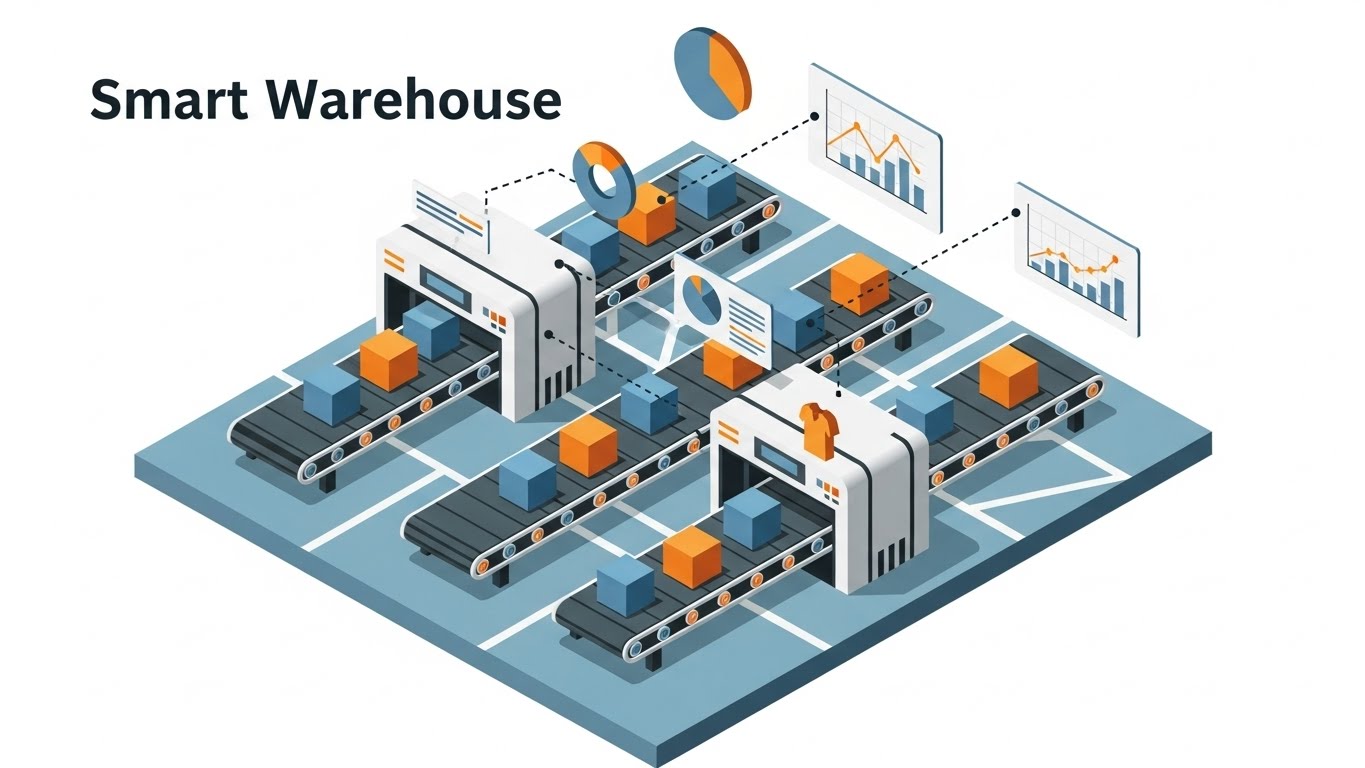
The Visual & Narrative Approach
This style adopts a "Digital Blueprint" aesthetic. By using isometric perspective, we can display an entire smart campus infrastructure or city block in a single frame. The clean geometric lines and dotted data flows imply precision, planning, and control. The tone is calm, professional, and architectural, reinforcing the software's role as a foundational tool for facility capital planning.
Psychological Impact & KPI Focus
The "God's Eye View" of isometric design gives the viewer a sense of control and total oversight. It addresses the anxiety of fragmented systems by showing everything connected on one screen. It is excellent for visualizing Integrated Workplace Management Systems (IWMS) where the integration of multiple buildings is the primary value proposition.
Strategic Implementation & Trade-offs
- Best Use Case: Website hero backgrounds or "How it Works" overview sections.
- Duration: 10-20 Seconds (Loop).
- Trade-off: While excellent for showing scale, it can feel detached or impersonal. It lacks the emotional connection of character-driven styles but excels at establishing blueprint aesthetic credibility.
Companies using similar video content -
Planon – IWMS – Integrated Workplace Management System for real estate.
Archibus – IWMS – Manages real estate, infrastructure, and facilities assets.
Nuvolo – Connected Workplace – Optimizes workplace management across industries.
4. Wireframe to Reality Transition
TOFU | Category Creation
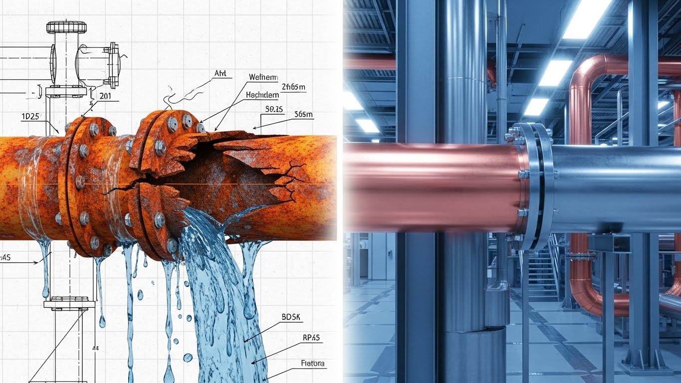
The Visual & Narrative Approach
This powerful visual metaphor uses a split-screen technique to show "Before" and "After" simultaneously. On the left, we see the risk—a wireframe of a rusting, leaking pipe (the chaos of legacy systems). On the right, the photorealistic, pristine reality of a well-managed asset. The transition line moves across the screen, visually "healing" the infrastructure. This clearly communicates the value proposition clarity: your software turns chaos into order.
Psychological Impact & KPI Focus
This triggers the "Transformation" psychological lever. It visualizes the ROI of CapEx planning and preventive maintenance. It validates the investment by showing the tangible result of software adoption: a move from "rust orange" decay to "steel blue" efficiency. It is highly effective for justifying MRO inventory management budgets.
Strategic Implementation & Trade-offs
- Best Use Case: High-impact ads where you need to prove value in the first 5 seconds.
- Duration: 15-30 Seconds.
- Trade-off: It is binary and direct. It works best for "Problem/Solution" narratives but lacks the nuance for explaining complex workflow approval chains.
Companies using similar video content -
MaintainX – Platform – Mobile-first workflow for maintenance and operations.
UpKeep – Asset Operations Management – Streamlines work orders and asset performance.
Limble CMMS – Software – Modern, mobile, and easy-to-use CMMS.
5. Futuristic Neon/Dark Mode
TOFU | Building Trust

The Visual & Narrative Approach
Security is often abstract, but this style makes it tangible. Using a "Dark Mode" aesthetic popular in developer communities, we visualize cybersecurity as a glowing neon fortress. The central cyan padlock represents your platform's encryption, standing guard over the blurred server racks in the background. The vibe is sophisticated, impenetrable, and cutting-edge, appealing to IT stakeholders involved in the buying process.
Psychological Impact & KPI Focus
This alleviates the fear of data breaches in cloud-based CMMS adoption. By using high-tech, "cyberpunk" visual cues, you signal that your platform is modern and robust. It builds authority in the realm of critical infrastructure protection and data sovereignty, which is essential for enterprise clients.
Strategic Implementation & Trade-offs
- Best Use Case: Security compliance pages or features regarding data protection.
- Duration: 10-15 Seconds.
- Trade-off: It is a niche style. While powerful for security topics, using this dark, neon aesthetic for general facility maintenance topics might feel too "gamer-like" or aggressive for traditional facility managers.
Companies using similar video content -
SAP – S/4HANA Asset Management – Integrated ERP/EAM solution with robust security.
Oracle – NetSuite – Cloud ERP and asset management for enterprises.
eFACiLiTY – Software – Cloud-based platform for maintenance, asset tracking, security.
6. 2D Graphics Over Live Action
TOFU | Demand Gen

The Visual & Narrative Approach
This style bridges the gap between the human workforce and digital tools. We use high-quality live-action footage of a real technician on a rooftop—grounding the video in reality. We then overlay crisp 2D vector graphics (checkmarks, shields) that track his movements. This visualizes mobile workforce enablement, showing how the software augments the human worker rather than replacing them.
Psychological Impact & KPI Focus
This is crucial for change management. It addresses the fear of technology replacing jobs. Instead, it frames the software as a "digital assistant" that makes the technician's life easier and safer. It visually reinforces service level agreement (SLA) tracking and successful job completion without being impersonal.
Strategic Implementation & Trade-offs
- Best Use Case: Testimonials, recruitment videos, or "Day in the Life" features.
- Duration: 30-45 Seconds.
- Trade-off: Requires live-action production (filming), which can be logistically higher effort than pure animation. The "Flow" generation model helps keep this cost-effective by using stock footage with custom overlays.
Companies using similar video content -
Fiix – CMMS – Cloud-based work order and preventive maintenance.
ServiceChannel – Platform – Streamlines facility maintenance and repair services.
Corrigo – Platform – Facility management and service automation.
7. Clean UI Workflow (Light Mode)
MOFU | Feature Education
The Visual & Narrative Approach
When the goal is education, clarity is king. This style strips away all distractions to focus purely on the User Interface (UI). Using a clean, "Light Mode" aesthetic with navy and grey accents, we demonstrate specific workflows like drag-and-drop scheduling. The motion is smooth and deliberate, simulating the perfect user experience. It proves that the software is easy to use and intuitive.
Psychological Impact & KPI Focus
This combats "Feature Fatigue" and the fear of complex learning curves. By showing a frictionless user onboarding experience, you lower the barrier to entry. It is the visual proof needed to convince a manager that their team can actually use this tool to manage preventive maintenance scheduling without weeks of training.
Strategic Implementation & Trade-offs
- Best Use Case: Product demo videos, help center articles, and feature release updates.
- Duration: 45-90 Seconds.
- Trade-off: It is functional, not emotional. It explains "how" perfectly but relies on previous content to establish the "why." It is a vital middle-of-funnel asset.
Companies using similar video content -
FMX – Software – User-friendly interface for facility management.
Hippo CMMS – Software – Maintenance-centric software for scheduling tasks.
Maintenance Care – CAFM Software – Streamlines facility operations and asset management.
8. Isometric 3D Workflow
MOFU | Feature Education
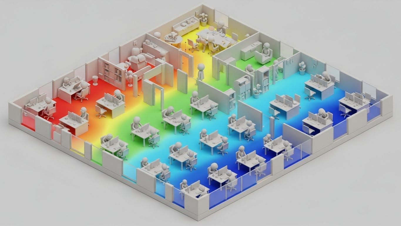
The Visual & Narrative Approach
This style uses a "Claymation" or matte 3D finish to make complex data approachable. We visualize an office floor plan as a miniature dollhouse, overlaying a occupancy heatmap. The red-to-blue gradients clearly show hot desking usage and density. The soft, tactile aesthetic makes the data feel friendly and manageable, rather than cold and clinical.
Psychological Impact & KPI Focus
This is excellent for space utilization analysis. It helps FMs visualize intangible metrics like "occupancy rates" in a physical context. It supports decision-making regarding soft services coordination (e.g., cleaning schedules based on usage) by making the data patterns obvious and undeniable.
Strategic Implementation & Trade-offs
- Best Use Case: Explaining analytical features, sensor integrations, or hybrid work tools.
- Duration: 30-60 Seconds.
- Trade-off: The stylized "toy-like" look must be balanced carefully to ensure it doesn't look too playful for a serious B2B enterprise tool. The matte finish helps maintain sophistication.
Companies using similar video content -
SpaceIQ – Platform – Workspace management, desk booking, space planning.
Freespace – Workplace Analytics Software – Utilizes space efficiently, reduces energy consumption.
HubStar – Software – Workspace management and space utilization analytics.
9. Photoreal 3D + Hologram
MOFU | Product Differentiation
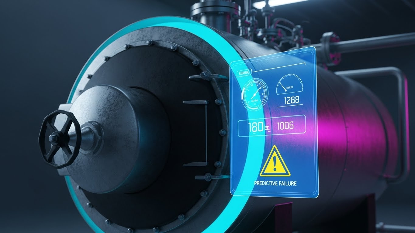
The Visual & Narrative Approach
This style screams "Premium Technology." We use photorealistic 3D to render the gritty reality of mechanical assets (grime, metal textures), and then overlay a crisp, glowing holographic UI. This contrast represents the "Digital Twin" concept perfectly—overlaying digital intelligence onto physical reality. The yellow "Predictive Failure" warning highlights the software's ability to catch issues before they happen.
Psychological Impact & KPI Focus
This visualization builds immense credibility for predictive maintenance algorithms. It shows exactly how the software intervenes to prevent downtime. It appeals to the technical buyer who wants to see the condition-based monitoring capabilities in action. It visually reinforces the stat regarding the reduction of unplanned downtime.
Strategic Implementation & Trade-offs
- Best Use Case: Keynote presentations, high-stakes sales pitches, and webinar intros.
- Duration: 15-30 Seconds.
- Trade-off: High production cost (Whisk model). It is a "hero" asset. Use it sparingly where it has the most impact on perception.
Companies using similar video content -
Tractian – Enterprise CMMS – AI-driven insights for real-time maintenance.
Sensgreen – Smart Building Platform – AI-driven insights, predictive maintenance capabilities.
LLumin – CMMS+ – Manages assets, facilities, and maintenance operations.
10. 2D Character-Driven Story
MOFU | Overcoming Objections

The Visual & Narrative Approach
Technology adoption often fails due to culture, not code. This style focuses on the people. Using friendly, geometric 2D characters, we tell the story of a technician who is happy, empowered, and efficient because of the software. The "thumbs up" gesture and bright lighting convey success and ease. It is a narrative-driven approach that focuses on the outcome of the work, not just the tool.
Psychological Impact & KPI Focus
This directly addresses change management resistance. It shows that the software is a partner, not a burden. It is highly effective for internal newsletters or adoption campaigns, reinforcing positive tenant experience and employee satisfaction. It humanizes the ROI of work order automation.
Strategic Implementation & Trade-offs
- Best Use Case: Customer success stories, onboarding emails, and internal training.
- Duration: 60-90 Seconds.
- Trade-off: It is less "tech-forward." If the goal is to impress a CIO with data capabilities, this style is too soft. But for the Operations Manager worried about team morale, it is perfect.
Companies using similar video content -
AkitaBox – Software – Asset and facility management with user-friendly interface.
eMaint CMMS – Software – Cloud-based, optimizes workflows, automates maintenance.
SuperCMMS – Software – Free, open-source, easy-to-use CMMS.
11. Abstract 2D Motion Graphics
MOFU | Competitive Displacement

The Visual & Narrative Approach
This style creates a powerful visual metaphor for interoperability. We begin with a chaotic scattering of vivid magenta and deep purple geometric shapes, representing the fragmented reality of disparate legacy systems (siloed BMS, spreadsheets, and emails). Through fluid, magnetic motion, these shapes converge and morph into a perfectly aligned, stable grid structure. The narrative positions your platform as the harmonizing force that turns data chaos into a "Single Source of Truth."
Psychological Impact & KPI Focus
This directly targets "Integration Anxiety." Facility leaders often fear that adding new software will increase complexity. This visualization provides cognitive closure, showing order emerging from entropy. It supports KPIs related to system efficiency and the elimination of data redundancy, visually promising a seamless digital ecosystem.
Strategic Implementation & Trade-offs
- Best Use Case: Competitive comparison posts highlighting open API integrations versus closed legacy systems.
- Duration: 15-20 Seconds (Loopable).
- Trade-off: It is highly conceptual. While it emotionally solves the problem of fragmentation, it does not show the actual UI. It works best to disrupt the viewer's mindset before presenting a hard product demo.
Companies using similar video content -
Facilio – Platform – Unified enterprise facility management, interoperable environment.
Nuvolo – Connected Workplace – Integrates facility management into unified system.
Spacewell – Smart Building Solutions – Centralized platforms for real-time monitoring.
13. Lifestyle Stock with UI Overlay
MOFU | Driving Demo Requests

The Visual & Narrative Approach
To sell to leadership, you must mirror their aspirations. This style utilizes high-end stock photography of a Facility Director in a charcoal suit, overseeing operations from a modern glass-walled command center. We overlay crisp, "monitor-blue" abstract graphs—visualizing energy benchmarks and occupancy trends—onto the physical environment. The focus is on the strategic control of the human leader, empowered by the digital intelligence of your software.
Psychological Impact & KPI Focus
This leverages Social Proof and aspirational identity. It reframes the user from a "maintenance supervisor" to a "strategic asset manager." It visually validates the desire for portfolio-wide visibility. This style effectively communicates high-level KPIs like ESG reporting and capital planning (CapEx) oversight.
Strategic Implementation & Trade-offs
- Best Use Case: Landing page hero sections, webinar registration pages, and case study covers.
- Duration: Static Image or 5-10 Second Cinemagraph.
- Trade-off: Reliance on stock footage can feel generic if not carefully curated. The UI overlay must be custom-designed to ground the image in your specific brand reality, avoiding generic "business chart" tropes.
14. Dynamic Data Visualization
BOFU | ROI Justification

The Visual & Narrative Approach
When speaking to the CFO, the language is finance. This style translates operational efficiency into hard currency. We use a 3D animation where gold and silver coins stack rapidly to form aggressive, upward-trending bar charts. Interspersed with glowing copper "energy bolts," this visualizes the direct correlation between energy optimization and profitability. The low camera angle emphasizes the sheer scale of the savings, making the ROI appear monumental.
Psychological Impact & KPI Focus
This targets the Economic Buyer by satisfying the need for financial justification. It shifts the conversation from "software cost" to "investment return." It is laser-focused on Total Cost of Ownership (TCO) and proves that the savings from predictive maintenance and energy reduction will fund the platform itself.
Strategic Implementation & Trade-offs
- Best Use Case: Financial proposal slides, pricing pages, and "Business Case" videos.
- Duration: 15-20 Seconds.
- Trade-off: It is purely transactional. It lacks the operational nuance of other styles but is the most effective tool for overcoming budget objections at the final decision stage.
Companies using similar video content -
IBM Maximo – Application Suite – EAM for strategic asset management.
Planon – IWMS – Strategic oversight for real estate and facility management.
Archibus – IWMS – Dashboards and real-time data for strategic oversight.
15. 2D Line Art Animation
BOFU | Risk Mitigation

The Visual & Narrative Approach
Compliance requires precision, not flash. This style uses an elegant, "drafting pencil" aesthetic—fine grey lines on a stark white background—to depict a clipboard checklist and a shield icon. The lack of visual noise signals transparency and engineering rigor. The motion is deliberate and exact, reinforcing that your platform handles regulatory audits (OSHA, Fire Safety) and vendor compliance with absolute accuracy.
Psychological Impact & KPI Focus
This appeals to the Risk Averse stakeholder (Legal/Compliance). It reduces anxiety by visualizing stability and order. It supports KPIs related to audit readiness, vendor insurance tracking, and safety incident reduction. It visually guarantees that "nothing falls through the cracks."
Strategic Implementation & Trade-offs
- Best Use Case: Content regarding security, compliance standards (SOC 2, ISO), and Service Level Agreements (SLAs).
- Duration: 5-10 Seconds (Loop).
- Trade-off: It is emotionally reserved. It builds trust but generates little excitement. It is a "safety" asset, designed to reassure rather than convert.
Companies using similar video content -
Brightly Software – Asset Essentials – Efficient maintenance management, cost savings.
eMaint CMMS – Software – Reduces maintenance costs, improves asset performance.
Facilio – Platform – Enhances efficiency, reduces operational costs.
16. Bold Kinetic Typography (Visual)
BOFU | The Economic Buyer

The Visual & Narrative Approach
Sometimes you need to shout to be heard. This style uses massive 3D typography to dramatize the conflict between costs and savings. We see the words "Financial Budget" (in Impact Red) and "Cost Savings" (in Bold Black) colliding in mid-air. The collision physically shatters the "Budget" text, symbolizing how your software breaks through financial constraints. The motion is aggressive and high-velocity, designed to stop the scroll.
Psychological Impact & KPI Focus
This utilizes Pattern Interrupt. It creates a sense of urgency and directness, appealing to the buyer looking for immediate OpEx reduction. It visually demonstrates that your solution is a disruptor of the status quo, designed to slash administrative waste and inefficient spending.
Strategic Implementation & Trade-offs
- Best Use Case: Retargeting ads for users who visited pricing pages but didn't convert.
- Duration: 6-10 Seconds.
- Trade-off: It lacks subtlety. It is a "blunt instrument" for attention. It works best as a closer in a paid campaign but cannot explain how the savings are achieved.
Companies using similar video content -
SafetyCulture – Platform – Inspections, audits, and checklists for compliance.
Trimble – Unity – Asset management solutions, mitigates risk, ensures compliance.
Infraspeak – Platform – Centralized asset management, compliance with SLAs.
17. Rapid UI Feature Montage
BOFU | The Functional Buyer
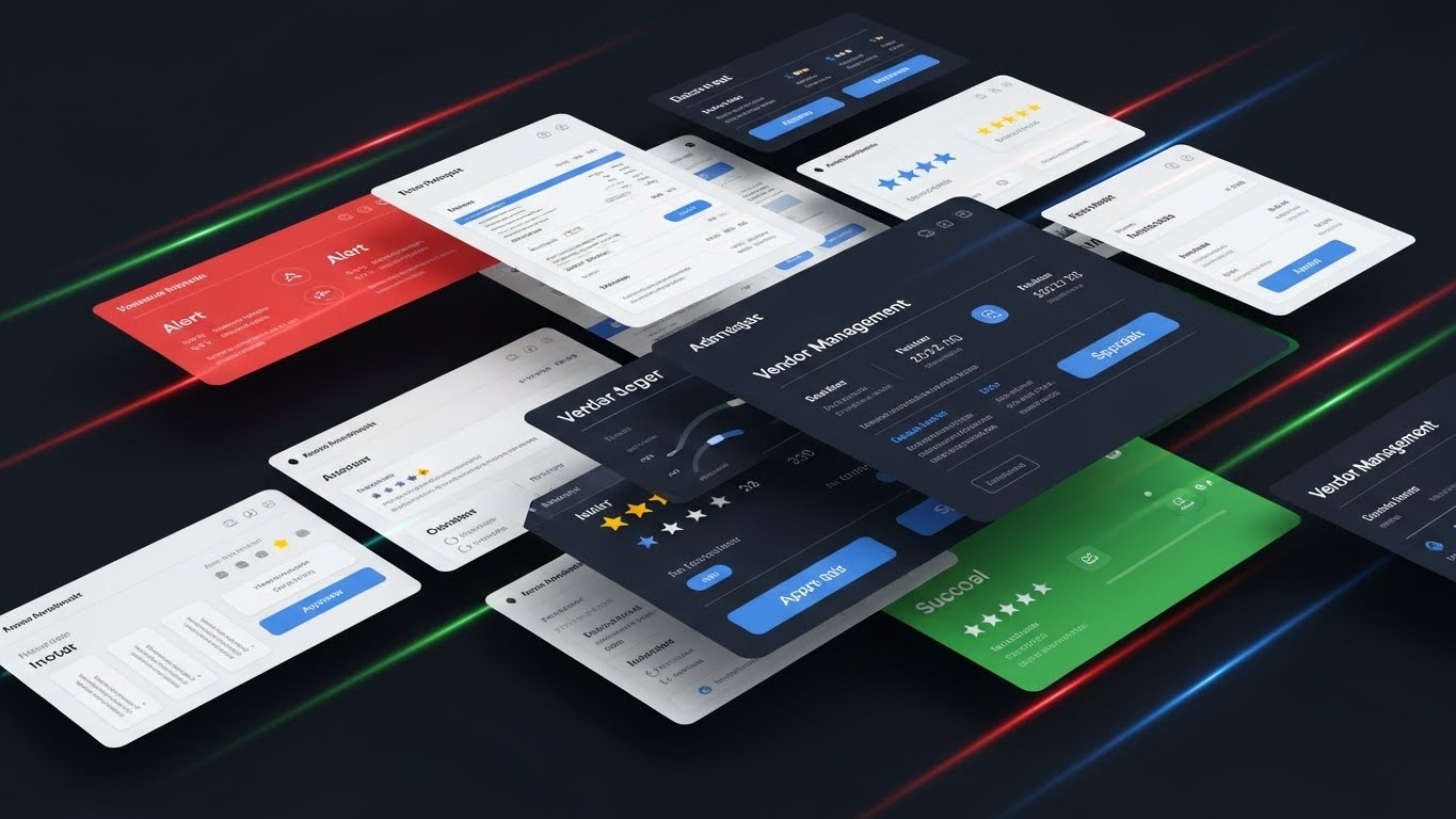
The Visual & Narrative Approach
The functional buyer wants to know: "Does it have X, Y, and Z?" This style answers "Yes" to everything—fast. We layer angled slices of the UI—vendor invoices, star ratings, approval buttons, asset registries—flying past the camera in a dynamic stream. The motion blur and density of screens convey speed and comprehensive capability. It visually proves that the platform is a robust, all-in-one ecosystem.
Psychological Impact & KPI Focus
This addresses "Feature FOMO" (Fear Of Missing Out). By overwhelming the viewer with the sheer volume of features, you build confidence in the platform's maturity. It supports the evaluation of comprehensive workflow management and assures the buyer that their specific operational needs are covered.
Strategic Implementation & Trade-offs
- Best Use Case: "Why Choose Us" videos, trade show loops, and YouTube mid-roll ads.
- Duration: 15-30 Seconds.
- Trade-off: The pace is too fast for training. Viewers won't learn how to use the features, but they will walk away convinced that the platform is feature-rich.
Companies using similar video content -
UpKeep – Asset Operations Management – Reduces costs and increases asset uptime.
Limble CMMS – Software – Simplifies maintenance, reduces unplanned downtime.
MaintainX – Platform – Tracks maintenance, provides real-time business insights.
18. Split Screen: Optimized Reality
BOFU | Competitive Comparison
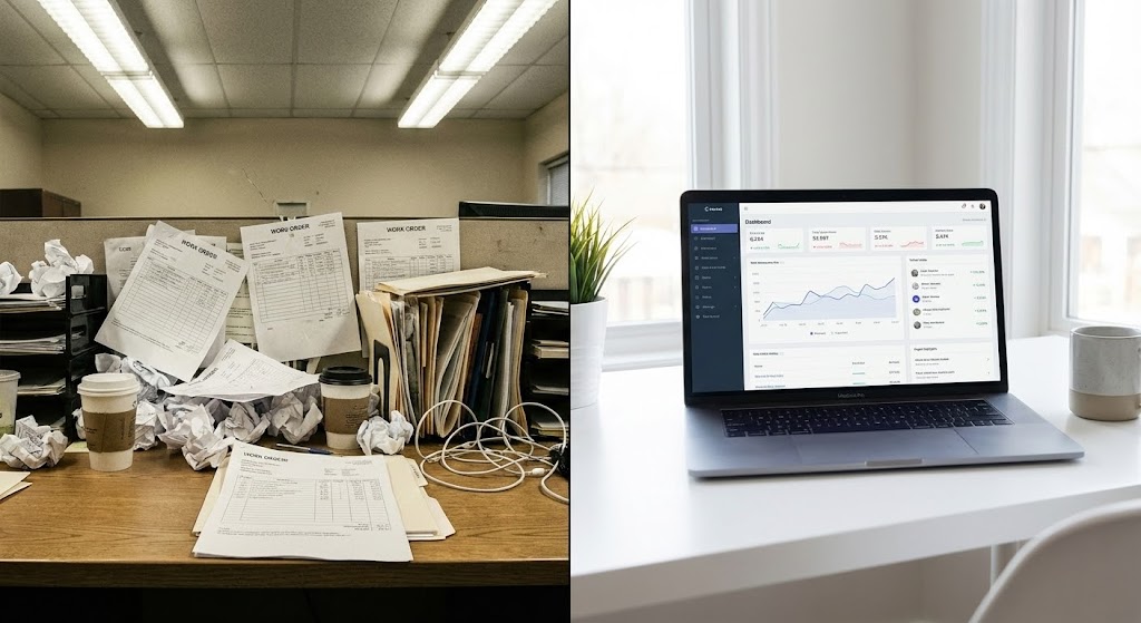
The Visual & Narrative Approach
This is the definitive "Before and After." We split the screen: the left side shows the "Old Way"—a chaotic, desaturated desk piled with paper work orders and tangled wires. The right side shows the "New Way"—a pristine, crisp white desk with a single laptop displaying your dashboard. The contrast is visceral. It doesn't just sell software; it sells a better quality of life for the Facility Manager.
Psychological Impact & KPI Focus
This leverages the Contrast Principle. By placing the pain (chaos) directly next to the cure (your software), the value becomes self-evident. It effectively visualizes the intangible benefit of reduced administrative burden and validates the shift from reactive firefighting to proactive management.
Strategic Implementation & Trade-offs
- Best Use Case: "Us vs. Excel" comparison pages and bottom-of-funnel email campaigns.
- Duration: 10-20 Seconds (Static or Wipe).
- Trade-off: It is binary. It relies on the assumption that the prospect's current reality is chaotic. It is most effective for displacing manual processes rather than competing digital tools.
Companies using similar video content -
ServiceChannel – Platform – Comprehensive facility maintenance and repair services.
Accruent – Solutions – Lifecycle management excellence, comprehensive solutions.
IBM Maximo – Application Suite – Unified suite for asset maintenance and reliability.
19. Macro UI Micro-Interactions
Onboarding | Trial/Freemium User Activation

The Visual & Narrative Approach
Adoption often fails because users fear the tool is difficult. This style zooms in—extreme macro—on a 3D fingertip pressing a glowing green "Complete" button on a glass touchscreen. We see the tactile details: the fingerprint, the glass texture, the satisfying checkmark. It demystifies the interaction, telling the user: "It’s this simple. Just one tap."
Psychological Impact & KPI Focus
This increases Self-Efficacy. It convinces the field technician that they can use the tool successfully with zero training. It is critical for Change Management. By visualizing the "dopamine hit" of task completion, you encourage the habit of real-time data entry, directly improving user adoption rates.
Strategic Implementation & Trade-offs
- Best Use Case: Welcome emails, in-app tooltips, and mobile app store preview videos.
- Duration: 3-6 Seconds (Loop).
- Trade-off: It is extremely micro. It creates a feeling of ease but provides no context on the broader workflow. It is an emotional nudge, not a tutorial.
Companies using similar video content -
FMX – Software – Streamlined, easy-to-use facility management solution.
MaintainX – Platform – Modern, cloud-based workflow management.
Limble CMMS – Software – Modern, mobile, and easy-to-use CMMS.
20. Low-Poly 3D Modeling
Onboarding | Reducing Implementation Friction

The Visual & Narrative Approach
Implementation is the final hurdle. This style uses a playful, "building block" aesthetic to make the setup process look effortless. We see a facility assembling itself—yellow walls snapping into place, blue trees popping up—synced to the setup of the software. The tone is light and constructive. It reframes the daunting task of data migration as a simple, creative act.
Psychological Impact & KPI Focus
This reduces Implementation Overwhelm. By abstracting the complex facility into simple geometric forms, the task feels manageable. It encourages the user to begin the onboarding process, visually supporting the promise of "Rapid Deployment" and reducing the perceived time-to-value.
Strategic Implementation & Trade-offs
- Best Use Case: "Getting Started" guides, setup wizards, and customer success intro videos.
- Duration: 20-40 Seconds.
- Trade-off: The stylized look is less serious. It is perfect for illustrating the process of setup but should transition to realistic UI when discussing actual operational data.
Companies using similar video content -
MaintainX – Platform – User-friendly interface for all organizations.
UpKeep – Asset Operations Management – Designed for ease of use and rapid adoption.
Limble CMMS – Software – Mobile-first platform for high user adoption.
21. 2D Animation & UI Composition
Onboarding | Self-Serve Onboarding

The Visual & Narrative Approach
The moment a new user logs in, the clock starts on "Time-to-Value." This style uses a friendly, abstract character—rendered in soft pastel purples and mint greens—to guide the user. The character looks at a semi-transparent, floating UI window where a dotted arrow playfully points to key features. The animation is bouncy and welcoming, explicitly designed to remove the intimidation factor of complex enterprise software.
Psychological Impact & KPI Focus
This reduces Cognitive Load during the critical first session. By pairing a relatable character with simplified UI elements, we leverage the "Guide" archetype. This builds immediate trust and encourages self-serve learning, directly impacting KPIs like User Activation Rate and reducing the initial burden on your Customer Success team.
Strategic Implementation & Trade-offs
- Best Use Case: "Welcome Aboard" emails, first-login modal popups, and password reset confirmations.
- Duration: 15-30 Seconds.
- Trade-off: It is stylized and "cute." While perfect for hand-holding new users, it is not suitable for technical deep-dives for advanced engineers who prefer raw data.
Companies using similar video content -
openMAINT – Software – Open-source CMMS with BIM extensions.
SuperCMMS – Software – Free, open-source, easy-to-use CMMS.
Odoo – CMMS Module – Open-source, customizable maintenance management.
22. Aspirational Stock Montage
Retention | Knowledge Base

The Visual & Narrative Approach
Retention is about belonging. This style utilizes high-quality cinematic footage of a diverse facility team—wearing safety vests and hard hats—collaborating in a sunlit, modern lobby. They are smiling at a shared tablet, reinforcing the idea that your software is the "campfire" around which the team gathers. The warm "Golden Hour" lighting evokes a sense of optimism, pride, and professional success.
Psychological Impact & KPI Focus
This leverages Social Proof and tribal belonging. It reminds the user that they are part of a forward-thinking, modern community of professionals. This emotional connection creates a barrier to churn. It supports KPIs related to Net Promoter Score (NPS) and Daily Active Users (DAU) by framing the software as a collaborative hub rather than a solitary tool.
Strategic Implementation & Trade-offs
- Best Use Case: Login screens, community forum headers, and monthly newsletter intros.
- Duration: Static Image or 10-15 Second Video.
- Trade-off: Stock footage is generic by nature. To be effective, it must be color-graded to match your brand palette perfectly, or it risks looking like a generic "corporate happy" filler.
Companies using similar video content -
Axonator – Platform – Streamlines maintenance with customizable forms.
Keyclic – Platform – User-friendly interface for efficient task management.
eBASE – Workflow Manager – Streamlines facility requests, enhances communication.
23. Realistic Character Video
Retention | Accelerating Time-to-Value
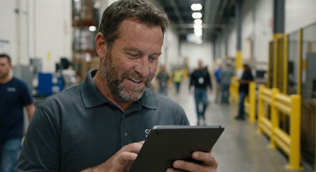
The Visual & Narrative Approach
To validate the user's purchase decision, we mirror their relief. This style features a hyper-realistic character—a middle-aged Facility Manager with visible experience lines—standing in a blurred industrial corridor. He looks at his tablet, exhales deeply, and smiles. It captures the specific micro-moment of solving a crisis (e.g., a boiler failure averted). It is intimate, authentic, and deeply relatable to anyone in operations.
Psychological Impact & KPI Focus
This triggers Mirror Neurons. The viewer "feels" the relief of the character. It reinforces the Value Proposition that your software provides peace of mind, not just data. This is a powerful tool for Customer Retention, reminding clients why they renewed their contract: to avoid stress.
Strategic Implementation & Trade-offs
- Best Use Case: Customer success testimonials, "Year in Review" videos, and renewal campaign emails.
- Duration: 15-30 Seconds.
- Trade-off: This requires high-end character generation or casting. If the acting or animation feels "uncanny," it breaks the emotional connection. It relies heavily on execution quality.
Companies using similar video content -
JLL Technologies – Solutions – Broad solutions for real estate and facilities.
ServiceChannel – Platform – Service automation for multi-location businesses.
Corrigo – Platform – Facility management and service automation.
24. Minimalist Flat 2D Vector
Retention | Reducing Support Overhead

The Visual & Narrative Approach
In the daily workflow, clarity is speed. This style uses absolute minimalism: a solid white background with a crisp, "Icon Blue" wrench and gear symbol. A single red notification badge with the number "1" sits atop it. There is no background noise, no gradients, just the signal. The motion is a subtle "pulse" of the red badge, demanding attention without being annoying.
Psychological Impact & KPI Focus
This utilizes Signaling Theory. It cuts through the noise of a busy day to prompt a specific action (e.g., "Approve Invoice" or "Update Status"). It is designed to drive Feature Adoption and habit formation. By making the trigger clear and simple, you reduce the friction of engaging with the app multiple times a day.
Strategic Implementation & Trade-offs
- Best Use Case: Push notifications, smartwatch app icons, and in-app empty states.
- Duration: 3-5 Seconds (Loop).
- Trade-off: It is purely functional. It conveys zero brand emotion or story. It is a utility asset, essential for UI but insufficient for marketing.
Companies using similar video content -
FMX – Software – Simplified facility management, ease of use.
Hippo CMMS – Software – Maintenance-centric, reduces downtime and costs.
MaintainX – Platform – Tracks reactive and preventive maintenance.
25. Holographic UI over 3D Render
Retention | Driving Deep Feature Adoption
The Visual & Narrative Approach
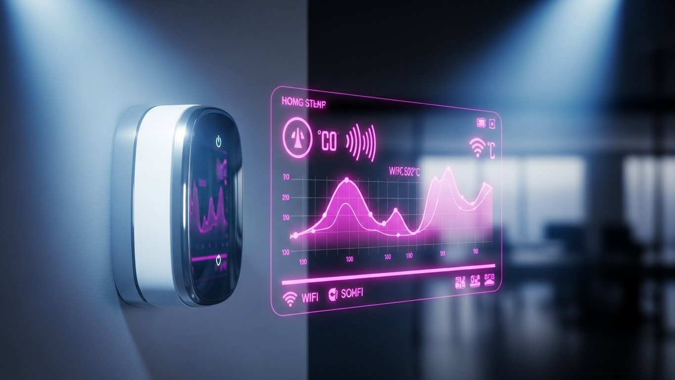
As you roll out new IoT integrations, you need to show the connection between hardware and software. This style renders a physical device—like a smart thermostat—in pristine white 3D, mounted on a wall. Floating in front of it is a complex, glowing pink and purple holographic interface displaying temperature curves and Wi-Fi signals. It visualizes the "invisible conversations" happening between your software and the building's hardware.
Psychological Impact & KPI Focus
This appeals to the Innovator mindset within your client base. It validates their investment in smart building tech. It is highly effective for driving adoption of advanced modules (like Energy Management Systems) by making the data stream look tangible and high-tech.
Strategic Implementation & Trade-offs
- Best Use Case: New feature announcements, integration partner showcases, and hardware compatibility lists.
- Duration: 10-20 Seconds.
- Trade-off: High production value ("Whisk" model). It creates a "wow" factor but must be technically accurate to satisfy engineering stakeholders.
Companies using similar video content -
MaintainX – Platform – Mobile-first workflow management.
UpKeep – Asset Operations Management – Streamlines workflow process.
Limble CMMS – Software – Mobile-first, simplifies core maintenance tasks.
26. Hyper-lapse Stock Footage with Data
Retention | Reducing Churn
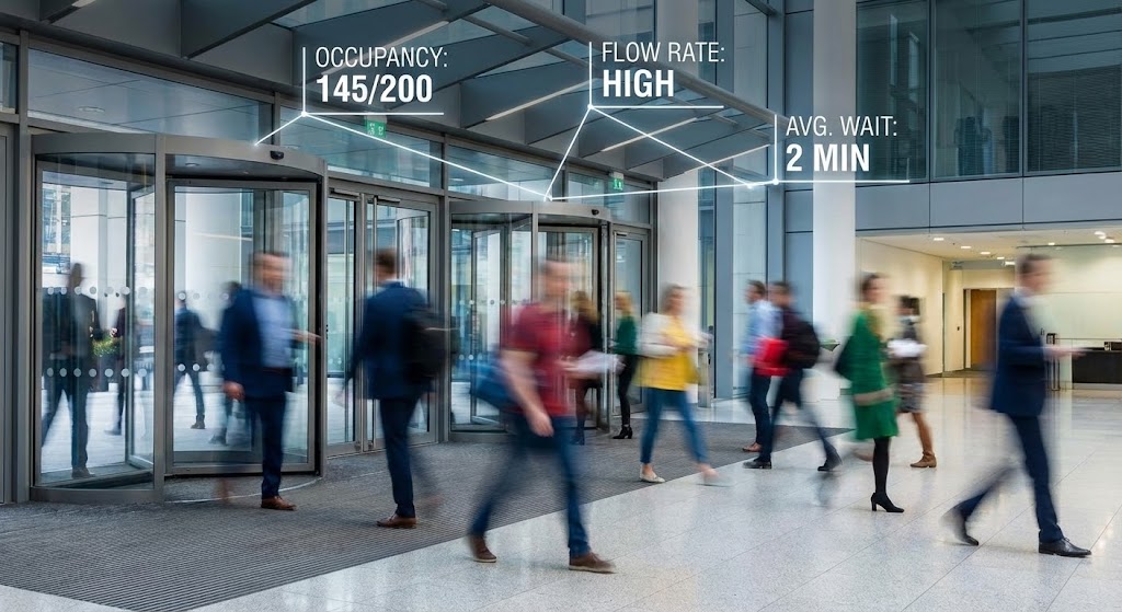
The Visual & Narrative Approach
For Quarterly Business Reviews (QBRs), you need to show the "pulse" of the facility. We use hyper-lapse footage of a busy lobby—people are blurred streaks of motion, representing the flow of traffic. Superimposed over this chaos are stable, sharp white data lines and counters ("Occupancy: 145/200"). The contrast between the frenetic human motion and the calm, precise data emphasizes your platform's ability to measure and manage the chaos.
Psychological Impact & KPI Focus
This provides Operational Validation. It proves that the software is capturing the reality of the building's usage. It is critical for justifying space planning decisions and lease renewals. It visualizes the ROI of people counting sensors and occupancy analytics.
Strategic Implementation & Trade-offs
- Best Use Case: QBR decks, year-end reports, and lobby display screens.
- Duration: 10-30 Seconds.
- Trade-off: Requires stock footage that matches the client's building type (e.g., corporate vs. retail). Misalignment here (showing a mall for an office client) breaks immersion.
Companies using similar video content -
Facilio – Platform – AI and IoT for real-time operational intelligence.
Sensgreen – Smart Building Platform – IoT, AI analytics, extensive integrations.
Infogrid – Smart Building Platform – IoT sensors, AI for facility optimization.
27. Dark Mode UI Showcase
Expansion | Driving Upsell/Cross-sell
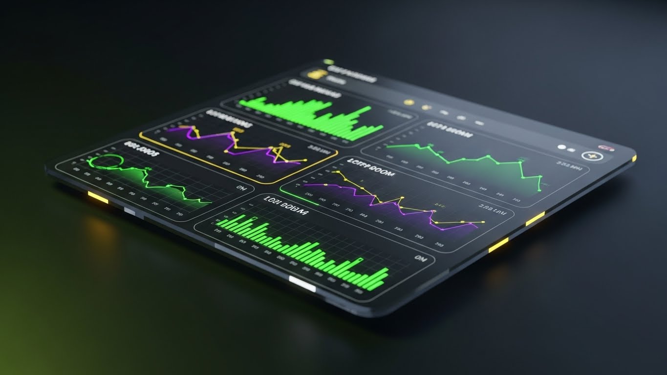
The Visual & Narrative Approach
Dark mode is often associated with "Pro" or "Enterprise" tiers. This style presents your dashboard in a sleek, deep charcoal aesthetic with neon green and electric purple data accents. The camera angles are dramatic and isometric, giving the flat screen a sense of physical depth and gloss. It feels like a command center for elite operators.
Psychological Impact & KPI Focus
This leverages Exclusivity and Status. It visually distinguishes the "Standard" tier (Light Mode) from the "Premium" tier (Dark Mode). It makes the upgrade feel like a status symbol for the facility team. It supports Expansion Revenue goals by making the higher-tier features look more powerful and sophisticated.
Strategic Implementation & Trade-offs
- Best Use Case: Upsell pages, "Enterprise Plan" brochures, and advanced analytics demos.
- Duration: 15-20 Seconds.
- Trade-off: It can look "gamer-y" if not restrained. The design must remain professional and legible, avoiding style over substance.
Companies using similar video content -
Freespace – Workplace Analytics Software – Space utilization, occupancy-led intelligence.
HubStar – Software – Space utilization, predictive workplace analytics.
InnerSpace.io – Platform – Office space utilization analytics.
28. Cinematic Video
Expansion | Driving Referrals & Advocacy

The Visual & Narrative Approach
To turn customers into advocates, align with their higher purpose. This style uses breathtaking 8K drone footage of a sustainable corporate campus—roofs covered in solar panels, lush greenery, and clear blue skies. The sun flares into the lens, creating a feeling of hope and future-readiness. It positions your software not just as a maintenance tool, but as a driver of Sustainability and ESG goals.
Psychological Impact & KPI Focus
This taps into Corporate Social Responsibility (CSR) and pride. It helps your champion within the client organization sell the success of the program to their stakeholders. It supports Brand Advocacy and referral programs by associating your platform with the "Green Building" movement.
Strategic Implementation & Trade-offs
- Best Use Case: ESG impact reports, customer success documentaries, and "Vision" keynotes.
- Duration: 30-60 Seconds.
- Trade-off: Extremely high effort to shoot original footage. Best executed using high-end stock ("Flow" model) with custom branding overlays to manage costs.
Companies using similar video content -
IBM Maximo – Application Suite – EAM for complex asset lifecycle management.
SAP – S/4HANA Asset Management – Integrated ERP/EAM solution for enterprises.
Oracle – NetSuite – Cloud ERP and asset management for enterprises.
29. 3D Parallax UI Presentation
Expansion | Proactive Support

The Visual & Narrative Approach
As you expand into new modules, the ecosystem becomes complex. This style visualizes depth. We deconstruct the UI into floating layers in 3D space—the main dashboard in front, with sub-panels, widgets, and data streams floating on planes behind it. The camera pushes through the layers, suggesting a "deep dive" into data. It communicates that there is "more beneath the surface."
Psychological Impact & KPI Focus
This combats Churn by revealing hidden value. It suggests that the user has only scratched the surface of the platform's capabilities. It encourages exploration and supports Cross-Sell opportunities by visualizing the depth and interconnectedness of the full product suite.
Strategic Implementation & Trade-offs
- Best Use Case: Major version release trailers (e.g., "V2.0 Launch") and roadmap presentations.
- Duration: 20-40 Seconds.
- Trade-off: It is abstract. It doesn't show the actual workflow but rather the concept of the architecture. It inspires rather than trains.
Companies using similar video content -
Brightly Software – Asset Essentials – Asset lifecycle management, sustainability focus.
Planon – IWMS – Environmental sustainability modules, smart building solutions.
Spacewell – Smart Building Solutions – Optimizes energy consumption, sustainability.
30. Photorealistic 3D Renders
Expansion | Driving Upsell/Cross-sell
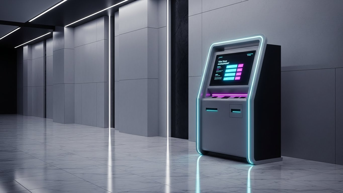
The Visual & Narrative Approach
When selling physical hardware add-ons (like Visitor Management Kiosks), the product must look tangible and premium. This style places a sleek, steel-grey kiosk in a photorealistic marble lobby. The lighting is architectural and high-contrast, highlighting the materials and the glowing screen. It looks like a high-end architectural visualization, signaling that this hardware enhances the building's aesthetic.
Psychological Impact & KPI Focus
This targets the Aesthetic Buyer (Architects/Designers). It overcomes the objection that "tech looks ugly in our lobby." By rendering it in a luxury context, you validate the Visitor Experience (VX) upgrade. It directly supports Hardware Sales revenue and physical expansion of the platform's footprint.
Strategic Implementation & Trade-offs
- Best Use Case: Hardware product pages, brochures, and trade show booth backdrops.
- Duration: Static Renders or Turntable Animation.
- Trade-off: It must be flawless. Any drop in render quality makes the hardware look cheap. It requires top-tier 3D modeling ("Whisk" model).
Strategic Knowledge Base: The Visual Operations Doctrine
To bridge the gap between "looking good" and "working well," we have synthesized a 30-point strategic framework. This doctrine moves beyond simple video production into the realm of Visual Operations (VisOps). It is designed to help you treat your visual assets as critical infrastructure that drives adoption, efficiency, and revenue.
Strategic Alignment & Visual Architecture (Pre-Production)
The foundation of a successful visual strategy lies in the "Why" and the "Who" before a single pixel is rendered.
- The Cognitive Load Audit: Before creating content, audit your current training materials. If a PDF takes 20 minutes to read, the goal is a 60-second visual that retains 80% of that information.
- Role-Based Visual Mapping: Do not use the same visual style for everyone. The Executive needs "Style 13: Executive Command Center" (Macro Trends), while the Technician needs "Style 19: Macro UI" (Micro-Actions).
- The "Glanceability" Standard: In facility management, users are often on ladders or in basements. Design visuals (like "Style 24: Minimalist Vector") that can be understood in under 2 seconds on a mobile screen.
- Brand Voice Consistency: Your visuals must speak one language. Whether it's a marketing ad or a support tutorial, the color palette (e.g., Safety Orange vs. Tech Blue) must remain consistent to build subconscious familiarity.
- The Advids Strategic Audit: This is where a partner like Advids becomes essential. We don't just animate; we help define this "Visual Operating System," ensuring that every asset you build contributes to a unified library rather than a fragmented collection of videos.
- Standardization vs. Customization: Use the "Flow Model" (templated stock) for general concepts like "Safety," but invest in the "Whisk Model" (custom 3D) for your core proprietary differentiators like "Predictive Algorithms."
- The Cross-Departmental Bridge: Use visuals to unify terminology. If Sales calls it "Asset Health" and Support calls it "Machine Status," use "Style 11: Motion Graphics" to visually link these terms and eliminate confusion.
- Legacy System Integration: Don't hide the complexity. Use "Style 1: Abstract X-Ray" to visually acknowledge the legacy systems (pipes/wires) while highlighting your digital overlay. This builds trust with veteran engineers.
- Accessibility in Operations: Your workforce is diverse. Visuals relying on "Style 21: Character Animation" bypass language barriers, allowing you to train multi-lingual teams without translating text manuals.
- The Mobile-First Mandate: 70% of FM usage happens on mobile. Ensure all 30 styles—especially UI demos—are legible on a 5-inch screen. If the text is too small to read on a phone, the asset is operationally useless.
Operational Adoption & Implementation (Deployment)
How to embed these visuals into the daily workflow to drive usage and reduce friction.
- Overcoming "Big Brother" Anxiety: When rolling out tracking features, use "Style 6: Graphics Over Live Action" to emphasize safety and efficiency for the worker, rather than surveillance by management.
- The Micro-Learning Shift: Replace hour-long seminars with a library of 30-second clips (referencing "Style 7: Clean UI"). Users learn best when the answer is bite-sized and immediate.
- Just-in-Time Support: Embed specific visual styles directly into the helpdesk. When a user clicks "Error 404," they should see a "Style 4: Wireframe Transition" video showing exactly how to fix it, right then and there.
- Gamification of Training: Use "Style 14: Dynamic Data" to visualize technician scorecards. Showing a rising bar chart of "Jobs Completed" motivates teams more effectively than a spreadsheet.
- Reducing Support Ticket Volume: There is a direct correlation: for every proactive "Style 19: Macro UI" video you deploy for a new feature, you can expect a measurable drop in "How do I...?" support tickets.
- Remote Onboarding: In a hybrid world, you cannot fly trainers to every site. Use "Style 8: Isometric 3D" to give remote employees a virtual tour of the facility and the software's role within it.
- Visualizing SOPs: Transform text-based Standard Operating Procedures into "Style 15: Line Art" checklists. Visual sequences reduce ambiguity and compliance errors in critical tasks like fire safety checks.
- Feedback Loops: Use interactive video elements. After a "Style 21: Onboarding" video, ask the user to click a "Thumbs Up/Down" to measure if the visual actually helped them.
- Scalable Localization: When designing "Style 10: Character Stories," avoid putting text inside the animation. Keep text as overlays so you can easily swap languages for global facility teams without re-rendering the animation.
- Leadership Communication: When the FM Director needs to present to the CFO, give them "Style 1: Abstract 3D" assets. Elevate the financial conversation by empowering your champion with high-end visuals to sell the strategy up the chain.
Measuring Impact & Future-Proofing (ROI & Evolution)
Moving beyond vanity metrics to measure true business impact and prepare for the next wave of tech.
- Beyond "Views": Move beyond vanity metrics like view count. Start measuring Time-to-Competency. Did the "Style 7" video reduce the time it takes a new hire to close their first work order? That is the real KPI.
- The "Idle Time" Metric: Correlate better visualization with reduced software navigation time. If users find buttons faster because of "Style 24" visual cues, you are saving hundreds of man-hours across the enterprise.
- Compliance Velocity: Measure how fast a new regulation (e.g., OSHA update) is understood. Visual distribution via "Style 15" often results in 3x faster compliance acknowledgment than email text.
- Retention and Churn: High-quality UX visualization ("Style 23") increases perceived value. Track the LTV (Lifetime Value) of cohorts exposed to the visual academy versus those who were not.
- The AI Visual Frontier: Prepare for Generative AI. The styles defined here (like "Style 30") are the training data for future AI video generators that will create custom tutorials on the fly.
- Scalability of Assets: Build a library, not a graveyard. Organize your source files so that when the UI updates, you can quickly refresh the "Style 17: UI Montage" without starting from scratch.
- The Advids Partnership: As you scale, maintaining this library becomes a full-time job. Advids acts as your long-term extension, ensuring that your visual assets grow in lockstep with your feature set, preventing "visual debt."
- Benchmarking Success: Compare your visual engagement against industry standards. If your "Style 13" video has a 90% drop-off, your narrative is failing. Iterate based on data.
- The ROI of Safety: Quantify the un-quantifiable. If "Style 4" safety videos reduce accidents by even 1%, the insurance savings alone can pay for the entire video marketing budget.
- Final Call to Innovation: Treat video as Digital Infrastructure. It is not a marketing expense; it is an operational asset. The companies that visualize their value will capture the market; those that remain invisible will be left behind.
Companies using similar video content -
Facilio – Platform – Unified enterprise facility management, comprehensive portfolio management.
Nuvolo – Connected Workplace – Integrates facilities management into a unified system.
Archibus – IWMS – Unified platform for facilities and infrastructure management.
Author & Editor Bio


