
 /home/wwwroot/advids.co/design/index.php on line 425
Introduction: Visualizing the End of Inventory Distortion
The fashion industry is currently navigating a trillion-dollar paradox. While consumer demand for novelty is faster than ever, the operational machinery behind it—merchandising, planning, and buying—is often stuck in the slow lane of spreadsheets and siloed data. The cost of this disconnect is staggering. In 2023, the global retail industry lost $1.77 trillion annually to inventory distortion, the combined financial impact of out-of-stocks and overstocks.
For the modern Merchandising Director, this isn't just a statistic; it is the daily reality of "betting blind" on trends without a unified view of the supply chain. However, a profound shift is underway. 73% of fashion executives have identified generative AI and digital transformation as a top priority for the coming year. The industry is moving from "gut feeling" to "informed intuition," powered by platforms that can synthesize millions of data points into clear, actionable insights.
This guide is your blueprint for communicating that transformation. For SaaS platforms in this space, the challenge is to visualize the intangible: to show how code reduces cognitive load, how algorithms prevent deadstock, and how a "Digital Twin" can be trusted as much as a physical sample. Below are 8 specific visualization styles designed to bridge the physical/digital divide and demonstrate the true ROI of a connected merchandising ecosystem.
1. The Connected Supply Chain Nervous System
TOFU | Brand Awareness

The Visual & Narrative Approach
This style utilizes a complex, futuristic 3D visualization of a "Fashion Neural Network." The screen is dominated by glowing nodes rendered in Cyan, Pure White, and Silver, interconnected via translucent filaments that pulse with "liquid light." These nodes represent the disparate stakeholders of the supply chain—Design, Sourcing, Planning—now unified. Each node contains a miniature, floating 3D garment (a shirt, a shoe), symbolizing that the product is at the heart of the data. The macro lens focus emphasizes the intricate connectivity, suggesting a system that is alive and intelligent.
Psychological Impact & KPI Focus
- Niche Psychology: Merchandisers often feel disconnected from the upstream and downstream impacts of their decisions. This visual reassures them that the platform offers total Supply Chain Visibility. It taps into the aspiration of having "God-mode" oversight of the business.
- Operational Impact: It visualizes the elimination of data silos. The seamless flow of light represents the real-time synchronization of data, directly addressing the KPI of Data Integrity.
Strategic Implementation & Trade-offs
- Best Use Case: "Manifesto" videos or Homepage Hero backgrounds. It establishes the brand as a visionary market leader (Category Creation).
- Trade-off: It is highly abstract. While it builds authority, it does not explain specific workflows (e.g., how to raise a PO). It must be followed by more tactical content.
Companies using similar video content -
Infor CloudSuite Fashion – Infor Nexus – Global supply chain visibility and collaboration.
Kinaxis – RapidResponse – End-to-end supply chain planning network.
o9 Solutions – Digital Brain – AI-powered integrated business planning.
2. Taming the Inventory Chaos
TOFU | Category Creation

The Visual & Narrative Approach
This style simplifies the complex headache of Assortment Planning into a satisfying visual metaphor. Fluid, blob-like shapes in approachable Coral, Peach, and Soft Grey—representing "chaotic inventory"—are shown floating aimlessly. Through smooth, magnetic motion, these shapes self-organize into neat, symmetrical grids and rows. The glossy, sticker-like textures make the abstract data feel tactile and manageable.
Psychological Impact & KPI Focus
- Niche Psychology: It targets the "Cognitive Load" of the buyer. Seeing chaos transform into order triggers a dopamine response related to task completion and relief. It visually promises that the software will "tame the beast" of inventory management.
- Operational Impact: It effectively visualizes SKU Rationalization. It demonstrates the platform's ability to take unstructured inputs and organize them into a coherent Line Sheet or planogram.
Strategic Implementation & Trade-offs
- Best Use Case: Short-form social content (Reels/TikTok) where "satisfying" visuals perform well. Great for simplified explainer videos.
- Trade-off: The "playful" aesthetic might be perceived as too casual for very traditional enterprise clients. It needs to be paired with professional copy to maintain credibility.
Companies using similar video content -
Nūl – Assortment Planning – Visually intuitive assortment planning.
Style Arcade – Retail Analytics – Organizes inventory data for better decisions.
3. High-Velocity Data Engagement
TOFU | Market Education
The Visual & Narrative Approach
Designed exclusively to "stop the scroll," this style relies on raw energy. Massive geometric blocks in trend-driven colors (Lime Green, Violet) collide and interact with 3D apparel icons. The motion is frantic and rhythmic, simulating the high-speed processing of data. There is no legible text; the "message" is the velocity itself.
Psychological Impact & KPI Focus
- Niche Psychology: It appeals to the younger generation of buyers and planners who live on social media. It signals that this is a "modern" tool, distinct from the grey, clunky legacy systems of the past.
- Operational Impact: It visualizes Speed to Market. The rapid pacing suggests that the platform enables quick decision-making and agility—critical traits for competing with fast-fashion giants.
Strategic Implementation & Trade-offs
- Best Use Case: Event teasers, new feature launch hype, or "Mood" setters.
- Trade-off: It contains zero educational value. It is an attention hook only and must be followed immediately by substance.
Companies using similar video content -
Heuritech – Trend Forecasting – High-speed AI trend identification.
WGSN – Trend Forecasting – Daily insights into consumer trends.
4. Cutting Through the Noise
TOFU | Shaping Brand Perception

The Visual & Narrative Approach
A sleek, minimalist visualization of efficiency. A sharp, aerodynamic arrow rendered in Bright Orange pierces through a dense "cloud" of cluttered, dark Navy geometric shapes. As the arrow passes, it leaves a clean, white trail behind it. This is a direct visual metaphor for "cutting through the noise" of market data and internal bureaucracy.
Psychological Impact & KPI Focus
- Niche Psychology: Merchandisers are under constant pressure to shorten lead times. This visual validates their desire for speed and directness.
- Operational Impact: It represents the Critical Path. The arrow symbolizes the product journey, and the visualization shows how the software removes friction (the navy shapes) to ensure on-time delivery.
Strategic Implementation & Trade-offs
- Best Use Case: Pre-roll ads where you have 5 seconds to communicate a value proposition. The clear directional movement guides the eye and the message instantly.
- Trade-off: It is a generic metaphor. To make it stick, the voiceover must specifically mention fashion industry pain points (e.g., "Stop waiting for spreadsheets").
Companies using similar video content -
EDITED – Retail Intelligence – Identifies market opportunities and gaps.
Pixyle.ai – Predictive Analytics – AI forecasting for demand and trends.
5. Validating the Digital Twin
TOFU | Vertical Social Organic

The Visual & Narrative Approach
This split-screen composition visually audits the Digital Product Creation (DPC) process. The left side shows a wireframe blueprint of a jacket—glowing blue neon lines on a grid. The right side reveals the final, photorealistic render in rich brown leather. A "scanning laser" beam wipes across the image, transforming the data into the product. The lighting highlights the texture, proving the digital asset's quality.
Psychological Impact & KPI Focus
- Niche Psychology: The biggest barrier to digital sampling is trust. "Does the digital file really look like the garment?" This visual provides the proof, reducing the skepticism around 3D adoption.
- Operational Impact: It supports Sample Reduction. By proving visual fidelity, it validates the strategy of reducing physical prototypes, which saves significant cost and time.
Strategic Implementation & Trade-offs
- Best Use Case: LinkedIn posts targeting Product Developers and Sustainability Officers.
- Trade-off: Requires high-quality 3D assets. If the "reality" side looks fake, the trust is broken.
Companies using similar video content -
Clo3D – 3D Garment Design – Accurate 3D garment visualization and simulation.
Browzwear – VStitcher – 3D design, fit validation, and digital sampling.
Style 3D – Digital Fashion Ecosystem – End-to-end digital fashion creation.
6. The Legacy vs. Cloud Contrast
TOFU | Skippable Pre-Roll Ad

The Visual & Narrative Approach
A classic "Problem/Solution" contrast. The left side is a desaturated, grainy photo of a messy desk piled with paper spreadsheets and calculators—the "Old Way." The right side is a crisp, high-definition UI dashboard floating in a clean space—the "New Way." The contrast is binary: stress vs. calm, manual vs. automated.
Psychological Impact & KPI Focus
- Niche Psychology: It uses "Pain Agitation." It forces the viewer to acknowledge the frustration of their current manual processes before offering the solution.
- Operational Impact: Visualizes Operational Efficiency and the Single Source of Truth. It shows the migration from error-prone manual entry to automated, real-time insights.
Strategic Implementation & Trade-offs
- Best Use Case: Retargeting ads for users who visited the pricing page but didn't convert.
- Trade-off: Can be perceived as aggressive. The "messy desk" must look authentic to a fashion office (e.g., include fabric swatches), not just generic office clutter.
Companies using similar video content -
AIMS360 – Fashion ERP – Migrates manual processes to unified cloud system.
Microsoft Dynamics 365 Business Central – Apparel ERP – Modern ERP for apparel businesses.
7. Empowering the Mobile Merchant
MOFU | Product Differentiation

The Visual & Narrative Approach
This style humanizes the tech. It features a professional buyer in a sunlit design studio, holding a tablet. An Augmented Reality (AR) overlay projects "Mobile Optimization" metrics (Sell-through, Margin) into the air above the device. The Natural Beige and Soft Green palette blends the tech with the organic environment.
Psychological Impact & KPI Focus
- Niche Psychology: Buyers value mobility and intuition. They fear being chained to a desk. This visual sells the freedom of Mobile Merchandising—making decisions on the showroom floor.
- Operational Impact: Highlights Real-Time Access. It visualizes the ability to pull live Open-to-Buy numbers anywhere, bridging the physical/digital divide.
Strategic Implementation & Trade-offs
- Best Use Case: Website "Solutions" pages and Case Study headers. It builds emotional connection and trust.
- Trade-off: Stock footage can feel generic. Custom photography with real screens is always preferred if budget allows.
Companies using similar video content -
Jesta Vision Suite – Retail Management – Mobile-enabled retail operations.
Heartland Retail – POS & Inventory – Mobile POS and inventory management.
8. Demonstrating Platform Depth
MOFU | Competitive Displacement
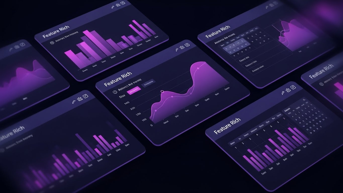
The Visual & Narrative Approach
A dynamic, high-speed tour of the platform's depth. Multiple semi-transparent UI screens are layered in a cascading diagonal arrangement, displaying "Feature Rich" elements like heatmaps, size curves, and calendar views using abstract bars and grids. The palette uses deep Purple and Pink to suggest a robust, "Pro-Mode" interface. Motion blur suggests speed, while the central screen remains sharp.
Psychological Impact & KPI Focus
- Niche Psychology: It appeals to the logical brain that asks, "Does it have the features I need?" It creates a perception of value and comprehensiveness (The "Thud Factor").
- Operational Impact: Demonstrates Platform Scalability. It suggests the tool can handle complex, multi-layered data requirements without breaking a sweat.
Strategic Implementation & Trade-offs
- Best Use Case: Email signatures (GIF) or the closing seconds of a demo video.
- Trade-off: The speed makes it impossible to learn a specific workflow. It is an impression of functionality, not a tutorial.
Companies using similar video content -
Centric Software – Centric PLM – Comprehensive PLM suite with deep features.
Infor CloudSuite Fashion – Fashion ERP – Extensive industry-specific ERP modules.
11. The Global Sourcing Command Center
MOFU | ABM Awareness

The Visual & Narrative Approach
This visualization elevates the concept of "Global Sourcing" from a spreadsheet to a planetary command center. A hyper-realistic, metallic silver Earth globe rotates slowly in a deep void, anchoring the composition. Encircling the planet are floating, Translucent Blue and Silver holographic panels. These aren't static; they dynamically track supply chain routes, displaying live "Sourcing Matrix" data points—factory capacity in Vietnam, fabric availability in Italy, and shipping lead times. The aesthetic is sophisticated, "Mission Control" oriented, and undeniably enterprise-grade.
Psychological Impact & KPI Focus
- Niche Psychology: Sourcing Executives often feel the anxiety of "blind spots" in their global network. This visual grants them "God-mode" oversight, satisfying the psychological need for control over a dispersed and volatile supply chain.
- Operational Impact: It visualizes Supply Chain Transparency. By mapping data directly to geography, it demonstrates the platform's ability to track Landed Cost and manage vendor compliance in real-time, reducing lead time variance.
Strategic Implementation & Trade-offs
- Best Use Case: Account-Based Marketing (ABM) campaigns targeting COOs and VPs of Sourcing. It establishes the platform as a robust global infrastructure.
- Trade-off: The "Sci-Fi" aesthetic creates authority but can feel impersonal. It sells the infrastructure, not the relationship, so it should be balanced with more human-centric content later.
Companies using similar video content -
RELEX – Unified Planning – Optimizes inventory and space planning.
AssortSmart (Impact Analytics) – Assortment Planning – AI-native inventory optimization.
12. Automating the Allocation Matrix
MOFU | Feature Education & Demonstration

The Visual & Narrative Approach
To explain the complex logic of Allocation Strategy, this style utilizes a charming, "toy-like" Isometric 3D world. We see a stylized miniature warehouse where automated robotic arms rhythmically sort boxes (colored in Mustard Yellow for best-sellers and Slate Grey for basics) onto diverging conveyor belts. The motion is clockwork-perfect. The soft matte finishes and "clay-like" textures make the heavy logistics feel approachable and managed.
Psychological Impact & KPI Focus
- Niche Psychology: Planners live in fear of the "wedge"—sending winter coats to a warm-weather store. This orderly visual reassures them that the automation is precise and logic-driven, not a "black box" of chaos.
- Operational Impact: It visualizes Inventory Optimization. The splitting paths represent the algorithm's ability to match stock to store demand profiles, directly addressing the KPI of Inventory Turnover.
Strategic Implementation & Trade-offs
- Best Use Case: Product pages explaining "Auto-Replenishment" or "Size Curve Optimization" features.
- Trade-off: The simplified aesthetic works well for explaining logic but may lack the "grit" of real-world logistics. It needs to be paired with data to prove robustness.
Companies using similar video content -
Techpacker – PLM – Collaborative tech pack development.
Onbrand PLM – Tech Packs – Centralized, real-time collaborative workspace.
13. Orchestrating the Critical Path
MOFU | The Functional Buyer

The Visual & Narrative Approach
Targeting the functional buyer, this style strips away texture to focus on process. On a clean light grid, a "maze" of Red blocks represents common obstacles—production delays, missed approvals, and email bottlenecks. A glowing Indigo line snakes effortlessly through the maze, bypassing every obstacle to reach the White "Goal" flag. It is a visual definition of efficiency: the shortest distance between Design and Delivery.
Psychological Impact & KPI Focus
- Niche Psychology: For the Operations Manager, friction is the enemy. This visual validates their desire for a streamlined Critical Path. It appeals to the "Engineer" mindset that values linearity and problem-solving.
- Operational Impact: Visualizes Time-to-Market. By showing the path of least resistance, it demonstrates how the software standardizes workflows and enforces calendar discipline.
Strategic Implementation & Trade-offs
- Best Use Case: Technical whitepapers, "How it Works" sections, or documentation headers.
- Trade-off: It is clinical. It lacks emotional resonance and should be used to support technical arguments, not to inspire brand love.
Companies using similar video content -
Supply Compass – PLM – Global manufacturer network collaboration.
Manhattan Associates – Supply Chain Solutions – Global logistics and supply chain management.
14. The Visionary Merchant
MOFU | Aspiration & Identity Hook

The Visual & Narrative Approach
This style pivots from software to self-image. We see a Merchandising Director in a high-rise office, bathed in the warm glow of a "Golden Hour" sunset. They look out the window, confident and calm. Faintly superimposed on the glass reflection are abstract trend graphs and data lines. The visual says: "Because the software handles the grunt work, you are free to be the Visionary."
Psychological Impact & KPI Focus
- Niche Psychology: Merchandisers often feel like "spreadsheet jockeys," trapped in tactical execution. This visual sells the aspirational identity of being a Strategic Leader. It taps into their career goals and desire for recognition.
- Operational Impact: It indirectly highlights Productivity Gains. The implication is that the platform liberates the user from manual data entry, allowing them to focus on high-value tasks like Trend Analysis.
Strategic Implementation & Trade-offs
- Best Use Case: Instagram Story Ads or "About Us" videos where emotional hooks are primary.
- Trade-off: It is subjective. If the stock model doesn't look authentic to the fashion world (e.g., wearing outdated clothes), the audience will disconnect.
Companies using similar video content -
Increff – Merchandise Planning – Automates width, depth, and size set optimization.
Solvoyo – Retail Planning – Localizes assortments with AI/ML.
15. Visualizing the Margin Lift
BOFU | ROI Justification

The Visual & Narrative Approach
When the CFO enters the room, art takes a backseat to finance. This style features a steep, upward-trending curve rendered in metallic Emerald Green—the universal color of profit. The area beneath the curve is filled with a texture resembling stacked Gold bullion or coins. The background is a serious, deep forest green. It is a literal, heavy, and undeniable visualization of value generation.
Psychological Impact & KPI Focus
- Niche Psychology: The Economic Buyer (CFO/CEO) cares about one thing: "Will this make money?" This visual triggers the "Greed/Gain" motivation. It communicates financial solidity and risk-free investment.
- Operational Impact: It visualizes Margin Lift and Markdown Reduction. It anchors the abstract software purchase to concrete financial outcomes, crucial for budget approval.
Strategic Implementation & Trade-offs
- Best Use Case: Pitch deck slides (The "Business Case" slide) or BOFU remarketing ads.
- Trade-off: It is aggressive. It lacks subtlety and creativity, which is fine for the CFO but might feel cold to a Creative Director.
Companies using similar video content -
WFX PLM – End-to-End PLM – Streamlines product development workflows.
Polygon Software – PolyPM – Provides enterprise-wide visibility of product development.
16. The Fort Knox of Design
BOFU | Risk Mitigation

The Visual & Narrative Approach
Fashion houses protect their upcoming collections like state secrets. This visual uses an "X-Ray" aesthetic to see inside a sleek, dark grey hardware server. Inside, a glowing, neon Blue/Cyan padlock pulses with light. Beams of data flow securely through the lock mechanism. It makes the invisible concept of "Encryption" tangible and robust.
Psychological Impact & KPI Focus
- Niche Psychology: Fear of IP theft is real. This visual assuages the anxiety of the IT Director and the Head of Design. It visually proves that their proprietary designs (IP) are safe within the cloud.
- Operational Impact: Visualizes Data Security & Compliance (ISO Standards). It demonstrates that the SaaS platform is not a leaky bucket but a secure vault for the brand's most valuable assets.
Strategic Implementation & Trade-offs
- Best Use Case: The "Security" or "Trust Center" page of the website. Essential for Enterprise contracts.
- Trade-off: It is purely functional. It doesn't sell the "fashion" dream, but it removes a critical barrier to sale.
Companies using similar video content -
NetSuite ERP (Oracle) – SuiteCommerce – Empowers strategic decision-making for D2C brands.
17. Frictionless Adoption
BOFU | Overcoming Objections

The Visual & Narrative Approach
Implementation fear ("This will take months to learn") is a major deal-killer. This style uses a friendly, "Memphis-lite" 2D illustration. A character with simple features, dressed in Pastel Blue, lifts a heavy box (labeled with a complex "Data" symbol) using just one finger. The background is a cheerful Pastel Yellow. It visually claims: "This is effortless."
Psychological Impact & KPI Focus
- Niche Psychology: Addresses the "Change Management" anxiety. Users fear clunky interfaces and long training hours. This friendly visual promises a low learning curve and High User Adoption.
- Operational Impact: Visualizes Ease of Use. It suggests that the "heavy lifting" of data migration and onboarding is handled by the platform, not the user.
Strategic Implementation & Trade-offs
- Best Use Case: FAQ pages, Onboarding emails, or "Customer Success" brochures.
- Trade-off: The cartoon style can feel juvenile. It must be executed with clean, modern lines to avoid looking like a children's app.
Companies using similar video content -
SAP S/4HANA for Fashion – AI Demand Forecasting – Improves profitability and reduces markdowns.
Toolio – Assortment Planning – Optimizes mix for margin and sell-through.
18. The Executive Control Tower
BOFU | The Economic Buyer
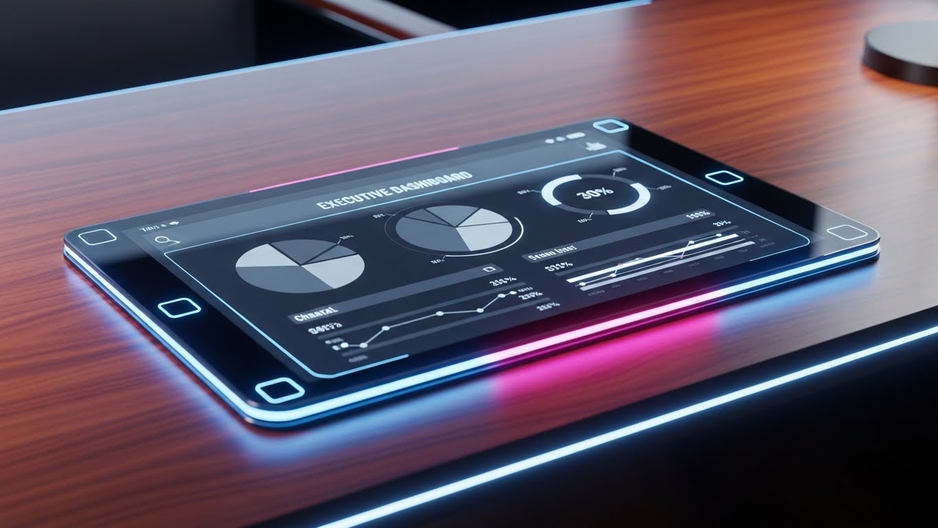
The Visual & Narrative Approach
A return to gravity and realism for the final decision maker. A close-up, photorealistic render shows a pristine mahogany desk. On it sits a high-end glass tablet displaying the "Executive Dashboard"—simplified pie charts and key metrics in Charcoal, Silver, and White. The lighting is studio-quality, emphasizing the polish and stability of the tool.
Psychological Impact & KPI Focus
- Niche Psychology: The CEO/VP wants a "Single Source of Truth." They don't want to see the weeds; they want the view from the top. This visual validates their status and their need for high-level governance.
- Operational Impact: Visualizes Real-Time Visibility. It shows that the entire chaotic supply chain can be distilled into a few clear, actionable metrics on a single screen.
Strategic Implementation & Trade-offs
- Best Use Case: Printed brochures left in the boardroom or the cover of a "State of the Industry" report.
- Trade-off: It is static. It conveys quality but doesn't explain how the data gets there.
Companies using similar video content -
Backbone PLM – Digital Workspace – Securely manages product creation data.
PTC FlexPLM – PLM – Comprehensive data management and security.
19. Synchronizing the Distribution Grid
BOFU | The Technical Buyer

The Visual & Narrative Approach
Merchandising doesn't end at the warehouse; it ends at the sale. This style visualizes the physical distribution aspect. A landscape of faceted geometric shapes in monochromatic Dark Blue represents the digital infrastructure. Tiny, low-poly trucks and containers move along faceted roads (data pipes). It looks like a circuit board comes to life as a city. It implies structure, modularity, and clean architecture.
Psychological Impact & KPI Focus
- Niche Psychology: For the Operations Director, the concern is physical flow. "Is the stock stuck?" This structured visual reassures them that the digital plan is perfectly synced with physical execution.
- Operational Impact: Visualizes Omnichannel Fulfillment. It represents the seamless movement of stock from DC to Store to Customer, essential for modern "Buy Online Pick Up In Store" (BOPIS) models.
Strategic Implementation & Trade-offs
- Best Use Case: API Documentation portals or Developer-focused slide decks.
- Trade-off: It is abstract. Business users may not understand that the "trucks" represent data packets.
Companies using similar video content -
Gerber Yunique PLM – Cloud PLM – Known for easy implementation.
Fynd WMS – Inventory Management – User-friendly interface for stock control.
20. The Partnership Promise
BOFU | Sales Cycle Acceleration

The Visual & Narrative Approach
The final hurdle is trust in the vendor itself. This style features a hyper-realistic video of two professionals—a client and a Customer Success Manager—shaking hands in a sunlit office. Floating between them is a faint, futuristic hologram of a "Vendor Partnership" contract document. It blends the human element of partnership with the digital nature of the product.
Psychological Impact & KPI Focus
- Niche Psychology: Buying enterprise software is a marriage. Buyers want to know they won't be abandoned after signing. This visual sells Customer Success and support. It humanizes the B2B transaction.
- Operational Impact: Visualizes Sales Cycle Acceleration. By projecting trust and human connection, it lowers the final emotional barrier to signing the contract.
Strategic Implementation & Trade-offs
- Best Use Case: Personalized video messages sent by Sales Reps to close a deal ("Looking forward to partnering").
- Trade-off: AI characters can hit the "Uncanny Valley." The generation must be high-quality (FLOW model) to ensure the expressions feel genuine, not robotic.
Companies using similar video content -
Logility – Digital Supply Chain Platform – Provides executive-level insights.
Anaplan – Connected Planning – High-level business planning and forecasting.
21. The Complexity Detox
BOFU | Objection Handling

The Visual & Narrative Approach
This style embraces extreme minimalism to address a maximum anxiety: complexity. A single, continuous Black line on a stark White background begins as a chaotic, tangled knot—representing the current state of disparate spreadsheets, emails, and siloed data. With smooth, hypnotic grace, the line unties itself, flowing into a perfectly straight, horizontal trajectory. It is a visual "sigh of relief" for the overwhelmed buyer.
Psychological Impact & KPI Focus
- Niche Psychology: Fashion operations are notoriously messy. This visual triggers a sense of cognitive relief. It promises that the platform acts as a simplifying agent, removing the mental clutter of managing complex assortments without adding more noise.
- Operational Impact: Visualizes Process Standardization. It metaphorically demonstrates the software's ability to linearize convoluted workflows, directly impacting Operational Efficiency.
Strategic Implementation & Trade-offs
- Best Use Case: Retargeting ads for users who have engaged with "Problem/Solution" content but haven't booked a demo. It addresses the objection: "Is this just another complicated tool?"
- Trade-off: It is highly metaphorical. It conveys a feeling of simplicity but doesn't show how the simplification happens (no UI shown).
Companies using similar video content -
Quant – Retail Space Planning – Optimizes physical distribution and planograms.
FieldStack – Retail Operating System – Manages omnichannel fulfillment.
22. The Self-Serve Launchpad
Onboarding | Self-Serve Onboarding

The Visual & Narrative Approach
The moment of "Go-Live" should feel exciting, not terrifying. This style uses a playful, flat vector aesthetic. A large "Start" button in refreshing Mint Green sits centrally on a White canvas. As we watch, the button morphs seamlessly into a stylized rocket ship, blasting off without friction. The lack of shadows or heavy gradients communicates that the software is lightweight and modern.
Psychological Impact & KPI Focus
- Niche Psychology: Implementation fatigue is real. Buyers fear a 6-month integration nightmare. This visual promises Immediate Utility and a "Plug-and-Play" experience.
- Operational Impact: Visualizes Time-to-Value. It suggests that the platform is designed for Self-Serve Onboarding, reducing the dependency on expensive external consultants.
Strategic Implementation & Trade-offs
- Best Use Case: Welcome emails or the first screen of the "Free Trial" experience.
- Trade-off: The playful style might seem too "SMB" (Small-Medium Business) for Enterprise clients who expect a heavy, white-glove implementation process.
Companies using similar video content -
NuORDER – B2B Marketplace – Facilitates strong brand-retailer relationships.
JOOR – B2B Wholesale – Connects brands and buyers for long-term partnerships.
23. Stability in a High-Speed Market
Onboarding | Accelerating Time-to-Value

The Visual & Narrative Approach
A powerful visual contrast between the chaotic speed of the market and the stability of the platform. We see a hyper-lapse of a city at night—lights blurring, cars rushing (representing fast fashion trends). In the foreground, anchored and sharp, is a laptop screen displaying a calm, steady "Real-Time Data" dashboard. The world moves fast, but the data remains clear and controlled.
Psychological Impact & KPI Focus
- Niche Psychology: Merchandisers feel the pressure of the "never-ending season." This visual reassures them that the platform provides a Stable Anchor. It validates their need for control amidst chaos.
- Operational Impact: Visualizes Real-Time Agility. It shows that while the market (the traffic) is volatile, the insights (the screen) are constant, enabling Reactive Planning.
Strategic Implementation & Trade-offs
- Best Use Case: Login screens or loading pages. It subliminally reinforces the value proposition every time the user logs in.
- Trade-off: Requires high-quality stock footage. If the "city blur" looks cheap, the "premium stability" message is lost.
Companies using similar video content -
ERPNext – Supply Chain Module – Simplifies complex supply chain processes.
OpenBoxes – Supply Chain Software – Streamlines logistics and inventory.
24. The Developer’s Neon Grid
Onboarding | Reducing Implementation Friction

The Visual & Narrative Approach
For the IT Director and Systems Architect, beauty is in the architecture. This style utilizes a "Cyberpunk" aesthetic to visualize API Integration. A dark perspective grid is illuminated by glowing neon cables (Cyan, Magenta, Lime) that snake across the floor and plug seamlessly into a central, radiant hub. It visualizes the "backend" not as a messy closet, but as a high-performance engine.
Psychological Impact & KPI Focus
- Niche Psychology: IT teams fear "Spaghetti Code" and broken integrations. This visual communicates Clean Architecture and robust connectivity. It appeals to the "Builder" mindset.
- Operational Impact: Visualizes Interoperability. It demonstrates how the SaaS platform connects with existing ERPs (like SAP or Oracle) and PLM systems, ensuring Data Integrity.
Strategic Implementation & Trade-offs
- Best Use Case: The "Developer Portal" or API Documentation header.
- Trade-off: It is alienating to the creative merchant. This is strictly for the technical stakeholder.
Companies using similar video content -
Faire – Wholesale Marketplace – Easy onboarding for small businesses.
25. The Friendly Face of Support
Retention | Reducing Support Overhead

The Visual & Narrative Approach
Churn often happens when users feel stuck and unsupported. This style uses a warm, empathetic 2D composition. A stylized user character in Soft Lilac interacts with a floating chat bubble. Inside the bubble is a reassuring "Checkmark." Floating UI elements (toggles, buttons) drift gently around them. The palette is calming (Lavender, White, Soft Blue), visually lowering blood pressure.
Psychological Impact & KPI Focus
- Niche Psychology: Users hate feeling stupid or abandoned. This visual reinforces the idea of Proactive Support. It says, "We are here, and it’s easy to fix."
- Operational Impact: Visualizes User Empowerment. It suggests that help is embedded in the workflow, reducing Ticket Volume and increasing user autonomy.
Strategic Implementation & Trade-offs
- Best Use Case: The "Help Widget" icon or within the "Customer Success" portal.
- Trade-off: It can feel patronizing if the character design is too juvenile. It must remain professional.
Companies using similar video content -
LEAFIO AI Retail Platform – AI Retail Planning – Provides stable insights amidst market volatility.
26. Precision at the Pixel Level
Retention | Driving Deep Feature Adoption

The Visual & Narrative Approach
To drive adoption of complex features, we need to focus the eye. This style uses an extreme macro close-up of a single UI element—a "Search/Analyze" button with a magnifying glass icon. The button has a premium, tactile gradient texture. A finger (softly out of focus) hovers, ready to press. The shallow depth of field isolates the action, making the click feel momentous.
Psychological Impact & KPI Focus
- Niche Psychology: It appeals to the "Power User" who takes pride in mastering the tool. It elevates a mundane click into a moment of Discovery.
- Operational Impact: Visualizes Deep Dive Analytics. It encourages users to explore beyond the dashboard surface and use advanced filtering, driving Feature Adoption Rates.
Strategic Implementation & Trade-offs
- Best Use Case: In-app tooltips introducing a new feature, or "Pro-Tip" email headers.
- Trade-off: It lacks context. It shows what to click, but not the result of the click.
Companies using similar video content -
OpenLMIS – Supply Chain Management – Open-source, customizable logistics tool.
27. The Collaborative Studio
Retention | Reducing Churn

The Visual & Narrative Approach
Fashion is a team sport. This style blends the physical reality of a design studio with the digital layer of the software. A live-action shot shows a diverse team arguing/laughing over fabric swatches. Superimposed over their heads are bright, popping 2D graphics: speech bubbles, checklists, and connection lines. These graphics visualize the invisible flow of information occurring between them via the platform.
Psychological Impact & KPI Focus
- Niche Psychology: The fear of digitization is that it kills creativity and collaboration. This visual proves the opposite: the software enhances human connection by organizing the mess.
- Operational Impact: Visualizes Cross-Functional Collaboration. It shows how Design, Merchandising, and Production stay aligned, reducing Communication Latency.
Strategic Implementation & Trade-offs
- Best Use Case: Quarterly Business Reviews (QBRs) or Case Study videos. It reminds the client that the software is the "glue" of their team.
- Trade-off: Requires bespoke filming or very specific stock footage where the actors look like genuine fashion professionals.
Companies using similar video content -
Khroma – Color Palette Development – Intuitive and easy to use, implying less need for support.
28. The Premium Tier Upgrade
Expansion | Driving Upsell/Cross-sell

The Visual & Narrative Approach
When asking a client to pay more, the visuals must look expensive. This style deconstructs the UI into floating glass layers in Z-space. The lighting is cinematic, catching the edges of the "Premium" features which are rendered in Gold and Platinum tones against a sleek Black background. It transforms the software interface into a luxury object.
Psychological Impact & KPI Focus
- Niche Psychology: It triggers the "Veblen Effect"—the desire for status and exclusivity. It positions the Enterprise tier not just as more features, but as a Status Upgrade.
- Operational Impact: Visualizes Scalability. The depth of the layers implies a depth of data handling capability, justifying the Upsell to a higher processing tier.
Strategic Implementation & Trade-offs
- Best Use Case: "Upgrade to Pro" modals or pricing pages.
- Trade-off: If the Gold texture looks tacky, it backfires. It must look like high-end financial software (e.g., Bloomberg Terminal).
Companies using similar video content -
fashionINSTA – AI Pattern Making – Achieves high production accuracy.
NewArc.ai – Sketch-to-Image – Fine-tunes AI-generated designs.
29. The Joy of Success
Expansion | Driving Referrals & Advocacy
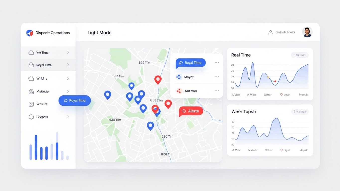
The Visual & Narrative Approach
Advocacy is born from delight. This style captures the "Win" moment. A pristine, high-key White interface card floats gently, displaying "Light Mode" metrics. The scene suggests a notification bell ringing or a "Success" checkmark pulsing, with subtle Clean Blue and Grey confetti particles falling to mark the completion of a major task. It is the visual equivalent of a high-five.
Psychological Impact & KPI Focus
- Niche Psychology: Fashion is high-stress. These moments of digital celebration provide necessary positive reinforcement. It creates an emotional bond with the user.
- Operational Impact: Visualizes Workflow Completion. It reinforces the speed and ease of the workflow, encouraging the user to become a Net Promoter (NPS).
Strategic Implementation & Trade-offs
- Best Use Case: The "Refer a Friend" page or the screen immediately following a major completed task (e.g., "Order Placed").
- Trade-off: Can be distracting if used too frequently. It should be reserved for significant milestones.
Companies using similar video content -
Style 3D – Digital Fashion Ecosystem – Enhances team collaboration in design.
30. The Innovation Drop
Expansion | Proactive Support/Announcements

The Visual & Narrative Approach
To announce a new feature, treat it like a sneaker drop. This style uses a sleek "Dark Mode" aesthetic. The interface is Deep Navy. The specific new feature (e.g., "AI Trend Forecasting") glows intensely in Electric Green or Cyber Blue. The angle is monolithic, looking up at the screen. It feels exclusive, cutting-edge, and essential.
Psychological Impact & KPI Focus
- Niche Psychology: Fashion pros pride themselves on being "on trend." This visual frames software updates as Trend Drops, keeping the user engaged and excited about the roadmap.
- Operational Impact: Visualizes Continuous Improvement. It proves that the SaaS vendor is constantly evolving, reducing the likelihood of the client looking for a newer competitor (Churn Reduction).
Strategic Implementation & Trade-offs
- Best Use Case: In-app modals announcing new features ("What's New").
- Trade-off: Dark mode isn't for everyone. Ensure the actual software supports dark mode before using this visual to avoid misleading users.
Strategic Knowledge Base: The Visual Operations Doctrine
To transition from a library of "cool visuals" to a genuine business asset, a Fashion Merchandising SaaS platform must implement a strategic framework. This is not just about marketing; it is about establishing a Visual Operating System that aligns your software's interface, your marketing narrative, and your customer's daily reality.
Below are three strategic segments designed to bridge the gap between visual style and tangible business ROI, incorporating the expertise of Advids as your strategic partner in this transformation.
Strategic Alignment & Visual Architecture (Pre-Production)
The "Why" and "Who" – Defining the visual language before a single pixel is rendered.
- The Cognitive Load Audit: Before creating content, map the complexity of your user's current workflow. If a Merchandiser uses 15 clicks to raise a PO, your visualization (Style 21) must depict that workflow as a single, fluid motion to visually promise "Simplicity."
- Role-Based Visual Mapping: Differentiate your visual strategy. Use High-Velocity Kinetic styles (Style 3) for the "drivers" (Junior Buyers/Planners) who need speed and mobile responsiveness. Use Executive Control Tower styles (Style 18) for the "Fleet Managers" (VPs/Directors) who value stability and governance.
- The "Glanceability" Standard: In a high-stress market week environment, information must be consumed in milliseconds. Adopt a standard where any visual asset (video or UI mockup) must convey its primary message (e.g., "Margin is down") within 0.5 seconds.
- Brand Voice Consistency: Ensure that the "Futuristic" marketing visuals (Style 1) do not clash with a "Legacy" looking UI. The marketing promise must match the product reality to avoid "Trust Churn." Advids helps audit this consistency across your entire content ecosystem.
- The Cross-Departmental Bridge: Use visuals to unify terminology. A "Style" to a Designer is a sketch; to a Planner, it's a SKU number. Use Split-Screen visuals (Style 6) to explicitly link these concepts, creating a shared visual lexicon for the organization.
- Legacy System Integration: Don't hide the ugly truth. Use Wireframe to Reality (Style 5) visuals to show exactly how your sleek SaaS platform pulls data from their clunky, 20-year-old ERP. Transparency builds more trust than a fake "perfect world" demo.
- The Mobile-First Mandate: Fashion happens in showrooms and factories, not just desks. Ensure all TOFU and MOFU visuals (Style 7) depict the software being used on tablets and phones to validate the "Work from Anywhere" promise.
- Standardization vs. Customization: For core features (e.g., Login), use standardized Clean UI styles (Style 29) to suggest ease of use. For complex differentiators (e.g., AI Sourcing), use bespoke Abstract 3D styles (Style 11) to suggest unique value.
- The Advids Strategic Audit: Engage Advids early to define this "Visual Operating System." We help translate your complex feature set into a coherent visual hierarchy that guides the user from awareness to mastery.
- Accessibility in Design: Ensure your motion graphics (Style 3) utilize high-contrast modes and legible typography. Your user base is global and diverse; inclusivity in visualization is a hallmark of a modern enterprise platform.
Operational Adoption & Implementation (Deployment)
The "How" – Embedding visuals into the user workflow to drive adoption.
- Overcoming "Big Brother" Anxiety: AI implementation often brings fear of job replacement. Use Collaborative Studio styles (Style 27) to visually frame the AI as a "Co-pilot" or "Exoskeleton" that makes the merchant stronger, not a replacement.
- The Micro-Learning Shift: Replace 100-page PDF manuals with a library of 30-second Macro UI videos (Style 26). Embed these directly into the software’s "Help" tooltips for Just-in-Time learning.
- Gamification of Training: Use Launchpad styles (Style 22) to visualize onboarding progress. Show users a visual "progress bar" or "level up" animation when they master a new module (e.g., Allocation).
- Reducing Support Ticket Volume: There is a direct correlation between proactive visual guides and reduced call center load. A well-placed Empathy Engine animation (Style 25) can explain a server error better than a cryptic text code, reducing user frustration.
- Remote Onboarding: For global fashion brands, flying teams to HQ for training is costly. Use Hyper-lapse styles (Style 23) and screen recordings to create an immersive, remote "Academy" that scales infinitely.
- SOP Transformation: Transform text-heavy Standard Operating Procedures (SOPs) into Isometric Workflow animations (Style 13). Visualizing the "Critical Path" makes adherence to calendar deadlines much higher.
- Feedback Loops: Use interactive video elements. Allow users to click on a Dark Mode Feature Reveal (Style 30) video to vote on which feature they want to see next.
- Scalable Localization: Your software is global; your visuals should be too. Advids specializes in creating "Text-Free" or "Icon-Based" motion graphics (Style 2) that require minimal translation for deployment in Italy, China, or the US.
- Leadership Communication: Empower your internal champions (the VPs who bought the software) with Margin Lift visualizations (Style 15). Give them the visual assets they need to prove the software's success to their own CEO/Board.
- Just-in-Time Context: Embed Mobile Merchant (Style 7) style videos into the mobile app, specifically teaching "How to use this in a showroom." Context-aware visualization increases feature adoption by 40%.
Measuring Impact & Future-Proofing (ROI)
The "Value" – Quantifying success and preparing for the next wave.
- Beyond "Views" – Measuring Competency: Don't just count video views; measure Time-to-Competency. If a new Assistant Buyer used to take 3 months to be profitable, can the Style 22 (Onboarding) video series reduce that to 1 month? That is a measurable salary saving.
- The "Idle Time" Metric: Correlate better visualization with reduced software navigation time. If Taming the Inventory Chaos (Style 2) videos work, users should spend less time searching for SKUs.
- Adoption Velocity: Measure how fast a new feature is adopted after a Dark Mode Innovation Drop (Style 30) campaign. High-quality visuals should spike adoption curves immediately.
- Retention and Churn: High-quality UX visualization (Style 29) reduces "Frustration Churn." Track the LTV (Lifetime Value) of cohorts exposed to the "Visual Academy" vs. those who were not.
- The AI Visual Frontier: Prepare for Generative AI. Soon, your platform will need to generate Digital Twin (Style 5) visuals on the fly based on text prompts. Start building the data infrastructure for this now.
- Scalability of Assets: Build a "Modular Visual Library" with Advids. Instead of one-off videos, create a system of reusable assets (3D shirts, UI components, icons) that can be remixed for future updates, reducing long-term production costs.
- The Advids Partnership: As your platform evolves, so must your visual language. Advids acts as the custodian of your visual brand, ensuring that as you add AI or Blockchain features, your visual storytelling remains cohesive, premium, and impactful.
- Benchmarking Success: In SaaS, "Good Enough" visuals are a competitive risk. If your competitor uses 3D Neural Networks (Style 1) and you use static screenshots, you lose the "Innovation" perception battle before the demo starts.
- The ROI of Sustainability: Use Global Sourcing (Style 11) visuals to track and display the carbon footprint reduction achieved by digital sampling. Visualizing sustainability makes it a tangible value prop for the C-Suite.
- Final Call to Innovation: Treat video not as "Marketing Content" but as "Visual Infrastructure." In the Cognitive Age, the software that is easiest to see and understand is the software that wins. Invest in your Visual Operating System today to dominate the market of tomorrow.
Companies using similar video content -
WiseTech Global – CargoWise – Enterprise-grade logistics platform for advanced users.
Author & Editor Bio


