
Introduction: The Digital Runway is Open 24/7
The fashion wholesale industry is currently navigating its most significant operational shift in decades: the transition from purely physical, sample-heavy buying cycles to streamlined, hybrid digital ecosystems. For showroom managers and sales directors, the challenge is no longer just about curating the perfect collection; it is about translating the tactile magic of silk and leather into a digital experience that converts.
This "Physical Paradox"—the tension between the need for touch and the demand for speed—is where your greatest opportunity lies. By adopting a visual-first strategy, you are not just digitizing a line sheet; you are engineering a global sales engine that operates without time zones or travel budgets.
The scale of this shift is undeniable. The global digital wholesale fashion market is projected to reach 23.7 billion by 2033, driven by brands demanding efficiency and broader reach. This isn't just about growth; it's about operational excellence. Leading brands have already reported a 60% sample reduction after adopting virtual alternatives, simultaneously slashing costs and bolstering their sustainability credentials.
This guide serves as your strategic bridge. We have curated 30 precise visual examples designed to alleviate the anxieties of "digital coldness" and replace them with high-fidelity, persuasive assets. From photorealistic fabrics to intuitive UI demonstrations, these styles are mapped to specific stages of the B2B buying funnel, ensuring that every pixel serves a commercial purpose.
1. Abstract 2D Flat Vector Organic Modern Motion Graphics
TOFU | Brand Awareness

The Visual & Narrative Approach
This style masterfully visualizes the core promise of your platform: transformation. The animation avoids literal representations of software interfaces, which can often feel sterile in a TOFU context. Instead, it uses a sophisticated metaphor. We witness a seamless metamorphosis where the chaotic, organic nature of a physical material—represented by a flowing, vivid coral red silk fabric ribbon—organizes itself into a structured, digital teal blue data stream. The background is a clean, soft cream color, ensuring the focus remains on this fluid transition.
Psychological Impact & KPI Focus
- Niche Psychology: Fashion professionals often fear that digitization means a loss of "soul" or texture. This visual reassures them by maintaining the organic curves of the silk before organizing it into data, symbolizing that the essence of the fashion is preserved, just better managed.
- Operational Impact: This style directly addresses the friction of the "Physical/Digital Divide." It visually proves that the chaotic physical sample process can be converted into a streamlined, digital workflow without losing quality.
- Primary KPI: Brand Recall and Engagement Rate.
Strategic Implementation & Trade-offs
- Best Use Case: 15-second social media intros or looping backgrounds where the goal is to stop the scroll with satisfying motion.
- Trade-offs: It is purely conceptual. It does not educate the user on how the platform works, only what it feels like to use it. Do not use this for feature demos.
Companies using similar video content -
Fashion Cloud – B2B Platform – Streamlines content and order processes for fashion.
Centra – B2B E-commerce Platform – Integrates direct-to-consumer and wholesale channels.
3. Isometric 2D Motion Design
TOFU | Market Education

The Visual & Narrative Approach
Isometric design provides a "god's eye view" of the ecosystem, offering perfect clarity. This visualization creates a miniaturized, controllable world. Set against a pale mint green grid, the showroom floor is demystified. We see the direct correlation between the physical rack and the digital database. A bright white beam of light connects a physical dress to a floating digital tablet icon above it, visually explaining the "Digital Twin" concept without a single line of voiceover. The style is clean, precise, and flat with hard edges.
Psychological Impact & KPI Focus
- Niche Psychology: Showroom managers are often overwhelmed by spatial constraints and the logistics of sample management. This clean, grid-based view reduces cognitive load, offering a sense of total control over their inventory.
- Operational Impact: This visual anchors the concept of "Assortment Planning." It demonstrates how physical racks are mirrored in the digital space, facilitating easier merchandising.
- Primary KPI: Time-on-page and Comprehension Rate.
Strategic Implementation & Trade-offs
- Best Use Case: Explaining ecosystem architecture or workflow diagrams in a simplified, digestible format on blogs or landing pages.
- Trade-offs: The simplified vector style lacks the texture and "hand" that fashion buyers crave. It sells the logic of the system, not the beauty of the product.
Companies using similar video content -
Colect.io – Digital B2B Sales Platform – Transforms sales and marketing for fashion brands.
Brandboom – B2B Wholesale Platform – Simplifies product presentations and order placement.
4. Generative AI Cinematic Video
TOFU | Shaping Brand Perception
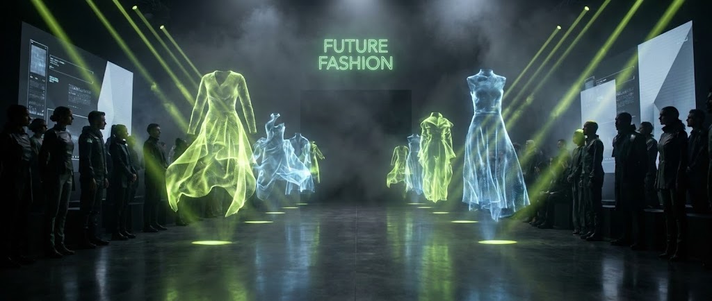
The Visual & Narrative Approach
This style leverages the futuristic and ethereal nature of Generative AI to paint a vision of "Next-Gen Fashion." We move beyond the present day into an aspirational future. The low-angle, dramatic shot of a futuristic runway establishes authority. The key element is the absence of physical models; instead, glowing, ethereal holograms of clothing designs walk the runway. The interplay of moody fog and electric lime green spotlights creates a "Cyber-Couture" atmosphere.
Psychological Impact & KPI Focus
- Niche Psychology: The high-contrast lighting and holographic elements trigger a sense of wonder (FOMO), positioning the brand as a forward-thinking visionary.
- Operational Impact: It subtly communicates that adopting this platform is a step toward the inevitable future of fashion technology, where digital samples replace physical waste.
- Primary KPI: Brand Sentiment and Bounce Rate Reduction.
Strategic Implementation & Trade-offs
- Best Use Case: High-impact website headers or event openers that need to set a tone of innovation immediately.
- Trade-offs: The "AI look" can sometimes feel impersonal. It requires careful prompt engineering to ensure the holographic garments still look desirable and not glitchy.
Companies using similar video content -
PULPO WMS – Fashion Inventory Management – Optimizes warehouse and SKU management.
MarketTime – B2B Order Writing Platform – Unifies order writing and e-commerce for wholesalers.
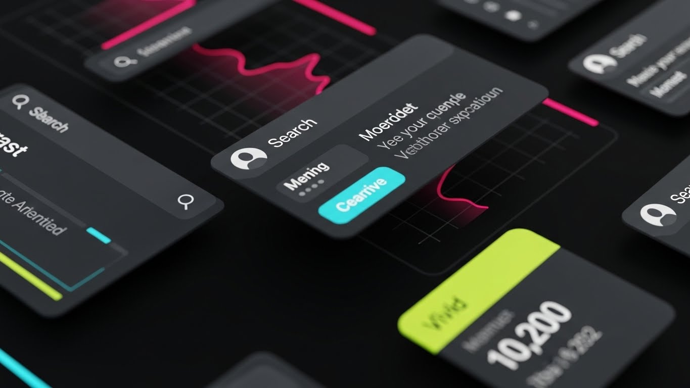
5. Bold Kinetic Typography (Visual)
TOFU | Vertical Social Organic

The Visual & Narrative Approach
In the fast-paced vertical feed, legibility is secondary to energy. This style uses typography as the visual protagonist. It mimics the high-pressure environment of a fashion week launch. Large, blocky geometric shapes in cyan blue and magenta crash into each other and reform into a streamlined vertical pillar. The background is a deep violet. Motion blur lines accentuate the speed of the collision.
Psychological Impact & KPI Focus
- Niche Psychology: The aggressive motion and vibrant contrast are designed specifically to disrupt the "zombie scroll" state of social media users.
- Operational Impact: The visual metaphor (Chaos -> Pillar) represents the consolidation of fragmented data into a single source of truth, appealing to the desire for efficiency.
- Primary KPI: View Retention and Shareability.
Strategic Implementation & Trade-offs
- Best Use Case: Hype reels, feature announcements, or "wake up" calls in a TikTok/Reels feed.
- Trade-offs: It offers zero depth. If the user doesn't already know the brand, this might just register as "noise." It must be paired with a clear caption.
Companies using similar video content -
Style3D – AI & 3D Fashion Design – Revolutionizes design with virtual sampling.
CreateOne – AI Fashion Design Platform – Crafts eco-conscious fashion with AI tools.
6. 2D Character-Driven Story
TOFU | Skippable Pre-Roll Ad

The Visual & Narrative Approach
This style introduces the human element through a "stylized 2D vector illustration." The protagonist, a "young fashion assistant" in a trendy blazer, serves as a mirror for the user. The visual contrast is stark and immediate: behind her, a "chaotic pile of colorful sketched clothes" (the old way) fades away, replaced by "neat, organized grid lines" (the new way). Her expression of "relief and happiness" while holding the "glowing white screen" effectively humanizes the software's ROI.
Psychological Impact & KPI Focus
- Niche Psychology: This taps directly into the "Burnout" anxiety of the target persona. Showroom managers often feel buried under samples and spreadsheets. Seeing a character who looks trendy (validating their identity) but organized (validating their aspiration) creates instant empathy.
- Operational Impact: The visual metaphor (Chaos -> Grid) provides instant cognitive closure, showing the solution's effect without explaining the technical "how."
- Primary KPI: View-Through Rate (VTR) and Ad Recall.
Strategic Implementation & Trade-offs
- Best Use Case: YouTube Pre-roll (15-30 seconds). The narrative arc (Problem: Chaos -> Solution: Tool -> Result: Relief) fits perfectly.
- Trade-offs: The "cartoon" style might be perceived as less "premium" by high-end luxury brands who prefer photographic realism. It works best for mid-market or mass-market fashion SaaS positioning.
Companies using similar video content -
JOOR – B2B Fashion Marketplace – Accelerates wholesale buying and sales.
NuORDER by Lightspeed – Global B2B Commerce Platform – Powers wholesale for brands and retailers.
7. Photorealistic 3D Renders
TOFU | Connected TV
The Visual & Narrative Approach
For the luxury segment, "premium" is the only acceptable language. This style uses photorealism to build trust. The environment is a high-end luxury showroom in a converted industrial loft. Sunlight streams through floor-to-ceiling windows, illuminating a rack of silver satin evening gowns. In the foreground, a sleek, glass-and-aluminum digital kiosk stands prominently. The focus is sharp on the kiosk, with the gowns softly blurred in the background (bokeh).
Psychological Impact & KPI Focus
- Niche Psychology: The high-fidelity rendering transfers the perceived value of the luxury environment onto the software itself. It proves the tech belongs in the showroom.
- Operational Impact: It visually bridges the physical/digital divide, showing the hardware as a natural extension of the physical space.
- Primary KPI: Brand Lift and direct search traffic.
Strategic Implementation & Trade-offs
- Best Use Case: Streaming Ads or Trade Show Loop. The high fidelity demands a larger screen (TV or Monitor) to appreciate the textures.
- Trade-offs: High production cost. Requires high-quality assets. If the 3D render looks "fake" or "uncanny," it will damage the brand's reputation for quality.
Companies using similar video content -
Uphance – Apparel Management Software – Empowers data-driven decisions and efficiency.
Brandscope – B2B Fashion Platform – Streamlines sales and marketing processes.
8. Wireframe to Reality Transition
MOFU | Product/Solution Differentiation
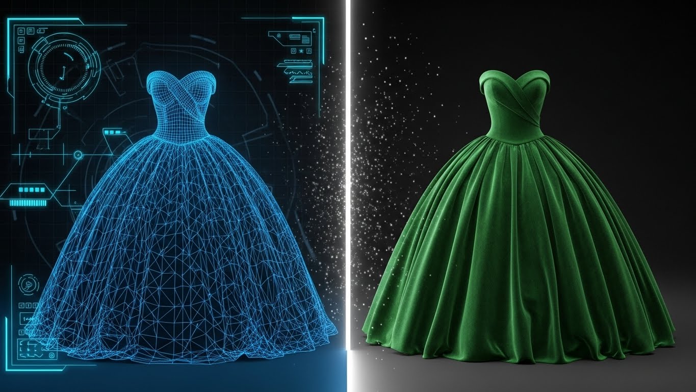
The Visual & Narrative Approach
This split-screen composition is the ultimate "Feature Education" visual. It directly compares the "3D blue wireframe blueprint" (data/structure) with the "fully rendered, realistic fabric version" (final product). The "glowing white vertical line" acting as the threshold emphasizes the platform's processing power. It visually proves that your tool captures every technical specification—stitch count, fabric weight, drape—and renders it faithfully.
Psychological Impact & KPI Focus
- Niche Psychology: This addresses the "Accuracy Anxiety" of production managers. They worry that digital samples hide flaws. By showing the skeleton (wireframe) alongside the skin (velvet), you demonstrate transparency and technical rigor.
- Operational Impact: It visually bridges the "Left Brain" (Data) and "Right Brain" (Design), appealing to cross-functional buying teams.
- Primary KPI: Engagement (Slides) and Click-Through to Technical Specs.
Strategic Implementation & Trade-offs
- Best Use Case: LinkedIn Carousel or Product Page. It encourages users to pause and analyze the details on both sides of the line.
- Trade-offs: It is technical and dry. It appeals to the logical brain (Head of Production) rather than the emotional brain (Creative Director).
Companies using similar video content -
WFX Virtual Showroom – Virtual Showroom Tool – Showcases products without physical samples.
CLO 3D – 3D Fashion Design Software – Creates virtual, true-to-life garment visualizations.
9. Macro UI Micro-Interactions
MOFU | Feature Education & Demonstration

The Visual & Narrative Approach
This style zooms in to an extreme macro level, filling the screen with a single "toggle" switch. The "vivid neon purple" glow against the "soft grey" background draws the eye immediately to the point of interaction. The visible "microscopic RGB pixel texture" adds a layer of tactile realism to the screen itself. It turns a mundane action—clicking a button—into a significant, powerful event.
Psychological Impact & KPI Focus
- Niche Psychology: In SaaS, "ease of use" is a top selling point. By isolating a single interaction, you demonstrate clarity and responsiveness. The "active" status glow triggers a dopamine hit associated with completion and control.
- Operational Impact: It assures the user that the interface is modern, responsive, and satisfying to use—reducing the fear of clunky, legacy enterprise software.
- Primary KPI: Conversion Rate (Free Trial Sign-ups) and Time on Product Page.
Strategic Implementation & Trade-offs
- Best Use Case: Feature Release Email or Product Tour Video. It works well to highlight specific new updates (e.g., "One-click publishing").
- Trade-offs: It lacks context. A user seeing only a button doesn't know what the software does. It must be part of a sequence or accompanied by descriptive text.
Companies using similar video content -
Browzwear – Digital Apparel Design Platform – Develops garments that fit first time.
Zeddwork Studio – 3D Garment Visualization – Offers realistic digital sampling services.
10. Aspirational Stock Montage
MOFU | Building Trust & Credibility

The Visual & Narrative Approach
This montage moves away from the software interface to focusing on the people using it. A "diverse team of fashion buyers" is shown in a "sunlit studio," laughing and collaborating. The overlay of "semi-transparent white shield icons and checkmarks" subtly communicates that this happy collaboration is protected and verified. It associates the feeling of "warm (golden hour)" sunlight with the security of your platform.
Psychological Impact & KPI Focus
- Niche Psychology: This addresses the social dimension of B2B buying. It answers the question, "Will my team actually use this?" Seeing a happy, collaborative team suggests high adoption rates.
- Operational Impact: The shield icons address the IT Director's concerns about data protection without disrupting the positive human narrative.
- Primary KPI: Email Click-Through Rate and Trust Score.
Strategic Implementation & Trade-offs
- Best Use Case: Email Newsletter or Case Study header. It humanizes the brand and is excellent for testimonials.
- Trade-offs: Stock footage can feel generic. It is crucial to select high-quality clips that look authentic to the fashion industry to avoid looking like a generic corporate ad.
Companies using similar video content -
WizCommerce – AI-powered B2B Platform – Manages wholesale transactions efficiently.
EasyReplenish – Fashion Inventory Management – Automates forecasting and inventory.
11. Minimalist Flat 2D Vector**
MOFU | Competitive Displacement
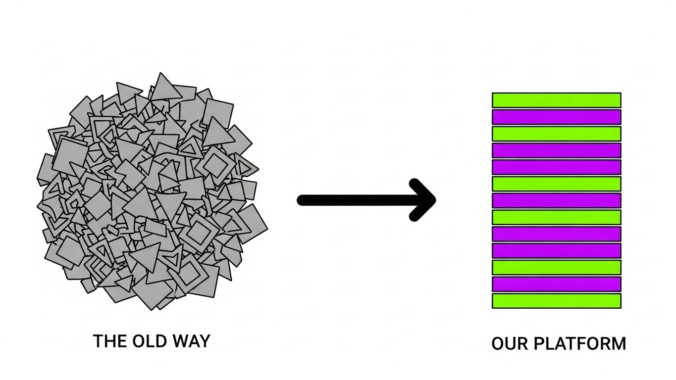
The Visual & Narrative Approach
This style employs a stark, "Bauhaus-inspired" minimalist approach to visualize the concept of competitive displacement. It presents a side-by-side comparison on a pristine white background. On the left, a "chaotic pile of grey geometric shapes" represents the legacy methods—spreadsheets, physical swatch books, and disjointed emails. An arrow curves elegantly to the right, where these shapes are transformed into a "perfectly aligned stack of vivid purple and lime green horizontal bars." This visual shorthand immediately communicates the transition from disorder to structured efficiency.
Psychological Impact & KPI Focus
- Niche Psychology: Fashion buyers and showroom managers are visually sensitive professionals who crave order. This clean, vector style appeals to their desire for a decluttered mental space, positioning your platform as the "curator" of their wholesale reality.
- Operational Impact: It visually summarizes the core value proposition: taking disparate, messy data points (SKUs, inventory levels, customer notes) and stacking them into a unified, accessible tier.
- Primary KPI: Click-Through Rate (CTR) on comparison pages and Bounce Rate Reduction.
Strategic Implementation & Trade-offs
- Best Use Case: "Us vs. Them" comparison pages or competitor-targeting landing pages. The simplicity allows for instant comprehension without reading heavy text.
- Trade-offs: The abstract nature lacks emotional depth. It convinces the logical brain (efficiency) but may not excite the creative brain (design) as much as a photorealistic style would.
Companies using similar video content -
FashionUnited B2B Marketplace – Global B2B Marketplace – Connects apparel buyers and brands.
Bluescape – Virtual Workspaces – Facilitates team collaboration and decision-making.
12. 3D X-Ray Visualization
MOFU | ABM Awareness

The Visual & Narrative Approach
To target the technically-minded stakeholders (IT Directors, COOs), this style literally looks beneath the surface. We see a sleek server infrastructure unit or high-end digital kiosk floating in a "dark void." The outer casing is rendered transparent, revealing glowing internal components that look like "miniature racks of clothes and conveyor belts" in electric blue and cyan. This powerful visual metaphor implies that the hardware is merely a window into a vast, complex logistics world powered by your software. The internal lighting creates a sense of depth and sophisticated engineering.
Psychological Impact & KPI Focus
- Niche Psychology: There is often skepticism about whether a simple app can handle the complexity of global wholesale. By showing a "miniature industrial world" inside the machine, you validate the robustness of the backend architecture.
- Operational Impact: It bridges the gap between the sleek frontend interface and the heavy-lifting backend ERP integrations, reassuring the viewer that the platform is powerful enough to handle enterprise-level data.
- Primary KPI: Account Engagement Score (for ABM targets) and Time on Technical Specs Page.
Strategic Implementation & Trade-offs
- Best Use Case: Targeted Display Ads for C-Suite decision-makers or technical integration headers.
- Trade-offs: It feels very "tech-heavy." It is less effective for creative buyers who care more about the visual fidelity of the garments than the database architecture.
Companies using similar video content -
Centric PLM – Fashion PLM Solution – Manages product lifecycles from design to delivery.
Onbrand PLM – Fashion Management Platform – Connects design, sourcing, and production.
13. Rapid UI Feature Montage
MOFU | Driving Freemium/Trials
The Visual & Narrative Approach
This style is all about speed and volume. Designed for the "Product-Led Growth" (PLG) funnel, it uses a dynamic composition where multiple "abstract UI screens in bright yellow and black" are layered diagonally, appearing to "fly towards the viewer." Motion blur edges accentuate the feeling of forward momentum. The screens display abstract bar charts and inventory grids, suggesting a high-frequency trading environment adapted for fashion sales. The background is a "dynamic radial gradient of grey," keeping the focus on the fast-moving interface elements.
Psychological Impact & KPI Focus
- Niche Psychology: For sales teams, time is money. This visual triggers a sense of urgency and productivity. It promises that the platform moves as fast as they do during market week.
- Operational Impact: It creates an impression of a "high-performance workspace." It suggests that the tool is designed for power users who need to process orders and check inventory in seconds, not minutes.
- Primary KPI: Sign-up Rate (Free Trials) and Video Completion Rate (Social).
Strategic Implementation & Trade-offs
- Best Use Case: Instagram/LinkedIn Stories ads or retargeting loops. The high energy captures attention in a passive feed.
- Trade-offs: The speed makes it impossible to read specific details. It sells the feeling of efficiency, not the specific features. Do not use for tutorials.
Companies using similar video content -
Infor Fashion – Industry-Specific ERP – Provides ERP, PLM, and supply chain solutions.
BlueCherry – B2B Wholesale Software – Offers end-to-end supply chain solutions.
14. Clean UI Workflow (Light Mode)
MOFU | Website & Landing Pages
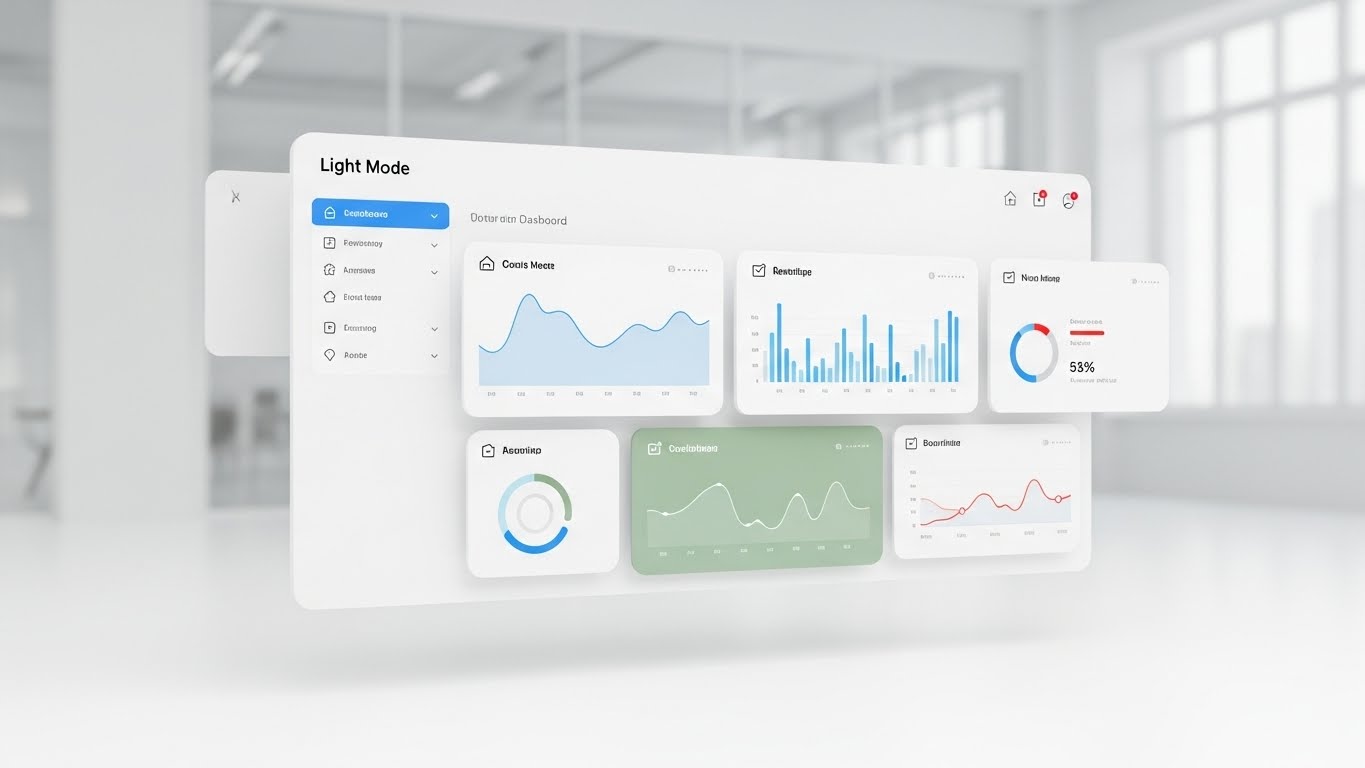
The Visual & Narrative Approach
This is the "hero shot" of your platform. A pristine, high-fidelity 3D rendering of the UI dashboard floats in mid-air. The aesthetic is strictly "Light Mode," utilizing ample white space, "soft drop shadows," and clean typography lines to convey approachability. Data elements are colored in "calming sky blue and soft sage green," contrasting pleasantly with the "blurred bright office environment" in the background. The lighting is "softbox studio quality," shadowless and flattering, making the software look like a high-end consumer product.
Psychological Impact & KPI Focus
- Niche Psychology: Fashion professionals are visually sensitive. They reject ugly software. This style assures them that the tool is aesthetically pleasing and won't be an eyesore to look at for 8 hours a day.
- Operational Impact: The clarity of the UI demonstrates "low cognitive load." It visually promises that onboarding will be easy and that the data is presented in a digestible, manageable format.
- Primary KPI: Conversion Rate (Demo Request) and Time on Site.
Strategic Implementation & Trade-offs
- Best Use Case: Homepage Hero section or "How it Works" page header. It builds immediate trust in the user experience (UX).
- Trade-offs: It can feel "generic SaaS" if the specific data points shown (e.g., "Summer 24 Collection") aren't relevant to the fashion industry. Detail matters here.
Companies using similar video content -
Cin7 Core – Inventory Management – Manages inventory for growing fashion brands.
AIMS360 – Fashion Business ERP – Manages product lifecycle, inventory, and orders.
15. 2D Line Art Animation
MOFU | Competitive Comparison/Switcher

The Visual & Narrative Approach
Targeting the sophisticated "Switcher" segment, this style uses an intellectual and elegant visual metaphor. Using a "single continuous thin black line," the animation tells a story of resolution. On the left, we see a "tangled, knotted ball of thread," representing the friction of legacy systems. As the eye moves right, the thread unravels into a "perfect geometric loom pattern," symbolizing the order your platform brings. Subtle accents of "red" on the knot and "calm green" on the loom guide the emotional journey from frustration to relief.
Psychological Impact & KPI Focus
- Niche Psychology: This taps into the "Artisan" identity of the fashion world. The thread/loom metaphor honors the craft of fashion while selling the logic of software. It feels bespoke rather than mass-produced.
- Operational Impact: It frames the software not as a disruption, but as a tool that respects the material (the thread) while optimizing the process (the weaving/loom).
- Primary KPI: Ad Recall Lift and Click-Through Rate on Retargeting.
Strategic Implementation & Trade-offs
- Best Use Case: Retargeting ads for users who have visited competitor sites. It offers a sophisticated alternative to loud "Buy Now" banners.
- Trade-offs: It is subtle. It requires the viewer to pay attention to the animation's evolution. It may be too abstract for audiences who just want to know "Does it integrate with Shopify?"
Companies using similar video content -
NetSuite ERP – Apparel ERP – Provides comprehensive ERP for large enterprises.
A2000 – ORACLE ERP SaaS – B2B and B2C connectivity hub for apparel.
16. Dynamic Data Visualization
BOFU | ROI Justification

The Visual & Narrative Approach
At the bottom of the funnel, buyers need proof of value. This style visualizes ROI as a tangible, high-value object. A 3D bar chart rises from a "reflective gold surface," suggesting premium worth. The bars are made of "translucent emerald green glass," growing taller from left to right. Floating above the peak is a "glowing golden percentage symbol." "Particles of light" drift upwards, symbolizing profit growth. The background is a "deep, professional slate grey," grounding the financial optimism in corporate seriousness.
Psychological Impact & KPI Focus
- Niche Psychology: In wholesale, margins are tight. This visual triggers the "Greed/Growth" motivation but packages it in a luxury aesthetic. It looks like wealth, not just data.
- Operational Impact: It translates abstract savings (time, samples) into concrete financial gain. The upward trajectory visualizes the direct correlation between platform adoption and revenue growth.
- Primary KPI: Conversion Rate (Sales Qualified Lead) and Case Study Download Rate.
Strategic Implementation & Trade-offs
- Best Use Case: Case Studies, Investor Decks, or the "Results" section of a sales proposal.
- Trade-offs: It focuses solely on the result, not the method. It assumes the user already understands what the platform does and now wants to know what it yields.
Companies using similar video content -
WFX PLM – Product Lifecycle Management – Digitizes and streamlines production lines.
Backbone PLM – Creative PLM Software – Organizes product details and design feedback.
17. 2D Animation & UI Composition
BOFU | Overcoming Objections

The Visual & Narrative Approach
Implementation anxiety is a major deal-killer. This style directly addresses the fear of "getting stuck." A stylized 2D character with "soft lavender skin" is shown "effortlessly pushing a large floating UI panel" through a "brick wall." The wall creates no resistance; it "crumbles easily" upon contact. The UI panel glows with a "soft white light," representing the solution. The "dark purple background" makes the action pop, focusing entirely on the ease of the breakthrough.
Psychological Impact & KPI Focus
- Niche Psychology: Change management is painful. This visual acts as an "empathy balm," reassuring the buyer that the transition won't be a hard struggle. The character's ease of movement is the key emotional signal.
- Operational Impact: It visualizes "Ease of Integration." It suggests that connecting this platform to a legacy ERP is not a demolition project, but a smooth breakthrough.
- Primary KPI: Sales Cycle Velocity and Objection Handling Success Rate.
Strategic Implementation & Trade-offs
- Best Use Case: Sales Decks (specifically the "Onboarding" slide) or FAQ video headers.
- Trade-offs: The "cartoon" style is less formal. It works best when addressing the human users, not necessarily the CFO.
Companies using similar video content -
Stylumia – AI Trend Forecasting – Predicts trends and forecasts demand.
Intelistyle – AI Styling & Forecasting – Uses AI for trend prediction and styling.
18. Futuristic Neon/Dark Mode
BOFU | Risk Mitigation

The Visual & Narrative Approach
For enterprise clients, data security is non-negotiable. This style uses the visual language of cybersecurity to build trust. A heavy, "metallic vault door" rendered in "dark matte grey" dominates the frame. Instead of a key, the lock is a "glowing neon blue digital fingerprint scanner." "Complex circuit lines" radiate outwards, symbolizing encryption. The lighting is "high-contrast," emphasizing the solidity and impenetrability of the system.
Psychological Impact & KPI Focus
- Niche Psychology: Brands are terrified of design leaks before market launch. This visual taps into the "Protector" instinct. It assures them that their intellectual property is locked away in a fortress, not just a cloud folder.
- Operational Impact: It visualizes "Access Control." It demonstrates that digital showrooms allow for precise control over who sees which designs, and when.
- Primary KPI: Trust Score and Security Compliance Check-ins.
Strategic Implementation & Trade-offs
- Best Use Case: The "Security" or "Enterprise" page of the website, and IT security review meetings.
- Trade-offs: It can feel cold and intimidating. It should not be used for the creative or sales-focused sections of the user journey.
Companies using similar video content -
Persooa – Marketing Automation – Increases e-commerce revenue with AI.
FINDMINE – AI Styling & Merchandising – Provides AI-powered styling solutions.
19. Isometric 3D Workflow
BOFU | Sales Cycle Acceleration
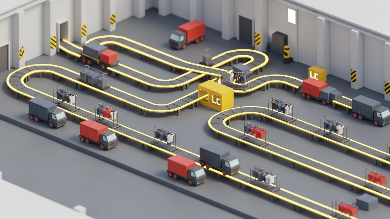
The Visual & Narrative Approach
This style offers the comprehensive "Control Tower" view. Using an isometric 3D perspective, we see a "factory-to-showroom supply chain." Miniature trucks, shipping containers, and clothing racks are connected by "glowing yellow conveyor belts" on a clean grey floor. The system runs "smoothly and quickly," simulating a "bright, clinical warehouse environment." This is the ecosystem view, showing how the showroom tool connects upstream to production and downstream to logistics.
Psychological Impact & KPI Focus
- Niche Psychology: Operations Directors worry about silos. This visual creates a sense of "Gestalt"—showing how the whole is greater than the sum of its parts. It alleviates the fear of disconnected systems.
- Operational Impact: It visualizes "Unified Commerce." It shows that the showroom is not an island; it is connected to inventory, logistics, and fulfillment.
- Primary KPI: Average Deal Size (upselling to full-suite adoption).
Strategic Implementation & Trade-offs
- Best Use Case: Email Nurture Sequences for leads who are stuck. It reminds them of the comprehensive value of the platform.
- Trade-offs: The detail can be overwhelming on small screens. It requires a larger canvas (Desktop/Tablet) to be fully appreciated.
Companies using similar video content -
PolyPM – Integrated PLM & ERP – Manages business processes for apparel.
Sync – Apparel ERP & PLM – Integrated system for apparel and footwear.
20. Abstract 2D Motion Graphics
BOFU | Objection Handling & Friction Reduction
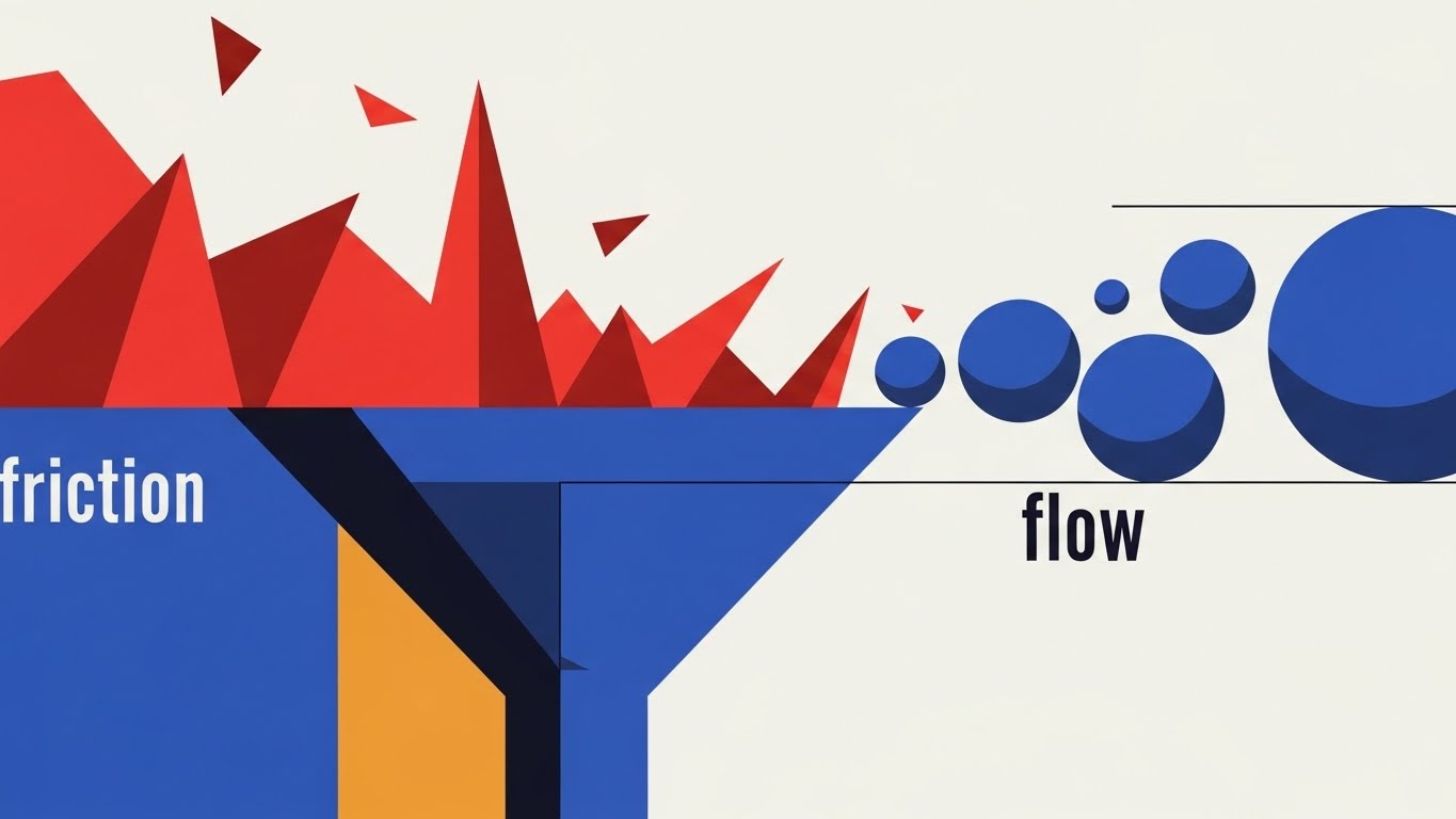
The Visual & Narrative Approach
This style conceptualizes the removal of pain points. It is a piece of geometric poetry. "Jagged, sharp red shapes," representing the friction of manual data entry and email threads, flow into a funnel. As they pass through, they are processed and emerge as "smooth, rounded blue spheres," representing the flow of clean data. The background is a "very light grey," keeping the focus on this transformation from pain to ease.
Psychological Impact & KPI Focus
- Niche Psychology: Everyone in wholesale fashion hates "friction"—the endless back-and-forth emails, the wrong samples sent. This visual promises a "Flow State," a highly desirable psychological state for creative and sales teams.
- Operational Impact: It visualizes "Efficiency Gains." It serves as a visual guarantee that the software acts as a filter, removing the noise and leaving only the signal.
- Primary KPI: Churn Reduction and Customer Satisfaction (NPS).
Strategic Implementation & Trade-offs
- Best Use Case: Remarketing Ads and "Thank You" pages. It reinforces the decision to buy by reminding the user of the pain they are leaving behind.
- Trade-offs: It is purely metaphorical. It relies on the user understanding the abstract representation of their pain. It needs strong copy to anchor the meaning.
Companies using similar video content -
Tukatech – 3D Design & Pattern Making – Offers advanced pattern making and 3D.
Lectra – Modaris 3D – Provides virtual prototyping for samples.
21. Abstract 3D AI Visualization
BOFU | The Economic Buyer

The Visual & Narrative Approach
To secure the "Economic Buyer" (CFO or CEO), visual language must shift from "utility" to "valuation." This abstract 3D visualization abandons the interface entirely to represent the financial ecosystem your platform creates. We see a globe formation constructed of "fine silver threads" connecting "sapphire blue gemstone nodes." Inside each node, "tiny financial data points" flicker, representing transactions and inventory turns. The background is a "deep, expensive midnight blue," evoking the solidity of a blue-chip investment. The lighting creates sparkling refractions, symbolizing intelligence and wealth.
Psychological Impact & KPI Focus
- Niche Psychology: C-Suite executives in fashion are focused on global reach and brand equity. The gemstone metaphor appeals to their desire for "premium" infrastructure, framing the software not as a cost center, but as a high-value asset class.
- Operational Impact: It visualizes "Global Connectivity." It demonstrates that the platform is the central nervous system of a global operation, connecting disparate markets into a unified, valuable whole.
- Primary KPI: Deal Closure Rate (Strategic Accounts) and Investor Confidence.
Strategic Implementation & Trade-offs
- Best Use Case: Executive Summary videos in proposal decks or Investor Relations presentations.
- Trade-offs: It is highly abstract. It tells the CFO nothing about how the inventory is managed, only that the system is valuable and interconnected.
Companies using similar video content -
Cloudfy – B2B E-commerce Platform – Simplifies complex ordering in fashion.
Zentail – Multichannel Retail Management – Manages multichannel apparel retail.
22. Split Screen: Optimized Reality and UI
BOFU | The Functional Buyer
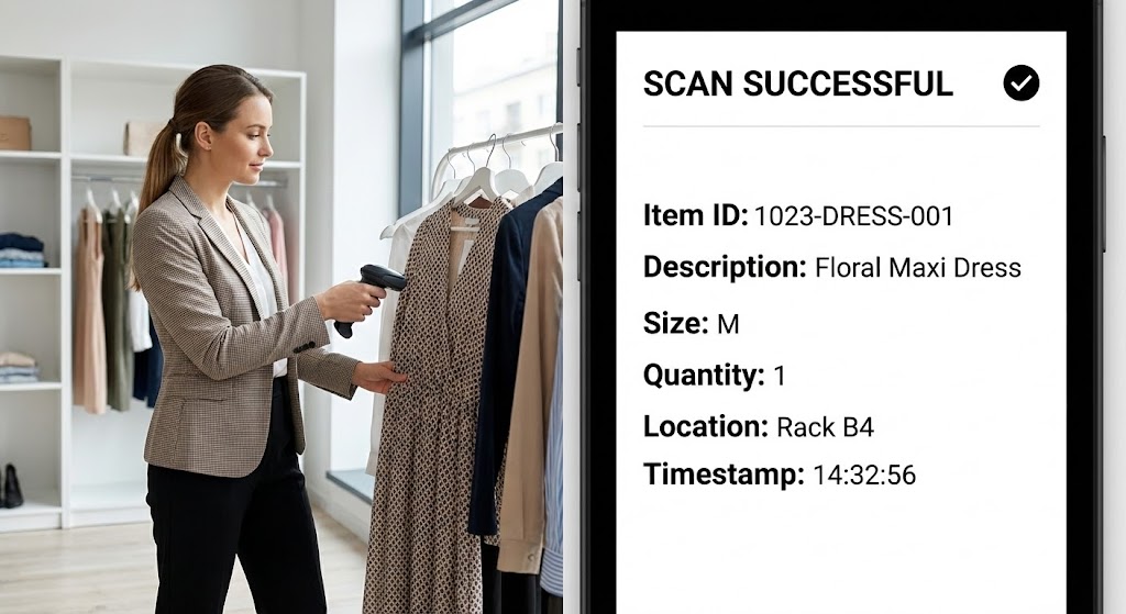
The Visual & Narrative Approach
The Functional Buyer needs proof of synchronization. This split-screen composition provides irrefutable evidence. On the left, we see high-quality footage of a "focused showroom manager" scanning a physical dress with a handheld device. On the right, simultaneously, we see a crisp, direct feed of the software UI displaying a "Scan Successful" notification with the correct SKU details (Item ID: 1023-DRESS-001). The visual timing is perfect: as the scanner beeps on the left, the data appears on the right.
Psychological Impact & KPI Focus
- Niche Psychology: The greatest fear in hybrid showrooms is "Data Latency"—the lag between physical action and digital record. This visual eliminates that fear by showing an instantaneous connection.
- Operational Impact: It visualizes "Data Integrity." It proves that the physical showroom and the digital database are perfectly mirrored, reducing the risk of overselling or inventory drift.
- Primary KPI: Conversion Rate (Demo to Pilot) and Feature Adoption.
Strategic Implementation & Trade-offs
- Best Use Case: Detailed Demo Videos or specific "Inventory Management" feature pages.
- Trade-offs: It requires high production coordination to ensure the footage and the UI animation match perfectly. If the sync looks "off," it defeats the purpose.
Companies using similar video content -
EON – Digital Product Passports – Creates digital identities for products.
DRESSX – Digital Fashion Platform – Offers digital fashion and virtual try-on.
23. 2D Graphics Over Live Action
Onboarding | Self-Serve Onboarding
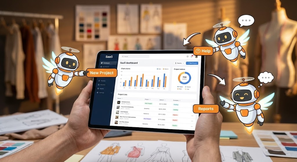
The Visual & Narrative Approach
Onboarding is where churn happens. To mitigate the intimidation of learning a new tool, this style overlays "live-action POV footage" of an iPad with "playful 2D animated robots." These little white and orange characters fly around the tablet, pointing to buttons like "New Project" or "Reports." The background is a warm, blurred design studio. The juxtaposition of the real world (the hand/iPad) with the animated helpers (the robots) creates a sense of "Augmented Guidance."
Psychological Impact & KPI Focus
- Niche Psychology: Fashion creatives often feel alienated by "cold" tech support. The cute, animated robots disarm this anxiety, making the learning process feel like a game rather than a chore.
- Operational Impact: It visualizes "Self-Sufficiency." It encourages users to explore the platform with the confidence that "help" is always hovering nearby, reducing dependency on human support agents.
- Primary KPI: Time-to-First-Action and Onboarding Completion Rate.
Strategic Implementation & Trade-offs
- Best Use Case: In-App Welcome Screens or "First Login" tutorial sequences.
- Trade-offs: The playful tone might feel too juvenile for ultra-luxury enterprise clients who expect white-glove concierge onboarding.
Companies using similar video content -
JOOR Reporting & Analytics – Wholesale Reporting – Provides real-time sales and order tracking.
BlueCherry B2B Wholesale – Digital Marketplace – Engages buyers and grows sales.
24. Generative AI Realistic Character Video
Onboarding | Accelerating Time-to-Value

The Visual & Narrative Approach
This style focuses entirely on the emotional result of using the software. Using high-fidelity Generative AI, we present a close-up of a "confident female fashion buyer" in a navy blouse. She isn't struggling; she is looking at her monitor with a distinct expression of "relief and satisfaction." A subtle "holographic overlay" of the software grid reflects in her glasses, linking her emotion directly to your tool. The lighting is natural and flattering, reinforcing a sense of calm competence.
Psychological Impact & KPI Focus
- Niche Psychology: It mirrors the desired emotional state of the user. Showroom managers want to feel in control, not overwhelmed. Seeing a peer look satisfied validates their decision to use the platform.
- Operational Impact: It humanizes the software's efficiency. It suggests that the tool handles the heavy lifting, allowing the human to focus on strategy and decision-making.
- Primary KPI: User Sentiment (NPS) and Retention Day 1.
Strategic Implementation & Trade-offs
- Best Use Case: Loading screens, "Success" state confirmations, or testimonial video headers.
- Trade-offs: While realistic, AI characters can occasionally slip into the "Uncanny Valley." Constant quality control of the generation is required to maintain the premium feel.
Companies using similar video content -
OBSESS – Virtual Stores Platform – Creates immersive virtual shopping experiences.
Adobe Illustrator – Vector Graphics Editor – Used for technical sketches and line sheets.
25. Low-Poly 3D Modeling
Onboarding | Reducing Implementation Friction

The Visual & Narrative Approach
Complex setup processes (importing SKUs, setting tax rules) are the biggest barrier to entry. This style simplifies that complexity using "Low-Poly 3D art." A character ascends a "staircase of pastel-colored blocks" (pink, mint, baby blue) toward a glowing door labeled "Setup Wizard." The aesthetic is soft, toy-like, and inherently non-threatening. It metaphorically breaks down a daunting technical task into simple, climbable steps.
Psychological Impact & KPI Focus
- Niche Psychology: "Implementation Paralysis" is real. By rendering the process as a playful, low-poly environment, you lower the cognitive stakes. It looks easy, so the user believes it is easy.
- Operational Impact: It visualizes "Progress Tracking." The staircase structure clearly indicates that there is a beginning, a middle, and an achievable end to the setup process.
- Primary KPI: Setup Completion Rate and Support Ticket Reduction.
Strategic Implementation & Trade-offs
- Best Use Case: Setup Guides, Configuration Wizards, or Knowledge Base articles about technical integration.
- Trade-offs: It is stylized and abstract. It is not suitable for showing the actual UI, so it must be paired with real screenshots for technical accuracy.
Companies using similar video content -
Yunique PLM – Precision PLM – Controls product data, patterns, and specs.
CLO-SET – Fashion Collaboration Platform – Empowers 3D garment lifecycle collaboration.
26. 3D Parallax UI Presentation
Retention | Driving Deep Feature Adoption
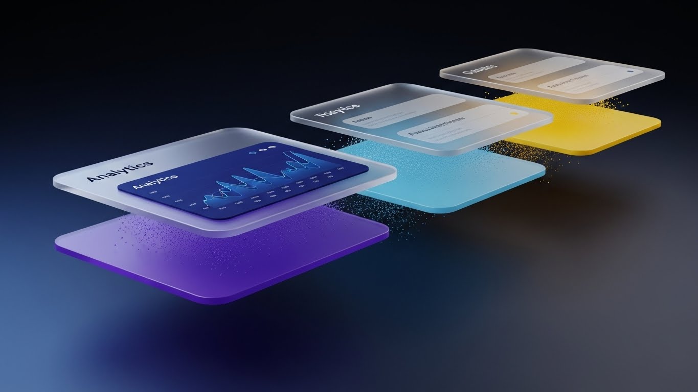
The Visual & Narrative Approach
To retain users, you must show them the depth of the platform they might be missing. This style uses a "3D Parallax" effect to stack UI cards in deep space. The foreground card, displaying "Analytics," is crisp and detailed with deep blue graphs. The background cards are blurred, hinting at more features waiting to be discovered. Floating "particles of light" add a sense of premium atmosphere. The dark navy gradient background makes the UI elements pop with importance.
Psychological Impact & KPI Focus
- Niche Psychology: Users often stick to the 10% of features they know. This visual sparks curiosity about the "other layers" of the software. It positions the platform as a deep tool with more value to unlock.
- Operational Impact: It visualizes "Multifunctionality." It reminds the user that the platform is not just a digital catalog, but also an analytics engine, a CRM, and an inventory tool.
- Primary KPI: Feature Adoption Rate and Daily Active Users (DAU).
Strategic Implementation & Trade-offs
- Best Use Case: "New Feature" announcement emails or "Did You Know?" in-app pop-ups.
- Trade-offs: It prioritizes aesthetics over readability. It is designed to tease a feature, not explain it in full detail.
Companies using similar video content -
Wild Ginger PatternMaster – CAD Pattern Software – Creates digital patterns for garments.
PatternMaker – CAD Pattern Software – Offers pattern making software.
27. Lifestyle Stock with UI Overlay
Retention | Reducing Churn

The Visual & Narrative Approach
Churn often happens when customers forget the value they are receiving. This style anchors that value in a warm, human moment. We see a "candid lifestyle photo" of a fashion designer in a sun-drenched cafe, relaxed and smiling at her laptop. Floating next to the screen is a "semi-transparent, gold holographic badge" reading "SUCCESS." The visual creates a direct association between the software (the laptop) and the user's personal freedom and happiness.
Psychological Impact & KPI Focus
- Niche Psychology: It reinforces the "Lifestyle Promise" of SaaS—that the software gives you time back. The "Success" badge acts as a visual dopamine hit, validating their hard work.
- Operational Impact: It visualizes "Remote Management." It shows that the showroom can be managed from a cafe, reinforcing the "work from anywhere" capability of the cloud platform.
- Primary KPI: Churn Rate Reduction and Customer Health Score.
Strategic Implementation & Trade-offs
- Best Use Case: Customer Success emails, Milestone Celebrations (e.g., "You've processed 1,000 orders!"), or Case Study thumbnails.
- Trade-offs: Generic stock photography can destroy trust if it looks too "staged." The overlay must look integrated, not just slapped on.
Companies using similar video content -
NuORDER Analytics – Sales Analytics – Tracks sales trends and identifies upsells.
JOOR Snapshot – Analytics Dashboard – Provides visual, easy-to-read metrics.
28. Holographic UI over 3D Render
Retention | Proactive Support/Announcements
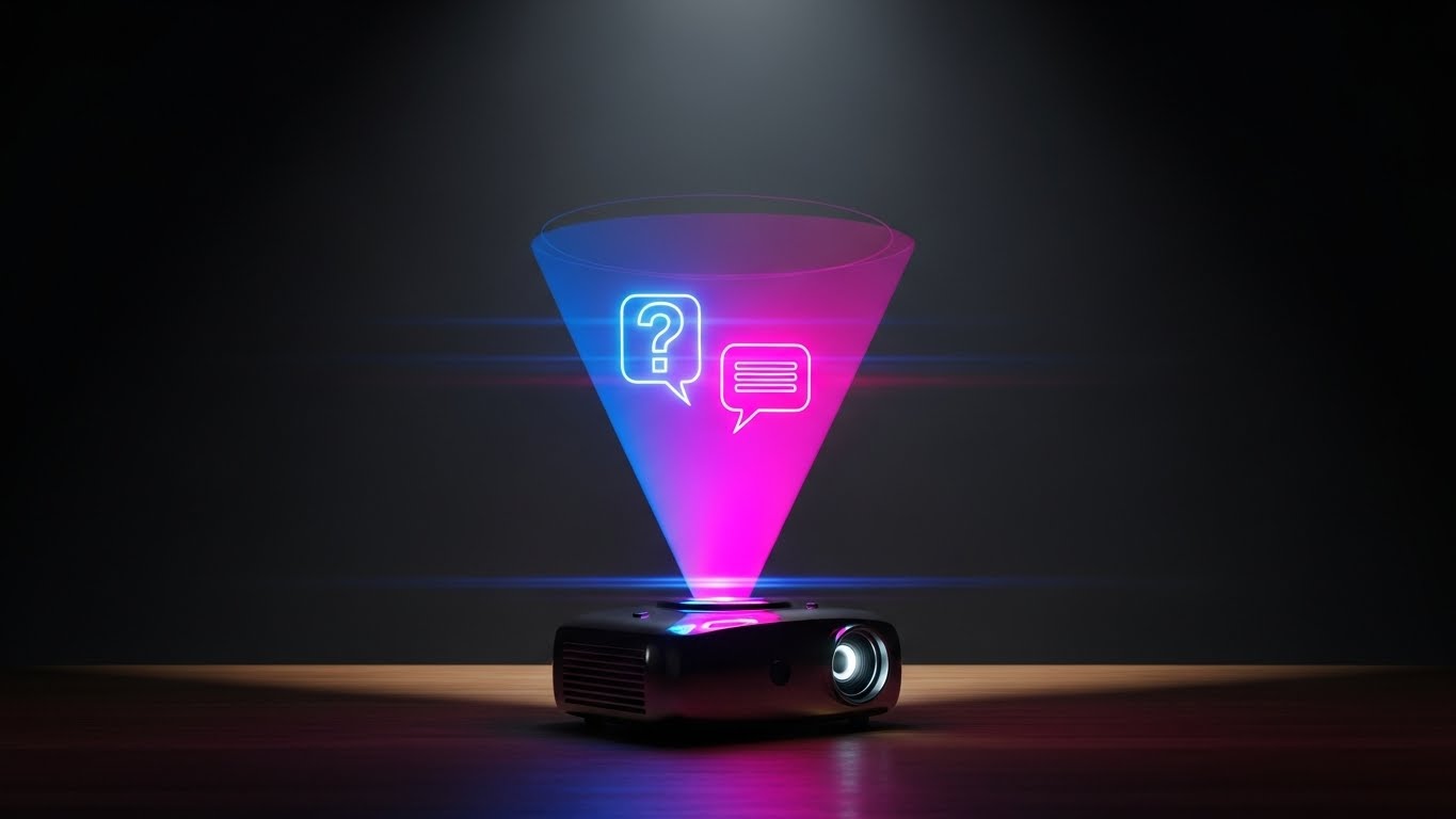
The Visual & Narrative Approach
Support doesn't have to look boring. This style elevates the concept of "Help" to a futuristic feature. A realistic 3D render of a wooden desk features a "small projector device" emitting a "holographic cone of blue and magenta light." Suspended in the hologram are a "question mark" and a "chat bubble." The lighting is moody and dramatic, focusing entirely on the glow. It frames "asking for help" as engaging with advanced technology, rather than admitting defeat.
Psychological Impact & KPI Focus
- Niche Psychology: It counters the frustration of needing support. By making the support interface look like a sci-fi hologram, it maintains the user's sense of wonder and engagement even when they are stuck.
- Operational Impact: It visualizes "Always-On Intelligence." It implies that the support system is active, modern, and ready to beam answers directly to the user's desk.
- Primary KPI: Self-Service Resolution Rate and Help Center Traffic.
Strategic Implementation & Trade-offs
- Best Use Case: Help Center headers, Chatbot avatars, or "What's New" update videos.
- Trade-offs: It is purely metaphorical. It doesn't show the actual support ticket interface, so it sets a tone rather than explaining a process.
Companies using similar video content -
REFLAUNT – Resale-as-a-Service – Enables brands to offer resale options.
SAVE YOUR WARDROBE – Wardrobe Management App – Focuses on sustainability and organization.
29. Dark Mode UI Showcase
Expansion | Driving Upsell/Cross-sell
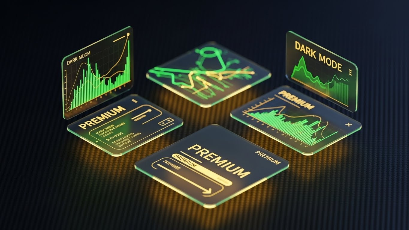
The Visual & Narrative Approach
To drive upsells to "Enterprise" or "Pro" tiers, the visual language must shift to "Luxury." This style presents a sleek "Dark Mode" UI against a "dark charcoal carbon fiber texture." The UI panels are "floating glass" with "gold text and accents," explicitly labeling features as "PREMIUM." The specular highlights on the gold elements trigger an immediate association with exclusivity and high status (like a black credit card).
Psychological Impact & KPI Focus
- Niche Psychology: Fashion professionals are status-conscious. Dark Mode + Gold accents leverages the psychology of "Veblen Goods"—making the higher-priced tier appear more desirable simply because of its aesthetic exclusivity.
- Operational Impact: It visualizes "Power User Capabilities." The complex graphs shown in gold imply that this tier offers deeper insights and more powerful controls than the standard version.
- Primary KPI: Upgrade Conversion Rate (MRR Expansion) and ARPU (Average Revenue Per User).
Strategic Implementation & Trade-offs
- Best Use Case: "Upgrade to Pro" modals or Pricing Pages (Enterprise Tier), or "Pro Feature" highlight reels.
- Trade-offs: It creates a visual divide. Standard users might feel their version is "inferior" rather than just "standard." Use carefully to inspire, not alienate.
Companies using similar video content -
Virtusize – Fit Recommendation Software – Helps shoppers find their perfect fit.
TrueFit – Fit & Size Recommendation – Reduces returns and improves fit.
30. Hyper-lapse Stock Footage with Data
Expansion | Driving Referrals & Advocacy

The Visual & Narrative Approach
The final style visualizes the ultimate benefit: stability amidst chaos. We see a "hyper-lapse background" of a busy fashion district street, with people and traffic blurring by in a rush. Superimposed in the center is a "static, sharp, crystal-clear green progress bar" reading "100% COMPLETE." The contrast is the story: while the industry rushes around frantically, your platform (the foreground) remains stable, finished, and ready.
Psychological Impact & KPI Focus
- Niche Psychology: The fashion industry is defined by chaotic speed. This visual positions the platform as the "eye of the storm"—the one reliable constant that gets the job done (100% Complete) while the world spins.
- Operational Impact: It visualizes "Reliability." It tells the user that no matter how busy the market week gets, their data processing and order completion will remain steady and secure.
- Primary KPI: Net Promoter Score (NPS) and Referral Rate.
Strategic Implementation & Trade-offs
- Best Use Case: Case Study Videos, Year-in-Review campaigns, or "Thank You" screens after a major market event.
- Trade-offs: It is a mood piece. It doesn't show specific features, but rather the feeling of having finished the work.
Strategic Knowledge Base: The Visual Operations Doctrine
To transition from a "collection of videos" to a "strategic asset," we have synthesized a 3-part framework. This doctrine moves beyond the aesthetics of the 30 styles and focuses on the business architecture required to implement them effectively.
Strategic Alignment & Visual Architecture (Pre-Production)
The Blueprint of Digital Attraction
Before a single pixel is rendered, the visual strategy must be aligned with the operational realities of the showroom. This segment defines who sees what and why.
- The Cognitive Load Audit: Fashion showrooms are sensory-overload environments. Before production, map your current training manuals against the 30 styles. Where text exceeds 200 words, replace it with Style 3 (Isometric Precision) or Style 25 (Low-Poly 3D) to reduce cognitive friction.
- Role-Based Visual Mapping: Differentiate your visual language by user role. Use "Mobile/Simple" styles (Style 23) for Sales Reps on the floor, and "Desktop/Data-Dense" styles (Style 16) for Inventory Managers.
- The "Glanceability" Standard: In a busy showroom, a Sales Director has 3 seconds to understand a screen. Visuals must pass the "Squint Test"—if blurred, is the "Action Color" (Style 9) still visible?
- Brand Voice Consistency: Your software is an extension of your fashion brand. Ensure the "Digital Texture" (Style 1) matches the "Physical Hand" of your garments to avoid brand dissonance.
- The Advids Strategic Audit: Partner with Advids to define this "Visual Operating System" before production begins, ensuring your asset library scales coherently, preventing a fragmented brand experience as you add new features.
- Standardization vs. Customization: Use "Stock/Montage" styles (Style 10) for broad, emotional appeals. However, for specific feature demos (Style 22), customized UI recording is non-negotiable. Don't fake the UI; fashion buyers have a sharp eye for authenticity.
- The Cross-Departmental Bridge: Use specific styles to unify terminology. When Sales sees Style 19 (Velocity Stack), they should use the same language ("Order Velocity") as Operations.
- Legacy System Integration: Visually acknowledge the old world. Use Style 12 (X-Ray) to show how your sleek SaaS layer connects to the "clunky" legacy ERP, validating the IT Director's architecture.
- Accessibility in Global Markets: Fashion is global. Motion graphics (Style 5) must rely on symbols and icons, not just English text, to ensure comprehension across Milan, Paris, and New York.
- The Mobile-First Mandate: 70% of wholesale buying happens on iPads. All 30 styles must be legible on a 10-inch screen. If Style 26 (Parallax) is too detailed for mobile, create a simplified "Flat" variant.
Operational Adoption & Implementation (Deployment)
Engineering the Hybrid Workflow
A video is only valuable if it changes behavior. This segment outlines how to embed these visual assets directly into the showroom workflow to drive adoption.
- Overcoming "Big Brother" Anxiety: Sales reps often fear CRM tools are for monitoring them. Use Style 23 (Robotic Guides) and Style 10 (Collaborative Team) to frame the tool as a helper, not a tracker. Empathy in visualization drives adoption.
- The Micro-Learning Shift: Destroy the PDF manual. Replace it with a library of 30-second clips using Style 13 (Rapid UI) for quick feature recall during market appointments.
- Just-in-Time Support: Embed Style 28 (Holographic Help) visuals directly into the "Empty States" of your application. If a user opens a blank order form, show a looping visual of how to fill it.
- Gamification of Training: Use Style 29 (Dark Mode/Gold) visuals to reward "Power Users" who complete advanced training modules, creating a status symbol within the sales team.
- Reducing Support Ticket Volume: There is a direct correlation between the clarity of Style 22 (Split Screen) videos and reduced "How do I scan?" support tickets. Invest in high-fidelity demo videos to save money on support staff later.
- Remote Onboarding: For distributed global teams, use Style 24 (Realistic Character) to create a "human connection" during onboarding, simulating a face-to-face trainer.
- Standard Operating Procedures (SOPs): Transform text-based SOPs into Style 19 (Isometric Workflow) animations. Visualizing the flow of goods from "Warehouse" to "Digital Rack" prevents inventory errors better than a checklist.
- Feedback Loops: Use interactive video elements. If a user pauses Style 25 (Setup) repeatedly at step 3, your UX team knows exactly where the friction lies.
- Scalable Localization: When expanding to new regions, swap the background of Style 30 (Hyper-lapse) to match the local city (e.g., Tokyo vs. NYC) to build immediate local relevance.
- Leadership Communication: When the CEO presents the digital strategy, they should use Style 21 (Abstract 3D) to communicate vision and value, avoiding the weeds of UI features.
Measuring Impact & Future-Proofing (ROI)
The ROI of Visual Intelligence
Finally, we must measure the return on this visual investment and prepare for the next wave of technology.
- Beyond "Views": Do not measure success by how many people watched the video. Measure Style 9 (Micro-Interaction) success by the "Feature Adoption Rate" of that specific button. Connect visual consumption to behavioral change.
- The "Idle Time" Metric: Correlate better visualization with reduced "Time-on-Task." Style 14 (Clean UI) should lead to faster order entry.
- Compliance Velocity: Use Style 18 (Digital Vault) to explain GDPR or Security protocols. Measure how fast teams sign off on compliance updates after watching the video versus reading the policy.
- Retention and Churn: Use Style 27 (Lifestyle) and Style 30 (Stability) in your QBR (Quarterly Business Review) decks. Reminding clients of the stability and freedom you provide is a powerful defensive strategy against lower-priced competitors.
- The AI Visual Frontier: Prepare your asset library for AI. The clean vector elements of Style 1 (Abstract 2D) are perfect training data for future generative AI tools that might build custom pitches for you.
- Scalability of Assets: Build a "Visual Component Library." The 3D assets from Style 19 (Isometric) should be reusable for Style 26 (Parallax). Advids specializes in building these modular asset ecosystems to lower your long-term Cost Per Asset.
- The Advids Partnership: We are not just video makers; we are your "Visual Lifecycle Architects." As your platform evolves from V1 to V2, we ensure your Style 14 (UI) assets evolve without needing a total reshoot, protecting your marketing investment.
- Benchmarking Success: If your competitor uses generic screen recordings, your use of Style 8 (Wireframe to Reality) is a competitive moat. It signals superior engineering and attention to detail that generic videos cannot match.
- The ROI of Sustainability: Use Style 12 (Photorealistic 3D) to replace physical samples. Quantify this! "This video cost $5k but replaced $50k of physical samples." This is the ultimate ROI story for fashion sustainability.
- Final Call to Innovation: Treat video as infrastructure, not content. A well-designed visual system (Styles 1-30) is as critical to your platform's success as the code itself. It is the interface through which the world understands your value.
Companies using similar video content -
BlueCherry Enterprise – Enterprise ERP – Offers advanced supply chain solutions.
Infor Fashion Enterprise – Premium ERP Suite – Drives innovation with industry-specific software.
Author & Editor Bio


