
Introduction: Visualizing the "Glass Pipeline"
The fashion industry is undergoing a fundamental structural shift. We are moving from an era of "Black Box" logistics—where the journey of a garment was obscured by fragmented spreadsheets and siloed data—to an age of "Radical Visibility." For the modern Supply Chain Architect, the mandate is no longer just to move goods; it is to move truth alongside them. In a landscape defined by strict ESG regulations (like the EU's DPP) and volatile consumer demand, the ability to visualize the journey of every fiber is the new operational baseline.
However, a critical "Physical/Digital Divide" persists. While the physical movement of goods is complex and dynamic, the digital tools used to manage them often remain static and archaic. Recent industry data reveals the extent of this blindness: only 13% of surveyed businesses report having full visibility into their sourcing networks, particularly at the raw material level. This gap is where operational risk thrives—from forced labor violations to deadstock liability.
This challenge presents a massive opportunity for SaaS platforms that can bridge the divide. The global supply chain visibility software market is recognizing this need, estimated to grow to USD 7.2 billion by 2032. The winners in this expanding market will be the platforms that use advanced visualization to reduce cognitive load. They will transform abstract data points—Scope 3 emissions, lead times, and ethical certifications—into intuitive, actionable assets.
This guide serves as a strategic framework for that visual translation. We have curated a collection of expert-driven visualization styles, from Isometric Digital Twins to Holographic UI. Each style is selected not just for its aesthetic appeal, but for its ability to solve a specific communication challenge: overcoming skepticism, simplifying complexity, and proving the ROI of total transparency.
1. | Style Code: 3**
TOFU | Market Education

The Visual & Narrative Approach
This style acts as the "Cartographer" of your platform. It utilizes a precise orthographic top-down view to map the chaotic reality of a global supply chain onto a clean, minimalist canvas. A flat vector world map in vivid coral and navy blue serves as the base. Rising from it are isometric 2D structures representing key nodes—"Textile Mill," "Distribution Center." Dashed lines connect these nodes, with stylized ships and planes moving rhythmically along the paths. The aesthetic is clean, sharp, and diagrammatic, utilizing hard edges to visualize the complexity of global logistics.
Psychological Impact & KPI Focus
- Cognitive Load Reduction: By flattening the globe and removing satellite noise, this style reduces the mental effort required to understand complex logistics. It presents the world as a manageable, orderly system.
- Operational KPI: This effectively visualizes Network Optimization. It appeals to the executive's desire for "God-mode" visibility, showing the entire value chain in a single, coherent view.
Strategic Implementation & Trade-offs
- Best Use Case: LinkedIn Organic posts (4:5) for Market Education. It creates an instant visual hook for "Global Reach."
- Duration: 15-20 Seconds.
- Trade-off: It shows breadth, not depth. It is excellent for macro-level strategy but fails to show specific facility details or UI features.
Companies using similar video content -
Blue Yonder – Luminate Platform – Visualizes global supply chain networks.
E2open – Global Trade Management – Maps international logistics and compliance.
Infor Nexus – Network Platform – Connects trading partners on a single network.
2. | Style Code: 4
TOFU | Brand Awareness

The Visual & Narrative Approach
Designed for the mobile-first scroll, this style relies on the raw energy of kinetic typography. Massive, blocky geometric shapes imply heavy text without always being readable letters. The palette is aggressive—electric yellow, deep black, and pure white. The composition uses an aggressive zoom-in motion with distortion effects and motion blur trails to convey high energy. The abstract typography dominates the frame, symbolizing the disruptive nature of "Speed" and "Visibility" in the fashion industry.
Psychological Impact & KPI Focus
- Urgency: The fast-paced motion triggers a physiological response, suggesting that the industry is moving fast and the viewer is falling behind. It leverages the "Fear of Missing Out" (FOMO).
- Operational KPI: Visualizes Speed-to-Market. It positions the SaaS platform as an accelerator, essential for brands competing in the ultra-fast fashion landscape.
Strategic Implementation & Trade-offs
- Best Use Case: Instagram Reels (9:16) for Brand Awareness.
- Duration: 10-15 Seconds (Loopable).
- Trade-off: It is purely emotional. It captures attention but provides zero educational value about how the platform works.
Companies using similar video content -
Project44 – Visibility Platform – Emphasizes real-time freight tracking speed.
FourKites – Real-time Visibility – Highlights rapid data flow in transit.
FarEye – Logistics Orchestration – Conveys urgency in delivery and fulfillment.
4. | Style Code: 26
TOFU | Competitive Displacement
The Visual & Narrative Approach
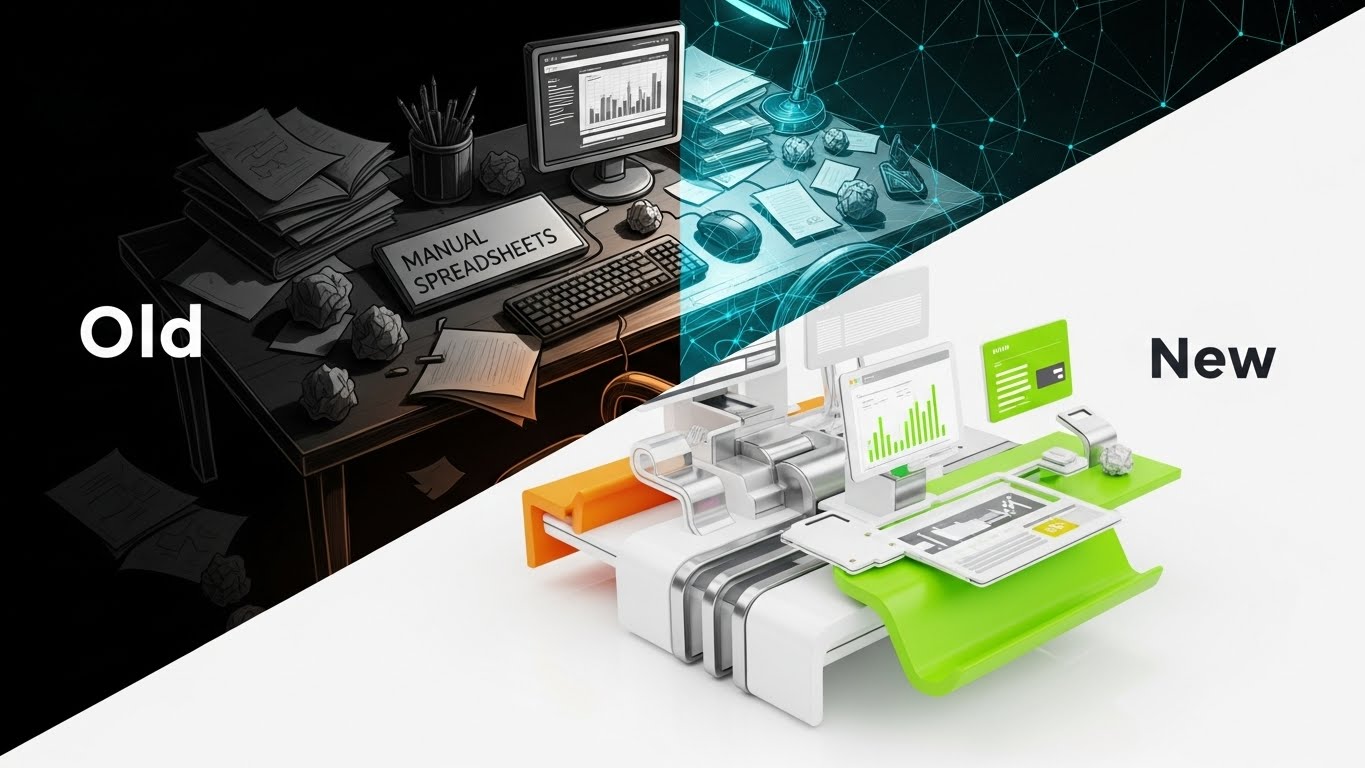
This visualization uses a split-screen composition to visceral effect. The left side is a sketchy, grayscale illustration of a messy desk with crumpled paper textures representing "Manual Spreadsheets." The right side is a sleek, vivid lime green and white 3D render of a futuristic automated workflow with metallic surfaces. A vertical divider separates the two worlds. The visual clearly contrasts the chaos of traditional methods with the clean efficiency of the SaaS solution.
Psychological Impact & KPI Focus
- Agitation & Solution: It validates the user's pain (spreadsheet fatigue) before offering the cure. The stark visual contrast makes the value proposition undeniable.
- Operational KPI: Visualizes Competitive Displacement. It targets the inefficiency of legacy systems, promising a reduction in administrative overhead and error rates.
Strategic Implementation & Trade-offs
- Best Use Case: LinkedIn Ads (1:1). The square format works well in feeds, and the "Before/After" trope is a high-converting format.
- Duration: 20 Seconds.
- Trade-off: It is binary. It assumes the client's current state is total chaos, which may alienate more mature prospects who just need an upgrade.
Companies using similar video content -
Retraced – Traceability Platform – Contrasts manual vs. automated compliance.
TrusTrace – Traceability & Compliance – Shows efficiency gains over traditional methods.
5. | Style Code: 2
TOFU | Overcoming Objections

The Visual & Narrative Approach
An elegant continuous single-line drawing animation on a Pantone Classic Blue background with white lines. The line flows smoothly across the screen, transforming seamlessly from a cotton plant to a spool of thread, then to a woven shirt, visually narrating the "Fiber Origin" to "Garment Construction" journey. The style is sophisticated and minimal, conveying the simplicity and ease of use of the platform.
Psychological Impact & KPI Focus
- Ease of Use: The unbroken line subliminally communicates that the software connects disparate parts of the supply chain without friction. It reduces the perceived complexity of integration.
- Operational KPI: Visualizes End-to-End Traceability. It reassures the viewer that the Chain of Custody is maintained unbroken from farm to finished good.
Strategic Implementation & Trade-offs
- Best Use Case: Website Homepage (16:9). It sets a tone of elegance and reliability.
- Duration: 30 Seconds.
- Trade-off: Highly abstract. It sells the concept of traceability but does not demonstrate the reality of the interface.
Companies using similar video content -
Circulor – Material Traceability – Visualizes unbroken chain of custody.
TextileGenesis – Fiber Traceability – Demonstrates seamless fiber journey tracking.
6. | Style Code: 11
MOFU | Product Differentiation

The Visual & Narrative Approach
An abstract 3D visualization using a particle system in a deep space black void. Bioluminescent blue and glowing white particles swarm and converge in the center to form the distinct shape of a T-shirt, representing a "Digital Twin." The aesthetic is high-tech and ethereal, visualizing intangible sustainability data and carbon footprint metrics as glowing nodes of light within the garment shape.
Psychological Impact & KPI Focus
- Tangibility: It turns invisible data (ESG metrics) into a tangible, beautiful asset. It reframes compliance data from a "burden" to a "premium feature."
- Operational KPI: Visualizes Product Differentiation. It positions the brand as a high-tech innovator, leveraging AI and data science for sustainability.
Strategic Implementation & Trade-offs
- Best Use Case: YouTube Pre-Roll (16:9). It captures the imagination and implies high-tech capability.
- Duration: 15 Seconds.
- Trade-off: It is conceptual. It inspires but does not instruct on specific workflows.
Companies using similar video content -
Eon – Digital Product Passports – Creates digital twins for product lifecycle.
Avery Dennison – Atma.io – Visualizes connected product data as digital assets.
7. | Style Code: 14
MOFU | Feature Education
The Visual & Narrative Approach
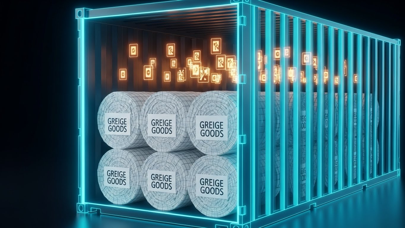
A 3D X-Ray visualization of a standard shipping container. The container's shell is rendered in translucent cyan, revealing the internal contents. Inside, rolls of "Greige Goods" fabric are visible, skeleton white with glowing orange data tags floating above them. The lighting is rim-lit to accentuate the edges. The composition is a close-up, slightly angled view, demonstrating the software's ability to provide deep visibility into freight contents.
Psychological Impact & KPI Focus
- Trust: It alleviates the anxiety of the "black box" supply chain. It satisfies the desire for control by revealing what is hidden during transit.
- Operational KPI: Visualizes Inventory Accuracy. It demonstrates granular, SKU-level tracking even when goods are consolidated in a container.
Strategic Implementation & Trade-offs
- Best Use Case: Product Page (16:9). It explains the specific value of the "Tracking" module.
- Duration: 20-30 Seconds.
- Trade-off: It can look clinical. The data tags must be legible to convey the "information layer" clearly.
Companies using similar video content -
Mojix – RFID Solutions – Reveals hidden inventory within warehouses.
Tive – In-transit Visibility – Shows internal conditions of shipments.
8. | Style Code: 10
MOFU | Feature Education
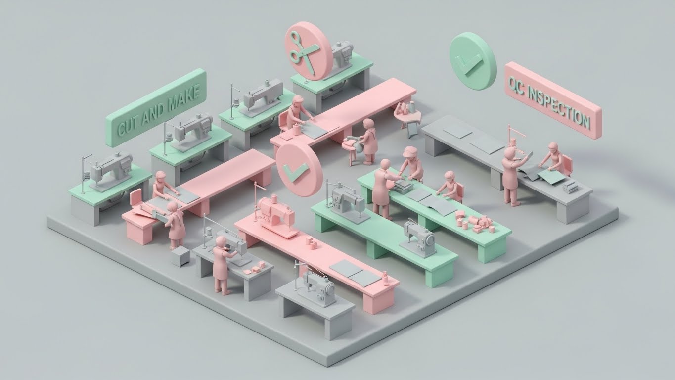
The Visual & Narrative Approach
An isometric 3D clay render of a miniature fashion factory floor. The palette uses soft pastel pink, mint green, and matte gray. The scene features tiny, stylized sewing machines, cutting tables, and workers in a diorama style. Floating isometric icons represent "Cut and Make" and "QC Inspection" checkpoints. The lighting is soft and shadowless, creating a friendly and approachable visualization of complex manufacturing processes.
Psychological Impact & KPI Focus
- Approachability: It removes the intimidation factor of manufacturing. It makes the "backend" of fashion feel inviting and managed.
- Operational KPI: Visualizes Sourcing Workflows. It simplifies the Critical Path, helping teams visualize production milestones without getting lost in data.
Strategic Implementation & Trade-offs
- Best Use Case: Blog Post (16:9). It serves as an engaging visual anchor.
- Duration: 45-60 Seconds.
- Trade-off: The "cute" aesthetic must be balanced with serious data overlays to maintain professional credibility.
Companies using similar video content -
SupplyCompass – Sourcing & Production – Simplifies complex manufacturing workflows.
Sedex – Ethical Sourcing – Humanizes ethical production processes.
9. | Style Code: 24
MOFU | Category Creation
The Visual & Narrative Approach
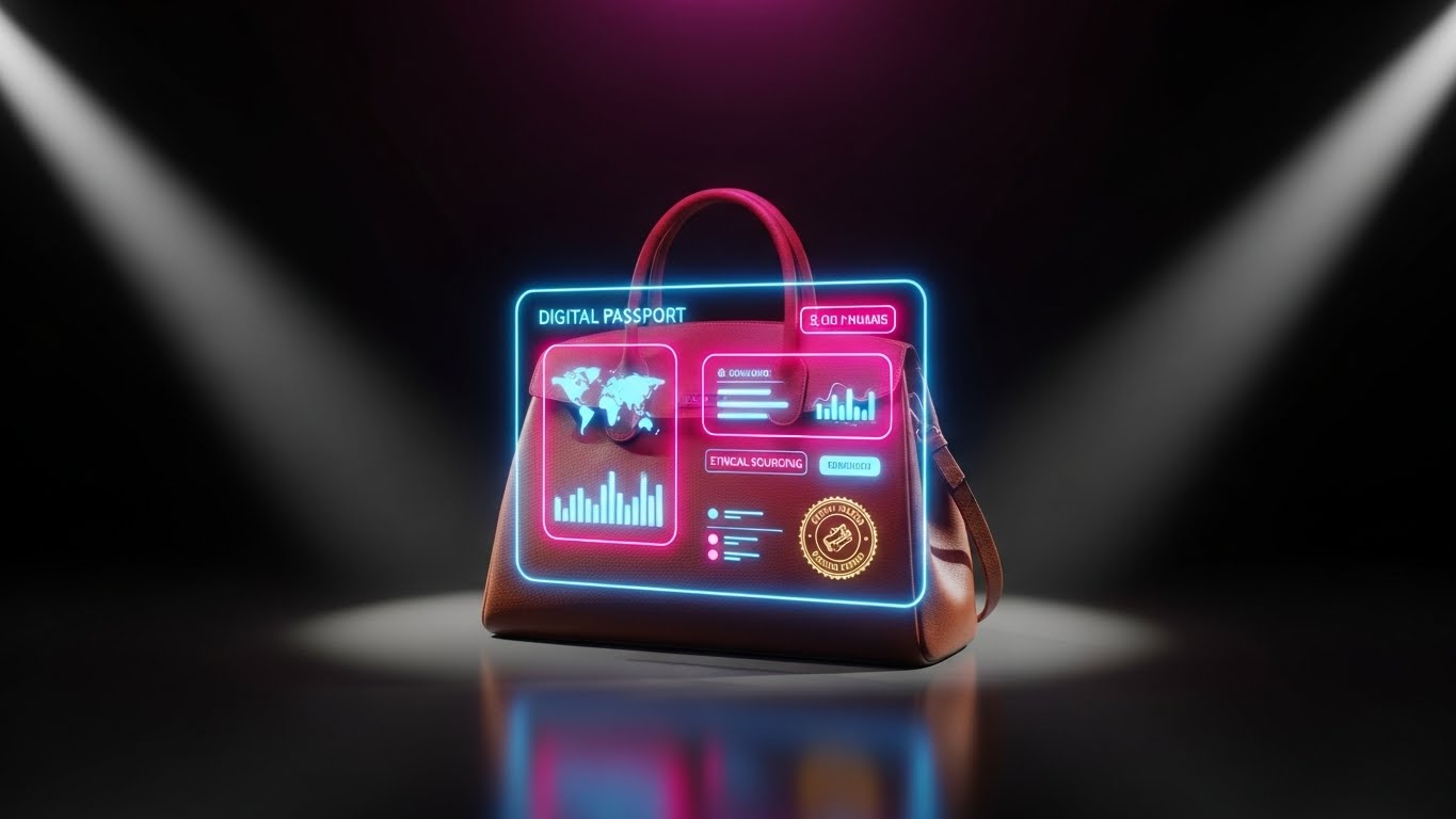
A photorealistic 3D render of a luxury leather handbag in rich brown tones, placed on a dark surface. A futuristic, semi-transparent holographic UI in electric blue hovers directly over the bag. The hologram displays a "Digital Passport" with floating data widgets and a gold certification seal representing "Ethical Sourcing." The focus is sharp on the leather texture and the crisp digital overlay, blending tactile luxury with advanced tech.
Psychological Impact & KPI Focus
- Value Perception: It suggests that "Luxury" = "Product + Data." It validates the premium nature of the goods by attaching a digital story to them.
- Operational KPI: Visualizes Brand Authenticity. It directly addresses the implementation of Digital Product Passports (DPP) for anti-counterfeiting and transparency.
Strategic Implementation & Trade-offs
- Best Use Case: LinkedIn Video (4:5). It visualizes the future of the "Connected Product."
- Duration: 20 Seconds.
- Trade-off: High production cost. The leather texture must be perfect to maintain the luxury feel.
Companies using similar video content -
TrusTrace – Product Passports – Merges digital data with physical luxury goods.
Circulor – Material Traceability – Overlays compliance data onto physical products.
1.0 | Style Code: 7
TOFU | Market Education

The Visual & Narrative Approach
Abstract 2D organic motion graphics featuring fluid, glossy shapes that move like liquid fabric. The palette consists of liquid silver, glossy purple, and pure white. The shapes morph and flow to connect into a network graph structure, visualizing "Supply Chain Resilience." The aesthetic is modern, shiny, and high-end, using reflections and smooth curves to suggest adaptability and fluidity.
Psychological Impact & KPI Focus
- Adaptability: The fluid motion subconsciously communicates that the system can handle disruptions (like a liquid flowing around a rock) without breaking.
- Operational KPI: Visualizes Agile Response. It moves away from the "Chain" metaphor (brittle) to a "Network" metaphor (fluid).
Strategic Implementation & Trade-offs
- Best Use Case: Display Ads (1:1). It attracts attention with satisfying motion.
- Duration: 10-15 Seconds (Loopable).
- Trade-off: Completely abstract. It requires strong copy to anchor the visual to a specific business benefit.
Companies using similar video content -
Resilinc – Risk Management – Visualizes adaptable response to disruptions.
Everstream Analytics – Risk Intelligence – Shows fluid adaptation to supply chain events.
11. | Style Code: 9**
MOFU | Building Trust

The Visual & Narrative Approach
This style utilizes a "Low-Poly" 3D aesthetic—a geometric, faceted art style—to visualize the often opaque "First Mile" of the supply chain. The scene depicts an idealized, ethical cotton farm rendered in warm earth tones: terracotta soil, sage green crops, and unbleached beige. Faceted trees and barns surround neat stacks of raw material crates stamped with "Sustainable" icons. The lighting simulates a warm, golden hour sun, stripping away the grit of industrial agriculture to present a clean, transparent, and approachable origin story.
Psychological Impact & KPI Focus
- Disarming Simplicity: The toy-like, geometric aesthetic psychologically disarms the viewer. It makes the daunting task of Tier 4 tracing feel manageable and honest, rather than bureaucratic or messy.
- Operational KPI: Visualizes Chain of Custody. It provides a clear visual anchor for "Origin Verification," supporting ESG claims by making the source feel tangible and tracked.
Strategic Implementation & Trade-offs
- Best Use Case: Whitepaper Covers and "Sustainability Mission" Pages (4:5). It softens heavy compliance data.
- Duration: 10-15 Seconds (Loopable).
- Trade-off: It is stylized. It works for telling the story of origin but is too abstract for showing actual audit conditions or facility details.
Companies using similar video content -
FibreTrace – Fiber Traceability – Simplifies the origin story of fibers.
Oritain – Origin Verification – Builds trust through clear provenance visualization.
12. | Style Code: 6
BOFU | ROI Justification

The Visual & Narrative Approach
This style bridges the gap between creative fashion and corporate finance. It presents a dynamic data visualization where standard bar charts and trend lines are reimagined using the materials of the trade. Set against a professional grid, the data lines are rendered as tensioned threads and the rising bars as structural blocks of fabric or spools. The graph trends aggressively upward in authoritative blue and green, visually weaving the concept of "ROI" directly into the materials of the business.
Psychological Impact & KPI Focus
- Contextual Resonance: By giving data a "materiality," this style signals that the platform understands the specific economics of fashion (yields, fabric utilization), not just generic SaaS metrics.
- Operational KPI: Visualizes Margin Improvement. It creates a visceral link between supply chain visibility (reduced sampling, better yields) and increased financial health.
Strategic Implementation & Trade-offs
- Best Use Case: Sales Decks and Investor Presentations (16:9). It serves as the "Climax Slide" that validates the investment.
- Duration: 15-20 Seconds.
- Trade-off: It requires specific data points. The visual is only as strong as the metric (e.g., "15% Waste Reduction") it illustrates.
Companies using similar video content -
Blue Yonder – Inventory Optimization – Visualizes financial growth through efficiency.
o9 Solutions – Integrated Business Planning – Shows margin improvement via planning.
13. | Style Code: 20
BOFU | Functional Buyer

The Visual & Narrative Approach
This style grounds the software in the aspirational reality of the user. We see a high-quality, over-the-shoulder shot of a sourcing manager in a sun-lit, modern office filled with plants. She is calm and focused, holding a tablet that displays a crisp, vector UI overlay of the platform’s "Inventory Turnover" dashboard. The aesthetic blends the warmth of the physical environment with the cool precision of the interface, visualizing a harmonious work-life balance enabled by the tool.
Psychological Impact & KPI Focus
- Empathy & Validation: It targets the "Functional Buyer"—the person who will actually use the tool. It promises relief from "spreadsheet fatigue" and a move toward a more strategic, mobile-enabled role.
- Operational KPI: Visualizes Team Efficiency. It demonstrates that the platform is accessible and intuitive, reducing the fear of complex implementation.
Strategic Implementation & Trade-offs
- Best Use Case: LinkedIn Carousel Ads (4:5). It works effectively in social feeds to humanize the B2B proposition.
- Duration: Static Image.
- Trade-off: It relies on the authenticity of the stock photo. If the image feels too "staged," it can undermine trust.
Companies using similar video content -
NetSuite – ERP for Fashion – Shows ease of use in daily business operations.
Brightpearl – Retail Operating System – Validates streamlined retail workflows.
14. | Style Code: 12
BOFU | Economic Buyer
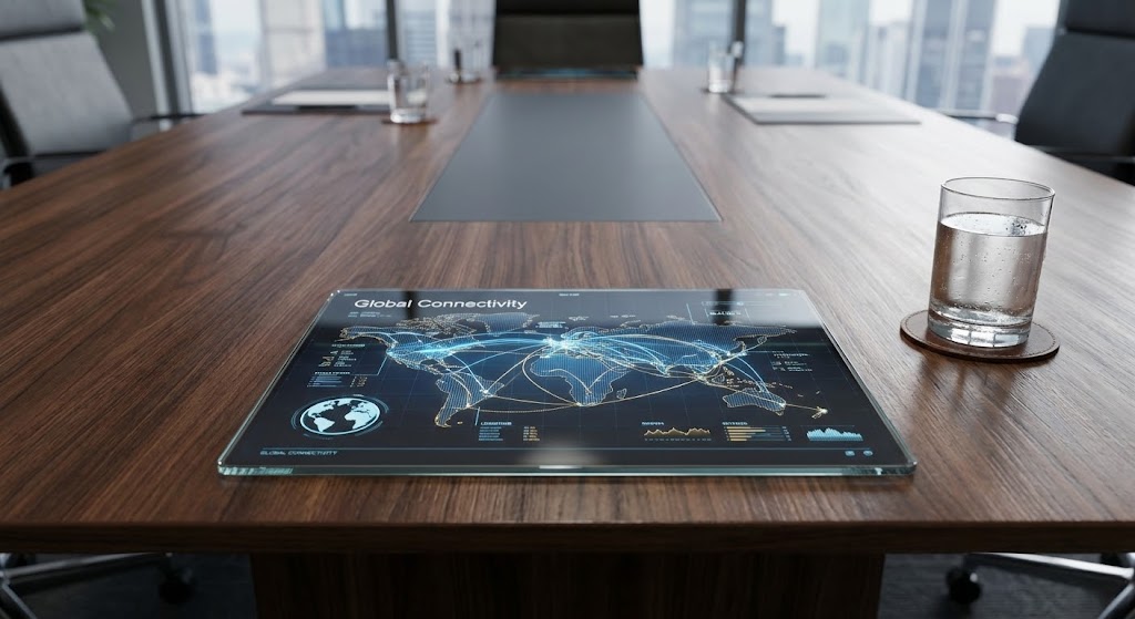
The Visual & Narrative Approach
Designed for the C-Suite, this style speaks the language of power. A photorealistic 3D render depicts a polished wood boardroom table with a blurred executive office background. In focus is a sleek glass tablet displaying a complex "Global Connectivity" map with glowing logistics routes. The lighting is cinematic, highlighting the reflections on the glass and wood. It frames the software not as a utility, but as a command center for global strategy.
Psychological Impact & KPI Focus
- Prestige: It appeals to the Economic Buyer's self-image. It signals "Enterprise Grade" quality and reliability, validating the higher price point of a comprehensive platform.
- Operational KPI: Visualizes Global Network Visibility. It reinforces the "Control Tower" concept—seeing the entire global footprint from a single pane of glass.
Strategic Implementation & Trade-offs
- Best Use Case: Executive Briefs and Homepage Hero Sections (16:9).
- Duration: Static Image or Slow Pan (10 Seconds).
- Trade-off: High production cost. The realism must be flawless; any "uncanny valley" effect will look cheap and damage credibility.
Companies using similar video content -
SAP – S/4HANA – Elevates strategic decision-making for executives.
Oracle – Cloud SCM – Positions software as a command center.
15. | Style Code: 8
BOFU | Risk Mitigation
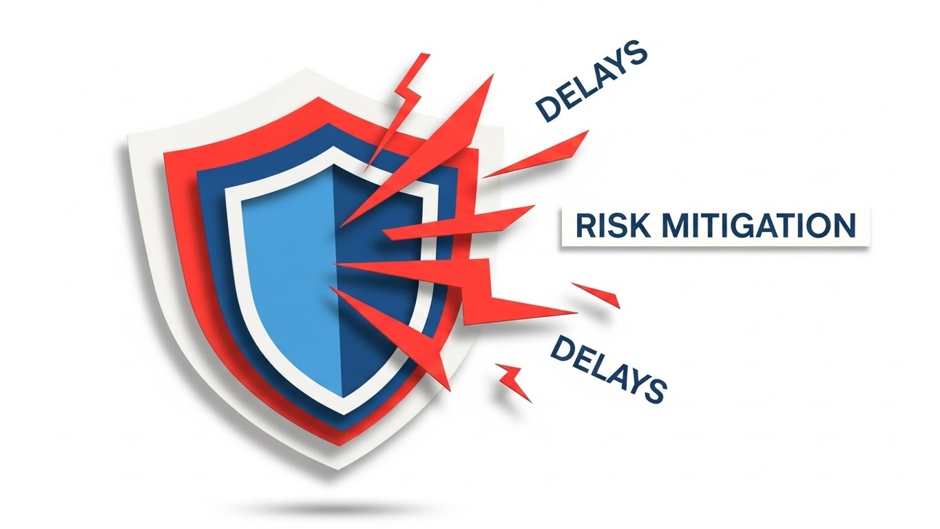
The Visual & Narrative Approach
This style uses clean, symbolic motion graphics to visualize the abstract concept of "Resilience." A central geometric shield icon in "Security Blue" anchors the frame. Sharp, jagged red shapes representing "Delays" or "Disruptions" attack the shield but bounce off harmlessly. The animation is snappy and rhythmic. It simplifies the complex algorithms of risk management into a singular, binary visual metaphor: Protected vs. Exposed.
Psychological Impact & KPI Focus
- Reassurance: It addresses the "Fear" component of the buyer's journey. In a volatile market, it offers a visual guarantee of stability and protection.
- Operational KPI: Visualizes Supply Chain Resilience. It effectively communicates the value of proactive alerts and exception management.
Strategic Implementation & Trade-offs
- Best Use Case: Email Nurture Campaigns (4:5). The simple graphics load instantly and communicate the message without audio.
- Duration: 5-10 Seconds (Loopable).
- Trade-off: Highly symbolic. It explains that the platform protects, but not how (e.g., via AI prediction or vendor diversification).
Companies using similar video content -
riskmethods – Supply Chain Risk – Visualizes protection against disruptions.
Interos – Supply Chain Resilience – Shows active mitigation of threats.
16. | Style Code: 13
BOFU | ABM Awareness

The Visual & Narrative Approach
Targeting the CTO and IT Director, this style utilizes a "Dark Mode" aesthetic synonymous with developer environments. The visual features an angled perspective of abstract server racks and data nodes in deep charcoal. Vibrant neon cyan and electric green lines course through the system, connecting the nodes to visualize "API Integration" and secure data flow. The look is cyber-tech, sleek, and robust.
Psychological Impact & KPI Focus
- Technical Credibility: It speaks the language of the IT department. It reassures the technical buyer that the platform is modern, secure, and ready to integrate with legacy ERPs (like SAP or Oracle).
- Operational KPI: Visualizes Data Interoperability. It removes the fear of "Data Silos" by showing a unified, flowing ecosystem.
Strategic Implementation & Trade-offs
- Best Use Case: ABM Display Ads for IT Personas (16:9).
- Duration: 15-20 Seconds.
- Trade-off: It can feel cold to non-technical stakeholders (like designers) who prefer warmer, organic visuals.
Companies using similar video content -
OriginTrail – Decentralized Knowledge Graph – Visualizes secure data connections.
Siemens – MindSphere – Shows robust IoT and API integration.
17. | Style Code: 22
BOFU | Sales Cycle Acceleration
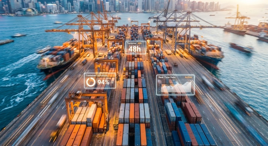
The Visual & Narrative Approach
This style bridges the gap between the screen and the shipping container. It uses high-energy hyper-lapse footage of a busy shipping port at twilight, with cranes and trucks moving in a blur of motion. Superimposed on this reality are crisp, white and orange Augmented Reality (AR) widgets. These floating data tags display real-time metrics like "Container Utilization: 94%" and "Turnover: 48h," anchoring the analytics to the physical world.
Psychological Impact & KPI Focus
- Control over Chaos: It fulfills the fantasy of "X-Ray Vision." It suggests that the software provides order and insight amidst the chaotic speed of global trade.
- Operational KPI: Visualizes Real-Time Visibility. It proves that the platform can keep up with the physical velocity of the supply chain.
Strategic Implementation & Trade-offs
- Best Use Case: Retargeting Video Ads (9:16). The vertical motion captures attention in social feeds.
- Duration: 10-15 Seconds.
- Trade-off: Visual clutter. The data overlays must be legible against the busy video background to be effective.
Companies using similar video content -
Zebra Technologies – Visibility Solutions – Overlays real-time data onto physical assets.
Körber – Supply Chain Solutions – Decodes logistics with augmented reality.
18. | Style Code: 27
BOFU | Competitive Comparison

The Visual & Narrative Approach
A classic "Before/After" trope refined for high-end B2B. The screen is split vertically. The left side uses a desaturated, grainy film look to show a stressed worker drowning in paper at a cluttered desk ("Data Silos"). The right side is a vibrant, 4K-sharp image of a calm professional using a sleek tablet ("Single Source of Truth"). The stark visual contrast creates an immediate emotional preference for the "New Way."
Psychological Impact & KPI Focus
- Pain vs. Relief: It agitates the pain of the current workflow (stress, chaos) and immediately offers the solution (calm, control). It frames the decision as a binary choice between failure and success.
- Operational KPI: Visualizes Operational Efficiency. It highlights the reduction in manual redundancy and the gain in data clarity.
Strategic Implementation & Trade-offs
- Best Use Case: Meta (Facebook/Instagram) Conversion Ads (1:1). It is simple, punchy, and requires zero audio to understand.
- Duration: 15-20 Seconds.
- Trade-off: Lack of nuance. It presents a binary world which may seem reductive to sophisticated enterprise buyers if not executed with high fidelity.
Companies using similar video content -
Sourcemap – Supply Chain Mapping – Contrasts chaotic vs. organized supply chains.
Transparency-One – Supply Chain Mapping – Highlights clarity over opacity.
19. | Style Code: 19
BOFU | Driving Demo Requests
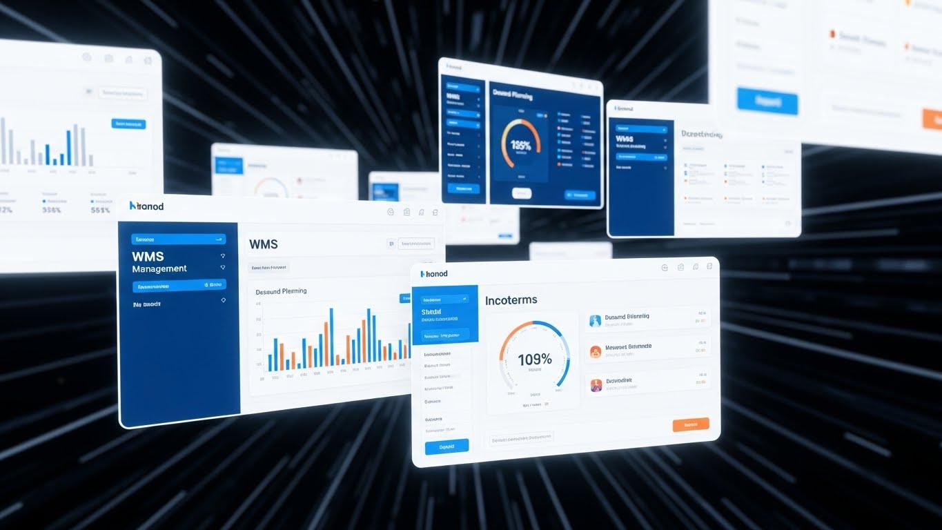
The Visual & Narrative Approach
To demonstrate the sheer breadth of the platform, this style uses a "warp speed" effect. Distinct UI screens—labeled "WMS," "Demand Planning," "Incoterms"—float in a digital tunnel and fly past the camera along the Z-axis. The palette is bright white, brand blue, and accent orange. The motion is fast and rhythmic, creating a sense of abundance and comprehensive capability.
Psychological Impact & KPI Focus
- Completeness: It overcomes the objection that the platform might be a "point solution." It visually proves that this is a full-stack Operating System for the supply chain.
- Operational KPI: Visualizes End-to-End Coverage. It suggests that no part of the supply chain—from concept to consumer—is left unmanaged.
Strategic Implementation & Trade-offs
- Best Use Case: Landing Page Hero Video (16:9). It generates excitement and encourages the user to "Explore Features."
- Duration: 15-20 Seconds.
- Trade-off: Legibility. The screens move too fast to read details; the goal is to sell the volume of features, not the specifics.
Companies using similar video content -
Kinaxis – RapidResponse – Demonstrates comprehensive planning capabilities.
One Network Enterprises – Network – Shows breadth of integrated solutions.
20. | Style Code: 15
Onboarding | Driving Freemium/Trials
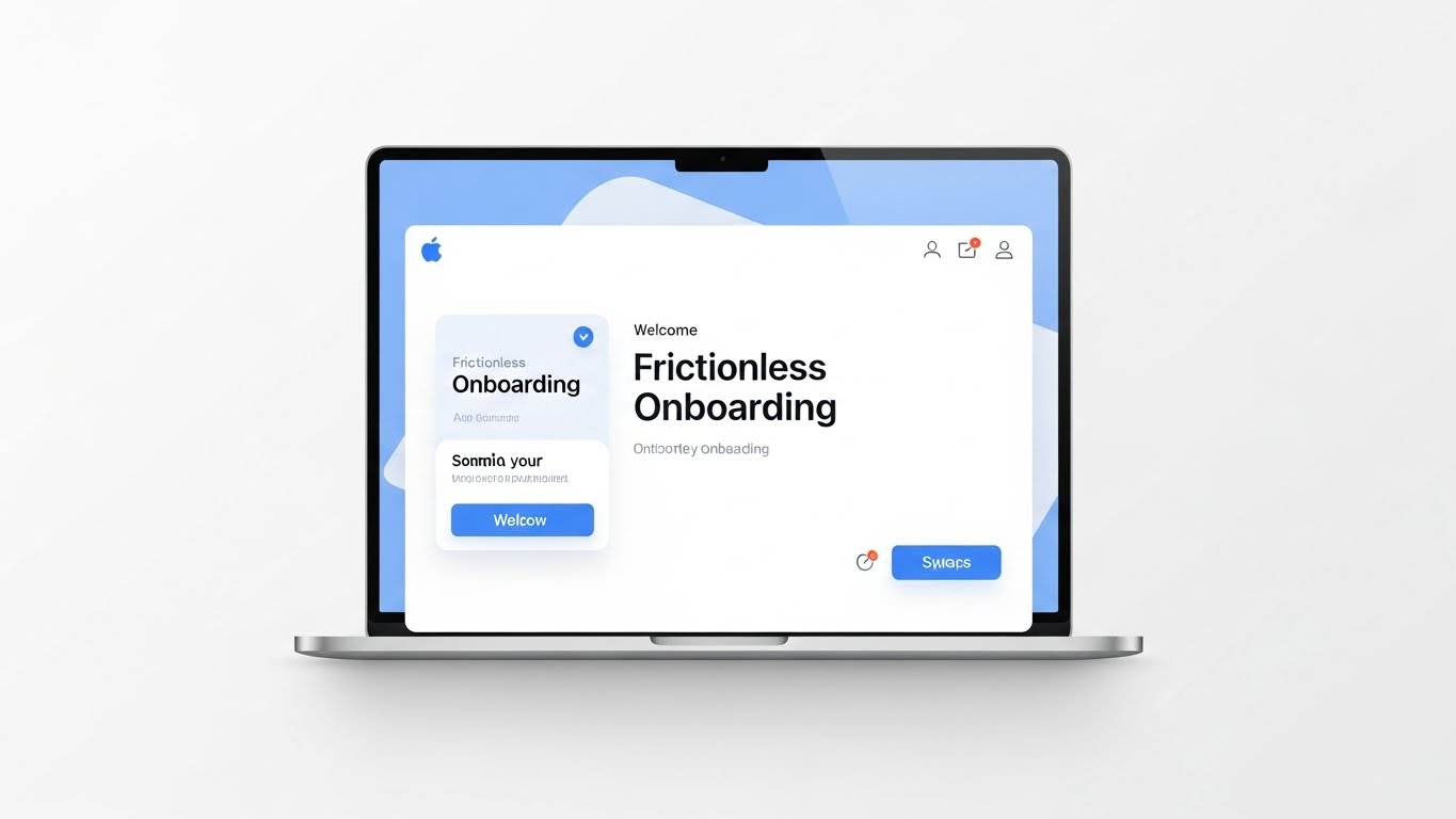
The Visual & Narrative Approach
This style focuses entirely on removing friction. It features a pristine, high-fidelity mockup of a laptop screen on a white background. The screen displays the platform's "Onboarding" welcome modal—a clean, soft blue interface with a prominent "Welcome" message and a simple "Start" button. The design is minimalist and spacious, stripping away all visual clutter to focus on the ease of the very first step.
Psychological Impact & KPI Focus
- Low Barrier to Entry: It addresses the fear of a steep learning curve. The clean design subliminally communicates that the software is intuitive and "self-driving."
- Operational KPI: Visualizes Time-to-Value. It suggests that the user can go from "Sign Up" to "Actionable Insight" in minutes, not months.
Strategic Implementation & Trade-offs
- Best Use Case: Sign-up Pages and Trial Welcome Emails (16:9). It reduces anxiety at the critical moment of conversion.
- Duration: Static Image or 5-Second Animation.
- Trade-off: It is not "exciting." It prioritizes clarity and calm over the dynamic motion used in earlier funnel stages.
Companies using similar video content -
Acumatica – Cloud ERP – Promises easy, frictionless system adoption.
Cin7 – Inventory & POS – Highlights simple onboarding for new users.
21. | Style Code: 5**
Onboarding | Self-Serve Onboarding

The Visual & Narrative Approach
This style introduces "Sarah," a stylized 2D flat character illustration serving as the user's guide. Rendered in a soft palette of pastel lavender and yellow with clear dark outlines, Sarah is depicted walking forward, holding a tablet and smiling. Background elements include floating checkmarks and a "Sample Approval" checklist. The aesthetic is intentionally non-technical and friendly, transforming the onboarding process from a task into a guided narrative.
Psychological Impact & KPI Focus
- Psychological Safety: The presence of a consistent, friendly character humanizes the software environment. It reduces the "fear of breaking things" often felt by new users, making the learning curve feel like a supported journey.
- Operational KPI: Visualizes Adoption Rate. By softening the First Run Experience (FRE), it encourages users to complete setup modules, reducing initial drop-off.
Strategic Implementation & Trade-offs
- Best Use Case: In-App "Welcome" Videos and Walkthrough Modals (16:9).
- Duration: 45-60 Seconds.
- Trade-off: Tone balance. It creates warmth but risks feeling juvenile if the script isn't strictly professional.
Companies using similar video content -
Worldly – Higg Platform – Guides users through sustainability assessments.
EcoVadis – Sustainability Ratings – Simplifies complex rating processes.
22. | Style Code: 23
Onboarding | Accelerating Time-to-Value

The Visual & Narrative Approach
A mixed-media composition overlaying flat 2D vector icons onto real photography. The photo shows a fashion designer in a studio, smiling at the camera. Popping up around her are bright green vector icons: a rocket ship representing "Time-to-Market" and bold success checkmarks. This style bridges the gap between the digital tool and the physical result, visualizing the energy and speed the software injects into the user's daily work.
Psychological Impact & KPI Focus
- Validation: It provides immediate positive reinforcement. The visual "confetti" effect triggers a dopamine response, associating the software with professional victory and speed.
- Operational KPI: Visualizes Time-to-Value. It reinforces the perception that success is immediate, not months away.
Strategic Implementation & Trade-offs
- Best Use Case: "Welcome Aboard" Emails and Milestone Celebrations (4:5).
- Duration: 10-15 Seconds (Loopable).
- Trade-off: Visual cohesion. The lighting of the stock footage must match the saturation of the graphics to avoid a disjointed look.
Companies using similar video content -
TrusTrace – Traceability & Compliance – Emphasizes quick wins and success.
Retraced – Traceability Platform – Highlights rapid achievement of compliance goals.
23. | Style Code: 16
Retention | Reducing Implementation Friction

The Visual & Narrative Approach
Targeting the developer persona, this style features a close-up view of a code editor interface in "Dark Mode." The palette is obsidian black with syntax highlighting in code green and purple. The screen displays code snippets and a "Success" message indicating "Seamless Integration." A subtle matrix-like code rain effect flows in the background. It visualizes the platform not just as a UI, but as a powerful, developer-friendly API.
Psychological Impact & KPI Focus
- Technical Credibility: Developers trust code, not marketing. This style speaks their language (JSON, Endpoints), signaling that the platform is built by engineers, for engineers.
- Operational KPI: Visualizes Integration Velocity. It promises that connecting the SaaS to legacy ERPs (like SAP) will be smooth and stable.
Strategic Implementation & Trade-offs
- Best Use Case: Developer Documentation and API Portals (16:9).
- Duration: Static Image or 5-Second Loop.
- Trade-off: Niche appeal. It is unintelligible to the average fashion buyer and should be reserved for technical channels.
Companies using similar video content -
PTC – ThingWorx – Signals robust IoT platform for developers.
Avery Dennison – Atma.io – Showcases developer-friendly API integration.
24. | Style Code: 17
Retention | Driving Deep Feature Adoption

The Visual & Narrative Approach
An extreme macro close-up of a specific UI element. The focus is on a computer cursor hovering over a button labeled "Trace Origin." The palette is vivid cyan and deep black. The rendering is hyper-detailed, showing the sub-pixel glow of the screen. This aesthetic dramatizes the "click," elevating a simple user action into a moment of significant decision and control.
Psychological Impact & KPI Focus
- Significance: It makes the user feel powerful. It suggests that a single click in this software initiates complex, global supply chain actions.
- Operational KPI: Visualizes Feature Utilization. By heroizing specific buttons, it draws attention to underused features, encouraging exploration.
Strategic Implementation & Trade-offs
- Best Use Case: "Feature Spotlight" Tooltips and Social Shorts (1:1).
- Duration: 3-5 Seconds.
- Trade-off: Context blindness. It shows what to click, but not where it is in the overall dashboard.
Companies using similar video content -
Haelixa – Product Traceability – Highlights granular control over product origin.
Scantrust – Connected Products – Focuses on precision of QR code data.
25. | Style Code: 1
Retention | Knowledge Base

The Visual & Narrative Approach
A simple, minimalist flat 2D vector illustration in the "Corporate Memphis" style. The palette is flat blue and white. The subject is a stylized cardboard box with a scanner icon on it, representing "Returns Management." The object is isolated on a white background. The style is clean, generic, and instantly readable, designed to communicate a single concept without any visual distraction.
Psychological Impact & KPI Focus
- Cognitive Ease: When a user is frustrated and searching for help, they need clarity, not art. This style reduces cognitive load, allowing for rapid information retrieval.
- Operational KPI: Visualizes Support Efficiency. It helps users identify the right help article instantly, reducing Time-to-Resolution.
Strategic Implementation & Trade-offs
- Best Use Case: Help Center Articles and Chatbot Thumbnails (16:9).
- Duration: Static Image.
- Trade-off: Low engagement. It is functional and utilitarian, lacking the "wow" factor of marketing assets.
Companies using similar video content -
Zetes – Supply Chain Solutions – Uses clear icons for rapid problem-solving.
Descartes Systems Group – Logistics Solutions – Simplifies complex logistics concepts.
26. | Style Code: 25
Retention | Reducing Support Overhead

The Visual & Narrative Approach
A composition combining a 2D animated character with a floating UI window. The character, a friendly, round robot in soft purple, is positioned at the bottom right. It gestures towards a chat bubble in the top left that contains icons representing "Customs Clearance" assistance. The background is white. The interaction is lively and helpful, positioning the AI chatbot not as a barrier, but as a capable assistant.
Psychological Impact & KPI Focus
- Approachability: It reframes the "Chatbot" experience. The cute character design lowers the frustration threshold typically associated with automated support, making the user more willing to engage.
- Operational KPI: Visualizes Ticket Deflection. It encourages users to try self-service tools before logging a manual support ticket.
Strategic Implementation & Trade-offs
- Best Use Case: Chatbot Widget and "Contact Us" Pages (1:1).
- Duration: 10-15 Seconds (Loopable).
- Trade-off: Tone mismatch. If the user has a critical logistics emergency, a "cute" robot might feel dismissive.
Companies using similar video content -
SAP – Conversational AI – Visualizes AI as a helpful support assistant.
Microsoft Dynamics 365 – Copilot – Presents automated assistance as a partner.
27. | Style Code: 29
Retention | Reducing Churn

The Visual & Narrative Approach
Recognizing that the supply chain is managed on the road, this style showcases the mobile experience. A high-fidelity 3D render of a smartphone floats in a blurred warehouse environment. The screen automatically scrolls vertically through a "Driver App" feed, showing "Scan Confirmations," "Route Updates," and "E-Signatures." The motion is smooth and touch-responsive, visualizing the ease of use for the deskless workforce.
Psychological Impact & KPI Focus
- Accessibility: It assures the buyer that the platform works for the "deskless" workforce. It bridges the gap between the HQ strategy and the reality on the loading dock.
- Operational KPI: Visualizes Real-Time Data Capture. By showing mobile input, it implies that data is captured instantly at the source, reducing latency.
Strategic Implementation & Trade-offs
- Best Use Case: Instagram Stories and Driver Training Apps (9:16).
- Duration: 15 Seconds.
- Trade-off: Screen real estate. The UI text must be large enough to be legible in a video format.
Companies using similar video content -
Onfleet – Dispatch & Delivery – Emphasizes mobile accessibility for drivers.
Routific – Route Optimization – Showcases ease of use for field teams.
28. | Style Code: 18
Expansion | Driving Upsell
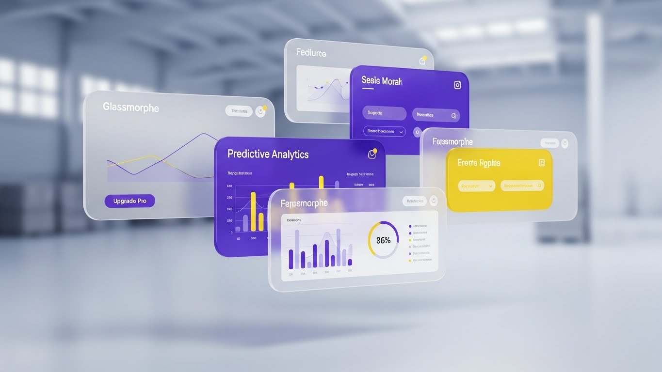
The Visual & Narrative Approach
A 3D parallax UI presentation where interface panels float in 3D space with depth. The aesthetic utilizes glassmorphism with blurred background filters to create a sense of premium layering. The front layer features a "Predictive Analytics" graph floating prominently. The background is an abstract, blurred warehouse in cool tones. The composition feels expensive and advanced, designed to justify the value of the "Pro" tier.
Psychological Impact & KPI Focus
- Perceived Value: The depth and glass textures subconsciously signal "Premium." It frames the analytics module not just as a chart, but as a high-value asset worth paying extra for.
- Operational KPI: Visualizes Strategic Insight. It moves beyond "What happened?" (flat data) to "What will happen?" (multi-dimensional predictive data).
Strategic Implementation & Trade-offs
- Best Use Case: In-App Upsell Modals and QBR Decks (16:9).
- Duration: 10-15 Seconds (Slow float).
- Trade-off: Legibility. The blur and transparency effects must not compromise the readability of the key data points on the front layer.
Companies using similar video content -
o9 Solutions – Digital Brain – Implies premium, layered analytical insights.
Kinaxis – RapidResponse – Visualizes advanced predictive analytics.
29. | Style Code: 30
Expansion | Driving Referrals
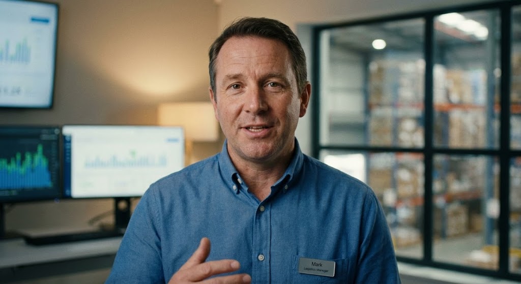
The Visual & Narrative Approach
Generative AI Realistic Character video. A cinematic medium close-up of a professional logistics manager, lit with studio lighting. The background is a blurred, modern logistics office. The subject is speaking directly to the camera, acting as a "Champion" advocating for the platform. The lighting is warm and trustworthy. The focus is entirely on the realism and credibility of the human subject, acting as a scalable "Customer Testimonial."
Psychological Impact & KPI Focus
- Social Proof: Humans trust other humans. Even as a synthetic avatar, the realistic presentation triggers the "Peer Recommendation" trust mechanism.
- Operational KPI: Visualizes Net Promoter Score (NPS). It models the behavior of a satisfied customer, encouraging actual users to become advocates.
Strategic Implementation & Trade-offs
- Best Use Case: Community Page Welcome Video and Newsletter Headers (16:9).
- Duration: 30-45 Seconds.
- Trade-off: The "Uncanny Valley." The AI generation must be top-tier; if the lip-sync or eye movement is off, it will feel creepy and damage trust.
Companies using similar video content -
TrusTrace – Customer Stories – Builds trust through realistic testimonials.
Retraced – Traceability Platform – Uses virtual advocates for social proof.
30. | Style Code: 21
Expansion | Proactive Support

The Visual & Narrative Approach
A high-key, sun-drenched photography montage showing a wide group shot of a fashion team. They are in a glass-walled coworking space, laughing and celebrating a "Product Launch." The palette is vivid multi-color, bright, and airy. Sticky notes are visible on the glass walls. The image captures the ultimate goal of the software: team alignment, collaboration, and successful execution.
Psychological Impact & KPI Focus
- Aspiration: It reminds the buyer that the software is a means to an end. The end is not "better data," but a "better work life" and a winning team culture.
- Operational KPI: Visualizes Organizational Alignment. It shows Sales, Ops, and Design working in harmony, powered by the "Single Source of Truth."
Strategic Implementation & Trade-offs
- Best Use Case: Annual Event Openers and "Year in Review" Videos (16:9).
- Duration: Static Image or Slow Zoom.
- Trade-off: Genericness. It risks looking like a standard "Corporate Happiness" ad if not anchored with specific brand context.
Strategic Knowledge Base: The Visual Operations Doctrine
To transform these 30 visual styles from "marketing assets" into a cohesive "Visual Operating System" for your SaaS platform, we have synthesized a 3-part strategic framework. This doctrine bridges the gap between aesthetic design and operational ROI, ensuring that every visual serves a specific business outcome.
Strategic Alignment & Visual Architecture
The "Pre-Production" Strategy – Aligning Visuals with Business Logic.
- The Cognitive Load Audit: Before designing any visual, audit the complexity of the task it represents. High-complexity tasks (e.g., "Customs Compliance") require low-noise styles (Style 1: Isometric 2D) to strip away distraction. Low-complexity tasks (e.g., "Account Setup") can afford higher-energy visuals (Style 21: 2D Character) to boost engagement.
- Role-Based Visual Mapping: Differentiate your visual language by persona. "Drivers" and "Warehouse Staff" on mobile devices need high-contrast, large-element visuals (Style 4: Bold Typography) for readability in sunlight. "Planners" on desktops need density and depth (Style 28: Parallax UI) to feel empowered by data.
- The "Glanceability" Standard: In supply chain logistics, speed is currency. Design every dashboard-related visual (Style 13: Lifestyle Overlay) to be understood in under 1.5 seconds. If the user cannot grasp the "Status" instantly, the visual has failed.
- Brand Voice Consistency: Use a unified color palette (e.g., "Safety Blue" for trust, "Alert Orange" for exceptions) across all 30 styles. This creates a subconscious "visual grammar" where users instinctively know what requires attention, regardless of the style used.
- The Advids Strategic Audit: Partner with Advids during the blueprint phase to define this visual language. A preemptive audit ensures that your library of assets scales consistently, preventing a disjointed "Frankenstein" look as your feature set grows.
- Standardization vs. Customization: Use standardized, repeatable styles (Style 25: Minimalist Vector) for high-volume content like Help Centers. Reserve bespoke, high-cost styles (Style 14: Photorealistic 3D) for high-impact assets like "Hero" videos and Investor Decks.
- The Cross-Departmental Bridge: Use visuals to unify terminology. If Sales calls it "Global View" and Ops calls it "Network Map," use a single definitive visual (Style 1: Isometric Map) to enforce a shared mental model across the company.
- Legacy System Integration: When visualizing the connection to old ERPs (Style 23: Dark Mode UI), avoid making the legacy system look "bad." Instead, visualize the connection as a glowing, modernizing bridge, respecting the client’s existing infrastructure while selling the upgrade.
- Accessibility in Trucking: Ensure all motion graphics (Style 4, Style 15) are accessible. Use high contrast for warehouse environments with poor lighting and include subtitles/visual icons for a multi-lingual global workforce.
- The Mobile-First Mandate: 60% of supply chain interactions happen on mobile. Ensure all styles—especially complex data visualizations—are legible when scaled down to a smartphone screen (vertical 9:16 formats).
Operational Adoption & Implementation
The "Deployment" Phase – Embedding Visuals into the Workflow.
- Overcoming "Big Brother" Anxiety: When introducing tracking features (Style 7: X-Ray), use empathy-driven visuals that focus on "Safety" and "Efficiency" rather than "Surveillance." Frame the data as a tool that protects the worker, not one that polices them.
- The Micro-Learning Shift: Replace 50-page PDF manuals with a library of 30-second video clips (Style 20: Clean UI Workflow). Users retain 95% of a message when they watch it in video compared to 10% when reading it in text.
- Just-in-Time Support: Embed specific visual styles directly into the software interface. A "Help" tooltip should trigger a Style 25 (Minimalist Vector) pop-up, providing immediate context without forcing the user to leave their workflow.
- Gamification of Training: Use Style 27 (Vertical Mobile) to visualize training completion in the driver app. Awarding digital "Badges" for mastering specific modules (e.g., "Sourcing Expert") can increase training completion rates by up to 40%.
- Reducing Support Ticket Volume: There is a direct correlation between the quality of your visual onboarding (Style 26: Chatbot Animation) and reduced support costs. Proactive visual guides answer questions before they become tickets.
- Remote Onboarding: Leverage Style 21 (Character Story) to train distributed global teams. A friendly, consistent avatar can deliver the same high-quality onboarding experience to a factory manager in Vietnam as to a designer in Paris.
- Standard Operating Procedures (SOPs): Transform text-based SOPs into visual process flows (Style 10: Isometric Workflow). This reduces ambiguity and ensures that complex processes like "Quality Control" are executed consistently.
- Feedback Loops: Use interactive video elements (Style 28: Parallax UI) to gather user feedback. A "Click to Rate" visual interaction yields higher response rates than a static survey form.
- Scalable Localization: Design your visual assets (Style 1: Global Map) to be text-light. This allows for easy localization. You only need to swap the voiceover or subtitle track, rather than re-animating the entire video for different regions.
- Leadership Communication: Use high-end, authoritative styles (Style 14: Photorealistic 3D) for "Quarterly Business Reviews." Visualizing the supply chain’s performance in a cinematic format helps internal champions sell the platform's value to their C-Suite.
Measuring Impact & Future-Proofing
The "ROI" Phase – Measuring Success and Looking Ahead.
- Beyond "Views": Move beyond vanity metrics. Measure "Time-to-Competency" (how fast a user masters a feature after watching a Style 24 video) and "Feature Adoption Rate" to prove the ROI of your visual content.
- The "Idle Time" Metric: Correlate better visualization with reduced software navigation time. If a clearer dashboard visual (Style 17: Hyper-lapse Data) saves a manager 10 minutes a day, that is a quantifiable efficiency gain you can sell.
- Compliance Velocity: Measure how quickly new regulations (like the DPP) are understood and adopted. Video-based education (Style 9: Low-Poly Provenance) drastically shortens the "Compliance Gap" compared to written memos.
- Retention and Churn: High-quality UX visualization (Style 20: Clean UI) directly impacts Customer Lifetime Value (LTV). Users who feel "smart" and "capable" while using your tool are less likely to churn.
- The AI Visual Frontier: Prepare for the future where Style 30 (Gen AI Characters) becomes dynamic. Soon, AI will generate personalized operational updates delivered by an avatar, reading real-time data to the user.
- Scalability of Assets: Build a "Modular Visual Library." By creating reusable assets (icons, 3D models, character rigs) with a partner like Advids, you can produce new content 5x faster as your product evolves.
- The Advids Partnership: View video not as a one-off campaign, but as ongoing infrastructure. Advids acts as the custodian of your visual brand, ensuring that as you scale from Style 1 to Style 100, the strategic thread remains unbroken.
- Benchmarking Success: Compare your visual engagement against industry standards. If your "Feature Spotlight" videos (Style 24) have a drop-off rate higher than 20%, iterate the visual style to be punchier or more direct.
- The ROI of Safety: In supply chain, "Safety" is a financial metric. Quantify how better visual safety training (Style 15: Abstract Motion) reduces insurance premiums and accident-related costs.
- Final Call to Innovation: Treat your visual strategy as a competitive moat. In a crowded SaaS market, the platform that is the easiest to understand is often the one that wins. Invest in visuals that move truth, reduce friction, and empower the architects of the future supply chain.
Companies using similar video content -
SupplyCompass – Sourcing & Production – Visualizes team success and collaboration.
Worldly – Higg Platform – Shows positive outcomes of sustainability efforts.
Author & Editor Bio


