
Introduction: Visualizing the "Last Mile" of Enterprise Efficiency
The modern Field Operations landscape is navigating a profound shift from reactive "break-fix" models to predictive, data-driven ecosystems. For COOs and VPs of Operations, the challenge is no longer just dispatching a truck; it is orchestrating a complex symphony of assets, technicians, and IoT telemetry in real-time. However, a significant disconnect often remains: the "Physical-Digital Divide." When a technician leaves the depot, visibility can drop, and the sophisticated data residing in the cloud often fails to translate into actionable execution on the ground.
Visualization is the critical bridge across this divide. It is not merely an aesthetic choice but a strategic tool to reduce the cognitive load on dispatchers and technicians alike. With the global field service management market to reach $9.68 billion by 2030, the organizations that will dominate are those that can best articulate their value proposition—transforming the complexity of logistics, asset management, and technician behavior into clear, compelling visual narratives.
The stakes for effective communication are immense. Technology is the answer, but adoption is the hurdle. Recent industry data confirms that 75% of service organizations report that AI tools directly improved their First-Time Fix Rates (FTFR). To capture this value, platforms must use video to prove their usability, demonstrate their "Digital Twin" capabilities, and validate that they can handle the gritty reality of field work. This guide explores 30 distinct video styles designed to articulate the value of Field Operations Management platforms, ensuring that the promise of digital transformation is clearly visible to every stakeholder.
1. Minimalist Flat 2D Vector
TOFU | Brand Awareness

The Visual & Narrative Approach
This style employs a disciplined, "hub-and-spoke" visual architecture to address the primary anxiety of the executive buyer: fragmentation. By stripping away textures and shadows, the visual focuses entirely on connectivity. The central cloud icon acts as the "brain," while the thin, precise lines connecting it to the truck, wrench, and clipboard visually prove that the disparate parts of the business are locked in sync. The Electric Blue (#0052CC) palette exudes enterprise reliability and calm control.
Psychological Impact & KPI Focus
Psychologically, this clean unification offers visual relief to a VP of Ops drowning in siloed data. It cognitively signals "Order from Chaos." It directly supports KPIs related to System Integration and Operational Visibility, positioning the platform as the single source of truth that tethers the mobile workforce to the central office.
Strategic Implementation & Trade-offs
- Best Use: High-level "What We Do" sections on homepages or intro slides in pitch decks.
- Duration: 10-15 seconds.
- Trade-off: While excellent for clarity, it lacks emotional depth. It explains what the system is (a connected hub) but not how it feels to use it.
Companies using similar video content -
ServiceMax – Field Service Management – Connects disparate field operations.
2. Abstract 2D Flat Vector Organic
TOFU | Market Education

The Visual & Narrative Approach
Moving away from rigid grids, this style embraces fluid, biological shapes to visualize the concept of an "Adaptive Network." A central teal node anchors the composition, with smooth, branch-like pathways extending outward, terminating in smaller green nodes. The purple and teal intertwined elements suggest a complex, living system that is growing and evolving. This visual metaphor suggests that the software is not a static tool, but a dynamic organism that adapts to the changing needs of the field.
Psychological Impact & KPI Focus
Field operations are rarely linear; they are chaotic and evolving. This style resonates with managers who view their workforce as a dynamic ecosystem. It alleviates the fear of Rigidity in software. It supports KPIs related to Scalability and Network Expansion, visually demonstrating how adding more technicians (nodes) strengthens the entire system.
Strategic Implementation & Trade-offs
- Best Use: Background videos for "Philosophy" or "Our Approach" pages, helping to conceptualize the flexibility of the platform.
- Duration: 20-30 seconds (Slow, evolving motion).
- Trade-off: The abstract nature requires strong copy to contextualize the meaning. Without narration, it conveys "modernity" but not specific utility.
Companies using similar video content -
Salesforce Field Service – Field Service Lightning – Visualizes flexible service networks.
3. Bold Kinetic Typography
TOFU | YouTube
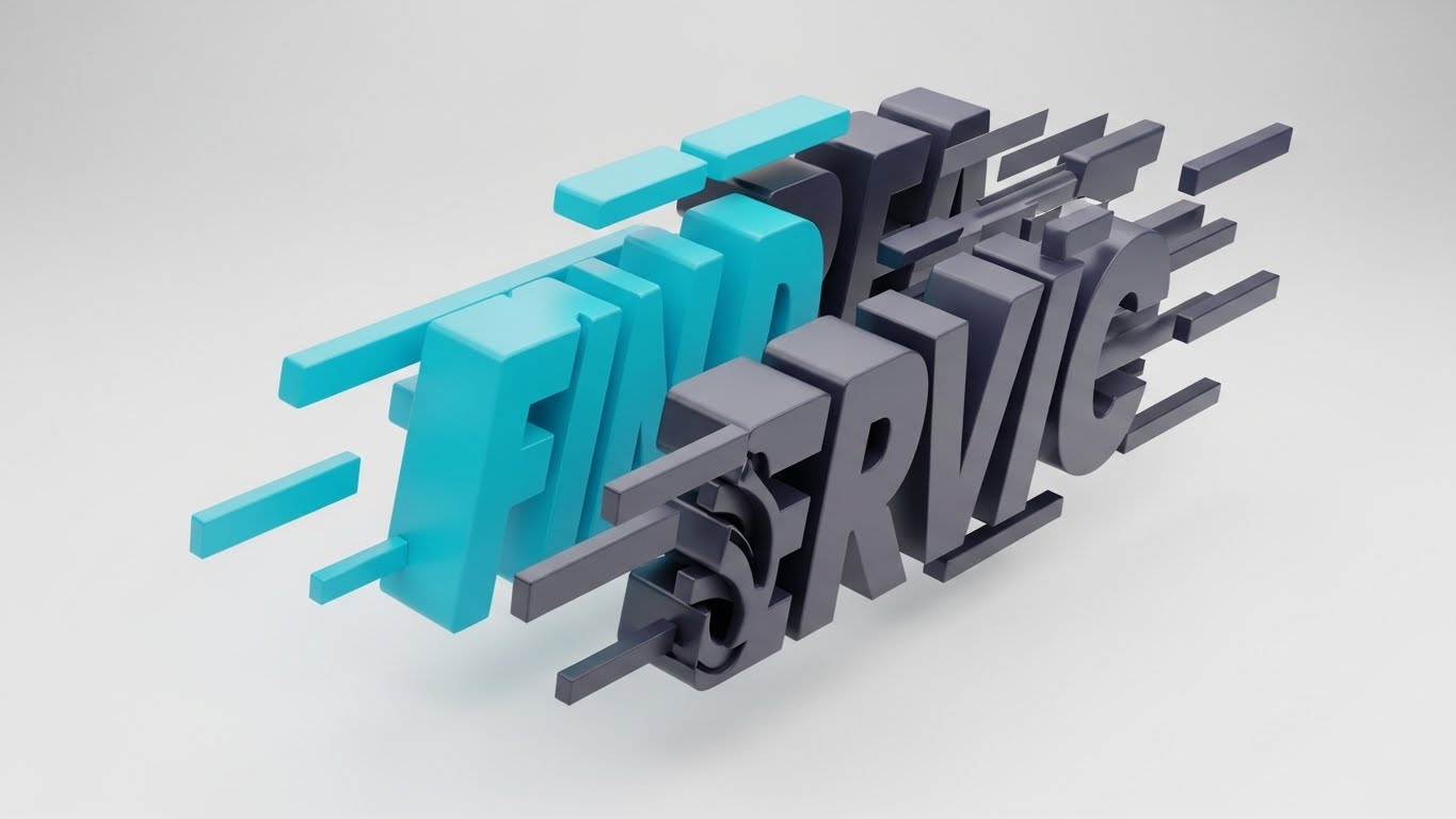
The Visual & Narrative Approach
Speed is the currency of field operations. This style abandons traditional imagery to focus purely on the sensation of velocity. The chunky, block-like 3D text ("FIND SERVICE") is captured in a state of "controlled motion," with slight motion blur and a tilted composition suggesting forward momentum. The Vibrant Cyan and Deep Charcoal palette creates a stark, high-contrast look that demands attention. It visually simulates the urgency of an emergency dispatch or a same-day service request.
Psychological Impact & KPI Focus
This style triggers a high-arousal state associated with Urgency and Efficiency. It directly addresses the pain point of "Slow Response Times." It aligns perfectly with KPIs like SLA Adherence and Time-to-Site, promising a platform that moves as fast as the problem itself.
Strategic Implementation & Trade-offs
- Best Use: YouTube Bumper ads or social media "Hype" reels (5-8 seconds) designed to stop the scroll.
- Duration: Short and punchy.
- Trade-off: It conveys energy but zero detail. It is a "mood setter" that must be paired with other styles to explain how the speed is achieved.
Companies using similar video content -
Oracle Field Service – Oracle Field Service Cloud – Emphasizes accelerated dispatch.
4. AI Generated Mixed Media
TOFU | Vertical Social Organic
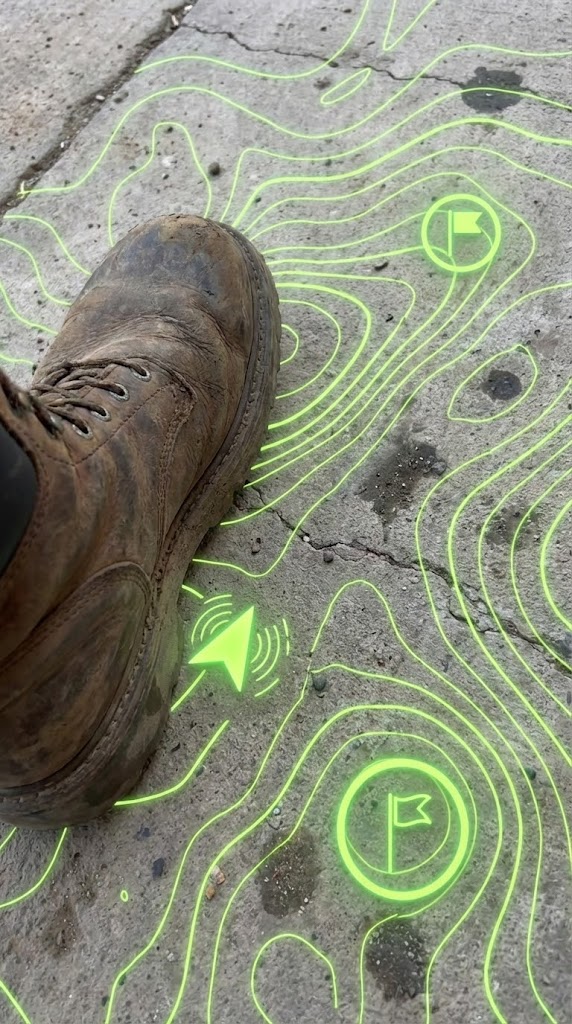
The Visual & Narrative Approach
This style bridges the physical-digital divide by blending gritty realism with high-tech vector overlays. The visual anchors the viewer in the technician's reality: a close-up, handheld POV shot of a rugged work boot stepping onto concrete. Overlaid on this is a glowing, neon lime green topographical map with waypoint markers. This visually fuses the harsh environment of the job site with the precision of digital guidance, representing "Augmented Reality" or "Location Intelligence."
Psychological Impact & KPI Focus
This style generates Empathy and Relevance. It tells the technician, "We understand your world; we aren't just software people in a tower." It validates their environment while positioning the tech as a helpful guide. It strongly communicates Technician Enablement, Safety Compliance, and First-Time Fix Rate (by showing the tech arriving at the exact right spot).
Strategic Implementation & Trade-offs
- Best Use: Vertical Social Media (TikTok/Reels) targeting the younger workforce or recruitment videos.
- Duration: 15-30 seconds.
- Trade-off: Requires high-quality source footage. If the underlying video looks staged or fake, the "authenticity" value is lost.
Companies using similar video content -
PTC Vuforia – Vuforia Chalk – Provides AR guidance for technicians.
TeamViewer Frontline – Frontline – Offers remote AR assistance.
5. Abstract 2D Motion Graphics
TOFU | Skippable Pre-Roll Ad

The Visual & Narrative Approach
This style visualizes the invisible "heartbeat" of a SaaS platform: data flow. Against a clinical white background, luminous magenta lines pulse along circuit-board-like paths, converging and diverging in rhythmic patterns. The aesthetic is sleek, digital, and antiseptic. It represents the continuous stream of telemetry, status updates, and GPS pings that flow into the central system. The motion is hypnotic and looping, suggesting a system that "never sleeps."
Psychological Impact & KPI Focus
The precision of the lines reassures the viewer about System Health and Reliability. For an IT Director or COO, this visual offers a sense of calm control over complex data. It aligns with KPIs like Uptime, Real-Time Visibility, and IoT Connectivity. It visually demonstrates that the platform is actively monitoring the operation 24/7.
Strategic Implementation & Trade-offs
- Best Use: Background visuals for webinar waiting screens, pre-roll ad backgrounds, or sections discussing API integrations.
- Duration: Loopable.
- Trade-off: It is highly abstract and "cold." It works best to support technical claims, not to tell human stories.
Companies using similar video content -
Microsoft Azure IoT – Azure IoT Central – Visualizes continuous data streams.
6. Isometric 2D Motion Design
TOFU | Category Creation
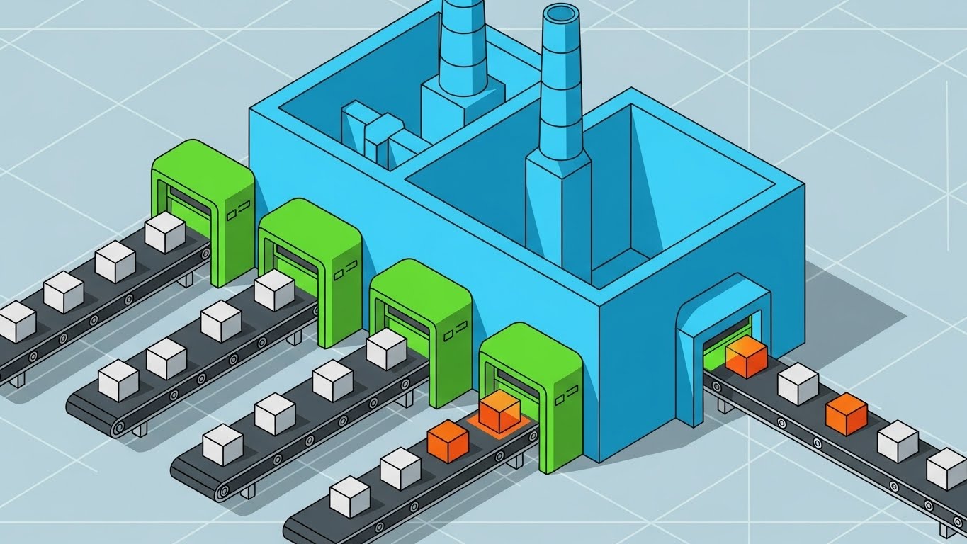
The Visual & Narrative Approach
This style re-imagines Field Service not as a chaotic city, but as a precise, automated "Service Factory." The isometric angle reveals a stylized production line where work orders (represented by boxes) travel along conveyor belts through processing units. The clean Cyan and Green palette suggests a frictionless, standardized process. This visual metaphor powerfully argues that field service can be managed with the same rigorous process control as a manufacturing floor.
Psychological Impact & KPI Focus
This style appeals to the desire for Predictability and Standardization. Operations leaders often envy the control of a factory; this visual promises that same level of control for the field. It focuses on Workflow Automation, Process Consistency, and Scalability, showing that the platform can handle high volumes without breaking.
Strategic Implementation & Trade-offs
- Best Use: "How it Works" sections on the website or "Platform Overview" videos.
- Duration: 30-60 seconds.
- Trade-off: The "Factory" metaphor can feel impersonal. It is excellent for showing process, but must be balanced with human-centric visuals to avoid treating technicians like robots.
Companies using similar video content -
IBM Maximo – Maximo Application Suite – Illustrates asset maintenance workflows.
7. Clean UI Workflow (Light Mode)
MOFU | Feature Education
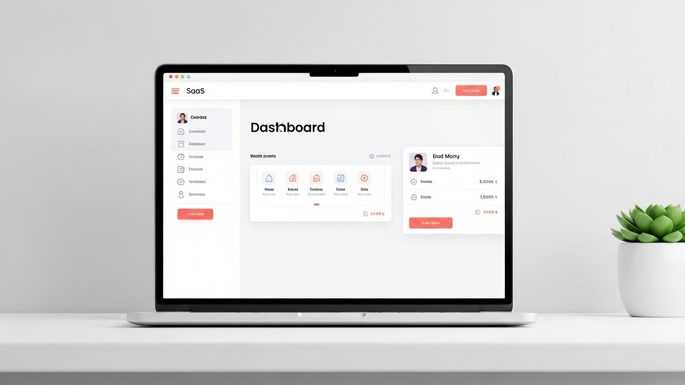
The Visual & Narrative Approach
Here, the product is the hero. The visual centers on a high-fidelity rendering of a SaaS dashboard on a floating laptop screen, set against a soft Mint Green background. The interface is simplified—text is replaced by abstract bars, but the colorful status dots and drag-and-drop layout remain sharp. The soft drop shadows and "floating" effect make the software feel tangible and modern. The focus is purely on the clarity of the interface.
Psychological Impact & KPI Focus
The primary trigger is Cognitive Ease. "Software bloat" is a major barrier to adoption; this style visually assures the buyer that the platform is intuitive and easy to learn. It directly addresses User Adoption Rates and Dispatcher Efficiency. By removing the clutter of real data, it allows the viewer to appreciate the logical workflow of the tools.
Strategic Implementation & Trade-offs
- Best Use: Landing pages for specific features (e.g., "Smart Scheduling") or product demo videos.
- Duration: 30-90 seconds.
- Trade-off: Because it strips away real text, it can't be used for detailed training. It sells the experience of the UI, not the granular mechanics.
Companies using similar video content -
ServiceTitan – ServiceTitan Software – Showcases user-friendly dispatch UI.
8. Wireframe to Reality Transition
MOFU | Product/Solution Differentiation

The Visual & Narrative Approach
This split-screen composition creates a powerful "Digital Twin" narrative. The left half displays a technical, blueprint-style blue wireframe of a utility truck; the right half transforms seamlessly into a photorealistic, high-gloss white truck. A glowing energy beam acts as the transition line. This visualizes the seamless connection between the digital asset record in the software and the physical machine in the real world.
Psychological Impact & KPI Focus
This style builds Trust in Data. It tells the Asset Manager or CFO that the software "knows" the asset inside and out—from its specs to its current condition. It reinforces concepts of Asset Lifecycle Management and Preventive Maintenance Accuracy, bridging the gap between engineering data and operational reality.
Strategic Implementation & Trade-offs
- Best Use: "Technology" or "Platform" deep-dive pages.
- Duration: 15-20 seconds.
- Trade-off: High production value is required. The alignment between the wireframe and the photo must be pixel-perfect for the illusion to work.
Companies using similar video content -
Dassault Systèmes – 3DEXPERIENCE Platform – Connects digital models to physical assets.
GE Digital – Digital Twin Solutions – Bridges virtual and physical asset data.
9. Rapid UI Feature Montage
MOFU | Driving Demo Requests
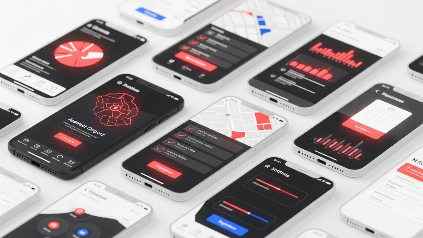
The Visual & Narrative Approach
To showcase the depth of the mobile application, this style uses a "cascade" of floating UI screens. Multiple translucent and solid screens overlap, featuring maps, checklists, and signature pads in a Coral Red and Midnight Blue palette. Motion blur suggests high-speed usage. It creates a sense of volume and fluidity, implying that the app is rich in features but fast to navigate—a critical requirement for busy technicians.
Psychological Impact & KPI Focus
This addresses the anxiety of "Feature Gaps." It visually shouts "Yes, we have it all," without needing to pause on every single feature. It conveys Comprehensive Functionality and App Performance. The speed of the animation suggests a tool that won't slow down the worker, supporting Wrench Time and Productivity.
Strategic Implementation & Trade-offs
- Best Use: GIF embeds in email campaigns to drive demo requests or high-energy closers for demo videos.
- Duration: 5-10 seconds.
- Trade-off: It is impressionistic. The viewer gets a feeling of abundance but won't retain specific details.
Companies using similar video content -
FieldAware – FieldAware FSM – Highlights rich mobile app features.
10. Split Screen: Optimized Reality and UI
MOFU | Competitive Displacement
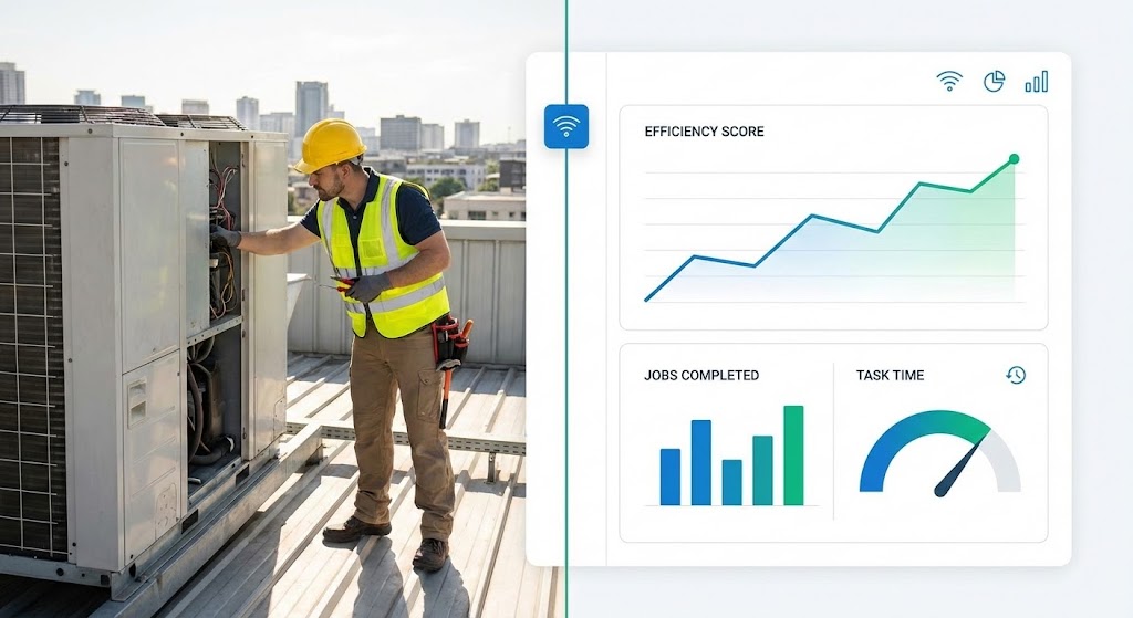
The Visual & Narrative Approach
This style is the definitive "Cause and Effect" visualization. It juxtaposes the physical work (a Technician on a roof) with the digital result (a Dashboard with rising graphs). A thin vertical line connects the two worlds. The lighting on the left is natural sunlight; the right is clean digital light. It visually proves that the work done in the field is immediately reflected in the office analytics.
Psychological Impact & KPI Focus
This speaks directly to the VP of Ops' desire to measure performance. It validates the hard work of the technician while satisfying the executive's need for metrics. It visually embodies Real-Time Visibility, Workforce Productivity, and ROI. It answers the skeptical question: "Does this software actually impact what happens on the roof?"
Strategic Implementation & Trade-offs
- Best Use: Case study headers, "Results" slides in pitch decks, or competitive comparison pages.
- Duration: Static or subtle motion.
- Trade-off: The photography must feel authentic to the specific industry (e.g., HVAC tools for HVAC software) to maintain credibility.
Companies using similar video content -
Trimble – Trimble FSM – Links field work to dashboard metrics.
Samsara – Connected Operations Cloud – Connects fleet activity to data.
11. Macro UI Micro-Interactions**
MOFU | LinkedIn Video Ads

The Visual & Narrative Approach
This style abandons the wide shot to focus on the microscopic moment of decision: the "tap." The visual is an extreme close-up of a single, glossy gold interface button on a pristine white surface. As the button is pressed, a subtle, fluid ripple effect radiates outward, creating a tactile sense of responsiveness. The shallow depth of field blurs the edges, forcing the eye to focus entirely on the interaction. It creates a sensory experience of "weightlessness," suggesting that even the most complex field task can be executed with a single, satisfying touch.
Psychological Impact & KPI Focus
This triggers the psychological principle of Cognitive Fluency. By isolating the interaction, it visually proves that the tool is frictionless. For a Field Service Manager worried about technician pushback, this image is a sigh of relief. It directly supports KPIs related to User Adoption and Data Entry Compliance, visually promising that the software effectively "disappears" during use.
Strategic Implementation & Trade-offs
- Best Use: LinkedIn feed ads (autoplay) where detailed text is ignored but a satisfying visual hook captures attention.
- Duration: 3-5 seconds (Looping).
- Trade-off: It is purely functional art. It does not explain what the button does, only how good it feels to use it. It must be accompanied by benefit-driven ad copy.
Companies using similar video content -
GoCanvas – GoCanvas Mobile Forms – Emphasizes easy data capture.
12. Aspirational Stock Montage
MOFU | Building Trust & Credibility

The Visual & Narrative Approach
Technology serves people, not the other way around. This style places the human workforce at the center of the narrative. A low-angle "hero shot" captures a diverse team of field engineers in safety gear, standing confidently in a solar farm at sunset. The warm "Golden Hour" lighting and deep blue sky create an emotional tone of optimism and pride. Unlike the previous abstract styles, this is grounded, gritty, and human. It visualizes the result of good software: a team that is organized, safe, and ready for the next challenge.
Psychological Impact & KPI Focus
This appeals to the Safety & Culture priorities of the Operations Director. It frames the software as an enabler of human potential rather than a replacement for it. It aligns with KPIs like Employee Retention and Safety Compliance, suggesting that equipping teams with the right tools leads to higher morale and professional pride.
Strategic Implementation & Trade-offs
- Best Use: "About Us" pages, recruitment videos, or the emotional closing of a product demo.
- Duration: 10-20 seconds.
- Trade-off: It is generic by nature. To be effective, the voiceover must clearly connect the happy team to the specific benefits of the platform (e.g., "Give them the tools they deserve").
Companies using similar video content -
Accruent – Maintenance Connection – Highlights productive field teams.
13. Dynamic Data Visualization
BOFU | ROI Justification

The Visual & Narrative Approach
When speaking to the CFO, numbers are the only language that matters. This style translates abstract financial projections into a tangible, rising structure. In a high-key, glossy studio environment, Emerald Green bars (representing profit or savings) rise from a reflective floor. A glowing silver curve trends aggressively upward above them. The textures of glass and polished metal convey premium value and financial solidity. It is a literal "building" of wealth, devoid of confusing dashboard UI, focusing solely on the upward trajectory.
Psychological Impact & KPI Focus
This leverages Confirmation Bias for the financial buyer who is already looking for reasons to approve the budget. The clean, upward motion validates their investment thesis. It laser-focuses on ROI, Cost Savings, and Revenue Growth. It answers the question, "Will this pay for itself?" with a resounding, visual "Yes."
Strategic Implementation & Trade-offs
- Best Use: Investor decks, proposal summaries, or the "ROI" section of a sales presentation.
- Duration: 10-15 seconds.
- Trade-off: It is devoid of operational context. It sells the result (money), not the method. It should not be used to explain features.
Companies using similar video content -
Uptake – Uptake Fleet – Visualizes financial impact of predictive insights.
C3 AI – C3 AI Suite – Demonstrates growth through AI-driven data.
14. 3D X-Ray Visualization
BOFU | Risk Mitigation

The Visual & Narrative Approach
For the IT Director, beauty is skin deep; they need to see the engine. This style uses a "Superman vision" effect to peer inside a ruggedized industrial tablet. The casing becomes semi-transparent, revealing a glowing, complex internal circuitry and a central, locking holographic shield. The cool blue and green lighting symbolizes active data protection and encryption. It visually argues that the software is not just an app, but a hardened, secure infrastructure capable of protecting proprietary field data.
Psychological Impact & KPI Focus
This directly addresses Security Anxiety and Risk Aversion. It visually validates claims about "Enterprise-Grade Security." It supports KPIs related to Data Compliance (SOC2, GDPR) and System Integrity. It reassures the technical buyer that the platform is robust enough to handle sensitive infrastructure data.
Strategic Implementation & Trade-offs
- Best Use: "Security" or "Architecture" whitepapers, or technical deep-dive videos for IT stakeholders.
- Duration: 15-20 seconds.
- Trade-off: It is highly technical. It may alienate a non-technical Operations Manager who cares more about dispatch speed than encryption protocols.
Companies using similar video content -
Hitachi Vantara – Lumada – Illustrates secure IoT infrastructure.
Microsoft Dynamics 365 Field Service – Dynamics 365 – Shows robust platform security.
15. 2D Line Art Animation
BOFU | The Economic Buyer

The Visual & Narrative Approach
Complex decisions often require simplified metaphors. This style utilizes a sophisticated, continuous line art aesthetic on a textured off-white background to visualize the "tipping point" of modernization. A classic balancing scale weighs a stack of legacy servers and heavy cloud infrastructure against a single, streamlined digital document. The scale tips in favor of the digital solution, symbolizing the efficiency of the cloud. The minimalist Navy Blue lines convey a sense of legal and financial precision, suitable for a boardroom setting.
Psychological Impact & KPI Focus
This appeals to the Strategic Logic of the C-Suite. It strips away the noise of features to focus on the fundamental trade-off: Heavy Infrastructure vs. Agile Value. It highlights Total Cost of Ownership (TCO) and Operational Agility. It visually proves that the "lightweight" software solution actually carries more weight in value than the heavy legacy hardware.
Strategic Implementation & Trade-offs
- Best Use: Email signatures for executive outreach or simplified "Concept" slides in final contract reviews.
- Duration: 10-15 seconds (Smooth, elegant morphing).
- Trade-off: It is metaphorical, not literal. It requires the viewer to understand the symbol of the scale; it does not show the actual software interface.
Companies using similar video content -
Odoo Field Service – Odoo FSM – Simplifies complex value propositions.
16. Dark Mode UI Showcase
BOFU | The Functional Buyer
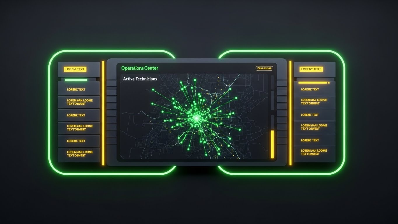
The Visual & Narrative Approach
For the Dispatch Manager, the screen is their world. This style presents the software in "Dark Mode"—the preferred aesthetic for high-intensity, multi-screen operations centers. The deep Matte Grey background allows the Neon Green status dots and data streams to pop with urgent clarity. It looks like a "Mission Control" or military dashboard. The symmetry and high contrast suggest absolute situational awareness and the ability to spot exceptions instantly.
Psychological Impact & KPI Focus
This triggers a sense of Mastery and Control. It validates the dispatcher's role as the "Air Traffic Controller" of the field. It emphasizes Real-Time Visibility, Exception Management, and Dispatcher Efficiency. It visually promises that the user will never miss a critical alert.
Strategic Implementation & Trade-offs
- Best Use: "Features" page on the website, specifically for the "Dispatch & Scheduling" module.
- Duration: 20-40 seconds.
- Trade-off: Dark mode can sometimes feel "intense" or intimidating to less tech-savvy users. It frames the job as high-stakes, which is accurate but demanding.
Companies using similar video content -
Verizon Connect – Reveal – Presents fleet tracking in a command center style.
Geotab – MyGeotab – Showcases detailed telematics dashboard.
17. 2D Graphics Over Live Action
BOFU | Objection Handling

The Visual & Narrative Approach
To overcome the objection "Will my team actually use this?", this style blends the physical and digital worlds. An over-the-shoulder shot shows a warehouse manager using a tablet in a real, blurred industrial setting. Bright, Vivid Amber vector icons (checkmarks, sync arrows, inventory boxes) float in the air above the screen, visually extending the software's logic into the real world. This technique, often called "match-moving," demonstrates how the software augments the worker's reality rather than distracting from it.
Psychological Impact & KPI Focus
This builds Operational Trust. It shows the software in its natural habitat—the dirty, busy warehouse—proving it isn't just "shelfware." It reinforces Inventory Accuracy, Process Compliance, and Worker Augmentation. It visually answers the question: "Does this work on the floor?"
Strategic Implementation & Trade-offs
- Best Use: Retargeting ads for users who visited the "Pricing" page but didn't convert, or case study videos.
- Duration: 15-30 seconds.
- Trade-off: Requires custom filming or high-end stock footage. If the live-action footage doesn't match the client's specific industry (e.g., wrong type of warehouse), it can break immersion.
Companies using similar video content -
Librestream Onsight – Onsight Connect – Overlays digital info on real-world tasks.
Scope AR – WorkLink – Blends AR instructions with live action.
18. 2D Character-Driven Story
BOFU | Sales Cycle Acceleration

The Visual & Narrative Approach
Sometimes, you need to visualize the relationship rather than the tech. This style uses a clean, flat 2D vector illustration of a professional character in a modern office, smiling while signing a digital document on a tablet. "Shine" lines and sparkles indicate the instant success of the transaction. The Pastel Blue and Soft Pink palette is disarming and friendly. It visualizes the specific moment of "deal closure" or "job sign-off," framing it as a happy, frictionless event rather than a bureaucratic chore.
Psychological Impact & KPI Focus
This leverages Social Proof and Emotional Relief. It reduces the anxiety around contracts and approvals. It targets Cycle Time Reduction and Customer Satisfaction (CSAT). It subconsciously tells the prospect, "Doing business with us (and using our tool) is easy and pleasant."
Strategic Implementation & Trade-offs
- Best Use: Email nurture sequences for "Stalled Opportunities" or to visualize the "e-Signature" feature.
- Duration: 5-10 seconds (GIF format).
- Trade-off: It is "cute." It works well for administrative features but lacks the grit required to sell heavy operational tools. Use sparingly.
Companies using similar video content -
Jobber – Jobber Software – Illustrates easy client interactions.
Service Fusion – Service Fusion FSM – Depicts smooth job sign-offs.
19. Abstract 3D AI Visualization
Onboarding | Accelerating Time-to-Value

The Visual & Narrative Approach
The most dangerous moment in SaaS is the implementation gap. This style visualizes the "Day 1" value. A central point explodes into a structured network of glowing Violet and Electric Blue particles. Unlike a chaotic explosion, this is a "constructive" blast—the particles instantly snap into a grid or web, symbolizing the rapid ingestion and organization of legacy data. It represents the "Big Bang" of going live, where scattered data suddenly becomes a coherent system.
Psychological Impact & KPI Focus
This addresses Implementation Fear. It reframes the daunting task of data migration as a powerful, instantaneous event. It focuses on Time-to-Value and Onboarding Velocity. It promises that the transition to the new platform will be energetic and transformative, not a slow, painful slog.
Strategic Implementation & Trade-offs
- Best Use: In-App welcome screens ("Setting up your environment...") or the "Implementation" section of a proposal.
- Duration: 5-8 seconds.
- Trade-off: It is purely symbolic. It doesn't show how the data is migrated, only the feeling of the result.
Companies using similar video content -
AWS IoT – AWS IoT Core – Visualizes rapid data ingestion and organization.
Google Cloud IoT – Google Cloud IoT Core – Represents seamless data integration.
20. 2D Animation & UI Composition
Onboarding | Self-Serve Onboard

The Visual & Narrative Approach
For Product-Led Growth (PLG) strategies, users must teach themselves. This style combines a simplified, cel-shaded UI panel with a playful, oversized Yellow hand cursor. The cursor explicitly clicks a "Play" or "Start" button, triggering a positive animation. The bold outlines and Vibrant Yellow background make it impossible to miss. It functions as a digital "signpost," guiding the new user through their first critical actions with clarity and whimsy.
Psychological Impact & KPI Focus
This lowers the Barrier to Entry. It makes the learning curve feel like a game rather than a lesson. It directly drives Feature Activation and Self-Serve Success Rates. It removes the intimidation factor from the first login, encouraging the user to click and explore.
Strategic Implementation & Trade-offs
- Best Use: In-App tooltips, "Empty State" screens (when no data is present yet), or "Getting Started" email gifs.
- Duration: Loopable.
- Trade-off: It is instructional, not promotional. It is too simple for high-level marketing but perfect for user guidance.
Conclusion: The Visual Architecture of Trust
In the complex domain of Field Operations Management, a platform is only as powerful as its adoption. As we have explored across these 20 styles, visualization is not merely about making the software look "pretty"—it is about dismantling the barriers to belief.
From the Minimalist Vector that clarifies the ecosystem for the CEO, to the Holographic X-Ray that assures the CISO of security, and the Macro UI that promises simplicity to the technician, every visual style serves a distinct strategic function. The "Physical-Digital Divide" is bridged not just by code, but by the visual evidence that the digital tool understands the physical reality.
By mapping these styles to the specific anxieties and aspirations of your stakeholders—Operational Visibility, ROI, Security, and Ease of Use—you transform your marketing from a feature list into a compelling narrative of efficiency and growth. The companies that master this visual language will be the ones that define the future of the $9.68 billion Field Service Management market.
Companies using similar video content -
Connecteam – Connecteam App – Guides new users through features.
When I Work – When I Work Scheduling – Simplifies onboarding for scheduling.
21. Low-Poly 3D Modeling**
Onboarding | Reducing Implementation Friction
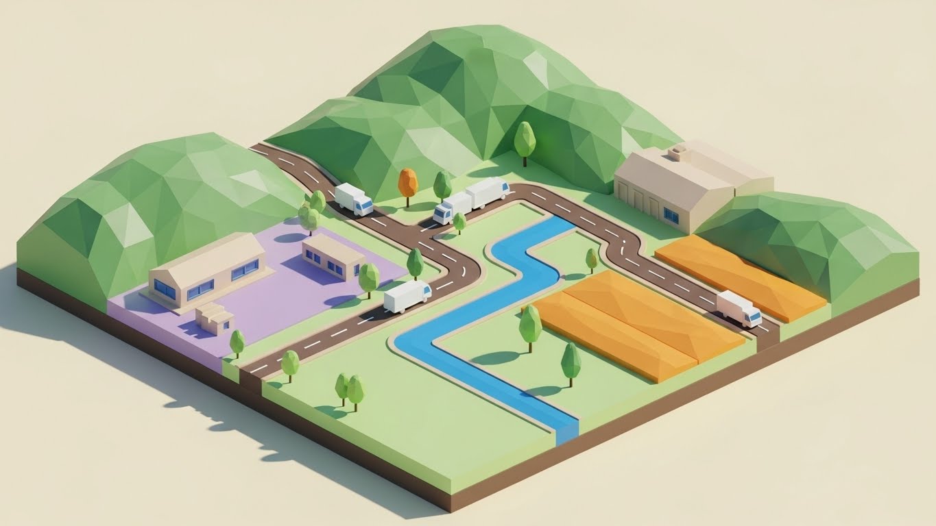
The Visual & Narrative Approach
Implementation is often where excitement turns to exhaustion. This style counters that fatigue by simplifying the world into a manageable, logic-driven model. Using a "Low-Poly" aesthetic, the complex reality of a service territory is rendered as a charming isometric landscape with faceted green hills, brown roads, and simple white trucks. The soft global illumination and toy-like geometry strip away the noise of satellite imagery, focusing entirely on the structure of the route. A bright blue path winds through the terrain, making the task of route optimization look clear, structured, and achievable.
Psychological Impact & KPI Focus
This style leverages Cognitive Ease. By reducing visual fidelity, it lowers the intimidation factor for new administrators. It reframes "Territory Management" from a cartographic nightmare into a strategy game. It directly supports Time-to-Value and Setup Completion Rates, visually reassuring the user that configuring their logistics network is a logical, step-by-step process.
Strategic Implementation & Trade-offs
- Best Use: Interactive "Setup Wizards," onboarding guides for territory definitions, or "Getting Started" videos.
- Duration: 30-60 seconds.
- Trade-off: The stylized, game-like aesthetic sells the concept of ease but lacks the precision required for detailed mapping training (e.g., explaining GPS drift).
Companies using similar video content -
OptimoRoute – OptimoRoute Planner – Visualizes simplified route planning.
Route4Me – Route4Me Route Planner – Presents territory optimization playfully.
22. Holographic UI over 3D Render
Retention | Reducing Support Overhead
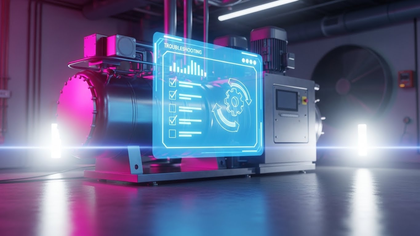
The Visual & Narrative Approach
When a machine fails, the technician needs answers, not a manual. This style empowers the user with a "Digital Twin" experience. A photorealistic, metallic 3D render of a complex industrial asset (like an HVAC compressor) sits in a clean laboratory setting. Hovering in the foreground is a semi-transparent, Holographic Blue UI panel displaying a diagnostic checklist and a rotating gear icon. The seamless blend of heavy hardware and ethereal software visualizes the concept of "Augmented Intelligence"—the answer is overlaid directly on the problem.
Psychological Impact & KPI Focus
This fosters Technician Autonomy. It validates the user's competence by providing tools for self-resolution. Strategically, it targets Support Ticket Deflection and First-Time Fix Rates (FTFR). It visually promises that the platform acts as an expert mentor, reducing the need to call the back office for help.
Strategic Implementation & Trade-offs
- Best Use: Knowledge Base articles, in-app "Troubleshooting" modules, or feature announcements for diagnostic tools.
- Duration: 15-20 seconds.
- Trade-off: Requires high-fidelity 3D assets. The machinery shown must closely match the customer's actual equipment to maintain relevance.
Companies using similar video content -
Augury – Machine Health Solutions – Overlays diagnostics on industrial equipment.
Senseye – Senseye PdM – Provides holographic views for predictive maintenance.
23. Minimalist Flat 2D Vector
Retention | Knowledge Base & FAQ Videos

The Visual & Narrative Approach
In a moment of frustration, clarity is the only metric that matters. This style strips away all distraction, using a bold, split-background composition (Grey and Red). The focus is a singular, thick-lined composite icon: a wrench merged with a lightbulb. There is no depth, no motion blur, and no texture. It is the visual equivalent of a direct answer. It signals "Practical Solutions" instantly, serving as a visual anchor in a dense library of information.
Psychological Impact & KPI Focus
This triggers Processing Fluency. It respects the user's time by reducing cognitive load to zero. It supports Self-Service Success and Customer Effort Score (CES). It visually signals that the content to follow is a straightforward fix, building trust through efficiency.
Strategic Implementation & Trade-offs
- Best Use: Thumbnails for FAQ videos, category headers in the Help Center, or "Pro Tip" overlays in the app.
- Duration: Static or <3 seconds.
- Trade-off: It is purely functional. It has low emotional resonance and is not suitable for marketing or sales narratives.
Companies using similar video content -
UpKeep – UpKeep CMMS – Uses clear icons for maintenance solutions.
24. Lifestyle Stock with UI Overlay
Retention | Reducing Churn
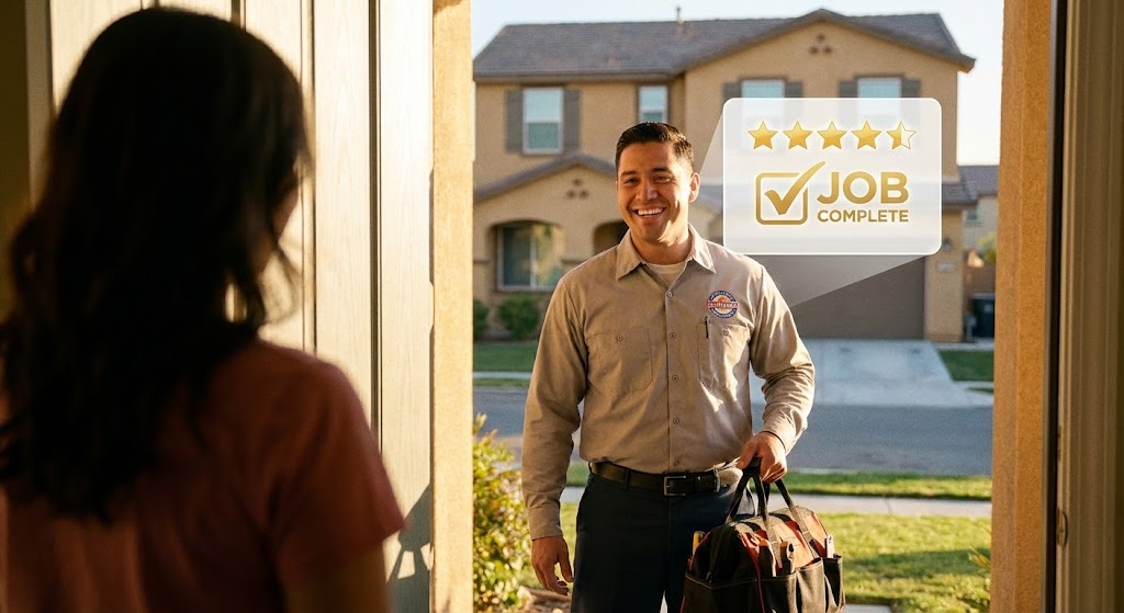
The Visual & Narrative Approach
Retention is driven by the result, not the process. This style visualizes the emotional payoff of field service. A warm, "Golden Hour" shot captures a technician smiling at a homeowner—the ultimate moment of trust. Crucially, a subtle, semi-transparent White UI overlay floats near the technician, displaying a "Job Complete" checkmark and a 5-Star rating. This bridges the gap between the human interaction and the digital record, reinforcing that the software facilitates this success.
Psychological Impact & KPI Focus
This appeals to Professional Pride and Reputation. It reminds the business owner why they use the software: to keep their customers happy. It aligns with Net Promoter Score (NPS) and Customer Retention. It subliminally links the software interface with positive real-world outcomes.
Strategic Implementation & Trade-offs
- Best Use: "Year in Review" emails, customer success newsletters, or login screens celebrating milestones.
- Duration: Static or subtle parallax.
- Trade-off: Relying on stock footage carries a risk of feeling generic. The UI overlay must match the actual product interface exactly to ground the image in reality.
Companies using similar video content -
FieldEdge – FieldEdge Software – Connects service success to customer satisfaction.
Workiz – Workiz FSM – Highlights positive customer interactions.
25. 3D Parallax UI Presentation
Retention | Trial/Freemium User Activation

The Visual & Narrative Approach
To convert a trial user, you must show them the depth they are missing. This style uses a 3D parallax effect to explode the mobile interface into layers. Screens float in a soft Lavender Mist, separated along the Z-axis. The front screen is sharp, while back layers (suggesting advanced analytics or future features) are slightly blurred. Glassy geometric shapes drift between the layers. The aesthetic is premium and fluid, suggesting that the app is a portal to a deeper, more sophisticated operational world.
Psychological Impact & KPI Focus
This triggers Curiosity and Perceived Value. It makes the "Pro" features feel tangible and within reach. It drives User Activation and Freemium-to-Paid Conversion. It visually argues that the platform is not just a tool, but a multi-dimensional ecosystem waiting to be explored.
Strategic Implementation & Trade-offs
- Best Use: In-app paywalls, "Unlock Pro" modals, or new feature release videos.
- Duration: 10-15 seconds (Looping).
- Trade-off: It creates high expectations. The actual user experience must be as smooth and modern as the animation implies.
Companies using similar video content -
ServicePower – ServicePower FSM – Showcases layered feature sets.
simPRO – simPRO Software – Reveals depth of operational features.
26. Futuristic Neon/Dark Mode
Expansion | Driving Upsell/Cross-sell

The Visual & Narrative Approach
When selling "Enterprise" tiers, you are selling power. This style adopts a "Cyberpunk Logistics" aesthetic to visualize global command. In a dark environment lit by Neon Pink and Cyan strips, a complex 3D wireframe globe spins, emitting data streams to satellite nodes. The reflective floor adds a grounded, cinematic texture. It looks like a futuristic war room. This visual language signals that the features being shown (AI, Predictive Analytics) are cutting-edge and exclusive.
Psychological Impact & KPI Focus
This appeals to Ambition and Status. It targets the executive who wants to lead a market-dominating organization. It supports Upsell Revenue and Strategic Planning. It positions the advanced analytics package as a "superpower" for global visibility.
Strategic Implementation & Trade-offs
- Best Use: Launch videos for AI modules, "Enterprise Tier" landing pages, or executive briefing decks.
- Duration: 15-20 seconds.
- Trade-off: It is highly stylized. It works for selling the vision of data, but is too dark and abstract for training users on daily tasks.
Companies using similar video content -
Palantir Technologies – Foundry – Visualizes global data command.
Planet Labs – Planet Platform – Offers global monitoring capabilities.
27. Isometric 3D Workflow
Expansion | Driving Deep Feature Adoption
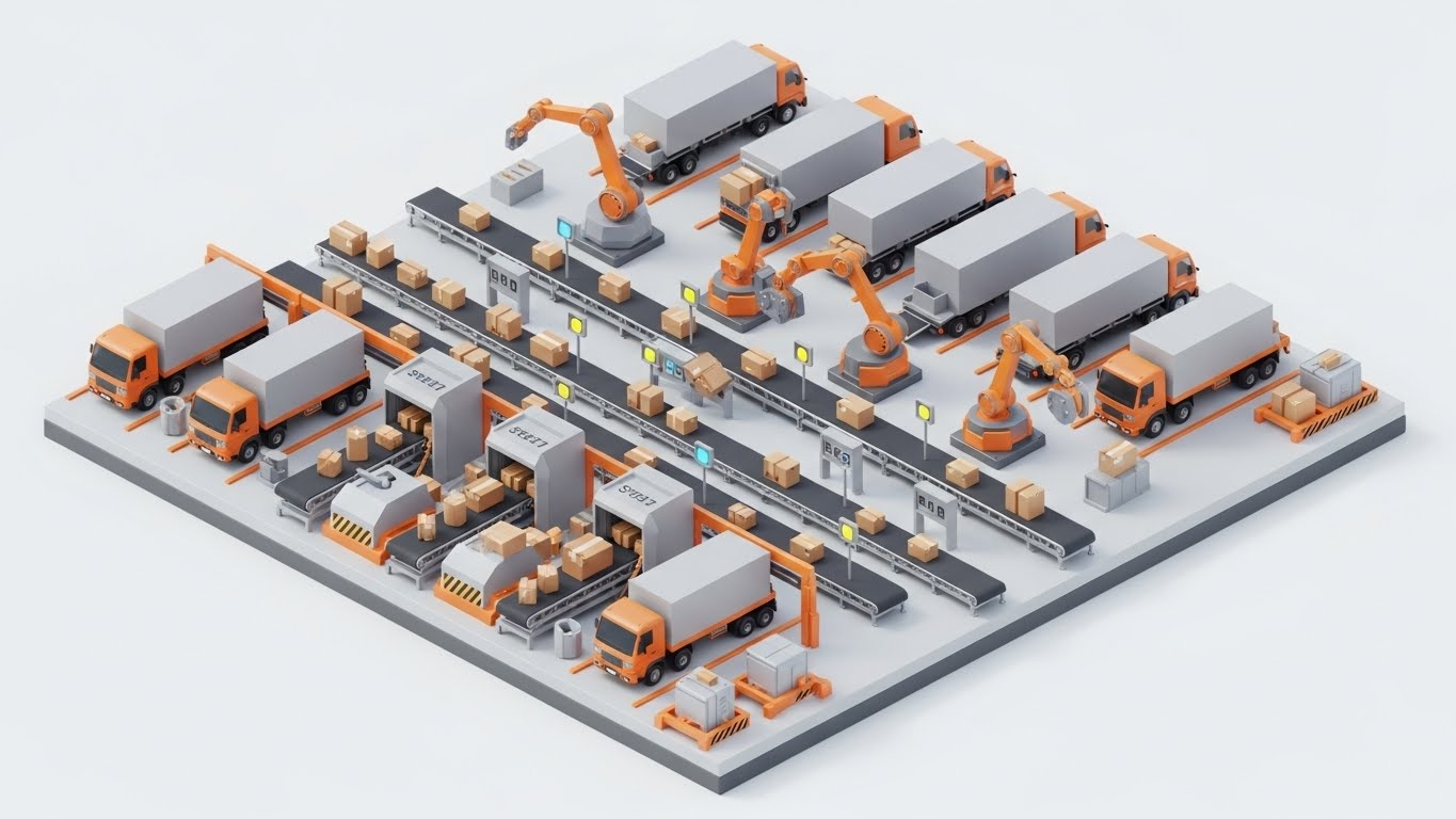
The Visual & Narrative Approach
To sell automation, you must visualize the system as a machine. This style uses a pristine, highly detailed isometric 3D render of a logistics hub. Miniature conveyor belts, robotic arms, and trucks move in perfect, clockwork synchronization. The Industrial Orange and Steel Grey palette keeps it grounded in industrial reality. It visually demonstrates that by adopting deep features (like auto-dispatch), the chaotic depot transforms into a self-regulating, efficient factory.
Psychological Impact & KPI Focus
This satisfies the desire for Order and Control. It makes complex automation feel manageable and predictable. It supports Feature Depth Adoption and Stickiness. It visually proves that the platform can handle infinite scale without breaking, encouraging the user to trust it with their entire operation.
Strategic Implementation & Trade-offs
- Best Use: "Solutions" pages, deep-dive webinars on automation, or trade show loops.
- Duration: Loopable.
- Trade-off: The complexity requires attention. It is a "lean-in" experience for educated buyers, not a "lean-back" ad for cold prospects.
Companies using similar video content -
Infor EAM – Infor EAM – Depicts automated asset management.
AssetWorks – AssetWorks EAM – Illustrates integrated fleet workflows.
28. Generative AI Cinematic Video
Expansion | Driving Referrals & Advocacy

The Visual & Narrative Approach
Advocacy is born from pride. This style uses high-end AI generation to simulate a Super Bowl-quality commercial. An anamorphic wide shot captures a massive fleet of pristine white electric vans rolling out at sunrise. The Teal and Orange lens flares and dramatic tracking motion convey scale, momentum, and dominance. It doesn't show the software; it shows the success of the company using it. It frames the client as the hero of their own epic story.
Psychological Impact & KPI Focus
This builds Brand Affinity and Emotional Connection. It encourages customers to share the video (and the brand) because it reflects their own aspirations. It drives Referrals and Brand Advocacy. It aligns the software brand with the identity of a modern, market-leading fleet.
Strategic Implementation & Trade-offs
- Best Use: Keynote openers, "Year in Review" thank-you videos, or social media brand anthems.
- Duration: 15-30 seconds.
- Trade-off: It is purely emotional. It contains zero functional information and relies entirely on the "vibe" of success.
Companies using similar video content -
Caterpillar – Cat Connect – Showcases large-scale fleet operations.
John Deere – John Deere Operations Center – Visualizes vast operational success.
29. Photorealistic 3D Renders
Expansion | Proactive Support/Announcements
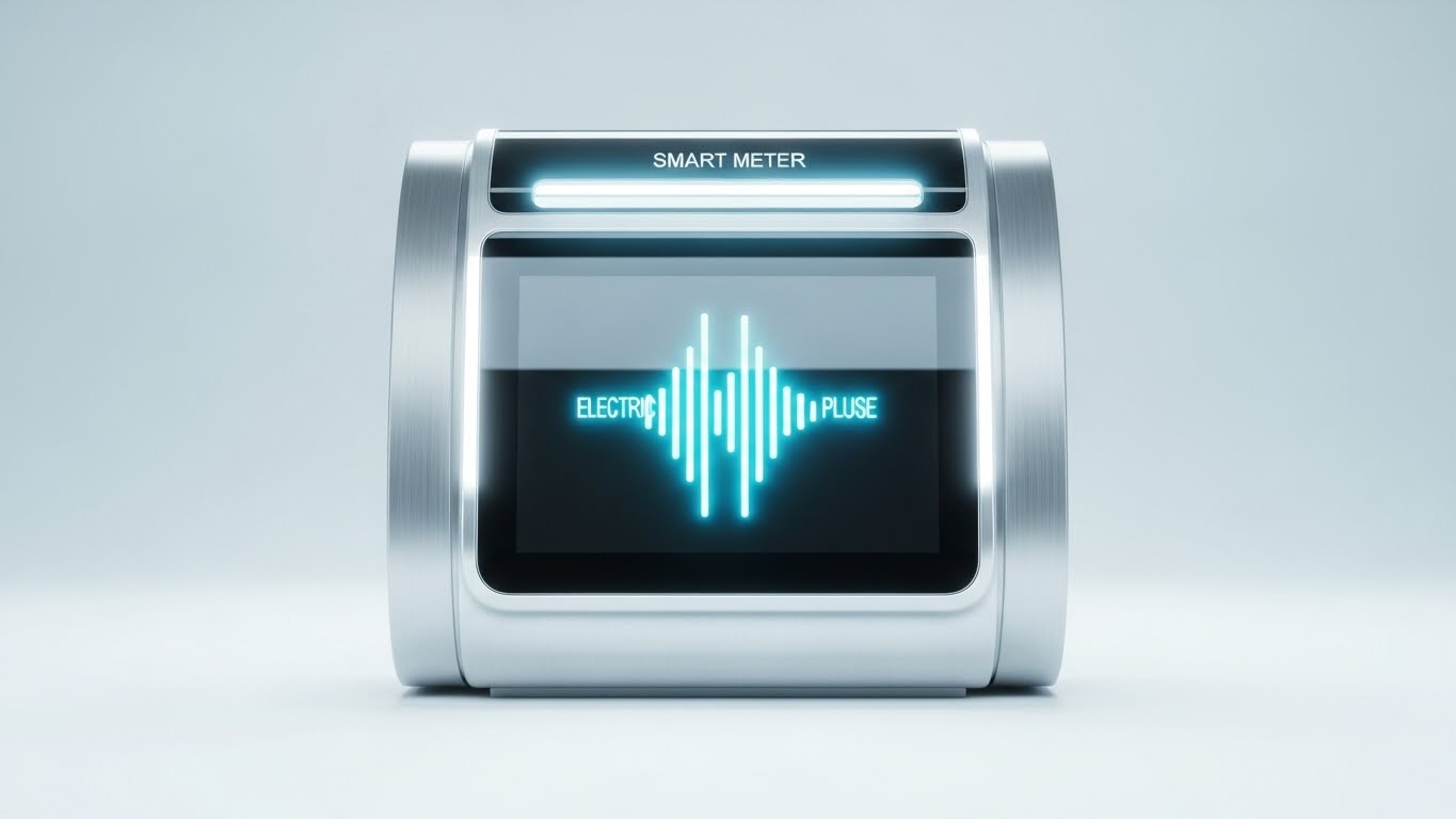
The Visual & Narrative Approach
As SaaS platforms integrate with IoT, the hardware must be sold as a premium asset. This style isolates a "Smart Meter" or sensor in a clean white studio environment. The render is photorealistic, highlighting the brushed silver texture and the glowing green signal on the screen. It treats the industrial device like a luxury consumer product. It visually validates the engineering quality of the hardware, bridging the gap between the invisible cloud and the physical sensor.
Psychological Impact & KPI Focus
This builds Product Trust and Perceived Value. It assures the buyer that the physical component of the solution is robust and reliable. It supports Hardware Sales and IoT Feature Adoption. It makes the data collection feel tangible and premium.
Strategic Implementation & Trade-offs
- Best Use: Product launch emails, hardware spec sheets, or "What's New" catalogs.
- Duration: 10-15 seconds (Turntable rotation).
- Trade-off: It is sterile. It showcases the object beautifully but lacks environmental context. It validates the thing, not the usage.
Companies using similar video content -
Honeywell – Honeywell Forge – Renders smart industrial devices.
Schneider Electric – EcoStruxure – Showcases high-fidelity IoT hardware.
30. Generative AI Realistic Character Video
Expansion | Establishing Thought Leadership

The Visual & Narrative Approach
At the highest level, business is human. This style uses a hyper-realistic AI-generated "CEO Persona"—a confident professional woman in a modern office—to deliver strategic updates. The lighting is flattering and authoritative. The focus is on eye contact and delivery. This allows for the scalable production of "face-to-face" communication, humanizing the brand and establishing the company as a thought leader without the logistical friction of filming executives.
Psychological Impact & KPI Focus
This leverages Authority Bias and Intimacy. It transitions the relationship from "Vendor" to "Partner." It supports Executive Engagement and Long-Term Retention. It reassures the client that there is a visionary human element guiding the technology they rely on.
Strategic Implementation & Trade-offs
- Best Use: LinkedIn thought leadership, quarterly business review intros, or strategic roadmap updates.
- Duration: 30-60 seconds.
- Trade-off: The "Uncanny Valley" risk is real. The quality of voice sync and facial expression must be flawless to maintain credibility.
Strategic Knowledge Base: The Visual Operations Doctrine
The 30 styles detailed in this guide are not merely aesthetic choices; they represent a "Visual Operating System" for the modern field service enterprise. To transform these visuals into a competitive moat, organizations must move beyond creation and focus on strategic integration. The following framework outlines the 30-point doctrine for embedding this visual language into the DNA of your operations.
STRATEGIC ALIGNMENT & VISUAL ARCHITECTURE
The "Pre-Production" Strategy: Defining the Why and Who.
- The Cognitive Load Audit: Before creating a single asset, audit your current training materials. If a technician needs to read 500 words to perform a 1-minute task, you have a "Cognitive Debt." Replace text with Minimalist Vector (Style 23) to balance the load.
- Role-Based Visual Mapping: Do not use the same visuals for the C-Suite and the Driver. The Fleet Manager needs dense Dark Mode UI (Style 16) to feel control; the Driver needs large, high-contrast Bold Kinetic Typography (Style 3) on a mobile screen.
- The "Glanceability" Standard: In logistics, seconds matter. Design all field-facing visuals to be understood in under 1.5 seconds. Use high-contrast icons rather than subtle gradients.
- Brand Voice Consistency: Your marketing videos (Style 4) and your internal support videos (Style 22) must feel like they come from the same company. A disconnect here creates trust gaps.
- The Advids Strategic Audit: Developing a "Visual Operating System" is complex. Engaging a strategic partner like Advids during the blueprint phase ensures that your library of assets is built for reuse and consistency, rather than as one-off projects.
- Standardization vs. Customization: For generic tasks (e.g., "Changing a Tire"), use high-quality Stock (Style 12). For proprietary software workflows, you must use custom Clean UI (Style 7). Don't mix them up.
- The Cross-Departmental Bridge: Sales uses "Efficiency" (abstract); Ops uses "Uptime" (concrete). Use Split Screen visuals (Style 10) to unite these terms, showing the financial result of the operational action.
- Legacy System Integration: When replacing old hardware, use Wireframe to Reality (Style 8) to visually honor the old (wireframe) while celebrating the new (photorealism), reducing resistance from veteran staff.
- Accessibility in Trucking: The workforce is diverse and often multi-lingual. 3D Low-Poly (Style 21) and visual-only narratives transcend language barriers better than voiceover-heavy content.
- The Mobile-First Mandate: 80% of your users are deskless. Every visual style must be legible on a 5-inch screen in direct sunlight. Test your UI Montages (Style 9) on actual phones outdoors.
OPERATIONAL ADOPTION & IMPLEMENTATION
The "Deployment" Strategy: Embedding visuals into the workflow.
- Overcoming "Big Brother" Anxiety: Technicians fear surveillance. Use Human-Centric Stock (Style 12) to frame AI monitoring as "Safety & Protection" rather than "Policing." Show the driver getting home safe, not the manager watching a screen.
- The Micro-Learning Shift: Kill the PDF manual. Deploy a library of 30-second UI Interaction videos (Style 11) indexed by feature. Delivery via SMS or in-app push is far more effective than a Learning Management System (LMS) course.
- Just-in-Time Support: Embed Holographic Troubleshooting (Style 22) directly into the error message screens of your app. When a fault occurs, the video should auto-play.
- Gamification of Training: Use Dynamic Data Visualization (Style 13) to show "Leaderboards" or "Safety Scores." Visualizing performance data spurs competition and engagement.
- Reducing Support Ticket Volume: There is a direct correlation between the quality of your FAQ Videos (Style 23) and the volume of "How-to" calls. If a question is asked three times, create a video for it.
- Remote Onboarding: For distributed fleets, you cannot fly trainers everywhere. Use 3D Parallax (Style 25) and screencasts to create a virtual "Ride-Along" experience that scales globally.
- Visualizing Standard Operating Procedures (SOPs): Text-based SOPs are ignored. Convert critical safety SOPs into Isometric Workflows (Style 6) that show the process flow spatially.
- Feedback Loops: Use interactive video elements. After a Feature Demo (Style 7) plays, ask "Was this helpful?" A simple tap provides data on which visuals are actually driving adoption.
- Scalable Localization: If you operate globally, separate text from animation. Styles like Abstract 3D (Style 2) allow you to swap voiceovers and text overlays for different regions without re-rendering the core 3D assets.
- Leadership Communication: When strategy changes, don't send an email. Use a High-Fidelity AI Persona (Style 30) to deliver the message face-to-face. It commands attention and conveys gravity.
MEASURING IMPACT & FUTURE-PROOFING
The "ROI" Strategy: Measuring success and looking ahead.
- Beyond "Views": Vanity metrics don't matter. Measure "Time-to-Competency" (how fast a new hire reaches full productivity) and "Feature Adoption Rate" (clicks on a new tool after watching the video).
- The "Idle Time" Metric: In software, confusion equals idle time. Measure if users navigate faster after engaging with Clean UI visuals (Style 7). A reduction in "time-on-screen" is often a success metric for field apps.
- Compliance Velocity: How quickly does the fleet reach 100% compliance on a new regulation? Video-based training typically accelerates this by 3x compared to text.
- Retention and Churn: High-quality "Success" visuals (Style 24) sent during renewal periods remind clients of the value delivered, directly correlating to higher renewal rates.
- The AI Visual Frontier: Prepare for real-time video generation. Soon, Generative AI (Style 28) will allow you to personalize training videos with the specific truck model and driver name for every single user.
- Scalability of Assets: Build a "Visual Component Library." If you change your logo or UI color, you should be able to update your Motion Graphics (Style 5) globally without starting from scratch.
- The Advids Partnership: Visual styles evolve. Partnering with Advids ensures your visual language adapts to new trends (like spatial computing) while maintaining the integrity of your core business objectives.
- Benchmarking Success: Compare your "Visual Maturity" against competitors. If they use Photorealistic 3D (Style 29) and you use blurry screenshots, you are losing the perceived quality war before the demo starts.
- The ROI of Safety: Safety videos are not a cost; they are an investment. Quantify the reduction in insurance premiums and accident costs achieved through high-retention Simulation Training (Style 4).
- Final Call to Innovation: Treat video as infrastructure. It is the fiber-optic cable that carries understanding from the code to the human. Invest in it with the same rigor you invest in your software architecture.
Companies using similar video content -
Gartner – Gartner Research – Uses executive personas for insights.
IDC – IDC Research – Delivers strategic updates via expert personas.
Author & Editor Bio


