
Introduction: Visualizing the Pulse of Field Operations
The field service industry is navigating a pivotal transition. We are moving from an era of reactive "break-fix" models, defined by ringing phones and whiteboard schedules, to a future of predictive, synchronized service delivery. As the global Field Service Management (FSM) market accelerates—projected to reach $5.24 Billion in 2025—the pressure to optimize every mile and every minute has never been higher.
However, a critical challenge remains: the "Physical/Digital Gap." This is the friction between the perfectly optimized schedule on a dispatcher’s screen and the unpredictable reality of traffic, weather, and site access facing the technician. Bridging this gap is not just an operational necessity; it is a financial imperative. Data suggests that optimized scheduling and dispatch automation can lead to a 40% increase in first-time fix rates, directly impacting customer satisfaction and bottom-line margins.
For SaaS platforms in this space, visualization is the strategic lever that makes this optimization tangible. It transforms abstract algorithms into clear, actionable insights. A well-crafted video does more than demonstrate software; it visualizes the relief of a dispatcher clearing a backlog, the precision of a technician arriving on time, and the clarity of a fully optimized fleet.
This guide presents 30 distinct visual styles, curated to help marketing and product teams articulate the value of dispatch software. These examples are not just aesthetic choices; they are functional tools designed to reduce cognitive load, accelerate market education, and visually prove that you can bring order to the chaos of the field.
1. Minimalist Flat 2D Vector
TOFU | Brand Awareness
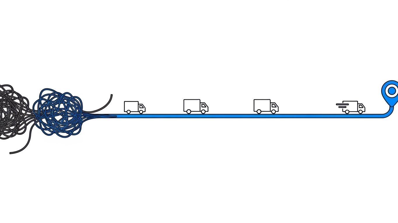
The Visual & Narrative Approach
This style utilizes a powerful visual metaphor to instantly communicate the core value proposition of optimization. The composition begins with a chaotic, tangled knot of dark charcoal yarn on the left, representing the "before" state of manual dispatching—confused, inefficient, and fraught with friction. As the eye moves right, this knot smoothly unravels into a single, perfectly straight, vivid cobalt blue line. Floating along this optimized path are simplified white delivery trucks. The background is a pure, stark white, removing all distractions and forcing focus on the transition from chaos to order.
Psychological Impact & KPI Focus
- Cognitive Relief: The "Knot-to-Line" transition triggers an immediate sense of psychological relief for operations managers burdened by complex logistics.
- KPI Focus: It visually underscores Route Optimization and Efficiency, promising a direct reduction in "windshield time" and operational waste.
Strategic Implementation & Trade-offs
- Best Use Case: High-speed social feeds (Instagram/LinkedIn) where you have less than 3 seconds to stop the scroll.
- Trade-off: The extreme simplicity sacrifices detailed feature explanation for immediate emotional impact. It is a hook, not a demo.
Companies using similar video content -
OptimoRoute – Route Optimization Software – Streamlines delivery and service routes efficiently.
Routific – Delivery Route Planner – Optimizes routes for last-mile delivery.
2. Bold Kinetic Typography
TOFU | Market Education

The Visual & Narrative Approach
Designed for the vertical scroll, this style treats text as physical infrastructure. Massive, blocky 3D letters spelling "DISPATCH" are constructed from industrial materials like concrete and safety-orange metal. The letters are dynamically assembling themselves in the center of the frame against a clean, bright white background, conveying a sense of construction and solidity. Interspersed among the letters are floating 3D icons of wrenches and location pins. The motion is implied through speed lines and geometric debris, suggesting a high-energy, active environment.
Psychological Impact & KPI Focus
- Authority Building: The industrial textures (concrete, metal) resonate with the target audience's reality—construction, utilities, and heavy engineering. It signals, "We understand your environment."
- KPI Focus: The "assembling" motion serves as a metaphor for Resource Allocation and Workforce Management, implying that the software actively constructs order.
Strategic Implementation & Trade-offs
- Best Use Case: Mobile-first brand awareness campaigns where the goal is to associate the brand name with strength and reliability.
- Trade-off: Text-heavy visuals require the viewer to read, which can be a barrier if the motion is too fast. Synchronization with audio is critical here.
Companies using similar video content -
Trimble – Field Service Management – Robust solutions for construction and heavy civil.
HCSS – HeavyJob – Manages construction operations and field data.
3. Abstract 2D Motion Graphics
TOFU | Shaping Brand Perception
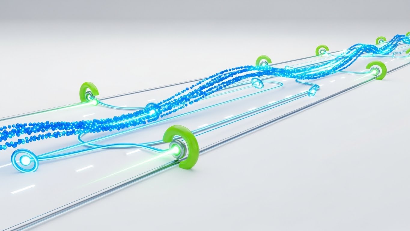
The Visual & Narrative Approach
This style creates a mesmerizing, fluid representation of traffic and data flow. A stream of glowing electric blue particles flows rapidly across a clean, high-key white background, weaving around stylized lime green obstacles representing traffic. The particles leave a trail of light, forming a digital road network. The aesthetic is glossy and modern with smooth vector curves. Small circular nodes pulse rhythmically along the path, symbolizing service stops and data synchronization points.
Psychological Impact & KPI Focus
- Flow State: The smooth, uninterrupted motion induces a "flow state" in the viewer, countering the anxiety of gridlock and delay.
- KPI Focus: Perfectly illustrates Dynamic Scheduling and Real-Time Adaptability. It shows that the system is alive and responsive, not static.
Strategic Implementation & Trade-offs
- Best Use Case: Website headers or hero backgrounds where the goal is to convey modernity and high-tech capability without demanding focused attention.
- Trade-off: The abstract nature means it cannot communicate specific UI features or workflows. It creates a feeling, not a tutorial.
Companies using similar video content -
Skedulo – Deskless Productivity Cloud – AI-powered scheduling for mobile workforces.
KloudGin – AI-Powered FSM – Unifies field service, asset, and inventory management.
4. Abstract 2D Flat Vector Organic
TOFU | Category Creation

The Visual & Narrative Approach
Moving away from hard lines, this style uses soft, fluid shapes to visualize the consolidation of fragmented service zones. Large, soft blobs in shades of soft teal and coral pink are gently merging together in the center of the frame, representing the unification of disparate territories into a cohesive system. The textures are subtle with a light grain overlay. In the negative space, stylized white outlines of gears and map markers are visible. The background is a very pale, off-white cream.
Psychological Impact & KPI Focus
- Silo Busting: The visual merging addresses the pain point of disjointed communication. It promises harmony and integration.
- KPI Focus: Supports narratives around Territory Management and Unified Operations, suggesting a holistic approach to field service.
Strategic Implementation & Trade-offs
- Best Use Case: Editorial content and blog posts discussing "soft" topics like team culture, change management, or organizational alignment.
- Trade-off: The "soft" aesthetic might lack the technical edge required for hard-core engineering audiences who prefer precise schematics.
Companies using similar video content -
Comarch – Field Service Management – Unifies disparate service operations and territories.
Astea International – FSM Software – Integrates service lifecycle for unified operations.
5. AI Generated Mixed Media Video
TOFU | Skippable Pre-Roll Ad
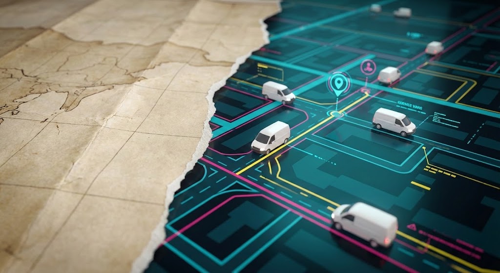
The Visual & Narrative Approach
This high-energy style uses a "rip-paper" transition effect to visualize the leap from analog to digital. The video features a dynamic, fast-paced collage animation blending vintage paper map textures with sleek, modern 3D renders of white service vans. A dull, grey paper map is torn away to reveal a vibrant, high-definition digital map underneath with moving 3D vehicles. The camera zooms in rapidly on a specific route. The lighting shifts from flat to cinematic as the medium changes.
Psychological Impact & KPI Focus
- Old vs. New: The contrast leverages the "Anchoring Effect," making the digital future look even brighter by juxtaposing it with the dull past.
- KPI Focus: Clearly communicates Digital Transformation and Modernization, appealing to businesses looking to retire legacy paper processes.
Strategic Implementation & Trade-offs
- Best Use Case: High-impact advertising where you need to disrupt the viewer's pattern immediately.
- Trade-off: The complexity of mixing textures requires high-end production values; if done poorly, it can look messy rather than dynamic.
Companies using similar video content -
ServicePower – Field Service Management – Blends workforce types for dynamic service.
FieldAware – Field Service Management – Modernizes field operations from paper to digital.
6. 2D Line Art Animation
TOFU | Vertical Social Organic

The Visual & Narrative Approach
A vertical 2D line art animation designed for elegance and precision. A single, continuous, thin black line draws the outline of a heavy industrial wrench in the center of a yellow background. The line smoothly morphs, reshaping the wrench into the outline of a modern smartphone with a checkmark on the screen. The style is precise, thin, and consistent, conveying technical accuracy. The background is a solid, vibrant caution yellow, instantly recognizable in the field service industry.
Psychological Impact & KPI Focus
- Tool Evolution: This appeals to the technician's pride in their tools while subtly introducing technology as an upgrade, not a replacement.
- KPI Focus: Focuses on Field Mobility and Technician Enablement. It validates the shift to mobile-first workflows.
Strategic Implementation & Trade-offs
- Best Use Case: Organic social content aimed at technicians and younger workforce demographics.
- Trade-off: The minimalistic style limits the ability to show complex data or interface depth.
Companies using similar video content -
MobiWork – Mobile Workforce Solution – Equips technicians with mobile tools and forms.
Synchroteam – Field Service Software – Streamlines job scheduling and mobile reporting.
7. Isometric 2D Motion Design
MOFU | Product/Solution Differentiation
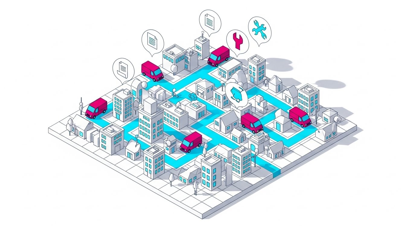
The Visual & Narrative Approach
An isometric 2D design of a stylized city grid, adopting the "God's Eye View." The scene features a clean, white grid floor with pop-up buildings in shades of cool grey. Bright cyan paths weave through the buildings, showing the optimized routes of miniature magenta service vans. The camera angle is a strict 45-degree isometric view. Above the city, floating bubbles contain simple icons of invoices and tools. The lighting is soft and global, casting uniform shadows to the bottom right.
Psychological Impact & KPI Focus
- Control & Oversight: The isometric perspective psychologically places the viewer "above" the chaos, fulfilling the manager's desire for control.
- KPI Focus: Visualizing Fleet Visibility and Job Clustering. It shows how individual jobs fit into the larger city-wide schedule.
Strategic Implementation & Trade-offs
- Best Use Case: Product landing pages explaining the "How it Works" logic of the dispatch engine.
- Trade-off: Isometric art can sometimes feel "game-like," so the color palette must remain professional to maintain B2B credibility.
Companies using similar video content -
WorkWave – Route Manager – Provides optimized routing and fleet visibility.
Verizon Connect – Fleet Management – Offers GPS tracking and dispatch oversight.
8. Clean UI Workflow (Light Mode)
MOFU | Feature Education & Demonstration
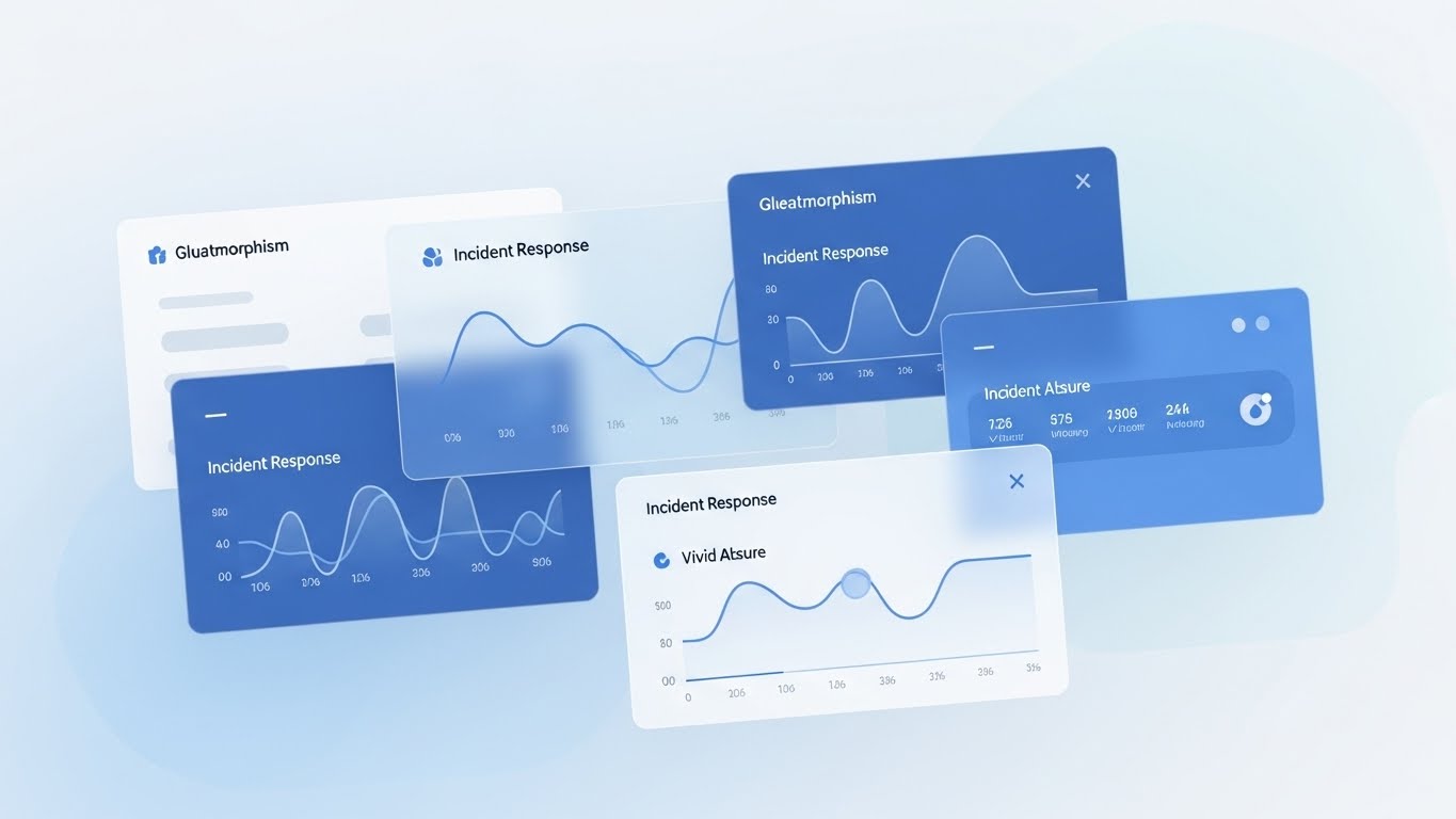
The Visual & Narrative Approach
A pristine, high-fidelity UI mockup of a dispatch calendar dashboard. The interface is clean, modern, and predominantly white with soft grey borders. A stylized 3D hand cursor is depicted dragging a colorful "Job Block" (in bright blue) from a sidebar onto the calendar grid. The background is a blurred, high-key office environment, keeping the focus entirely on the sharp, crisp UI elements. The screen shows detailed but abstract text placeholders for job times and technician names.
Psychological Impact & KPI Focus
- Ease of Use: This style directly combats the fear of "clunky software." It proves the system is intuitive and user-friendly.
- KPI Focus: Demonstrates Dispatcher Productivity and Drag-and-Drop Scheduling, key features for reducing training time.
Strategic Implementation & Trade-offs
- Best Use Case: Feature walkthroughs and demo videos where clarity is paramount.
- Trade-off: It is literal and functional. It lacks the emotional "hook" of the abstract styles, so it works best for audiences who are already interested (MOFU).
Companies using similar video content -
Jobber – Field Service Software – Simplifies scheduling, dispatch, and invoicing.
Housecall Pro – Field Service Management – Manages jobs, scheduling, and customer communication.
9. Split Screen: Optimized Reality and UI
MOFU | Competitive Displacement
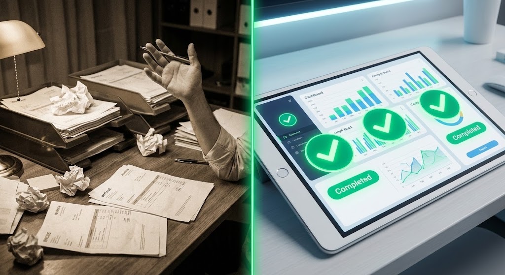
The Visual & Narrative Approach
A split-screen composition that forces a choice. The left half shows a desaturated, slightly grainy photo of a disorganized desk piled high with crumpled paper invoices and a confused person's hand holding a pen. The right half is a hyper-saturated, sharp render of a sleek tablet displaying a clean, organized digital dashboard with green "Completed" indicators. A glowing vertical line separates the two worlds. The lighting on the right is bright and clinical; the left is dim and warm.
Psychological Impact & KPI Focus
- Pain vs. Gain: Leverages the "contrast principle" to make the solution appear even more desirable. It validates the pain of the current manual process.
- KPI Focus: Visually represents the shift from Manual Processes to Automated Workflows, highlighting the reduction in administrative burden.
Strategic Implementation & Trade-offs
- Best Use Case: Retargeting ads for prospects who are still "stuck" using spreadsheets or whiteboards.
- Trade-off: The negative imagery on the left must be relatable, not insulting. It should look like "hard work" (noble but inefficient) rather than "incompetence."
Companies using similar video content -
mHelpDesk – Field Service Software – Transforms manual processes to automated workflows.
Service Fusion – Field Service Management – Replaces paper-based systems with digital solutions.
10. Low-Poly 3D Modeling
MOFU | ABM Awareness
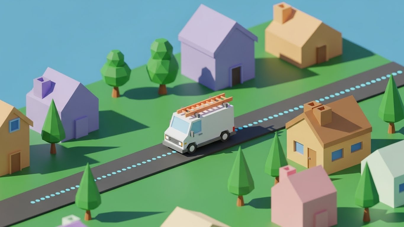
The Visual & Narrative Approach
A low-poly 3D illustration of a service van driving through a miniature, blocky neighborhood. The trees are simple geometric cones, and the houses are faceted blocks in pastel colors. The van is white with a bright orange ladder on top. A dotted blue line floats just above the road, indicating the digital route. The lighting simulates a sunny morning with sharp, hard shadows typical of low-poly art. The background is a solid, soft sky blue.
Psychological Impact & KPI Focus
- Simplification: The low-poly aesthetic suggests that the software takes the complex, "messy" real world and simplifies it into manageable data points.
- KPI Focus: Supports Route Density and Geofencing concepts. It visualizes the "digital twin" of the service territory in an approachable way.
Strategic Implementation & Trade-offs
- Best Use Case: Display ads and explainer videos for technical audiences who appreciate structured, architectural visuals.
- Trade-off: Can appear "cartoony" if the lighting isn't sophisticated. The hard shadows and pastel palette are essential to keep it looking modern and "tech" rather than "juvenile."
Companies using similar video content -
Samsara – Fleet Management Platform – Visualizes fleet activity and asset locations.
Geotab – Telematics Solutions – Provides data-driven insights for fleet optimization.
11. Aspirational Stock Montage
MOFU | Building Trust & Credibility

The Visual & Narrative Approach
This style creates an immediate emotional connection by focusing on the "ideal state" of service delivery. It features high-quality, aspirational photography of a field technician who looks capable, friendly, and professional. The technician, dressed in a clean navy uniform, stands confidently before a pristine white service van. The setting is a suburban driveway bathed in the warm, reassuring glow of "golden hour" sunlight, with a blurred homeowner in the background suggesting a positive interaction. The composition is calm, centered, and human-centric.
Psychological Impact & KPI Focus
- Trust Transference: By using high-fidelity photography and warm lighting, the viewer unconsciously transfers the feeling of warmth and competence to the software brand. It counters the "faceless" nature of SaaS.
- KPI Focus: Subtle reinforcement of Customer Satisfaction (CSAT) and Brand Reputation. It visualizes the end result of efficient dispatch: a stress-free arrival.
Strategic Implementation & Trade-offs
- Best Use Case: Email marketing headers and "About Us" pages where humanizing the brand is essential to differentiate from cold, robotic competitors.
- Trade-off: Stock photography can feel generic if not carefully curated. It requires high-quality, custom shoots to avoid the "canned stock" look.
Companies using similar video content -
ServiceMax – Field Service Management – Enhances customer satisfaction and service delivery.
Salesforce Field Service – FSM Solution – Improves technician efficiency and customer experience.
12. 2D Character-Driven Story
MOFU | Demand Gen & Lead Capture

The Visual & Narrative Approach
This style uses narrative illustration to address the cultural challenge of remote work. The visual depicts a split environment: a female dispatcher in a purple-toned office on the left and a male technician in a green-toned field environment on the right. They are bridging the physical distance with a "digital high-five" through their respective screens (monitor and tablet). A stylized lightning bolt icon creates a dynamic bridge between them. The vector art style is clean, modern, and textured, using distinct color zones to represent the seamless link between office and field.
Psychological Impact & KPI Focus
- Team Synergy: The visual directly addresses the pain of "Us vs. Them" mentality often found in field service organizations. It promises alignment and camaraderie.
- KPI Focus: Highlights Real-Time Communication and Remote Collaboration, showing that the software acts as the unifying force for the workforce.
Strategic Implementation & Trade-offs
- Best Use Case: Social media carousels and blog content focusing on team culture, change management, and employee retention.
- Trade-off: The illustrative style is softer and less technical; it works better for HR and Operations Managers than for IT Directors seeking technical specs.
Companies using similar video content -
Connecteam – Employee Management App – Unifies remote teams with communication tools.
Beekeeper – Frontline Success System – Fosters team collaboration and communication.
13. Rapid UI Feature Montage
MOFU | Overcoming Objections
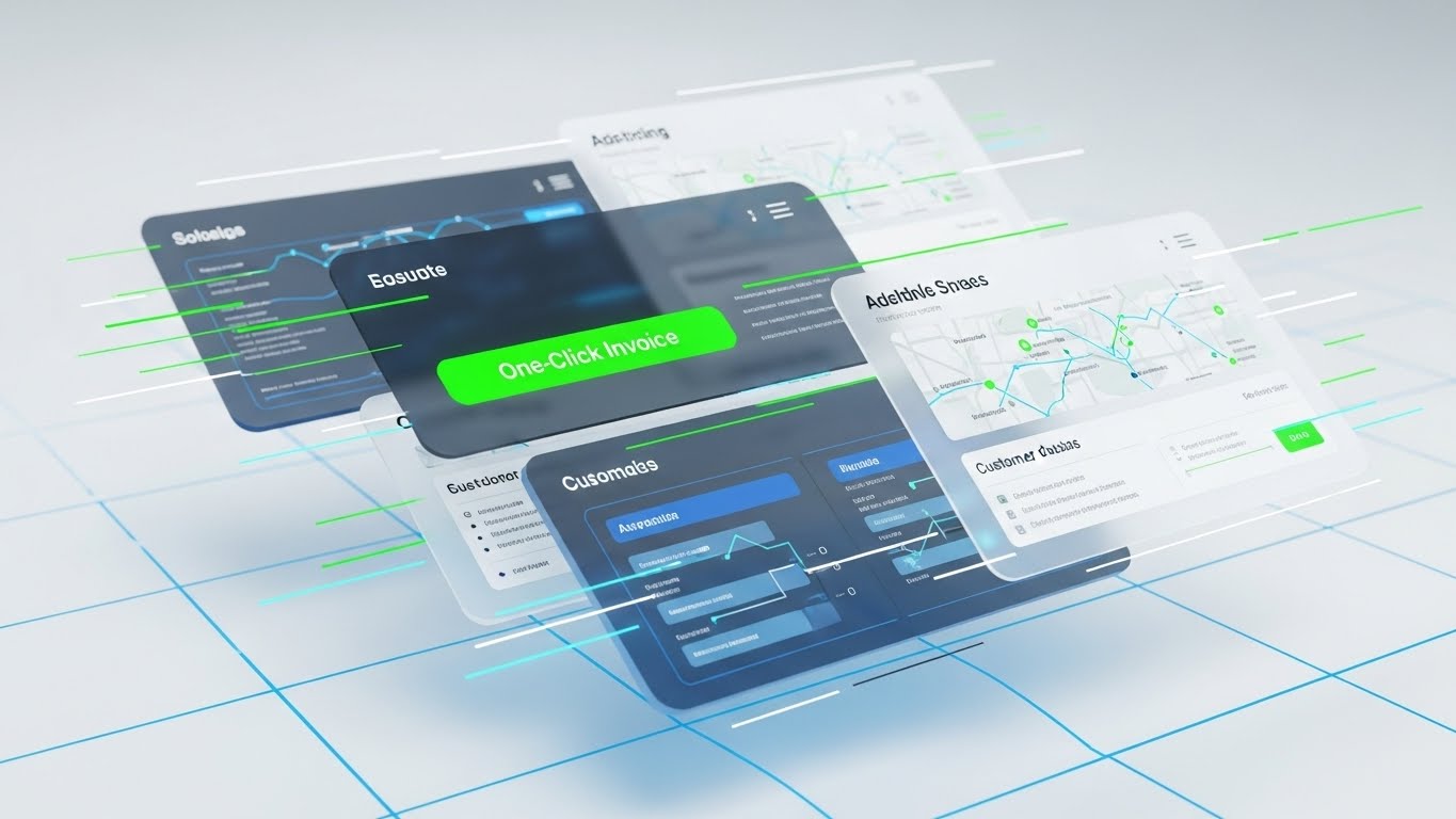
The Visual & Narrative Approach
Designed to communicate velocity and depth, this style features multiple UI screens floating in a 3D space, layered one behind the other. The composition suggests forward momentum with motion blur and speed lines in electric green and cyan. The frontmost screen is in sharp focus, highlighting a critical "One-Click Invoice" button in bright green, while background layers hint at routing maps and customer databases. The background is a high-tech, clean white grid, emphasizing precision and modern architecture.
Psychological Impact & KPI Focus
- Perceived Velocity: The "flying" screens and motion blur trigger a sense of speed, directly countering objections about "slow" or "laggy" legacy software.
- KPI Focus: Sharpens the focus on Workflow Automation and Cash Flow Acceleration (via the invoicing feature), promising a faster path from job completion to payment.
Strategic Implementation & Trade-offs
- Best Use Case: "Features" sections on websites or fast-paced explainer videos where you need to show the breadth of the platform quickly.
- Trade-off: The rapid layering means viewers cannot read the details of the back screens. It is an impression of capability, not a detailed tutorial.
Companies using similar video content -
Infor – Field Service Management – Accelerates workflows across various service functions.
SAP Field Service Management – FSM Solution – Automates complex service processes rapidly.
14. 3D X-Ray Visualization
MOFU | Risk Mitigation
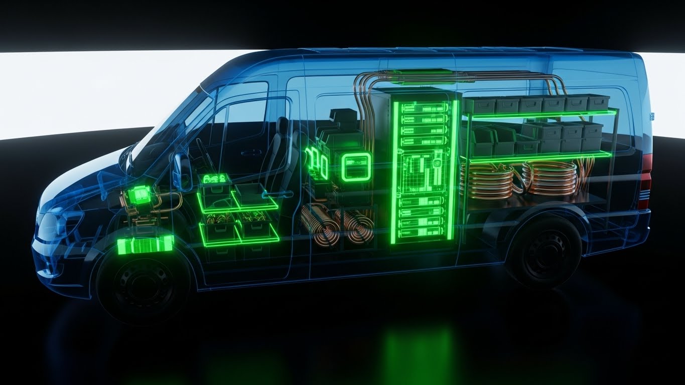
The Visual & Narrative Approach
This striking visual uses an "X-Ray" effect to reveal the hidden value within a service vehicle. The van's exterior is rendered in semi-transparent, ghostly blue glass, allowing the viewer to see inside. The interior is packed with opaque, perfectly organized inventory bins and copper piping. Crucially, the engine block is replaced by a glowing digital server rack, symbolizing that data is the new engine of the fleet. The background is a clinical, dark studio environment that makes the internal components glow with importance.
Psychological Impact & KPI Focus
- Total Visibility: The X-Ray metaphor powerfully communicates "seeing the unseen," satisfying the manager's need for oversight into mobile inventory.
- KPI Focus: Visually represents Inventory Management and Asset Intelligence. It creates a "Digital Twin" of the vehicle, promising that nothing gets lost.
Strategic Implementation & Trade-offs
- Best Use Case: Whitepapers, eBooks, or deep-dive articles about inventory leakage and asset tracking technology.
- Trade-off: This is a high-concept abstract visual. It requires a sophisticated audience who understands the metaphor of the "server rack engine."
Companies using similar video content -
IBM Maximo – Application Suite – Provides deep visibility into asset inventory and health.
Accruent – Maintenance & Operations – Manages mobile inventory and asset intelligence.
15. Dynamic Data Visualization
BOFU | ROI Justification
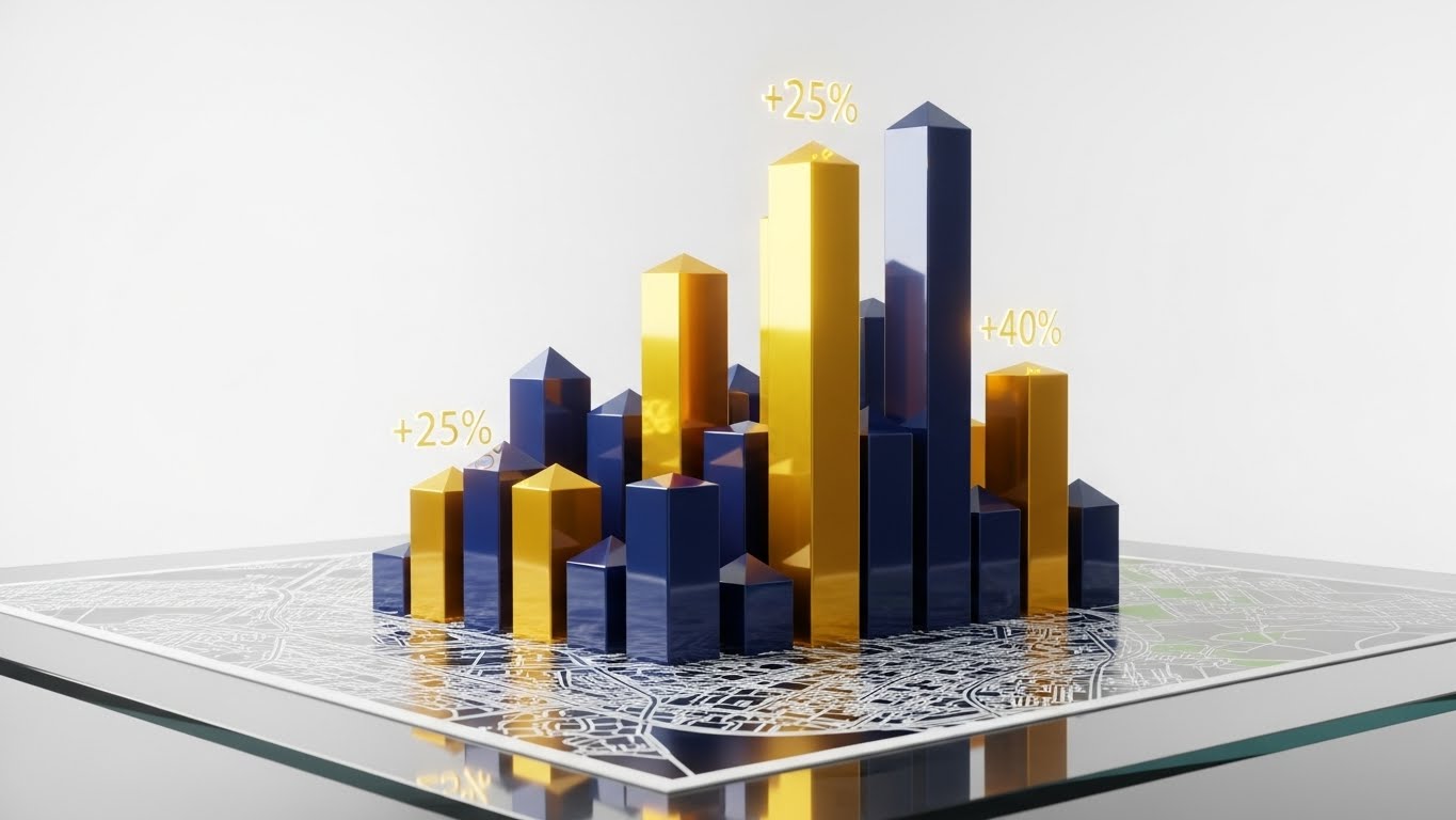
The Visual & Narrative Approach
Moving to the Bottom of the Funnel, this style strips away the "van" and focuses on the "result." A digital city map lies flat on a glass surface. Rising vertically from the map are substantial 3D bar charts in metallic gold and navy blue. These bars represent revenue density per territory. Floating text elements ("+25%", "+40%") highlight specific growth metrics. The rendering is high-gloss and premium, using dramatic lighting to spotlight the "Gold" (profit) rising from the map.
Psychological Impact & KPI Focus
- Financial Validation: The use of gold and vertical height triggers associations with wealth, growth, and success. It speaks the language of the CFO.
- KPI Focus: Directly visualizes Revenue Growth, Territory Profitability, and ROI. It shifts the conversation from "operational cost" to "profit generation."
Strategic Implementation & Trade-offs
- Best Use Case: Sales pitch decks and ROI calculator results pages where the goal is to justify the investment.
- Trade-off: It is purely analytical. It lacks the human element, so it should be used only after the operational value has been established.
Companies using similar video content -
Zuper – Field Service Management – Visualizes revenue growth and operational efficiency.
LeadSquared – Field Force Automation – Tracks and optimizes field sales and service performance.
16. Photorealistic 3D Renders
BOFU | The Economic Buyer
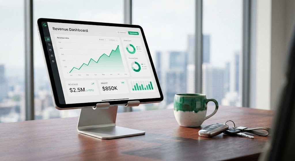
The Visual & Narrative Approach
This style uses hyper-realistic 3D rendering to place the software in the context of the decision-maker. The scene depicts a high-end executive desk with a mahogany texture. A tablet on a sleek aluminum stand displays a "Revenue Dashboard" with a clear, upward-trending green graph. Next to it are personal artifacts: a ceramic coffee cup and car keys. The lighting is soft natural daylight with a shallow depth of field, blurring the city skyline in the background. It looks like a photograph of a real Director's office.
Psychological Impact & KPI Focus
- Executive Context: By placing the software next to "car keys" and "coffee," it subtly integrates the tool into the daily routine of the leader. It feels premium, essential, and grounded in reality.
- KPI Focus: Focuses on Executive Dashboards and High-Level Analytics. It validates that this is a tool for leadership, not just dispatchers.
Strategic Implementation & Trade-offs
- Best Use Case: LinkedIn ads targeting C-Level executives (CEO, CFO, COO) who value polish, clarity, and bottom-line results.
- Trade-off: High production cost. The render must be flawless; any "uncanny valley" effect will damage credibility.
Companies using similar video content -
IFS – Field Service Management – Delivers executive-level insights and strategic ROI.
Oracle Field Service – FSM Cloud Service – Provides high-level analytics for decision-makers.
17. Isometric 3D Workflow
BOFU | The Functional Buyer
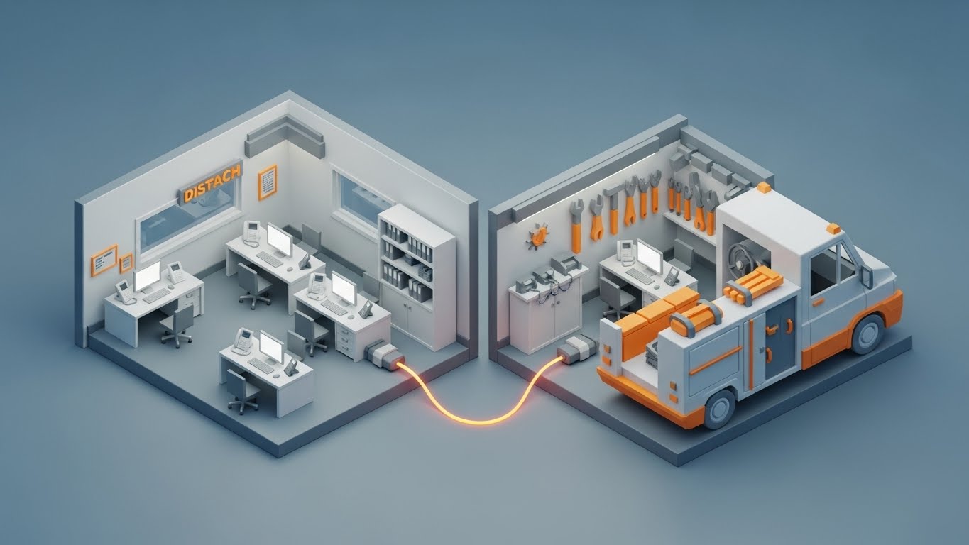
The Visual & Narrative Approach
This "dollhouse" cutaway view provides a comprehensive look at the integrated workflow. The composition is split: the left side shows a miniature dispatch office with desks and computers; the right side shows the interior of a service van with tools. A glowing orange fiber-optic cable runs under the floor, physically connecting the office computer to the van, symbolizing the data tether. The aesthetic is clean, matte, and architectural (clay render style), using grey tones with safety orange accents to highlight the connection.
Psychological Impact & KPI Focus
- Systemic Clarity: The isometric view reduces a complex, multi-location operation into a single, manageable visual model. It satisfies the Operations Director's need for "end-to-end" control.
- KPI Focus: Visualizes Field-to-Office Sync and Unified Operations. It proves that the gap between the dispatcher and the driver has been closed.
Strategic Implementation & Trade-offs
- Best Use Case: "How it Works" pages and detailed product brochures where showing the mechanics of connectivity is crucial.
- Trade-off: The text can be small in isometric views, so it works best on desktop screens (websites) rather than mobile feeds.
Companies using similar video content -
Microsoft Dynamics 365 Field Service – FSM Solution – Synchronizes office and field operations seamlessly.
ServiceMax – Field Service Management – Offers comprehensive, integrated workflow management.
18. Dark Mode UI Showcase
BOFU | The Technical Buyer
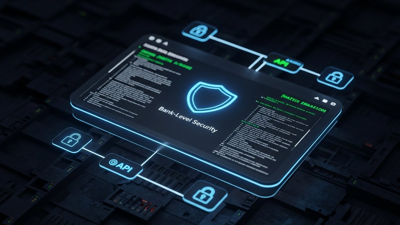
The Visual & Narrative Approach
Targeting the IT stakeholder, this style utilizes a sleek "Dark Mode" aesthetic associated with cybersecurity and coding. The background is a deep charcoal server mesh texture. The focal point is a floating, glowing neon blue UI window displaying a shield icon and "Bank-Level Security" text. Surrounding nodes connect via API lines to lock icons and code snippets. The look is precise, serious, and reminiscent of high-end cybersecurity platforms.
Psychological Impact & KPI Focus
- Security & Robustness: The dark palette and neon blue accents trigger immediate associations with sophisticated technology and protection, alleviating IT fears about data breaches.
- KPI Focus: Highlights Data Security, SOC2 Compliance, and API Reliability. It answers the question: "Is this safe for our enterprise?"
Strategic Implementation & Trade-offs
- Best Use Case: Technical documentation, security pages, and sales enablement sheets for IT reviews.
- Trade-off: It can feel "cold" or intimidating to non-technical users, so it should be reserved for the technical buyer persona.
Companies using similar video content -
Cisco Meraki – Cloud-Managed IT – Emphasizes secure, robust network and IoT management.
Comarch – Field Service Management – Provides secure, enterprise-grade data protection.
19. Generative AI Cinematic Video
BOFU | Sales Cycle Acceleration
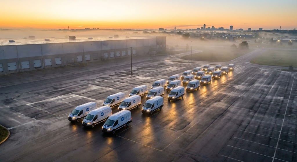
The Visual & Narrative Approach
This cinematic style uses Generative AI to create a sense of massive scale and readiness. It features a sweeping drone-style shot at sunrise over a vast industrial parking lot. A fleet of twenty pristine white service vans, perfectly aligned, simultaneously turn on their headlights. The golden morning light reflects off the wet pavement, creating a heroic atmosphere. The imagery is not about a specific feature, but about the feeling of power, capacity, and operational dominance.
Psychological Impact & KPI Focus
- Market Leadership: The sheer scale of the fleet and the "sunrise" metaphor suggest a new dawn of efficiency and growth. It appeals to the buyer's ambition to be a market leader.
- KPI Focus: Implies Scalability and Fleet Readiness. It visually validates that the software can handle enterprise-level volume without breaking.
Strategic Implementation & Trade-offs
- Best Use Case: Closing emails, event backdrops, or "Hype Reels" used at the beginning of a sales demo to set a confident tone.
- Trade-off: It sets a very high bar. The actual product demo must live up to the promise of this cinematic introduction.
Companies using similar video content -
Salesforce Field Service – FSM Solution – Projects market leadership and scalable operations.
IFS – Field Service Management – Showcases enterprise-level fleet and operational scale.
20. Abstract 3D AI Visualization
BOFU | Competitive Comparison/Switcher
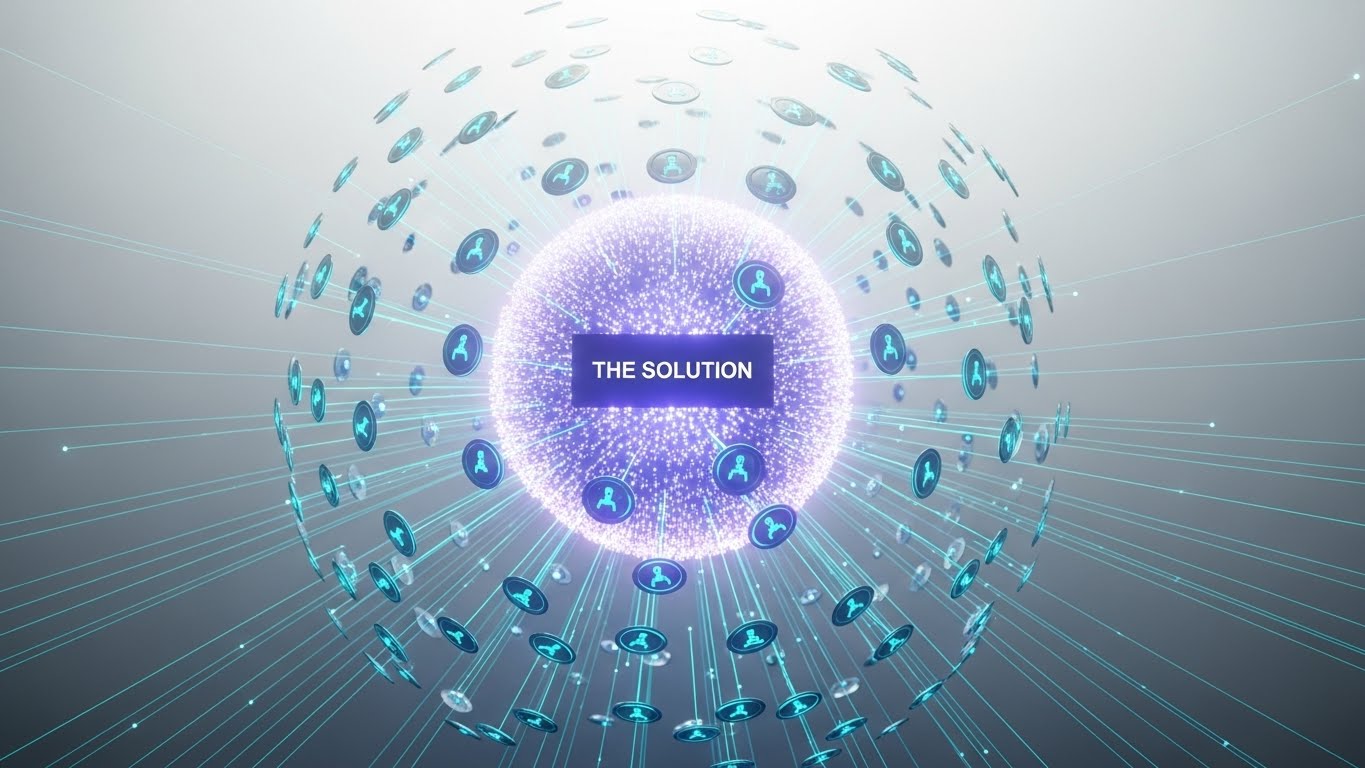
The Visual & Narrative Approach
This final style visualizes the "Platform" concept. A large, central sphere labeled "THE SOLUTION" pulsates with ultraviolet light in a clean white void. Hundreds of thin cyan laser lines connect this central hub to smaller, orbiting nodes representing field technicians. The composition uses a "Hub and Spoke" model to represent centralization. The aesthetic is ethereal and futuristic, using bloom effects to suggest that this solution is the "brain" of the entire operation.
Psychological Impact & KPI Focus
- Centralization: The visual powerfully argues against using fragmented tools (spreadsheets, separate GPS). It positions the software as the singular "Source of Truth."
- KPI Focus: Visualizes Centralized Dispatching and The Connected Workforce. It is a strong visual argument for replacing disparate legacy systems with one unified platform.
Strategic Implementation & Trade-offs
- Best Use Case: Retargeting ads aimed at prospects using competitor solutions, visually suggesting a "switch to the superior hub."
- Trade-off: It is highly abstract. It works best when the viewer already understands the problem (fragmentation) and is looking for the solution (unification).
Companies using similar video content -
Skedulo – Deskless Productivity Cloud – Centralizes dispatch and connected workforce.
KloudGin – AI-Powered FSM – Unifies disparate systems into a central intelligence hub.
21. Holographic UI over 3D Render
BOFU | Driving Freemium/Trials
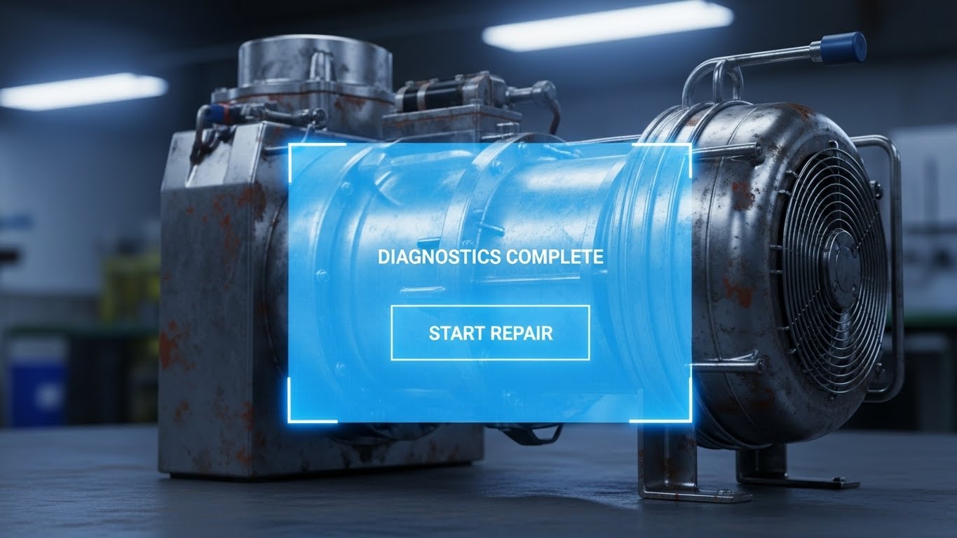
The Visual & Narrative Approach
This style visually bridges the gap between "old iron" and "new intelligence." The composition features a realistic 3D close-up of a dirty, metallic HVAC compressor unit, representing the gritty reality of field infrastructure. Superimposed over this industrial grime is a pristine, futuristic blue holographic UI panel. The hologram displays crisp text: "Diagnostics Complete" and a "Start Repair" button. The contrast is sharp—the rust signifies the physical problem, while the glowing hologram signifies the intelligent digital solution.
Psychological Impact & KPI Focus
- Modernization without Replacement: It psychologically reassures the viewer that they don't need to replace their entire physical fleet to benefit from digital intelligence. It frames the software as an upgrade to existing assets.
- KPI Focus: Highlights Remote Diagnostics and Asset Longevity. It visually demonstrates how the software extends the life and value of current equipment.
Strategic Implementation & Trade-offs
- Best Use Case: Social ads (Facebook/LinkedIn) targeting maintenance managers who are hesitant to adopt "high-tech" solutions for "low-tech" machinery.
- Trade-off: The futuristic aesthetic must be grounded; the UI elements shown should loosely match the actual mobile interface to avoid creating false expectations of "Iron Man" technology.
Companies using similar video content -
Augury – Machine Health Solutions – Provides remote diagnostics and predictive insights.
PTC ThingWorx – Industrial IoT Platform – Overlays digital intelligence onto physical assets.
22. Wireframe to Reality Transition
Onboarding | Reducing Implementation Friction

The Visual & Narrative Approach
Designed to visualize the concept of "Plan to Reality," alleviating anxiety about implementation. The composition uses a split-screen sliding effect. The left side creates a blue wireframe blueprint of a technician holding a drill, set against a grid paper background. As the slider moves right, the wireframe dissolves seamlessly into a high-resolution, full-color photograph of a real technician in the exact same pose, wearing a safety vest on a construction site. It visually demonstrates the materialization of the plan.
Psychological Impact & KPI Focus
- Certainty & Execution: This style combats the fear of "shelfware." It validates that the abstract plans made in the office (the blueprint) will translate directly into tangible action in the field (the photo).
- KPI Focus: Supports Time-to-Value (TTV) and SLA Compliance. It reassures stakeholders that the roadmap is solid and the outcome is guaranteed.
Strategic Implementation & Trade-offs
- Best Use Case: Kick-off meeting decks and "Welcome" emails sent immediately after contract signing to set a confident tone for deployment.
- Trade-off: Requires precise alignment between the vector wireframe and the stock photo. Any misalignment breaks the illusion of seamless execution.
Companies using similar video content -
Procore – Construction Management Software – Visualizes project plans transforming into field execution.
Fieldwire – Construction Management – Bridges blueprint planning with on-site reality.
23. Macro UI Micro-Interactions
Onboarding | Self-Serve Onboarding
The Visual & Narrative Approach
A hyper-focused, sensory style designed to make the software feel tangible. The visual uses a macro photography aesthetic, focusing deeply on the glass surface of a smartphone screen where the pixel grid is faintly visible. A fingertip is captured just millimeters away from tapping a vibrant green circular button with a white checkmark. The lighting is exquisite, highlighting the texture of the skin and the gloss of the glass. It creates a sense of anticipation and tactile satisfaction.
Psychological Impact & KPI Focus
- Friction Reduction: By magnifying the simplicity of a single interaction (a tap), the visual reduces the perceived complexity of the software. It says, "It's just this easy."
- KPI Focus: Focused on User Engagement and Feature Activation. It is perfect for guiding users through their first "win" inside the app.
Strategic Implementation & Trade-offs
- Best Use Case: In-app tooltips, "Getting Started" wizards, or short loops in help articles demonstrating specific gesture-based actions.
- Trade-off: It is hyper-specific. You cannot show a full workflow here, only a single, critical interaction (e.g., "Accept Job").
Companies using similar video content -
Workiz – Field Service Management – Encourages user action with intuitive mobile taps.
ServiceTitan – All-in-One Software – Guides users through simple, critical in-app actions.
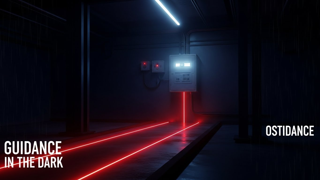
24. Futuristic Neon/Dark Mode
Onboarding | Accelerating Time-to-Value
The Visual & Narrative Approach
This style adopts a high-contrast "Dark Mode" aesthetic to represent guidance in uncertain environments. A dark, industrial basement is illuminated only by a glowing neon red line on the floor, which leads directly to a fuse box. The aesthetic borrows from video game waypoint systems, signaling intuitive direction. The environment is moody, but the path is unmistakably clear. The caption "GUIDANCE IN THE DARK" underscores the narrative.
Psychological Impact & KPI Focus
- Clarity in Chaos: The dark environment represents the "unknown" of a new software system; the neon line represents the guided onboarding path. It reassures the user they won't get lost.
- KPI Focus: Visualizes Guided Workflows and Error Reduction. It reinforces the idea that the system prevents the technician from straying off-process.
Strategic Implementation & Trade-offs
- Best Use Case: Loading screens, error pages, or "Empty State" screens where you need to keep the user engaged while the system processes data.
- Trade-off: The "Dark Mode" aesthetic appeals strongly to younger, tech-savvy demographics but may feel too "gaming-centric" for traditionalist operational leaders.
Companies using similar video content -
GeoPal – Mobile Workforce Management – Guides field workers through complex tasks.
Synchroteam – Field Service Software – Provides clear, guided workflows in the field.
25. 2D Animation & UI Composition
Retention | Reducing Support Overhead

The Visual & Narrative Approach
A friendly, approachable style designed to lower the temperature of frustrated users. It features a clean, flat-illustrated character (a support avatar) in a calming pastel blue shirt. The character points upward to a floating UI bubble containing a question mark and a lightbulb idea icon. Surrounding the character are floating geometric shapes in soft pastels. The background is a clean white, keeping the mood light, airy, and stress-free.
Psychological Impact & KPI Focus
- Empathy & Support: The character design injects a human element into the help center, making the user feel supported rather than isolated with a manual.
- KPI Focus: Targets Ticket Deflection and Self-Service Resolution. It encourages users to engage with automated help tools rather than calling a live agent.
Strategic Implementation & Trade-offs
- Best Use Case: Knowledge base headers, "No Results Found" search pages, or chatbot avatars.
- Trade-off: It can feel generic if not customized. To be effective, the character should ideally wear the company's specific uniform or branding colors.
Companies using similar video content -
ServiceTitan – All-in-One Software – Humanizes technical assistance and support.
Jobber – Field Service Software – Offers friendly, self-service support resources.
26. Lifestyle Stock with UI Overlay
Retention | Knowledge Base & FAQ Videos
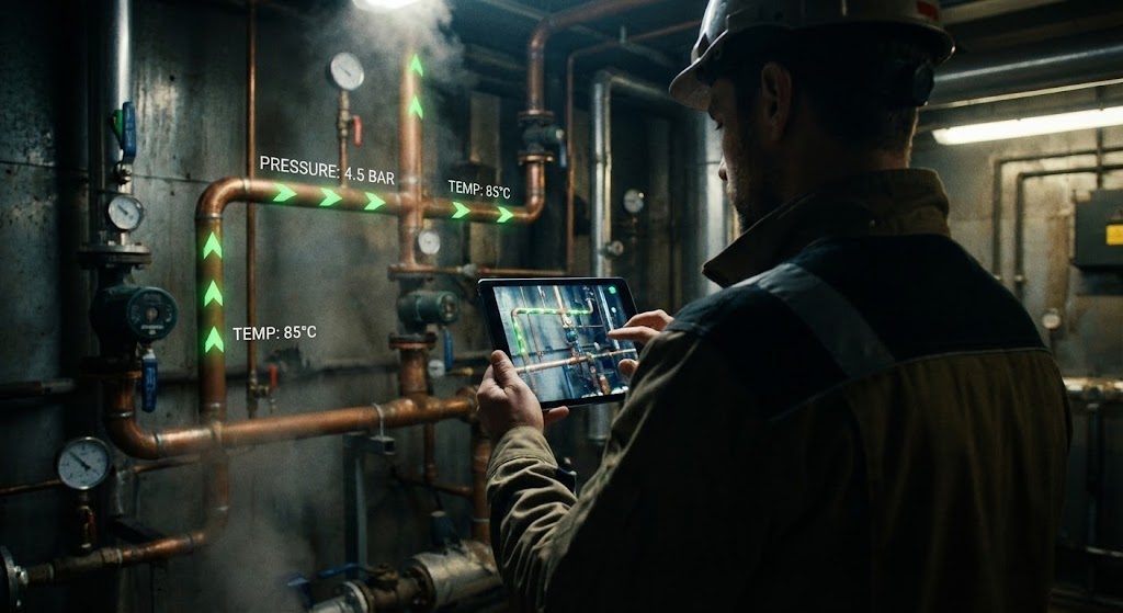
The Visual & Narrative Approach
This style blends high-quality photography with data visualization to represent "Augmented Intelligence." A technician is shown from over the shoulder in a boiler room, holding a tablet up to a complex pipe system. A digital AR overlay is composited onto the pipes, showing green flow direction arrows and white pressure readings. The lighting is moody and industrial, but the data on the screen is bright and legible.
Psychological Impact & KPI Focus
- Competence Amplification: It validates the technician's role, showing that the software enhances their natural skills rather than replacing them. It fosters pride in the tool.
- KPI Focus: Highlights Technician Efficiency and Remote Expert Capabilities. It suggests the tool provides "all the answers" right at the point of service.
Strategic Implementation & Trade-offs
- Best Use Case: Educational content, Knowledge Base articles, and training videos demonstrating complex diagnostic features.
- Trade-off: The AR overlay must look plausible. If the graphics float awkwardly, it breaks the immersion and looks like a cheap sticker.
Companies using similar video content -
FieldAware – Field Service Management – Empowers technicians with augmented insights.
ServicePower – Field Service Management – Amplifies technician capabilities with real-time data.
27. 2D Graphics Over Live Action
Retention | Reducing Churn

The Visual & Narrative Approach
A celebration of success. The visual features a bright, high-key photo of a smiling homeowner in a modern kitchen, giving a thumbs-up. Overlaying this reality are popping 2D vector graphics: five bright red stars appearing above her head and a green "Job Complete" checkmark badge pinned to the corner. The style blends real human emotion with "app-like" gratification elements, reinforcing the dopamine hit of a job well done.
Psychological Impact & KPI Focus
- Positive Reinforcement: The visual combination of a smiling human and a "5-Star" graphic reinforces the link between the software's efficiency and the end-customer's happiness.
- KPI Focus: Directly visualizes Net Promoter Score (NPS) and Customer Retention. It reminds the user of the ultimate goal: a happy customer.
Strategic Implementation & Trade-offs
- Best Use Case: "Year in Review" emails, success milestone notifications, and case study headers.
- Trade-off: It leans heavily on B2C aesthetics. It works best for residential service businesses (HVAC, plumbing) rather than heavy industrial infrastructure.
Companies using similar video content -
Housecall Pro – Field Service Management – Validates customer delight and positive feedback.
Jobber – Field Service Software – Celebrates customer satisfaction and job completion.
28. 3D Parallax UI Presentation
Expansion | Driving Deep Feature Adoption
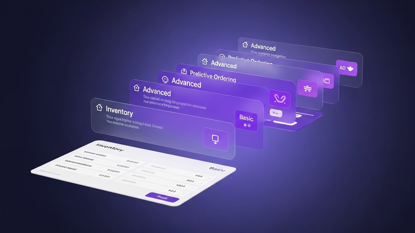
The Visual & Narrative Approach
A sophisticated visualization of software depth. Multiple semi-transparent UI panels float in a dark void, arranged in depth layers. The front layer shows a "Basic" inventory list. The layers further back, glowing in premium purple and pink, reveal "Advanced" features like predictive ordering and supplier integration. The camera angle looks through the layers, suggesting that there is more value waiting to be unlocked.
Psychological Impact & KPI Focus
- Depth & Discovery: The parallax effect suggests that the user has only scratched the surface. It triggers curiosity about the "glowing" features in the back.
- KPI Focus: Supports Upselling, Cross-Selling, and Feature Adoption. It visually creates a roadmap for upgrading to higher tiers.
Strategic Implementation & Trade-offs
- Best Use Case: "What's New" webinars, product roadmap presentations, and upgrade prompts within the software.
- Trade-off: It is abstract. The text on the back layers must be large enough to be legible, or the message of "advanced features" will be lost.
Companies using similar video content -
IFS – Field Service Management – Unlocks deep enterprise value through layered features.
SAP Field Service Management – FSM Solution – Showcases advanced modules and integration depth.
29. Hyper-lapse Stock Footage with Data
Expansion | Driving Upsell/Cross-sell

The Visual & Narrative Approach
This style conveys massive scale and kinetic energy. It uses a night-time hyper-lapse of a busy city highway, with traffic moving as streaks of light. Overlaying this organic chaos are structured, glowing cyan and orange data lines connecting the moving vehicles to a central skyscraper "hub." The visual rhythm is fast and electric, symbolizing high-volume data processing and enterprise-level management.
Psychological Impact & KPI Focus
- Mastery of Scale: The bird's-eye view of a breathing city reinforced with digital lines suggests total command over a massive, complex ecosystem.
- KPI Focus: Visualizes Scalability, Big Data Analytics, and Fleet Telematics. It appeals to large enterprises looking to optimize thousands of assets.
Strategic Implementation & Trade-offs
- Best Use Case: Account-Based Marketing (ABM) campaigns targeting Enterprise accounts and large fleet owners.
- Trade-off: It is a mood piece. It doesn't show how the software works, only the scale it can handle.
Companies using similar video content -
Samsara – Fleet Management Platform – Scales to enterprise volume with big data analytics.
Verizon Connect – Fleet Management – Manages large fleets with telematics and data.
30. Generative AI Realistic Character Video
Expansion | Driving Referrals & Advocacy
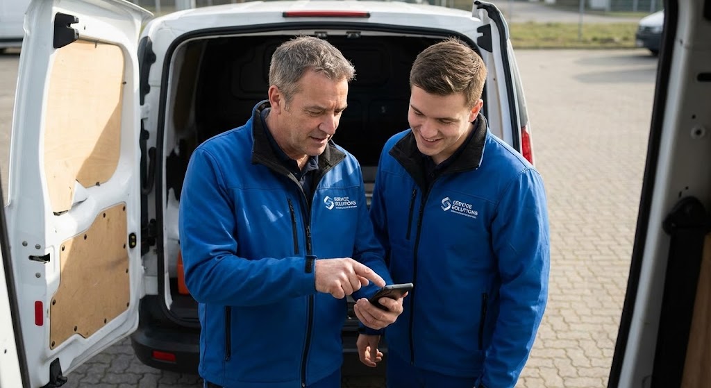
The Visual & Narrative Approach
Leveraging the latest in Generative AI video, this style creates a hyper-realistic scenario that would be expensive to shoot. It features two professional technicians standing by a van. An older mentor is showing his smartphone screen to a younger apprentice. Both are nodding and smiling naturally. The focus is entirely on the human connection and the "word-of-mouth" moment. The lighting is natural and warm.
Psychological Impact & KPI Focus
- Social Proof: We trust our peers more than brands. This visual creates a synthetic but emotionally resonant representation of peer advocacy.
- KPI Focus: Drives Net Retention and Referral Programs. It visualizes the software as a tool that technicians actually like enough to share.
Strategic Implementation & Trade-offs
- Best Use Case: Referral program landing pages and community forum headers.
- Trade-off: Ethical transparency is key. While AI allows for perfect demographic tailoring, it should not be passed off as a "real customer testimonial" if it is synthetic.
Strategic Knowledge Base: The Visual Operations Doctrine
To truly bridge the "Physical/Digital Gap," a dispatch software company cannot simply create pretty videos. It must treat visualization as a strategic operational asset. This doctrine synthesizes the 30 styles into a cohesive framework for driving adoption, efficiency, and growth.
Strategic Alignment & Visual Architecture
The "Pre-Production" Phase – Defining the Visual Operating System.
- 1. The Cognitive Load Audit: Before creating any asset, conduct an audit of the complexity of the workflow being visualized. If a scheduling task takes 10 clicks, a "Minimalist Flat" style (Style 1) will be deceptive. Instead, use "Clean UI Workflow" (Style 8) to show the reality, or "Abstract Motion" (Style 3) to sell the result of the efficiency. Match the style to the cognitive load.
- 2. Role-Based Visual Mapping: Do not use the same visual style for all personas. Drivers on mobile devices need high-contrast, large-element visuals (Style 24: Neon/Dark Mode) that are "glanceable" in bright sunlight. Dispatchers on desktop need density and data (Style 7: Isometric City). Map your visual styles to the physical environment of the user.
- 3. The "Glanceability" Standard: In field service, attention is a scarce resource. Visual assets—especially those used in onboarding or support—must be comprehensible in under 3 seconds. Styles like "Minimalist Vector" (Style 1) and "Line Art" (Style 6) are not just aesthetic choices; they are safety features that reduce distraction.
- 4. Brand Voice Consistency: With 30 different styles, fragmentation is a risk. Establish a "Golden Thread"—such as a specific hex code for "Action" buttons or a consistent voiceover artist—that runs through the "Cartoon Story" (Style 12) and the "Photorealistic Executive" (Style 16). This creates a unified brand experience across the funnel.
- 5. The Advids Strategic Audit: Leveraging an external partner like Advids during the pre-production phase allows for an objective review of your visual architecture. We ensure that your "Feature Montage" (Style 13) doesn't contradict the promise of your "Zen Flow" (Style 3), ensuring the visual narrative supports the business logic.
- 6. Standardization vs. Customization: For core, immutable features (like Login or Sync), use high-fidelity UI styles (Style 8). For variable scenarios (like different truck types), use abstract Low-Poly (Style 10) or Vector styles (Style 1). This allows you to scale assets without re-shooting for every fleet variation.
- 7. The Cross-Departmental Bridge: Use these visuals to unify your internal teams. The "Isometric Workflow" (Style 17) should be printed on the wall of the Sales office and the Support center. It aligns everyone on how the product connects the office to the field, reducing terminology mismatches.
- 8. Legacy System Integration: Many prospects fear that new software won't talk to old hardware. Use "Holographic UI" (Style 21) or "X-Ray" (Style 14) specifically to visualize this integration, calming the fear that "digital transformation" means "ripping and replacing" everything.
- 9. Accessibility in Motion: Field workforces are diverse. Styles that rely heavily on kinetic text (Style 2) must be balanced with purely visual narratives (Style 4) to ensure that language barriers do not hinder understanding of the software's value.
- 10. The Mobile-First Mandate: Every style listed, from 1 to 30, must be legible on a 6-inch screen. Even the complex "Dynamic Data" (Style 15) must be composed so that the key numbers are visible without zooming. If it doesn't work on a phone, it doesn't work for the field.
Operational Adoption & Implementation
The "Deployment" Phase – Embedding Visuals into the Workflow.
- 11. Overcoming "Big Brother" Anxiety: The introduction of GPS tracking often triggers resistance. Use empathetic, human-centric styles (Style 12: Character Story or Style 30: Realistic Peer) to explain why tracking exists (safety, efficiency) rather than just showing how it works. Frame it as protection, not surveillance.
- 12. The Micro-Learning Shift: Replace 50-page PDF manuals with a library of 30-second clips using "Rapid UI" (Style 13) or "Macro UI" (Style 23). Operations managers prefer assigning a playlist of 5 videos over scheduling a day-long seminar.
- 13. Just-in-Time Support: Embed "Neon Guidance" (Style 24) or "2D Support Avatar" (Style 25) assets directly into the app's error states. When a sync fails, show a 5-second loop of how to fix it. This reduces panic and support calls.
- 14. Gamification of Training: Use "Level Up" visuals (similar to Style 27) to track training progress. Visualizing driver certification with badges and progress bars increases engagement and completion rates for mandatory software training.
- 15. Reducing Support Ticket Volume: There is a direct correlation between the clarity of "Onboarding" visuals (Style 22, Style 23) and the volume of "Tier 1" support tickets. Investing in high-quality visual explanations of basic features pays for itself in reduced support costs.
- 16. Remote Onboarding: For distributed fleets that cannot gather in one room, use "Split Screen" (Style 9) and "Isometric Workflow" (Style 17) to conduct virtual walkthroughs. These styles provide the spatial context usually gained from an in-person demo.
- 17. Visualizing SOPs: Standard Operating Procedures often languish in binders. Convert them into "Line Art Animations" (Style 6) that show exactly how to hold the device, scan the barcode, and close the job. Visual SOPs eliminate ambiguity.
- 18. Feedback Loops: Use interactive video elements (Style 23) to gather feedback. If a user watches a help video twice, trigger a prompt: "Was this helpful?" Use this data to refine the visual assets.
- 19. Scalable Localization: Global fleets need global assets. "Abstract Vector" (Style 4) and "Low Poly" (Style 10) are easier to localize because they lack specific cultural markers or text-heavy elements. Choose these styles for multi-national deployments.
- 20. Leadership Communication: When rolling out the software, the VP of Ops should use "Cinematic Scale" (Style 19) or "Photorealistic Executive" (Style 16) to communicate the vision. High-production value signals that the initiative is a strategic priority, not just an IT update.
Measuring Impact & Future-Proofing
The "ROI" Phase – Measuring Success and Looking Ahead.
- 21. Beyond "Views": Do not measure these videos by view count. Measure them by "Time-to-Competency." How much faster does a new hire reach full productivity after watching the "Wireframe to Reality" (Style 22) module vs. reading the manual?
- 22. The "Idle Time" Metric: Correlate better visualization with reduced "windshield time" and app idle time. If the "Neon Guidance" (Style 24) works, the time spent staring at the screen should decrease, and wrench time should increase.
- 23. Compliance Velocity: When a new regulation (like ELD mandates) hits, use "Kinetic Typography" (Style 2) to push the update. Measure how quickly the fleet reaches 100% compliance compared to text-based email updates.
- 24. Retention and Churn: High-quality UX visualization (Style 26: AR Overlay) increases the perceived value of the product. Track Net Retention Rate (NRR) in cohorts that are exposed to these "Expansion" assets vs. those that are not.
- 25. The AI Visual Frontier: Prepare for the future where "Generative AI" (Style 5, 30) allows for real-time video generation. Soon, dispatchers might type "Show me the route for Truck 5," and the system will generate a custom 3D flyover (Style 7) on the fly.
- 26. Scalability of Assets: Build a library, not a landfill. Styles like "Clean UI" (Style 8) and "Vector Art" (Style 1) are modular. You can update the screen content without re-animating the hand. This ensures your visual library grows with your feature set.
- 27. The Advids Partnership: Visual strategy is not a one-time project; it is an evolving infrastructure. Partnering with Advids ensures that as your software evolves from V1 to V2, your visual language evolves from "Education" (Style 2) to "Advocacy" (Style 30) without losing brand coherence.
- 28. Benchmarking Success: "Good enough" visuals are a competitive risk. If your competitor uses "Photorealistic 3D" (Style 16) to sell to the CFO, and you use screen recordings, you lose credibility. Visual fidelity is a proxy for software quality.
- 29. The ROI of Safety: Use "Line Art" (Style 6) to visualize safety protocols clearly. The ROI here is measured in insurance premiums and accident reduction. Clear, undistracted visuals save lives.
- 30. Final Call to Innovation: Treat video as infrastructure, not content. In the Field Service Dispatch market, the interface is the product. By elevating the visualization of that interface, you are not just marketing the software; you are improving the operational reality of the user.
[END OF PART 3 - MASTER GUIDE COMPLETE]
Companies using similar video content -
ServiceTitan – All-in-One Software – Leverages peer trust for referrals and advocacy.
Housecall Pro – Field Service Management – Fosters community and word-of-mouth recommendations.
Author & Editor Bio


