
Introduction: The Visualization of Invisible Efficiency
The field service industry is on the cusp of a quiet revolution. It is no longer just about getting a van to a house; it is about the seamless orchestration of data, people, and assets in real-time. For Operations Directors and Service Leaders, the aspiration is clear: to move from reactive firefighting to predictive mastery. The goal is a "Zero-Touch" environment where routine schedules are automated, and human intelligence is reserved for the exceptions.
However, bridging the physical gap between the dispatch office and the remote technician remains a complex challenge. This digital-physical divide is where the battle for efficiency is won or lost. In an industry where inefficient scheduling costs field service companies up to 20% of their annual revenue, the ability to visualize these hidden gaps is not just a luxury—it is a strategic imperative. The difference between a struggling operation and a market leader is often visible in the data: top-performing companies maintain a first-time fix rate of 86%, compared to 53% for their lower-performing peers.
This guide explores how advanced video visualization strategies can close that gap. By translating complex algorithms and workflows into clear, compelling visual narratives, software platforms can demonstrate their value instantly. From the high-level brand awareness that inspires confidence to the granular feature walkthroughs that educate the functional buyer, these visual styles are designed to reduce cognitive load and showcase the future of connected field service.
1. The Network Clarity Approach
TOFU | Brand Awareness
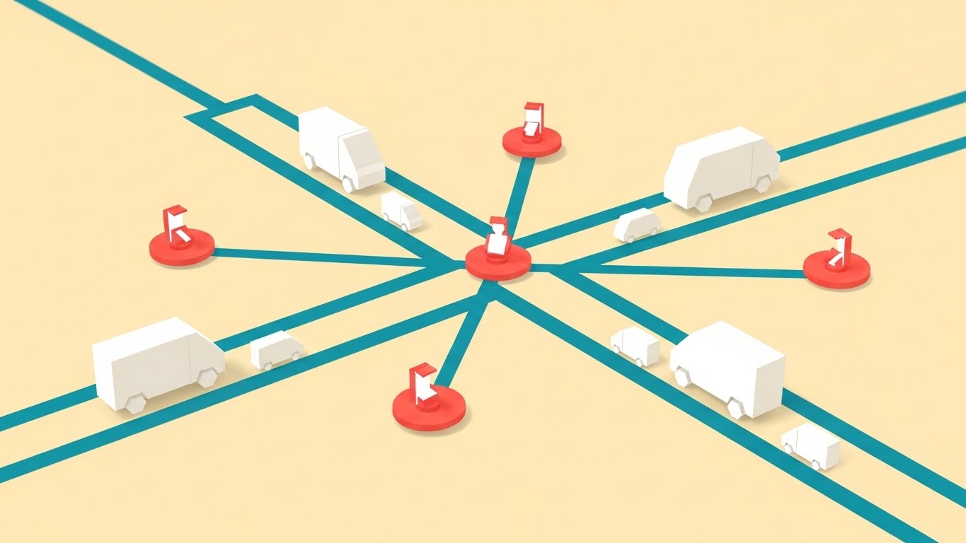
The Visual & Narrative Approach
This style utilizes a "Command Center" aesthetic, offering a bird's-eye view of the operational landscape. The scene is stripped of unnecessary noise, using a Cream background to let the data pop. Coral Red dots act as active beacons for technicians, while Electric Teal lines physically draw the connections back to the central hub. The movement of the white geometric vans along these lines is smooth and linear, suggesting a frictionless operation where every asset is accounted for.
Psychological Impact & KPI Focus
Psychologically, this style addresses the "Anxiety of the Unknown." By showing a complete, unbroken grid of connectivity, it visually assures the viewer that "nothing is lost." It lowers cognitive load, allowing the viewer to focus instantly on the relationship between the assets (vans) and the brain (the hub). It subtly reinforces KPIs related to Network Visibility and Fleet Uptime.
Strategic Implementation & Trade-offs
- Best Use Case: Top-of-Funnel (TOFU) social ads (15-20s) where you have less than 3 seconds to communicate "Connection" and "Control."
- Trade-off: The lack of texture and depth makes it less suitable for showing detailed software features or complex UI interactions. It sells the concept, not the interface.
Companies using similar video content -
FieldPulse – All-in-one FSM for office and field synergy.
Skedulo – Intelligent scheduling and mobile workforce management.
2. The Algorithmic Order Approach
TOFU | Market Education

The Visual & Narrative Approach
This style visualizes the core value proposition of scheduling software: turning entropy into structure. We see bold, chunky geometric shapes in Magenta and Cyan—representing unsorted work orders or data blocks—colliding and then snapping into a perfectly stacked, solid structure against a Pure White background. The floating clock and map pin icons serve as context clues, anchoring the abstract shapes to the reality of "Time" and "Location."
Psychological Impact & KPI Focus
The "Chaos to Order" motion triggers a deeply satisfying cognitive response (Resolution). It mirrors the dispatcher's daily struggle of organizing hundreds of variables. By using heavy, blocky shapes, the video implies that the software can handle "heavy lifting" and substantial workloads. It directly targets the desire for Operational Efficiency and Automated Sorting.
Strategic Implementation & Trade-offs
- Best Use Case: Instagram Reels or TikTok (10-15s), where sound-synced, rhythmic motion captures attention without needing voiceover.
- Trade-off: It is highly abstract. If used for too long without a UI reveal, the viewer might forget what specific product is being sold.
Companies using similar video content -
Jobber – Streamlines home service operations from quoting to payment.
Workiz – All-in-one platform for scheduling, dispatch, invoicing.
3. The Seamless Sync Approach
TOFU | Category Creation

The Visual & Narrative Approach
Moving away from rigid grids, this style uses organic, liquid motion to represent the flow of information. Blobs in Emerald Green and Quicksilver (Silver) do not just connect; they merge and separate fluidly on a Pale Mint background. The white icons (wrenches, pins) suspended inside the liquid suggest that the tools and data are an intrinsic part of the flow, not external add-ons.
Psychological Impact & KPI Focus
The viscous, glossy texture implies "smoothness" and "adaptability." It suggests that the software is agile enough to handle the unpredictable nature of field service (traffic, cancellations, emergency calls) without breaking. This appeals to the "Agile Operations" mindset, focusing on SLA Flexibility and Seamless Integration.
Strategic Implementation & Trade-offs
- Best Use Case: Facebook Feeds or background visuals for a website header (15-30s), symbolizing the "ecosystem" of the software.
- Trade-off: The abstract nature can feel "soft." It may not resonate with highly technical buyers who want to see hard edges and precise metrics.
Companies using similar video content -
Synchroteam – FSM for mobile workforce tracking and job management.
Odoo – Open-source FSM with integrated business modules.
5. The Heroic Fleet Approach
TOFU | Skippable Pre-Roll Ad

The Visual & Narrative Approach
This style shifts from software abstraction to real-world impact. We see a low-angle, "Golden Hour" shot of pristine white service vans rolling out in unison. The sun flare and detailed asphalt texture ground the viewer in physical reality. It is not about the code; it is about the result of the code: a fleet that is ready, punctual, and professional.
Psychological Impact & KPI Focus
This taps into Workforce Pride and Brand Reputation. For a Director of Operations, this image represents the "Perfect Morning"—no breakdowns, no missing drivers, just execution. It humanizes the software, reminding the buyer that their technology powers real people. It aligns with KPIs regarding Team Morale and Service Professionalism.
Strategic Implementation & Trade-offs
- Best Use Case: YouTube Pre-Roll ads (15-30s) where emotional connection helps retention before the skip button appears.
- Trade-off: High production value (or high-quality AI generation) is required. Poor execution here looks like cheap stock footage and damages credibility.
Companies using similar video content -
ServiceTitan – All-in-one FSM for HVAC, plumbing, electrical.
Motive – Fleet management and FSM for safety and productivity.
6. The Intelligent Network Approach
TOFU | Shaping Brand Perception

The Visual & Narrative Approach
This visualization elevates the brand to a "Futuristic" status. It depicts a neural network of Silver and Metallic White nodes connected by fine Electric Blue filaments. The arrangement subtly mimics a city map, but the "High-Key" Platinum lighting makes it feel like a clean, sterile laboratory environment. It visualizes the AI "brain" behind the dispatch decisions.
Psychological Impact & KPI Focus
The aesthetic screams "Intelligence" and "Precision." It targets the CTO or CIO persona who looks for Advanced Algorithms and Machine Learning capabilities. The clean, glowing lines reduce the fear of "messy data," promising a pristine, error-free computational environment.
Strategic Implementation & Trade-offs
- Best Use Case: Website Hero section or a "Technology" page background (30-45s). It establishes the vendor as a cutting-edge leader.
- Trade-off: It can feel cold or impersonal. It needs to be paired with warm copy or human-centric imagery elsewhere to avoid feeling robotic.
Companies using similar video content -
Oracle Field Service Cloud – AI-driven scheduling and real-time tracking.
IFS Field Service Management – AI-driven insights and automation for FSM.
7. The Augmented Reality Approach
TOFU | Demand Gen

The Visual & Narrative Approach
This style effectively bridges the gap between the chaotic real world and digital control. By overlaying sharp, glowing Electric Blue data lines and graphs onto blurry, hyper-lapse city footage, it creates a powerful visual metaphor: The world is fast and messy, but your data is precise and stable. The "floating tags" above the vans suggest an Augmented Reality (AR) view, giving the manager "Super-Vision."
Psychological Impact & KPI Focus
This appeals to the desire for Omniscience or "God Mode." The contrast between the blur (traffic/chaos) and the sharp lines (data/software) validates the software's value proposition: bringing clarity to chaos. It strongly supports KPIs like Real-Time Visibility and Asset Tracking.
Strategic Implementation & Trade-offs
- Best Use Case: LinkedIn Video Ads (15-30s). The professional context of LinkedIn creates the perfect environment for a "command and control" visual.
- Trade-off: Requires precise motion tracking. If the data elements "slip" or don't track perfectly with the footage, the illusion of precision is broken.
Companies using similar video content -
Salesforce Field Service – Mobile-enabled workforce with data, AI, CRM.
OverIT – Utilities FSM with real-time data analytics.
8. The Architectural Plan Approach
MOFU | Differentiation

The Visual & Narrative Approach
Using a strict 45-degree isometric perspective, this style transforms a city block into an organized circuit board. The Sunny Yellow roads act as defined pathways for the service vans, guiding the eye logically through the process. Floating speech bubbles and checklists above the buildings visualize the invisible communication layers (SMS updates, customer confirmations) that occur during a service call.
Psychological Impact & KPI Focus
Isometric design is inherently trustworthy because it is undistorted and equal in measure. It appeals to the "Architect" persona—the planner who wants to see how the pieces fit together. It visualizes Workflow Logic and Communication Loops without the distraction of realistic perspective.
Strategic Implementation & Trade-offs
- Best Use Case: Website "Features" section (45-60s). It allows for a step-by-step walkthrough of a specific workflow (e.g., "From Dispatch to Doorstep").
- Trade-off: It can look "game-like." The color palette must remain professional (like the Slate Grey used here) to avoid looking like a mobile game.
Companies using similar video content -
BuildOps – Commercial FSM for HVAC, plumbing, project visibility.
Knowify – FSM for professional services, resource and task management.
9. The Connected Ecosystem Approach
MOFU | Feature Education

The Visual & Narrative Approach
This style uses "Claymorphism"—soft, tactile 3D shapes—to create a friendly, miniature world. The critical visual device is the Cutaway: slicing open the dispatch office to show the human operator, and connecting them via a glowing Turquoise line to the technician in the van/field. It physically visualizes the "Digital Tether" that keeps remote teams aligned.
Psychological Impact & KPI Focus
The "Miniature" effect makes complex operations feel manageable and contained. It reduces the intimidation factor of adopting new enterprise software. The soft shadows and global illumination create a welcoming vibe, countering the skepticism that software is "hard to use." It focuses on Remote Collaboration and Dispatch Efficiency.
Strategic Implementation & Trade-offs
- Best Use Case: Product Pages or Explainer Videos (45-60s). It is perfect for telling a "Day in the Life" story that connects the office to the field.
- Trade-off: Rendering time is higher, and the "cute" factor must be balanced. It works best for "Ease of Use" messaging rather than "Enterprise Power" messaging.
Companies using similar video content -
Fieldpoint – FSM for medical equipment and HVAC, integrating ERP/CRM.
Field Promax – Cloud-based FSM with work order management.
10. The Power User Approach
MOFU | Functional Buyer
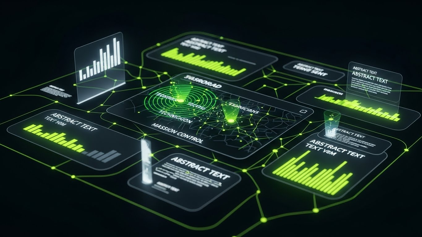
The Visual & Narrative Approach
This style abandons abstraction for high-fidelity UI visualization. The Deep Charcoal background signals a "Pro" or "Night Mode" environment, often preferred by power users. Neon Green data lines and pulsing radar dots draw the eye to critical alerts and status updates. It mimics a high-end "Mission Control" dashboard, emphasizing density of information and speed of access.
Psychological Impact & KPI Focus
This targets the Functional Buyer—the person who will actually sit behind the screen. It validates their expertise and need for robust tools. The high contrast suggests that key information (alerts, breaches) is unmissable. It supports KPIs related to Response Time and Incident Management.
Strategic Implementation & Trade-offs
- Best Use Case: LinkedIn Organic posts or Webinars (30-60s). It serves as "proof" of the product's depth and capability.
- Trade-off: It must be accurate. You cannot fake UI features here; technical buyers will scrutinize the dashboard elements for realism and utility.
Companies using similar video content -
Microsoft Dynamics 365 Field Service – Intelligent scheduling and resource optimization.
ServiceMax – Optimized service operations and complete asset view.
11. The Geometric Agility Approach
MOFU | Competitive Displacement
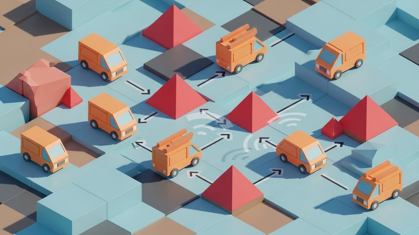
The Visual & Narrative Approach
This style embraces a simplified, "Low-Poly" aesthetic to represent the complex logic of dynamic routing. We see a stylized terrain rendered in Clay Orange and Sky Blue, where blocky service vans navigate a geometric grid. When red pyramidal "obstacles" (representing traffic jams or cancellations) erupt from the ground, the vans instantly and visibly reroute along new paths. The bright, directional lighting emphasizes the faceted surfaces, giving the scene a clean, logical quality that makes problem-solving look effortless.
Psychological Impact & KPI Focus
By stripping away the noise of the real world, this style "gamifies" logistics, making the challenge of exception handling appear manageable rather than stressful. It appeals to the Operational Strategist who treats dispatch as a puzzle to be solved. It visually proves the software’s agility, directly supporting KPIs like Route Adherence and Automated Rerouting Efficiency.
Strategic Implementation & Trade-offs
- Best Use Case: Blog Headers or Comparative Articles (10-15s loops). It effectively illustrates "Scenario A vs. Scenario B" logic without the distraction of photorealism.
- Trade-off: The "toy-like" aesthetic can undermine authority if used for serious compliance or safety messaging. It is best for illustrating logic, not gravity.
Companies using similar video content -
BigChange – Complete Job Management Platform for planning, managing, tracking.
FieldRoutes – FSM for pest control and lawn care, optimizing routes.
12. The Transparent Operations Approach
MOFU | Building Trust
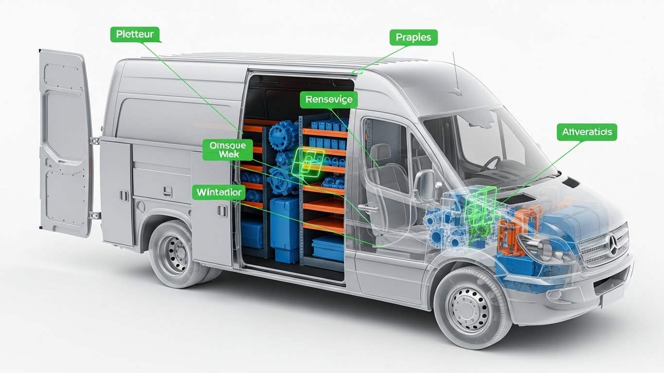
The Visual & Narrative Approach
To build trust, you must show what lies beneath the surface. This style features a service van rendered with a semi-transparent "Frosted Glass" outer shell, revealing the organized complexity within. We see internal gears, inventory shelves, and components rendered in opaque Matte Blue and Orange. Floating 3D labels dynamically point to specific parts, simulating a digital inventory scan. The clinical, studio lighting implies precision and hygiene.
Psychological Impact & KPI Focus
This visual metaphor addresses "Black Box" anxiety—the fear of not knowing what is actually in the field. By literally making the vehicle transparent, the software promises Total Visibility. It appeals to the Director of Asset Management who needs to track more than just GPS location. It creates a strong association with KPIs like Inventory Accuracy and First-Time Fix Rate.
Strategic Implementation & Trade-offs
- Best Use Case: Whitepapers or Technical eBooks (Static or looped video). It is the perfect visual anchor for content discussing "Inventory Management" or "Van Stock" visibility.
- Trade-off: It is technically demanding to render "glass" effectively. If the transparency looks muddy or the internal parts look generic, the metaphor of "clarity" is lost.
Companies using similar video content -
Datamoto – Medical device FSM with inventory and recall reports.
FSM Grid – Medical device FSM with real-time device monitoring.
13. The Tactile Response Approach
MOFU | Demo Request

The Visual & Narrative Approach
Adoption is the enemy of ROI. This style zooms in—extreme macro close-up—on the mobile interface. We focus on a single, critical interaction: a toggle switch moving from "Inactive" grey to a Vibrant Pink "Active" state. The viewer can see the faint pixel texture of the screen and the dynamic reflection moving across the Glossy Black bezel. It simulates the physical sensation of touching a responsive, high-end app.
Psychological Impact & KPI Focus
This style targets the fear of "Clunky Tech." By highlighting the responsiveness and polish of a simple button press, it subliminally communicates that the software is a joy to use. It lowers the barrier to entry for non-technical field technicians, directly addressing concerns about User Adoption Rates and Technician Satisfaction.
Strategic Implementation & Trade-offs
- Best Use Case: Email GIFs or "Book a Demo" landing pages (5-10s loops). A high-quality GIF of a satisfying interaction can increase click-through rates significantly.
- Trade-off: It is hyper-focused. You cannot show workflow or breadth of features. It serves only one purpose: to prove the interface is modern and responsive.
Companies using similar video content -
Housecall Pro – Cloud-based FSM app for field service professionals.
WorkPal – HVAC FSM with mobile solutions for field operatives.
14. The Frictionless Scheduler Approach
MOFU | Driving Freemium
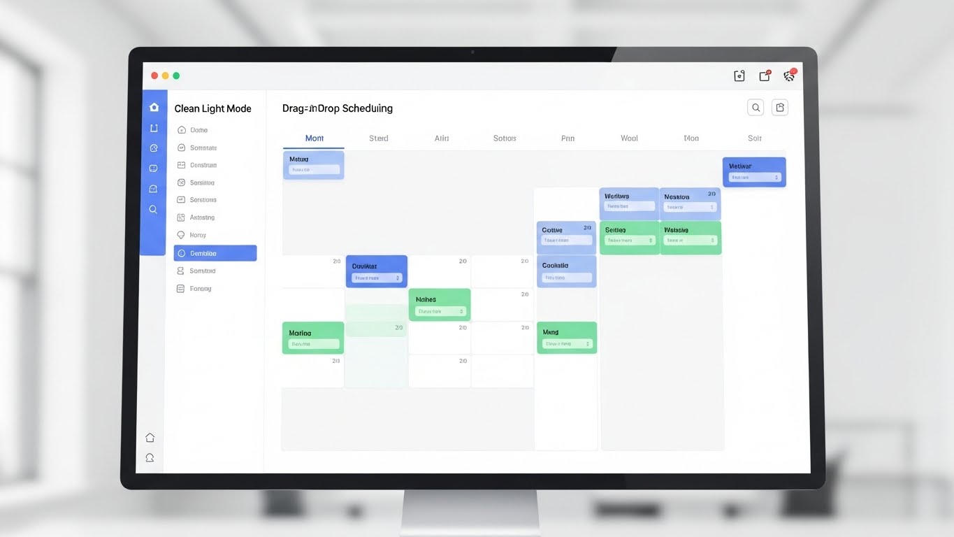
The Visual & Narrative Approach
For the self-serve buyer, clarity is king. This style presents a photorealistic, straight-on view of the scheduling dashboard in a pristine Clean Light Mode. The focus is on the familiar: a drag-and-drop calendar with comforting Pastel Blue and Green blocks. The background is a high-key, blurred white office, suggesting a calm, organized work environment. There are no dark shadows or complex data overlays—just pure, functional utility.
Psychological Impact & KPI Focus
This aesthetic creates a "Safe Harbor" for the buyer. It signals that the learning curve is low and that the software is "Plug and Play." It appeals to the SMB owner or Department Head who wants to start immediately without a six-month integration project. It reinforces Time-to-Value and Dispatcher Efficiency.
Strategic Implementation & Trade-offs
- Best Use Case: Pricing Page or "Start Free Trial" landing page (30-60s). It should walk through the "First 5 Minutes" of the user experience.
- Trade-off: It can look generic if the UI design isn't distinct. It relies entirely on the quality and cleanliness of your actual product interface.
Companies using similar video content -
Aspire – FSM for landscaping and commercial cleaning.
FieldPulse – Ultimate FSM solution with features and automation.
15. The Reality Contrast Approach
MOFU | Self-Serve Onboarding

The Visual & Narrative Approach
This is the classic "Problem/Solution" visual, elevated. The screen is split by a sharp white line. The left side depicts the "Old World": a chaotic desk, dim yellow lighting, piles of paper maps, and stress. The right side depicts the "New World": a bright, pristine workspace with a single monitor displaying a Cool Blue organized dashboard. The contrast is not just in content, but in lighting temperature (Warm/Dirty vs. Cool/Clean).
Psychological Impact & KPI Focus
This triggers a powerful "Pain vs. Relief" response. It validates the user's current struggle (empathy) while instantly offering the escape route (solution). It is highly effective for buyers who are still using manual methods or spreadsheets. It focuses on the transition from Administrative Burden to Digital Efficiency.
Strategic Implementation & Trade-offs
- Best Use Case: Comparison Pages ("Us vs. Excel") or Retargeting Ads (15-30s). It reminds the viewer why they started looking for software in the first place.
- Trade-off: It is a binary, somewhat aggressive tactic. It works for displacing manual processes but is less effective for displacing a sophisticated competitor.
Companies using similar video content -
GoCanvas – Automates paperwork and manual processes.
Job-Dox – FSM for restoration tasks, centralizing job management.
16. The Financial Proof Approach
BOFU | ROI Justification
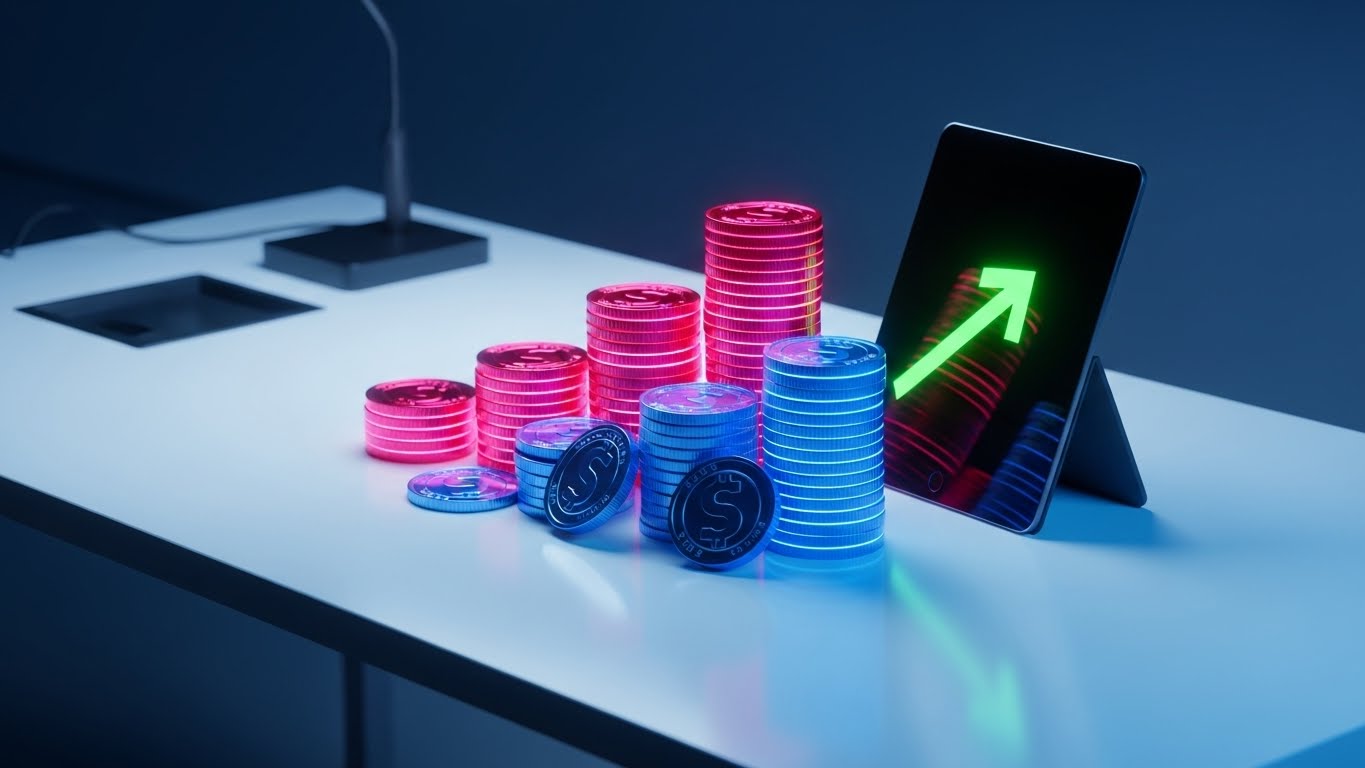
The Visual & Narrative Approach
When speaking to the CFO, you must visualize value, not features. This style abandons the interface entirely for a metaphorical representation of profit. On a luxurious white surface, we see realistic stacks of Gold coins arranging themselves into an upward-trending bar chart. A sleek tablet leans against the coins, displaying a matching green growth arrow. The lighting is high-end commercial style, emphasizing the weight and value of the currency.
Psychological Impact & KPI Focus
This appeals strictly to the Economic Buyer. It translates abstract savings (time, fuel) into hard currency. It subliminally suggests that the software is not a "cost" but an "asset" that generates wealth. It squarely targets ROI (Return on Investment), Revenue Growth, and Cost Reduction.
Strategic Implementation & Trade-offs
- Best Use Case: Investor Decks or the "Pricing/Enterprise" section of a proposal (Static Image or Slide Build). It provides the "money shot" that justifies the budget.
- Trade-off: It is purely metaphorical. It doesn't explain how the money is saved, only that it is. It must be supported by hard data points in the accompanying text.
Companies using similar video content -
Zuper – FSM solution focused on driving growth and efficiency.
FieldInsight – Preventive maintenance software for time savings.
17. The Deep Architecture Approach
BOFU | Technical Buyer
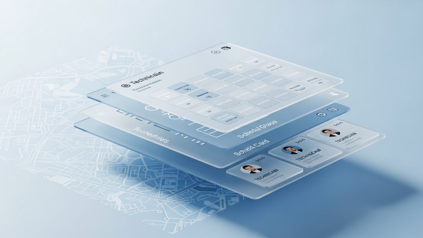
The Visual & Narrative Approach
The Technical Buyer (CTO/IT Director) wants to know how the system is built. This style explodes the UI into floating layers in Z-space. We see the map layer at the back, the schedule grid in the middle, and technician profile cards floating in the front. The Glassmorphism and soft shadows demonstrate that these are separate, modular, yet integrated components. The camera tilts to reveal the depth of the stack within a Soft Blue void.
Psychological Impact & KPI Focus
This validates the Robustness and Modularity of the architecture. It visually proves that the software is not just a "flat" skin but has deep, interconnected logic. It reduces the risk perception regarding Scalability and Data Integration.
Strategic Implementation & Trade-offs
- Best Use Case: Sales Decks or Technical Webinars (30-60s). It helps the sales engineer explain the relationship between different modules (Dispatch, CRM, Mobile).
- Trade-off: It is abstract. It doesn't show how to use the tool, only how it is structured. It should be used for concept selling, not training.
Companies using similar video content -
SAP Field Service Management – Comprehensive FSM solution.
ServiceNow Field Service Management – FSM with strong automation and ITSM integration.
18. The Human-Centric Validation Approach
BOFU | Economic Buyer

The Visual & Narrative Approach
Ultimately, the software must work in the real world. This style places the viewer over the shoulder of a real technician in a van. We see the sunlight, the blurred suburban street through the windshield, and the texture of the steering wheel. Overlaid on the technician's tablet is a crisp, clean UI graphic showing a simple "Job Accepted" status. It blends high-quality photography with sharp motion graphics.
Psychological Impact & KPI Focus
This humanizes the technology. For the buyer concerned about their workforce pushing back against new tracking tools, this visual reassures them that the technology fits naturally into the workday. It promotes Driver Retention, Safety Compliance, and Field Efficiency.
Strategic Implementation & Trade-offs
- Best Use Case: Homepage Hero or "Careers/Driver Experience" page (Looping background). It sells the experience of the job improved by technology.
- Trade-off: Authenticity is key. Stock photos can look generic; ensuring the technician is wearing the correct safety gear and driving the correct vehicle type is critical for credibility.
Companies using similar video content -
ServiceTrade – FSM for commercial HVAC and fire protection.
FIELDBOSS – FSM for elevator and HVAC industries.
19. The Implementation Certainty Approach
BOFU | Sales Cycle Accel
The Visual & Narrative Approach
This style creates a bridge between the promise (the plan) and the delivery (the reality). A slider moves from left to right across the frame. On the left, we see a Blueprint Blue wireframe mesh of a technician holding a device. As the slider reveals the right side, the wireframe instantly fills with photorealistic lighting and textures, showing the smiling technician in the real world on a bright construction site.
Psychological Impact & KPI Focus
This acts as a "Proof of Concept" visualization. It tells the prospect, "We don't just plan efficiency; we deliver it." It is powerful for closing the gap between the theoretical value discussed in sales meetings and the tangible reality of implementation. It reinforces Project Certainty and Implementation Success.
Strategic Implementation & Trade-offs
- Best Use Case: Case Studies or "Our Process" page (15-20s). It visually summarizes the implementation journey from design to go-live.
- Trade-off: It is highly conceptual. It works best as a metaphor for the vendor's reliability rather than a demonstration of specific features.
Companies using similar video content -
Connecteam – Employee management and FSM for deskless teams.
Simpro – Business management cloud solutions for workflow.
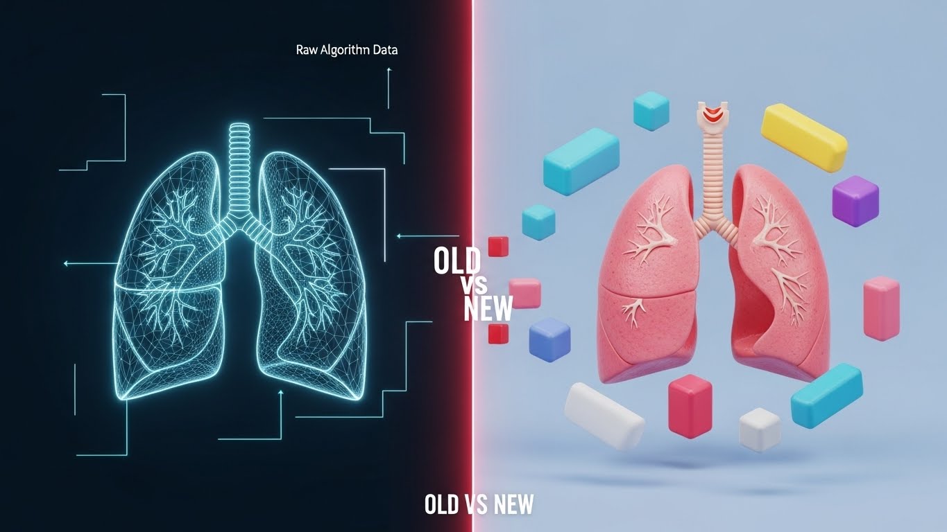
20. The Predictive Protection Approach
BOFU | Risk Mitigation

The Visual & Narrative Approach
The ultimate value of field service software is preventing failure before it happens. This style features a hyper-realistic 3D render of an industrial asset (like a rusted boiler) in a clean lab. Floating above it is a Hologram Blue diagnostic interface, casting a soft glow onto the metal. The UI isn't just reading data; it is analyzing the physical condition of the asset in real-time.
Psychological Impact & KPI Focus
This targets the fear of Downtime. It positions the software as a "Guardian" that sees what the human eye cannot. It appeals to the Director of Maintenance or Service, focusing heavily on Predictive Maintenance, Asset Longevity, and SLA Compliance.
Strategic Implementation & Trade-offs
- Best Use Case: LinkedIn Ads targeting Maintenance Directors or high-level Feature Pages (30-45s). It positions the brand as a "Deep Tech" leader.
- Trade-off: It implies a high level of IoT integration. Do not use this style if your software relies solely on manual inputs, as it creates a false expectation of automated diagnostics.
Companies using similar video content -
Shifton – Predictive maintenance software for field service.
ServicePower – Predictive maintenance analytics for FSM.
21. The Conflict Resolution Approach
BOFU | Overcoming Objections
The Visual & Narrative Approach
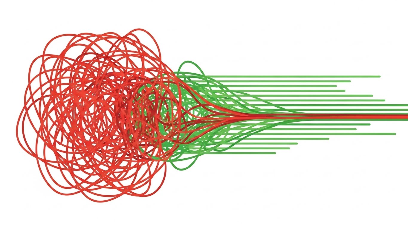
This style tackles the most common operational objection: "Can this software really handle our messy reality?" The visual metaphor is visceral and direct. We see a chaotic, tangled knot of Signal Red lines in the center, vibrating with tension—representing scheduling conflicts, double-bookings, and route overlaps. As the software's logic is applied, the knot aggressively unravels, smoothing out into parallel, efficient Green lines that flow swiftly to the right. The Pure White background ensures the focus remains entirely on the transformation from "Blocked" to "Flowing."
Psychological Impact & KPI Focus
This triggers a powerful "Relief" response. It visually validates the dispatcher's desire for order. By showing the physical "untying" of complexity, it offers a promise of peace and resolution. It directly supports KPIs related to Schedule Optimization Efficiency and Conflict Resolution Speed.
Strategic Implementation & Trade-offs
- Best Use Case: Retargeting Ads (6-10s loops) or Sales Decks. It visually answers the question, "Does the algorithm actually work?"
- Trade-off: It is highly abstract. It requires a strong headline (e.g., "Untangle Your Dispatch Board") to connect the abstract lines to the business reality.
Companies using similar video content -
Kickserv – Job management and customer relationship management.
Solarvista – FSM for optimizing service delivery.
22. The Value Burst Approach
Onboard | Reducing Friction
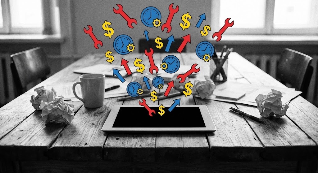
The Visual & Narrative Approach
Implementation is often where excitement turns to fatigue. This style injects energy back into the process by bridging the gap between the physical office and the digital tool. We see a desaturated, black-and-white photo of a typical meeting room or dispatch desk. Suddenly, bursting out of the tablet screen are hyper-vibrant 2D vector icons—wrenches, clocks, and dollar signs—in Primary Red, Blue, and Yellow. The contrast emphasizes that the "color" (value) in the business flows from the software.
Psychological Impact & KPI Focus
This appeals to the End User (dispatcher or manager). It frames the software not as "more work" but as a source of energy and abundance. The explosion of icons suggests capability and speed. It creates a positive association with the "Go-Live" date, supporting KPIs like User Adoption Rate and Onboarding Velocity.
Strategic Implementation & Trade-offs
- Best Use Case: Welcome Emails or "Getting Started" videos (15-20s). It sets an optimistic tone for the learning journey.
- Trade-off: The live-action background must be generic enough to fit any office but specific enough to look professional. Poor stock photography can ruin the effect.
Companies using similar video content -
FieldAware – FSM solution for streamlining field operations.
ReachOut Suite – FSM for managing field operations.
23. The Schematic Precision Approach
Onboard | Accelerating TTV

The Visual & Narrative Approach
For technical training, clarity is paramount. This style uses a continuous, single-weight line in Navy Blue and Lime to draw a transparent schematic of a service van. The line weaves through the vehicle, tracing the logic of inventory or inspection points, before morphing seamlessly into a large, confident checkmark. The aesthetic is precise and architectural, stripping away all distraction to focus on the "Correct Path."
Psychological Impact & KPI Focus
This style appeals to the Technician mindset—logical, process-driven, and detail-oriented. It removes the "fluff" of marketing and focuses on the "how-to." The fluid morphing into a checkmark provides positive reinforcement, encouraging Process Adherence and Checklist Completion.
Strategic Implementation & Trade-offs
- Best Use Case: In-App Tutorials or LMS modules. It keeps the file size low and the instructional focus high.
- Trade-off: It can feel "dry." It is excellent for instruction but lacks the emotional hook needed for top-of-funnel marketing.
Companies using similar video content -
FieldEquip – HVAC and Utilities FSM with advanced tracking.
Miracle Service – Medical equipment FSM for regulatory compliance.
24. The Friendly Guide Approach
Onboard | Self-Serve Onboarding
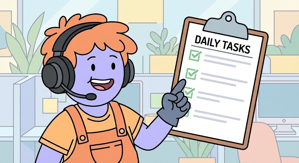
The Visual & Narrative Approach
Software can feel isolating. This style introduces a "Digital Companion." We feature a stylized 2D character with inclusive Pastel Purple skin and warm orange clothing. The character acts as a guide, smiling and pointing to a large floating "Daily Tasks" checklist that mimics the software interface. The background is a soft, abstract office pattern. The thick outlines and flat colors make the character readable even on small mobile screens.
Psychological Impact & KPI Focus
This leverages the Avatar Effect. Users feel more supported when a human-like figure guides them. It reduces the anxiety of "messing up" the new system. It encourages self-serve learning, directly impacting Feature Utilization and reducing the burden on the human Customer Success team.
Strategic Implementation & Trade-offs
- Best Use Case: "First Login" wizards or interactive platform tours (15-30s). The character becomes the "face" of the help system.
- Trade-off: The character design must be universally appealing. If the character feels too childish, it can alienate senior technicians.
Companies using similar video content -
Field Force Tracker – FSM for mobile workforce management.
eWorkOrders CMMS – CMMS and FSM for real-time communications.
25. The Visual Logic Approach
Retain | Knowledge Base
The Visual & Narrative Approach
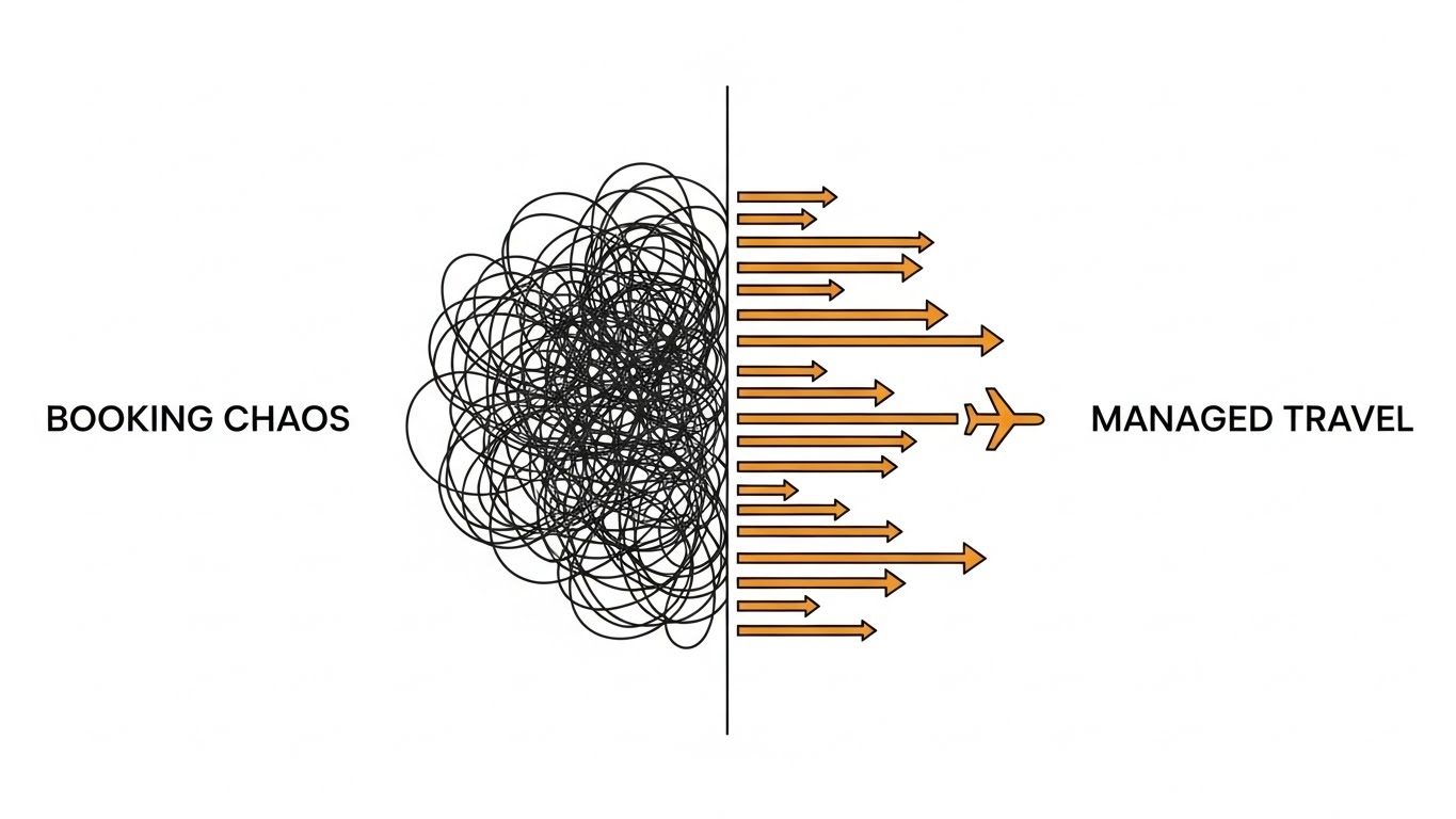
When a user visits the support portal, they are often frustrated and confused. This style mirrors the solution they seek: moving from confusion to clarity. We see a split composition. On the left, a "Booking Chaos" scribble represents the problem; on the right, organized orange arrows represent the "Managed" solution. While this visual metaphor uses travel as a proxy, the principle—turning a messy scribble into a linear path—is the universal language of troubleshooting and support.
Psychological Impact & KPI Focus
The binary contrast (Left vs. Right) reduces cognitive load, allowing the user to instantly recognize the "Before" and "After" states. It reinforces the concept of Linear Efficiency and Logic. It serves as a visual anchor for users seeking to understand the logic behind the algorithms or workflows.
Strategic Implementation & Trade-offs
- Best Use Case: Knowledge Base articles or "Tips & Tricks" video thumbnails. It provides immediate visual context for troubleshooting.
- Trade-off: It is a high-level abstraction. It explains the concept of optimization but does not show the interface settings required to achieve it.
Companies using similar video content -
Cryotos CMMS – CMMS and FSM for asset maintenance.
Commusoft – FSM for plumbing, electrical, and HVAC trades.
26. The Human Connection Approach
Retain | Reducing Churn

The Visual & Narrative Approach
To scale personal support without scaling headcount, this style utilizes high-quality Generative AI video. We see a photorealistic Customer Success Manager (CSM) in a bright, modern office, looking directly at the camera with a helpful, intelligent expression. The lighting is soft studio quality. This allows for the rapid creation of personalized "check-in" videos or localized support updates without filming a real person for every single message.
Psychological Impact & KPI Focus
This triggers the Reciprocity Bias; users feel more connected to a human face than a text email. Even if they know it is AI-generated, the visual cue of a person creates a sense of presence and care. It aims to boost Net Promoter Score (NPS) and Customer Loyalty.
Strategic Implementation & Trade-offs
- Best Use Case: Quarterly Business Review (QBR) invites or "New Feature" announcements in the Help Center.
- Trade-off: The "Uncanny Valley" risk is real. The lip-sync and eye movement must be perfect, or the effect will shift from "helpful" to "creepy."
Companies using similar video content -
Salesforce Field Service – Delivers personalized service with AI and CRM.
IFS Field Service Management – Enhances customer satisfaction with AI-driven insights.
27. The Proactive Intelligence Approach
Retain | Proactive Support

The Visual & Narrative Approach
Long-term retention often depends on proving that the software is evolving. This style visualizes the "Brain" of the platform: the AI scheduling engine. Against a pitch-black background, a complex network of Cyber Pink nodes pulses with energy, feeding into a central, glowing brain icon. It represents the "Dark Mode" backend intelligence that works quietly while the client sleeps.
Psychological Impact & KPI Focus
This reinforces the value of the Subscription. It reminds the client that they are paying for continuous algorithmic improvement, not just a static tool. The high-contrast neon aesthetic signals "Advanced Tech" and "Future-Proofing." It supports Renewal Rates and Perceived Value.
Strategic Implementation & Trade-offs
- Best Use Case: Feature Release announcements (e.g., "New AI Routing Algorithm") or background visuals for roadmap webinars (15-30s).
- Trade-off: It is aggressive. Use it sparingly to highlight major technical upgrades; using it for minor updates dilutes its impact.
Companies using similar video content -
Microsoft Dynamics 365 Field Service – Agile platform for intelligent FSM.
ServiceMax – Optimizes service operations with complete asset view.
28. The Revenue Growth Approach
Expand | Driving Upsell

The Visual & Narrative Approach
To upsell a client to a higher tier, you must show them the growth they are missing. This style uses 3D abstract charts rising from a Silver surface. The bars are made of translucent Violet and Green glass. As they rise, glowing Euro (or Dollar) symbols float upwards, symbolizing the financial potential of the premium tier. The clean white background keeps the focus strictly on the upward trajectory.
Psychological Impact & KPI Focus
This stimulates the Gain Motivation. It shifts the conversation from "saving money" (efficiency) to "making money" (expansion). The premium materials (glass, gold) subtly suggest that the higher software tier is a "VIP" experience. It targets Upsell Conversion Rates and Account Expansion.
Strategic Implementation & Trade-offs
- Best Use Case: Dashboard "Upsell" widgets or End-of-Year reports. It serves as a visual prompt to upgrade to a higher tier.
- Trade-off: It is aspirational. If the user's actual data is stagnant, showing them a "generic growth" graphic can feel tone-deaf.
Companies using similar video content -
Zuper – FSM solution focused on driving growth and efficiency.
FieldInsight – Preventive maintenance software for time savings.
29. The Feature Velocity Approach
Expand | Feature Adoption
The Visual & Narrative Approach
Clients often only use 20% of the software they pay for. This style combats that by showcasing the full breadth of the platform. Multiple angled UI screens, displaying advanced reporting and analytics modules, fly towards the camera in a tunnel-like formation. The palette is Vivid Multi-color, and motion blur simulates high speed. It feels like flying through a corridor of innovation.
Psychological Impact & KPI Focus
This creates FOMO (Fear Of Missing Out) regarding unused features. It visually overwhelms the viewer with the sheer volume of tools available to them, prompting them to explore the platform deeper. It drives Feature Adoption Rates and Platform Stickiness.
Strategic Implementation & Trade-offs
- Best Use Case: "Year in Review" videos or promotional teasers for user conferences (20-30s). High energy is key here.
- Trade-off: It is fast. The viewer won't read the screens; they will only register the amount of screens. Do not use this for training; use it for excitement.
Companies using similar video content -
ServiceTitan – Comprehensive platform with CRM, dispatch, reporting.
Simpro – Manages workflow, process, productivity, and profitability.
30. The Advocacy Loop Approach
Expand | Referrals

The Visual & Narrative Approach
The ultimate stage of the funnel is advocacy. This style illustrates the act of sharing value. We see two stylized 2D characters. One hands a glowing, oversized envelope (representing an invite) to the other. Floating around them are UI elements like star icons and "thumbs up" bubbles in Vibrant Pink and Purple. The background is a simple, celebratory circle pattern.
Psychological Impact & KPI Focus
This leverages Social Proof and Reciprocity. It frames the referral not as a sales pitch, but as a gift (the envelope) from one professional to another. The vibrant colors create a sense of fun and reward. It directly targets Referral Velocity and Net Promoter Score (NPS).
Strategic Implementation & Trade-offs
- Best Use Case: Post-NPS survey screens or "Refer a Friend" program pop-ups. It keeps the mood light, social, and rewarding.
- Trade-off: It can look like a generic consumer app if not branded correctly. It must maintain the professional color palette of the core brand to feel legitimate.
Strategic Knowledge Base: The Visual Operations Doctrine
The 30 styles detailed above are not merely artistic choices; they are functional components of a high-performance field service operation. To maximize the ROI of these assets, organizations must integrate them using a cohesive strategic framework. This section synthesizes the visual guide into three actionable operational segments.
Strategic Alignment & Visual Architecture
The "Pre-Production" Strategy – Aligning Vision with Operations.
- The Cognitive Load Audit: Before creating any video asset, conduct an audit of your current training materials. If a PDF manual takes 10 minutes to read, the replacing video (Style 23) must convey the same logic in under 60 seconds. Success Metric: 50% reduction in information processing time.
- Role-Based Visual Mapping: Do not use the same visual style for all personas. Drivers on mobile devices need Style 25 (Minimalist Vector) for high contrast and readability in sunlight. Dispatchers on desktop monitors respond better to Style 10 (Dark Mode UI) which handles data density.
- The "Glanceability" Standard: In field service, attention is scarce. Visuals must pass the "Glance Test"—the core message (e.g., "Route Changed") must be understood in <1.5 seconds. Use Style 11 (Geometric Agility) principles to strip away non-essential textures.
- Brand Voice Consistency: Your marketing visuals (Style 5) and your support visuals (Style 25) must share a "Visual DNA." Even if the fidelity changes, the color palette (e.g., Signal Red for alerts, Mint Green for success) must remain consistent to reduce user confusion.
- The Advids Strategic Audit: Partnering with a specialized agency like Advids allows for a comprehensive audit of your visual taxonomy. We define the "Visual Operating System" before a single frame is rendered, ensuring that your library is built for scale, not just one-off campaigns.
- Standardization vs. Customization: For universal concepts (e.g., "How to Reset Password"), use standardized Style 14 (Clean UI). For unique competitive differentiators (e.g., "Proprietary AI Routing"), invest in bespoke Style 6 (Abstract 3D AI) to signal premium value.
- The Cross-Departmental Bridge: Use visuals to unify terminology. If Sales calls it "Smart Dispatch" and Ops calls it "Auto-Assign," create a Style 2 (Algorithmic Order) video that visually links the two terms, ensuring the promise made by Sales is recognized by Ops.
- Legacy System Integration: When replacing old hardware, use Style 15 (Reality Contrast) to visually acknowledge the user's past experience (the "Old World") before transitioning to the new interface. This validation reduces resistance to change.
- Accessibility in Trucking: The workforce is diverse. Use Style 21 (Abstract Motion) and Style 23 (Line Art) which rely on visual logic rather than text, making your training materials universally understood regardless of language barriers.
- The Mobile-First Mandate: 80% of your users are deskless. Audit every visual style on a 5-inch screen. If the UI details in a "Desktop Demo" video (Style 14) are unreadable on a phone, the asset is operationally useless for the field.
Operational Adoption & Deployment
The "Deployment" Phase – Embedding Visuals into Workflow.
- Overcoming "Big Brother" Anxiety: Tracking features often cause friction. Use Style 18 (Human-Centric Validation) to frame GPS tracking as "Safety" and "Support," not surveillance. Show the driver being protected by the data, not watched by it.
- The Micro-Learning Shift: Replace hour-long seminars with a library of 30-second "Micro-Visuals" (Style 13). Trigger these videos based on context—e.g., if a driver fails a vehicle check, the app automatically plays the "How to Inspect Tires" clip.
- Just-in-Time Support: Embed Style 25 (Minimalist Vector) GIFs directly into the mobile app's error messages. If a driver fails to complete a form, a 10-second loop should pop up showing exactly how to fix it, bypassing the support call.
- Gamification of Training: Use Style 28 (Revenue Growth) aesthetics to visualize Driver Scorecards. Showing a 3D "Gold Bar" growing for safe driving streaks is more motivating than a spreadsheet of safety stats.
- Reducing Support Ticket Volume: There is a direct correlation between the quality of your visual "Self-Serve" library and your support costs. Proactively sending a Style 24 (Friendly Guide) video during onboarding can deflect up to 30% of "How-To" tickets.
- Remote Onboarding: For distributed fleets, physical training is impossible. Use Style 9 (Connected Ecosystem) to virtually tour the dispatch process, giving remote drivers a sense of belonging and understanding of the bigger picture.
- Visual Standard Operating Procedures (SOPs): Transform text-heavy SOP binders into Style 8 (Architectural Plan) animations. Seeing the workflow as a logical circuit board helps staff internalize the process steps faster than reading them.
- Feedback Loops: Use interactive video elements (Style 30) to gather feedback. After a training video, a simple "Thumbs Up/Down" interaction provides data on which visuals are working and which are confusing.
- Scalable Localization: When expanding globally, use Style 26 (Gen AI Character) to rapidly generate training videos in local languages with perfect lip-syncing, ensuring every region feels equally supported without filming new actors.
- Leadership Communication: When rolling out a new strategy, Ops Directors should use Style 5 (Heroic Fleet) to communicate the vision. High-production values signal importance and inspire confidence in the new direction.
Measuring Impact & Future-Proofing
The "ROI" Phase – Quantifying Success and Scaling.
- Beyond "Views": Do not measure video success by views. Measure Time-to-Competency. If a new dispatcher using Style 23 training videos reaches full productivity in 2 weeks instead of 4, that is a calculable ROI.
- The "Idle Time" Metric: Monitor the time users spend "idling" or searching in the software. Effective UI visualization (Style 10) should reduce this navigation friction, directly returning billable hours to the business.
- Compliance Velocity: When a new regulation (e.g., ELD mandate) hits, measure how fast the fleet achieves 100% compliance after watching the Style 20 (Predictive Protection) explainer. Speed of compliance protects against fines.
- Retention and Churn: Track the correlation between user engagement with Style 27 (Proactive Intelligence) updates and renewal rates. Customers who visually understand the product's evolution are less likely to churn.
- The AI Visual Frontier: Prepare for the future where Style 7 (Augmented Reality) becomes the norm. The next generation of software will overlay data directly on the windshield. Building a visual language now prepares your team for that reality.
- Scalability of Assets: Build a library, not a graveyard. Create assets in layers (Style 17) so that when the UI changes, you only need to update the top layer, not re-shoot the entire video.
- The Advids Partnership: Visual strategy is not a one-time project; it is an ongoing operation. Advids serves as the long-term partner, ensuring your visual assets evolve in lockstep with your software updates, maintaining the integrity of your "Visual Operating System."
- Benchmarking Success: Compare your "First-Time Fix Rates" before and after implementing Style 12 (Transparent Operations) inventory training. The data will prove the value of the visual investment.
- The ROI of Safety: Use Style 20 (Holographic UI) to visualize potential hazards in safety training. A reduction in accident rates and insurance premiums is the ultimate financial validation of high-quality visualization.
- Final Call to Innovation: In the era of AI and automation, the companies that win will be those that make the complex feel simple. Treat video not as "content," but as operational infrastructure. It is the fiber-optic cable that connects human intelligence to artificial intelligence.
Companies using similar video content -
Jobber – Strong focus on customer management and satisfaction.
Housecall Pro – Helps businesses look professional and manage jobs.
Author & Editor Bio


