
Introduction: The Architecture of Trust
The financial landscape is undergoing a tectonic shift, moving from physical vaults to digital streams. As the global Open Banking market is projected to reach USD 135.2 billion by 2030, the ability to visualize this invisible infrastructure has become a critical competitive advantage. We are no longer just processing numbers; we are architecting the neural pathways of the global economy.
For industry leaders, the challenge is not just connectivity, but comprehension. With API call volumes projected to exceed 580 billion annually by 2027, the sheer velocity of information can be overwhelming. The "Physical/Digital Bridge" is widening—legacy systems struggle to speak the language of modern cloud infrastructure. This is where strategic video visualization bridges the gap. By transforming abstract code into tangible visual assets, we turn "spaghetti data" into a clear, navigable intelligence.
This guide is designed for the forward-thinking architects of finance. It explores how to use motion, geometry, and high-fidelity rendering to communicate security, speed, and scale. These styles are not merely aesthetic choices; they are functional tools that reduce cognitive load, verify security protocols, and prove the reliability of your infrastructure to stakeholders who demand perfection. Let us explore the visual language of the next generation of finance.
1. The Ecosystem Engine: Generative AI Cinematic Video
TOFU | Brand Awareness

The Visual & Narrative Approach
We open on a breathtaking, wide aerial shot of a futuristic digital metropolis at sunrise. The skyscrapers are not concrete, but constructed from pristine white server racks and crystalline glass, glowing with soft Sunrise Gold and Cyan light. Streams of luminescence, representing "Data Packets," flow through the streets like high-speed traffic, converging into a central citadel of finance. The lighting is bright, volumetric, and optimistic, creating a sense of awe and massive scale.
Psychological Impact & KPI Focus
- Niche Psychology: Institutional buyers often fear that new SaaS platforms lack the "weight" or stability of legacy systems. This style directly addresses that anxiety by projecting immense scale and solidity.
- Operational Impact: It bridges the physical/digital divide by giving "cloud infrastructure" a physical form (the metropolis).
- KPI: Brand Awareness – Positioning the platform as the foundational infrastructure of the future city.
Strategic Implementation & Trade-offs
- Funnel Stage: TOFU (Brand Awareness)
- Duration: 15-30 Seconds.
- Trade-off: This is a "Macro" style. It is excellent for setting the scene and inspiring awe but suboptimal for explaining specific technical features (like schema mapping). Use it to open a keynote or as the "Hero" background on a landing page.
Companies using similar video content -
AWS for Financial Services – Provides scalable cloud infrastructure for finance.
Google Cloud for Financial Services – Delivers enterprise cloud solutions for banking.
Microsoft Azure for Financial Services – Offers secure, compliant cloud for institutions.
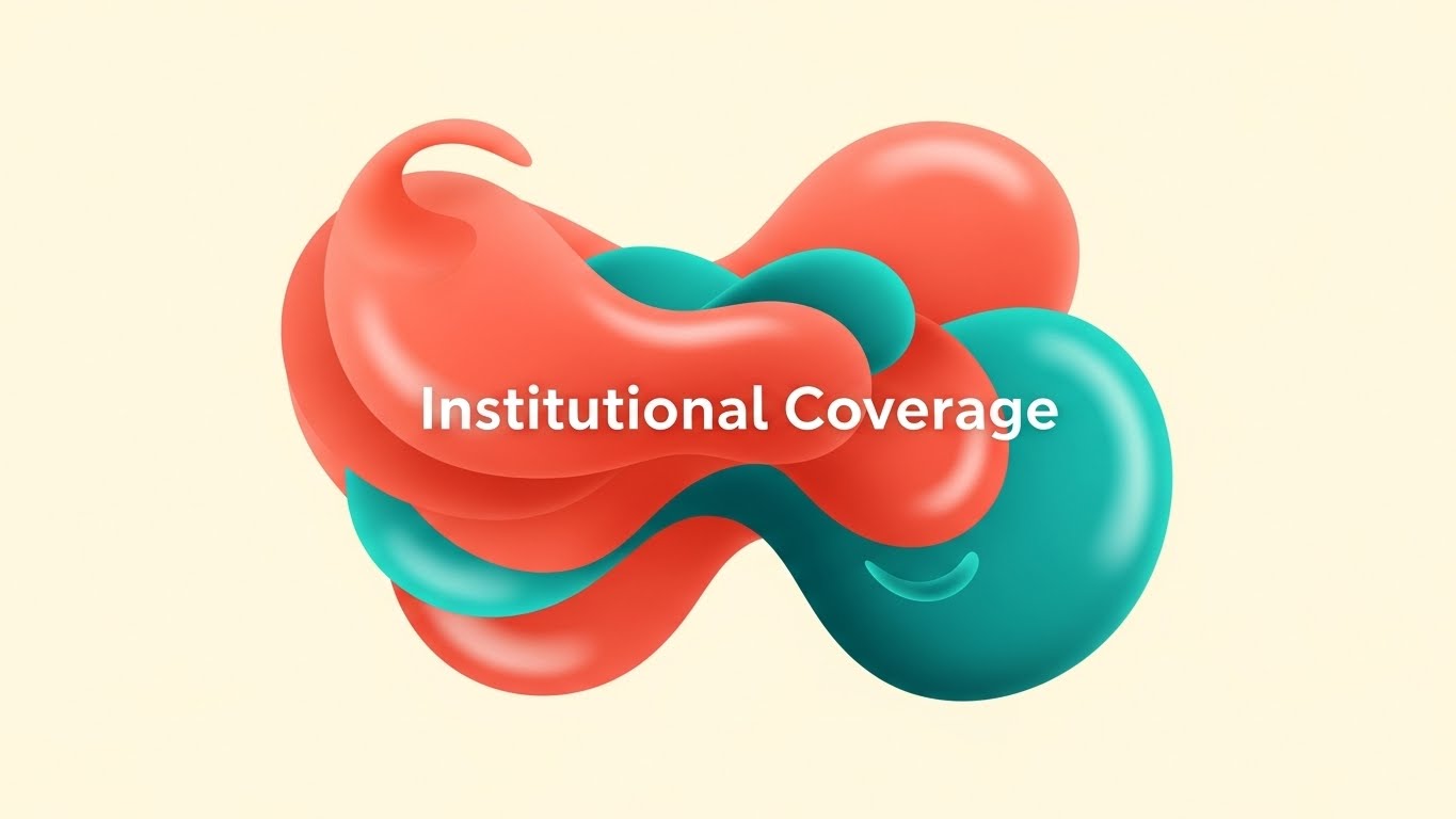
2. The Connectivity Engine: Abstract 2D Flat Vector Organic
TOFU | Category Creation
The Visual & Narrative Approach
A central composition features fluid, amorphous shapes in Vibrant Coral and Teal, interlocking smoothly to represent "Institutional Coverage." The shapes morph and connect with a satisfying, liquid consistency against a Soft Cream background. The style is clean, shadowless, and highly polished, utilizing vector precision to visualize the seamless nature of modern API connectivity.
Psychological Impact & KPI Focus
- Niche Psychology: Integration headaches are a primary barrier to entry. This visual style subconsciously communicates that the process is "fluid" and "flexible," rather than rigid or brittle.
- Operational Impact: It simplifies the complexity of multi-source data aggregation into a friendly, approachable visual metaphor.
- KPI: Category Creation – Positioning the platform as the "glue" of the financial world.
Strategic Implementation & Trade-offs
- Funnel Stage: TOFU (Category Creation)
- Duration: 10-15 Seconds.
- Trade-off: The abstract nature is beautiful but may be too vague for technical audiences requiring detailed specs. It prioritizes feeling over function.
Companies using similar video content -
Plaid – Connects bank accounts for financial applications.
Tink – Powers open banking payments and data aggregation.
Yapily – Provides seamless open banking API connectivity.
3. The Logic Engine: Abstract 2D Motion Graphics
TOFU | Market Education

The Visual & Narrative Approach
Drawing inspiration from Bauhaus principles, this style uses precise geometry to visualize the chaotic process of "Schema Mapping." Sharp lines, circles, and squares in Mint Green, Light Grey, and White traverse the screen diagonally, interlocking and organizing themselves into structured grids. The motion is rhythmic and precise, symbolizing the transformation of chaotic raw data into organized financial intelligence.
Psychological Impact & KPI Focus
- Niche Psychology: CTOs and Data Engineers value precision and order above all else. This style appeals directly to their desire for clean architecture and reliable logic.
- Operational Impact: It effectively demonstrates the "ETL" (Extract, Transform, Load) process without showing boring code.
- KPI: Market Education – Proving the platform's ability to handle complexity.
Strategic Implementation & Trade-offs
- Funnel Stage: TOFU (Market Education)
- Duration: 30-60 Seconds.
- Trade-off: The intellectual, geometric style attracts technical buyers but may feel "cold" to non-technical business stakeholders.
Companies using similar video content -
Informatica – Manages enterprise data integration and quality.
Talend – Ensures data integration and integrity across systems.
Fivetran – Automates data integration for analytics pipelines.
4. The Velocity Engine: Bold Kinetic Typography (Visual)
TOFU | Shaping Brand Perception

The Visual & Narrative Approach
This style eschews traditional legibility for raw energy. Massive, blocky geometric shapes in Electric Orange and Silver crash zoom into the frame, representing the concept of "SPEED." The shapes distort slightly to convey velocity, with motion blur trails. The composition leverages negative space on a Pure White background to make the orange forms pop. It is a visceral visualization of millisecond latency and high throughput.
Psychological Impact & KPI Focus
- Niche Psychology: Speed is a currency in fintech. This style triggers a physiological response of urgency and power, aligning with the desire for real-time performance.
- Operational Impact: It creates a "feeling" of speed that static numbers cannot convey.
- KPI: Shaping Brand Perception – Identifying as the fastest player in the market.
Strategic Implementation & Trade-offs
- Funnel Stage: TOFU (Shaping Brand Perception)
- Duration: 6-10 Seconds.
- Trade-off: It sacrifices detailed messaging for pure impact. It grabs attention but requires a follow-up interaction to explain the "how."
Companies using similar video content -
Adyen – Processes high-volume global payments instantly.
Visa Direct – Enables real-time push payments worldwide.
6. The Architecture Engine: 2D Line Art Animation
TOFU | LinkedIn Organic

The Visual & Narrative Approach
A sophisticated, architectural aesthetic defined by a single, continuous thin white line drawing a complex "Network Topology" map. Set against a professional Navy Blue background, the line weaves effortlessly to form abstract icons of banks, servers, and devices without ever breaking. Small, glowing dots travel along this path, representing the continuous flow of data.
Psychological Impact & KPI Focus
- Niche Psychology: Security and stability are paramount. The "unbroken line" metaphor subliminally reinforces the platform's reliability and uptime guarantees.
- Operational Impact: It visualizes the entire ecosystem in a single, coherent frame.
- KPI: LinkedIn Organic – Ideally suited for professionals who appreciate elegant system design.
Strategic Implementation & Trade-offs
- Funnel Stage: TOFU (LinkedIn Organic)
- Duration: 15-20 Seconds.
- Trade-off: The minimalist style can feel understated. It requires high-quality sound design to prevent it from feeling "flat."
Companies using similar video content -
Kong – Manages APIs and microservices connectivity securely.
MuleSoft – Anypoint Platform – Connects applications, data, and devices.
7. The Security Engine: Abstract 3D AI Visualization
TOFU | Skippable Pre-Roll Ad

The Visual & Narrative Approach
This style utilizes high-end particle simulation to depict the concept of a "Secure Vault." A mesmerizing system features millions of glowing points in Violet and Crystalline White swirl around a central point in a bright white laboratory environment. These particles aggregate to form the solid shape of a shield. The rendering showcases complex fluid dynamics, making the "security" feel alive and adaptive rather than static.
Psychological Impact & KPI Focus
- Niche Psychology: Security is often viewed as a "blocker." This style reframes security as a dynamic, intelligent, and beautiful active defense system.
- Operational Impact: It makes the abstract concept of encryption visible and premium.
- KPI: Skippable Pre-Roll Ad – Hooks viewers with visual beauty while reassuring them of safety.
Strategic Implementation & Trade-offs
- Funnel Stage: TOFU (Skippable Pre-Roll Ad)
- Duration: 15-30 Seconds.
- Trade-off: Rendering particle simulations is technically demanding. It is a "mood" piece that builds trust but doesn't explain how the encryption works.
Companies using similar video content -
Fortanix – Secures data with confidential computing solutions.
Thales – Provides advanced data security and encryption.
Feedzai – Prevents financial crime with AI-powered fraud detection.
8. The Aspiration Engine: Aspirational Stock Montage
TOFU | Aspiration & Identity Hook

The Visual & Narrative Approach
This style grounds the technology in human success. It features a low-angle hero shot of a diverse team of young fintech professionals standing in a sun-drenched, glass-walled modern office. They look confidently at an off-camera screen displaying an upward green arrow, symbolizing "Growth." The palette is professional—Office Greys, Natural Skin Tones, and Trust Blue accents.
Psychological Impact & KPI Focus
- Niche Psychology: Ultimately, buyers want to be the heroes of their own story. This style mirrors their aspiration to lead a successful, growing fintech company.
- Operational Impact: It connects the software to positive business outcomes (ROI, Team Morale).
- KPI: Aspiration & Identity Hook – Creating an emotional connection on Instagram.
Strategic Implementation & Trade-offs
- Funnel Stage: TOFU (Aspiration & Identity Hook)
- Duration: 10-15 Seconds.
- Trade-off: It can feel generic if the stock footage is not carefully selected. It relies heavily on the "quality" of the actors and setting to avoid looking "cheesy."
Companies using similar video content -
eMoney Advisor – Empowers financial planning for advisors and clients.
Orion Advisor Solutions – Powers wealth management growth and efficiency.
9. The Insight Engine: Lifestyle Stock with UI Overlay
MOFU | Thought Leadership
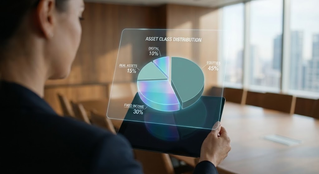
The Visual & Narrative Approach
This style merges the physical and digital worlds. It uses an over-the-shoulder perspective of a female CIO in a high-end executive boardroom holding a tablet. Above the device, a sophisticated, semi-transparent Augmented Reality hologram projects a 3D pie chart of "Asset Class" distribution in Muted Teal and Holographic Blue. The background is blurred (bokeh), forcing the eye to focus on the data interaction.
Psychological Impact & KPI Focus
- Niche Psychology: Executives want to feel in control. This visual empowers them, showing technology as an extension of their strategic mind.
- Operational Impact: It demonstrates the end-user experience—how the data will actually look in the hands of decision-makers.
- KPI: Thought Leadership – Positioning the brand as an executive essential.
Strategic Implementation & Trade-offs
- Funnel Stage: MOFU (Thought Leadership)
- Duration: 15-20 Seconds.
- Trade-off: Requires seamless motion tracking to make the hologram look integrated. Poor tracking will break the illusion of quality.
Companies using similar video content -
Tableau – Salesforce Tableau – Visualizes data for executive insights and decisions.
Looker – Google Cloud Looker – Provides data exploration and business intelligence.
10. The Detail Engine: Dynamic Data Visualization
MOFU | Demand Gen
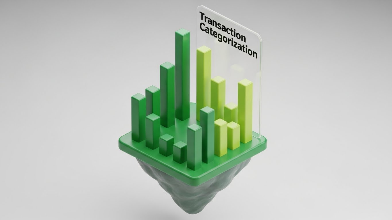
The Visual & Narrative Approach
A 3D isometric infographic turns complex analytics into a tangible, toy-like structure. Set on a floating island against a clean white studio background, vertical bars in Emerald Green and Bright Lime rise and fall mechanically to represent "Transaction Categorization" sorting. The textures are matte plastic, giving the data a physical weight.
Psychological Impact & KPI Focus
- Niche Psychology: Complexity causes anxiety. By turning data into a "toy," this style reduces the intimidation factor and makes analytics feel manageable and even playful.
- Operational Impact: It creates a "craving" for the product interface.
- KPI: Demand Gen (MQLs) – Making the product look easy to use to drive clicks.
Strategic Implementation & Trade-offs
- Funnel Stage: MOFU (Demand Gen - MQLs)
- Duration: 6-10 Seconds.
- Trade-off: It is highly stylized and simplified. It may not accurately represent the actual UI of the SaaS product, so it should be used for marketing concepts rather than training.
Companies using similar video content -
Qlik Sense – Analyzes data for actionable insights and discovery.
Power BI – Microsoft Power BI – Transforms data into rich, interactive visuals.
11. The Foundation Engine: Photorealistic 3D Renders
MOFU | Building Trust

The Visual & Narrative Approach
We shift the narrative from the ephemeral cloud to the "Physical Reality" of the network. The camera performs an extreme macro close-up pan across the brushed aluminum face of a server rack. The focus is razor-sharp, highlighting the microscopic grain of the metal and the rhythmic pulsing of "Status Lights" in Steel Blue, labeled "SERVER NODE." The rendering is hyper-realistic, utilizing cinematic high-key lighting to accentuate the weight, coolness, and industrial solidity of the hardware.
Psychological Impact & KPI Focus
- Niche Psychology: Institutional buyers often harbor a subconscious fear of the "vaporware" risks associated with pure SaaS. This style counters that anxiety by visually proving that the digital code resides on rock-solid, premium physical infrastructure.
- Operational Impact: It grounds the abstract concept of "Cloud Hosting" in a tangible, high-value asset, signaling robust capacity and redundancy.
- KPI: Building Trust – Reassuring stakeholders of the platform's physical reliability and uptime.
Strategic Implementation & Trade-offs
- Funnel Stage: MOFU (Building Trust)
- Duration: 6-10 Seconds.
- Trade-off: This is a static, atmospheric style. It builds mood and confidence but does not explain how the software functions. It is best used as a transition or background element.
Companies using similar video content -
Temenos – Provides cloud-native core banking infrastructure.
Couchbase – Powers modern applications with robust database infrastructure.
12. The Alchemy Engine: Wireframe to Reality Transition
MOFU | Overcoming Objections
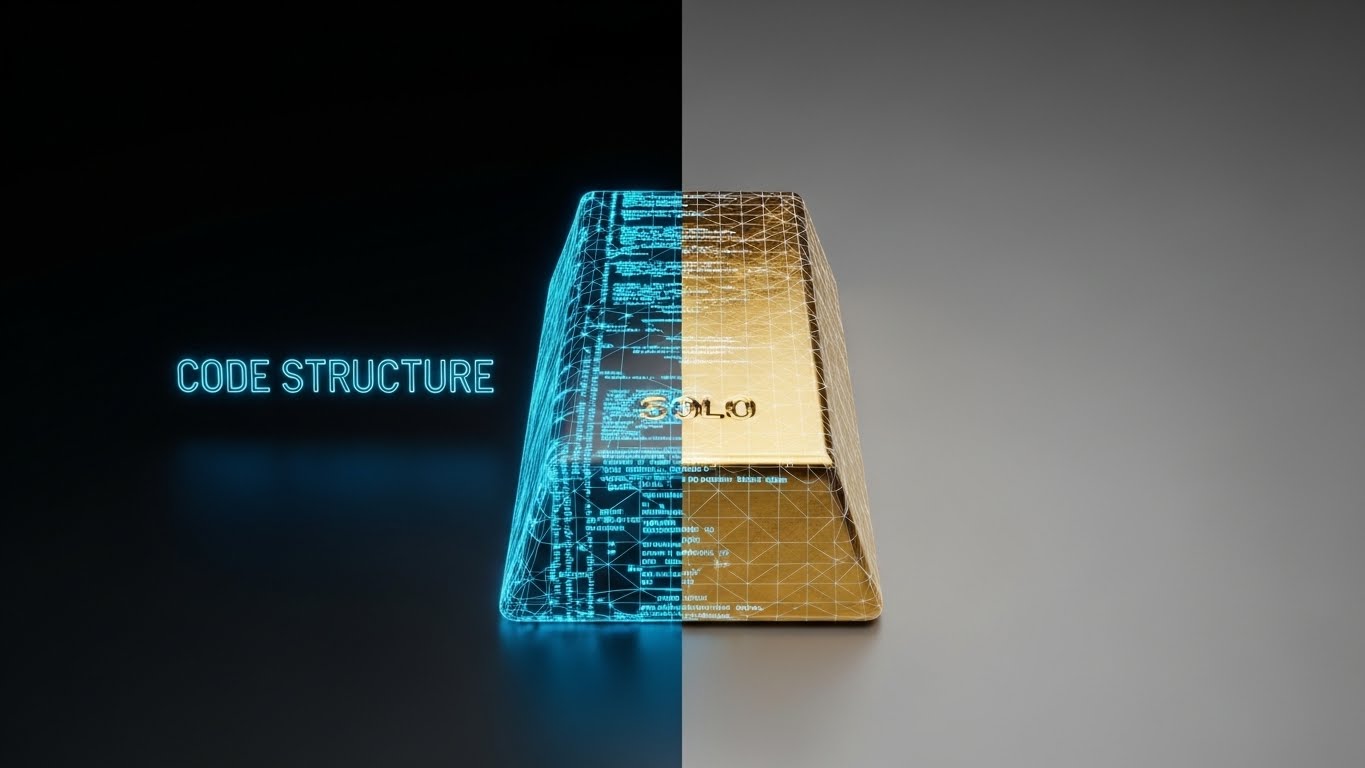
The Visual & Narrative Approach
This style visualizes the primary value proposition: the transmutation of data into wealth. A split-screen composition divides the frame vertically. The left side displays a rotating "Blueprint Blue" wireframe mesh of a raw "Code Structure." As the mesh crosses the center line to the right, it instantly solidifies into a heavy, realistic Gold Bar labeled "SOLO." The background remains a neutral studio grey to keep the focus entirely on this alchemical transformation of raw inputs into financial value.
Psychological Impact & KPI Focus
- Niche Psychology: Finance professionals view code as a means to an end. This visual metaphor validates their worldview: your platform is not just "IT spend"; it is a generator of asset value.
- Operational Impact: It dramatically simplifies the complex "Data Enrichment" process, showing the end result (Value) rather than the messy interim steps.
- KPI: Overcoming Objections – Justifying the price point by visualizing the "weight" of the output.
Strategic Implementation & Trade-offs
- Funnel Stage: MOFU (Overcoming Objections)
- Duration: 10-15 Seconds.
- Trade-off: It is highly metaphorical. To be effective, it requires a voiceover or text overlay to ensure the viewer understands specific benefits (e.g., "Raw Data to Actionable Insight").
Companies using similar video content -
FactSet – Transforms raw financial data into actionable insights.
Morningstar – Enriches investment data for comprehensive analysis.
13. The Clarity Engine: Split Screen Optimized Reality
MOFU | Competitive Displacement
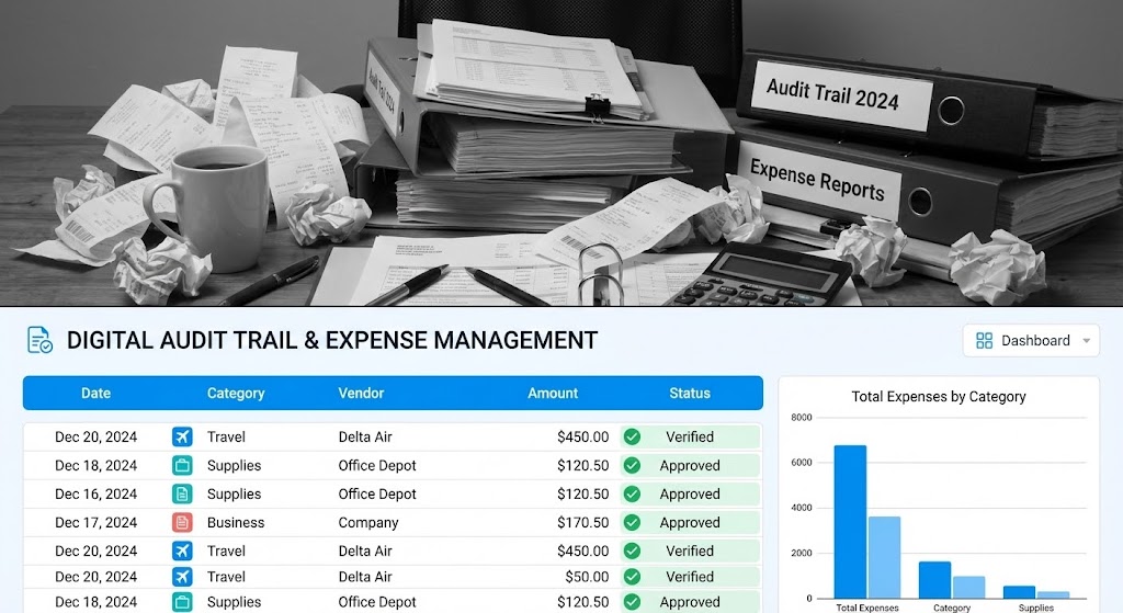
The Visual & Narrative Approach
A stark, horizontal split-screen composition creates an immediate "Before and After" narrative. The top half displays a chaotic, desaturated black-and-white photograph of a desk buried under "Audit Trail" binders, crumpled receipts, and calculators. In direct contrast, the bottom half reveals a pristine, vibrant UI dashboard organizing that exact data into a clean, colorful list in "Vibrant Blue" and White. The visual emphasizes the immediate relief of organization.
Psychological Impact & KPI Focus
- Niche Psychology: The greatest pain point for operations managers is the "Audit Nightmare." This style triggers that pain (the messy desk) and immediately provides the dopamine hit of the solution (the clean UI).
- Operational Impact: It visually quantifies the time-savings and compliance safety the platform offers by contrasting manual friction with digital automation.
- KPI: Competitive Displacement – Visually rendering the competitor's manual process as obsolete.
Strategic Implementation & Trade-offs
- Funnel Stage: MOFU (Competitive Displacement)
- Duration: 15-20 Seconds.
- Trade-off: The "messy desk" trope is common. The execution must be high-quality and specific (e.g., specific finance binders) to avoid looking like a generic infomercial.
Companies using similar video content -
UiPath – Automates chaotic manual financial processes with RPA.
Automation Anywhere – Streamlines business operations with intelligent automation.
14. The Processing Engine: Isometric 2D Motion Design
MOFU | ABM Awareness
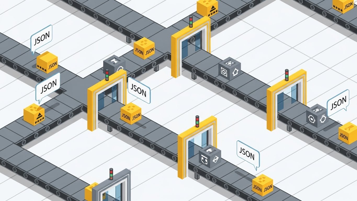
The Visual & Narrative Approach
We visualize the backend as a digital factory. Using a "Sim-City" style isometric perspective, conveyor belts in "Industrial Grey" and "Safety Yellow" transport boxes labeled with "JSON" icons. These data packets pass through scanning gates where they are validated and sorted. The aesthetic is clean, flat, and vector-based, turning the invisible, high-speed parsing of API calls into a rhythmic, understandable industrial process.
Psychological Impact & KPI Focus
- Niche Psychology: For the technical buyer (CTO/IT Lead), "factory" metaphors imply reliability, standardization, and high throughput. It assures them the system can handle volume without breaking.
- Operational Impact: It demystifies "Batch Processing" and "Data Normalization," making them appear systematic, error-free, and scalable.
- KPI: ABM Awareness – Targeting technical decision-makers who value process architecture.
Strategic Implementation & Trade-offs
- Funnel Stage: MOFU (ABM Awareness)
- Duration: 20-30 Seconds.
- Trade-off: The "gamified" vector style may lack the premium feel required for Board-level presentations but is perfect for technical explainers and documentation videos.
Companies using similar video content -
Apache Flink – Processes data streams with high throughput.
Apache Kafka – Handles real-time data feeds reliably and scalably.
15. The Efficiency Engine: Minimalist Flat 2D Vector
MOFU | Competitive Comparison
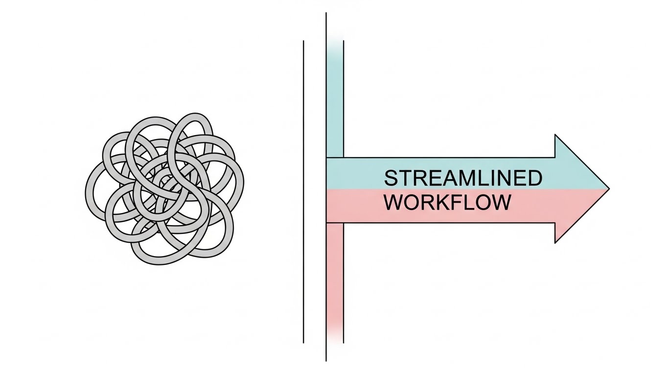
The Visual & Narrative Approach
This style utilizes the "Corporate Memphis" aesthetic to strip away all noise. On a stark white background, the composition compares two states: the "Legacy Workflow," depicted as a tangled, knot-like line in Grey that loops confusedly; and the "Streamlined Workflow," a straight, efficient arrow in "Soft Pastel Blue" and "Pink" that cuts through the noise. It is a pure, geometric abstraction of efficiency and speed.
Psychological Impact & KPI Focus
- Niche Psychology: Decision fatigue is real. This style respects the viewer's cognitive load by offering a simple, binary choice: Confusion or Clarity?
- Operational Impact: It communicates "Speed to Value" and "Reduced Friction" instantly, without needing to show a complex UI or technical diagram.
- KPI: Competitive Comparison – Positioning the legacy solution as "The Tangle" and your platform as the solution.
Strategic Implementation & Trade-offs
- Funnel Stage: MOFU (Competitive Comparison)
- Duration: 5-10 Seconds.
- Trade-off: It is very generic. It relies entirely on the accompanying copy or voiceover to give it specific meaning within the financial context (e.g., "Reduce Settlement Time").
Companies using similar video content -
Boomi – Simplifies complex integration workflows for efficiency.
Prefect – Orchestrates dataflows for automated, reliable operations.
16. The Unity Engine: Isometric 3D Workflow
MOFU | The Functional Buyer
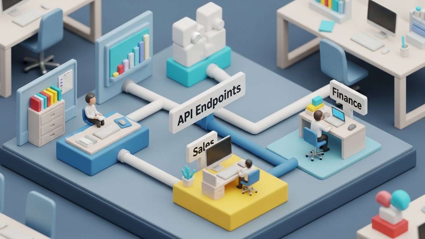
The Visual & Narrative Approach
A charming yet highly detailed "Claymorphism" diorama depicts a miniature office complex. Soft, tactile pipes in "Clay White" and "Blue" physically connect isolated office cubicles labeled "Finance," "Sales," and "IT." These pipes represent "API Endpoints," physically flowing data between departments. The global lighting creates soft shadows, making the complex integration challenge look friendly, manageable, and "plug-and-play."
Psychological Impact & KPI Focus
- Niche Psychology: Integration is often feared as a painful, "sharp" process. The soft, rounded clay aesthetic subliminally signals that this integration is "gentle," non-disruptive, and easy to handle.
- Operational Impact: It visualizes the breaking down of "Data Silos" in a way that non-technical functional buyers can instantly grasp.
- KPI: The Functional Buyer – Persuading Department Heads that the tool will facilitate collaboration.
Strategic Implementation & Trade-offs
- Funnel Stage: MOFU (The Functional Buyer)
- Duration: 20-30 Seconds.
- Trade-off: The "toy-like" appearance must be balanced with serious messaging to ensure it isn't perceived as a tool for small businesses only.
Companies using similar video content -
nCino – Unifies banking processes on a single platform.
Backbase – Connects customer journeys across digital channels.
17. The Momentum Engine: Low-Poly 3D Modeling
BOFU | ROI Justification
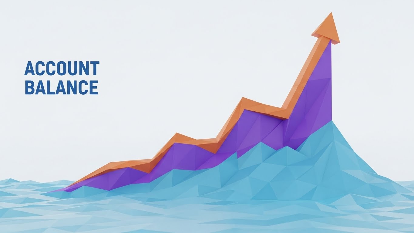
The Visual & Narrative Approach
Financial growth is reimagined as a digital landscape. An upward-trending chart is rendered as a rugged mountain range made of low-poly triangles in facets of "Purple," "Blue," and "Orange." The terrain slopes sharply upward, mimicking a bullish market chart labeled "Account Balance." The lighting is crisp, defining the hard edges of the polygons, turning abstract compounding numbers into a solid, climbable topography of success.
Psychological Impact & KPI Focus
- Niche Psychology: Investors and CFOs are driven by the "climb." This style visualizes their goal not just as a line on a page, but as a massive, solid structure they are building.
- Operational Impact: It connects the software's data aggregation capabilities to the ultimate business outcome: Growth.
- KPI: ROI Justification – Visualizing the "Summit" of profitability.
Strategic Implementation & Trade-offs
- Funnel Stage: BOFU (ROI Justification)
- Duration: 10-15 Seconds.
- Trade-off: It is abstract art. It serves as an emotional reinforcement of ROI but does not prove how the ROI is achieved. It is best used as a punctuation mark in a presentation.
Companies using similar video content -
Addepar – Visualizes investment performance and portfolio growth.
BlackRock Aladdin – Manages investment portfolios for institutional growth.
18. The Verification Engine: 3D X-Ray Visualization
BOFU | Risk Mitigation

The Visual & Narrative Approach
To prove security, we must look inside. This style uses an X-Ray view of a heavy digital padlock. The outer casing is rendered in "Translucent Cyan," revealing the internal glowing tumblers and gears in "Skeleton White" and "Gold." The tumblers align perfectly to represent a successful "Token Exchange." The clean, clinical lab setting emphasizes transparency, showing the viewer that there are no hidden vulnerabilities.
Psychological Impact & KPI Focus
- Niche Psychology: Security through obscurity is no longer trusted. Buyers want "Transparency." This style satisfies the need to verify the mechanism without needing to read the code.
- Operational Impact: It creates a powerful visual metaphor for "Encryption" and "Authentication" protocols working in harmony.
- KPI: Risk Mitigation – Reducing the anxiety of data breaches during the final decision phase.
Strategic Implementation & Trade-offs
- Funnel Stage: BOFU (Risk Mitigation)
- Duration: 15-20 Seconds.
- Trade-off: High production cost. The rendering of glass, light refraction, and internal mechanics requires high-end 3D design resources to look professional.
Companies using similar video content -
CipherTrust – Thales CipherTrust Manager – Provides data encryption and key management.
Darktrace – Delivers AI-powered cyber defense with internal visibility.
19. The Oversight Engine: Futuristic Neon/Dark Mode
BOFU | Sales Cycle Acceleration
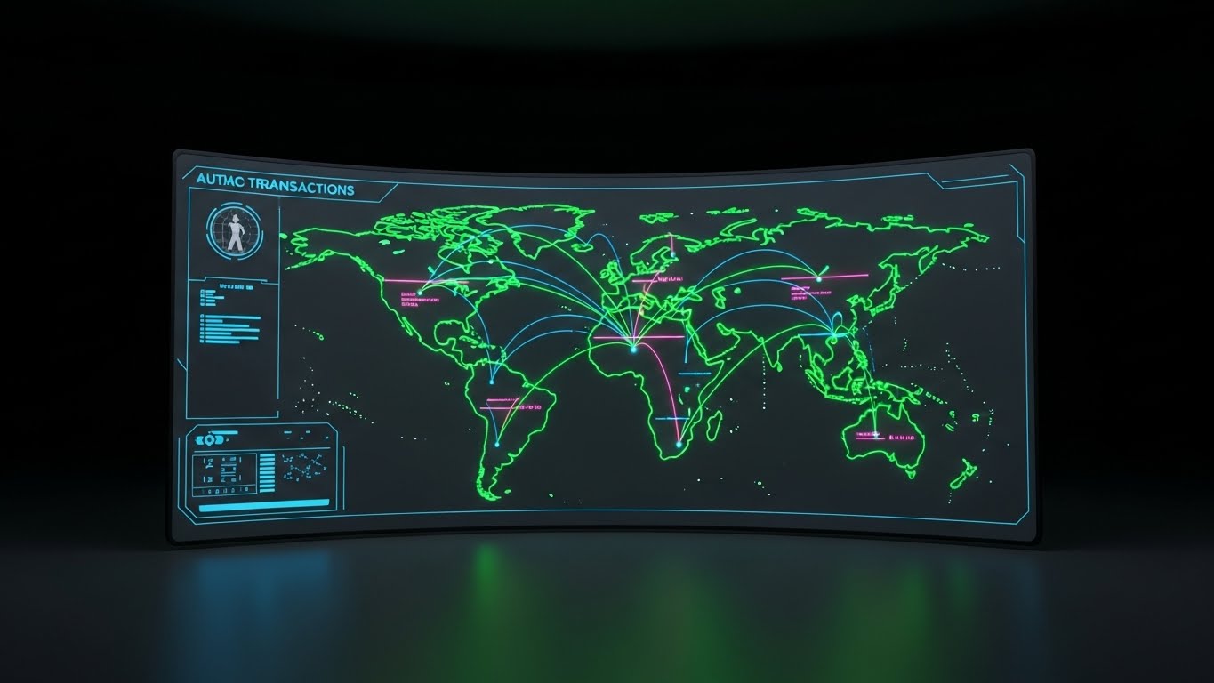
The Visual & Narrative Approach
This is the view from the bridge of the enterprise. We see a wide-angle, curved mission-control dashboard in "Dark Mode." The interface glows with a "Neon Green" and "Pink" map of the world, visualizing "Autac Transactions." Arcs of light travel between continents, representing real-time cross-border payments. The slight screen curvature and room reflections immerse the viewer in the role of the operator.
Psychological Impact & KPI Focus
- Niche Psychology: It appeals to the "Master of the Universe" fantasy. It gives the user a sense of god-like oversight and control over global operations.
- Operational Impact: It highlights "Real-Time Visibility" and global reach, essential for multi-national deployments.
- KPI: Sales Cycle Acceleration – Creating a "desire to own" the dashboard.
Strategic Implementation & Trade-offs
- Funnel Stage: BOFU (Sales Cycle Acceleration)
- Duration: 10-15 Seconds.
- Trade-off: Dark mode interfaces are sleek but can sometimes obscure details. Ensure the text elements are large and legible (high contrast).
Companies using similar video content -
ACI Worldwide – Monitors real-time payments globally.
Ripple – Facilitates global cross-border payments with blockchain.
20. The Authority Engine: Generative AI Realistic Character
BOFU | Driving Demo Requests

The Visual & Narrative Approach
Ultimately, people buy from people. This style features a high-fidelity Generative AI video of a confident man in a professional navy suit. He stands in a warm, wood-paneled executive conference room, gesturing towards a large screen (out of focus in the background) while explaining a "Strategic Oversight" dashboard. The lighting is cinematic ("ARRI Alexa" look), focusing entirely on his expression of expertise and trustworthiness as he explains the strategic value of the data.
Psychological Impact & KPI Focus
- Niche Psychology: In high-stakes B2B finance, the "Consultative Partner" is as important as the software. This style personifies the brand as an expert advisor.
- Operational Impact: It bridges the gap between the software (the screen in the background) and the business strategy (the human in the foreground).
- KPI: Driving Demo Requests – Encouraging the viewer to initiate a conversation with a human sales rep.
Strategic Implementation & Trade-offs
- Funnel Stage: BOFU (Driving Demo Requests)
- Duration: 15-30 Seconds.
- Trade-off: Generative AI characters can hit the "Uncanny Valley" if not executed perfectly. The lip-sync and micro-expressions must be flawless to maintain trust; otherwise, it risks looking cheap.
Companies using similar video content -
Moody's Analytics – Provides financial intelligence and expert insights.
Refinitiv – LSEG Refinitiv – Delivers financial data and strategic insights.
21. The Synchronization Engine: Hyper-lapse Stock Footage
BOFU | Objection Handling
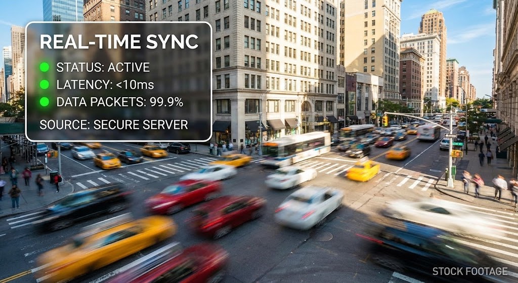
The Visual & Narrative Approach
This style juxtaposes the chaotic speed of the physical world with the calm stability of digital infrastructure. We see a fast-moving time-lapse of a bright, sun-drenched city street (Manhattan or London). Cars and pedestrians blur into streams of light and motion, representing the unpredictable "Real-World Economy." Superimposed over this frenetic background is a rock-steady, crisp white data panel. Inside the panel, "Real-time Sync" metrics update calmly with green indicators, unaffected by the speed of the background.
Psychological Impact & KPI Focus
- Niche Psychology: Financial markets are volatile, and data streams can be noisy. This visual metaphor reassures the viewer that while the market moves fast, the platform remains a constant, unwavering source of truth.
- Operational Impact: It visualizes "Low Latency" and "High Availability" without needing complex charts.
- KPI: Objection Handling – Proving stability in high-volatility environments.
Strategic Implementation & Trade-offs
- Funnel Stage: BOFU (Objection Handling)
- Duration: 6-10 Seconds.
- Trade-off: The stock footage must be of cinematic quality. If the footage looks cheap or generic, it undermines the "Premium" feel of the data overlay.
Companies using similar video content -
MX – Provides real-time financial data connectivity and insights.
Yodlee – Envestnet Yodlee – Aggregates financial data in real-time.
22. The Acceleration Engine: Rapid UI Feature Montage
Onboard | Accelerating Time-to-Value
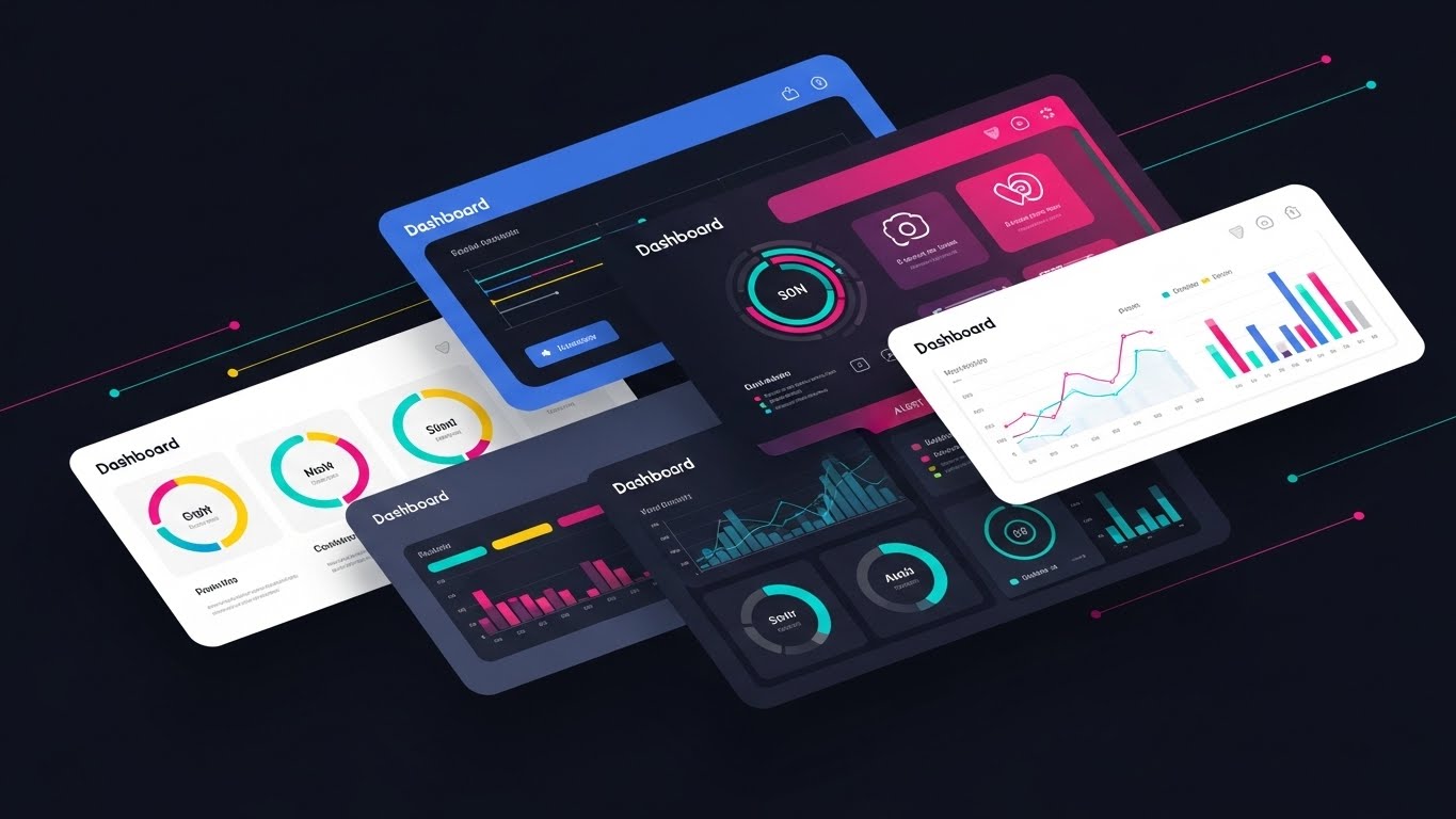
The Visual & Narrative Approach
A dynamic, high-energy composition suggests a fast-paced sequence of UI screens. Layers of software interfaces in "Bright White," "UI Blue," and "Alert Red" cascade diagonally across the screen like a deck of cards being fanned out. The focus is on the diversity of widgets and the clarity of the "Dashboard." Motion lines suggest the screens are sliding into place rapidly, visualizing quick setup and the immediate availability of a comprehensive toolset.
Psychological Impact & KPI Focus
- Niche Psychology: Buyers often fear "Empty Shell" platforms that require months of configuration. This style overwhelms that fear with an abundance of ready-to-use features.
- Operational Impact: It visually demonstrates "Time-to-Value," showing that the ecosystem is rich and pre-populated.
- KPI: Accelerating Time-to-Value – convincing new users to start configuration immediately.
Strategic Implementation & Trade-offs
- Funnel Stage: Onboarding (Accelerating Time-to-Value)
- Duration: 10-15 Seconds.
- Trade-off: The pace is fast. It creates an impression of "Feature Density" but does not allow the viewer to read specific data points.
Companies using similar video content -
Domo – Delivers business intelligence apps rapidly.
Alteryx – Accelerates data science and analytics workflows.
23. The Developer Engine: Dark Mode UI Showcase
Onboard | Reducing Implementation Friction

The Visual & Narrative Approach
We enter the sanctuary of the engineer. A sleek, angled perspective focuses on a developer's terminal screen in "Dark Mode." The background is Deep Charcoal, making the pastel syntax colors of specific "SDK Integration" code snippets pop neon-bright. In the foreground, slightly out of focus, is the edge of a desk with a coffee cup, grounding the tech in a real-world use case. The lighting is moody and focused, highlighting the clean typography and elegant code structure.
Psychological Impact & KPI Focus
- Niche Psychology: Developers are the gatekeepers of implementation. They distrust marketing fluff. This style speaks their language (Code) and respects their preferred environment (Dark Mode).
- Operational Impact: It signals that the platform is "Developer First," with clean documentation and easy-to-implement SDKs.
- KPI: Reducing Implementation Friction – Encouraging technical sign-off.
Strategic Implementation & Trade-offs
- Funnel Stage: Onboarding (Reducing Implementation Friction)
- Duration: 15-20 Seconds.
- Trade-off: It excludes non-technical viewers. This asset should be deployed specifically in developer documentation or technical API overview emails.
Companies using similar video content -
Postman – Develops and tests APIs for developers.
Unit – Offers banking-as-a-service APIs for builders.
24. The Integration Engine: 2D Animation & UI Composition
Onboard | Self-Serve Onboarding
The Visual & Narrative Approach
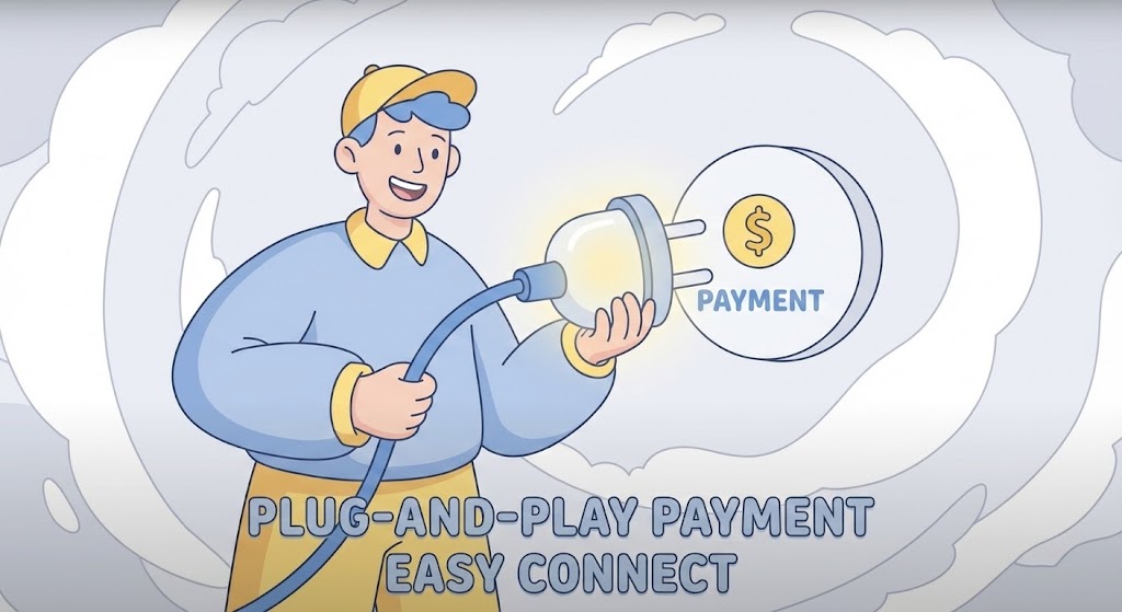
A stylized, cel-shaded character in "Soft Blue" and "Yellow" tones stands next to a floating, oversized wall plug. The character is smiling and effortlessly connecting the plug into a socket labeled with a "Payment" icon. The background is an abstract cloud pattern in White and Pale Grey. The physics are bouncy and light, emphasizing that the "API Connection" is not a heavy lift, but a simple, almost trivial action.
Psychological Impact & KPI Focus
- Niche Psychology: The "Integration Nightmare" is a common PTSD for Operations Managers. This friendly, simplified visual heals that pain point by promising a "Plug-and-Play" experience.
- Operational Impact: It lowers the psychological barrier to starting the integration process.
- KPI: Self-Serve Onboarding – Driving users to attempt integration without support.
Strategic Implementation & Trade-offs
- Funnel Stage: Onboarding (Self-Serve Onboarding)
- Duration: 10-15 Seconds.
- Trade-off: The cartoon style is disarming and friendly, but must be kept "Clean" to avoid looking childish. It works best for "How-to" clips rather than sales pitches.
Companies using similar video content -
Dwolla – Simplifies bank transfers with an intuitive API.
Salt Edge – Provides easy open banking API access.
25. The Relief Engine: 2D Character-Driven Story
Onboard | Trial/Freemium User Activation

The Visual & Narrative Approach
We focus on the human result of good software: Relief. A cozy home office scene is rendered in a textural, vector illustration style with "Warm Earth Tones." A character leans back in their chair, hands behind their head, looking satisfied. On their laptop screen, a prominent green checkmark indicates "Automated Intelligence: Running." The vibe is relaxed and stress-free, contrasting with the usual high-stress imagery of finance.
Psychological Impact & KPI Focus
- Niche Psychology: Users don't just want features; they want their weekends back. This style sells the "Lifestyle Benefit" of automation—peace of mind.
- Operational Impact: It connects "Background Processing" technical capabilities to the user's personal well-being.
- KPI: Trial/Freemium User Activation – Motivating users to turn on automation features.
Strategic Implementation & Trade-offs
- Funnel Stage: Onboarding (User Activation)
- Duration: 15-30 Seconds.
- Trade-off: It is soft on technical details. It sells the feeling of the solution, not the mechanics.
Companies using similar video content -
H2O.ai – Automates machine learning for business users.
DataRobot – Simplifies AI for business users.
26. The Compliance Engine: Macro UI Micro-Interactions
Retention | Knowledge Base

The Visual & Narrative Approach
An extreme macro 3D render focuses entirely on a single UI toggle button. The camera captures the exact moment the button slides smoothly from "Off" (Grey) to "On" (Vivid Green), alongside text indicating "Compliance Mode." The texture of the button is smooth, matte, and tactile. The lighting is clinical and focused, highlighting the ease of enabling complex regulatory features with a simple, binary choice.
Psychological Impact & KPI Focus
- Niche Psychology: Compliance is usually viewed as a complex web of laws. This visual reduces that complexity to a single, controllable switch, giving the user a sense of power over regulation.
- Operational Impact: It highlights specific "One-Click" features that save hours of manual work.
- KPI: Knowledge Base Engagement – visual aids for support articles.
Strategic Implementation & Trade-offs
- Funnel Stage: Retention (Knowledge Base)
- Duration: 3-5 Seconds (Looping).
- Trade-off: This is a micro-asset. It is not a standalone video but a powerful component for GIFs in emails or support chats.
Companies using similar video content -
ComplyAdvantage – Activates AI for financial crime compliance.
MetricStream – Manages GRC with clear, controllable features.
27. The Flow Engine: 2D Graphics Over Live Action
Retention | Reducing Churn

The Visual & Narrative Approach
A mid-shot of a professional typing on a laptop in a bustling, modern coworking space. Floating around them in 3D space are bright, neon graphical icons representing a "Frictionless Experience"—glowing checks, shields, and speed bolts. The live-action footage is natural and slightly desaturated, while the graphics are vibrant and "popped," showing the invisible "magic layer" of the software protecting and accelerating the user's real-world work.
Psychological Impact & KPI Focus
- Niche Psychology: Users want to feel "augmented." This style visualizes the software as a superpower that surrounds them in their daily environment.
- Operational Impact: It bridges the gap between the user's physical context and the software's digital benefits.
- KPI: Reducing Churn – Reminding users of the invisible value the software provides daily.
Strategic Implementation & Trade-offs
- Funnel Stage: Retention (Reducing Churn)
- Duration: 15-20 Seconds.
- Trade-off: Requires high-quality tracking. If the graphics "float" incorrectly, the illusion breaks.
Companies using similar video content -
Palo Alto Networks – Augments cybersecurity in real-time environments.
Varonis – Protects data with invisible, intelligent security layers.
28. The Purity Engine: Clean UI Workflow (Light Mode)
Retention | Proactive Support
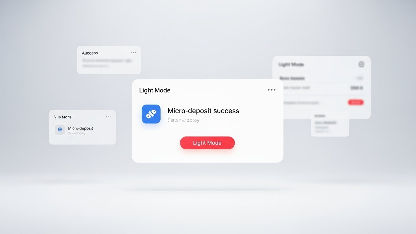
The Visual & Narrative Approach
A perfectly symmetrical, front-on view of a pristine white UI card floating in a white void. High-key lighting eliminates almost all shadows, creating a "Laboratory" feel. The UI card displays a notification for a "Micro-deposit Success" with a clean blue icon. The aesthetic is clinical, pure, and ultra-modern, focusing entirely on the clarity of the communication and the cleanliness of the interface design.
Psychological Impact & KPI Focus
- Niche Psychology: In finance, "cleanliness" equals "accuracy." This sterile, Apple-esque aesthetic communicates that the data is scrubbed, verified, and error-free.
- Operational Impact: It emphasizes the "Data Normalization" capabilities—taking messy data and presenting it beautifully.
- KPI: Proactive Support – Showing users what "Success" looks like.
Strategic Implementation & Trade-offs
- Funnel Stage: Retention (Proactive Support)
- Duration: 6-10 Seconds.
- Trade-off: It can feel sterile. It lacks human warmth, so it is best used for functional confirmation messages.
Companies using similar video content -
Mambu – Delivers clean, cloud-native core banking solutions.
Thought Machine – Provides pristine core banking solutions.
29. The Depth Engine: 3D Parallax UI Presentation
Expand | Deep Feature Adoption
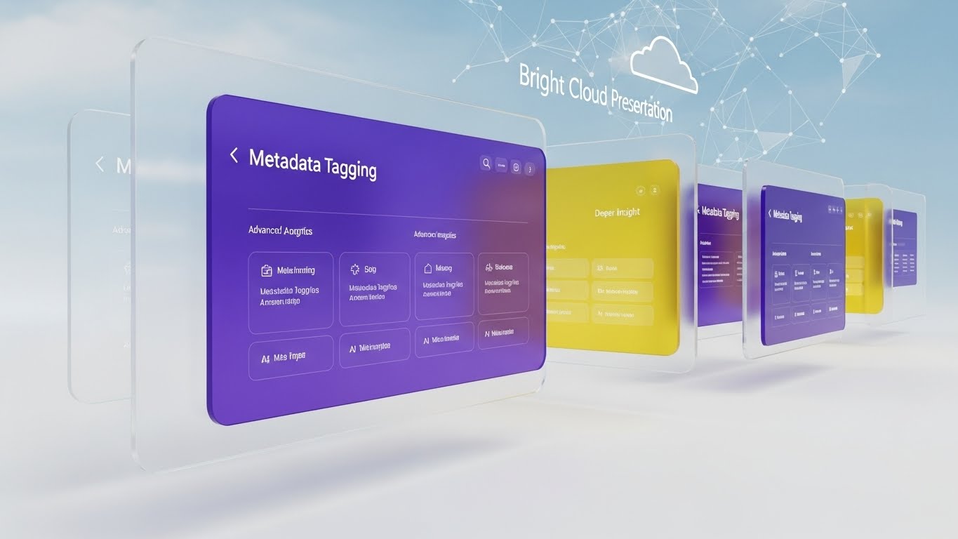
The Visual & Narrative Approach
A deep-space composition where multiple UI screens float in Z-space (depth) at different intervals. The background is a "Bright Cloud Network" in Sky Blue and White. The screens show layers of "Metadata Tagging" and advanced analytics. The camera moves forward through the screens, suggesting a journey through the data. As we pass the top layer, we see deeper, more detailed insights behind it, visualizing the depth of the platform's intelligence.
Psychological Impact & KPI Focus
- Niche Psychology: Sophisticated buyers know that summary data isn't enough; they need drill-down capabilities. This style visually proves that the platform has "depth" and isn't just a surface-level dashboard.
- Operational Impact: It visualizes "Data Enrichment" and the layering of metadata.
- KPI: Deep Feature Adoption – Encouraging users to explore advanced analytics.
Strategic Implementation & Trade-offs
- Funnel Stage: Expansion (Deep Feature Adoption)
- Duration: 15-20 Seconds.
- Trade-off: Complex to design. The hierarchy of information must be clear, or it becomes visual noise.
Companies using similar video content -
SAS – Offers deep analytics and business intelligence.
Quantexa – Provides contextual decision intelligence for deep insights.
30. The Expansion Engine: Holographic UI over 3D Render
Expand | Driving Upsell

The Visual & Narrative Approach
A high-tech laboratory pedestal holds a rotating 3D wireframe globe. Hovering over the globe is a curved, transparent Holographic Blue UI panel displaying connection lines that arc across continents, symbolizing "Global Reach." The lighting is moody but bright (High-Key Sci-Fi), emphasizing the futuristic and expansive capabilities of the platform. It suggests that the user has the world at their fingertips.
Psychological Impact & KPI Focus
- Niche Psychology: This appeals to the "Empire Builder" persona. It validates the ambition of the client to expand globally and dominate their market.
- Operational Impact: It visualizes "Cross-Border" capabilities and multi-jurisdictional compliance.
- KPI: Driving Upsell – Selling the vision of global expansion to existing clients.
Strategic Implementation & Trade-offs
- Funnel Stage: Expansion (Driving Upsell)
- Duration: 10-15 Seconds.
- Trade-off: Highly aspirational. It is less about specific features and more about the "Future State" of the client's business.
Strategic Knowledge Base: The Visual Operations Doctrine
To transform these 30 visual styles from "marketing assets" into a cohesive "Visual Operating System" for financial data platforms, we must implement a strategic framework. This section synthesizes the visual analysis into actionable business intelligence, designed for decision-makers who view design as a function of capital efficiency.
Strategic Alignment & Visual Architecture
The "Pre-Production" Strategy – Defining the Why and Who.
Before a single pixel is rendered, the visual architecture must be aligned with the cognitive reality of the user. In the complex domain of financial SaaS, reducing Cognitive Load is the primary directive.
- The Cognitive Load Audit: We must assess the current "training tax"—the time and mental energy required for a new user to understand the platform. The goal of the visual strategy is to lower this tax. By replacing dense text documentation with Style 3 (Geometric Logic) or Style 14 (Isometric Factory), we bypass the language center of the brain and utilize faster visual processing pathways.
- Role-Based Visual Mapping: Different stakeholders process information differently. A CTO requires the structural clarity of Style 11 (Photorealistic Hardware) to trust the infrastructure, while a CFO responds to the outcome-oriented Style 17 (Low-Poly Growth). The "Visual Operating System" must segment assets: "Drivers" (End Users) receive simple, linear visuals (Style 24), while "Fleet Managers" (Admins) receive data-dense, comprehensive visuals (Style 19).
- The "Glanceability" Standard: In high-stakes finance, users do not have time to study interface videos. We must design for "Glanceability"—the ability to comprehend the message in under 3 seconds. This informs the high contrast of Style 4 (Kinetic Typography) and the binary clarity of Style 26 (Micro-Interactions).
- Brand Voice Consistency: Your "Marketing" voice (Style 1 - Cinematic) and your "Product" voice (Style 28 - Clean UI) must share a color palette and typographic hierarchy. Disconnects here cause trust erosion.
- The Advids Strategic Audit: Developing this architecture is not a creative exercise; it is a strategic one. This is where partnering with specialized teams like Advids becomes critical. We help define the "Visual Vocabulary" of the platform—ensuring that a "Data Packet" looks identical in a sales video, a training GIF, and the actual product UI—creating a seamless user journey.
- Standardization vs. Customization: For core infrastructure (APIs, Security), use standardized, high-fidelity 3D renders (Style 11). For customer-specific case studies, switch to adaptable 2D styles (Style 2) that can be quickly recolored for specific client branding.
- The Cross-Departmental Bridge: Use video to unify terminology. A Wireframe to Reality (Style 12) video helps Sales explain "Data Enrichment" to a lead using the exact same visual metaphor that Customer Success uses during onboarding, preventing expectation gaps.
- Legacy System Integration: Visualizing the invisible link between "Mainframe" and "Cloud" is critical. Use Generative AI Cinematic (Style 1) to visually bridge the gap between the "Concrete" (Legacy Banks) and the "Crystalline" (Cloud SaaS), validating the hybrid nature of modern finance.
- Accessibility in Finance: Financial tools must be inclusive. Ensure that Kinetic (Style 4) and Rapid UI (Style 22) styles adhere to WCAG standards for flashing content, and ensure color contrast in Data Viz (Style 10) accommodates color-blind users (avoiding Red/Green reliance for critical data).
- The Mobile-First Mandate: Even institutional finance is moving to mobile for approvals. Adapt Style 26 (Macro Toggle) and Style 9 (Lifestyle UI) specifically for vertical (9:16) formats to show how the C-Suite can approve multi-million dollar transfers from a phone.
Operational Adoption & Implementation
The "Deployment" Phase – Embedding Visuals into Workflow.
The best visual assets fail if they are not deployed at the point of friction. The strategy shifts from "Broadcast" (Marketing) to "Contextual Support" (Operations).
- Overcoming "Black Box" Anxiety: Financial clients fear what they can't see (AI models). Use Transparency Styles (Style 18 X-Ray) to visually open the "Black Box," showing the internal gears of the algorithm. This builds trust without revealing IP.
- The Micro-Learning Shift: Replace 50-page PDF integration guides with "Video API Docs." Embed 6-second loops (Style 26) directly into the code documentation to show exactly where to find the API Key or how to toggle the Sandbox environment.
- Just-in-Time Support: Integrate Clean UI (Style 28) clips into the helpdesk chatbot. When a user asks "How do I reverse a transaction?", the bot should serve a 10-second visual guide, not a text article.
- Gamification of Training: For internal teams, use Isometric Workflow (Style 16) to gamify the learning of new compliance protocols. Visualizing the workflow as a "level" to be beaten increases engagement and retention of dry regulatory material.
- Reducing Support Ticket Volume: There is a direct correlation between the quality of onboarding visuals and support costs. A Rapid UI Montage (Style 22) that clearly shows the "Setup Wizard" can reduce "How do I start?" tickets by significant margins.
- Remote Onboarding: In a distributed workforce, you cannot rely on in-person seminars. Use Generative AI Characters (Style 20) to deliver "Personalized" welcome messages from the CEO at scale, making remote implementation feel high-touch and human without using expensive account manager time.
- Standard Operating Procedures (SOPs): Transform rigid text-based SOPs for "Month-End Close" into 2D Line Art (Style 6) flows. Visualizing the "Money Flow" makes it easier for junior analysts to spot anomalies and adhere to compliance protocols.
- Feedback Loops: Use interactive video elements. After a Feature Reveal (Style 29) video plays inside the app, a simple "Thumbs Up/Down" overlay can gather instant feedback on the new feature's perceived value.
- Scalable Localization: Global finance requires global assets. Abstract styles like Abstract 2D Organic (Style 2) and 3D Motion (Style 3) are language-agnostic. They allow you to scale into EMEA and APAC markets by simply swapping the voiceover/text, without reshooting the video.
- Leadership Communication: When pivoting strategy, slide decks fail. Use Holographic Vision (Style 30) videos in Board Meetings to visualize the "Future State" of the company. It turns a theoretical roadmap into a tangible destination.
Measuring Impact & Future-Proofing
The "ROI" Phase – Measuring success and looking ahead.
Visual strategy is an investment class. It requires measurement, attribution, and a plan for appreciation.
- Beyond "Views" to "Competency": Vanity metrics like "Video Views" are irrelevant in B2B. The true KPIs are Time-to-Competency (how fast a new user performs a transaction) and Feature Adoption Rate. If Style 29 (Parallax Insight) is deployed on the analytics page, we should measure the subsequent increase in analytics usage.
- The "Idle Time" Metric: Inefficient software navigation burns capital. We correlate the deployment of clear Style 15 (Minimalist Vector) guides with a reduction in user "Idle Time" (time spent confused on a screen).
- Compliance Velocity: When regulations change, how fast can the fleet adapt? Video allows for rapid dissemination of new protocols. Using Style 18 (X-Ray Security) to explain a new encryption standard is 10x faster than a memo, ensuring the organization remains compliant in real-time.
- Retention and Churn (LTV): High-quality UX visualization is a retention tool. Users who engage with Feature Discovery (Style 29) videos typically have higher Net Revenue Retention (NRR). Track this cohort.
- The AI Visual Frontier: We are preparing for a future where visuals are generated in real-time. Style 7 (AI Particles) and Style 20 (Generative Characters) are the beachhead for this shift. By experimenting with these styles now, the organization prepares its data structures and brand guidelines for the age of generative video.
- Scalability of Assets: As the product evolves, the visuals cannot become obsolete. The Advids Partnership model focuses on creating "Living Assets"—template-based project files that can be quickly updated when the UI changes, preventing the "Visual Debt" of outdated training materials.
- The Long Game - Advids: Scale requires a partner, not a vendor. Advids acts as the custodian of your Visual Component Library, ensuring that as your software evolves (v1.0 to v2.0), your visual assets evolve seamlessly without needing a "Rip and Replace" strategy.
- Benchmarking Success: "Good enough" visuals are a competitive risk in Fintech. If your video looks cheap, clients assume your security is cheap. Regularly benchmark your Trust Engines (Styles 1, 7, 11) against Tier-1 banks, not just other SaaS startups.
- The ROI of Safety: In finance, "Safety" means data security. Quantify the reduction in "Phishing Incidents" or "Data Breaches" following internal security training using X-Ray Visuals (Style 18).
- Final Call to Innovation: Do not view these 30 styles as a menu to pick from once. View them as the vocabulary of a new language. The companies that dominate the next decade of finance will not just process data better; they will visualize it better. Treat your video strategy as critical infrastructure, and the ROI will follow.
Companies using similar video content -
Mastercard Send – Enables global real-time payments and expansion.
FIS – Fidelity National Information Services – Powers global financial services and growth.
Author & Editor Bio


