
 /home/wwwroot/advids.co/design/index.php on line 425
Introduction: Visualizing the Currency of Trust
The financial intelligence landscape is undergoing a tectonic shift. We are no longer just processing transactions; we are interpreting the nervous system of the global economy. For the modern CFO, the mandate has evolved from retrospective reporting to real-time, predictive strategy. However, as the complexity of data grows, so does the "Cognitive Gap" between the algorithm and the decision-maker.
The market opportunity is immense. The global financial analytics sector is predicted to surpass around USD 27.51 billion by 2034. Yet, a significant "Physical/Digital Divide" remains. Recent industry data reveals that only 1% of CFOs have automated over three-quarters of their financial processes. This staggering statistic highlights a massive opportunity: the vast majority of the market is still stuck in a hybrid limbo of paper receipts, legacy spreadsheets, and disconnected tools.
For SaaS platforms, the challenge is not just technical; it is communicative. How do you sell invisible logic to a risk-averse buyer? The answer lies in Strategic Visualization. You must use specific visual languages to lower cognitive load, bridge the physical/digital divide, and prove—visually—that your platform turns chaos into clarity.
This guide provides a strategic visual vocabulary for Financial Intelligence. It moves beyond "making it look pretty" to "making it understandable." From the clarity of minimalist vectors to the hyper-real precision of UI interactions, these styles are your blueprint for building institutional trust and closing the gap between data and decision.
8. Abstract 2D Motion Graphics
MOFU | Product/Solution Differentiation

1. The Visual & Narrative Approach
Visualization Scenario:
The screen begins filled with a chaotic cloud of floating geometric shapes (circles, triangles, cubes) in slate grey and metallic silver, representing unstructured data (receipts, random invoices). Suddenly, a wave of "logic" sweeps across the screen. The shapes are magnetically pulled to the right, snapping into a rigid, organized 4x4 grid. As they lock into place, they transform into vivid orange indicators. The movement is rhythmic and satisfying, visualizing the transformation of financial mess into an organized ledger.
Narration Tone:
Educational and rhythmic. "Entropy is the enemy of equity. Watch chaos become clarity."
2. Psychological Impact & KPI Focus
- The "Tetris Effect": Humans derive dopamine from seeing chaos organized. This style leverages that satisfaction to promise the user that your software will tame their messy reality.
- Focus Management: The neutral grey background ensures that the viewer’s eye is forced to follow the orange "active" elements, guiding them through the educational narrative without distraction.
3. Strategic Implementation & Trade-offs
- Best For: Explainer videos on your homepage that need to simplify complex algorithms into easy-to-understand visual metaphors.
- Trade-off: It can feel too "playful" if the motion is too bouncy. The physics must feel weighted and precise to maintain B2B authority.
- Duration: 30-60 seconds (Explainer length).
Companies using similar video content -
Adeptia Automate – Automate – Efficiently connect, map, validate financial data.
Mammoth Analytics – Platform – Automates financial data integration across systems.
FIS – Accounting Data as a Service API – Provides normalized and analyzed financial data.
4. Bold Kinetic Typography (Visual)
TOFU | LinkedIn Organic

1. The Visual & Narrative Approach
Visualization Scenario:
Words don't just appear; they land. Heavy, 3D-extruded letters slam into the frame with palpable weight, assembling to form phrases like "AUDIT READY" or "ZERO LATENCY." The palette of Royal Purple and Gold conveys a sense of premium authority. Floating geometric particles orbit the text, suggesting that the words are built from data itself. The camera moves dynamically, flying through the gaps in the letters, making the viewer feel part of the message.
Narration Tone:
Punchy, energetic, and disruptive. No voiceover is needed; the visual rhythm drives the impact.
2. Psychological Impact & KPI Focus
- Thumb-Stopping Power: On LinkedIn, sound is often off. Kinetic typography allows the message to be "heard" visually through the speed and impact of the text animation.
- Authority Bias: Large, heavy fonts imply a large, stable company. It subconsciously reassures the risk-averse buyer that this is an enterprise-grade solution.
3. Strategic Implementation & Trade-offs
- Best For: Hype reels, event announcements, or major feature launches where the goal is brand awareness rather than detailed education.
- Trade-off: Zero educational depth. It builds excitement, not understanding.
- Duration: 15-30 seconds (Social optimized).
Companies using similar video content -
Anaplan – Platform – Hyperblock technology for what-if scenarios.
Finmark – Platform – Scenario planning, runway and burn rate metrics.
Workday Adaptive Planning – Adaptive Planning – AI-driven budgeting, forecasting, scenario modeling.
1. Abstract 3D AI Visualization
TOFU | Brand Awareness

1. The Visual & Narrative Approach
Visualization Scenario:
We dive into the "brain" of the platform. Against a deep, clean background, a complex network of silver nodes is connected by pulsing filaments of electric blue light. The camera uses a shallow depth of field to focus on a single node as it "fires," sending a signal down the chain. This is not a literal representation of code, but a visual metaphor for the Neural Network processing millions of transactions instantly. It looks futuristic, clean, and incredibly powerful.
Narration Tone:
Futuristic, sophisticated, and quiet. "Beyond calculation. True cognition."
2. Psychological Impact & KPI Focus
- The "Black Box" Solution: AI is abstract and scary to some financiers. Visualizing it as a clean, organized network of light makes the technology feel accessible, benevolent, and controlled.
- Trust through Fidelity: The high-end 3D rendering signals significant R&D investment, implying that the underlying technology is equally robust.
3. Strategic Implementation & Trade-offs
- Best For: "Platform Overview" pages or background video headers to establish a high-tech brand image.
- Trade-off: Expensive to produce. If done cheaply, it looks like generic stock footage.
- Duration: Loops or short 10-second transitions.
Companies using similar video content -
SAP S/4HANA Finance – S/4HANA Finance – Enterprise-centric solution emphasizing process efficiency.
Microsoft Dynamics 365 Finance – Dynamics 365 Finance – ERP for advanced financial management.
Oracle NetSuite – NetSuite ERP – Cloud ERP for comprehensive financial management.
9. Low-Poly 3D Modeling
MOFU | Feature Education & Demonstration

1. The Visual & Narrative Approach
Visualization Scenario:
The scene is a stylized, isometric view of a large corporate office floor, rendered in matte grey "Low-Poly" 3D. It’s uniform and monochromatic—except for one specific cubicle/desk which is highlighted in a vibrant, urgent Red. The lighting is soft and diffuse. This visual isolates the "target," representing the Account-Based Marketing (ABM) approach: ignoring the noise of the general market (the grey desks) to focus entirely on the specific needs of the high-value account (the red desk).
Narration Tone:
Playful yet professional. "We ignore the noise. We focus on the signal."
2. Psychological Impact & KPI Focus
- Selective Attention: The stark colour contrast forces the viewer to focus exactly where you want them. It is a visual cue for "We are talking specifically to YOU."
- Approachability: Low-poly art is inherently less intimidating than photorealism. It suggests that the problem (finding the right account) is simple and solvable.
3. Strategic Implementation & Trade-offs
- Best For: Personalized display ads or landing pages targeting specific roles (e.g., "Hey CFOs...").
- Trade-off: Can feel "cartoony" if not lit professionally. The lighting must remain soft and premium.
- Duration: Static images or subtle 3-5 second loops.
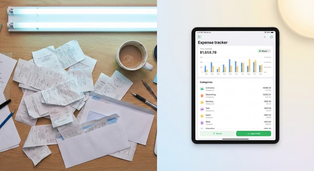
Style 27: Split Screen: Optimized Reality and UI
Funnel Stage: MOFU | Goal: 1.7 Product/Solution Differentiation | Model: FLOW
1. The Visual & Narrative Approach
Visualization Scenario:
A classic "Before and After" presented simultaneously. The left half shows a photorealistic, top-down view of a cluttered desk with messy stacks of paper receipts, lit by harsh fluorescent light (Pastel Blue tones). The right half shows a pristine, high-fidelity UI on a tablet displaying a clean expense dashboard, lit by soft, warm light (Pastel Yellow and White). The contrast highlights the shift from chaos to organized efficiency.
Narration Tone:
Empathetic and comparative. "The headache of yesterday. The harmony of today."
2. Psychological Impact & KPI Focus
- Loss Aversion vs. Gain: It triggers the pain of the current manual process (clutter/stress) and immediately offers the dopamine hit of the solution (cleanliness/order).
- Tangibility: It bridges the physical world (receipts) with the digital solution, validating the "Physical/Digital Divide" challenge.
3. Strategic Implementation & Trade-offs
- Best For: Instagram/LinkedIn ads where you need to communicate the value proposition instantly without audio.
- Trade-off: Requires high-quality live-action filming for the left side to match the fidelity of the UI on the right.
- Duration: 15-20 seconds.
Companies using similar video content -
Spotlight Reporting – Platform – High-level dashboards, KPI reporting, custom reports.
Jirav – Platform – Budgeting, forecasting, reporting, custom dashboards.
Domo – Business Intelligence – Intuitive dashboards and robust integration capabilities.
7. Macro UI Micro-Interactions
TOFU | ABM Awareness

1. The Visual & Narrative Approach
Visualization Scenario:
The camera pushes in to an extreme macro close-up of the User Interface. We see the pixel texture of a button labeled "Generate Insight." The rendering is hyper-detailed, showing the pixel grid and vector edges with 4K clarity. The palette uses deep indigo, violet, and bright cyan accents. Ring lighting creates a circular reflection on the virtual glass surface. The image conveys precision and the granular power of the software.
Narration Tone:
Technical and precise. "One click. A billion calculations."
2. Psychological Impact & KPI Focus
- Perceived Quality: If the button looks this good, the code behind it must be solid. It appeals to the buyer's need for precision and attention to detail.
- Anticipation: The "hover" state builds micro-tension, and the "click" releases it, subconsciously satisfying the user's desire for action.
3. Strategic Implementation & Trade-offs
- Best For: Product tour videos where you want to highlight specific "Magic Moments" in the software workflow.
- Trade-off: Requires rebuilding UI elements in a motion graphics engine (like After Effects) rather than just screen recording, which is time-intensive.
- Duration: 3-5 seconds per interaction.
Style 26: Wireframe to Reality Transition
Funnel Stage: MOFU | Goal: 1.13 Competitive Displacement | Model: WHISK

1. The Visual & Narrative Approach
Visualization Scenario:
The image is split diagonally. The lower left shows a wireframe blue-print structure of a financial system in navy blue and steel grey. A sweeping transition effect wipes across to the upper right, revealing the final, photorealistic rendered platform in bright yellow and polished metal. The visual demonstrates the upgrade from a basic legacy framework to a fully realized, modern solution.
Narration Tone:
Transformational and definitive. "Don't just plan for efficiency. Engineer it."
2. Psychological Impact & KPI Focus
- Evolutionary Narrative: It tells the story of an upgrade without using words. It validates the foundational work (the wireframe) while selling the future benefit (the render).
- Competence: It shows that the flashy UI is built on a solid, engineered structure, appealing to the technical skepticism of IT stakeholders.
3. Strategic Implementation & Trade-offs
- Best For: "How it Works" pages or implementation guides, showing that the transition from old to new is seamless and planned.
- Trade-off: Can look too technical for non-technical buyers if the wireframe is too complex.
- Duration: 10-15 seconds.
Companies using similar video content -
Acumatica Cloud ERP – Cloud ERP – Flexible cloud ERP for various industries.
Odoo – ERP and CRM – Open source, modular, cloud-based ERP.
Pimcore – Platform – 100% API-driven for digital data management.
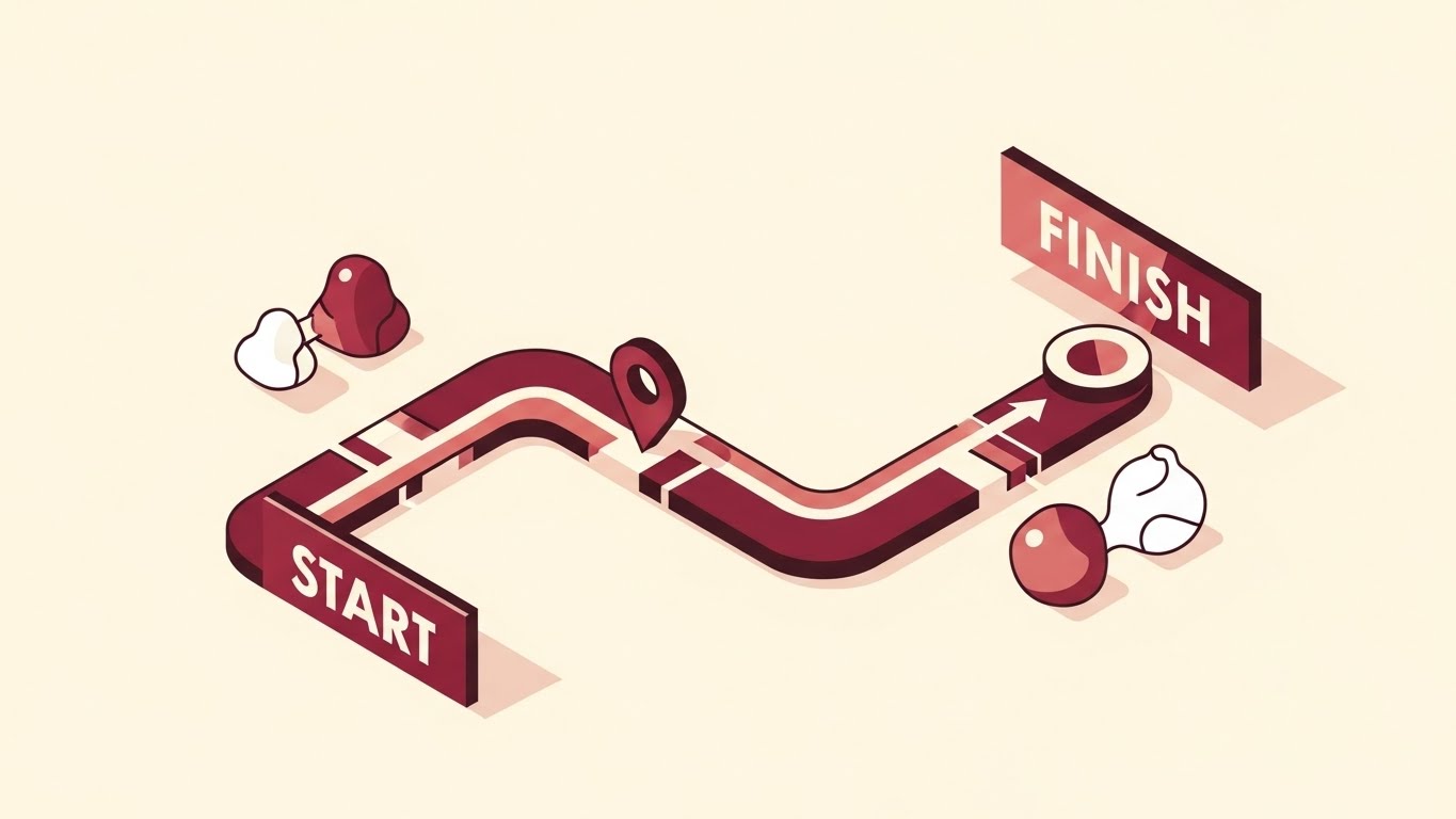
11. Isometric 2D Motion Design
MOFU | Overcoming Objections
1. The Visual & Narrative Approach
Visualization Scenario:
The visual addresses the primary anxiety of the mid-funnel buyer: implementation drag. We see an orthographic, 45-degree isometric view of a simplified process map. The background is a warm, reassuring cream. A clean path, rendered in professional Burgundy and Rose Gold, winds from a block labeled "START" to one labeled "FINISH." As the animation plays, potential obstacles are smoothed over by a sliding "Integration" indicator, clearing the way for the data marker to glide effortlessly to the finish line.
Narration Tone:
Assuring, process-oriented, and calm. "Complexity is inevitable. Complication is optional. We pave the path from day one."
2. Psychological Impact & KPI Focus
- The "Easy Button" Effect: By visualizing the implementation process as a smooth, linear journey rather than a tangled knot, you reduce the perceived effort cost. It signals that your team handles the heavy lifting of data migration.
- Time-to-Value: The visual compression of the timeline (Start to Finish) subconsciously accelerates the viewer's expectation of ROI, directly addressing concerns about long deployment cycles.
3. Strategic Implementation & Trade-offs
- Best For: Automated email sequences sent to prospects who have stalled due to "resource concerns," or the "Onboarding" section of a proposal deck.
- Trade-off: This style is highly stylized. It simplifies the reality of integration, so it must be backed up by technical documentation to satisfy the IT buyer.
- Duration: 45-60 seconds.
Companies using similar video content -
Vena Solutions – Complete Planning Platform – Enhances functionality with native Excel.
Solution 7 – Financial Reporting for NetSuite in Excel – Agile financial reporting solutions.
Great Expectations – Data Validation – Sets and asserts specific data validation rules.
12. 2D Line Art Animation
MOFU | Establishing Thought Leadership

1. The Visual & Narrative Approach
Visualization Scenario:
In a world of fragmented markets, this style visualizes unity. A single, fluid line of light (Lime Green) draws itself across a deep Forest Green canvas. It forms the outline of a globe, then seamlessly morphs into a network of connecting arcs that link major financial capitals. The line never breaks; it flows continuously, symbolizing the unceasing nature of global capital. The camera pans smoothly, following the leading edge of the line as it connects disparate points into a unified whole.
Narration Tone:
Sophisticated, worldly, and fluid. "Capital has no borders. Neither should your intelligence."
2. Psychological Impact & KPI Focus
- Fluidity and Continuity: The unbroken line triggers a sense of stability and endless possibility. It serves as a visual metaphor for 100% uptime and seamless cross-border compliance.
- Minimalist Authority: By stripping away noise and textures, the brand appears confident. It suggests that you see the "big picture" clearly, positioning you as a strategic thought leader rather than just a vendor.
3. Strategic Implementation & Trade-offs
- Best For: LinkedIn thought leadership posts discussing macro-economic trends or global expansion strategies.
- Trade-off: It is abstract. It does not show the product, so it relies entirely on the strength of the accompanying message or voiceover to drive value.
- Duration: 15-30 seconds (Loopable).
Companies using similar video content -
Board – Enterprise Planning Platform – Unifies finance and operations with a single source of truth.
Cube – FP&A Platform – Spreadsheet-native, automated forecasting and analysis.
Planful – Platform – Continuous planning, forecasting, and budgeting.
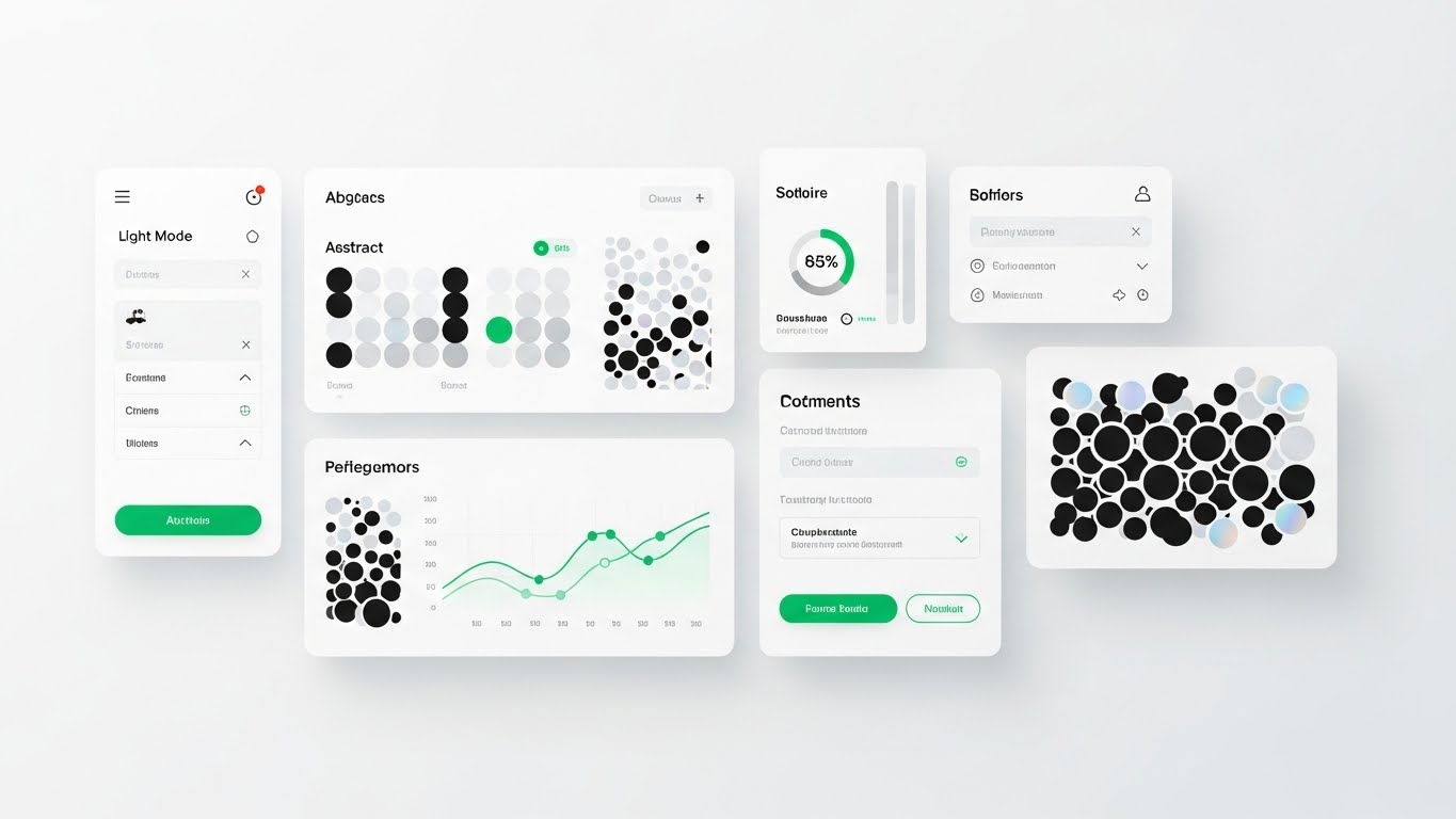
13. Clean UI Workflow (Light Mode)
MOFU | The Functional Buyer
1. The Visual & Narrative Approach
Visualization Scenario:
We shift from the abstract to the tangible tool. This is a "Flat Lay" composition of the actual software interface in Light Mode. The background is a sterile, clean white. The UI cards float with subtle drop shadows, displaying "Material Design" aesthetics. We see specific, recognizable functional elements: a "Light Mode" toggle, clear bar charts populated with abstract data patterns, and green status indicators. The lighting is soft and diffuse, eliminating harsh contrasts to prevent eye strain.
Narration Tone:
Practical, crisp, and helpful. "Designed for the desk. Built for the day. Clarity at every click."
2. Psychological Impact & KPI Focus
- Cognitive Ease: The "Light Mode" aesthetic mimics the familiar environment of modern productivity apps. This familiarity reduces the anxiety of learning a new tool.
- Usability Validation: For the functional buyer (the daily user), this style proves that the software is not a clunky legacy ERP system but a modern, breathable workspace. It promises a friction-free workday.
3. Strategic Implementation & Trade-offs
- Best For: "Features" pages on your website or mid-funnel product webinars targeting the end-users who will live in the platform.
- Trade-off: It lacks "drama." It won't excite a CEO, but it will reassure the Finance Manager.
- Duration: 30-60 seconds.
Companies using similar video content -
DealCheck – Mobile-First Analysis – Mobile-first real estate investment analysis.
Property Evaluator – Proforma Powerhouse – Deep cash-flow modeling for real estate.
HouseCanary – Market Intelligence Engine – Enterprise market intelligence for real estate.
14. Dynamic Data Visualization
MOFU | Website Visitor Re-engagement

1. The Visual & Narrative Approach
Visualization Scenario:
Data is beautiful when it is winning. This visual features a set of 3D bar charts rising like skyscrapers from a clean white floor. The bars are rendered in a translucent "glassy" texture, tinted with a vibrant sunset gradient (shifting from warm orange at the base to royal purple at the peak). As the camera tilts upward, a lens flare catches the edge of the highest bar. This isn't just data; it is a celebration of growth.
Narration Tone:
Celebratory, upward, and energetic. "Don't just measure performance. Visualise potential."
2. Psychological Impact & KPI Focus
- The "Up and to the Right" Bias: The bottom-up perspective makes the growth look monumental. It triggers the viewer's desire for success and progress.
- Visual Reward: The vibrant colours and glossy textures provide a "sugar hit" for the eyes, standing out against the typically dry, grey financial charts. It is designed to recapture attention in a display ad.
3. Strategic Implementation & Trade-offs
- Best For: Retargeting (Display Ads) for visitors who viewed pricing pages but didn't convert. It visually reminds them of the growth they are missing.
- Trade-off: It is purely symbolic. The data values are abstract, so it conveys "Growth" generally, not specific metrics.
- Duration: 5-8 seconds (Looping GIF/HTML5).
Companies using similar video content -
Infor Financials & Supply Management – Financials & Supply Management – Comprehensive financial and supply chain solutions.
Plex Smart Manufacturing Platform – Smart Manufacturing Platform – ERP for manufacturing operations.
IFS Cloud – Cloud – Enterprise resource planning for various industries.
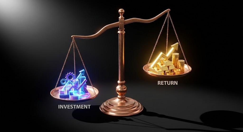
15. Photorealistic 3D Renders
BOFU | ROI Justification
1. The Visual & Narrative Approach
Visualization Scenario:
The decision often comes down to weight. Against a void-like black background, a classic weighing scale is rendered in hyper-realistic polished bronze. On the left pan, a glowing blue hologram of "Investment" (gears/tech) sits. On the right, a significantly larger, heavier stack of solid Gold Bars represents "Return." The scale tips heavily and decisively to the right. The lighting is dramatic, catching the imperfections in the gold to prove its "reality."
Narration Tone:
Serious, heavy, and definitive. "The cost is temporary. The value is weighted in gold."
2. Psychological Impact & KPI Focus
- Tangibility of Value: SaaS is intangible. By using gold bars, we use a universal signifier of wealth to give physical weight to the digital ROI.
- Loss Aversion: The scale metaphor visually proves that the "risk" of investment is far lighter than the "reward" of the outcome, helping the champion argue the case to the CFO.
3. Strategic Implementation & Trade-offs
- Best For: Slide decks for the "Closing" meeting or pricing pages where you need to justify a premium price point.
- Trade-off: Must be rendered with extreme photorealism. If the gold looks like plastic, the metaphor fails, and the value feels cheap.
- Duration: Static Image or slow 10-second cinematic pan.
Companies using similar video content -
Prophix – Prophix One – Unifies financial performance management processes.
CCH Tagetik – Intelligent Platform – Corporate performance management solutions.
IDU-Concept – IDU-Concept – Simplifies budgeting, forecasting, and reporting.
16. 3D X-Ray Visualization
BOFU | Risk Mitigation
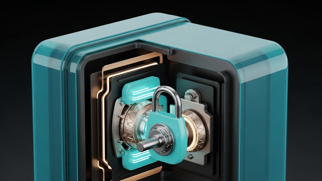
1. The Visual & Narrative Approach
Visualization Scenario:
Security is often invisible, which makes it hard to sell. This style makes it visible. We see a heavy, cubic digital vault. The outer shell is a translucent Turquoise glass. As the camera moves, we get a "cutaway" view, revealing the complex internal locking mechanisms (tumblers, gears) rendered in Aqua and Sand Gold. The internal parts glow softly, pulsing with active encryption. It shows that the security is not just a shell; it is deep, complex engineering.
Narration Tone:
Technical, reassuring, and secure. "Transparency for you. Impenetrable for them."
2. Psychological Impact & KPI Focus
- Trust through Complexity: The intricate internal mechanisms signal "We have thought of everything." It appeals to the paranoia of the Technical Buyer (CISO) by showing the depth of the defense.
- Control: The X-Ray view implies that the user has full visibility into the security protocols—there are no hidden vulnerabilities.
3. Strategic Implementation & Trade-offs
- Best For: The "Security & Compliance" pages, or as a visual aid during the Due Diligence phase of a deal.
- Trade-off: High production cost. Modeling the internal mechanics requires significant 3D design time.
- Duration: 10-15 seconds.
Companies using similar video content -
Snowplow – Behavioral Data Platform – Granular data collection and analysis.
Apache Airflow – Airflow – Automates, schedules, and monitors data pipelines.
dbt – dbt – Brings engineering principles to data transformation.
17. Generative AI Realistic Character Video
BOFU | Building Trust & Credibility

1. The Visual & Narrative Approach
Visualization Scenario:
After seeing abstract data and UI, the buyer needs to see a human face. A photorealistic, AI-generated male character (40s, professional suit) stands in a modern, glass-walled office. The background is a soft-focus city skyline in Sky Blue and Cloud White. He maintains direct eye contact with the lens, nodding slightly, conveying active listening and confidence. The lighting is "Rembrandt" style—professional and flattering.
Narration Tone:
Personal, direct, and empathetic. "We are more than code. We are your partners in precision."
2. Psychological Impact & KPI Focus
- The "Uncanny Valley" Bridge: High-quality AI characters can now bridge the gap between anonymous software and human service. This builds "Social Trust" without the logistical cost of filming a real CEO.
- Authority Figure: The attire and setting signal competence. He looks like a peer to the CFO, not a junior support agent.
3. Strategic Implementation & Trade-offs
- Best For: Welcome videos in the onboarding sequence or "About Us" sections where human connection is required to seal the trust.
- Trade-off: Voice synchronization (lip-sync) must be perfect. Any lag breaks the illusion immediately.
- Duration: 30-90 seconds (Script dependent).
Companies using similar video content -
QuickBooks – QuickBooks Online – User-friendly accounting for small businesses.
Xero – Xero – Cloud accounting for small businesses.
Zoho Books – Books – Integrated financial solution for small businesses.
18. Aspirational Stock Montage
BOFU | The Economic Buyer

1. The Visual & Narrative Approach
Visualization Scenario:
This image sells the "After" state of the Economic Buyer. We see a CFO standing at a floor-to-ceiling window in a high-rise, overlooking a sprawling metropolis at twilight. The palette is dominated by Crimson (power), White, and Silver. The camera is over-the-shoulder, focusing on the tablet in his hand showing a simple green "Growth" metric, while the city blurs in the background. It creates a link between the data in hand and the empire outside.
Narration Tone:
Visionary, powerful, and quiet. "The city sleeps. Your data doesn't. Command the view."
2. Psychological Impact & KPI Focus
- Ego & Identity: This appeals to the CFO's self-image as a strategic leader, not a number cruncher. It validates their aspiration to move from "reporting" to "steering."
- Control over Chaos: The city is vast and complex, but the figure is calm and above it all. The tablet (the platform) is the remote control for this reality.
3. Strategic Implementation & Trade-offs
- Best For: LinkedIn Image Ads targeting C-Suite job titles, or the cover image of a "Strategic Finance" whitepaper.
- Trade-off: It can feel generic if the stock photography is too common. Color grading must be branded (Crimson/Silver) to own the look.
- Duration: Static Image.
Companies using similar video content -
Microsoft Power BI – Power BI – Interactive visuals of financial data.
Tableau – Tableau – Powerful data visualization for insights.
Apache Superset – Superset – Open-source data exploration and visualization.
19. Dark Mode UI Showcase
BOFU | The Technical Buyer
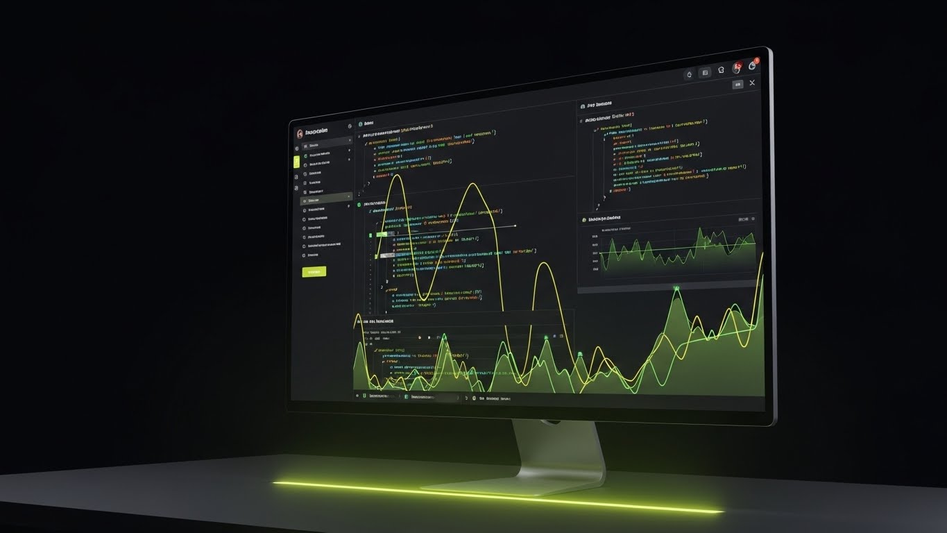
1. The Visual & Narrative Approach
Visualization Scenario:
To close the deal, you must pass the "IT Smell Test." This visual shows the platform's underbelly—the API and code environment. We see a monitor at a 30-degree angle displaying a code editor in Dark Mode. The syntax highlighting uses Olive and Sage Green against a deep charcoal background. A subtle green glow reflects on the desk surface. It looks serious, complex, and "developer-friendly."
Narration Tone:
Technical, concise, and respectful. "Clean code. Robust APIs. Built for builders."
2. Psychological Impact & KPI Focus
- Credibility with IT: Developers distrust marketing fluff. Showing raw code (even stylized) signals that you respect their craft and that the platform is extensible.
- The "Matrix" Aesthetic: Dark mode is the native environment of the engineer. It signals "high performance" and low eye strain for power users.
3. Strategic Implementation & Trade-offs
- Best For: Developer documentation pages, API integration guides, or technical due diligence packets.
- Trade-off: Alienates the non-technical user. Do not use this for the main homepage hero video.
- Duration: Static Image or slow scrolling loop.
Companies using similar video content -
Oracle Essbase – Essbase – Multidimensional analysis for business intelligence.
Oracle Fusion Cloud ERP – Fusion Cloud ERP – Flagship enterprise solution with AI automation.
Oracle Hyperion Planning – Hyperion Planning – Comprehensive financial planning.
20. Holographic UI over 3D Render
BOFU | Driving Demo Requests
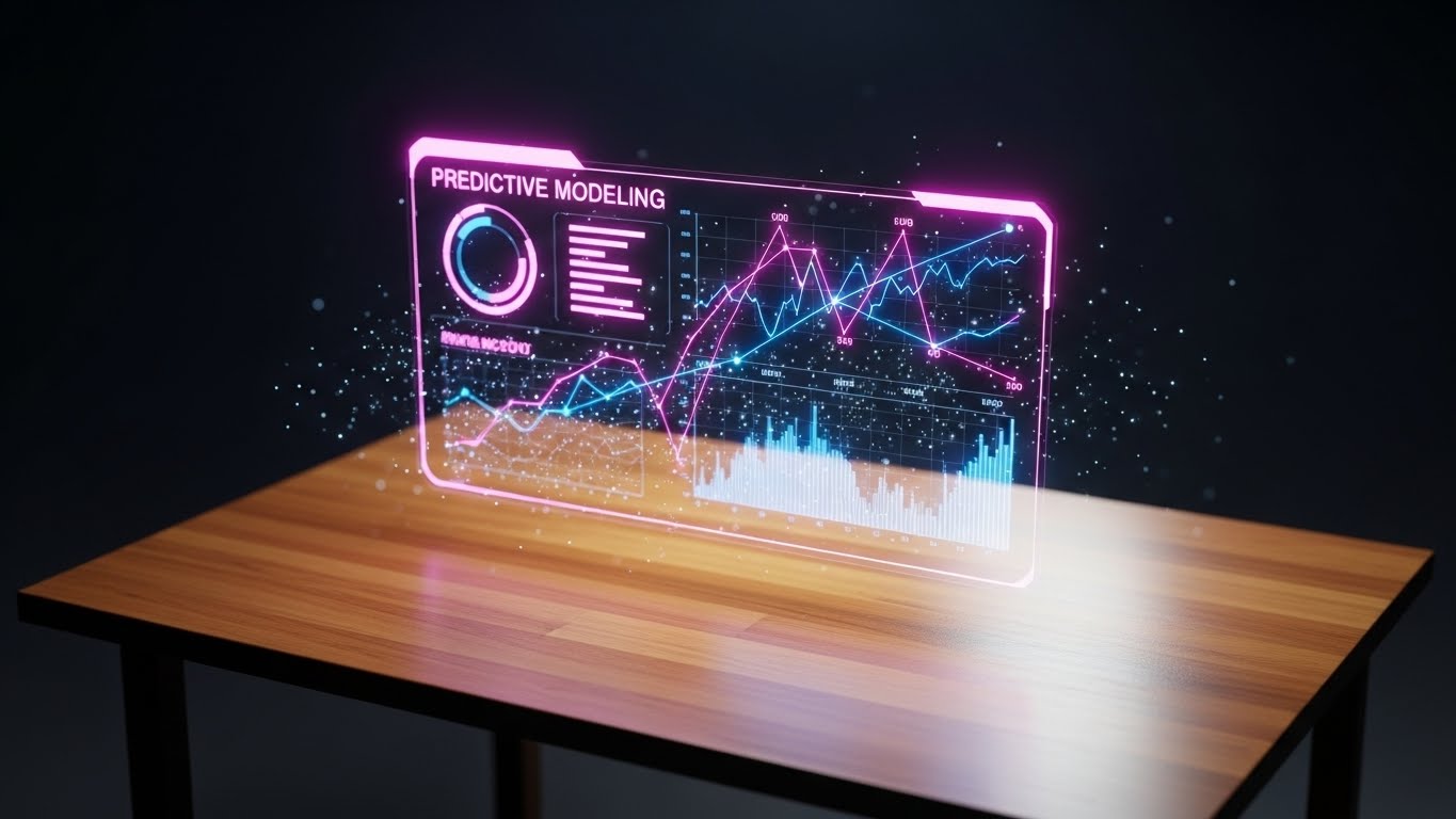
1. The Visual & Narrative Approach
Visualization Scenario:
The final bridge between the physical and digital. We see a realistic, warm wooden desk (Traditional Business). Floating slightly above it is a futuristic, glowing holographic interface displaying "Predictive Modeling" charts. The hologram glows in Magenta and Deep Blue, contrasting sharply with the warm wood tones. Small particle effects drift around the data, suggesting it is alive and processing in real-time.
Narration Tone:
Exciting, urgent, and transformative. "The future isn't coming. It's on your desk. See it now."
2. Psychological Impact & KPI Focus
- The "Magic" Factor: It creates a sense of wonder. It positions the software as cutting-edge technology that grants the user "superpowers" (predictive sight).
- Contrast: The wood/hologram contrast creates a visual vibration that grabs attention. It metaphorically says "We upgrade your current reality."
3. Strategic Implementation & Trade-offs
- Best For: "Book a Demo" CTA sections in emails. The high-tech visual acts as a hook to encourage the click.
- Trade-off: It is slightly sci-fi. Ensure the data on the hologram looks like real financial metrics, not Star Trek gibberish.
- Duration: 5-10 seconds (Loop).
Companies using similar video content -
ZenTreasury – ZenTreasury – Cloud-based IFRS 16 lease accounting and treasury.
Great Expectations – Data Validation – Sets and asserts specific data validation rules.
Hastic – Hastic – Detects anomalies in data for immediate alerts.
21. 2D Graphics Over Live Action
BOFU | Sales Cycle Acceleration

1. The Visual & Narrative Approach
Visualization Scenario:
To humanize the final push for a sale, we bridge the gap between tool and talent. The screen features high-quality, live-action footage of a sales professional in a bright, modern office, radiating confidence. Superimposed over this reality are sharp, flat vector icons in Bronze and Black—lightning bolts, ascending arrows, and gear mechanisms. These graphics don't just sit there; they orbit the person dynamically, reacting to their movements. It visualizes the concept that the software amplifies human potential rather than replacing it.
Narration Tone:
Empowering, energetic, and human-centric. "You bring the drive. We bring the engine. Accelerate your close."
2. Psychological Impact & KPI Focus
- Humanizing the Tech: Pure software videos can feel cold. By centering a human face, you trigger mirror neurons, allowing the viewer (a Sales Director) to see their team succeeding.
- Visualizing "Flow": The floating icons represent "Flow State"—the seamless integration of data and action that every salesperson strives for.
3. Strategic Implementation & Trade-offs
- Best For: "Why Us" videos in the late-stage sales cycle, specifically addressing Sales Leaders who worry about software adoption dragging down their team's speed.
- Trade-off: Requires original footage or very high-end stock to avoid the "cheesy corporate video" trap. The tracking of graphics must be flawless.
- Duration: 15-20 seconds.
Companies using similar video content -
Abacum – FP&A Platform – AI-native platform for smarter financial planning.
Microsoft Copilot – Copilot – Combines LLMs with data for mundane task alleviation.
OpenAI ChatGPT – ChatGPT – Assists in data extraction and summarizing financial reports.
22. Isometric 3D Workflow
Onboarding | Reducing Implementation Friction

1. The Visual & Narrative Approach
Visualization Scenario:
Migration is the "Bogeyman" of SaaS adoption. This style makes it look like a toy set. We utilize an isometric, "tilt-shift" camera angle looking down on a miniature server room rendered in matte Dark Teal and Mustard Yellow. Physical cables detach gently, and data packets (glowing spheres) float upward along soft, curved lines into a fluffy, organized "Cloud" structure. The animation is slow, orderly, and satisfying. It reframes a complex IT nightmare into a simple, managed transition.
Narration Tone:
Calm, methodical, and assuring. "Heavy lifting is our job. The transition is yours to enjoy."
2. Psychological Impact & KPI Focus
- The "God's Eye" View: Isometric angles give the viewer a sense of total control and oversight. It reduces the perceived size and difficulty of the migration process.
- Simplification Bias: By stripping away the grime and wires of real server rooms and replacing them with clean geometry, we subconsciously promise a clean slate.
3. Strategic Implementation & Trade-offs
- Best For: Kick-off meeting presentations or the first video in an automated "Welcome to Onboarding" email sequence.
- Trade-off: It is stylized reality. It reassures the emotional brain, but technical specs must follow immediately for the logical brain.
- Duration: 30-45 seconds.
Companies using similar video content -
Workday – Workday Platform – Unifies HR and Finance with AI at the core.
Pigment – Platform – Business planning to drive growth and adapt.
Planful – Platform – Continuous planning platform for agile forecasting.
23. 2D Character-Driven Story
Onboarding | Self-Serve Onboarding

1. The Visual & Narrative Approach
Visualization Scenario:
To prove "ease of use," we remove the office entirely. A stylized 2D vector character (Corporate Memphis style with clean curves) sits relaxed in a coffee shop, rendered in soothing Lilac and Mint. On their laptop screen, we see a simplified version of your platform's onboarding checklist ticking itself off. Steam rises from a coffee cup. The vibe is zero stress. It communicates that setting up your financial intelligence platform doesn't require a war room; it just requires a Wi-Fi connection.
Narration Tone:
Light, breezy, and encouraging. "Setup so simple, you can finish it before your coffee gets cold."
2. Psychological Impact & KPI Focus
- Stress Reduction: The pastel palette and relaxed posture of the character directly counter the high-stress association of financial implementation.
- Aspirational Freedom: It sells the modern work dream—managing millions in assets from a cafe—validating the "Self-Serve" promise.
3. Strategic Implementation & Trade-offs
- Best For: "Getting Started" guide intros or in-app welcome modals to encourage users to begin the setup wizard.
- Trade-off: If your software is actually complex to set up, this creates a false expectation. Only use this if the UX supports the promise.
- Duration: 45-60 seconds.
Companies using similar video content -
Metabase – Metabase – User-friendly business intelligence tool.
Redash – Redash – Collaborative data visualization platform.
Streamlit – Streamlit – Python library for interactive web applications.
24. Rapid UI Feature Montage
Onboarding | Accelerating Time-to-Value
1. The Visual & Narrative Approach
Visualization Scenario:
The goal is to show how much the user can achieve in seconds. We use a high-tempo montage of success states: "Report Generated," "Audit Cleared," "Sync Complete." These UI cards fly towards the camera from a central vanishing point, creating a "Tunnel Vision" effect of speed. The background is Midnight Blue, making the Electric Blue and White UI elements pop. The motion blur suggests high velocity. It’s a visual dopamine rush of productivity.
Narration Tone:
Fast, rhythmic, and punchy. "Done. Done. And done. Welcome to the speed of modern finance."
2. Psychological Impact & KPI Focus
- Perceived Velocity: By compressing multiple tasks into a short burst of visual information, we artificially accelerate the viewer's internal clock, making the software feel incredibly fast.
- Completion Bias: Seeing "Success" ticks repeatedly triggers a sense of accomplishment and motivates the user to reach that state themselves.
3. Strategic Implementation & Trade-offs
- Best For: The "What to Expect" section of the onboarding journey, psyching the user up for their first session.
- Trade-off: It can be overwhelming. Avoid strobing effects; keep the motion smooth to prevent cognitive overload.
- Duration: 10-15 seconds.
Companies using similar video content -
Kepion – FP&A Software – Cloud-based FP&A built on Microsoft technology.
MLflow – MLflow – Manages the machine learning lifecycle.
Timescale – TimescaleDB – Optimized for time-series data querying.
25. Lifestyle Stock with UI Overlay
Retention | Reducing Churn

1. The Visual & Narrative Approach
Visualization Scenario:
Retention is about habit formation. We see a high-quality photo of a person working in a cozy, relatable environment (home office or lounge). The focus is sharp on their laptop. Superimposed over the screen is a semi-transparent, sleek UI Notification in Burnt Orange and Navy: "Cash Flow Positive - Monthly Target Exceeded." The visual integrates the software into the fabric of daily life, reminding the user that your platform delivers good news, not just data.
Narration Tone:
Warm, supportive, and constant. "We watch the numbers, so you can live your life."
2. Psychological Impact & KPI Focus
- Positive Reinforcement: By associating the UI notification with a "win" (Target Exceeded), you condition the user to associate your brand with success.
- Ambient Intelligence: It reinforces the idea that the platform works in the background, providing value even when the user isn't actively logging in.
3. Strategic Implementation & Trade-offs
- Best For: Re-engagement email campaigns or login screens to remind users of the platform's passive value.
- Trade-off: The UI overlay must look like it belongs in the physical space (correct perspective/lighting), or it will look like a cheap sticker.
- Duration: Static Image or subtle cinemagraph.
Companies using similar video content -
JustPerform (insightsoftware) – JustPerform – Solutions for the Office of the CFO.
Fuelfinance – Fuelfinance – Financial analysis software for businesses.
Countly – Countly – Easy mobile, web, and desktop analytics.
26. 2D Animation & UI Composition
Retention | Knowledge Base & FAQ Videos

1. The Visual & Narrative Approach
Visualization Scenario:
Nobody wants to call support. This style visualizes self-empowerment. A friendly, Cel-Shaded character (Peach and Slate Blue) stands next to a floating, oversized UI window. With a confident smile, they point to a specific "Help" icon or "Smart Search" bar. As they point, a tool-tip expands instantly with the answer. The background is clean and white to keep the focus on the interaction. It positions the Knowledge Base not as a dusty library, but as an active, helpful assistant.
Narration Tone:
Helpful, clear, and instructive. "Answers aren't hidden. They are right here. Instant clarity, zero wait time."
2. Psychological Impact & KPI Focus
- Autonomy: Users prefer solving problems themselves. This visual validates their competence and autonomy.
- Reduction of Support Anxiety: It visually promises that the answer is one click away, reducing the frustration usually associated with troubleshooting.
3. Strategic Implementation & Trade-offs
- Best For: "How-To" video libraries, FAQ pages, or the support portal header.
- Trade-off: The character must look professional, not childish. Avoid "cartoony" exaggerated movements.
- Duration: 15-30 seconds.
Companies using similar video content -
Acumatica Cloud ERP – Cloud ERP – Flexible cloud ERP for various industries.
Odoo – ERP and CRM – Open source, modular, cloud-based ERP.
Pimcore – Platform – Digital data and customer experience management.
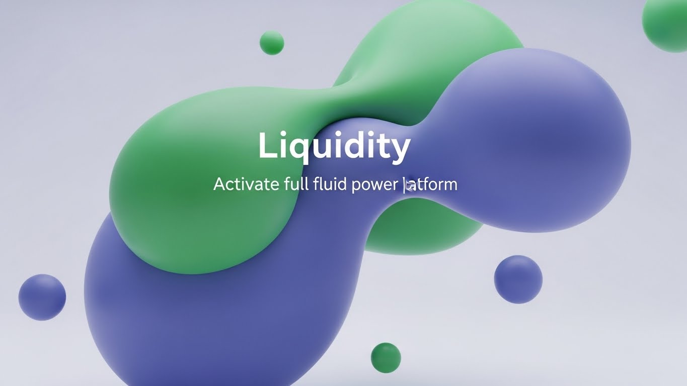
27. Abstract 2D flat vector organic modern
Retention | Trial/Freemium User Activation
1. The Visual & Narrative Approach
Visualization Scenario:
"Liquidity" is a financial concept, but here we treat it as a visual physics simulation. On a pristine white background, glossy, liquid shapes in gradients of Seafoam Green and Royal Blue drift towards each other. They merge seamlessly, morphing into a larger, more stable form without friction. This abstract art represents the frictionless flow of capital and data once the user activates the full suite. It is hypnotic, premium, and calm.
Narration Tone:
Sophisticated, fluid, and premium. "Remove the friction. Let your capital flow."
2. Psychological Impact & KPI Focus
- The Metaphor of Flow: Cognitive ease is linked to "fluidity." Visualizing this subconsciously suggests that upgrading to the paid plan removes obstacles (friction) from the user's workflow.
- Premium Aesthetics: The "Organic Modern" style is currently associated with high-end tech brands, signalling that this is a top-tier tool.
3. Strategic Implementation & Trade-offs
- Best For: "Upgrade to Pro" screens or background assets for webinar waiting rooms.
- Trade-off: It is purely mood-based. It conveys a feeling of ease, not specific feature information.
- Duration: Loops (10-20 seconds).
Companies using similar video content -
LedgerSMB – LedgerSMB – Open source accounting software for SMBs.
Onfinity – Onfinity – Open source accounting with real-time insights.
Dolibarr – Dolibarr ERP CRM – Open source ERP and CRM for businesses.
28. Futuristic Neon/Dark Mode
Expansion | Driving Upsell/Cross-sell

1. The Visual & Narrative Approach
Visualization Scenario:
To sell the "Premium" tier, you must make it look exclusive. We enter a dark, "Cyberpunk Professional" void. Floating in the center is a glowing badge or keycard constructed from fine neon lines in Violet, Magenta, and Cyan. Rim lighting highlights the edges, making it look tangible and precious. It looks like a VIP pass to a futuristic club. This represents the unlocked potential of the Enterprise tier—advanced analytics, AI forecasting, and priority support.
Narration Tone:
Exclusive, hushed, and inviting. "You've mastered the basics. Now, step into the future."
2. Psychological Impact & KPI Focus
- Exclusivity & Status: The dark aesthetic with neon accents triggers associations with "Night Mode" (power users) and VIP experiences. It appeals to the user's desire for status and advanced capability.
- Curiosity: The glowing object against the dark void draws the eye and creates a "moth to a flame" effect, driving clicks to explore the upgrade.
3. Strategic Implementation & Trade-offs
- Best For: Email headers announcing new Enterprise features or "Unlock Premium" banners inside the free product.
- Trade-off: Can look too "gaming" focused if not restrained. Keep lines thin and fonts elegant.
- Duration: 5-8 seconds (GIF).
Companies using similar video content -
Sage Intacct – Intacct – Cloud financial management and accounting.
QuickBooks – QuickBooks Online – Streamlines invoicing, expense tracking, reporting.
Zoho Books – Books – Automated workflows and detailed reporting.
29. 3D Parallax UI Presentation
Expansion | Driving Deep Feature Adoption
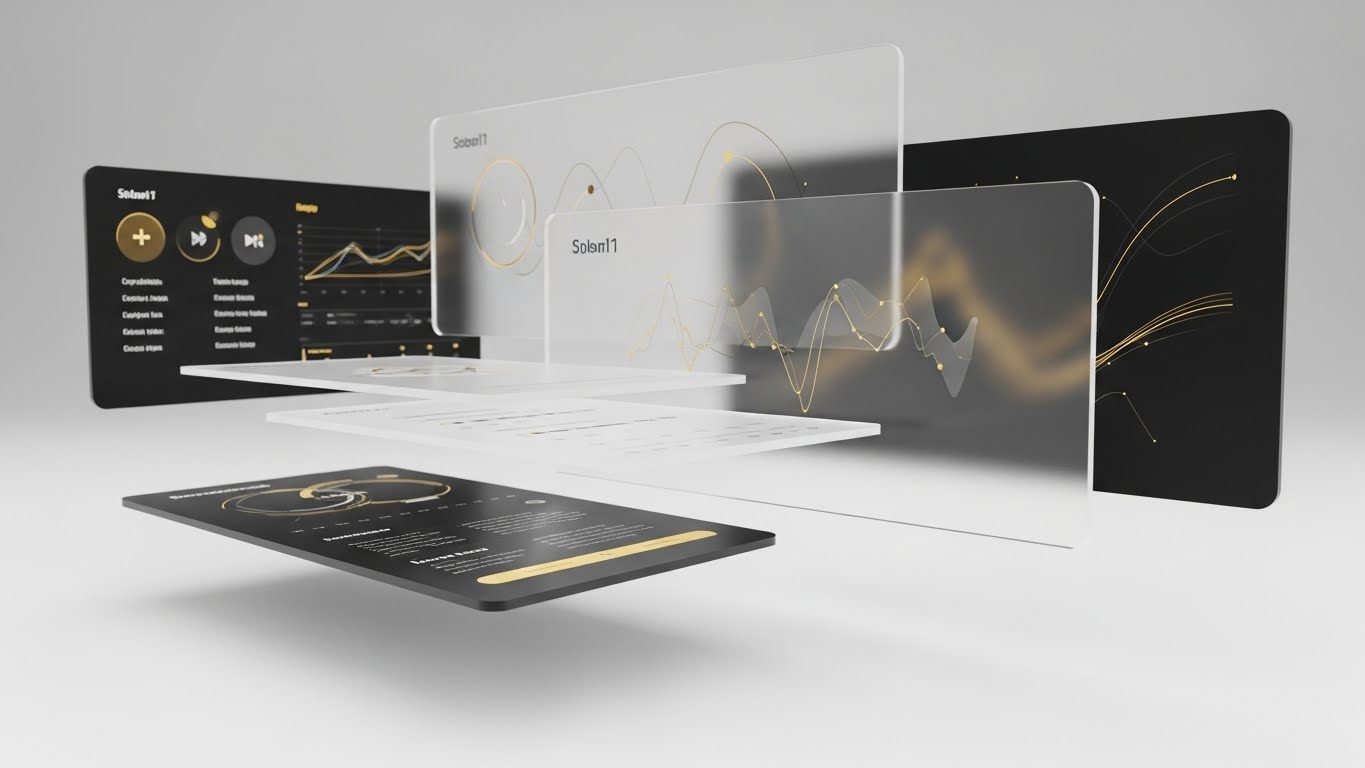
1. The Visual & Narrative Approach
Visualization Scenario:
Most users only scratch the surface. This style reveals the depth. We see a stack of UI screens floating in 3D space, separated by depth. The camera drifts through the top layer (Basic Reporting) to reveal the rich, complex data layers underneath (Predictive Modelling, API Connectors) rendered in Gold and Black. The parallax effect (layers moving at different speeds) creates a sense of deep immersion. It visually invites the user to "dive deeper" into the product.
Narration Tone:
Intriguing and depth-focused. "There is more beneath the surface. Discover the power you already own."
2. Psychological Impact & KPI Focus
- Value Realization: Users often churn because they don't know what they have. Showing the "hidden layers" visually demonstrates that the tool is more powerful than they realized, increasing perceived value.
- Exploration: The motion into the screen (Z-axis) mimics the act of exploration, subconsciously encouraging the user to click and dig into the menus.
3. Strategic Implementation & Trade-offs
- Best For: "Feature Spotlight" videos or product tour pages aimed at existing customers.
- Trade-off: Requires high-fidelity UI assets. If the "rear" screens are blurry, the effect fails.
- Duration: 15-20 seconds.
Companies using similar video content -
Fathom – Fathom – Financial analysis and reporting for startups.
Float – Float – Cash flow forecasting and management for startups.
Spotlight Reporting – Platform – Financial reporting, forecasting, and consolidation.
30. Hyper-lapse Stock Footage with Data
Expansion | Driving Referrals & Advocacy

1. The Visual & Narrative Approach
Visualization Scenario:
Referrals are about the network. We see a stunning hyper-lapse of a busy city intersection at twilight. Car lights smear into long streaks of Silver and Chrome, visualizing the speed of business. Superimposed over this city is a delicate, white connected network graph that pulses and expands, linking buildings and people. This visualizes the user's growing influence and the connected nature of the financial community. It suggests that by referring others, they are building a stronger ecosystem.
Narration Tone:
Grand, connective, and appreciative. "Intelligence grows when it is shared. Build the network."
2. Psychological Impact & KPI Focus
- Social Proof & Momentum: The fast-paced city footage suggests a thriving, energetic market. The network overlay places the user at the center of this activity.
- The "Connector" Identity: It appeals to the user's ego as an industry connector, motivating them to share the platform with peers to validate their own status.
3. Strategic Implementation & Trade-offs
- Best For: "Refer a Friend" landing pages or LinkedIn posts celebrating community milestones.
- Trade-off: Generic city footage is boring. The "Data Overlay" must be bespoke and branded to make it ownable.
- Duration: 10-15 seconds (Vertical 9:16 optimized for Social).
Strategic Knowledge Base: The Visual Operations Doctrine
This section moves beyond "style" to "strategy." It synthesizes the 30 visual examples into a cohesive operational framework for Financial Intelligence & SaaS platforms. This is your blueprint for turning visual assets into business outcomes.
Strategic Alignment & Visual Architecture
The "Pre-Production" Strategy. Why we visualize and who we visualize for.
- The Cognitive Load Audit: Financial analysts process massive data sets. Your visual strategy must be an act of subtraction. Before commissioning a video, audit the script: "Does this visual add clarity, or just movement?" If it doesn't reduce the cognitive load (Style 1), cut it.
- Role-Based Visual Mapping: One style does not fit all. Map your visual styles to user roles. The "Pilot" (Analyst) needs dark mode, high-contrast syntax highlighting, and granular UI interactions (Style 19, 7) for focus. The "Navigator" (CFO) needs aspirational horizons and "City View" metaphors (Style 18, 1) for strategic oversight.
- The "Glanceability" Standard: In a trading floor or high-stakes audit environment, information must be absorbed in milliseconds. Adopt a "Glanceability" standard for all educational content. If a Rapid UI Feature Montage (Style 24) doesn't communicate the core benefit in under 3 seconds, it fails the stress test.
- Brand Voice Consistency: Your platform likely spans multiple modules (Payroll, Forex, Audit). A fragmented visual style suggests a fragmented codebase. Establish a "Visual Unified Field Theory"—if the Audit module uses "Emerald Green" vectors (Style 1), the Payroll module cannot use "Cartoon Blue."
- The Advids Strategic Audit: Developing a "Visual Operating System" is not a graphic design task; it is a strategic one. Partnering with Advids allows for a comprehensive audit of your current asset library against industry benchmarks. This ensures that your visual language is not just "pretty," but structurally aligned with your sales funnel and retention goals from Day 1.
- Legacy System Integration: The biggest barrier to sale is the "It won't fit" objection. Use Wireframe to Reality Transition (Style 26) and Isometric 3D Workflow (Style 22) to visually prove compatibility. Create a specific asset library that visualizes your API "handshaking" with common legacy ERPs (SAP, Oracle).
- Accessibility for Global Teams: Financial SaaS is global. Text-heavy videos fail across language barriers. Lean heavily on abstract motion (Style 27) and visual metaphors (Style 15) that require no translation. A gold bar (Style 15) signifies "Value" in every language; a paragraph of text does not.
- The Mobile-First Mandate: The modern CFO is mobile. Ensure that Styles 21-30 (Expansion/Retention) are optimized for vertical viewing (9:16). A CFO approving an invoice from an airport lounge interacts with your brand via mobile; if your visual assets are only legible on a desktop, you are creating friction at the moment of decision.
- Standardization vs. Customization: For high-volume content (Help Desk), use standardized, template-driven styles (Style 26). For high-stakes content (Series B Pitch), use bespoke, hyper-real styles (Style 15, 17). Allocation of budget should match the potential revenue impact of the asset.
- The Cross-Departmental Bridge: Use visuals to unify terminology. Sales calls it "Revenue Optimization"; Product calls it "Feature X". A visual metaphor (Style 14) creates a shared mental image that aligns Sales, Product, and Customer Success.
Operational Adoption & Implementation
The "Deployment" Phase. Embedding visuals into the daily workflow.
- Overcoming "Black Box" Anxiety: AI is intimidating. Use Abstract 3D AI Visualization (Style 1) and Transparency X-Ray (Style 16) to demystify your algorithms. Showing the "logic" behind the decision builds trust with risk-averse compliance officers who fear what they cannot see.
- The Micro-Learning Shift: Replace the 100-page PDF implementation manuals with a library of Rapid UI Montage (Style 24) and Macro UI Micro-Interactions (Style 7). Modern users do not read manuals; they watch clips. Break your onboarding into 30-second "Micro-Moments."
- Just-in-Time Support: Embed 2D Character-Driven (Style 26) videos directly into the software's "Help" tooltips. Do not force users to leave the platform to find answers on YouTube. By keeping the visual support inside the ecosystem, you reduce context switching and keep the user in the "flow state."
- Gamification of Training: Drive adoption of boring features by using Futuristic Neon (Style 28) visuals for training completion badges. Transforming a "Compliance Training" module into a "Pro Tier Unlock" event triggers the status-seeking drive of financial professionals.
- Reducing Support Ticket Volume: There is a direct correlation between the clarity of your "Error State" visuals and your support costs. Use Abstract 2D Motion Graphics (Style 8) to explain why an error occurred rather than just showing a red code. Visualizing the logic empowers the user to fix it themselves.
- Remote Onboarding: The days of on-site implementation teams are fading. You must replicate the "hand-holding" experience digitally. Use warmth-infused styles (Style 17, 23) to make the remote onboarding process feel personal and high-touch.
- SOP Visualization: Standard Operating Procedures are critical in finance. Transform text-based SOPs into "Isometric Workflows" (Style 22). Seeing the document flow from Server to Cloud removes ambiguity and ensures compliance.
- Feedback Loops: Use interactive video elements. At the end of a "New Feature" video (Style 29), ask for a reaction. Visualizing user feedback data helps Product teams prioritize.
- Scalable Localization: If you expand to APAC or EMEA, your visuals must travel. Avoid embedding text directly into the video render. Use overlays (Style 25) that can be swapped out programmatically for different languages, drastically reducing localization costs.
- Leadership Communication: When rolling out the platform to a large enterprise, the message must come from the top. Use "Aspirational Montage" styles (Style 18) for the CFO's internal launch video to signal that this initiative is a strategic priority, not just an IT upgrade.
Measuring Impact & Future-Proofing
The "ROI" Phase. Quantifying the value of visualization.
- Beyond "Views": Defining Actionable KPIs: Stop measuring "Video Views." Start measuring "Time-to-Competency." How long does it take a new user to execute their first report after watching the onboarding video (Style 23)? If the video doesn't accelerate competency, it is just entertainment.
- The "Idle Time" Metric: Correlate better visualization with reduced software navigation time. If Style 11 (Isometric Motion) clearly shows the path, users spend less time "idling" or searching for menus, directly increasing operational efficiency.
- Compliance Velocity: How fast can your organization adapt to new regulations (e.g., ESG reporting)? Use rapid, template-based video styles (Style 4) to disseminate compliance updates instantly. Measure the speed of "Compliance Attestation" before and after introducing video training.
- Retention and Churn Defense: Churn often happens because users don't realize the value they are getting. Use Lifestyle Stock with UI Overlay (Style 25) and Parallax UI (Style 29) in your quarterly business reviews (QBRs) to visualize the "hidden" work the platform has done.
- The AI Visual Frontier: Prepare for the future where dashboards generate their own video summaries. Standardizing your visual language now (using Style 1 Minimalist and Style 13 Clean UI) creates the "Training Data" needed for future Generative AI tools to build custom reports for your clients automatically.
- Scalability of Assets: Build a "Visual Lego Kit." Don't create one-off videos; create libraries of 3D assets (servers, coins, graphs) that can be reassembled endlessly. Advids helps build these scalable asset libraries, ensuring your video marketing gets cheaper and faster over time.
- The Advids Partnership for Scalability: As your platform evolves, your visual language must adapt. A static library dies quickly. Partnering with Advids ensures that your "Visual Operating System" is living infrastructure. From updating UI screens in existing videos to rolling out new styles for new features, a long-term production partner converts video from a "marketing expense" into a scalable asset.
- Benchmarking Success: Your visuals are competing for attention against consumer apps (Instagram/Netflix). Benchmark your "Style Quality" not against other B2B finance tools (which are often poor), but against consumer-grade media. The "Consumerization of Enterprise" is real.
- The ROI of Safety: Quantifying insurance cost reduction through better visual safety training. If a visual workflow (Style 22) prevents a single major compliance error, the ROI of that video is infinite. Quantify this risk mitigation when budgeting for video.
- Final Call to Innovation: The gap between the "Physical" reality of business and the "Digital" promise of SaaS is bridged only by trust. Visuals are the currency of that trust. By adopting these 30 styles and the strategic frameworks attached to them, you are not just decorating your software; you are engineering the cognitive path to purchase, adoption, and advocacy. Treat your visual strategy as seriously as your code, and the market will reward you.
Companies using similar video content -
SAP S/4HANA Finance – S/4HANA Finance – ERP for large enterprises.
Microsoft Dynamics 365 Finance – Dynamics 365 Finance – ERP for finance and operations.
Oracle NetSuite – NetSuite ERP – Cloud ERP for financial management.
Author & Editor Bio


