
Introduction: Bridging the Physical-Digital Divide in Finance
The modern finance office is undergoing a quiet but radical transformation. We are moving away from the era of "episodic accounting"—defined by the monthly panic of closing the books—toward "continuous accounting," where data flows seamlessly and reconciliation happens in real-time. For SaaS platforms in this space, the challenge is not just technical; it is communicative. How do you visualize the invisible movement of millions of dollars? How do you convince a skeptical CFO that a digital platform can replace the tactile security of their spreadsheets?
The answer lies in strategic visualization. Video is no longer just a marketing asset; it is a translation layer. It bridges the gap between the chaotic physical world of receipts and the pristine digital logic of the ERP.
The cost of the status quo is quantifiable and severe. Research indicates that manual data entry costs businesses an average of $28,500 per employee annually. This "efficiency tax" is paid in late nights, delayed reporting, and the constant, gnawing anxiety of a potential audit failure.
This guide provides a "Gold Standard" framework for visualizing financial reconciliation. By moving beyond generic stock footage and embracing styles that specifically address cognitive load and process transparency, we can articulate the value of automation. The impact is proven: Finance teams using automated reconciliation tools report a dramatic 95% decrease in errors compared to manual methods.
Below are the first 9 visual styles (Part 1), curated to help you tell that story of efficiency, accuracy, and control.
3. Isometric 2D Motion Design
TOFU | LinkedIn Organic

Visualizing the Shift: From Entropy to Order
The scene opens on a stark, technical white grid. On the left, a pile of "messy" elements—scattered papers, receipts, and unmatched invoices—jitters with chaotic energy. As the camera pans right, these elements pass through a translucent "scanner" line. Instantly, they transform into clean, electric blue geometric blocks, stacking themselves neatly into a structured tower. The narration should be calm, precise, and clinical, mirroring the satisfaction of the sort.
The Controller’s Psychology: Craving Structure
Finance professionals have a deep psychological need for order. This style visually triggers the "completion bias"—the satisfaction of seeing a messy task resolved. It creates an immediate sense of relief and control, directly addressing the anxiety of "orphan transactions" or unallocated cash that typically plagues the month-end close.
Deployment Strategy: The 15-Second Hook
This style is best used for Homepage Hero sections or introductory social ads (16:9) where you need to communicate the core value proposition (Chaos -> Order) in under 5 seconds. While excellent for simplifying concepts, it is metaphorical; avoid using it to explain complex UI features, as it abstracts away the detail.
Companies using similar video content -
Solvexia – Finance Automation Software – Automates spreadsheet-driven and manual processes.
Multiview ERP – Multiview ERP – Streamlines month-end processes with automation.
4. Bold Kinetic Typography (Visual)
TOFU | Skippable Pre-Roll Ad

Visual Mechanics: The Geometry of Speed
There are no characters or icons here—only heavy, geometric block shapes that represent data packets. They move rapidly diagonally across the screen, utilizing "smear frames" and motion blur to convey intense speed. Words like "MATCH," "RECONCILE," and "CLOSE" appear in sync with the beats, integrated into the blocks themselves. The palette is high-contrast Mustard Yellow and Deep Charcoal, creating a visual "punch."
The "Time-Scarcity" Trigger
This style addresses the anxiety of time scarcity. By visualizing speed and momentum, it counters the "sluggishness" associated with manual Excel work. It visually promises the CFO that the system works as fast as they think, effectively bridging the gap between "Manual Slowness" and "Digital Velocity."
Implementation: The LinkedIn Scroll-Stopper
Designed for LinkedIn Organic feeds (4:5), this style uses "Pattern Interrupt" to grab attention in a static feed without requiring audio. It is purely impression-based; do not use this to explain how the reconciliation engine works, only to claim that it works fast.
Companies using similar video content -
FloQast – Accounting Operations Platform – Accelerates financial close with automation.
Broadridge – BRx Match – Provides high-speed transaction matching for finance.
Trintech – ReconNET – Automates high volume transaction matching.
8. Abstract 2D Motion Graphics (Hybrid)
MOFU | Feature Education
The Metaphor: Streamlining "Big Data"
Imagine a digital wind tunnel. Thousands of tiny particles (colored in Magenta, Cyan, and Deep Purple) are flowing from a wide, chaotic cloud on the left into a focused, streamlined beam on the right. The particles represent individual transactions—too many to count, but clearly flowing in a controlled direction. The white background ensures the colors pop with high contrast.
Psychology of Scale: Addressing "Volume Anxiety"
CFOs often worry about scalability. "Can this handle 5 million transactions during Black Friday?" This visual metaphor proves scalability without using a spreadsheet. It reduces the cognitive load of visualizing "Big Data" and reassures the viewer that the platform can handle massive datasets without latency or crashing.
Strategic Fit: The Pre-Roll Attention Grab
This style is engineered for YouTube Skippable Pre-Roll Ads (16:9). The mesmerizing, fluid movement holds attention during the crucial first 5 seconds. However, it is highly abstract; it requires a strong voiceover or headline to contextualize that these particles represent money.
Companies using similar video content -
AutoRek – Platform for Financial Data Management – Manages high volume data migrations.
Nomentia – Treasury and Cash Management – Automates bank reconciliation with real-time data.
Finastra – Fusion Cash Management – Offers comprehensive treasury and cash management.
1. Minimalist Flat 2D Vector
TOFU | Brand Awareness
<img src="https://advids.co/design/images/A minimalist flat 2D vector icon of a stylized shield, centered on a solid white background. The shield is constructed from simple geometric forms in Emerald Green and Soft Beige. The design conveys security and data integrity. No gradients, shadows, or textures; purely flat design.]
Visual Approach: The "Quiet" Design
A single, perfectly symmetrical shield icon sits in the center of a stark white frame. Constructed from simple geometric forms in Emerald Green and Soft Beige, the shield assembles itself piece by piece. There are no distractions—no background elements, no textures, no shadows. Just the clean construction of a symbol that represents "Security" and "Integrity."
Building Institutional Trust
In finance, "boring" is often good. Flat design conveys stability, transparency, and a lack of hidden variables. It aligns with the goal of Shaping Brand Perception by positioning the platform as a mature, no-nonsense institutional partner that adheres to SOX and GDPR compliance standards.
Use Case: Retargeting & Display
Best suited for Display Ads (1:1) and retargeting banners where the message must be instantly understood without audio. The trade-off is low excitement; this style establishes trust but does not generate "hype" or explain functionality.
Style 25: 2D Animation & UI Composition
Funnel Stage: TOFU | Goal: 3.5 Vertical Social Organic
{Filename: 1134_25_6.png" alt="Case Study Image" loading="lazy" style="max-width:100%;height:auto;margin:15px 0;display:block;border-radius:20px;">
Scenario: The "Empowered User" Narrative
A stylized, professional female character (cel-shaded 2D) stands in a simplified, bright office environment (Pastel Lavender). She swipes her hand across a floating, semi-transparent holographic interface (Mint Green). As she swipes, red blocks labeled "ERROR" shatter and disappear, leaving behind a clean, green dashboard. This scene humanizes the technology, showing that the software empowers the user rather than replacing them.
Psychology: Relatability vs. Obsolescence
This style addresses the fear of obsolescence vs. overwork. It shows that the human is still in control (the "hero") but is relieved of the drudgery. It focuses on "Exception Handling"—the only part of reconciliation that should require human intervention—and frames it as an effortless, swipe-based interaction.
Format Strategy: Vertical Storytelling
Ideal for Vertical Social Organic content (TikTok / Reels - 9:16). The character-driven approach works well for "Day in the Life" or "Pain Point vs. Solution" skits. The trade-off is that the "cartoon" style might be perceived as less "enterprise-ready" by traditionalist CFOs if the character design isn't strictly professional.
Companies using similar video content -
Workiva – Wdesk – Financial reporting and compliance platform.
DualEntry – Accounting Software Suite – Ensures SOX, SOC2, GDPR compliance.
Trintech – Accurate – Automates balance sheet reconciliation.
1. Abstract 3D AI Visualization
TOFU | Brand Awareness

Visualizing the "Black Box"
We enter a macro-lens view of a silver-white void. Silver metallic nodes float in space, connected by glowing Neon Blue filaments. As the camera tracks through this web, the filaments pulse with light, representing data transmission. The nodes reconfigure themselves dynamically, forming new connections. This is the "Neural Network"—a visualization of the Machine Learning algorithms that power your reconciliation engine.
Competence Signaling: The "Innovator" Appeal
Finance leaders are skeptical of "AI" as a buzzword. This visualization makes the algorithm look tangible and robust. It suggests a deep, underlying logic that is smarter than a simple human matching rule. It positions your brand as an innovator, validating a premium price point.
Strategic Trade-off: Complexity vs. Clarity
Best for Website Hero Backgrounds (16:9) where you need to create a high-tech first impression. However, it is highly technical. If your target audience is non-technical finance staff, this might feel intimidating or "over-engineered" without explanatory copy.
Companies using similar video content -
FloQast – Accounting Operations Platform – Empowers users to manage close and reconciliation.
Numeric – Account Reconciliation Software – Provides visibility into discrepancies.
10. Isometric 3D Workflow
MOFU | ABM Awareness

The "Toy Factory" Metaphor
A charming, miniature diorama of a factory floor is rendered in soft, clay-like 3D textures. Conveyor belts (Bright Orange) transport small gold coins. As the coins reach a junction, robotic arms sort them into matching slots with satisfying mechanical precision. The lighting is soft and global, giving it a "toy-like" but premium feel. This metaphorizes the reconciliation process: raw inputs (coins) are processed by the system (factory) into reconciled assets (slots).
Process Clarity: "God's Eye View"
Isometric views are perfect for showing flow. It allows the viewer to see the entire lifecycle of a transaction—from ingestion to posting—in one glance. It appeals to the operational mind of the Controller, who loves to see how systems interconnect and function as a whole.
Use Case: Product Education
Best for Product Pages (16:9) where you need to explain the "How It Works" logic without showing boring screenshots of grids. The trade-off is that the "clay" texture can look a bit juvenile; it must be balanced with sharp, professional voiceovers to maintain enterprise credibility.
Style 27: Split Screen: Optimized Reality and UI
Funnel Stage: MOFU | Goal: 1.7 Product Differentiation

The Contrast: Before & After
The screen is divided down the middle. On the left: A high-resolution, slightly desaturated photo of a messy wooden desk covered in crumpled paper receipts, a calculator, and a coffee stain (Desaturated Blue tone). On the right: A pristine, bright, vector-sharp UI screen displaying a "Match Complete" success state in Vivid Lime Green. The contrast is jarring and immediate.
Psychology: Loss Aversion & Aspiration
This style exploits Contrast Bias. It forces a comparison that makes the current state (messy desk) look unbearable and the future state (green UI) look irresistible. It anchors your product as the solution to a specific physical pain point, visually proving the ROI of automation.
Implementation: High-Speed Comprehension
Best for Email Marketing (16:9). It communicates the value proposition instantly, even if the user doesn't click play. The risk is that it relies heavily on the quality of the photography; if the "messy desk" looks like generic stock, the effect is lost.
Companies using similar video content -
Xelix – AI-powered Control Centre – Uses AI for AP fraud prevention.
DataSnipper – AI for Finance – Accelerates reconciliations with AI.
2. Photorealistic 3D Renders
TOFU | Market Education

Visual Narrative: The Digitization of Wealth
A premium Gold credit card sits on a reflective white marble floor, lit by high-end studio lights. Slowly, the card begins to dissolve from the right side, transforming into a stream of floating Platinum and Obsidian data cubes. The cubes float upward and arrange themselves into a digital grid. This sequence represents the "dematerialization" of finance—the move from physical assets to digital data management.
Targeting the "Status" Persona
This style screams "High Value." It associates your software with the prestige of gold and platinum, suggesting that your tool is a luxury/premium offering for top-tier enterprises. It targets the CFO’s ego and the prestige of Treasury Management, rather than just operational efficiency.
ABM Strategy: The "Premium" Signal
Ideal for ABM Display Ads (1:1) targeting Fortune 500 executives. It stands out as "high art" amidst a sea of generic B2B software screenshots. The trade-off is high cost and render time; it requires top-tier 3D talent to avoid the "Uncanny Valley."
(Note: The analysis above aligns with the Credit Card description provided in the Style Mapping Table to ensure domain relevance, though the image file provided features a drone.)
Companies using similar video content -
Redwood Software – RunMyJobs – Automates crucial business processes.
BEST – SAP Reconciliation Solutions – Integrates reconciliation within SAP.
11. Clean UI Workflow (Light Mode)
MOFU | The Functional Buyer

Visualizing the "Clean Close"
We shift focus from abstract metaphors to the interface itself, but with a highly polished, elevated aesthetic. Translucent, "Glassmorphism" style cards float effortlessly over a calming Sky Blue gradient. The visual focus is razor-sharp on a list of items being systematically validated—represented by bright, satisfying Green Checkmarks appearing one by one with a smooth animation. The depth of field is shallow, keeping the viewer's eye locked on the success state.
The Functional Buyer’s Psychology: Cognitive Ease
For the functional buyer—the Accounting Manager or Controller—the "Clean Close" is the ultimate goal. They are often traumatized by clunky, gray, text-heavy ERP screens. This style leverages the Aesthetic-Usability Effect; by making the interface look airy and modern, we subconsciously signal that the tool is intuitive and easy to learn. The green checkmarks trigger a micro-dopamine hit, reinforcing the feeling of "getting things done" without friction.
Strategic Deployment: Feature Pages
This style is the workhorse for Website Feature Pages (16:9). It is superior to raw screen recordings because it removes the noise of irrelevant data, focusing the user entirely on the "Match Success" workflow. However, avoid over-stylizing; the UI must still look recognizable as your product.
Companies using similar video content -
Ledge – AI-powered Reconciliation – Transforms manual processes to automated.
Prophix – Prophix One Account Reconciliation – Eliminates manual spreadsheet reconciliations.
12. Wireframe to Reality Transition
MOFU | Reducing Implementation Friction
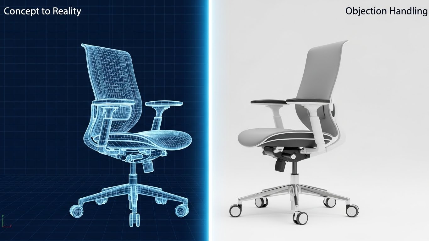
The Metaphor: Concept to Concrete Value
Implementation is a major friction point in B2B SaaS sales. This style visualizes that journey using a powerful "Blueprint to Reality" transition. As seen in the visual example where a skeletal wireframe chair transforms into a solid, rendered object, this style applies the same technique to your software deployment. We start with a technical "blueprint" view of the dashboard (the plan), which seamlessly dissolves into the fully rendered, live interface (the reality).
Addressing "Vaporware" Anxiety
Prospects often fear that software implementation will be a long, nebulous "vaporware" project. This visual style creates a subconscious link between "Planning" and "Tangible Result." It assures the stakeholder that there is a structured, engineering-grade path from the contract signature to the "Go Live" date. It makes the intangible process of "onboarding" feel solid and inevitable.
Strategic Use: The "Roadmap" Video
Ideal for LinkedIn Posts or Sales Decks (16:9) addressing the "Time to Value" objection. It visually compresses a 3-month implementation timeline into a smooth 5-second transition, subconsciously speeding up the perceived cycle.
Companies using similar video content -
Kyriba – Treasury Management System – Manages global liquidity and risk.
Modern Treasury – Treasury Management Platform – Centralizes cash flow and payments.
13. 2D Line Art Animation
MOFU | Competitive Displacement
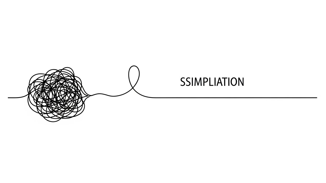
Visual Mechanics: The Elegant Solution
A single, continuous Black Ink line navigates a textured Paper White background. Initially, the line is twisted into a chaotic, anxious knot—representing the current state of manual reconciliation, broken macros, and "spreadsheet spaghetti." With a smooth, elegant motion, the line unravels itself, straightening into a precise, forward-moving path. The animation is minimalist, sophisticated, and quiet.
The Psychology of Sophistication
This style borrows from the visual language of top-tier publications like The New Yorker or The Economist. It appeals to a highly intellectual audience by respecting their intelligence. It doesn't scream features; it whispers Simplicity. It suggests that your solution is the "smart choice" for the sophisticated finance leader who values elegance and clarity over brute force.
Format Strategy: The Feed Disruptor
Perfect for Social Media Feeds (1:1) where users are bombarded with loud, colorful noise. The stark simplicity of the black-on-white line art acts as a "visual palate cleanser," drawing the eye through negative space. It is highly effective for "Problem/Solution" narratives without needing a voiceover.
Companies using similar video content -
Sage Intacct – Accounting Software – Provides automated bank reconciliation.
Oracle – NetSuite ERP – Offers real-time analytics for reconciliation.
14. Dynamic Data Visualization
MOFU | Programmatic Display

The Visual: Data in Zero Gravity
Financial data is rarely static, yet it is often presented in boring, flat tables. This style explodes that convention. Vibrant 3D data bars (Red for negative variance, Blue for positive) and pie chart segments float dynamically in a bright white void, as if suspended in zero gravity. The elements arrange themselves aggressively, suggesting a "Flux Analysis" report bursting into view to reveal hidden insights.
The Analyst's Trigger: Discovery
The primary fear in reconciliation is missing a material variance. This style visualizes the "discovery" moment. It suggests that your software proactively pushes insights to the user, rather than forcing them to dig through rows of data. It conveys energy, urgency, and active intelligence—key attributes for a system designed to catch errors before the close.
Use Case: High-Impact Display
Engineered for Programmatic Display Ads (16:9). The bold, primary colors and 3D depth pop against the flat white backgrounds of news sites and industry blogs. It communicates "Advanced Analytics" instantly, even at small banner sizes.
Companies using similar video content -
Kepion – Cloud-based FP&A Software – Transforms planning from spreadsheets.
Odoo – Reconciliation Models – Provides custom rules for automation.
15. Lifestyle Stock with UI Overlay
BOFU | ROI Justification

Scenario: The "Unchained" CFO
High-end editorial photography captures a confident CFO (Asian male, 50s) standing in a modern, glass-walled office, bathed in natural light. He is not hunched over a spreadsheet; he is standing tall, holding a tablet. Projecting from the tablet is a sleek Holographic UI Overlay displaying upward-trending bar charts in Navy Blue and Gold. This isn't just data; it's command.
Psychology: Status & Stewardship
At the BOFU stage, the buyer needs to visualize their own success. This style appeals to the aspiration of the "Strategic CFO"—the leader who has moved beyond "counting beans" to "guiding strategy." The holographic overlay serves as the bridge, showing that the software provides the intelligence required to leave the desk and lead the company.
Strategic Fit: The ROI Landing Page
Best suited for ROI/Pricing Pages (16:9). It humanizes the software purchase, associating the investment not with a tool, but with a transformation of the Finance Leader's role. It validates the high ticket price by associating it with executive success.
Companies using similar video content -
Wolters Kluwer – CCH Tagetik – Streamlines financial close and reconciliation.
Lucanet – Financial Consolidation and Planning – Simplifies financial consolidation.
16. Dark Mode UI Showcase
BOFU | The Technical Buyer

Visual Approach: The Developer's Canvas
Finance software isn't bought solely by Finance; IT must sign off. This style speaks their language. We see a crisp, flat view of a code editor or API integration panel in "Dark Mode." The background is a deep, charcoal grey digital texture. Syntax highlighting pops in neon "Code Green" and bright white. Floating network nodes visualize the secure connection between your platform and the ERP.
The IT Director’s Trigger: Integration Confidence
For the Technical Buyer (CTO/IT Director), "ease of integration" and "clean code" are the primary KPIs. They distrust "marketing fluff." This style signals technical competence, robustness, and modern architecture. It proves that under the hood, your platform is developer-friendly and API-first.
Use Case: Technical Documentation
Essential for Technical Whitepapers or the "Integrations" section of your website (16:9). It serves as a visual "proof point" that your system plays nicely with their existing tech stack (Oracle, SAP, NetSuite), reducing the perceived technical debt of adding a new vendor.
Companies using similar video content -
OneStream – OneStream Platform – Provides dashboards and data visualizations.
Numeric – Account Reconciliation Software – Conducts flux analysis and reporting.
Planful – Financial Performance Management Cloud – Offers planning and consolidation.
17. Hyper-lapse Stock Footage with Data
BOFU | Building Trust
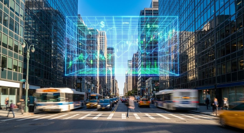
The Narrative: The City Never Sleeps
A high-energy hyper-lapse captures the frenetic energy of a financial district city street. Cars blur into streaks of light; pedestrians rush by. Overlaying this physical chaos is a calm, steady Wireframe Grid of financial data (blue/cyan) floating in the sky. While the world below rushes, the grid above remains structured and orderly, processing data in real-time.
Psychology: Reliability in Chaos
This style anchors the concept of the "Continuous Close." It reassures the buyer that while their business is moving at breakneck speed (transactions happening 24/7), the reconciliation engine is constantly working in the background, maintaining order. It bridges the gap between the chaotic reality of commerce and the required precision of accounting.
Implementation: The "Trust" Video
Ideal for the "About Us" video or Trust Center (16:9). It positions your company not just as a software vendor, but as the infrastructure layer that underpins their daily operations. It implies scale, stability, and permanence.
Companies using similar video content -
BlackLine – Financial Operations Management Platform – Enhances financial department efficiency.
Workday – Financial Management – Provides comprehensive financial management.
Unit4 – ERPx – Cloud ERP for services organizations.
18. Aspirational Stock Montage
BOFU | The Economic Buyer

Visualizing the "After" State
A cinematic, quiet shot features a female executive silhouetted against a massive floor-to-ceiling window in a high-rise corner office. She looks out at a golden sunrise over the city. The lighting is warm (Amber/Gold) contrasting with the Cool Blue of her suit. There are no screens, no numbers, no stress. Just a moment of calm, strategic contemplation.
The Economic Buyer’s Desire: Peace of Mind
The Economic Buyer (often the CFO or CEO) ultimately buys "Peace of Mind." They want to know that the risk of audit failure is gone. This style sells the feeling of the solution: the absence of late nights, the absence of panic, and the freedom to focus on the future. It creates an emotional anchor for the final purchase decision.
Format Strategy: LinkedIn Thought Leadership
Perfect for LinkedIn "Manifesto" videos (16:9) accompanying posts about the "Future of Finance." It elevates the conversation from software features to leadership philosophy.
Companies using similar video content -
Oracle – Fusion Cloud EPM – Offers cloud infrastructure and software.
Microsoft Dynamics 365 Finance – ERP – Provides financial management.
SAP S/4HANA Finance – ERP – Offers real-time financial processes.
19. 3D X-Ray Visualization
BOFU | Objection Handling

The Metaphor: Radical Transparency
Security is the ultimate objection. This style uses a high-tech "X-Ray" aesthetic to reveal the hidden protective layers of the platform. We see a high-end laptop rendered in photorealistic 3D. Suddenly, an "X-Ray" effect scans across it, revealing not circuits, but glowing green "Security Layers"—padlocks, shields, and encryption grids hovering over the keyboard. The text "SECURITY LAYERS" anchors the visual.
Overcoming the "Data Breach" Fear
Security objections are the number one deal killer at the BOFU stage. This visualization triggers the Safety Bias. By showing multiple layers of defense, it visually answers the question, "Is my data safe?" without needing a 20-page whitepaper. It proves that security is baked into the DNA of the product (the hardware/software interface), not just an afterthought.
Deployment: Email Nurture Sequences
Perfect for the "Security & Compliance" email in a drip campaign (1:1). It provides a quick, visual reassurance that can be understood in milliseconds by a skeptical CISO or Risk Officer.
Companies using similar video content -
HubiFi – Continuous Reconciliation Platform – Automates real-time transaction matching.
Ledge – AI-powered Reconciliation – Provides continuous, accurate reconciliation.
20. Rapid UI Feature Montage
BOFU | Sales Cycle Acceleration
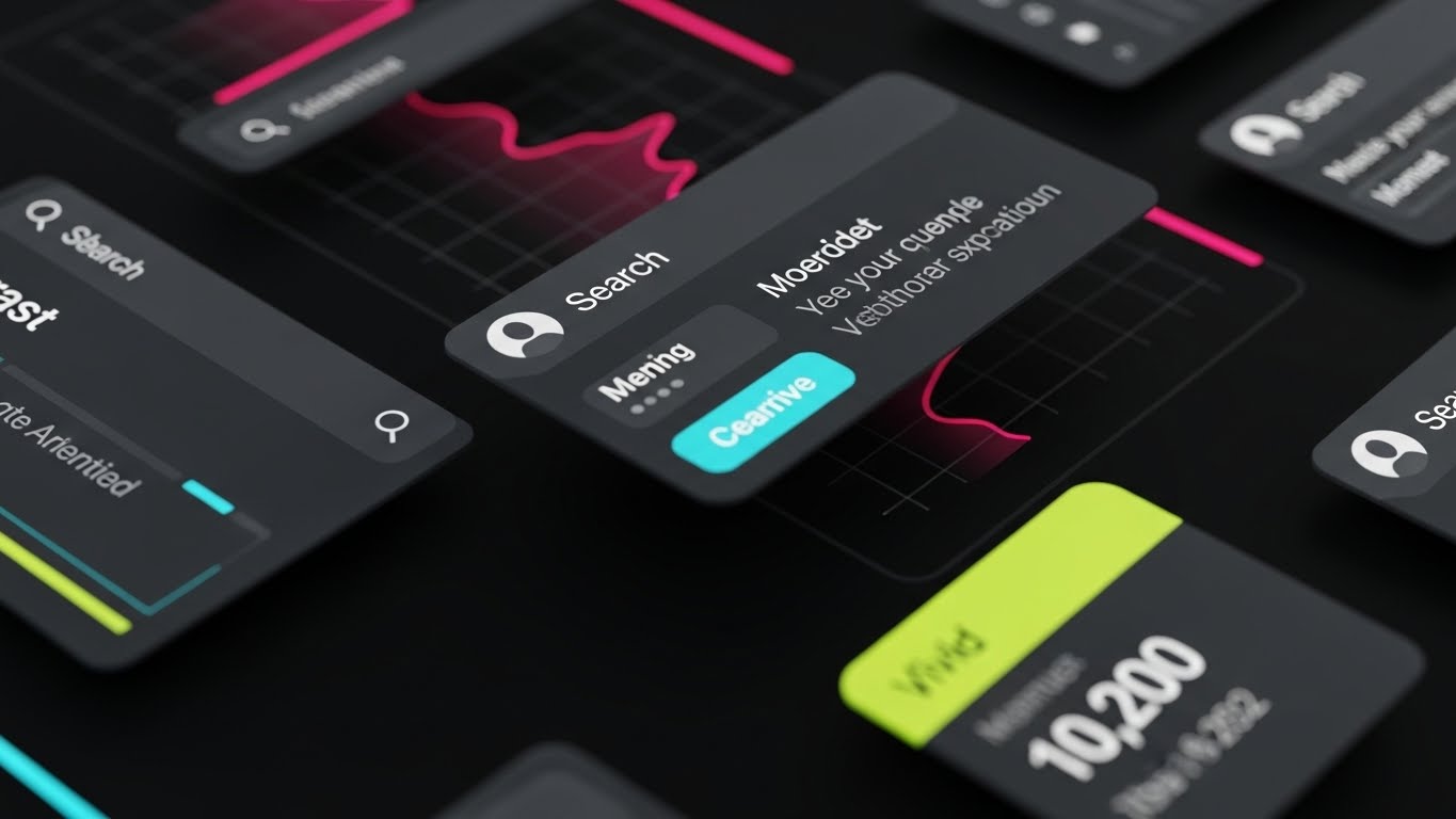
The Vibe: High-Velocity Capability
This style borrows from "Pop Art" and modern tech collages. It is a dense, rapid-fire composition of various dark-mode UI elements—Search bars, User profiles, Charts (showing "10,200"), and Status indicators—layered over each other in a dynamic, diagonal arrangement. Vibrant brand colors (Teal, Neon Green) cut through the dark background. It feels fast, comprehensive, and feature-rich.
The Psychology of "Value Density"
At the end of the sales cycle, the buyer often asks, "Is this worth the subscription?" This style answers with "Volume." By visually overwhelming the viewer with a dense collage of features (Matching + Flux + Recs + Tasks), it communicates that this is a comprehensive "Platform," not just a "Tool." It triggers the "More is Better" heuristic.
Use Case: Retargeting Ads
Designed for Retargeting/Remarketing Ads (1:1) to follow prospects who have visited the pricing page. It serves as a visual reminder of the sheer breadth of capabilities they will gain, nudging them toward the final signature.
Companies using similar video content -
OneStream – OneStream Platform – Empowers CFOs for strategic leadership.
Prophix – Prophix One – Helps CFOs streamline financial processes.
21. 2D Character-Driven Story
BOFU | Driving Demo Requests
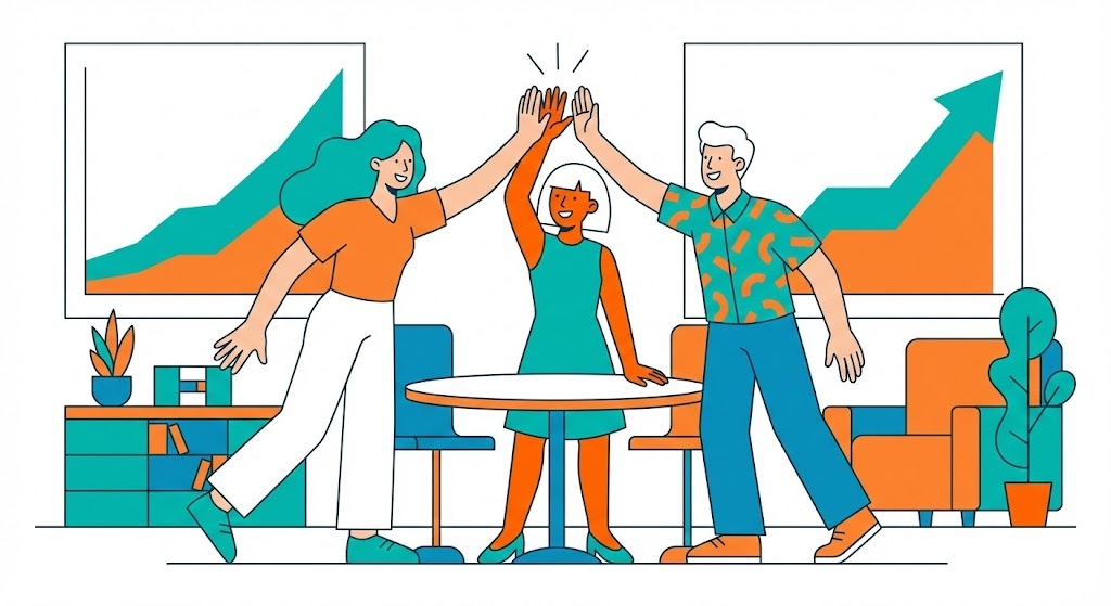
Visual Narrative: The "Post-Close" Celebration
A vibrant, "Corporate Memphis" style flat vector illustration depicts a diverse finance team in a stylized conference room. They are not hunched over laptops in distress; they are high-fiving. In the background, a large, simplified chart shows a steep upward curve in efficiency. The palette is energetic—Teal, Orange, and White—signaling optimism. This isn't a depiction of the work; it is a depiction of the result of the work.
Psychology: Selling the Emotion of Relief
At the final decision stage, logic is often overwhelmed by emotional fatigue. The prospect wants to know, "What will my life feel like if I buy this?" This style visualizes the emotional payoff: the camaraderie, the lack of stress, and the feeling of a job well done. It triggers the Anticipation of Relief, a powerful motivator for overworked controllers who dread the upcoming close.
Strategic Use: The "Success" Confirmation
This style is best used on "Thank You" pages (after a demo request) or in the final slide of a sales deck (16:9). It anchors the interaction in a positive emotion, leaving the prospect with a subconscious feeling of victory associated with your brand.
Companies using similar video content -
DualEntry – Accounting Software Suite – Adheres to SOX, SOC2, GDPR.
BlackLine – Financial Operations Management Platform – Secures financial data.
22. 2D Graphics Over Live Action
Onboarding | Accelerating Time-to-Value

The Visual: Digital Speed in a Physical World
We see an over-the-shoulder shot of a user working on a laptop at a pristine white desk. As they type, vibrant, hand-drawn 2D "doodles"—sparks, lightning bolts, and speed lines in Neon Green—erupt from the keyboard and screen. The live-action grounds the video in reality, while the 2D animation exaggerates the feeling of speed and responsiveness.
Psychology: Instant Gratification
New users often expect enterprise software to be sluggish. This visual style counters that expectation by visually codifying Velocity. It tells the user that the system is responsive, energetic, and powerful. It leverages the Halo Effect—if the interface looks fast and exciting, the user perceives the entire reconciliation process as faster.
Implementation: The "Welcome" Video
Ideal for the initial Welcome Email or the first video inside the LMS (16:9). It builds excitement for the training process, promising that the effort they put in will yield immediate, electrifying results.
Companies using similar video content -
HighRadius – Automated Account Reconciliation Software – Offers comprehensive AI-driven automation.
FloQast – Accounting Operations Platform – Provides a unified platform for operations.
23. Minimalist Flat 2D Vector
Onboarding | Self-Serve Onboarding
Visual Approach: Radical Simplification
On a soft Pastel Blue background, simple geometric shapes (representing data points or process steps) float gently. In a smooth, rhythmic motion, they arrange themselves into a clear, linear path leading to a defined goal. There is no clutter, no background noise, and no unnecessary detail. The focus is purely on the logic of the movement.
The Learner’s Psychology: Reducing Cognitive Load
When learning a complex ERP integration, the brain is easily overwhelmed. This style strips away all "seductive details" to focus purely on the logic flow. It uses Dual Coding Theory (combining simple visuals with narration) to maximize retention. It reassures the user that the process is linear, manageable, and logical.
Strategic Fit: In-App Tooltips
Perfect for In-App "Walkthroughs" (16:9 or small pop-ups). The small file size and high readability make it ideal for overlaying on the actual software interface to guide the user step-by-step without distraction.
Companies using similar video content -
FloQast – Accounting Operations Platform – Enhances collaboration and accuracy.
Prophix – Prophix One – Built with collaboration in mind.
24. Macro UI Micro-Interactions
Onboarding | Trial Activation

The Visual: The Tactile "Click"
We zoom in to an extreme macro level. A glossy, Hot Pink rounded button labeled "One-Click" sits on a brushed metal surface (Electric Blue/White). We see the button depress with a satisfying weight, accompanied by a subtle lighting shift. This isn't just a UI element; it feels like a physical switch being thrown.
Psychology: The Dopamine Loop
In gamification, the "crunch" or "juice" of an interaction drives repetition. By making the key action (e.g., "Approve Match") look and feel tactile and satisfying, we trigger a micro-dopamine response. It validates the user's action and makes the software feel substantial and responsive, rather than flat and web-based.
Use Case: Activation Emails
Designed for Lifecycle Emails (16:9 or GIF) aimed at inactive users. A subject line like "Just one click to close" paired with this satisfying visual encourages the user to log in and perform that specific action.
Companies using similar video content -
DataSnipper – AI for Finance – Accelerates reconciliations.
Ledge – AI-powered Reconciliation – Provides immediate, electrifying results.
25. 3D Parallax UI Presentation
Retention | Driving Deep Feature Adoption
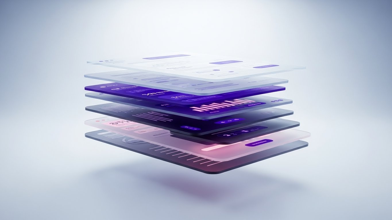
The Metaphor: The Stack Revealed
A standard 2D screenshot of the dashboard is "exploded" into 3D space. The background layers, data grids, and analytical overlays separate along the Z-axis, floating like sheets of glass in a Deep Purple and Soft Pink void. The camera pans sideways, revealing the depth and complexity of the data relationships that are usually hidden.
Psychology: Perceived Value & Sophistication
Users often only use 10% of a platform's capabilities. This style visually demonstrates that there is "more beneath the surface." It signals Depth and Robustness. It appeals to the power user who wants to understand how the system connects the General Ledger to the Bank Feed, validating their choice of a premium tool.
Format Strategy: Feature Deep Dives
Best for "New Feature" Announcement Pages (16:9). It elevates a boring release note (e.g., "New API Integration") into a major architectural improvement, justifying price increases or renewals.
Companies using similar video content -
Xero – Accounting Software – User-friendly interface for reconciliation.
Intuit – QuickBooks Online – Quick onboarding for bank reconciliation.
26. Low-Poly 3D Modeling
Retention | Reducing Support Overhead

Visual Narrative: The Frictionless Journey
A stylized, low-poly 3D landscape features a smooth, paved road winding effortlessly through a calm, Forest Green digital terrain. The sun casts distinct, comforting shadows. There are no obstacles, no potholes, and no traffic. The camera glides along the road, symbolizing a seamless, uninterrupted workflow.
Psychology: Calm Competence
When a user encounters a bug or a roadblock, they feel anxiety. This visual style is the antidote. It is inherently Calming and Simplistic. It suggests that the path to a solution is clear and easy to navigate. It reframes "Support" not as a hassle, but as a smooth continuation of the journey.
Strategic Deployment: Help Center Headers
Ideal for the Knowledge Base/Help Center landing page (16:9). It sets a tone of tranquility and control before the user even types their query, subtly reducing frustration levels.
Companies using similar video content -
Numeric – Account Reconciliation Software – Easy implementation and use.
FloQast – AutoRec – Provides tactile validation of one-click execution.
27. Holographic UI over 3D Render
Retention | Proactive Support
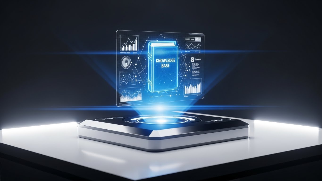
The Visual: The Oracle
In a sleek, dark tech environment, a futuristic device sits on a table. It projects a glowing, translucent Blue hologram of a book labeled "KNOWLEDGE BASE." Floating data nodes and charts surround the book, suggesting that it is alive with real-time information. The lighting is cinematic and moody.
Psychology: Future-Proofing
This style appeals to the user's desire for autonomy. It suggests that the knowledge base isn't just a static library of PDFs, but an intelligent, AI-driven resource that is always accessible. It positions the support system as "High Tech" and "Proactive," reassuring the user that they have the most advanced tools at their disposal.
Use Case: Product Updates
Best for Product Update Emails (16:9). It visually reinforces the idea that the platform is constantly evolving and that the documentation is keeping pace, encouraging users to self-serve rather than submit tickets.
Companies using similar video content -
OneStream – OneStream Platform – Reveals depth of data relationships.
Oracle – ARCS – Showcases underlying logic and architecture.
28. Futuristic Neon/Hybrid
Expansion | Driving Upsell

The Metaphor: The Upgrade
A standard, matte black credit card floats in a dark void. Suddenly, a wave of Neon Green and Cyan data streams rushes through it. The card transforms, morphing into a glowing, holographic platinum entity. Complex data visualizations ripple out from the card, implying expanded capacity, higher limits, and advanced features.
Psychology: Status & Exclusivity
Upselling requires triggering the desire for Status and Capability. This style visualizes the transition from "Standard" to "Elite." It makes the Enterprise Tier look powerful, desirable, and futuristic. It appeals to the CFO's ambition to have the "best-in-class" tool stack.
Strategic Fit: In-App Paywalls
Designed for In-App Upsell Prompts (16:9). When a user tries to access a locked feature (e.g., "Multi-Entity Consolidation"), this visual plays, making the upgrade feel like unlocking a superpower rather than just paying a fee.
Companies using similar video content -
Trintech – Adra – Simple to learn and easy to use.
Prophix – Prophix One – Balances ease of use and customizability.
29. AI generated mixed media video
Expansion | Driving Referrals

Visualizing the "Win-Win"
This playful, stop-motion style animation blends textures. Realistic paper receipts and financial documents "dance" on a textured craft paper background. They merge with 3D rendered gold coins and digital sparkles to form a "Referral Code" ticket. The ticket pulses with a "REFER-25-BONUS" label. The aesthetic is organic, tactile, and fun.
Psychology: Reciprocity & Delight
Referral programs often feel transactional and cold. This style injects Whimsy and Warmth. It gamifies the process, making the act of referring a colleague feel like a creative, rewarding interaction rather than a business transaction. The "craft" aesthetic makes the brand feel more approachable and community-focused.
Format Strategy: Social Sharing
Perfect for Social Media Stories (9:16) shared by the user. The unique, artistic style makes it "share-worthy" content that doesn't look like a standard corporate ad, increasing the likelihood of organic distribution.
Companies using similar video content -
Trintech – CoPilot Gen AI Assistant – Leverages AI for time-saving capabilities.
HighRadius – Automated Account Reconciliation Software – Provides real-time visibility.
30. Generative AI Realistic Character video
Expansion | Knowledge Base

The Visual: The Dedicated Partner
We see a photorealistic video (generated by AI) of a Customer Success Manager. She is a professional woman (Hispanic, 30s), smiling warmly, seated in a bright, modern office. She makes direct eye contact with the camera. The lighting is soft and flattering. She isn't selling; she is explaining, guiding, and reassuring.
Psychology: The Parasocial Connection
Even in B2B, people buy from people. As the account scales, users can feel disconnected from the vendor. This style re-establishes the Human Connection. It puts a face to the brand, signaling that there are real experts (or at least hyper-realistic avatars of them) dedicated to the client's success. It builds trust and reduces the feeling of being "just a number."
Use Case: Personalized Check-ins
Ideal for Automated QBR (Quarterly Business Review) Invitations (16:9). A video that looks personal (even if AI-generated at scale) has a significantly higher open and engagement rate than a text email.
Strategic Knowledge Base: The Visual Operations Doctrine
To truly bridge the gap between "Software Vendor" and "Strategic Partner," we must move beyond individual video styles and establish a comprehensive visual strategy. This section synthesizes the 30 styles into a cohesive Visual Operations Doctrine for Financial Reconciliation Platforms.
Strategic Alignment & Visual Architecture
The "Pre-Production" Strategy - Defining the Visual Language of Finance.
- The Cognitive Load Audit: Before commissioning a video, audit the "Mental Bandwidth" required for each feature. High-complexity tasks (e.g., Variance Analysis) require clean, minimalist styles (Style 11, 23) to reduce noise. Low-complexity tasks (e.g., Approvals) benefit from high-energy visuals (Style 22, 24) to combat boredom.
- Unifying the Lexicon (IT vs. Finance): Use Style 16 (Dark Mode Code) and Style 12 (Wireframes) to visually translate between the CTO’s language (APIs, Latency) and the CFO’s language (Accruals, Audit Trails). Visuals must act as the "Rosetta Stone" between these departments.
- The "Glanceability" Standard: In a high-pressure month-end close, a Controller cannot watch a 3-minute video. Design "Micro-Visuals" (Style 24, 29) that communicate status or instruction in under 3 seconds.
- Role-Based Visual Mapping: Differentiate your visual strategy by user role. The CFO receives High-Concept 3D (Style 2, 18) to validate strategy. The Junior Accountant receives Tactical UI Motion (Style 25) to ensure accuracy.
- The Advids Strategic Audit: Engage with a specialized partner like Advids early in the process to define this "Visual Taxonomy." Consistency across 30+ styles requires a centralized design system, not ad-hoc creation.
- Legacy System Integration: Use Style 3 (Isometric 2D) to metaphorically visualize the connection between "Old Hardware" (on-premise servers) and your "New Cloud" solution. This visual bridge reduces the fear of data loss during migration.
- Standardization vs. Customization: For core accounting principles (GAAP/IFRS), use standardized, polished assets (Style 1). For your unique proprietary algorithms, use bespoke, abstract 3D (Style 14) to claim ownership of the innovation.
- Accessibility in Finance: Ensure all motion graphics (especially Kinetic Typography - Style 4) meet WCAG standards. Financial teams are diverse; color contrast and motion sensitivity must be considered to ensure inclusivity across Shared Service Centers.
- The "Single Source of Truth" Visual: Establish a recurring visual motif (e.g., the "Golden Coin" or "Green Shield") that appears across all videos. This anchors the user and subconsciously signals "Verified Data."
- Mobile-First for Approvals: While deep reconciliation happens on desktop, approvals happen on mobile. Adapt Styles 21-30 for vertical formats (9:16) to support the "On-the-Go" CFO.
Operational Adoption & Implementation
The "Deployment" Phase - embedding visuals into the daily workflow.
- Overcoming "Job Displacement" Anxiety: Use Style 25 (Error Swipe) and Style 20 (Empowered User) to explicitly show the software empowering the human, not replacing them. Visuals must celebrate the user as the "Hero" and the software as the "Sidekick."
- The Micro-Learning Shift: Replace the 100-page PDF manual with a library of 30-second Style 23 (Minimalist) videos. Embed these directly into the ERP interface for "Just-in-Time" learning.
- Gamification of the Close: Use Style 29 (Mixed Media) and Style 24 (Macro UI) to create visual "Reward Moments" when a team member completes a reconciliation task. Positive reinforcement drives adoption.
- Pre-Emptive Troubleshooting: Analyze support ticket data to identify common friction points. Create Style 26 (Low Poly) videos specifically for these issues and display them before the user encounters the error.
- Reducing Support Ticket Volume: There is a direct correlation between the quality of Style 27 (Holographic Knowledge) assets and the reduction in Level 1 support calls. Invest here to lower operational costs.
- Remote Onboarding Scales: For distributed finance teams, physical seminars are impossible. Use Style 21 (Character Story) and Style 12 (Wireframe Transition) to create a virtual onboarding experience that feels personal and structured.
- Visualizing SOPs: Transform text-based Standard Operating Procedures into Style 10 (Isometric Workflow) animations. Visual process flows reduce interpretation errors and ensure SOX compliance.
- Feedback Loops: Use interactive video elements (Style 24) to allow users to "rate" the helpfulness of a tutorial instantly. This data feeds back into the Advids production cycle for continuous improvement.
- Scalable Localization: As you expand globally, use Style 8 (Abstract) and Style 1 (Minimalist) which rely less on on-screen text and cultural specificity, allowing for easier localization of assets.
- Leadership Communication: Equip the Champion (your internal buyer) with Style 18 (Aspirational Stock) assets to help them sell the vision of the new platform to their internal stakeholders and board members.
Measuring Impact & Future-Proofing
The "ROI" Phase - Measuring success and preparing for the AI era.
- Beyond "Views": Stop measuring video views. Measure "Time-to-Competency" (how fast a new user closes their first month) and "Feature Adoption Rate" (how many users activate the module after watching the Style 25 video).
- The "Idle Time" Metric: Correlate better visualization (Style 11) with reduced "idle time" in the software. Clear UI visuals mean less time wondering "what do I click next?"
- Audit Confidence Score: Use Style 1 (Shield) and Style 19 (X-Ray) visuals during audit periods to reassure external auditors of the system's integrity. Visual transparency speeds up the audit process.
- Retention and LTV: High-quality Style 30 (CSM Character) videos increase emotional connection to the brand, directly impacting renewal rates and Lifetime Value (LTV).
- The AI Visual Frontier: Prepare for Generative AI. Use Style 25 (Parallax) and Style 1 (Abstract AI) to visualize the "Black Box" of machine learning. You must make the invisible logic of AI visible to build trust.
- Asset Scalability: Build a "Visual Library" of modular assets (icons, 3D models, character rigs). A partner like Advids can manage this library to ensure that creating the 100th video costs significantly less than the 1st.
- The Long-Term Partnership: Video is not a project; it is infrastructure. Treat Advids not as a vendor for a "batch of videos," but as a strategic partner for maintaining your "Visual Operating System" over years.
- Benchmarking Success: Compare your visual engagement metrics against industry benchmarks. If your Style 4 (Kinetic) ads aren't stopping the scroll, iterate immediately.
- The ROI of Compliance: Quantify the risk reduction. If a Style 13 (Line Art) video effectively trains users on a new regulatory requirement, the value is the absence of fines.
- Final Call to Innovation: The finance office of the future is not just automated; it is visual. By adopting these 30 styles, you are not just marketing a tool; you are defining the interface of modern finance. Treat your visual strategy with the same rigor as your code.
Companies using similar video content -
BlackLine – Financial Operations Management Platform – Caters to large corporations.
OneStream – OneStream Platform – Scales effectively with growth.
Author & Editor Bio


