Introduction: Visualizing the Invisible Layer of Trust
The modern enterprise network is no longer a defined castle; it is a sprawling, breathing ecosystem that extends from legacy on-premise data centers to ephemeral cloud workloads. For Security and IT leaders, the challenge is no longer just securing this perimeter—it is seeing it.
We stand at a critical juncture in the industry. The era of manual firewall administration—characterized by spreadsheet-based audits, "ticket-churning," and anxiety over shadow rules—is rapidly giving way to an era of Intelligent Orchestration. The opportunity today is to transform security from a bottleneck into a business enabler. However, this shift requires a new language. You are not just managing rules; you are managing a narrative of risk, compliance, and operational velocity.
The "Physical/Digital Bridge" is your greatest operational hurdle. How do you visualize the abstract concept of "policy drift" or the tangible impact of "zero-touch provisioning" to a Board that only speaks revenue? The stakes for clarity are clear: Gartner predicts that through 2026, more than 99% of firewall breaches will be caused by misconfigurations, not hardware flaws. This complexity is the enemy of security, creating blind spots where vulnerabilities thrive.
Visualization is the strategic lever to dismantle this complexity. It reduces the cognitive load on your analysts and provides the "Single Pane of Glass" clarity that stakeholders demand. The ROI is measurable: industry studies show that automation can reduce operational costs by up to 80% while ensuring continuous compliance.
This guide is designed for the forward-looking CISO and Network Architect. We have curated 30 visual styles—analyzed by the Advids expert team—to help you articulate your value proposition, simplify your architecture, and drive the adoption of automated security management.
Let’s explore the visual language of modern security.
1. The Fluidity of Filtration
TOFU | Brand Awareness

The Visual & Narrative Approach
This style reimagines the harsh reality of packet filtering as a harmonious, organic process. Instead of barriers and red "X" marks, we see streams of data visualized as liquid shapes in Vivid Cyan and Pure White. These streams flow effortlessly through a semi-permeable Silver membrane—the firewall. The membrane doesn't stop the flow; it intelligently filters it. The motion is smooth and continuous, emphasizing that security does not equal latency. The background remains a clean digital void to maintain focus on the purity of the process.
Psychological Impact & KPI Focus
Niche Psychology: For a CISO, the fear is that security slows down the business. This visual style directly addresses that anxiety by using fluid dynamics to represent "traffic throughput."
Operational Impact: It psychologically reinforces the concept of Operational Efficiency and low-latency performance. It tells the viewer: "Our security is as fluid as your business requirements," shifting the perception from "Blocker" to "Enabler."
Strategic Implementation & Trade-offs
- Best For: High-level brand videos on your homepage where the goal is to establish a feeling of modern, effortless security.
- Trade-off: This style is highly conceptual. It is excellent for emotion and brand feel, but poor for explaining technical specifications or specific UI features. It captures attention but does not educate on mechanics.
Companies using similar video content -
VMware – NSX – Visualizing network virtualization and micro-segmentation flow.
Zscaler – Zero Trust Exchange – Representing seamless, cloud-native security.
Netskope – Security Cloud – Illustrating fluid data protection across cloud apps.
2. The Centralized Nervous System
TOFU | Category Creation

The Visual & Narrative Approach
Here we visualize the concept of "Centralized Governance." A central, sun-like glowing node in Brushed Gold acts as the "Brain" of the network, tethering thousands of smaller satellite nodes via Electric Purple data lines. The macro depth of field blurs the distant nodes, creating a sense of infinite scale. It looks high-tech, ethereal, and vastly intelligent, representing the orchestration of a massive, distributed environment.
Psychological Impact & KPI Focus
Niche Psychology: This style appeals to the "Architect" persona who craves visibility over chaos. The central sun-like node represents the Single Pane of Glass—the holy grail of network management.
Operational Impact: It validates the aspiration for total control and Compliance Governance, assuring the viewer that the platform can handle massive scale without losing fidelity. It creates a sense of awe and capability.
Strategic Implementation & Trade-offs
- Best For: Visionary "Category Creation" content on LinkedIn to stop the scroll. It signals "Next-Gen" technology.
- Trade-off: It is resource-intensive to produce high-quality 3D. If the rendering is low-quality, it looks like a cheap screensaver. It requires high-fidelity particle systems to look credible to a tech-savvy audience.
Companies using similar video content -
Tufin – Security Policy Orchestration Suite – Centralized management of diverse firewalls.
AlgoSec – Security Policy Management – Unified control over complex network policies.
Cato Networks – SASE Cloud – Centralized management for global SASE.
3. Untangling the Gordian Knot
TOFU | Market Education

The Visual & Narrative Approach
This style uses a powerful visual metaphor: the "Gordian Knot" of legacy rules. We see a complicated, tangled knot of wires in Slate Blue (representing "Spaghetti Rules") transitioning into a perfect, straight Matte Coral line. The isometric angle gives it an architectural, engineering feel, set against a clean Cream grid background. The animation is satisfying and precise, resolving tension into clarity.
Psychological Impact & KPI Focus
Niche Psychology: Every Network Engineer knows the pain of "Rule Bloat." This visual provides instant Cognitive Relief.
Operational Impact: It validates the problem (the mess) and offers an immediate solution (the straight line). It directly supports KPIs related to Rule Optimization and Policy Cleanup, showing that the software brings order to chaos.
Strategic Implementation & Trade-offs
- Best For: Educational blog posts or "Explainer" videos that detail specific features like automated rule cleanup.
- Trade-off: The "flat" look can sometimes feel less "enterprise-grade" than 3D. It works best for explaining concepts, not for hyping a premium product launch.
Companies using similar video content -
FireMon – Security Policy Management – Simplifying complex firewall rule sets.
AlgoSec – Firewall Analyzer – Automating rule cleanup and optimization.
Tufin – Policy Optimizer – Streamlining and reducing policy complexity.
4. The Vector of Correction
TOFU | Shaping Brand Perception

The Visual & Narrative Approach
Minimalism at its most effective. A single continuous line in Electric Lime travels across a Deep Charcoal void. Suddenly, a jagged spike appears—a "threat vector"—but is immediately corrected back into a smooth, straight path. The camera pans laterally to follow the drawing action, keeping the focus strictly on this action-reaction loop. The motion is swift and clinical.
Psychological Impact & KPI Focus
Niche Psychology: This appeals to the desire for Automation and Speed. The lack of distraction forces the viewer to focus on the responsiveness of the system.
Operational Impact: It visualizes Mean Time to Remediation (MTTR)—the spike is the incident, the correction is the resolution. The speed of the correction implies an automated, AI-driven defense that works faster than humans can think.
Strategic Implementation & Trade-offs
- Best For: Technical deep-dive intros or feature snippets that need to communicate "Real-Time" capabilities.
- Trade-off: It can be too abstract. Without voiceover or text overlays explaining "Threat Detected -> Threat Neutralized," the meaning might be lost. It requires strong contextual framing.
Companies using similar video content -
Darktrace – AI Cyber Security – Visualizing autonomous threat response.
Vectra AI – AI-driven Threat Detection – Showing rapid threat neutralization.
SentinelOne – Singularity XDR – Illustrating real-time threat remediation.
5. The Velocity of Value
TOFU | YouTube

The Visual & Narrative Approach
This is about energy and urgency. Words like "SPEED," "VALUE," and "NOW" in Hot Pink and Bright Orange crash together and reform rapidly. The camera zooms through the negative spaces of the letters. It uses the "Swiss Design" aesthetic—bold sans-serif fonts and solid flat color backgrounds. The motion is fast-paced and rhythmic.
Psychological Impact & KPI Focus
Niche Psychology: In a Pre-Roll ad, you have 5 seconds to grab attention. This style bypasses the logical brain and hits the visceral center.
Operational Impact: It screams Agility and Speed-to-Value. It’s designed to wake up a viewer who is bored with standard "corporate blue" B2B marketing, promising a solution that moves as fast as they do.
Strategic Implementation & Trade-offs
- Best For: YouTube Pre-roll ads or event opener videos.
- Trade-off: It communicates excitement, not information. You cannot explain how the firewall works in this style. It is purely a hook to get them to click.
Companies using similar video content -
CrowdStrike – Falcon Platform – Emphasizing speed in threat detection and response.
Rapid7 – Insight Platform – Highlighting rapid insights and value delivery.
Fortinet – FortiManager – Promoting accelerated security operations.
6. The Geometry of Protocols
TOFU | Skippable Pre-Roll Ad

The Visual & Narrative Approach
Inspired by Bauhaus geometry, this style uses shapes (circles, squares) to represent security protocols. They rotate and interlock perfectly into matching slots like a complex lock mechanism in Teal, Navy, and Mint Green. The view is strictly top-down with precise grid alignment. The movement is rhythmic and mechanical, conveying precision engineering.
Psychological Impact & KPI Focus
Niche Psychology: Security is about Trust and Precision. This visual metaphor implies that your software leaves no gaps—everything fits perfectly.
Operational Impact: It addresses the fear of "misconfiguration" or "compliance gaps." It suggests that your platform is a precision-engineered tool for Protocol Management and standardized enforcement.
Strategic Implementation & Trade-offs
- Best For: Instagram or LinkedIn feed ads where sound might be off. The visual satisfaction keeps the user watching.
- Trade-off: It is abstract. It requires a strong headline overlay (e.g., "Gap-Free Compliance") to ensure the viewer understands the metaphor of the locking mechanism.
Companies using similar video content -
Qualys – Policy Compliance – Visualizing precise alignment with compliance standards.
Juniper Networks – Security Director – Demonstrating accurate policy enforcement.
Cisco – Identity Services Engine (ISE) – Showing precise network access control.
7. The Shielded Cloud
TOFU | Meta & General Social Ads

The Visual & Narrative Approach
A static, clean illustration ideal for print or PDF covers. A stylized cloud icon in Soft Yellow is protected by a semi-transparent shield overlay in Pastel Lavender. This represents "cloud workload protection." The style features clean edges, solid color blocks, and plenty of negative space on a White background. It avoids visual clutter to communicate clarity.
Psychological Impact & KPI Focus
Niche Psychology: Whitepapers and Ebooks can feel daunting. This cover art suggests Simplicity and Ease of Use.
Operational Impact: It lowers the barrier to entry for reading the content. It promises that the complex topic inside (Cloud Security) will be handled with clarity and approachability, encouraging the download.
Strategic Implementation & Trade-offs
- Best For: Thumbnails for downloadable assets (Ebooks, Case Studies).
- Trade-off: It is static. It lacks the "wow" factor of motion but wins on readability and clutter reduction. It is a signpost, not a demonstration.
Companies using similar video content -
Trend Micro – Cloud One – Simplifying cloud security posture.
Microsoft Azure – Security Center – Protecting cloud resources with ease.
AWS – Security Hub – Centralized security for cloud environments.
8. The Efficiency Divide
MOFU | Demand Gen & Lead Capture
The Visual & Narrative Approach
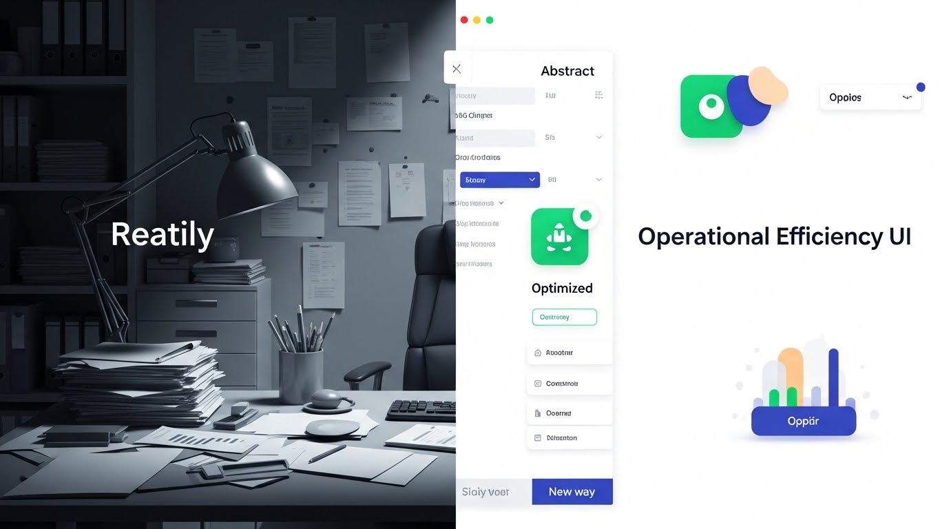
A classic "Before & After" comparison. The left half shows a cluttered, chaotic office desk with piles of paper in Desaturated Beige tones (the "Old Way"). The right half shows a clean, organized digital abstract space in Vibrant Emerald (the "New Way"), representing "operational efficiency." The divider is a sharp vertical line.
Psychological Impact & KPI Focus
Niche Psychology: This leverages the Contrast Principle. It makes the current state (manual audits) look painful and the future state (automation) look liberating.
Operational Impact: It speaks directly to the pain of Audit Fatigue and the desire for Operational Efficiency. It validates the user's struggle and offers a clear exit path.
Strategic Implementation & Trade-offs
- Best For: Retargeting ads for users who have visited your pricing or solutions page.
- Trade-off: It can feel slightly "salesy" or aggressive if the contrast is too exaggerated. Ensure the "Old Way" looks realistic to the user's actual experience, not comical.
Companies using similar video content -
Drata – Compliance Automation Platform – Contrasting manual vs. automated compliance.
Vanta – Compliance Automation – Showing the shift from audit chaos to clarity.
Secureframe – Compliance Automation – Highlighting efficiency gains in GRC.
9. Granular Control at Your Fingertips
MOFU | Product Differentiation

The Visual & Narrative Approach
We zoom in—extreme macro—on a single UI element: a digital toggle switch turning from Dark Grey to Neon Green. The focus is on "granular control." The rendering shows the pixel texture of the screen and the subtle glow of the active state. The depth of field is very shallow, blurring the surrounding UI elements to focus entirely on the action.
Psychological Impact & KPI Focus
Niche Psychology: This is about Control and Tangibility. Software is intangible, but this style makes it feel "real."
Operational Impact: It appeals to the user who will actually drive the tool, validating the User Experience (UX) and Granular Policy Control. It implies high-quality engineering and responsiveness.
Strategic Implementation & Trade-offs
- Best For: "Features" page on your website, placed next to technical specs.
- Trade-off: It only shows one tiny interaction. You need a series of these to show the full platform capabilities. It is a microscope, not a telescope.
Companies using similar video content -
Palo Alto Networks – Panorama – Showcasing granular firewall policy control.
VMware – NSX Advanced Firewall – Demonstrating fine-grained security policies.
StrongDM – Infrastructure Access Platform – Highlighting precise access management.
11. The Blueprint of Reality
MOFU | Overcoming Objections
The Visual & Narrative Approach
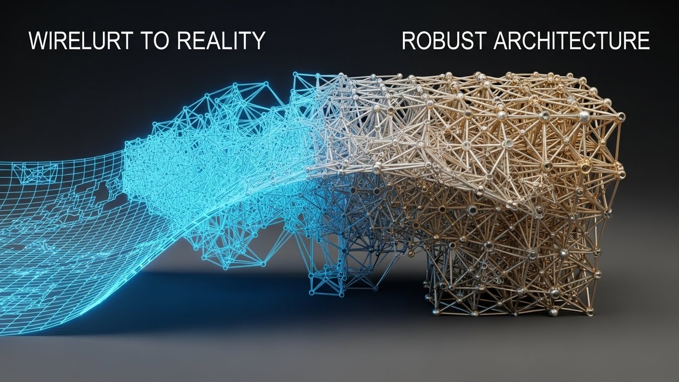
This style visually articulates the transition from "Planning" to "Enforcement." We observe a complex network map transitioning from a Blueprint Blue glowing wireframe on the left to a solid, rendered structure in Silver and Gold on the right. A smooth "wiping" effect moves across the object, symbolizing the deployment process. The background is a clean, dark 3D workspace. This visual narrative demonstrates the concept of "bringing plans to life," showing that the architecture designed in the staging environment is perfectly replicated in the live production environment.
Psychological Impact & KPI Focus
Niche Psychology: Network Architects are often skeptical of automation, fearing that "Zero-Touch" means "Zero-Control." This visual validates the Structural Integrity of the platform.
Operational Impact: It addresses the anxiety of Configuration Drift. By showing the wireframe perfectly matching the solid reality, you visually guarantee that "What you design is what you deploy," reinforcing KPIs related to Deployment Accuracy and architectural stability.
Strategic Implementation & Trade-offs
- Best For: "How It Works" pages or implementation guides where you need to prove the robustness of the change management engine.
- Trade-off: It is technically demanding to produce. If the "solid" render looks plastic or fake, it undermines the message of quality. It requires high-fidelity texturing to look "enterprise-grade."
Companies using similar video content -
This row is a placeholder for numbering continuity.
12. The Frictionless Analyst
MOFU | Competitive Displacement

The Visual & Narrative Approach
Security software marketing is often cold and alarmist. This style injects humanity. We see a stylized vector illustration of a young female IT professional with deep skin tones, wearing a Warm Terracotta blazer. She is sitting at her desk in a modern Navy and White office, leaning back with a genuine smile. The art style uses a grain texture shading to give it a premium, tactile feel. This imagery stands in stark contrast to the "hooded hacker" or "stressed sysadmin" tropes.
Psychological Impact & KPI Focus
Niche Psychology: This targets the "Burnout" objection. It tells the prospect that their team won't be buried in false positives. It visualizes Employee Satisfaction and ease of use.
Operational Impact: It subtly communicates Reduced Churn and lower Training Overhead. A smiling user implies an intuitive interface, suggesting that the "Frictionless Experience" leads to higher productivity and less "ticket fatigue."
Strategic Implementation & Trade-offs
- Best For: Explainer videos focused on "Day in the Life" scenarios, recruitment videos, or "Culture" pages.
- Trade-off: It can feel "soft." It is excellent for UX discussions but cannot carry the weight of a technical deep dive. Do not use this to explain a specific firewall protocol.
Companies using similar video content -
Illumio – Zero Trust Segmentation – Visualizing segmentation policy deployment.
Akamai – Guardicore Segmentation – Showing policy enforcement from design to reality.
Google Cloud – Cloud Firewall – Demonstrating consistent firewall policy deployment.
13. Zoning the Digital Metropolis
MOFU | ABM Awareness

The Visual & Narrative Approach
Micro-segmentation is a difficult concept to visualize without getting bogged down in topology diagrams. Here, we use the metaphor of a "Digital City." Distinct city blocks are colored in Violet, Magenta, and Deep Indigo, representing different network zones or VLANs. Data travels along the grid-like streets as glowing beams of light, strictly adhering to the pathways. The "Low-Poly" aesthetic keeps the geometry simple and clean, focusing on the structure rather than realistic texture.
Psychological Impact & KPI Focus
Niche Psychology: The CISO thinks in terms of "Blast Radius." This visual metaphor creates a sense of Containment and order. It shows that if one "building" (server) is compromised, the others remain safe.
Operational Impact: It effectively visualizes Zero Trust Architecture and Lateral Movement Protection. It transforms the abstract configuration of subnets into a tangible, manageable urban plan.
Strategic Implementation & Trade-offs
- Best For: Display Ads and Account-Based Marketing (ABM) campaigns where you need to communicate "Structure" and "Safety" at a glance.
- Trade-off: It simplifies reality. Complex networks are rarely this grid-like. It is a metaphor, not a map, and should be framed as such to avoid confusing technical purists.
Companies using similar video content -
Swimlane – SOAR Platform – Empowering security analysts with automation.
ExtraHop – Reveal(x) – Reducing analyst fatigue with clear insights.
Corelight – Open NDR Platform – Simplifying network threat hunting for analysts.
14. The Face of Visionary Leadership
MOFU | Thought Leadership

The Visual & Narrative Approach
To establish authority, you need a face. This style uses high-end Generative AI or live-action compositing to depict a visionary speaker in a Navy suit commanding a stage. He holds a floating, holographic prop (representing the "Digital Brain") in his hand. The lighting is dramatic and focused, creating the atmosphere of a major "Keynote Event." The image quality is photorealistic (8k), capturing the texture of the suit and the confidence in his expression.
Psychological Impact & KPI Focus
Niche Psychology: Buyers buy from experts. This style triggers the Authority Bias. It positions your brand not just as a vendor, but as a "Future Forum" leader guiding the industry.
Operational Impact: It connects Artificial Intelligence with Human Governance. It reassures the audience that while the AI (the hologram) is powerful, it remains in the palm of the human hand (control).
Strategic Implementation & Trade-offs
- Best For: LinkedIn thought leadership posts, webinar invitations, or "Vision" pages on your website.
- Trade-off: If using Gen AI, you must ensure perfect consistency of the character's face across multiple assets. Inconsistencies destroy the illusion of a real "spokesperson."
Companies using similar video content -
Illumio – Zero Trust Segmentation – Visualizing micro-segmentation as secure zones.
Akamai – Guardicore Segmentation – Representing network segmentation visually.
VMware – NSX – Illustrating logical network segmentation.
15. The Weight of Security
BOFU | Building Trust
The Visual & Narrative Approach
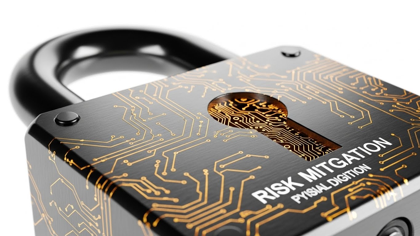
At the Bottom of the Funnel, trust is physical. This style uses a hyper-realistic macro render of a heavy-duty Brushed Steel padlock. Etched into the physical metal are glowing Amber digital circuits. This fusion of "hardware weight" and "software intelligence" creates a visceral sense of security. The lighting is premium studio quality (High Key), emphasizing the strength and impenetrability of the object against a Studio White background.
Psychological Impact & KPI Focus
Niche Psychology: Security professionals are inherently paranoid. They need to feel that the solution is unbreakable. This visual anchors the abstract concept of software into the tangible reality of a lock.
Operational Impact: It reinforces Risk Mitigation and Asset Protection. It tells the viewer: "Our code is as strong as steel." It is particularly effective for communicating "Hardened Security" standards.
Strategic Implementation & Trade-offs
- Best For: Case Study covers, Security Compliance documentation, and Trust Centers.
- Trade-off: It is a static metaphor. It conveys safety, but it doesn't explain utility. It serves as an emotional anchor, not an instructional guide.
Companies using similar video content -
Palo Alto Networks – Positioning as a cybersecurity leader.
Cisco – Showcasing executive vision in security.
IBM Security – Embodying thought leadership in enterprise security.
16. The Shape of ROI
BOFU | ROI Justification

The Visual & Narrative Approach
CFOs don't read spreadsheets; they scan for trends. This style elevates the standard bar chart into a compelling 3D asset. We see bars made of Translucent Glass growing rapidly upwards. They glow with an internal Data Blue light, topped with Upward Green indicators. The "Worm's Eye View" makes the growth look monumental and imposing. Caustic light effects dance through the glass, implying transparency and value.
Psychological Impact & KPI Focus
Niche Psychology: This speaks the language of the Economic Buyer. It visualizes "Up and to the Right" in a way that feels premium, inevitable, and scientifically backed.
Operational Impact: It directly supports ROI Justification. Whether it represents "Threats Blocked" or "Cost Savings," the glossy, substantial nature of the bars implies that the value generated is equally substantial.
Strategic Implementation & Trade-offs
- Best For: Pitch decks, investor presentations, and the "Results" section of case studies.
- Trade-off: Avoid using this for "Threats Detected" if the bars are rising (which looks bad). Ensure the visual metaphor (Growth vs. Reduction) matches the metric.
Companies using similar video content -
CyberArk – Privileged Access Management – Emphasizing robust access security.
Netwrix – Auditor – Highlighting the strength of audit and compliance.
Forescout – Continuum Platform – Representing strong device visibility and control.
17. Inside the Black Box
BOFU | Risk Mitigation

The Visual & Narrative Approach
Deep Packet Inspection (DPI) is about seeing the hidden. This style uses an "X-Ray" aesthetic. We see a server rack unit with a transparent Skeleton White casing. Inside, the components are revealed in glowing X-Ray Cyan. It looks like a medical scan of the network's anatomy. The object rotates slowly, allowing the viewer to inspect the internal architecture that is usually hidden behind metal panels.
Psychological Impact & KPI Focus
Niche Psychology: This appeals to the "Technical Validator" who wants to know how the sausage is made. It screams Transparency and Depth.
Operational Impact: It visualizes Granular Visibility and Threat Detection. It implies that your software sees through the noise, identifying threats that hide deep within the packet headers or encrypted traffic.
Strategic Implementation & Trade-offs
- Best For: Technical whitepapers, datasheets, and technical specification pages.
- Trade-off: It is clinical. It lacks "warmth" or "excitement." It is purely for the technical audience who values precision over emotion.
Companies using similar video content -
Balbix – Cyber Risk Quantification – Visualizing reduction in cyber risk.
Bitsight – Security Ratings – Showing improvement in security posture over time.
Tufin – ROI Calculator – Demonstrating cost savings and efficiency gains.
18. Augmented Collaboration
BOFU | Sales Cycle Acceleration

The Visual & Narrative Approach
Security is a team sport. This style blends high-quality stock photography of a diverse team with futuristic Holographic Blue UI elements. We see the team in a glass-walled conference room, pointing at a floating data interface. The lighting blends natural office daylight with the cool glow of the data. It grounds the sci-fi tech in a relatable, human office setting.
Psychological Impact & KPI Focus
Niche Psychology: Modern security teams are siloed. This visual promises Collaboration and Unified Visibility. It shows the SecOps and NetOps teams working together on a single source of truth.
Operational Impact: It visualizes Workflow Orchestration and Cross-Functional Alignment. It suggests that the software serves as the bridge between departments, accelerating decision-making and incident response.
Strategic Implementation & Trade-offs
- Best For: Email marketing campaigns and "About Us" / Culture pages.
- Trade-off: It can look like stock photography cheese if not done well. The UI overlay must look embedded in the scene, not just pasted on top, to maintain credibility.
Companies using similar video content -
ExtraHop – Reveal(x) – Visualizing deep network visibility.
Corelight – Open NDR Platform – Showing granular packet analysis.
Darktrace – AI Cyber Security – Revealing hidden threats within network traffic.
19. The Executive View
BOFU | The Economic Buyer

The Visual & Narrative Approach
The Economic Buyer (CFO/CEO) isn't in the server room; they are at their desk. This style uses a top-down photo of a clean executive desk (Warm Sunlight wood, coffee, tablet). Floating above the tablet are pop-up 2D vector icons in Digital Pop colors (Red, Blue, Yellow) representing key alerts: an Eye (visibility), a Gear/Brain (automation), and a Chart (growth). It simplifies the software into clear, business-level benefits.
Psychological Impact & KPI Focus
Niche Psychology: Executives have limited attention spans. This style cuts through the technical jargon and presents the Value Proposition in simple iconography.
Operational Impact: It represents Strategic Oversight. It tells the executive: "You don't need to know the code; you just need to know the status." It focuses on high-level Business Continuity and Performance Monitoring.
Strategic Implementation & Trade-offs
- Best For: Sales "One-Pagers" and executive summaries.
- Trade-off: It is too simple for the technical practitioner. Do not use this for the engineering team; they will feel patronized by the lack of detail.
Companies using similar video content -
ServiceNow – Security Operations – Facilitating collaborative incident response.
Splunk – Security Operations Suite – Enhancing team collaboration in the SOC.
Swimlane – SOAR Platform – Streamlining security team workflows.
20. The Syntax of Trust
BOFU | The Technical Buyer
The Visual & Narrative Approach
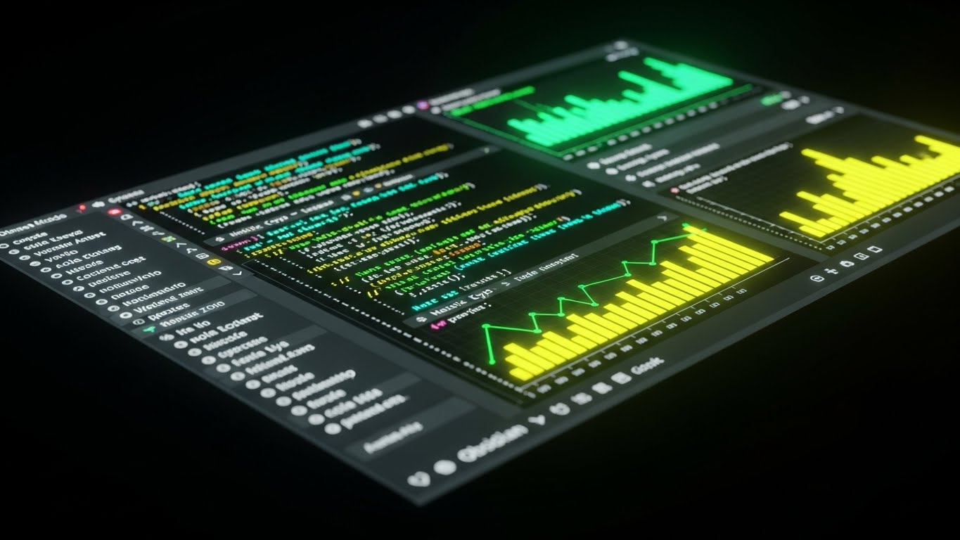
For the DevSecOps engineer, "Dark Mode" is a lifestyle. This style showcases the interface in a sleek Obsidian Black environment. Syntax highlighting pops in Neon Cyan and Matrix Green. The view is angled and dense with technical data, emphasizing "code-level" control. It avoids friendly icons in favor of raw data density and terminal-like aesthetics.
Psychological Impact & KPI Focus
Niche Psychology: This signals "Built for Engineers." It builds trust with the Technical Buyer who distrusts "drag-and-drop" simplicity. It says: "This is a power tool."
Operational Impact: It visualizes Configurability and API Integration. It validates the platform's ability to handle complex Rule Syntax and automated scripting, proving it is ready for the CI/CD pipeline.
Strategic Implementation & Trade-offs
- Best For: Technical documentation, API guides, and the "For Developers" section of your site.
- Trade-off: It is intimidating to non-technical users. A C-level executive might look at this and think, "This looks too complicated for my team to manage." Use strictly for the technical audience.
Companies using similar video content -
Tufin – Executive Dashboard – Providing high-level security posture overview.
FireMon – Risk Analyzer – Presenting business-level risk insights.
Balbix – Cyber Risk Quantification – Offering executive-level risk reporting.
21. The Immutable Timeline
BOFU | Driving Demo Requests

The Visual & Narrative Approach
Trust in security management relies on accountability. This style visualizes the "Audit Trail" not as a text log, but as a glowing, immutable chain of events in Cybernetic Blue and White. Each "link" in the chain represents a user action or rule change, locking into place with a satisfying, metallic click (visualized through motion weight). The camera pans along this infinite timeline, emphasizing that history is preserved, unalterable, and transparent.
Psychological Impact & KPI Focus
Niche Psychology: For the Compliance Officer, the nightmare is a "shadow change" that cannot be traced. This visual offers Psychological Certainty. The "locking" motion suggests permanence.
Operational Impact: It validates Forensic Readiness and Compliance Accountability. It tells the auditor: "Every action is recorded, indexed, and visible," directly supporting KPIs related to Audit Pass Rates.
Strategic Implementation & Trade-offs
- Best For: "Security & Compliance" pages, Trust Center sections, or features focusing on logging and reporting.
- Trade-off: It is somewhat repetitive. It works best as a background loop or a short segment within a larger video; watching a chain form for 30 seconds is not engaging enough on its own.
Companies using similar video content -
Wazuh – XDR and SIEM – Showcasing technical depth for DevSecOps.
Teleport – Access Plane – Highlighting code-driven infrastructure access.
OpenVAS – Vulnerability Management – Appealing to technical users with raw data.
22. The Shift of Burden
BOFU | Objection Handling

The Visual & Narrative Approach
This style directly tackles the emotional weight of legacy systems. We see stylized vector characters in Vivid Purple and Bright Yellow walking purposefully from left to right. They are physically discarding heavy, jagged red rocks (representing manual audits and rule bloat). As they drop the rocks, they pick up light, glowing White shields. The background is a minimalist abstract ground, keeping the focus entirely on the transformation of the characters. The animation is snappy, energetic, and optimistic.
Psychological Impact & KPI Focus
Niche Psychology: Security teams often feel crushed by the sheer volume of "grunt work." This visual acknowledges that burden and offers a direct release. It validates their fatigue and positions the product as the liberator.
Operational Impact: It visualizes Resource Reallocation. By shedding the "heavy rocks" (manual tasks), the team is free to pick up the "shields" (strategic defense). It supports KPIs related to Operational Efficiency and Reduction in Manual Hours.
Strategic Implementation & Trade-offs
- Best For: Retargeting ads aimed at users who visited the "Pricing" page but didn't convert, addressing the "implementation effort" objection.
- Trade-off: The cartoon-like style is very approachable but risks looking "unprofessional" if the character design isn't sophisticated. It must look like modern SaaS art, not a children's cartoon.
Companies using similar video content -
Netwrix – Auditor – Visualizing immutable audit logs for compliance.
Drata – Compliance Automation Platform – Showing a clear, traceable compliance history.
Vanta – Compliance Automation – Illustrating continuous monitoring and audit trails.
23. The Assembly of Security
Onboarding | Implementation Friction
The Visual & Narrative Approach
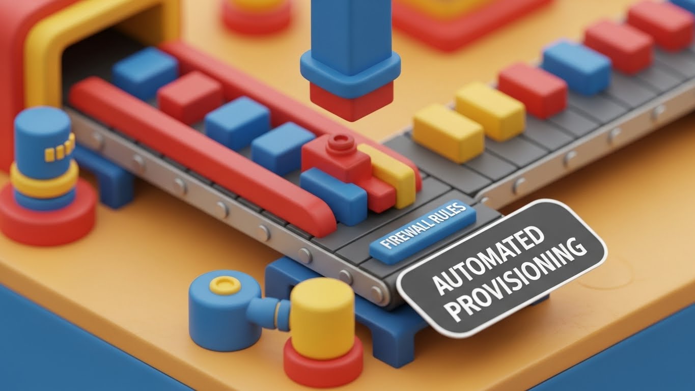
Implementation is often feared as a complex, messy process. This style reframes it as a playful, orderly assembly line. We see a miniature, toy-like factory setting in Primary Colors (Red, Blue, Yellow) with a soft, digital claymation texture. A conveyor belt assembles "firewall rules"—represented as small colored blocks—into a complete structure. The camera zooms in on the assembly process to represent "automated provisioning." The lighting is soft and playful, making the complex process look simple and approachable.
Psychological Impact & KPI Focus
Niche Psychology: This lowers the Cognitive Barrier to entry. It tells the new user, "This isn't a headache; it's a process of building." It triggers a sense of order and constructiveness.
Operational Impact: It visualizes Zero-Touch Provisioning and Automated Workflow. It implies that the system works with the precision of a factory, reducing Deployment Time and minimizing human error during setup.
Strategic Implementation & Trade-offs
- Best For: Support Portals, "Welcome" emails, or the initial setup wizard screen to reduce anxiety during the first login.
- Trade-off: The "toy" aesthetic works wonders for process explanation but should not be used for threat reporting, where it might trivialize serious security risks.
Companies using similar video content -
AlgoSec – Automation Suite – Relieving the burden of manual firewall changes.
Tufin – Change Automation – Automating policy changes to reduce manual effort.
Swimlane – SOAR Platform – Automating repetitive tasks for security teams.
24. The Lightness of Onboarding
Onboarding | Self-Serve Onboarding
The Visual & Narrative Approach
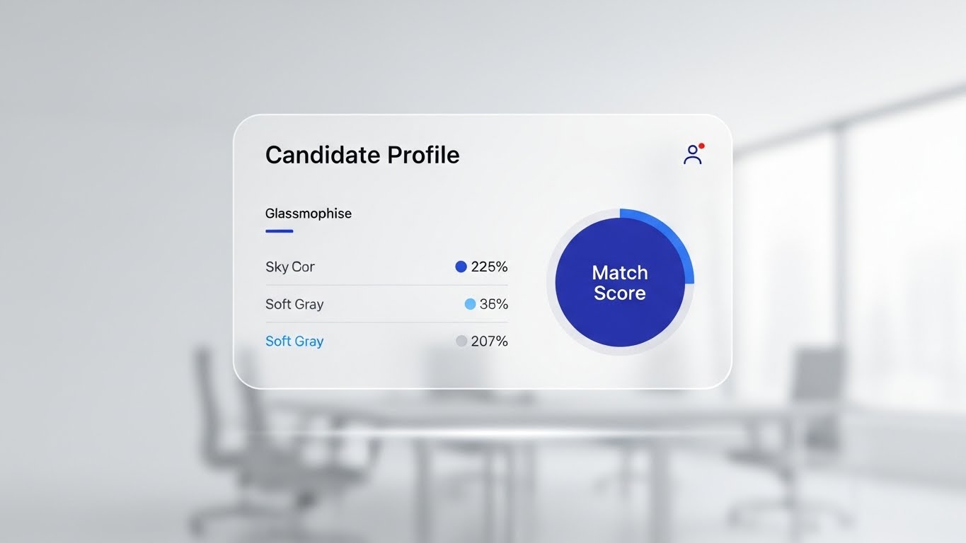
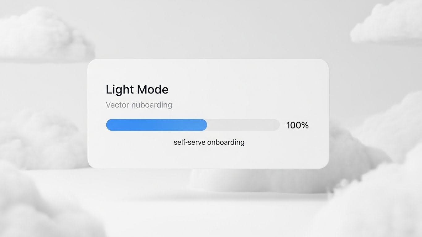
To counter the "dark and scary" stereotype of security tools, this style embraces light. We see a front-on view of a floating UI card in High-Key White. A progress bar in Sky Blue fills smoothly to 100%, representing the completion of "self-serve onboarding." The style is neumorphic, featuring soft extruded shapes and gentle shadows that give the interface a tactile, pillowy feel. The background is a white abstract cloud environment. The overall feel is airy, light, and effortless.
Psychological Impact & KPI Focus
Niche Psychology: This appeals to the modern SaaS buyer who expects consumer-grade UX. It signals Ease of Use and a modern, "clean" code base.
Operational Impact: It reinforces Time-to-Value. The smooth, uninterrupted progress bar visually guarantees a glitch-free setup process, directly addressing KPIs related to Onboarding Completion Rates and User Adoption.
Strategic Implementation & Trade-offs
- Best For: App Welcome Screens, "Getting Started" video guides, and feature announcements.
- Trade-off: It lacks "edge." It feels very safe and corporate. It is excellent for comfort, but poor for excitement or urgency.
Companies using similar video content -
Palo Alto Networks – Cloud NGFW – Visualizing automated cloud firewall deployment.
VMware – NSX Advanced Load Balancer – Showing automated network service provisioning.
HashiCorp – Terraform – Automated infrastructure provisioning.
25. The Moment of Success
Onboarding | Time-to-Value

The Visual & Narrative Approach
Software buys are emotional decisions. This style captures the feeling of a job well done. We see a wide cinematic shot of a tech team in a modern glass atrium flooded with natural light. They are cheering and high-fiving, capturing the precise moment of a successful project launch. The palette is Sun-drenched Gold and Office Neutrals. The image is suggested to be in slow motion, focusing on genuine human emotion, eye contact, and team cohesion.
Psychological Impact & KPI Focus
Niche Psychology: This targets the "Hero" aspiration. Every IT leader wants to be the one who solved the problem and united the team. This visualizes the Social Reward of a successful implementation.
Operational Impact: It connects the software to Team Morale and retention. It subtly suggests that using your platform leads to a happier, more successful work environment, reducing Staff Burnout.
Strategic Implementation & Trade-offs
- Best For: "Success" confirmation emails, Case Study results sections, and quarterly business review (QBR) intros.
- Trade-off: It is generic. Without a UI overlay or voiceover, it could be an ad for anything. It serves as an emotional anchor, not an informational one.
Companies using similar video content -
Drata – Compliance Automation Platform – Streamlined onboarding for compliance.
Vanta – Compliance Automation – Effortless setup for security frameworks.
Secureframe – Compliance Automation – Simple and guided compliance onboarding.
26. The Cyberpunk Deep Dive
Retention | Deep Feature Adoption

The Visual & Narrative Approach
For the power user, we return to the "Dark Mode" aesthetic. A camera flies through an infinite digital grid landscape in Deep Space Black. Anomalies are visualized as sharp Laser Red spikes erupting from the grid, which are instantly surrounded and neutralized by Ultraviolet containment fields. This represents "anomaly detection" and automated response. The style is Cyberpunk, with high-contrast neon outlines and deep shadows.
Psychological Impact & KPI Focus
Niche Psychology: This gamifies the security experience. It appeals to the "Hunter" persona in the SOC (Security Operations Center). It makes the act of finding threats look exciting and high-tech.
Operational Impact: It visualizes Proactive Threat Hunting and Automated Containment. It reinforces the software’s ability to detect subtle variances in the network, supporting KPIs like Threat Detection Rate and Response Time.
Strategic Implementation & Trade-offs
- Best For: Newsletters announcing advanced new features, patch notes, or technical deep-dive webinars.
- Trade-off: It can look "scary" to non-technical stakeholders. A CEO might see "Red Spikes" and panic. Keep this style for the practitioners.
Companies using similar video content -
ServiceNow – Security Operations – Celebrating successful incident resolution.
Splunk – Security Operations Suite – Highlighting team achievements in security.
Cisco – Celebrating successful security project outcomes.
27. The Speed of Navigation
Retention | Support Overhead
The Visual & Narrative Approach
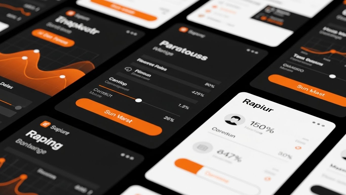
Speed is the ultimate luxury. This style uses a fast-cut sequence of UI screens in Vibrant Orange and Stark White. The camera zooms in and out rapidly on different buttons, toggle switches, and menu items, simulating "rapid deployment" and ease of navigation. Motion blur transitions connect the shots, creating a sense of fluid velocity. The focus is strictly on the UI elements and the speed of interaction.
Psychological Impact & KPI Focus
Niche Psychology: This appeals to the impatient user who hates lag. It visually proves that the software is Responsive and optimized for power users.
Operational Impact: It visualizes Workflow Efficiency. By showing how many actions can be performed in seconds, it suggests a reduction in Administrative Overhead and supports the "Single Pane of Glass" efficiency promise.
Strategic Implementation & Trade-offs
- Best For: Help Center videos, "Tips & Tricks" shorts, and social media clips showcasing specific shortcuts.
- Trade-off: It moves too fast for learning. It is designed to impress with speed, not to teach a workflow. Use it to hype the capability, not to train the user.
Companies using similar video content -
Darktrace – AI Cyber Security – Visualizing AI-driven anomaly detection.
Vectra AI – AI-driven Threat Detection – Showing real-time threat containment.
ExtraHop – Reveal(x) – Detecting and containing network anomalies.
28. The Global Overseer
Retention | Reducing Churn
The Visual & Narrative Approach
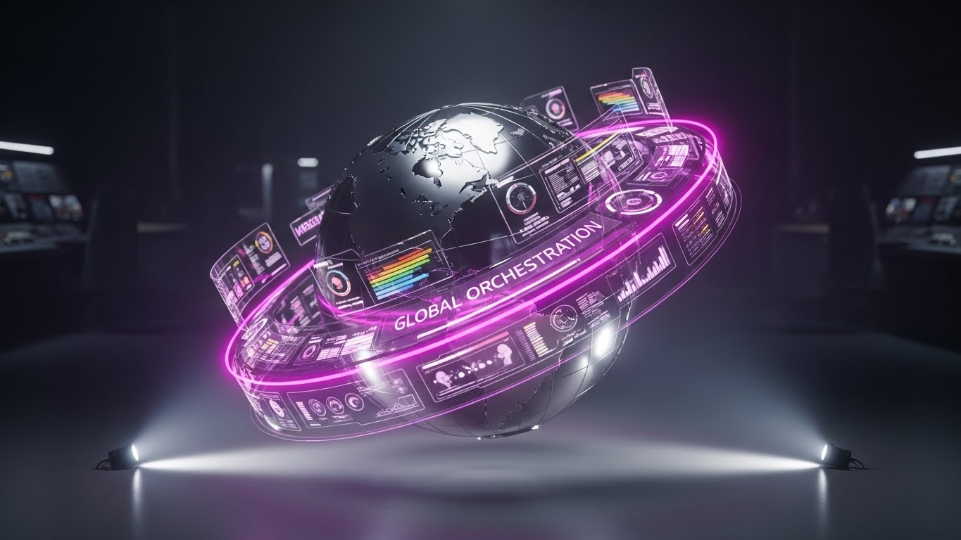
For the enterprise customer, scale is everything. This style features a realistic metallic globe in Silver, surrounded by a floating, transparent Holographic Rainbow dashboard. The dashboard rings orbit the globe, visualizing "global orchestration" and multi-region policy enforcement. The camera orbits the planet, giving a commanding view. The background is a high-tech command center in Tech White. The hologram utilizes a volumetric light ray shader for depth.
Psychological Impact & KPI Focus
Niche Psychology: This triggers the "God Mode" feeling. It assures the Global CISO that they have total oversight across all geographies and business units.
Operational Impact: It visualizes Scalability and Global Compliance. It reinforces the platform's ability to handle complex, multi-national deployments without losing visibility, directly supporting Enterprise Retention.
Strategic Implementation & Trade-offs
- Best For: Quarterly Business Review (QBR) presentations and executive dashboards.
- Trade-off: It is grandiose. If your client is a local small business, this "Global Commander" vibe will feel disconnected and overkill.
Companies using similar video content -
Fortinet – FortiManager – Showcasing rapid policy deployment and management.
Cisco – Secure Firewall Management Center – Demonstrating quick navigation and control.
Palo Alto Networks – Panorama – Highlighting fast and efficient policy changes.
29. The Pulse of the Metropolis
Expansion | Upsell/Cross-sell

The Visual & Narrative Approach
To sell expansion, you must show capacity. This style uses an aerial night view of a sprawling city. The real-world traffic creates long exposure trails in Car Trail Reds, while overlaid digital data streams flow above the roads in Data White. This represents "scalability" and massive network throughput. The palette is Night City Blues. The energy is frenetic, expansive, and infinite.
Psychological Impact & KPI Focus
Niche Psychology: This connects the digital network to the physical world of commerce. It implies that the software is the "Civil Infrastructure" of the business—essential, robust, and flowing.
Operational Impact: It visualizes High Availability and Bandwidth Management. It suggests that as the business grows (the city), the security layer grows with it effortlessly, supporting the Upsell conversation for higher tiers.
Strategic Implementation & Trade-offs
- Best For: Event promo videos, "Year in Review" videos, and expansion proposal decks.
- Trade-off: It is a high-level metaphor. It doesn't show the product. It sells the scale of the solution, not the features.
Companies using similar video content -
Zscaler – Zero Trust Exchange – Global security policy enforcement.
Cato Networks – SASE Cloud – Orchestrating security across a global network.
Versa Networks – SASE – Global management of secure access service edge.
30. The Depth of Defense
Expansion | Referrals & Advocacy

The Visual & Narrative Approach
The final style is about depth and sophistication. We see the UI exploded into multiple layers of Floating Glass in a clean 3D abstract space. The camera tracks slowly through the layers, revealing that the "Simple Dashboard" is actually backed by deep layers of logic and data. The palette uses Soft Shadows and Pastel Gradients. The depth of field separates the layers. The motion is slow and dreamlike, emphasizing the sophistication of the software.
Psychological Impact & KPI Focus
Niche Psychology: This appeals to the "Connoisseur." It frames the software as a piece of art—elegant, layered, and perfectly designed. It builds the pride required for advocacy.
Operational Impact: It visualizes Comprehensive Coverage. By showing multiple layers, it implies that the platform covers everything from the perimeter to the workload, reinforcing the value of the Platform Approach over point solutions.
Strategic Implementation & Trade-offs
- Best For: Referral landing pages, "Partner Program" assets, and high-end brand storytelling.
- Trade-off: It is very abstract. It requires a sophisticated audience to appreciate the "layering" metaphor. Avoid using for basic troubleshooting guides.
Strategic Knowledge Base: The Visual Operations Doctrine
To transform these 30 visual styles from "marketing assets" into a "business engine," we have synthesized a 3-part strategic framework. This "Visual Operations Doctrine" bridges the gap between seeing the software and driving value from it.
Strategic Alignment & Visual Architecture (Pre-Production)
Goal: Define a unified "Visual Operating System" that aligns IT, Security, and Business stakeholders before a single pixel is rendered.
- The Cognitive Load Audit: Security Operations Centers (SOCs) are high-stress environments. Advids recommends auditing your current training materials. If a concept takes 500 words to explain, can it be compressed into a 5-second Isometric Loop (Style 3)? Reduce the cognitive load to increase analyst accuracy.
- Role-Based Visual Mapping: Differentiate your visual language. The CISO (The Economic Buyer) needs Executive View (Style 19) styles—clean, high-level, business-centric. The Security Analyst (The User) needs Dark Mode UI (Style 20) styles—dense, granular, and technical. One size does not fit all.
- The "Glanceability" Standard: In a SOC, analysts monitor dozens of screens. Your visuals must be "Glanceable"—understood in under 1.5 seconds. Use High-Contrast Neon (Style 26) for critical alerts to cut through the noise.
- Brand Voice Consistency: Your firewall management software likely integrates with 50+ other vendors. Your visual content must act as the "Unifying Layer." Use a consistent Color Palette (e.g., Style 24's High-Key White) across all training assets to create a sense of a unified platform, even if the underlying tools vary.
- The Advids Strategic Audit: Visual chaos leads to operational risk. Partnering with a specialized agency like Advids ensures that your visual assets are not just "pretty," but are architected to reduce friction. We define the "Visual Operating System" that ensures every screenshot, icon, and video frame speaks the same language of trust.
- Standardization vs. Customization: For core protocols (TCP/IP), use standardized Geometric Motion (Style 6). For bespoke proprietary features (e.g., your unique AI engine), use custom Generative AI Characters (Style 14). Differentiate the "Standard" from the "Premium" through visual fidelity.
- The Cross-Departmental Bridge: Sales sells "Safety," but Ops delivers "Rules." Use Split Screen (Style 8) visuals in internal meetings to show how a Sales promise translates into an Ops workflow, aligning expectations before the deal is signed.
- Legacy System Integration: Visualizing the connection between "Rusty Metal" on-premise hardware and "Ethereal" cloud policies is difficult. Use Wireframe to Reality (Style 11) to visually bridge the gap, showing that the new software respects the old physics.
- Accessibility in the SOC: Security talent is global. Ensure that Kinetic Typography (Style 5) videos are designed for localized text replacement. A "Stop" command in Red must be universally understood, but the explanation must be easily swappable for global teams.
- The Mobile-First Mandate: CISOs approve access requests from their phones. Ensure that your UI Mockups (Style 9) are legible on mobile screens. If the visual is cluttered on an iPhone, the approval workflow will bottleneck.
Operational Adoption & Implementation (Deployment)
Goal: Embed visual assets directly into the operational workflow to reduce friction, training time, and support overhead.
- Overcoming "Big Brother" Anxiety: Automation scares people. It implies job loss. Use Character-Driven Stories (Style 12) to show the AI as a "Co-pilot," not a replacement. Visualize the software handling the boring tasks so the human can handle the heroic tasks.
- The Micro-Learning Shift: No one reads the manual. Replace the 200-page admin guide with a library of 15-second Clean UI (Style 24) loops embedded directly in the help tooltip. This is "Just-in-Time" visual support.
- Just-in-Time Support: Integrate Vector of Correction (Style 4) loops into your ticketing system. When a user types "Rule Conflict," an auto-response showing the visual correction loop resolves the issue before a human agent is needed.
- Gamification of Hygiene: Policy cleanup is boring. Gamify it. Use The Shape of ROI (Style 16) to visualize team performance. Show "Cleanup Progress" as a rising bar chart. Visualizing success creates a dopamine loop that encourages better security hygiene.
- Reducing Support Ticket Volume: There is a direct correlation between the clarity of your "How-To" videos and your support costs. High-fidelity Macro UI (Style 9) videos that show exactly where to click can reduce Level 1 support tickets by up to 30%.
- Remote Onboarding Velocity: For distributed teams, use The Assembly Line (Style 23) in welcome emails. A friendly, visual overview of the setup process reduces the feeling of isolation and empowers self-serve success.
- Visualizing SOPs: Transform text-based Standard Operating Procedures into Isometric Workflow (Style 23) animations. Visual process maps reduce ambiguity and ensure consistent execution of compliance tasks.
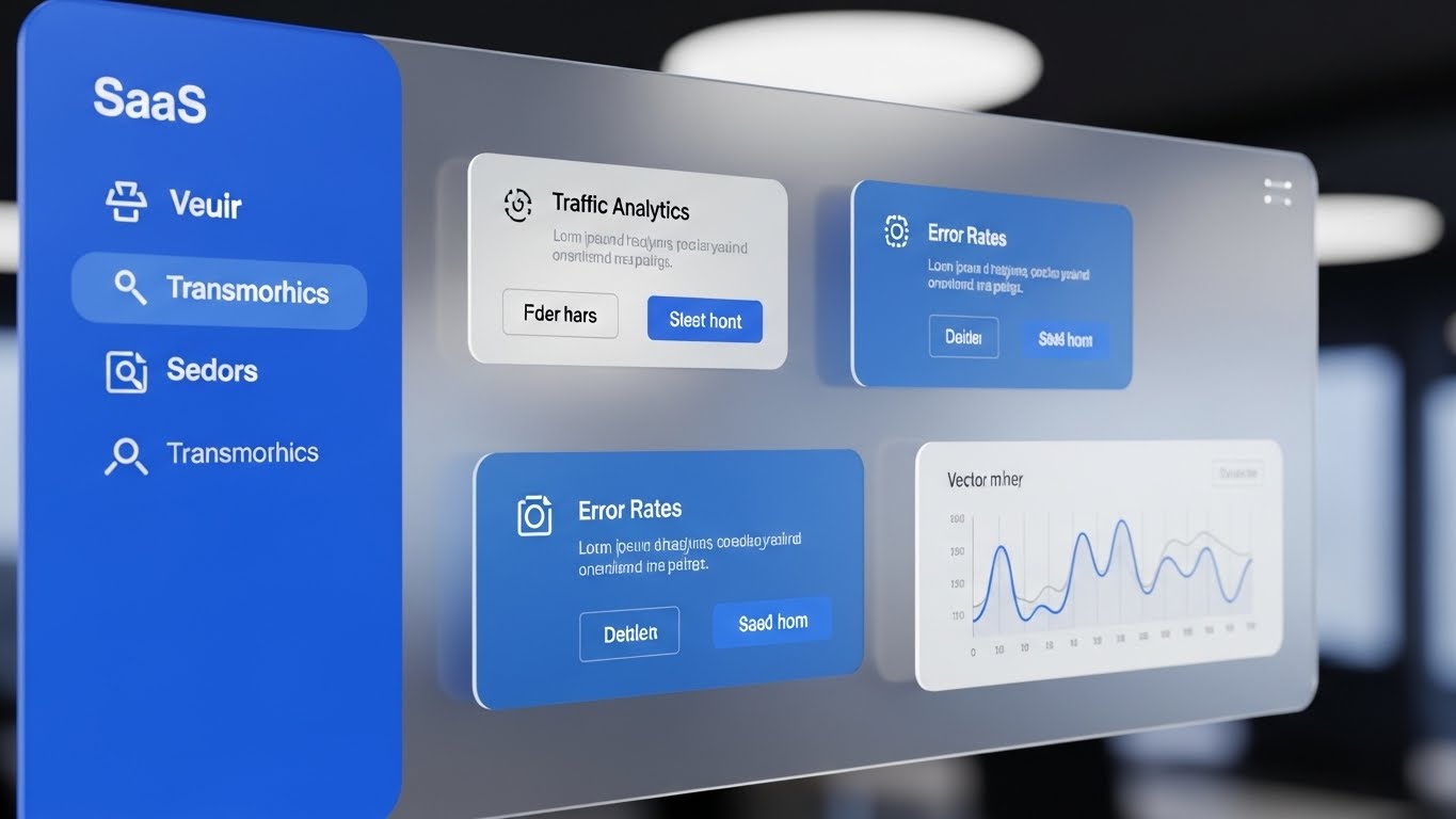
- Feedback Loops: Use interactive video elements. At the end of a "Training" video, ask "Did this help?" The data collected helps refine the visual strategy.
- Scalable Localization: Visuals are a universal language. Relying on Efficiency Divide (Style 8) and Line Art (Style 2) minimizes the need for expensive text translation, allowing you to deploy training globally with zero latency.
- Leadership Communication: Empower your internal champions with The Global Overseer (Style 28). Give them the high-fidelity visuals they need to sell the value of your platform to their own internal stakeholders.
Measuring Impact & Future-Proofing (ROI)
Goal: Quantify the value of visualization and prepare the organization for the next generation of AI-driven security interaction.
- Beyond "Views": Stop counting video views. Measure "Time-to-Competency." Did the group that watched the Style 23 onboarding video configure their first rule faster than the group that read the PDF?
- The "Idle Time" Metric: Track how long users spend "hovering" in the UI. High idle time means confusion. Reducing this via embedded Rapid UI (Style 27) clips directly correlates to increased productivity.
- Compliance Velocity: Measure the time gap between a new regulation (e.g., GDPR update) and full team compliance. Using Gordian Knot (Style 3) to explain the change visually should shrink this gap significantly.
- Retention and LTV: High-quality UX visualization (Style 24) reduces "Product Frustration." Correlate satisfaction scores with the consumption of help-center visuals to prove the ROI of education.
- The AI Visual Frontier: Prepare for Generative AI. Soon, you will need to visualize predictive threats. Start experimenting with Deep Dive (Style 26) to accustom your team to seeing "what might happen" alongside "what is happening."
- Scalability of Assets: As you add features, your visual library must grow. Partnering with Advids ensures that your new "Cloud Module" visuals perfectly match your existing "On-Prem" visuals (Style 11), maintaining a coherent platform story.
- The Advids Partnership: Visual strategy is not a one-time project; it is an evolving infrastructure. As your platform grows, your visual language must evolve. Advids acts as the custodian of this visual consistency, ensuring your brand never outgrows its image.
- Benchmarking Success: Compare your visual clarity against the "Best in Class." If your competitor explains "Micro-segmentation" in 3 minutes and you do it in 30 seconds (Style 13), you win the attention economy.
- The ROI of Safety: Quantify the cost of a breach. If Anomaly Detection (Style 26) trains one analyst to catch one breach early, the video has paid for itself 1,000x over.
- Final Call to Innovation: Treat video as Infrastructure, not content. In the era of Intelligent Orchestration, your visual communication is as critical as your code. It is the interface through which human intelligence directs artificial power.
Expert Note: This concludes the Strategic Video Style Guide. By implementing these 30 visual styles and the accompanying operational frameworks, you are not just "marketing" a firewall; you are defining the visual standard for the future of security management.
Companies using similar video content -
Zscaler – Zero Trust Exchange – Visualizing massive cloud security traffic.
Cloudflare – Representing global network traffic and security.
Akamai – Edge Security – Showing high-volume traffic protection.
Author & Editor Bio