
Introduction: Visualizing the Future of Sustainable Logistics
The logistics sector is standing at a transformative crossroads. Driven by the dual engines of regulatory compliance and operational efficiency, fleet leaders are moving rapidly beyond simple GPS tracking into an era of deep, data-driven intelligence. With the global emission management software market projected to reach USD 78.72 billion by 2034, the scale of this digitization is undeniable.
However, for the "Strategic Fleet Modernizer"—the VPs and Directors tasked with this transition—the challenge isn't just acquiring data; it is interpreting it. As fleets ingest terabytes of information regarding Scope 3 emissions, battery health, and predictive maintenance, a new challenge emerges: the "Physical/Digital Divide." How do you translate complex, invisible data streams into actionable insights that stakeholders can instantly comprehend?
This is where strategic video visualization becomes a critical business lever. It serves as the bridge, translating the abstract mathematics of carbon offsetting into tangible, visual narratives. The operational argument is equally powerful: advanced route optimization strategies can now deliver 20-30% fuel savings by converting raw data into smarter driving decisions.
This guide explores distinct visual styles designed to solve specific communication challenges within the Fleet Emissions Management domain. From simplifying market education to visualizing high-fidelity engineering, these frameworks provide the "Gold Standard" for articulating value in a complex B2B landscape.
7. Abstract 2D Flat Vector Organic Motion Graphics
TOFU | Connected TV

(Abstract Motion): Fluid Adaptability + Seamless Integration
The Visual & Narrative Approach
This aesthetic uses fluid, amorphous shapes to represent the adaptability of modern software. As seen in the example, "blob" shapes in gradients of Teal and Mint Green seamlessly morph to suggest the form of a delivery van before transitioning into a water droplet or leaf. The background is a soft Ice Blue, providing a calm, liquid finish. The motion is continuous and smooth, suggesting that the software is an organic, living part of the logistics ecosystem rather than a rigid tool.
Psychological Impact & KPI Focus
The "Strategic Fleet Modernizer" often fears that new software will be rigid and difficult to integrate. This visual style leverages Metaphorical Processing, using the fluidity of the graphics to subconsciously communicate agility and ease of integration. It addresses the "Integration Anxiety" key finding by showing the system adapting to different shapes (needs). The primary KPI here is Viewer Retention, as the mesmerizing, constant motion keeps the eye engaged longer than static slides.
Strategic Implementation & Trade-offs
- Duration: 45-60 Seconds.
- Strategic Trade-off: While visually arresting, this abstract approach can be too vague for technical audiences who want to see the actual dashboard UI. It is best used for "Why Us" narratives rather than "How It Works" tutorials.
Style 24: Holographic UI over 3D Render
Funnel Stage: TOFU | Goal: 1.5 Shaping Brand Perception | Screen: 16:9

(Holographic UI): Digital Twin + Premium Brand Authority
The Visual & Narrative Approach
This style represents the pinnacle of "Digital Twin" visualization. It features a futuristic holographic user interface floating elegantly over a high-fidelity 3D environment. While the style often overlays Luminous Cyan and Magenta wireframes onto vehicle chassis to show battery packs, it is equally powerful in data center contexts (as shown in the visual), where a "Supplier Scorecard" hologram hovers before a server rack. The background is a pristine, high-key white or cool blue virtual showroom. The lighting implies a high-tech studio setting with holographic glow effects.
Psychological Impact & KPI Focus
This style directly targets the persona's desire for Control and Visibility. By superimposing data (the hologram) over the physical asset (the truck or server), it visually solves the "Physical/Digital Divide." It signals to the CIO or CTO that this platform provides a literal "layer of intelligence" over their physical operations. The goal is to elevate Brand Perception, positioning the SaaS platform as a futuristic, enterprise-grade solution worthy of significant investment.
Strategic Implementation & Trade-offs
- Duration: 30-45 Seconds.
- Strategic Trade-off: This is a high-cost production style requiring advanced 3D modeling. It is optimal for "Hero" sections of a website to wow visitors but suboptimal for quick social media updates where the fine details might be lost on small screens.
Companies using similar video content -
Aurora – Aurora Driver – Visualizes self-driving tech with holographic data overlays on trucks.
Motive – Motive AI Dashcams – Shows AI insights overlaid on vehicle footage.
Epika Fleet – Autonomous Fleet Management – Represents AI-driven control over autonomous vehicles.
4. Bold Kinetic Typography (Visual)
TOFU | Shaping Brand Perception
(Kinetic Typo): High Contrast + Zero Emissions Urgency
The Visual & Narrative Approach
Designed for the fast-paced scroll of TikTok, this style uses no voiceover, relying entirely on visual rhythm. Bold, blocky geometric shapes in Electric Lime crash into Charcoal Black smoke clouds (representing emissions), causing the smoke to instantly dissipate into clean Pure White circles. The motion is rapid, percussive, and synchronized to a high-energy beat. It abstracts the concept of "Zero Emissions" into a visceral, kinetic conflict between pollution and solution.
Psychological Impact & KPI Focus
On platforms like TikTok, attention spans are measured in milliseconds. This style utilizes Pattern Interruption—sudden, bold movement that arrests the thumb scroll. It appeals to the younger demographic of logistics professionals or "green tech" enthusiasts by framing sustainability as an energetic, active pursuit rather than a passive compliance task. The KPI is pure Engagement Rate (Views/Likes), aiming to create viral awareness.
Strategic Implementation & Trade-offs
- Duration: 10-15 Seconds (Loopable).
- Strategic Trade-off: It lacks nuance. You cannot explain how the emissions are reduced, only that they are reduced. It serves purely as a hook to drive traffic to more detailed content.
Companies using similar video content -
Pledge – Carbon Accounting Software – Focuses on rapid, impactful messaging about emissions reduction.
Climatiq – Carbon Calculation Engine – Emphasizes quick, clear communication of carbon impact.
Seedling.Earth – Carbon Accounting Software – Uses bold visuals for carbon footprint reduction.
5. 2D Character-Driven Story
TOFU | Vertical Social Organic

(Character Story): Relatable Workflow + User Empathy
The Visual & Narrative Approach
This style humanizes the software. We see "Sarah," a relatable Fleet Manager, in a modern, airy open-plan office. She is dressed professionally and holds a tablet, looking confidently at a large wall-mounted screen displaying logistics routes. The art style uses clean outlines and flat shading with a palette of Soft Pastel Blue and Warm Grey. The lighting is soft and diffuse, creating an inviting, low-stress atmosphere that contrasts with the chaotic reality of many logistics hubs.
Psychological Impact & KPI Focus
This style triggers Mirror Neurons; the target audience sees themselves in Sarah. It validates their aspiration to be "The Strategic Fleet Modernizer"—calm, in control, and tech-savvy. By showing the human using the software rather than just the software itself, it builds Trust and Empathy. It is particularly effective for explaining "Day in the Life" use cases, reducing the anxiety that new tech will complicate their daily routine.
Strategic Implementation & Trade-offs
- Duration: 60-90 Seconds.
- Strategic Trade-off: The "cartoon" aesthetic can sometimes be perceived as less "enterprise" if not executed with high polish. It is best for educational/explainer content, not for high-stakes investor presentations.
Style 28: Generative AI Cinematic Video
Funnel Stage: TOFU | Goal: 4.6 Connected TV (CTV) | Screen: 16:9

(Cinematic AI): Solar Utopia + Visionary Leadership
The Visual & Narrative Approach
This style aims for Hollywood-level production value. A wide, majestic establishing shot reveals a futuristic "Smart Highway" cutting through a pristine landscape at Golden Hour. Sleek, autonomous electric trucks with aerodynamic fairings glide silently over road surfaces embedded with solar panels. The lighting creates dramatic long shadows and lens flares, using a palette of Solar Orange, Sky Blue, and White. It is high-end sci-fi realism that paints a picture of a desirable future.
Psychological Impact & KPI Focus
This style sells the "Dream." It leverages Aspirational Psychology, allowing the Fleet Executive to visualize the ultimate goal of their sustainability efforts. It moves the conversation from "compliance checklists" to "building the future," which is a powerful emotional hook for senior leadership (C-Suite). The primary KPI is Brand Recall and Emotional Resonance, making the brand synonymous with the future of logistics.
Strategic Implementation & Trade-offs
- Duration: 15-30 Seconds.
- Strategic Trade-off: While Generative AI lowers the cost of these visuals, consistency can be an issue. It is excellent for mood-setting spots but cannot accurately depict specific UI features or proprietary hardware details.
Style 26: Wireframe to Reality Transition
Funnel Stage: MOFU | Goal: 1.7 Product Differentiation | Screen: 1:1
[Image Placeholder: A split-screen composition demonstrating "Planning vs Execution." The left side depicts a technical blue wireframe blueprint of a truck engine. The right side seamlessly transitions into a pristine, glowing photorealistic white electric motor.]
(Wireframe Transition): Blueprint Reality + Execution Proof
The Visual & Narrative Approach
A split-screen composition that visually demonstrates the journey from "Planning" to "Execution." The left side features a technical Blueprint Blue wireframe of a truck engine or logistics grid. A sharp vertical line scans across the screen; as it passes, the wireframe instantly resolves into a pristine, photorealistic Metallic Silver and Studio White render. The background transitions from grid paper to a clean studio environment.
Psychological Impact & KPI Focus
This style addresses the skepticism of "Vaporware." It visually proves that the software is grounded in rigorous engineering reality. It appeals to the Analytical/Logical side of the persona, satisfying the need for technical validation. The "Reveal" effect offers a moment of "Cognitive Closure," satisfying the brain's desire to see the complete picture. The KPI is Click-Through Rate (CTR) on ads, as the visual transformation invites curiosity.
Strategic Implementation & Trade-offs
- Duration: 10-20 Seconds.
- Strategic Trade-off: It is a binary visual (Before/After) that doesn't allow for nuanced storytelling. It is a tactical asset for retargeting campaigns where the user is already aware of the brand.
Companies using similar video content -
Fleetio – Fleetio Platform – Often uses relatable scenarios for fleet managers.
MaintainX – MaintainX CMMS – Focuses on empowering maintenance teams with easy-to-use tools.
Azuga – Azuga Fleet – Emphasizes driver safety and coaching through user-centric stories.
4. 3D X-Ray Visualization
TOFU | Shaping Brand Perception

(3D X-Ray): Internal Insight + Technical Transparency
The Visual & Narrative Approach
This visual style is about peering inside the "Black Box." A heavy-duty truck is rendered with a translucent, ghostly Blue Glass outer shell. Inside, the critical components—the Battery Management System (BMS) and electric drivetrain—are opaque and solid. Specific parts glow in Alert Red to show hotspots or potential failures, and Safe Green to show optimized performance. The background is a clean silver studio, ensuring nothing distracts from the internal mechanics.
Psychological Impact & KPI Focus
For the technical buyer (Fleet Manager/Maintenance Director), "what you can't see can hurt you." This style provides Radical Transparency, alleviating the fear of hidden mechanical risks. It empowers the user by giving them "Superhuman Vision" into their assets. The KPI is Time on Page, as users will likely pause and study the details of the visualization to understand the technical nuances.
Strategic Implementation & Trade-offs
- Duration: 45-60 Seconds.
- Strategic Trade-off: High production complexity. It requires accurate CAD data to be credible. If the internal components look generic, the technical audience will spot the inaccuracy immediately.
Companies using similar video content -
UPS – Sustainable Logistics Initiatives – Showcases future vision of green logistics.
DHL Group – GoGreen Plus – Presents a futuristic, sustainable logistics network.
FedEx – Sustainability Insights – Visualizes a carbon-neutral future for shipping.
9. Low-Poly 3D Modeling
MOFU | Feature Education

(Low-Poly 3D): Macro Scale + Network Trust
The Visual & Narrative Approach
A charming, miniature world view. A clean, blocky city grid features tiny trucks navigating streets, with trees represented by geometric green cones. A floating, translucent Glass Shield hovers over the city, symbolizing protection and insurance. The palette is bright and primary: Sky Blue, Grass Green, and White. The lighting simulates bright daylight with sharp shadows, giving the scene a tactile, "toy-set" quality.
Psychological Impact & KPI Focus
Complex logistics networks can feel overwhelming. Low-poly art utilizes Abstraction and Simplification to make these massive systems feel manageable and "containable." It lowers the intimidation factor of managing a global fleet, suggesting that the software makes the complex simple. The KPI is Content Comprehension, making it perfect for blog headers or introductory guides where you want to invite the reader in without overwhelming them with detail.
Strategic Implementation & Trade-offs
- Duration: Static or 5-10 Second Loop.
- Strategic Trade-off: It can look "childish" if the lighting and textures aren't sophisticated. It is not suitable for showing precise hardware specs but is perfect for illustrating network-wide concepts (e.g., "coverage," "security," "routing").
Companies using similar video content -
PTV Logistics – PTV EV Truck Route Planner – Demonstrates planning (wireframe) becoming optimized routes (reality).
Basemap – EVR (Electric Vehicle Routing) – Shows route planning transforming into efficient real-world execution.
Trimble MAPS – Trimble MAPS Platform – Visualizes route optimization from conceptual maps to real-world navigation.
11. Generative AI Realistic Character video
MOFU | Thought Leadership

(Realistic Video): Human Authority + Visionary Leadership
The Visual & Narrative Approach
This style reintroduces the human element into a tech-heavy narrative. We see a hyper-realistic AI-generated Chief Sustainability Officer standing on a TED-Talk style stage. The lighting is dramatic, with high-contrast Spotlight White beams on the speaker and a blurred auditorium background in deep Navy Blue and Stage Black. The speaker, dressed in a sharp blazer, gestures passionately towards the empty space beside her, where we can overlay key statistics or quotes in post-production.
Psychological Impact & KPI Focus
In the B2B SaaS world, people ultimately buy from people. This style leverages Authority Bias and Social Proof. By associating the software with a confident, articulate human figure (even a synthetic one), we bridge the emotional gap. It positions the brand not just as a tool provider, but as a thought leader guiding the industry. The primary KPI is Brand Affinity and Share of Voice on platforms like LinkedIn.
Strategic Implementation & Trade-offs
- Duration: 45-60 Seconds.
- Strategic Trade-off: Optimal for high-level "State of the Industry" addresses or announcing major sustainability initiatives. Suboptimal for detailed product demos, as the viewer’s focus is on the speaker, not the software.
Companies using similar video content -
LLumin – LLumin CMMS+ – Visualizes internal vehicle health and predictive maintenance.
Volpis – Predictive Maintenance Solutions – Shows internal diagnostics and component health.
Ampcontrol – EV Fleet Management – Displays internal battery health and charging infrastructure.
ToolSense – ToolSense Telematics – Provides internal asset health and maintenance insights.
12. Dynamic Data Visualization
MOFU | Data Visualization

(Dynamic Data): Chaos to Order + Insight Clarity
The Visual & Narrative Approach
This style is a visual metaphor for the core value proposition: making sense of chaotic data. We observe thousands of floating glass shards in Vivid Purple and Cyan drifting in a white void. Suddenly, they magnetically organize themselves into a pristine, upward-trending bar graph. The shards cast colorful refractive caustics on the floor, suggesting depth and value. It visualizes the raw emission data being processed into clear, actionable reduction insights.
Psychological Impact & KPI Focus
Fleet Managers are often overwhelmed by "Data Noise." This style provides Cognitive Relief. It visually demonstrates the transition from entropy (random shards) to order (structured graph), subconsciously reassuring the viewer that the platform will organize their messy reality. The KPI is Message Comprehension, helping stakeholders instantly grasp the "Why" behind the data processing.
Strategic Implementation & Trade-offs
- Duration: 10-15 Seconds (Looping).
- Strategic Trade-off: Excellent for case study intros or presentation slides to summarize results. However, it is abstract; it does not show how the data is processed, only the result.
Companies using similar video content -
Optibus – Electric Vehicle Scheduling – Simplifies complex urban transit networks and EV charging.
FarEye – EV Route Planner – Visualizes simplified logistics networks for efficient EV routing.
Onfleet – Last Mile Delivery Software – Represents delivery networks in a clear, simplified manner.
13. 2D Line Art Animation
MOFU | Overcoming Objections

(2D Line Art): Continuous Flow + Elegant Simplicity
The Visual & Narrative Approach
Elegance implies ease. This style uses a single, continuous Navy Blue line drawn against a textured Paper White background. The line morphs seamlessly from a truck silhouette into a leaf, and finally into a global logistics network. The animation is smooth and unbreaking, symbolizing an interruption-free workflow. Small Electric Blue dots pulse at key intersections, representing active nodes in the network.
Psychological Impact & KPI Focus
This style addresses the objection of "Complexity." By using a single continuous line, we visually metaphorize a Frictionless Experience. It suggests that the software connects all disparate parts of the operation (trucks, sustainability, global reach) without breaking the workflow. The KPI is Email Open Rate/Click Rate, as this lightweight, elegant visual stands out in cluttered inboxes without triggering "ad blindness."
Strategic Implementation & Trade-offs
- Duration: 15-30 Seconds.
- Strategic Trade-off: Optimal for "soft" messaging about ease of use and integration. Suboptimal for showing UI density or specific features, as the abstraction is too high for technical training.
Companies using similar video content -
NetNada – ESG Reporting Software – Features experts discussing sustainability and compliance.
Shippeo – Emissions Management Software – Presents thought leaders on supply chain visibility and emissions.
BigMile – Carbon Accounting Software – Showcases experts explaining carbon reduction strategies.
14. Isometric 3D Workflow
MOFU | ABM Awareness
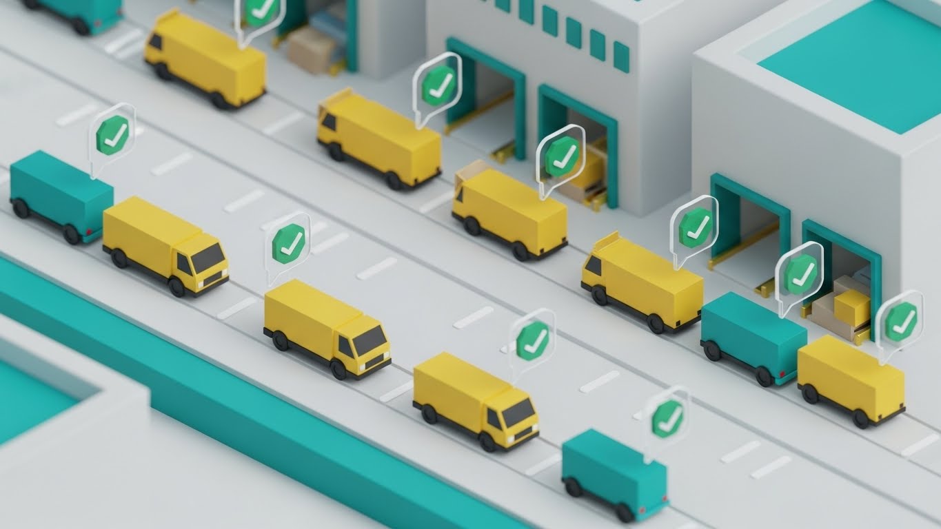
(Isometric 3D): Orchestrated Control + Micro-Efficiency
The Visual & Narrative Approach
This style treats the logistics yard like a perfectly tuned machine. We see a clean, isometric 3D view of a distribution center rendered in Matte White, Safety Yellow, and Teal. Miniature trucks move along marked paths with clockwork precision. Floating above each vehicle is a semi-transparent glass bubble containing a green checkmark, signaling compliance and readiness. The lighting is soft and global, giving the scene a "toy-set" appeal that makes the massive operation feel manageable.
Psychological Impact & KPI Focus
For Operations Directors, the yard is often a source of chaos. This visual leverages the God-Eye View effect, giving the viewer a sense of total control and omniscience. It validates the desire for a synchronized, error-free environment. The KPI is Landing Page Conversion, specifically for Account-Based Marketing (ABM) campaigns targeting large enterprise logistics firms.
Strategic Implementation & Trade-offs
- Duration: 30-45 Seconds.
- Strategic Trade-off: It is fantastic for showing the relationship between assets (e.g., truck to dock). However, the zoomed-out perspective makes it difficult to show driver-specific mobile app features.
Companies using similar video content -
Samsara – Samsara Intelligence – Transforms raw fleet data into clear operational insights.
Geotab – Geotab Data & Analytics – Visualizes complex telematics data into actionable reports.
Verizon Connect – Verizon Connect Reveal – Organizes real-time fleet data into clear dashboards.
Quartix – Quartix Tracking System – Displays real-time vehicle data and performance metrics.
15. Split Screen: Optimized Reality and UI
MOFU | Competitive Displacement
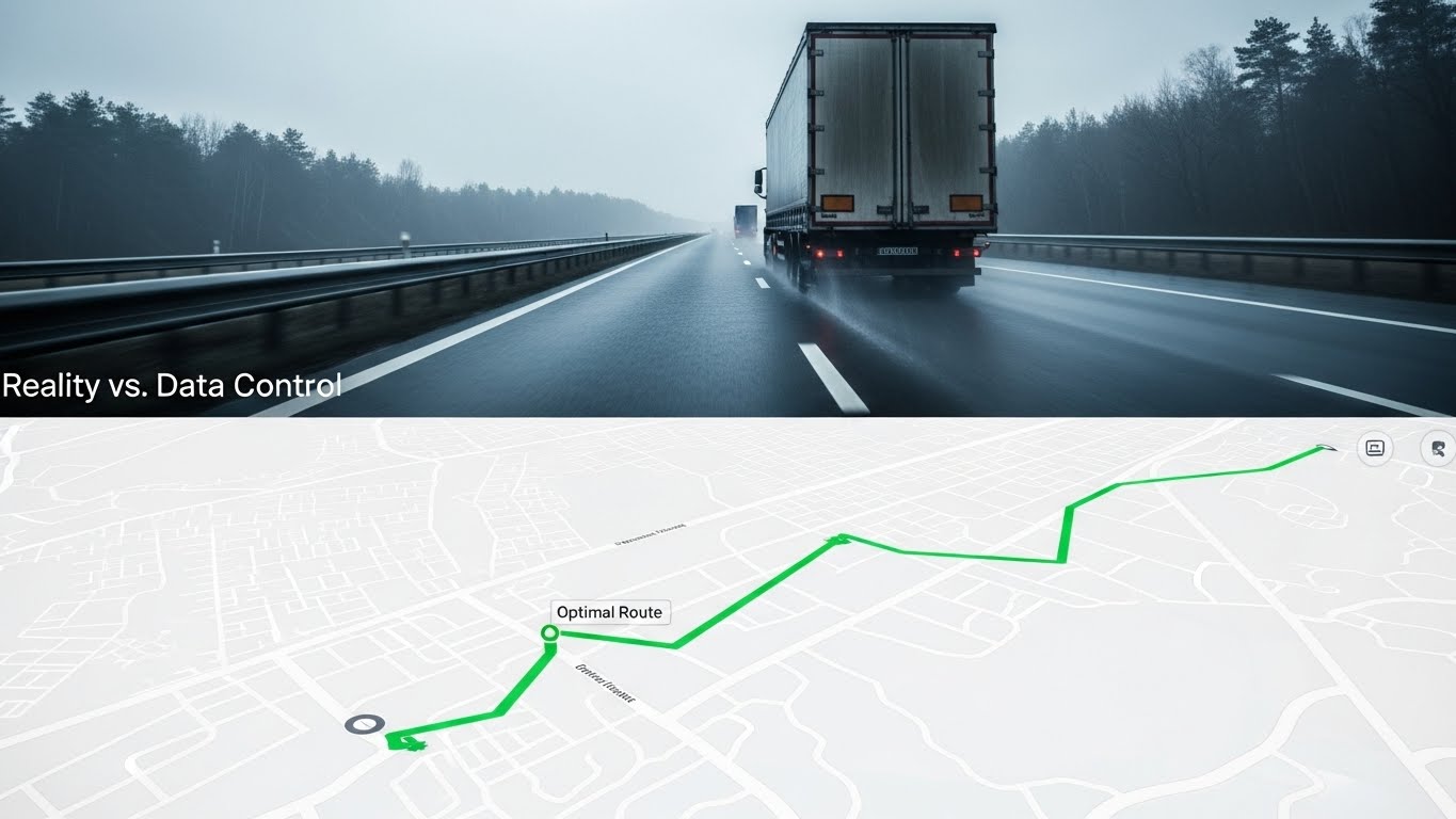
(Split Screen): Operational Reality vs. Digital Control
The Visual & Narrative Approach
This style directly confronts the "Physical/Digital Divide." The screen is split horizontally. The top half shows a cinematic, moody shot of a semi-truck battling rain on a grey highway (Reality). The bottom half shows the exact same route, but rendered as a pristine White and Green digital map UI, where the path is clear and optimized. The contrast between the chaotic, moody environment and the clean, controlled data stream is sharp and intentional.
Psychological Impact & KPI Focus
This is a powerful Competitive Displacement tool. It visually argues that while the competitor might just track the truck (top screen), your platform controls the outcome (bottom screen). It appeals to the Analytical Buyer by juxtaposing the problem (weather, traffic) with the solution (optimization). The KPI is Sales Demo Bookings, as it explicitly promises a "Control Layer" over reality.
Strategic Implementation & Trade-offs
- Duration: 20-30 Seconds.
- Strategic Trade-off: Optimal for comparison pages and "Why Switch" campaigns. Suboptimal for brand awareness, as it requires the viewer to already understand the basic context of fleet tracking.
Companies using similar video content -
Fleetbase – Open-Source Logistics OS – Illustrates seamless integration and workflow.
OpenRemote – OpenRemote IoT Platform – Shows continuous data flow and network connections.
GPSWOX – GPS Tracking Software – Depicts continuous tracking and route optimization.
Navixy – Navixy GPS Tracking – Visualizes uninterrupted tracking and asset management.
16. Aspirational Stock Montage
BOFU | The Economic Buyer

(Aspirational Stock): Financial Confidence + Strategic Growth
The Visual & Narrative Approach
Designed specifically for the CFO, this style projects financial stability. We see a high-key, airy shot of a confident executive in a modern glass office, holding a printed report titled "Q3 Financial Growth." The background is a blurred city skyline, implying scale. Superimposed in the air next to him are rising trend lines in Professional Blue and White. The lighting is natural and bright, conveying transparency and optimism.
Psychological Impact & KPI Focus
The Economic Buyer (CFO) cares about risk reduction and ROI. This style utilizes Halo Effect imagery—clean, bright, professional—to subconsciously associate the software with financial health and corporate success. It moves the conversation from "Expense" to "Investment." The KPI is Proposal Acceptance Rate, used primarily in the final decks sent to buying committees.
Strategic Implementation & Trade-offs
- Duration: Static Image or 5-10 Second Motion Still.
- Strategic Trade-off: It is highly effective for establishing corporate trust but lacks technical depth. It convinces the check-writer, not the user.
Companies using similar video content -
Omnitracs – Omnitracs One – Visualizes organized logistics operations and route execution.
Teletrac Navman – TN360 – Shows efficient fleet operations in a structured environment.
Wialon-Gurtam – Wialon Platform – Depicts large-scale fleet management with precise control.
EKA Solutions – EKA Omni-TMS – Orchestrates transportation workflows in a 3D isometric view.
17. 2D Graphics Over Live Action
BOFU | The Functional Buyer
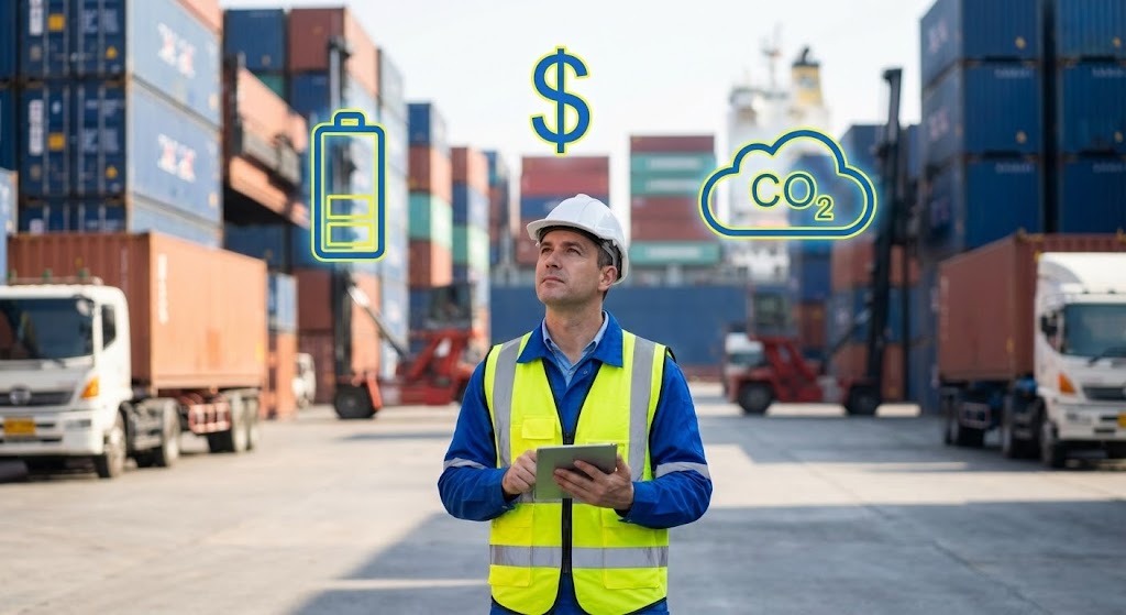
(AR Overlay): Augmented Intelligence + Workforce Empowerment
The Visual & Narrative Approach
This style champions the end-user. We see a high-res photo of a Fleet Manager in a safety vest and hard hat standing in a busy shipping yard. Floating around him in 3D space are "Augmented Reality" (AR) icons: a Battery symbol, a Dollar Sign, and a CO2 Cloud. These icons are rendered in flat Primary Blue and Yellow vector styles to pop against the realistic background. It visualizes the software as a superpower for the worker.
Psychological Impact & KPI Focus
The "Functional Buyer" (the person using the tool) fears being replaced or overwhelmed. This style uses Empowerment Psychology, showing the tech assisting the human, not replacing them. It validates their role as the decision-maker who is now equipped with better data. The KPI is User Onboarding Speed and internal adoption, as it positions the tool as a helpful assistant.
Strategic Implementation & Trade-offs
- Duration: 15-30 Seconds.
- Strategic Trade-off: Optimal for social media (LinkedIn/Instagram) to show "Life at [Company]." Suboptimal for high-level executive presentations which require more abstract data visualization.
Companies using similar video content -
Motive – Motive Fleet Management – Contrasts real-world driving with optimized digital routes.
Lytx – Lytx DriveCam – Shows real-world driving events alongside AI-driven safety insights.
GPS Insight – GPS Insight Platform – Juxtaposes fleet operations with data-driven solutions.
Rand McNally – Rand McNally Fleet – Compares actual routes with optimized navigation UI.
18. Futuristic Neon/Dark Mode
BOFU | The Technical Buyer
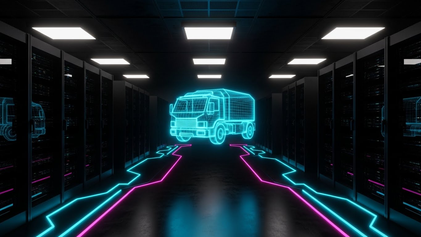
(Neon Dark Mode): Infrastructure Security + Modern Tech Stack
The Visual & Narrative Approach
Targeting the CTO/CIO, this style speaks the language of modern infrastructure. We are inside a sleek, dark server room. The server racks are matte black, but the floor is alive with pulsating Neon Cyan and Magenta data lines. In the center, a wireframe truck hologram floats, representing the virtualization of the fleet. The aesthetic is "Cyberpunk Corporate," emphasizing encryption, speed, and cutting-edge architecture.
Psychological Impact & KPI Focus
The Technical Buyer's primary anxiety is security and legacy integration. This style uses High-Tech Signifiers (Dark Mode, Neon, Wireframes) to communicate robustness and modernity. It implicitly answers the question, "Is this enterprise-ready?" The KPI is Technical Review Pass Rate, helping the champion sell the solution to their IT department.
Strategic Implementation & Trade-offs
- Duration: 30-45 Seconds.
- Strategic Trade-off: Optimal for technical specs pages and security whitepapers. Suboptimal for general audiences who may find the "Matrix" aesthetic too alien or intimidating.
Companies using similar video content -
CEVA Logistics – CEVA FORPLANET – Projects financial and sustainable growth.
Maersk – Decarbonization Initiatives – Focuses on long-term financial and environmental success.
DP World – Our World, Our Future – Highlights strategic growth and sustainability achievements.
19. Isometric 2D Motion Design
BOFU | ROI Justification

(Isometric 2D): ROI Visualization + Sustainable Profit
The Visual & Narrative Approach
This style creates a direct visual link between sustainability and profitability. Using clean, flat isometric vectors, a stack of Gold Coins sits on a white desk. As the stack grows higher, the coins seamlessly morph into lush Emerald Green trees. The animation is loopable and rhythmic. It strips away all extraneous detail to focus on one equation: Sustainability = Growth.
Psychological Impact & KPI Focus
ROI is often abstract. This style utilizes Conceptual Blending, merging the mental models of "Wealth" and "Nature" into a single object. It provides the "Economic Buyer" with a simple visual argument to justify the purchase: "Green is Gold." The KPI is Pricing Page Conversion, reinforcing value right at the point of purchase decision.
Strategic Implementation & Trade-offs
- Duration: 5-10 Seconds (Loop).
- Strategic Trade-off: Optimal for small screens and sidebars where attention is scarce. Suboptimal for explaining how that ROI is achieved; it is a promise, not a proof.
Companies using similar video content -
Zonar Coach – Zonar Coach App – Overlays safety insights and coaching cues on live driver footage.
Azuga – Azuga Fleet Mobile – Augments driver experience with real-time performance data.
Motive – Motive Driver App – Provides drivers with augmented data for compliance and safety.
20. Dark Mode UI Showcase
BOFU | Risk Mitigation
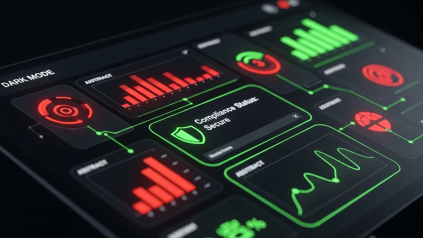
(Dark Mode UI): Alert Visibility + Compliance Assurance
The Visual & Narrative Approach
When dealing with risk and compliance, clarity is paramount. This style features a close-up, angled view of the SaaS dashboard in "Dark Mode." The background is Deep Charcoal, allowing the Neon Red (Alert) and Neon Green (Secure) elements to pop with urgency. A central "Compliance Status: Secure" shield icon glows reassuringly. The screen reflects slightly, grounding the digital UI in a physical monitor environment.
Psychological Impact & KPI Focus
This style triggers the Salience Network in the brain—bright colors on dark backgrounds demand attention. It is designed to reassure the "Risk Officer" that exceptions and failures will be immediately visible, never buried in a white spreadsheet. It communicates Vigilance. The KPI is Churn Reduction, as it reinforces the platform's role as the "Watchtower" protecting the fleet.
Strategic Implementation & Trade-offs
- Duration: 45-60 Seconds.
- Strategic Trade-off: Optimal for "Security" and "Compliance" feature pages. Suboptimal for initial marketing, as "Dark Mode" can sometimes feel less "friendly" or "open" than high-key light mode visuals.
Companies using similar video content -
Samsara – Samsara Site Security – Emphasizes advanced security and data infrastructure.
Geotab – Geotab Marketplace – Showcases a modern, secure telematics ecosystem.
Driivz – Driivz InSite – Presents a high-tech EV charging and energy management platform.
21. Clean UI Workflow (Light Mode)
BOFU | Driving Demo Requests
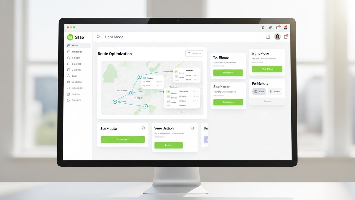
(Clean UI): Visual Clarity + Cognitive Relief
The Visual & Narrative Approach
This style serves as the visual antidote to the chaos of logistics. It presents a pristine, high-resolution render of the SaaS platform in Light Mode. The interface is predominantly Clinical White and Soft Grey, accented only by Vivid Lime Green action buttons that guide the eye. The screen displays a "Route Optimization" map with crystal-clear waypoints. The setting is a bright, sunlit office, but the background is heavily blurred (bokeh), ensuring the viewer’s focus remains locked strictly on the UI’s logical flow.
Psychological Impact & KPI Focus
At the Bottom of the Funnel (BOFU), the prospect’s primary anxiety is "usability." Will this be hard to learn? This style leverages Processing Fluency—the ease with which information is processed. By presenting a clean, light, and airy interface, we subconsciously signal that the software is approachable and "clean." It removes the intimidation factor of complex data. The primary KPI is Demo Request Conversion Rate, as the visual promise is one of organized simplicity.
Strategic Implementation & Trade-offs
- Duration: 30-45 Seconds.
- Strategic Trade-off: This style is excellent for showing workflow and ease of use. However, it can lack the "cool factor" of dark mode or 3D animations. It appeals more to the day-to-day user than the visionary tech enthusiast.
Companies using similar video content -
EcoTransIT – EcoTransIT World – Visually links emissions reduction to cost savings.
BigMile – Carbon Accounting Software – Connects carbon reduction with business optimization.
NetNada – ESG Reporting Software – Illustrates how sustainability drives financial benefits.
22. Hyper-lapse Stock Footage with Data
BOFU | Sales Cycle Acceleration
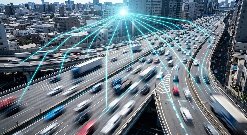
(Data Hyper-lapse): Real-World Velocity + Connected Intelligence
The Visual & Narrative Approach
This style visually connects the software to the pulse of the city. We see a hyper-lapse of a busy highway system; vehicles are blurred streaks of motion, representing the ceaseless pace of logistics. Superimposed over this reality are sharp, glowing Data Cyan lines that connect moving trucks to a central "Control Node" in the sky. The perspective is high-angle, emphasizing the network scale. It communicates that while the physical world moves fast, the digital layer moves faster, capturing every data point in real-time.
Psychological Impact & KPI Focus
This style utilizes Temporal Urgency. The fast-paced motion creates a sense of momentum, subtly pressuring the prospect to "keep up" with the market. It bridges the gap between the physical asset (the truck) and the digital value (the data line), reinforcing the concept of a "Connected Fleet." The KPI here is Email Click-Through Rate, as this dynamic visual is designed to stand out in a stagnant inbox environment.
Strategic Implementation & Trade-offs
- Duration: 10-15 Seconds (Loop).
- Strategic Trade-off: It is an impressionistic style. It conveys connectivity and speed effectively but cannot convey specific product features or interface details. It is a mood-setter, not an explainer.
Companies using similar video content -
Samsara – Samsara Dashboards – Highlights critical alerts and compliance status in a dark UI.
Geotab – Geotab Fleet Management – Displays real-time alerts and diagnostic trouble codes.
Verizon Connect – Verizon Connect Reveal – Shows compliance and safety alerts prominently.
23. Rapid UI Feature Montage
Onboarding | Accelerating TTV
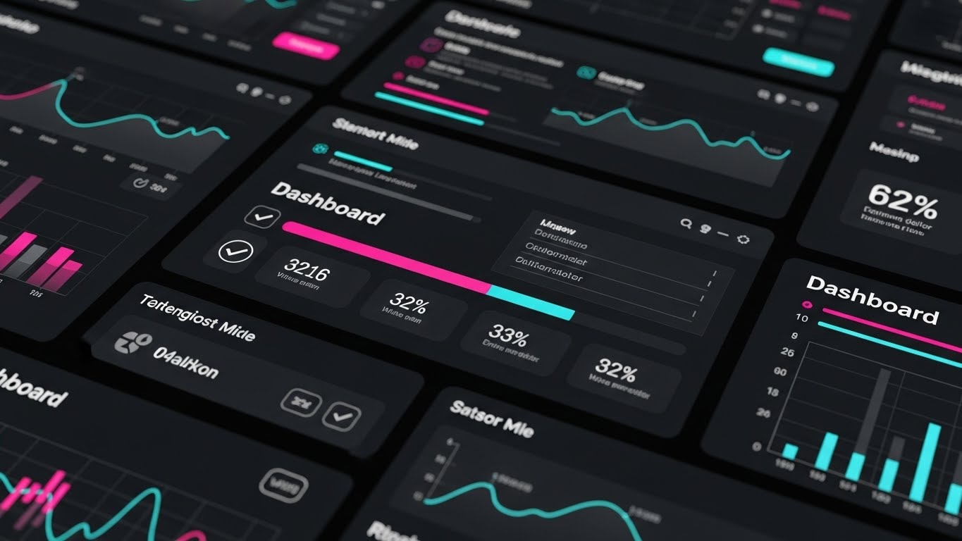
(Rapid Montage): Feature Velocity + Instant Value
The Visual & Narrative Approach
Designed for the crucial first days of user onboarding, this style is all about speed and capability. It features a rhythmic, high-energy montage of the platform’s most powerful dashboards. We see dark-mode interfaces with Vivid Magenta and Cyan data visualizations popping against Charcoal backgrounds. Loading bars fill instantly, checkmarks appear in rapid succession, and graphs populate in sync with an energetic beat. It creates a feeling of a powerful, responsive system at your fingertips.
Psychological Impact & KPI Focus
New users often experience "Buyer's Remorse" or "Setup Fatigue." This style counters that by demonstrating Time-to-Value (TTV). It visually validates their purchase decision by showing just how much the tool can do, and how fast it does it. The rapid pacing triggers excitement and reduces the perceived "slog" of configuration. The KPI is Onboarding Completion Rate, keeping momentum high during the setup phase.
Strategic Implementation & Trade-offs
- Duration: 15-30 Seconds.
- Strategic Trade-off: The pace is too fast for learning. Users cannot study the UI details. It is intended to motivate and excite, not to teach specific workflows.
Companies using similar video content -
Fleetio – Fleetio Platform – Presents a clean, intuitive interface for fleet management.
GPS Insight – GPS Insight Platform – Focuses on user-friendly dashboards and reporting.
Webfleet – Webfleet Solutions – Offers a clear, easy-to-navigate interface for fleet tracking.
NexTraq – NexTraq Fleet Tracking – Provides a straightforward, easy-to-use tracking interface.
24. Abstract 3D AI Visualization
Onboarding | Reducing Friction

(Abstract AI): Network Intelligence + Simplified Hardware
The Visual & Narrative Approach
When explaining complex backend technology like AI or hardware integration, literalism can be boring. This style uses abstraction to make the technical feel magical. We see a central, glowing Silver Cube (representing the hardware device) connected to a vast network of floating spheres via pulsing Blue Light beams. The background is a clean, dark void that highlights the connections. It visualizes the "Neural Network" of the fleet in a way that looks sophisticated yet organized.
Psychological Impact & KPI Focus
This style addresses Cognitive Overload related to hardware installation and network setup. By abstracting the mess of cables and servers into clean, glowing geometry, we make the infrastructure feel elegant and manageable. It appeals to the user’s desire for a "Plug and Play" experience. The KPI is Support Ticket Reduction, as a clear conceptual model helps users understand the system architecture without getting lost in the weeds.
Strategic Implementation & Trade-offs
- Duration: 20-30 Seconds.
- Strategic Trade-off: Highly abstract. If the user needs to know which port to plug a cable into, this style is useless. It is best for conceptual overviews before the nitty-gritty training begins.
Companies using similar video content -
Uber Freight – Uber Freight Emissions Dashboard – Visualizes rapid logistics with data overlays.
Motive – Motive Connected Operations – Shows fast-paced operations with real-time data connections.
Verizon Connect – Verizon Connect Reveal – Depicts dynamic fleet movement with superimposed data.
Descartes Systems Group – Descartes Route Planner – Visualizes fast-moving logistics with data integration.
25. 2D Animation & UI Composition
Onboarding | Self-Serve Onboarding

(2D Instructional): Guided Interaction + User Confidence
The Visual & Narrative Approach
This style is the digital equivalent of a friendly instructor looking over your shoulder. It combines a realistic UI screenshot with stylized 2D animation elements. An illustrated hand taps a Bright Orange button, and exaggerated "sparkle" effects emphasize the successful interaction. The palette uses Deep Blue and Pastel Yellow to create a warm, non-threatening environment. It transforms a boring "Click Here" instruction into a rewarding, tactile moment.
Psychological Impact & KPI Focus
Fear of breaking the system is real for new users. This style uses Positive Reinforcement visual cues (sparkles, glow, bright colors) to reward the user for taking the right action. It builds Self-Efficacy, the user's belief in their own ability to master the software. The KPI is Feature Adoption Rate, specifically for self-serve setup modules where no human support is available.
Strategic Implementation & Trade-offs
- Duration: 5-10 Seconds (Micro-Loops).
- Strategic Trade-off: The "cartoonish" elements might feel too informal for C-Level strategy decks, but they are perfect for in-app modals and driver training apps.
Companies using similar video content -
Samsara – Samsara Connected Workflows – Showcases rapid feature interactions and quick results.
Geotab – Geotab Solutions – Highlights quick access to various telematics features.
Fleetio – Fleetio Mobile App – Demonstrates fast navigation and feature access for users.
GPSGate – GpsGate Platform – Presents quick feature overviews for fleet tracking.
26. Abstract 2D Motion Graphics
Retention | Knowledge Base

(Liquid Motion): Frictionless Support + Knowledge Flow
The Visual & Narrative Approach
Used primarily for help centers and loading screens, this style represents the ease of finding answers. Smooth, liquid-like shapes in Teal and Blue gradients flow horizontally across the screen. They navigate around invisible obstacles with grace, morphing and adapting their shape. The background is a clean, stark white. The motion is continuous and hypnotic, suggesting that problems in the platform are easily resolved and that workflow is never truly blocked.
Psychological Impact & KPI Focus
When a user visits a Knowledge Base, they are usually frustrated. This style is designed for Anxiety Reduction. The slow, fluid motion has a calming effect, counteracting the stress of a technical issue. It visually reinforces the brand promise of "Adaptability" and "Support." The KPI is Customer Satisfaction Score (CSAT), specifically regarding the self-help experience.
Strategic Implementation & Trade-offs
- Duration: Loopable Background.
- Strategic Trade-off: It is purely decorative and atmospheric. It conveys no information but sets the correct emotional tone for support interactions.
Companies using similar video content -
Aurora – Aurora Driver Hardware – Abstractly visualizes AI and hardware integration.
Motive – Motive AI – Represents complex AI systems and their network connections.
Epika Fleet – Autonomous Fleet Management – Simplifies the visualization of autonomous tech infrastructure.
27. 3D Parallax UI Presentation
Retention | Reducing Churn
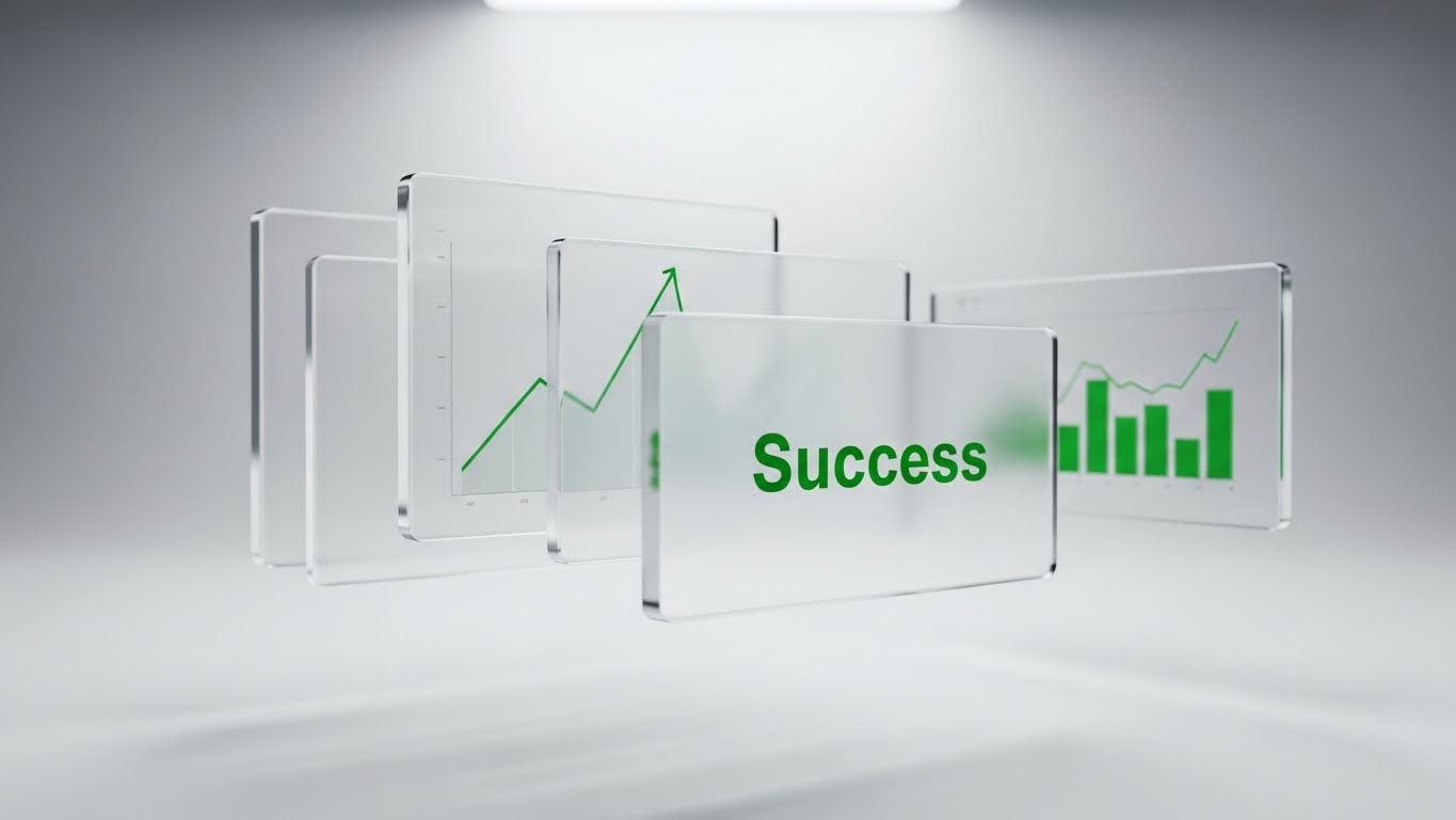
(Glass Parallax): Depth of Value + Strategic Review
The Visual & Narrative Approach
Designed for Quarterly Business Reviews (QBRs), this style elevates standard screenshots into a premium presentation. We see multiple glass-like UI screens floating in layers. The foreground shows a "Success" notification in Emerald Green. The middle layer displays a rising growth graph. The background is a blurred, ethereal workspace. As the camera pans, the parallax effect creates a deep sense of dimensionality, implying that the software offers deep, multi-layered value.
Psychological Impact & KPI Focus
This style targets Perceived Value. By giving the UI "depth" and "weight" through 3D rendering, we subconsciously signal that the platform is substantial and robust—harder to "rip and replace." It frames the data as a premium asset. The KPI is Retention Rate, as it is used to remind stakeholders of the cumulative success achieved over the contract period.
Strategic Implementation & Trade-offs
- Duration: 30-60 Seconds.
- Strategic Trade-off: High production value means high render times. It is not suitable for daily reporting but is perfect for high-stakes renewal presentations.
Companies using similar video content -
Azuga – Azuga Driver App – Uses animated cues for driver training and interaction.
Motive – Motive Driver App – Guides users through ELD and compliance tasks with clear animations.
Fleetio – Fleetio Inspections – Animates steps for completing vehicle inspections.
Fleetms – Fleetms Maintenance – Illustrates maintenance workflows with clear animated steps.
28. Macro UI Micro-Interactions
Expansion | Driving Deep Feature Adoption
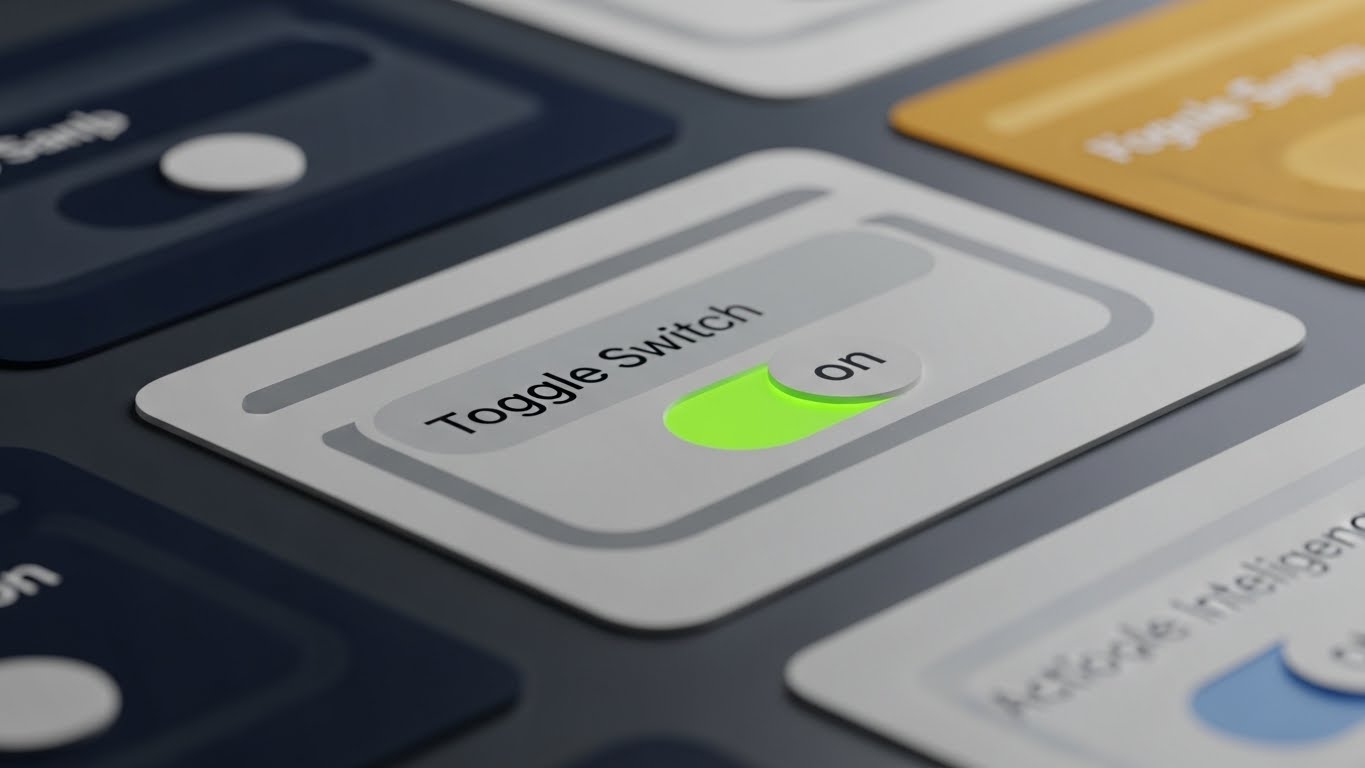
(Macro Detail): Precision Engineering + Feature Focus
The Visual & Narrative Approach
To announce a specific new feature, we zoom in—extreme close-up. This style uses a macro photography aesthetic to render a single UI element: a toggle switch turning from "Grey" to LED Green. The detail is so high that we can see the faint sub-pixel texture of the screen. The lighting highlights the tactile "click" of the switch. It focuses the viewer's entire universe on one specific action: activating the new capability.
Psychological Impact & KPI Focus
This style utilizes Selective Attention. By filling the screen with a single button, we eliminate all distraction. It triggers the Curiosity Gap—"What happens when I flip that switch?" It suggests that this small action has massive consequences. The KPI is Upsell/Cross-sell Conversion, as it typically highlights premium features that require activation.
Strategic Implementation & Trade-offs
- Duration: 5-10 Seconds.
- Strategic Trade-off: It lacks context. You cannot see the full dashboard. It relies on accompanying text or voiceover to explain what the switch actually does.
Companies using similar video content -
Samsara – Samsara Support Resources – Uses fluid motion to convey ease of support.
Geotab – Geotab Support Documentation – Represents seamless access to knowledge.
OpenRemote – OpenRemote Community – Visualizes a flowing, adaptable support ecosystem.
29. Photorealistic 3D Renders
Expansion | Driving Upsell
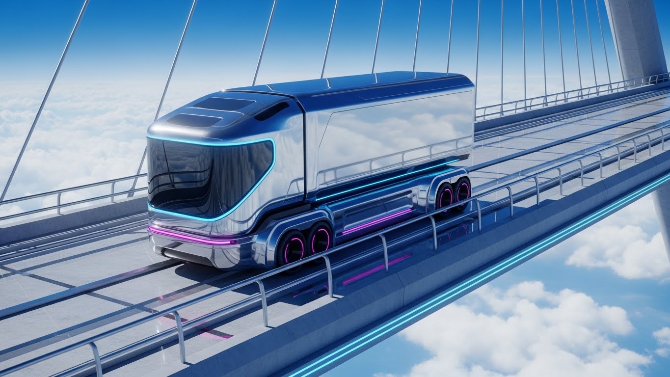
(Photo-Real Future): Aspirational Growth + Next-Gen Logistics
The Visual & Narrative Approach
This is the "Vision" style. It features a stunning, photorealistic 3D render of a futuristic, aerodynamic silver truck driving on a glass bridge suspended above the clouds. The lighting is bright, high-altitude daylight (5500K), reflecting the blue sky on the vehicle's polished chassis. It looks less like a software ad and more like a high-end automotive commercial. It represents the future state of the client's fleet—autonomous, clean, and elevated.
Psychological Impact & KPI Focus
This appeals to the client's Ideal Self-Image. It validates their ambition to be a market leader. It is used to sell "Future-Readiness" packages or long-term contract extensions. The visual metaphor of driving "above the clouds" suggests leaving competitors behind. The KPI is Customer Lifetime Value (LTV), positioning the SaaS provider as the partner for the next decade of innovation.
Strategic Implementation & Trade-offs
- Duration: Static Image or Slow Motion Video.
- Strategic Trade-off: Extremely expensive to produce. It sets a very high visual bar that the actual day-to-day software UI might not match. Use sparingly for "Vision" selling.
Companies using similar video content -
Samsara – Samsara Executive Dashboards – Presents multi-layered data for strategic reviews.
Geotab – Geotab Benchmarking Report – Showcases deep insights and growth trends.
Verizon Connect – Verizon Connect Reporting – Visualizes comprehensive data with depth for stakeholders.
Descartes Systems Group – Descartes MacroPoint – Displays multi-layered supply chain visibility data.
30. Lifestyle Stock with UI Overlay
Expansion | Driving Referrals

(Authentic Lifestyle): Human Success + Social Proof
The Visual & Narrative Approach
Ultimately, software is about people. This style features a candid, high-resolution photo of a diverse team of logistics professionals celebrating on a sunny rooftop garden. They are high-fiving, and some hold tablets displaying Green status screens. The lighting is natural, warm, and authentic—not "staged corporate." It captures the feeling of a "Win."
Psychological Impact & KPI Focus
This style leverages Social Proof and Emotional Contagion. Seeing happy, successful peers triggers a desire to share that success. It humanizes the technology, reminding the viewer that the result of good software is a happy team. The KPI is Net Promoter Score (NPS) and Referral Generation, as it depicts the emotional reward of using the platform.
Strategic Implementation & Trade-offs
- Duration: Static Image.
- Strategic Trade-off: Stock photography can feel generic if not carefully curated. It must feel authentic to the industry (e.g., proper safety gear if in a yard, proper attire if in an office) to avoid being dismissed.
The Visual Operations Doctrine: A Strategic Framework
Having defined the 30 distinct visual styles, we must now synthesize them into a cohesive operational strategy. The "Strategic Fleet Modernizer" does not just need pretty videos; they need a Visual Operating System that drives adoption, compliance, and ROI. This framework is divided into three critical knowledge segments.
STRATEGIC ALIGNMENT & VISUAL ARCHITECTURE
The "Pre-Production" Strategy – Designing for the Logistics Brain.
- The Cognitive Load Audit: Before commissioning any asset, audit the "Mental Cost." A Driver on a rainy highway has 5% cognitive availability; a CFO in a quiet office has 80%. Use Style 1 (Minimalist) for the former and Style 16 (Aspirational) for the latter. Never force high-fidelity complexity on a low-bandwidth user.
- Role-Based Visual Mapping: Create a matrix. Drivers receive Style 25 (2D Instructional) and Style 4 (Kinetic Typo) for quick, mobile-first consumption. Fleet Managers receive Style 14 (Isometric Workflow) for desktop situational awareness. Match the pixel density to the job role.
- The "Glanceability" Standard: In logistics, seconds cost money. Define a "Glanceability Standard" for all visual content. Can the core message of a video (e.g., "Brakes Overheating") be understood in 3 seconds with the sound off? If not, it fails the "Yard Test."
- Brand Voice Consistency: Your sustainability report (Style 19) and your driver app (Style 25) must feel like siblings. Use a consistent accent color (e.g., "Safety Green") across all 30 styles to thread the brand identity through every touchpoint, from the warehouse floor to the boardroom.
- The Advids Strategic Audit: This is where a partner like Advids adds value beyond production. By auditing your existing training library against these 30 styles, we can identify "Visual Gaps"—areas where you are over-reliant on text or outdated PDFs—and prescribe the specific visual remedy.
- Standardization vs. Customization: Use Style 29 (3D Photorealism) for generic "Hero" shots of trucks to save budget. Save your custom animation budget for Style 28 (Macro UI) where showing your specific proprietary interface is non-negotiable.
- The Cross-Departmental Bridge: Sales talks "Revenue," Ops talks "Efficiency." Use Style 15 (Split Screen) to visually align these departments. Show the Revenue graph (Sales) reacting to the Route Optimization (Ops) on the same screen. Visuals force a shared language.
- Legacy System Integration: The biggest barrier to sale is "We have old hardware." Use Style 26 (Wireframe to Reality) to visualize the seamless overlay of your new SaaS on their old trucks. Visually respect their legacy investment while selling the upgrade.
- Accessibility in Trucking: The logistics workforce is global and multilingual. Style 5 (Character Story) and Style 13 (Line Art) rely on visual narrative, not voiceover. These styles reduce localization costs and ensure safety messages cross language barriers.
- The Mobile-First Mandate: 70% of your users (drivers) effectively work on a phone. Ensure that Styles 21-30 are all legible on a 9:16 vertical screen. If the UI text is too small to read on a phone, the video is functionally useless for the frontline.
OPERATIONAL ADOPTION & IMPLEMENTATION
The "Deployment" Phase – Embedding Visuals into the Workflow.
- Overcoming "Big Brother" Anxiety: Drivers hate being watched. Use Style 17 (AR Overlay) to frame AI cameras not as "surveillance" but as "iron man suits"—tools that protect and empower the driver. Visual empathy is the key to union buy-in.
- The Micro-Learning Shift: Kill the 40-page PDF manual. Replace it with a library of ten 30-second clips using Style 23 (Rapid Montage) and Style 28 (Macro UI). Deliver these "Just-in-Time" visual snacks directly to the driver's tablet before a shift.
- Just-in-Time Support: Embed Style 26 (Abstract Motion) loops into the "Loading" or "Help" screens of your app. These calming visuals reduce frustration during wait times and subconsciously signal that support is fluid and available.
- Gamification of Training: Use Style 4 (Kinetic Typo) and Style 19 (Isometric ROI) to visualize driver scorecards. Show a "High Score" visual language rather than a "Compliance Checklist." Make safety exciting and competitive.
- Reducing Support Ticket Volume: There is a direct correlation between the quality of Style 24 (Abstract 3D AI) videos and the volume of "How do I install this?" support tickets. Front-load visual clarity to reduce backend support costs.
- Remote Onboarding: You cannot fly trainers to every depot. Use Style 24 (Holographic UI) to create a "Virtual Seminar." A 3D walkthrough of the hardware installation ensures consistency across 50 locations without a single plane ticket.
- Visual SOPs (Standard Operating Procedures): Text-based SOPs are ignored. Transform them into Style 14 (Isometric Workflow) animations. Show the traffic flow of a yard in 3D. A visual SOP is a followed SOP.
- Feedback Loops: Use interactive video elements (branching scenarios) within Style 5 (Character Story). Let drivers "choose" the right safety reaction. This turns passive watching into active learning and provides data on driver knowledge gaps.
- Scalable Localization: When planning Style 30 (Lifestyle) or Style 11 (Realistic AI Character), use generative AI tools to swap lipsync or background signage for different regions. This allows one master asset to serve Global, EMEA, and APAC markets efficiently.
- Leadership Communication: When the VP of Logistics presents to the Board, they need ammunition. Equip them with Style 29 (Photorealistic Future) and Style 27 (Parallax UI). Give your internal champion the "Hollywood" assets they need to sell your vision up the chain.
MEASURING IMPACT & FUTURE-PROOFING
The "ROI" Phase – Quantifying Value and Scaling Success.
- Beyond "Views": Do not measure video success by "Views." Measure it by "Time-to-Competency." Did watching the Style 25 video reduce the driver's first-setup time by 20%? That is a business metric.
- The "Idle Time" Metric: Poor software UX causes truck idle time (drivers fiddling with tablets). Correlate the deployment of Style 21 (Clean UI) training assets with a reduction in "Yard Idle Time." Visual clarity equals fuel savings.
- Compliance Velocity: When a new mandate (e.g., ELD) hits, how fast does the fleet adapt? Track the adoption curve before and after introducing Style 20 (Dark Mode Alert) videos. Speed of compliance is a major risk mitigator.
- Retention and Churn: High-quality UI visualization (Style 27) during QBRs reduces churn. It reminds the client of the sophistication they are paying for. Treat video as a "Customer Success Manager" that never sleeps.
- The AI Visual Frontier: Prepare for Real-Time Generative Video. Soon, the Style 12 (Data Viz) will not be a pre-rendered video; it will be generated live from the client's actual data. Build your visual foundations now to plug into these future engines.
- Scalability of Assets: Build a "Component Library" of 3D assets (Trucks, Warehouses, UI screens). This allows you to generate new Style 14 or Style 29 videos in hours, not weeks.
- The Advids Partnership: Scaling this visual engine requires a long-term partner, not a gig-worker. Advids acts as the custodian of your "Visual Digital Twin," ensuring that as your software features evolve, your visual library evolves in lockstep, without version control chaos.
- Benchmarking Success: Compare your visuals to the B2C apps your drivers use (Uber, TikTok). If your enterprise training looks like 1990s TV compared to their TikTok feed (Style 4), you lose their attention. The benchmark is not "Competitors"; it is "Consumer Tech."
- The ROI of Safety: Insurance premiums are a massive cost. Work with insurers to certify your Style 13 (Line Art) safety curriculum. Many underwriters offer premium reductions for fleets with verifiable, high-engagement visual training programs.
- Final Call to Innovation: Stop treating video as "Marketing Content." Treat it as "Visual Infrastructure." In an industry moving physical goods through a complex world, the ability to visualize the invisible—data, emissions, risk—is the ultimate competitive advantage. Build this bridge, and you don't just manage a fleet; you lead the market.
Companies using similar video content -
Fleetio – Fleetio Automations – Highlights specific UI elements for new feature activation.
Samsara – Samsara Connected Training – Focuses on micro-interactions for feature adoption.
Motive – Motive Workflow Automation – Emphasizes precise control over specific features.
Geopointe – Geopointe Mapping – Focuses on precise map interactions and data toggles.
Author & Editor Bio


